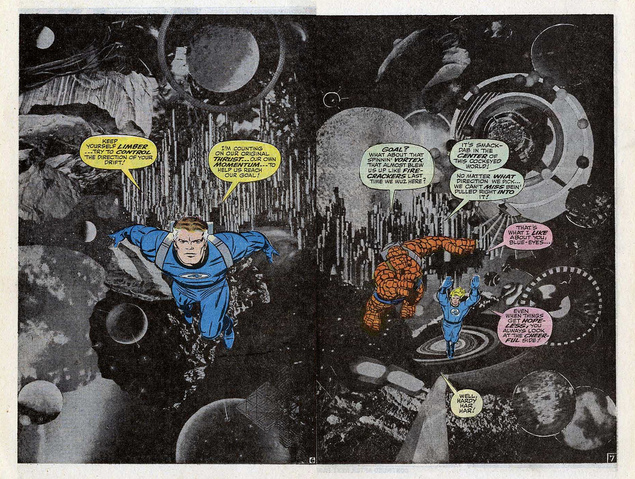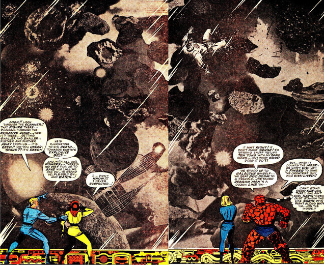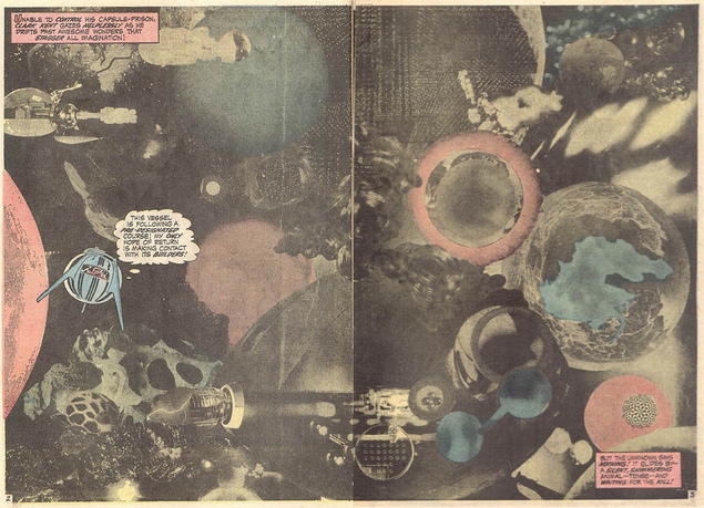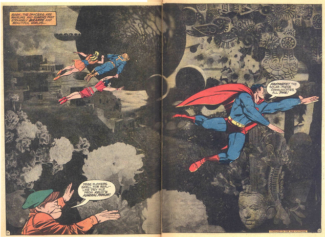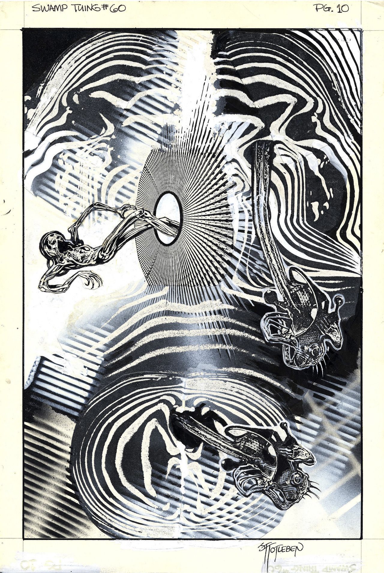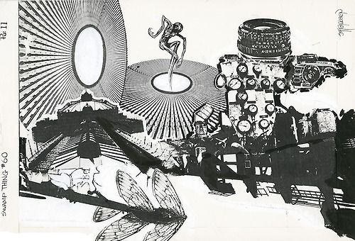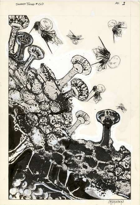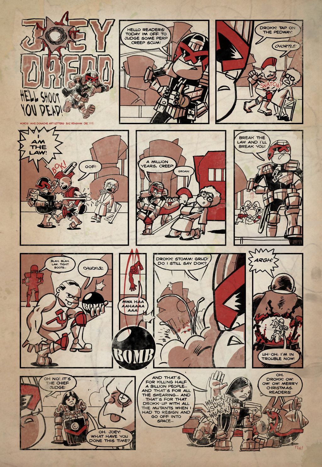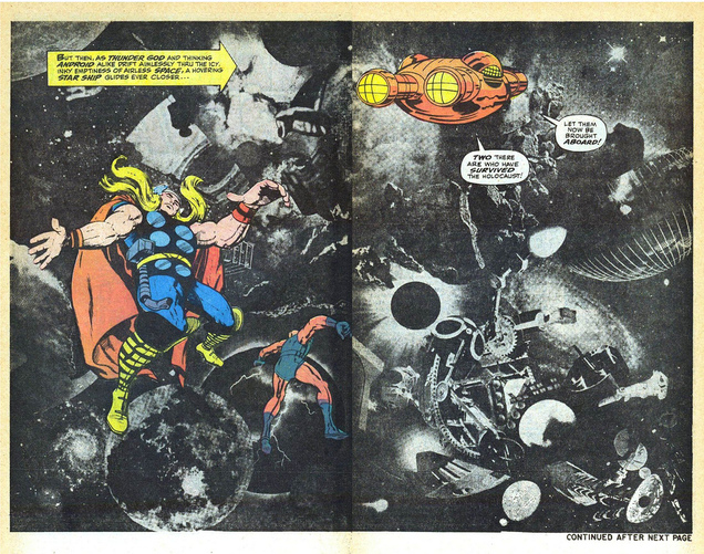
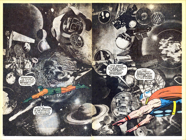
 Exactly what is says in the header – staggering work of course and including some of Kirby’s collage work too – view them all here.
Comics
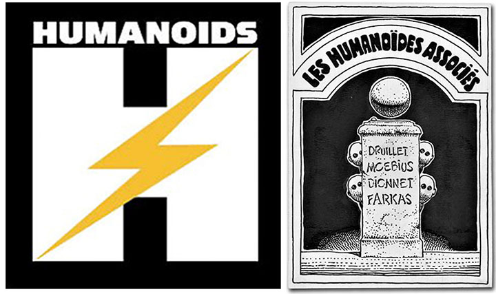 Humanoids (Les Humanoïdes Associés – roughly translated as ‘United Humanoids’), the French publishing imprint set up by Jean ‘Moebius’ Giraud, Phillip Druilett and others in 1974 has recently opened a UK office.
Instantly recognisable on shelves by their large HUMANOIDS logo on each book spine, they produce beautiful hardback editions of French and European comics include oversize versions of Moebius and Jodorowsky‘s ‘The Incal’. This year is their 40th anniversary and it looks like they have big plans for the international market.
Last week they had the chance to buy the original art for their first logo, drawn by Moebius and long thought lost, from an auction in Manhattan (above right).
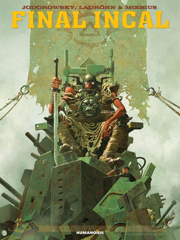
Now that they have a UK office (as well as relocating their French HQ to LA and opening one in Japan) I hope we will see lots of new issues of classic material associated with their founders. Moebius’ ’40 Days In The Desert’ and ‘Quatre-vingt huit’ would be top of my list and I think the English translation of the ‘Final Incal’ book is due any time soon (cover below not final and taken from Robot 6).


 Available Feb 13th from 3A
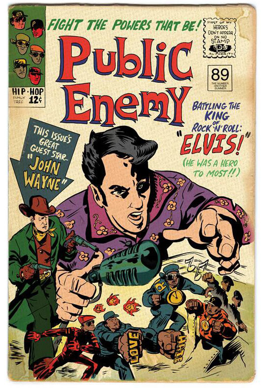
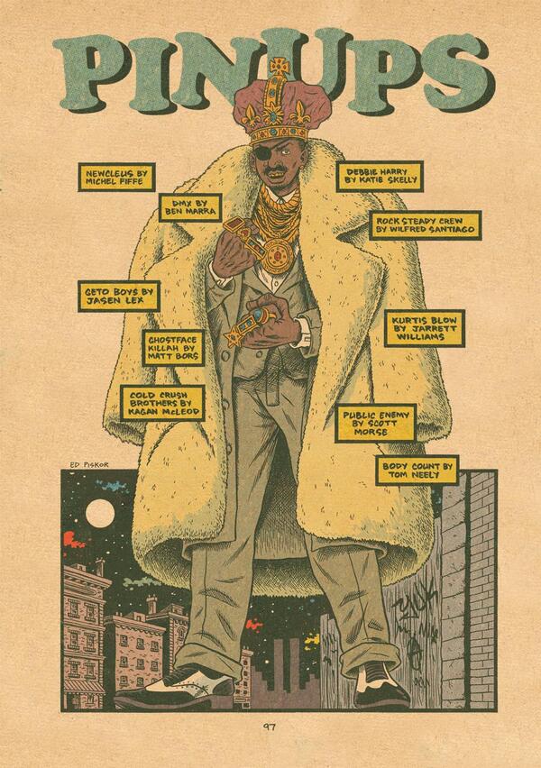
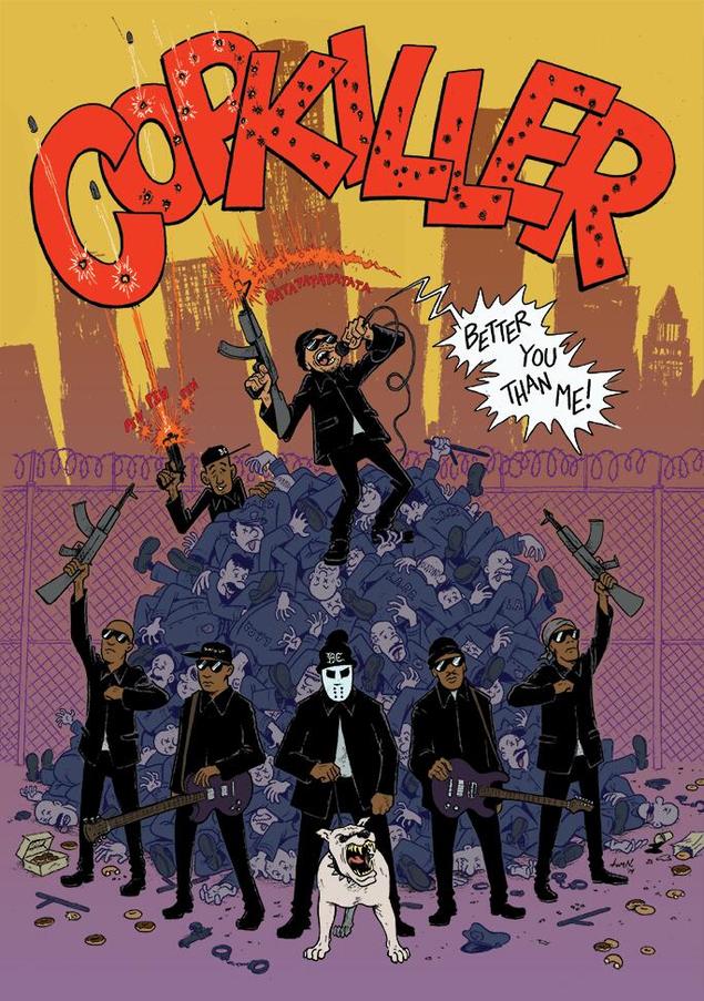
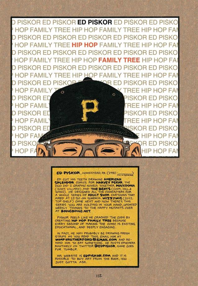
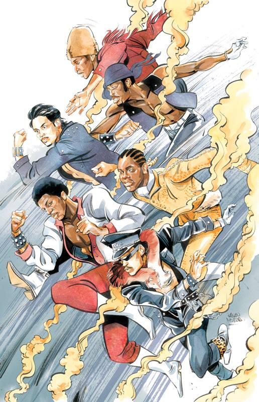 The second volume of Ed Piskor‘s ‘Hip Hop Family Tree‘ – a history of rap music in comic book form – is out this summer. It features another round of guest artist pin ups and a few of these have leaked on the web in the past week or so. There will also be a free issue, drawing from both volumes and sporting a new cover, out for Free Comic Book Day this May.
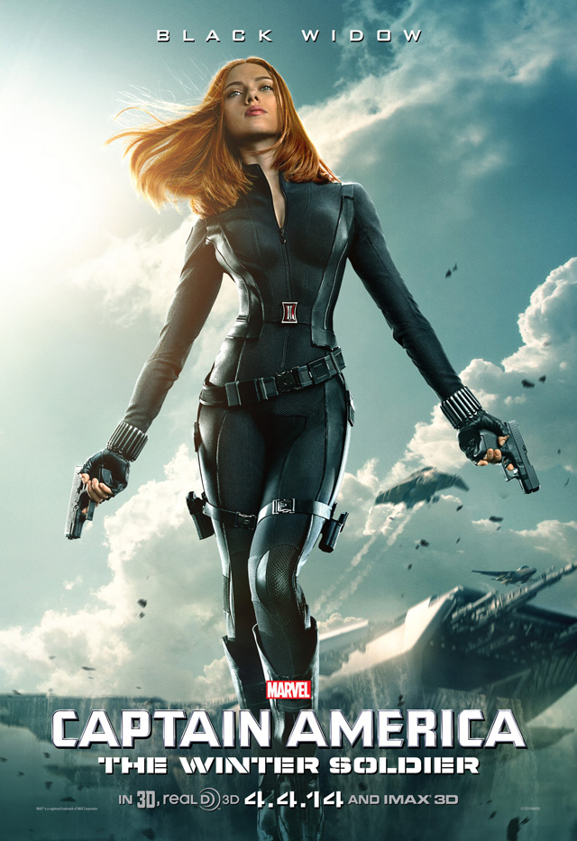 I’ve shamelessly stolen this from Steve Cook‘s Secret Oranges site. This version of Black Widow may not be pleasing the purists online but, as a Scarlett fan, all I can say is, ‘Damn!’.
Looks like they seriously upped the budget on this one too after the success of The Avengers.
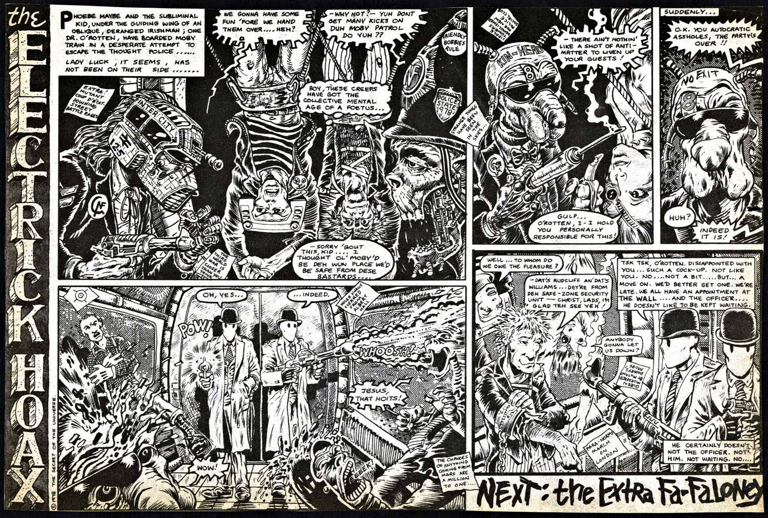
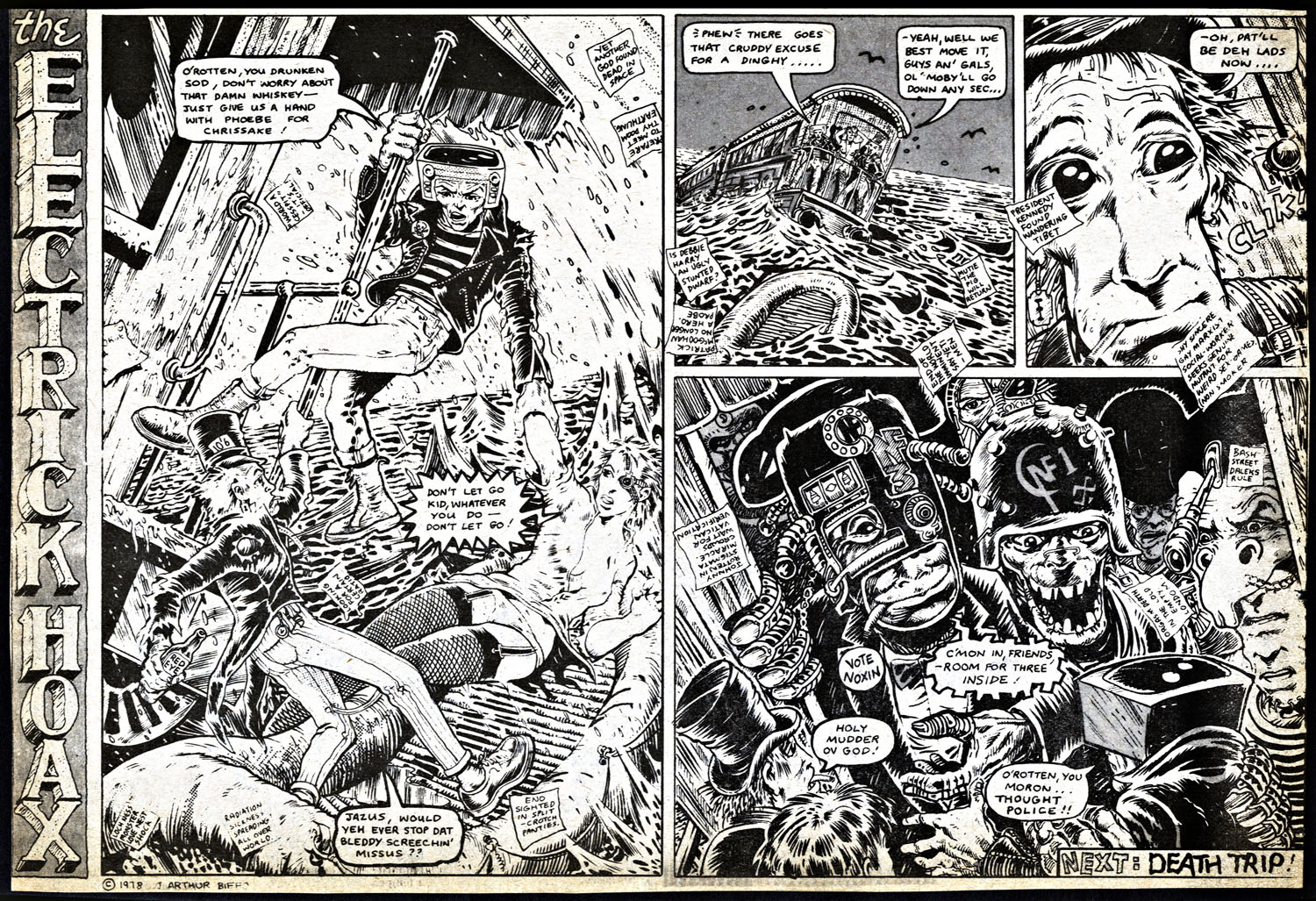
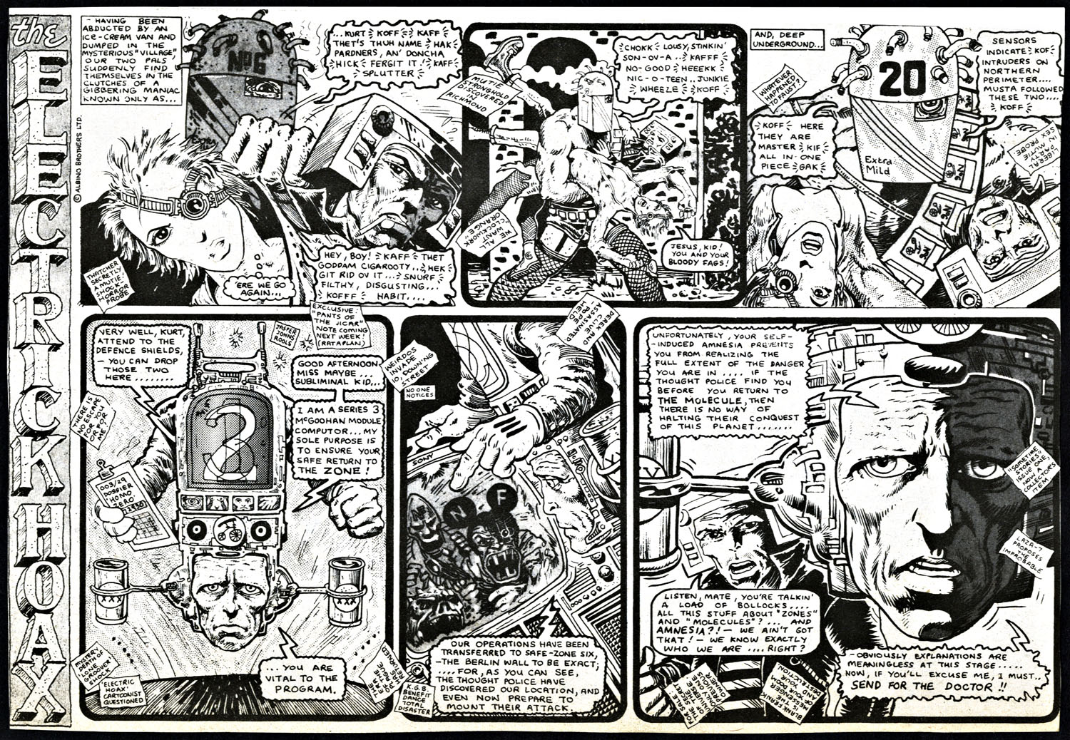
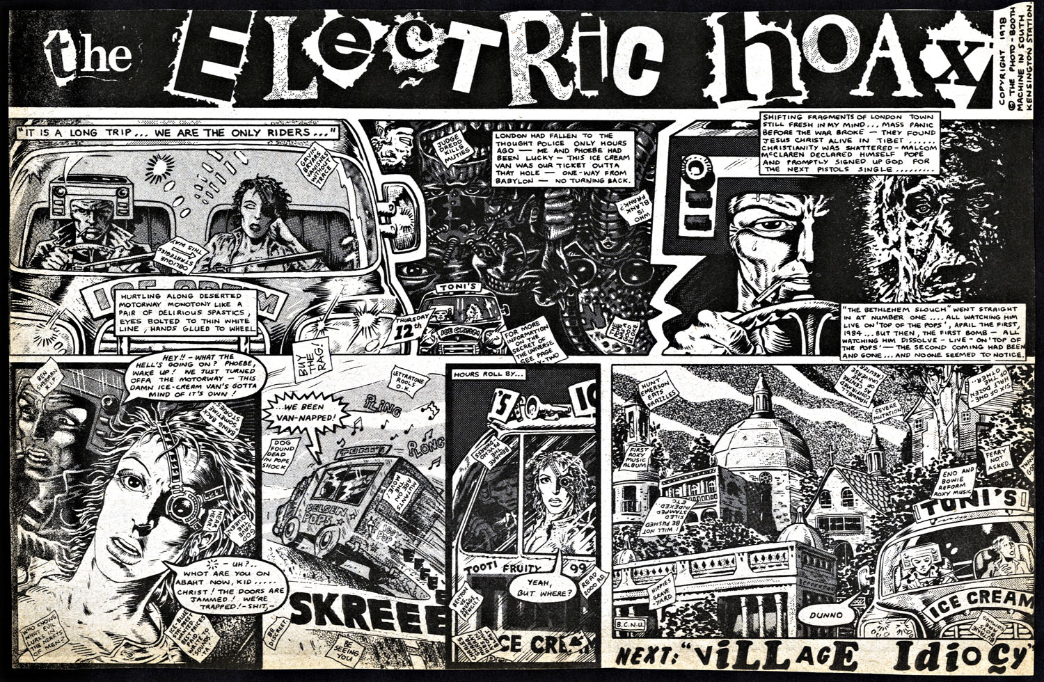
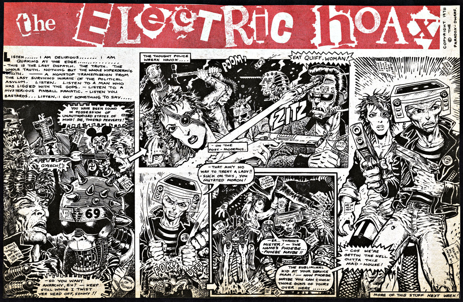
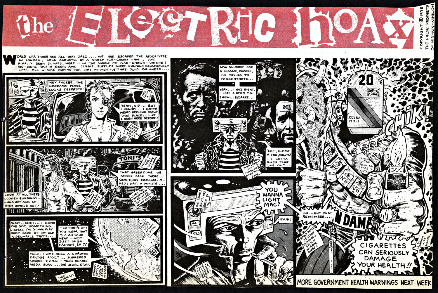 The Electric Hoax Pt.4 by Pete Milligan and Brendan McCarthy. This strip appeared in the weekly UK music paper, Sounds, in 24 parts sometime between mid ’78 and ’79. Click image for larger version.
Also – just in stores – a new strip by McCarthy, ‘The Deleted’, just debuted in Dark Horse Presents no.32.
 One of the recent trends in comics has been the over-sized deluxe ‘original art’ edition of a book or artist’s work. These are reproductions of the original pages, sans colour, with all the pencil marks, printer mark up and notes, reproduced at the original size – usually ‘half up’ from the final printed size. Usually expensive (around the £100 mark) these beautiful tombs are fascinating artifacts and show how much detail is lost in the print process.
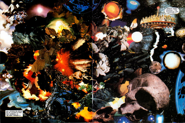
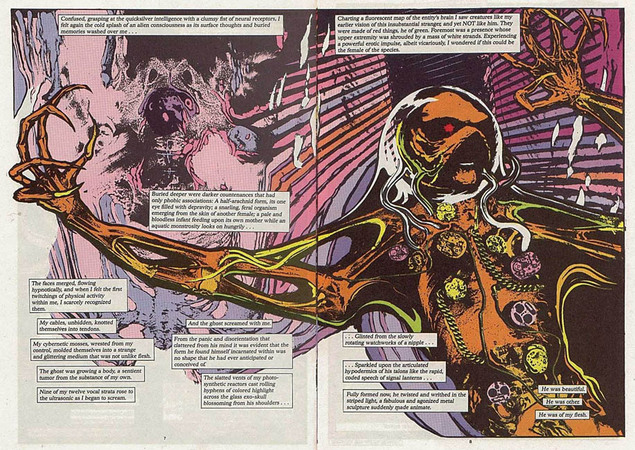
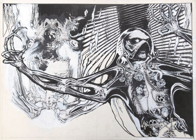
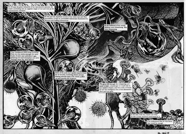
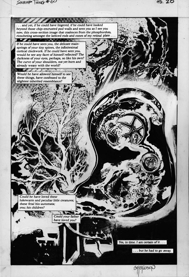
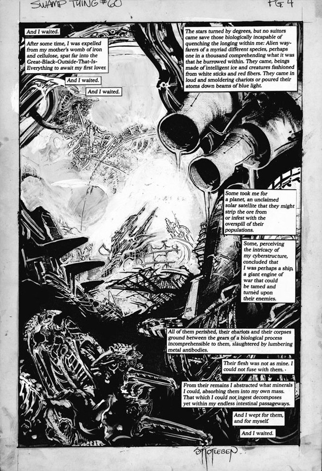
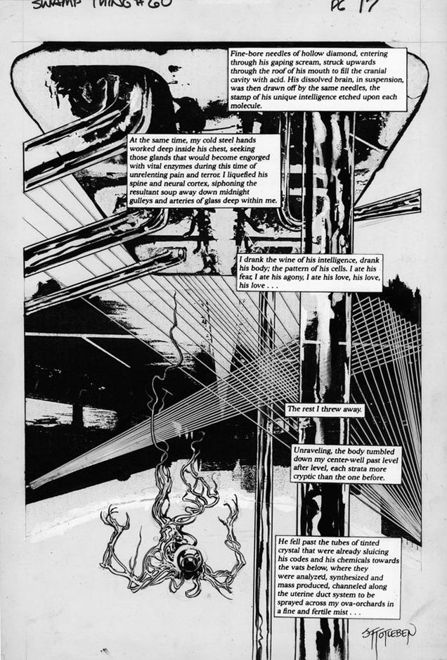
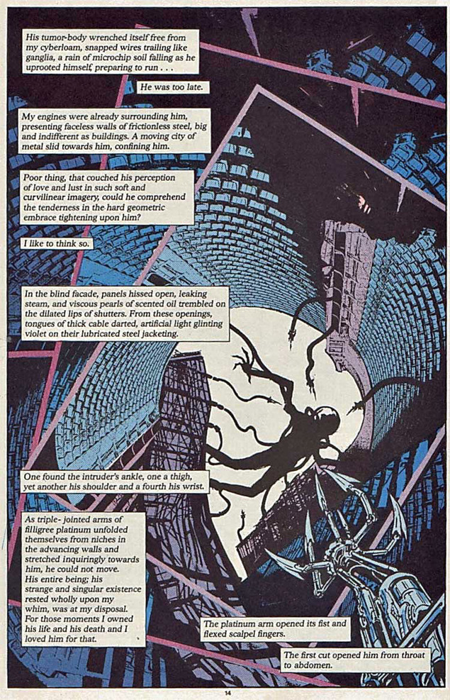
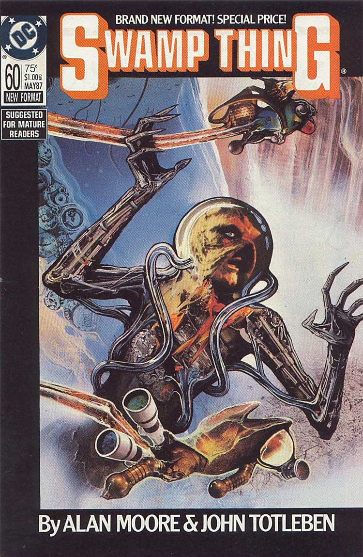
If there’s one issue that needs collecting in this way it’s Jon Totleben‘s work on issue 60 of Alan Moore‘s run on Swamp Thing from 1987. This self-contained story is a standalone in that it’s all collage rather than a straighter pen and ink style and features a sci-fi plot where Swampy is basically raped in space by an alien entity with the horn (I think).
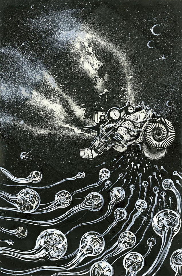
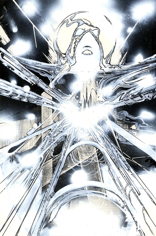
Anyway, the terrible reproduction and flat colours flattened all the subtleties out of the art as these scans of some of the original art from the Cool Lines Artwork website reveal (where you can actually still buy some of the art if you have deep pockets).
Some of it has objects like metal chains and watch innards attached to it but it’s doubtful if this could ever be collected as the art is now scattered to different owners after Steve from Cool Lines bought the majority of it it from the artist. Maybe DC has decent quality scans of it with all the separations somewhere and will see an opportunity milk some more of the Moore cash cow at some stage.
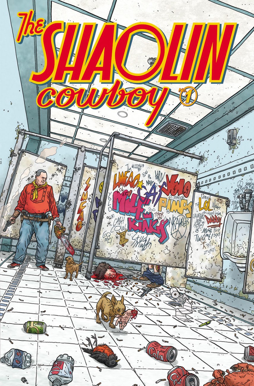
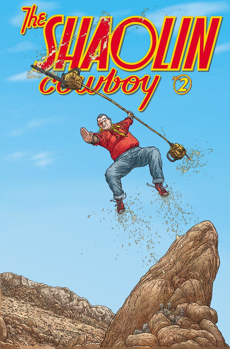 Just finished reading The Shaolin Cowboy* (no.4 of 4) and all I can think is that Geof Darrow (the writer and artist) is insane. There is no book out there like this and to give the plot away would be pointless, to even tell you what vaguely happens would spoil the experience completely.
I take my hat off to him because only a madman would have drawn what he has drawn, to say it’s an achievement is an understatement but to what end I have no idea. I don’t even know if I enjoyed it as, once it gets going, it’s relentless in pace and action and leaves far more questions than answers. This is something that will divide people who read it – although it’s more about looking than reading – and it’s almost too much to read in one go.
The man is insane, but in the most creative way, few can do what he can and even less would choose to do what he’s done here.
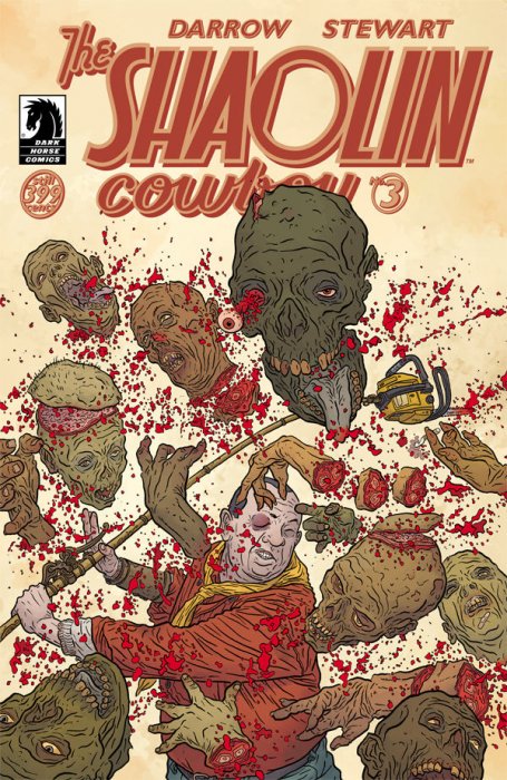
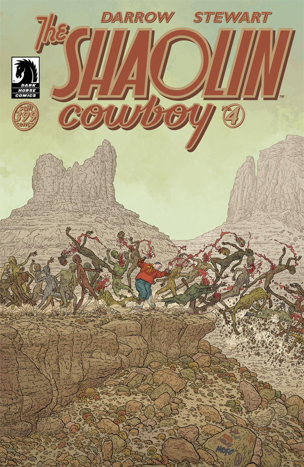
* this is a new series of 4, just released by Dark Horse, separate from the 7 issues previously released, which are equally as impressive but, maybe, not quite as insane.
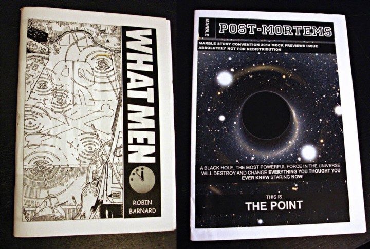 Robin Barnard makes comics, he draws them, writes them, then copies, folds and staples them before distributing them amongst various people he knows. At a quick glance they look like comics that you might have seen before but closer inspection reveals…
Let’s start again; Robin Barnard REmakes comics, he REdraws them, REwrites them, then copies, folds and staples them… You HAVE seen these before, but you’ve not read them like this before. His ‘What Men’ facsimile takes sections of Moore & Gibbons‘ classic ‘Watchmen’ and rewrites it into a critique of the spin-off ‘Before Watchmen’ franchise and the people responsible – Gibbons included.
Barnard redrew each panel in Gibbons’ style and you’d be hard-pressed to spot that it wasn’t just a scanned copy of the original with new lettering. The book is structured in the most incomprehensible way too, it took me a few goes before I cottoned on that you could read it in four different directions. Starting from the back, front or center pages, various pages read in or out of the book, all in landscape format, it’s a bit hard to describe in writing.
In his own words, “What Men is (just) Chapter V of Watchmen: Fearful Symmetry, which is both completely symmetrical and full of mirrored images. I purposely took all the mirrored images and put them all opposite each other and then also put in mirrored dialogue with references to the opposite page as well. What was in my mind was to take those previously seen mirrors rearrange them into an infinite mirror maze and use them to reflect on the Before Watchmen thing.”
There are levels of meaning here and he makes probably the nearest thing to a readable comics mash up that I think I’ve seen and you can find out more on his Images Degrading Forever site. There’s plenty more food for thought concerning ‘What Men’ in the post about reflections on the same site. These are comics ABOUT COMICS or at least indirectly about the comics industry, Barnard is using the medium to comment on the medium rather than write a blog about it.
Another one of his projects takes the Marvel comics Preview Catalogue and lampoons the never ending solicitations of forthcoming series’, character cross-overs and final, FINAL, F-I-N-A-L issues with self-referencing in-jokes that fold in on themselves as ‘The Point’ of it all is sought. It doesn’t all make immediate sense if you don’t have a keen interest or knowledge of certain areas of the comics world and its internal politics, which sometimes read like a superhero cross-over series in themselves.
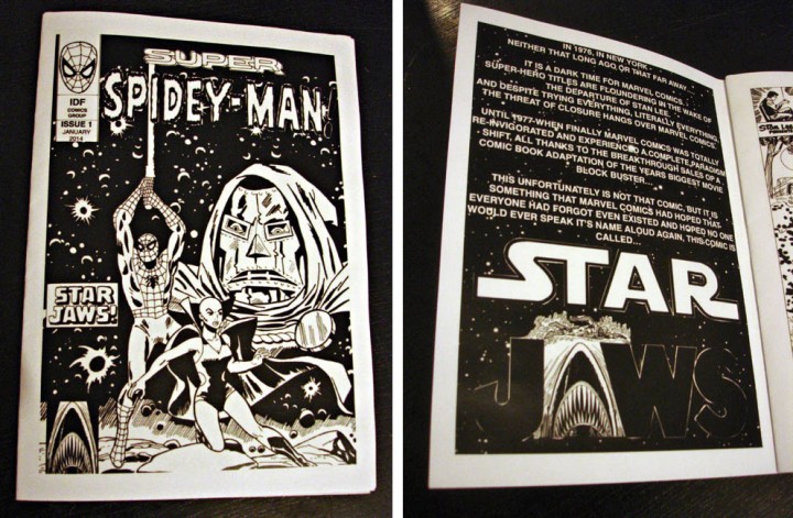
His newest is a comics mash-up proper: ‘Super Spidey Man’ or ‘Star Jaws’ (I’m not sure which) is a mixture of Spiderman, Star Wars, Sesame Street and Dr Doom among others (I won’t spoil where Jaws gets into the mix). This is part 1 of a 4 issue series which may or may not be available from Orbital Comics in London. I don’t know where he’s going with this one but it’ll be interesting to see how it unfolds as the mysterious packages arrive in the post. He does make some physical copies but these are very low runs (‘What Men’ was 10 copies I believe) – but all this material is available to view online at his site, Images Degrading Forever.
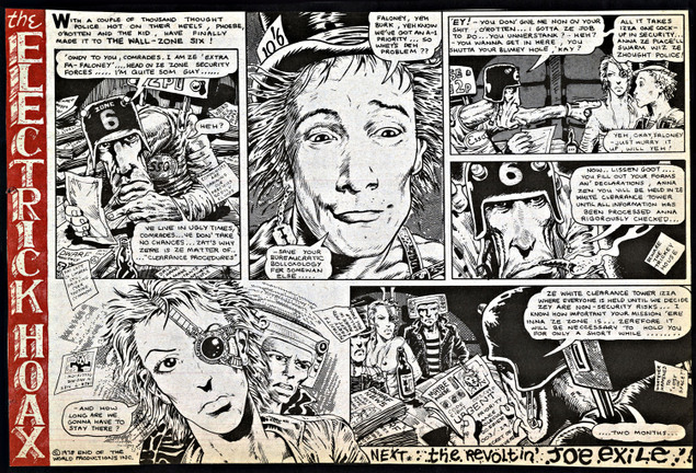
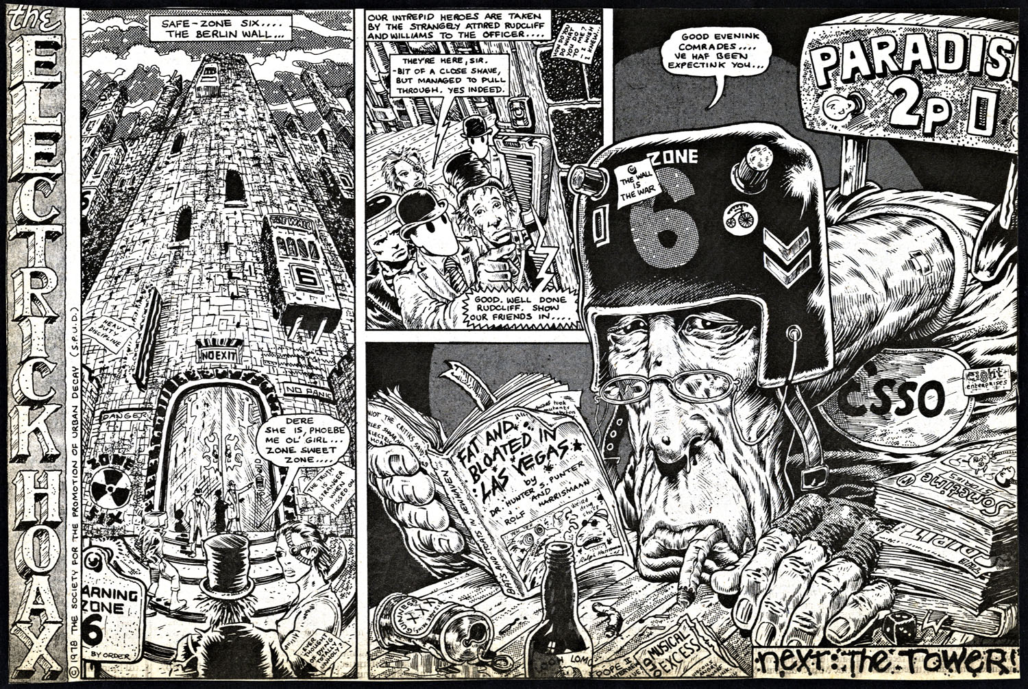
Back in 2009 I wrote a song with Natural Self that I titled, ‘The Illectrik Hoax’, the inspiration for which came from the comic strip by Pete Milligan and Brendan McCarthy – ‘The Electric Hoax’. This was one of the first (if not THE first) creative collaborations by the pair who (with Brett Ewins) went on to create some of my favourite comics of the 80’s and 90’s – Freakwave, Paradax, Rogan Gosh, Strange Days, Skin, Hewligan’s Haircut, Bad Company, Artoons, Sooner Or Later, various episodes of Judge Dredd and more.
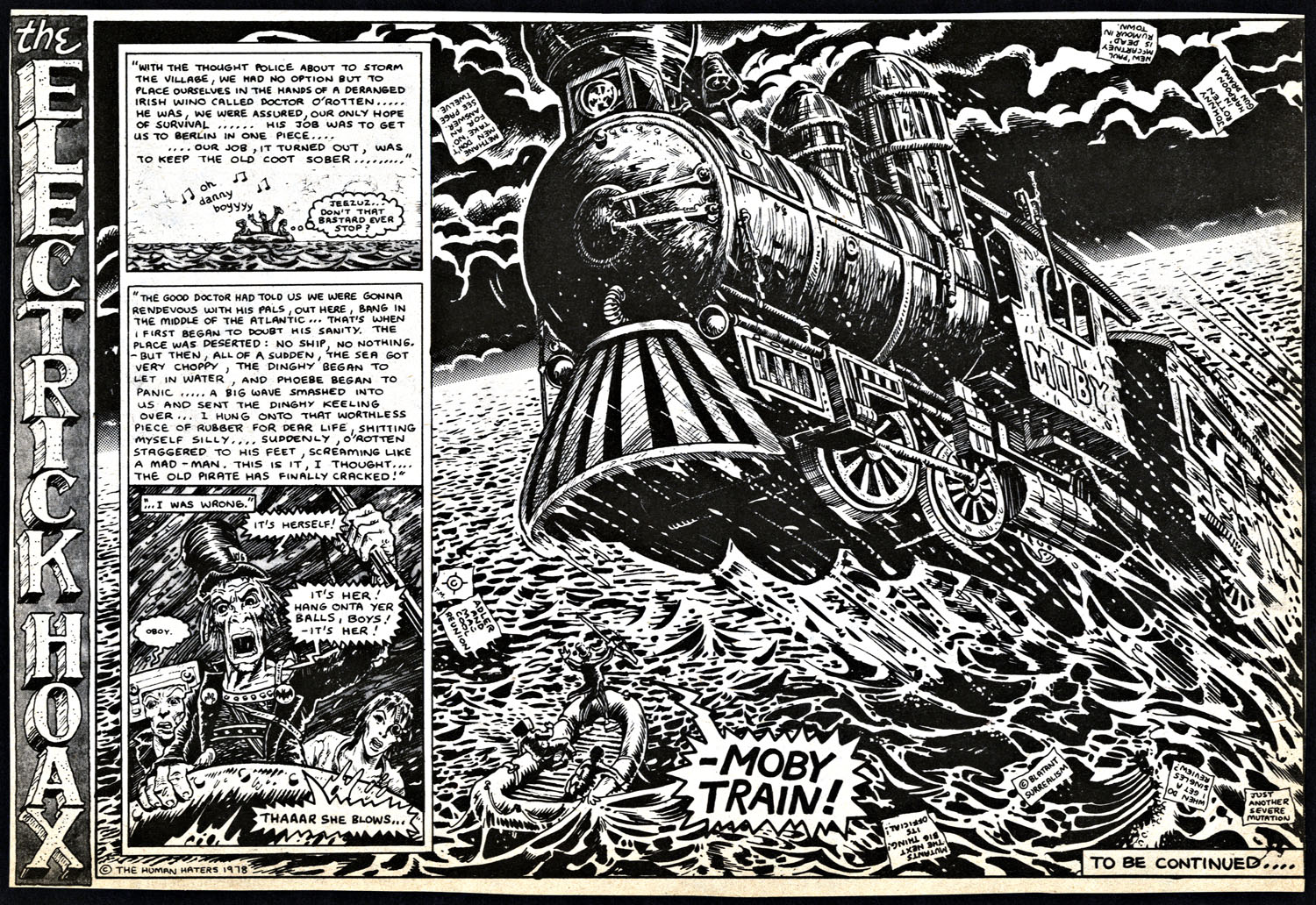
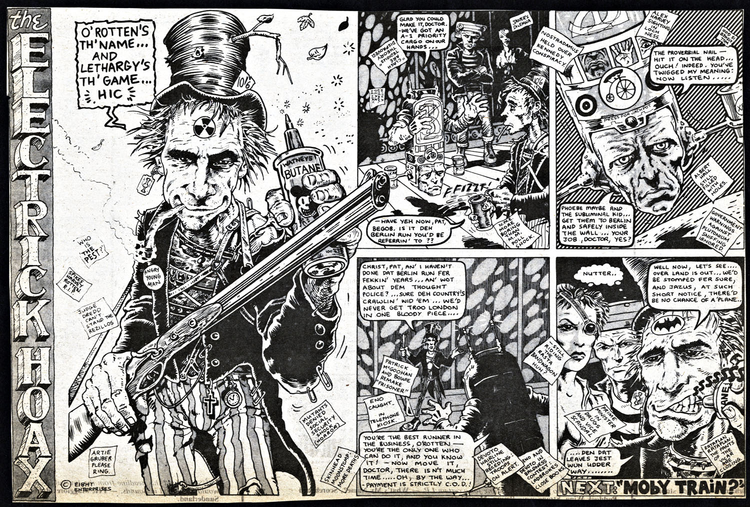
The strip appeared in the weekly UK music paper, Sounds, in 24 parts sometime between mid ’78 and ’79. Each one a half page telling a vaguely coherent, if disjointed, story that seemed to throw up new characters with each episode. It’s a fascinating glimpse into a team’s earliest work and you can see them becoming more confident as the story progresses. McCarthy’s art improves, initially starting out with a lot of collage, and you can see him gain confidence with his figures and many different memes that would reoccur in his work surface for the first time. There are in-jokes and plugs for characters in 2000ad dotted amongst the numerous notes seen floating around in many of the episodes and personalities like Patrick McGoohan and John Lydon make appearances.
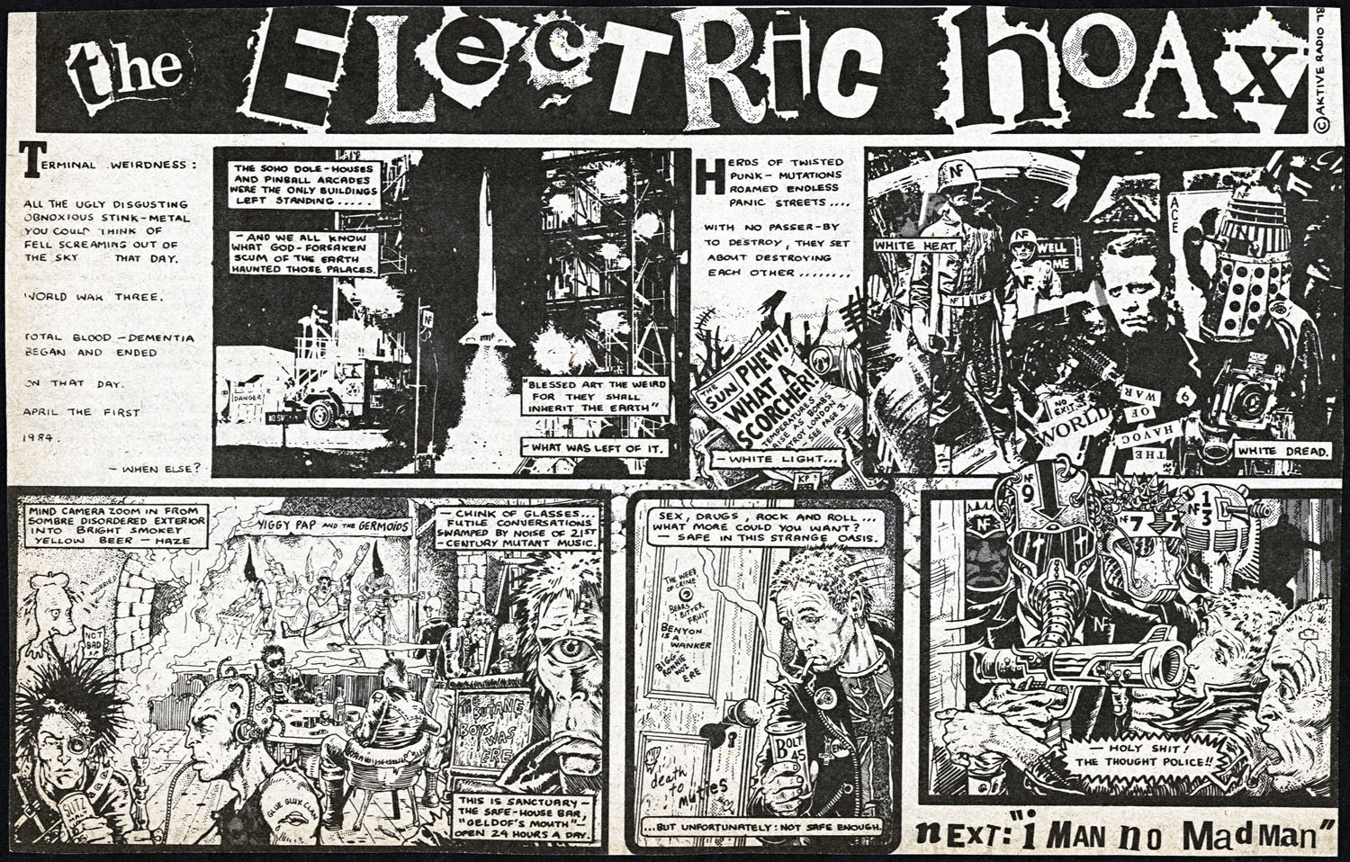 The Electric Hoax Pt.1 – click image for larger version
There’s a definite sense of post-punk Britain in the strip, both in the artwork and the tone, a crumbling state gripped by strikes and pre-1984 paranoia. Interestingly, some of the character designs already mirror that of the Mad Max films that McCarthy was later influenced by, even though this pre-dates the opening of the first film by a good 6 months. In a lot of ways his Thought Police could be described as cyber-punks before the phrase was invented, a clear mash up of the then-current punk fashion and the dystopian sci-fi setting of the strip.
Last year saw the publication of ‘The Best of Milligan & McCarthy’ hardback which reprinted selections from many of the titles listed above but not the full run of ‘The Hoax’. After years of searching for back issues of Sounds for episodes and the few instances where they crop up on the web, I lucked out when an eBayer put the complete run up for sale, all neatly clipped from the various issues they originally appeared in. I intend to share these, week by week, here on the blog but I urge you to check out the excellent Dark Horse -published ‘best of’ mentioned above which can be bought HERE.
Both creators went on to bigger things with Milligan writing for everyone from Marvel to DC, Vertigo to Dark Horse – his run on Shade The Changing Man reinventing the character. Since then he’s written just about all the greats: Batman, Hellblazer, Animal Man, Justice League, X-Men (in all sorts of varieties), Spiderman, The Punisher, Thor… you get the idea, he’s a big deal in comics writing. McCarthy went to Hollywood to design and storyboard film and TV concepts for films like Highlander, Coneheads, Teenage Mutant Ninja Turtles, Lost In Space and the first cgi TV show, ReBoot. He was also asked by director George Miller to design and co-write the fourth installment of the Mad Max saga, ‘Fury Road’ which has finally made it out of development hell to be released in 2015. Now working back in comics as well with his excellent ‘visual autobiography’, ‘Swimini Purpose’, new episodes and covers for Dredd, a Spiderman / Dr Strange crossover and the psychedelic ‘The Zaucer of Zilk’ all carrying on his unique take on the medium.
NB: My different spelling of ‘electric’ was intentional and the lyrics of the track in question have nothing to do with the strip itself, it was my coded nod to two of my favourite comic creators.
