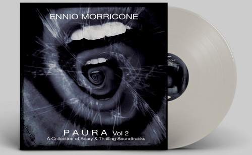
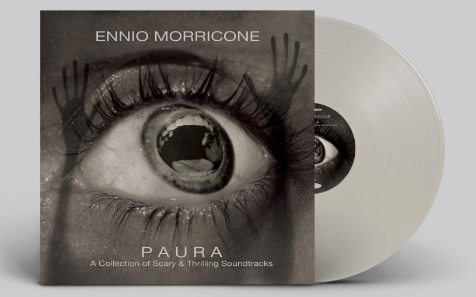
I remember seeing the cover to volume 1 of this Ennio Morricone collection last year and liking it, now there’s a second will another great image to continue the series. Both on trnasparent vinyl in an edition of 499 copies on Rustblade Records. Showcasing “the darker experimental side of Ennio” vol. 2 contains “Frightening orchestrations, dark jazz tapestries and unsettling piano movements…” apparently on vinyl for the first time. Both volumes and much more are available from OneWayStatic.com.
Design

Loving the covers of these two new compilations from Mr Bongo. Above is Pedro Santos, ‘Krishnanda’ was released in 1968 and is described by them as, “an album in the truest sense of the word-a spiritual, psychedelic Brazilian masterpiece from start to finish”. Below is the new ‘Mr Bongo Record Club’ compilation series – “a selection of favourites, recent discoveries and sought after obscurities, which form the basis of the Bongos Sound System DJ sets and their radio show of the same name”. Find out more about both of them here
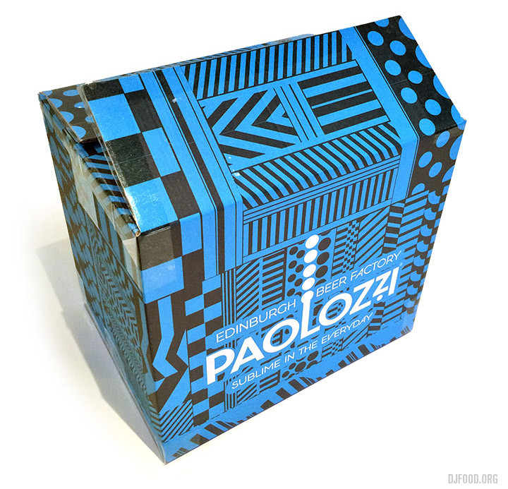
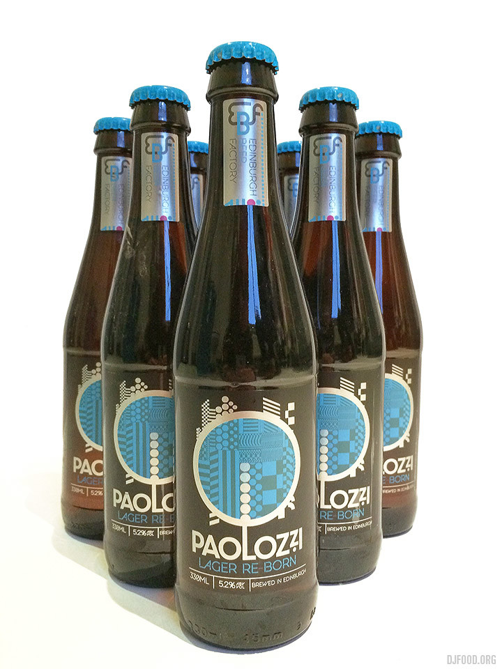
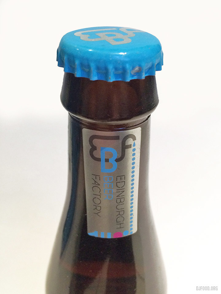
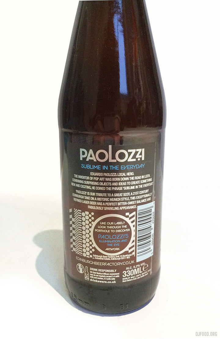
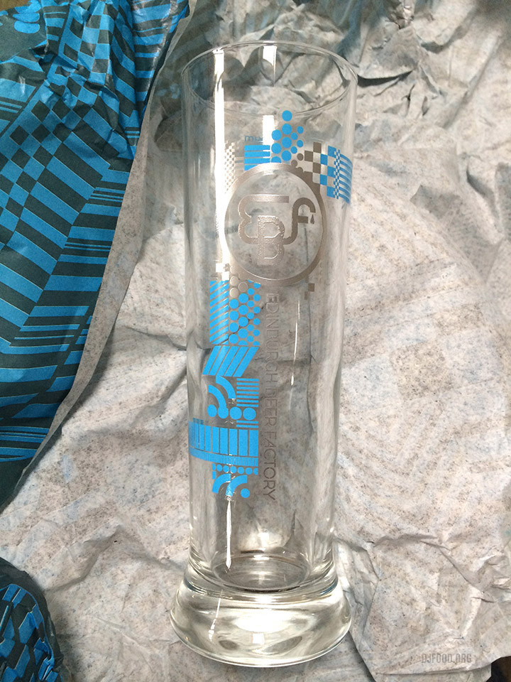
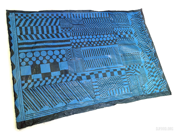
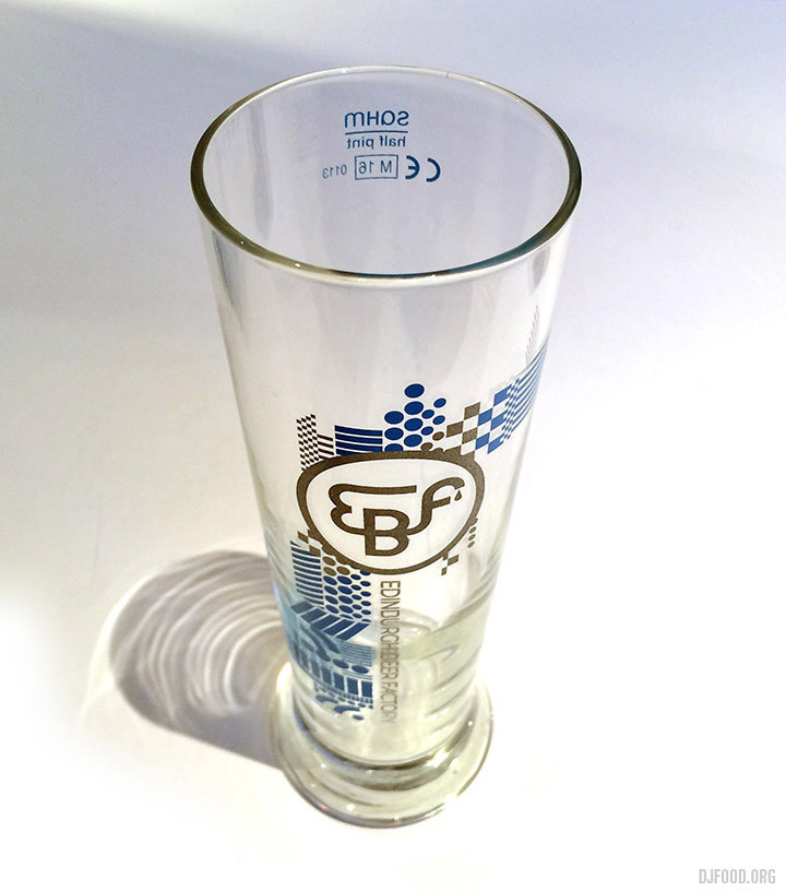
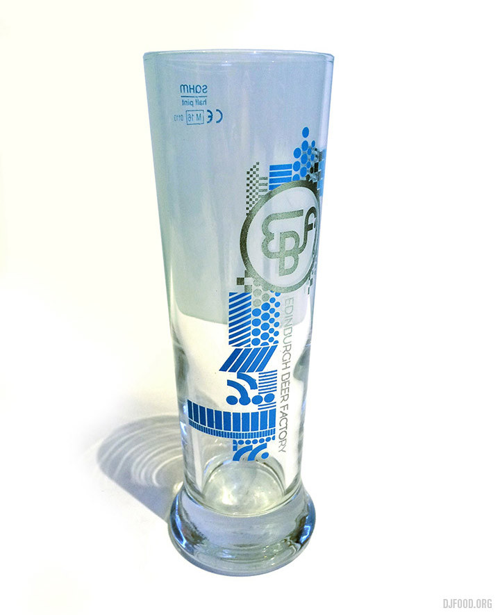
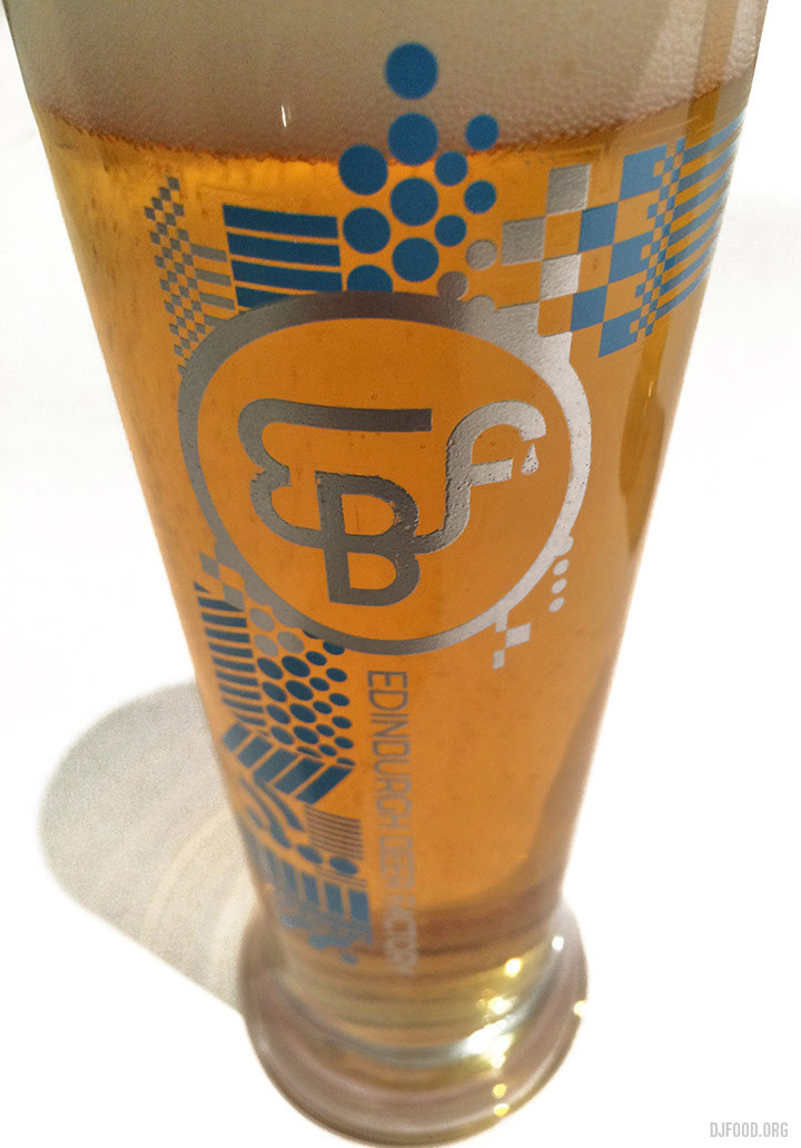
On my trip to Edinburgh last weekend, one of my missions was to track down a bottle or two of the Edinburgh Beer Factory‘s Paolozzi – mostly for the design of the bottle it has to be said. I only managed to find it on draught in one bar but was surprised at how nice it tasted, a superbly light, clean beer with a slightly sweet taste. On returning home I was sent a link to the EBF website where they sell not only the beer in bottles, but glasses too, in various numbers, all wrapped in glorious Eduardo Paolozzi designs.
You can get boxes of just beer or get them to swap out bottles for glasses and some sets come with coasters and a poster. I ordered a box and it arrived in less than 24 hours and all for under a fiver postage, excellent service and a beautiful set to behold with design touches like the ‘Ta Da’ when you open the box. The box and bottles are so nice you don’t want to throw them away when you’re finished. Find them all here in a multitude of combinations including a tour of the brewery.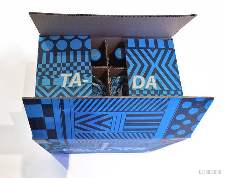



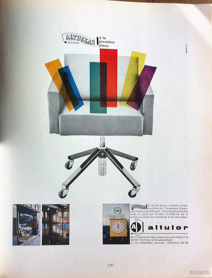
Inspired by the Olivetti exhibition a couple of months ago I went through my small collection of Architecture d’aujourd’hui magazines and snapped some 60s era adverts.
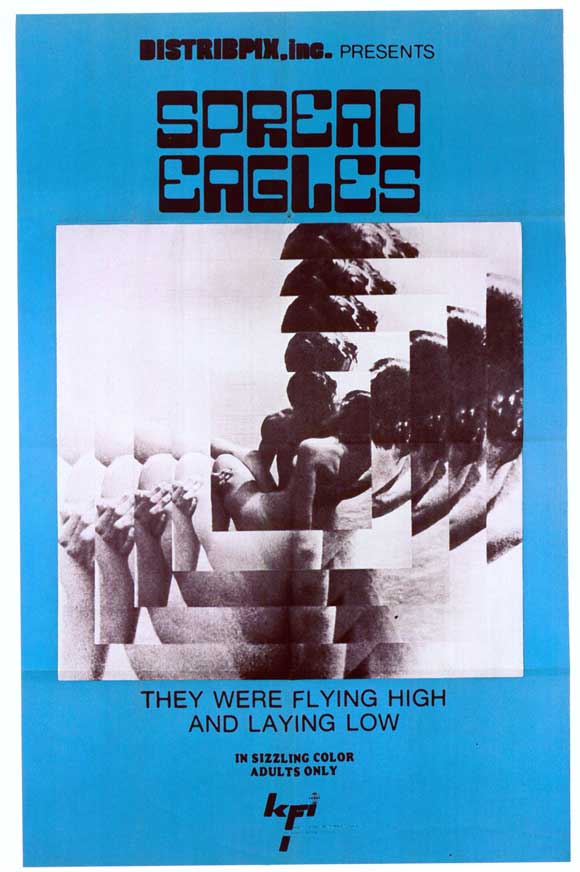 Love that poster, especially the font – via Juxtapoz – Adult Movie Posters of the 60s and 70s
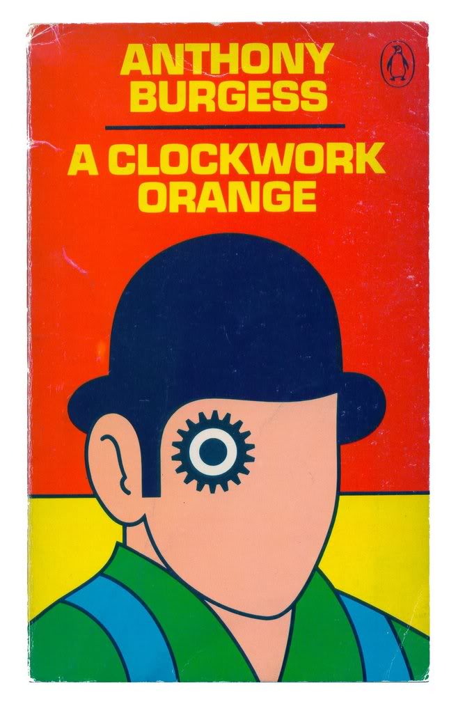
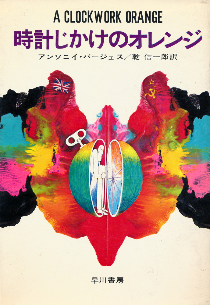
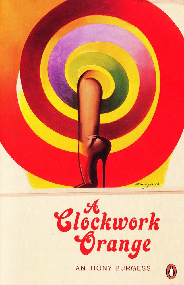
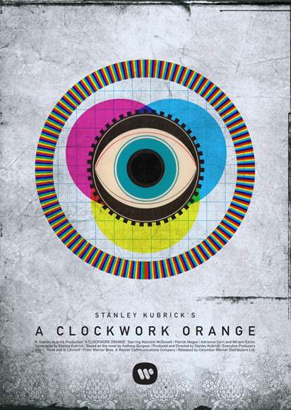
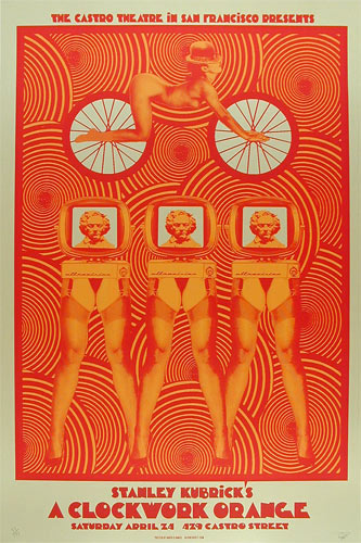
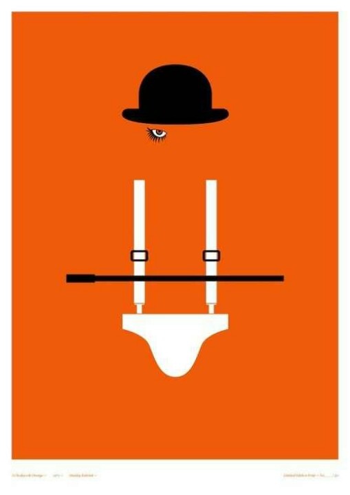
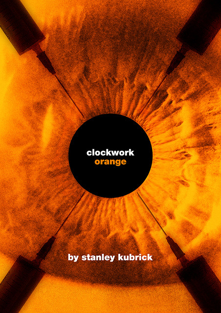
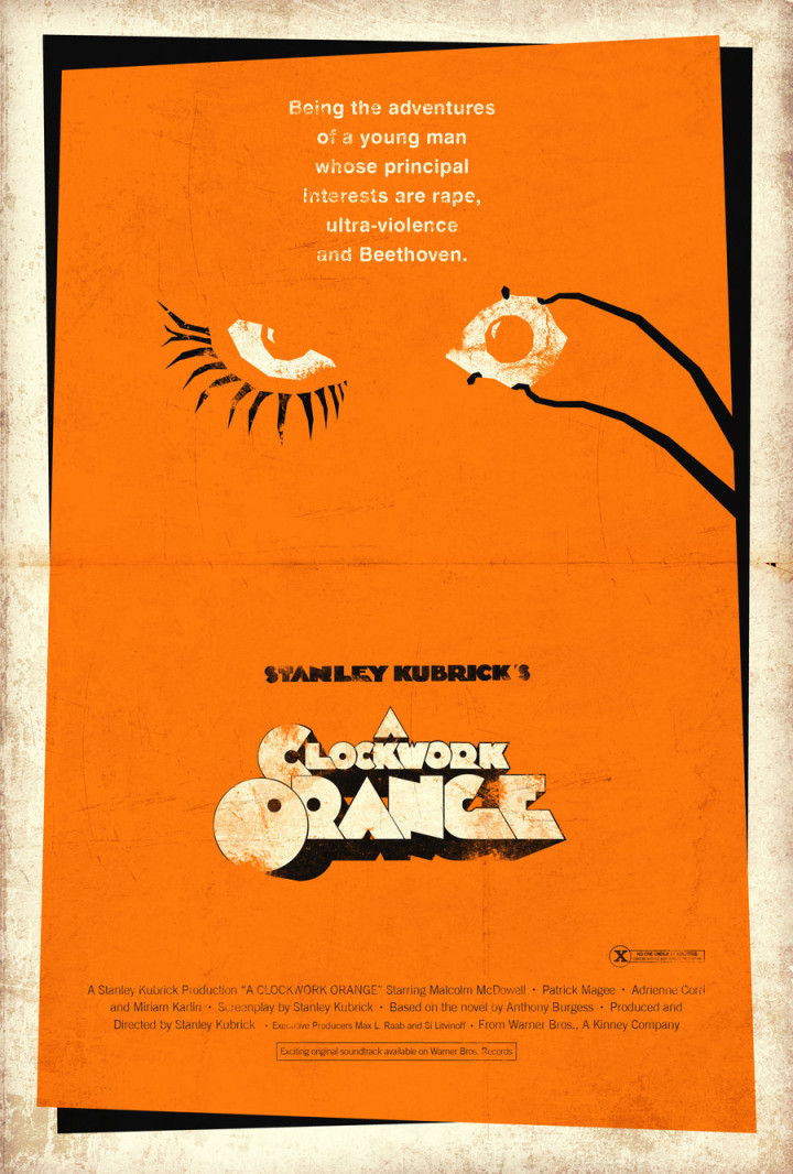
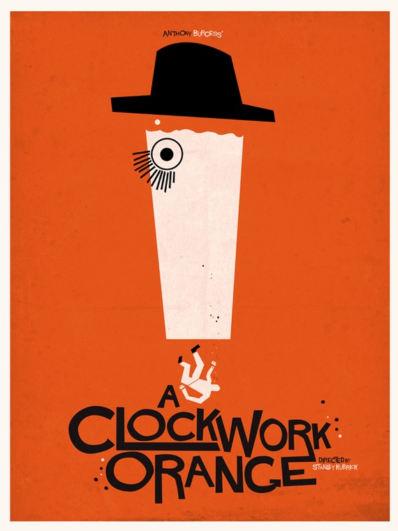
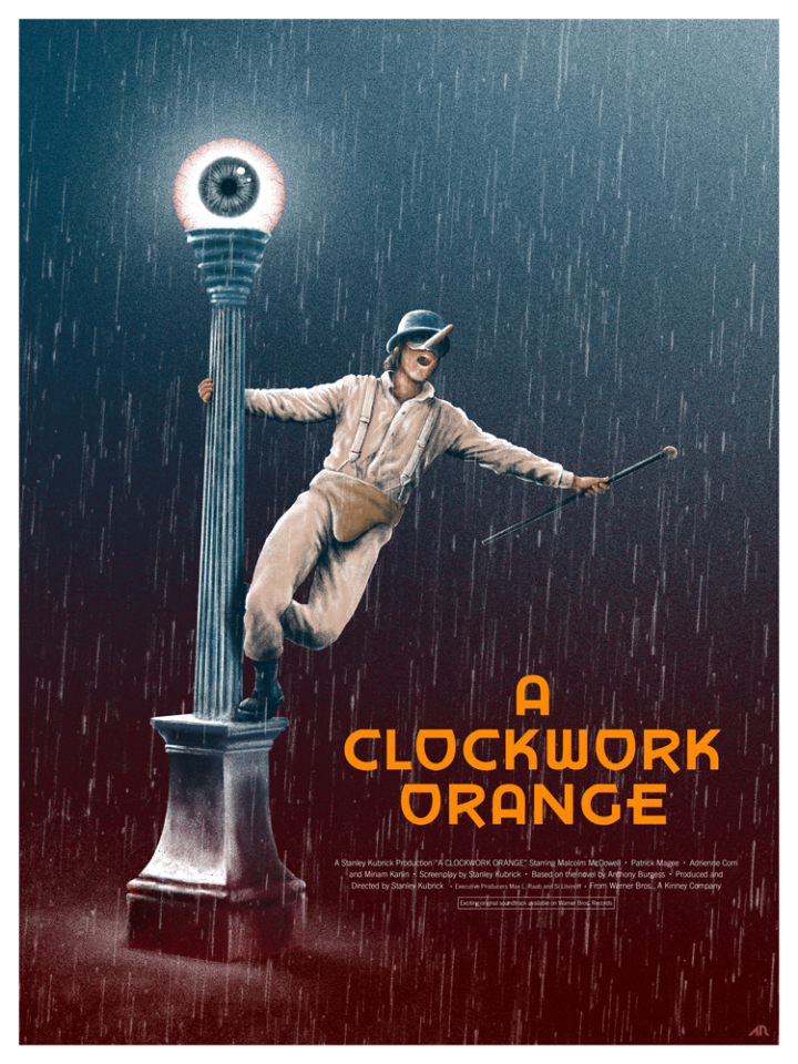
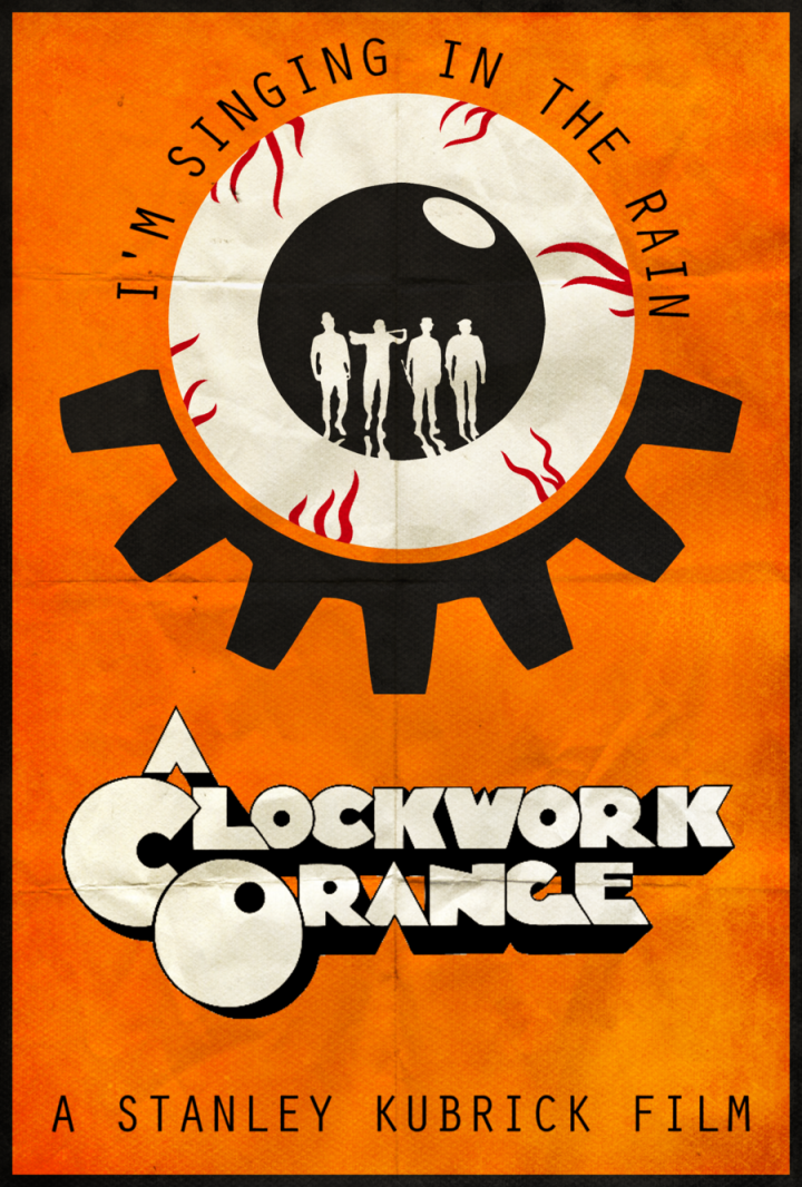
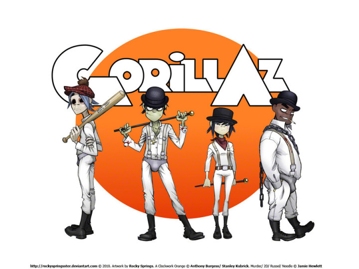
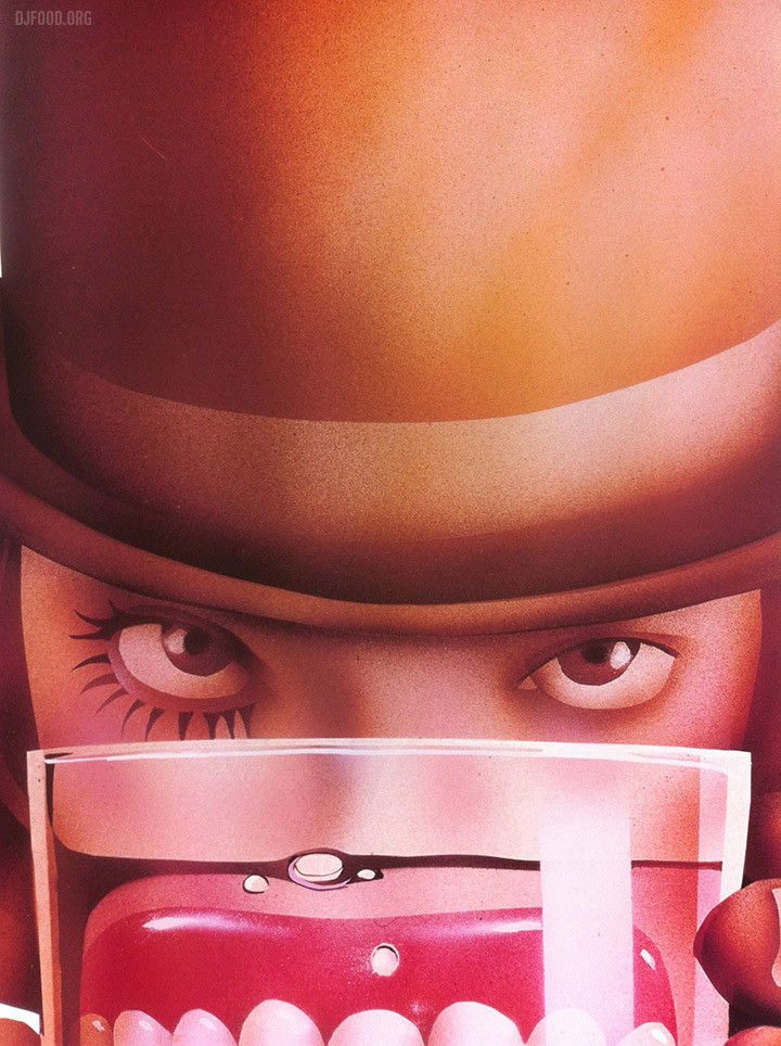
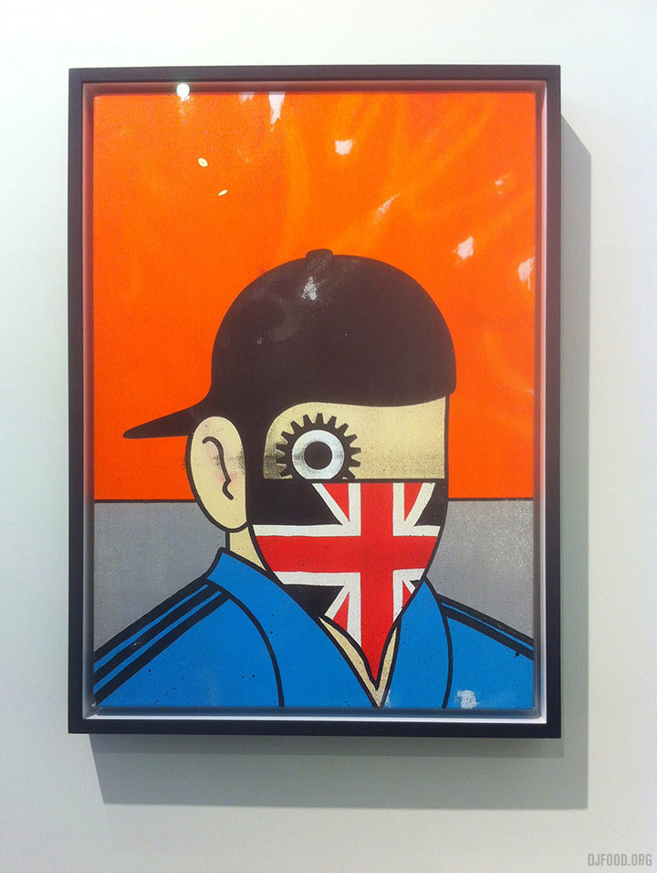
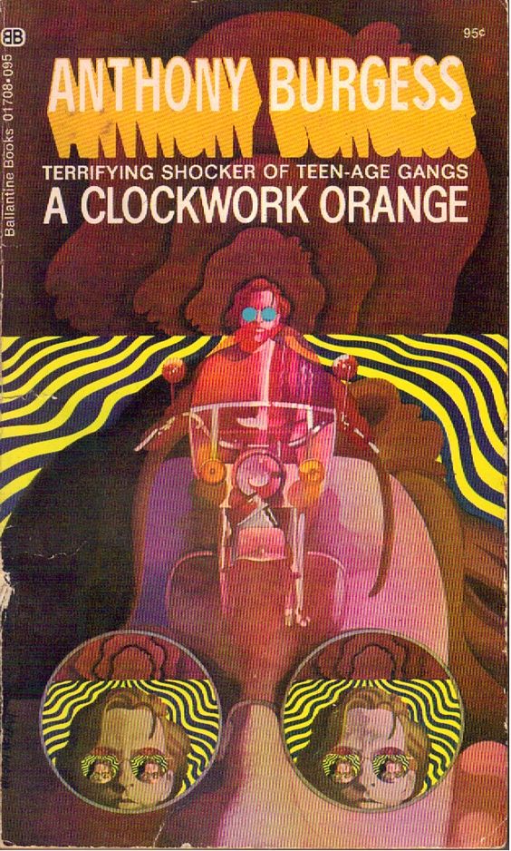
Whilst researching the Dreaming with Stanley Kubrick exhibition last week I dug into the iconography of A Clockwork Orange, looking up David Pellam‘s classic Droog design for Penguin (above) first revealed several earlier book covers and then the tidal wave of fan film posters. Cogs, eyes, eye lashes, milk glasses and, of course, the colour orange were in abundance. There were several great ones that managed to capture both the era and the menace of the film as well at a very nice Gorillaz droog wallpaper by Jamie Hewlett.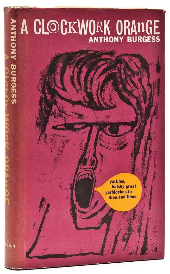
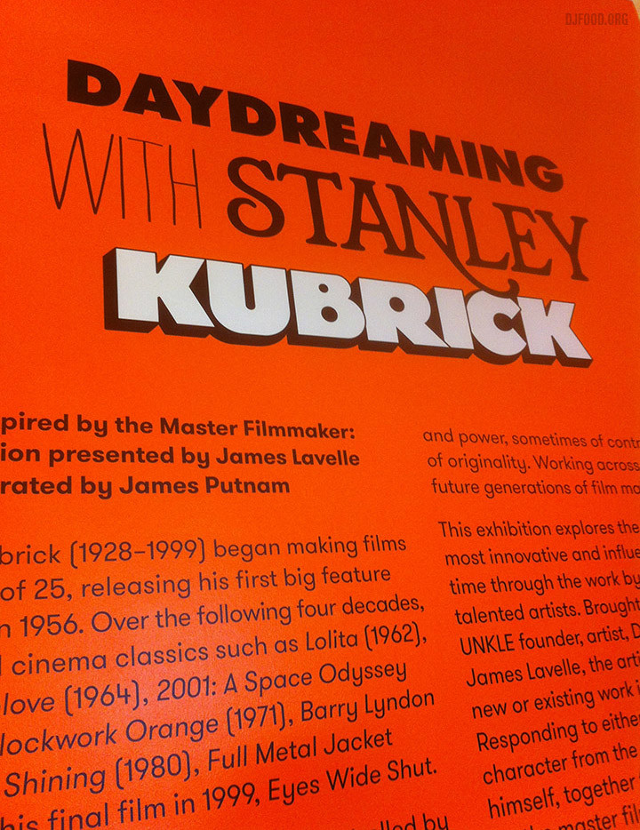
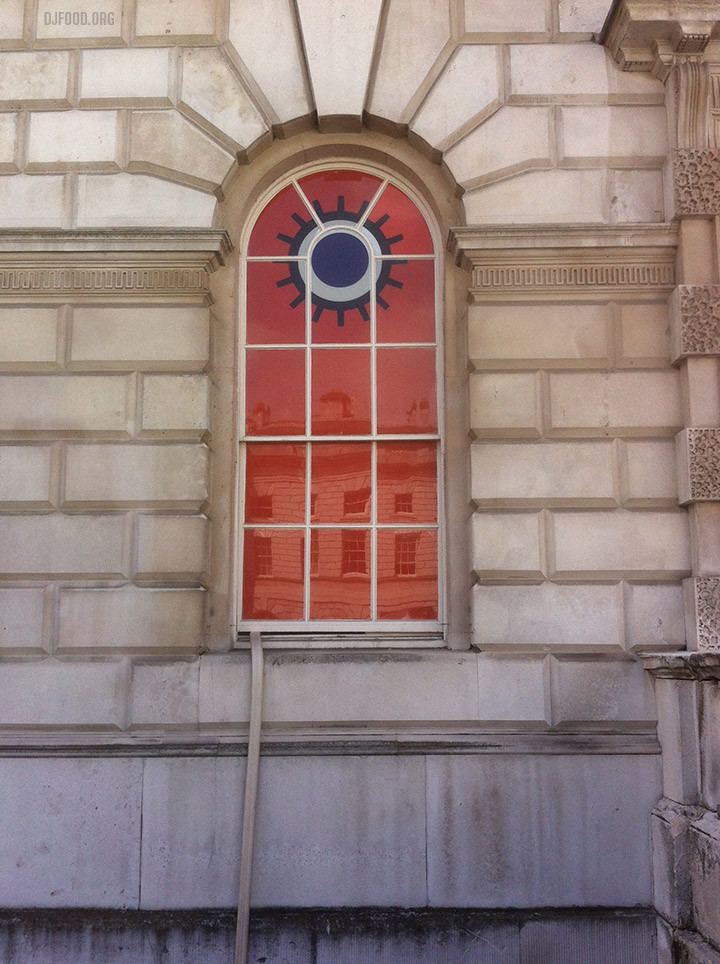
The Daydreaming With Stanley Kubrick exhibition started a few weeks back at Somerset House in London’s West End and it’s well worth a look. Curated by James Lavelle, it features many familiar names that hint that his phone book must be a thing to behold. Artists, film makers and musicians from around the world have contributed but with over 40 pieces to look at there’s always going to be some stronger than others.
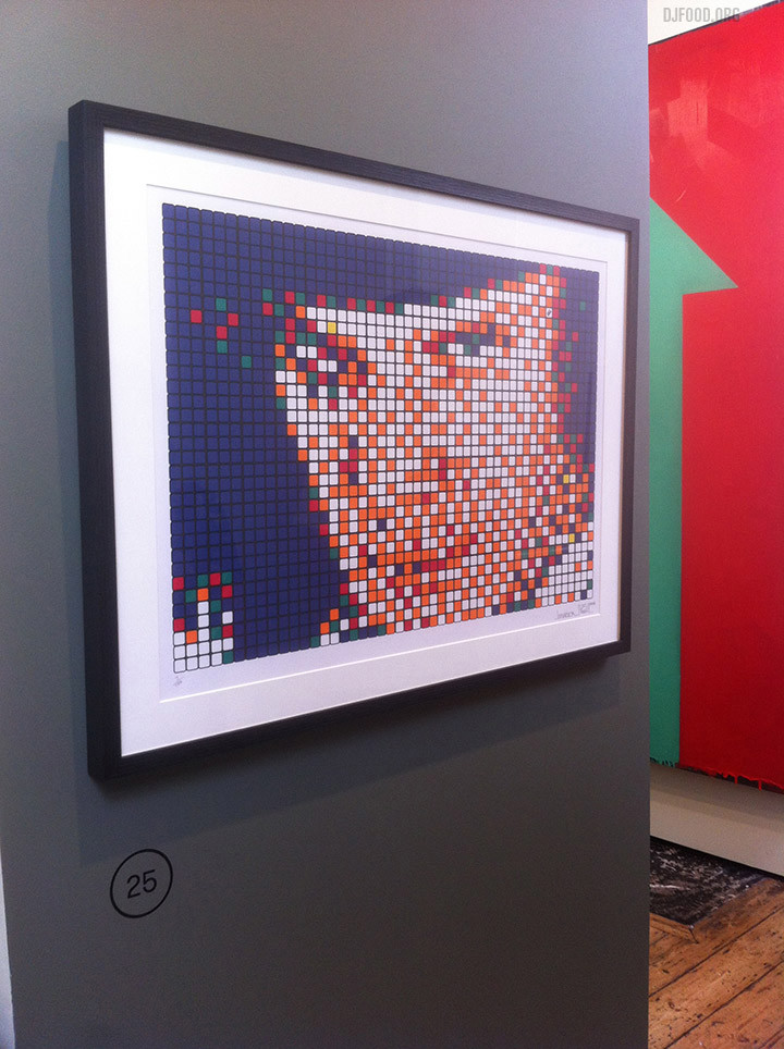
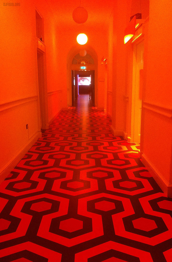
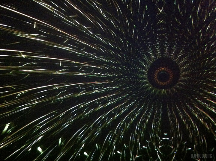
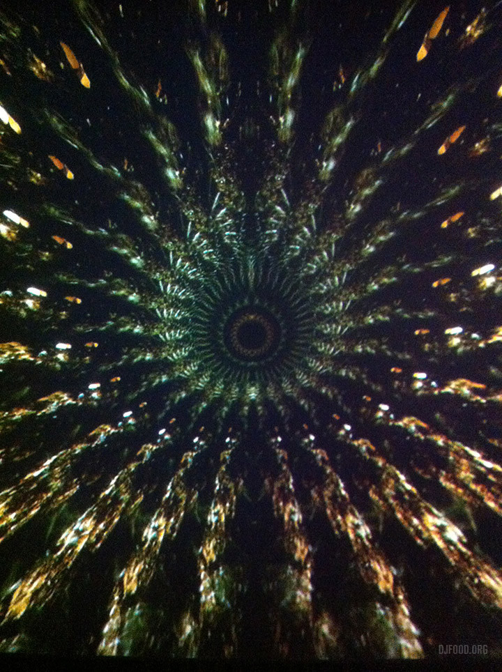
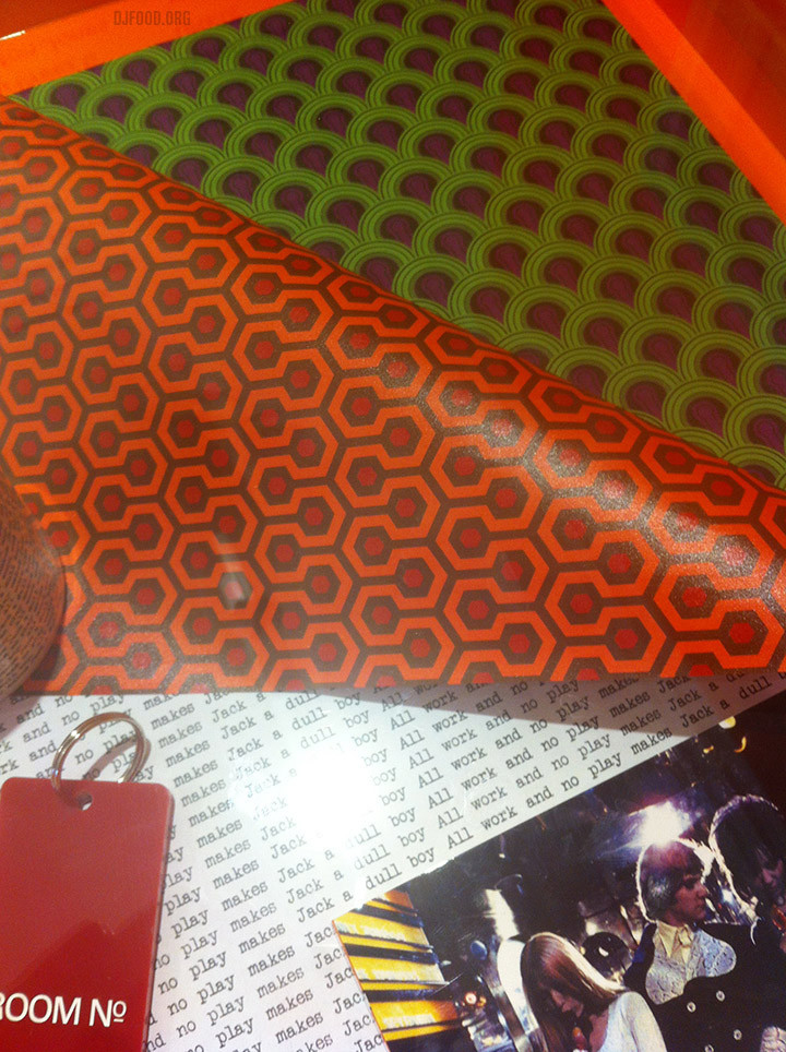
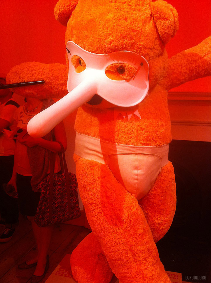
For the most part, I enjoyed the more literal, graphic interpretations; the hexagon-patterned floor from The Shining, Space Invader‘s Rubix-cubed Alex from A Clockwork Orange and Doug Foster’s homage to the stargate scene in 2001, ‘Beyond The Infinite’ – a mesmerising widescreen kaleidoscope that constantly shifted to a soundtrack by UNKLE. I was surprised there wasn’t more reference to Hal from 2001 outside of some of the graphics for the exhibition branding though and there was a missed opportunity to do something with Kubrick toys seeing as James has had an affinity with them for so long.
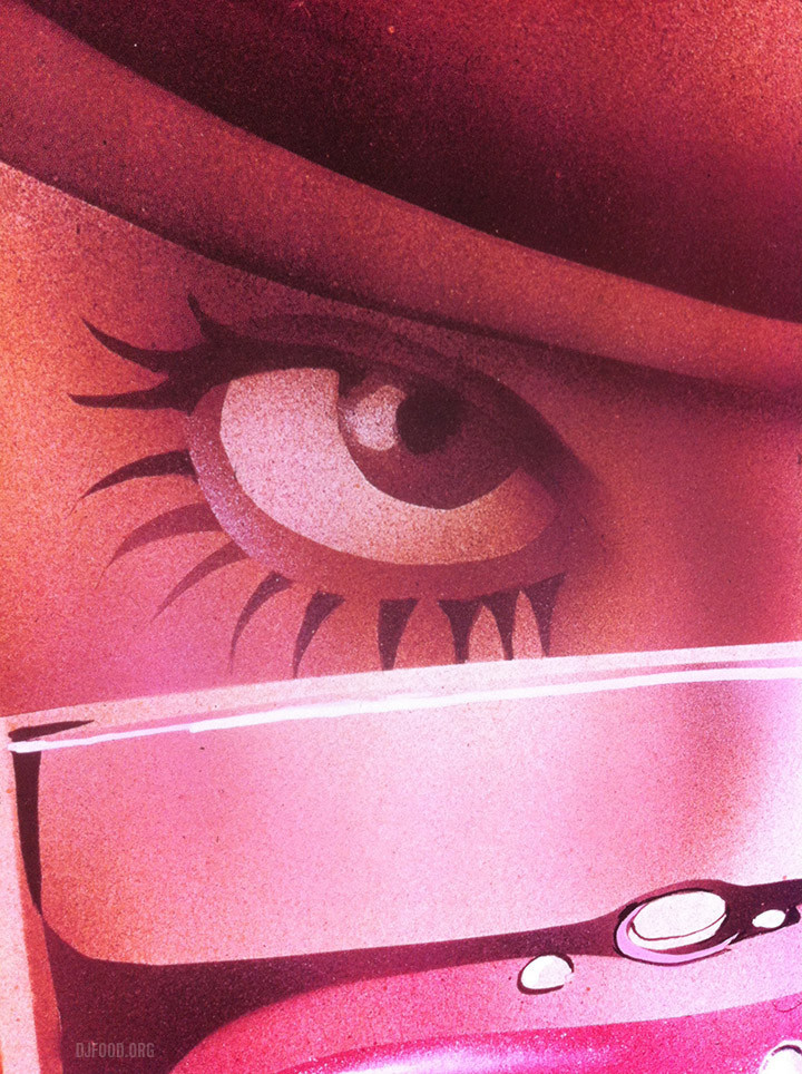
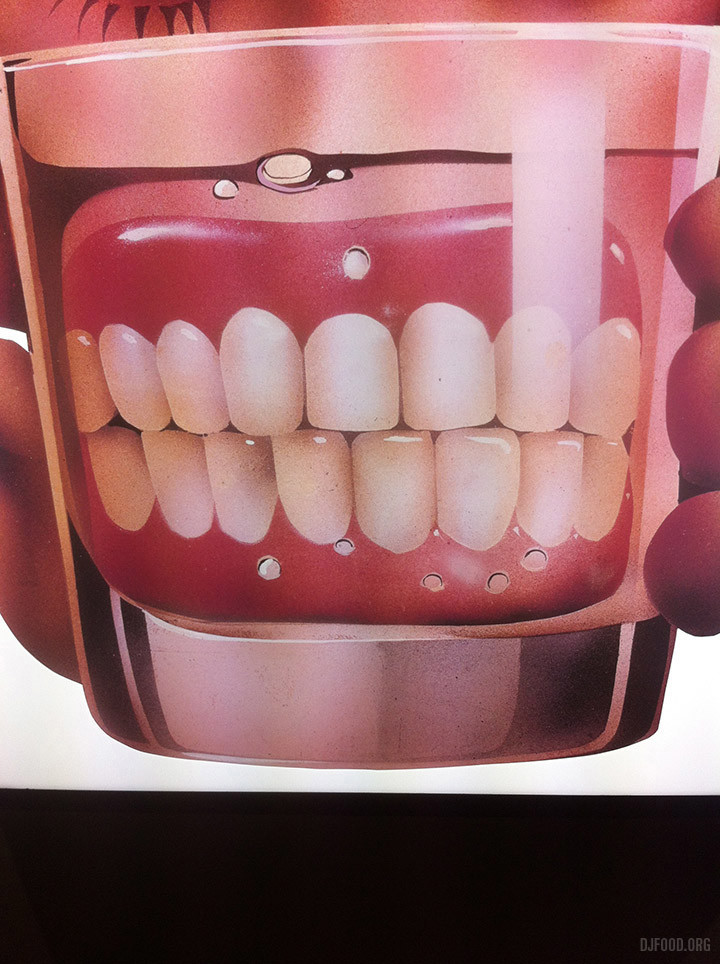
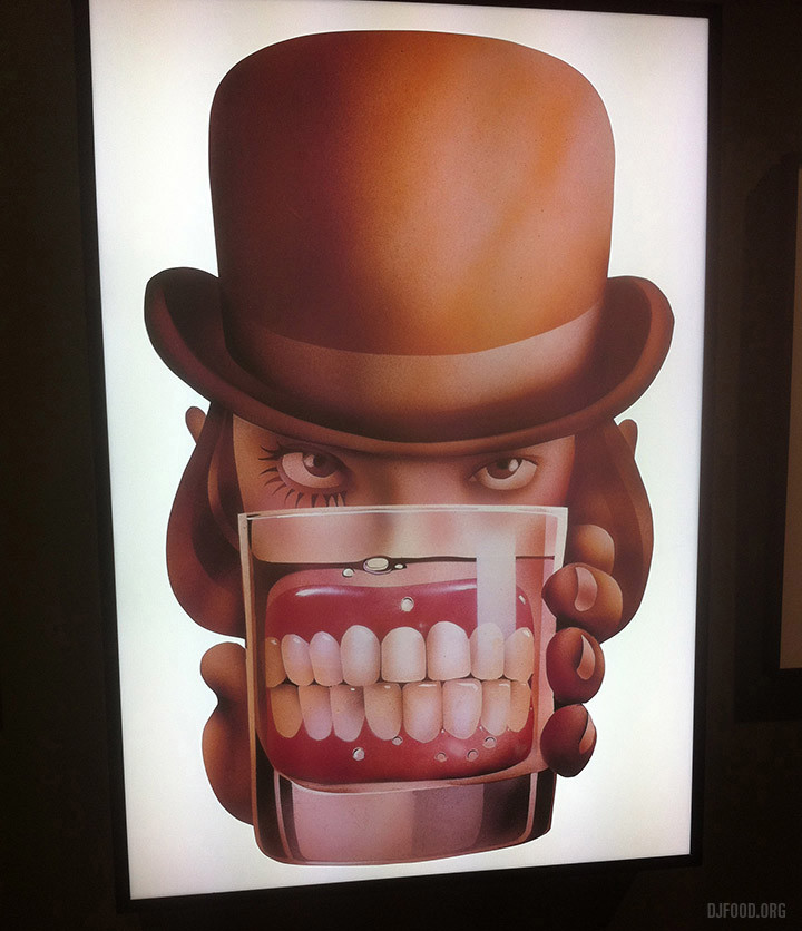
One of my favourite pieces was Philip Castle‘s 70s airbrushed illustration for the original film of Alex with dentures in a glass. Unfortunately this was represented as a slide blown up rather than the original painting but it still had enough presence, menace and period textured beauty to outshine most of the other exhibits.
Elsewhere, several installation pieces were the most successful in invoking Stanley’s spirit. A vertical pulsing strip of LED lights by Chris Levine burned images onto the retina from the end of a corridor so that, when you looked away, you saw split second flashes of Kubrick’s face. A ‘breathing’ camera by Nancy Fouts, sat eerily in another corner, rasping in and out to itself. A room of 114 wireless’ all tuned to the same channel in a dimly-lit workshop created a WWII-like atmosphere and the exhibition guide revealed that a huge cast of celebs had made the soundtrack playing through the tinny speakers. Peter Kennard‘s ant-war collages were further bolstered by additions from Dr. Strangelove although it felt largely transplanted from his recent Imperial War Museum exhibit with some added Kubrickisms.
Possibly equal to Foster’s AV piece was Toby Dye‘s small room showing four different scenes from The Corridor, each one using a Kubrick technique of focus pulling in or out of a centralised corridor. This, when shown full frame on each of the four walls, gave the viewer a sense of unease or vertigo as the walls appeared to shift around them. Very effective if off-balancing. David Pellam‘s classic Droog design featured twice, once in the show branding and once in Paul Insect‘s updating of his work, ‘Clockwork Britain’. An iconic design, connected with Kubrick by the simplification of his visualisation for the Droogs, it sits alongside the Shining carpet as a graphic motif instantly connected to his films. A VR headset with interior 2001 space station scenario was also installed but the queue was just too long so don’t head to it at peak weekend hours if possible.
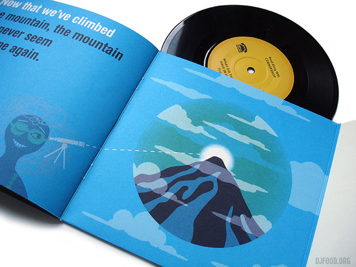
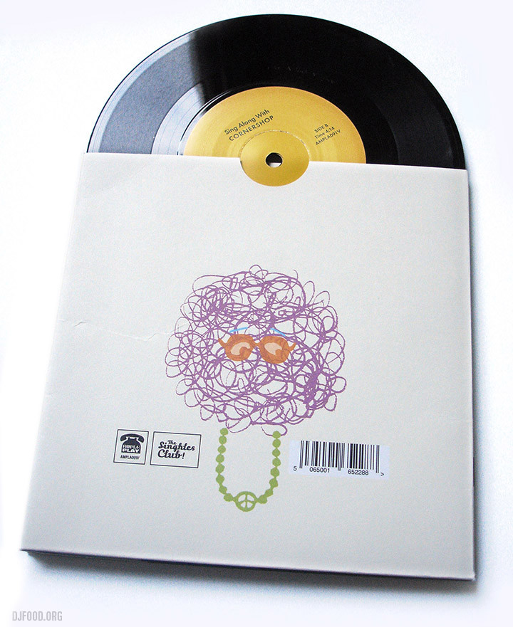
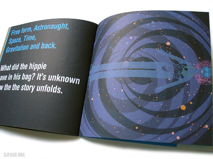
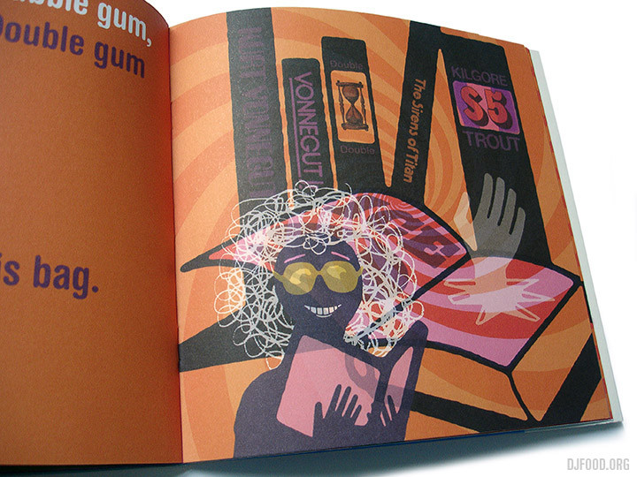
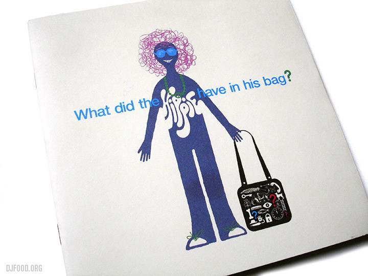 I picked this up a few weeks back, a short book with a record by Cornershop called, ‘What Did The Hippy Have in His Bag?’. It’s a lovely little thing with a simple song going through the content of said bag (not what you’d expect), perfect for kids and with an instrumental on the B side you can learn it and then sing your own version. Released a few years back on the band’s Ample Play Records’ Singles Club, you can still find copies in their shop for £12.
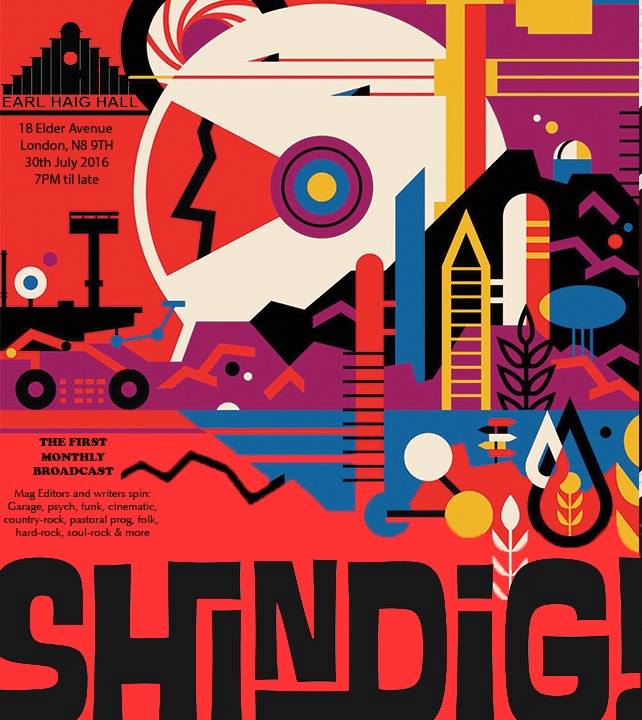
I’m really liking that there seem to be a lot of grass-roots level nights popping up that cater for the more esoteric tastes in music at the moment. Shindig! magazine start a new one in North London at the end of the month – good luck guys but points deducted for taking someone else’s artwork for the flyer.
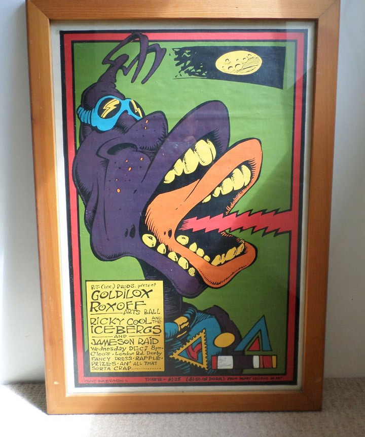
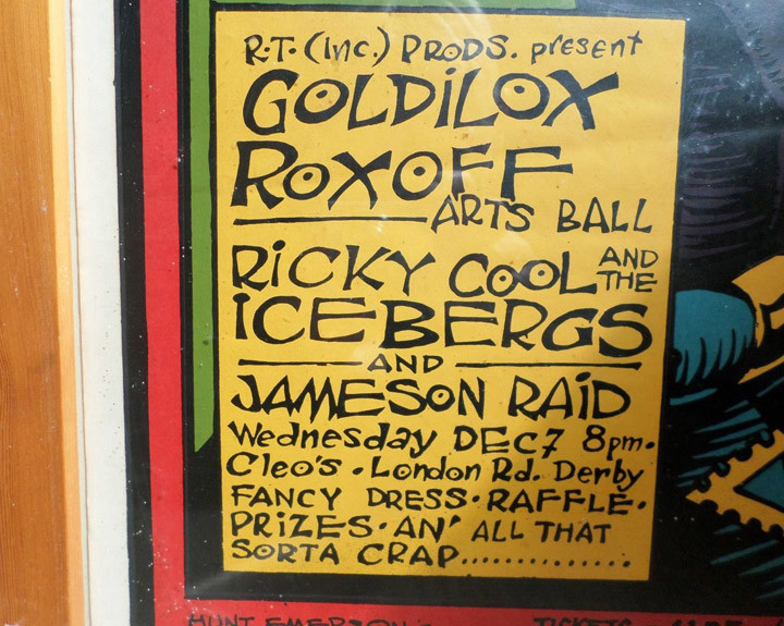
This amazing late 70s Hunt Emerson poster is on eBay right now with less than 2 days to go, never seen it before, probably never will again.
All week Wordplay Magazine have been hosting a takeover by Soundsci who take you through the various elements of how they work as an international crew. Short films and interviews form the basis of the daily pieces leading up to the release of their new album, ‘Walk The Earth’ on Monday.
Part 1: Digging With Oxygen
Part 2: No Sleep Nigel interview – fascinating article with the legendary mixer
Part 3: Connecting the Dots with Audyessey
Part 4: Interview with Darrell Krum – the art of Soundsci, the World Expo label and many more.
Part 5: In the studio with Ollie Teeba and Jonny Cuba
Also out today is the second single, ‘Write On’ / ‘Changing The Gods’, on a limited 45 – available here
Part 6: Rhyming with Audessey
AND FINALLY!!! Here’s the album to buy SOUNDSCI BANDCAMP – it’s digital only for now, aside from the 45s but there’s talk of a vinyl edition although that’s a way off yet

I’m totally in love with this Danish label, run by two guys, Jakob Skott and Jonas Munk, El Paraiso Records.
If you want modern psychedelic rock then try Monarch, Causa Sui, Mythic Sunship, Papir or Landing, for percussion-heavy jazz with electronic krautrock overtones try Jakob Skott, for guitar-led workouts try Nicklas Sorenson and for cosmic synth minimalism then Jonas Munk is your man
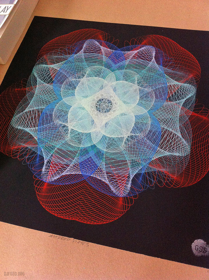
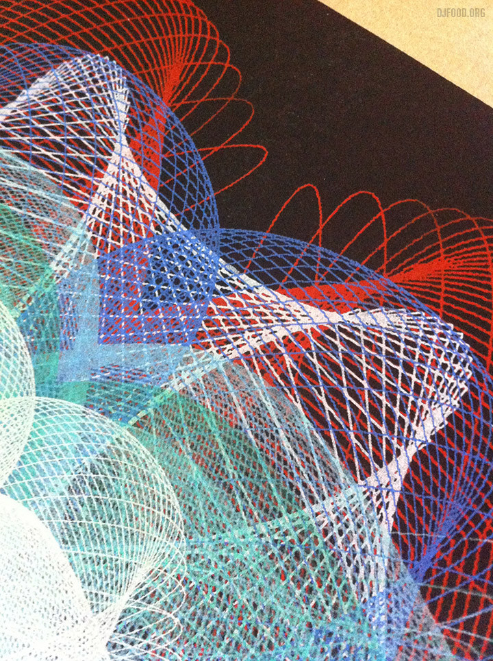
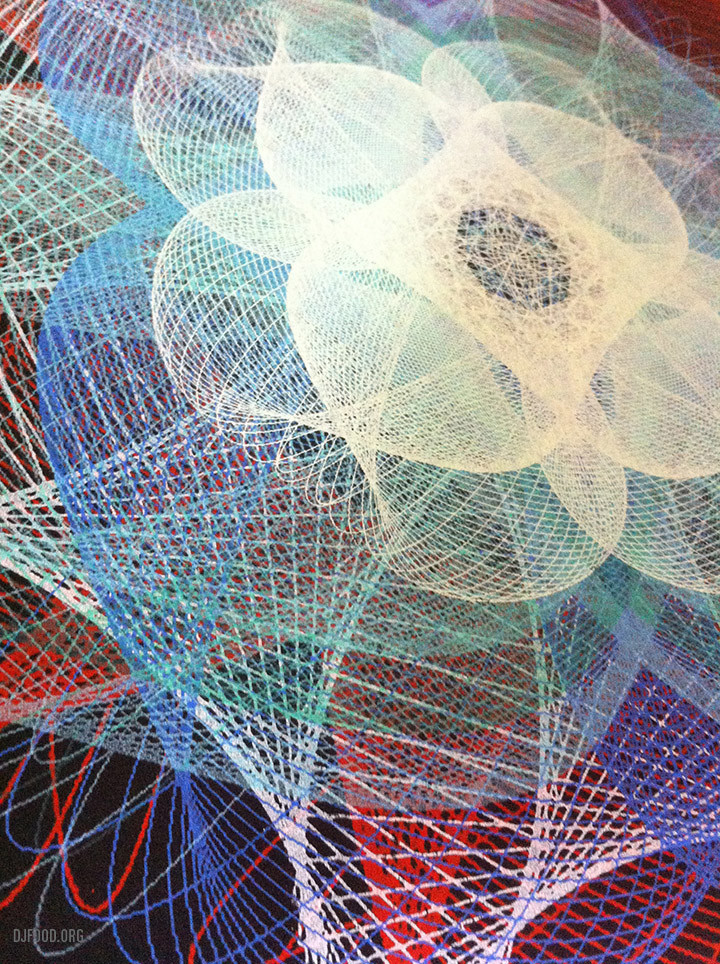
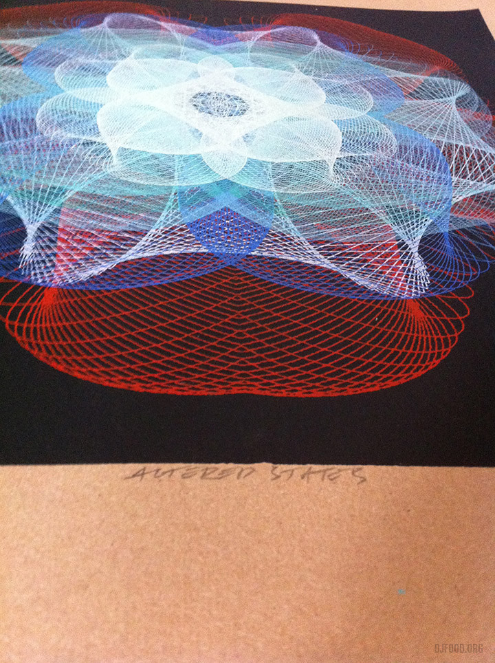
I just received this gorgeous screen print from Glass Siren Studios – check out their site for more amazing designs – not sure how many colours this is but it’s a work of art.
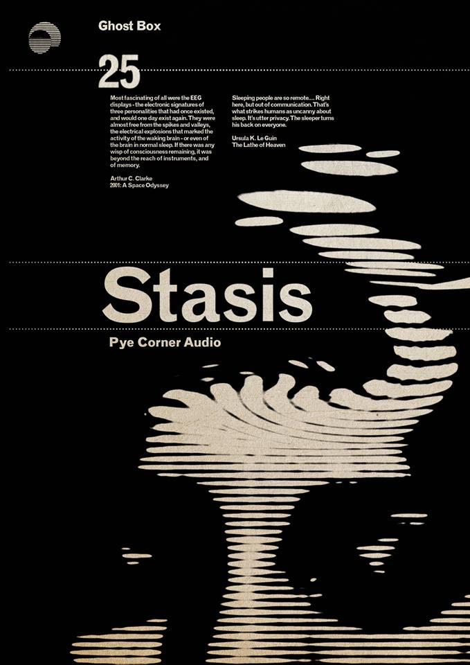
Coming at the end of August from Ghost Box – reminds me of the 60s sci-fi Penguin covers of Franco Grignani
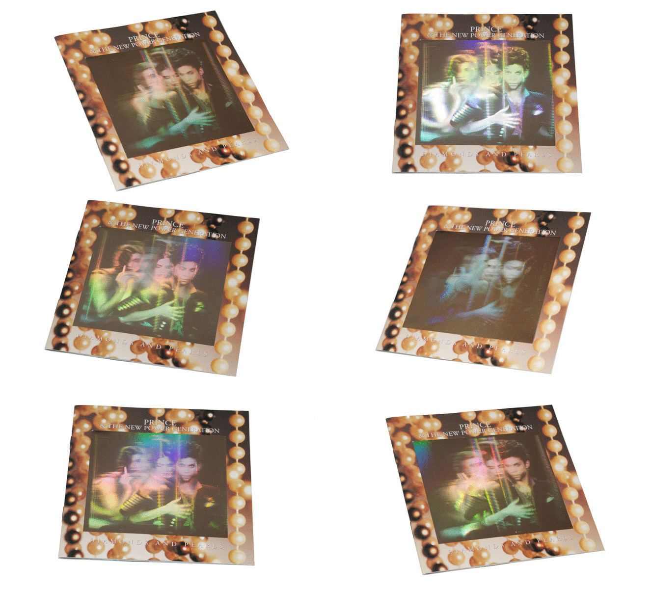
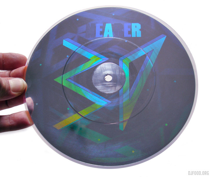 My latest Freaky Formats piece for The Vinyl Factory just went up – this time it’s about holograms on both records and their sleeves, I even sneaked a CD in.
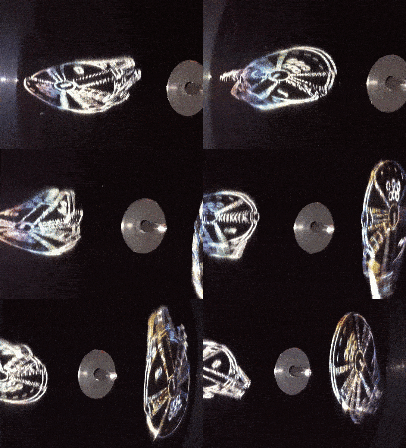

Several boxes were ticked last Monday night when I was invited to Abbey Road Studios in North London to feature on a panel to talk about Star Wars and its influence on music over the last near 40 years. It was part of the launch of a new vinyl edition of the soundtrack to Star Wars: The Force Awakens, complete with holographic Tie Fighters and Millennium Falcons etched into the surface of the two discs by Tristan Duke.
 Journalist Andrew Harrison (Your Empire Needs You T-shirt) chaired a small panel of myself, Tristan Duke (peeking over my shoulder) – the man responsible for the holograms, and Alex Milas (centre back, editor of Metal Hammer magazine and life-long SW fan). After plenty of nerdy fan banter two First Order Storm Troopers strode in to deliver the LP to Tristan who then played it as it was projected onto the screen above. Food was served, vinyl was cooed over, photos were taken with Storm Troopers and much was discussed of a fanboy nature.
A few days later I took on trying to capture the holograms from my vinyl copy at home. This was easily achieved with just direct sunlight or you can use a torch or lamp in dark conditions. This is what the hologram looks like in normal light (above) and this is what it looks like when having direct light pointed at it (below)


 The LP sleeve is printed on thick mirror board card which makes the star field sparkle when light hits it and the cover logo is embossed. It’s a beautiful package that Disney/Universal have really gone the extra length to get looking and feeling special. There’s also a 16 page 12″-sized booklet with a forward by JJ Abrams and stills from the film.
It’s released worldwide on Friday, June 17th.
On the panel I remarked on how the new release is so like the original OST in layout – minimal and tasteful. That made be want to dig out my 1977 copy, check the poster and gatefold. I’d forgotten how big the poster was!


How many Millennium Falcons? Early John Berkey concept painting when the Falcon was a rebel fighter – there’s a fascinating glimpse at more Star Wars Berkey prelim paintings on his site


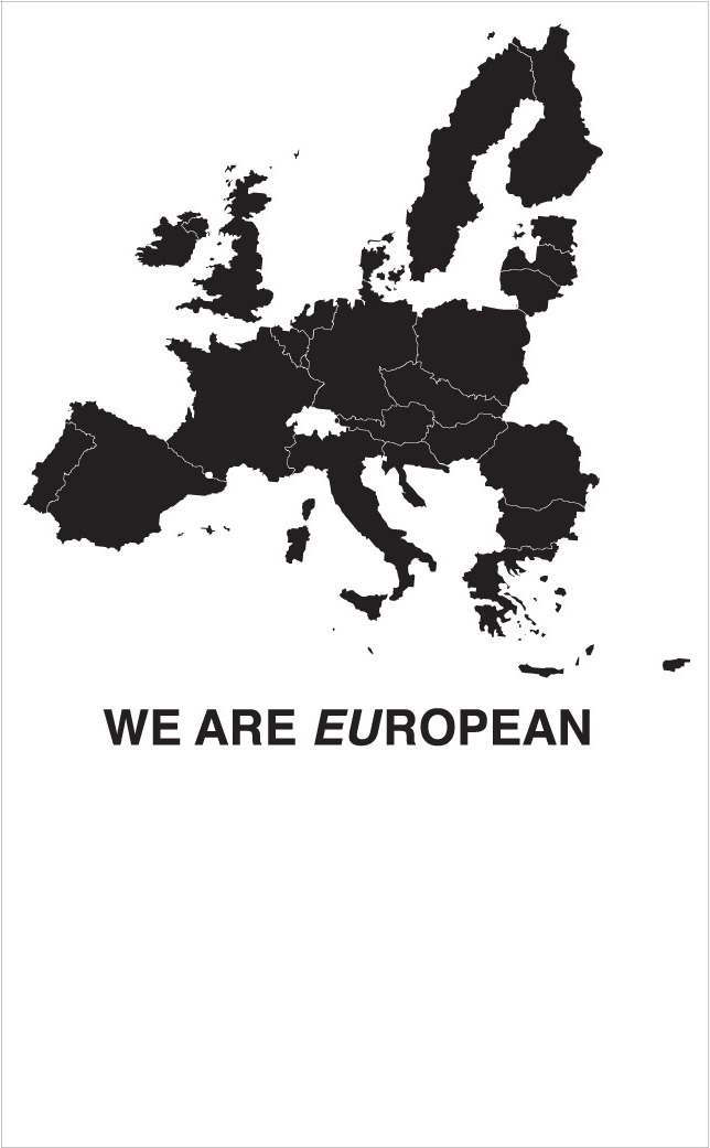
Several artists have produced posters for the Remain campaign, Wolfgang Tillmans, Eva Rothschild, Trevor Jackson are shown here and all can be viewed and downloaded on the Artists For IN site.

The Olivetti exhibition currently at the ICA in London is small but perfectly formed, much like its contents. Blink and you’ll miss it (tucked away in a little room under the stairs to the bar), it’s a beautiful collection of vintage typewriters and word processors supported by original posters, promo material and historical documents.


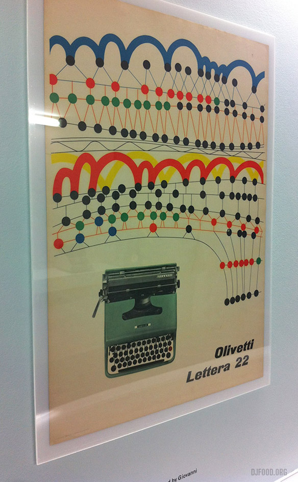
Inspired by this tiny treasure trove of gorgeous design I raided my archives of Graphis Annuals and Architecture Aujourd’hui magazines and snapped a few quick shots of Olivetti adverts contained within.
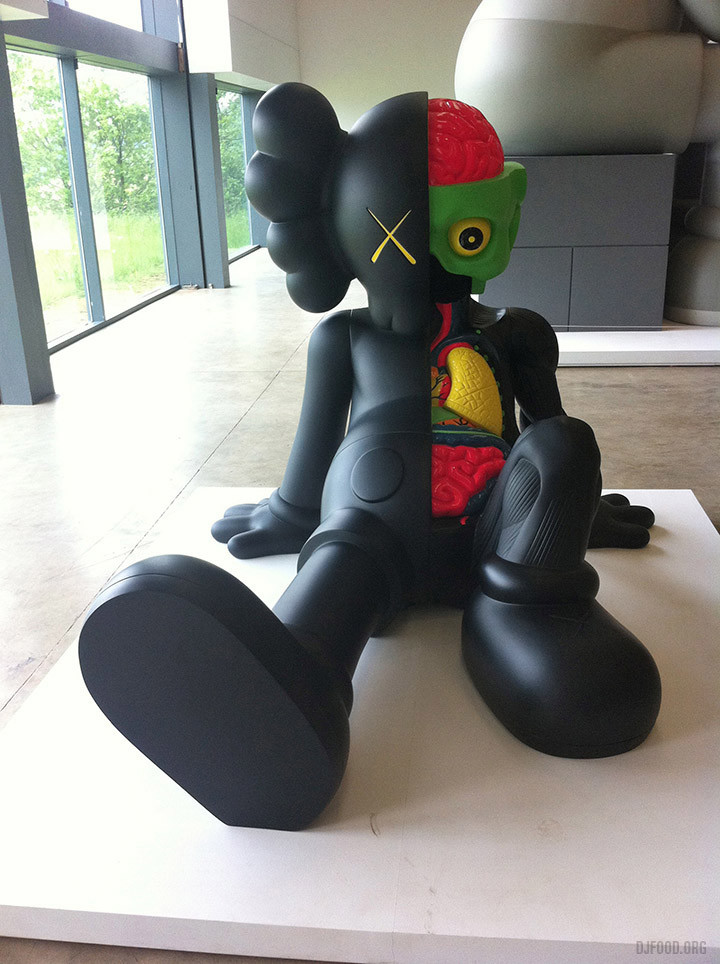
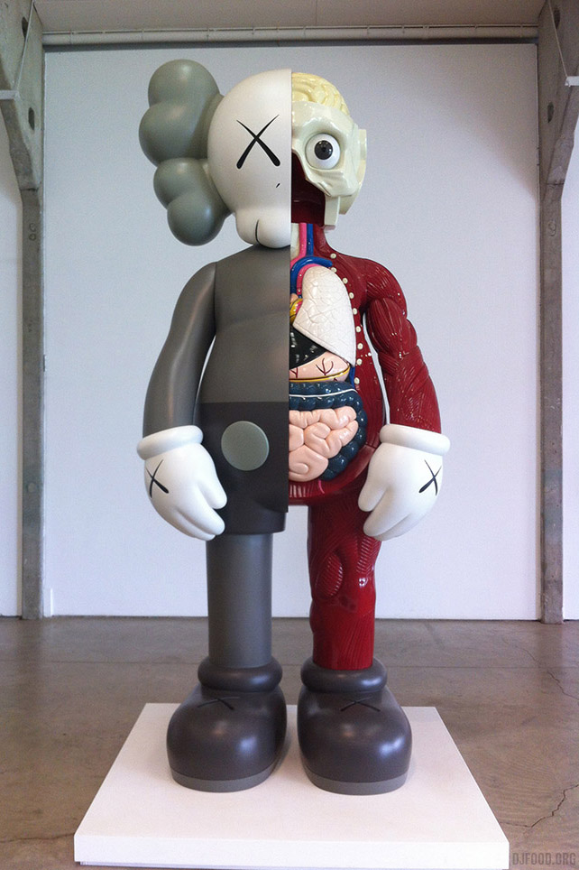
This weekend I visited the Yorkshire Sculpture Park for the final week of the KAWS and Eduardo Paolozzi exhibitions (not shown but awesome). Highly recommended but only one week left! I’ll let the pictures do the talking, they’re mainly KAWS but there are some other incidentals from the park added in too.
 Things have been a bit quiet on here recently due to various changes happening in my life right now, 2016 is turning out to be quite a rollercoaster. I’ve been a little more active over on Instagram though, with almost daily postings of personal miscellania, record finds and the Kosmischer Debris series, but even that’s taken a hit this month.
Above – top row, some experiments that date back a fair few years now with manipulated audio waves put through a spectral visualiser. Middle row – left: collage detail, middle: ‘Circult Skull 1′ test, right: ‘weird jazz thing’ that was the unexpected result of an old Freehand file where I held down the wrong key. Bottom row – experiments with a flexible material and light reflections – more to come with that…


