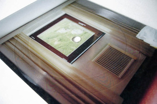
Postcard Records

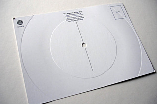
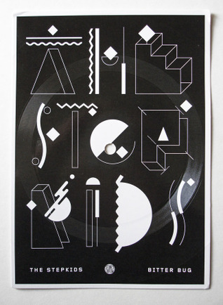
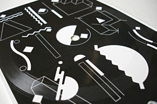
I recently came across a couple of new postcard records, people are suddenly reviving old vinyl pressing techniques the likes of which I never thought I’d see again. The first one was by The Stepkids, a massive favourite of mine after only one album, on the excellent Stones Throw label, and came free with online orders of the new record. It’s a short exclusive track called ‘Bitter Bug’ and the grooves are cut right into the cardboard so the sound quality is not far short of dirt (but that’s not the point, it looks great).

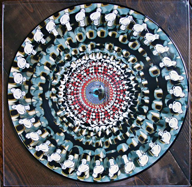
The second one I chanced upon on Facebook and is the creation of Markus Oberndorfer as part of an art project called Lenscape#02 for which he created 33 copies. I was lucky enough to secure the last copy and the difference between this and the Stepkids one is that the grooves are cut into a transparent slice of plastic and the postcard is fixed to this.
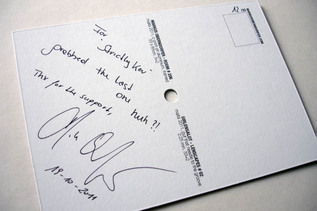
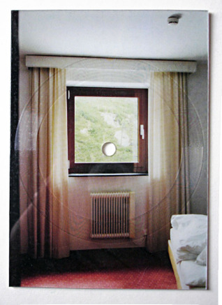
I have several records like these and most get filed along with the flexi discs I collect as they are usually 5 or 7 inches in size and square. These postcards are, well, postcard sized and have the space to write a name and address on the back.

Posted in Design, Oddities, Records. | 1 Comment |

Equinox Records

[singlepic id=3352 w=360 h=360 float=left] [singlepic id=3354 w=245 h=347 float=right]

[singlepic id=3358 w=640 h=480 float=left] [singlepic id=3348 w=640 h=480 float=left] [singlepic id=3361 w=640 h=480 float=left]

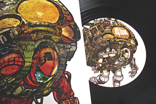
Equinox Records out of Berlin have been around for a while and they currently have a sale on in their shop so I recently hoovered up some bits I fancied. The packaging and design aesthetic of the label is very strong, being overseen by the label head Gunter Stoppel aka DJ Scientist. There is a look of unbleached card, circular designs, B&W inner sleeve photography and a multitude of formats including colour and clear vinyl, 5″ and postcard records, cassettes and other oddities. It’s a varied roster, mainly concentrating on instrumental beats and electronica with a heavy leaning toward Hip Hop and sampling. Of course I would be first to recommend 2econd Class Citizen but the new David Vangel album is excellent as are releases by Davinci and Deckard amongst others.

Soundcloud’s new Spectrogr.am plug in

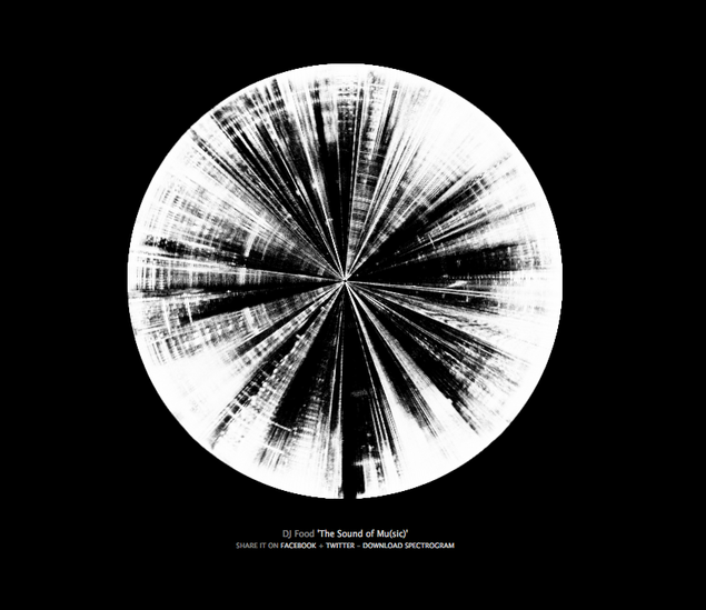
This is my KLF mix ‘The Sound of Mu(sic)’ as visualised with the new Soundcloud plug in Spectrogr.am.  It doesn’t seem to like Firefox at the moment (maybe I should update) but it works in Safari fine.

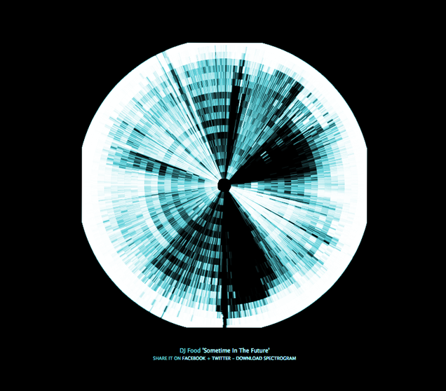
My Boards of Canada mix came out a little weird round the edges, I added the colour as I couldn’t get the colour on Spectrogr.am to work for love nor money.

Magma DJ bags

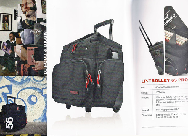
I can’t say enough good things about the bags and DJ equipment that German company Magma makes. DK and I have been using them for a while now and they have the suss to tailor some of their kit to exactly fit the airline baggage size restrictions which mean we can take these onboard when we fly because they fit in overhead lockers. Check out their new catalogue, they pretty much have a bag for every need and they are all customisable with pull out compartments. They also make laptop stands, covers and sleeves, headphone and needle bags and more.

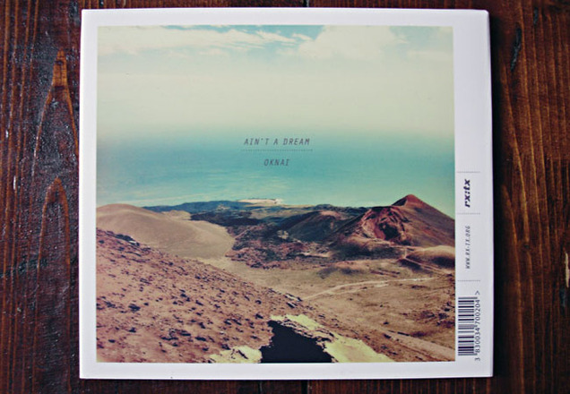
Oknai – Ain’t A Dream CD packaging

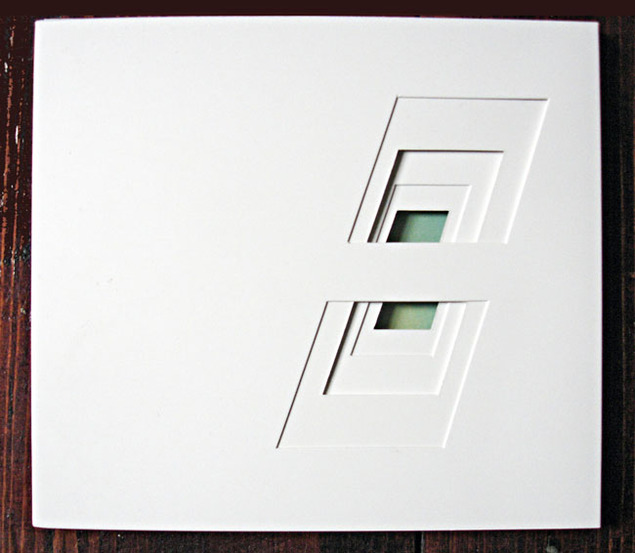
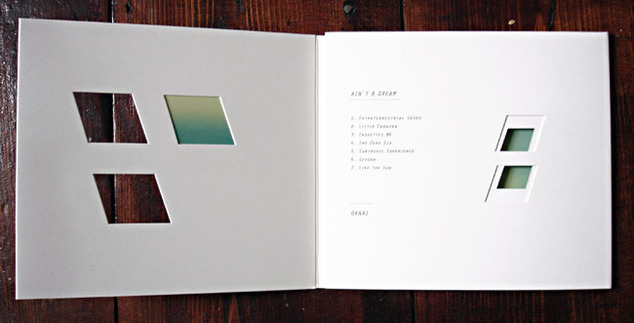
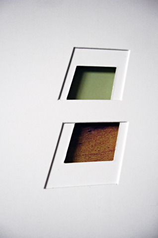
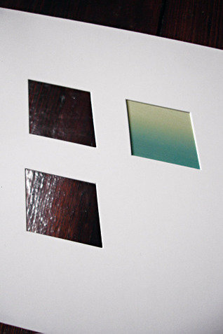
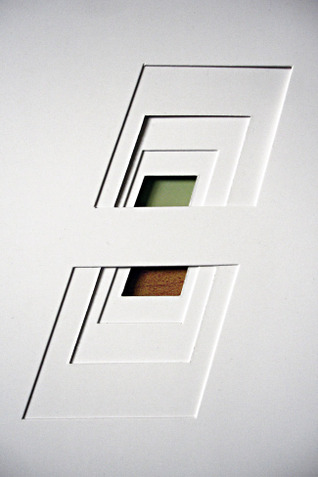
Some very beautiful CD packaging was recently sent to me from the RX:TX label in Ljubijana, Slovenia. It’s a tri-panel CD pack with die-cut windows that show through various layers of card to reveal parts of the CD disc inside as the only colour.

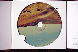
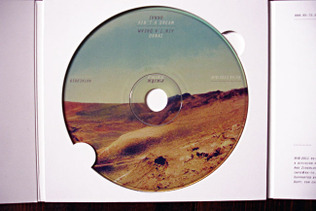
The CD disc is designed so that it can be viewed either regular or upside down and the titles still readable. Depending on which way up you have the disc it changes the colours viewed through the windows on the other panels.

Posted in Design, Packaging. | 2 Comments |

Augustine Kofie at the White Walls Gallery

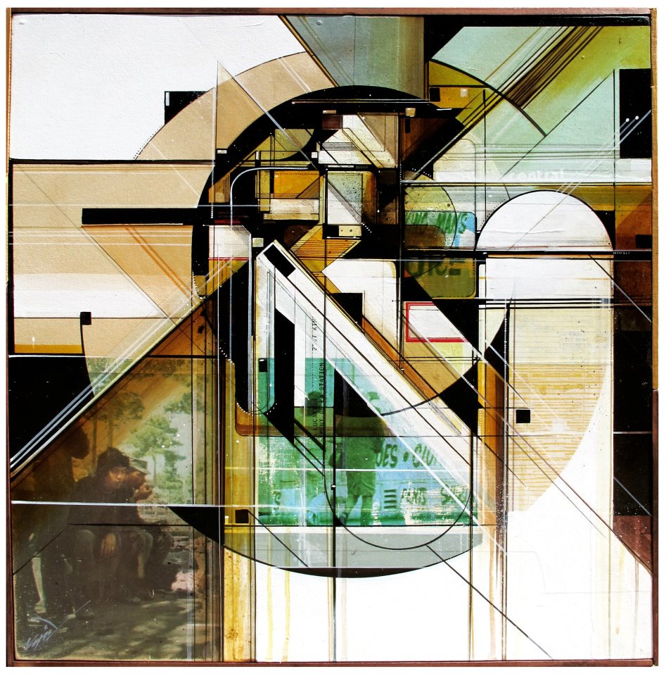
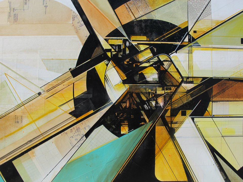
The amazing Augustine Kofie returns to the White Walls gallery in San Francisco next month for a new solo exhibition called ‘Circulatory System’.

I was lucky enough to see his previous exhibition there last year and he has posted two pieces from the forthcoming show here.

Also Kofie makes music as 4×4 Tracktor and he posted a soundtrack to the show

Posted in Art, Design, Event. | No Comments |

70’s Sci-Fi logos and magazine design

[singlepic id=3206 w=302 h=233 float=right]
[singlepic id=3207 w=302 h=233 float=right]

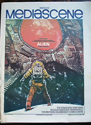
Going through a couple of recently acquired Mediascene magazines today from the late 70’s and I was struck by how much more imaginatively designed the headers on some of the articles were. A lot of them riffed off of film or comic logo design of the age but were mini works of art in themselves. I’ve included various shots of comic logos from ads in the mags too.