God I love these. Buy them and many more from here


God I love these. Buy them and many more from here


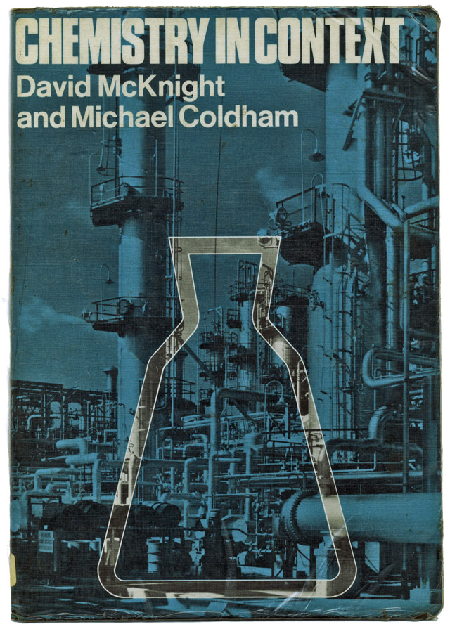 Chemistry book, 1975, ex-library, carboot sale find.
[vimeo width=”640″ height=”300″]http://vimeo.com/20901980[/vimeo]
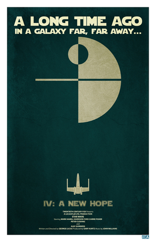
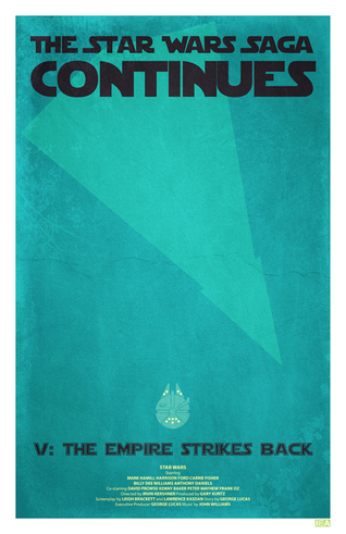
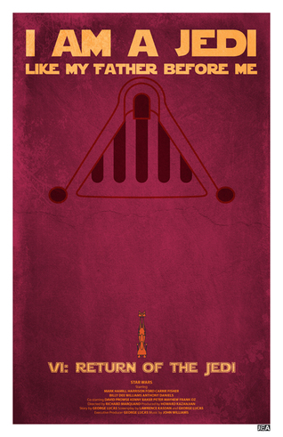 Another set of original Star Wars trilogy posters, this time by Jon E. Allen. Nicely done but Return of the Jedi doesn’t quite work for me. Also I think they’re too reminiscent of Andy Helms’ ones in this post.
via the Crack 2 blog, more here, utterly beautiful!


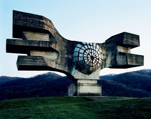

“These structures were commissioned by former Yugoslavian president Josip Broz Tito in the 1960s and 70s to commemorate sites where WWII battles took place (like Tjentište, Kozara and Kadinjača), or where concentration camps stood (like Jasenovac and Niš). They were designed by different sculptors (Dušan Džamonja, Vojin Bakić, Miodrag Živković, Jordan and Iskra Grabul, to name a few) and architects (Bogdan Bogdanović, Gradimir Medaković…), conveying powerful visual impact to show the confidence and strength of the Socialist Republic. In the 1980s, these monuments attracted millions of visitors per year, especially young pioneers for their “patriotic education.” After the Republic dissolved in early 1990s, they were completely abandoned, and their symbolic meanings were forever lost.
From 2006 to 2009, Jan Kempenaers toured around the ex-Yugoslavia region (now Croatia, Serbia, Slovenia, Bosnia and Herzegovina, etc.) with the help of a 1975 map of memorials, bringing before our eyes a series of melancholy yet striking images. His photos raise a question: can these former monuments continue to exist as pure sculptures? On one hand, their physical dilapidated condition and institutional neglect reflect a more general social historical fracturing. And on the other hand, they are still of stunning beauty without any symbolic significances.”
Much more detail on Kempenaers‘ book of these stunning monuments here and you can buy his book of the photographs on Amazon
[vimeo width=”636″ height=”380″]http://vimeo.com/3302330[/vimeo]
Incredible motion typography with music by Forss
By no means definitive, but seeing as I’m on a Mike Hinge kick at the moment, here is a selection of his book and magazine covers, scavenged from various blogs and galleries around the web.
[singlepic id=2895 w=320 h=451 float=left] [singlepic id=2903 w=320 h=451 float=right]
This has been going on for a while now over on Warren Ellis’ sprawling Whitechapel forum. The idea is that you get a few scraps of info about what has now become a classic comic or series, and have to imagine you’ve never seen or read the comic before but were given the job of illustrating the front cover of that issue or book.
[singlepic id=2875 w=320 h=437 float=left] [singlepic id=2866 w=343 h=437 float=right]
The Fantastic Four, Spiderman (via Amazing Adult Fantasy), 2000ad, Superman, Zap Comix and more have all come in for a re-imagining over the last year and I’ve rounded up my favourites in the gallery below.


More can be seen here and there’s also a Remake/Remodel series where you’re asked to redesign obscure characters from the past.
Much more to see and read here – just ignore the ultra geek programming / processing tech-speak of this piece and marvel at what it achieved on screen.


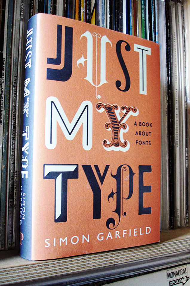 I can’t recommend this enough, a very good read for designers or even people with a just passing interest in design. You don’t have to know your kerning from your baselines to appreciate the information in this great book. Simon Garfield take a humorous, but well researched, look at fonts and typography across the ages, from design giants like Helvetica, Univers and Gill to the underdogs of the lettering community.
Chapters on Comic Sans prove he’s no type snob, a fascinating story about a lost typeface that drowned in the Thames and even a few eye openers will keep you turning the page. Who would have thought Eric Gill was into that? Also the new Olympic font comes in for a good kicking before he’s done.
If you’re a student just starting, a seasoned pro or you just know someone who likes their design but is really hard to buy a present for, this book is for you. I only wish something like this was around when I was in college, it might have saved me from making some of those dodgy font decisions in the past.
 Yes, I know what you’re thinking, Katy Perry, I would too, but…
Aside from the fact that I have a thing for women in black bob haircuts and none other than Noisia have remixed her new single into a dubstep ‘anthem’, check out the font on the cover.
No, really. I don’t know who the designer is but I love some of those letter forms, the K, A and E especially. Shame they had to go and spoil it with the terrible dot matrix font for KanYe, no less than he deserves I suppose.
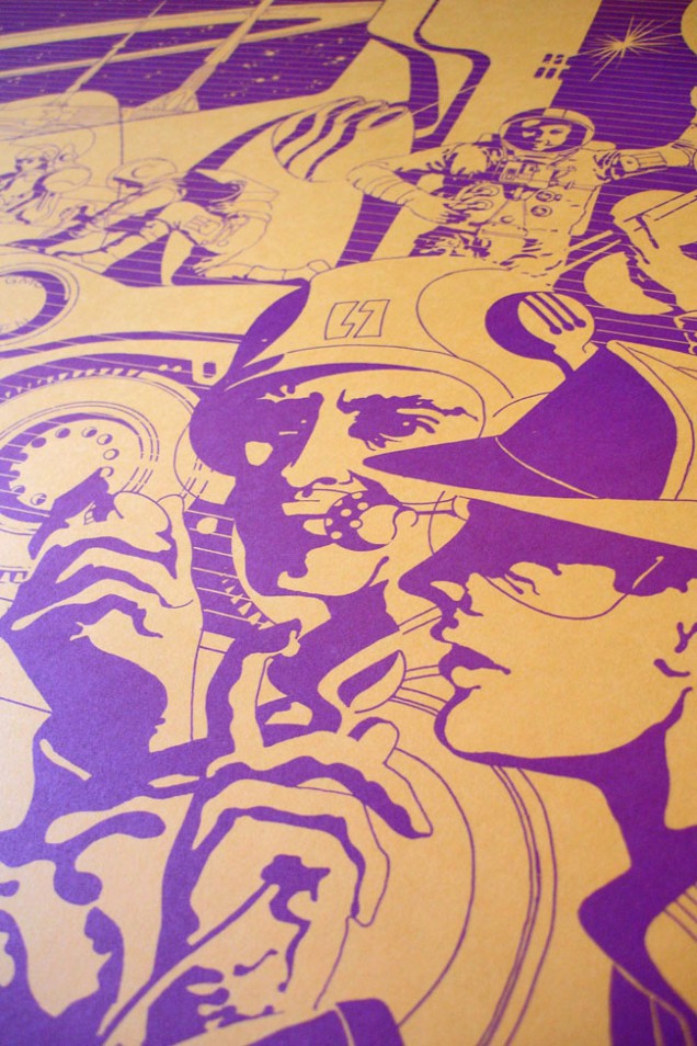
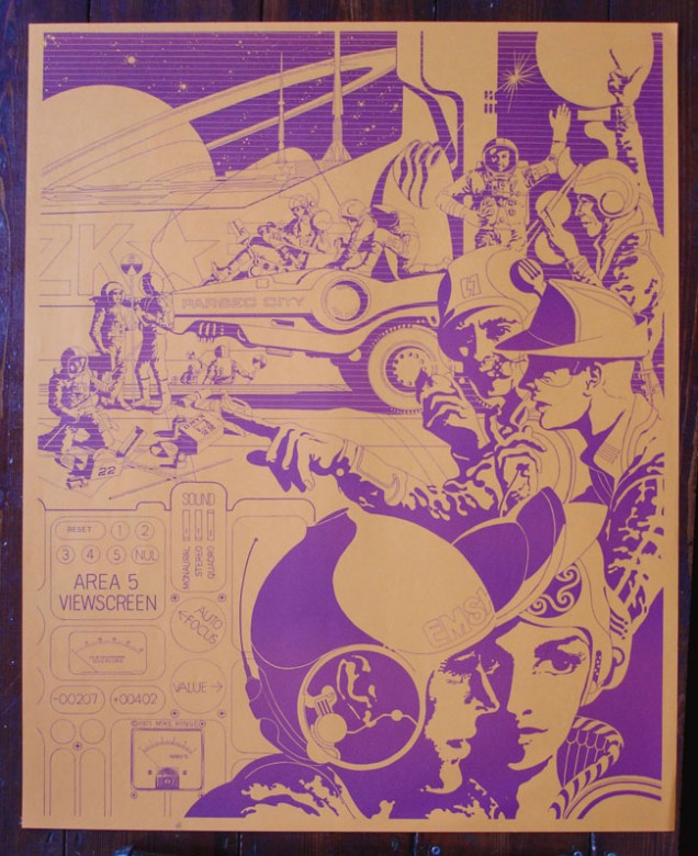
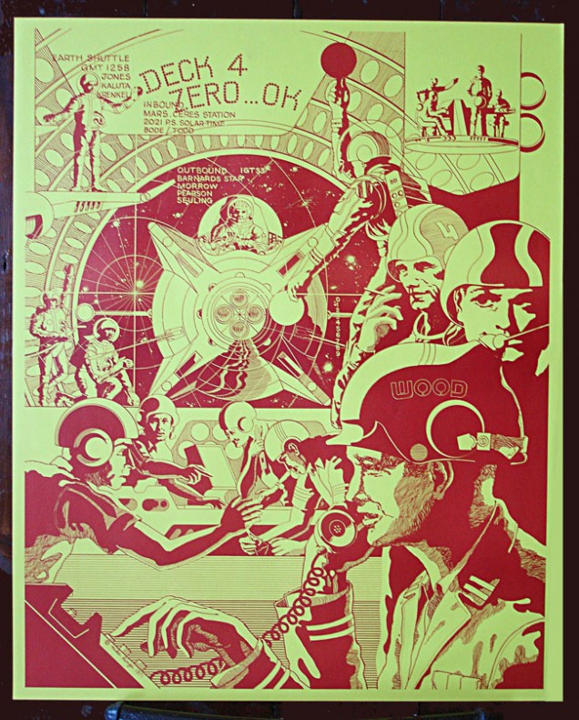
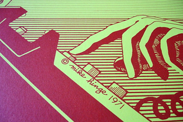
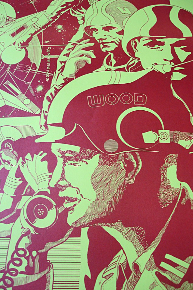
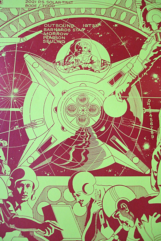
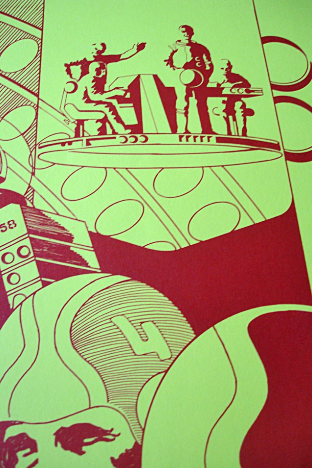
Mike Hinge was an illustrator, typographer and graphic designer, born in Auckland, New Zealand, in 1931. Early in his illustration career he worked for the largest ad agency in New Zealand before moving to Los Angeles, where he attended the Art Center of the College of Design. In 1966 he moved to Manhattan, where he worked as an art director for several ad agencies. His graphic designs were notable, and his colorful and psychedelic illustrations appeared on numerous science fiction paperback books and magazines during the 1970s, including Analog, Mediascene, Heavy Metal, Fantastic, and Amazing.
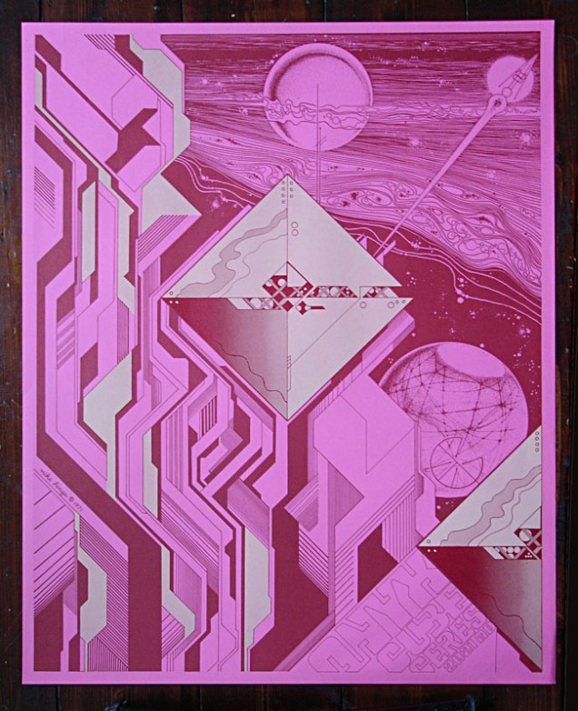
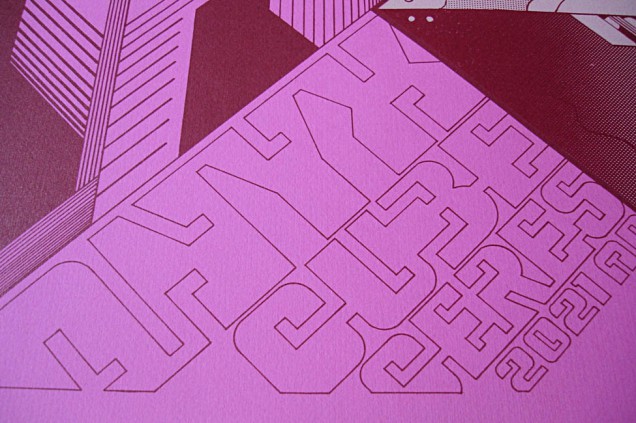
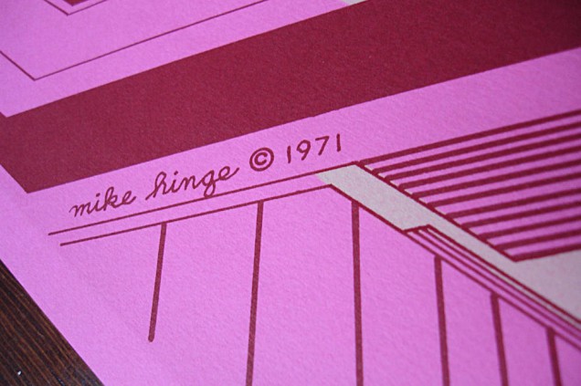
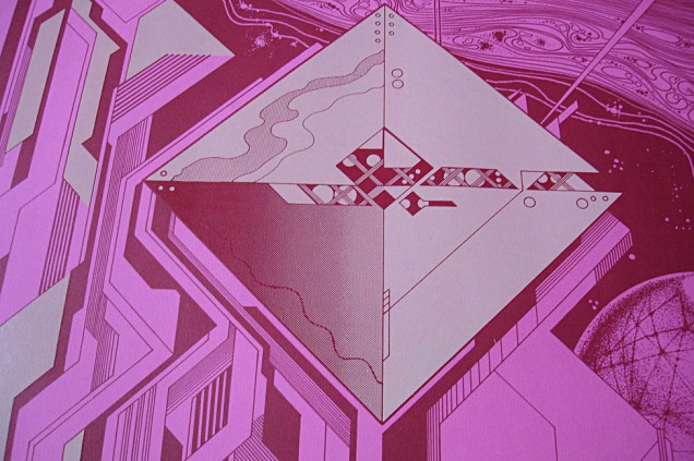
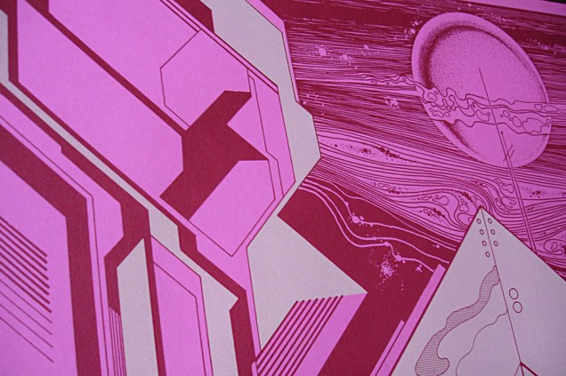
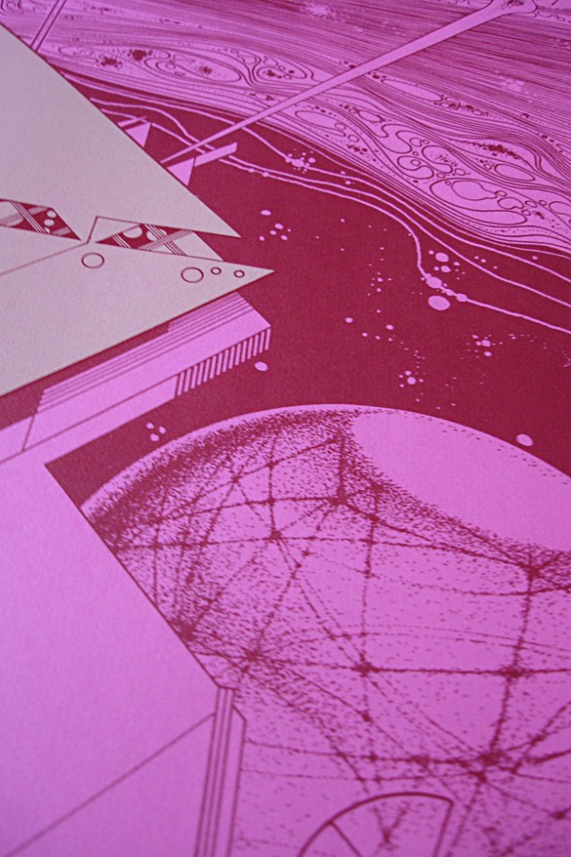
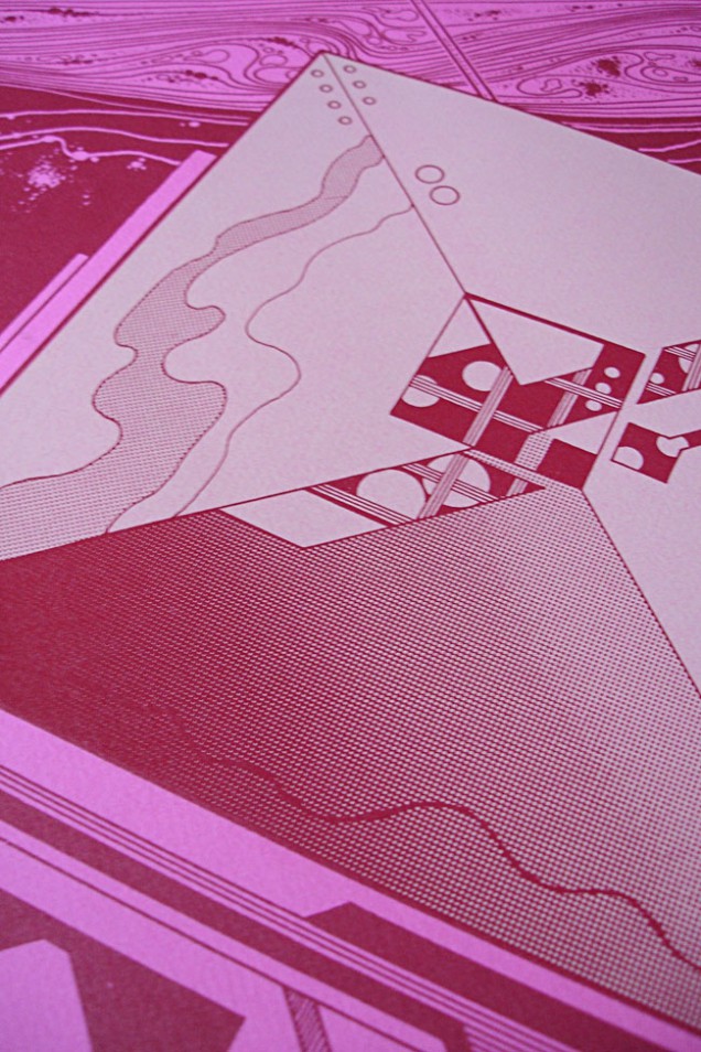
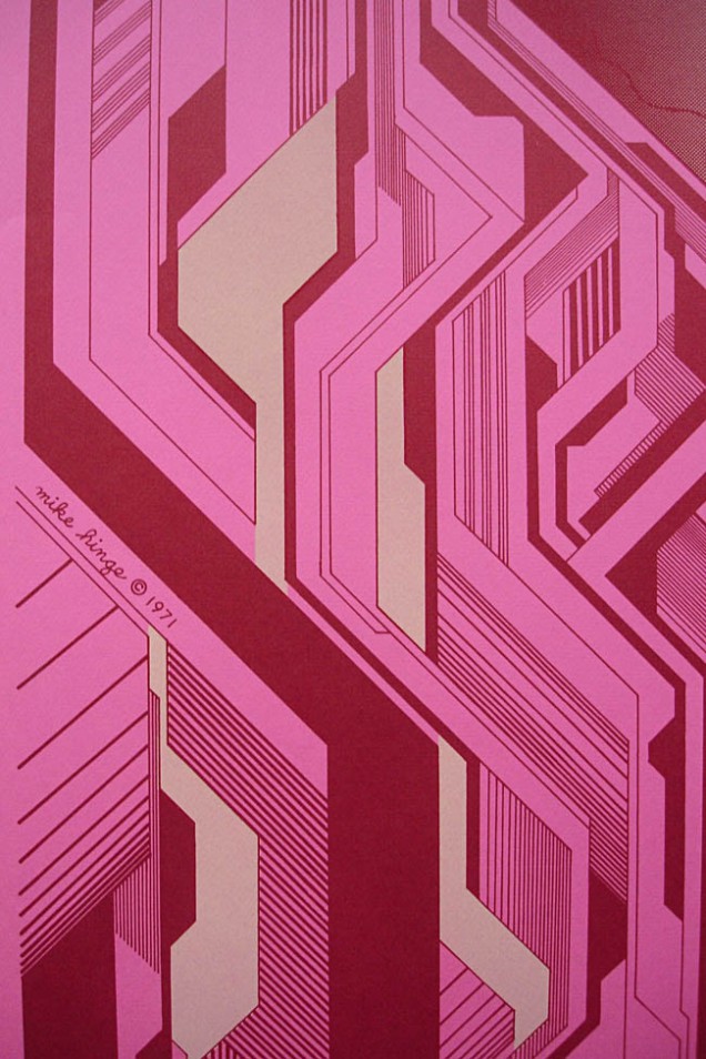
Hinge also did design work for 2001: A Space Odyssey and produced illustrations for mainstream publications like Time magazine, including covers featuring Richard Nixon and Emperor Hirohito. He was nominated for the Hugo Award for Best Professional Artist in 1973, plus nominated for 6 Locus awards in the ’70’s. His designs for typefaces and graphics won him several awards and were exhibited, including a show at the Brooklyn Museum. A book about his art The Mike Hinge Experience was published in 1973 and he featured in the 1982 artists anthology The New Visions. He died of a heart attack in 2003 and still remains relatively unknown outside of the sci-fi community, for more info check out Ivan Richards’ Onyx Cube blog for many examples of his original artwork.
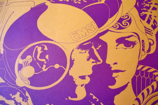
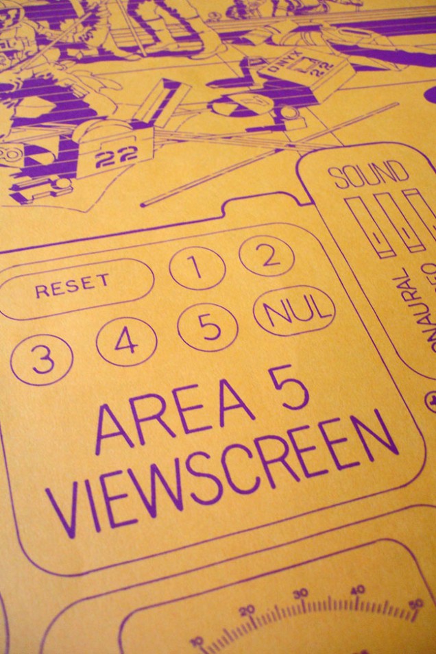
[youtube width=”636″ height=”382″]http://www.youtube.com/watch?v=rpPVPEoJdb0[/youtube]
Taken from the new Wagon Christ album ‘Toomorrow’, out now on CD, LP and download
The ‘Chunkothy’ video is directed and animated by Celyn Brazier at Nexus with Beccy McCray providing invaluable production skills. Bali Engel helped colour and provided the beautiful animated sequences for the insect loop and fishes. Margot Tsakiri-Scanatovits and Manav Dhir also provided colouring skills and contributed to the animation of the insects. Steve Mc Inerney constructed the final edit with perfect timing and imagination.
The animation was created in Photoshop, with most sequences on one layer. It was as simple as that really. No gimmicks, no tweeny motion tricks, no cgi. Celyn created small beat guides for reference, sometimes following the rhythm, for example on the bouncy ball loops, but mostly as many random patterns and as much weird sh*t that she could possibly make in six weeks.
CREDITS
Celyn Brazier – directing, deigning, colouring, animating
Beccy Mccray – producer
Steve Mcinerney – editor
Bali Engel – colouring, animating
Margot Tsakiri-scanatovits – assistant colouring
Manav Dhir – assistant colouring
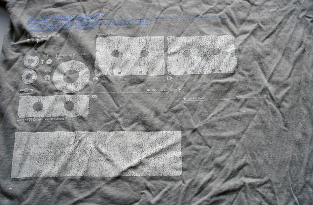
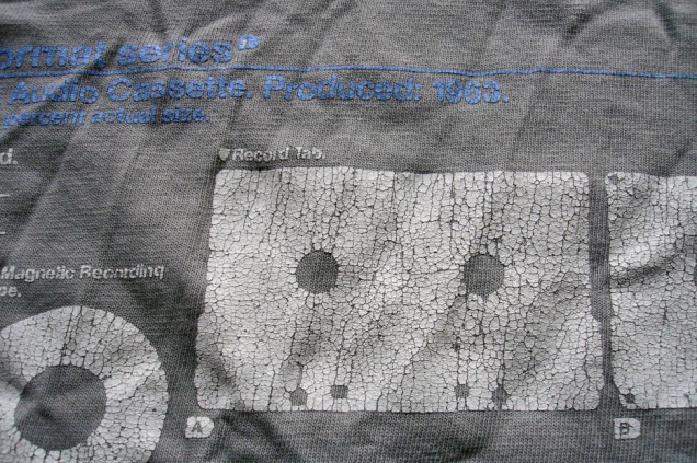
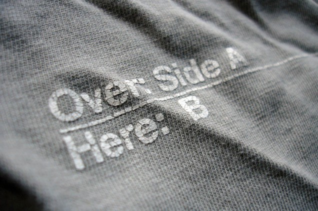
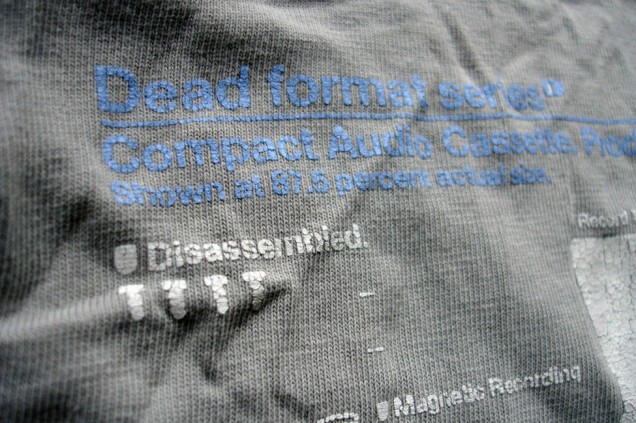
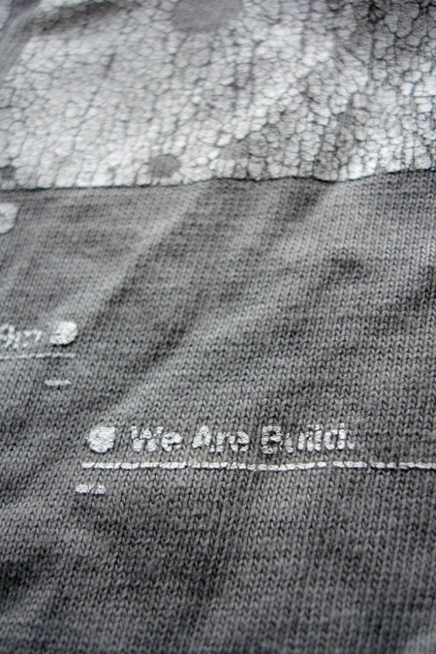
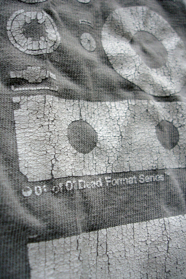 Dead Formats T-shirt Series No.3: Compact Audio Cassette by Michael C Place / Build 2003
[flv width=”312″ height=”255″]http://www.djfood.org/wp-content/uploads/2011/03/GAL-BANDEANNONCE.flv[/flv] [flv width=”312″ height=”255″]http://www.djfood.org/wp-content/uploads/2011/03/MO-DESSLIVE-STELETATAN-1-MUSIQUE.flv[/flv]
The Moebius exhibition in Paris ends this weekend at the Foundation Cartier. I sadly didn’t make it back there but hope it will come to the UK some day. Here are a selection of the films featured on the exhibition site.
[flv width=”312″ height=”255″]http://www.djfood.org/wp-content/uploads/2011/03/E-CARD-2011.flv[/flv] [flv width=”312″ height=”255″]http://www.djfood.org/wp-content/uploads/2011/03/MO-DESSLIVE-MAJOR-5.flv[/flv]

The Six Ton Armour site hosts ‘Psychcasts’ – psychedelic podcasts – alongside artwork by Rimrimrim. They’ve recently started putting out mixes on CD too and I got a couple of them in the post last week. Beautiful they are too, with screen printed covers that recall some of the Twisted Nerve / Finders Keepers sleeves or Canada’s now defunct Bully label. The mixes are very good, sprawling across the psych realm and digging deep. Definitely worth keeping and eye and ear on for future releases and mixes. Buy these two CDs here… but you can also download the Black Olsun ‘Spells’ mix for free from here…


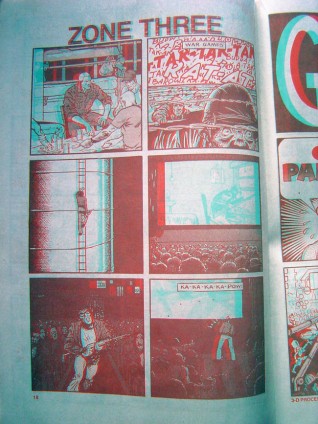
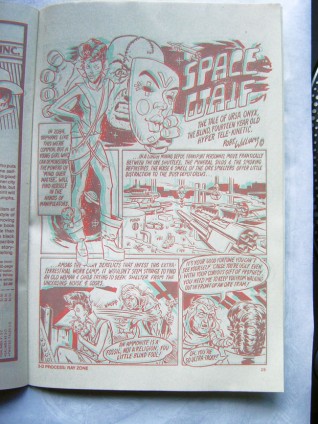
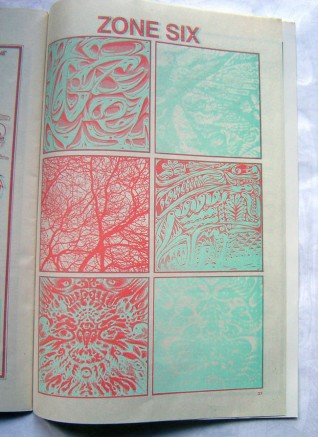
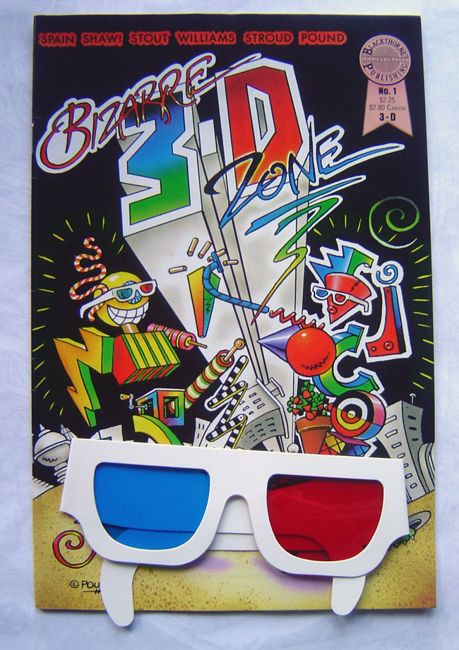 Further to the post about 3D I did last week, I’ve dug out some of the comics I was talking about. Best find was ‘Bizarre 3D Zone’ which is almost Zap Comix in 3D form, including a strip by Robert Williams which works extremely well visually. There were a few underground comics in the the 60’s and 70’s using 3D it seems but not all of them work because the printing is so bad the red/green division can’t be seen too easily.
A company called Blackthorne Publishing spearheaded the 3D comics surge in the late 80’s, buying up licenses to lots of kids shows like Transformers, GI Joe and Star Wars. Their most successful line was, bizarrely, the California Raisins (!?) but they bit off more than the could chew when they acquired the rights to print Michael Jackson’s ‘Moonwalker’ in 3D. The film didn’t do the business expected and their comic flopped, costing them the company. Most of their titles only ran for 1 or 2 issues and the projected Star Wars line (surely a golden ticket?) only made it to issue 3 before the company folded.
In Bizarre 3D Zone there are a few singular page strips that crop up that are quite bizarre indeed, some don’t even work in the conventional 3D way as they are simply only either the green or red. But in amongst the other separated images they give an odd effect and you realise that this is the ultimate in psychedelic comics as it’s playing with your perceptions of the page. I can only imagine what it was doing to hippies on acid way back when.
