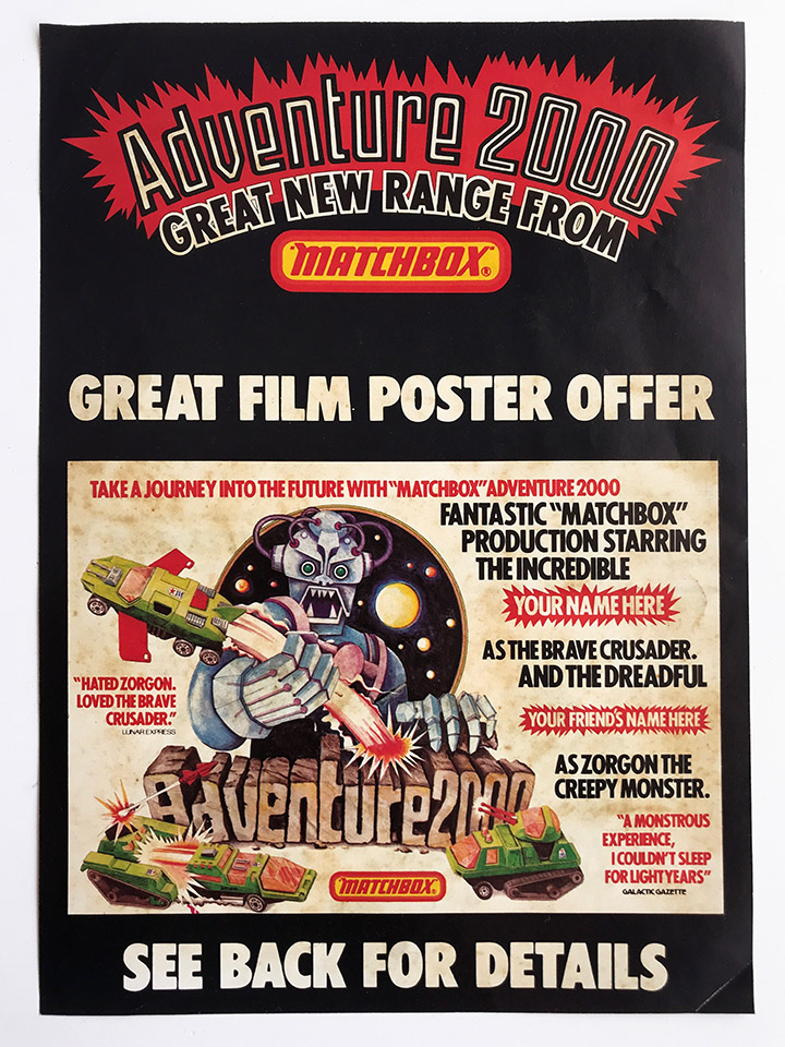
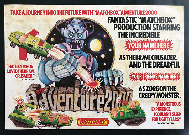
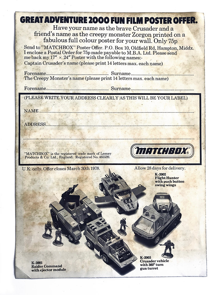
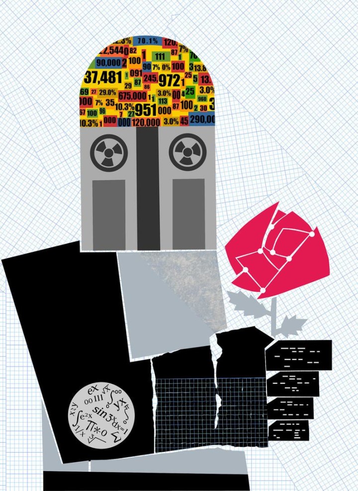
Adults of a certain age (ie. over 50) might remember this little promotional flyer for the Matchbox Adventure 2000 line of die-cast toys from the 70s. I found this flyer in Gosh Comics a few years back but remember seeing it in some comics possibly way back and wanting to get this poster so badly. I think I may have even sent off for one to have my name printed on but never received anything back (but that could be the mind playing tricks). I know that I definitely copied the robot in the poster in my sketchbook and wanted there to be a film so badly. I still have a (Land) Raider Command vehicle in its box and my brother and I had the other two vehicles pictured as well, they were well and truly played with until they broke. Did anyone actually get a poster with their name on it?
Poster / flyer
 Dear friends, I hate to be the bringer of bad news but the Covid curse has finally struck – and at the worst time possible too.
After evading the bugger for 2 years I tested positive yesterday, the day before tonight’s opening BSMT Space for EPOD‘s first solo show of new work. I was supposed to be there and this has put months of work and prep out the window. Be vigilant, we’re not through this yet, no matter what our government tells us.
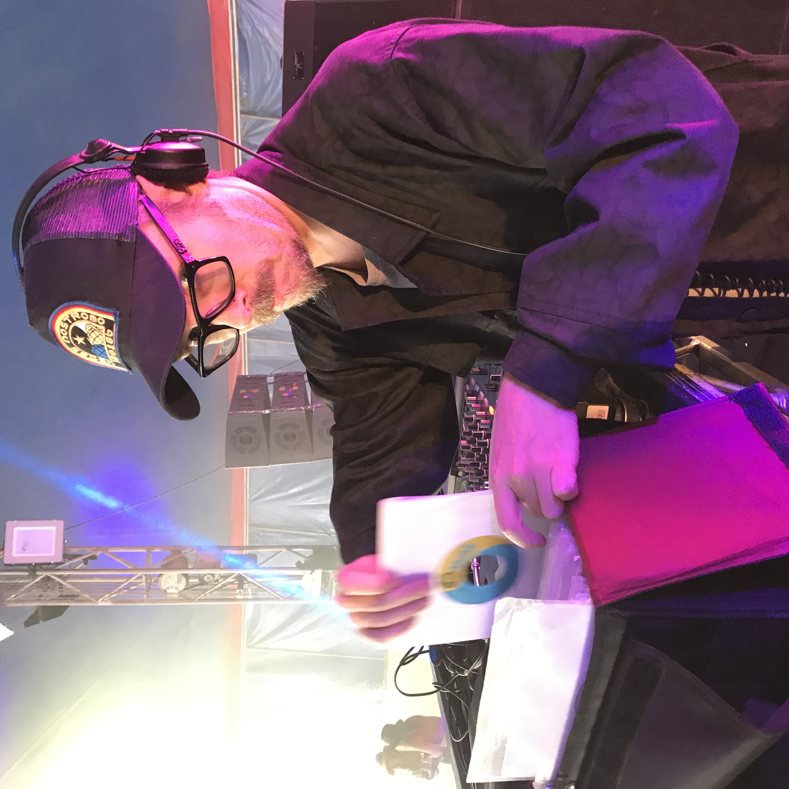
But it’s not all bad news though as my man Ollie Teeba has gamely stepped up to bat at the 11th hour with his box of 45s and two turntables for your delectation tonight. I’m sure he needs little introduction but having hands in The Herbaliser, The Process and Soundsci as well as a solo artist and DJ in his own right is nothing to scoff at – he’ll do us all proud.
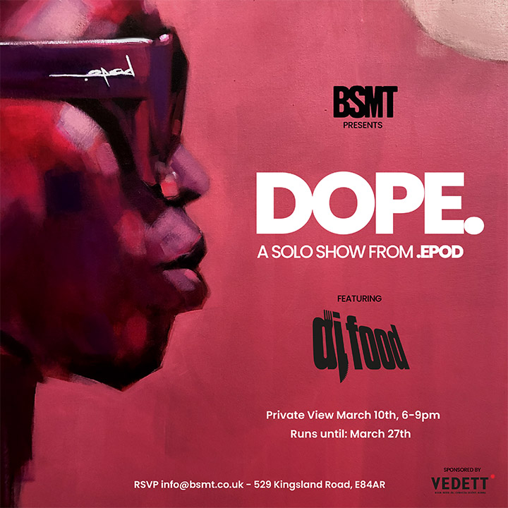
So – the show must go on, get down to BSMT tonight between 6-9pm, there will be excellent art, great music and free beers supplied by Vedett. Maybe even snag one of the limited slipmats or prints being sold on the night?
I’ll be there in spirit and hopefully we can do something once I’m out of isolation. 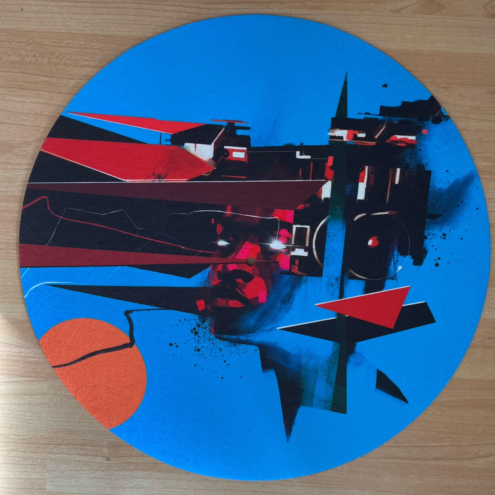
This Thursday – March 10th – .EPOD‘s first solo show opens at BSMT Space in Dalston. EPOD has made a pair of slipmats in five different colourways which will be on sale on the night and exclusively through the gallery. There will also be prints and new canvases plus beers by the Vedett brewery.
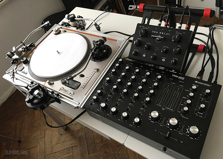 I’ll be providing the music on the opening night from 6pm-9pm via my Quadraphon turntable with the currently unreleased Omnitronic TRM-422 mixer and the Ninja Tune Zen Delay, creating music live with locked grooves and up to four tone arms.
RSVP to [email protected] for entry to the private view on Thursday.
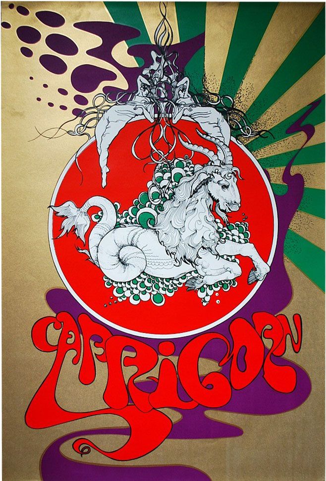
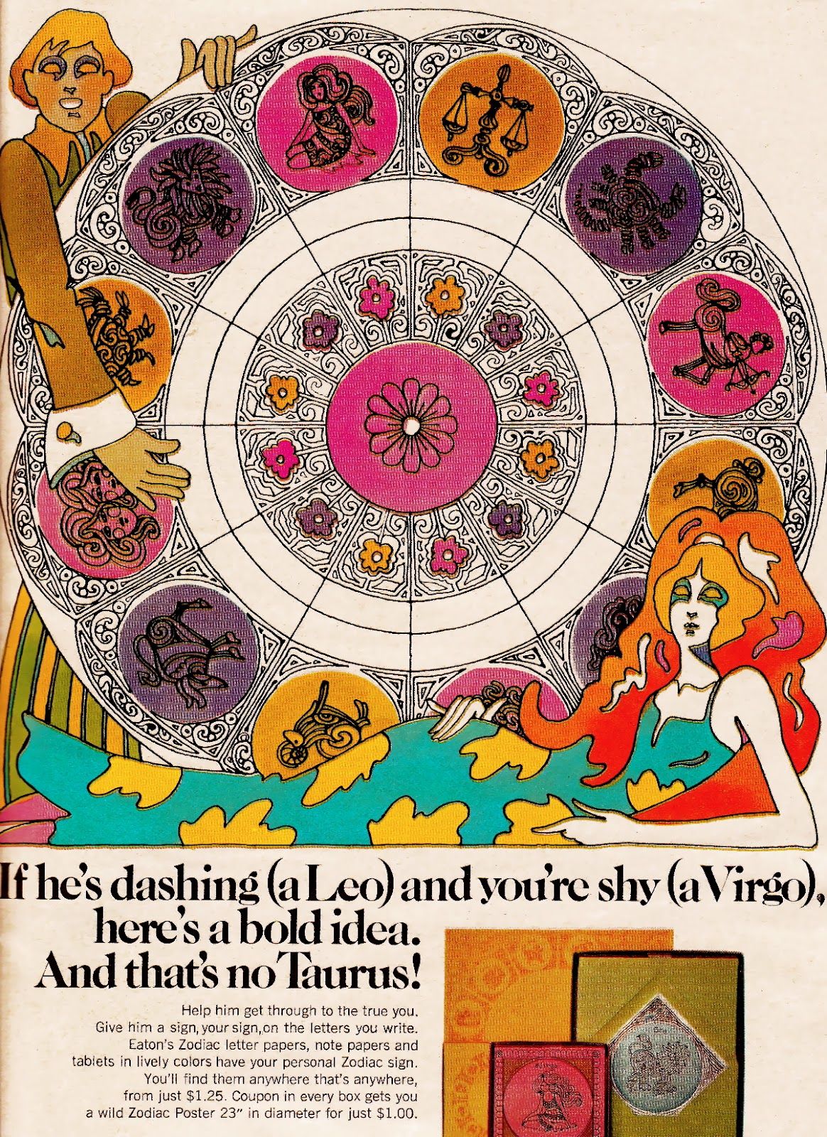
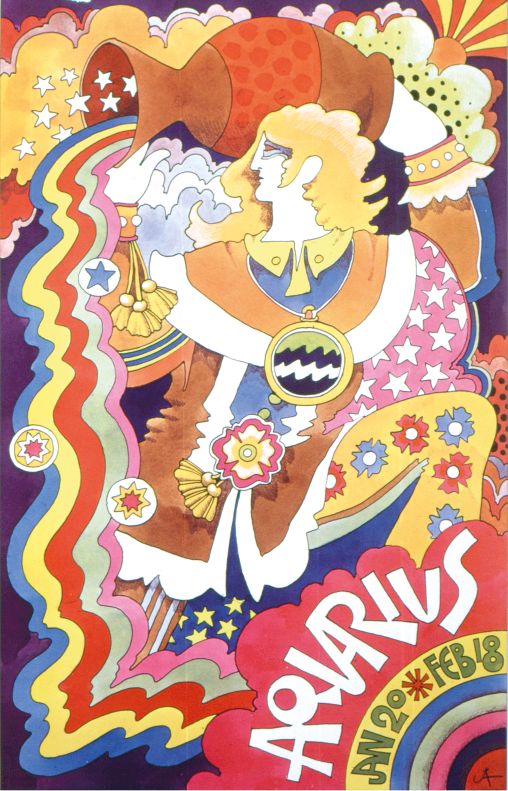
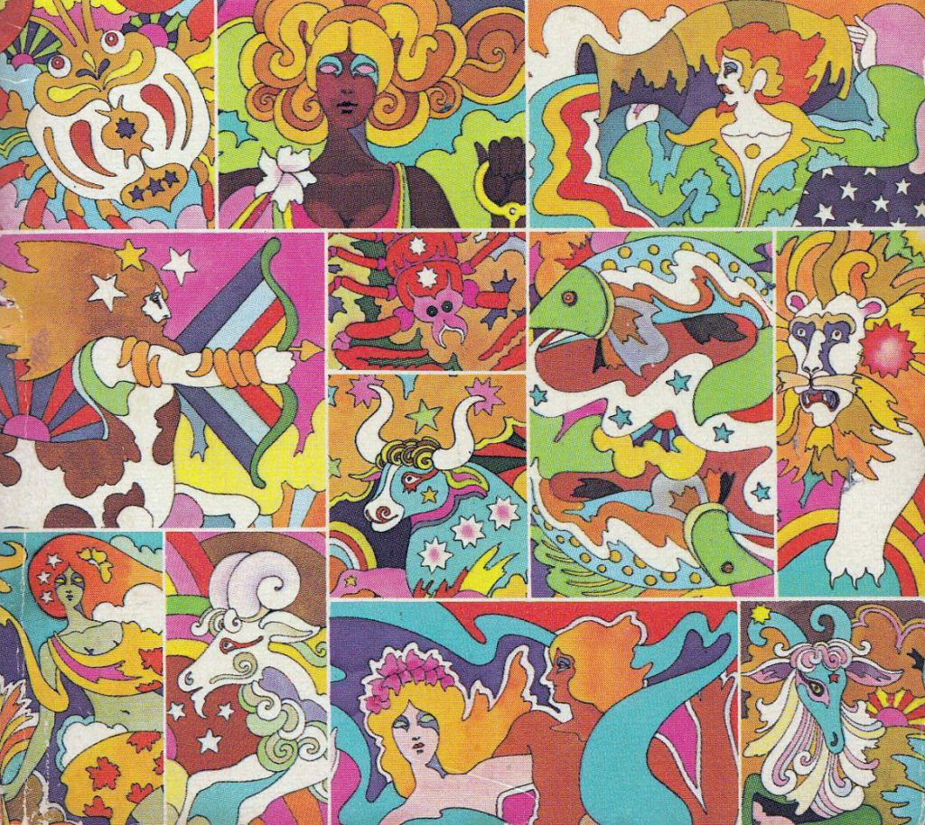
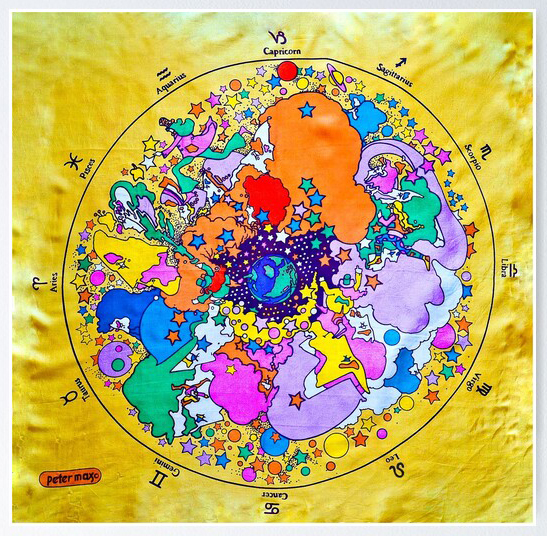
After the Simboli Design Zodiac, the Funky Features Zodiac and the long Astrological door posters of Wespac, here’s the rest that took my fancy, picked up along the way but not fitting into a whole set that I can find.
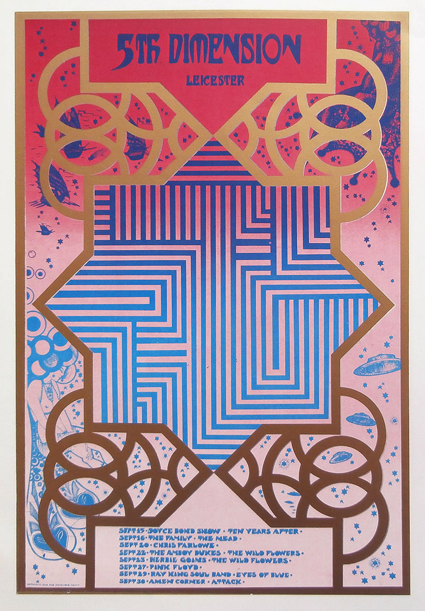
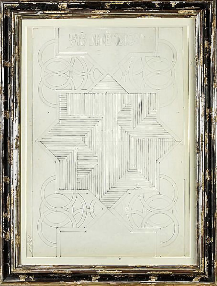
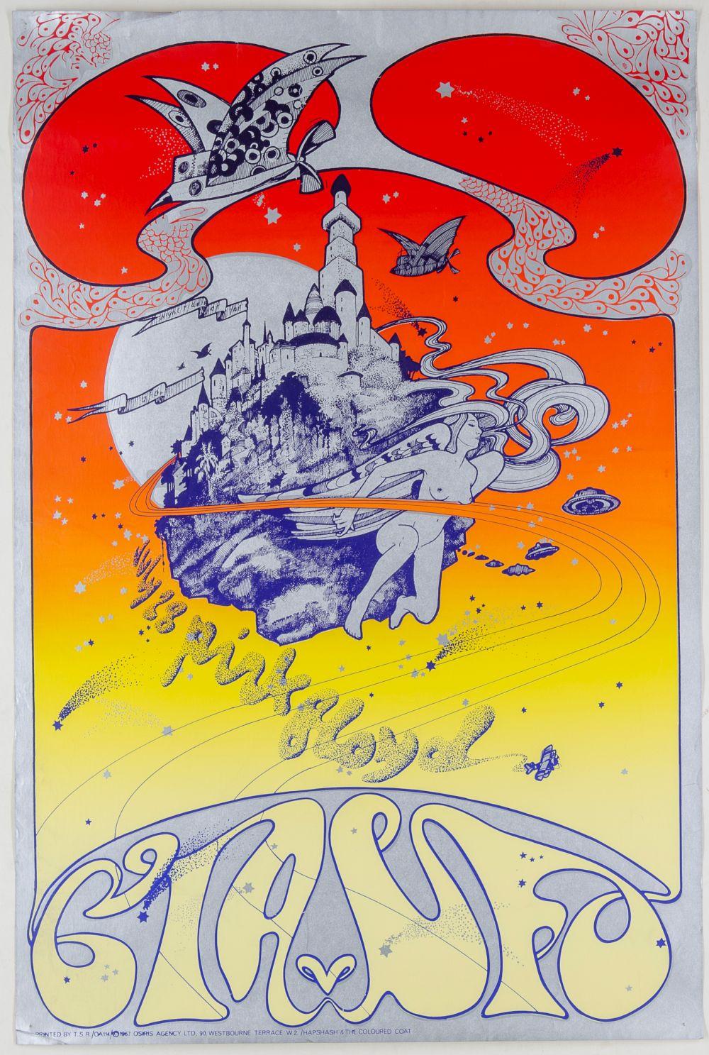
The Fifth Dimension was a very short-lived club night in Leicester, it only lasted around two months by all accounts. I showcased plenty of acts in its short life though with an average of four gigs a week. It also had the distinction of having an original poster designed by Michael English of Hapshash & The Coloured Coat, printed in red, blue and gold as seen above. The original pencil line work for this was sold at auction many years back and a letter from Michael with it, signed and dated December 1999, explained the genesis and concept of the design.
”Normally, the structural design of our work was created on layout paper and then traced out onto the final artwork card. That layout was then invariably discarded as waste. However the 5th Dimension poster was so complex that it required a great deal more preparatory work. This meant the creation of a master drawing on cartridge paper whose more robust nature allowed us the freedom to erase and re-draw the various parts of the design until we were satisfied with it. That done, a final tracing was then made from it on layout paper which was then transferred to the card.
The complex maze like pattern that comprises the central theme of this poster was intended to give the impression of a window or doorway into a fifth dimension. The flickering effect of the colours together with the pattern creates a mesmerising experience that was supposed to draw the observer into another space. Under the influence of LSD, of course, the effect would have been much more dramatic”.
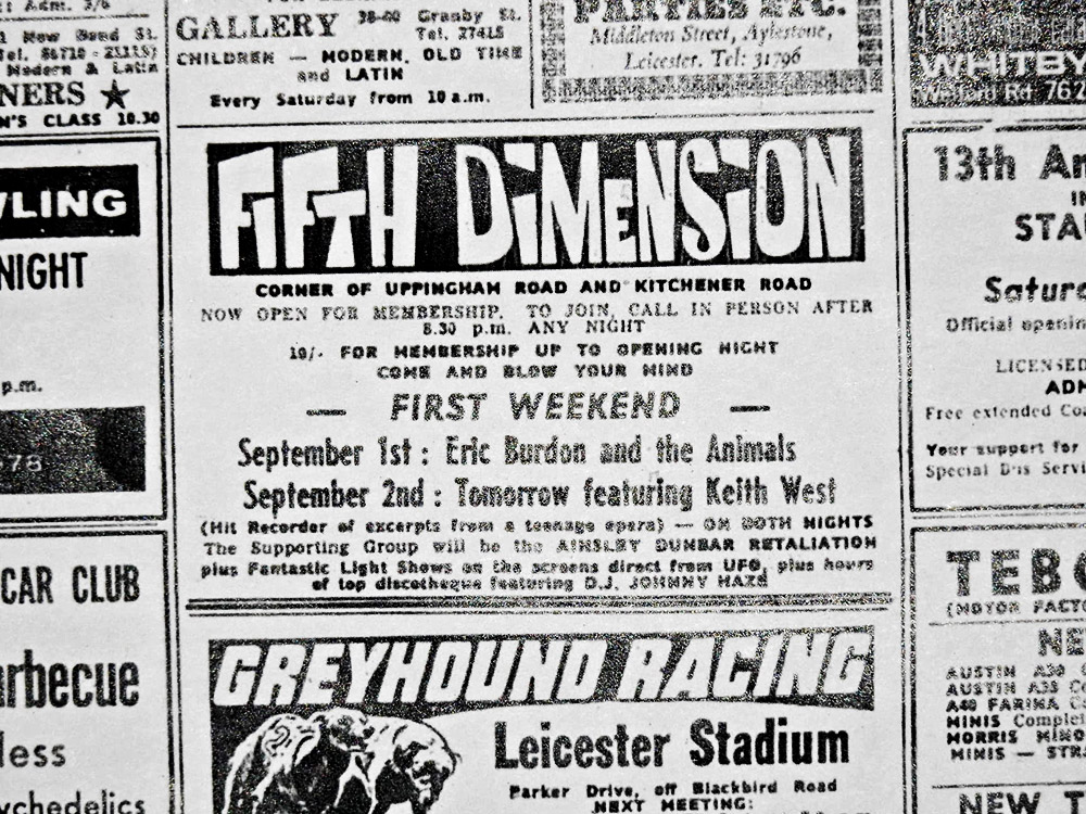
Below is a local paper listing for the opening night of the club, presumably before they had the poster above. By the end of October the night would be over.
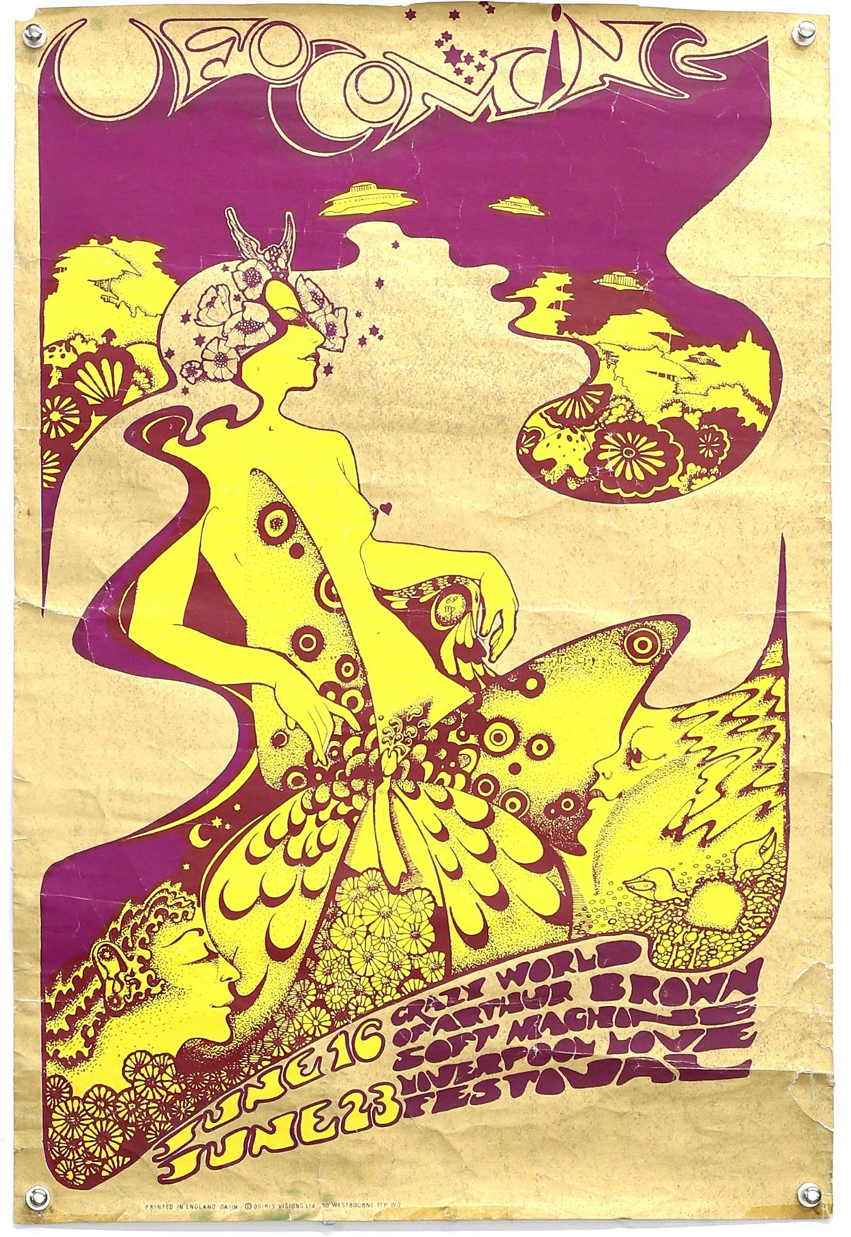
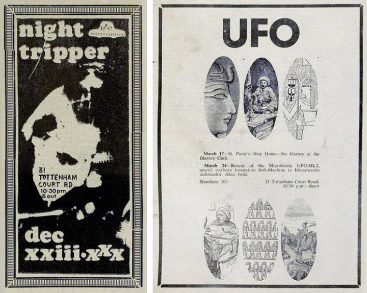
Having already covered adverts for the UFO Club in a previous post I thought I’d try to match the posters up with the dates. The club started life at The Blarney Club in the basement of the Berkley Cinema at 31 Tottenham Court Road in December 1966. Founded by John ‘Hoppy’ Hopkins and Joe Boyd, the night was first billed as ‘UFO Presents Nite Tripper‘ because they couldn’t decide on a name, it came to be the former, pronounced, ‘You-Fo’ (Unlimited Freak Out). The woman on the first poster is Karen Astley, at the time Pete Townsend‘s girlfriend, her face painted by Michael English.
Listings taken from the UFO wiki page, I’ve tried to match posters to the dates but sometimes bands were announced but wouldn’t play as their fame grew and other commitments called. Most were done by Michael English and Nigel Waymouth who designed under the name Hapshash & The Coloured Coat.
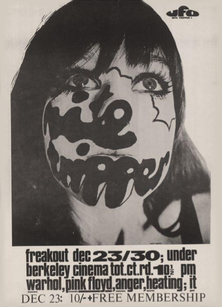
23/30 Dec: Nite Tripper under Gala Berkeley Cinema; Warhol movies; Soft Machine; Pink Floyd; Anger movies; Heating warm; IT god
Poster by Michael English
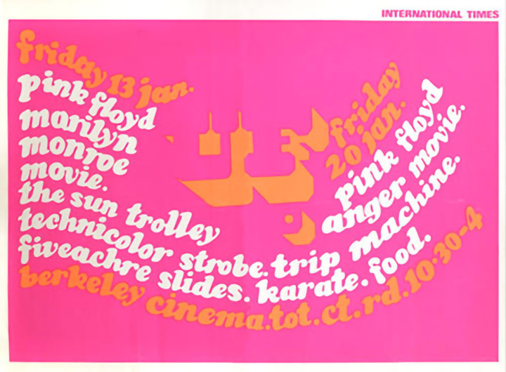
13 Jan: Pink Floyd; Marilyn Monroe movie; The Sun Trolley; Technicolor strobe; Five acre slides; Karate
20 Jan: Pink Floyd; Anger movie
Poster by Michael English
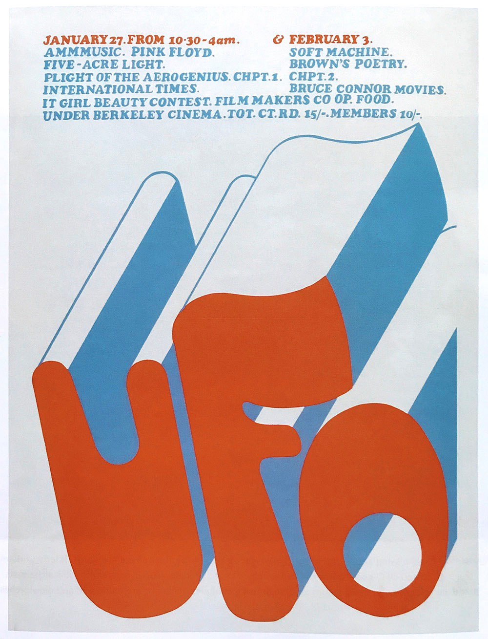
27 Jan: AMM Music; Pink Floyd; Five Acre Light; Flight of the Aerogenius Chpt 1; International Times; IT Girl Beauty Contest
3 Feb: Soft Machine; Brown’s Poetry; Flight of the Aerogenius Chpt 2; Bruce Connor Movies
Poster by Michael English
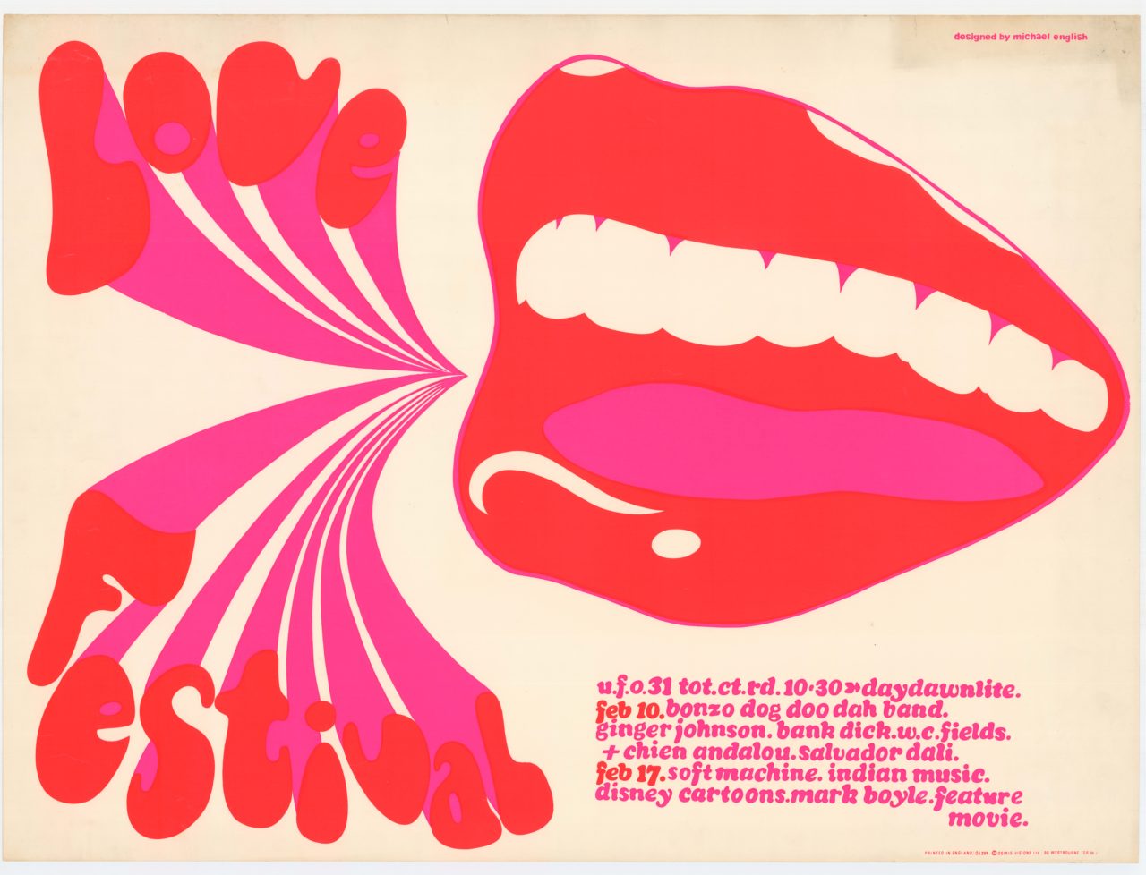
10 Feb: Bonzo Dog Doo Dah Band; Ginger Johnson African Drums; flix – Dali – Bunuel, WC Fields
17 Feb: Soft Machine; Indian Music; Disney Cartoons; Mark Boyle Projections; Feature Movie; ‘erogenius 3 + 4’
Poster by Michael English
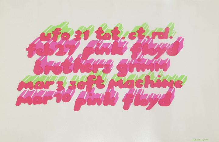
27 Feb: Pink Floyd; Brothers Grimm
3 Mar: Soft Machine; Pink Floyd
10 Mar: Pink Floyd
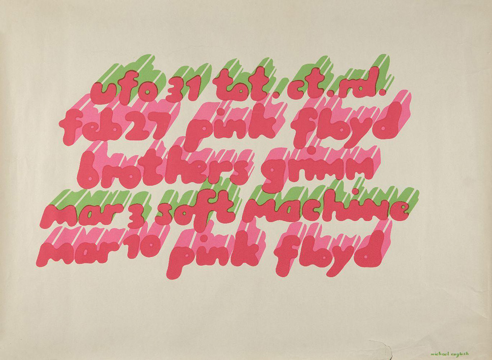
Poster by Michael English, below is English’s original artwork, notice there is a mistake with the date, it should have read Feb 24th
17 Mar: St Patrick’s day off – or ‘St Pattys – stay home’ as this flyer says
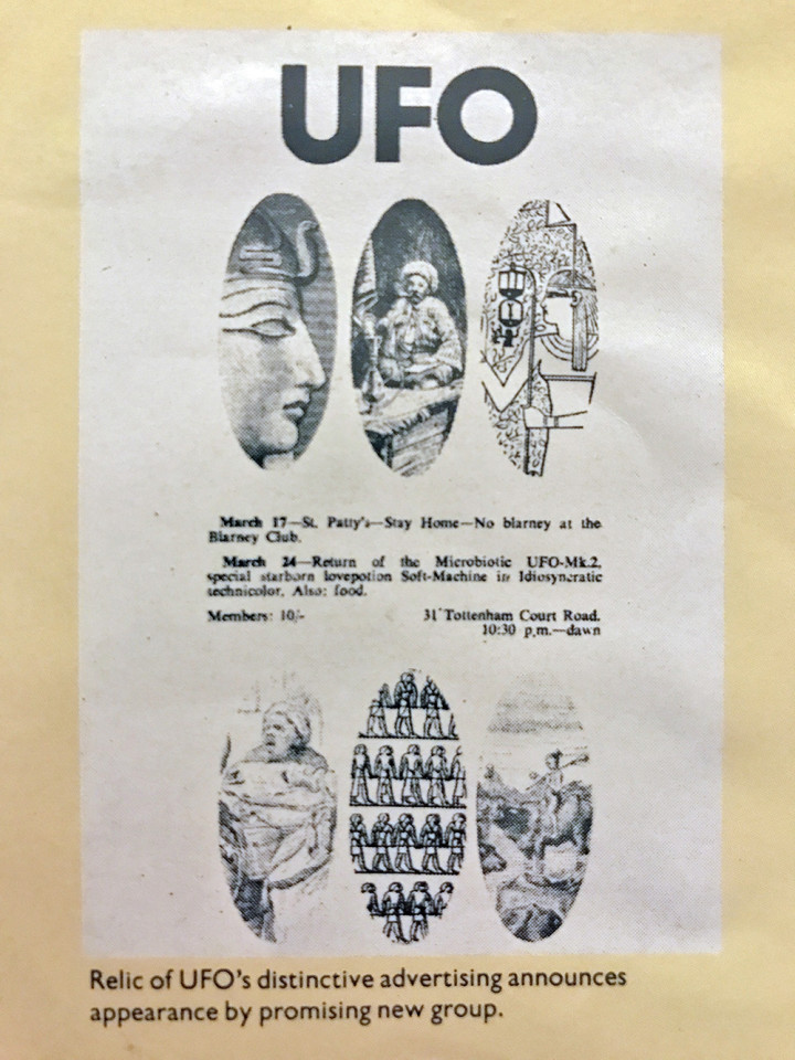
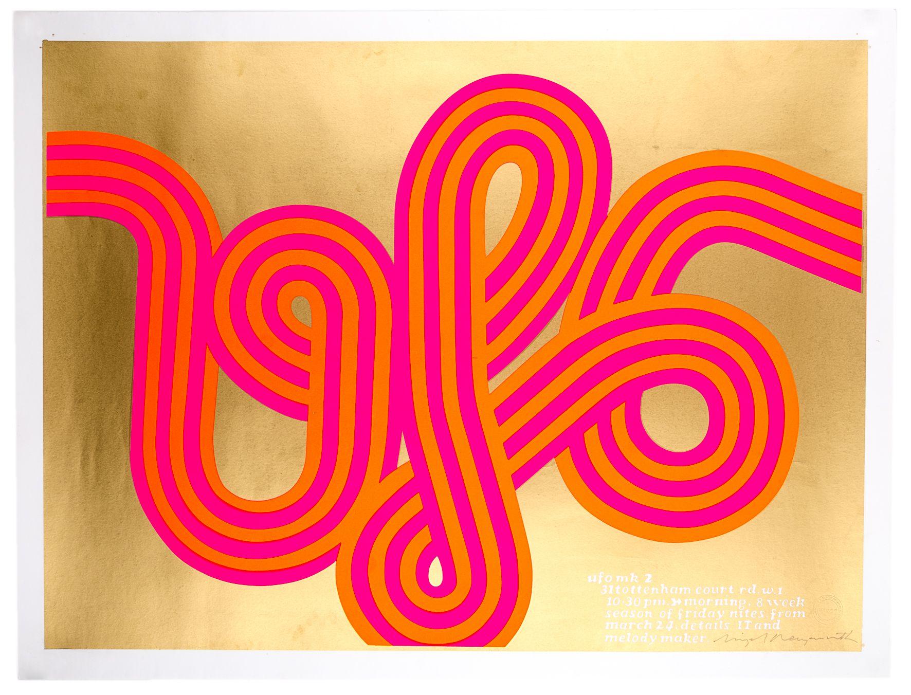
The classic ‘UFO Mk2’ by Hapshash & The Coloured Coat, this is the reprint, stamped and signed by Nigel Waymouth
24 Mar: Soft Machine
31 Mar: Crazy World of Arthur Brown; Pink Alberts; ‘spot the fuzz contest’
7 Apr: Soft Machine
14 Apr: Arthur Brown; Social Deviants; Special: the fuzz
21 Apr: Pink Floyd
28 Apr: Tomorrow; The Purple Gang
(29/30 Apr: The 14 Hour Technicolor Dream at the Alexandra Palace) – To be covered in a future post…
5 May: Soft Machine; Arthur Brown
12 May: The Graham Bond Organisation; Procol Harum
19 May: Tomorrow; Arthur Brown; The People Show
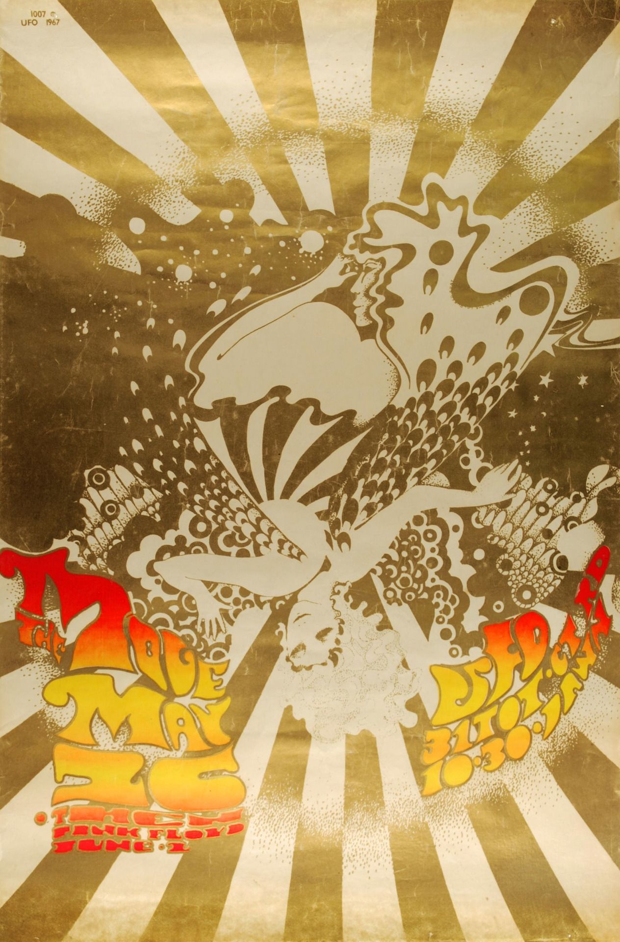
26 May: The Move, The Knack
2 Jun: Pink Floyd; Soft Machine; The Tales of Ollin dance group; Hydrogen Jukebox
Poster by Jacob And The Coloured Coat (Michael English & Nigel Waymouth)
9 Jun: Procol Harum; The Smoke
10 Jun: Pink Floyd
16 Jun: Crazy World of Arthur Brown; Soft Machine; The People Blues Band 4.30am
23 Jun: Liverpool Love Festival; The Trip
30 Jun: Tomorrow; The Knack; Dead Sea Fruit
7 Jul: Denny Laine; The Pretty Things
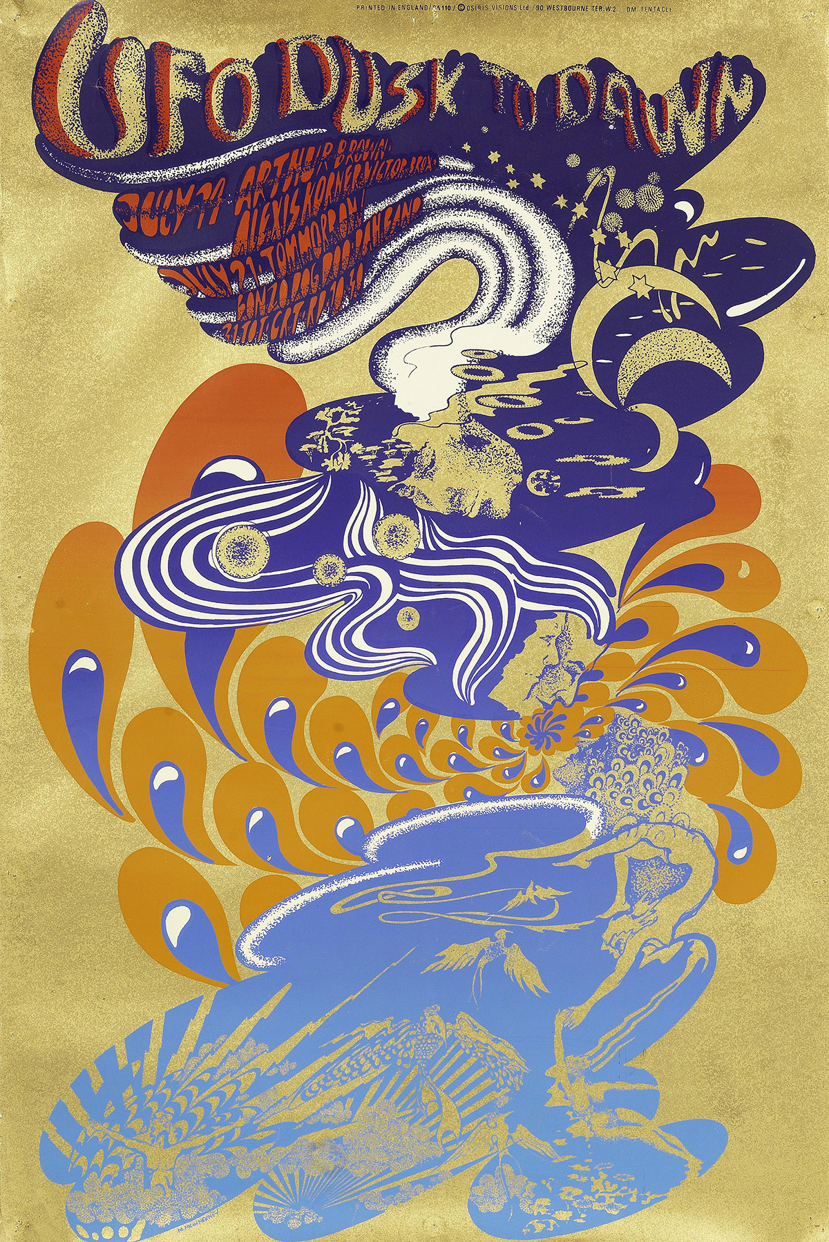
UPDATE: Rare colour variant via the High Meadows Vintage Posters amazing poster site, absolutely essential, give them a follow.
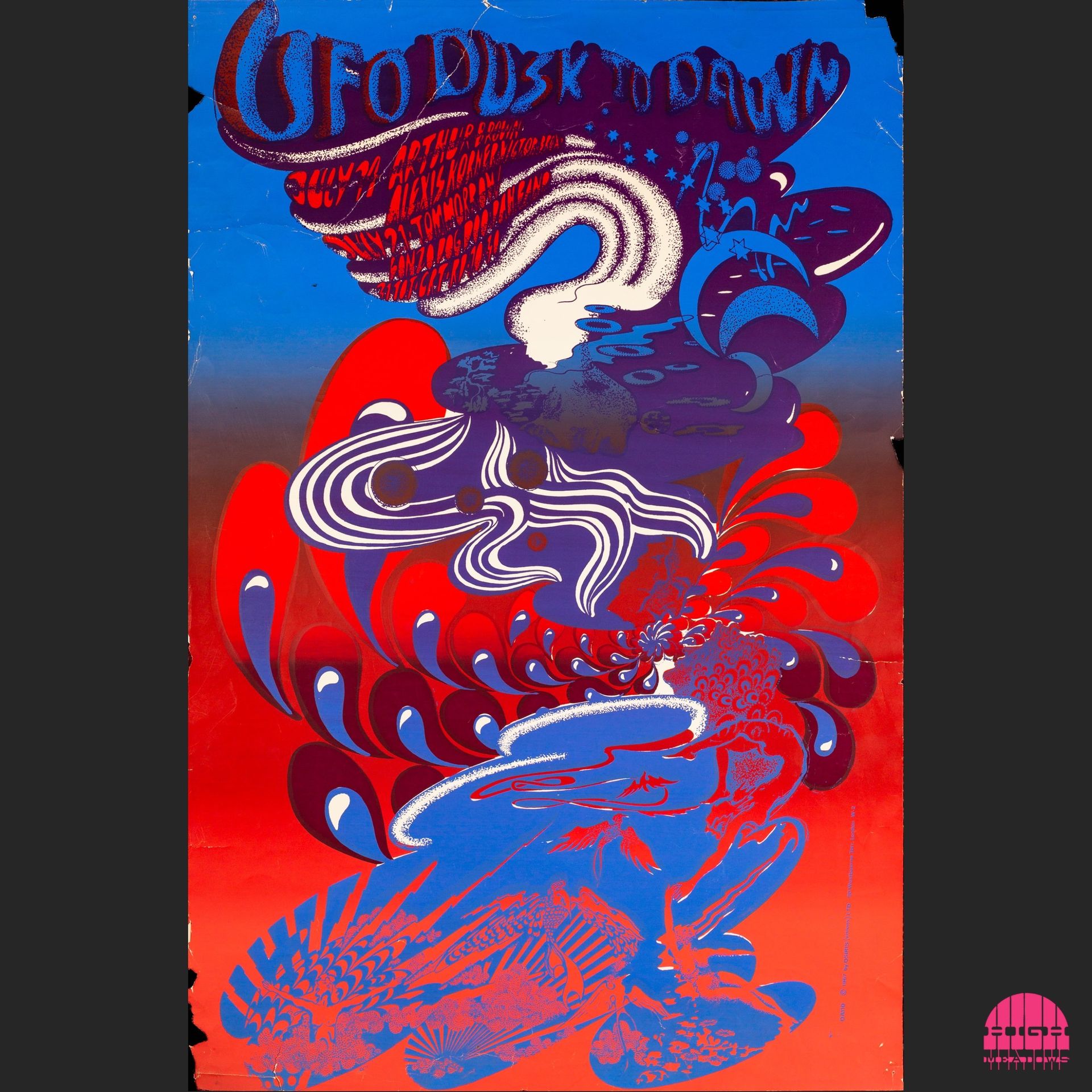
A more accurate line up on this new poster for the next two dates
14 Jul: Arthur Brown; Alexis Korner; Victor Brox
21 Jul: Tomorrow; Bonzo Dog Doo Dah Band
28 Jul: Pink Floyd; CIA v UFO; Fairport Convention; Shiva’s Children
After an article published in the News of the World on 30 July, the landlord told Joe Boyd the UFO could not continue at the Blarney and Boyd decided to use the larger Roundhouse venue.
4 Aug: Eric Burdon & The New Animals; Family; The Hydrogen Juke Box
11 Aug: Tomorrow
18 Aug: Arthur Brown; The Incredible String Band
1/2 Sep: UFO Festival: Pink Floyd; Soft Machine; The Move; Arthur Brown; Tomorrow; Denny Laine
8 Sep: Eric Burdon & The New Animals; Aynsley Dunbar
15 Sep: Soft Machine; Family
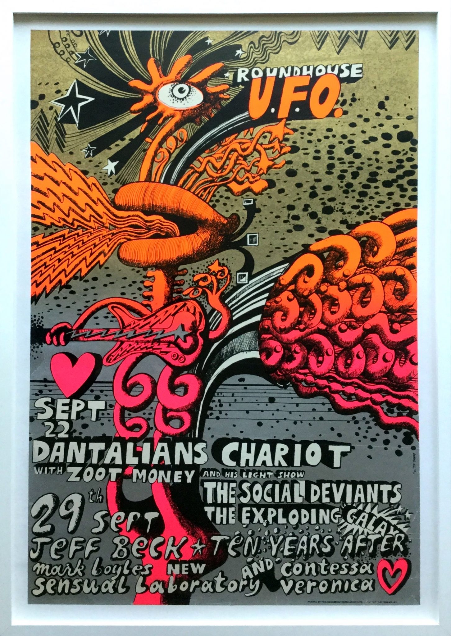
This fantastic Martin Sharp poster sadly heralded the end of the UFO’s run at the Roundhouse.
22 Sep: Dantalian’s Chariot w/ Zoot Money & His Light Show; The Social Deviants; The Exploding Galaxy
29 Sep: Jeff Beck; Ten Years After; Mark Boyle’s New Sensual Laboratory; Contessa Veronica
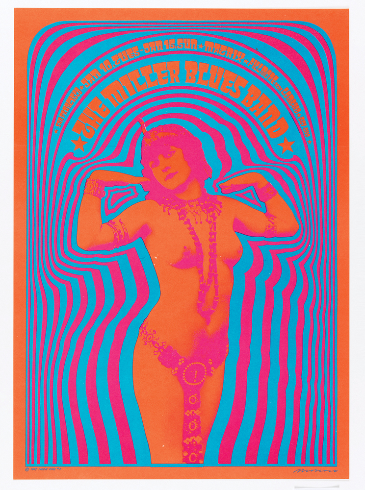
Photo: Matt Flynn © Smithsonian Institution
‘Poster From The Past’ – #2 in the Neon Rose series by the legendary Victor Moscoso – plus original artwork below. 55 years ago today.
![]()
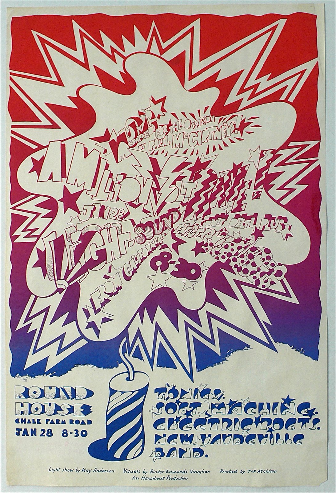
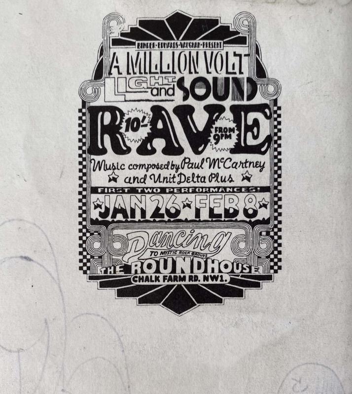
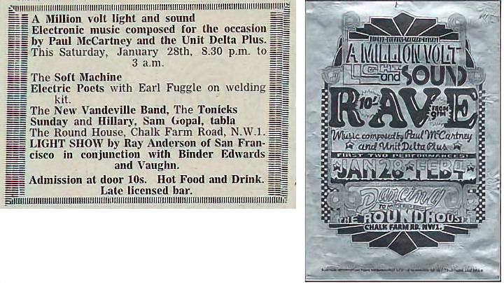
The Million Volt Light & Sound Rave was put on at The Roundhouse over two separate days in early 1967 by the Binder Edwards Vaughan / BEV design partnership of Douglas Binder, Dudley Edwards and David Vaughan.
Sometimes also known as the Carnival of Light Rave, it most famously featured the airing of ‘Carnival of Light’, Paul McCartney’s mythical 14 minute musique concrete piece, specially made for the occasion with the participation of the other three Beatles. Vaughan had painted a piano for McCartney the year before and asked if he would be up for contributing something whilst delivering it. It was played a number of times during the two events and hasn’t been officially released since. Less heralded was a performance of tape music by Unit Delta Plus, the trio of Delia Derbyshire, Brian Hodgson and Peter Zinovieff although it’s unknown if they were there in person to play it or if it was just playback. Also on the bill, Tonics, Soft Machine and Electric Poets which consisted of Soft Machine‘s Daevid Allen and Robert Wyatt with Gilli Smyth and Early Fuggle on welding kit (according to a clipping from International Times). Allen and Smyth of course went on to form Gong. The poster and flyer above and below I’m presuming were done by BEV although I can’t find any confirmation of this anywhere, if anyone knows please leave a comment.
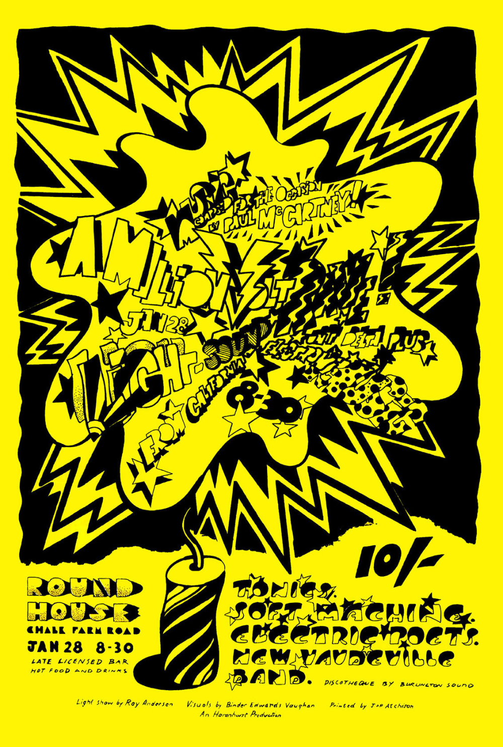
Above, A Million Volt Rave flyer for the first event, these also exist on white, below, detail from BEV headed stationary that was found dumped in a skip outside a mill in Manchester, 1999. The collection of papers included sketches for McCartney’s piano and a list of BEV commissions was found by builder Andy Clynes, more info and photos here. This design has also been found printed on silver paper as a poster (see below) and may be an early draft (I’m speculating here).
 Here’s Dudley Edwards talking about the event, he reveals that an unknown Jimi Hendrix was also on the bill.
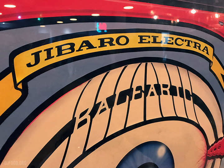
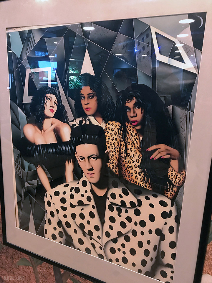
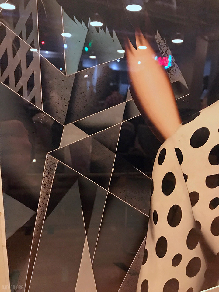
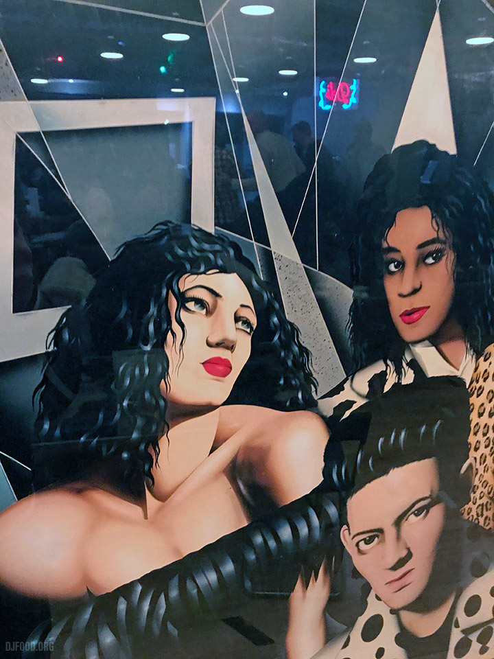
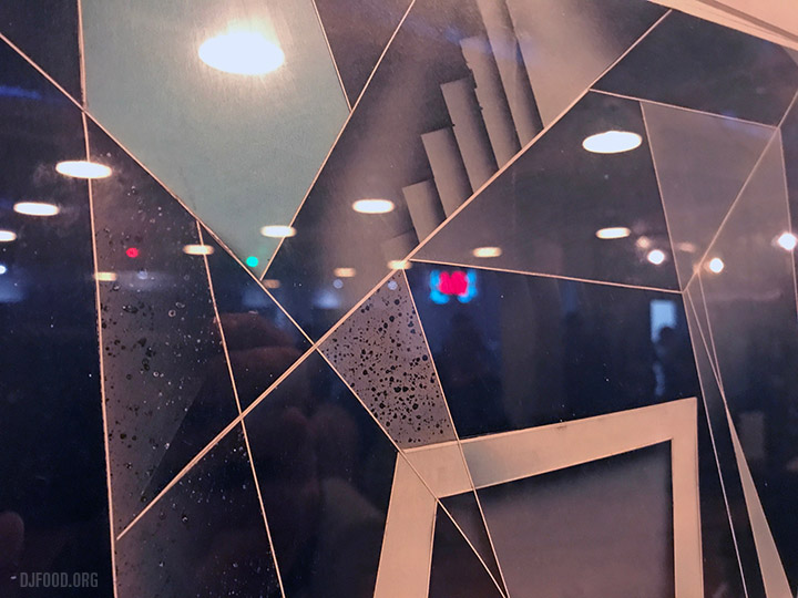
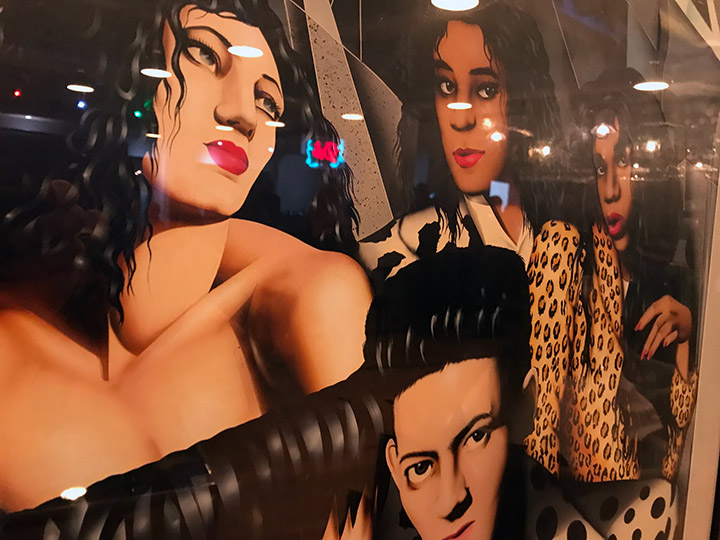
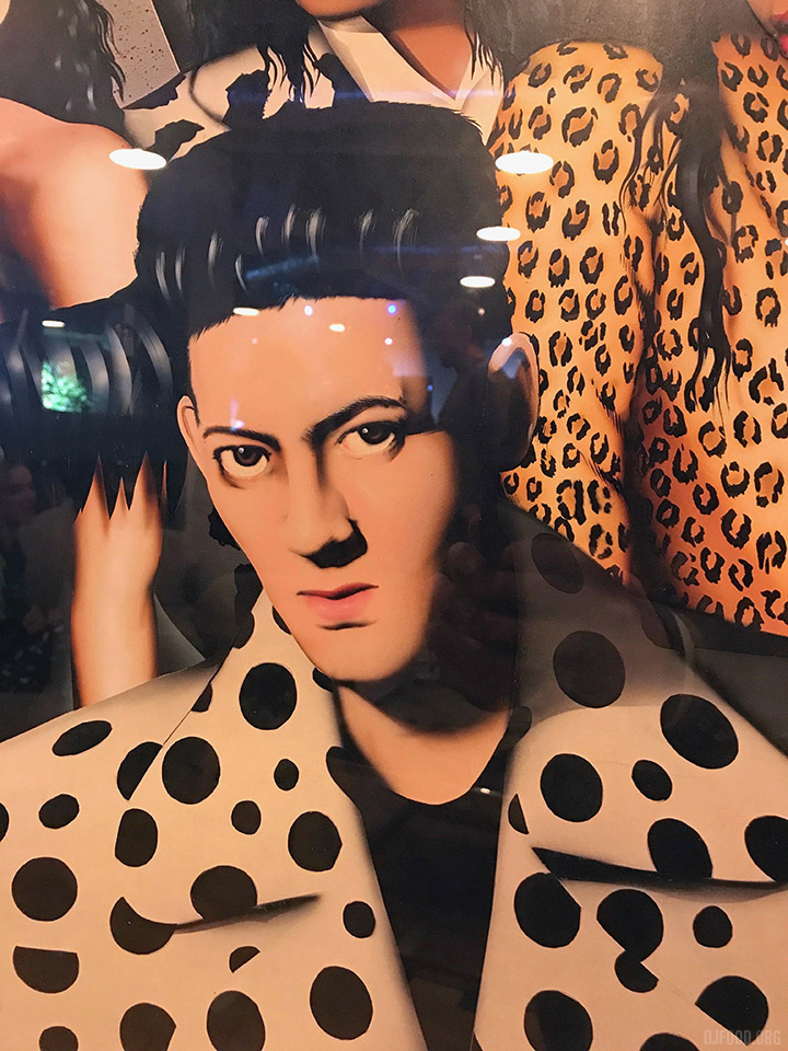
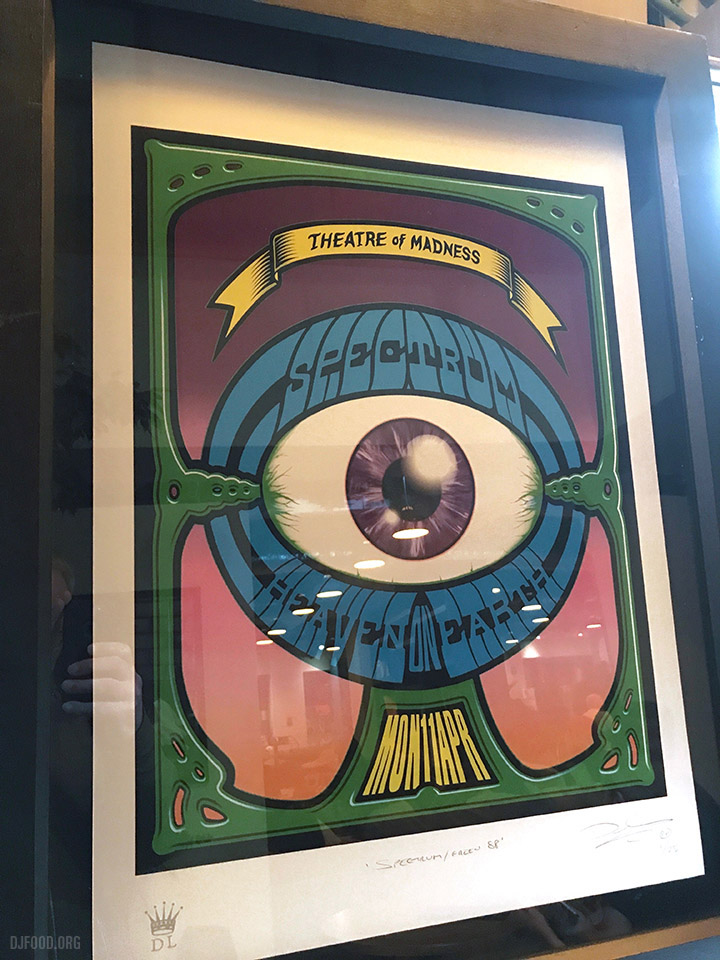
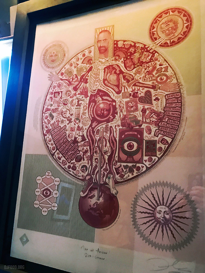
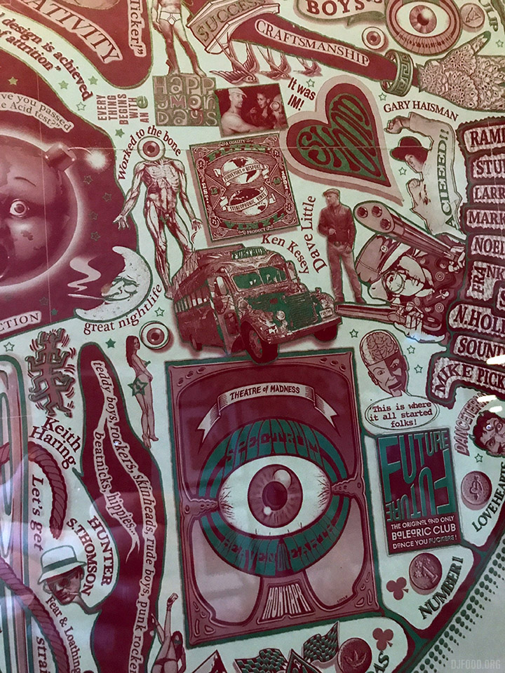
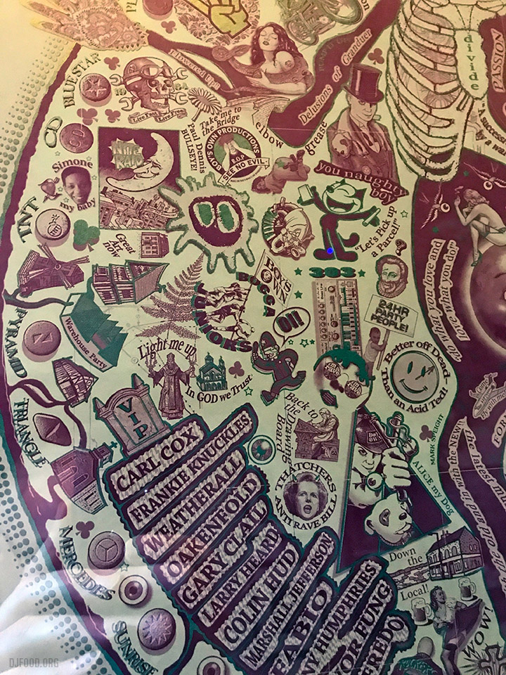
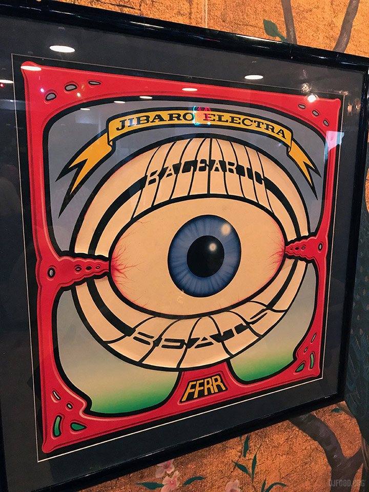 I was amazed to see the originals of Dave Little‘s covers for S’Express‘ Original Soundtrack album and Jibraro ‘Electra’ 12″ at the screening of the 1988 documentary, Club Culture tonight at Arboretum. There was a small show of his work including Renegade Soundwave, Spectrum, Junior Boys Own and his Acid screen print. If you look closely at the Jibaro sleeve you can see the stuck on lettering peeling away. You can buy some of these as prints from Dave’s site.
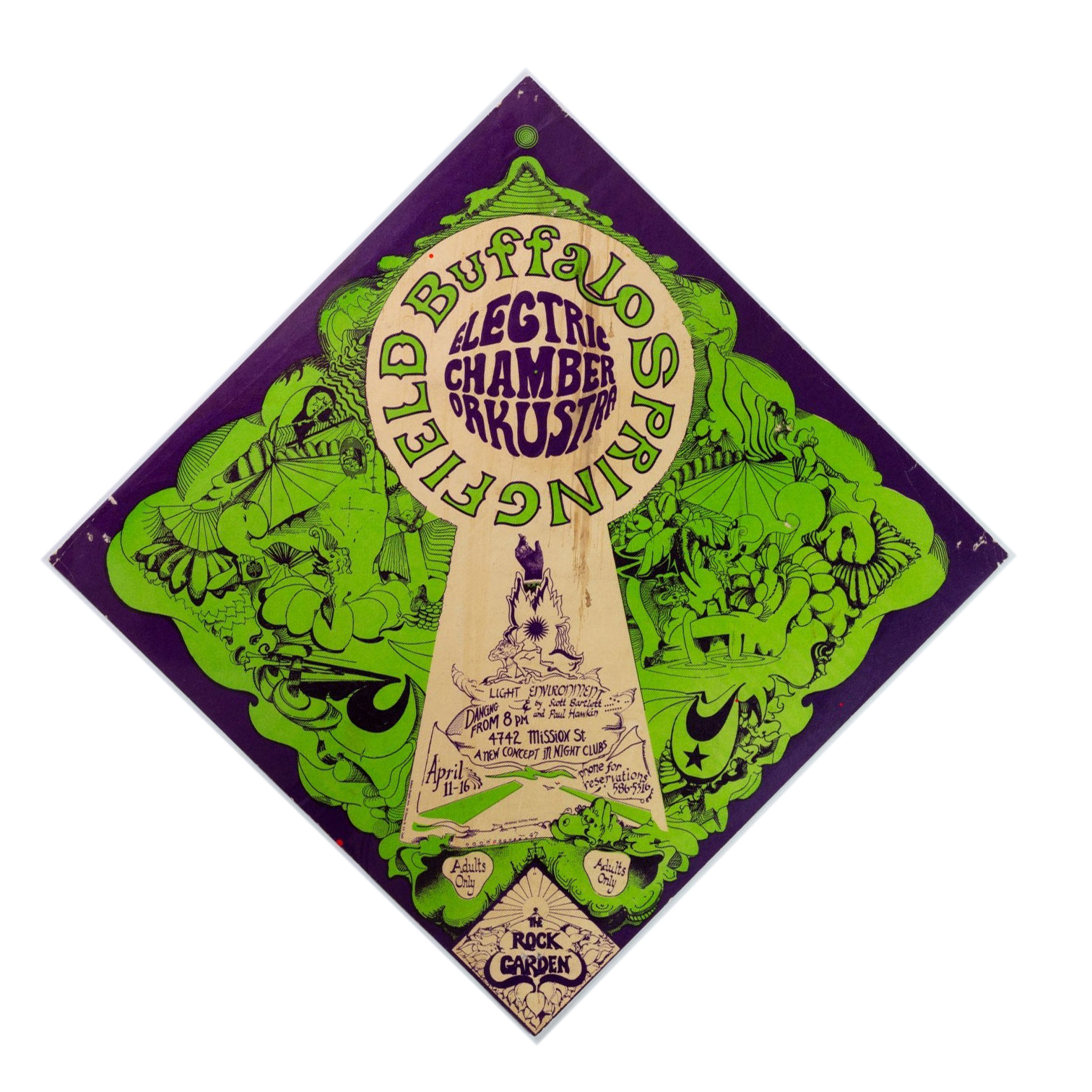
Apparently these flyer don’t come up for sale very often and I’ve certainly never seen one. There are only three in this diamond style and they are extremely rare. Hard to tell who the artist is although it looks like there may be a signature near the bottom of the keyhole shape. Anyway, saw this and thought I’d share.
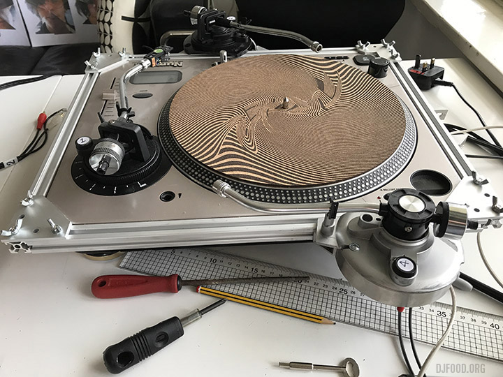
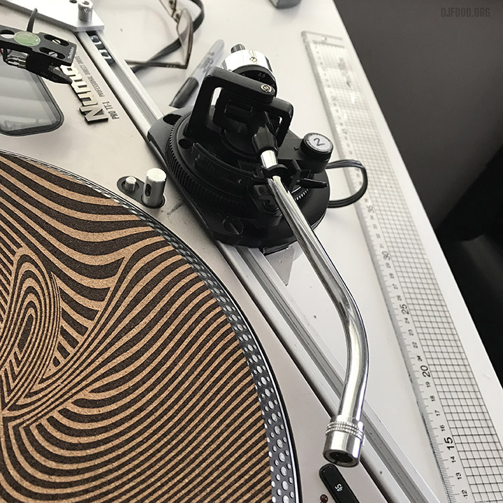
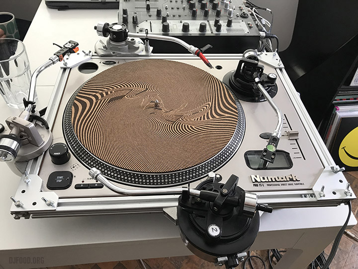 The Quadraphon Mk II – a lot of last week was spent working on this, making container pods that hold three extra tone arms, attached to a modular sliding rail that can be fitted over any DJ turntable.
Each tone arm can be moved and locked into position to recalibrate where the arm sits in the groove and the whole thing comes apart for portability.
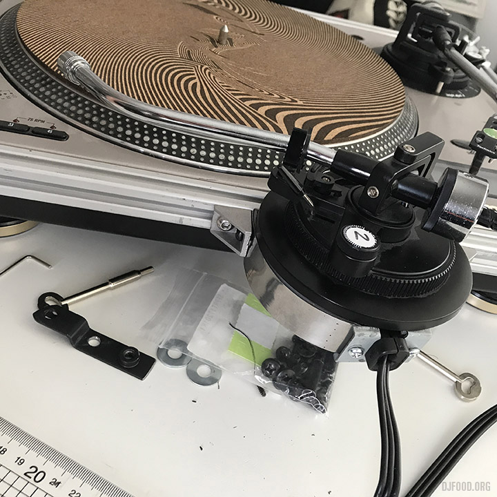
It’s not perfect but better than the Mark I which had free-standing tone arms. Still got to perfect the sliding action to make it smoother and retool one of the pods but it all works. If you want to hear what comes out of such a contraption then check out the releases on my Infinite Illectrik label on Bandcamp.
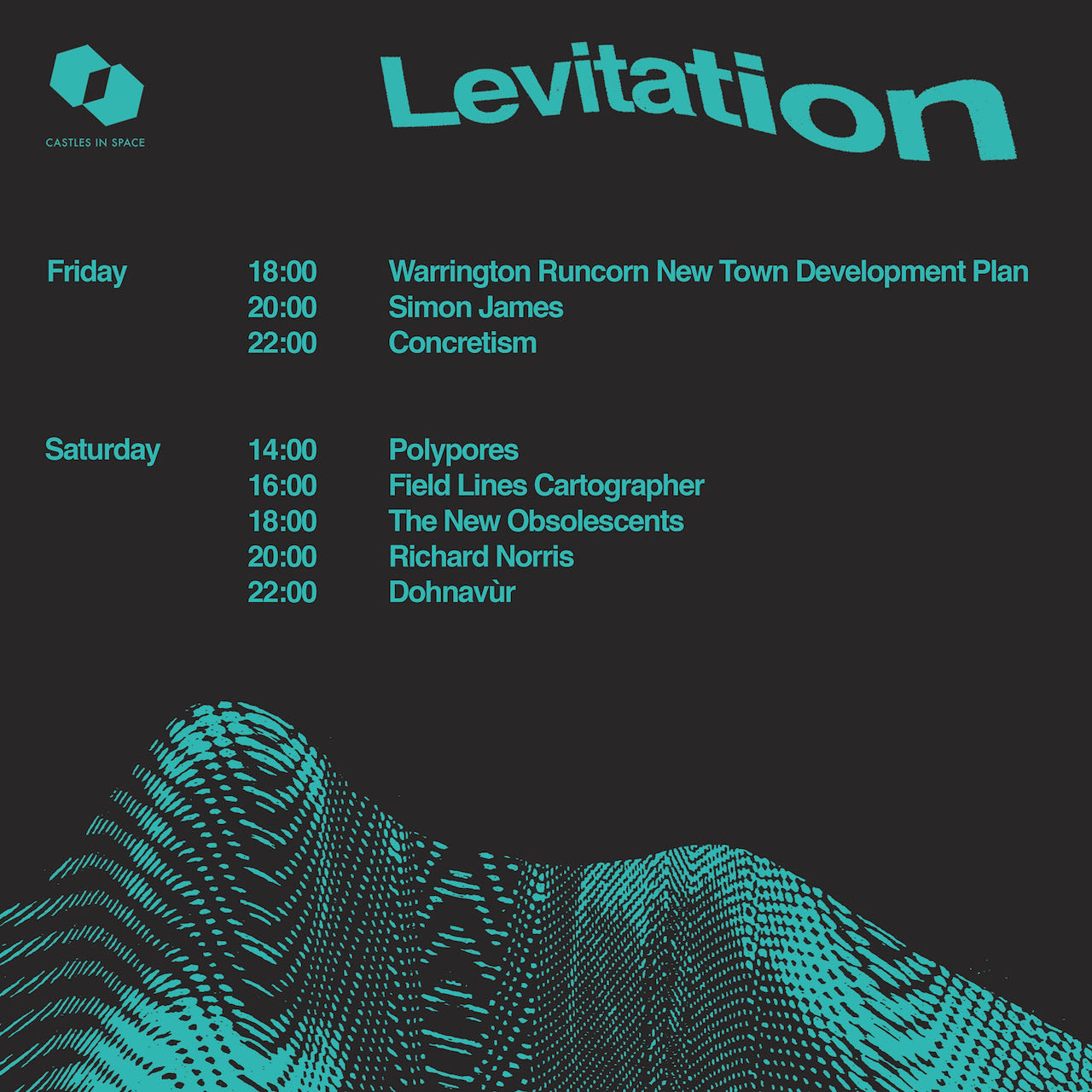
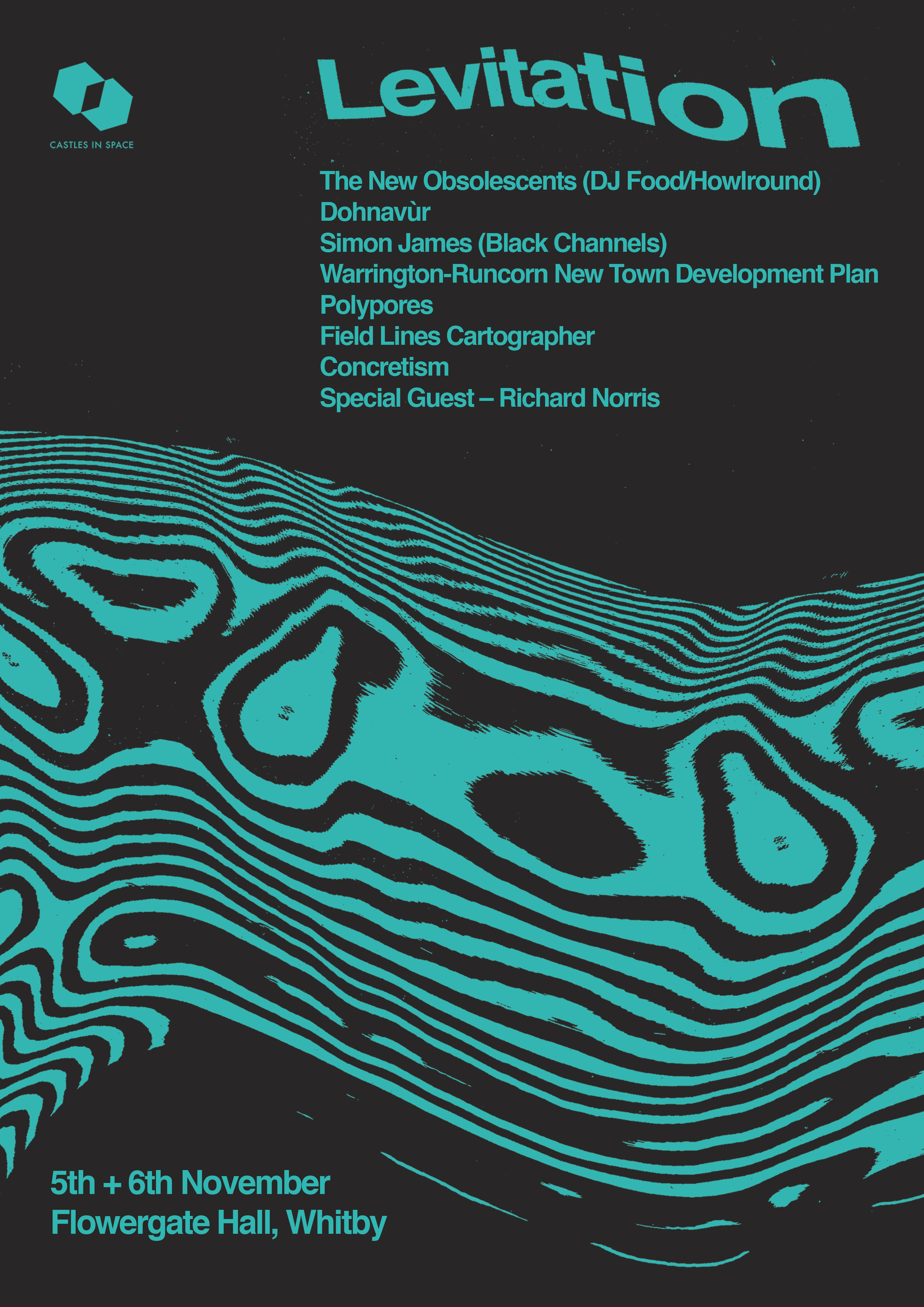
Its debut should be at the Castles In Space Levitation show in Whitby, Nov 6th as part of The New Obsolescents’ first proper live show, the time and details of which are below. There are two nights and tickets can be bought here
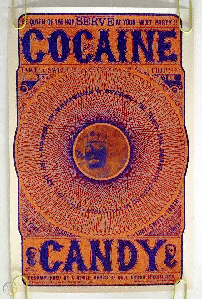
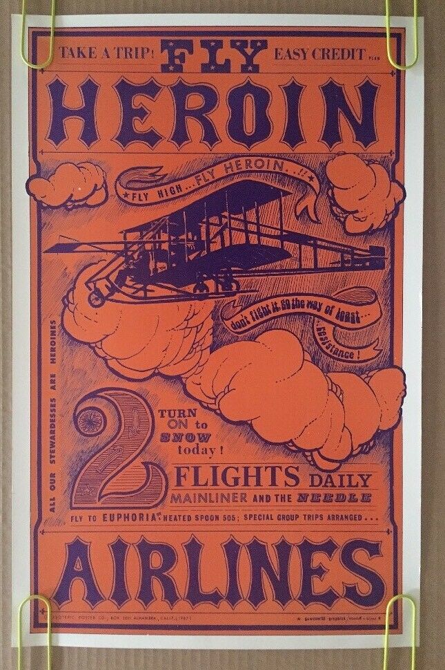
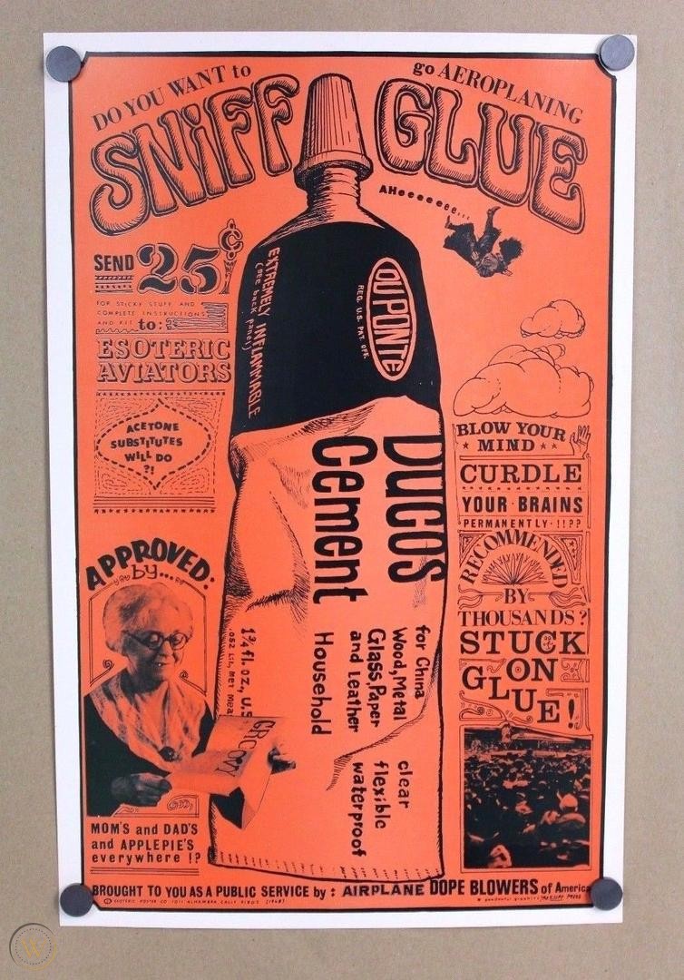
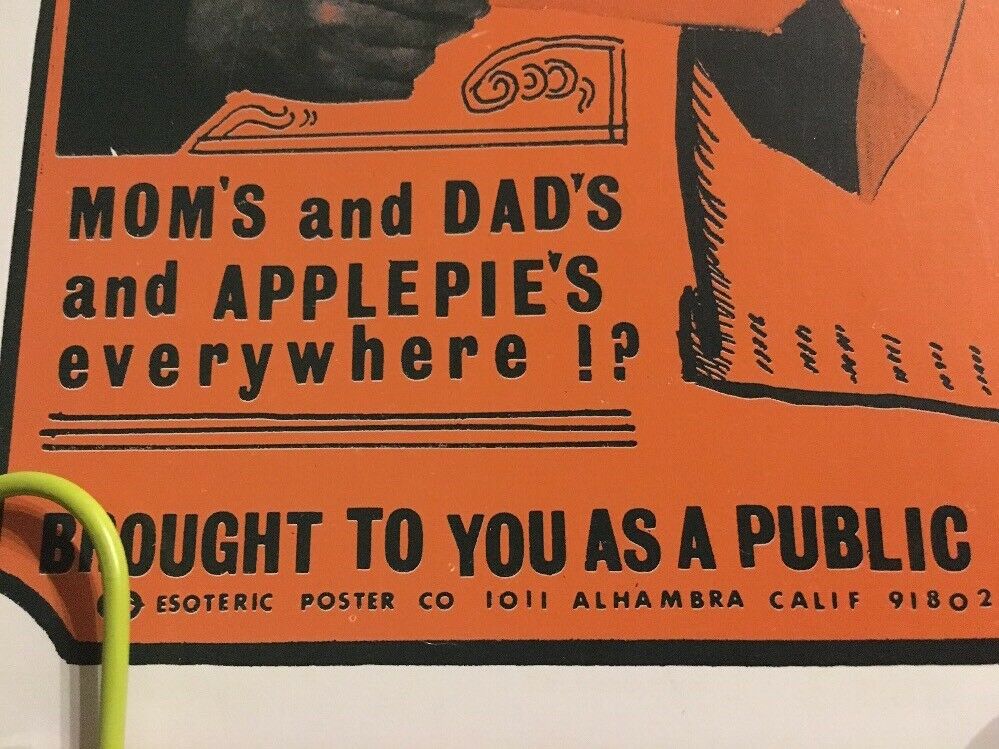
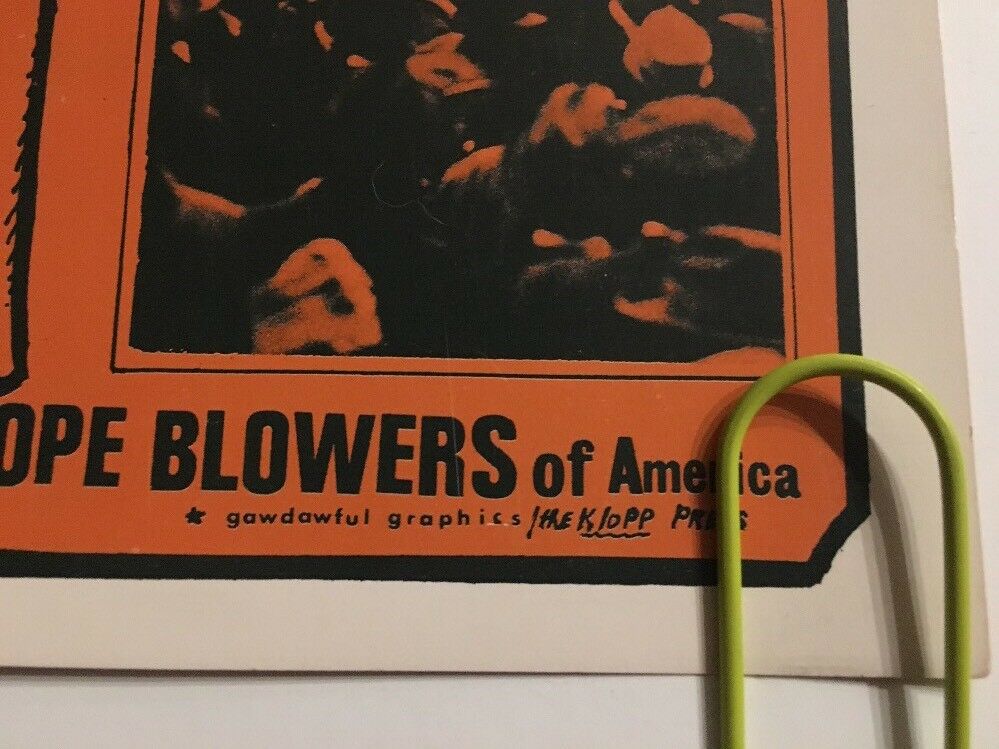
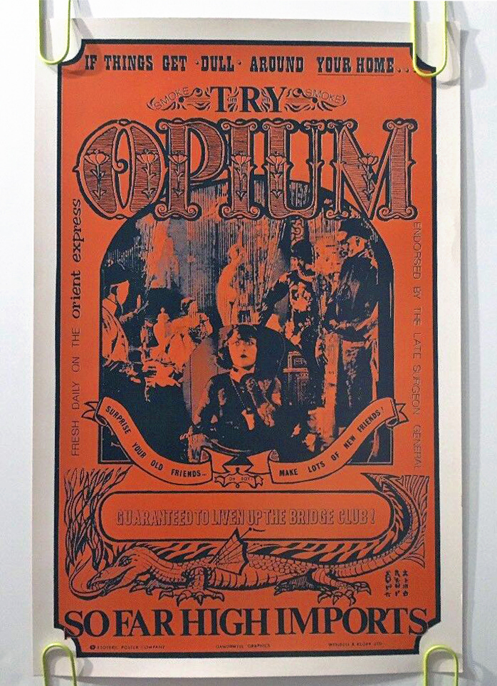
On my travels round the web I ran across these late 60s parody drug posters – the following info was cribbed from the Worthpoint website:
Vintage Psychedelic Poster ‘Cocaine Candy’ Limited Print
Published by The Esoteric Poster Company in 1967
Hand-Pulled Serigraph on Thick Stock Paper, Semi-Gloss Finish
Original Art by Robert Wendell, after Roland Crump
Printing by Gawdawful Graphics / Wendell & Klopp
20″ x 13″ Black Light Sensitive
The Esoteric Poster Company, founded by Howard Morseburg in California during the early 1960’s, had a brief run before folding for good in 1968. The beatnik satirical ‘drug’ parody posters achieved popularity from the community they sought to mock. Owner and founder Howard Morseburg hired artists Roland Crump (acclaimed Disney animator) and Robert Wendell to produce the designs. Very limited printing, less than 300 (as low as 100) printed.. among the most collectible and prized of all 1960’s psychedelic era posters.
Guaranteed original from very limited back stock, from Howard Morseburg’s gallery in Alhambra, California.
A bit more history:
Howard Morseburg (1924-2012) began his career in the art business in the 1950s. He was a World War II veteran who had served in the Merchant Marine and later worked in the book and magazine business. As a young officer during the war, Morseburg was on the “Murmansk Run” to the Soviet Union and other perilous wartime voyages through the submarine-infested North Atlantic. It was one of Morseburg’s friends from this time, a young skipper named Jim Greenberg, who was to introduce him to the art business.
After the war, this friend became a ship’s captain on the Atlantic route, and began importing paintings by European artists to the United States. In Europe, which was still suffering from the economic after effects of the war, there was no appreciable market for these artists’ work. During the 1950s Greenberg began selling the paintings he imported to galleries, furniture stores and interior designers who were then developing a wider consumer market for art than had existed before the war. From his base in Seattle, where he and his young family were then living, Howard Morseburg followed suit, and he began selling paintings imported from Europe throughout the western United States.
In addition to the European paintings he received, Morseburg began representing young American artists. He also became involved in the West Coast printmaking movement. In the late 1950s and early 1960s he started to represent young artists like Wayne Thiebaud, Elton Bennett and Mel Ramos, who created their own hand-pulled prints. It was this interest in printmaking that helped lead to his next venture.
The Beatnik Posters: About 1960, Morseburg became interested in creating humorous and satirical posters. At this time, the “beatnik” movement was in full swing and coffee houses and jazz clubs were full of beatniks spouting free-form poetry to the beat of bongo drums. To Morseburg, the beatnik movement found in Greenwich Village, Seattle, San Francisco and the East Bay was ripe for satire. He met a talented young Disney artist and Imagineer named Roland Crump at a gift shop in the San Fernando Valley, just north of Los Angeles. Crump was a brilliant and eccentric young artist and designer who became one of the most important Disney “Imagineers.” Crump was already producing some hand-pulled beatnik posters before he met Morseburg, but once the association began, Morseburg had larger quantities of some of the posters published using the photo-offset process.
Crump designed a series of images that satirized the drug culture that was developing among the Beats, which Morseburg took on the road, travelling down the coast from Seattle to San Diego. In that era, drug use was not widespread and they were chiefly popular with musicians and beatnik hipsters. So, Esoteric Poster’s first releases were “Smoke Marijuana,” “Fly High, Fly Heroin Airlines” “Cocaine” and “Opium.”The next posters were which poked fun at a Beatnik club, and “Big Liz,” which was a colorful poster of a Beatnik princess. Those 30″ x 24″ posters were silk screened in three colours and for posterity’s sake they cost $0.50 to produce, were sold to book stores for only $1.00 and retailed for $1.95.
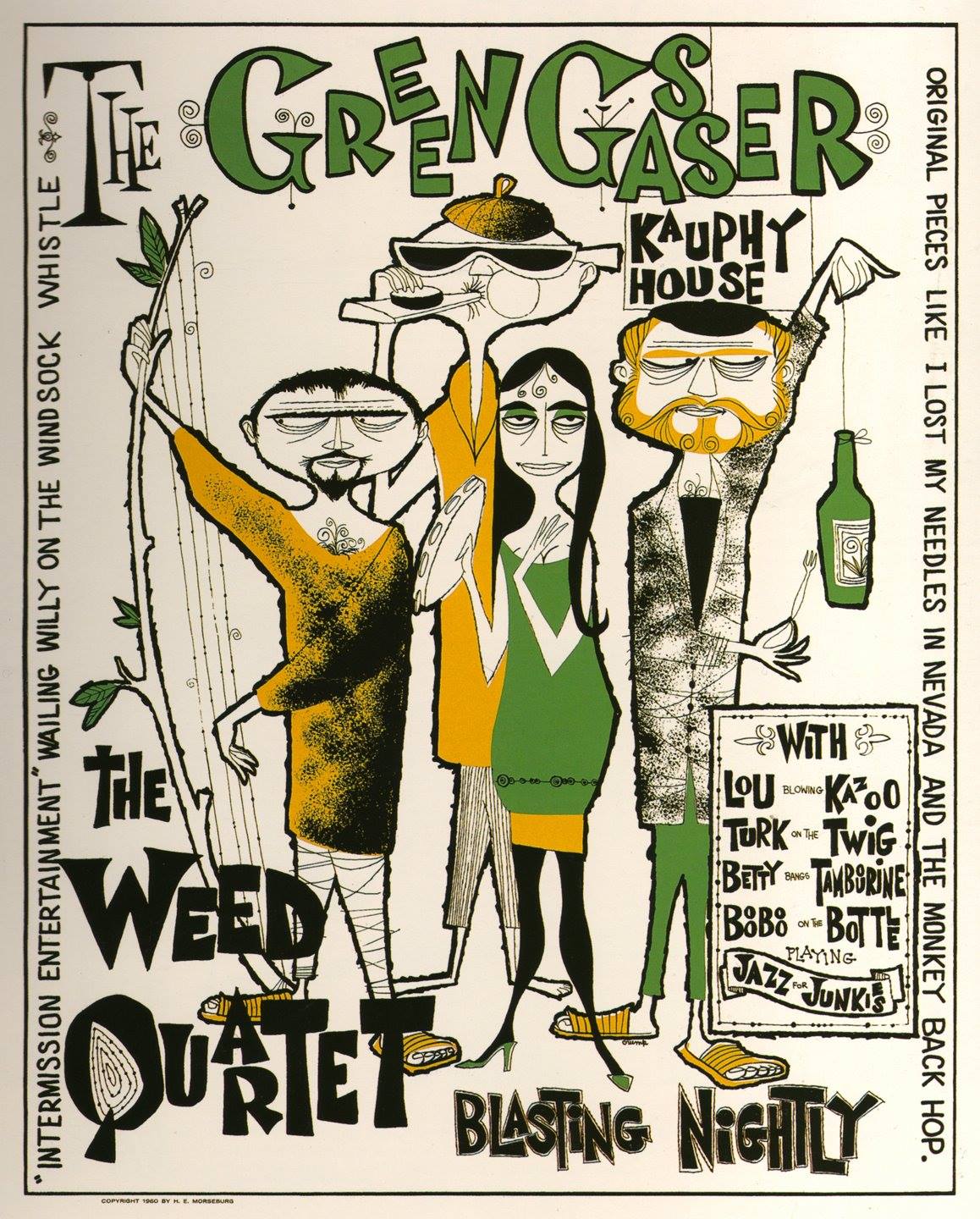 In the course of his frequent sales trips to visit art galleries, Morseburg personally distributed Esoteric’s posters. His primary outlets for the posters were the book stores along the west coast that catered to college students in Berkeley, Stanford, Portland, Seattle, San Francisco and San Diego. These posters were produced as very early critical parody of the drug culture by the Esoteric Poster Company, but the message was so subtle that they were popular among the very community they sought to mock.
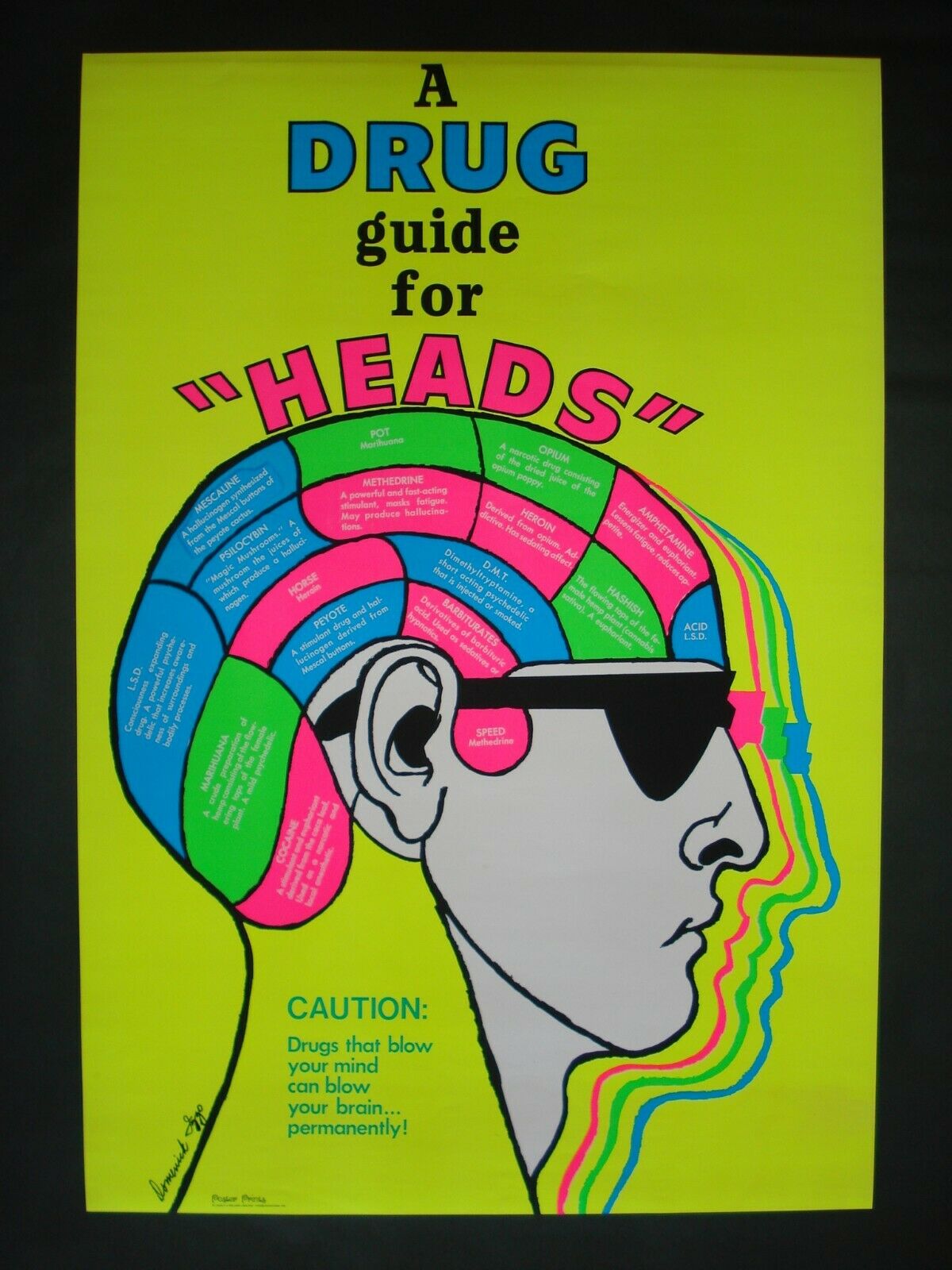
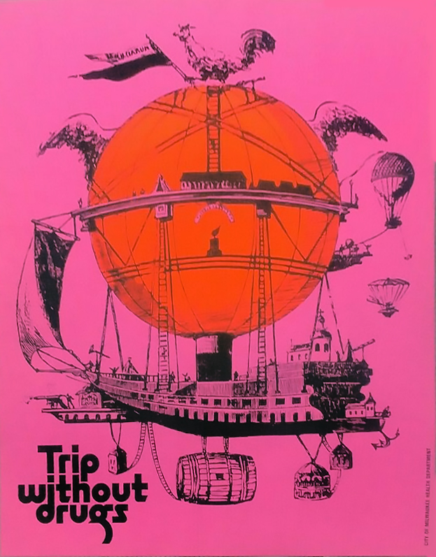
Below are a few more I’ve run across although details about dates and print houses are scarce but I’m reasonably sure they’re from the same era.
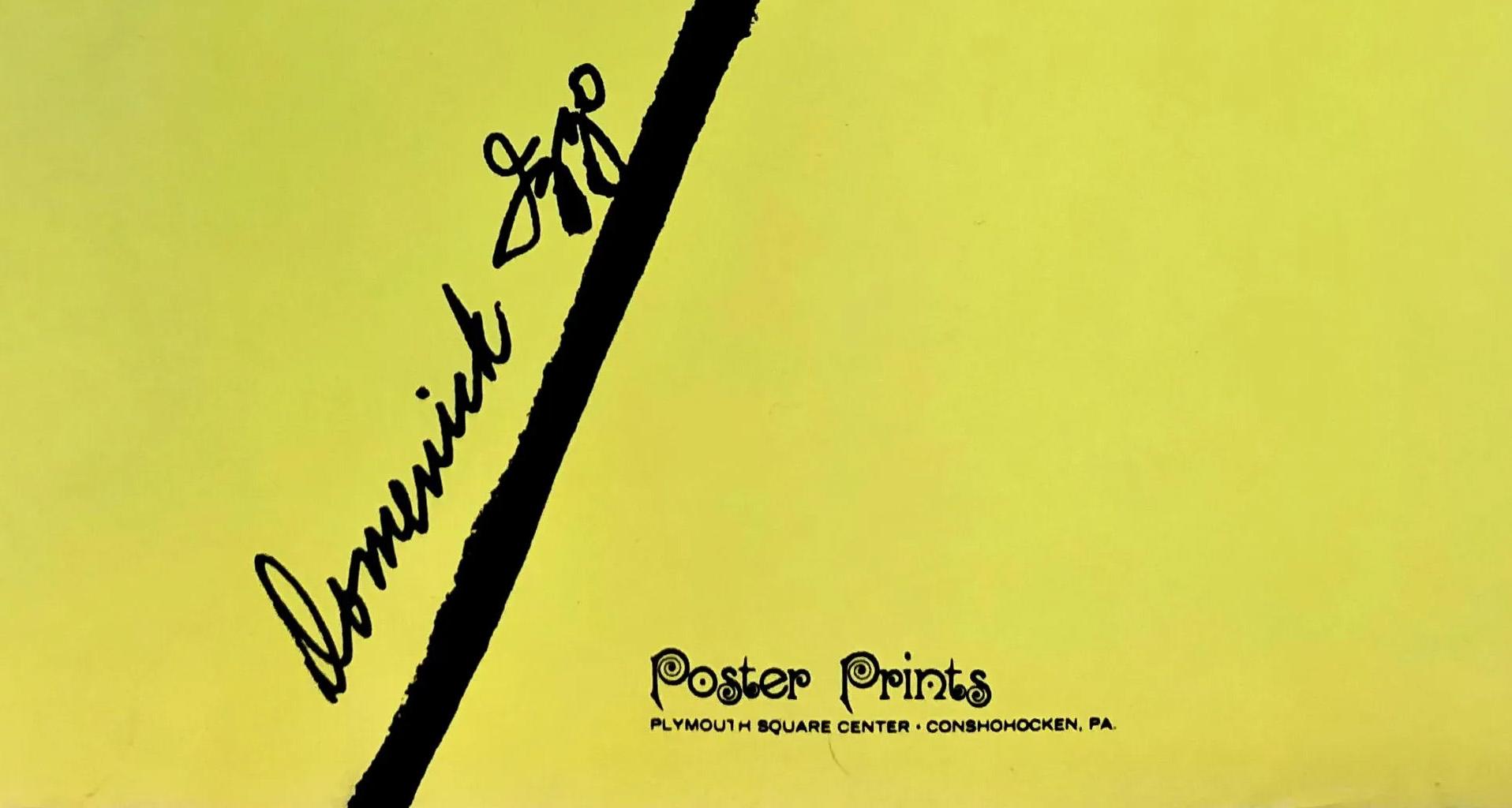
Original vintage black light ultra violet poster designed by Dominick Jago, 1969.
Depiction of the pharmacopeia of the era.
Publisher: Poster Prints, Plymouth Square Center-Conshohocken, PA.
Dimensions: full sheet: 21″ x 31.5″
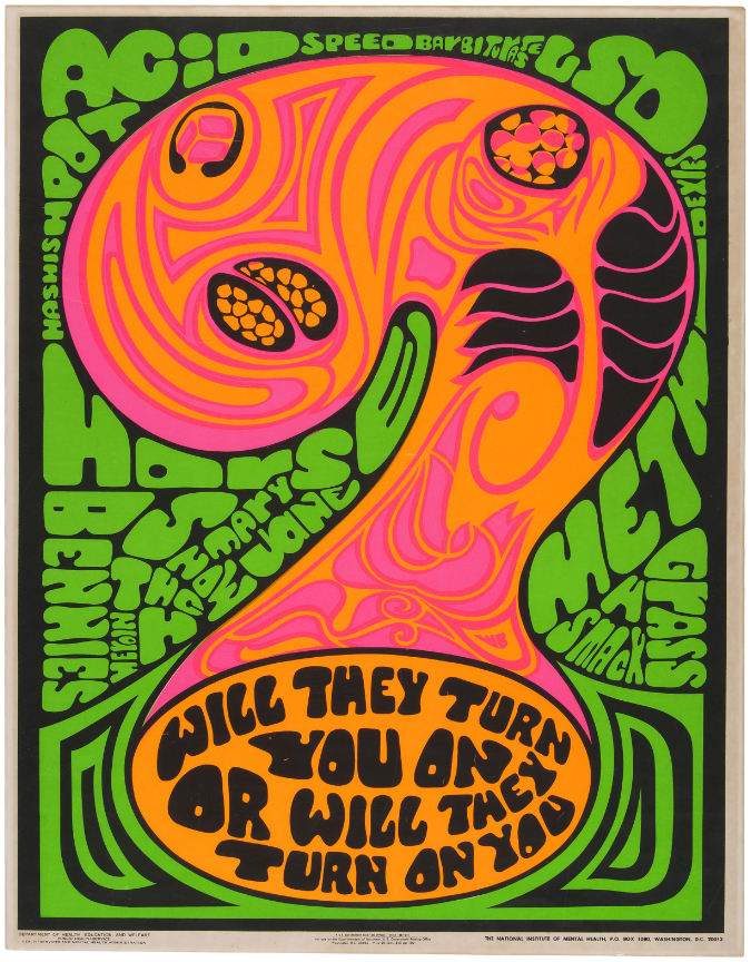
Printed by The US Department of Health, Education and Welfare; Public Health Services and Mental Health Administration, possibly 1969 although other sources say 70’s.
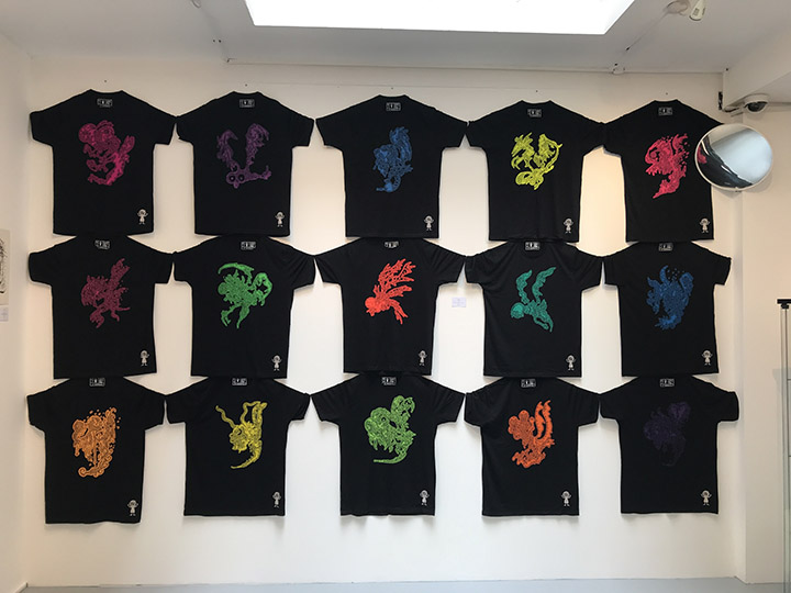
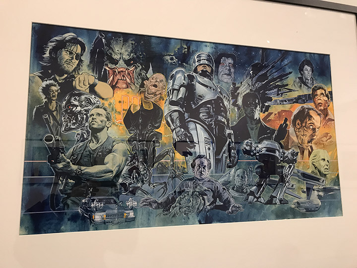
There’s a free Savage Pencil exhibition at Orbital Space for the month of September, that being the new name for Orbital Comics on 8 Great Newport Street, Covent Garden. There are T-shirts and prints for sale as well as prices on most of the artwork although they’re not cheap. It’s great to see the originals to the Nothing Short of Total War compilation on Blast First as well as several others and Edwin’s visual bite hasn’t dimmed in the last 40 years.
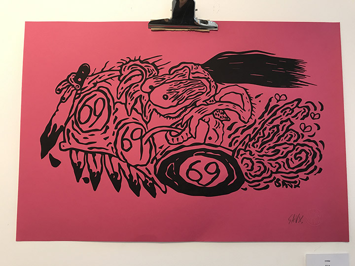
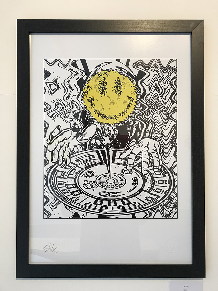
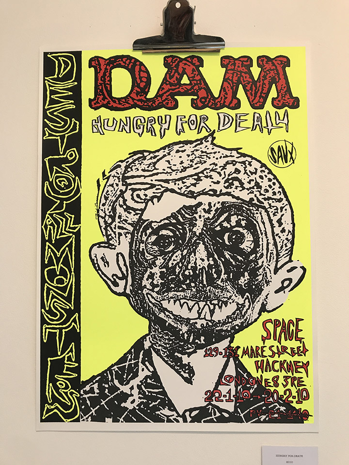
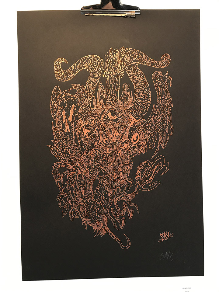
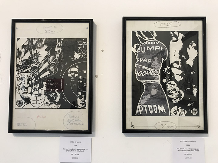
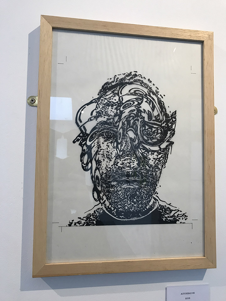
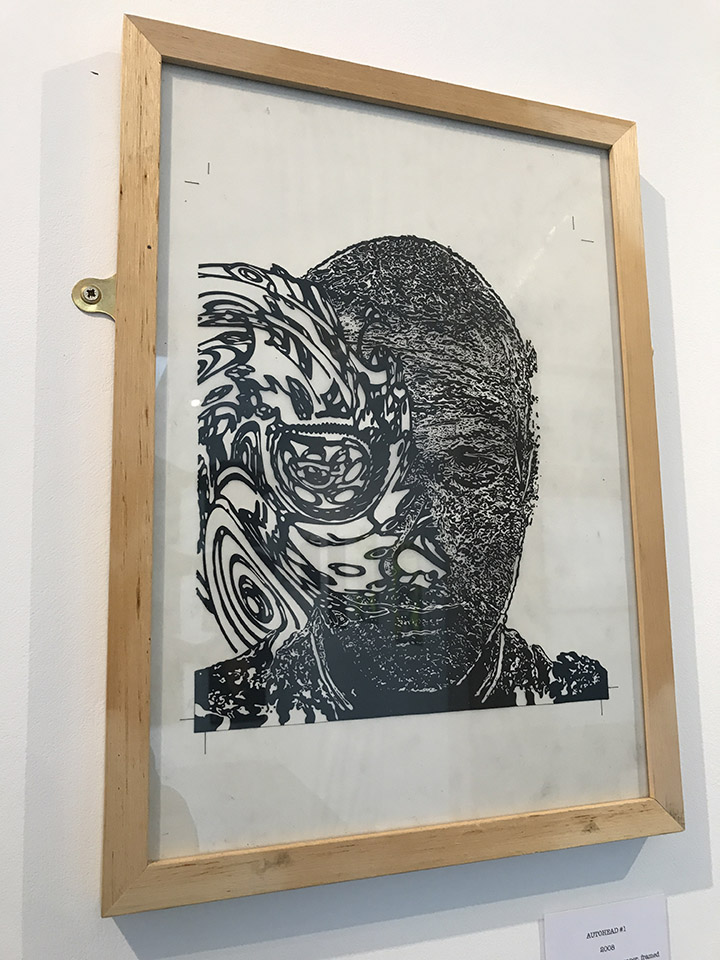
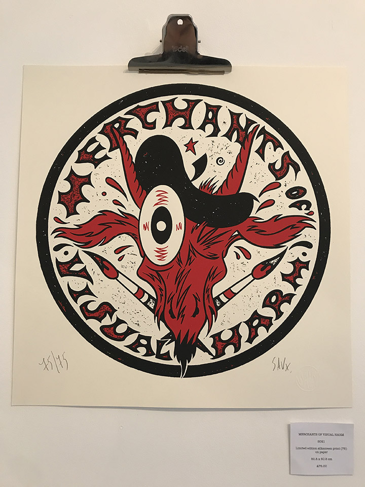
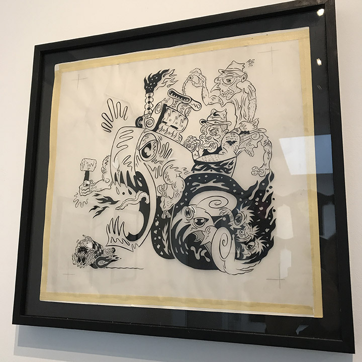
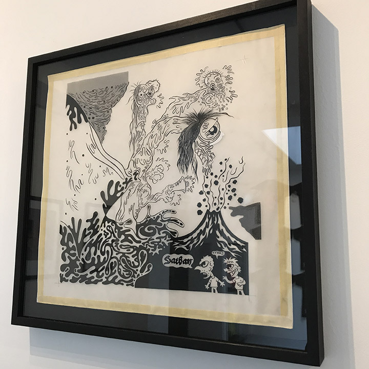
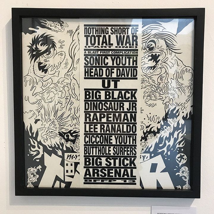
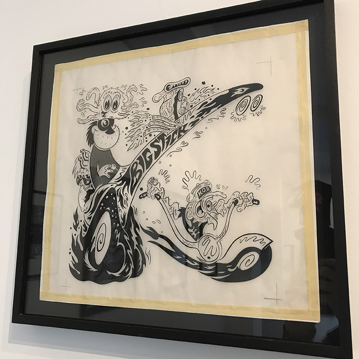
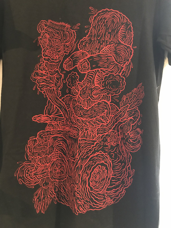
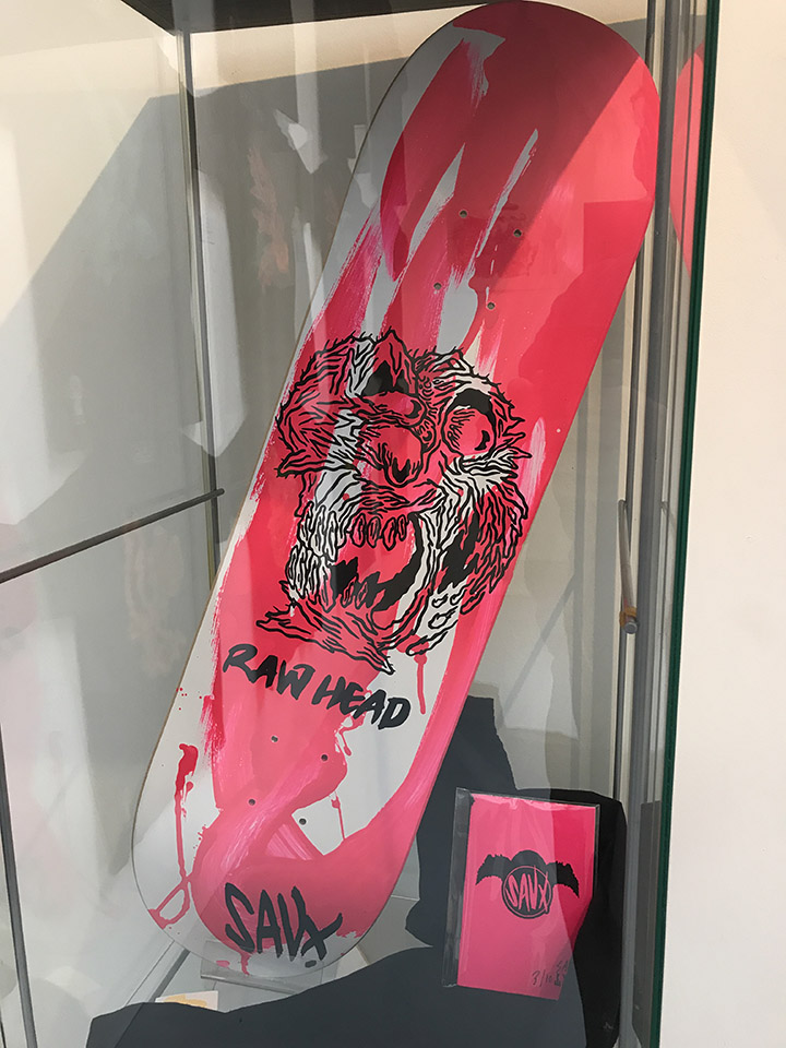
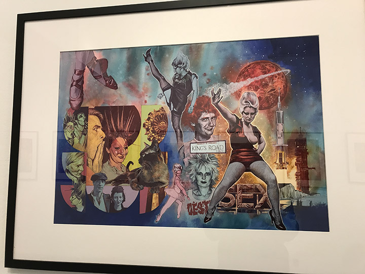
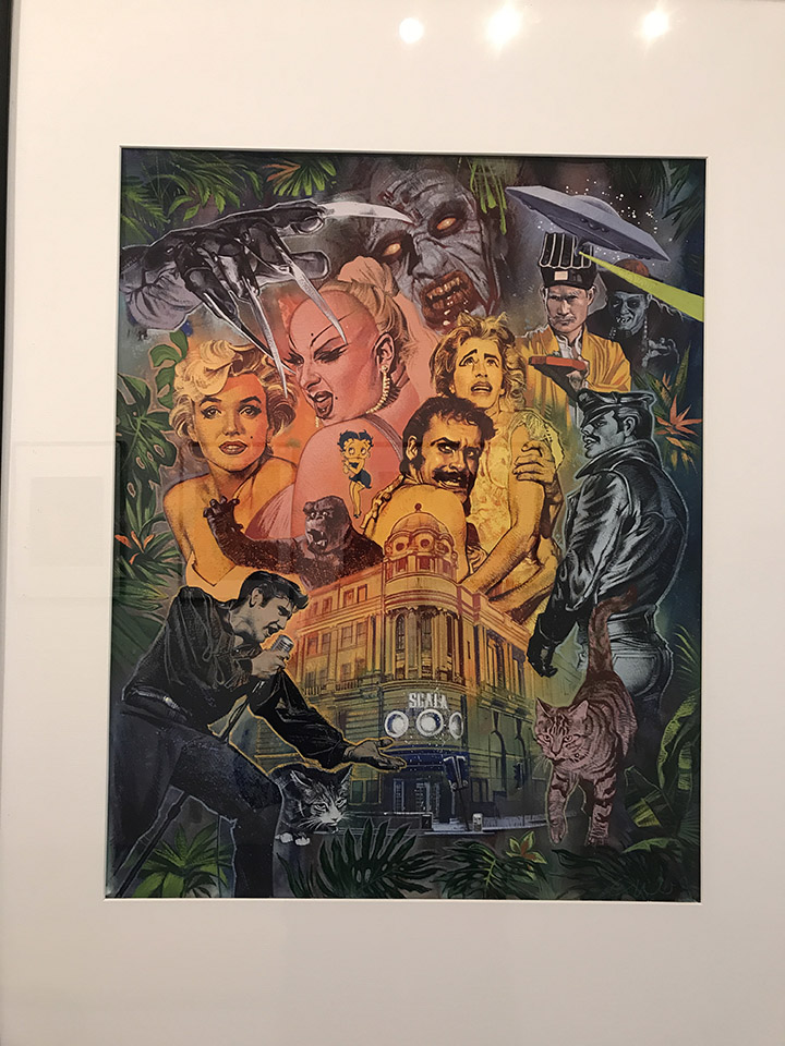
In the front of the shop there’s also a great display of Graham Humphreys‘ work for film and books, mainly dealing with horror or B movie content. It’s great to see the originals and most are for sale although some have already been taken.
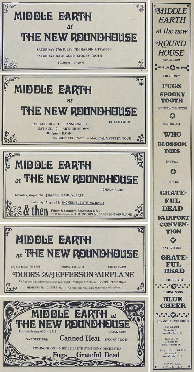
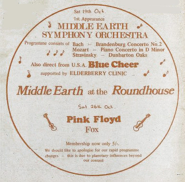
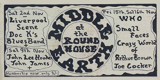
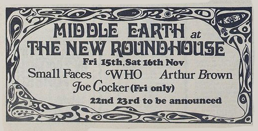
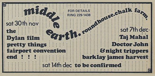
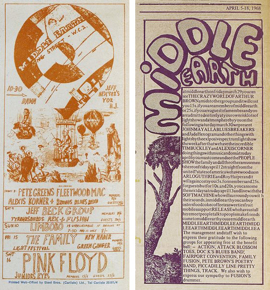
In this second part of Middle Earth flyers collected from the International Times archive we get to the point where the club moved from their original Covent Garden home to The New Roundhouse in Chalk Farm after numerous raids by the police. At the top we see the Magical Mystery Tour event still advertised on Aug 24th/25th 1968 (see previous post) but by the next issue (two weeks later) it was replaced by a regular gig featuring Traffic, Family and Free but with a large ‘& then’ before announcing The Doors and Jefferson Airplane gig. There’s a uniformity to these ads previously unseen at the old venue, broken by the tall thin ad above right and the circular orange one below which advertises a programme of classical music by the Middle Earth Symphony Orchestra!
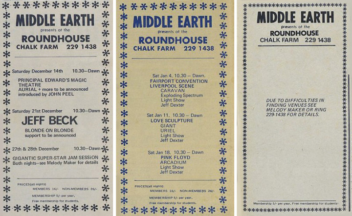
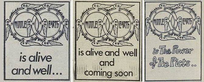
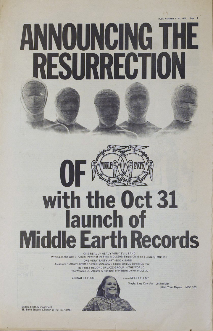
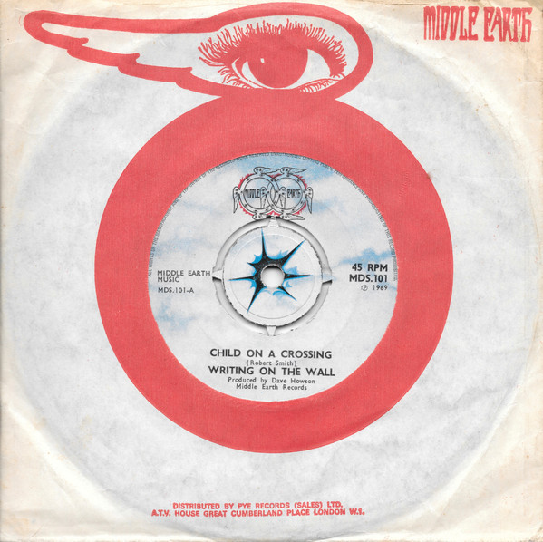
Problems with The Roundhouse meant that the club was forced to move again by early 1969, the nearly blank advert above appearing mid February in IT. Following a message in the next issue stating they’d moved to the Royalty Cinema in Notting Hill Gate, a month’s worth of gigs were later listed through March into April. After that things appeared to dry up until a series of tiny ads appeared in September, one a week, stating, ‘Middle Earth is alive and well…’ ‘and coming soon’, ‘is The Power of The Picts’. Then in November, a full page ad announced the rebirth of the night as a record label with a management address in Soho Square. It lasted for two years, releasing five singles and five albums in that time, there’s a short history of it here.
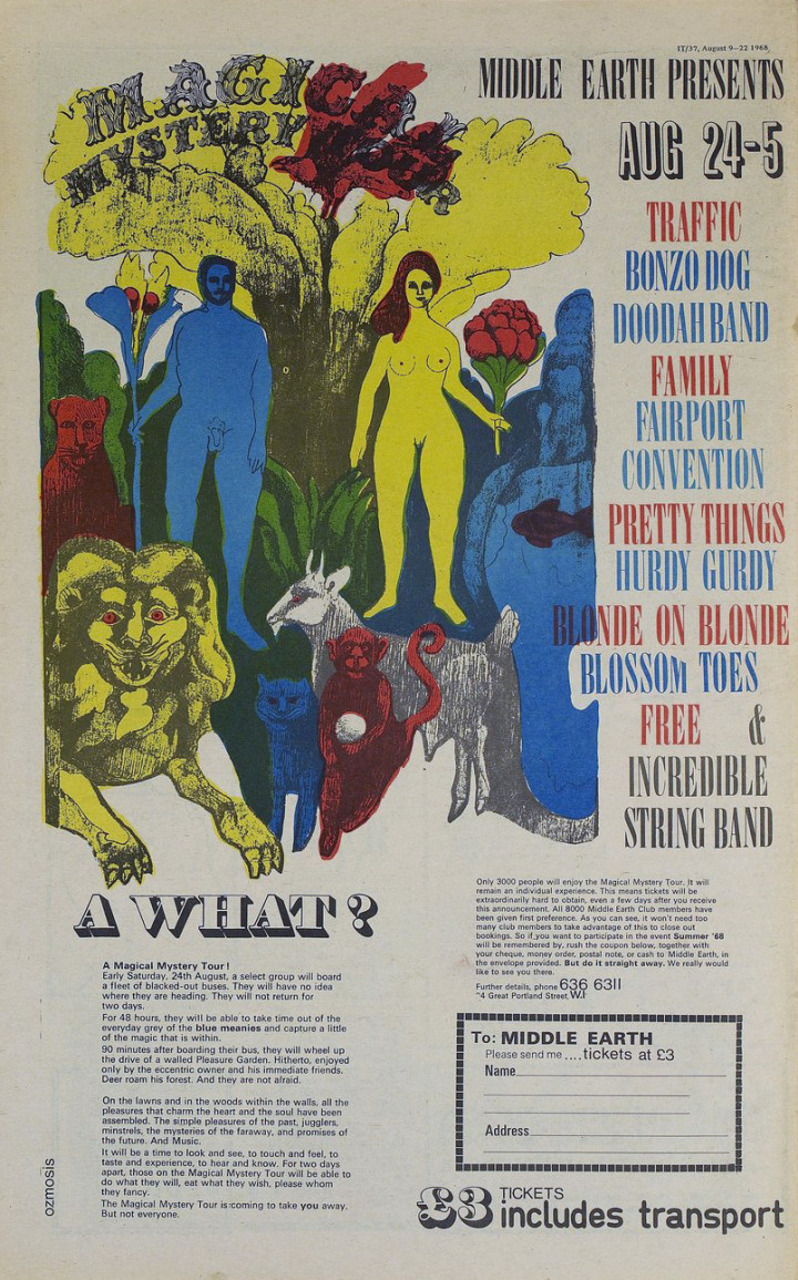
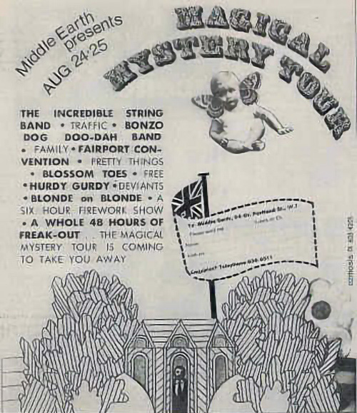
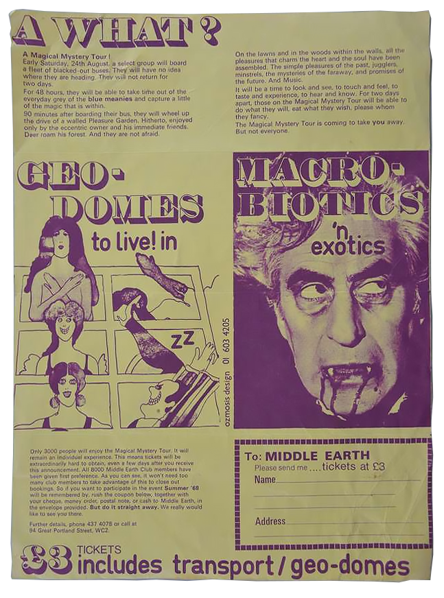
The full page back cover advert above appeared in the 9th Aug 1968 issue of International Times magazine, promises much and looks like some sort of insane bargain for the princely sum of £3. The idea of the event, as you can read from the text, was to take 3,000 paying punters on a Magical Mystery Tour via a fleet of blacked out buses. 90 minutes later attendees would disembark inside a ‘walled Pleasure Garden’ with deer roaming in the grounds for 48 hrs of music, mischief and mayhem. Undoubtedly taking its name from The Beatles’ song of the same name released the previous year, there were reportedly the first showings of the film of the same name due to take place but I’ve not been able to confirm this.
The first sign of the impending gig was a small ad in the back of the 12th July 1968 issue of IT with just these words…
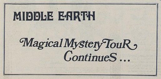
This also seems to coincide with the moment when Middle Earth at the King St. address in Covent Garden moved to The (New) Roundhouse in Chalk Farm with some reports suggesting that this event even took place at that venue. Again this seems to be pure speculation and hardly fits the bill of the advertised ‘lawns and woods within the walls’ plus how would they do a six hour firework show indoors?
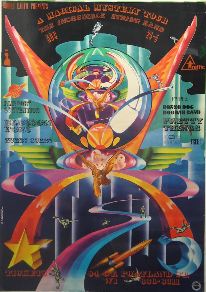
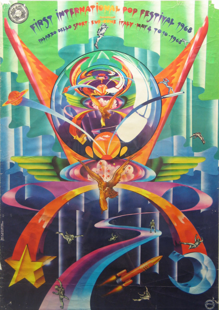
Above is a full colour poster for the event by Hapshash & The Coloured Coat although it’s been credited solely to Michael English too. A version of this image also exists for the First International Pop Festival in Rome earlier the same year, and it appears that the poster may have been over-printed, adding new band names whilst obliterating the original festival name and date. According to Middle Earth club DJ, Jeff Dexter, this was, “put together by Giorgio Gomelsky with Dave Howson from Middle Earth.” I’d speculate that they wanted to add to the promotion for the event with an eye-catching poster at short notice, thinking that few would have seen the Italian festival poster? Hapshash had of course done many posters for both UFO and Middle Earth and were pretty much the premiere poster designers for that era in the UK along with Martin Sharp. If anyone has any further info on this I’d love to know more.
Below are both sides of a poster (or possibly flyer) designed by Ozmosis – who had also assembled the ad at the top of this post plus the smaller flying baby one. I’ve not been able to dig up anything about who Ozmosis were from anywhere – Jeff Dexter didn’t know, psychedelic poster collector, Peter Golding had heard the name but no more, antique book and magazine seller, Adrian Sclanders of Beatbooks drew a blank and artist and ex-IT arts editor Mike McInnerney hasn’t so far got back to me.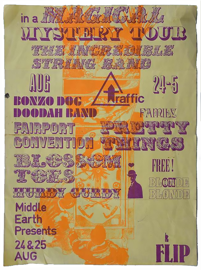
So what happened? Any eye witness accounts, footage or reviews of the event are missing in action whereas there are plenty for the 14 Hour Technicolour Dream or The Million Volt Light & Sound Rave. You’d think something as ambitious as this would be up there as one of the events of the era? The answer seems to be in a small news piece in the 23rd August 1968 edition of IT.
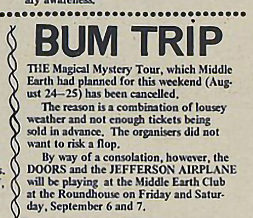
Jeff Dexter again, “The Mystery tour never happened due the weather and lack of sales, but there was a quickly put together event by coaches from Covent Garden to a very smart reception space the ‘Baronial Hall’ in the City of London.”
The Doors / Jefferson Airplane gig mentioned here two weeks later has of course passed into legend though…
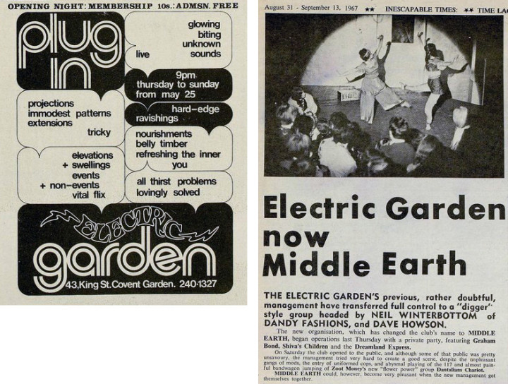
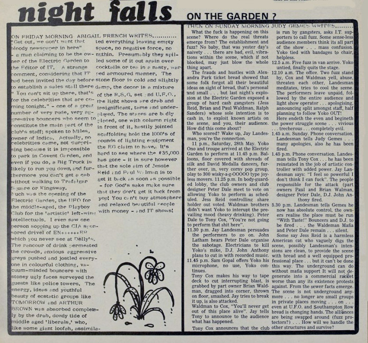
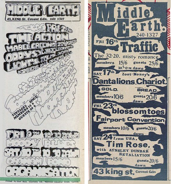
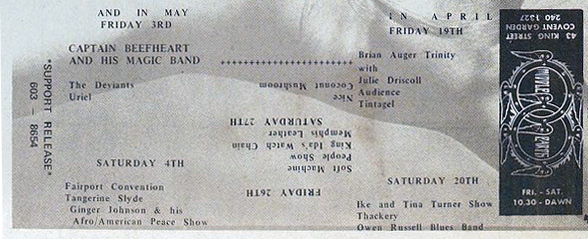
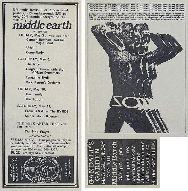
Middle Earth was one of the original, late 60s psychedelic clubs in London, coming shortly after The UFO (pronounced You-Fo – Underground Freak Out) club on Tottenham Court Rd. and pitching itself up in King St, Covent Garden. It actually started out as The Electric Garden in May 1967 but, after a disastrous opening weekend with completely misjudged vibes, heavy security and bizarre VIP areas, it had a change of name as well as management and became Middle Earth in September.
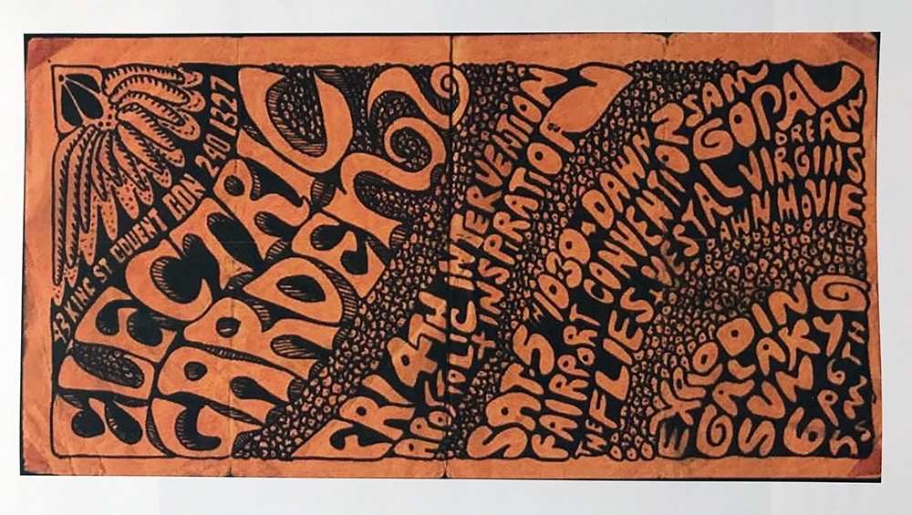
See below for eye witness details of the opening event – all these clippings taken from the International Times magazine online archive which is an invaluable resource of the times. Orange flyer above taken from Jill Drower’s excellent book on The Exploding Galaxy, ’99 Balls Pond Road’.
Middle Earth, an obvious Tolkien reference, John Peel was one of the resident DJs along with Jeff Dexter who would play to the crowd and the dance floor rather than Peel who would play more for the listeners out there. Jeff told me that they would be situated under the lighting rig for the light show until a small booth was built for them out with the stages for the bands to make them more part of the events. A regular track for him was The Lemon Pipers’ ‘Through With You’ apparently, the nearest thing to an anthem for the nights, he liked this because it was nearly 10 minutes long so he could go for a smoke.
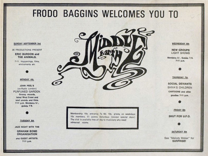
Above, the listing for the re-opening week, I like the way they were closed on the Friday that UFO was on rather than give the impression that they were competing.
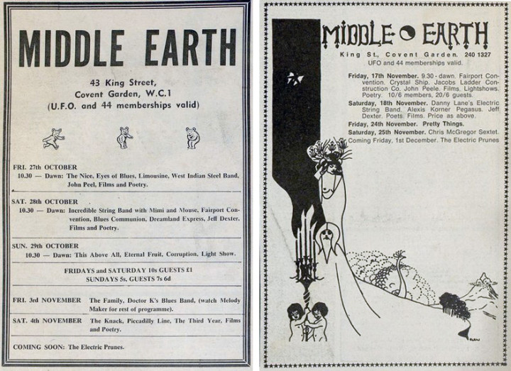
There was no consistent art direction with the adverts featured in IT and most were dictated over the phone and the magazine would come up with the designs for the issue.
Below right: A benefit for Oz magazine with a ‘sexy Barney Bubbles Light Show’ – Barney Bubbles being the alias of Colin Fulcher who went on to design so many great sleeves for Hawkwind, Stiff Records and many more. Along with other pioneers like Liquid Len, he got his nickname from doing light shows where he would heat ink and oil under glass clock faces and project it across the club after witnessing this on the hippy scene in San Francisco on a trip to the States.
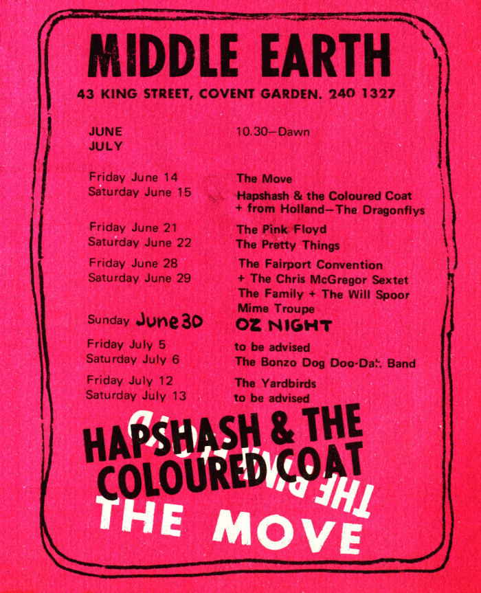
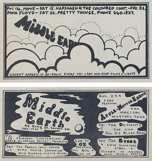
One of the mysteries of the Apple Middle Earth 3 Day festival listed above was that it never officially happened, something I’ll cover in another post, but things were changing for the club around this time. Middle Earth was raided repeatedly by the police and was eventually forced to move to another venue, The Roundhouse in Chalk Farm, which I’ll cover in part 2.
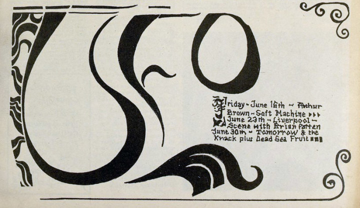
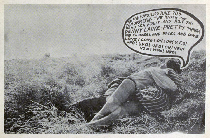
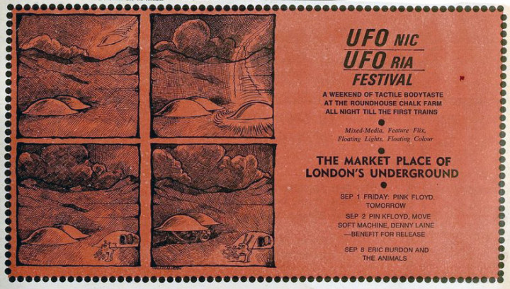
Recently researching light shows in London around the mid 60s I was perusing the International Times archive online and noticed that the UFO Club had various ‘flyers’ present in each issue around its tenure at the Blarney Club and The Roundhouse during ’66-’67. It’s no surprise as UFO initially gave money to IT and you’ll notice the first event was called Night Tripper / UFO as they couldn’t decide on a name.
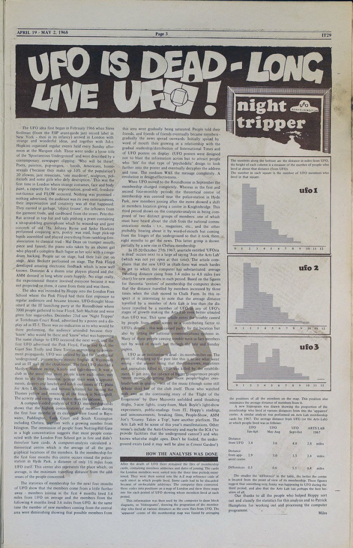
There was no format, some had to be decoded and the 27th October ’67 issue featured a piece stating that UFO is Dead! Reading between the lines you can detect some general annoyance that some promised cash flow had been cut off. The final image here maybe or may not be connected but it was on the same page as the club obituary and features lights in the sky.

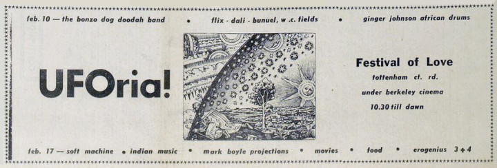
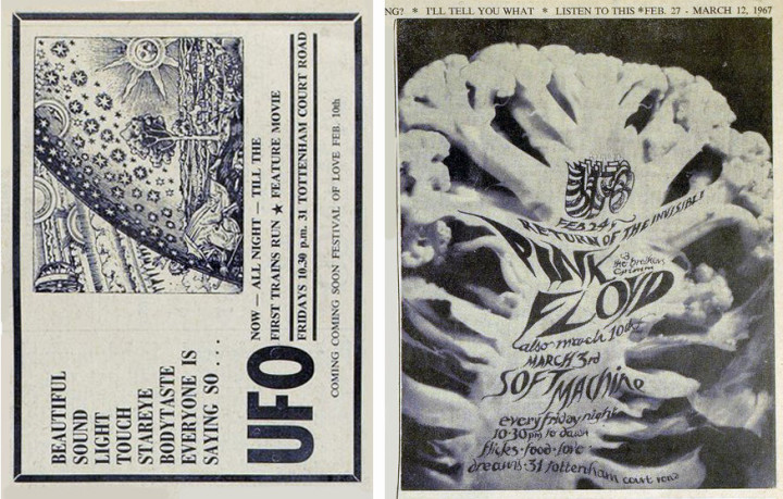
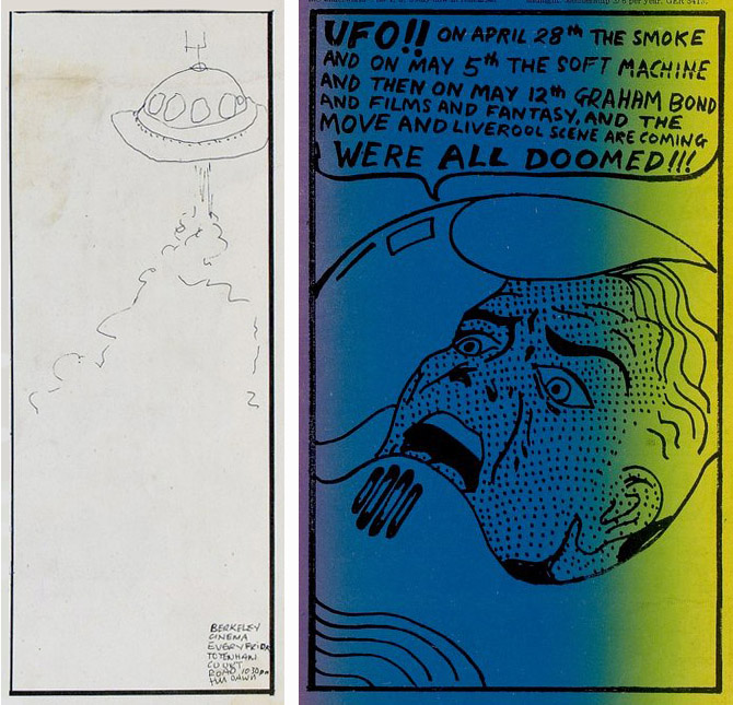
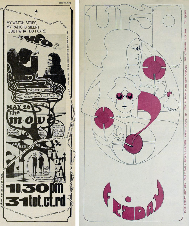
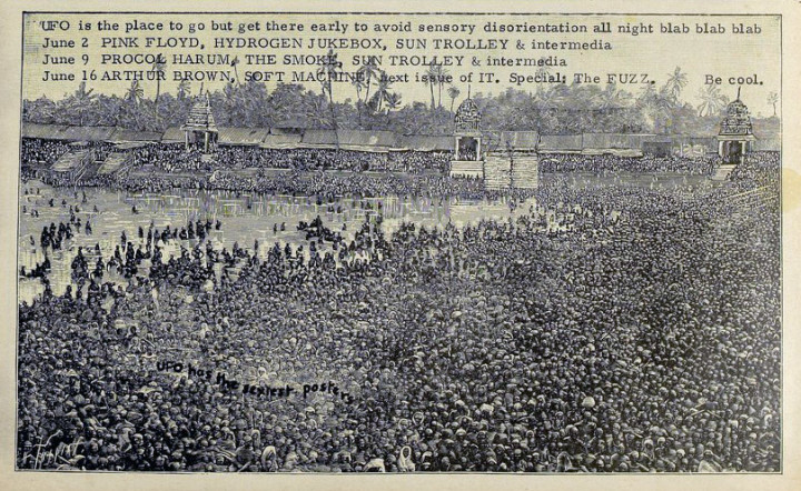
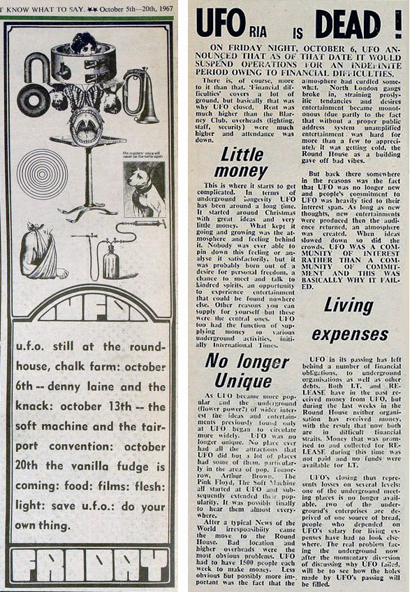
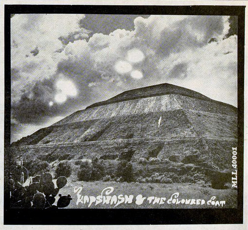
There was a posthumous analysis of what killed UFO in IT nearly a year after it closed, comparing the audience’s locations as the popularity grew.
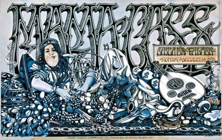
Amazing Rick Griffin billboard poster for a Mama Cass gig that I found online at the excellent Far Out Company website.
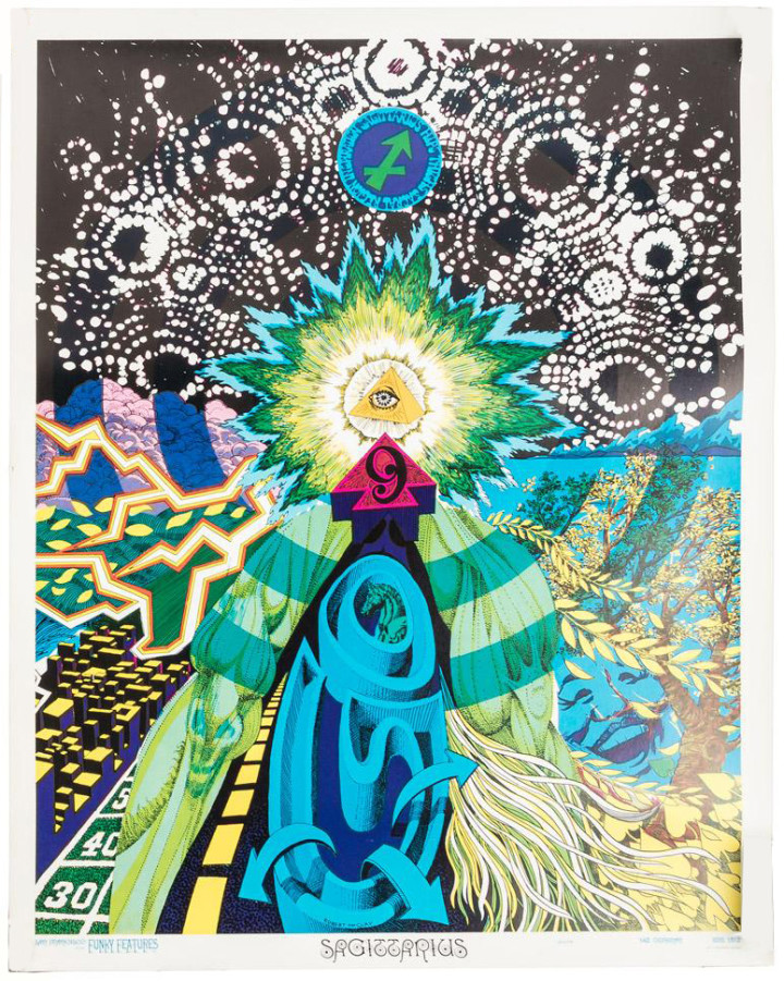
(images and text adapted from the pbagalleries website)
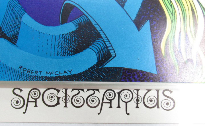
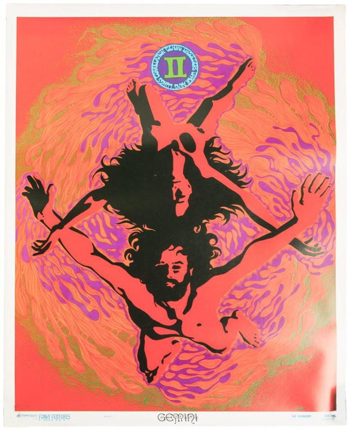
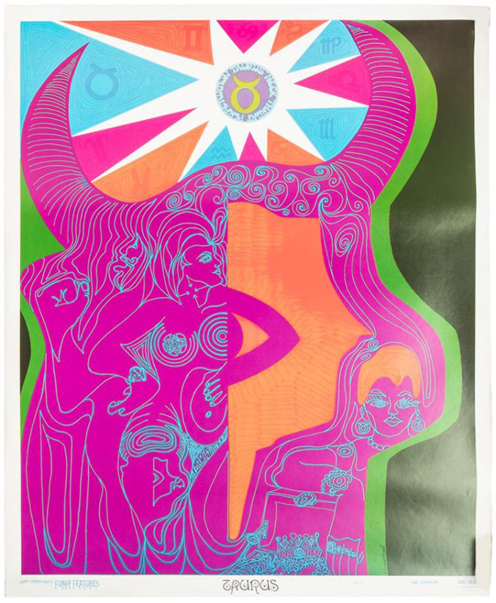
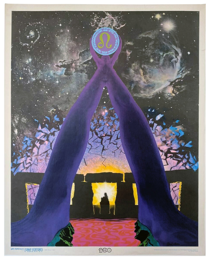
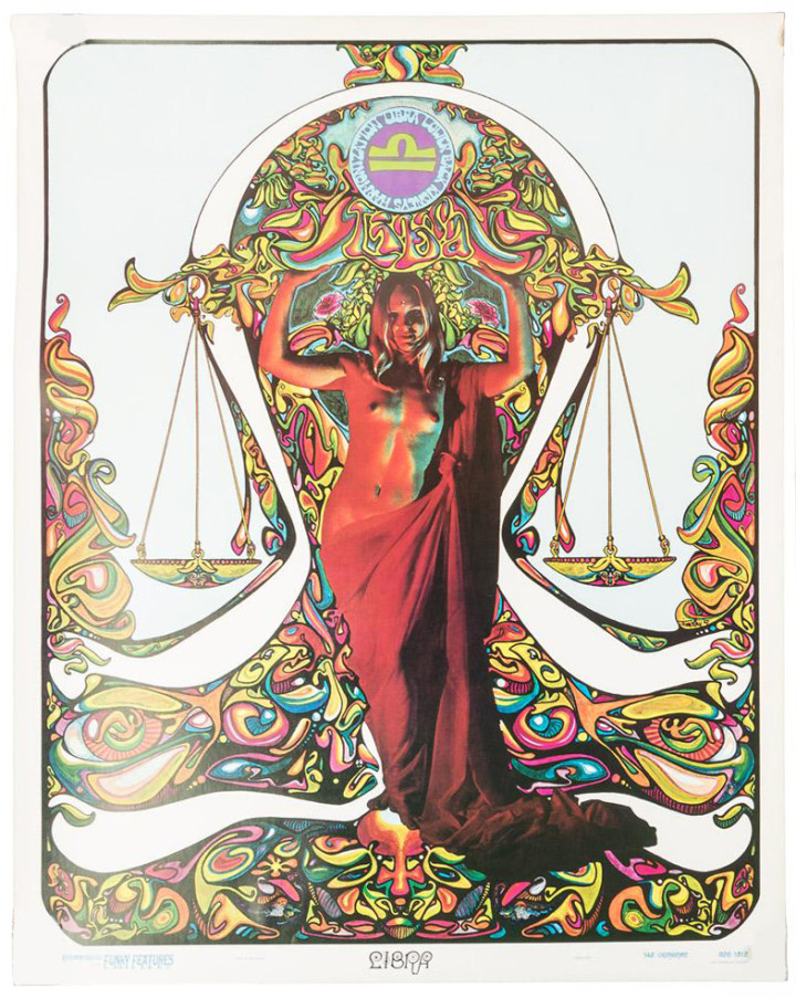
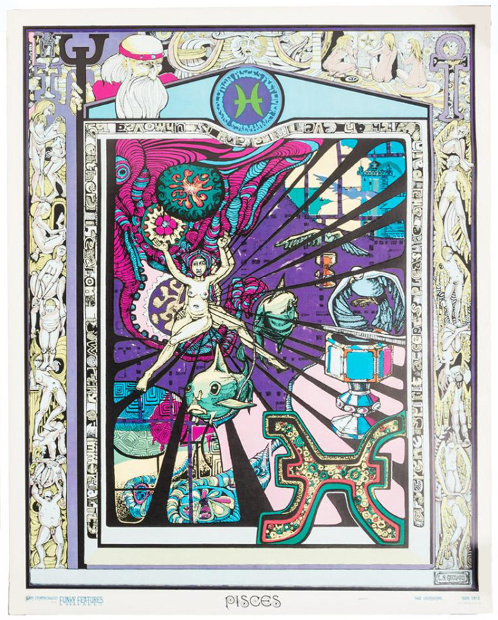
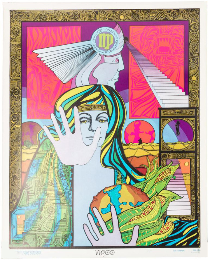
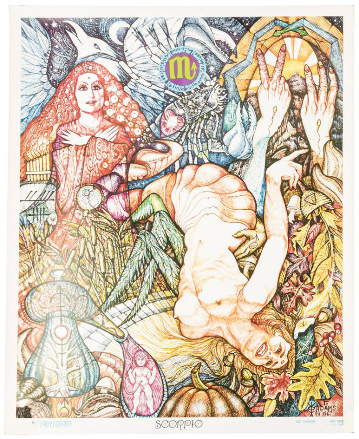
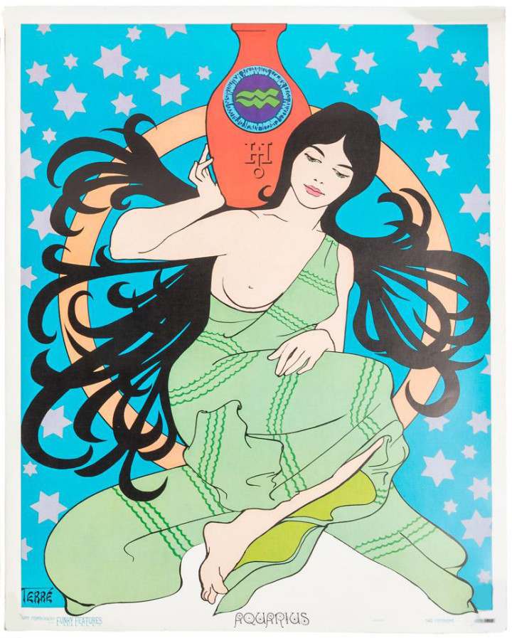
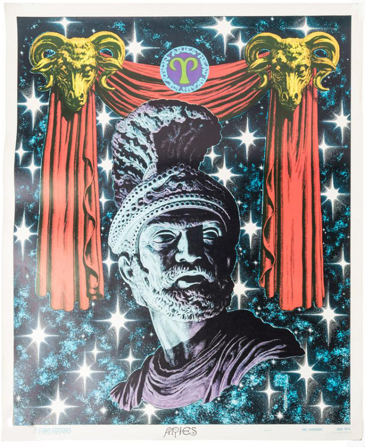
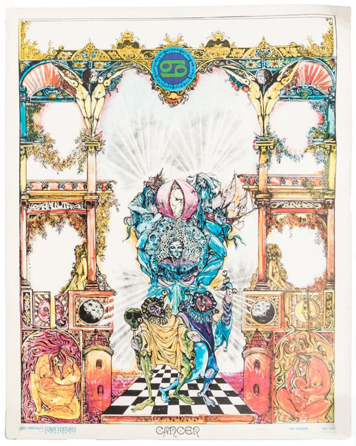
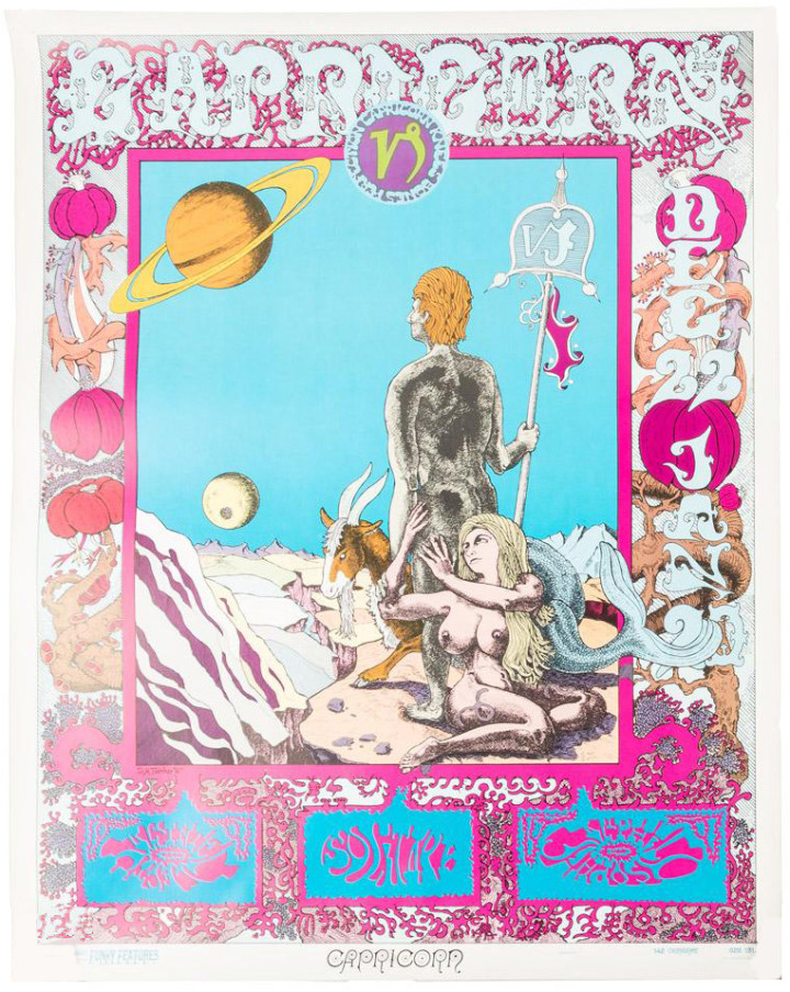
A complete set of original 12 Zodiac Astrology Star Sign Posters, commissioned by Jack Leahy (“Funky Jack”), of San Francisco’s Funky Features, in 1967. Funky Features was originally a home recording studio in an Edwardian house that quickly became a popular recording location for Big Brother and the Holding Company, Cold Blood, Steve Miller, and others. Leahy also went on to do artwork for a number of motion pictures, airbrushing the Starship Enterprise for the first Star Trek film. Each poster is by a different artist, uniquely capturing the heyday of San Francisco’s counterculture. Artists include Dick Moore, Tommy Dixon, Lee and Shirley Goddard, Robert McClay, Fred Adams, Primo Angel, Jim Blashfield, and others. Complete sets of all 12 posters are extremely rare, especially in this condition.
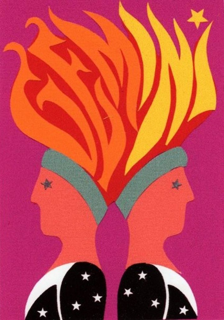
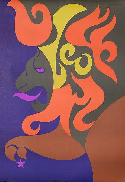
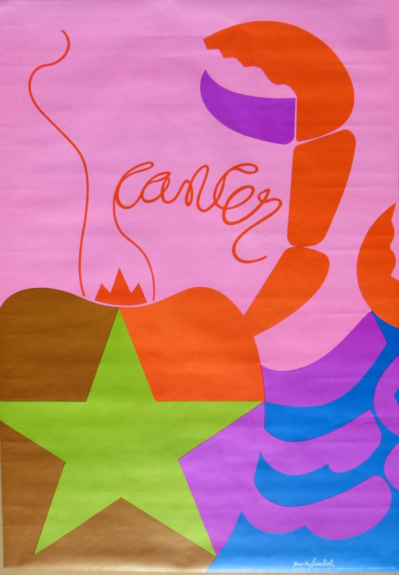
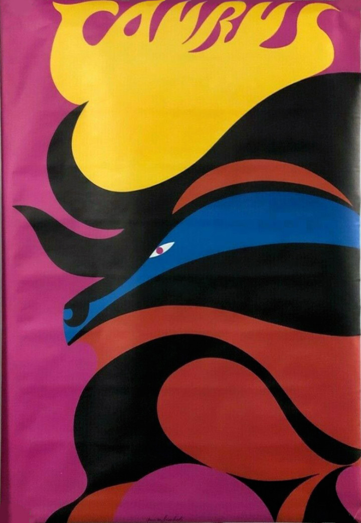
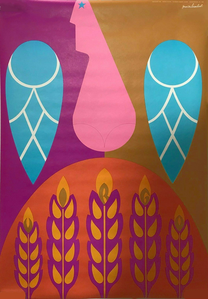
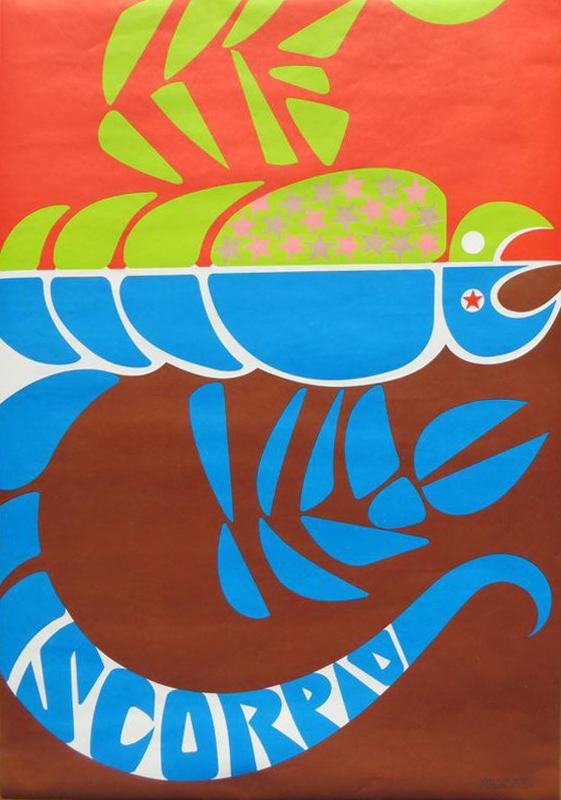
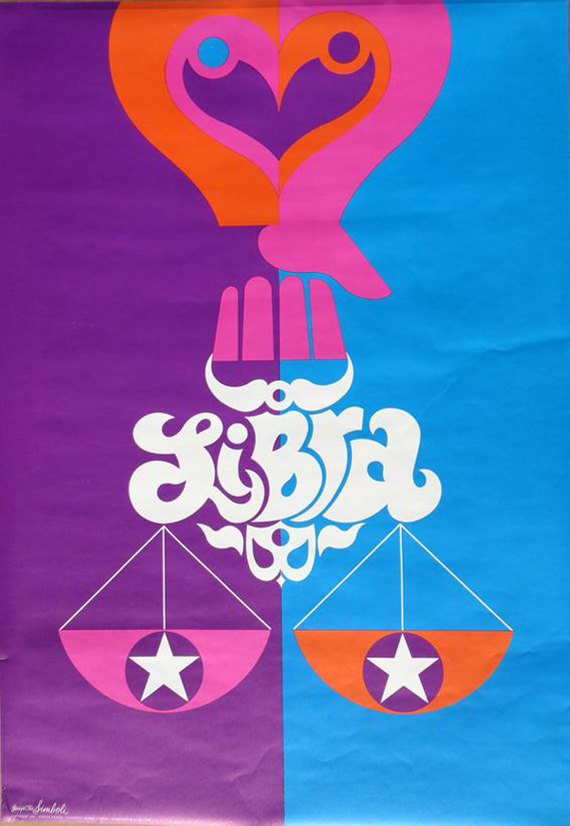
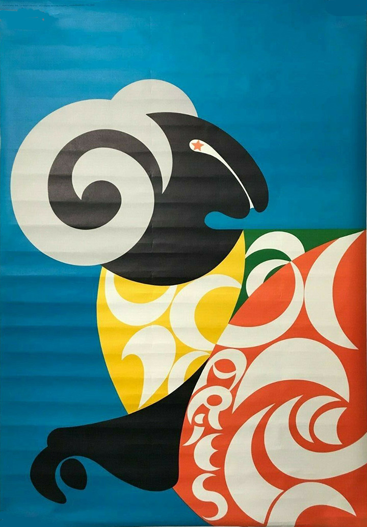
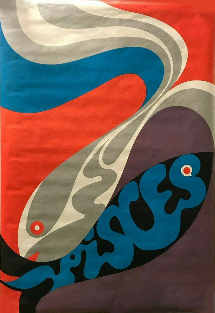
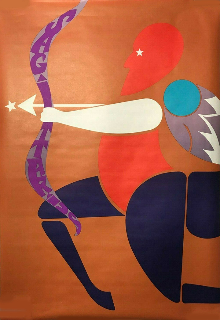
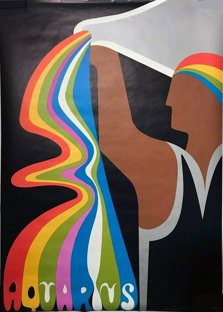
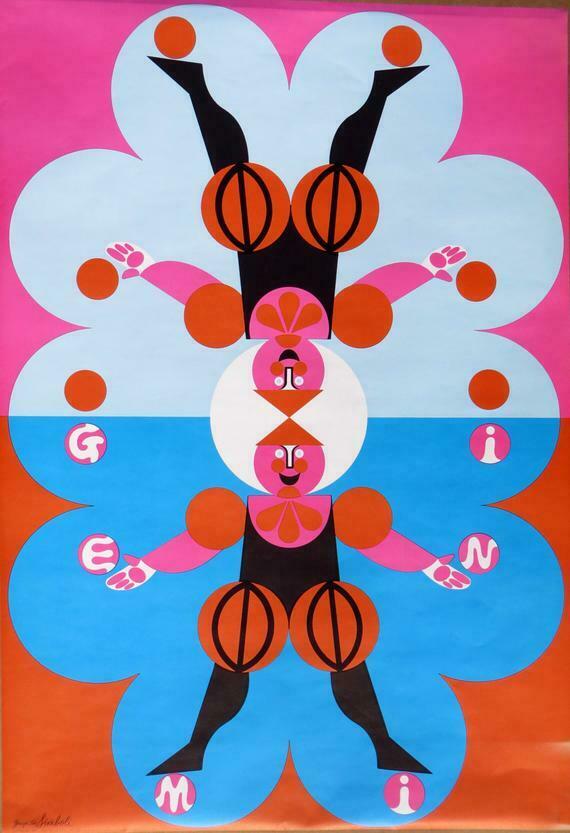
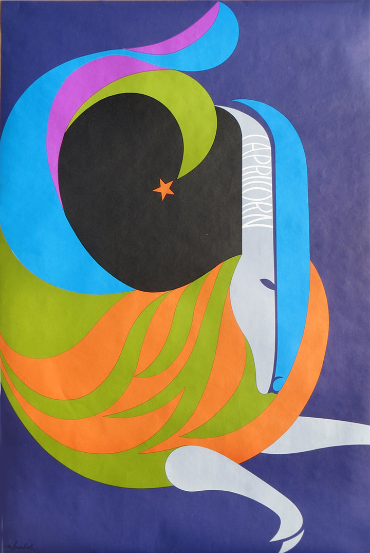
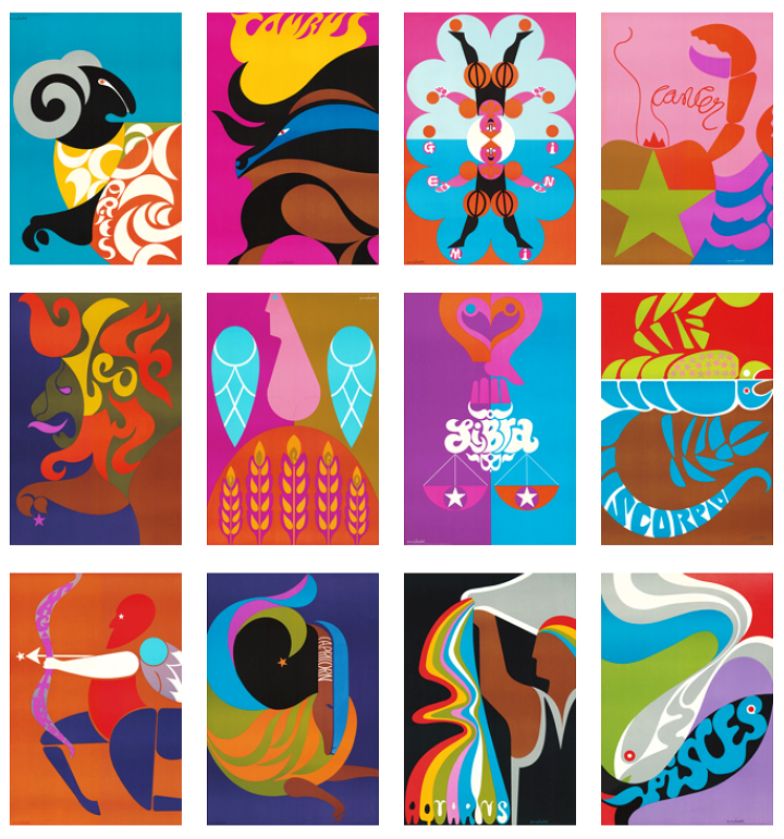 In my periodic searches for graphic material from the late 60s I came across several sellers on eBay offering these lovely zodiac posters for sale. I did some digging and found decent resolution copies of most of them and a bit of info about their origins. In 1969, Poster Prints commissioned Simboli Design – Gerry & Joe Simboli – to create a line of graphically strong and colourful zodiac posters, which were sold worldwide. There seems to have been two different designs for Gemini for some reason but finding an original of the fire-headed twins seems impossible, their website seems to suggest it’s a new design.
Paul Smith, the UK fashion designer, found the posters on a website and used them for a line of casual clothing for Neiman Marcus in 2004. Recently, the posters were also used on the set of the HBO series, Vinyl, produced by Martin Scorsese and Mick Jagger.
Simboli have a website and they sell some of the originals and Gicleé repros via Etsy, dimensions are 12″x18″ with additional 1″ border for matte. They also have other sets themed around Anti-War, Tea, Coffee, some great logo designs, toys and this lovely robot which was created at some point in the 70s.
There are several more zodiac set by different designers from this era out there that I’ll be posting as I find complete sets.
