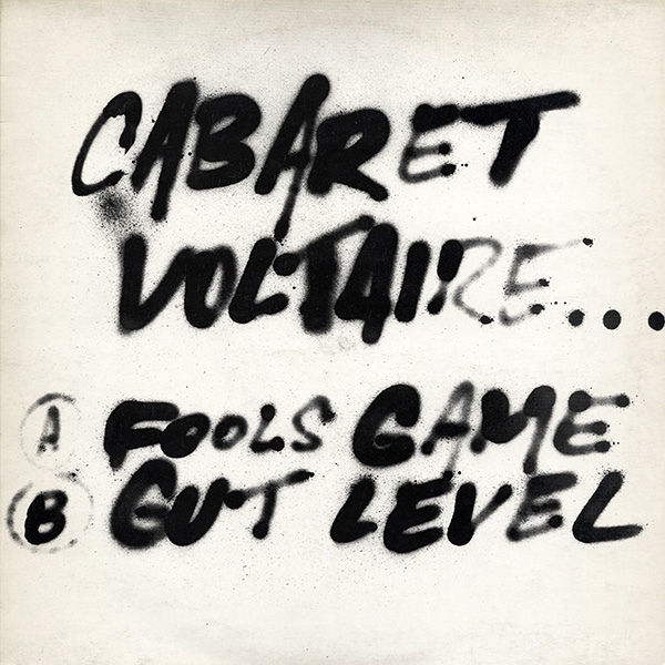
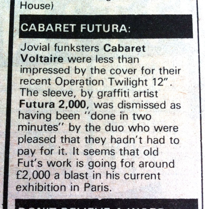
 Made me laugh – not sure why Operation Twilight is mentioned though as this never came out on that label.
Records

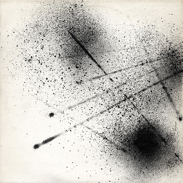
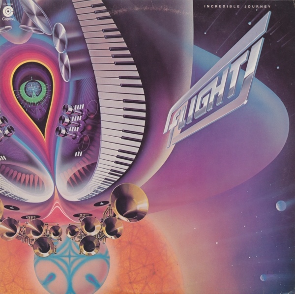
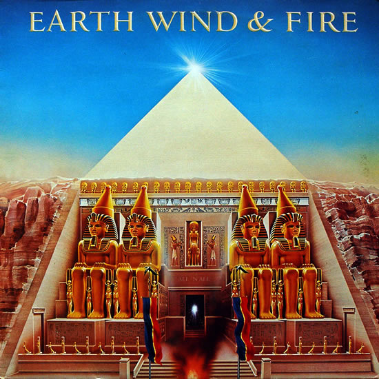
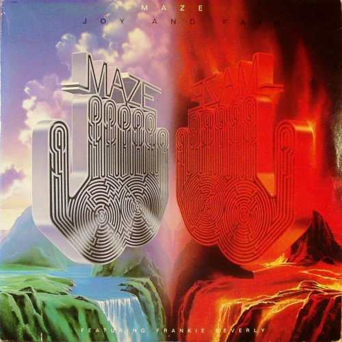
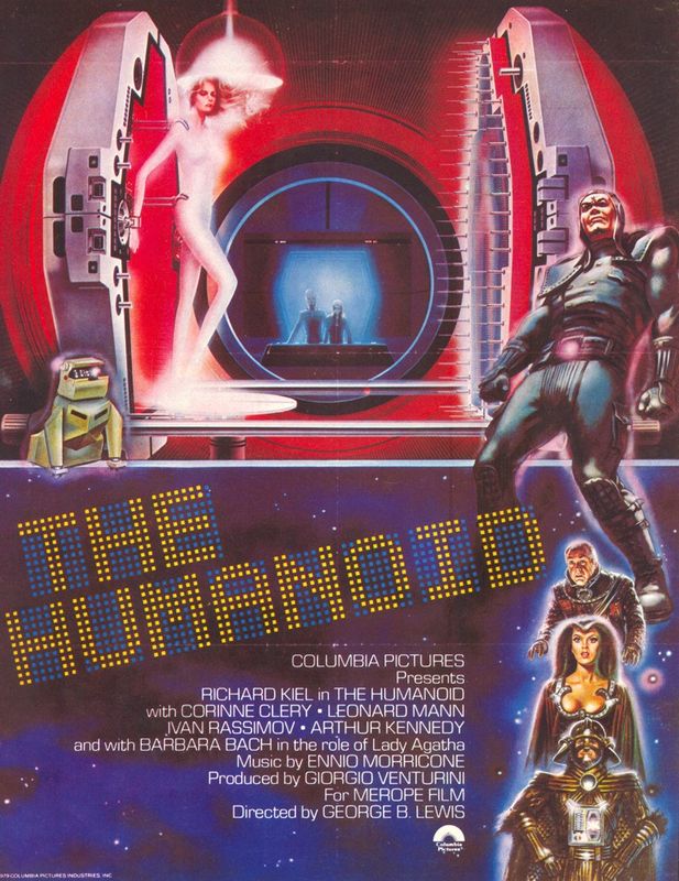
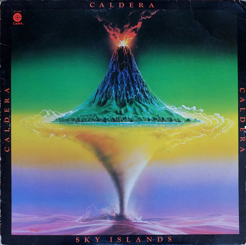
RIP Shusei Nagaoka – not a name I was familiar with but all of us must know at least a handful of these album covers? ELO, Earth Wind & Fire, Maze, Deep Purple, Boston and more. Big respect.



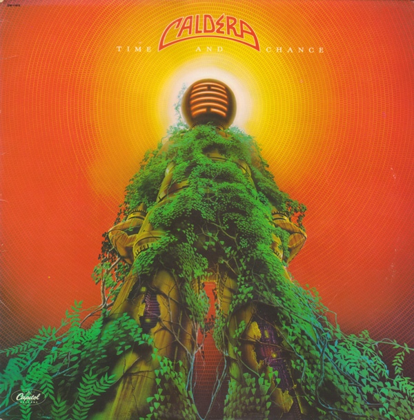


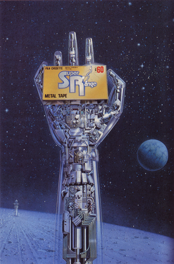


Notice how this poster for The Humanoid uses one of his images and flips it, I doubt the added characters are by him.

Soviet flexi discs, ‘bones’ or ‘ribs’, music pressed on old X-Rays due to lack of resources. Stephen Coates aka The Real Tuesday Weld has been collecting and exhibiting these for a while now and Strangeattractor Press are publishing a book of them this autumn. Pre-order is here and there is a limited edition with a free flexi disc which I will no doubt be featuring in the Flexibition at some point.
Next week, Tuesday 30th June, Stephen will be telling the story of the X-Ray Bootleggers at The Last Tuesday Society. More details and tickets here…
…and on Friday 3rd July Stephen and Aleks Kolkowski will be presenting a special evening at the Masonic Temple of the Andaz Hotel as part of the East End Film Festival. A new x-ray record will be cut live with a 1940s recording lathe from a live performance by Marcella Puppini of The Puppini Sisters. Go HERE for more details and tickets
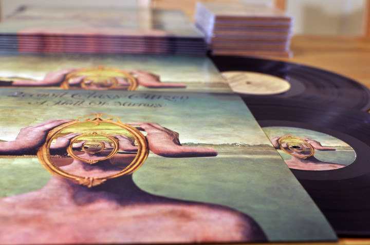
Out today is ‘Hall of Mirrors’, the third album by 2econd Class Citizen aka Aaron Thomason, another beautiful collection of haunted beats, raps and atmospheres that I’ve been lucky enough to hear develop over the last few years. You can hear echoes of parts of ‘Magpie Music’ – the track we collaborated on – in some of the tracks and if you enjoyed his two previous albums you won’t be disappointed as he’s crafted another winner and advanced his sound another notch.
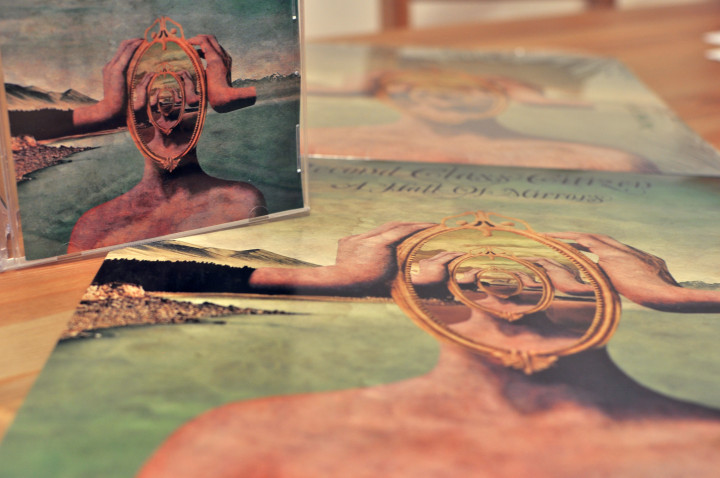
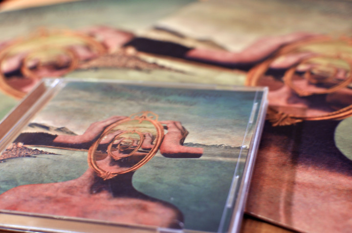
The album (very limited vinyl, CD & download) is out on The Content Label from California since Aaron’s previous label, Equinox, closed its doors two years ago. You can order all formats here in various bundles as well as a T-shirt and I nearly forgot, there’s a remix from The Herbaliser that closes the album too. I helped with the typography on the front cover and the excellent front cover was created by French surreal-collagist Albane Simon. Here’s a 15 minute taster for the album mixed by Aaron and he also has all sorts of free downloads, re-edits and videos over on his revamped website here.
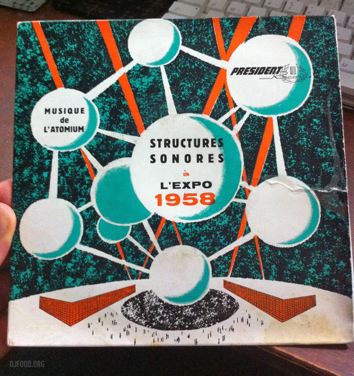 Music de L’atomium, made for Expo ’58, also known as the Brussels World’s Fair. 7″ on President Records with Structures Sonores played by Y. Lasry, F. & B. Baschet, J.P. Cotte and J. Chouet – you can hear one side of this single on the Cacophonic compilation of Lasry / Baschet recordings, ‘Instruments Non-Electronique’
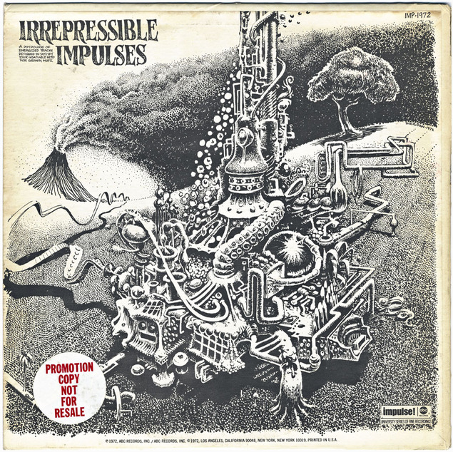
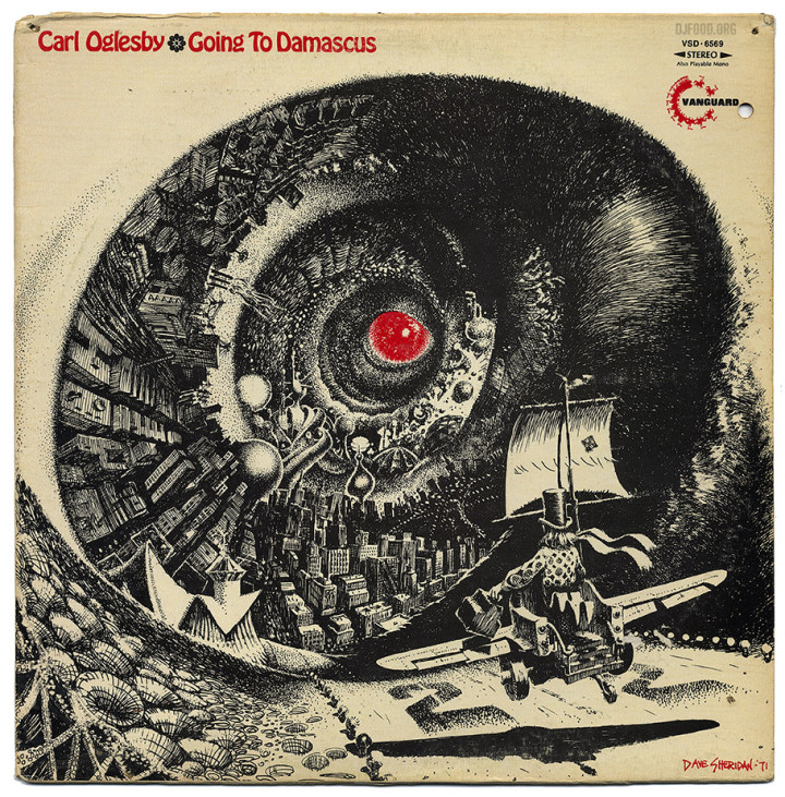 I found this Carl Oglesby album with a cover illustrated by Dave Sheridan, the comic artist who worked on titles like Dealer McDope, The Leather Nun and some of The Fabulous Furry Freak Brothers. Now sadly deceased, Dave’s work is always hyper detailed and tripped out, I featured another of his covers some years back, an Impulse Jazz compilation – I wonder if he ever did any more record sleeves?
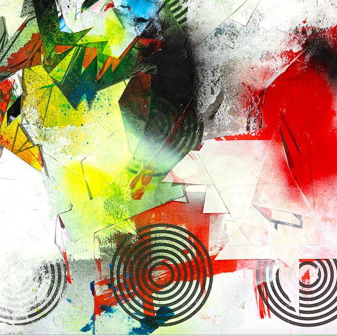 The Gamma Proforma label is on fire this year with the Divine Styler album, a new T-shirt series featuring Augustine Kofie and Will Barras plus retrospective books of Will’s work as well as graphic design legend Ian ‘Swifty’ Swift. Not only that, their ‘Cosmic Flush’ series of 12″s and prints based on The Rammellzee‘s last work now reaches it’s third installment. Delta is on the art and Mike Ladd on the remix and I’m starting to suspect Rob Swain from Gamma is mining some telepathic mind link with me as all the releases so far push all the right buttons for me. Pre-order the third part, ‘Crayzay’, here.
If you’re lucky there may still be some copies of the first and second releases with prints by Futura and Ian Kuali’i with remixes by Divine Styler which will form part of the full box set to the ‘Cosmic Flush’ album release. Check out Will’s Rammellzee graphic for the second T-shirt in the X99 series below too, in fact check out the whole site as there are loads of free mp3s, plus a selection of books, magazines, prints and T-shirts, they even have Syd Mead designs!. Gamma’s shaping up to be the label to watch in 2015.
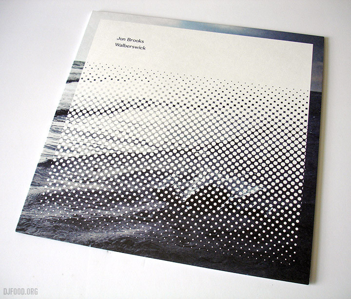
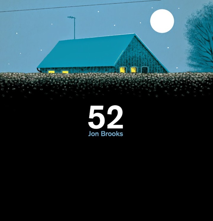
Not content with issuing his ‘MuSIC FOR THOMAS CARNACKI’ album from his own Café Kaput label on vinyl earlier this year, Jon Brooks albums are cascading out of the woodwork this year. His latest, ‘Walberswick’, on Canada’s More Than Human Records is sold out on vinyl and two more reissues are about to hit the shops. His ’52’ album for Clay Pipe Music gets an ‘evening edition’ repress at the end of June with a new version of the sleeve picturing the house during the twilight hour, a clever way of presenting a second run. Pre-order here – be quick!
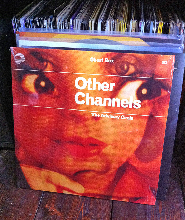
The last album from his Ghost Box discography to get the vinyl treatment also arrived last week with 2008’s ‘Other Channels’ under his The Advisory Circle alias, Brooks at possibly his most ‘hauntological’, it’s a favourite. Another of the GB back catalogue getting a vinyl outing for the first time is ‘The Seance At Hobs Lane’ by Mount Vernon Arts Lab, their sole release so far on the label and itself a reissue from 2001. Order them both here (free download only with GB shop orders too!)

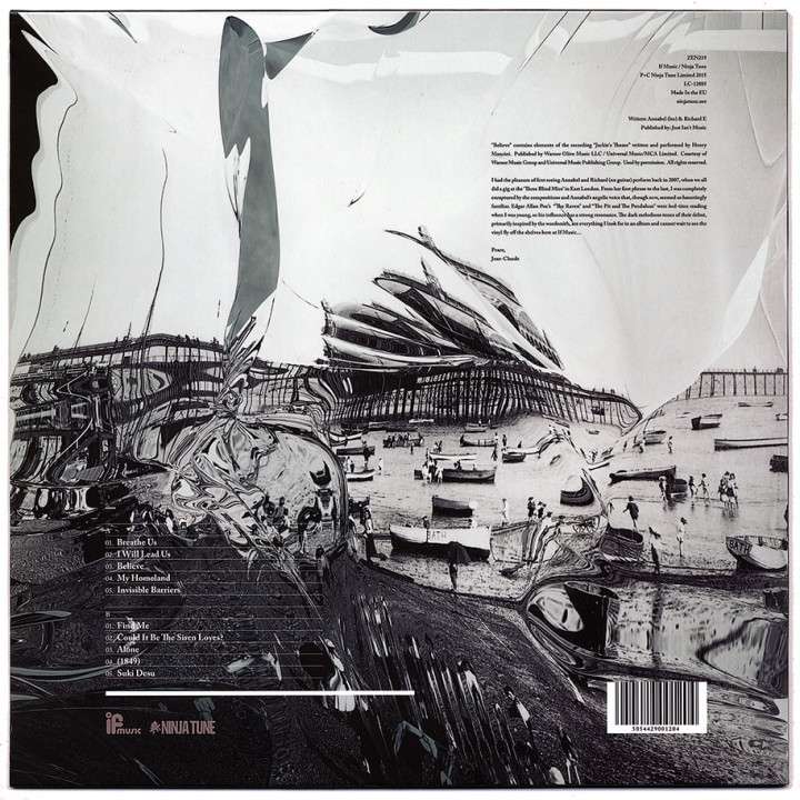
This is pretty special, passed me by when it was released in April as a co-production between If Music and Ninja Tune. Annabel (lee) qualifies for a raft of clichés to be employed – haunting, fragile, beautiful, widescreen, string-laden – it sounds like a lot of things but still manages to sound unique. I’m not sure if the orchestration is sampled or has been played and put through processing to sound like it but there’s a vintage quality to it, not dissimilar to The Caretaker’s crackly 78’s drenched in reverb, although way cleaner.
Think of Nina Simone‘s darker moments with Lou Rhodes‘ folkier ones but backed by an orchestra ripped from a 60s Bernard Herrmann score. I know nothing about her or the record’s origin but her voice is exquisite and I love it. I’ll never make a decent music reviewer, have a listen and make your own mind up. The sleeve is beautiful as well, some sort of distortion process added to old black and white photographs that perfectly match the audio they cover. No credit for the artist or photographer at all unfortunately but with my Ninja contacts I can reveal it was done by my old mate Doug Bowden aka Pandayohurt. Listen and buy it here.
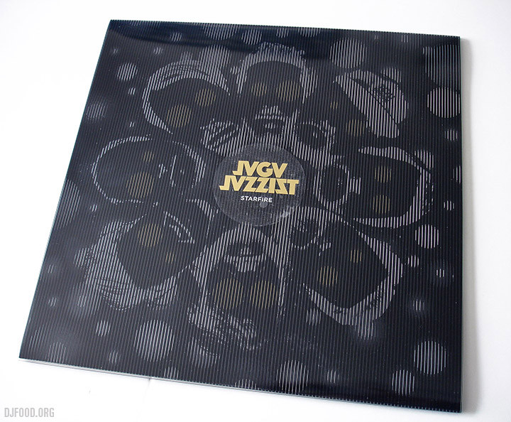
This is the stunning new album from Jaga Jazzist, not only contender for cover design of 2015 by a very long margin but also heading for top 10 album of the year status too. It’s taken a while for me to fully appreciate Jaga but with each album they’ve crept further into my orbit so that now each release has to be checked out. ‘Starfire’, after only a few listens, I can quite confidently say, is my favourite so far and it sees a slightly more electronic mission statement than before whilst still retaining the uber-tight Zappa-like syncopation of previous work.
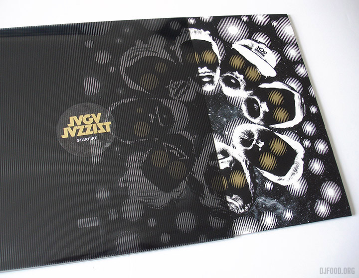
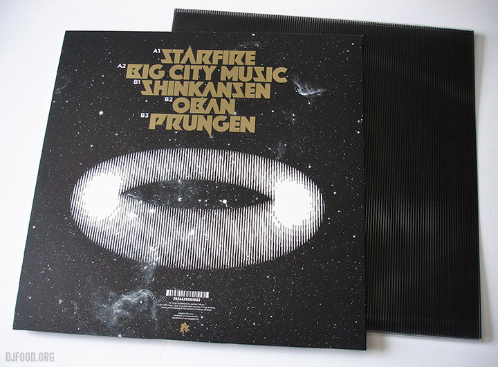
The design on the sleeve is magnificent here as well and really compliments the futuristic feel of the music perfectly. Browsing the new releases in Fopp the other day I was struck by how little of the current crop of album designs stood out, possessed any kind of classic iconography or would make me want to look at them twice. So much of the ‘style’ of the last few years of the kind of music that racks up kudos from the critics seems to be about minimal, safe, almost nonchalant anti-design, designers afraid to go all out and make a statement or content to reference past styles.
The Jaga sleeve, besides being striking yet minimal, has a clever trick up its sleeve – or should that be on it?. It comes in a screen printed transparent outer cover of evenly spaced vertical lines that animate keys graphics underneath on both front and back as you slowly pull the inner cover out. This effect is being billed as ‘anamorphic’ in the press releases but that’s more about stretching an image, this process is closer to the ‘moire effect’ that tricks the eye into believing that objects are moving as the black and white lines move past each other, much like a TV screen flicker.

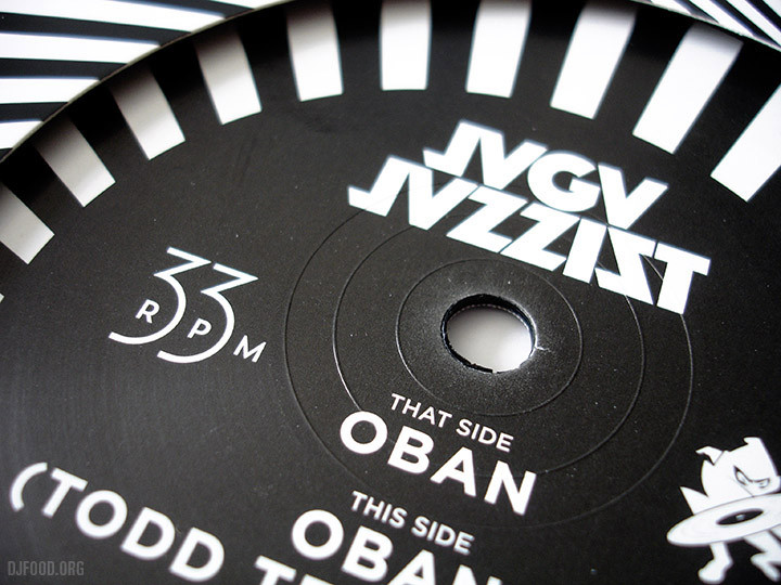
Aside from the outer cover gimmick, the typography on it is stunning, look at those titles above, that must be a custom made face that works with just the right dose of sci-fi and heavy metal styling to make it unique. The labels and second inner sleeve work beautifully to counterpoint the blackness of the outer as well, as does the companion single, ‘Oban’.
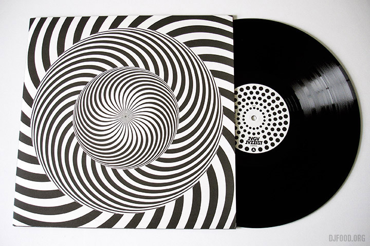
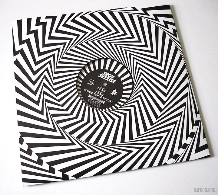
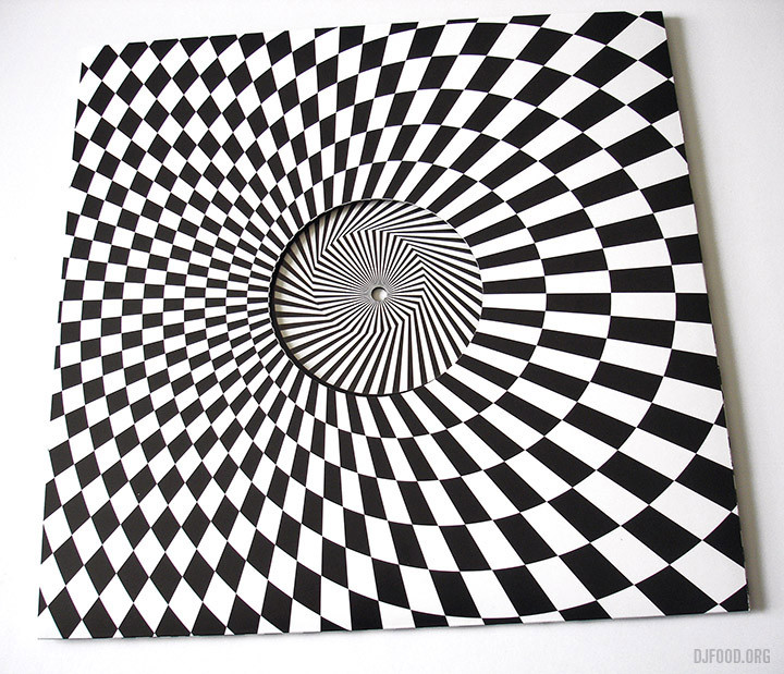
Coming from the Bridget Riley school of Op-Art the single’s sleeve is right in your face, begging you to pick it up. I take my hat off to Martin Kvamme who is credited with the design just for the elegant graphic solution to the 33 rpm speed text on the label, so few designers would bother devising something different these days.
Both releases are out now on Ninja Tune – go and grab them, music that needs to be held as much as heard.
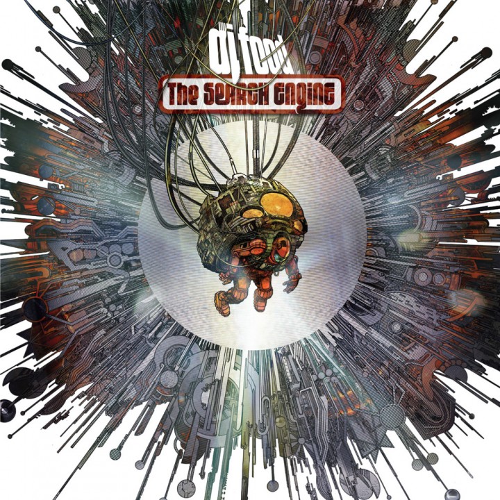
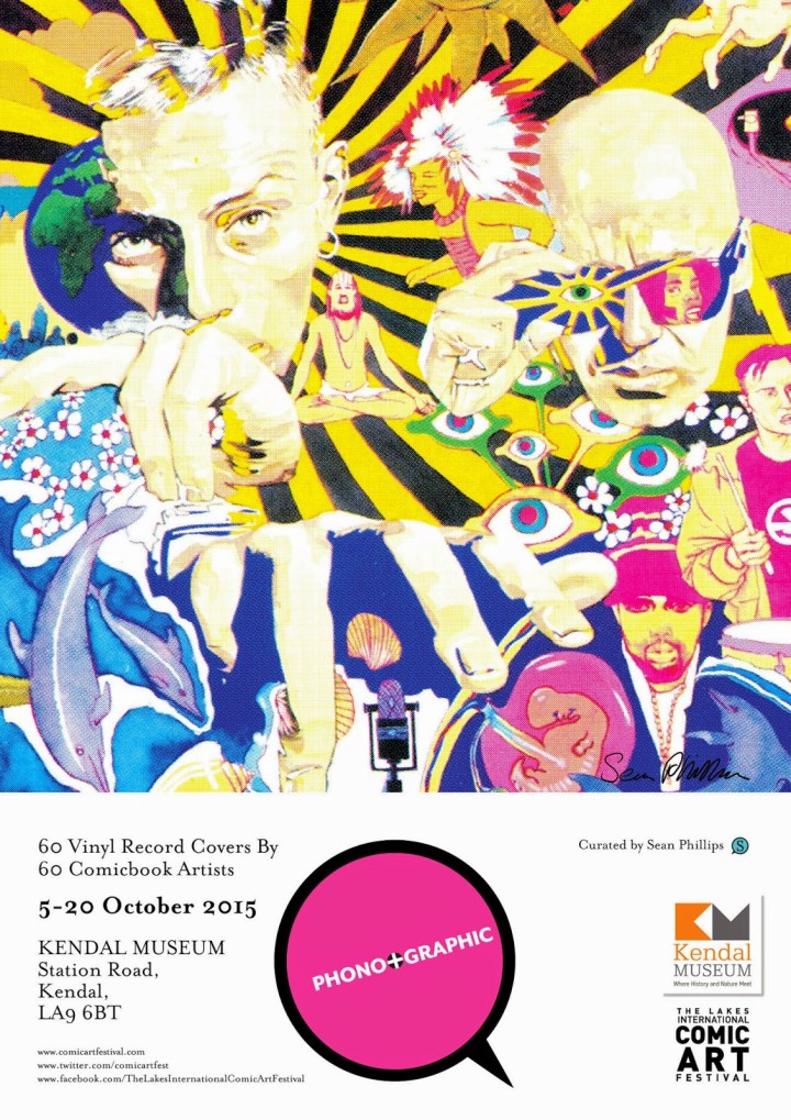 I’m reliably informed – by curator Sean Phillips – that the sleeve of my last album,‘The Search Engine’, features in this forthcoming exhibition of 60 album sleeves drawn by 60 comic artists. Phono+Graphic opens at the Kendal Museum in, errr… Kendal this October. Check out Sean’s blog for more info nearer the time.
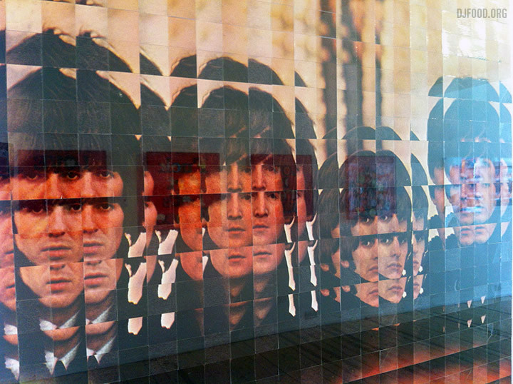
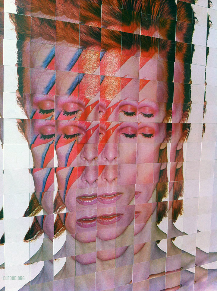
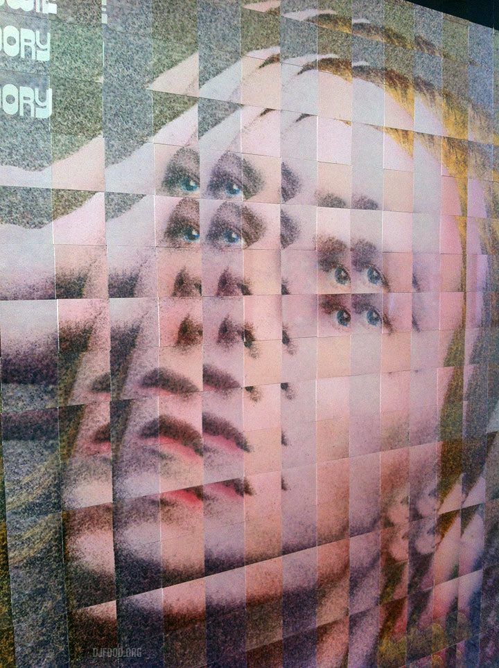
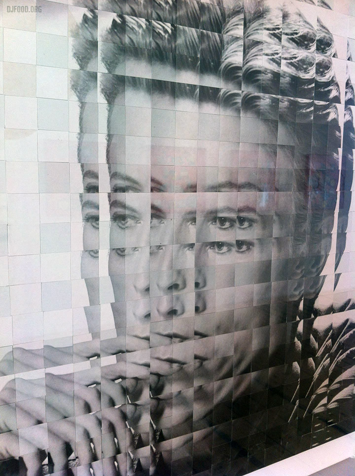
I made time to actually visit the Keith Haynes ‘Art Pop’ show at Gallery Different in London last week after posting photos friends had taken on the opening night. I really wanted to see the cut up Bowie and Beatles sleeves and I wasn’t disappointed, they are beautifully executed and what becomes apparent when you view them up close is that Keith has selected covers with differing print qualities so as to make the contrast between the same sections more apparent. The same covers printed 20 years apart can be quite noticeable, especially in this digital age where the original films or photos might have been lost and an inferior scan used in their place. This is especially noticeable on the ‘Hunky Dory’ image below, try and check them out before the show ends on May 30th and there’s another surprise in the basement of the gallery that I knew nothing about.
Roger Miles has installed his version of a 70’s record shop underneath the gallery entitled, ‘Resonate – Generate’, complete with vinyl, 8-Track machines, vintage posters and more. Having just read Roger Perry’s ‘The Writing On The Wall’ it was a timely coincidence that evoked memories of the same era. His jogroglog blog is full of fascinating artifacts and information on his various art projects (one was in a local dump where he could use anything that was bought in – including a speed boat on a trailer!). Anything one best viewed in the flesh.
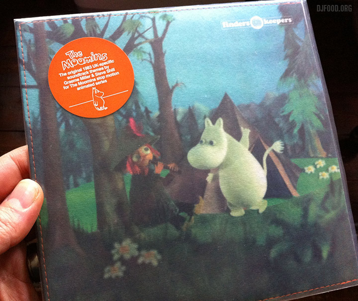
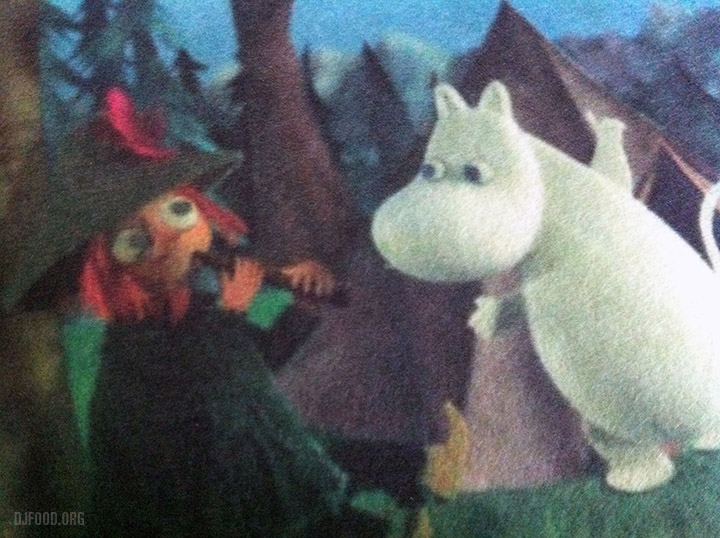
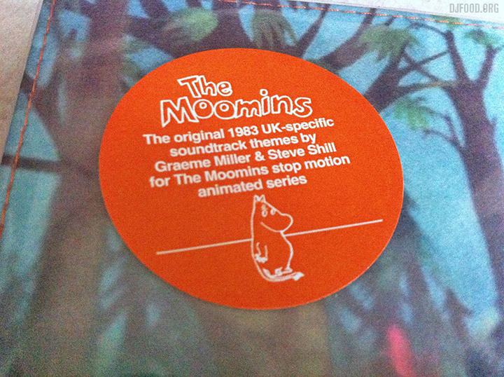
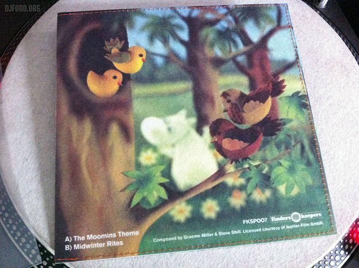
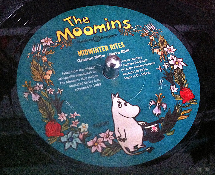
The Moomin 7″ from Finders Keepers was certainly one of the most popular releases of RSD 2015 in the UK and it’s an item of beauty, both musically and sleeve-wise. The cover is made of felt, hand-stitched and colour printed, I’ve never seen anything like it (there are also two different cover images to collect). The music is pure analogue electronics, being the UK-specific soundtrack by Graeme Miller and Steve Shill.
Happily for those that didn’t score a copy on RSD and now that the fuss has died down, Finders Keepers are allowed to sell it on their site. So don’t feed the flippers on eBay, pay the label direct. Whilst you’re there you could do worse than also pick up Bruce Ditmas‘ ‘Yellow Dust’ album – I did, he plays a Moog Drum and it’s mental in the best possible way.
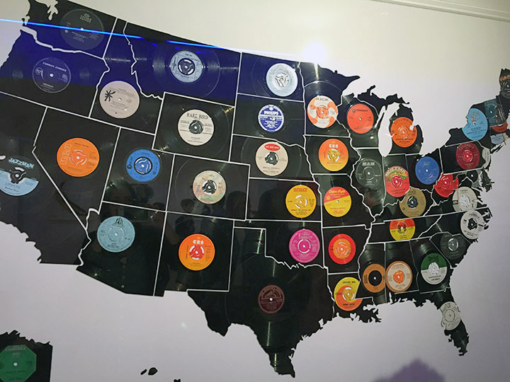
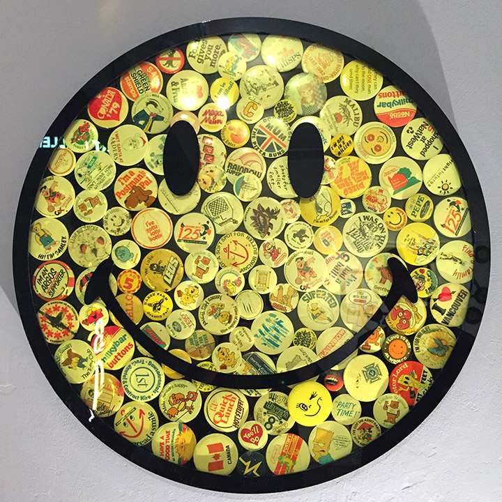
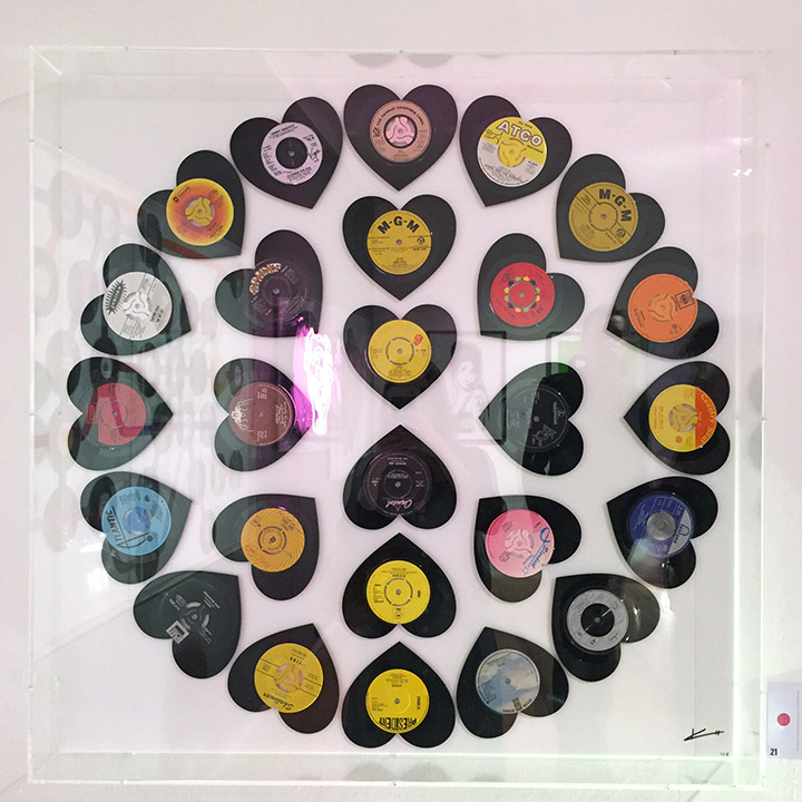
The ‘Art’ Pop show by Keith Haynes just opened at Gallery Different, 14 Percy Street, W1, just off Tottenham Court Road. The North American map above, entitled ‘Hitsville USA’, in made up of vinyl records, all laser cut and named after each of the states. Likewise the ‘Going Undeground’ maps all have relevant records associated with the stops they represent, a simple idea presented immaculately. In a subtle touch Haynes has used various colours from Factory Road’s extensive 45 adapter range to compliment the 7″ centres. I predict we’ll be seeing this ripped off for years to come.
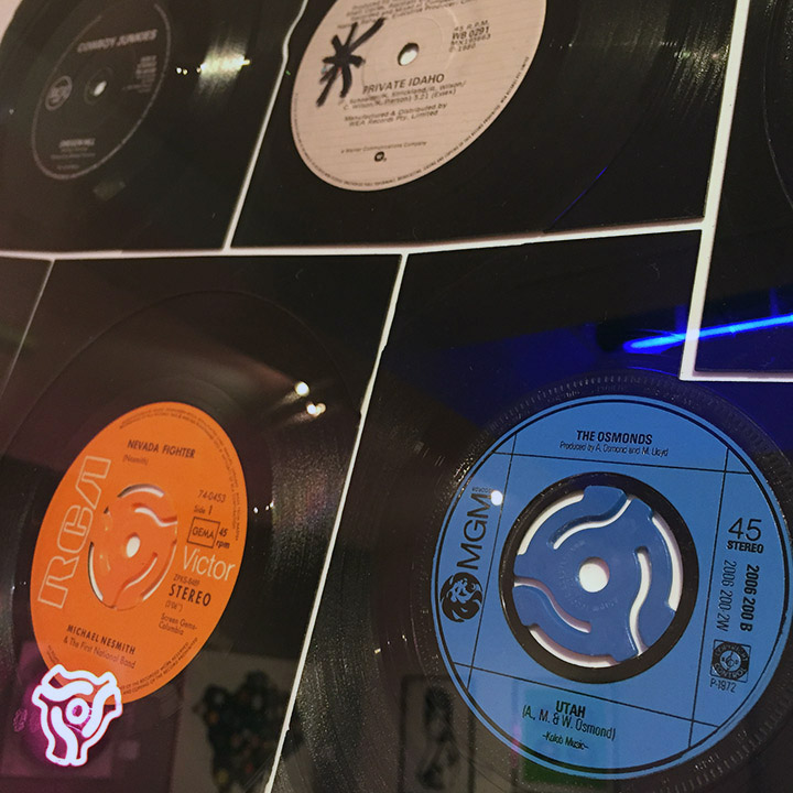
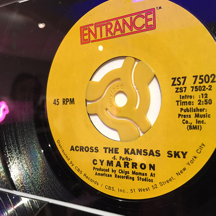
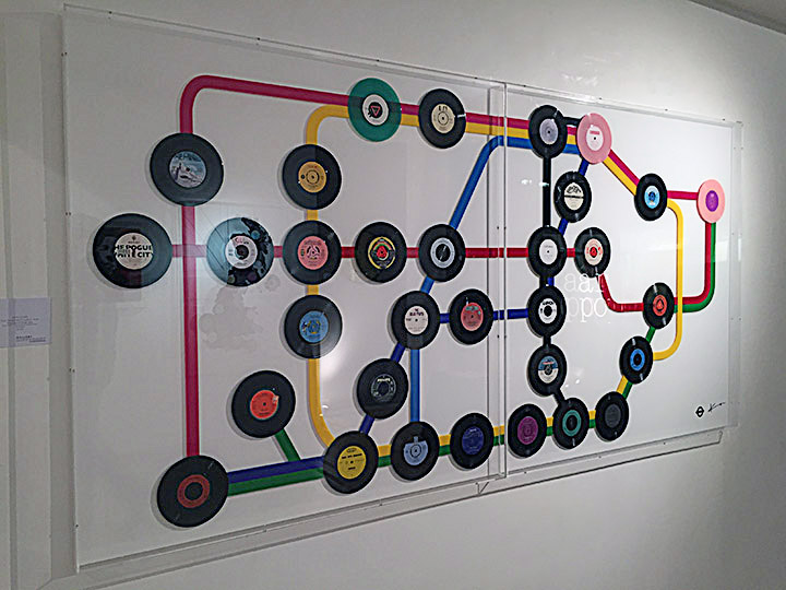
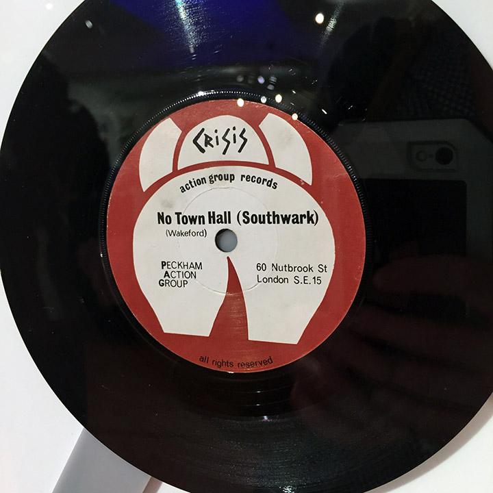
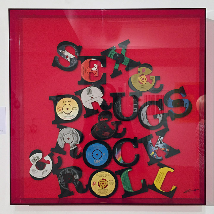
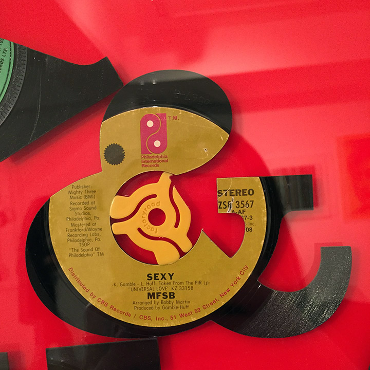
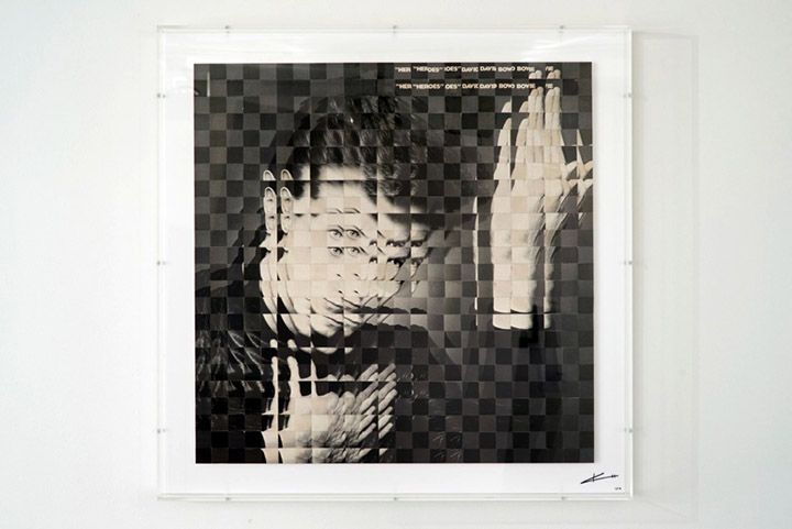
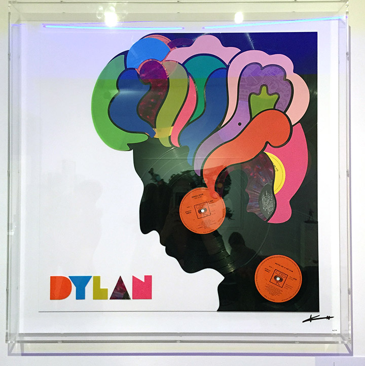
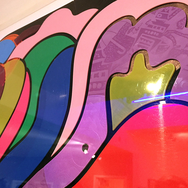
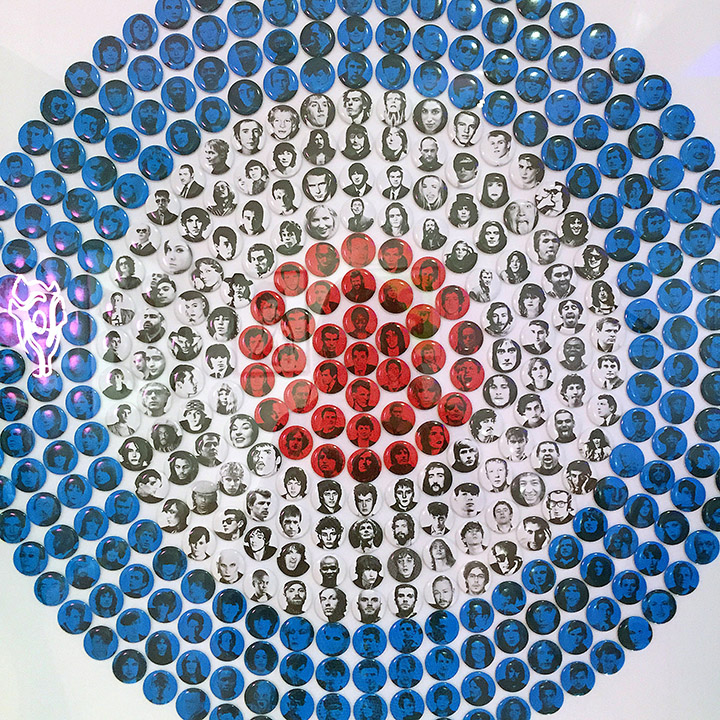
Musical icons such as the smiley and the target are rendered in coloured badges that remind me of the work of Ian Wright or Jimmy Cauty. ‘Cover Versions’ of Bowie & Beatles sleeves are cut up and modified, looking like physical manifestations of Photoshop filters. The mutated sleeves work well (the ‘Heroes’ one above is even preferable to Jonathon Barnbrook‘s reworking of same for Bowie’s ‘The Next Day’ last year) because he’s remixing the original physical media to form a new work, in the same way Christian Marclay has in the past. Where I find it less successful is when he’s recreated existing designs in vinyl – the Sex Pistols, Velvets (not shown) and Dylan covers for example. They’re beautifully done but they’re Reid, Warhol and Glaser designs, not Haynes’ and it irks me when I see artists reappropriating the iconic work of others. I feel the same way about the portraits of singers like Amy Winehouse, Blondie, Bolan and more in used copies of their old vinyl records.
It renders him as more craftsman than artist, reproducing and recontextualising the work of others, relying on the audience’s familiarity and love of the original subject matter to sell ‘his’ work. The same could be said for the smiley and underground map of course but these are now accepted cultural icons, as part of the public visual consciousness as Coca Cola or Apple. I love the look of his show but I’m conflicted because of some of its artistic origins. It’s on until May 30th, so still a month to check it out and make your own mind up. Photos courtesy of Leigh Adams
 I didn’t go into town for RSD, instead I stayed south of the river, went to smaller, local stores like Rat Records in Camberwell, Casbah and The Music & Video Exchange in Greenwich and The Book & Record Bar in West Norwood (above). Much calmer atmosphere, no crush or crazy queuing, no crowds. I saw some scenes in the centre of London on the day and it looked like Carnival was on. Read what happened to Mr Thing at his set on Berwick St. in the middle of Soho… not cool.
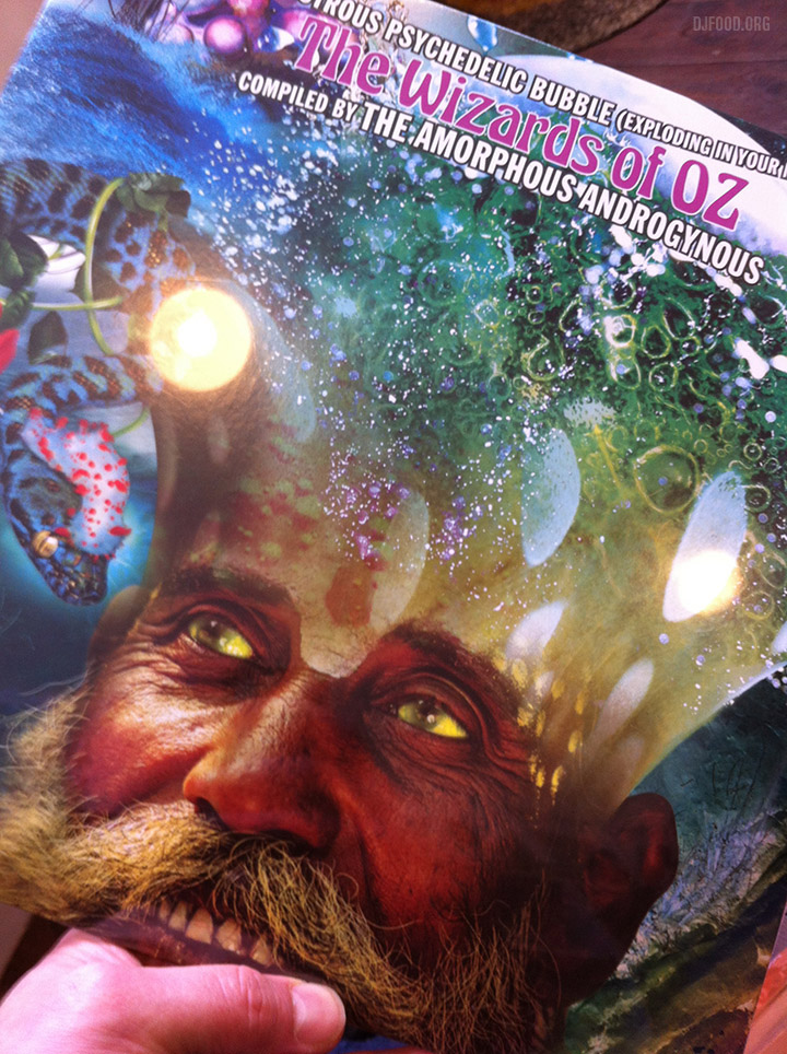
I went to West Norwood first, got there at 10am, walked in and pulled one record straight away from my list (the Amorphous Androgynous ‘Wizards of Oz’ comp above). No fuss, no crush, no queuing. They also still had records from RSD 2014 in the racks. I will go to Rough Trade at some point in the next few weeks to see what they have but I joined a queue there on RSD about 3 years ago and never again. It’s not for me, I don’t enjoy buying records that way. If people are all looking in one place I want to be somewhere in the opposite direction.
In all on Saturday I did four records shops, only two of which had RSD records, but I got plenty of vinyl, both old and new (plus books, magazines and a CD).
Also had time to see an exhibition (Snub 23, see previous post) and meet up with friends and family in the park. A relaxing day that involved going to record stores/shops and helping support them plus the artists and labels. No fretting about whether a record I wanted was going for stupid money on eBay, there’s plenty of time to hunt the one that got away down, I don’t need anything so badly that I have to pay those kind of prices. I should probably also add here, that this is pretty much the same as any number of other days in the year when I go shopping for records rather than making it a one-off.
 It’s that time of the year again when Secret 7″ rolls around and shows off its wares to the public before sale day. You know the deal by now, seven bands or recording artists provide a track pressed onto a seven inch record. Hundreds of artists are invited to design sleeves for one of the acts but aren’t allowed any titles on the image.
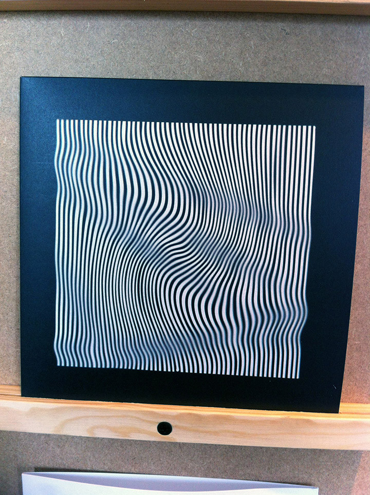
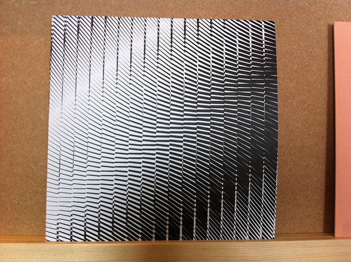
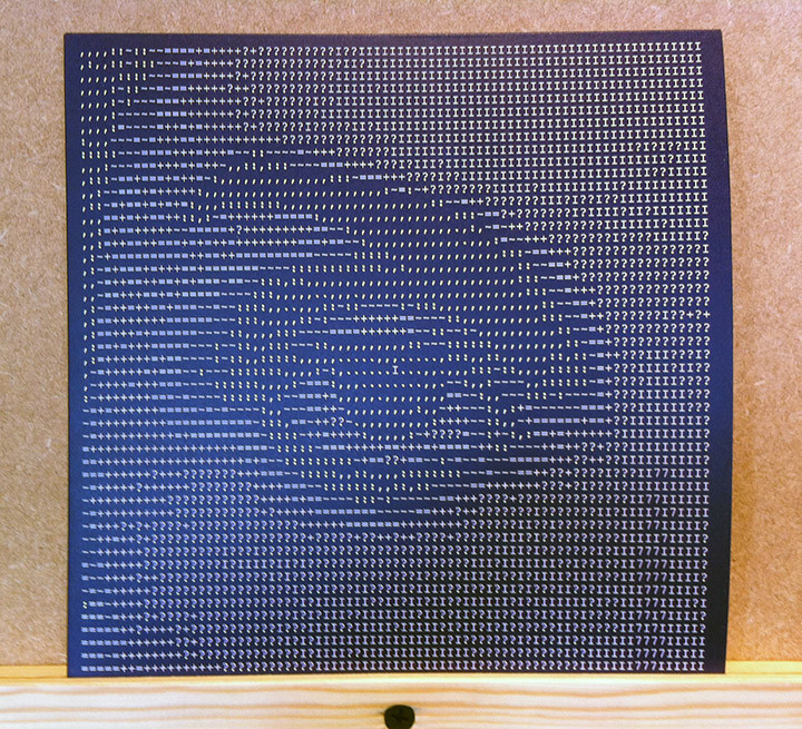

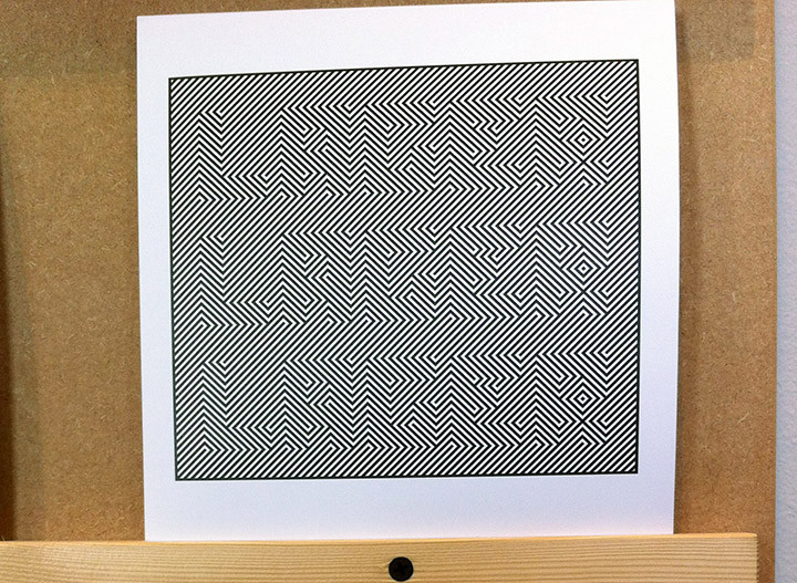
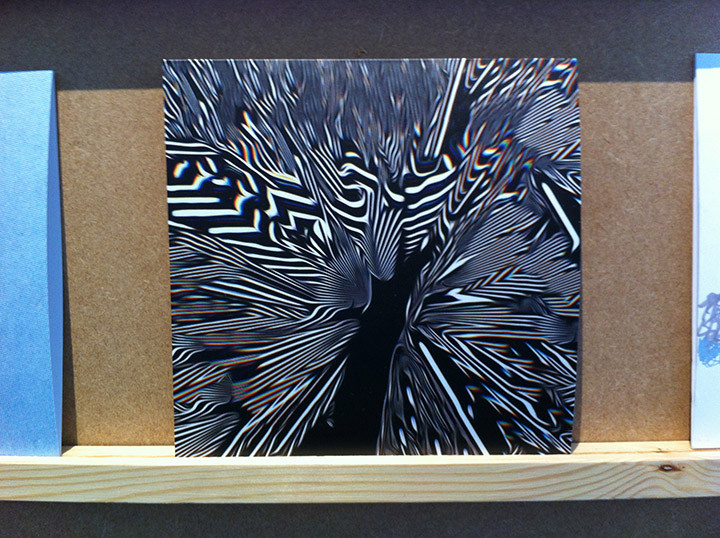
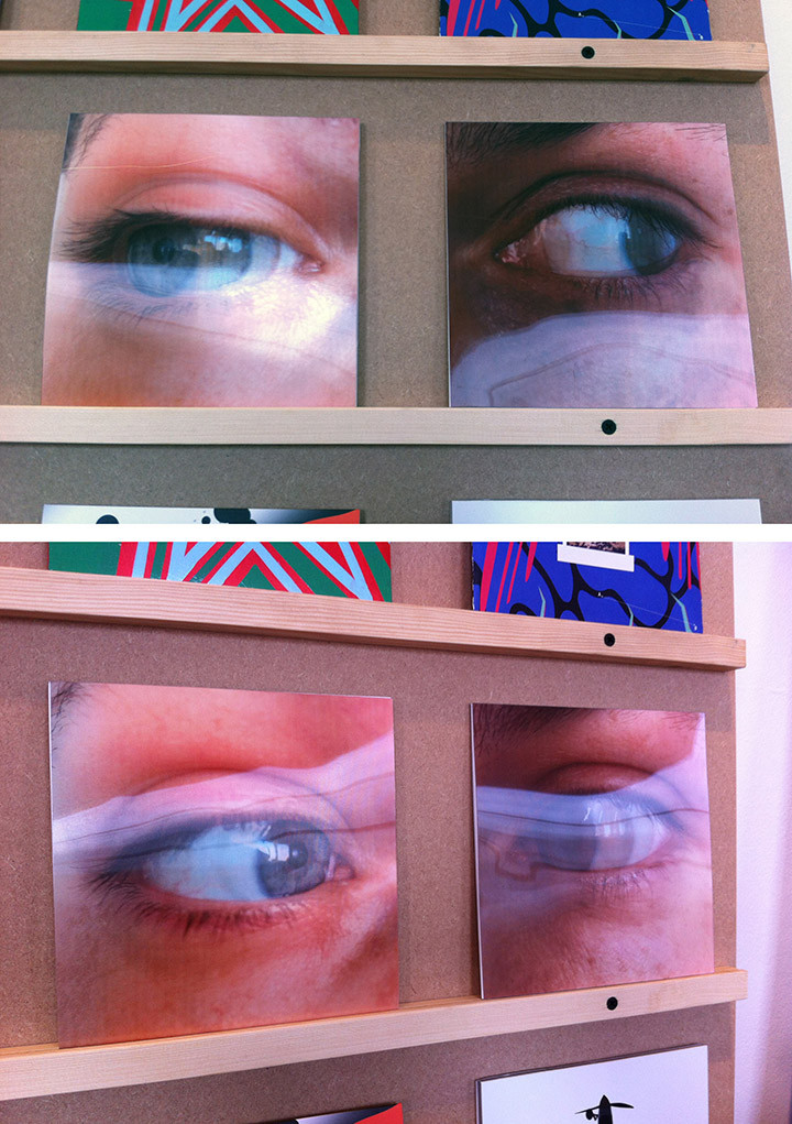
The records are housed inside their respective sleeves, all one-offs, and the public are allowed to buy them at £50 each, the proceeds of which then goes to charity. You have to second guess the covers if you want a particular song which can be tricky but some are more obvious than others. The two sleeves at the top of the post were lenticular so moved when viewed at different angles.
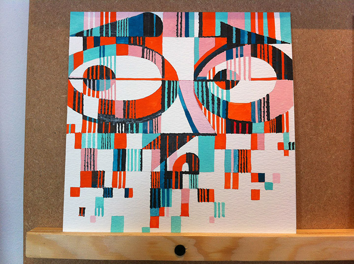
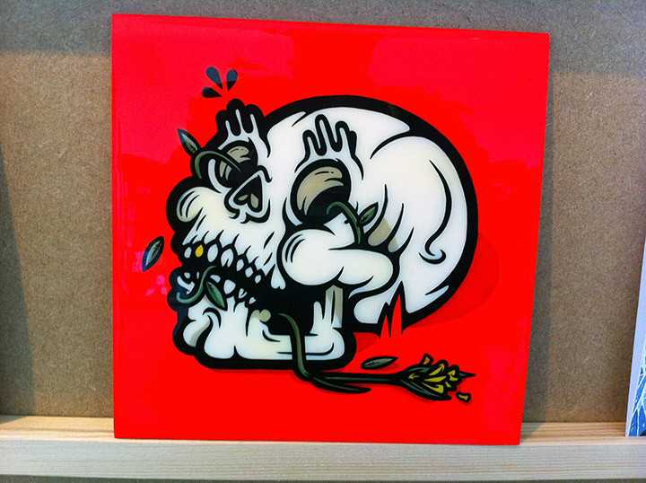
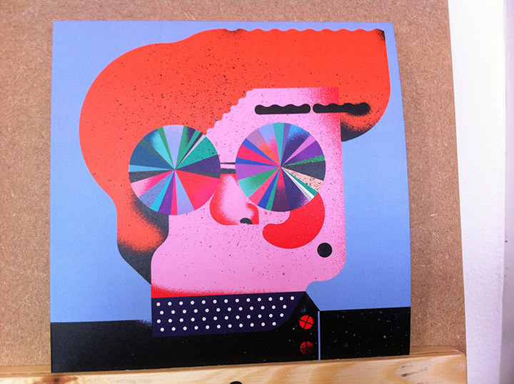
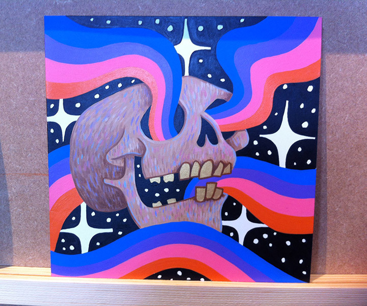
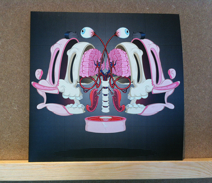
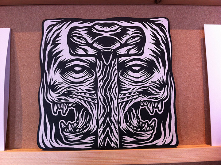
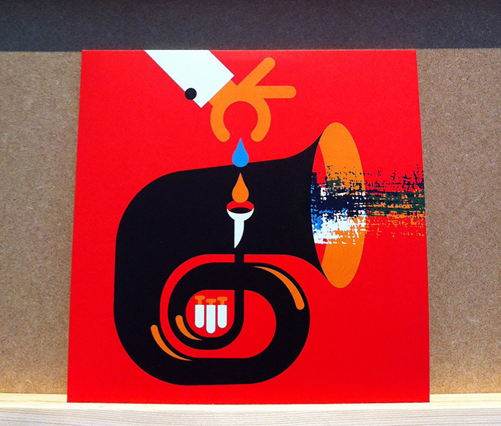
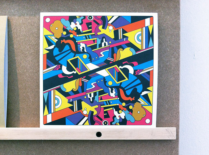
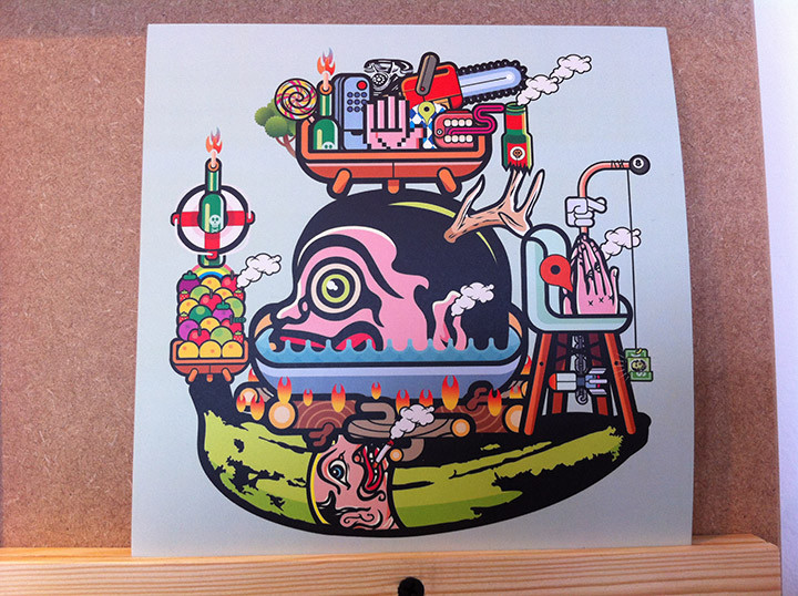

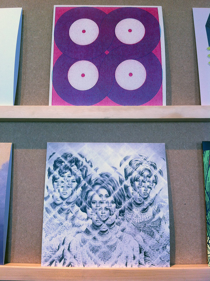
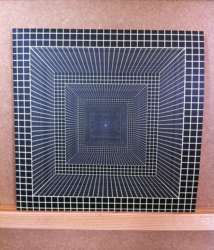
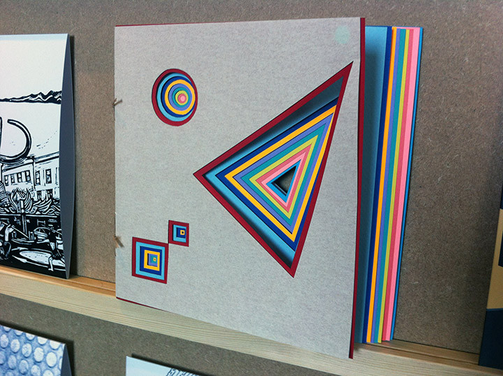
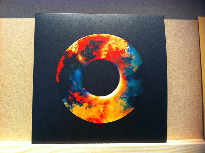
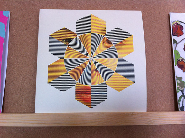
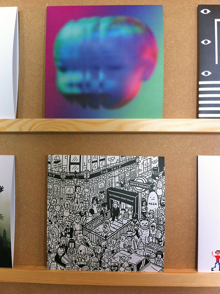
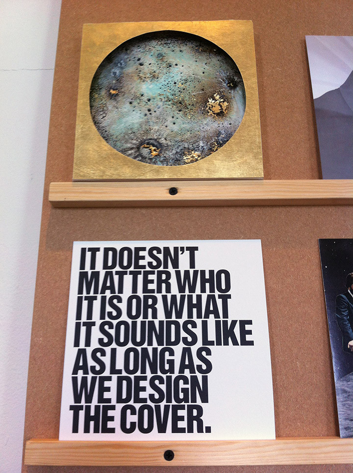
The venture has expanded this year and moved venues to Somerset House where they have seven prints to add to the occasion now. Another addition is a vinyl cutting booth where you can go and make your own one-off 7″ on the spot, you have 15 minutes to record something and £50 gets your song, message or performance on a unique piece of vinyl. Looking round the designs I saw several that I could quite happily own and there seemed to be different themes recurring: lots of Op Art, many more 3D works, flower skulls popped up at least three times and eyes were prominent. I’ve divided my own snaps into lots: graphic, illustration, Op Art and 3D work.




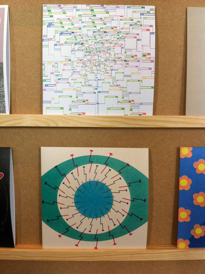
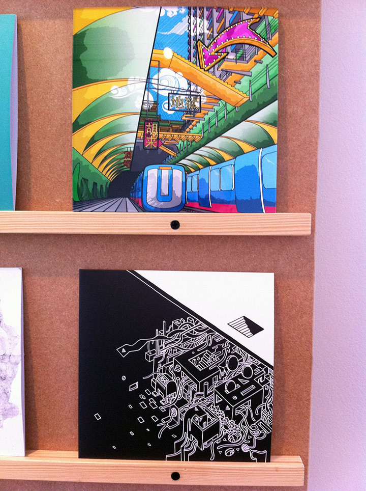

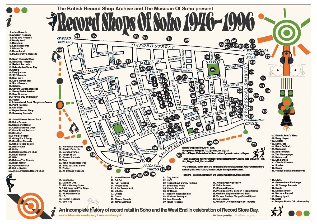 Fantastic map doing the rounds of all the records shops in and around Soho in London over a 50 year period (click for larger version). It’s no coincidence that last year’s Record Store Day celebrated by holding performances in Berwick Street, perhaps the heart of this map. Read MJ Carty’s blog about the legendary ‘record road’ here. Proud to say I once worked at a store on this street in the early 90’s, Ambient Soho/Worm Interface, right near the bottom, around no.11, close to where Gosh Comics now resides. I must get that added, it used to occupy the old Quaff Records shop site. This map coincides with an exhibition from Leon Parker’s archive which opens on the 11th of April at 2 Berwick Street.
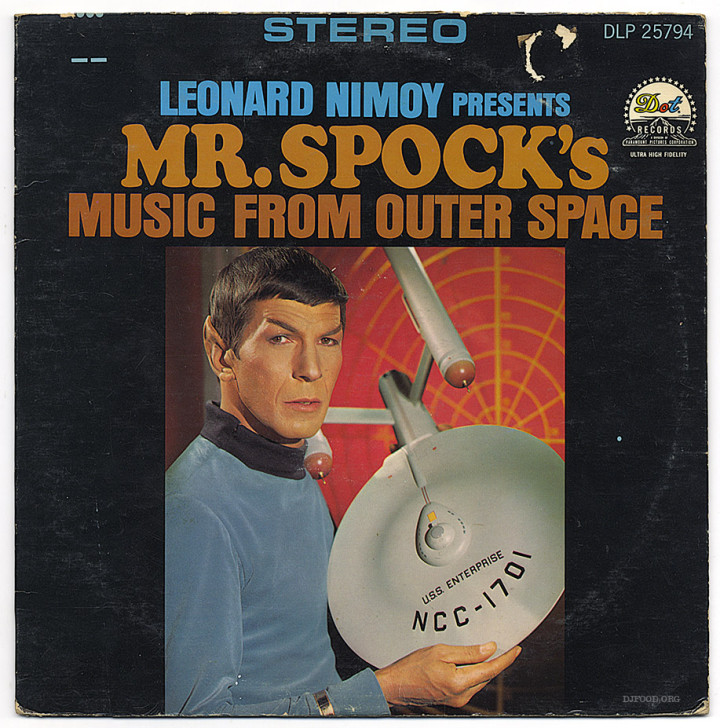 I was sad to hear of Leonard Nimoy‘s death over the weekend. Although I’ve never been a Trekkie his appeal for me was always his voice and I’ve dug out three records from the collection that feature him. The classic is ‘Mr. Spock’s Music From Outer Space’ album, a direct cash-in LP from the TV show that made him famous. As well as a groovey version of the theme from ‘Star Trek’ it also bizarrely features covers of themes from ‘Mission Impossible’ and ‘Oliver’ but the gold is in the spacey spoken word tracks were Nimoy shines, especially ‘Twinkle, Twinkle Little Earth’ and ‘A Visit To A Sad Planet’.
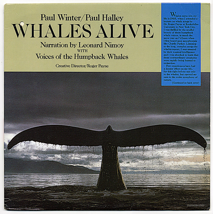
The second album is a 1987 release entitled ‘Whales Alive’ by Paul‘s Winter and Halley with narration by Nimoy. This is essentially a New Age record with voices of Humpback Whales accompanied by Leonard reading relevant spoken word passages. In the early 90’s I used to play selections from this over my ambient sets, one track in particular, ‘Queequeg and I’ extracted from ‘Moby Dick’, was a favourite. Unfortunately the record obtained a scratch at some point and you can hear it during one of my first ever Solid Steel sets from 1993. Near the end of the piece, just as it builds to a crescendo, Nimoy reads, “as he stood…” and the record jumps back to a perfect loop of the line, as I realised what was happening in the middle of the live mix you can hear me quietly fading the line out.
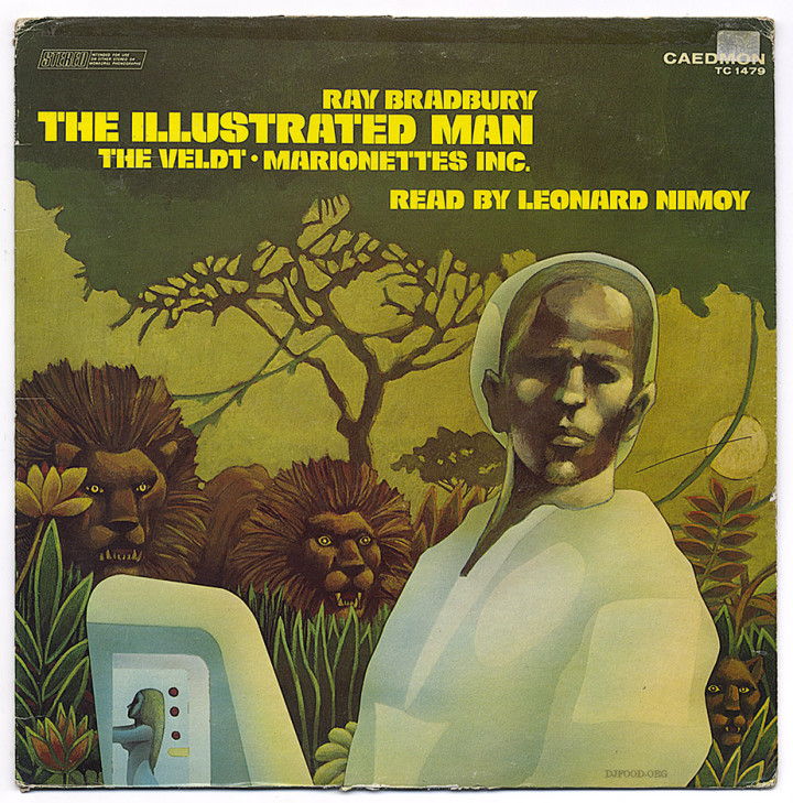
Probably the best known use of Leonard in one of the mixes I’ve been involved with though is the Ray Bradbury ‘Marionettes, Inc.’ story used during the ‘Taking of Pelham 123’ section of ‘Now, Listen’. I can’t lay claim to this as it was 100% PC‘s inclusion and arrangement but it stands as one of the most memorable moments of the mix. Someone has uploaded it to the web and it starts at around the 10 minute mark. I can’t recommend this 1976 Caedmon LP enough being that it contains Nimoy reading two other classic Bradbury sci-fi stories. RIP Leonard.

I love some of these designs from the first 20 or so releases from Mo Wax by Ian ‘Swifty’ Swift. I’ve purposely excluded the more well known releases like RPM, DJ Shadow, Attica Blues and La Funk Mob that came to characterize the label later and focused on the less well remembered artists. The first 3 releases had stickers like obi-strips on white sleeves and later they were printed on the covers.

