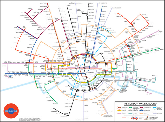
 This debuted in January this year apparently but I only just saw it, I rather like it as a new take on the standard London Underground map. The redesign isn’t official however but was done by Dr Max Roberts, based on concentric circles, partly inspired by the orbital London Overground. He posted it on the Going Underground blog earlier this year because he felt the regular map was becoming too crowded with the recent addition of new lines like the East London Line. It’s probably not geographically correct but then neither is the regular tube map, it does show however, show unbalanced the South of London is in relation to the North where transport links are concerned.
