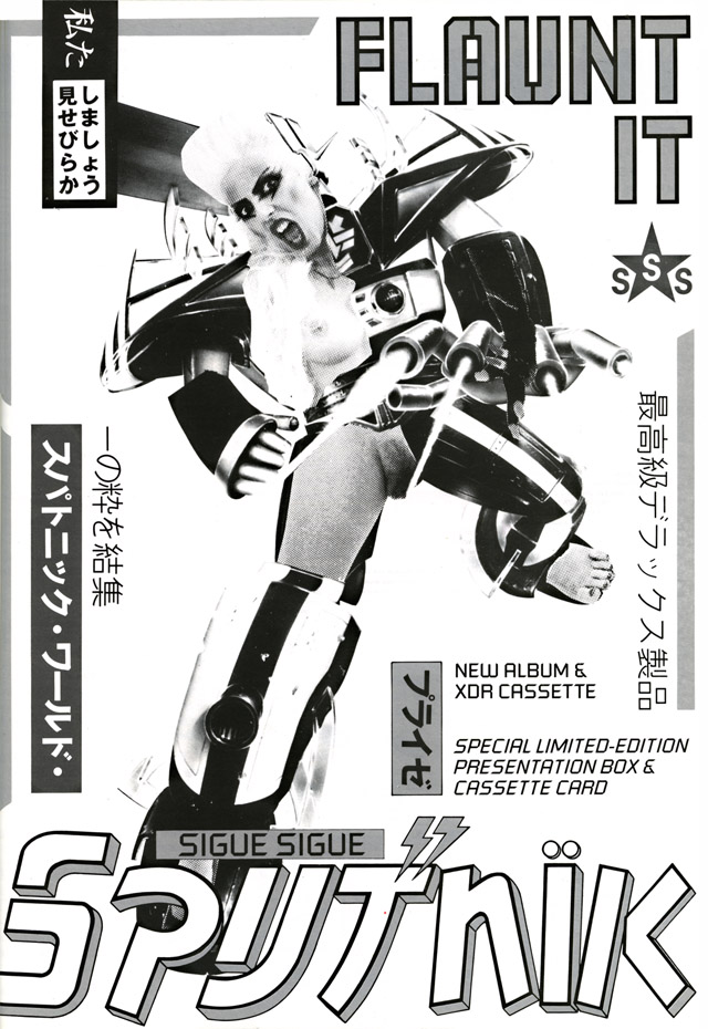
Sigue Sigue Sputnik – ‘Flaunt it’ ad from i-D

From an issue of i-D magazine dated Aug ’86, this recently turned up in an expedition in the Secret Oranges archive (incidentally it’s Steve Cook‘s birthday today). A rather risqué ad for Sigue Sigue Sputnik‘s debut album, ‘Flaunt It’, which I seem to remember got banned from most publications at the time. I’m a big fan of Sputnik, especially this Giorgio Moroder-produced album and its surrounding singles, so you’ll occasionally see posts about them featured here.
Tony James, band leader and general mastermind behind them recently wrote up their history at length on their newly-launched website and it’s a candid, no-holds-barred read. As with any history, it’s his version of events and I’m sure there’s another side to it but he’s very forthcoming about the failings of the second album and the record industry crap that went with it. There are also all sorts of outtakes and demos up online under the heading ‘Demobomb’ which are pretty illuminating in terms of how they got their sound.

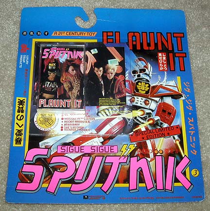
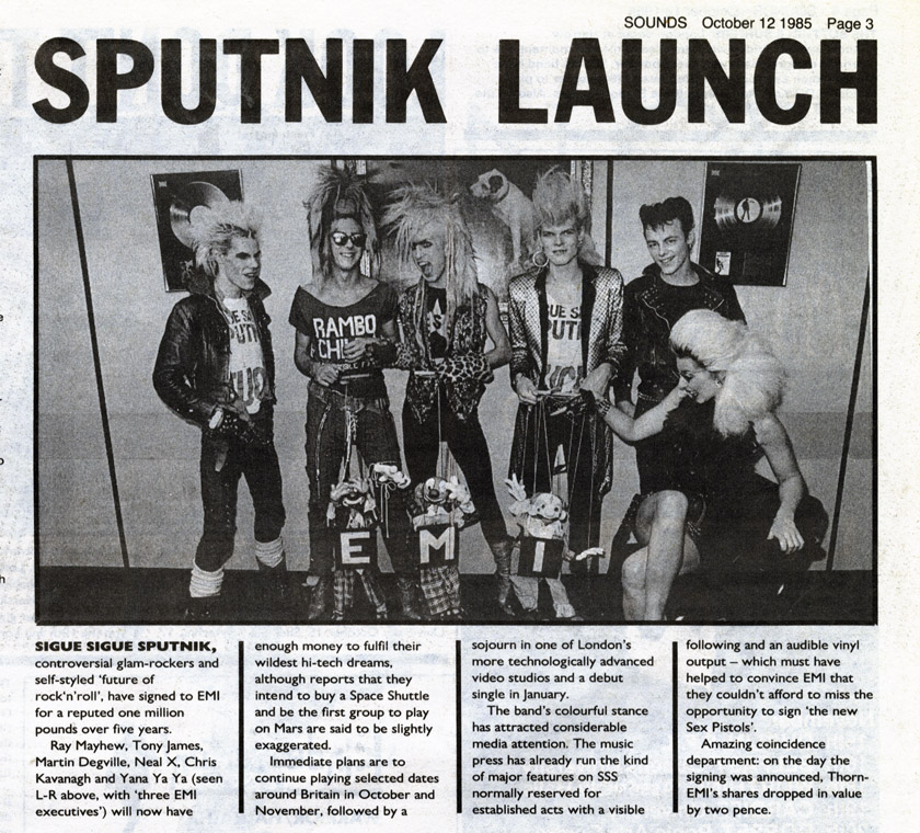
Also below is the news piece from Sounds the week the band signed their ‘million pound’ deal. This was quite something at the time as the band had a lot of hype surrounding them without a recording to their name but had managed to get the sort of double page features in the music press usually reserved for established artists. Also if anyone has a sealed copy of the cassette on card version of this album, (see above) packaged to look like a toy, then I’m still looking for a copy.

Posted in Design, Magazines. | 3 Comments |

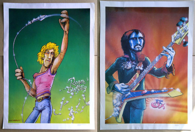
Vintage late 70’s comic rock posters on eBay


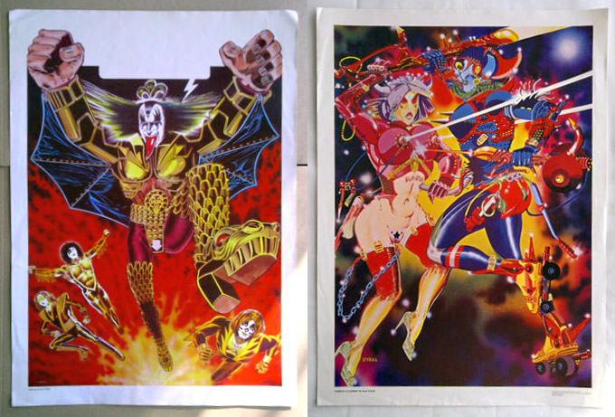
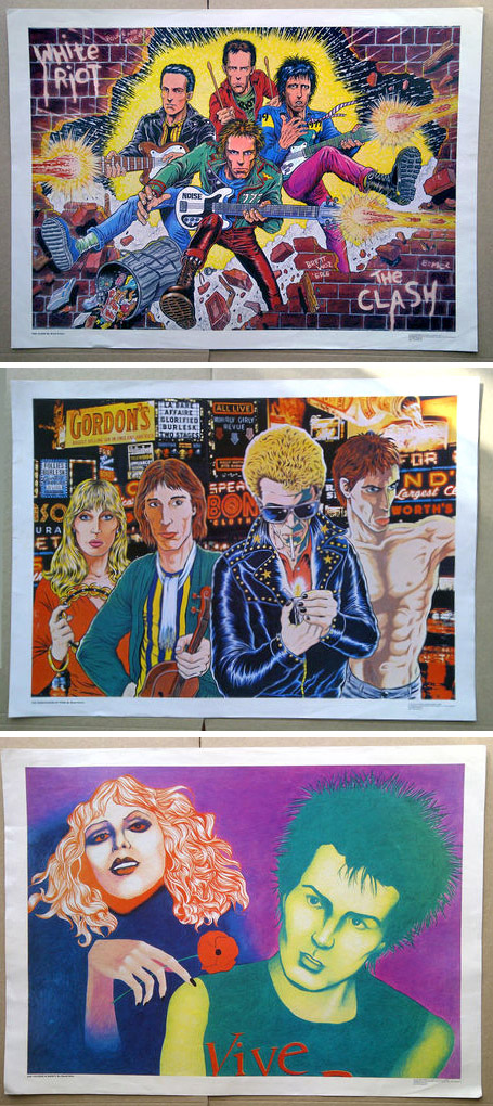
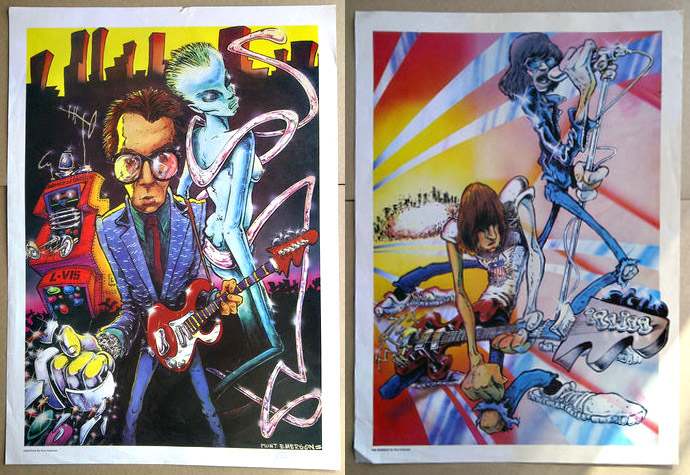
These vintage posters from the late 70’s, and many more of their kind, went up on eBay today from the seller v6kentman.They’re something you rarely see these days in a world where image and copyright is controlled meticulously; illustrated versions of current music idols, originally printed by Communication Vectors of London in 1979 and sold as posters.

What makes some of these especially interesting to me is that they are illustrated by some of the best of the UK’s underground comic artists at the time: Hunt Emerson, Kevin O’Neill, Bryan Talbot, Brett Ewins, John Higgins and David Hine. I’ve seen the O’Neill ones before but the rest are new to me and there were a lot of them it seems with 2 series’, A & B.

I can find virtually nothing about these on the web aside from a few more examples like Sid Vicious by Ewins and The Sex Pistols by Emerson. If anyone knows more about them then please get in touch. V6kentman has many more for sale though, all starting at £9.99 and featuring loads of other artists such as The Stones, Bowie, Ian Dury, The Runaways, Dylan, Zappa… some great, some not so successful. All fascinating to see though and linked in to a project I’m researching on music illustration in UK magazines from the 70’s onwards.

PS. David Hine writes:

“I hate that illustration! I think that was done 1979 or 1980. There were dozens of posters produced by Communication Vectors. This company, run by a guy called Mal Burns, also produced the comic Pssst! It was a weird setup, I think the money came from a mysterious French millionaire.
I do remember that all the submitted artwork was exhibited in a room and artists were invited to a meeting to vote on which should go to print. It was a ridiculous system. Only a small proportion of the artists were able to get there and I confess we fiddled the vote along the lines of “I’ll vote for yours if you vote for mine.” There were posters by Hunt Emerson, Bryan Talbot, Brett Ewins and Brendan McCarthy among others. Here’s a link to Brendan’s excellent take on The Specials and Johnny Rotten: I think I also did a Buzzcocks print. We were well paid for the time – £200 per artwork if memory serves.”

Posted in Art, Comics, Poster / flyer. | 3 Comments |

Demdike Stare – Test Pressing #1


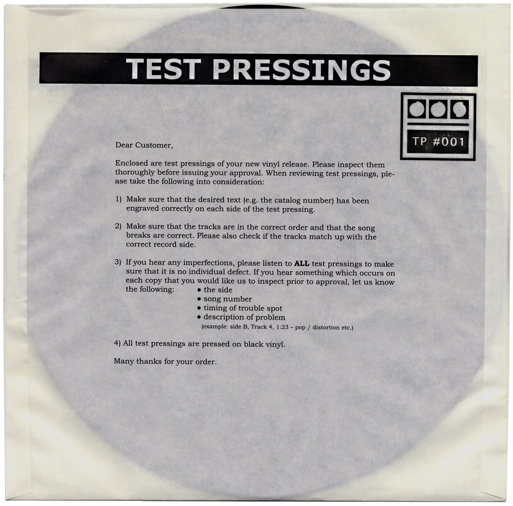
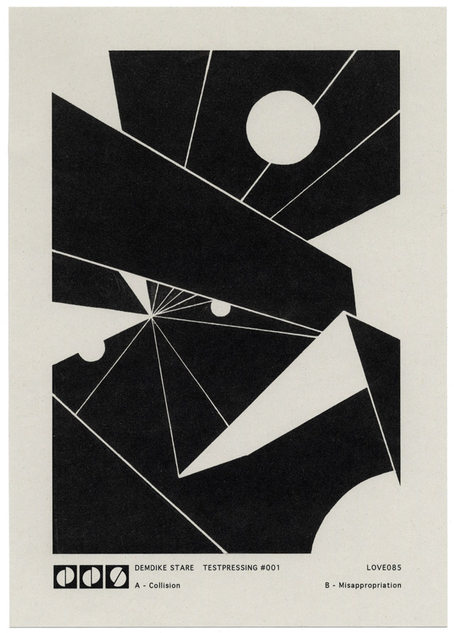
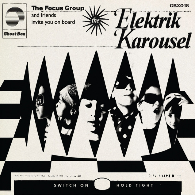
The new Demdike Stare 12″ has a nice twist to the packaging and design. It comes in a paper sleeve, housed in a second thin PVC protective cover with an A4 insert and labels that are either black or white for sides A and B. On the front are instructions that customers would see if they had ordered their own set of test pressings to approve before a release.

For those that don’t know, once a record is finished it goes to a cutting house where they make a master ‘lacquer’ of the disc on a large lathe in real time. That lacquer is then sent off to the pressing plant and a small number of ‘test’ pressings are made, usually called ‘white labels’ due to the fact that a white label is pressed onto the centre where the regular label would go. These are then sent to the artist or record label to check that ‘the cut’ was OK and that everything sounds fine before proceeding with the full run of the pressing. It would be foolish to go through such a delicate and variable process without checking a sample copy before pressing hundreds or thousands of discs only for them to all be defective.

The new release is the first in a series of ‘Test Pressings’ by the duo and the cover sets out the various steps you should take when getting such a pressing yourself. Only the catalogue number appears on the front, no titles or even the group’s name (that’s on the insert) and the same thing is repeated in German on the reverse of the sleeve. I think this is their best release in a while, dark and sinister as usual but more beat-orientated this time around, in an industrial meets jungle kind of way.

Posted in Design, Packaging, Records. | No Comments |
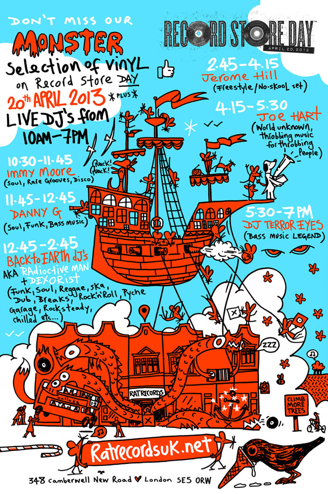
Rat Records poster for RSD by David Vallade

Record Store Day is only 3 weeks away and, as usual, my local used record store, Rat Records in Camberwell, will be celebrating. I had great fun playing there last year and, as is traditional, my good friend David Vallade has out done himself this year with his poster for the event. They have six separate in stores this year, lord knows where they will fit everyone!

Rat doesn’t have any of the usual RSD releases as they are a used store but they have new stock every Saturday and will be stockpiling specials for April 20th I’m sure. If you’re South of the river and don’t fancy joining the scrum uptown but want to just rummage in the unknown and support a local business in the celebration of vinyl then this is a good place to start.

They are just off Camberwell Green, nearest tube is Oval, nearest overground is Denmark Hill and there are plenty of buses from Oval or Elephant that go straight there.

Posted in Event, Records. | No Comments |

The Search Engine – 4×12″ repress for RSD 2013


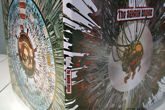
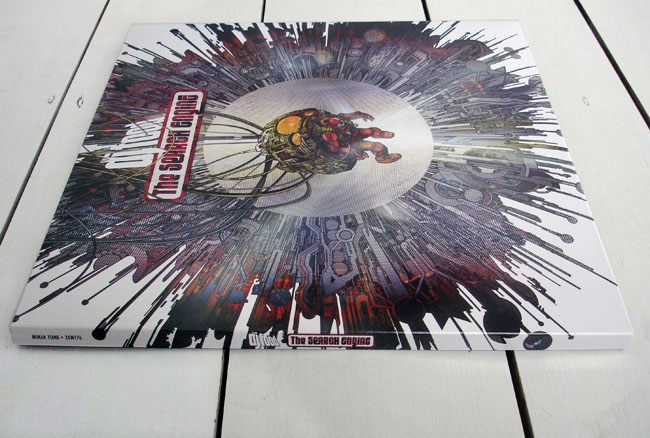
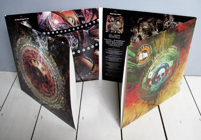
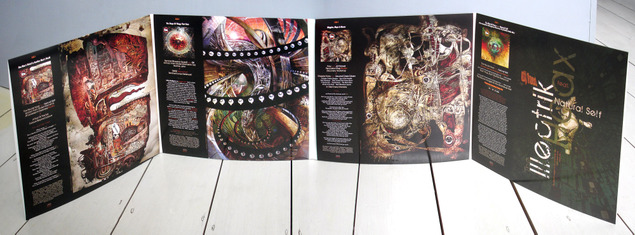
On Record Store Day this year (April 20th) Ninja Tune will release a four disc vinyl repress of the EPs that made up my album ‘The Search Engine’. These are straight represses of the original three EPs (One Man’s Weird…, The Shape of Things… and Magpies, Maps & Moons) plus the Amorphous Androgynous remix 12″ from last years’ RSD (on black vinyl this time though).

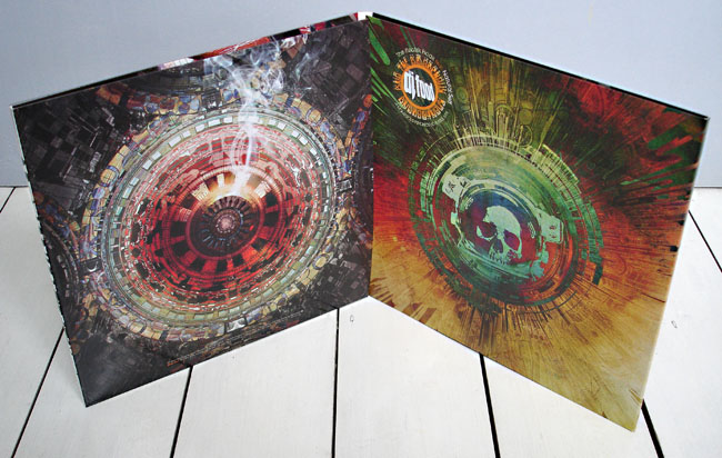
The first three 12″s have been out of print for some time now and contain extra tracks and some different mixes to the CD album, with some tracks also being full length versions. If your bought these the first time round there’s nothing new here I’m afraid except the poster covers are replaced by an eight panel foldout sleeve, similar to the original limited edition ‘Paul’s Boutique’ LP.

Each disc has its own sleeve and the spine measures a tasty 13 mm in width, easy to find in the rack for sure.
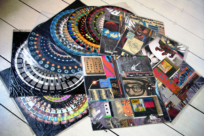
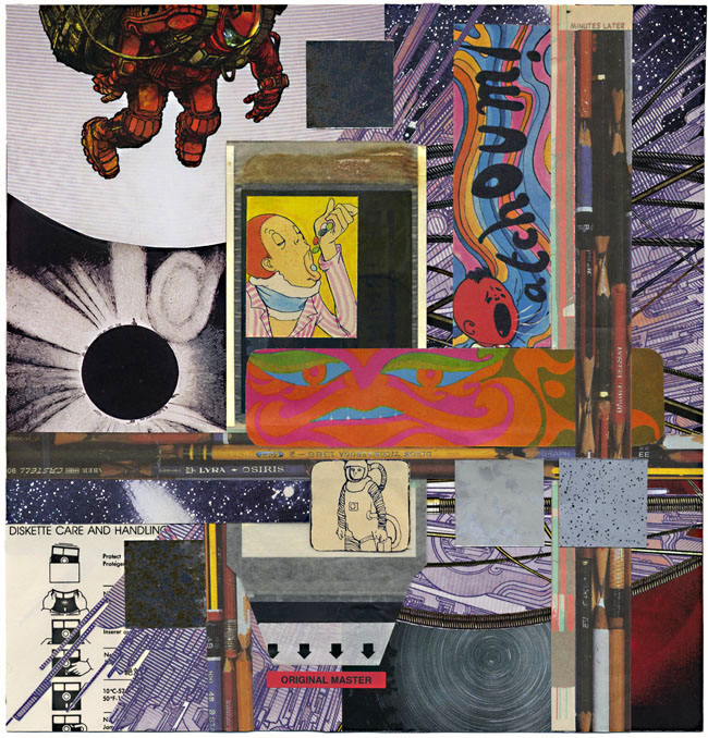
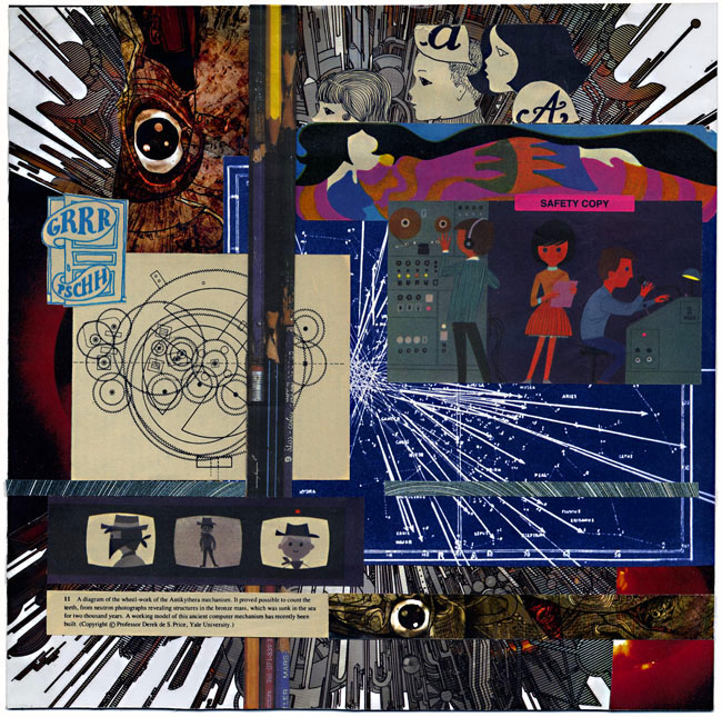
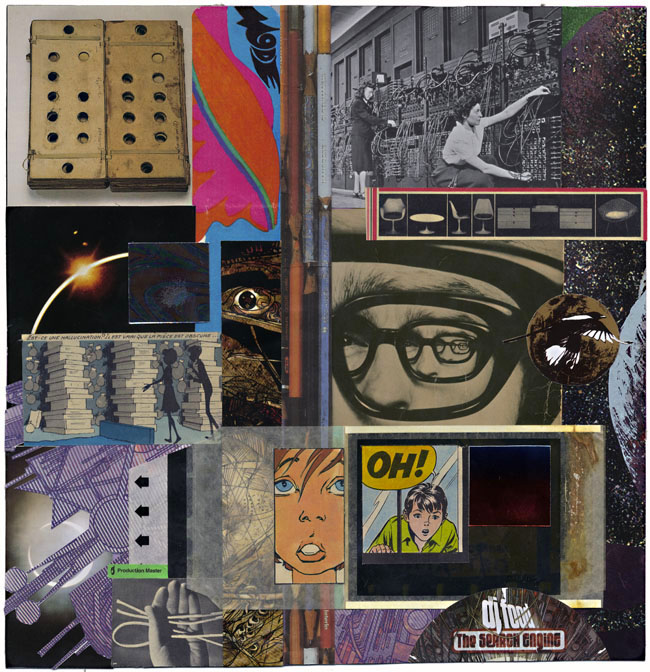
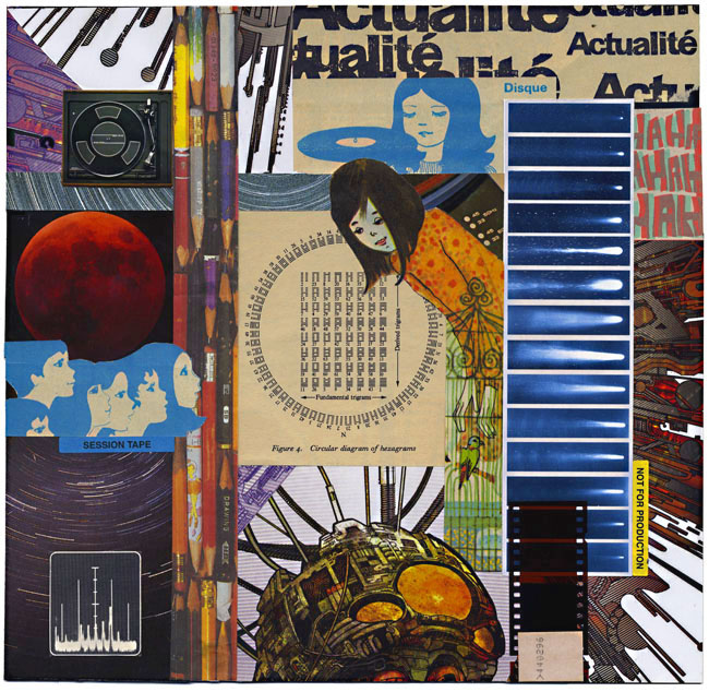
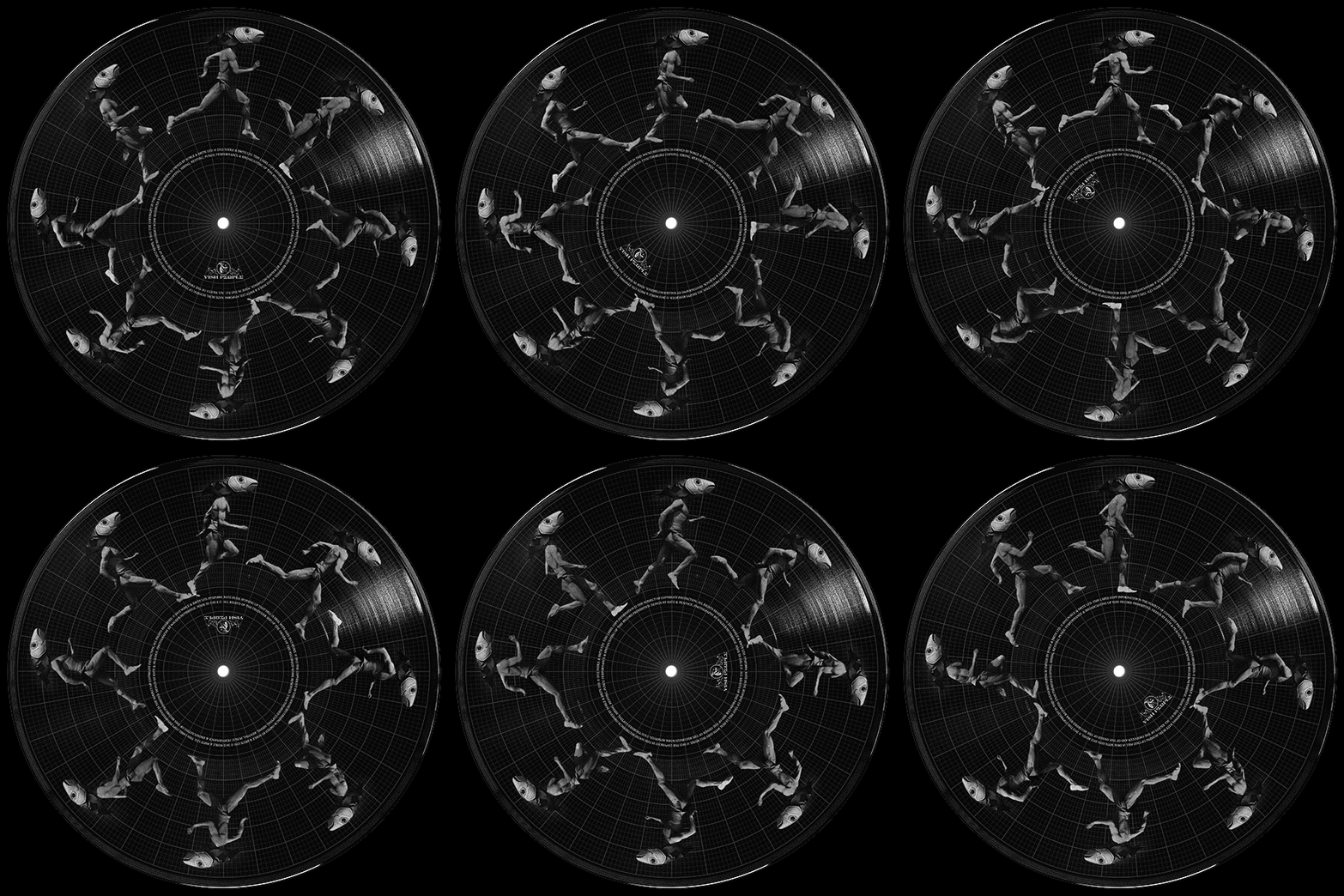
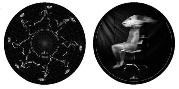
In the spirit of the title and to add a little something for RSD I’ve had ten unique pieces of artwork inserted into random copies of the album. Six high quality prints of zoetropes that I made for the exhibitions last year and four unique collages as seen below.
All are 12″x12″ in size, signed, stamped and protected by a transparent sleeve. If any readers of this blog find one, please let me know, it will be nice to see how far they go out into the world. I’m sure the Ninja Tune online shop will have copies the Monday after RSD so don’t worry if you can’t get to a store, everyone has a chance to find one of the inserts, they’re completely random and could go out to whoever orders them, not just stores participating in RSD.

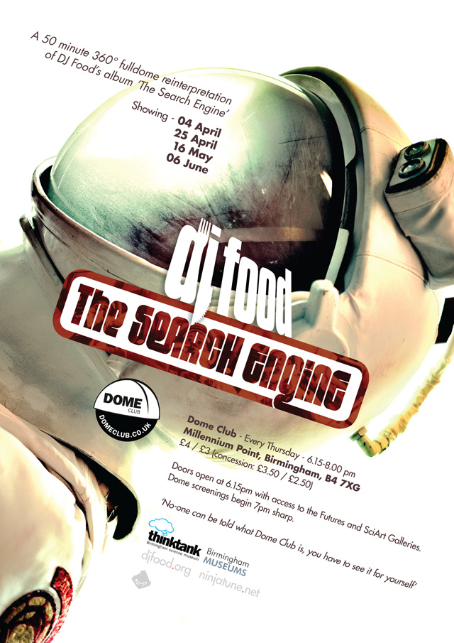
The Search Engine at Dome Club, Birmingham

Starting next week at Dome Club, the UK’s first weekly place to see full dome content, is the first of four performances of ‘The Search Engine’. This is a 360 degree film for the full dome (or planetarium) environment.

It’s been seen before in London, Leicester and Montreal but this is a newer, revised version that lasts 50 minutes and presents an alternative version of the album with film, animation, photography and graphics.

The first show is April 4th, starting at 7pm at the Think Tank planetarium at Millennium Point, Birmingham. It will then be shown on the 25th, then May 16th and June 6th. Admission is £4 or £3 depending where you sit – the middle back half is usually the sweet spot for dome showings.

The club has weekly showings of all sorts of interesting, art-based full dome films and it’s really the sort of experience it’s hard to convey without actually going yourself. Here’s the little short about the Montreal version of this show that I did last summer.

Ticket available both online or at the door, go to: domeclub.co.uk > TICKETS > Dome Club -> 4th April (or whichever date you’re after).

A Psyche For Sore Eyes compilation

Getting a copy of this little release has been a mission, by the time I found out about it it was sold out on pre-order. I put it on my Piccadilly Records wishlist and hoped, badgered the label to repress it but they couldn’t afford to. Eyed up copies on eBay but didn’t want to give the flippers the satisfaction but finally succumbed when the label – Sonic Catherdral – put up one  of their final copies to raise money for Red Nose Day a couple of weeks back. I think it was the most I’d ever paid for a 7″ (two actually) but it’s going to a good cause so fuck it.

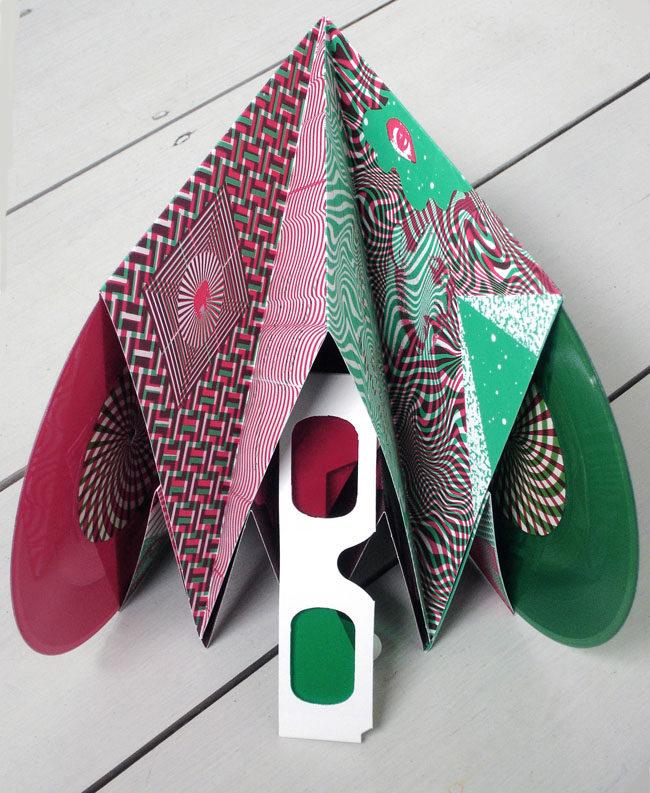
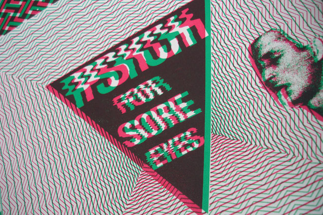
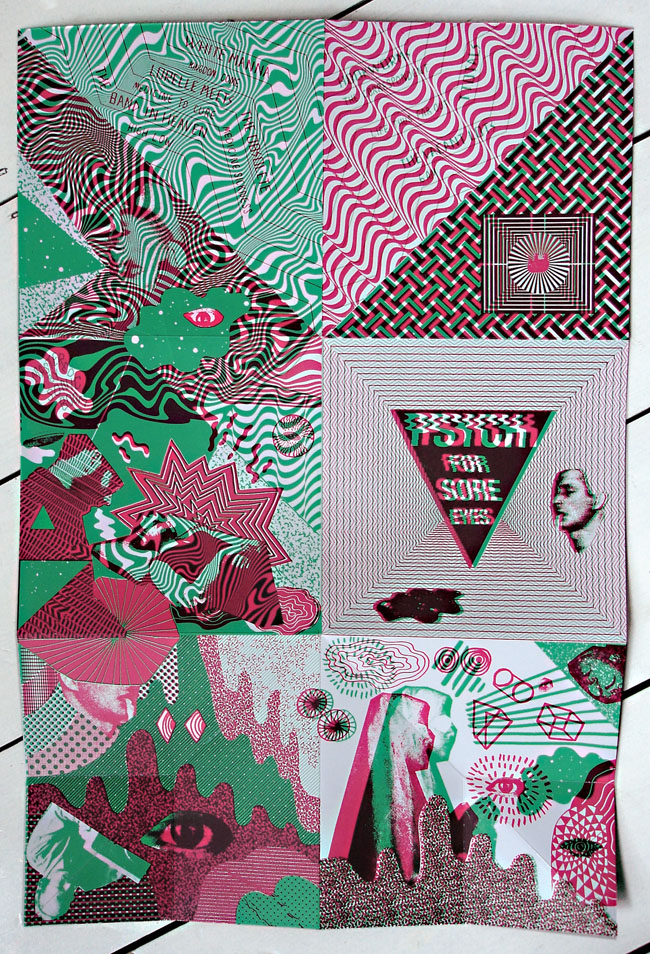
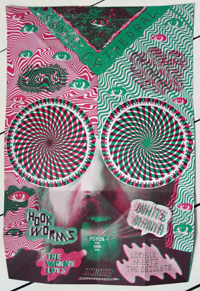
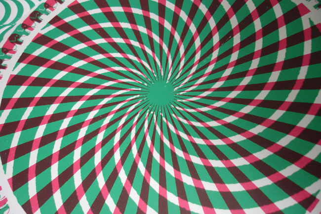
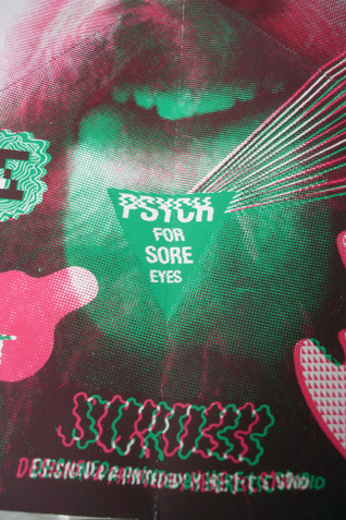
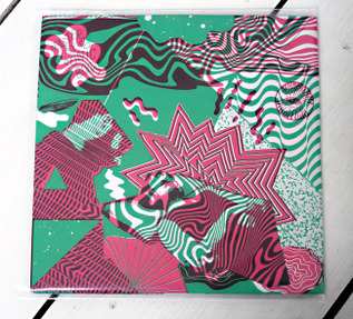
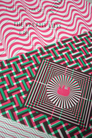
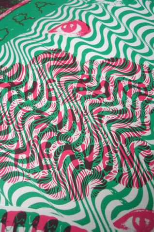
‘A Psyche For Sore Eyes’ is a beautifully realised package, designed by Heretic, to house two coloured 45s, a pair of 3D glasses and a whole heap of psychedelic imagery. The paper engineering is particularly clever in the way it accommodates each component and the glasses aren’t just a gimmick. Rather than have ‘look I can touch it’ 3D the red/green balance works more in an op-art sense, similar to the 3D underground comix designs I posted two years back.

Musically I wouldn’t call it ‘psyche’ as such, – it’s a compilation that swings from indie rock to shoegazing drones to electron-noise. Lead track, ‘The Correspondent’ by Hookworms, is so reminiscent of ‘A Storm In Heaven’-era Verve that it’s hard not to imagine ‘mad’ Richard Ashcroft on vocals. The Vacant Lots have been worshipping at the alter of Suicide but in a good way and the fuzz bass and reverb of Lorelle meets the Obsolete reminds me of both the 60’s and the 90’s simultaneously (see ’60, see ’90, go! anyone?*). Even though it’s hard to find in stores you can listen and buy digitally.


*(bad Bow Wow Wow joke – sorry)

Posted in Design, Music, Packaging, Records. | 1 Comment |

Iron Maiden ‘comic’ covers

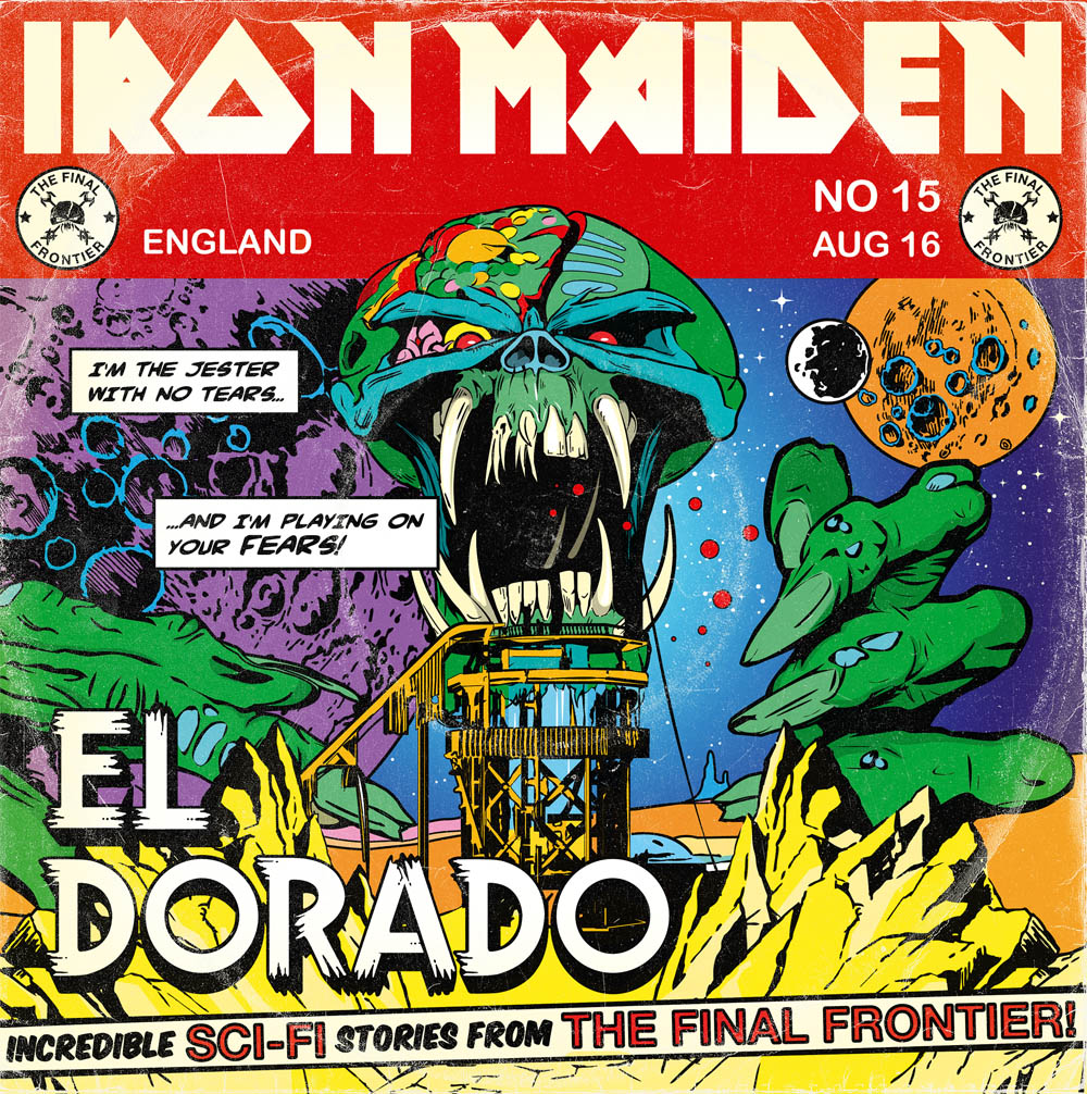
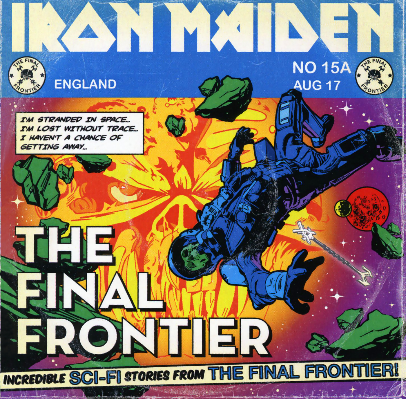
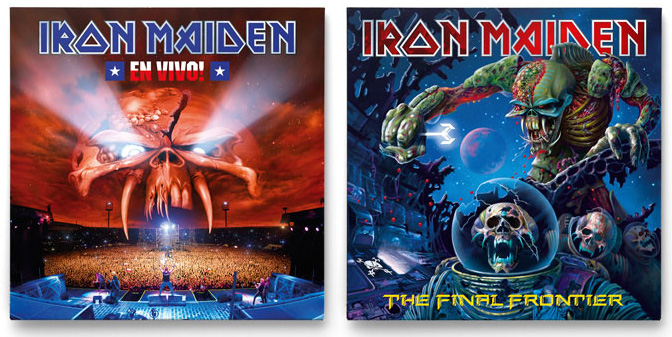
Every guy my age has a soft spot somewhere for Iron Maiden‘s covers (some of the music wasn’t bad either but I dipped out around ‘Somewhere in Time’). Their mascot, Eddie, has been with them through thick and thin, morphing and warping into new identities with each album and I just came across these two designs that ape classic sci-fi comics of the 60’s. I’m not sure if these were designs that didn’t make it as there seem to be more traditional versions of the same titles with Derek Riggs‘-style airbrush images too. But if you’re going to do the ‘comic’ look then this is how to do it. UPDATE: turns out that these were by Anthony Dry, see his comments about them down below.

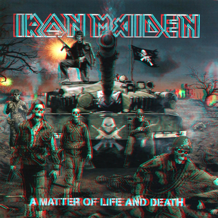
I also found this cover in 3D and couldn’t resist posting it

Kate Bush zoetrope picture disc

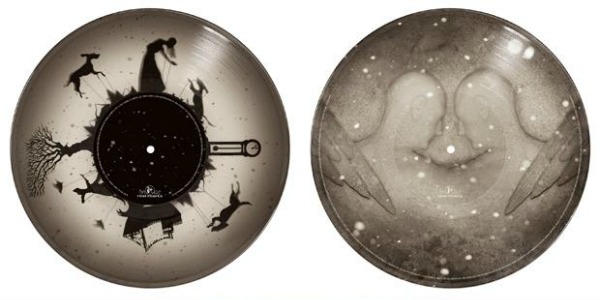
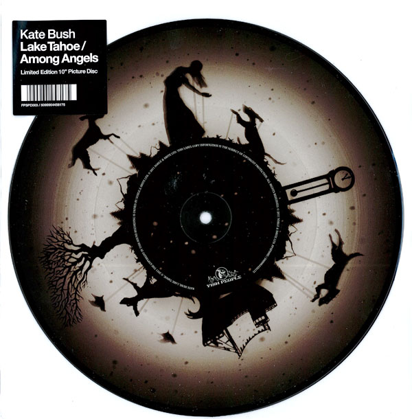
Another zoetrope picture disc – this time for Kate Bush‘s Record Store Day release of ‘Running Up That Hill’ (2012 remix). This will be on a 10″ but it’s not known yet how many copies will be pressed or how you’ll actually see this animate on the turntable. The design was put together by Peacock who also did the same for her last year – and check out the lovely homepage for Kate’s site here.

Posted in Design, Records. | No Comments |

Shogun Kunitoki ‘Vinonaamakasio’ LP pic disc / zoetrope


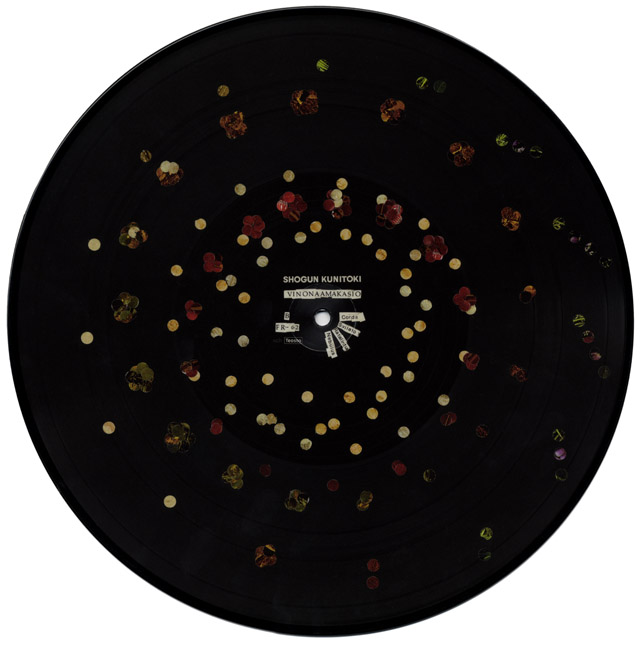
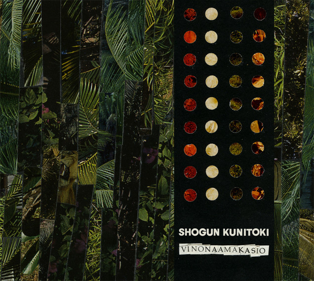
I’ve been meaning to post this for ages, it’s quite an old record now, being released in 2009 on Fonal Records. Shogun Kunitoki make epic organ-led instrumental space rock and their second album came as a picture disc which also doubles as a zoetrope. They even went so far as to issue a ‘Mystical Shogun Kunitoki Strobe Light’ with which to view the animated designs. The first edition is sold out but they have a few here, unfortunately the record is sold out though. Watch a clip of how it works and steps to build your own here. The Amorphous Androgynous included a track on one of their Monstrous Psychedelic Bubble mixes way back and you can check them out on iTunes.

Posted in Music, Records. | 1 Comment |

Machine Drum 10″ VIP release on Astrophonica

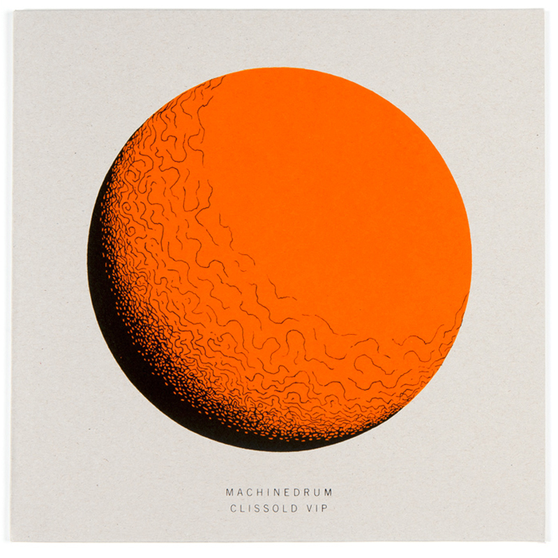
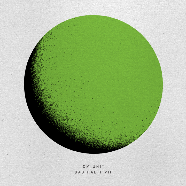
Astrophonica end their trilogy of VIP 10″s with Machine Drum‘s take on ‘Jungle Juke’. It works a treat and sits alongside the other two rather nicely. Each sleeve is screen-printed in two colours, hand stamped and the whole run is limited to 300 of each disc. Fracture and Om Unit head up the first two releases and they can be bought from here.

In other news, Machine Drum just signed to Ninja Tune! :)

Posted in Design, Records. | No Comments |

Dragon’s Heaven by Makoto Kobayashi

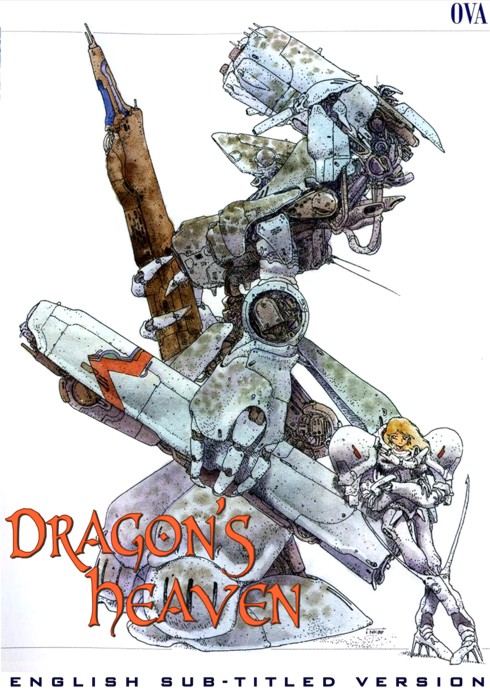
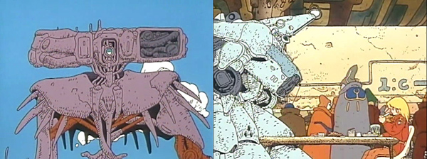
I hadn’t seen this before: Japanese Manga artist Makoto Kobayashi‘s ‘Dragon’s Heaven’ was an animated short made in 1988 featuring a lot of his weirder mech designs and drawn in a style more reminiscent of Moebius than the more polished styles you’d see in the Gundam cartoons.

Kobayashi’s mecha are unique, spindly, organic, curvacious and look like they could fall over any minute. It’s sometimes hard to tell where the eyes are or even which way round the body should face as his angular designs defy all regular robotic logic. This is the only time I’ve seen an animated short with this kind of look. The film starts with a face off between two actual models before moving into animation but the credits turn into a mini making-of feature involving the models from the intro.

You can see the whole thing on YouTube but it’s split into several parts.

Posted in Film, Robots. | 1 Comment |