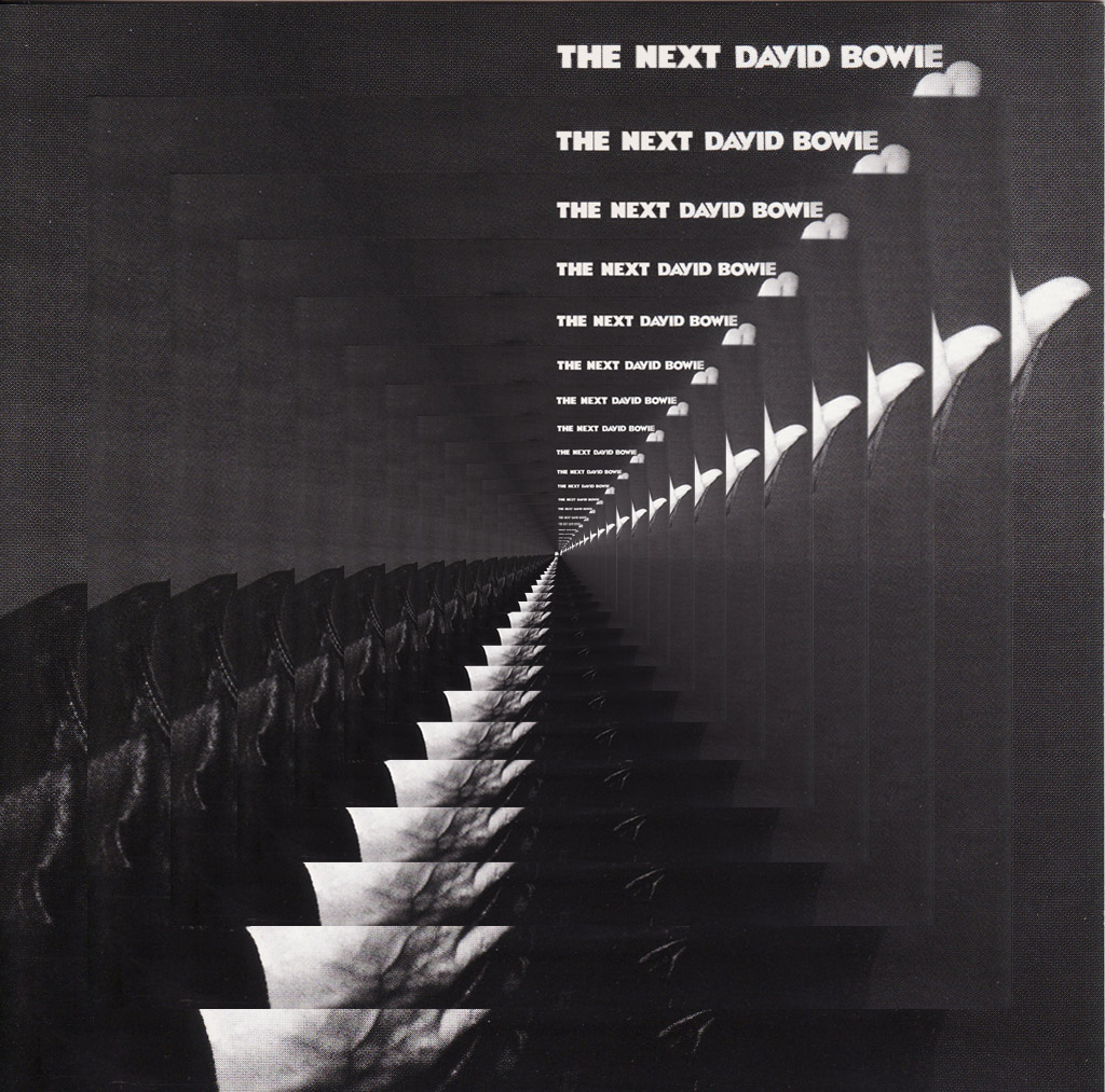
David Bowie – The Next Day

When the cover image for David Bowie‘s ‘The Next Day’ appeared earlier this year I was firmly in the ‘dislike’ camp. Designer friends raved about it but I just couldn’t agree, although it was nice to have a debate raging over a piece of graphic design – brilliant PR move there. Jonathan Barnbrook‘s defacing of Bowie’s classic, ‘Heroes’, did nothing for me visually despite being a bold move from Bowie for allowing such an act to become the cover of his new album. Supposedly signalling a need to move on and obscure the past from which any artist is always judged, Barnbrook said, “The obscuring of an image from the past is also about the wider human condition; we move on relentlessly in our lives to the next day, leaving the past because we have no choice but to.”
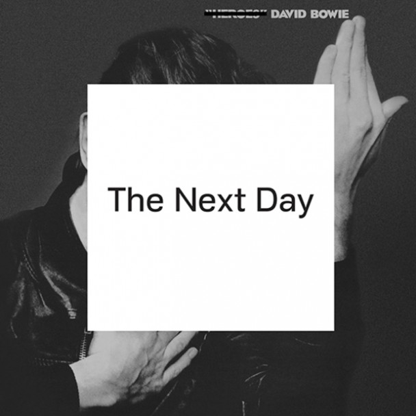
Fair enough, I can get with that but the result is dull and ugly to me, the casual scoring out of the original title and insertion of a white square seemingly designed to provoke. The use of a classic image reminds me of lesser designers who take other’s established icons as part of their own to bolster their visual cred, the equivalent of someone wearing a faux-distressed Led Zeppelin T-shirt they bought in Top Shop last week. The dull typeface across the middle… there’s just nothing to say about it. I would have liked it if they’d have physically stuck a white square with the title onto actual Bowie albums from the past, not just ‘Heroes’ but any of them, that would have had some impact.

The moment passed, as all internet ‘storms’ do, and the first single emerged to rabid fanfare, which I was also unmoved by. I like Bowie but I can’t say I could remember a song he’s done since the ‘Let’s Dance’ era if I’m honest and I stopped checking him out a long time ago. Then, last week, I was at dinner with some friends and one recommended I listen to it as it was, ‘the best thing he’s done since ‘Scary Monsters’. Really? But the single was a maudlin ballad, sung by a man who sounded like he was reminiscing about his glory days – although excessive plays on 6 Music over the past month have softened me to it somewhat. ‘No, that’s the only thing like it on the record, the rest is just a great rock album, said the friend. So I went home and checked the stream on iTunes. My god, he wasn’t wrong.

After hearing the single, the album is a revelation, not only is it full of killer hooks and inventive arrangements, it’s Bowie in full flow. Opener, ‘The Next Day’, kicks straight in and within 70 seconds roars into the chorus with Bowie hollering for all his worth, “HERE I AM, not quite dying, my body left to rot in a hollow tree!” As opening tracks on a comeback album go, that takes some beating and immediately silences all the pundits who were sure the album would be a melancholic glance back at the past by an aging icon. You’d never know it was the same record to feature, ‘Where Are We Now?’, which is a huge curveball of a lead single if ever there was one. ‘Dirty Boys’ skanks along sounding like he’s being backed by Fishbone at a New Orleans wake, ‘If You Can See Me’ is just intense, his voice pitched into alien dimensions whilst navigating a time signature that would tax any competent player. ‘Dancing Out In Space’ recalls the best parts of the 80’s pop like ‘Modern Love’, a joyous, bouncy song with doo-wop backing vocals whilst ‘Boss Of Me’ alternates hard and soft that even the saxophone can’t spoil. There are shades of both 70’s and 80’s Bowie, the ghost of Robert Fripp‘s guitar (although he doesn’t actually play on it), the mood is generally uptempo and his band is tight as… It’s chock full of singles and you wonder whose idea it was to lead off with what is essentially the breather you get after the first five tracks. The closing track, ‘Heat’ sounds like ‘Low’-era Bowie meets Scott Walker doing ‘The Electrician’, a chilling piece to end the album. If you get the deluxe download edition there are three bonus tracks too, none of which are filler in any way.

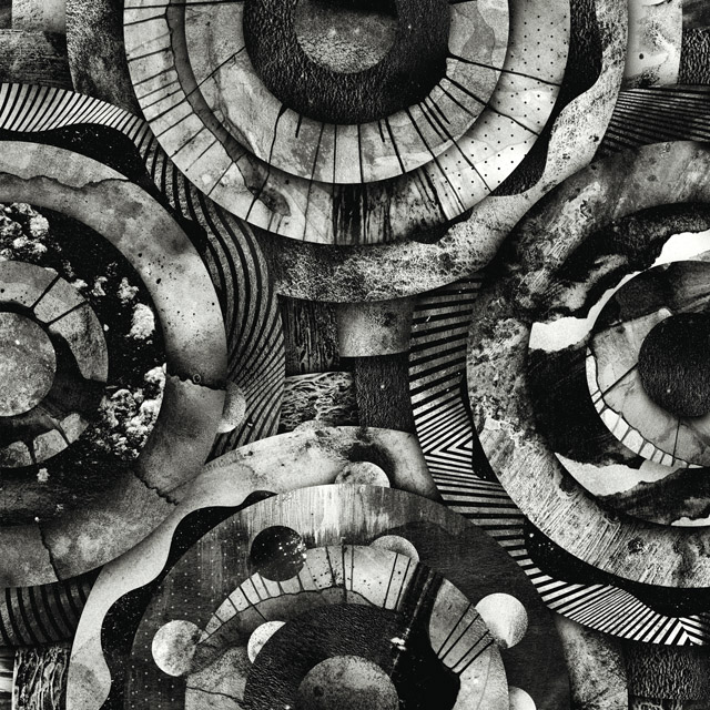
All that to say, I love it, I’ve played virtually nothing else all week and, inspired by the music, I decided to do my own take on defacing ‘Heroes’ which I’ve posted above.

Posted in Design, Music. | 6 Comments |

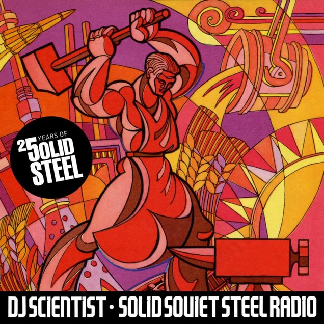
DJ Scientist’s Solid Soviet Steel mix

DJ Scientist, label head of Equinox Records, pulls out all the stops for his 25 years of Solid Steel mix this week with a Solid Soviet Steel special.. Never someone to do things by halves he’s been working on this for months and there’s a lot of background info to go with it:

Solid Soviet Steel Radio (SSSR) is a special guest mix for Solid Steel by DJ Scientist that solely features music from the former Soviet Union. The dedicated record collector, disc jockey and label owner from Berlin managed to unearth and put together an extensive and fascinating selection of tracks from countries like the Ukraine, Azerbaijan, Georgia, Moldavia, Russia and more.

More than that, to make it even more special, this first lesson in a series of other Soviet mixes by DJ Scientist is dedicated to tracks by so-called VIA bands. VIA is an abreviation for Vocal Instrumentalis Ansamblis or Vocal Instrumental Ensemble which was basically the synonym for pop groups in the Soviet communist states throughout the 70s. Many of these groups managed to create their own kind of sound, mixing western styles like Jazz, Funk and Rock with traditional music from their own countries. For example, very unique vocal harmonies can be heard in VIAs such as Iverya (Georgia) or Gaya (Azerbaijan).

All tracks have been recorded from original vinyl from the Soviet state label “Melodia” (Melody) and have been mixed and edited with Serato Scratch Live and Cubase. Some of the bands appearing in the mix cannot clearly be labeled as VIAs. Rero for example usually was an instrumental group and has been called “Variety Orchestra”. However, on the track “Come Outside” they play together with a vocal group. Technically speaking, the famous “Rude-Paparude” by Maria Kodrianu is not a straight VIA track too, as Kodrianu was a well known solo singer from Moldavia. However, here she is backed by one of the funkiest grooves, played by a VIA that was lead by A. Mordkowicha.

The artwork is taken from the cover of the Soviet youth magazine Krugozor issue 11/72.

Image Duplicator exhibition at Orbital Comics in May

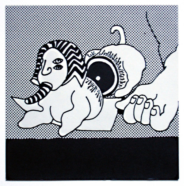
No, that’s not a Roy Lichtenstein, it’s Dave ‘Watchmen’ Gibbons after Irv Novick and this is his entry for the Image Duplicator show that starts in May at the Orbital comics gallery in London. The aim of the show is to highlight the original artists that Lichtenstein copied and produce a new take on their images, much the same as he did. The difference in this case will be that the show will mainly consist of comic book artists and commercial illustrators and be held in a gallery in a comic shop rather than an art gallery. The exhibition is the brainchild of designer Rian Hughes who has long written about the contradictions between what is deemed high and lo art and is a champion of showcasing lost or forgotten artists’ work.

For those unfamiliar with the nuts and bolts of Lichtenstein’s aping of others’ work as his own, take a look at this amazing site by David Barsalou called DECONSTRUCTING ROY LICHTENSTEIN. He has painstakingly tracked as many of the sources that Lichtenstein copied and presents the two side by side, the results are quite shocking both in how exactly he copied and how bad or bland the results are.


There was a great documentary on about him on the BBC just two weeks ago called, ‘Whaam!’ It covered his career from both sides of the story as well as featuring a section with Dave Gibbons making his case for the originals over Lichtenstein’s copies. The Image Duplicator show runs for two weeks between May 16th-31st, centered around the same time that The Tate Modern end their Lichtenstein retrospective. There is still time to enter if you fancy it and any proceeds from sales of prints will be given to the Hero Initiative charity that looks after the welfare of senior comic creators.
In another nice piece of synchronicity, this week the story broke about the aging British artist Brian Sanders who was sought out by the producers of Mad Men to illustrate posters for the new series in his old style. They found his originals in a book called, ‘Lifestyle Illustration of the 60’s’ and asked their art department to draft something in the same fashion. Rather than copy the style they went and found Sanders and the results speak for themselves. Just by coincidence, the person who put the book together that they saw the work in was none other than Rian Hughes.
Posted in Comics, Event. | 4 Comments |

A Case of mistaken identity with AJ Barratt Pt.1

Below is a post from my ‘other’ blog – ArtOfZTT.com – where I post artwork relating to the ZTT label and interview the people who made it.
I arrive early, at a pub just outside Hither Green station in deepest South East London, to meet Tony ‘AJ’ Barratt, renown music magazine photographer and key ingredient in the early days of ZTT image-making. His photos of spanners, statues, masks and landscapes gave an identity to (the) Art of Noise as well as gracing the first release from the label, ‘Into Battle’. He also did many live shots, promo and video stills for Frankie Goes To Hollywood and Andrew Poppy.

It’s Friday evening and the place is filling up, the only photo of Tony I’ve got for reference is 30 years old and he’s told me to look out for ‘a hairless Glenn Gregory, ex of Heaven 17 lookalike’. After about 10 minutes a guy comes in who might fit the bill and I catch his eye, ‘Tony?’, ‘Yes’, he says, shaking my hand but with a very puzzled expression on his face. ‘Tony Barratt?’ I enquire, ‘ah, no, you’ve got the wrong person, he says, ‘but my name IS Tony though’. With perfect timing, the right Tony walks through the door holding a copy of the Ambassadors Theatre program for ‘The Value of Entertainment’.

He does indeed look like Glen Gregory, albeit without hair, and is instantly warm, engaging and candid about his early experiences in the music business. We’re joined by his partner, Jan, and after a couple of pints we repair to his house nearby where I notice the 12″ picture discs for both ‘Relax’ and ‘Two Tribes’ amongst the many pictures hanging on their walls.

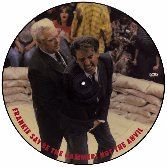
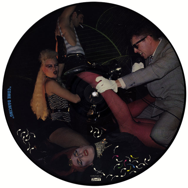
FGTH War Hidden 12" Pic Disc AFGTH Relax 12" Pic Disc AHow did you get it touch with ZTT? Presumably you knew Paul from working at the NME or was that later?
No, it’s much more personal than that, I moved down to London with Paul’s sister, Jayne (they were an item). I knew Paul in Stockport, vaguely…
Is that where you’re from?
Yeah, and he bought out a fanzine – ‘Out There’ – sent it down to the NME and they said, ‘you’ve gotta come down and speak to us as soon as you can’. He went down and started off his career, this must have been early eighties so that kind of fits in. I moved down to London with Jayne in ’83 and I was a photography student at Harrow. In my second year there, obviously Paul Morley was (at) the NME and he was doing all this great stuff, (so) I took my stuff to the NME. This was before the Art of Noise or whatever. I was shown the door.
I went to the Melody Maker and started doing work there, concert stuff and photos and things, and then as time went by, Paul suddenly started to get involved with… I’ve no idea how that whole thing came to be – that he met with Trevor Horn, you might know a bit more about it or it might be mythologised by Paul or whatever.

The accepted story is that he interviewed Trevor when he was in the Buggles…
Yeah I remember that.
…he slated them, but when Trevor got the opportunity from Chris Blackwell (head of Island records) to start a label, he remembered Paul and got in touch. That would have been at some point in ’82 or ’83 presumably so you would have done those Art of Noise photos in the summer?
(Laughs) It’s awful to say but I have no memory of when or how, you have to remember that I was coming to the end of my photography course, I don’t think I’d actually left and there was this vague idea of some vague photos that might be needed for this vague idea of a group. And it was never something that was kind of like, ‘here’s a brief, we would like you to go out and do this’. The record label started and there’re all very exciting PAs at the Camden Palace with the Frankies, all sorts of bands were signing and people were interested and it was going to be the artist event of the… which it turned out, in some ways, to actually be.

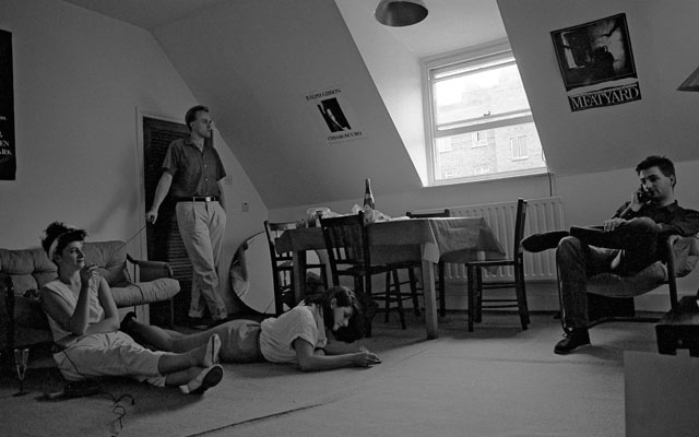
AJ, PM +friends 1AJ (with cable release), Paul Morley (with phone) and friends circa ’83 – AJ: “I took this from across the room with the cable release, if I remember, Paul was on the phone to Trevor sorting out the ZTT thing.”

But I can’t actually remember. I remember it being a great time, I’d moved down to London, I was on the guest list of these great parties and it was free drinks and I thought, ‘oh my god I can’t believe this’. And then there was this record label and there was the Frankies and this vague idea of this thing called The Art of Noise and it was never like a… Because the members were so busy all the time, it was never like, ‘the group are going on tour now, etc.’ So there was no real sense of urgency.

They weren’t a group in the classic sense were they? They were producers, studio engineers and arrangers, which is commonplace today, but back then… They were ‘the music’ and Paul was ‘the image and the words’ and he knew how to present them.
Yeah, I’m not sure how you’d describe it, and he would chuck things in, he really did chuck things into the mix there, but there was never any sense there of… a plan. I got the impression that the music they made was at the end of a hard day producing whoever the hell it was.

The initial ideas for the Art of Noise apparently came from producing Yes, they stole a drum track which was going to be wiped, which then became the basis for ‘Beatbox’.
Well, if you listen to ‘Owner Of A Lonely Heart’ by Yes, there’s a bit in the middle where it kind of flips up and I remember that being crucial to the Art of Noise. I think that’s when Morley kind of went, ‘that’s what the Art of Noise should be’.

AON Spanner 2

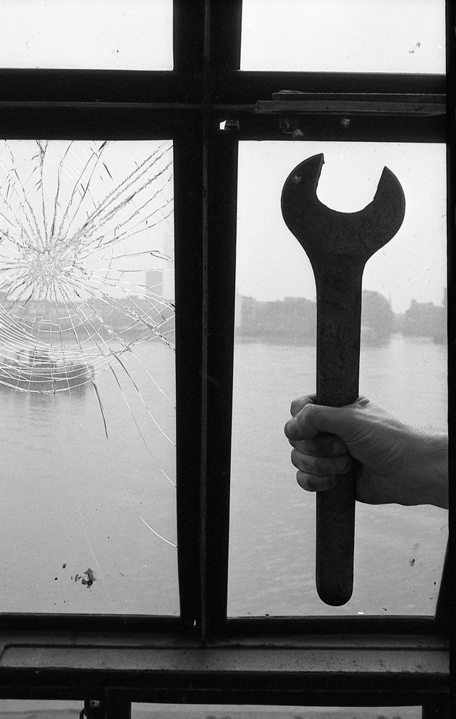
When you took all the images like the hand with the rose and the spanner, that was just you on your own or did Paul come with you, did he give you those props?
My memory of that is that, at that time, I would just go out and take photos. When Paul was talking about the Art of Noise, what kind of came into my head was like Russian Constructivism, FuturismThe Human League did an EP called, ‘The Dignity of Labour’ and I always thought of this idea of labour being a fantastic idea to get into, you know, the ‘strength through joy’ kind of thing.
I know what you mean, like SPK, imagery of spanners and hammers, almost acting out Russian Constructivist posters.
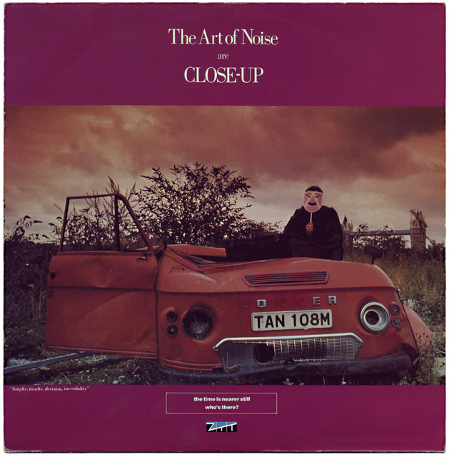
So, I would just go out on a Saturday afternoon, go down to parts of London that I didn’t know and I’d just wander about, climb into things and take photos of things and mess about. Where those photos were taken, where that crane was that I climbed into, the same place as the van (from the ‘Close Up’ sleeve). It has obviously been a scrap metal yard at some point but you can see Tower Bridge in the background and when you think about London 30 years ago, there’s a piece of scrap land that you can see Tower Bridge from, that’s unbelievable.

It’s fascinating for me to see the contacts for the original Art Of Noise spanners etc., just seeing the outtakes or different shots. (AJ had provided me with original contact sheets for some of these shots).AON232 Spanner 1
The spanner photo (above) is my favourite of all time because it’s my arms, I set the shot up and I judged how high up I should put the spanner and I did the cable release with my foot. Strange but true, when I saw it, I just thought, ‘wow’. It’s very rare that, you know yourself as a graphic designer, that you do something and…‘bosh’, it works. I was fairly pissed off when Morley didn’t put it on the cover. The one with the van is at a completely different time when I took my mate Phil down.

AON Close Up 12" front
I’d figured that, I was going to ask, who was that in the mask?
(Laughs) In those shots it’s a friend of mine from college called Phil Priestman, where is he now?
Because you’d assume it was Paul.
Really? Do you think so?
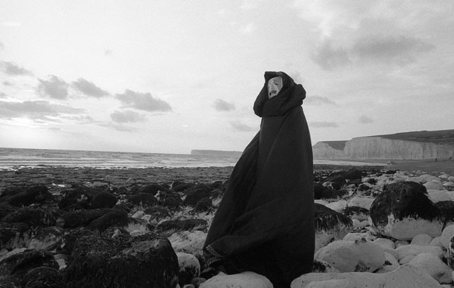
Well, if there’s an image of the group, he was presenting that so you’d assume (that). It doesn’t matter who’s behind it though. Was that the same with the figure on the beach?
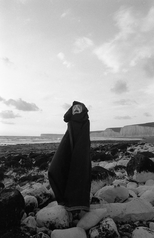
No, that was Jayne (laughs)
I’m not sure I want to explode any of these myths (laughs). This is the thing, I’m very aware that by explaining all this stuff it could just sort of pop the bubble. I don’t necessarily want to do that.
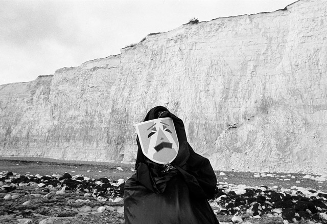
Well, I think it’s all well and good actually, the shots on the beach were at a place called Birling Gap, up between Brighton and Newhaven, very nice because of all those rocks and things. Me and Jayne went for a nice day out and…
“Put this cloak and mask on love…’ (laughs)
It was a cape actually, Jayne used to work at the National Theatre as a dresser and she borrowed it (laughs). If memory serves I was given the mask at ZTT and we took it down with us, or Paul dropped it around to where we lived back then. It had never crossed my mind that people would take for granted that that was Morley.
Well, who could it be? No one knew who it was… it was The Art Of Noise in some respects.
(raucous laughter from Tony) Trevor Horn?

AON seaside 1AON208
You would assume he’s the guy in the cloak, you know? ‘Don’t look behind the screen’, kind of thing. So there’s me thinking it’s Paul and it’s actually his sister!
That’s great.
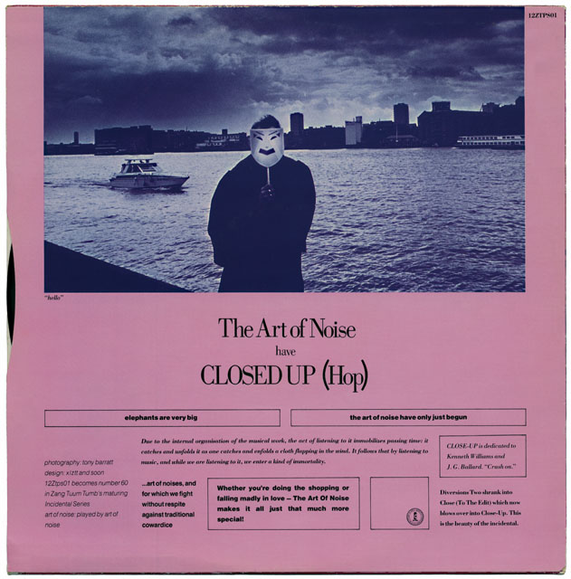
I didn’t know who it was, there’s one on the back of ‘Close Up’ and there’s someone holding the mask and you can see some slicked back hair…
Yeah, that’s Phil Priestman (laughs). Who happened to have the same kind of haircut but that’s really interesting, I’d never thought of that.
In all the Art of Noise sleeves – their greatest visual asset (to my mind) was the masks and they dropped that completely once they’d moved to China records.

AON Close Up 12" back

‘Close Up’ is my favourite Art Of Noise 12″ bar none. For everything about it – the music, the cover, the photos, the colours – that epitomizes them for me.
I’d say you’re right actually.
I would stare at that record, like many other ZTT sleeves, and just try and find clues because that was what ZTT was about, it never gave you the answers it just posed the questions and that was half the fun of it.
Well that was part of Morley’s…mystic.
Because he got so much stick over other things, he hasn’t really gotten the credit for the art direction.
Having known him since… when I first met Paul he had hair parted down to here. Tangerine Dream, Nick Drake, reggae, he loved all that. I have the utmost admiration for him, but having said that, I have watched him chance it and throw it out there so much, actually to the detriment of his health. Like all his heroes, he believed that if he kept that up, he could keep throwing out those great ideas, ‘their fourth number one’, let’s put sperm on the cover, this’ll go. And it got to the point where actually, Jill Sinclair and Trevor were saying, ‘well look, we need to make some money here’.
You can kind of see that in the sleeves and such, that playfulness, ridiculously indulgent whilst the coffers are filling up from Frankie’s success. He had a couple of years of ‘the dream’, the honeymoon period, if you like, and then he was reeled back to reality.
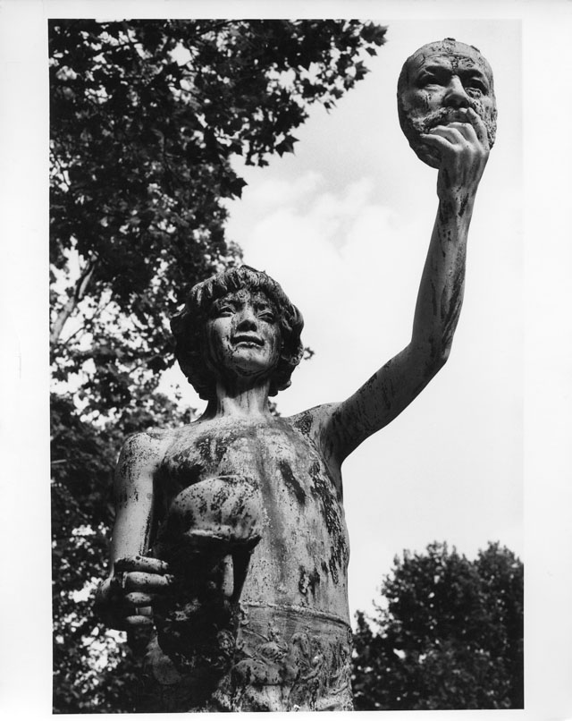
AON240 statue mask

The cemetery pictures for ‘Who’s Afraid of the Art Of Noise’, was that Highgate with all the statues?
I don’t know which one because there are a few, I think the cover is Anton‘s (Corbijn), that’s nothing to do with me. I used to get really pissed off at it actually because I’d be ‘Art of Noise photography: AJ Barratt’ and then there’d be this image that wasn’t mine – Anton Corbijn. Because there was no real brief… there’s a photo of a statue holding up a mask, I can’t remember what it’s on? (Moments In Love 12″ sleeve). That’s in a Paris cemetery, I thought, ‘mask, statue, that’ll do for me’ and off you go. There’s another one in Paris from the same time where there’s a wall and a bit of graffiti and a statue behind, that’s at the Eiffel Tower, it was the same time. But the whole thing with the Art Of Noise was, if you see a little image like that, from my point of view, ‘take it’ and take it to Paul who would say, ‘I like that, we’ll see what we can do with it’. And the next week it’d be on a sleeve and you’d go, ‘er, alright Paul, should I chuck an invoice in?’, ‘yeah’, ‘alright, thanks’.
So, what would happen with this? Would you ever meet the designers or would you give the stuff to Paul and he would sort it?
I didn’t have much contact with designers – I was a photography student at the time. I remember going to a design studio in Soho in, maybe, Carnaby St. and I’d take stuff in and talk to them about it. They were really nice actually.
That would have been XL
It was XL, it wasn’t Tom though (Watkins) because he was the manager. I remember taking some stuff in and them saying, ‘what was the brief with this?’, and I said, ‘hey, this is ZTT, Paul Morley’..., you know? See if you like it and work around that.
He was famous for coming in with little things like beer mats with scribbles on and then working from that.
He directed the ‘Moments In Love’ video and I remember doing the stills on that and getting a picture of JJ (Jeczalik) who had the make up on, holding a rose. And then going round to Paul’s house once when he was sick to get permission to use it and him shouting, ‘AJ, what were you thinking?’.
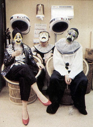
You did the shot of the three of them and they’re made up as, almost clown / marionettes? It looks like it’s in a hairdressing salon.

Art+of+Noise+ARTOFTUBE2No, no, that’s backstage at The Tube (80’s TV music show) when they were on it, I did take those, yeah. We flew up to Newcastle, it was a horrible flight, bumpy all the way.
I love that photo, that’s the nearest they came (whilst on ZTT) to ‘being the group’, Anne and Gary have face paint and JJ has a mask. It’s interesting that when the Art O Noise signed to China records they made lots of records with guests – Tom Jones, Max Headroom, Duane Eddy – and they needed a front man because Paul had previously provided that.
I think they suffered from that, there was no guiding voice.

Who has these negatives then? ZTT?
Um, you see, when we moved abroad a lot of stuff got destroyed and lost but I would love to say that everything was filed up beautifully from A to B, but it isn’t. But yes, they did go to ZTT and they might well have disappeared.

At this point we have to disappear too so we’ll end part 1 here having sampled AJ’s memories of the Art Of Noise. Part 2 will be along shortly where we conclude with tales of Frankie tours and frustrating videos shoots.

All photos except the backstage of the Tube scanned from AJ’s negatives, © AJ Barratt. All sleeve and picture disc art scanned from my personal collection, © ZTT. All text © ArtOfZTT 2013.

Postscript:Trevor Horn once told me, every studio in the land has a cupboard, where they’ve nicked all his samples” (laughs).

Posted in Design, Music, Photography. | 3 Comments |

Metal Made Flesh comic

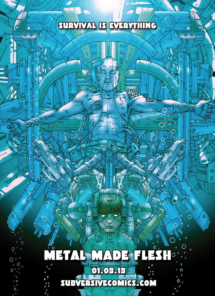
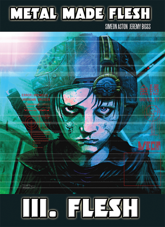
‘Metal Made Flesh’ is the start of a new series from Subversive Comics, a new independent publisher who emerged with ‘Bearlands’ last year. Created and illustrated by Simeon Aston and written by Jeremy Biggs, it’s the first of 3 books that will separately showcase a trio of assassins whose stories will later intertwine. The first concerns Phaeon who, in order to get close to his next, heavily guarded target, goes to the extreme measure of having his body swapped into a child’s.

The layout is text with illustrations rather than your regular panels and speech balloons and they’ve chosen to start with part 3 – ‘Flesh’, rather than publish the initial arc in sequence as each is self-contained. Don’t go thinking you’ve missed 1 & 2 – you haven’t, they’re not publishing them in order, I just hope this doesn’t work against them.

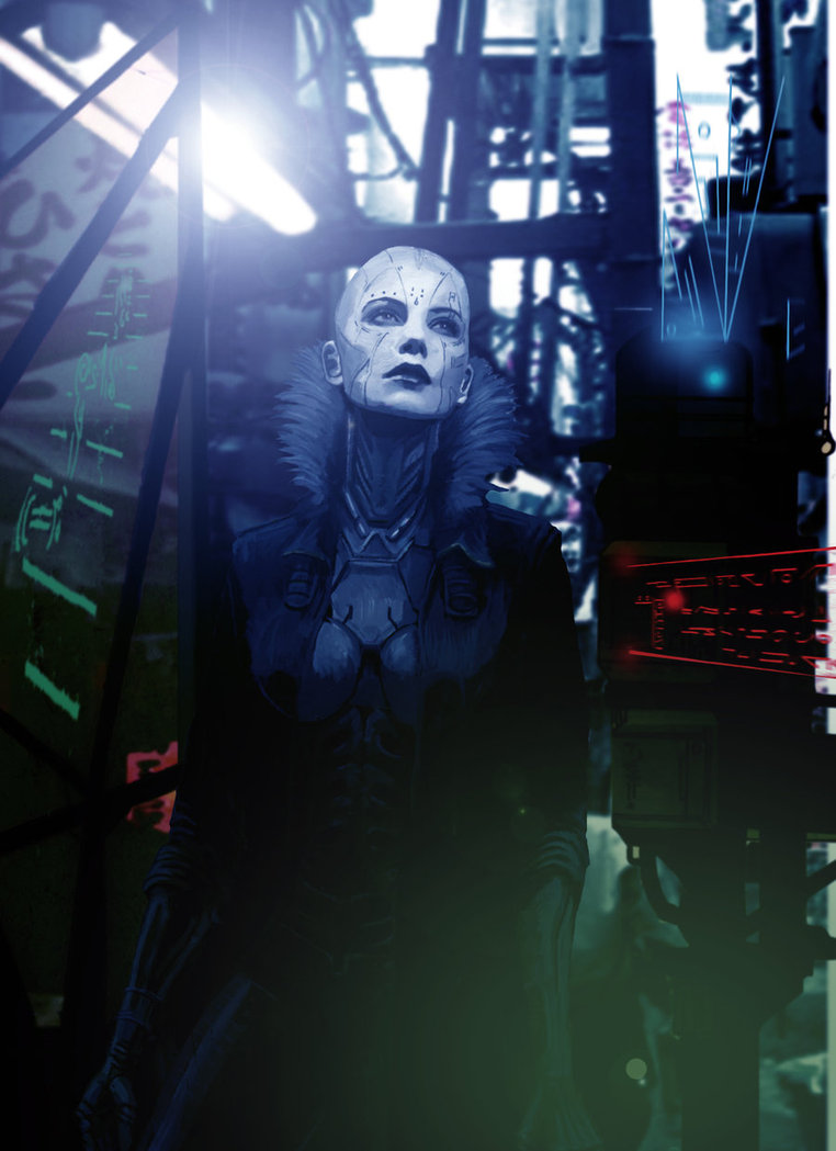
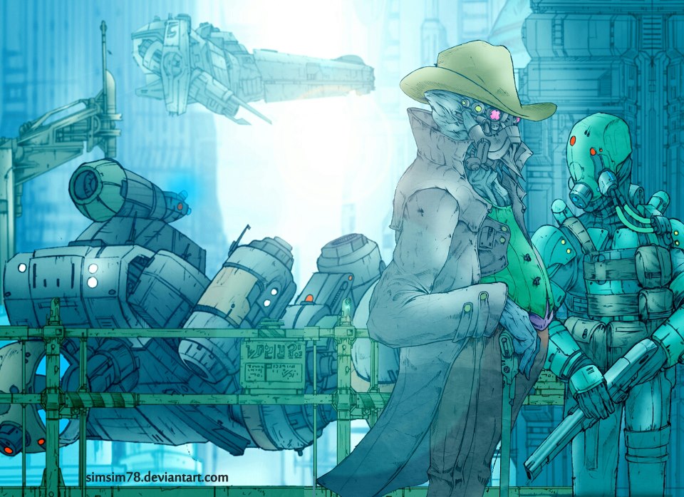
The mood is gritty, adult sci-fi with few punches pulled and the art is nicely handled with a heavy palette of blues and greens. A lot of the illustrations are one page affairs that lend themselves more to covers and the weakest moment is a splash page with the nearest thing to the sequential art of a regular comic which seems overworked and messy. But it’s early days yet and I wouldn’t be posting about it here if I didn’t think it was worth looking out for.

The influences are worn on their sleeve; Blade Runner, Total Recall, Ghost In The Shell, District 9, Gibson and P.K. Dick – cyberpunk with great hardware, no complaints here. I look forward to seeing what happens in the next two installments (1 – ‘Metal’ and 2 – ‘Made’, see what they did there?) and then how the three tie together once the stage is set. Check out the art here or see more on Ashton’s Deviant Art page and find the comic direct from Subversive. If supporting your local comic shops is more your thing then it should be available in Dave’s comics, Brighton, Moving Pictures, Devon and Killer Bunny, London (Camden Market). Issue 3 is out now with issue 2 due around May.

Posted in Comics. | No Comments |

Happy Mothers Day

Hope all the fantastic Mothers out there have a great day today (and every day).

It’s been a little quiet on here of late due to illness, work and having builders pulling my house apart. Lots going on though, Record Store Day is coming up next month with some special Food treats dropping around the same time. I’ve also been working on a very special item for another Ninja artist that I can’t wait to reveal…

Posted in Event. | No Comments |

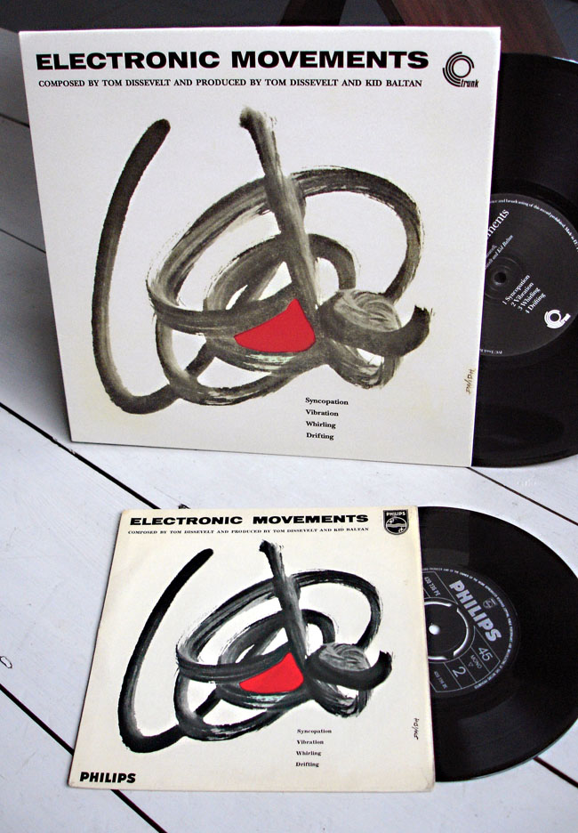
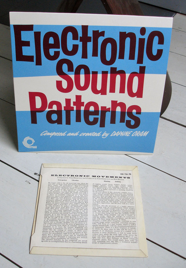
Electronic Movements/Sound Patterns 10″ on Trunk

The Trunk reissue 10″ of Tom Dissvelt and Kid Baltan‘s ‘Electronic Movements’ single with my original Philips 7″ version of the same. The reverse of the Trunk release has Daphne Oram‘s ‘Electronic Sound Patterns’, which I don’t have an original of so you get the reverse of the Philips 45. As usual with Trunk, this is pretty limited and available from the website now. Also there’s an excellent 8 page overview of everything Trunk in this months (Feb 2013) Record Collector magazine.

Posted in Design, Records. | 4 Comments |

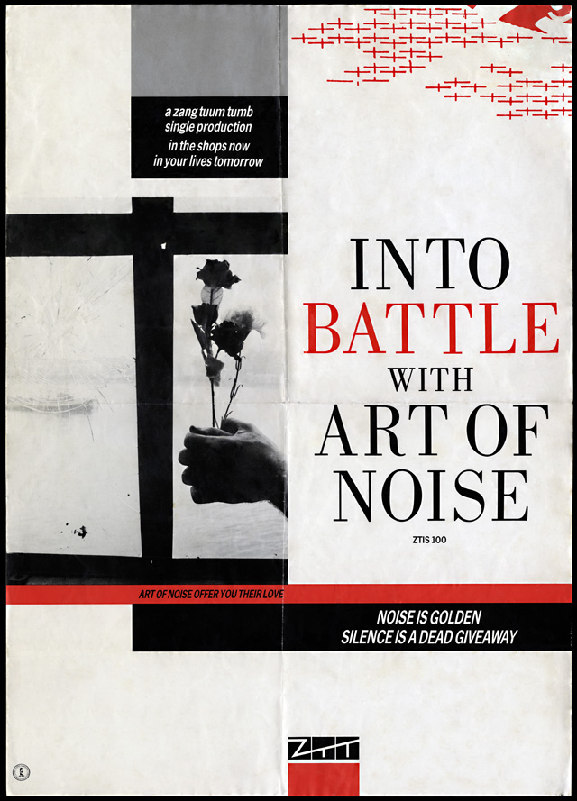
Into Battle with…

Posts are slowly but meticulously being added over at artofztt.com

AJ Barratt: “I remember going into the NME offices one day and I saw this poster on their wall, and someone had added a third line to the bottom of it. ‘Noise Is Golden, Silence is a Dead Giveaway… and Bullshit stinks’, that’s what it was! (Laughs) That’s what somebody had written.”

‘Into Battle’ promo poster from the archive of AJ Barratt, digitally restored by artofztt.com. Also included is the original photo for this design, scanned from the negative. The quote above is from a forthcoming interview with AJ which contains more exclusive images from his collection.

artist: Art Of Noise title: Into Battle With Art Of Noise format: A2 promo poster design: XLZTT photography: AJ Barratt cat. no: ZTIS100 date: 09/83 art of notes: The red crosses are identical to the ones on the ‘You Can’t Suck The Same Piece of Sugar…’ poster and continue the trend for ephemeral symbols hovering in the top right corner.

Posted in Art, Design, Poster / flyer. | 1 Comment |

Solid Steel 25 – Food, The Light Surgeons & Jack Dangers

The Solid Steel 25th anniversary continues and this week I’m in the first slot with a mix of /4 electronica both new and old. Modular experiments, deep house grooves, classic electro and a touch of acid. Ninja & Big Dada artists Falty DL and Dobie feature, oldies from Air, Eon and Hashim appear and a fantastic new track from Natural Self features near the end that I just can’t stop playing. His album, ‘Neon Hurts My Eyes’, drops next week on Tru Thoughts and it’s quite a departure being all-vocal led, most of it sung by the man himself including a great cover of Laurie Anderson‘s ‘O, Superman’.

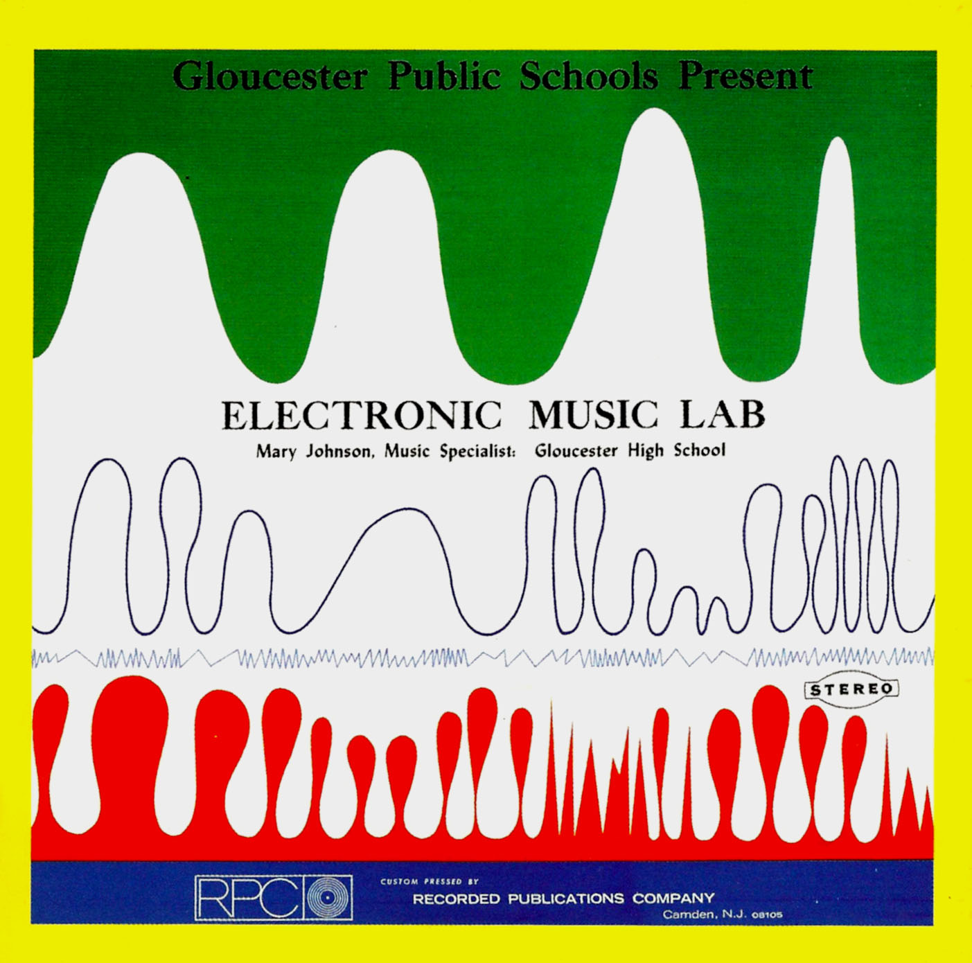
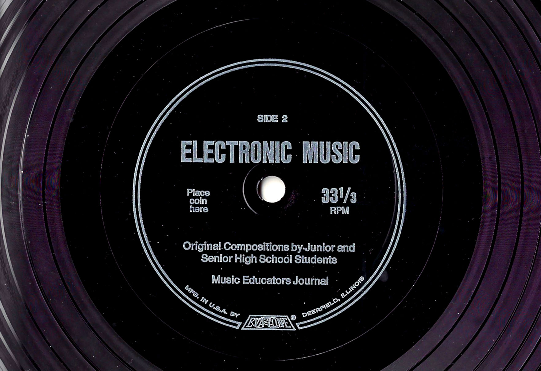
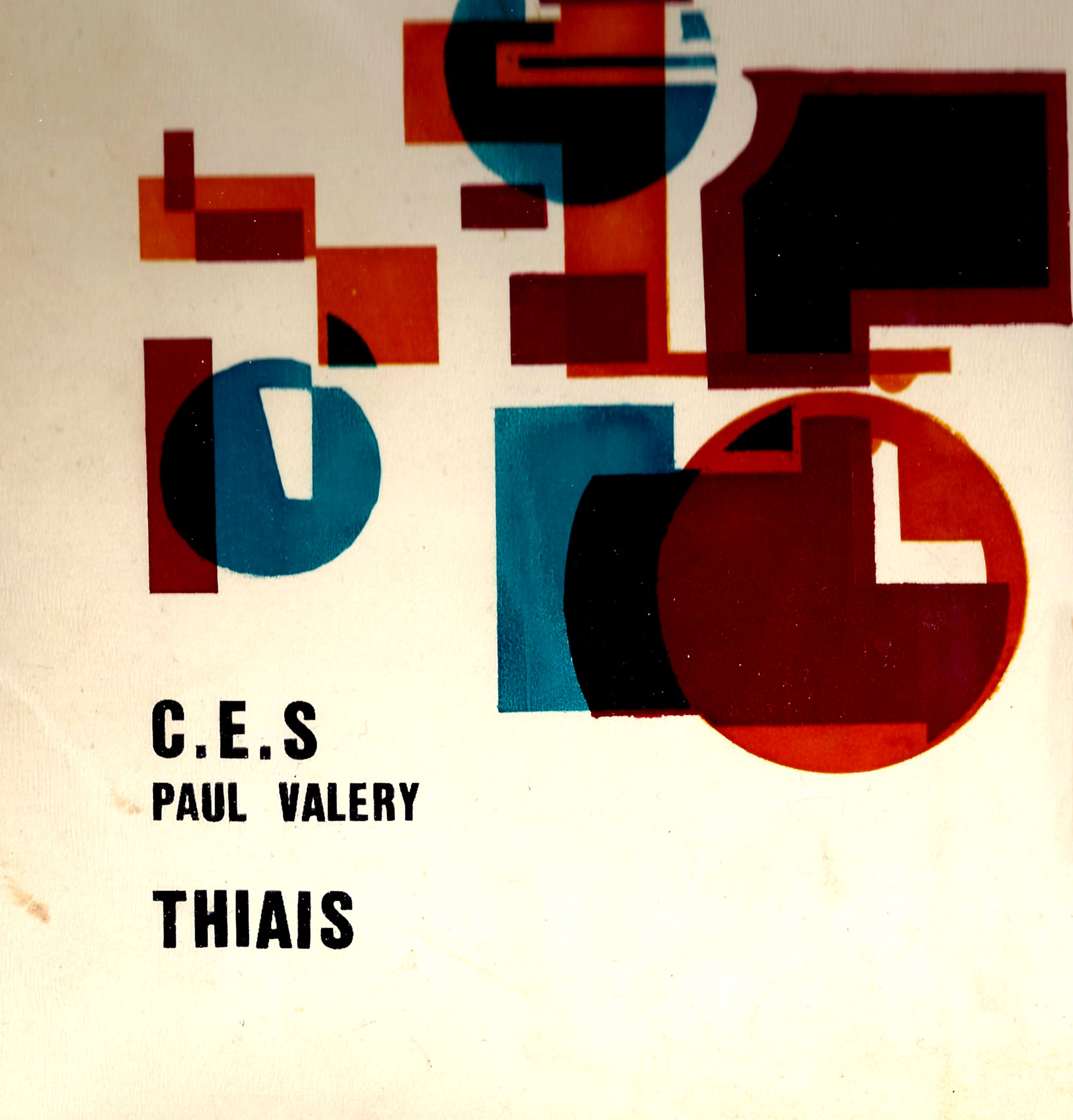
In hour 2 we have The Light Surgeons with a very different mix taken in part from their new show ‘SuperEverything*’, a narrative about cross cultural identity. They tour in the UK in March and play a London show in April. The last half hour has a mix from Meat Beat Manifesto‘s Jack Dangers, showcasing his collection of electronic record made by children in schools, see some of the sleeves below and be prepared for something different.

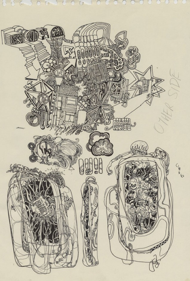
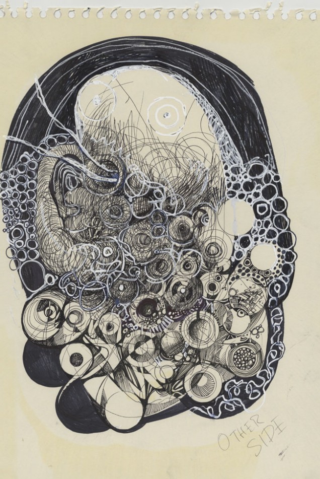
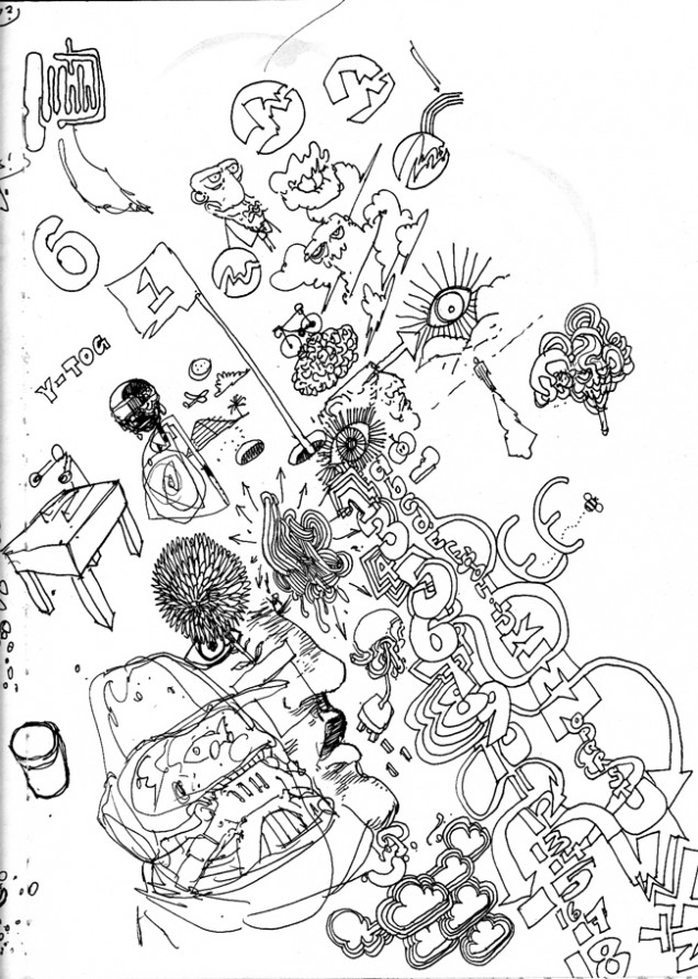
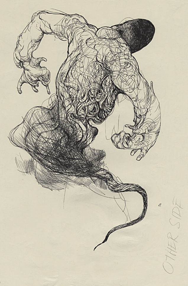
The other side of Henry Flint

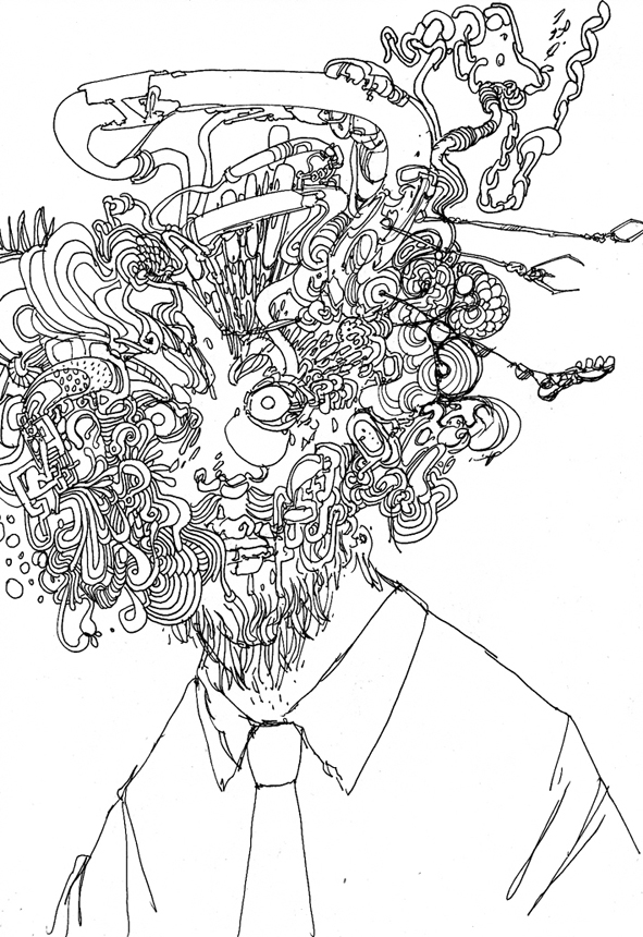
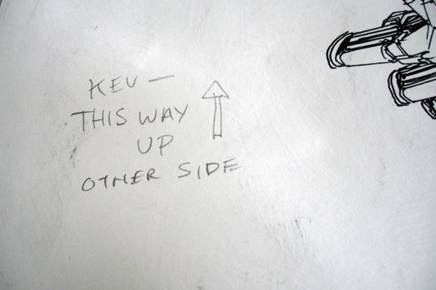
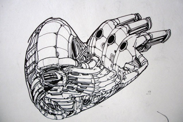
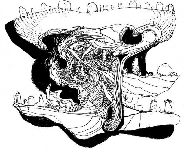
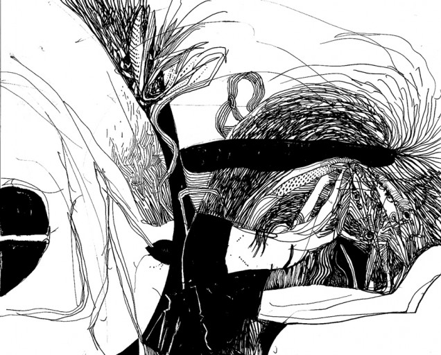
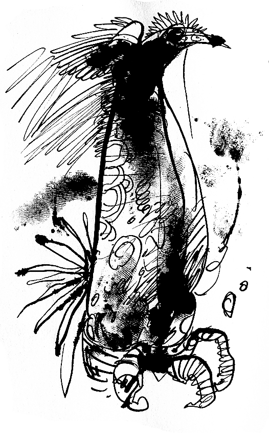
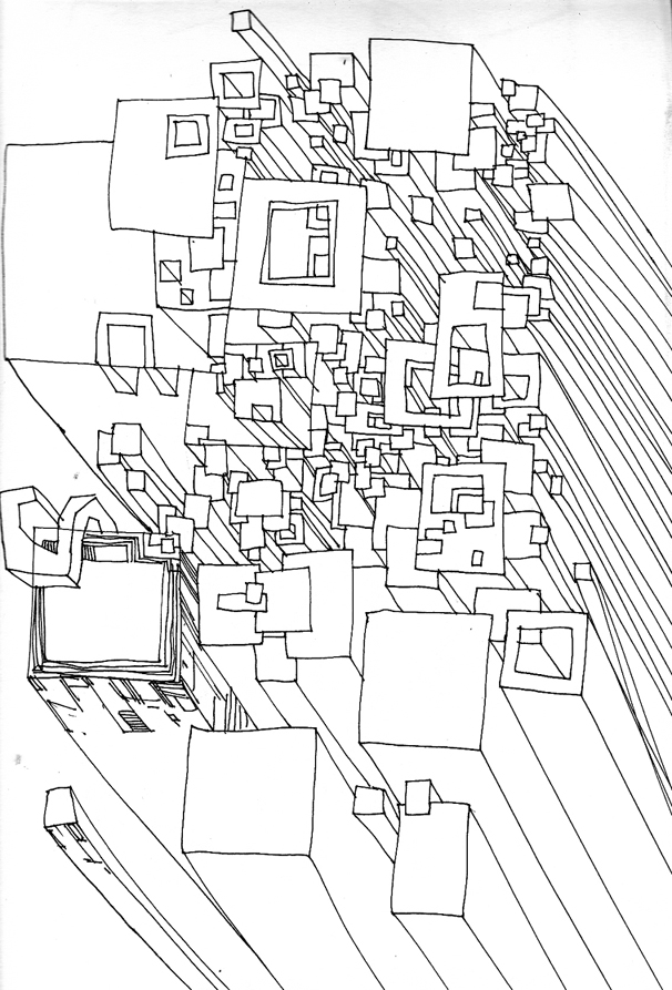
Having handled a fair bit of Henry’s artwork over the past few years it’s always interesting to see that he’s entirely un-precious about it, many pages arriving with other doodles or even finished images decorating the reverse sides.
I started scanning some of these as they were really quite good and I knew that I’d have to give the artwork back at some stage (these were mainly pages from ‘Broadcast’).
When I put the idea of showing some of these to him he promptly sent me a folder with a load more! So, here for your perusal, is a peek over the page, literally, at the other side of Henry Flint‘s work.

For more like this, see the aforementioned book, ‘Broadcast’ or check Henry’s site. He recently had an operation and used his time to draw his surroundings whilst in hospital.


Posted in Art, Comics. | 2 Comments |

Record Roulette #13

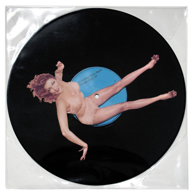
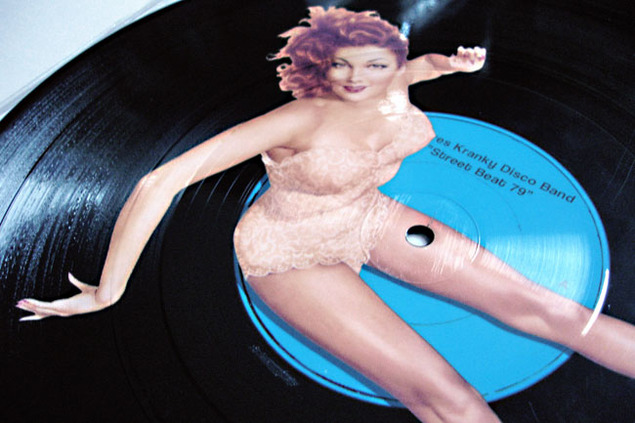
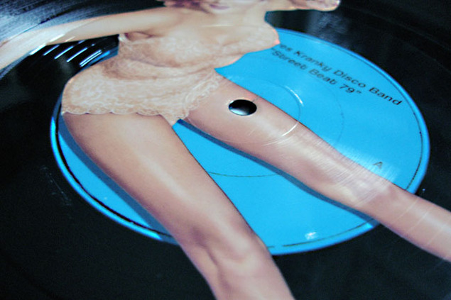
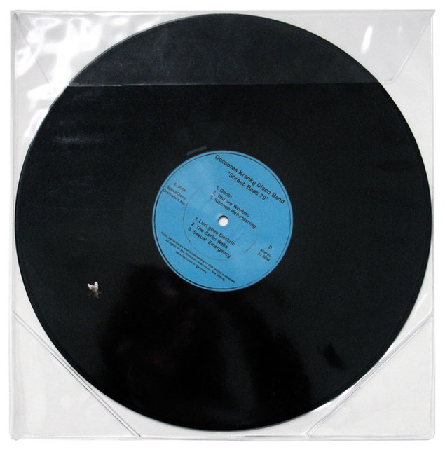
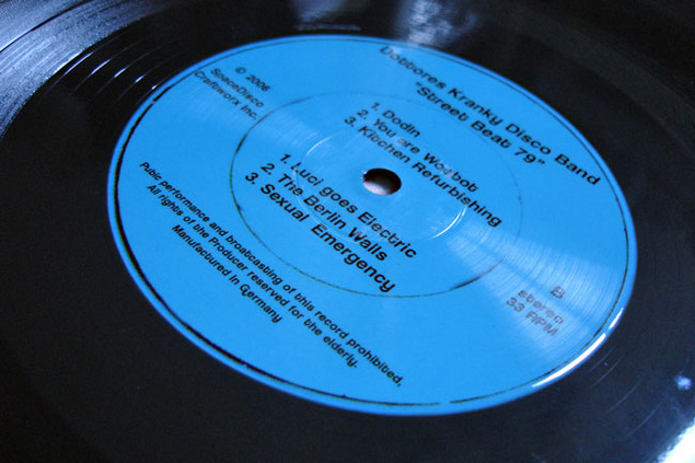
Dottores Kranky Disco Band – ‘Street Beat ’79’ (Space Disco Craftworx Inc.) 2006. 12″ picture disc in PVC sleeve, bargain bin find.

What I like about this is that most of the picture just looks like a normal record but then you have a woman lying across it and a fly on the reverse.

Posted in Record Roulette. | 1 Comment |

Comic Oddities


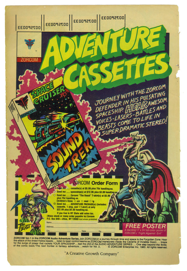
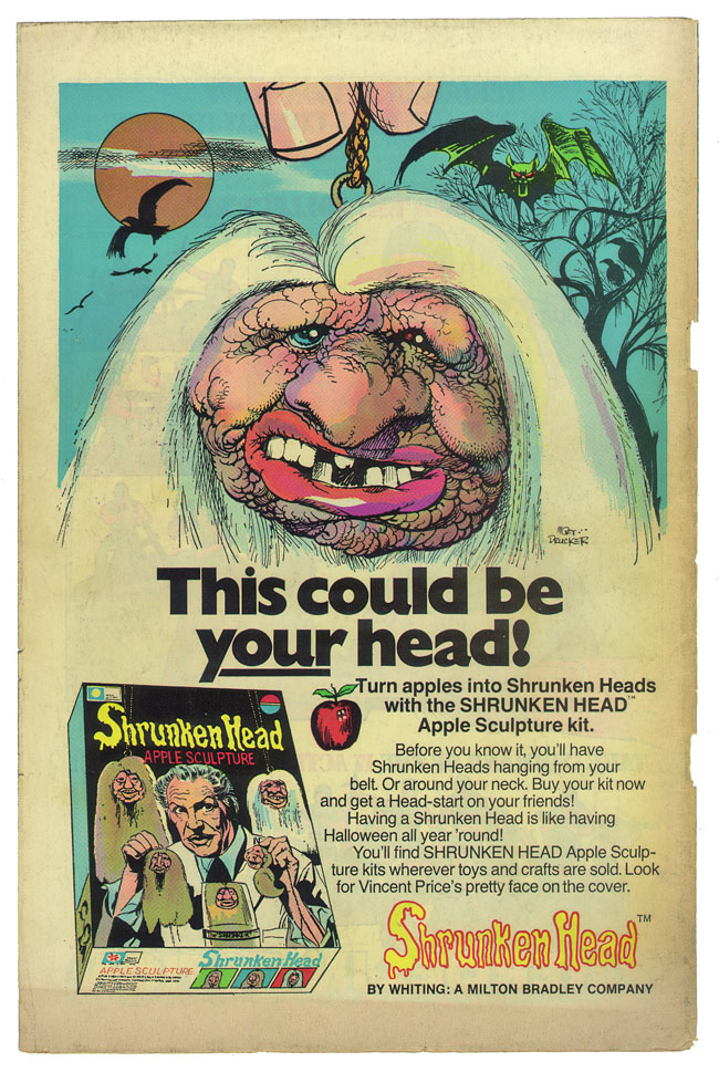
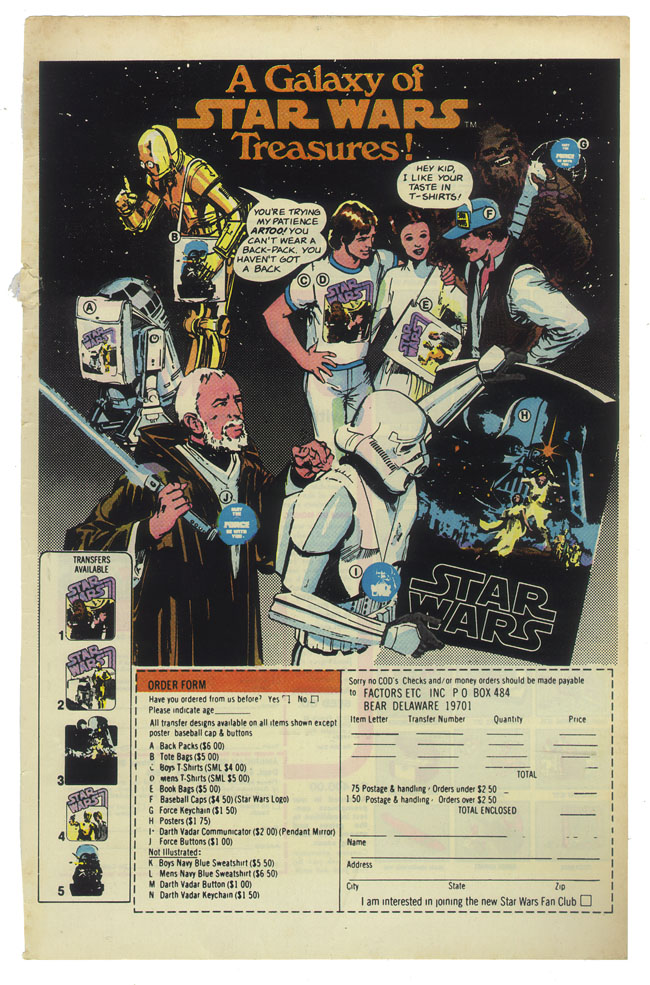
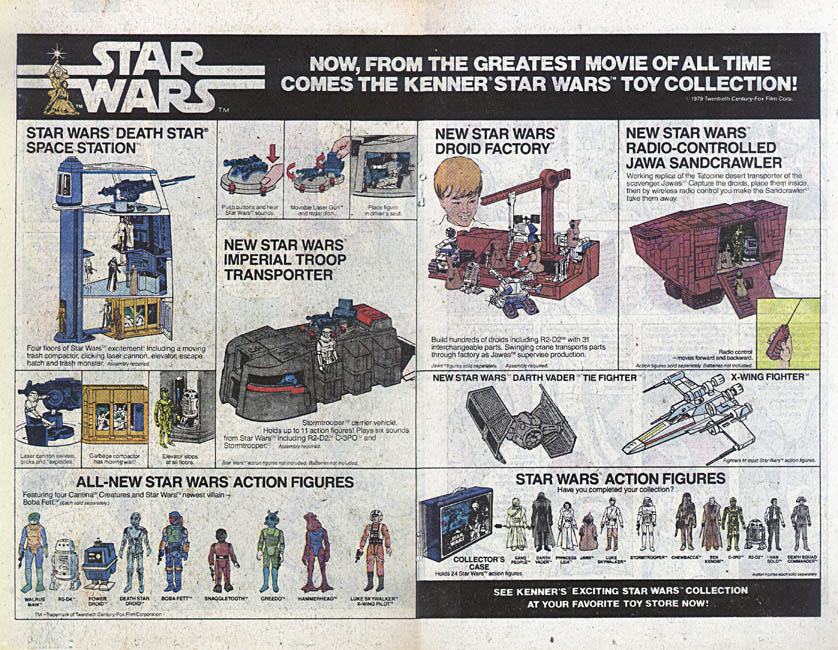
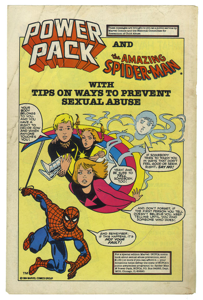
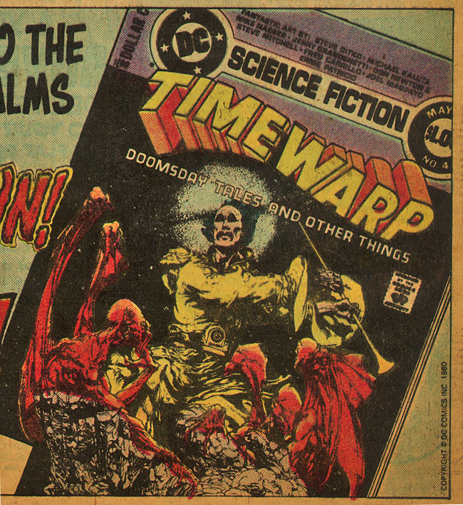
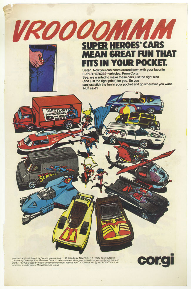
Various oddities clipped from vintage comics past: ‘Cassette Adventures’ – don’t remember these? ‘This Could Be Your Head’ – hmmmm, indeed. Some great original Star Wars toys ads, love the way they’re already billing it as, ‘the greatest movie of all time’. Check the Spidey-warns-against-sexual-abuse ad! Love the design of the Timewarp logo and the spread of vehicles on the ‘Vrrroooooomm’ ad.

Posted in Comics, Oddities. | 1 Comment |

Record Roulette #12


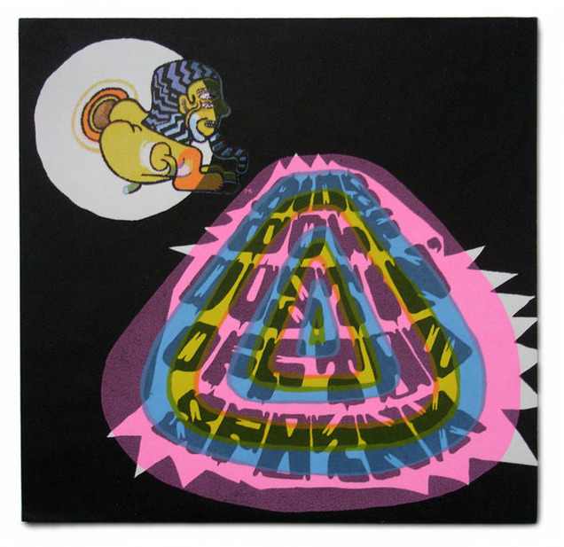
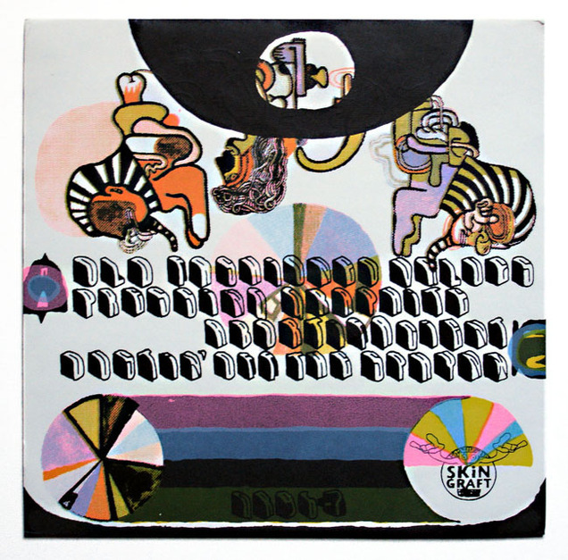
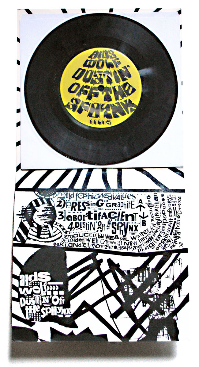
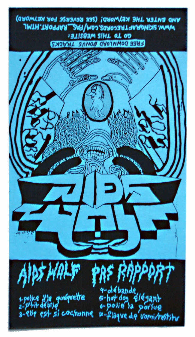
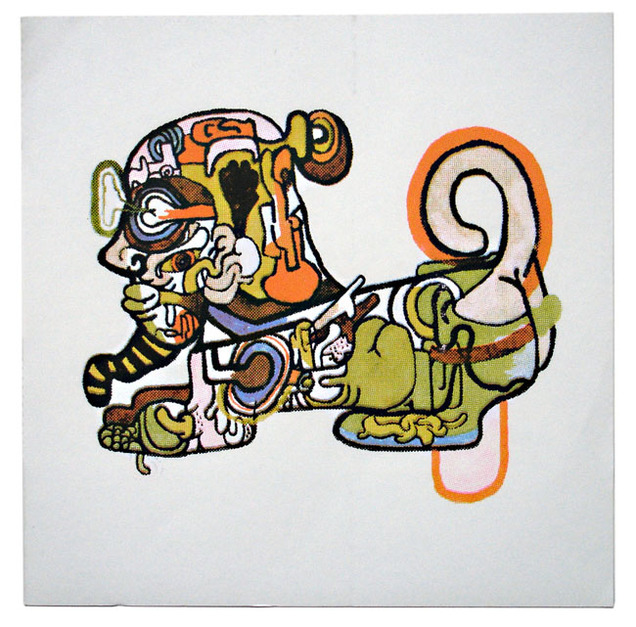
Aids Wolf – Dustin’ Off The Sphynx – 7″ with fold-out screen-printed cover, insert and tape inlay flyer, Skin Graft Records, 2009. Bargain bin find.

*I’ve decided to start a new offshoot of the Artifacts section just for records called Record Roulette. Increasingly I find myself buying records for their sleeves or packaging, regardless of the music, most of which I don’t know until I get them home. RR will be a showcase for these finds with Artifacts for all the other non-vinyl bits and bobs.

Posted in Record Roulette. | No Comments |

Brandon Graham’s ‘King City’

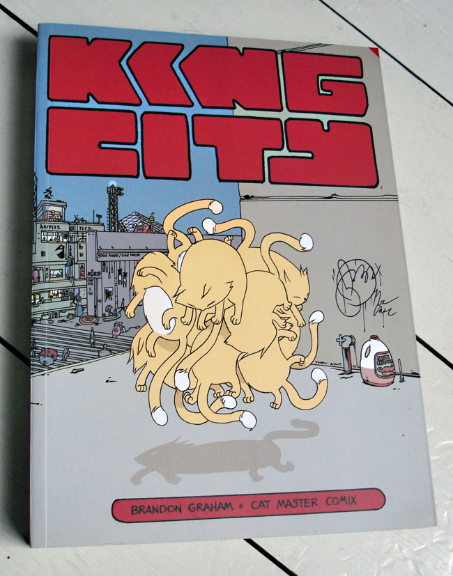
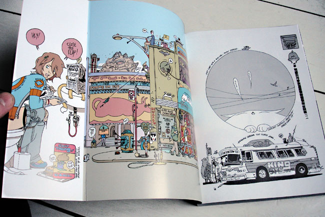
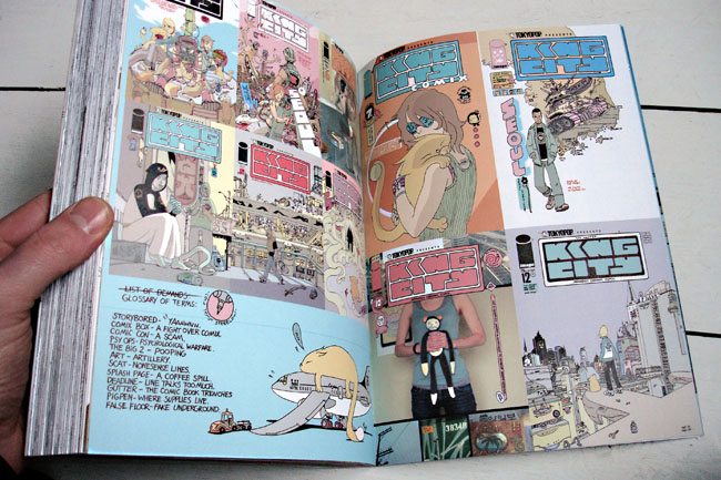
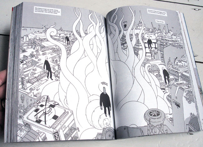
I’ve just finished reading this – King City by Brandon Graham – and it’s the best £15 I’ve spent on a book in a while. Graham’s style is a mix of Manga, sci-fi and playful punning gone mad. There are more ideas nestling in one page of Graham’s work than in some whole comic strips, he seems to shed them ten to the dozen, not only in the story narrative but also in the background details, graffiti and incidental characters who just so happen to be sharing a panel at any given moment.

King City is about a cat master called Joe, a cat master being someone trained to use their personal cat in any number of incredible ways in any number of different situations. He’s an expert lock-picker who gets coerced into secret missions by Beebay, the mysterious leader of the street gang, the Owls. He’s also pining for his ex-girlfriend, Anna, who has her own story going on across town involving a new boyfriend who’s addiction to chalk is slowly destroying him. Joe also hangs out with his best friend, Pete, who goes on similar covert missions in a range of masks and has his own problems. The stories intertwine but also meander along, taking breaks to flashback to events past or just take time out for incidental scenes that flesh out the characters or the city.

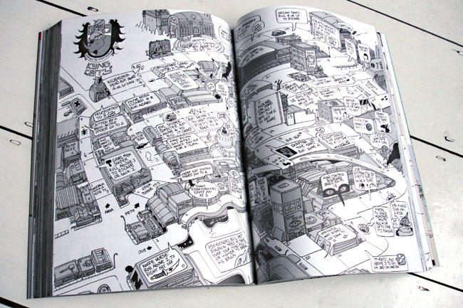
This is really just the tip of the iceberg though, what you get is a sense of a fully formed world that will be rewarded by repeated reads and could be infinitely expanded outside of these characters. As well as the wealth of detail in the city streets it occasionally throws up a crossword, a join the dots panel or a full double page game spread complete with cut out characters. Graham’s style is unique to me although I’m guessing that if I was well read in the Manga department then I would be able to draw some frames of reference. The overall tone feels like a perfect composite of American, Asian and Alien (is that a triple A rating?) and it’s truly a breath of fresh air, much the same as his ongoing sci-fi series, Prophet, which similarly blew my mind last year.

King City is a lighter affair though, similar to his recent Multiple Warheads 4-issue run for Image, largely due to being shot through with punning wordplay in almost every panel (seriously, if you find puns the lowest form of wit then stay away). Once you get used to the way he structures things though it’s a definite page turner and, weighing in at over 400 pages, you definitely get your money’s worth with all the original single issue covers, back up stories and such to add to the mix.


For me the weirdest thing about King City is that I hadn’t ever seen or heard of it on my regular trips to comic shops before. This is so up my street but until last year when the collection was released it had completely gone under my radar, Had I seen a copy on a shelf it would have immediately been the sort of thing I’d have picked up. Considering the first issue debuted in 2009 and the last in 2010, with this collection arriving nearly a year ago I really need to be a bit more alert.

Posted in Comics. | No Comments |

New ‘Art of ZTT’ blog online

I’d like to bring your attention to a new blog I’ve set up about the Art of ZTT Records (or ‘Who’s Afraid of the Art of Zang Tuum Tumb’ to give it its full title).

For years I’ve been collecting everything I can find from the early 80’s incarnation of this label and tracking down the designers and photographers responsible for some of the artwork. It’s a constant work in progress, starting off as a possible magazine article then progressing to a book idea and now, finally, I’ve decided to make it a website.

Inspired by Paul Gorman‘s rehabilitation of Barney Bubbles‘ work into today’s design community I hope the same can happen for the work of ZTT as it was hugely influential on my own desire to design for the music industry. XL, Accident and The London Design Partnership aren’t exactly household names in the same way as Vaughn Oliver and Peter Saville are but I think that the work they produced for the label in their golden age is at least an equal of the Factory and 4AD portfolios.

The site will eventually feature sleeves, promo posters, print ads, photos, exclusive interviews and associated ephemera connected with the label, its artists and designers. At the very least it should be an exhaustive gallery of an innovative label with a host of rare and forgotten imagery.

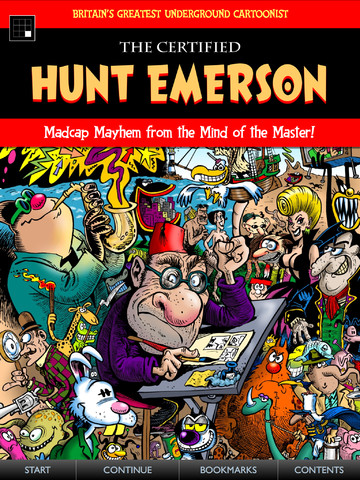
‘The Certified Hunt Emerson’ iPad collection

Hunt Emerson was probably the first ‘underground’ cartoonist I discovered. I was kind of aware of Robert Crumb from the Keep On Truckin’ images that did the rounds in the 70’s, Gilbert Shelton‘s Furry Freak Bros. comics were around and I’d been reading Mad magazine for a few years (not really the same league though). In my early teens my family would go shopping in Crawley, a large-ish town South of Gatwick airport, much bigger than the one I grew up in and with a better class of book shops. One such shop had early ‘graphic novels’ – more collections of comic strips back then – and one day in ’84 I found ‘The Big Book of Everything’, an early collection of Hunt’s work.

It was weird, surreal and the style was cartoon-y, like the Whizzer & Chips, Buster and Cheeky comics I’d read years back. But the humour was adult in places, definitely not for kids. The backgrounds changed in each scene and some strips broke the fourth wall and drifted off altogether. I’d never seen anything like it before and I loved it, my nearest frame of reference being Leo Baxendale‘s ‘Willy The Kid’ books which are the missing link between the aforementioned kids comics and Hunt’s work.

It was also the first use of the phrase, ‘comix’ I’d ever seen, thereby alerting me to the fact that there was a difference. I’d go on to find the whole Knockabout line of books from here which then led me to the US equivalent of Zap Comix with Crumb, Shelton, Griffin, Moscoso, Williams and many more. But this was British, pure luck that I found that first, and there was Hunt on the back cover, staring down at me with a cocked eyebrow. Looking back at it now I see Alan Moore wrote the introduction, no big deal at the time as he was still a rising writer, a few years away from making his mark but his northern humour perfectly suited Hunt’s style.

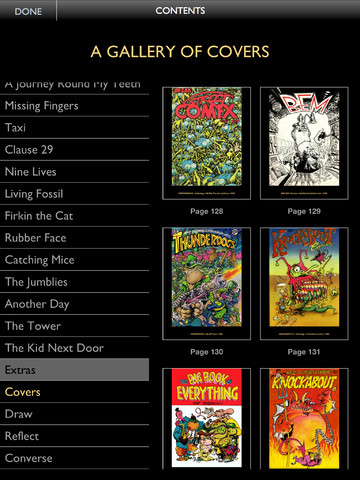
Now there’s a new collection of Emerson’s work, 30 years after the ‘Big Book of Everything’ (96 pages for £3.95), and this one’s available for the iPad via Panel Nine at £2.99 for 200 pages (some mistake there, surely?). ‘The Certified Hunt Emerson’ contains 27 strips, covers, notes and an audio commentary from Hunt plus a panel mode that means you can zoom into each individual panel and read it like that if you wish. If you want an intro to his work, an overview of one of the UK’s premiere underground comic artists with material that would cost you hundreds of pounds to track down then this is a steal. If you like humorous strips that deal with jazz, sex, TV, rabbits, unexplained phenomena, sin, cities, cats and some of the world’s great classics reinterpreted then this is for you.

P.S. Hunt also did the ‘Beat Girl’ logo for The Beat back in the late 70’s as well as their Go Feet label identity, first LP cover and this little Beat-mobile.

Posted in Comics. | No Comments |