Record collection clear out time

Going through records this last month, having a long overdue, very necessary clear out. One of those ‘do I REALLY need this anymore?’ kind of clear outs rather than just weeding the garden. Having had Serato as my playing out set up of choice since 2006 has meant that I’ve not needed to carry vinyl for a long time (thank god) save for the odd special set. It’s also meant that 12″s or LPs with one decent track can be transferred to digital and dispensed with.

Nothing makes it harder to dispense with vinyl than a nice cover or piece of packaging though and I have bought plenty for exactly that reason with little regard for the music. I found a whole raft of hand-painted promo sleeves which I will scan and put up here at some point, also this rather nice Runaways sleeve by She One.

A good length of time and some hindsight will also clear the unwanted guff though, as is normal when a new strand of music or scene appears, you hoover up all available product, regardless of quality, simply because there’s nothing else to compare it to. Years later the good is easier to distinguish from the bad or just plain average.

Not digging in the collection for a while can yield some surprises too; I was slightly horrified to find a Kylie record in my collection (the one with the Blue Monday/Can’t Get You Out Of My Head mash-up on the B side). But pleasantly surprised to find that a lot of the old Pussyfoot catalogue had stood the test of time – still full of undiscovered treasure and that the Richard X album was a pretty excellent pop record that had outlived the mash up genre that had spawned it. Another surprise was finding a 12″ of the follow up to ‘Play That Beat Mr DJ’ by Whiz Kid that appears to have been signed by him (long since deceased).

Posted in Records. | 5 Comments |

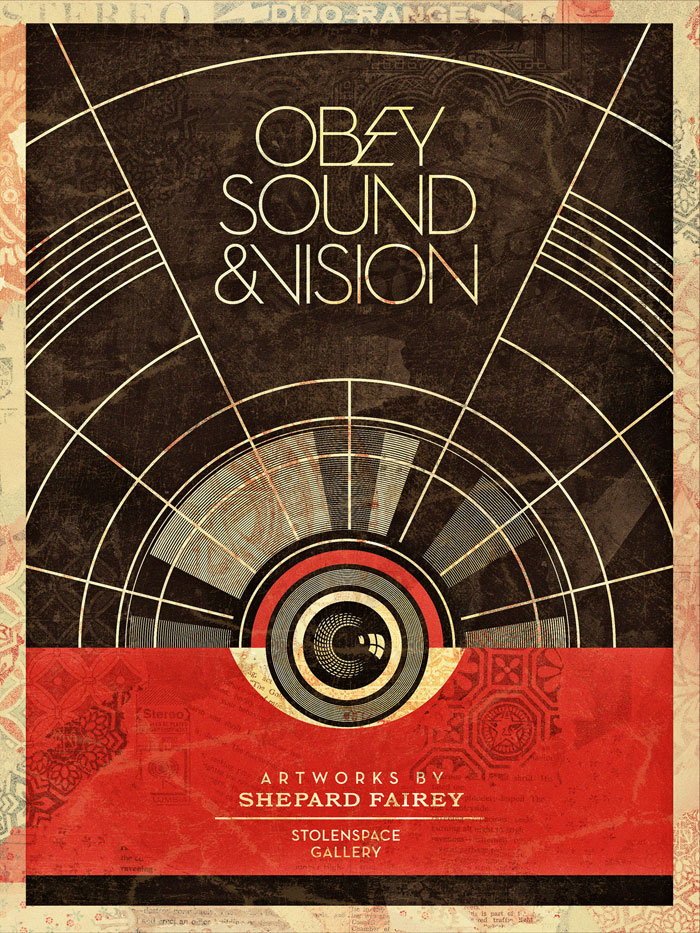
Obey Sound & Vision at Stolen Space Gallery, London

Looking forward to this record sleeve-themed exhibition by Shepard Fairey in October at the Stolen Space Gallery.

“The Sound and Vision art show includes mixed media works on canvas weaving my social commentary with inspiration from a range of musicians, including the Sex Pistols, David Bowie, Roxy Music, Gang of Four, the Clash, the Circle Jerks, Kraftwerk, Public Enemy, Neil Young, and Metallica. Sound and Vision will also include an installation of a record store environment, with customized vintage turntables and a portion of my own record collection for public listening. The record store space will also showcase over 80 12″x12″ images I’ve created as tributes to the 12″ LP sleeve. A comprehensive variety of other works will be featured, including screen prints on wood, metal, and paper; rubylith cuts; and retired stencils.”Shepard

More info here – exhibition runs from 19th Oct – 4th Nov, 2012.

“I wanna say a little something that’s long overdue…”

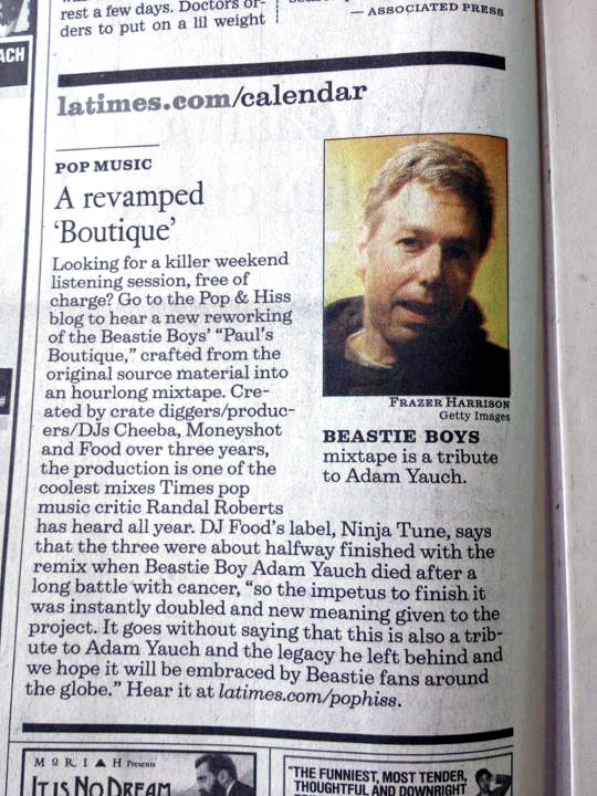
A great big THANK YOU to everyone who’s listened to the remake of The Beastie Boys‘Paul’s Boutique’ album that Cheeba, Moneyshot and I debuted 10 days ago. It’s been blogged and linked to from all over the world by magazines like Urb, Fact and Spin plus sites like EgoTrip, Comic Book Resource and Dangerous Minds, and this weekend the LA Times ran a news piece on it.

On Friday we broke the record for the most listens to one mix ever on our Solid Steel show (33,000 for Bonobo) and are currently heading towards the 40,000 listens mark on the Ninja Tune/Solid Steel Soundcloud. Sadly we received the news that Strongroom Alive – the radio station that hosts us in London every Thursday – was no more last week but their memory lives on in the live version currently on Mixcloud which has garnered another 10,000 plays.

Big thanks to Erik Batternberg who sent me the LA Times photo and for all of you who blogged it, shared it, retweeted it, let us know your thoughts and hipped us to others who have done the same.

Now that the mix has had it’s week on Solid Steel I’ve uploaded it to my own Soundcloud and you can access it quickly via the image on the right or the download page. We are all blown away with the reception this has received and will be working on something special as a follow up for next year.

2000ad week #7: Prog 1800 and the return of the Biz

Perfectly timed to coincide with the release of Dredd3D in the UK (US fans have to wait 2 more weeks – haha!) is Prog 1800 (prog, short for programme – keep up) – out this Wednesday.

This is what’s known as a ‘jumping on’ issue, ie: all the stories are new or first episodes, something 2000ad does a few times a year. To commemorate the occasion they’ve got Simon Bisley back to do the first artwork in 18 years for the comic that he made his name in. It’s a striking Dredd but coupled with the tooled up, ‘look, here’s my arse’ pose of Anderson and a barely visible Judge Death, it’s not his best work but will certainly stand out on the shelf.

One of the big developments in recent months is the digital editions of the comic. A recent upgrade which delivers the new issues the same week of publication through the free Apple Newstand app has seen many lapsed readers coming back to it via their iPads and Phones. Aside from a free 69 page sampler issue you can buy singles or there are various deals for 3, 6 or 12 subscriptions, which each come with extra issues for free from before the start date so that you can be up to speed with story lines. All info is here. Not got an iPad and want an Android alternative? Download direct for the 2000ad online shop.  And if that sounds like a hard sell then it was, I don’t do it often but this is a special occasion.

One more thing, Koze and Onion from Soulful Creative did this tasty mural to promote the film using an image of Dredd by Bisley from the ‘Judgement on Gotham’ story.

Judge, Jury & Executioner! from Soulful Creative on Vimeo.

Posted in Art, Comics, Film. | No Comments |

2000ad week #6: Dredd3D – the verdict

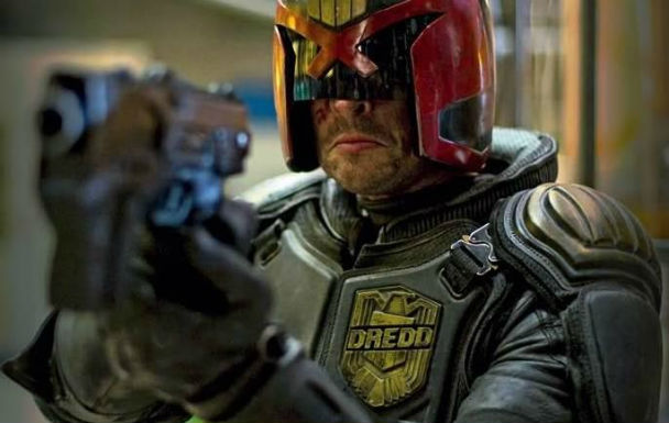
So, after 35 years of reading the comic, 17 years after the travesty of the Stallone version and months of anticipation as news and pictures slowly dribbled out on the film, I saw Judge Dredd on screen last night. It was tough, dark, dirty, violent, funny and beautiful in parts, sometimes at the same time. I loved it, the whole cinema cheered at the end and I just wanted to scream, “Judge Dredd, Fuck Yeah!” and punch the air.

There he was on screen, the character from the comic, Karl Urban nailed it, no two ways about it, he IS Dredd. Olivia Thirlby is gorgeous and did a great job as Anderson, being a rookie we’re still to see her character develop but she ends the film a different character to the one she starts it as shall we say? Lena Headey is pitched perfectly as the villain, Ma Ma – straight talking, intimidating and brutal. The script was tight and minimal, the plot was simple and believable and the score was excellent – very electronic, sometimes barely there, blending into the noises and vibrations of the buildings and city. The 3D was good, in some scenes it really made them, in others it was generally unobtrusive but you could watch the whole thing in 2D and not miss much. There were several bits where it really worked and one scene in particular where something was done with it that I’d never seen before in the medium.

For fans it hits all the right buttons, no comedy sidekick, no kisses and no taking off the helmet. There are loads of incidentals tucked away in the background from the block names spelling out famous artists and characters from the comic to graffiti on the walls referencing stories of old in the Dredd world. One of the nicest things (and this isn’t really a spoiler) is that the first names you see as the credits roll, in huge letters, are John Wagner and Carlos Ezquerra – the creators of Dredd – before any actor or director credit. Alex Garland has made sure that this is how you please the fans and get them on side to build a fanbase for any possible sequels that could happen if it makes the money at the box office.

*possible minor spoilers bit, but not really*

I’m not a fawning fanboy who can’t see the flaws though, the film isn’t perfect – the lawmaster bike and vehicles in general don’t sit well together. Whilst Dredd’s bike is nothing like the one in the comic, it holds up OK on screen but it looks out of place and time next to all the other vehicles which are just the same as anything you’d see on the road today. My biggest gripe with it was that it didn’t look futuristic enough in the outdoor shots (something the Stallone film actually got right) but these are soon forgotten about as the plot quickly moves indoors. Once you get into the visual groove of the film and accept these things it’s fine and I know that this was shot on a tiny budget compared to other blockbusters and that, had they had the money, this would have been the first thing rectified. There were a few instances where Anderson could have played a more inclusive role in the scenes with her psi powers too, I’m not going to spoil anything though by highlighting them here.

For the budget they had, the film makers nailed it, the tone, the dialogue and the action. I wasn’t expecting 10/10 incredible cinema to blow my mind, but wanted a credible film that did justice to the character and superceded the 1995 one. You get that hands down, it’s perfectly pitched and is winning fans over everywhere. Here’s to a sequel some day in the future if the film turns a healthy profit although they have their work cut out for them with an 18/R rating.

PS. to add to the experience I saw Henry Flint coming out of the screening before me, grinning from ear to ear and saying he was ‘speechless’ after seeing it. This is more than a little unusual seeing as he lives in Devon and I live in London but made it all the more special.

Posted in Film. | 6 Comments |

2000ad week #5: Drokk! Stomm! Hi-Ex! Dredd3D out today


[youtube width=”640″ height=”290″]http://www.youtube.com/watch?v=WZvfAYdn4DA&feature=player_embedded[/youtube]

Finally the day has come, Dredd3D is released and will, hopefully, wash away the (distant) memory of the 1995 Stallone blow out (which, to be fair, had a great looking Mega City 1 and Stallone’s chin looked the part). Here’s hoping also that it will open the door to many more franchises from the vast back catalogue that the comic holds – there’s already talk of Grant Morrison writing a Rogue Trooper screen play. Got my tickets for tonight with several other long-time fans / friends, some sort of review tomorrow…

Here’s a short featurette on the film and the world of Dredd from the comic


2012AUG15 by KUInternational

Posted in Comics, Event, Film. | No Comments |

2000ad week #4: Kevin O’Neill Mek Memoirs fanzine 1976


More Kevin O’Neill work, this time, pre-2000ad (for which he first became art director before drawing Ro-Busters, ABC Warriors, Dredd and Nemesis the Warlock). This was a 12 page fanzine from ’76 which apparently told robot war tales and has been on my wants list for what seems like forever.
Last week a copy came up on eBay, the first time I’d ever seen one listed in over a decade, I missed out to a higher bidder who was willing to shell out over £50 for a copy. Here’s the cover and one interior page, the most I can find of it on the net.

Posted in Comics. | 1 Comment |

2000ad Week #3: Dredd prologue comic ‘Ma Ma’


Appearing online yesterday and seeing printed form with this weekend’s Megazine issue is a prologue to the Dredd3D film dealing with the villain Ma Ma‘s origins. Written by Matt Smith and drawn by Henry Flint, it’s pretty gritty and not exactly SFW as it includes the first ever utterance of the ‘MF’ word in a 2000ad strip (to my knowledge). If the film is anything thing like this and the reviews of ultra violence are to be believed then it’s going to be hardcore.
Lionsgate (the film’s distributors) have put together a nice motion comic of the strip too which you can watch above. Alternatively you can read the strip version over on Scribd.com OR you can buy a physical version when the Megazine arrives over the weekend.

Posted in Art, Comics, Film. | No Comments |

Upcoming and exclusive Mike Mignola art

Big news for Mike Mignola / Hellboy fans: there’s finally a release date for the next installment of the red devil – Dec 5th – with a book that we’ve been waiting for for years. It’s the return of Mike writing AND drawing his finest creation (aside from The Amazing Screw On Head, but more of that another time). Hellboy In Hell starts a new chapter in the mythos with Red cast down into hell after the events in the recent The Fury storyline.

Other new Mignola art: he’s been doing alternate covers for various B.P.R.D.-related covers all year under the ‘Year Of Monsters’ title, below are some both from the last few months and forthcoming issues. And finally, on the Super-Team Family ‘fictional team-ups’ blog that I posted about yesterday I found a couple of Mignola mash-ups which work nicely.

Posted in Art, Comics. | 1 Comment |

2000ad week #2: “I’m going in, cover me!”

What? I never got that issue! Probably because it never existed, it’s the creation of Ross over at the Super-Team Family blogspot. He creates a series of ‘what if?’-style covers to comic team-ups that never existed – “but should have!” Here’s his interpretation of Old Stoney Face vs Bruce Banner‘s alter ego, using an old Brian Bolland image for Dredd by the look of things.

Speaking of covers this month sees the release of The Art of Judge Dredd, (not to be confused with The Art of ‘Judge Dredd’ The Movie book that collects the concept art for the Stallone film of old). The new book collects comic covers old and new featuring the lawman and comes in two editions, one only sold through the 2000ad online shop with an alternate (nicer) cover. Besides the images there will be comments from creators and celebrities and ‘Inside Story’ info boxes giving the background to some of Dredd’s most iconic covers.


But if we’re talking 2000ad covers then there’s only one site on the web to go to: Pete Wells‘ incredible 20000ad Covers Uncovered blog. Week after week he posts images from the artists who create the covers including layouts, alternate versions, work in progress and artists’ comments – a unique resource.

Posted in Comics. | 2 Comments |

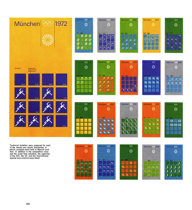
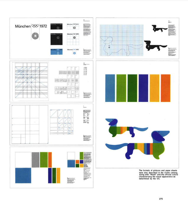
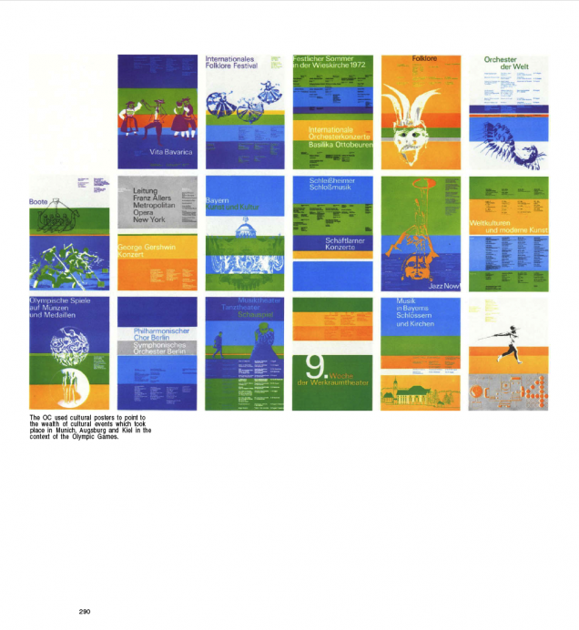
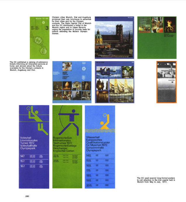
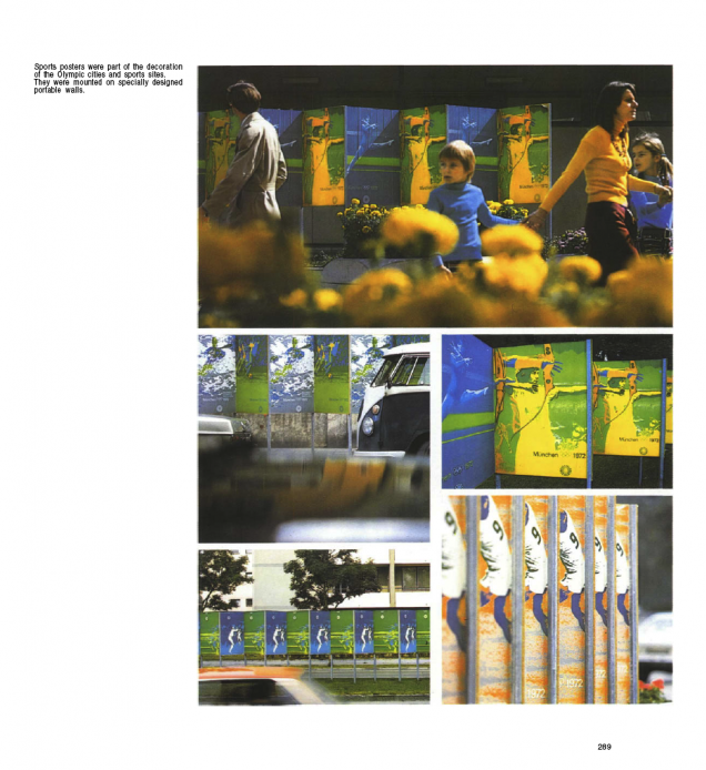
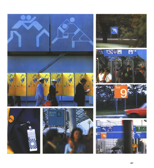
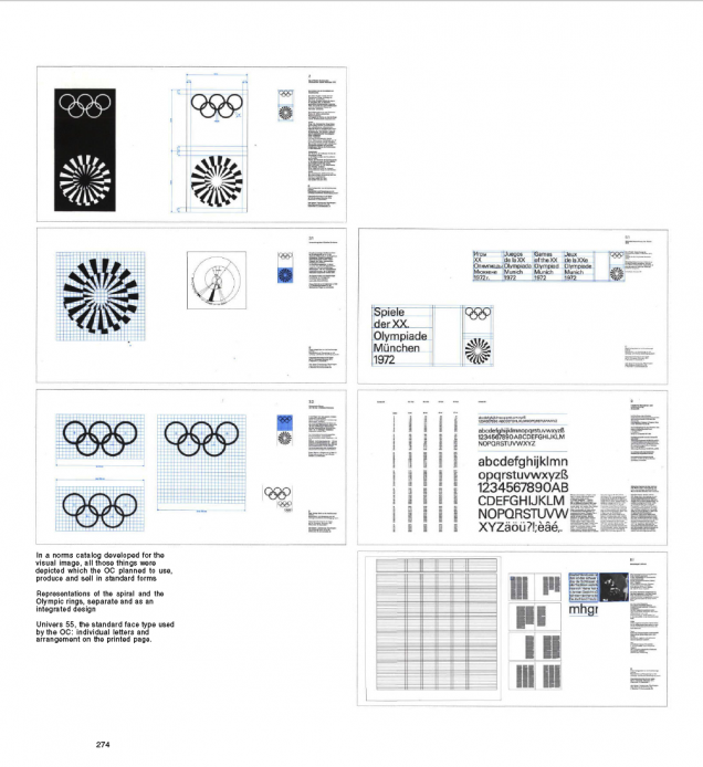
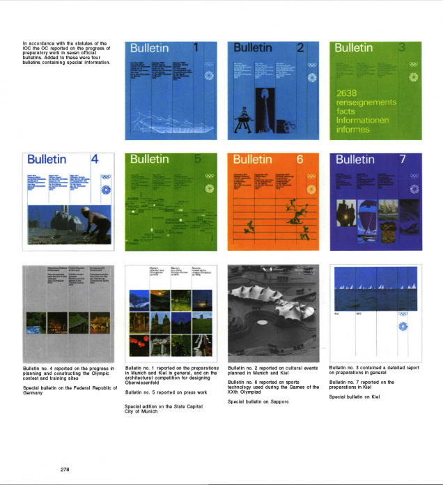
Munich Olympics ’72 brochure excerpts

To the news that George Obsbourne just got booed by a stadium of 80,000 at the Paralympics medal giving ceremony, I bring you more beautiful design from the games’ past.
The gorgeous look for the Olympic Games held in Munich in 1972 was designed by Otl Aicher and his team. This is widely credited as a superb reaction to such a wide-ranging brief with everything working together in harmony to create a perfect look and feel.

Posted in Design, Event. | No Comments | Tags: , ,

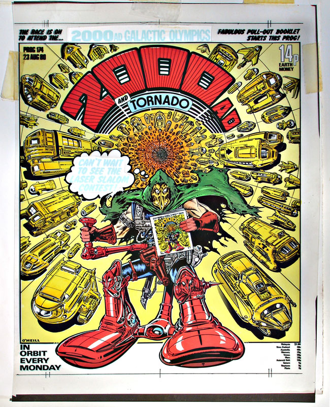
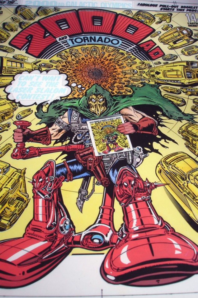
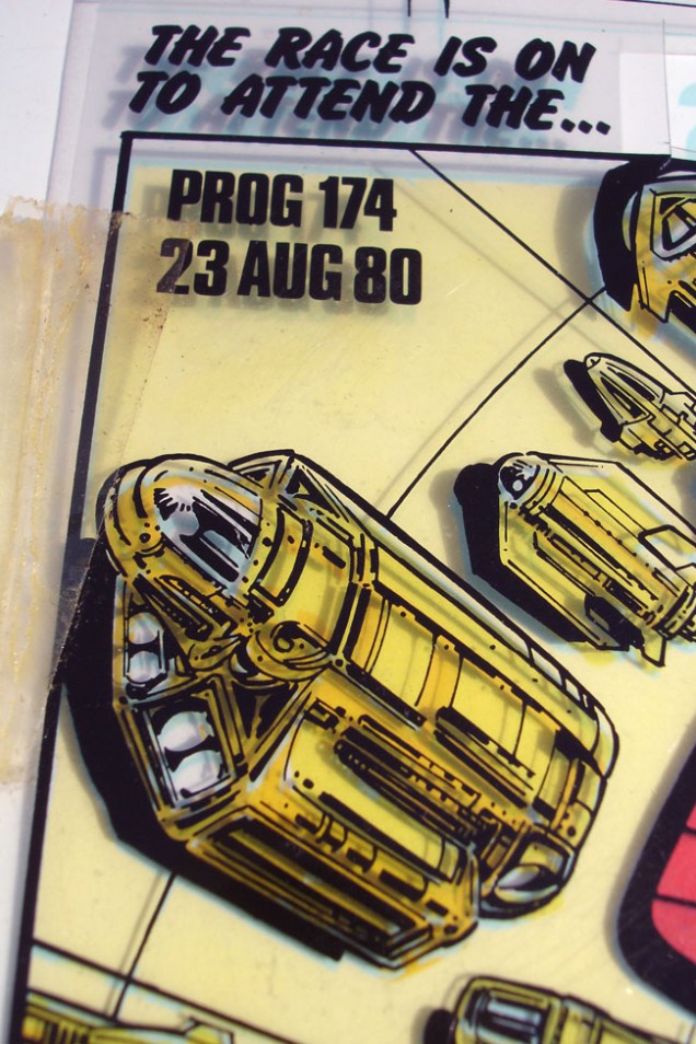
2000ad week #1: Prog 174 cover production art

It’s a pretty big week for the UK comic 2000ad – this Friday the film Dredd 3D officially hits cinemas in the UK, based on the anthology’s lead character, Judge Dredd. The day after that the 35 year old publication hits no. 1800 with a whole host of new stories beginning for readers who want to jump on board. Not only that but the sister mag, the Judge Dredd-related Megazine bumps up its page size and includes concept images from the film as well as an exclusive prequel comic to the movie drawn by none other than… regular readers of this blog will know the answer… Henry Flint. :)

Being that I’ve read the comic since I was 8 years old and have stuck with it every week, through the printers strikes, the mergers, the format changes and the lean years when a lot of the original creators went to the States to seek fame and fortune (and better deals), this is a very big deal. I’ll be celebrating this nicely timed piece of synchronicity this week with a series of related posts leading up to the big weekend of Thrill Power.

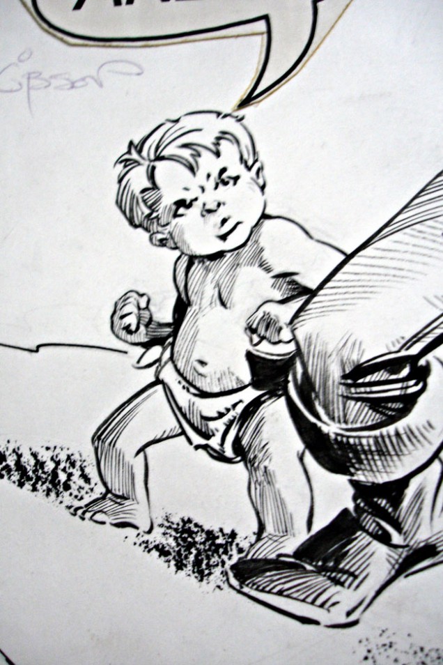
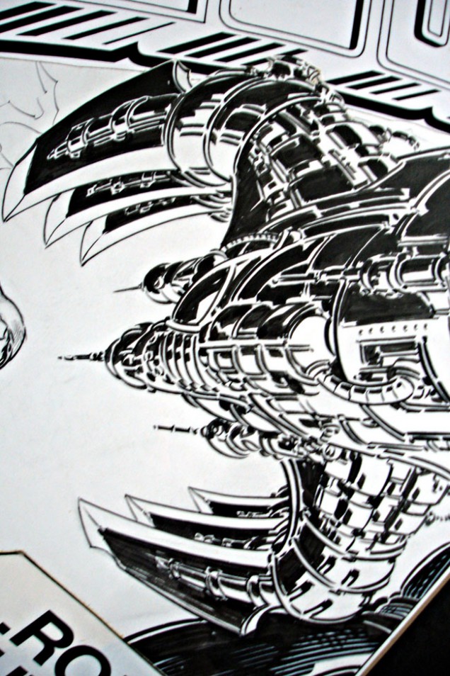
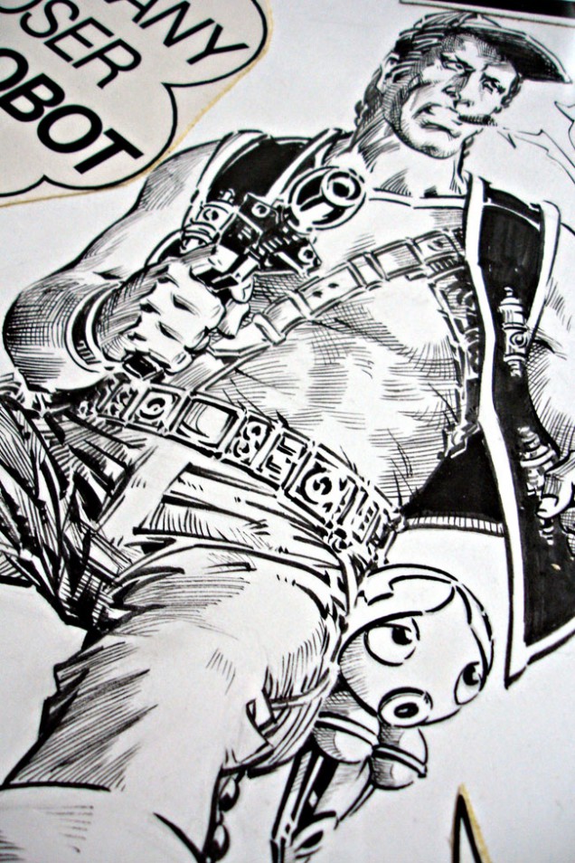
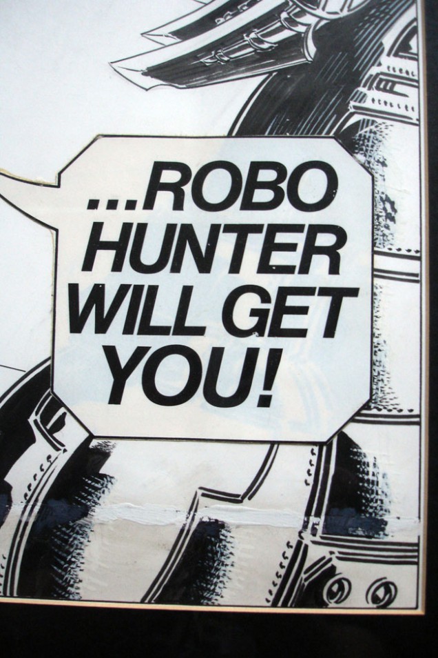
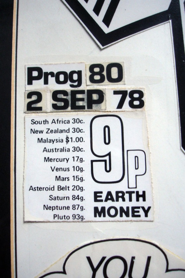
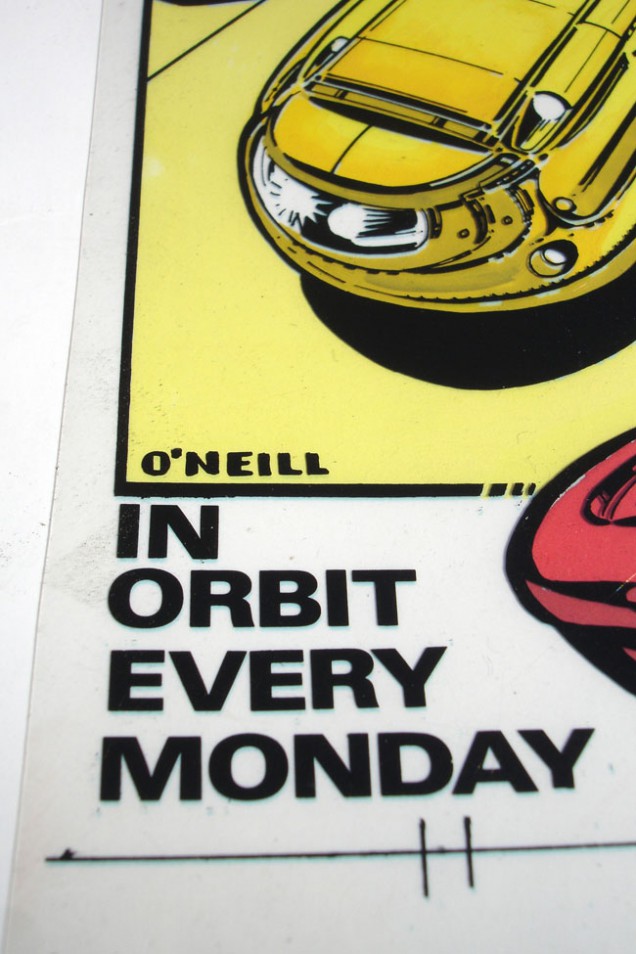
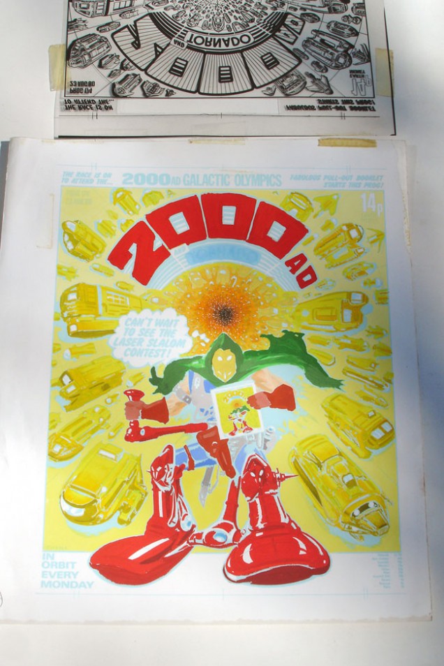
First up I’m digging in the archives for some vintage artwork from the first golden period of the comic. Some of you may remember me posting the original artwork for Kevin O’Neill‘s ‘Tube Warrior’ last year, which is one of my most prized pieces of original comic art. That was the black and white line art but it appeared on the comic’s cover in full colour.

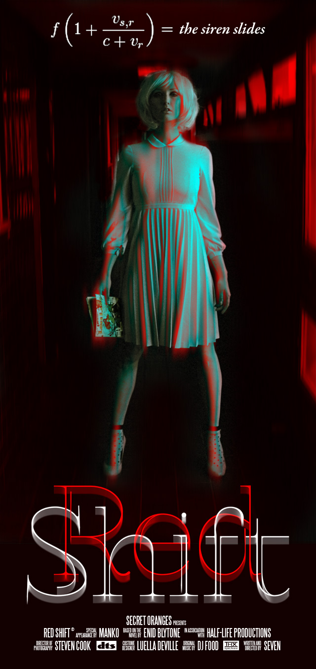
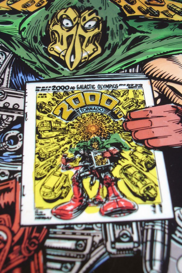
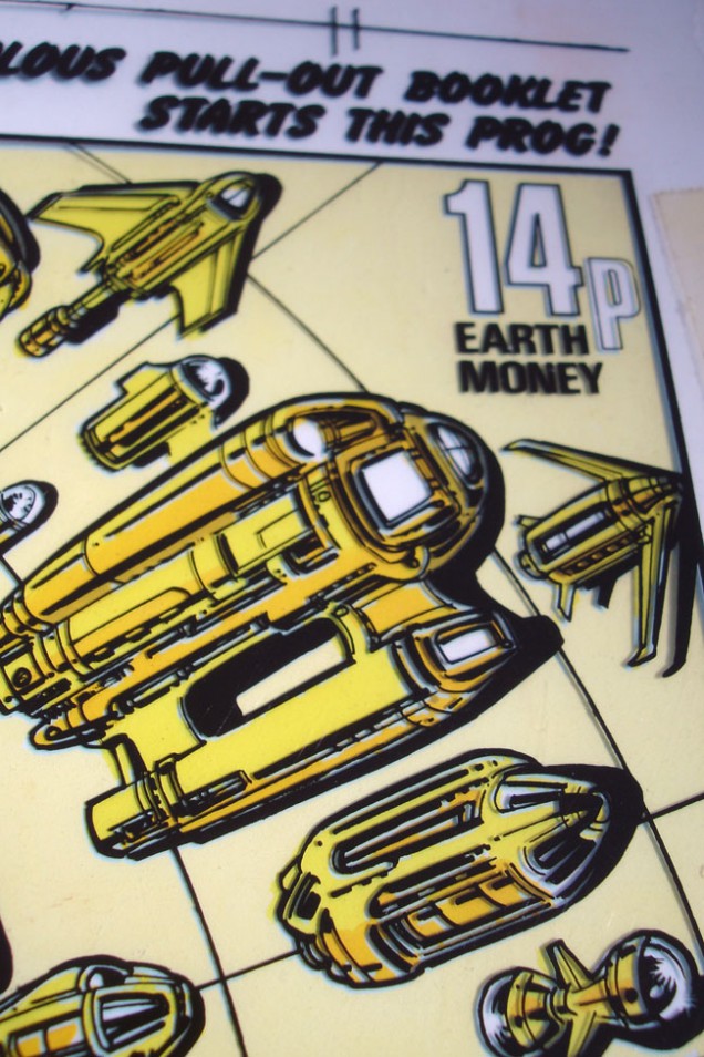
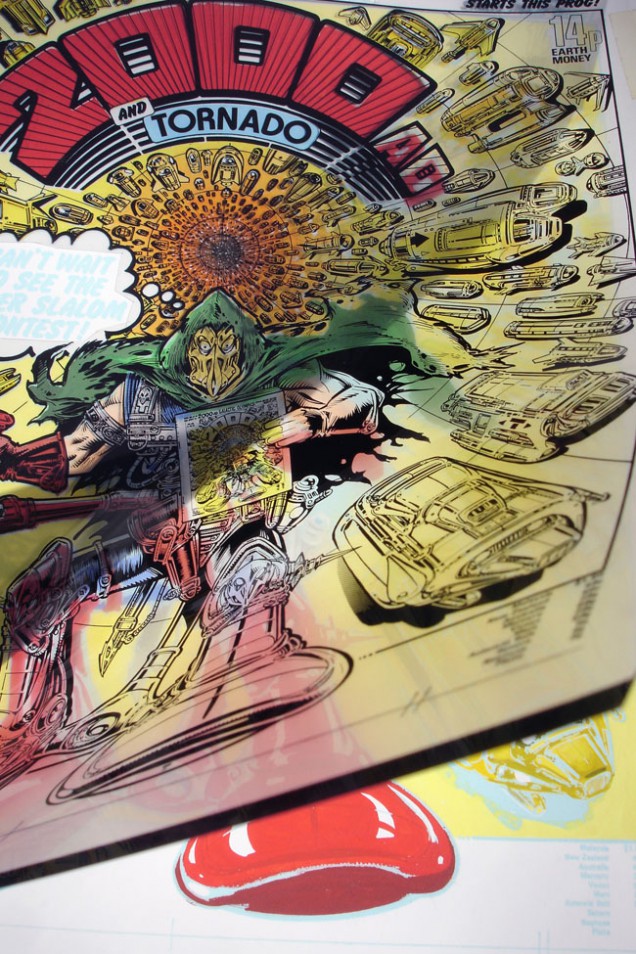
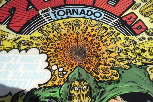
Enter Steve Cook, from the already legendary Secret Oranges blogspot, which amazingly celebrates it’s 1000th post this week. His collection of original production art is vast and we were going through a pile of images at his studio when the colour version of the same piece appeared at the top of the pile. Knowing that I had the original, and probably seeing me trying not to completely freak out in front of him, he graciously presented it to me for my birthday, for which I am eternally grateful. Note the header for the ‘Galactic Olympics’ booklet which was a fictitious games with things like ‘laser slalom’ as I remember.

2000ad Prog 174 cover production art, 1980.

Illustration: Kevin O’Neill‘Tube Warrior’ Colours: Tom Frame

(300 x 230 mm, black line art acetate overlay, paint on paper).
Posted in Art, Comics, Originals. | 1 Comment |
Record bag designs from around the world

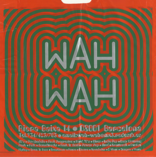
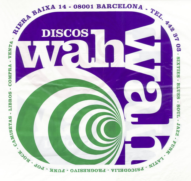
Wah Wah 1&2 – Barcelona’s best* new and used store for weird, psychedelic, electronic and everything else besides (*well it was the last time I was there).

I’m always on the lookout for interesting designs of all kinds and on my travels over the years I’ve kept a small collection of the more interesting record store bags I’ve found.

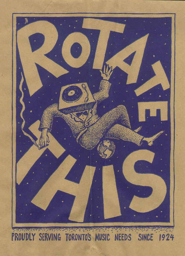
Rotate This – One from the many, many fine stores in Toronto, I love this, simple one colour on a brown paper bag.
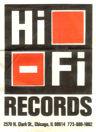
Hi Fi – A Chicago staple, clean and simple (and they remembered the address)
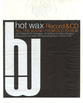
Hot Wax – An oldie from Tokyo, the shop is down in a basement, the store that’s there now might not be called Hot Wax any more though.

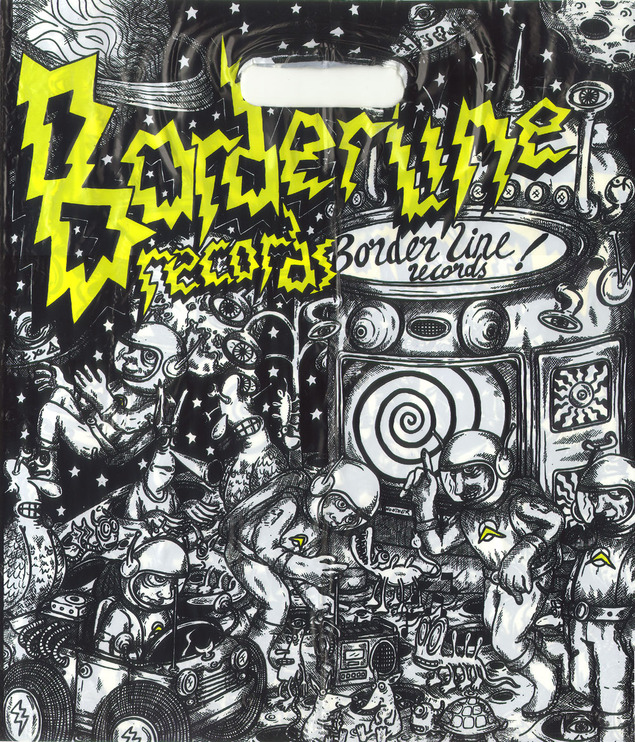
Borderline Records – From Brighton, UK – the edge to edge illustration is pretty nice.

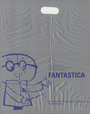
Fantastica – Great 60’s inspired design on silver plastic (you can’t really see that in the scan) This was a little shop in a back street on the first floor in Shibuya, Tokyo. It had the greatest collection of weird and wonderful records I found in that city in the 90’s. They even had an original copy of Afrika Bambaataa’s Death Mix 12″ but after picking out a ton of stuff with less than half an hour left before we had to go to the airport I discovered they didn’t take credit cards!

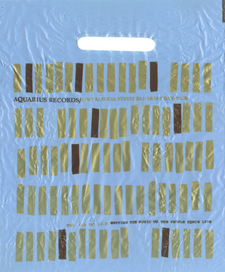
Aquarius – Nice Blue Note-esque design for San Francisco’s premier store for the weird and wonderful

Vinyl Planet – Another of the 50+ record shops rumoured to be open in Shibuya alone. This design is screen printed white onto a transparent bag (note Edan record inside).

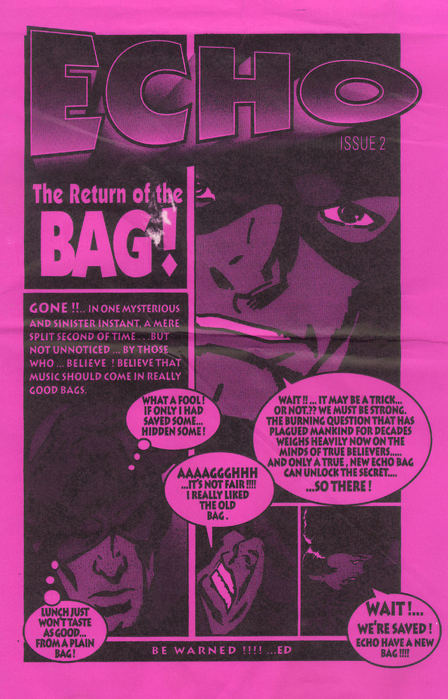
Echo – Return of the Bag – They know what i’m talking about, unfortunately this design is let down by the fact that they didn’t put the shop address on it so I don’t know where to go back to get more records.

Posted in Design, Records. | 10 Comments |

Record bag designs from around the world

Wah Wah 1&2 – Barcelona’s best* new and used store for weird, psychedelic, electronic and everything else besides (*well it was the last time I was there).

I’m always on the lookout for interesting designs of all kinds and on my travels over the years I’ve kept a small collection of the more interesting record store bags I’ve found.

Rotate This – One from the many, many fine stores in Toronto, I love this, simple one colour on a brown paper bag.
Hi Fi – A Chicago staple, clean and simple (and they remembered the address)
Hot Wax – An oldie from Tokyo, the shop is down in a basement, the store that’s there now might not be called Hot Wax any more though.

Borderline Records – From Brighton, UK – the edge to edge illustration is pretty nice.

Fantastica – Great 60’s inspired design on silver plastic (you can’t really see that in the scan) This was a little shop in a back street on the first floor in Shibuya, Tokyo. It had the greatest collection of weird and wonderful records I found in that city in the 90’s. They even had an original copy of Afrika Bambaataa’s Death Mix 12″ but after picking out a ton of stuff with less than half an hour left before we had to go to the airport I discovered they didn’t take credit cards!

Aquarius – Nice Blue Note-esque design for San Francisco’s premier store for the weird and wonderful

Vinyl Planet – Another of the 50+ record shops rumoured to be open in Shibuya alone. This design is screen printed white onto a transparent bag (note Edan record inside).

Echo – Return of the Bag – They know what i’m talking about, unfortunately this design is let down by the fact that they didn’t put the shop address on it so I don’t know where to go back to get more records.

Posted in Design, Records. | No Comments |

Mexico ’68 Olympic brochure excerpts

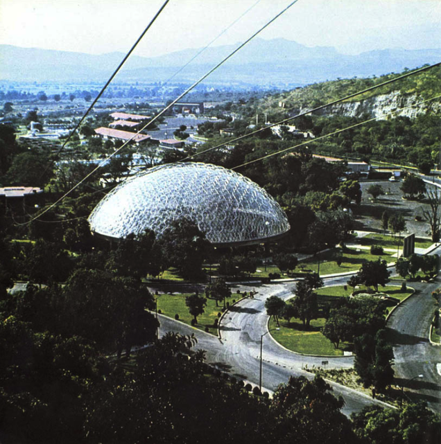
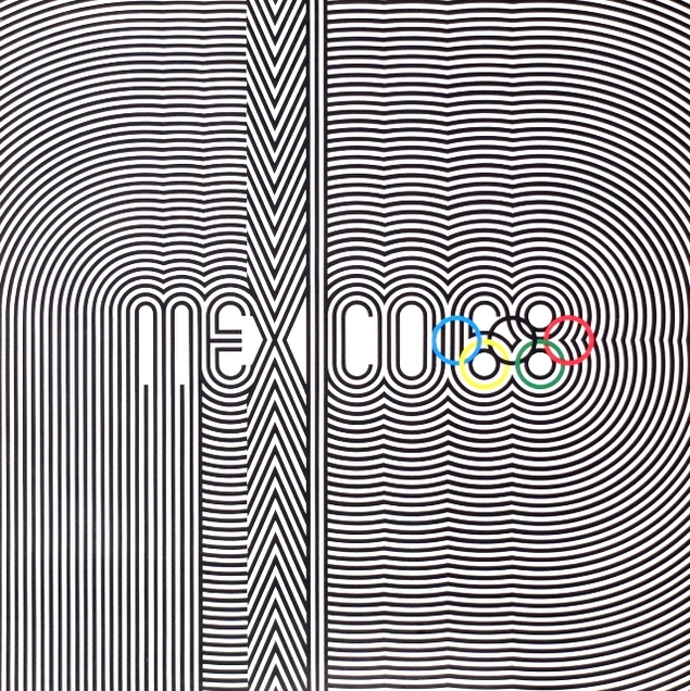
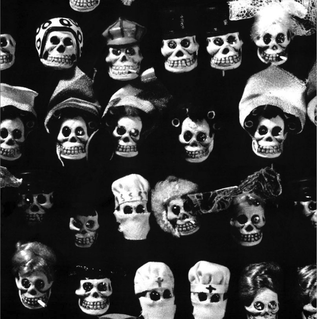
Seeing as we are still in the grip of ‘Olympic fever’ I thought I’d post some excerpts from the brochures that accompanied the ’68 games in Mexico. There were at least 2 volumes and they included everything from historical background, art and architecture of the region, design styles and transport layouts.

The design team responsible for the look of the games was headed up by Lance Wyman alongside Eduardo Terrazas for urban design Beatrice Trueblood for Olympic publications, Manuel Villazon for the student design team and Peter Murdoch for special projects. I also have some from the Munich games which are widely considered the pinnacle of Olympic design.

Well Mexico.

Posted in Design, Event. | No Comments |