 [singlepic id=3206 w=302 h=233 float=right]
[singlepic id=3207 w=302 h=233 float=right]
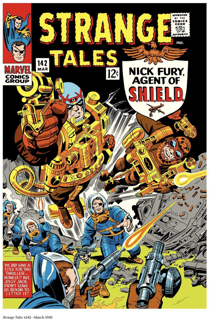
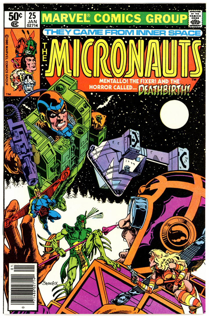
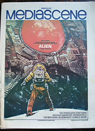
Going through a couple of recently acquired Mediascene magazines today from the late 70’s and I was struck by how much more imaginatively designed the headers on some of the articles were. A lot of them riffed off of film or comic logo design of the age but were mini works of art in themselves. I’ve included various shots of comic logos from ads in the mags too.
