Last weekend I did the rounds of some current and newly-opened exhibitions in London, Stanley Kubrick at the Design Museum, Emma Kunz at The Serpentine and Mary Quant at the V&A.
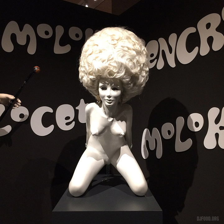
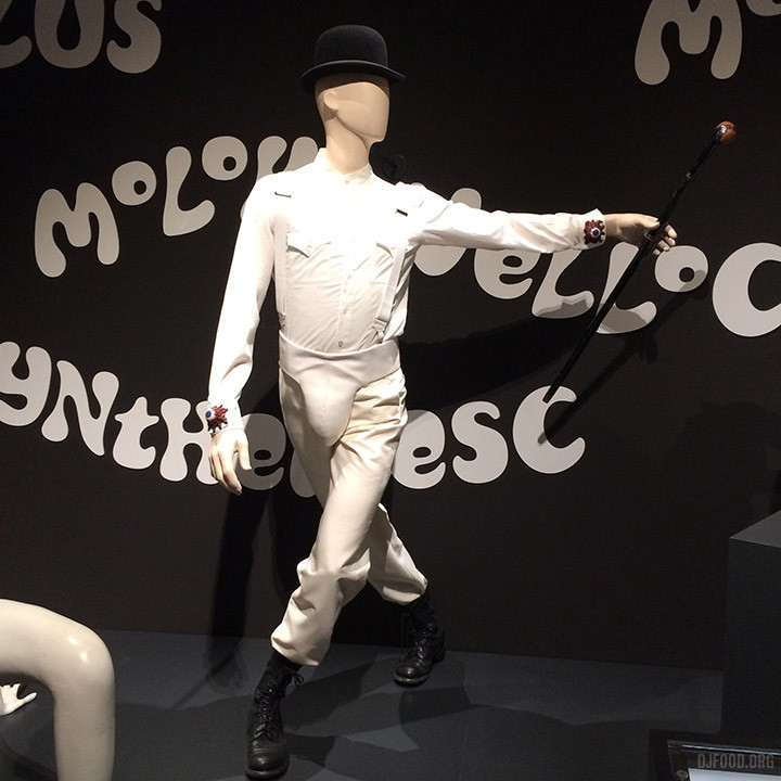
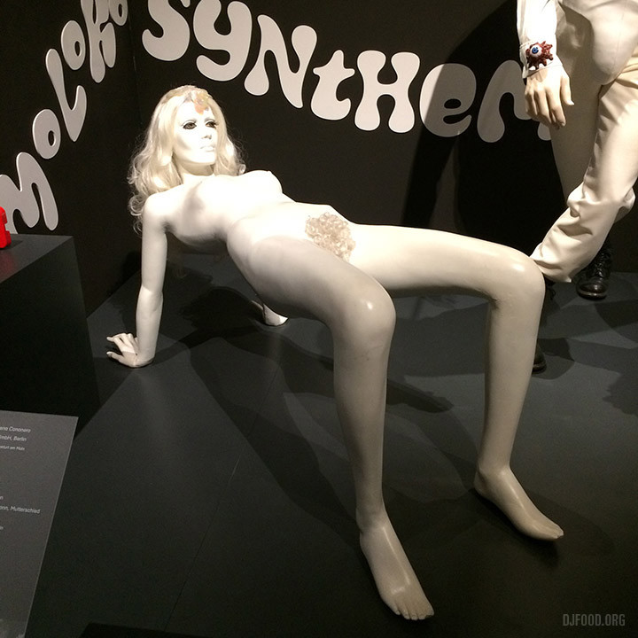
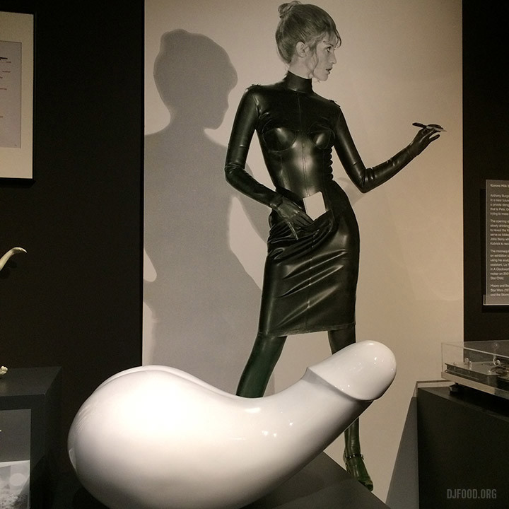
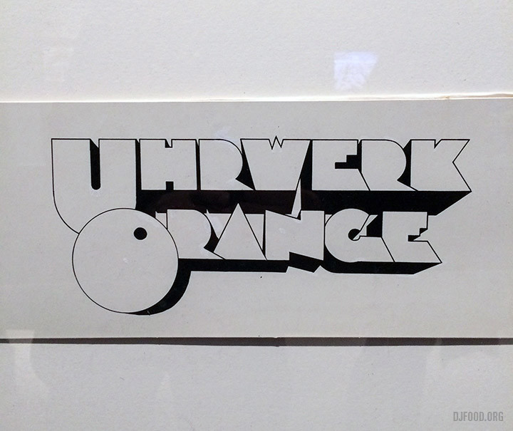
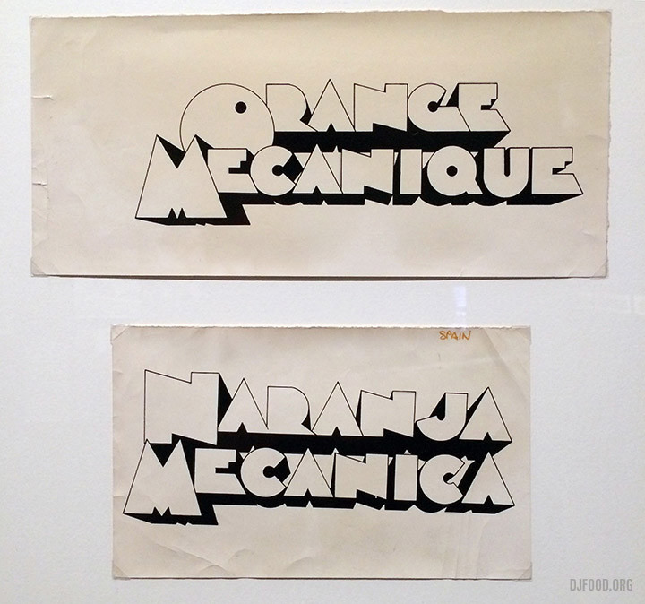
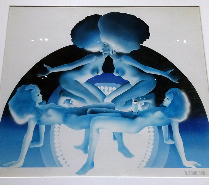
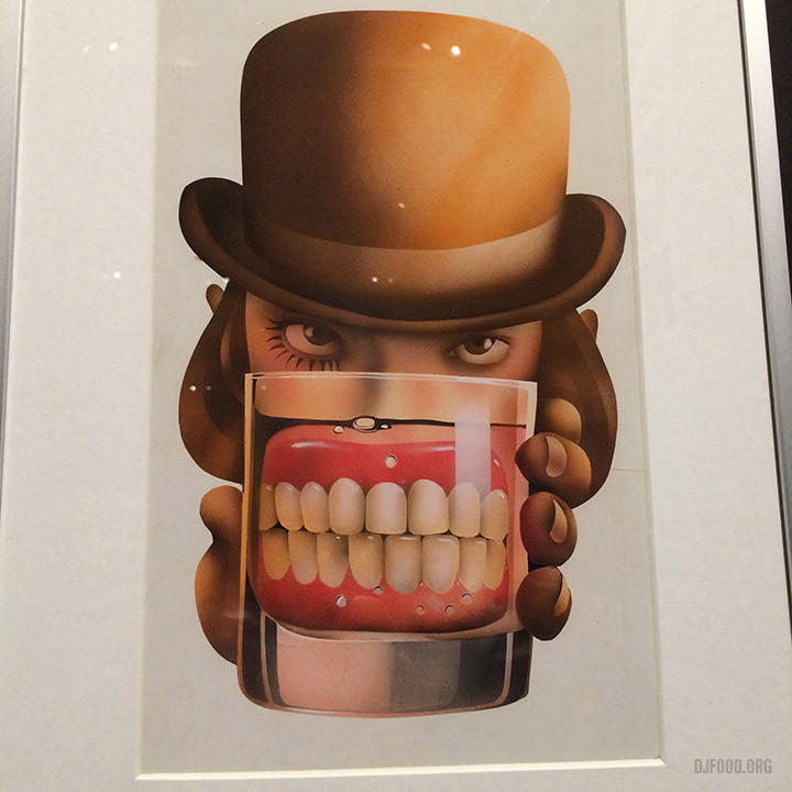
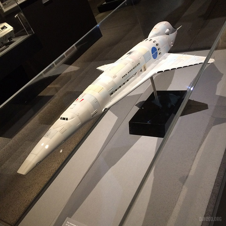
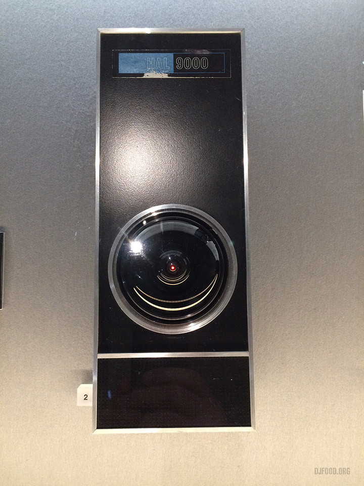
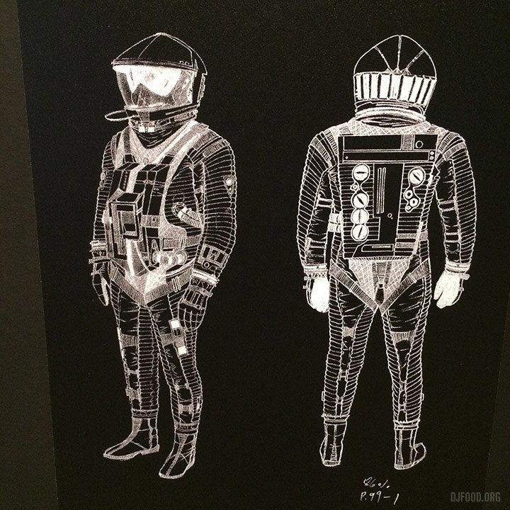
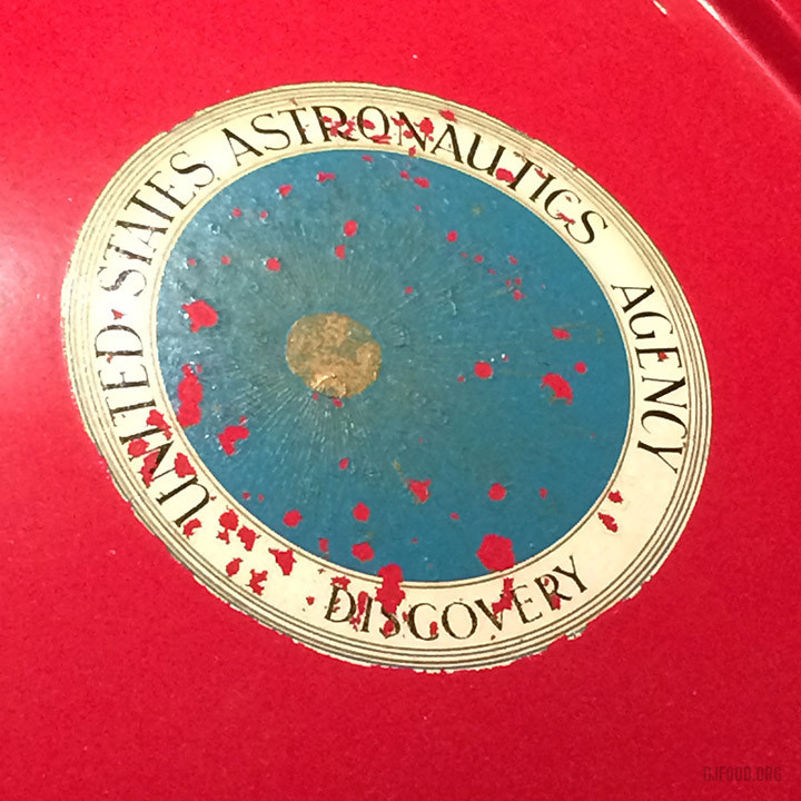
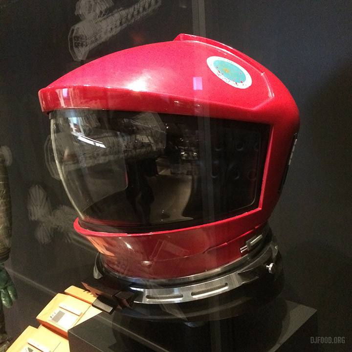
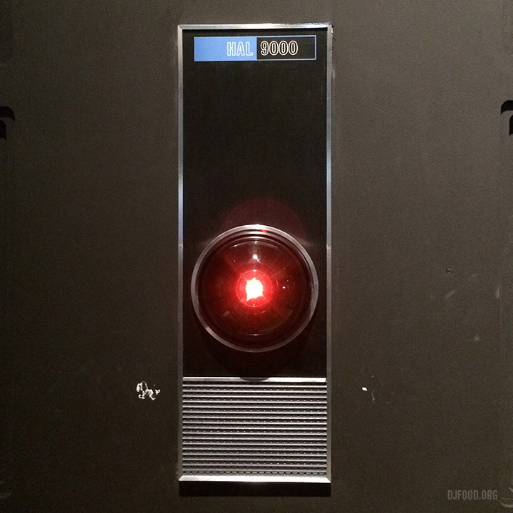
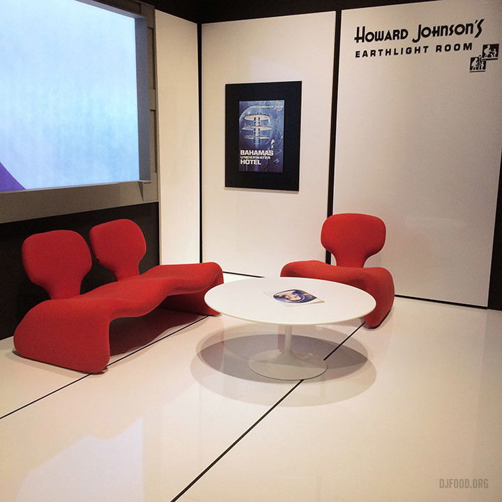
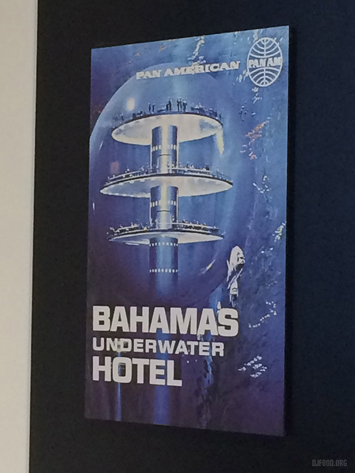
I wouldn’t call myself a Kubrick fan particularly but I’ve always been drawn to the design and imagery in 2001 and A Clockwork Orange in particular and this exhibition doesn’t disappoint on those fronts with many examples of props, artwork and ephemera associated with the films on display at close quarters. Philip Castle‘s airbrush paintings and foreign logo designs are a treat as are the Allan Jones-esque Korova Milk Bar figures and Droog costume.
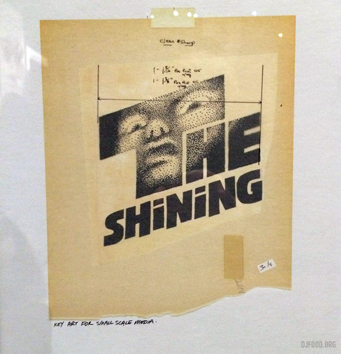
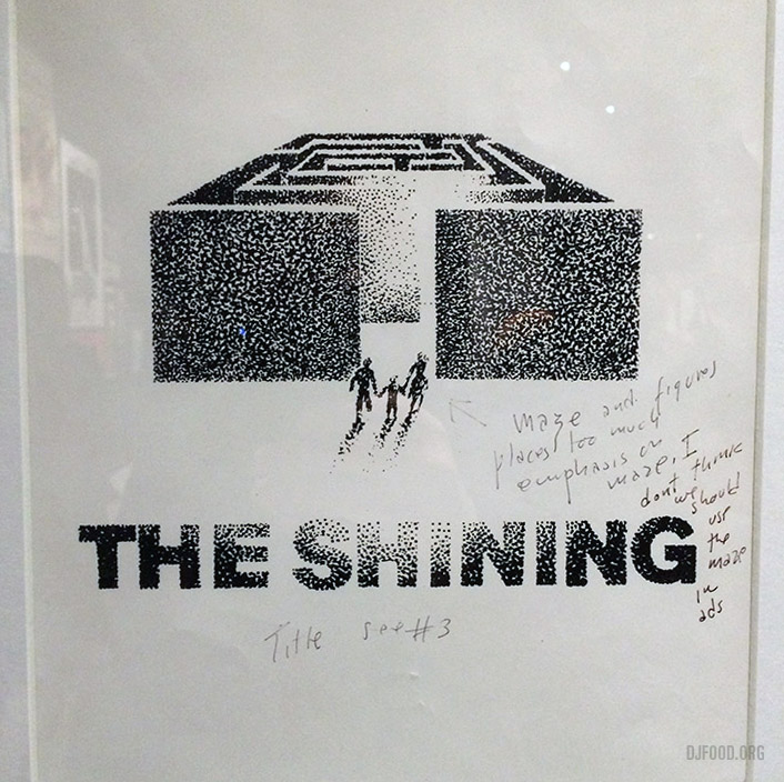
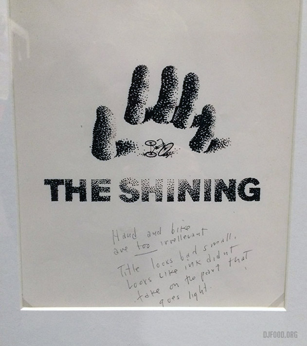
If you’re a Kubrick fan who hasn’t visited his archive I’d say there is probably everything you could want here. It was particularly nice to view Saul Bass’ concepts for The Shining poster up close complete with letters to Kubrick and the latter’s rejection comments.
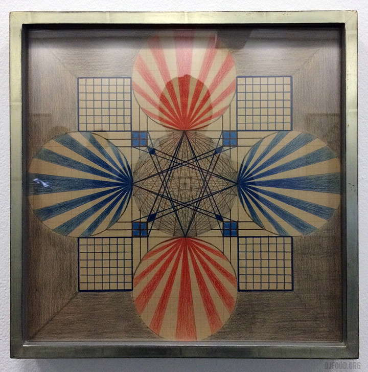
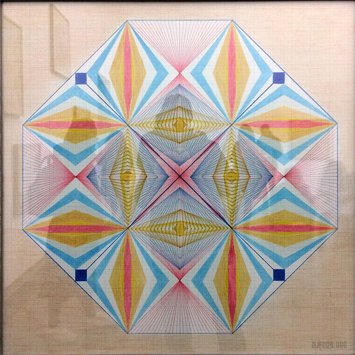
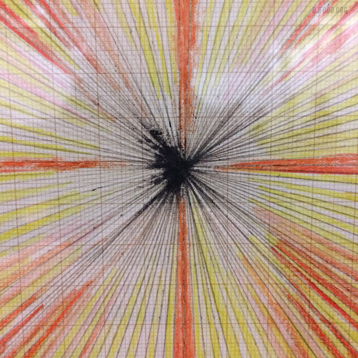
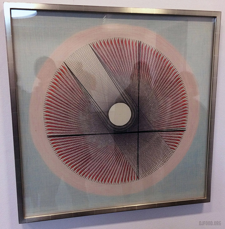
Emma Kunz was a wild card, I’d never heard of her but seen the work online and decided to give it a go as I was nearby. Not hugely impressive technically and with little to explain what and why she’d chosen to make these drawings with the most perfunctory titles, I was a little underwhelmed. The art was very hard to photograph in the light of the Serpentine so don’t take these as the complete picture.
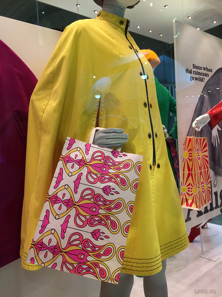
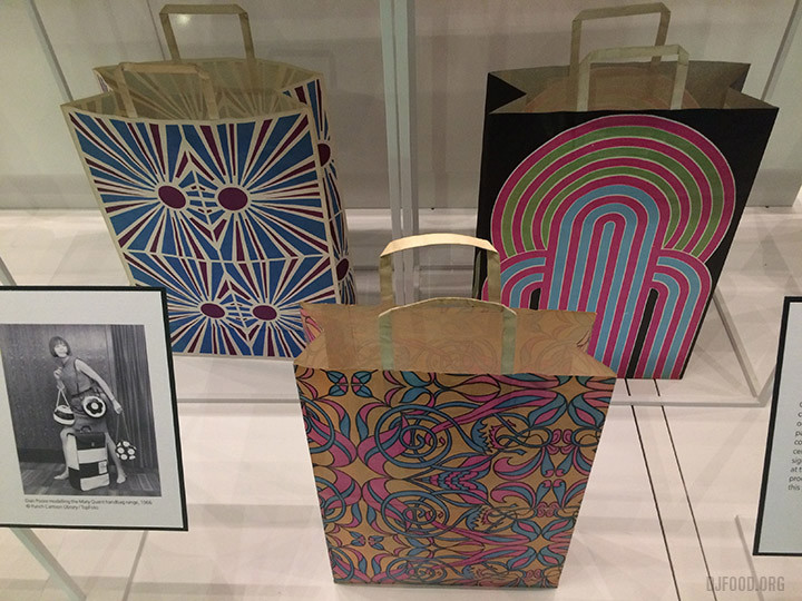
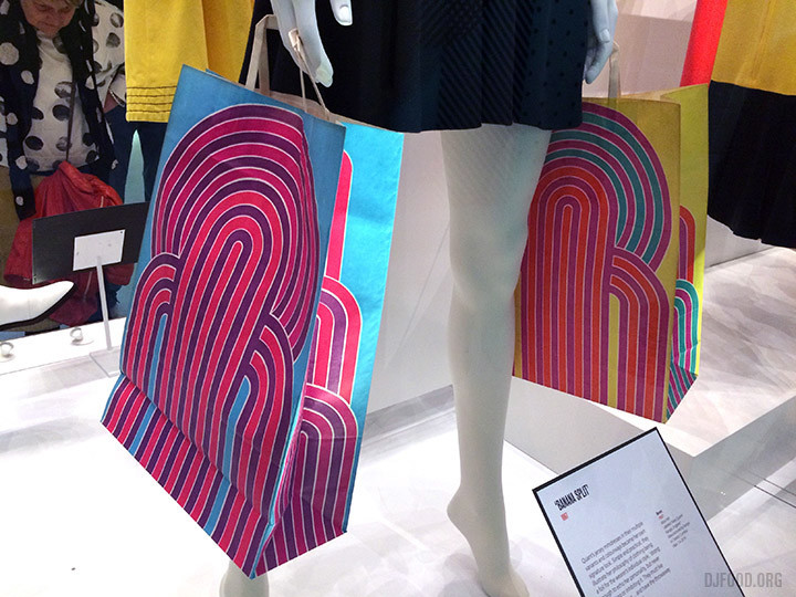
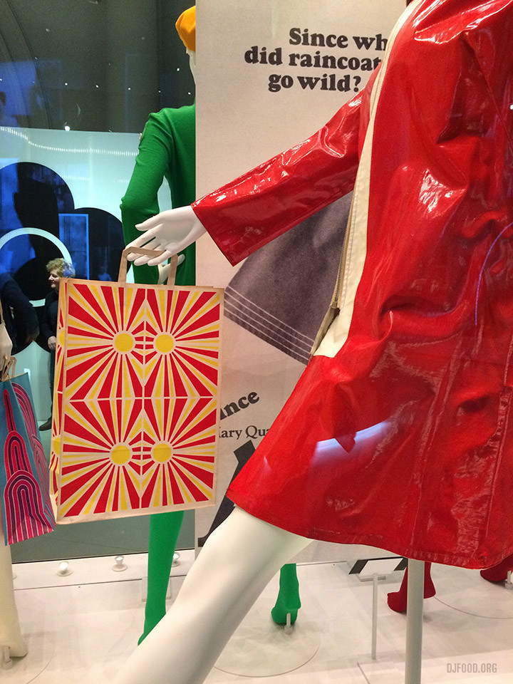
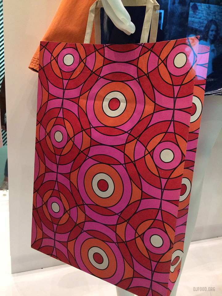
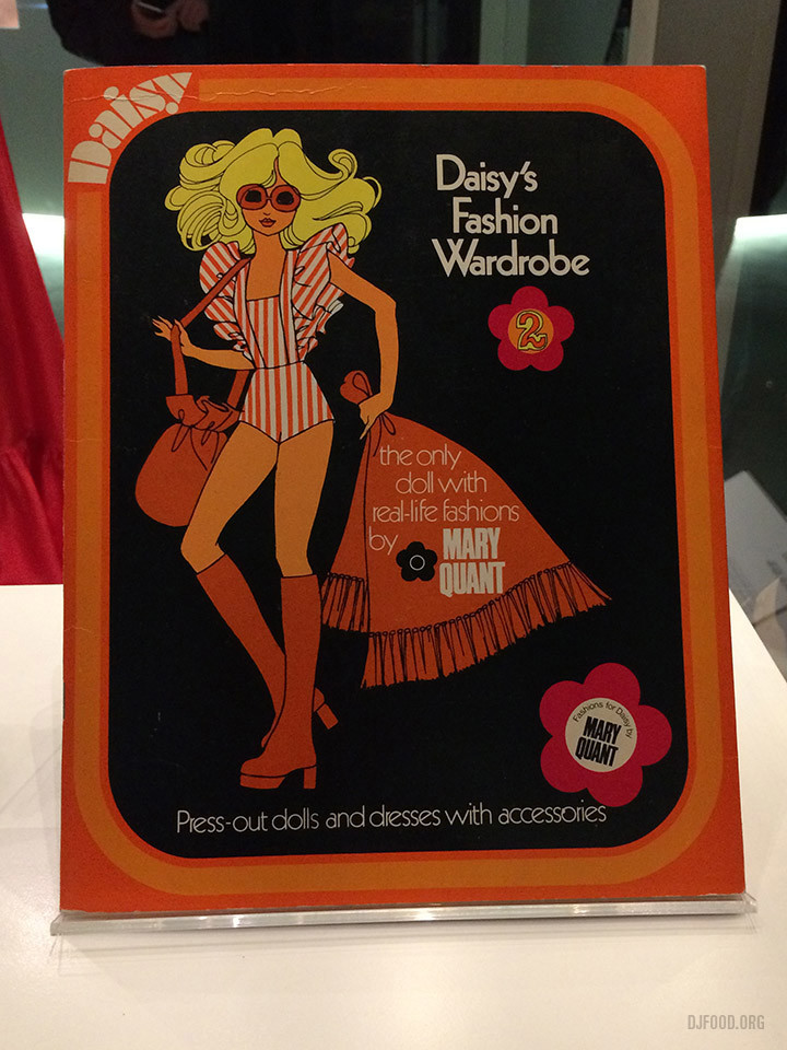
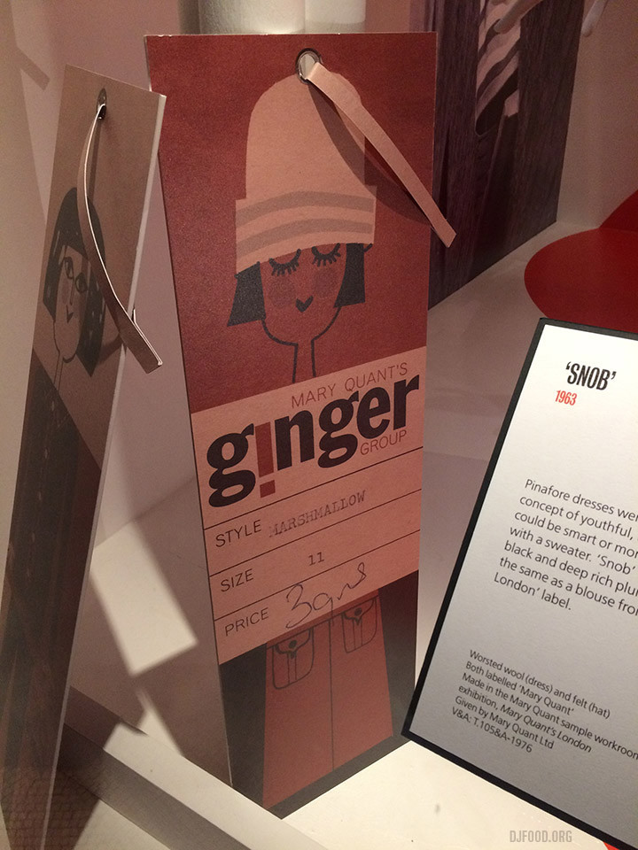
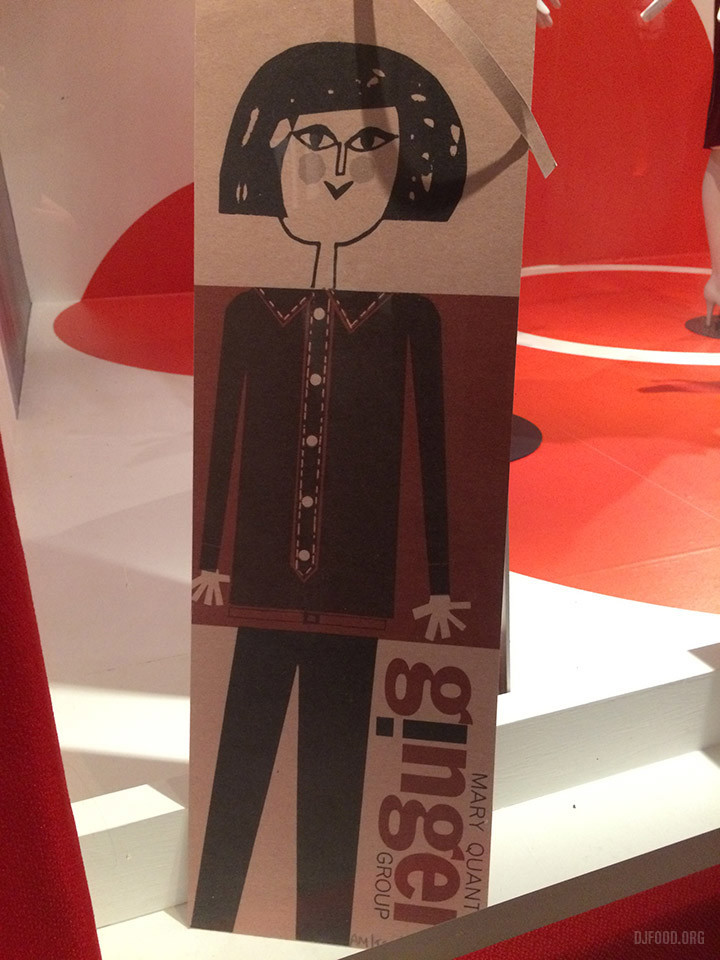
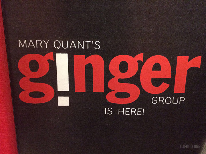
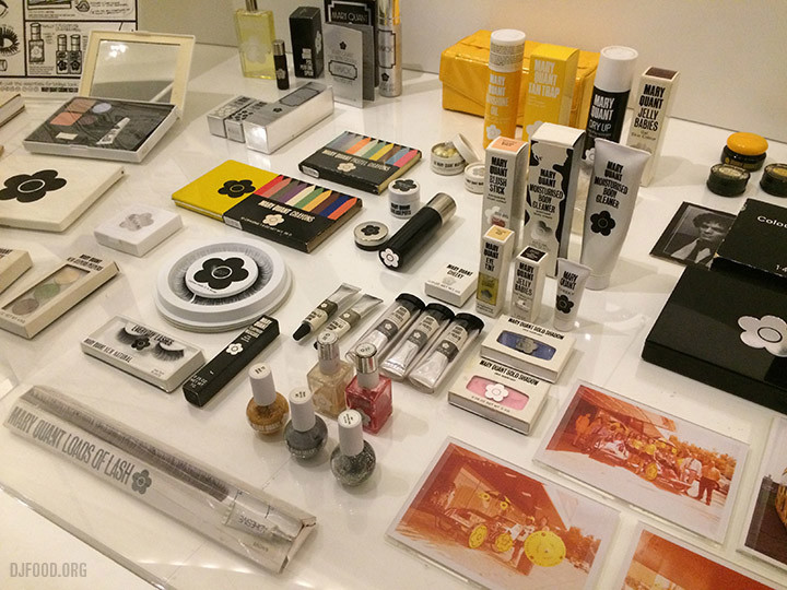
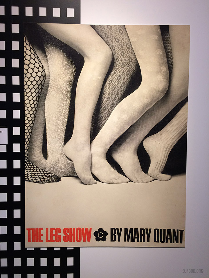
For Mary Quant I went for the packaging and graphics more than the clothes (although plenty were to my taste). The slightly confusing layout of the exhibits took some navigating if you wanted a chronological experience but the display design was excellent. I left wanting just a bit more than was on display and if this had been coupled with the content of the recent Fashion & Textlie Museum contents along similar lines then I think it would have felt more fulfilling.
