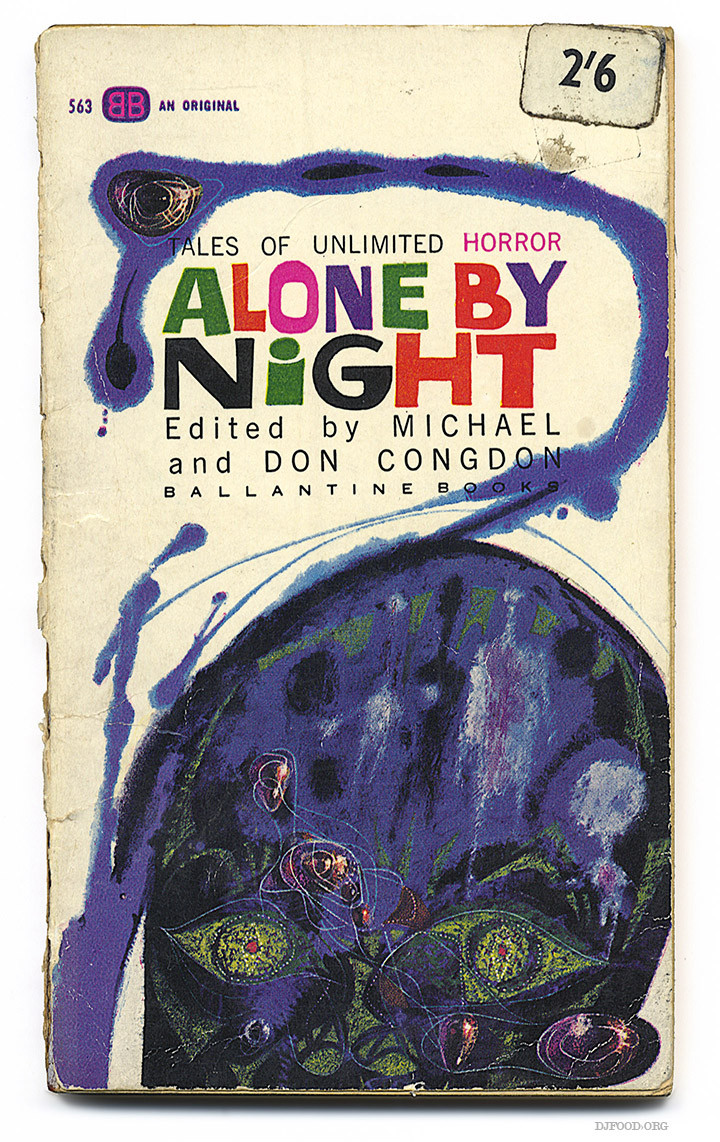
 An original Ballatine Horror anthology I found at the weekend with a cover by Richard M. Powers
Art
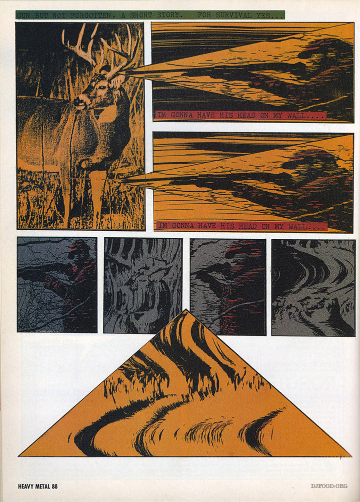
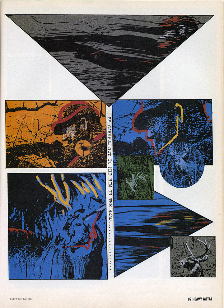
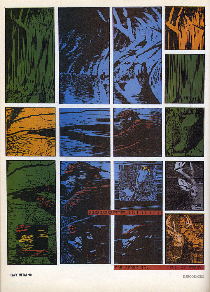
A 3 page story appeared in the January ’92 issue of Heavy Metal magazine, credited to Greg Gallo and made entirely out of distorted photocopies. I’ve searched for more comic work by Gallo but found nothing, can anyone enlighten me on anything else he’s done please or was this a one-off? The twisted xeroxes remind me of WKinteract‘s work that sometimes utilises a similar method.
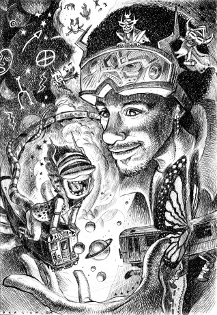
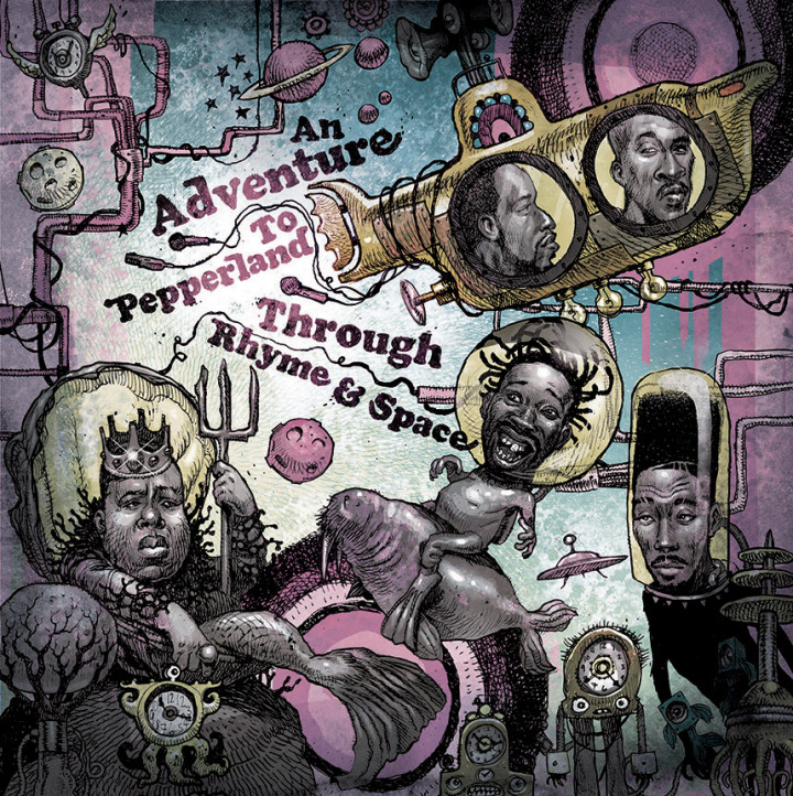
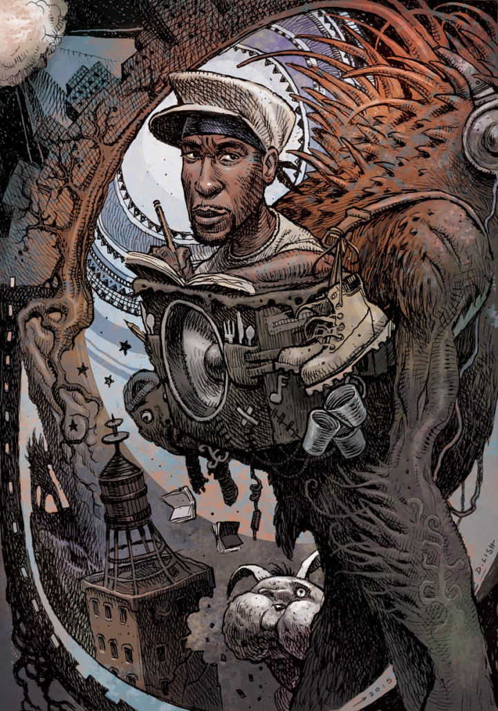
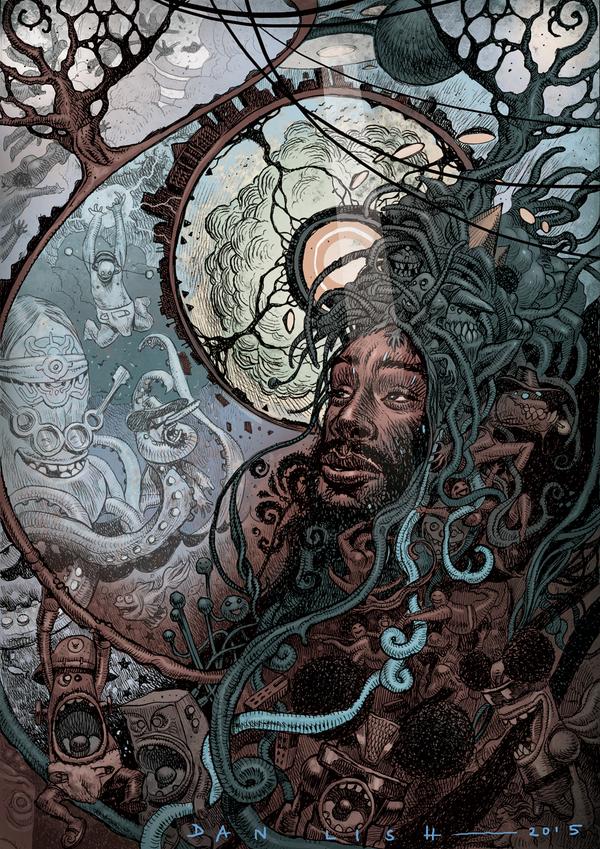
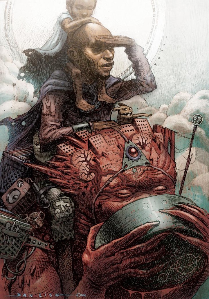
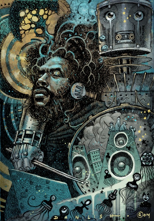
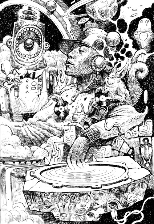
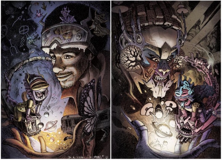 The Rammellzee love-in continues… finished colour versions of the Ramm(s) by Dan Lish (love that he flipped the 2nd one) and an old video popped up the other day of a performance by Rammellzee and Toxic C1 at the Rhythm Lounge in 1983. Toxic is cutting up Billy Squire‘s ‘Big Beat’ while Ramm raps but Jean Michell Basquiat also provides graphic overlays and doesn’t actually appear, the video isn’t all that but it’s all about the recording.
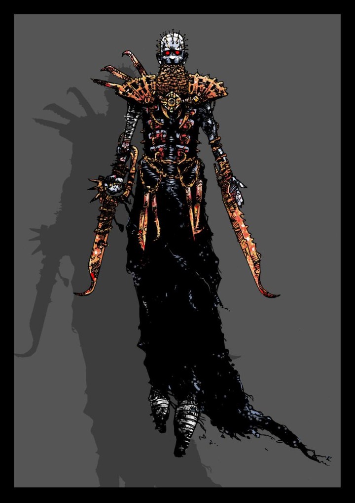 How inspired is this mash up? 2000ad’s Shakara mixed with Hellraiser‘s Pinhead by Neil McClements for the 2000ad forum monster mash art competition.
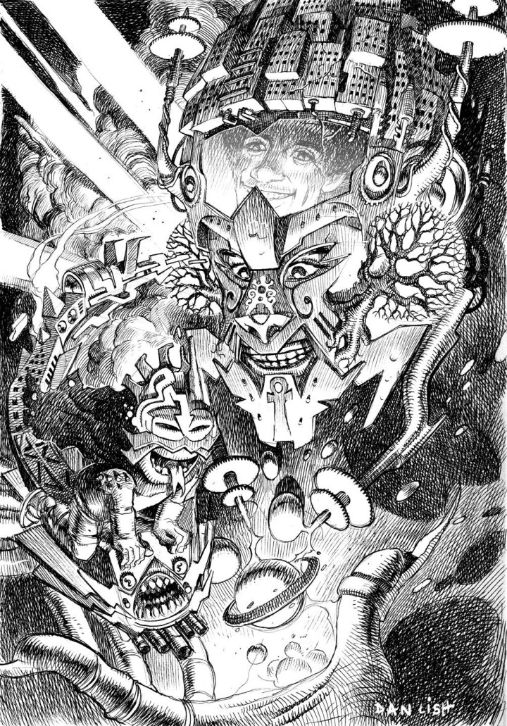 This blog seems to rapidly be becoming a Dan Lish showcase of late. Furthermore to the first portrait of Wildstyle-era Ramm that he posted just a few days ago, late last night this version went up. The Rammellzee in full on Ikonoklast Panzerism mode. Both so wonderful, can’t wait to see the colour versions.
I’ve been meaning to post his illustration for the weird Beatles meets Hip Hop mash up that went up the other month too…
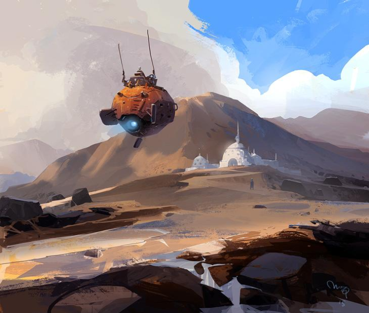
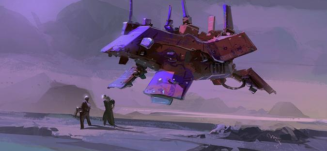
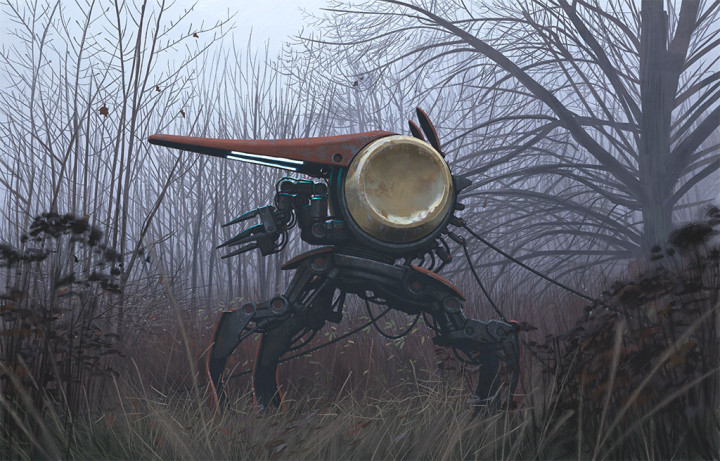
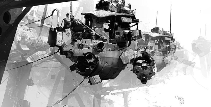
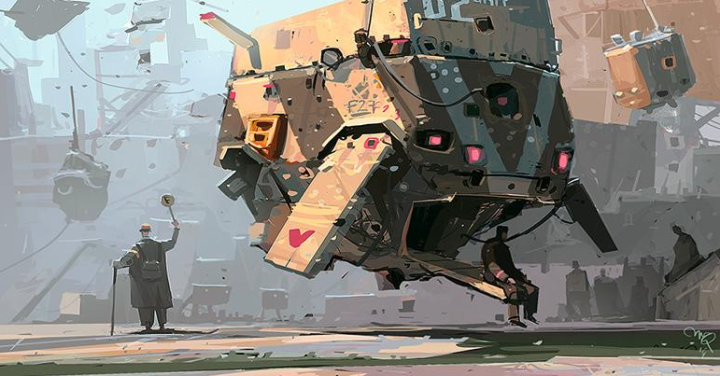 I follow Ian McQue on Twitter and have posted about him a couple of times now, his output and range never ceases to amaze me and he does these in a matter of hours. Here’s a collection of recent vehicles that sees a departure from his tugboat images of old.
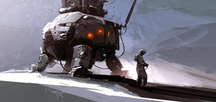
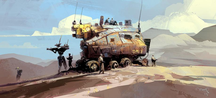
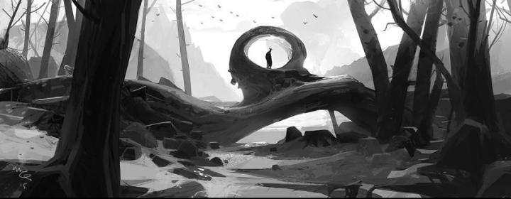
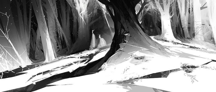
Check his beautiful black & white work below and he does a fine line in scenery and twisted old trees too. Also he put out a new sketchbook last year, the brilliantly titled (or groan-inducing if you hate puns) ‘Mechs & The City’. His online store has just reopened with restocks of prints and two sketchbooks.
There’s been something in the air recently concerning (The) Rammellzee, firstly there was the old interview that surfaced, pressed up for last year’s Mo Wax exhibition. Then ‘Rammellzee‘ appeared on Twitter last month, despite passing away in 2010… most strange. I got word that this was something to do with Gamma Proforma and a forthcoming project was hinted at. Then this morning Dan Lish posted his take on early Wildstyle-era Ramm as part of his Egostrips series…
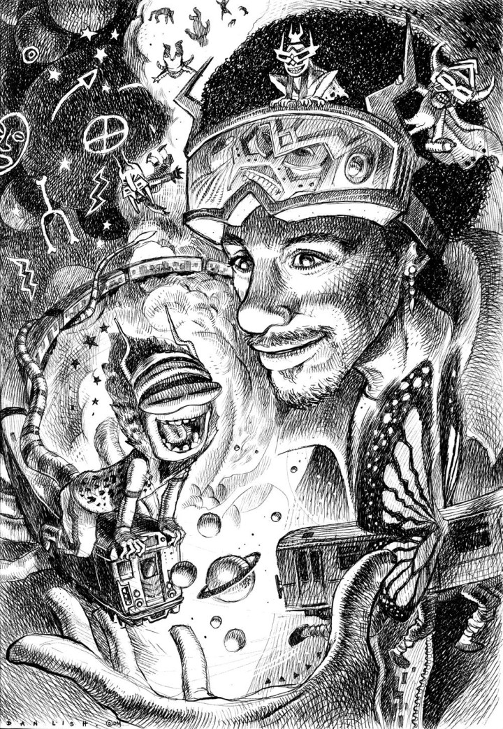 …pretty great huh? and this is only the black & white version.
Then the bombshell: Gamma announces a new release entitled ‘Brainstorm’ from an unreleased album, ‘Cosmic Flush’, Rammellzee’s magnum opus, recorded before his death. This will be the first part of a set and this edition will consist of vinyl (with a remix by Divine Styler) and a print by Ian Kuali’i, released March 30th. Preorder HERE
Definitely something in the air.
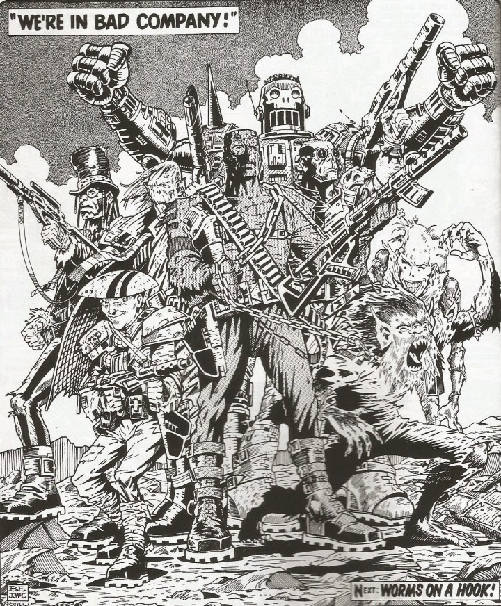
Very sad to hear the news today that Brett Ewins has died after a short illness. He was a master of his art and a huge influence in British comics in the 80’s and 90’s. Starting out with Brendan McCarthy and Pete Milligan he bought the sharpness of the ska movement into comics, slowly working his way up from one-off Future Shock stories in 2000AD to full-on national treasure status in the comic’s first golden age.
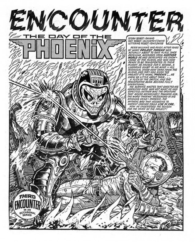
Judge Dredd, Bad Company, Rogue Trooper, Judge Anderson, Johnny Nemo and more, he made a huge impression on me as a kid. As the 80’s ended he co-founded the music and comics magazine, Deadline with Steve Dillon and they launched Tank Girl into the world among many others. I’m pretty sure I draw skulls the way I do because of Brett’s depiction of them as biochips in the Rogue Trooper stories. I remember copying at least one of his characters in a graffiti piece I did in my teens and also being shit-scared of a particular character he and Brendan McCarthy drew for a story called ‘The Day of the Phoenix’.
The one page ‘Encounter’ from a very early issue of 2000AD freaked me out as an 8 year old, mostly because of the leering face of the creature about to do something unspeakable to the human who had just teleported into its world. Back in 2011 Air Pirate Press published ‘The Art of Brett Ewins’, a collection of a lot of his best work from the start of his career up until that time. It’s an excellent book and came as a timely reminder of Brett’s achievements as he’d disappeared from the scene amid rumours of health issues. The book is even more important now that he is now longer with us and nestled inside was the ‘Phoenix’ page which triggered a deep nostalgia in me. I made some inquiries and got a message to Brett asking if he still had the page and was it for sale? Luckily he did and it was, so one summer afternoon I found myself visiting him in his West London home, looking through various classic Dredd stories and chatting about his career. He still had the table that he and Brendan used to sit at and draw on when they were first starting out and he told me he loved listening to Brian Eno when he drew.
He was very humble about his own work and forthcoming with answers to the many questions I had about it. I bought the page although, unfortunately, most of the lettering had fallen off over time (it was drawn in 1978). Brett said that it was around somewhere and that he’d find it and send it to me although that wasn’t to be. Just a few months later there was a news story that he had been arrested and sectioned after an incident outside that very house late one night and soon after he was imprisoned for stabbing a policeman. He had been diagnosed with paranoid schizophrenia and served several months in jail before being released in late 2012. Since then he had been under psychiatric care and even made a few appearances at comic events as many rallied round him to offer support. I feel very lucky to have met him for the hour I was at his house, he certainly won’t be forgotten.
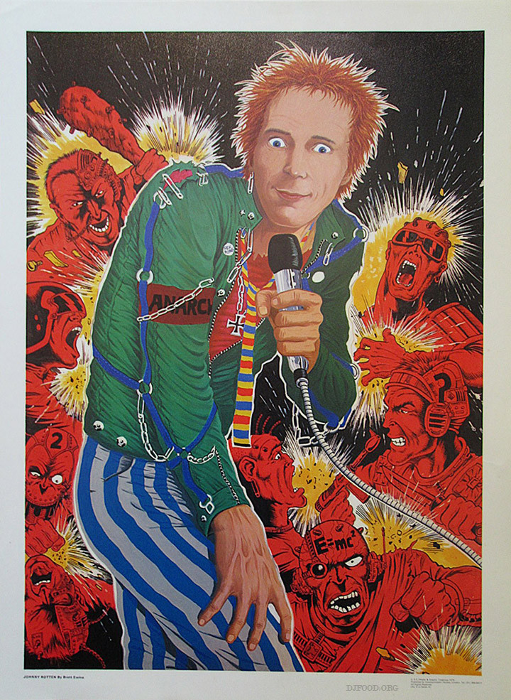
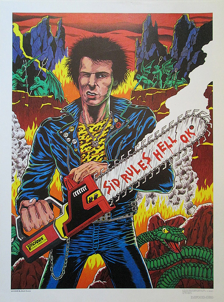
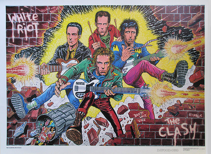
I urge you to buy a copy of ‘The Art of Brett Ewins’ to see how much great work this man gave to the comic world, Titan have also recently released a Johnny Nemo compendium collecting all the old strips and adding new work by artists like Rufus Dayglo, Ashley Wood and more. Air Pirate Press have collections of his Bad Company work and the US series, Skeemer. 2000AD have various Dredd collections available with Brett’s work in them but I don’t know the exact volumes that feature him. Lastly here’s some rarely seen early work that he did for a British poster company in the late 70’s, these are hard to find now but sometimes crop up on eBay.
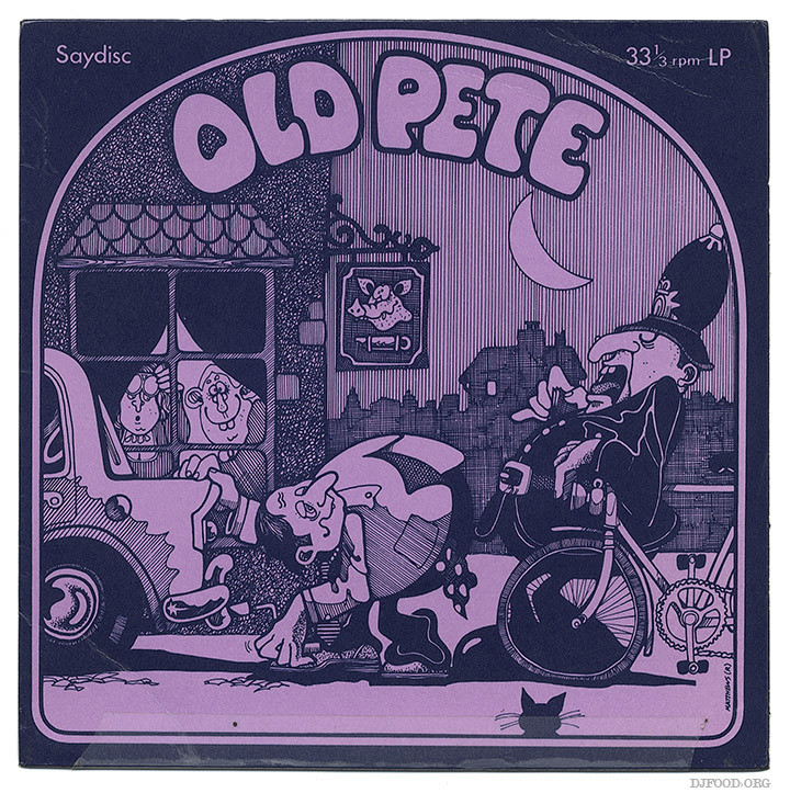
Found in a London basement this week, my eye was drawn to the illustration on the cover of the 7″ sleeve. ‘Sleeve drawing & design: Rodney Matthews, Plastic Dog Graphics‘, it said. I knew Rodney Matthews from hours spent looking at his posters our hip French teacher had plastered around his classroom in the 80’s, numerous record sleeves and Paper Tiger books. But I’d never heard of Plastic Dog Graphics so I looked it up on his website:
“In 1970, Matthews left the advertising world to form an art partnership with Terry Brace, who was an acquaintance from art college days and had played in the same band (Barnaby Goode) for a while. The partnership was related to a music agency and the two businesses were given the name Plastic Dog (graphics and music agency). The name was a joke at first (family dog!), but eventually became official.
Plastic Dog Graphics specialized in design for the music industry; everything from press ads to button badges to record covers, and what started as a company working mainly for local folk artists on the Village Thing label progressed to encompass internationally known artists via companies like United Artists Records, MCA Records, Sonet Records (Sweden), and Transatlantic Records. Rodney’s first full colour LP cover design was for the German band Amon Düül II (Live in London). It was to be the first of many.”
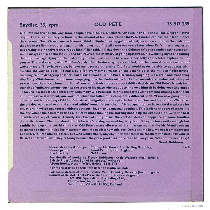
This sleeve dates from a year later so must be one of his first, but I can’t find it listed on Discogs although the label, Saydisc, is there. The content on the record is first person narrative, dodgy stories of the character Old Pete and his misfortunes, probably similar to a Viz of its day, although way tamer, more like pub banter.
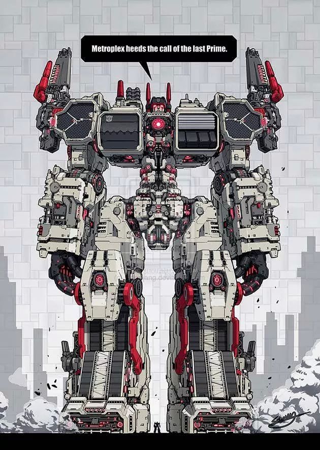 Found on a tumblr site via another tumblr site which, predictably, didn’t have any info on where it came from or who drew it because of the re-titling that goes on when you post on these sites. I despair at an information age in which the information is stripped from half the content. Google image search reveals it’s by a guy called Stormjang and comes from Deviant Art.
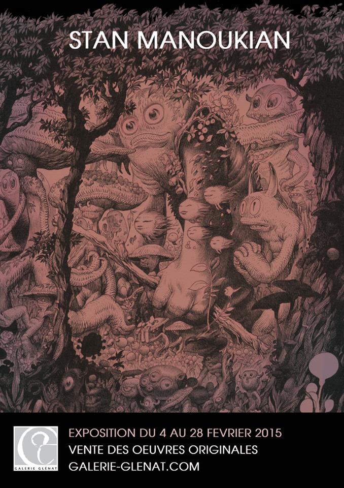
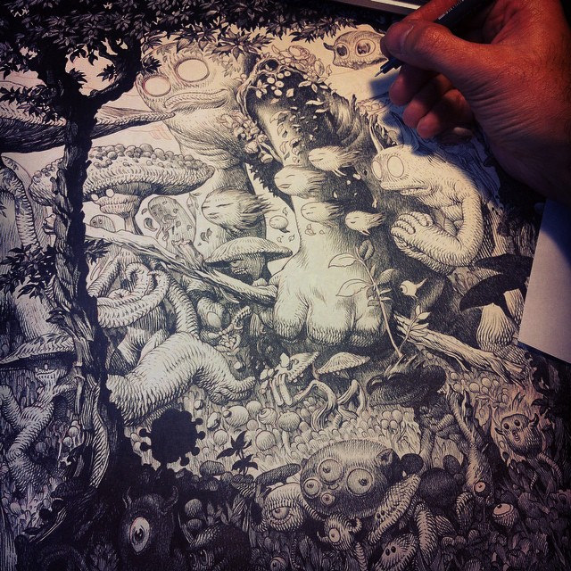
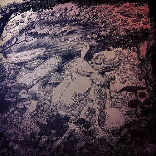
Just saw Stan Manoukian (of Stan & Vince fame) is having a show in Paris next month. Inspiring, I must start drawing again…
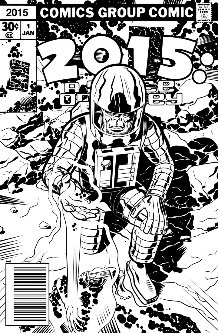
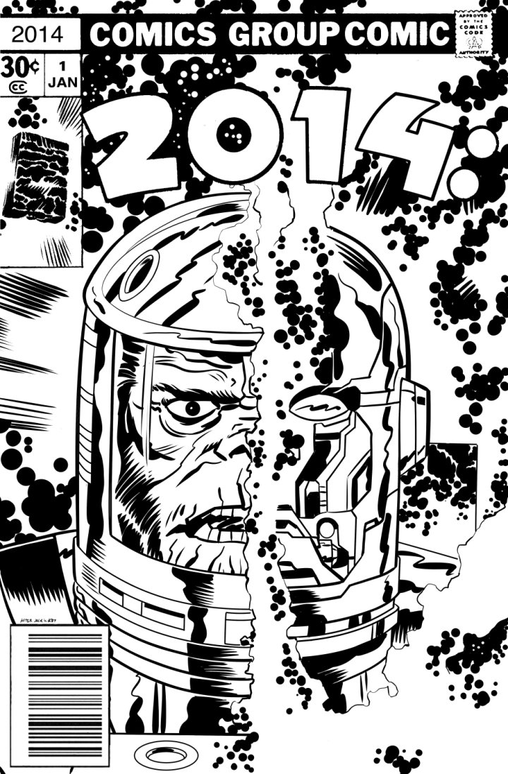
If you read this blog regularly you may remember that around New Year Edmund Bagwell does an annual ‘cover’ to mark the date in the style of the old Jack Kirby 2001 comics. I checked his blog earlier this year to see if he’d uploaded one but nothing doing. Then today the 2015 one popped up in my Twitter feed and checking back through my posts I realised that I hadn’t posted 2014’s cover either. So here they are although the 2015 one is very low res unfortunately. UPDATE: Edmund just sent me a hi quality version – thanks! 
Fibonacci Zoetrope Sculptures from Pier 9 on Vimeo.
“This mesmerizing blooming zoetrope sculpture is designed using the golden angle — 137.5º. The infinite blooming effect is achieved by spinning the sculpture very fast and photographing it with a camera with a fast shutter speed.“
And again, lit by a strobe at the right speed.
Fibonacci zoetrope sculpture under strobe light from Pier 9 on Vimeo.
For more fascinating info on the technical aspects of this go to this page.
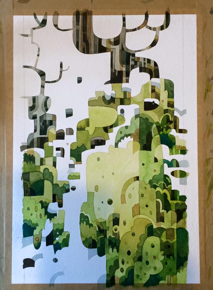
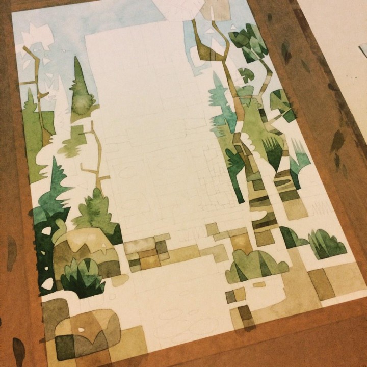
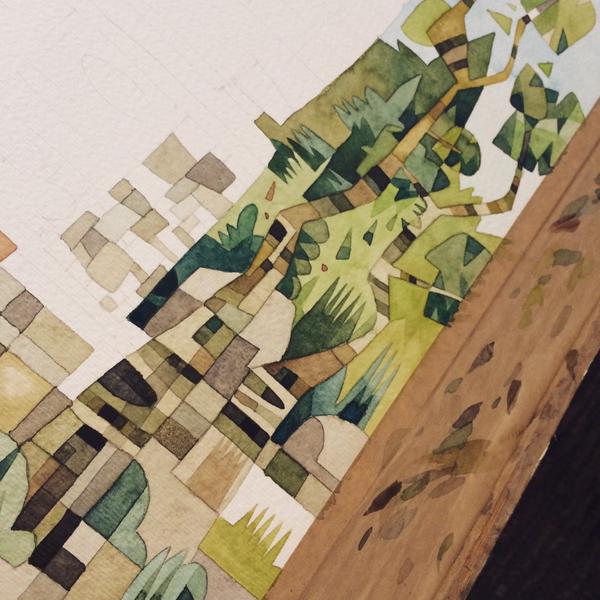
Love these tree paintings that Jonathan Edwards is producing right now, a mix of Yellow Submarine-era Heinz Edelmann and children’s book-style Rodney Matthews.

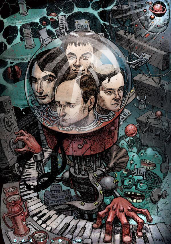
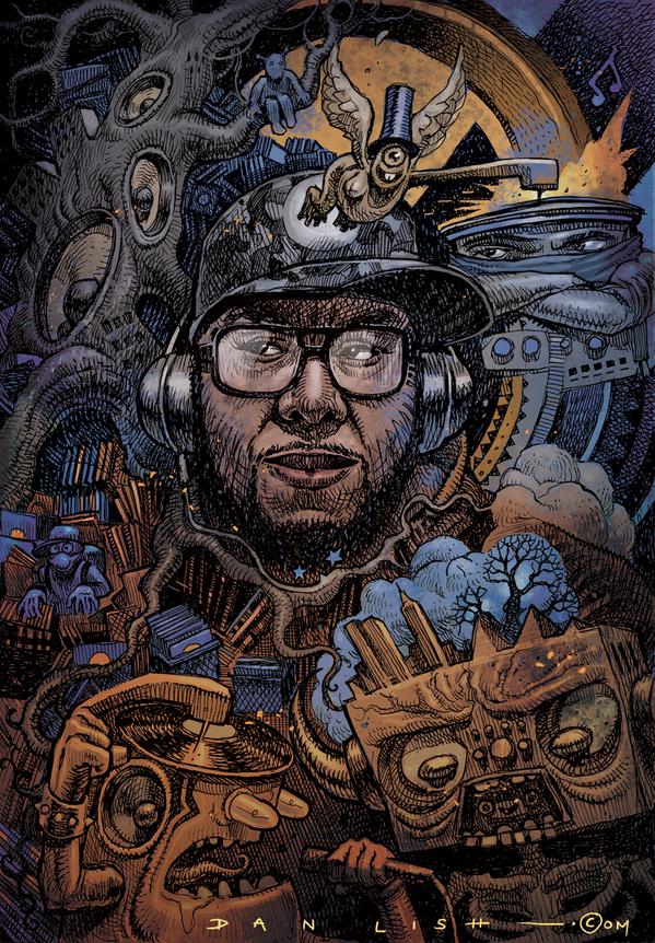
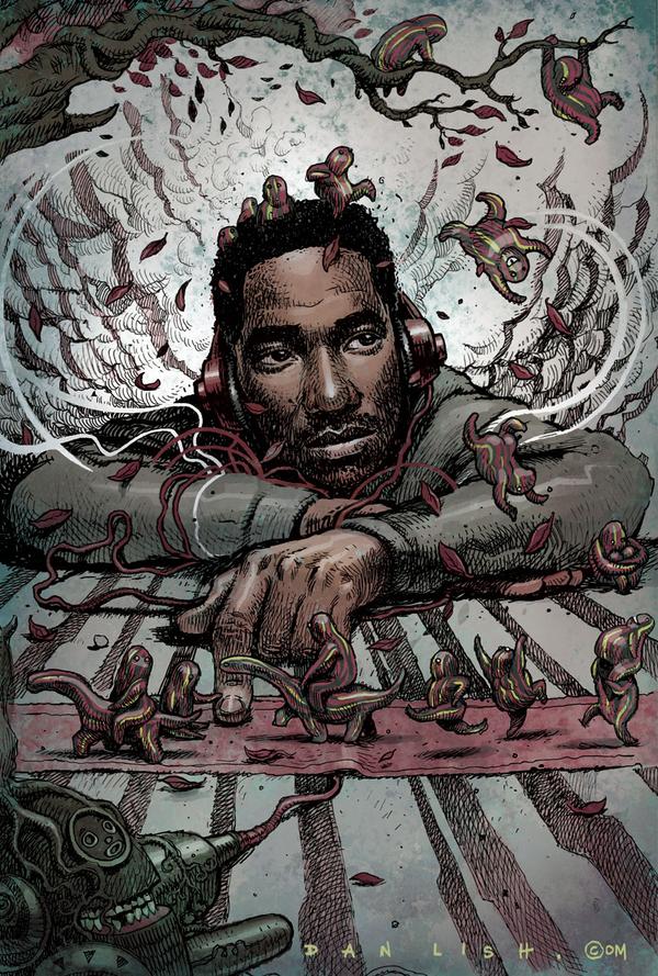
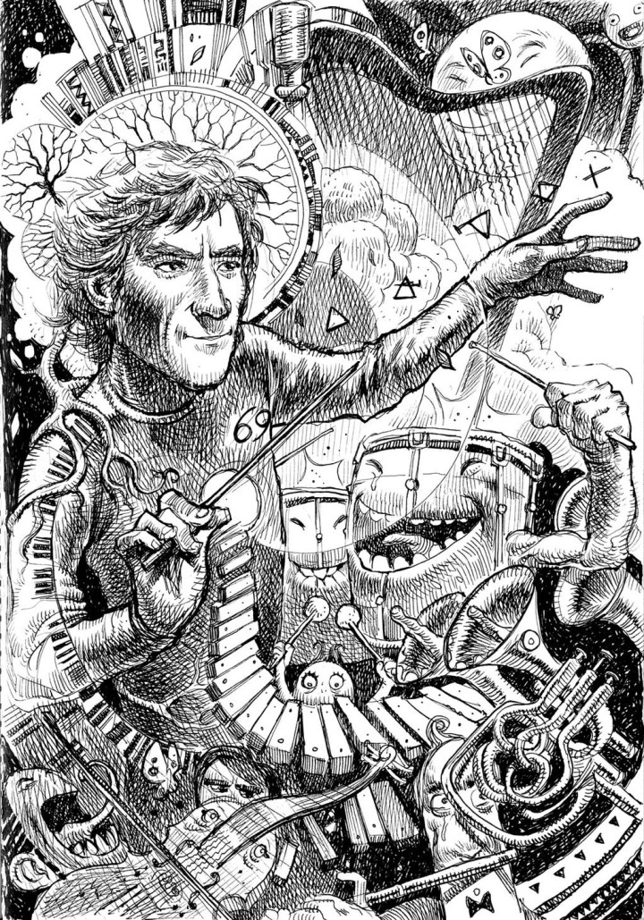
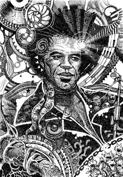
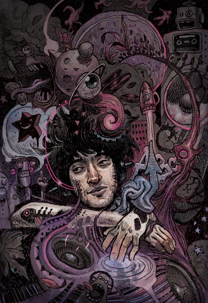
Can’t get enough of Dan Lish‘s ‘Egostrip’ illustrations at the moment, he’s illustrating some of his musical heroes – mainly from the world of Hip Hop – for a future book. In a mix of Moebius and Jeff Soto they inhabit a psychedelic otherworld straight out of a mushroom trip. He’s only gone and done Kraftwerk as well…
Below: Questlove, Q-Bert, Madlib, James Brown, Edan.
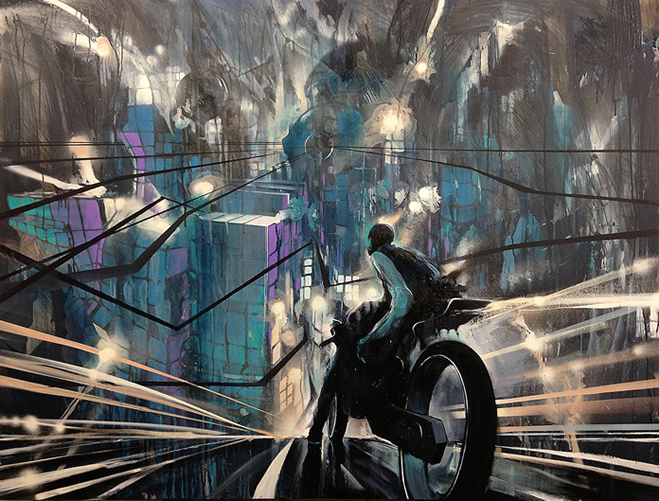 This one passed me by before the year ended as it got lost in the Xmas rush but I’m glad I remembered it as it’s a corker. Divine Styler makes records at about the the same pace as me, ie: not very often but this was well worth the wait. A dystopian sci-fi collage of film samples and electronic beats with his signature rhyme style unchanged from years past. This is Hip Hop that doesn’t look back to the golden age or ape the past even though it takes past practices. It’s a forward looking one that manages to sound contemporary without kow-towing to current sonic trends or fashions like EDM or its ilk. Sure it has touches of bass-wobble and the double-time snap of a drum and bass rhythm but that’s as far as it goes. For all the current media darlings of Rap’s bragging and boasting, even if they have a great voice and flow, few can touch Divine Styler’s pin prick sharp delivery or authoritative swagger.
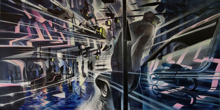
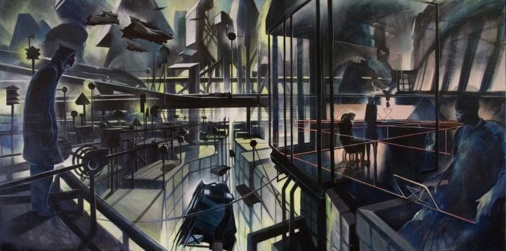
Couple this with art by Will Barras who envisages scenes from Styler’s future world in a limited edition book available with a special version of the vinyl on the Gamma Proforma label and you have a pretty unique vision for a Hip Hop album in 2015. If you don’t know Gamma Proforma then they’re the place where street art and electronic music meet, a boundary-pushing collective who have championed some of my favourite artists over the years. They stock music, books, prints, original art and T-shirts as well as hosting exhibitions and creating last years ReWire exhibition, book and compilation via Kickstarter.
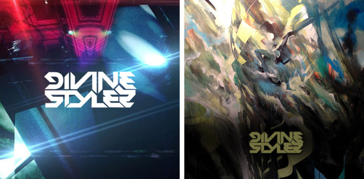
Anyway, back to Divine Styler’s album: more Blade Runner than Run the Jewels (in fact it starts with what sounds like a decaying sound effect from the film) it’s a refreshing counter balance to dull murder raps and the seemingly endless macho bullshit paraded on 95% of current Hip Hop. Buy it here direct from the label on LP, CD, DL and a special edition LP with signed 42 page book and print.
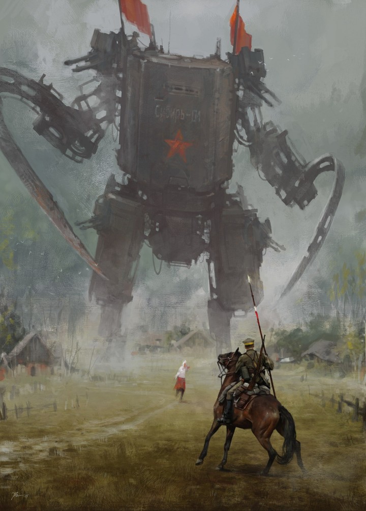
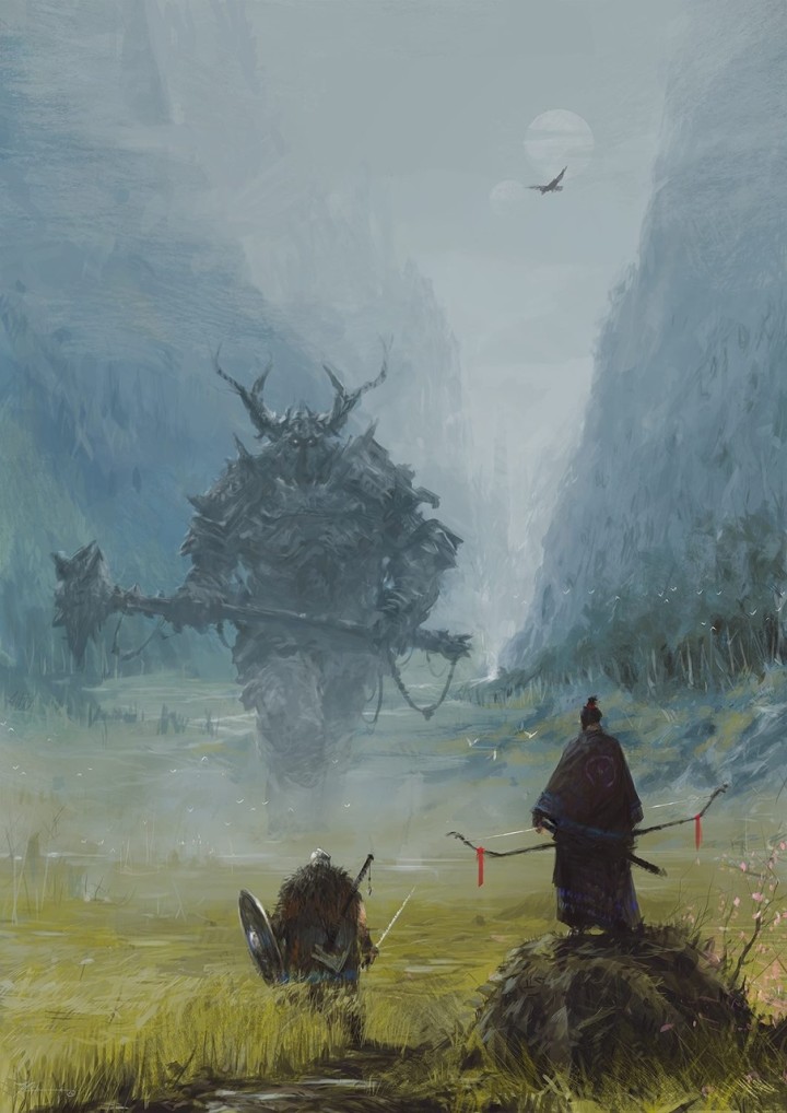
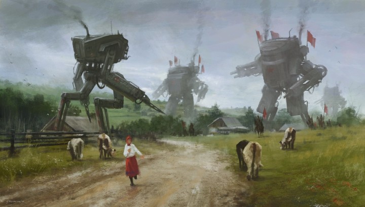
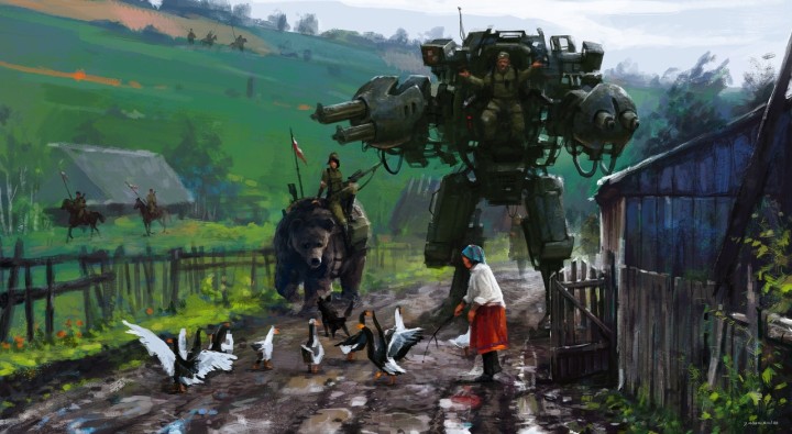
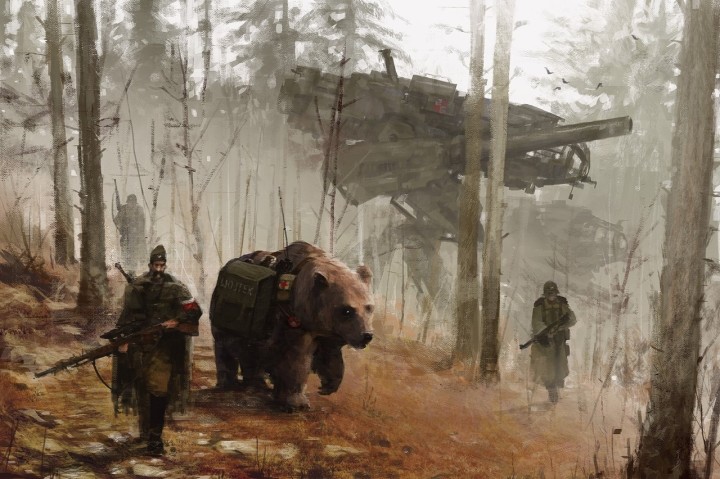
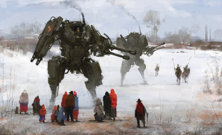
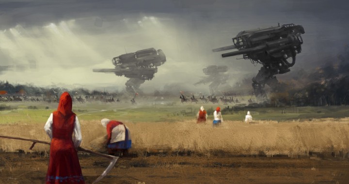
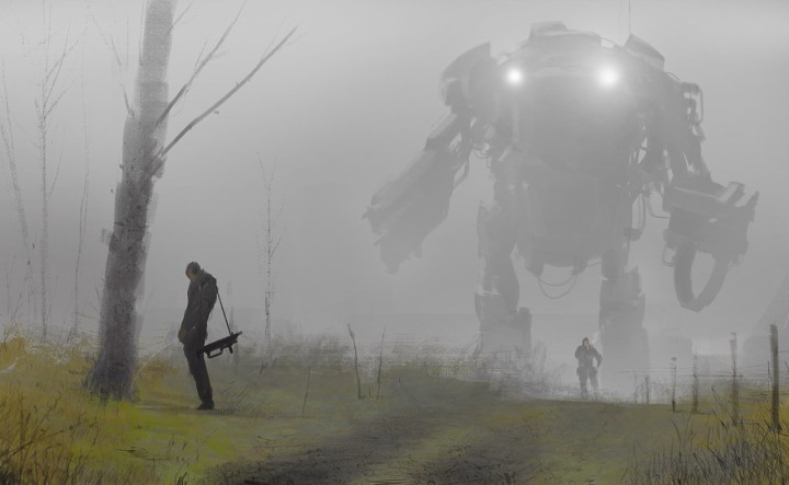
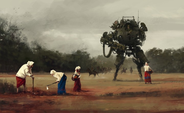
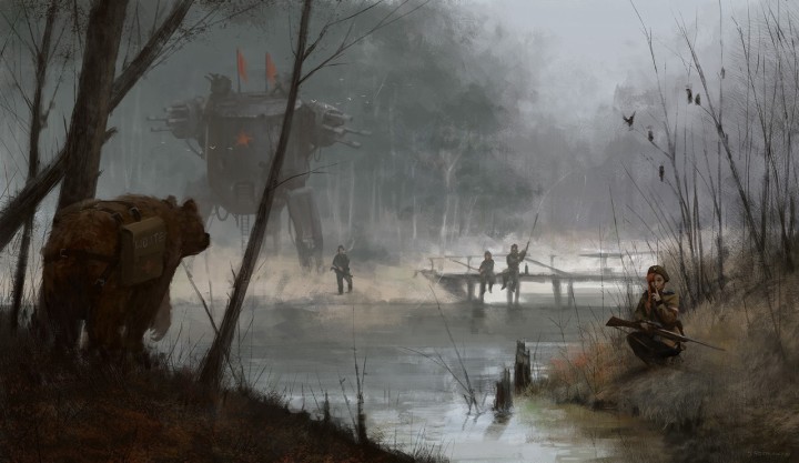
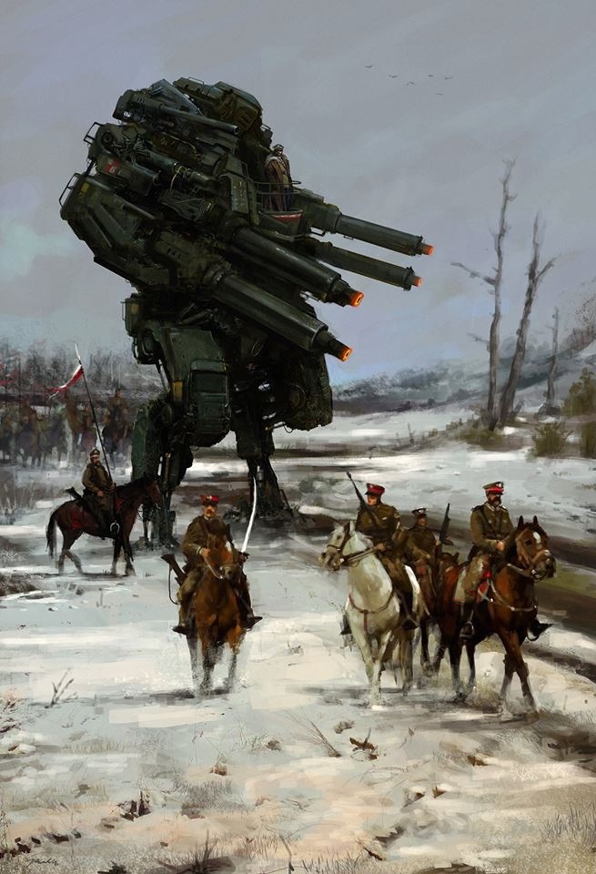 These paintings are by Jakub Rozalski, a Polish artist living in Germany. They’re from his 1920+ Project which introduces future tech into historic scenes from over a century ago.
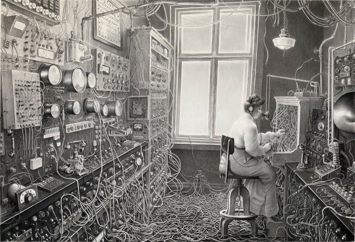
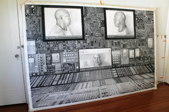
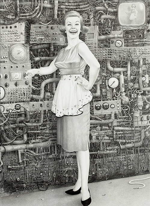
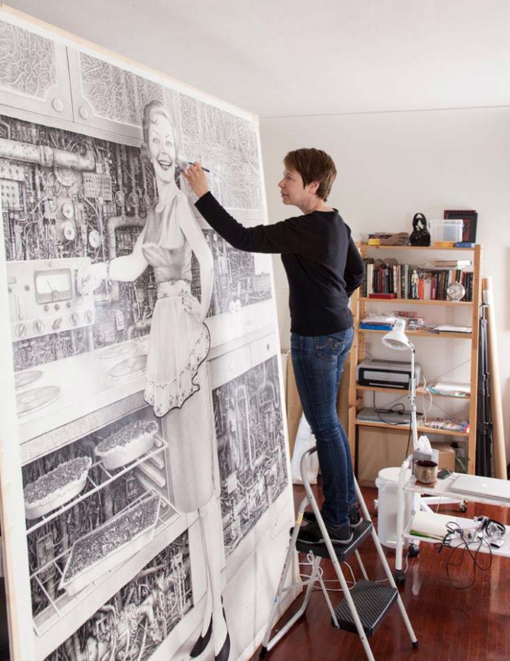
I just ran across Laurie Lipton‘s work via this studio visit on Hi-Fructose, totally new to me and mind-blowing in scale and detail. Check out her site for more galleries of work, some of it a lot darker than this, I prefer the dense machinery and wires works and her later ‘online’ series most but it’s all pretty great.
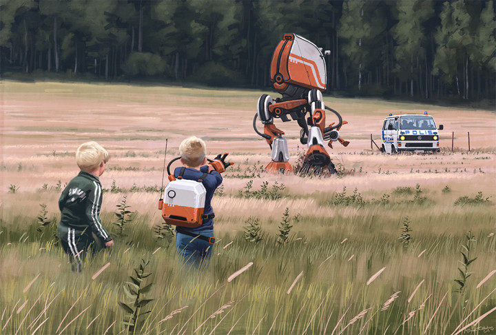
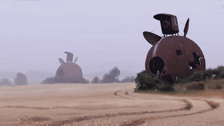
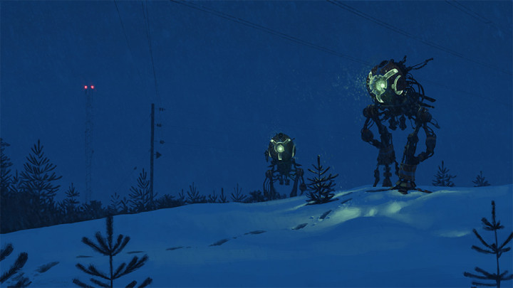
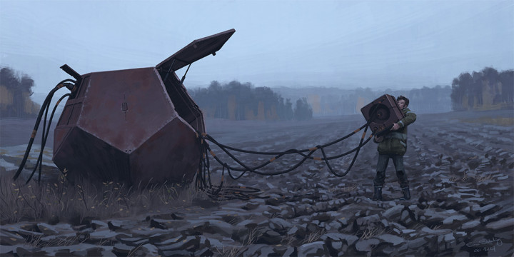
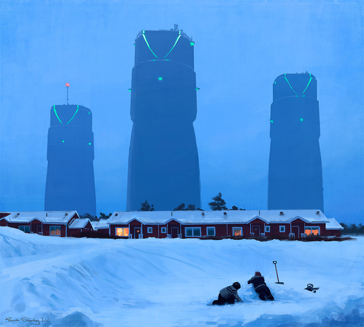
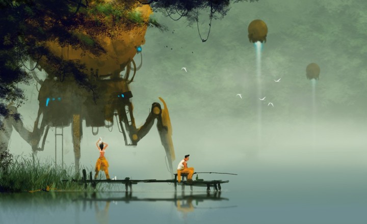
Absolutely love these images by Simon Stalenhag – his use of light and everyday rural locations with futuristic contraptions and machines remind me of a simpler, less hi-tech Syd Mead. His vision of the future is one that I think could be a reality within the next 50 years (maybe minus the dinosaurs that occasionally pop up in some of the paintings). His site has lots more plus close up details and you can now buy a book of them too if you follow the easy to read pdf to navigate the online shop.
