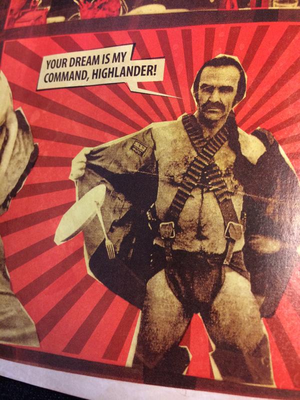
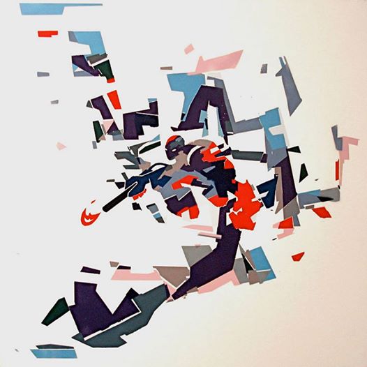
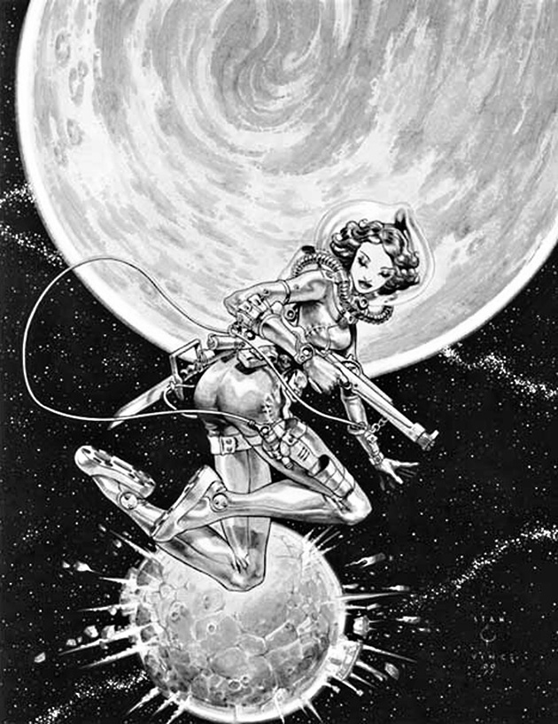
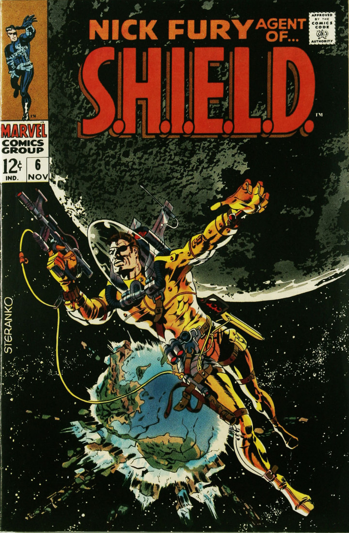
 I saw this on the web last week – attributed on numerous sites to Wally Wood, which seemed a bit wrong. The pose seemed wrong, too modern for someone like Wood, plus it was obviously a pastiche of the infamous Steranko cover of Nick Fury – Agent of S.H.I.E.L.D. no.6 (below) and I didn’t recall Wood ever doing that. There was also a signature on the bottom right corner that looked like Stan Vince and, after a bit of digging, I found that the French duo Stan (Manoukian) & Vincent (Roucher) were responsible.
It was a commission they had done for a friend a few years back and both were as mystified as to why it had been tagged as a Wood piece as I. The two images make a great couple but this was another case of the web stripping images of their info and misinformation passing as fact.
Art
There’s been lot of online activity surrounding the Alien film franchise recently, specifically aimed at the original film. I don’t seem to be able to go a day without some new spin-off popping up, I’ve updated this post three times already.
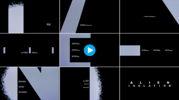
You might have seen the recent Alien: Isolation game that takes the look of Ridley Scott‘s version and goes to great lengths to emulate it. The Art of the Title website has an extensive feature on what went into creating the look and design of the game here with some fascinating info and behind the scenes stuff. Just the opening title sequence alone is worth a watch (above – click the image to be taken to the site).
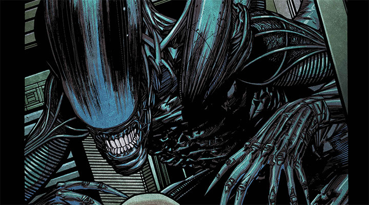
On the Alien: Isolation website there’s a whole host of Alien advent calendar goodies to get into, most pleasing to me being that you can now download parts of the comic that Henry Flint drew for the release around the time of SDCC. As well as that there are posters, concept art, game play tips and add-ons.
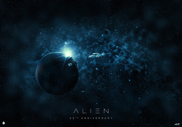
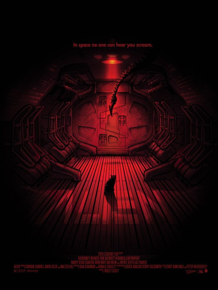
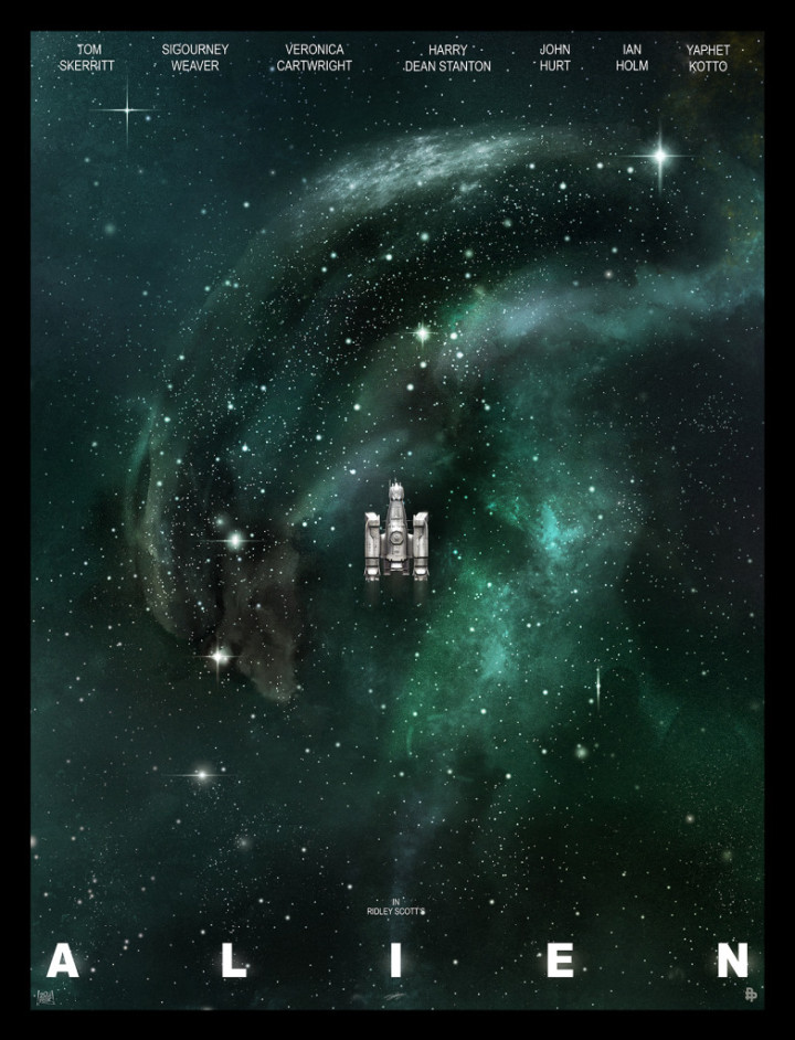
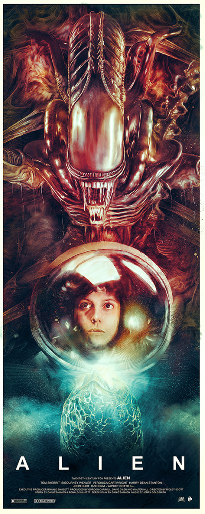
Poster posse have a great gallery of tribute posters to celebrate the 35th anniversary of the original and most, predictably, centre on the mood and tone of the debut. They’ve split the posters into three different phases and they can be viewed here PHASE 1 / PHASE 2 / PHASE 3.
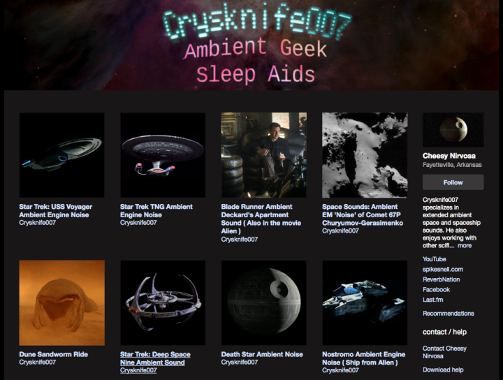
 If sound is your thing then Ambient Sleep Aids in the form of looped atmospherics and sound FX from Sci-Fi films are at your fingertips. Want to drift off to the sound of the Nostromo or the Death Star drifting through space? Someone called Crysknife007 has posted 20 minutes loops of just that.
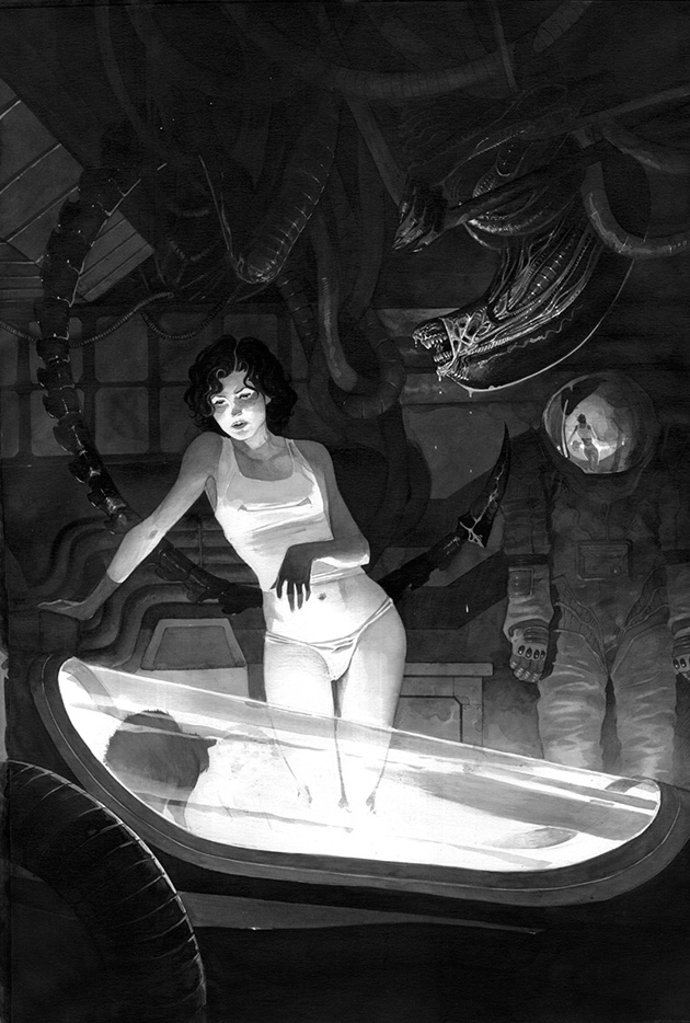
and there’s more… check out this gorgeous fan image by Lord Mishkin which reminds me of John Bolton‘s work. Just look at that light source casting shadows and the reflection in the helmet, beautifully realised. She must be really knackered not to have clocked the Alien hanging from the rafters though…
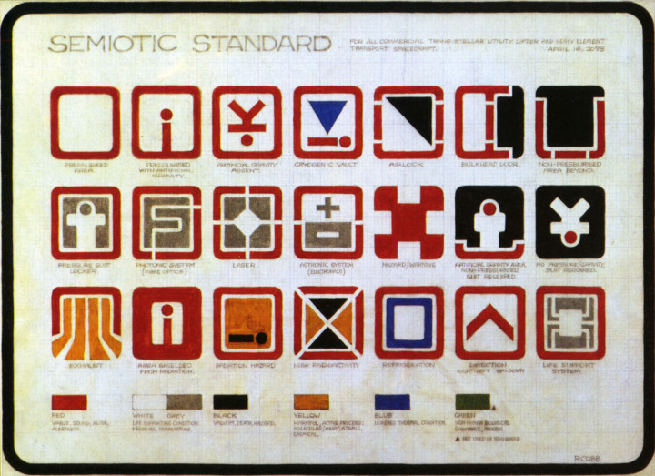
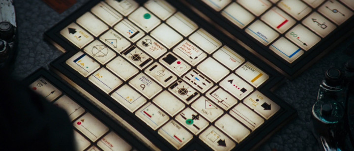
I’ve saved the best post for last, I hope you have some time on your hands because this one goes way deeper than most. Dave Addey‘s Typeset In The Future site has published a feature on the graphic design of ‘Alien’ after his exploration of the typography in ‘Moon’ and ‘2001’.
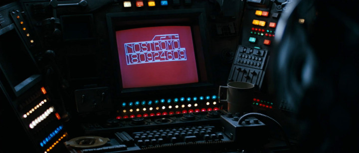
It’s beyond nerdy in all the best ways – going from the opening titles to signage and on screen read outs on board the Nostromo. Clothing insignia, food packaging, warning signs and even keyboard labeling is covered, the last of which reveals some telling details about what the designers were reading at the time.
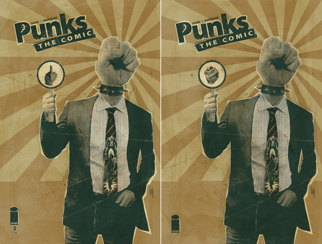
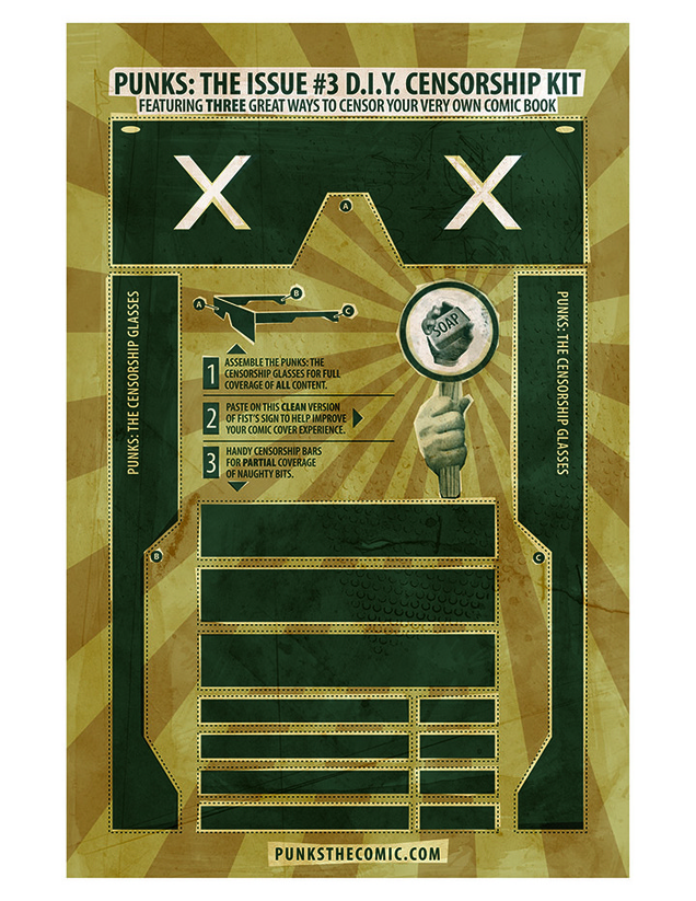
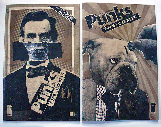
Punks The Comic #3 arrived this week and has generated a little bit of a fuss in some stores over the inclusion of Fist flipping the bird on the cover. There was meant to be a censored version (see right, above) but this got lost somehow at the printing stage so Kody Chamberlain (the artist) thought he’d have fun with the occasion and has made a censorship kit.
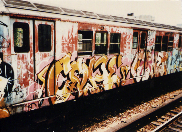 Here’s a really good half hour documentary from the BBC World Service about graffiti which interviews original NYC writers and has a great selection of relevant music rather than the usual well-worn tunes. Unfortunately they won’t let you embed the programme so here’s the link.
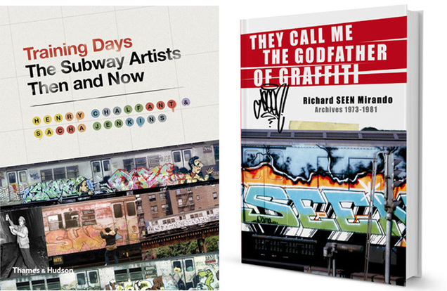
There are quite a few vintage New York-centric graffiti items popping up at the moment. The ‘Training Days’ book is out which I mentioned a while back, a ‘where-are-they-now?‘ book which interviews old writers and finds out what they’ve done in the past 40 years.
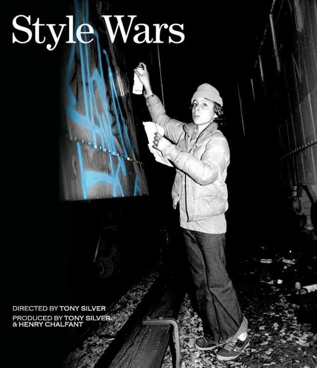
The Seen book, ‘They Call Me The Godfather of Graffiti’, finally shipped out last week too and it’s a treasure trove of unseen images or different views on old classics from one of the undisputed Kings. Also the restored ‘Style Wars’ Blu-ray is finally ready after years of work on the original reels which adds 40 minutes of unused footage from the original shoot.
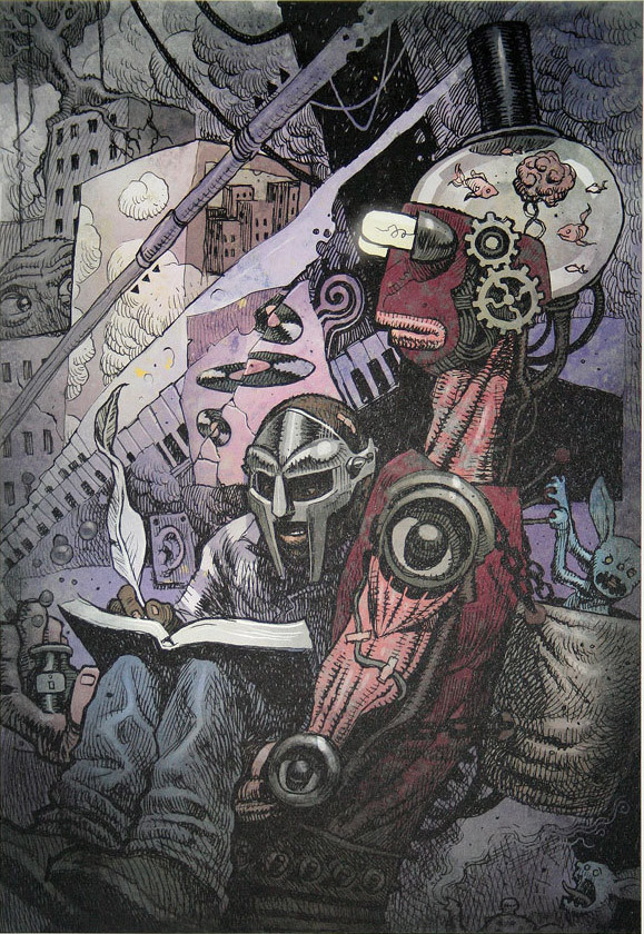
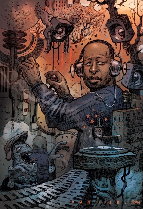
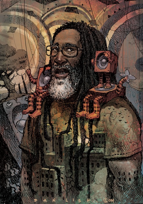
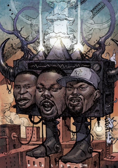
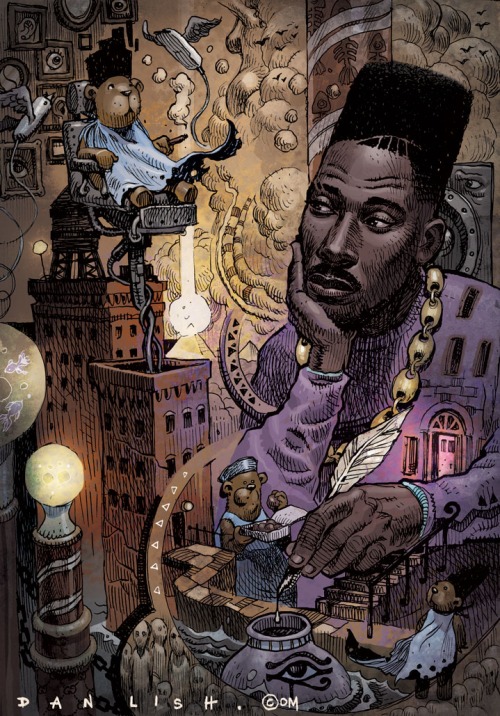
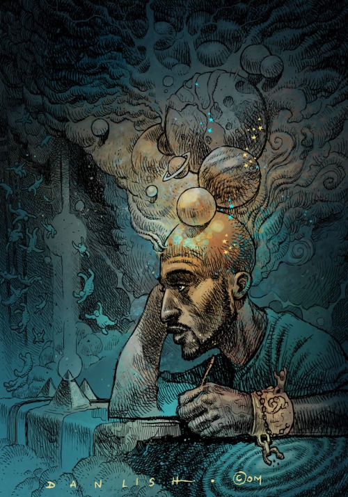
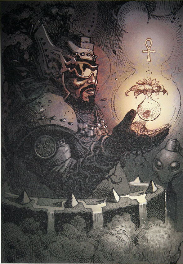 By day Dan Lish works as a concept artist for the video games industry but in his spare time he creates images of Hip Hop’s pioneers in a trippy style that brings to mind Moebius at his best. Check out just a few here and head over to Dan’s site to find out more about the Ego Strip project and maybe buy some prints.
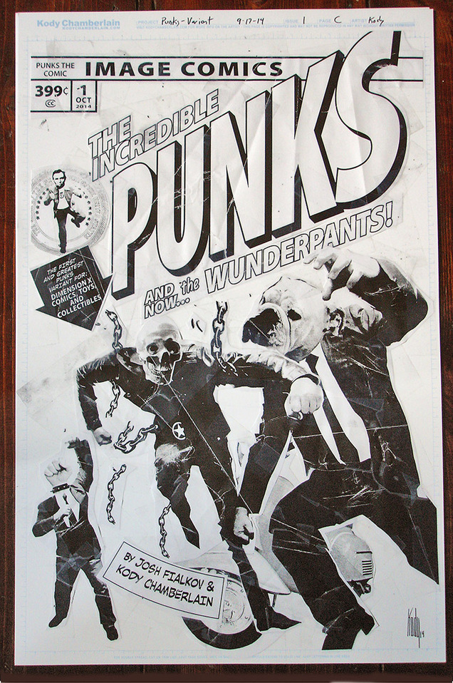
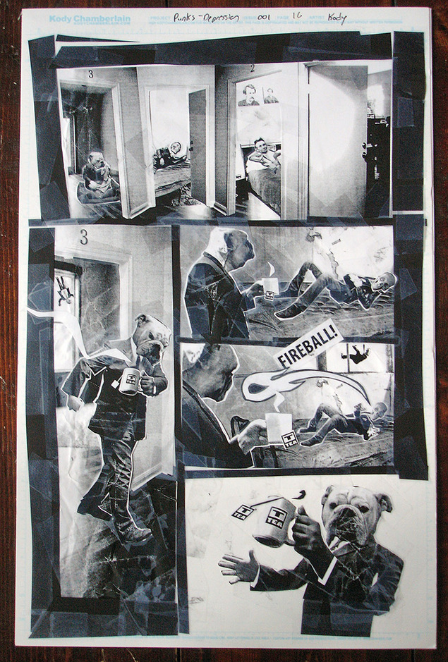
I recently bought some original art from Kody Chamberlain, the artist on Punks -The Comic. I managed to get in early and nab the Dimension X variant cover which is an homage to The Incredible Hulk 181 where he battles Wolverine. Kody also did another homage to Superman‘s first appearance on the cover of Action Comics and there’s Peanuts and Spiderman ones forthcoming.
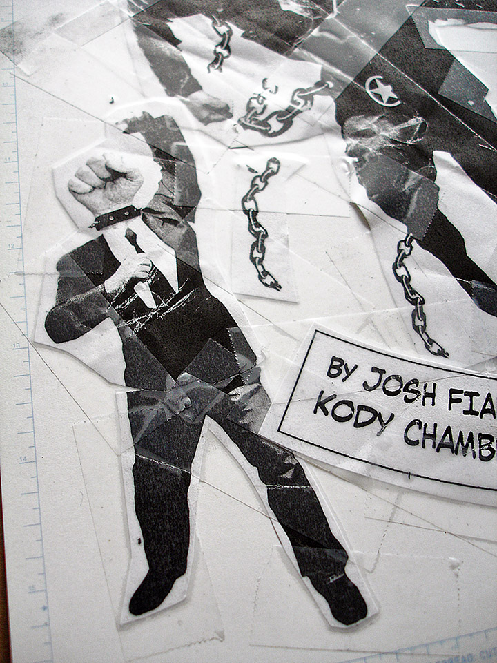
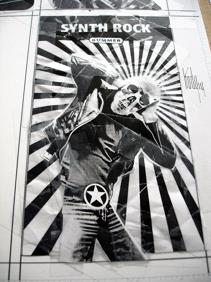
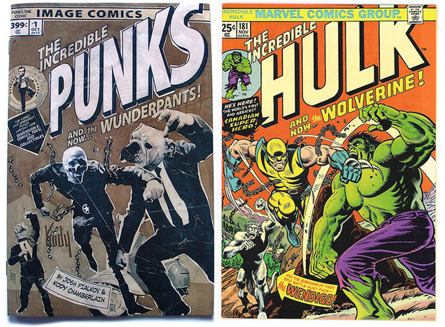 The art is a beautiful mess of Xeroxed, distressed photocopies and Scotch Magic tape complete with creases and no attempt to keep things clean in the best tradition of DIY Punk artists like Jamie Reid. I also got page 1 of issue 1 and a trio of Nutpuncher games cards featuring the character, Skull (see gallery below).
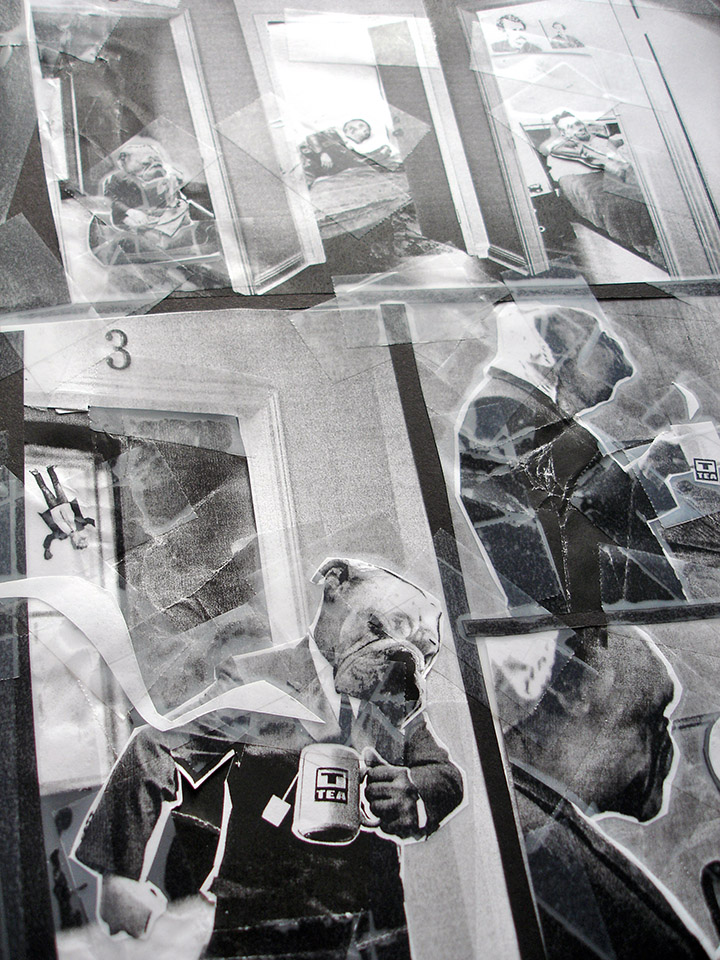
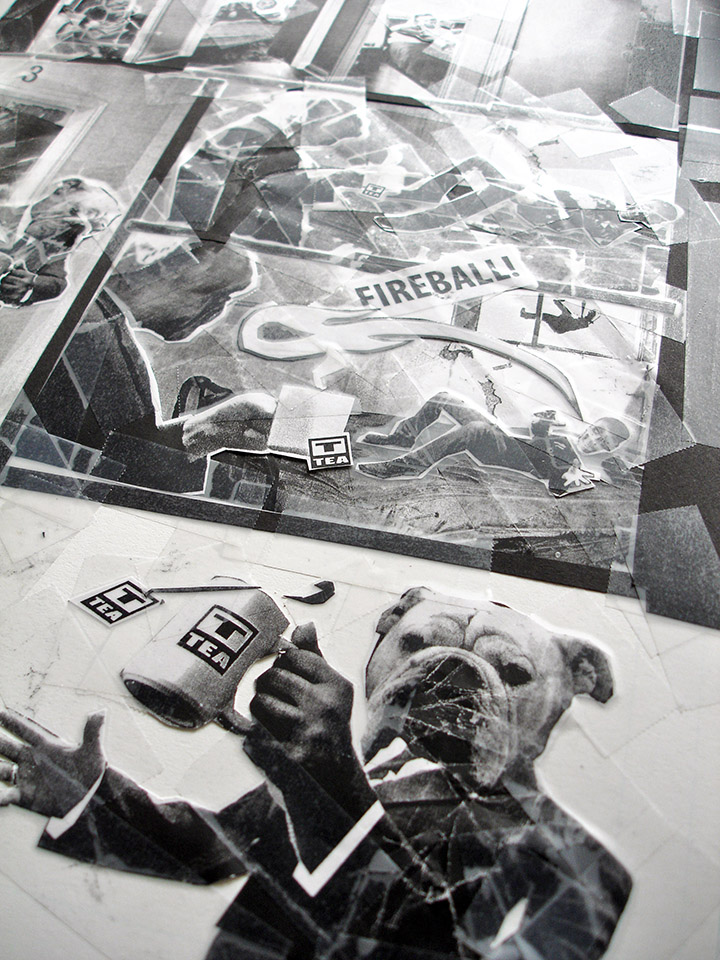
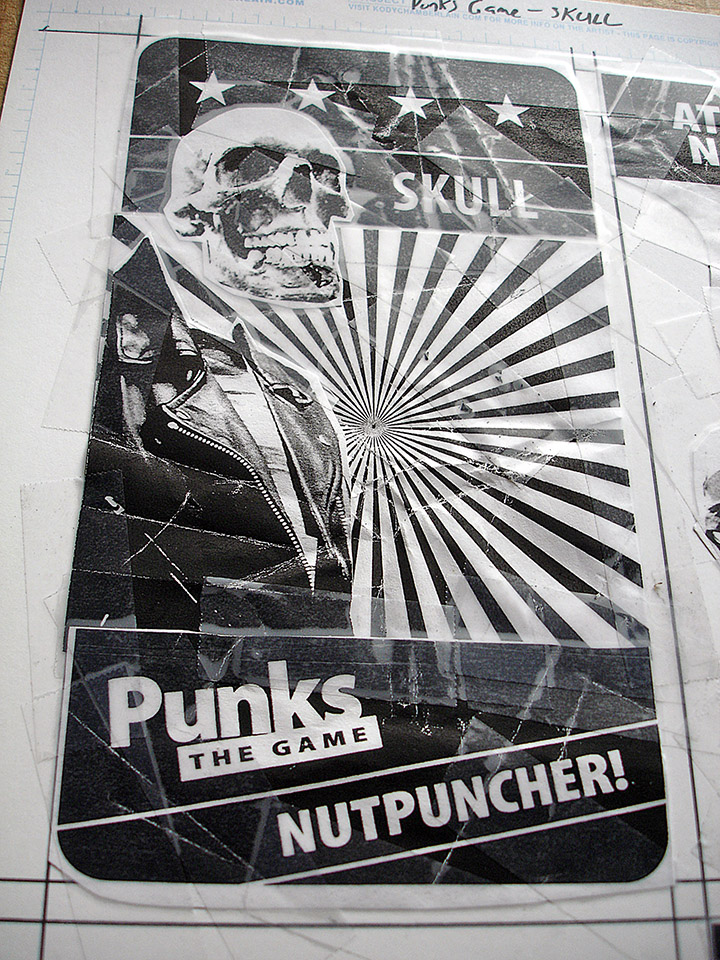
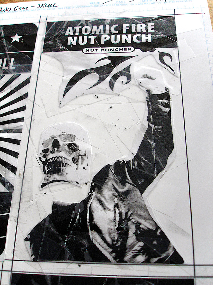
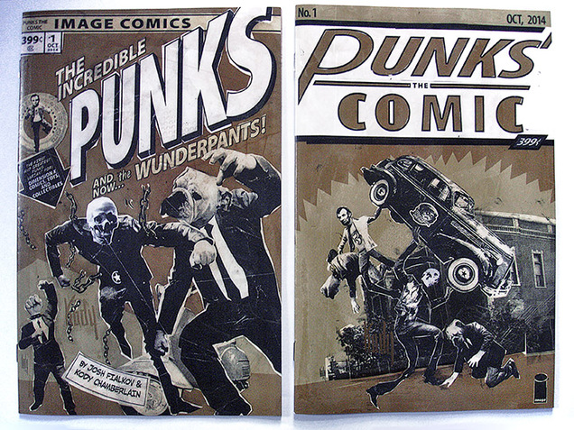
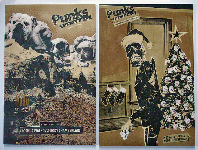 Punks #1&2 are out now from Image Comics, #3 is out this month sometime and you can buy original art from Kody’s site. There are also two previous issues, a Summer and Winter special although these date from 2007 (!) and are mostly being reprinted in part in the back of the new issues. The Summer special is well worth tracking down for an interview with Art Chantry who talks about collage work, David Carson and the age of the computer in the design world which is no less relevant now than it was 7 years ago.
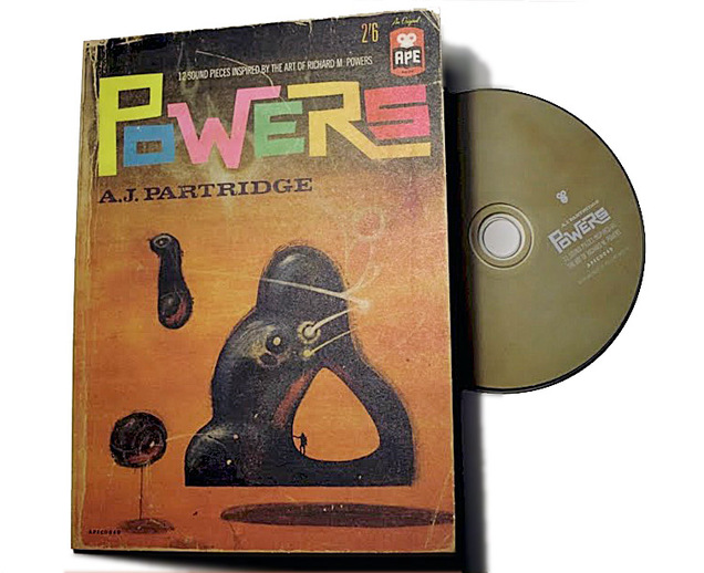
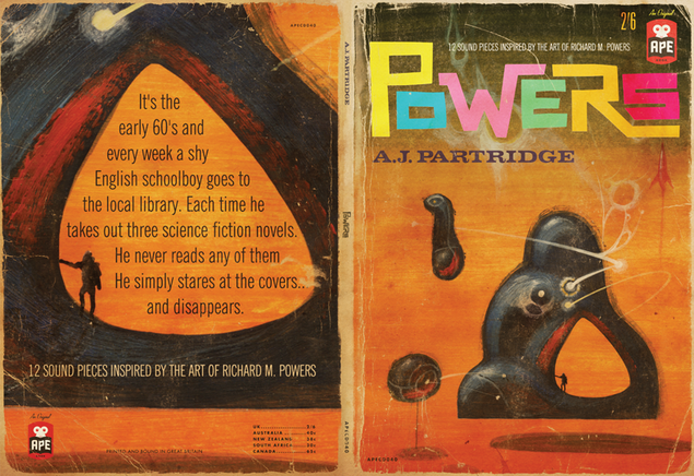
I’m not so up on Andy Partridges‘ solo work (I mainly know him from his XTC days) but this album swam into my field of vision the other day after a search for the book of collected Richard M. Powers‘ artwork. Apparently Partridge was fascinated by Powers’ book covers as a kid and later made a whole album of ambient / electro-acoustic sound pieces to soundtrack the fantastic worlds he saw on his library loans. The 500 copy CD is long sold out but you can still buy the 12 tracks as downloads from his Ape House imprint. Think Raymond Scott, Louis & Bebe Barron or Tod Dockstader and you’re in the right area.
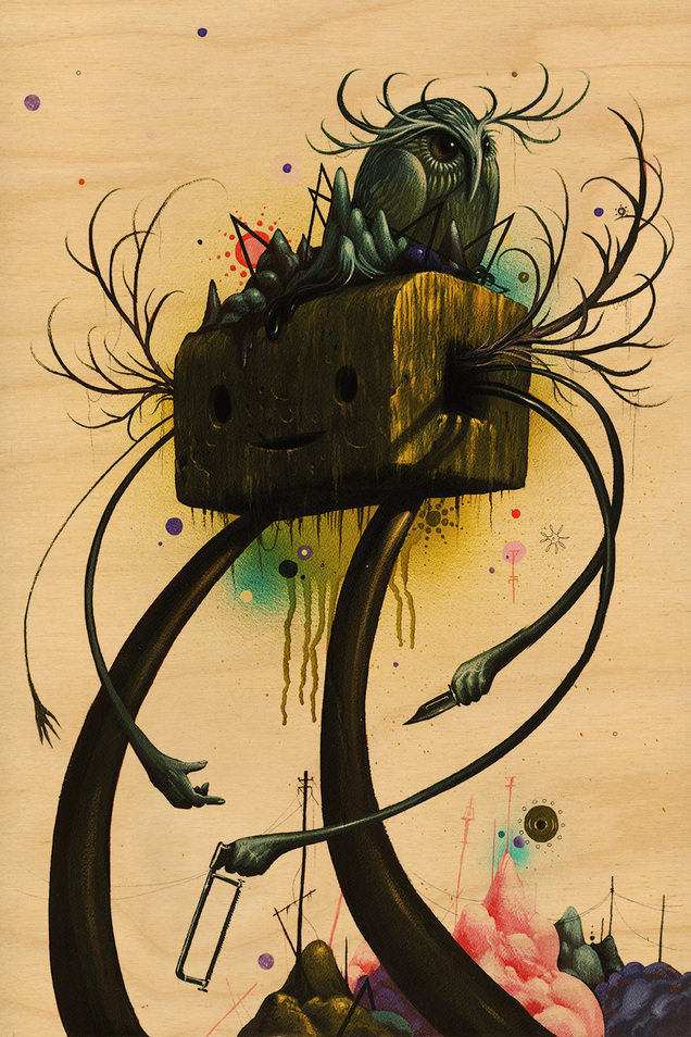
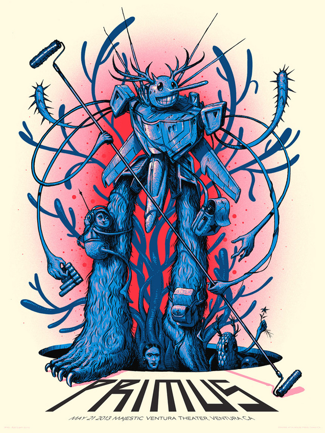
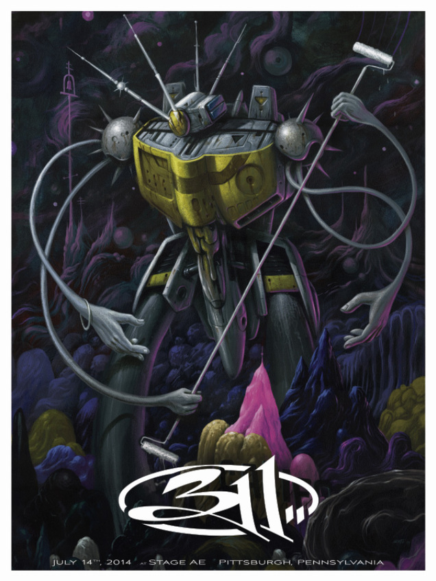
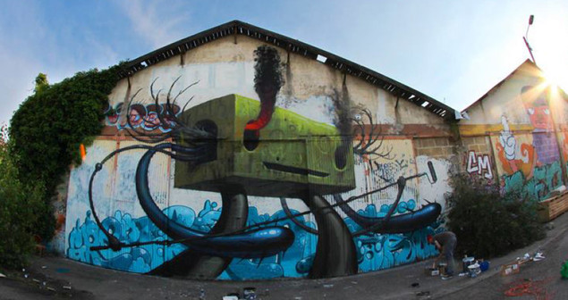 Nice to see Jeff Soto reintroducing some of his old characters back into more recent work, the Walker and the Builder were what attracted me to him in the first place but he’s since largely moved on from them. Maybe one day we’ll get the Walker toy they were always going to do…
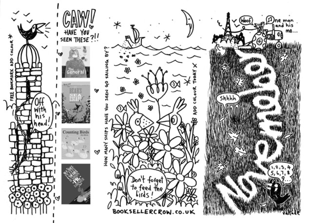
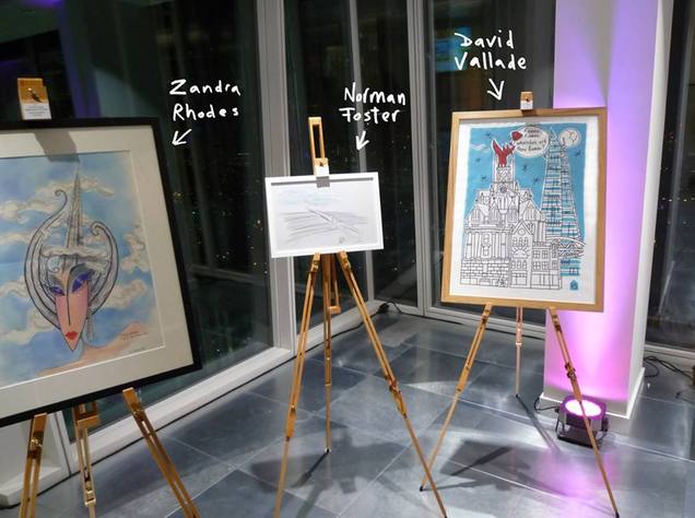
 My good friend David Vallade has a new website, go have a look and commission him to draw something especially for you…
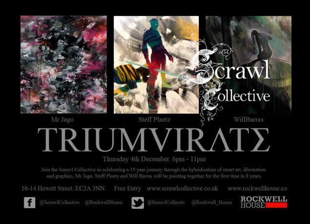
It’s been 15 years since the release of the first ever Scrawl book. Curated by Ric Blackshaw (with some contacts from yours truly) and Liz Farrelly, it was one of the first books to collect what later became known as ‘urban art’ or ‘street art’. Work that was informed by graffiti, comics, Hip Hop, film and more but strayed outside into new places. Vol.1 boasts an incredible line up of artists: Mode 2, Futura, She One, Kid Acne, Delta, Will Bankhead, David Vallade, Oscar Wilson, The Light Surgeons and some chancer called Openmind.
Shortly after compiling the first book (there were 2 volumes) Ric formed the Scrawl Collective, a loose affiliation of some of the artists in the pages to help them get work. Now, three of the artists who also came to prominence from the book – Mr Jago, Will Barras and Steff Plaetz are holding a ‘Scrawl Collective’ reunion exhibition of sorts. It’s called Triumvirate and opens Dec 4th at Rockwell House, 10-14 Hewett St, London, EC2A.
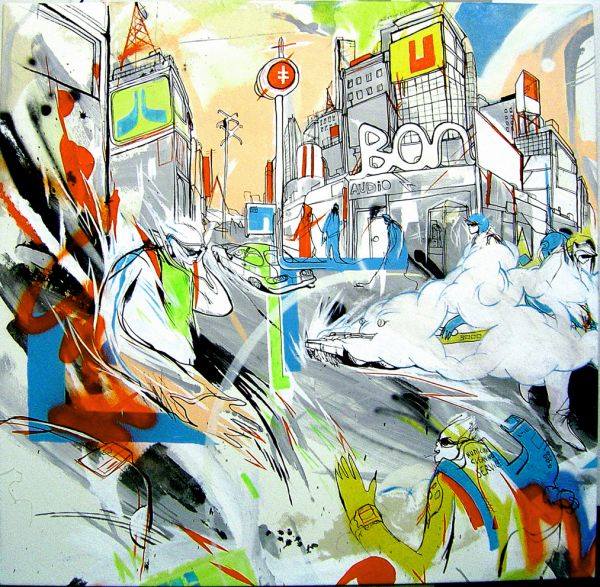 More details here:

A unique opportunity to buy items from the Mo Wax Urban Archaeology exhibition opens next week at the Saatchi Gallery.
Following on from the brief exhibition at the Southbank (featured here) ‘Build & Destroy’ is an exhibition of rare art works, proofs and merchandise from the Mo Wax archive. It will also feature new works and limited editions by various artists like Swifty, (who has been posting things on his Instagram recently) Futura and 3D who have worked with Mo Wax over the past 21 years. Build & Destroy also coincides with the major survey exhibition Post Pop: East Meets West at the Saatchi Gallery.
All of the works are available to buy and the exhibition is a rare opportunity for people to obtain original works and limited editions produced throughout the history of the label to date alongside newly commissioned pieces. More details here
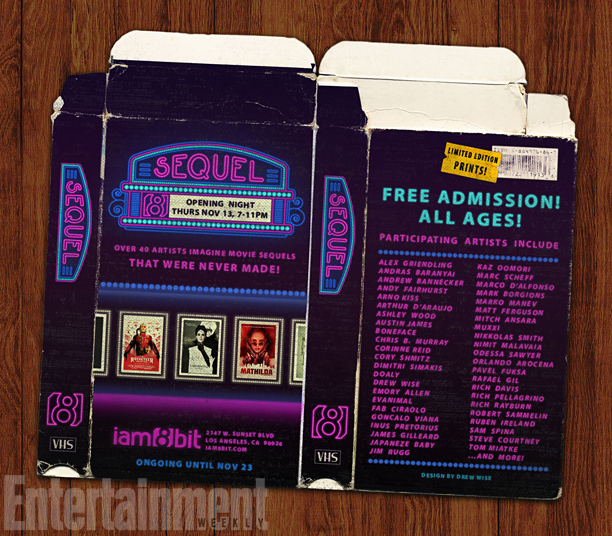
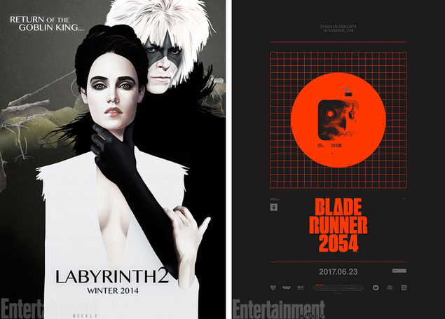
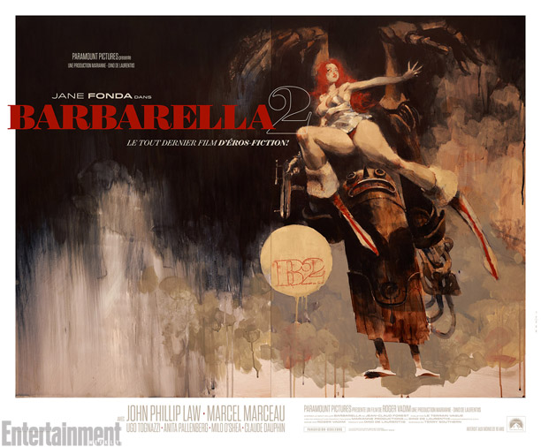 Imaginary film sequel art show opening at iam8bit Gallery in LA next week. More info and images here on the Entertainment Weekly site.
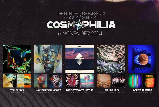 This opens on Thursday at The Print House in Stratford and stays up for a month. I was drawn to it be Nick Stewart Hoyle‘s inclusion but all the other artists’ work looks amazing too. I’ll be checking it out – more details here.
 A couple of weekends ago DK and I travelled to Madrid and played what might be the perfect template for all DJ sets in the future. Four deck AV set at 8.15-9.45pm to a receptive crowd on the top floor of the amazing Espacio Arts Centre. Pack up by 10pm, drop bags at hotel and go to a bar for beer and tapas, then go to a great seafood restaurant and be in bed by 1am. Get a good nights sleep and make it to breakfast at a normal hour. They don’t often happen like that…
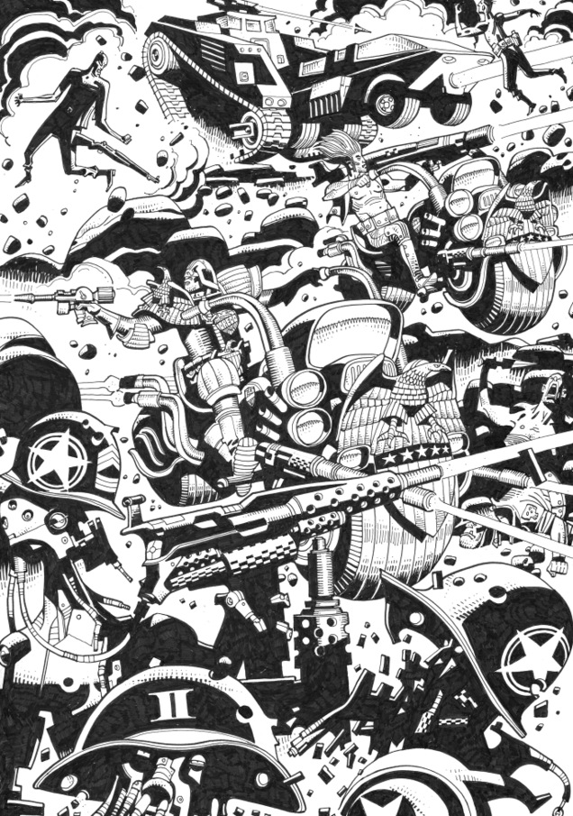
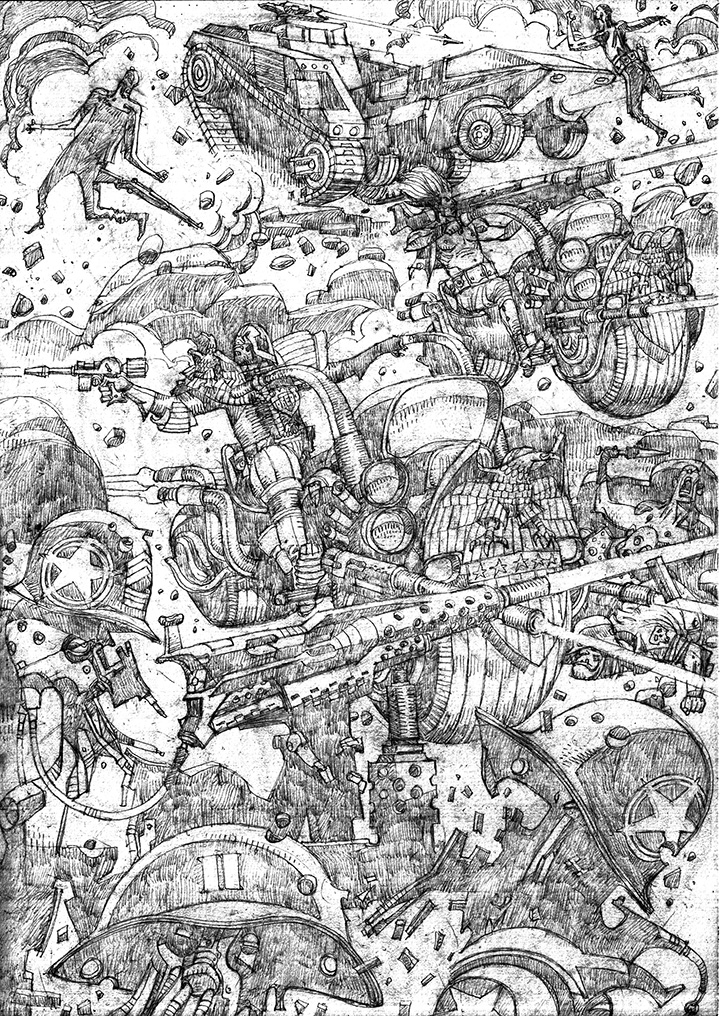 These are the pencils for a Judge Dredd commission I’ve been waiting on for between 18 months and 2 years from one of the greats – Mike McMahon.
I asked for a full-on Cursed Earth scene, basically a recreation of either the cover or inside spread of Prog 61, the first issue of 2000ad I ever bought and he’s knocked it out the park.
I’ve enhanced the pencils in Photoshop here as Mick uses a very light grade – you can see the original plus many more commissions both penciled and inked on his excellent tugging your coat blog.
Now to wait for the inked version…
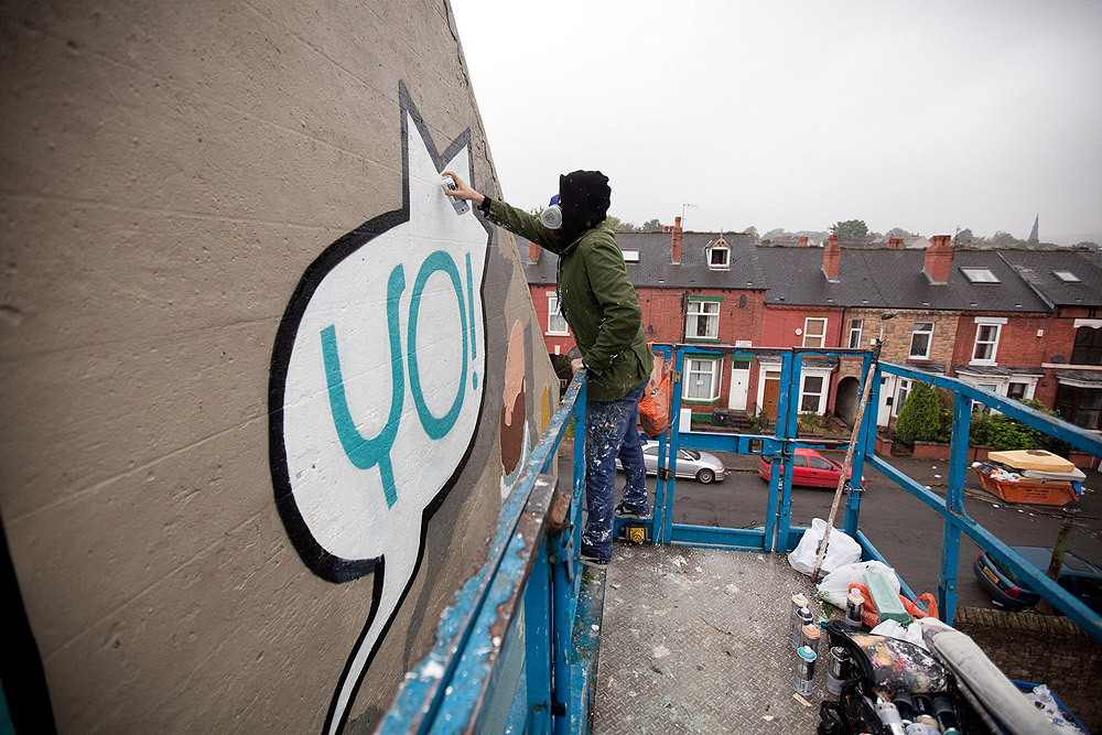
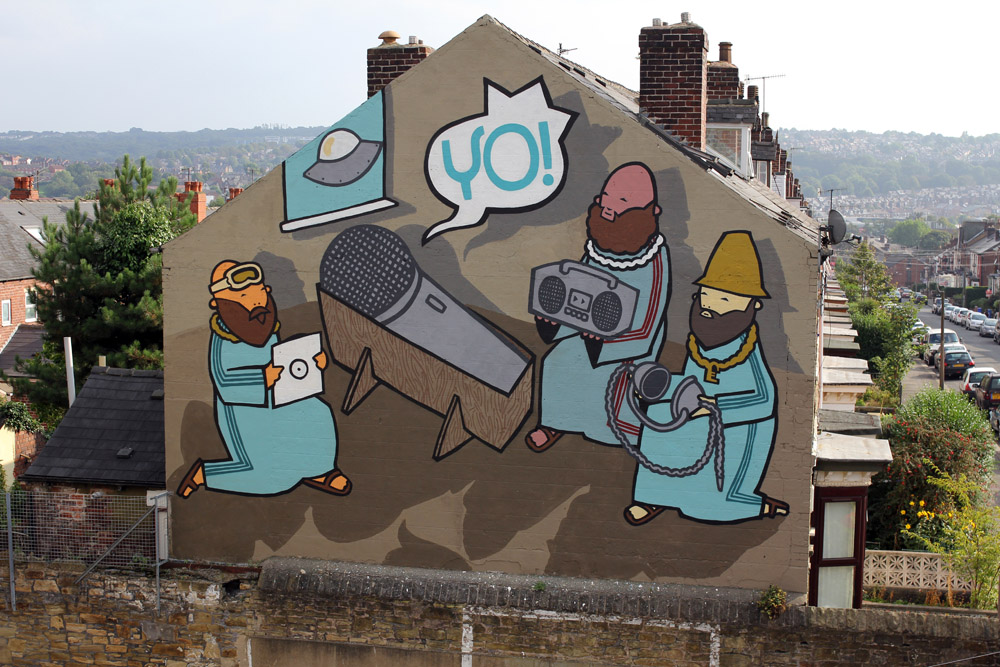 Kid Acne has just completed this incredible mural up in Sheffield which was commissioned by the Festival of the Mind. What’s interesting about this image is that it’s around 15 years old and was originally going to be the cover for DJ Vadim‘s side project The Isolationist when it was still called ‘Orators of Advanced Thought’.
Back in the late 90’s I was doing the artwork for Jazz Fudge, Vadim’s label and was introduced to Edna (Kid Acne) with a view to him contributing to some of the releases. Ed was finishing his college course at the time but painted a version of this as part of the final show I think (could be wrong here) and sent photos down to be scanned.
I can’t remember why they weren’t used but I still have roughs of it in the archive. What a great image and exciting way to end a terrace of houses, we’re seeing more and more murals like this springing up these days in the UK and that’s a good thing as far as I’m concerned.
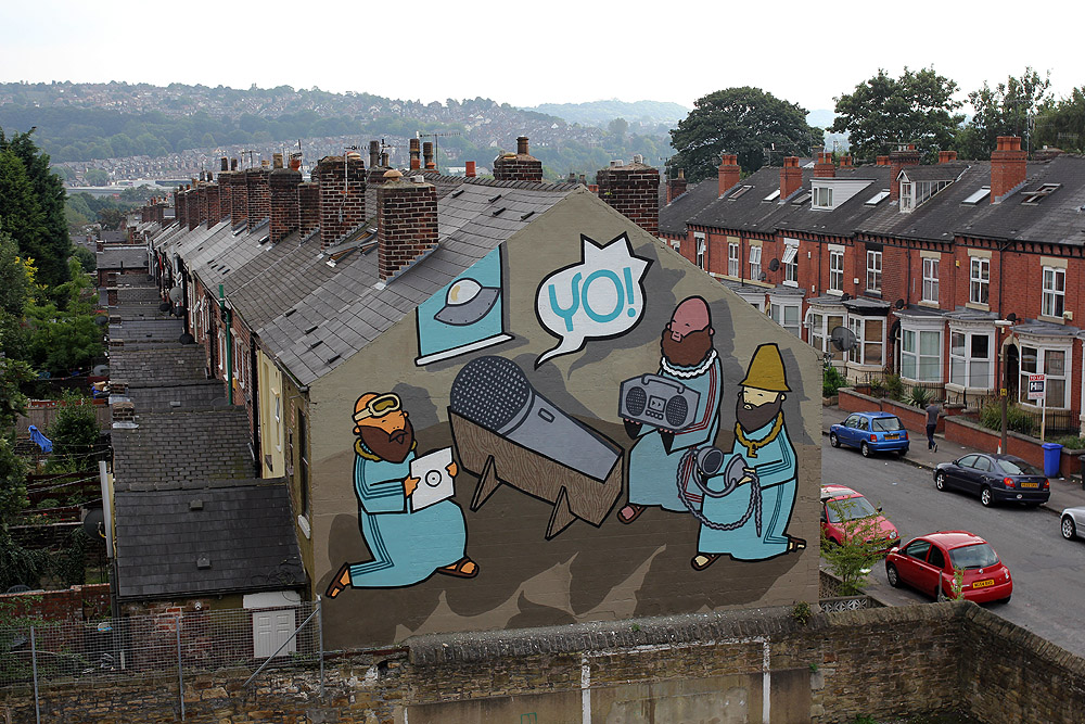
 Photos by Shaun Bloodworth (portrait) and Andy Brown (Yo! action shot) courtesy of Kid Acne. Check the video of the making below too.
THE BIRTH OF HIP-HOP / UNIVERSE RAP from Tom Sykes on Vimeo.
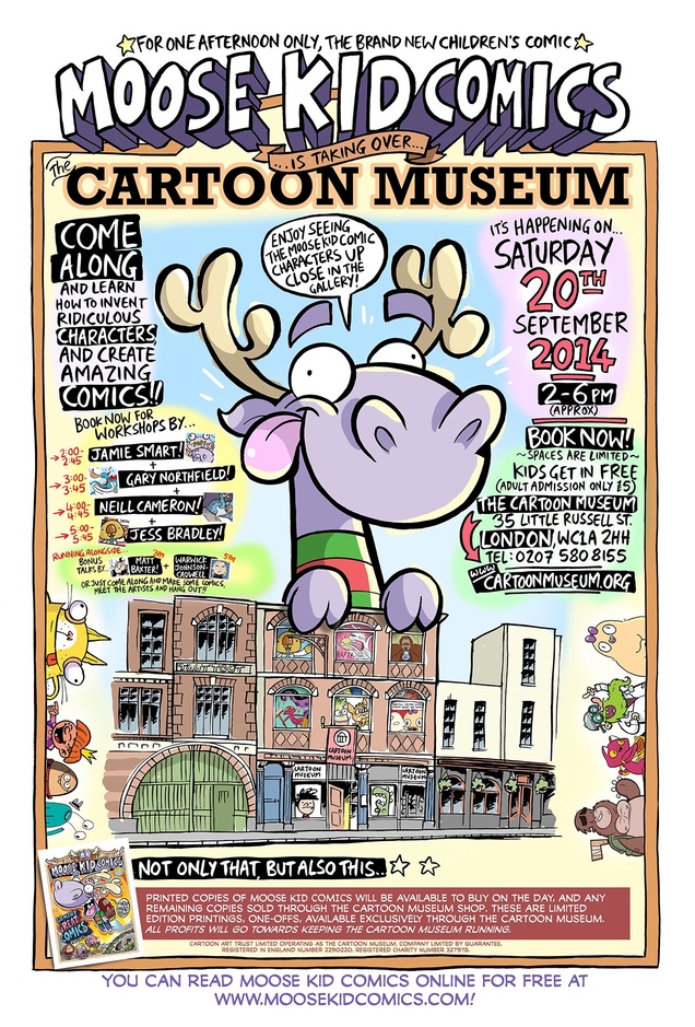 Gutted I can’t go to this as I will be away but a great opportunity for kids to get into comic-making… Download the first issue of Moose Kid Comics for free here.

