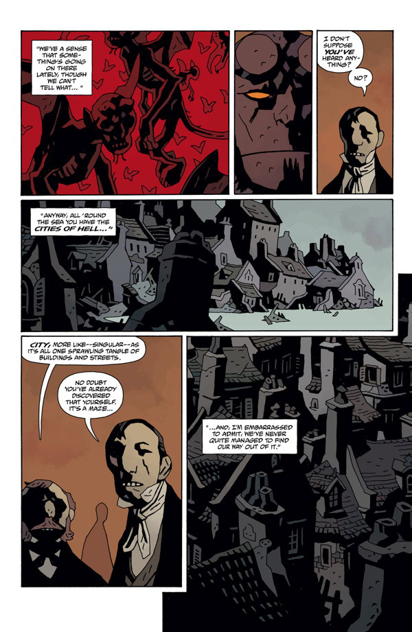
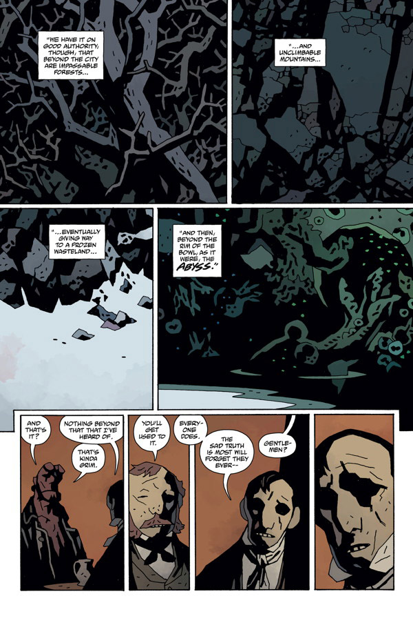
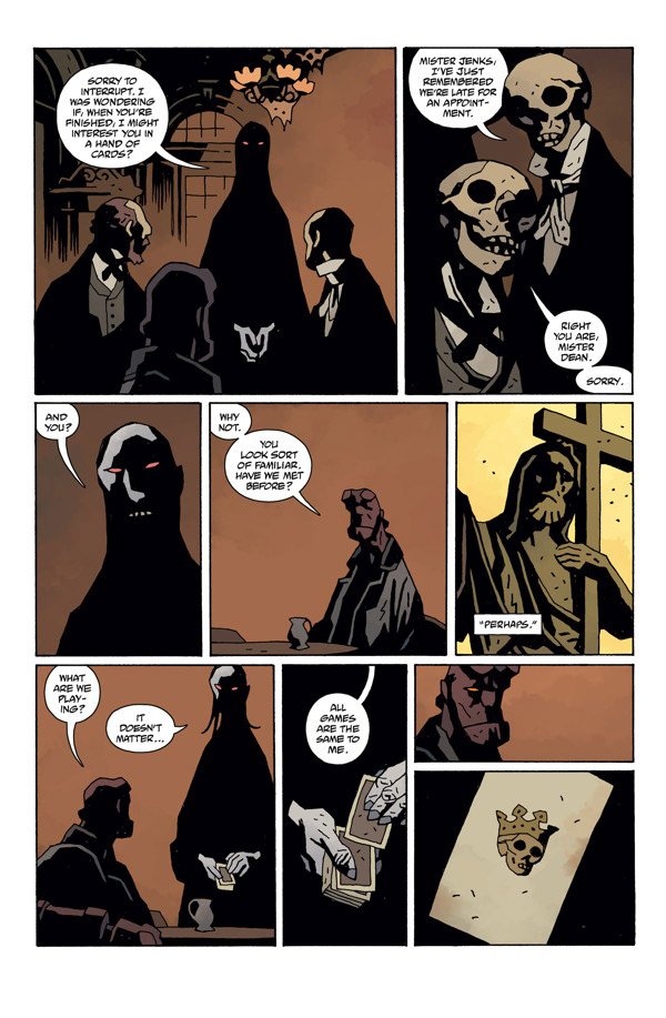
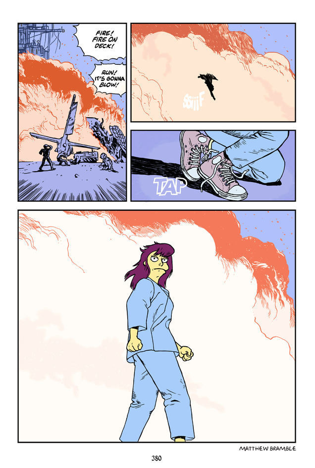
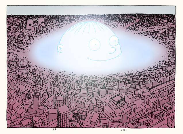
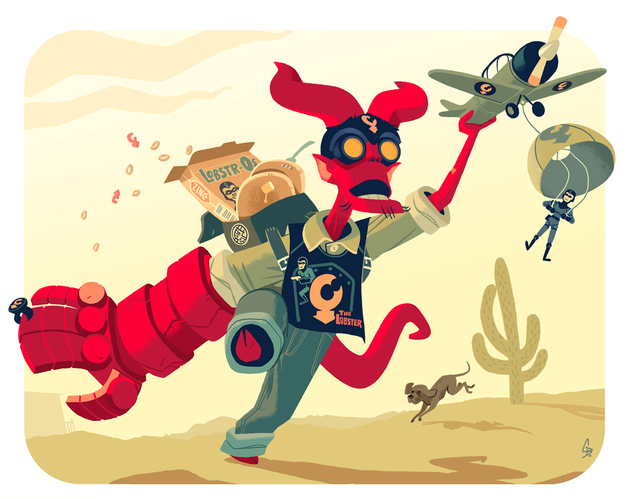
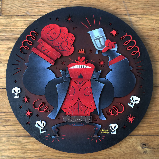
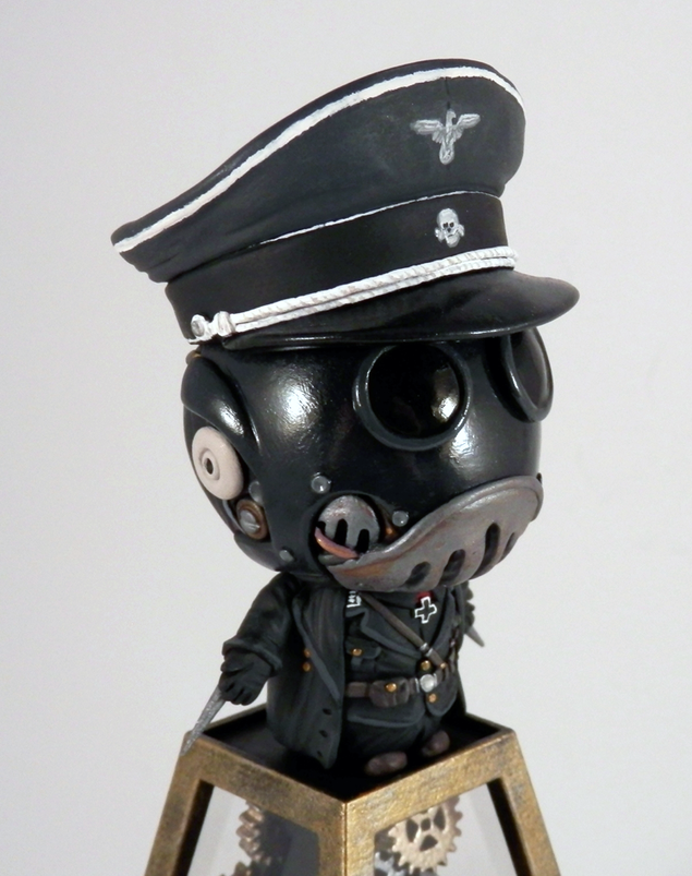
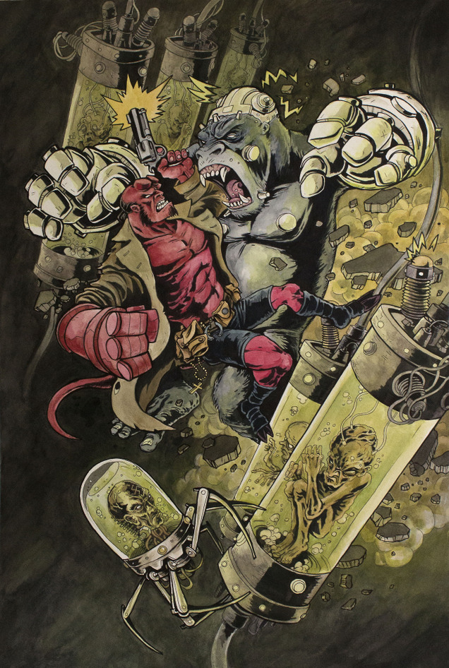
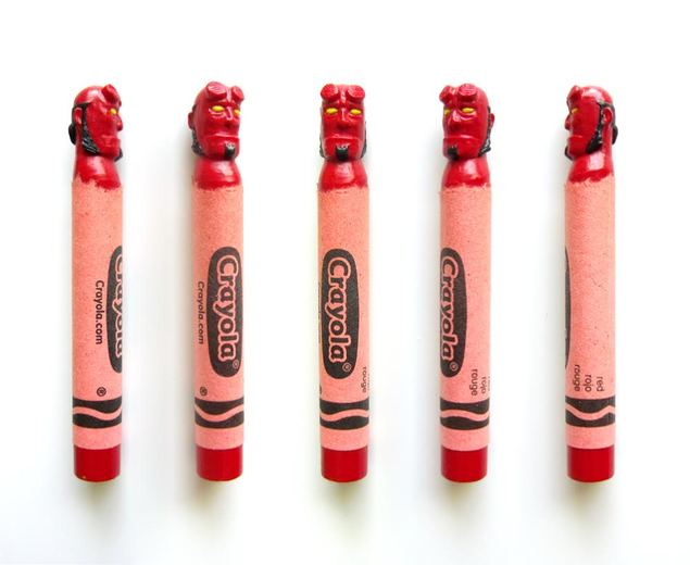
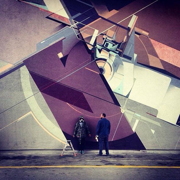
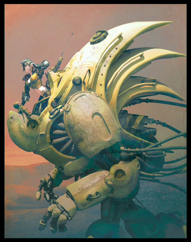
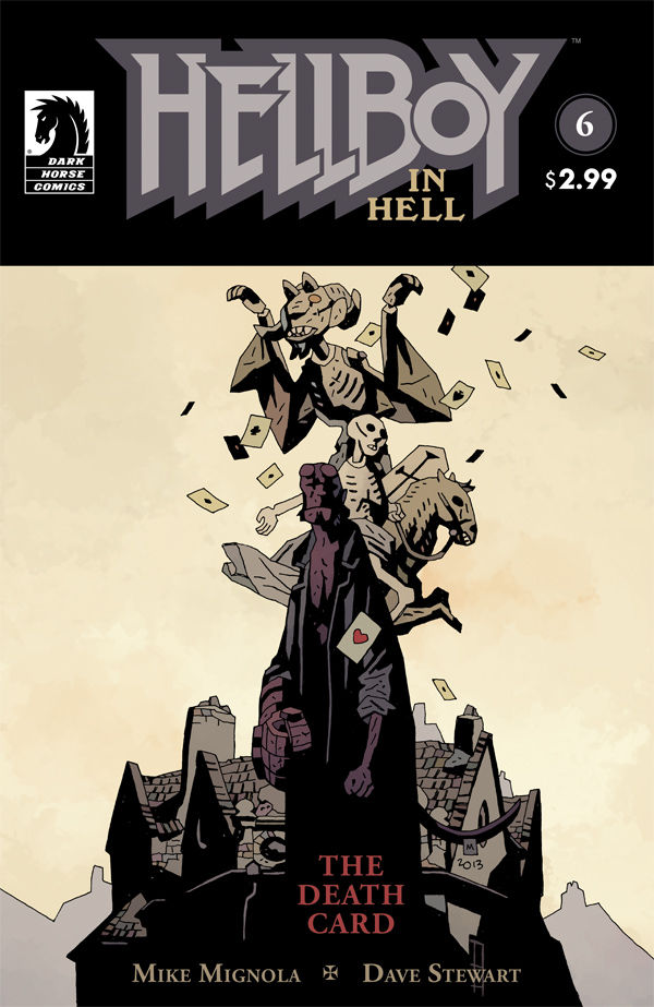
 I could just look at Mike Mignola‘s art forever and never get bored. This is out on Wednesday – he’s averaging one issue every 6 months now. If you like your Hellboy universe a bit more regular then I recommend the B.P.R.D. Hell On Earth series which is monthly and has just gone into full gear after treading water for a good 18 months.
Art
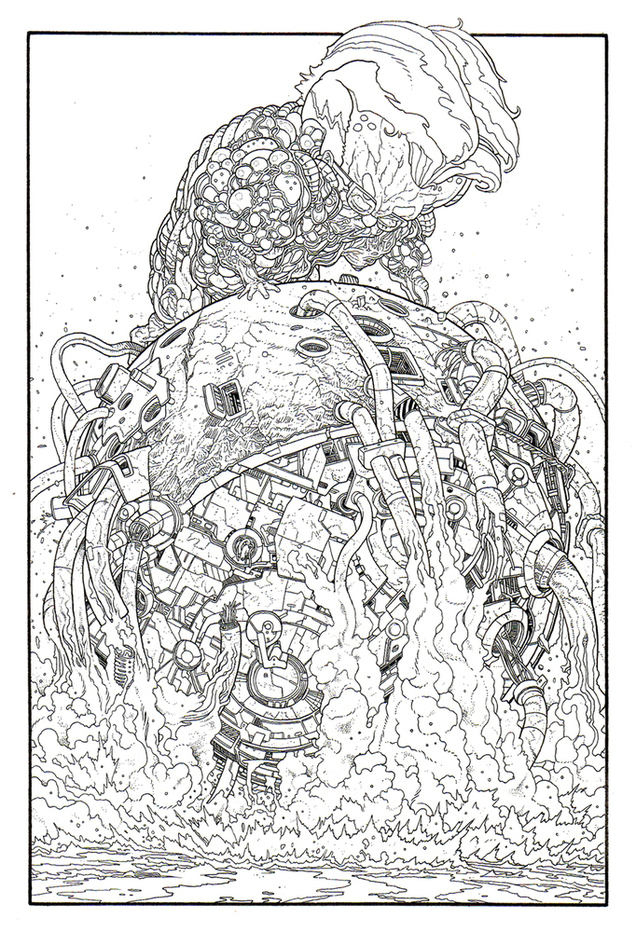
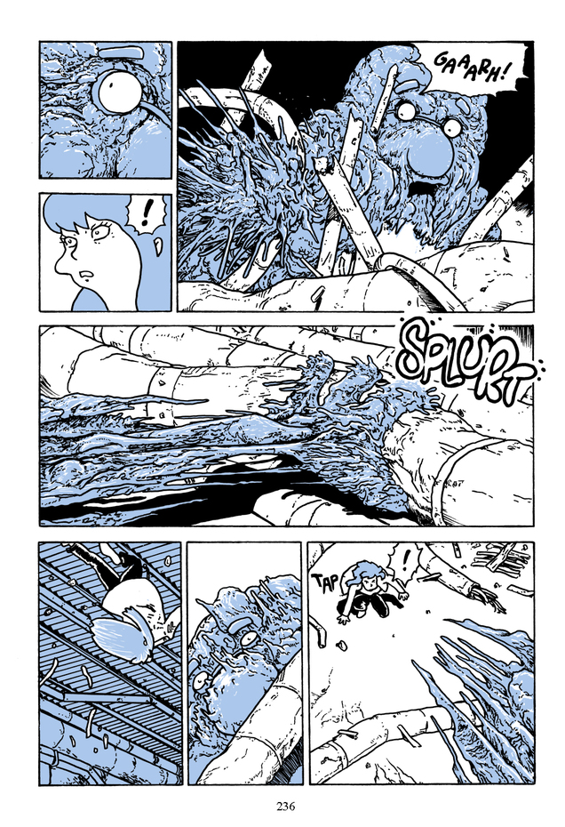
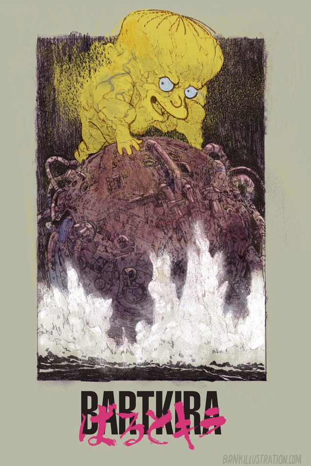
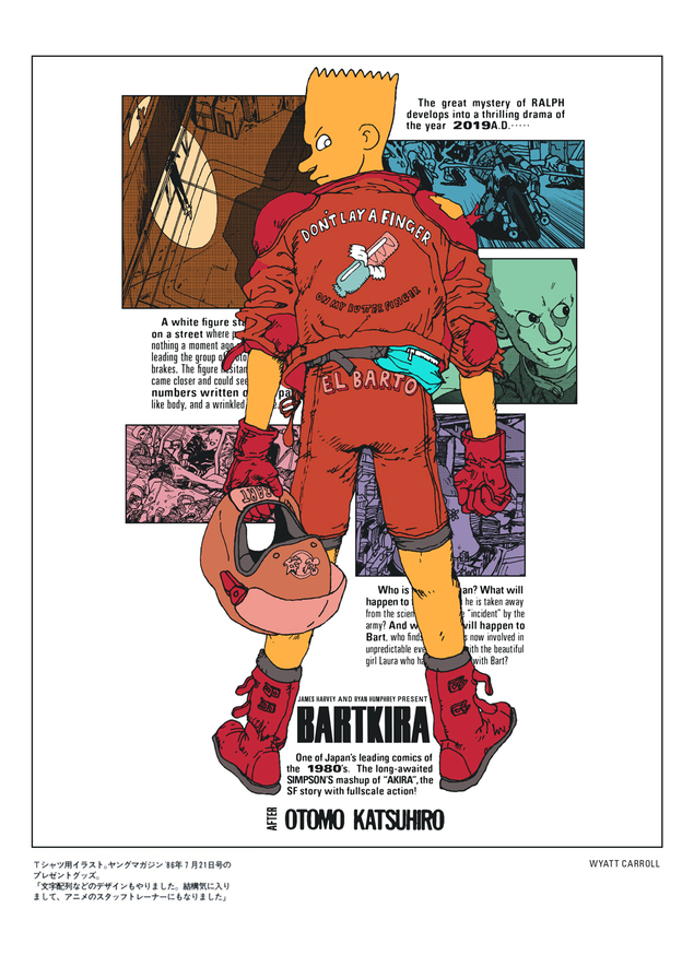
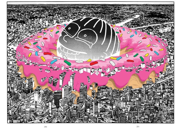
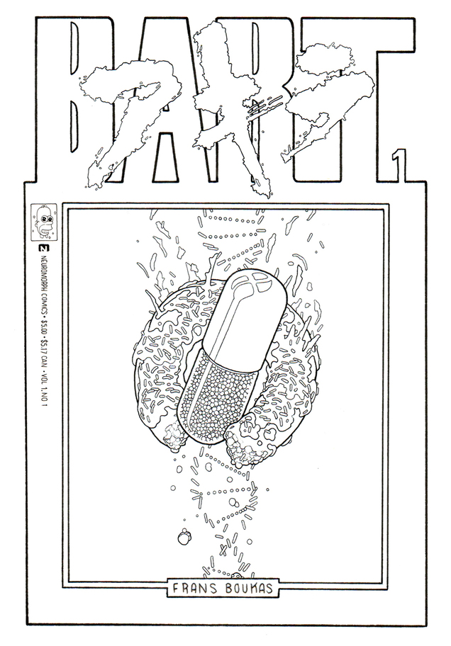
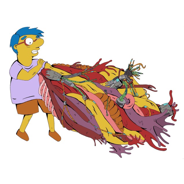
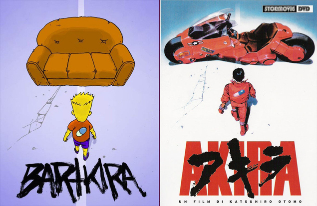 Akira + The Simpsons. Not an obvious combination but someone has had the idea to crowd source redrawing over 2000 pages of Akira with Simpsons characters and renaming it ‘Bartkira’. There is a tumblr full or images here and the full thing will be going online ‘soon’ apparently at www.bartkira.com.
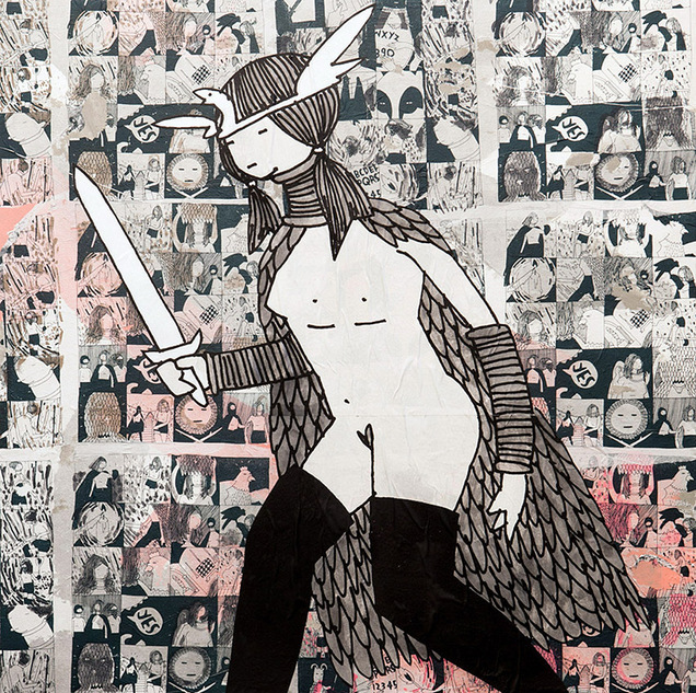 Kid Acne‘s ‘The Return’ solo exhibition just opened last weekend in Turin, Italy. Here are some photos from the opening and a film of him at work. The show runs until July 5th and is held at the Galo Art Gallery.
The entire exhibition focuses on his Stabby Women characters – adding new paintings, illustrations and prints to the ongoing body of work, which continues to explore the travels, rituals and mythology of these enigmatic female warriors.
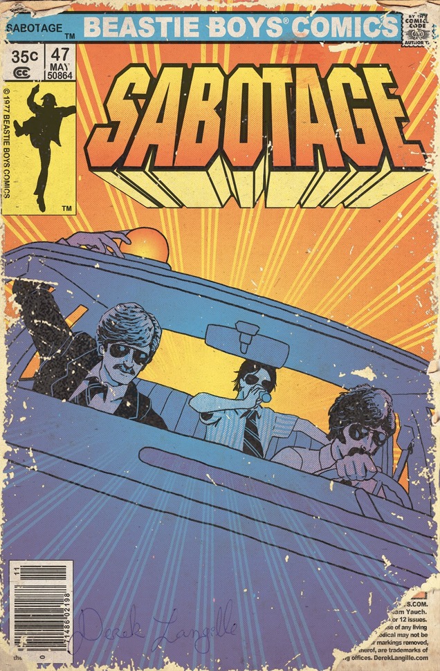 Sadly on Sunday it was two years since MCA passed away and there was a weekend long celebration in Brooklyn to remember the man and the music he made with the Beasties. With another, happier, anniversary also approaching – 25 years since the release of ‘Paul’s Boutique’ – there is a fair bit of Beastie-related activity on the horizon.
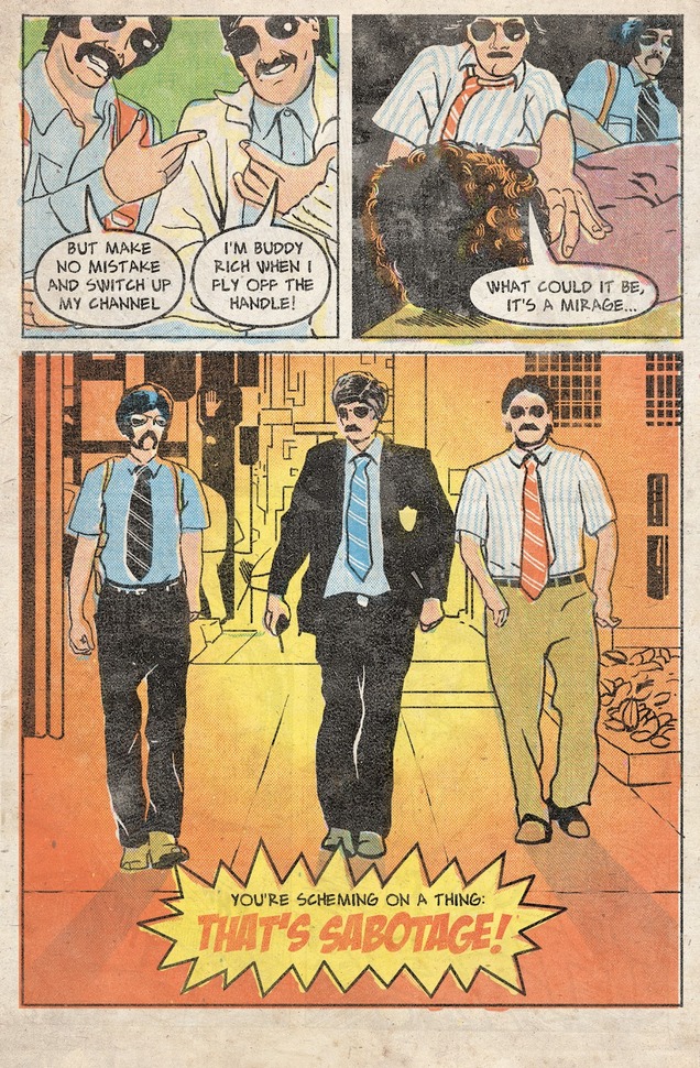
Above and below you can see a comic created by Derek Langille illustrating the song ‘Sabotage’ – this was done nearly two years ago now and takes a similar old school comic style to Ed Piskor‘s excellent on-going ‘Hip Hop Family Tree‘.
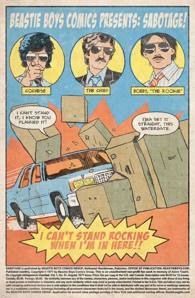
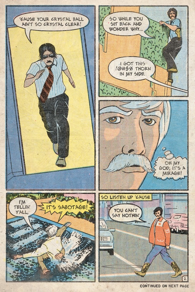
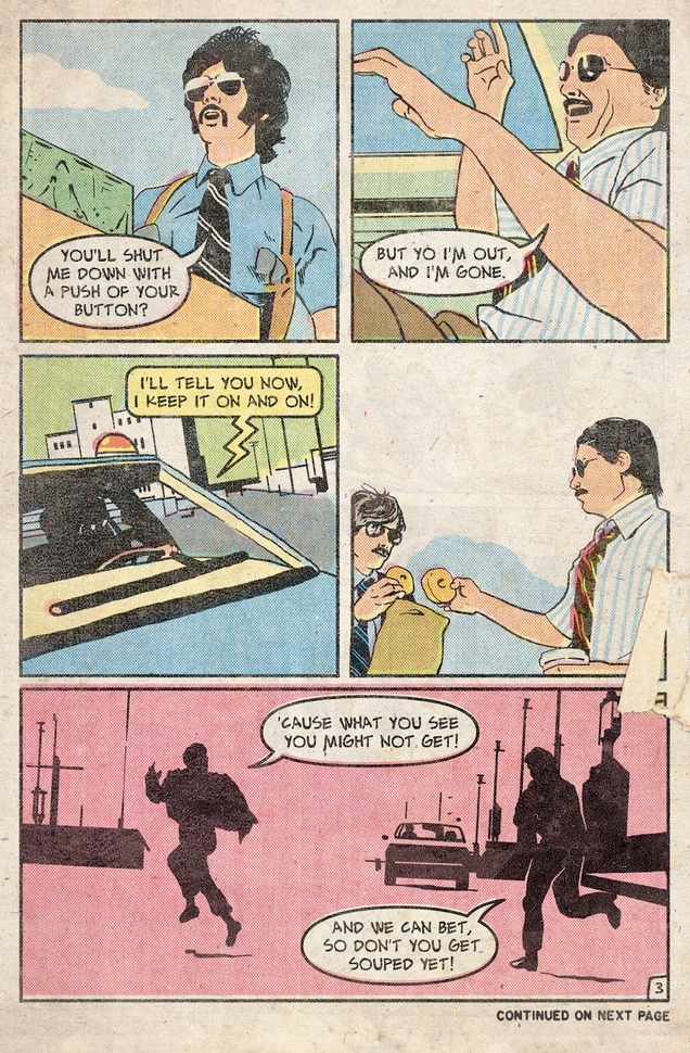
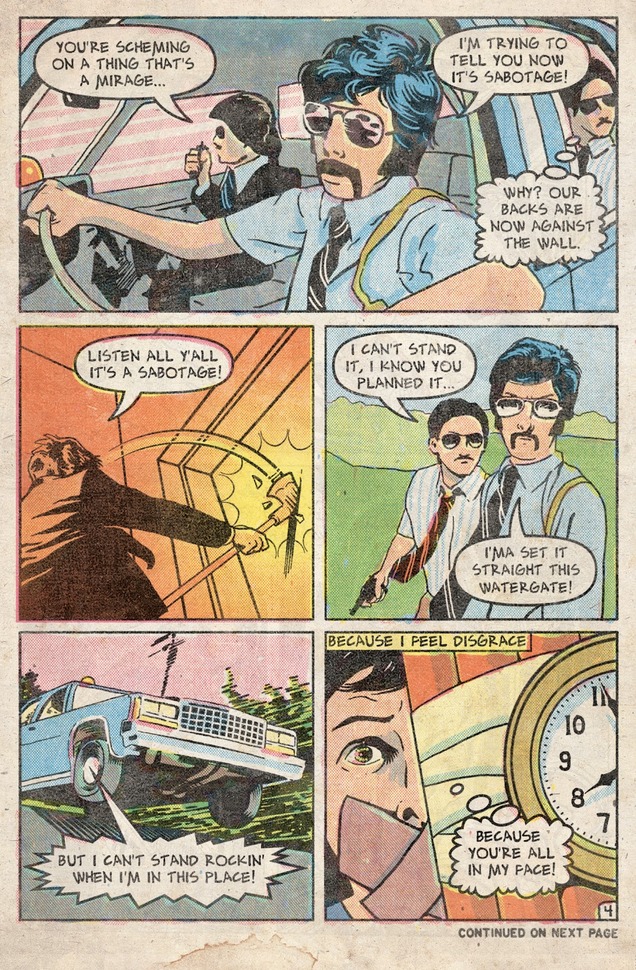
A couple of fans in Italy (SM&A Prod.) are preparing a ‘visual companion’ to the album, to debut online on July 25th (see new trailer above) and Filter magazine are running a special on it in an upcoming issue.
The 3-Way Mix should be getting a feature somewhere in that issue and I was interviewed recently for an updated version of Dan LeRoy‘s 33 1/3 book about the making of the album.
Also over the weekend the deconstructed mix of the album that I made with DJ Cheeba and DJ Moneyshot finally hit 100,000 plays on Soundcloud – this is a big milestone for us so thanks to all for listening.
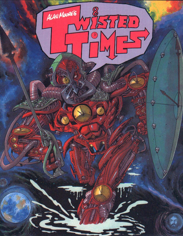
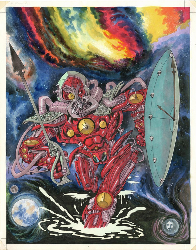 Check out this original Kevin O’Neill painting from the cover of the ‘Twisted Times’ collection – short Future Shock stories by Alan Moore from his old 2000ad days. This is on sale now from Artdroids if you have the hefty £6k that Rufus wants for it and underneath is the original book cover it was used for. “if I was a rich man, la la la la la etc”…
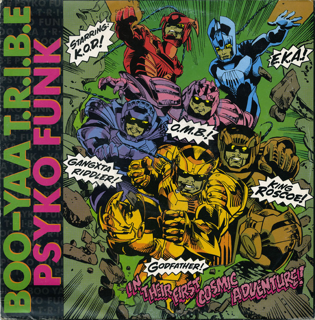 As with last year’s Free Comic Book Day I’ve put together another collection of record sleeves that use artists from or reference comics in some way. Above is a Boo-Yaa Tribe 12″ which I THINK is drawn by Bob Camp who also did the Bambaataa ‘Renegades of Funk’ and Newcleus sleeves from the previous post. The only credit is ‘designed by Island Art’ on the back and the German 12″ says ‘illustration: Marvel Comics’ (!) This version features two remixes by Coldcut incidentally.
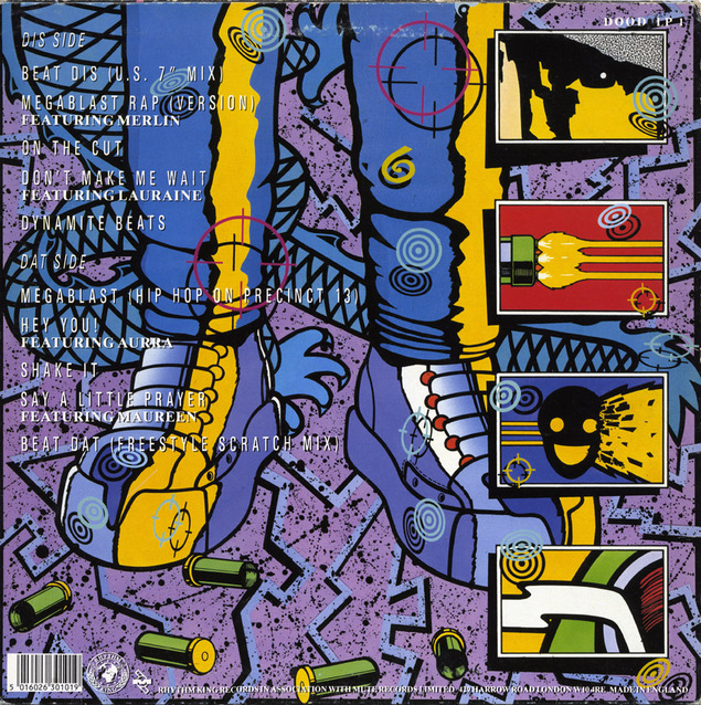
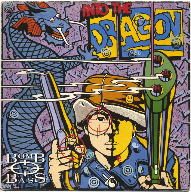 A classic back and front sleeve by (*update!) Dave Little for Bomb The Bass‘ first LP – the connection started when BTB adapted Dave Gibbons‘ Watchman smiley face with blood splat on their first 12″ cover for ‘Beat Dis’ – thus helping bring the smiley into the then current Acid House craze as its motif. Dave Little – as Steve Cook helpfully pointed out below in the comments – was Rhythm King‘s in-house designer, responsible for S’Express, Renegade Soundwave and more.
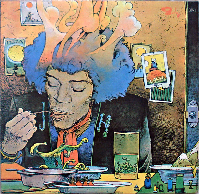
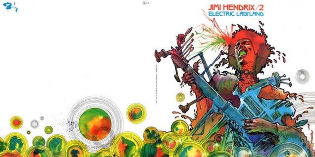
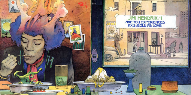 Next up – the master – Moebius, drawing Hendrix, as he would do several times in his career but this is the only album cover I know of. This is a ‘twofer’, two albums in one package for the French market on the Barclay label with a gorgeous gatefold. I love the way Hendrix is on the back instead of the front.
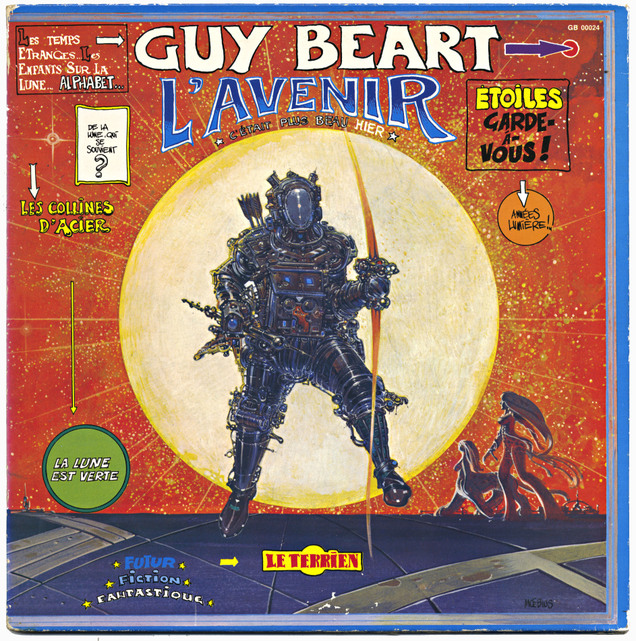
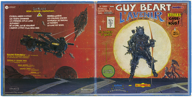
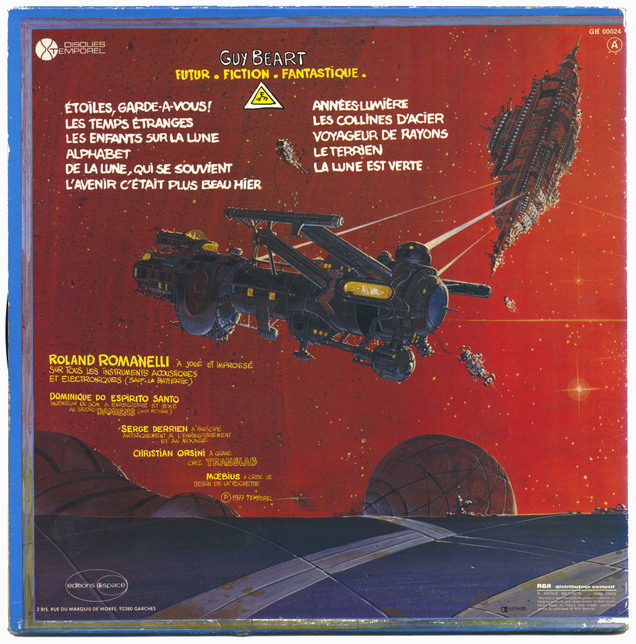
More Moebius, I’ve posted this before but it’s so good I’m going to do it again.
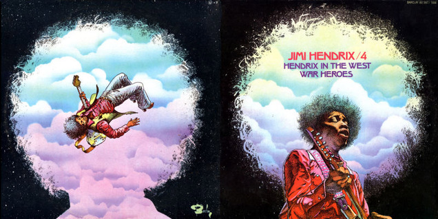
 Staying with the French artists here’s Philippe Druillet with another Hendrix gatefold and another similar record that I can’t identify the artist on – both released on Barclay. Anyone know the second artist? Update: several people have pointed the finger at Richard Corben on this one and I can see the similarity for sure plus it would fit in with the series of artists featured in Metal Hurlant at the time.
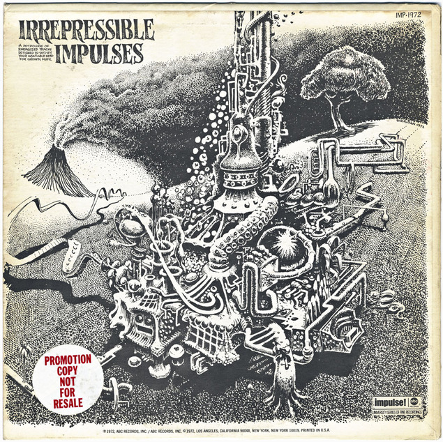
This is the back cover of an Impulse Jazz compilation with a weird contraption by lesser-known Underground Comix artist Dave Sheridan (RIP) – odd to see this on a jazz record but then again Robert Crumb was no stranger to the genre.
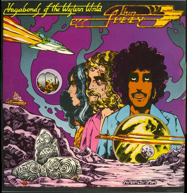
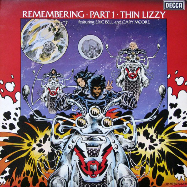 Last but not least we have Jim Fitzpatrick who did many sleeves for Thin Lizzy in the 70’s through to the early 80’s. Not really a comic artist as such, more in the Celtic Fantasy range as an illustrator but you can see the comic book influence in his style with the psychedelic lettering on the early releases looking like Robert Williams‘ work or even Hawkwind-era Barney Bubbles.
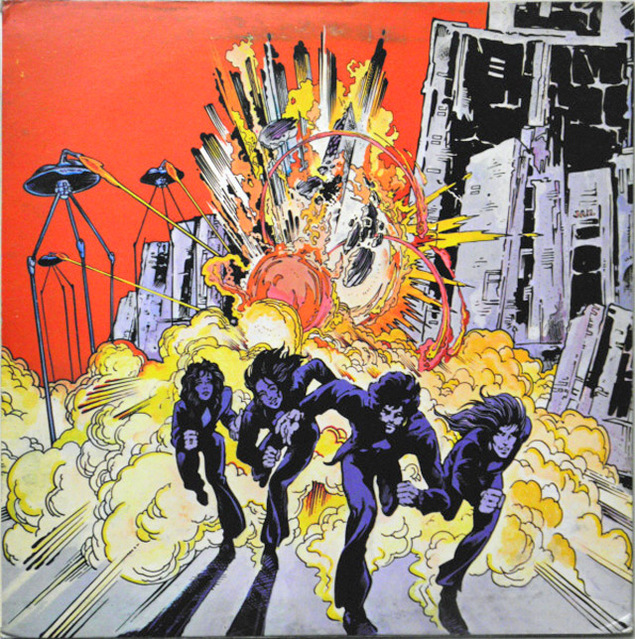
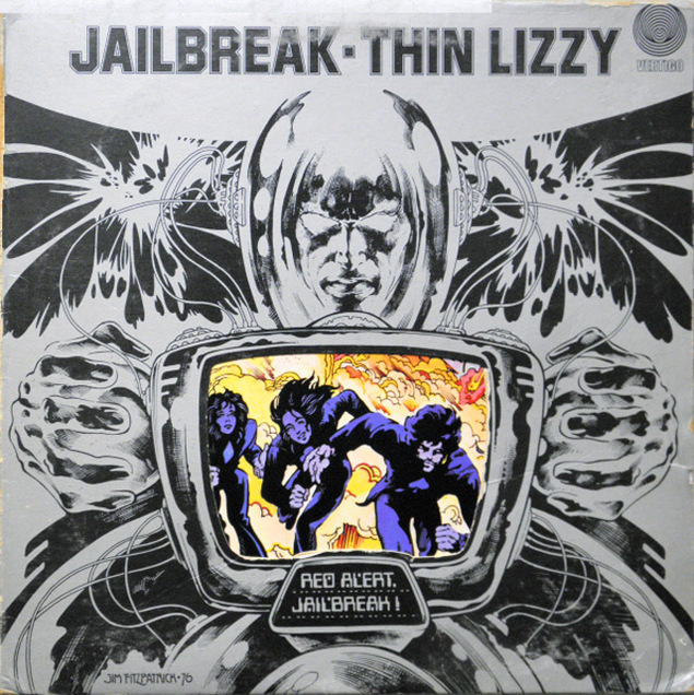 Love this die-cut cover showing through the inside sleeve.
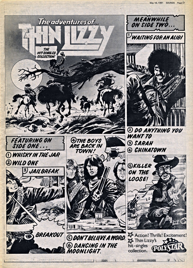
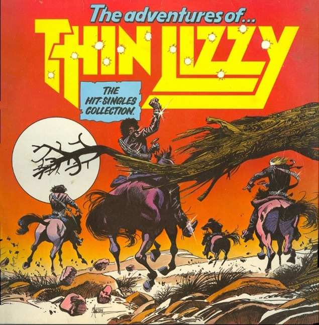 This Greatest Hits release was advertised with a comic strip-like page in an issue of Sounds, riffing off a cowboy theme.
  Not quite sure if this is Jim Fitzpatrick as the line work is a bit spikier and Steve Cook again pointed out that it could be Martin Asbury – probably best known for drawing Garth and the style certainly looks similar.
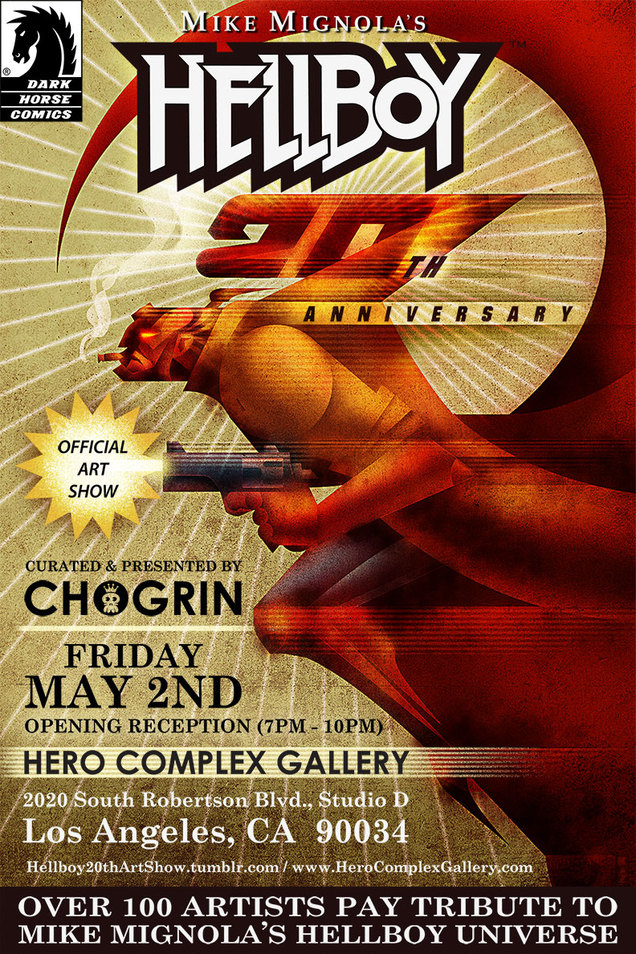 Seeing as it’s Free Comic Book Day tomorrow I’ll be posting a little more than usual about related events over the coming week. Another exhibition that just opened is this celebration of 20 Years of Hellboy by artists both professional and amateur.
It’s on at the Hero Complex Gallery in LA from today and you can see more examples of art here plus everything goes up for sale tomorrow .
This just opened in London at the British Library, I’m going Monday, can’t wait!
Featuring such iconic names as Neil Gaiman (Sandman), Alan Moore (Watchmen, V for Vendetta), Grant Morrison (Batman: Arkham Asylum) and Posy Simmonds (Tamara Drewe), this exhibition traces the British comics tradition back through classic 1970s titles including 2000AD, Action and Misty to 19th-century illustrated reports of Jack the Ripper and beyond.
“Can’t recommend British Library’s Comics Unmasked exhibition enough! Unexpected & rare exhibits, wonderfully presented.” – Dave Gibbons (Watchman and many more)
Parental guidance is advised for visitors under 16 years of age due to the explicit nature of some of the exhibits on display, the exhibition runs until August. For more info and updated content visit the Library’s Comics Unmasked page.
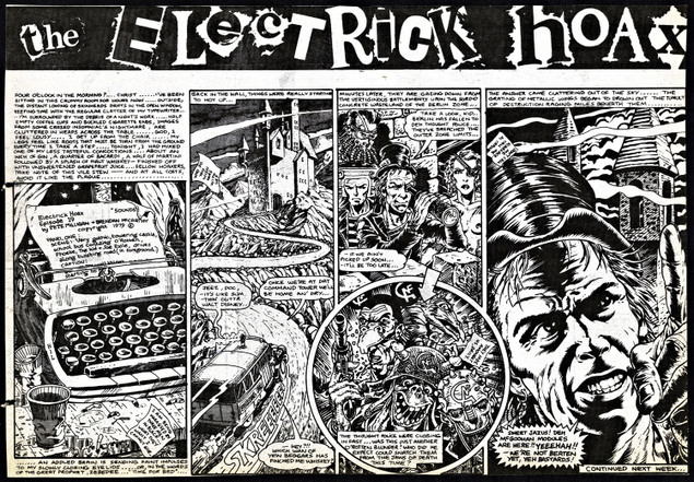
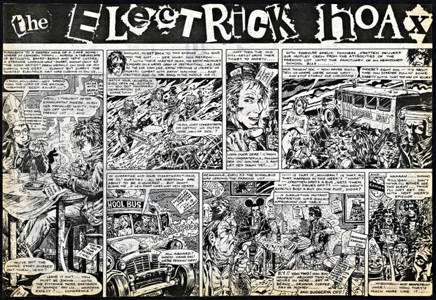
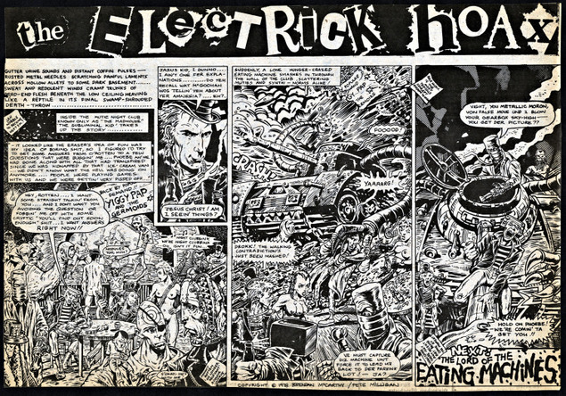
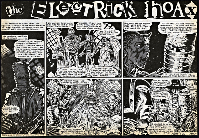
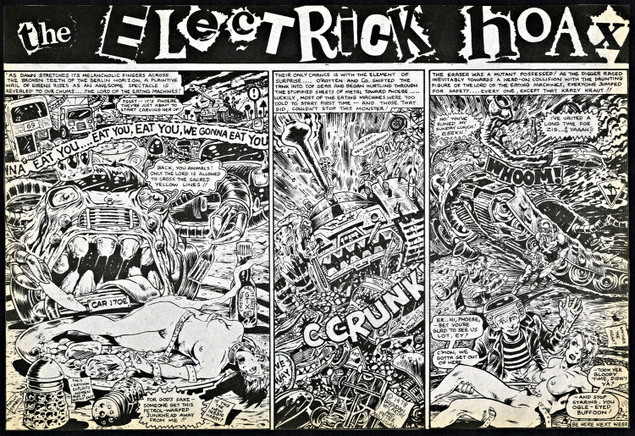 The Electric Hoax Pt.17 by Pete Milligan and Brendan McCarthy. This strip appeared in the weekly UK music paper, Sounds, in 24 parts sometime between mid ’78 and ’79. Click image for larger version (just realised I didn’t put this up over the weekend – really not sure why the heroine’s clothes have suddenly fallen off)
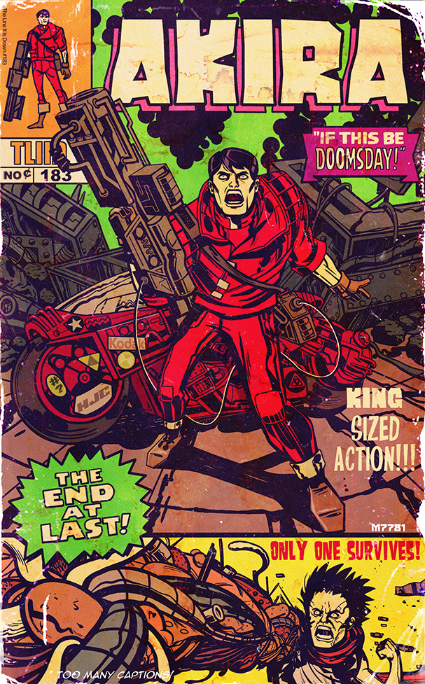 Canadian Marco D’Alfonso drew this Akira / Kirby ‘What If?’ mash up cover for The Line Is Drawn blog. I’d buy that in a minute.
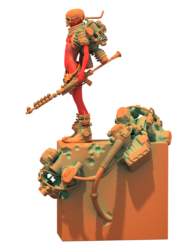
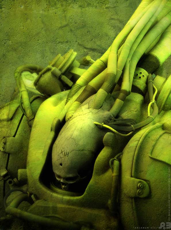
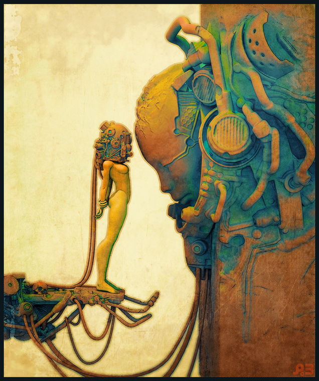
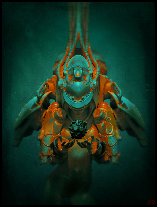 Love this work by Canadian artist Pascal Blanché. It’s all new but has just the right amount of 70’s Métal Hurlant / Heavy Metal vibe to evoke that retro age of sci-fi. He has a Deviant Art page with a patron scheme going on to fund him doing more material like this for a book.
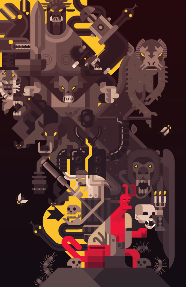 Love this, see how he did it on his blog here.
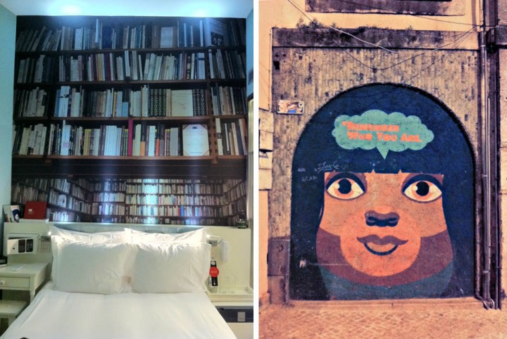 Two views of Lisbon; inside my hotel and out on the street by the MusicBox club where I played on Thursday night.
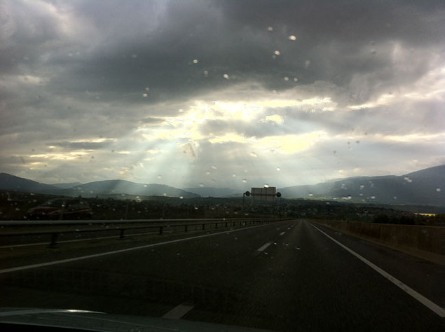 Sun through the clouds in Switzerland, driving towards France on Friday afternoon.
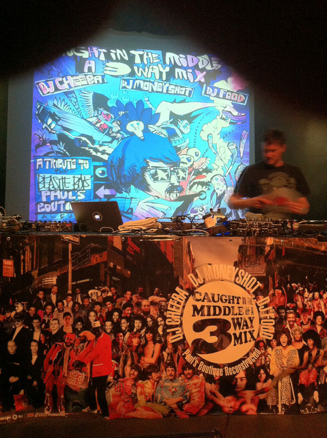 Sound check in La Rodia, Besancon, France with our new banner featuring every artist sampled on the ‘Paul’s Boutique’ LP.
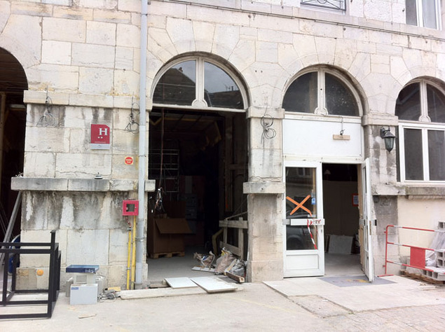
The not-quite-finished hotel in France the next morning – note the 2 stars – it was actually OK inside. Next, a fantastic view on the road back to Geneva.

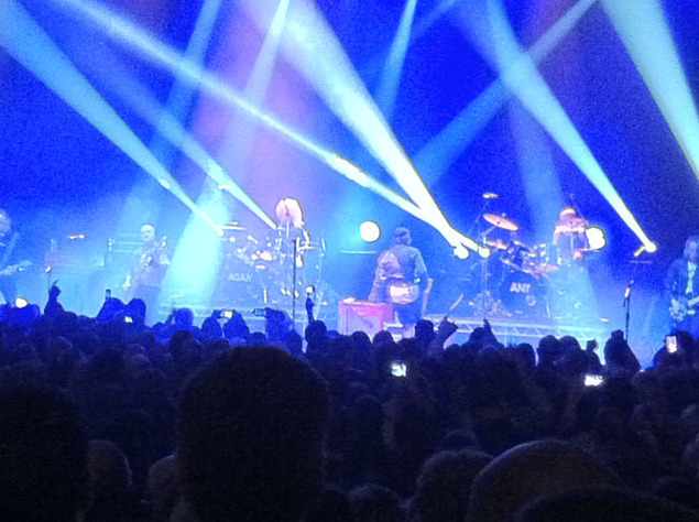
Saturday night back in London – Adam & The (original) Antz do ‘Dirk Wears White Sox’ at the Hammersmith Apollo.
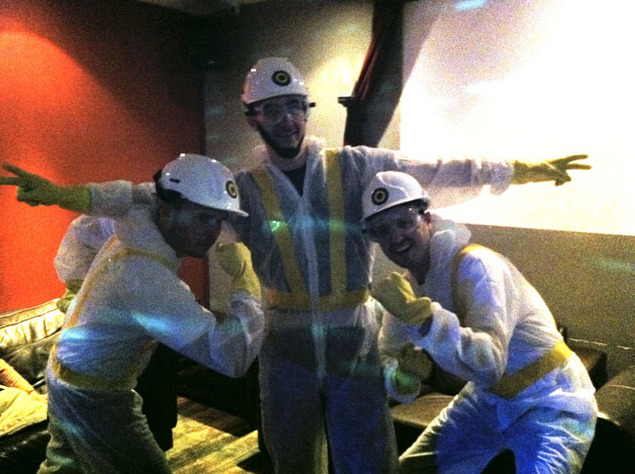
Beastie fans get ready for the 3-Way Mix at the Moon Club in Cardiff on Sunday night and we premiere our new picture disc controller records from 12InchSkinz during the set.
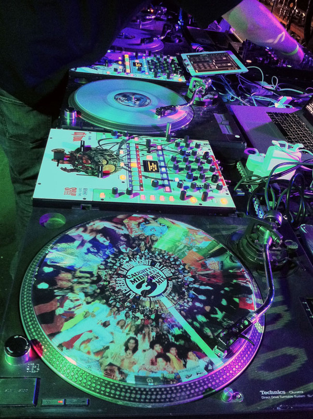
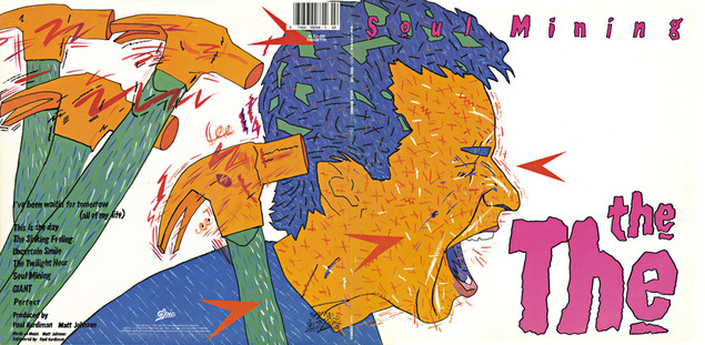
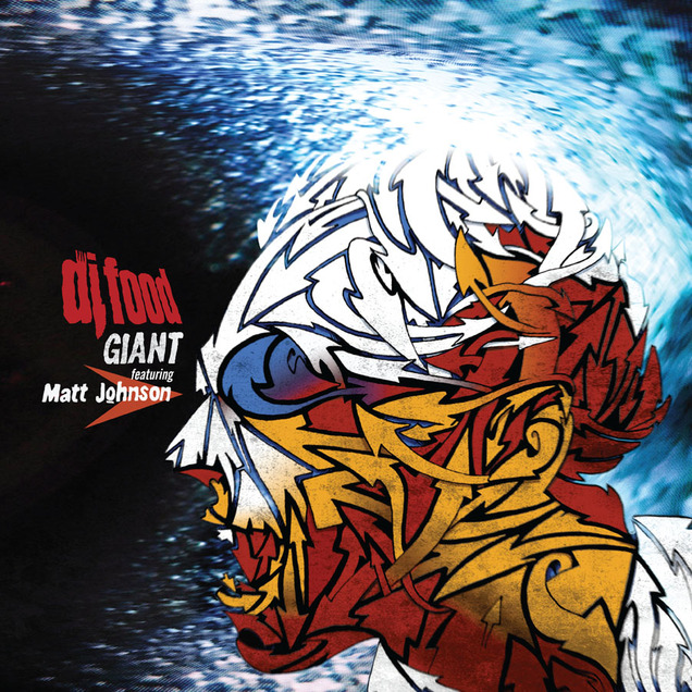
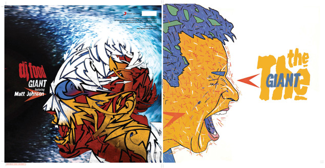
I was pretty excited when Matt Johnson got in touch to ask about the possibility of licensing my version of ‘GIANT’ for a The The vs DJ Food double A side 12″ on Record Store Day. Not only because my version would be paired with his original on vinyl (the only track from the album not to make it to vinyl in last years repress of the original EPs as his vocal didn’t make the deadline when those were pressed) but because he wanted me to design one side of the sleeve too.
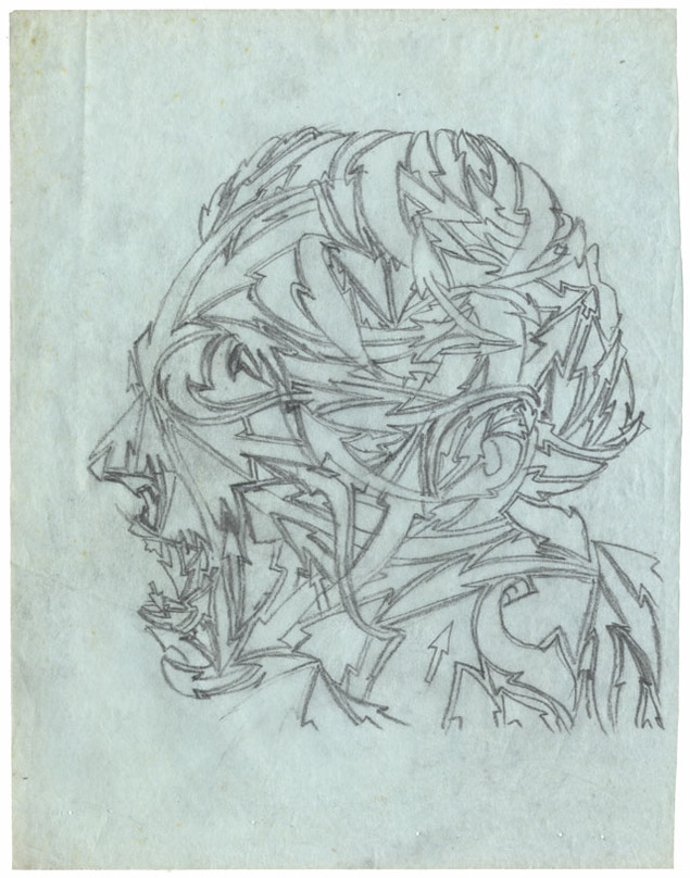
The brief was simple, the front was his brother, Andy ‘Dog’ Johnson‘s shouting face image from the cover of the American issue of the ‘Soul Mining’ LP and I was to do my interpretation for the reverse. OK, so a shouting face, fairly obviously Matt’s, to compliment Andy’s vision, how best to go about this? I didn’t want to ape his style as that would be pointless but there had to be some visual connection so I decide to use the same colour palette.
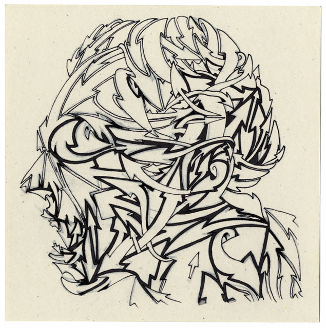
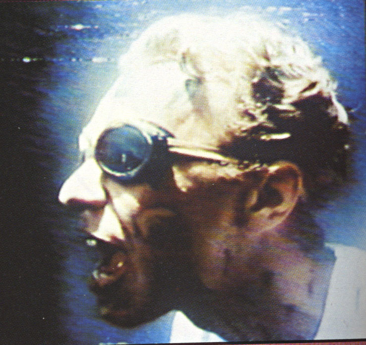 I’d remembered an image of Matt shouting/singing from the Infected video that was featured in the The The songbook as a still, taken straight from the TV by the looks of it and so scanned that as the basis of my version. The head was facing the opposite direction from Andy’s so this was a good start and I took the idea of the arrows he would add to some of his images and redrew the face, now made from a warren of intertwined arrows. This was supposed to represent the confusion in the character but also served to create a dynamic image with movement without copying the blizzard of detail that gives Andy’s art such a visual buzz.
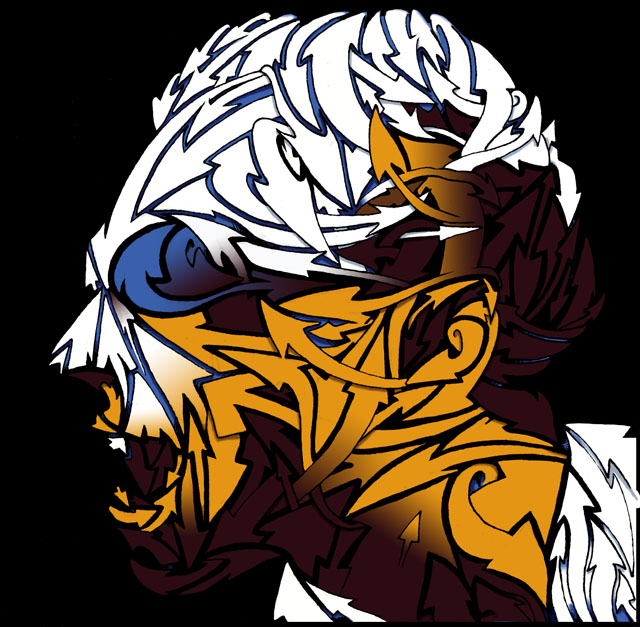
After inking the pencil tracing I scanned it and cleaned up edges to get a clear B&W version before adding a limited colour palette that would mimic the lighting of the original photo. The background I’d decided would be black rather than white to counterbalance the other side and I added some distorted TV feedback I’d taken years before to reference the texture of the original photo. It was looking a little clean for my taste so a layer of grain was added across the face just to give it some ‘glue’ to pull the flat face together with the background and a tiny amount of spin blurring to the black outlines to blend it further.
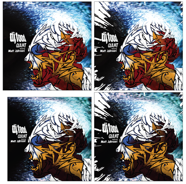
I then experimented with adding a section of the Robosunburst from the background of the ‘Search Engine’ LP cover to reference that release but, while it added an extra level of dynamism to the image. I felt it was too busy although I did submit a couple of versions to Matt for a second opinion and my feeling was Matt’s too and he went with the simpler image.
I also felt that my colour choice was a bit on the dark side so a re-balancing of the browns for redder tones evened things out and bought it a little closer to Andy’s colourful original.
 All that remained then was to add the titles and I wanted my clean DJ Food logo to reflect Fiona Skinner‘s original choppy The The logo design. For this I imported the Food one into Illustrator and used the tracing tool too create a rougher outline as it can never trace exactly, especially at small sizes.
This was then further roughed up on the edges in Photoshop and the words ‘featuring Matt Johnson’ and ‘GIANT’ were taken from the back of the ‘Soul Mining’ LP cover. Actually I think I had to cobble the ‘featuring’ together from several different words…
After this I wanted a copy of the arrow Andy had pointing toward the nose of the face to tie our designs together and form an anchor point to align the titles with.
Luckily Matt and the people at Sony loved what I had done and it was all sent off to have barcodes and other text added by Matt’s manager Cally at Antar (a fascinating character with many tales to tell if you ever run into him). The hardest thing then was the wait as this was finished back in January and I wasn’t allowed to announce anything about it until the end of March when all I wanted to do was scream about it from the rooftops. The finished copies arrived a couple of weeks before RSD and that was a day to remember I can tell you.
It’s impossible to convey how much Matt’s music has meant to me since I first heard it in college in the 80’s when a classmate taped ‘Soul Mining’ and ‘Infected’ back to back on a C90 cassette for me, instantly turning me into a fan who hunted down everything else he had recorded. To meet him for the first time, over ten years ago now, was a big enough deal but to then record and be a part of an official The The release is something I never thought would happen in a million years. As another friend of mine named Matt would say, “living the dream”…
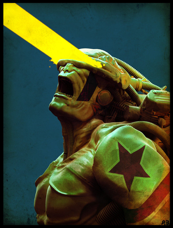
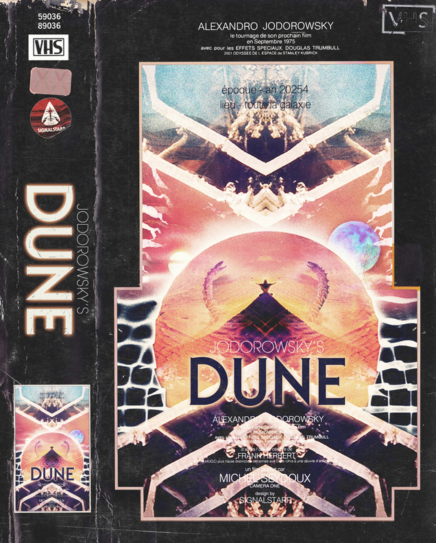
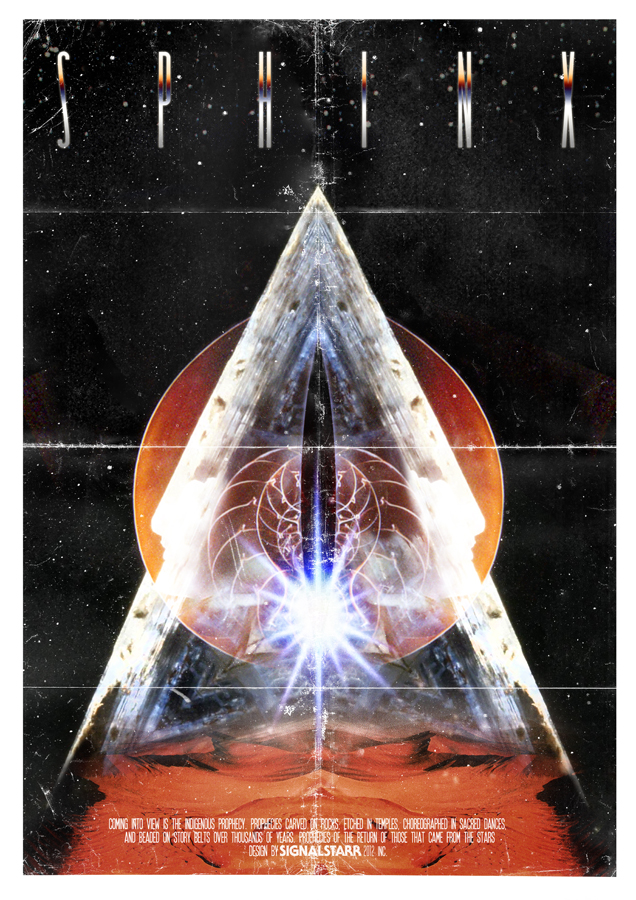
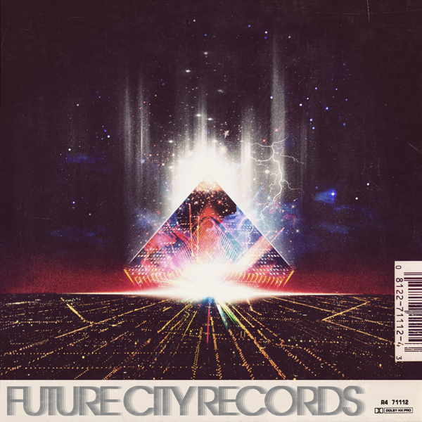
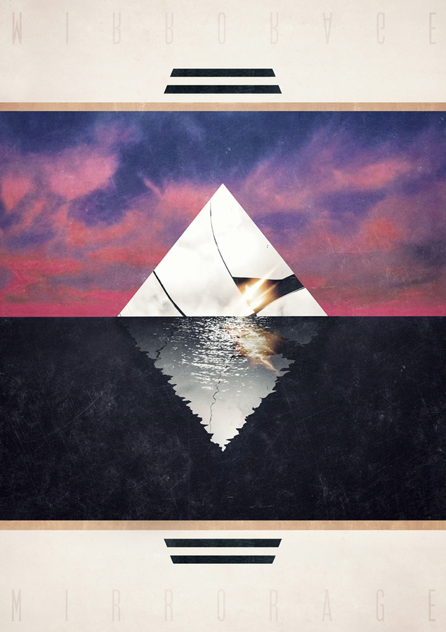
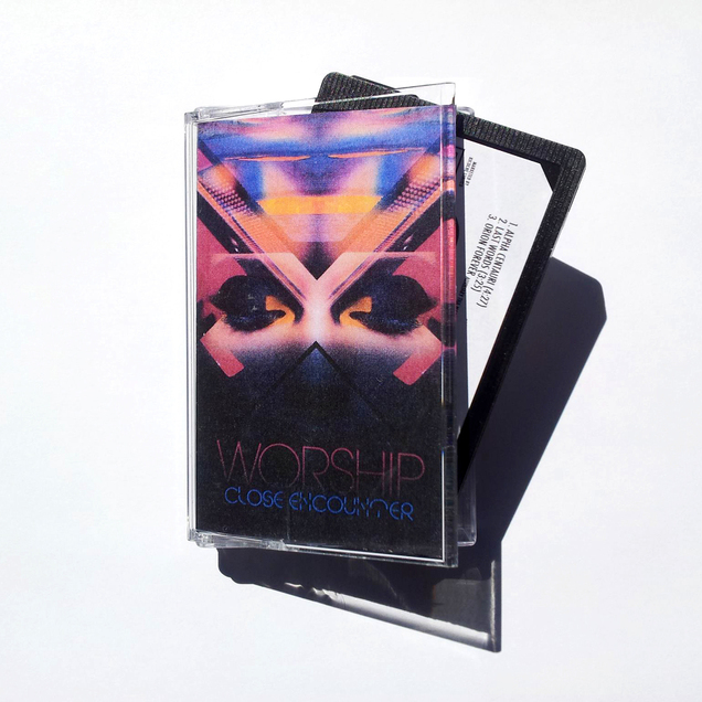
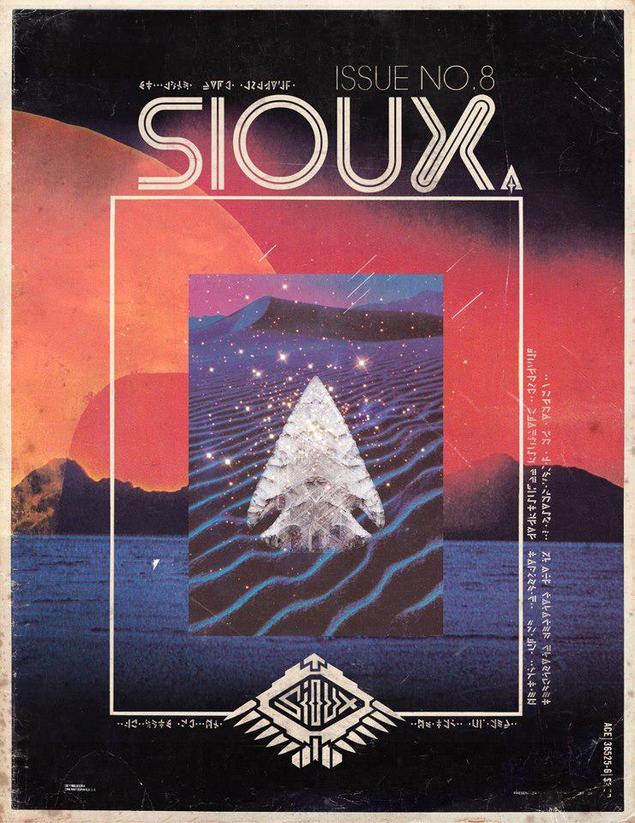
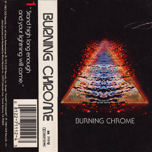
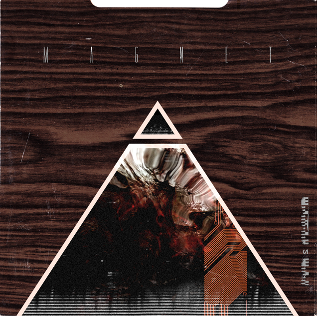
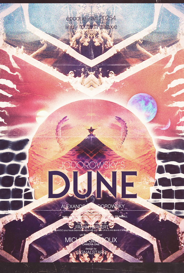 This guy’s work is phenomenal, that perfect balance of 70’s and 80’s retro, vague sci-fi overtones, interesting lost fonts, saturated colours and a distinctly weathered texture all round. Check out his site, Signalstarr Portals for more.
