Art
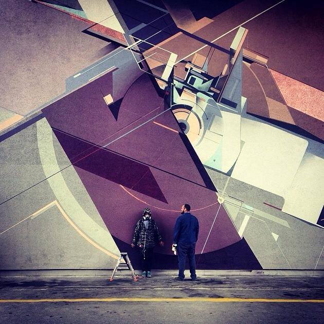
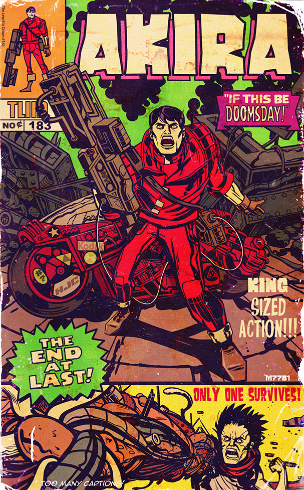 Canadian Marco D’Alfonso drew this Akira / Kirby ‘What If?’ mash up cover for The Line Is Drawn blog. I’d buy that in a minute.
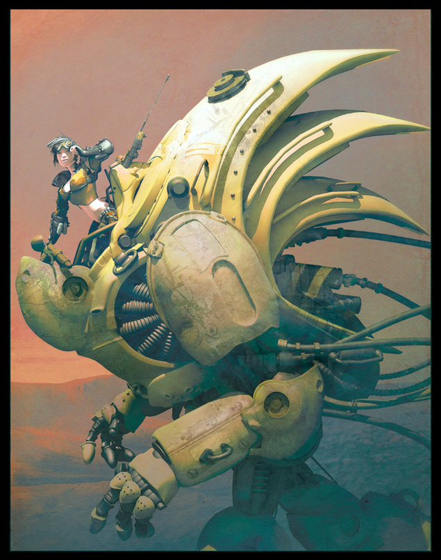
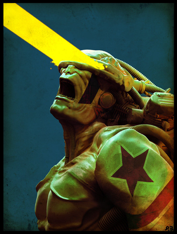
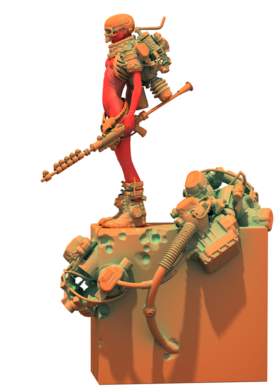
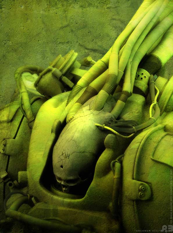
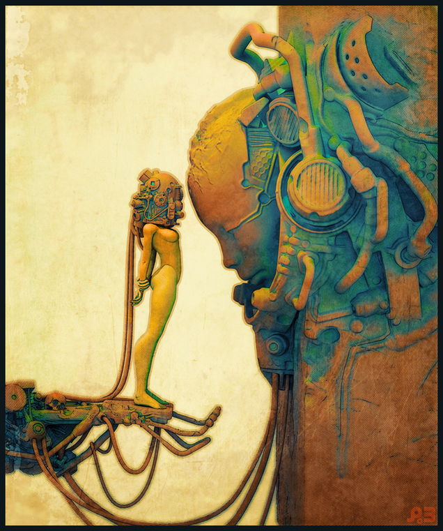
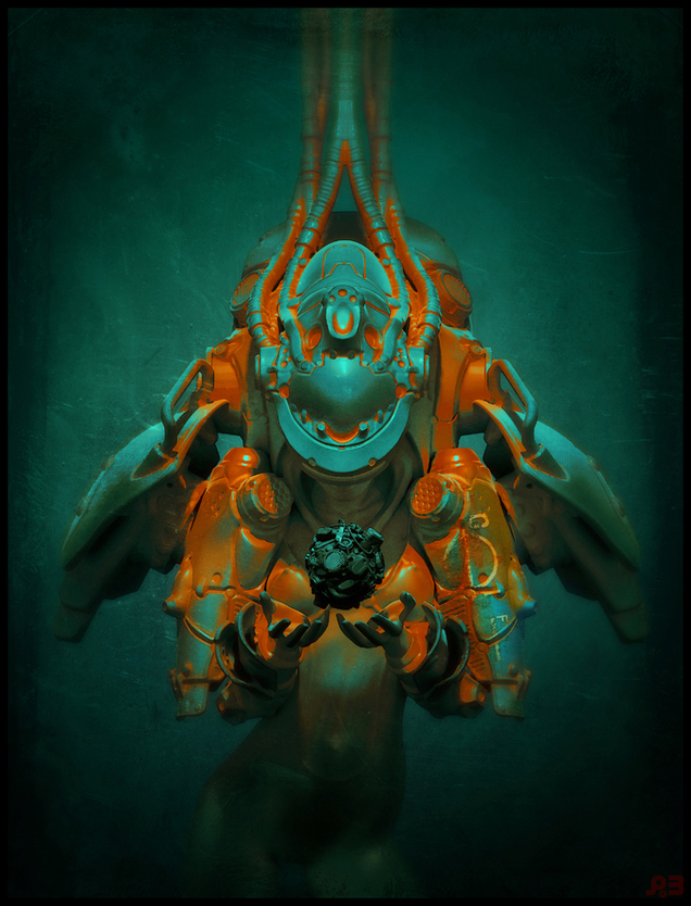 Love this work by Canadian artist Pascal Blanché. It’s all new but has just the right amount of 70’s Métal Hurlant / Heavy Metal vibe to evoke that retro age of sci-fi. He has a Deviant Art page with a patron scheme going on to fund him doing more material like this for a book.
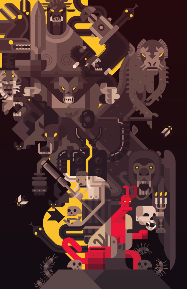 Love this, see how he did it on his blog here.
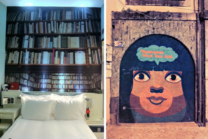 Two views of Lisbon; inside my hotel and out on the street by the MusicBox club where I played on Thursday night.
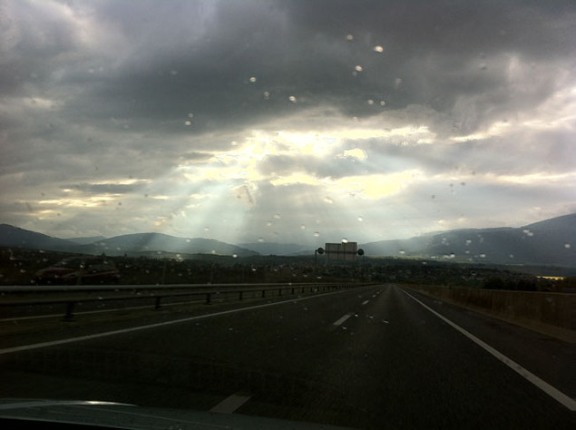 Sun through the clouds in Switzerland, driving towards France on Friday afternoon.
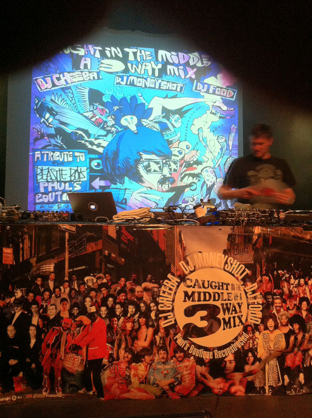 Sound check in La Rodia, Besancon, France with our new banner featuring every artist sampled on the ‘Paul’s Boutique’ LP.
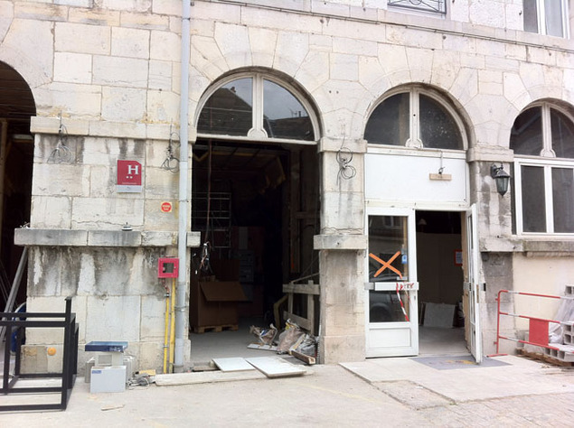
The not-quite-finished hotel in France the next morning – note the 2 stars – it was actually OK inside. Next, a fantastic view on the road back to Geneva.

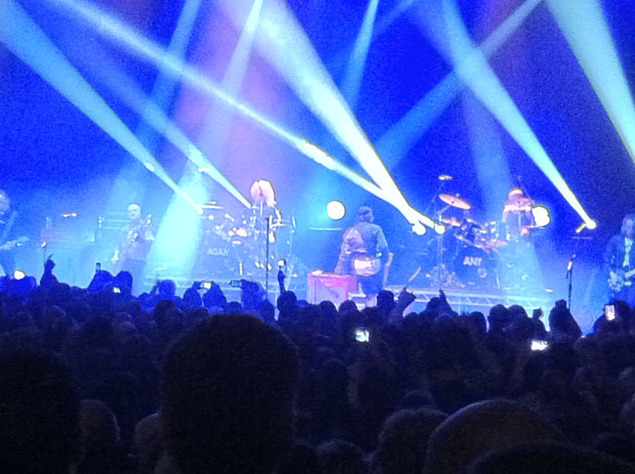
Saturday night back in London – Adam & The (original) Antz do ‘Dirk Wears White Sox’ at the Hammersmith Apollo.
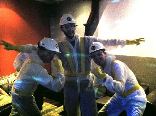
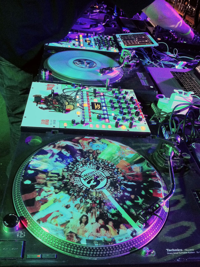
Beastie fans get ready for the 3-Way Mix at the Moon Club in Cardiff on Sunday night and we premiere our new picture disc controller records from 12InchSkinz during the set.
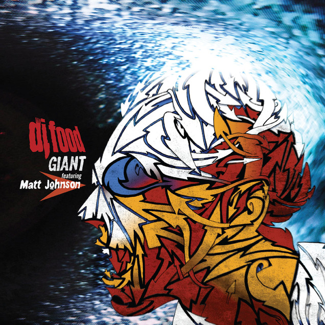
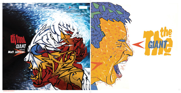
I was pretty excited when Matt Johnson got in touch to ask about the possibility of licensing my version of ‘GIANT’ for a The The vs DJ Food double A side 12″ on Record Store Day. Not only because my version would be paired with his original on vinyl (the only track from the album not to make it to vinyl in last years repress of the original EPs as his vocal didn’t make the deadline when those were pressed) but because he wanted me to design one side of the sleeve too.
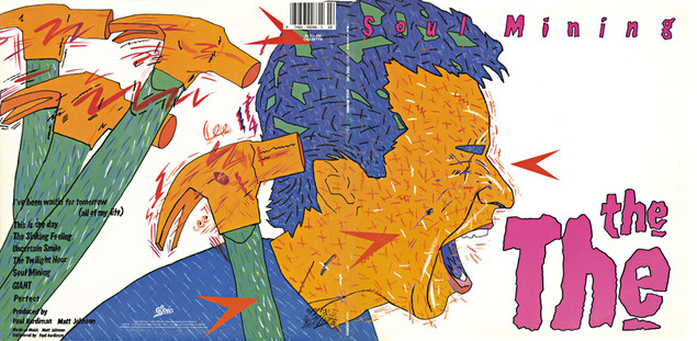
The brief was simple, the front was his brother, Andy ‘Dog’ Johnson‘s shouting face image from the cover of the American issue of the ‘Soul Mining’ LP and I was to do my interpretation for the reverse. OK, so a shouting face, fairly obviously Matt’s, to compliment Andy’s vision, how best to go about this? I didn’t want to ape his style as that would be pointless but there had to be some visual connection so I decide to use the same colour palette.
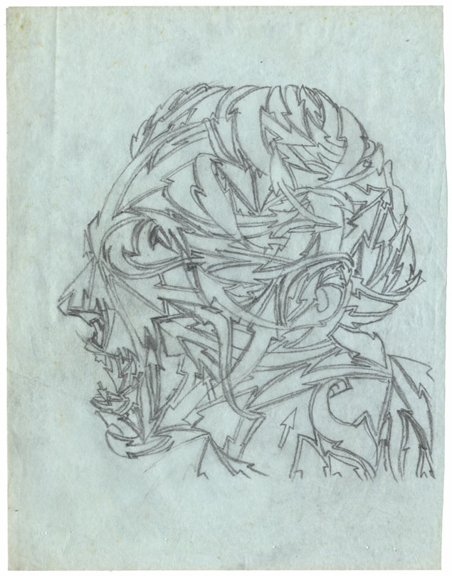
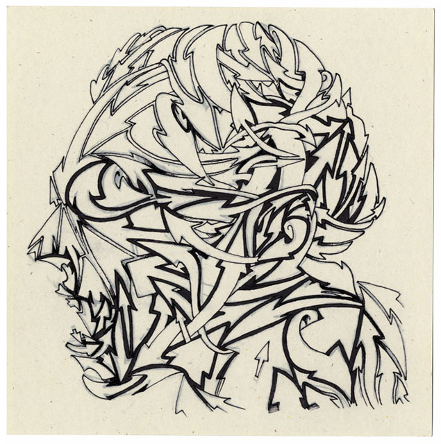
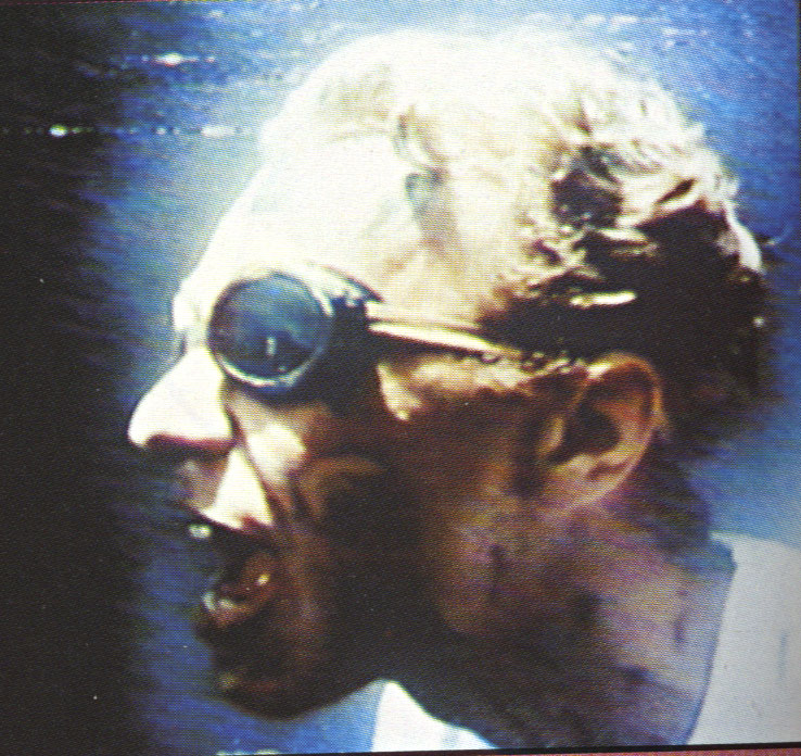 I’d remembered an image of Matt shouting/singing from the Infected video that was featured in the The The songbook as a still, taken straight from the TV by the looks of it and so scanned that as the basis of my version. The head was facing the opposite direction from Andy’s so this was a good start and I took the idea of the arrows he would add to some of his images and redrew the face, now made from a warren of intertwined arrows. This was supposed to represent the confusion in the character but also served to create a dynamic image with movement without copying the blizzard of detail that gives Andy’s art such a visual buzz.
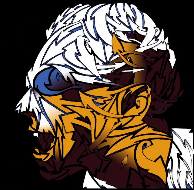
After inking the pencil tracing I scanned it and cleaned up edges to get a clear B&W version before adding a limited colour palette that would mimic the lighting of the original photo. The background I’d decided would be black rather than white to counterbalance the other side and I added some distorted TV feedback I’d taken years before to reference the texture of the original photo. It was looking a little clean for my taste so a layer of grain was added across the face just to give it some ‘glue’ to pull the flat face together with the background and a tiny amount of spin blurring to the black outlines to blend it further.
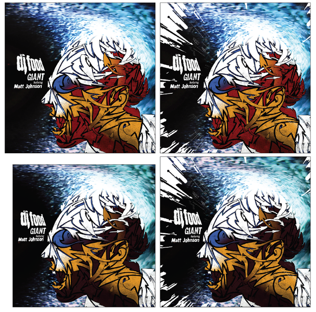
I then experimented with adding a section of the Robosunburst from the background of the ‘Search Engine’ LP cover to reference that release but, while it added an extra level of dynamism to the image. I felt it was too busy although I did submit a couple of versions to Matt for a second opinion and my feeling was Matt’s too and he went with the simpler image.
I also felt that my colour choice was a bit on the dark side so a re-balancing of the browns for redder tones evened things out and bought it a little closer to Andy’s colourful original.
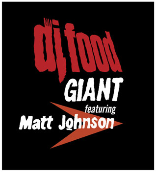 All that remained then was to add the titles and I wanted my clean DJ Food logo to reflect Fiona Skinner‘s original choppy The The logo design. For this I imported the Food one into Illustrator and used the tracing tool too create a rougher outline as it can never trace exactly, especially at small sizes.
This was then further roughed up on the edges in Photoshop and the words ‘featuring Matt Johnson’ and ‘GIANT’ were taken from the back of the ‘Soul Mining’ LP cover. Actually I think I had to cobble the ‘featuring’ together from several different words…
After this I wanted a copy of the arrow Andy had pointing toward the nose of the face to tie our designs together and form an anchor point to align the titles with.
Luckily Matt and the people at Sony loved what I had done and it was all sent off to have barcodes and other text added by Matt’s manager Cally at Antar (a fascinating character with many tales to tell if you ever run into him). The hardest thing then was the wait as this was finished back in January and I wasn’t allowed to announce anything about it until the end of March when all I wanted to do was scream about it from the rooftops. The finished copies arrived a couple of weeks before RSD and that was a day to remember I can tell you.
It’s impossible to convey how much Matt’s music has meant to me since I first heard it in college in the 80’s when a classmate taped ‘Soul Mining’ and ‘Infected’ back to back on a C90 cassette for me, instantly turning me into a fan who hunted down everything else he had recorded. To meet him for the first time, over ten years ago now, was a big enough deal but to then record and be a part of an official The The release is something I never thought would happen in a million years. As another friend of mine named Matt would say, “living the dream”…
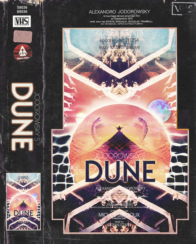
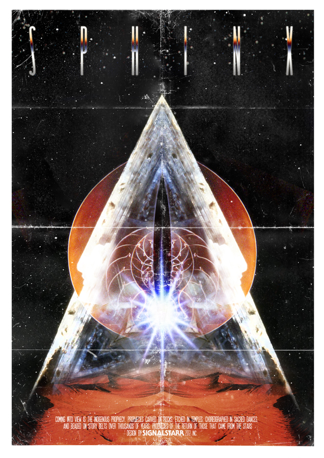
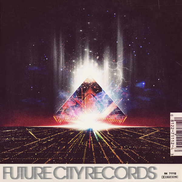
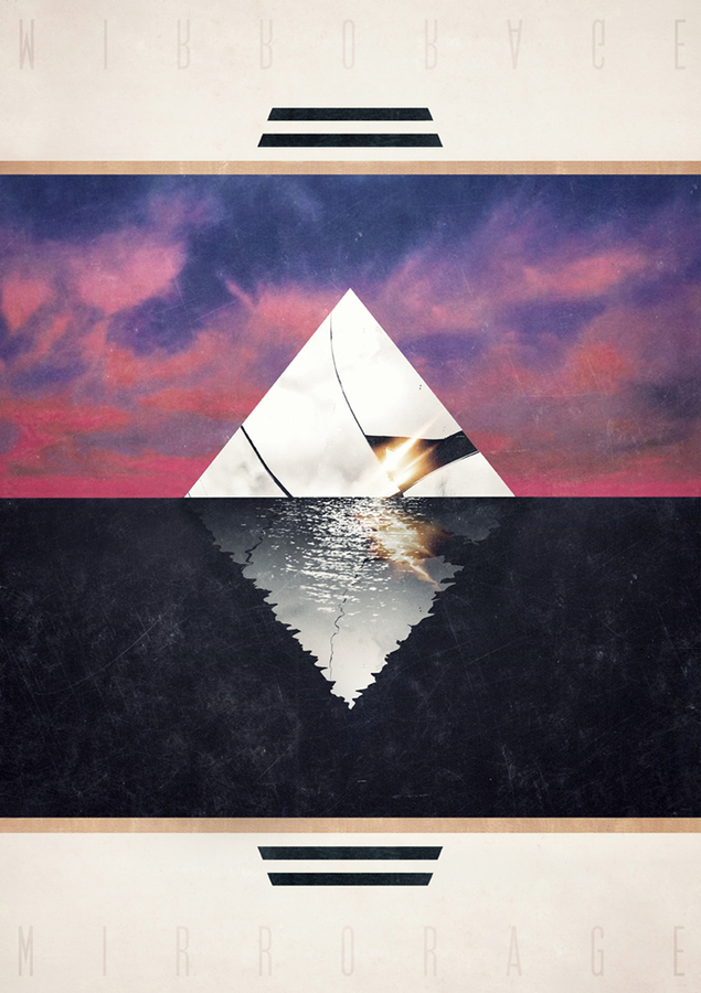
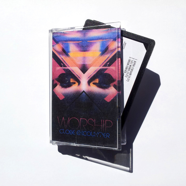
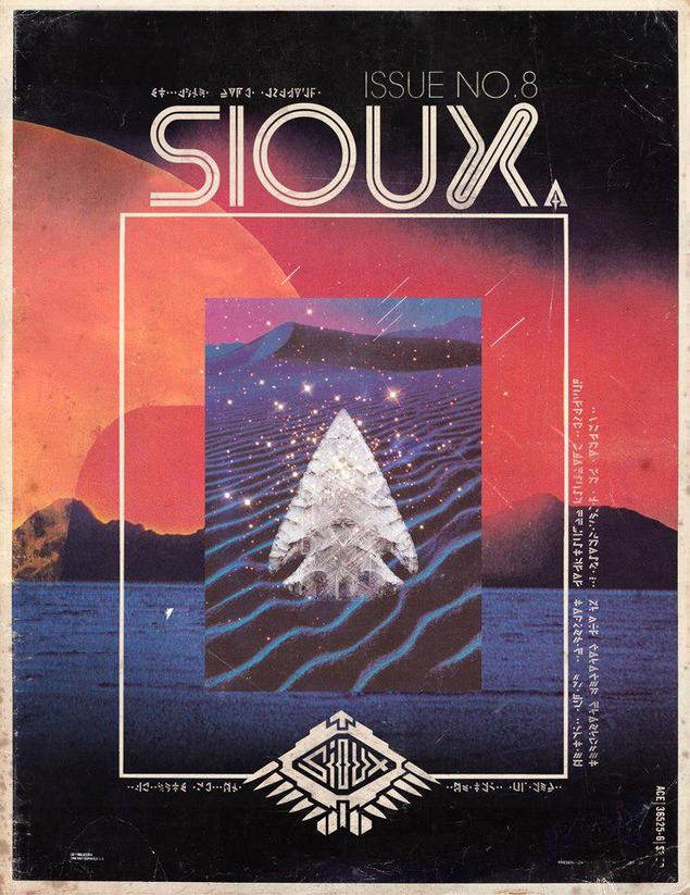
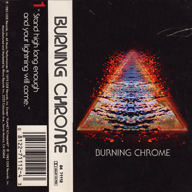
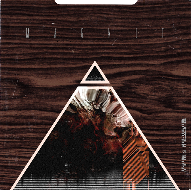
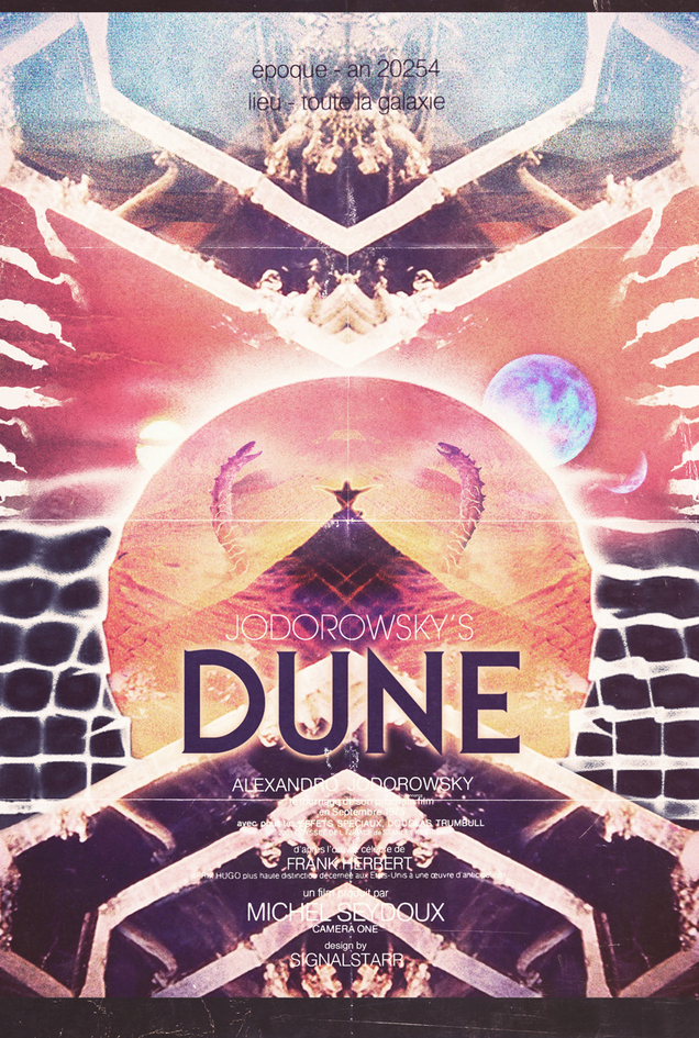 This guy’s work is phenomenal, that perfect balance of 70’s and 80’s retro, vague sci-fi overtones, interesting lost fonts, saturated colours and a distinctly weathered texture all round. Check out his site, Signalstarr Portals for more.
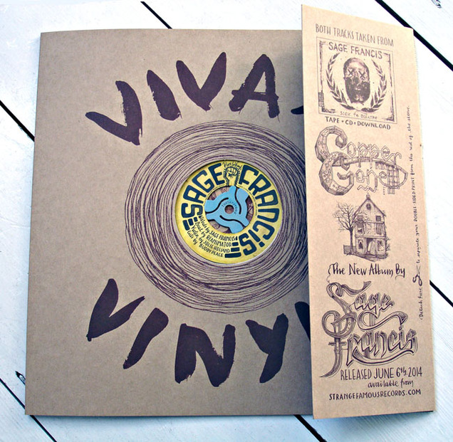 Those lovely people at Factory Road (purveyors of Solid Eggs, 45 adaptors, gallery spaces, Inkymole illustration etc) also run an occasional record label called Blunt Force Trauma.
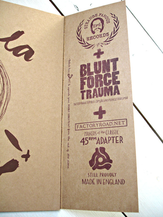
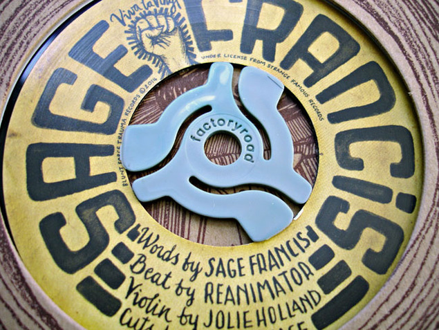
Their latest release is in conjunction with Sage Francis, an artist they’ve enjoyed a long association with, providing artwork for several of his releases over the years. Co-released with his Strange Famous label this one consists of a mini Hip Hop supergroup, the Epic Beard Men aka Sage, B. Dolan and the UK’s very own Buddy Peace.
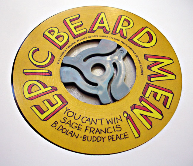
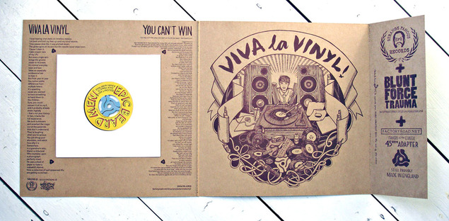
It’s a double A-sided 45 with an ode to black plastic on the A (“Viva La Vinyl‘) and a stomping funk party rap on the flip (‘You Can’t Win‘). As usual they’ve gone the extra mile on the packaging and artwork on this one and the 7″ comes in a 12″ fold out ‘sleeve’ with tear off double-sided art print and custom Factory Road 45 dink in the center.
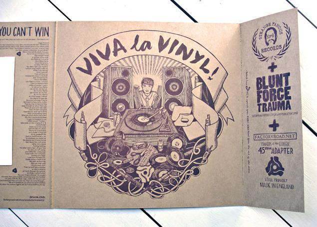
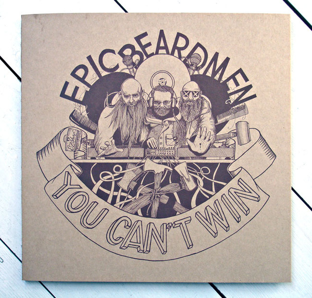
You can also listen to it and buy direct from them right now, ahead of its April 14th release date HERE. Also, check Sarah (Inkymole) Coleman illustrating some of the work in these two shorts.
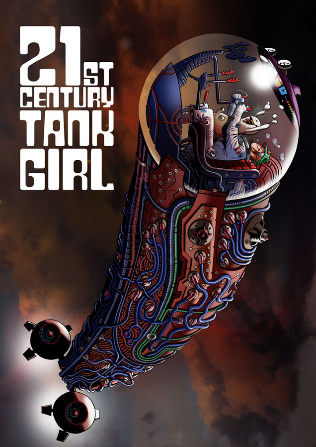
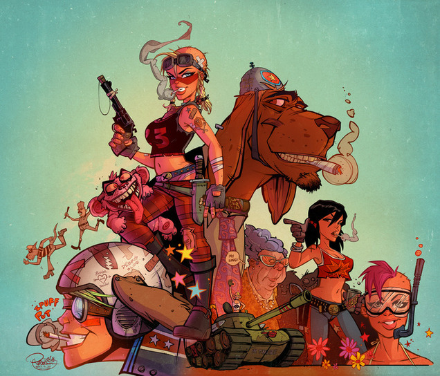 There’s a Kickstarter that just, er… started for a new Tank Girl book. Maybe this is nothing special because Alan Martin has been churning them out with an revolving door of artists for a few years now.
This time though, Jamie Hewlett is back on board, = and no, this is not an April Fool. Firstly for a cover (two actually) but also for his first strip for nearly 20 years. Add to this a line up of Philip Bond, Jim Mahfood, Jonathan Edwards and more and you get what could be the ultimate Xmas present come it’s projected Nov 2014 release date.
This is only if they reach their goal of £57,000 in the next 29 days though. They’re off to a strong start with over £16k pledged already after less than a day but there’s a long way to go. You can check their progress and even pledge yourself HERE – the basic hard back book package is a very reasonable £23 + postage and there are all sorts of other extras and incentives to be had as add-ons too.
A few artists are conspicuous by their absence – Rufus Dayglo for one who helped (ahem) kick start TG back into the public eye all those years back as well as Ashley Wood and Mike McMahon. Check Hewlett’s Kickstarter-only cover below with a huge blue-veiner of a space ship.
*UPDATE* – Funded in 48 hours!
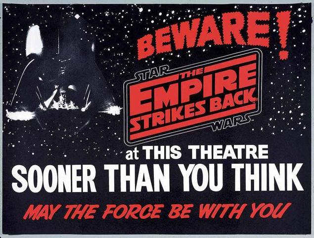
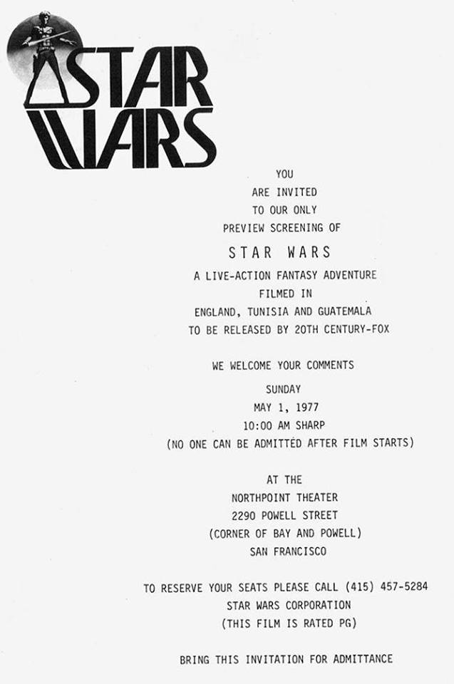
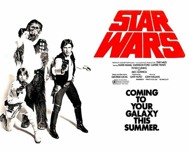 I love these examples of early Star Wars and Empire Strikes Back posters with alternate logos and artwork. Even the finished film poster above has a rare shot of the heroes with Leia in Chewbacca‘s arms and the uneven red ‘crawl’ logo which is quite badly rendered when you look at it.
Below is an even earlier version with Ralph McQuarrie paintings plus an invite to one of the first public screenings.
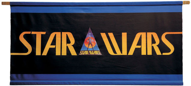
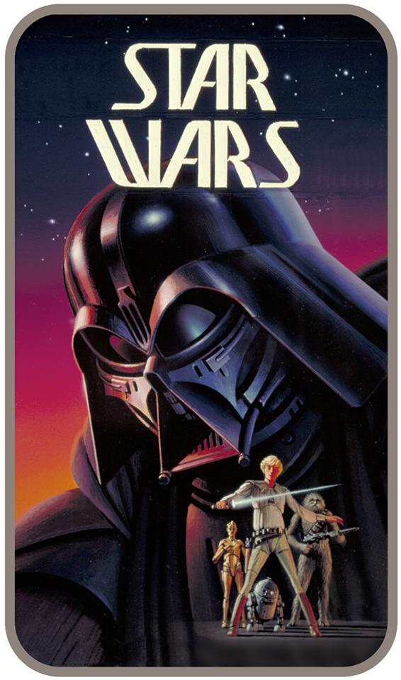
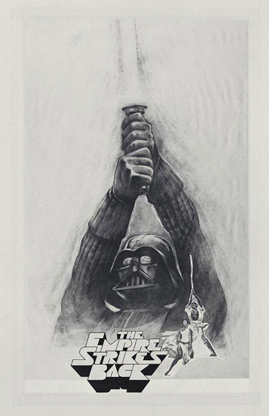
 Below are what look like poster prelims for Empire… with a totally different logo design that I’d never seen before.
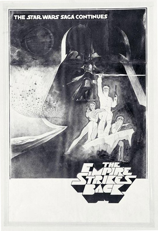
 Then another, more finished version of the logo with original SW poster art adapted. Love the way Leia is riding side saddle on the version above.
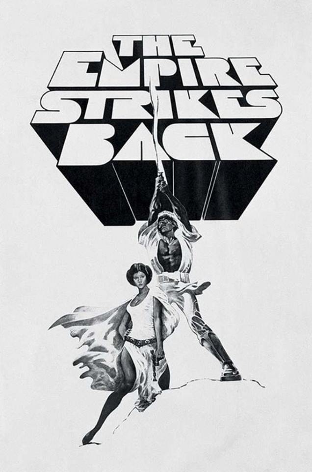 Actually, for all I know, these could be fan art but all the images are sourced from the Star Wars Archives page on Facebook which lends some sort of credibility to them.
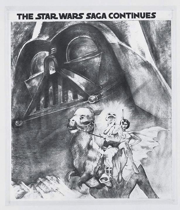
Below we get yet another logo with a Luke on Tauntaun image.
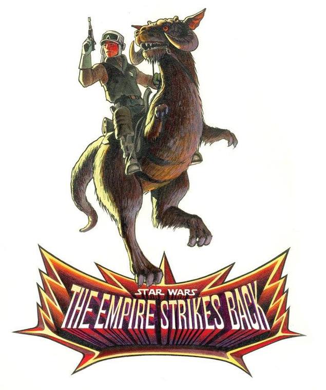 Lastly, a preview poster for Empire with a big “BEWARE!” warning across it, this certainly looks real.
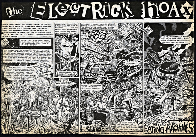
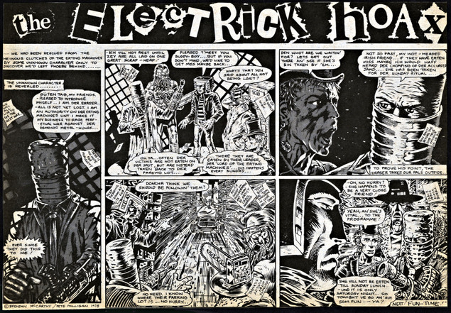
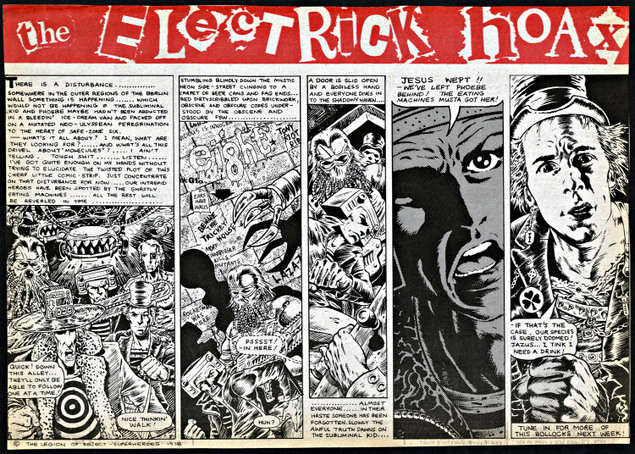
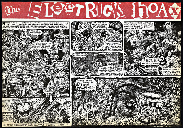
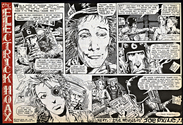
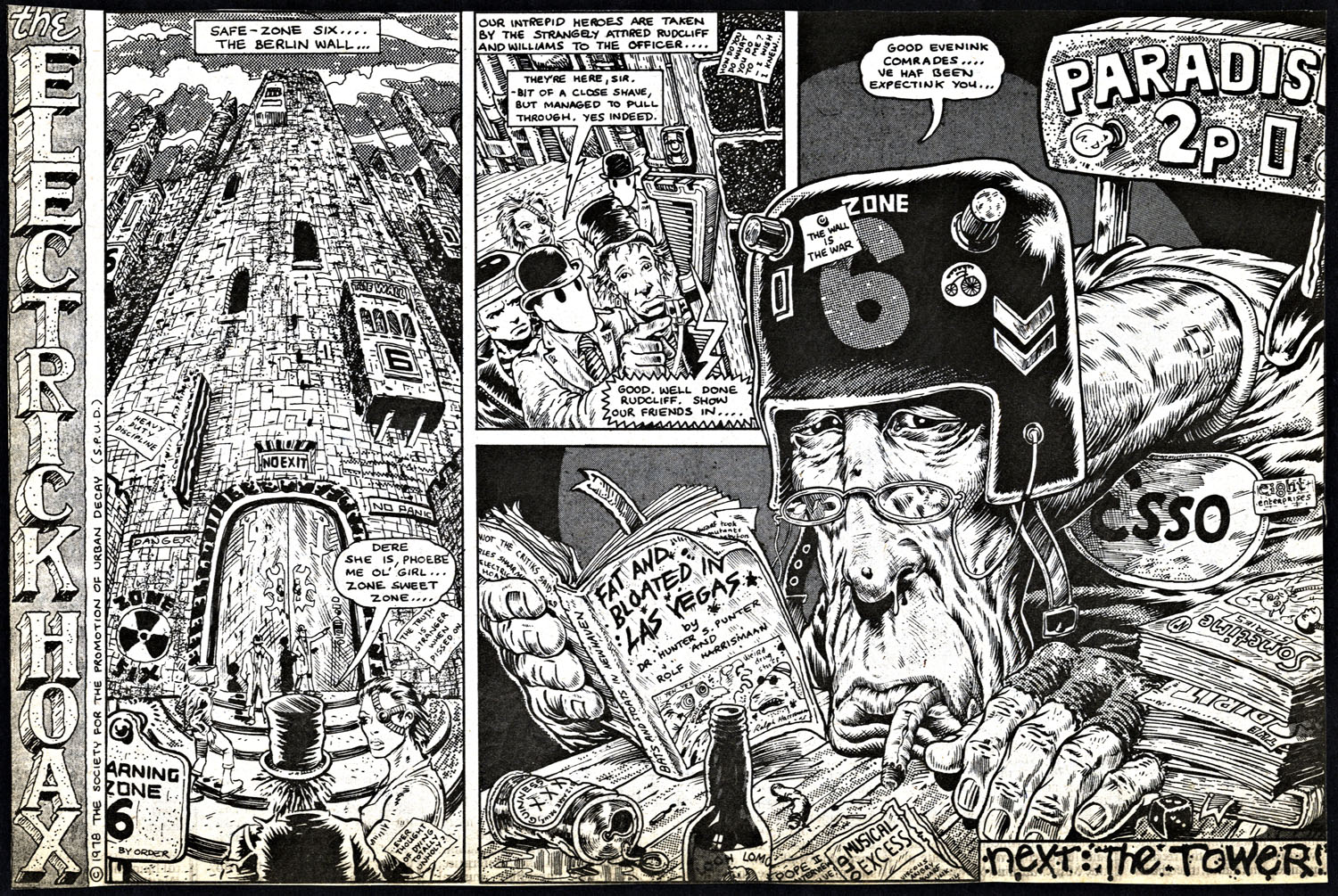
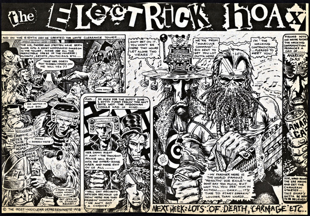 The Electric Hoax Pt.12 by Pete Milligan and Brendan McCarthy. This strip appeared in the weekly UK music paper, Sounds, in 24 parts sometime between mid ’78 and ’79. Click image for larger version.
Dark Horse Presents is currently running Brendan’s new creation, ‘The Deleted’ which is up to chapter 3. The latest Judge Dredd Megazine issue 346 has a huge interview with Pete Milligan about his writing career.
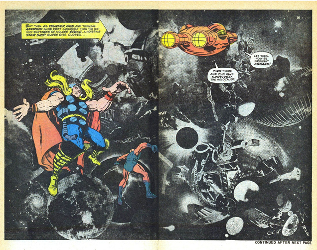
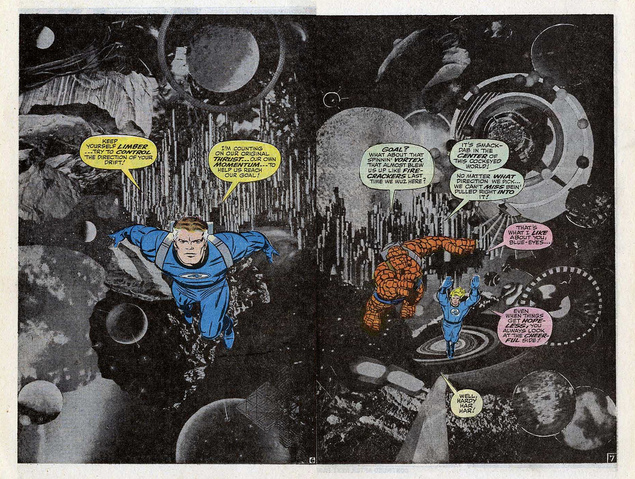
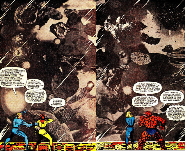
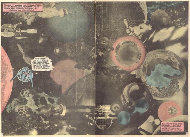
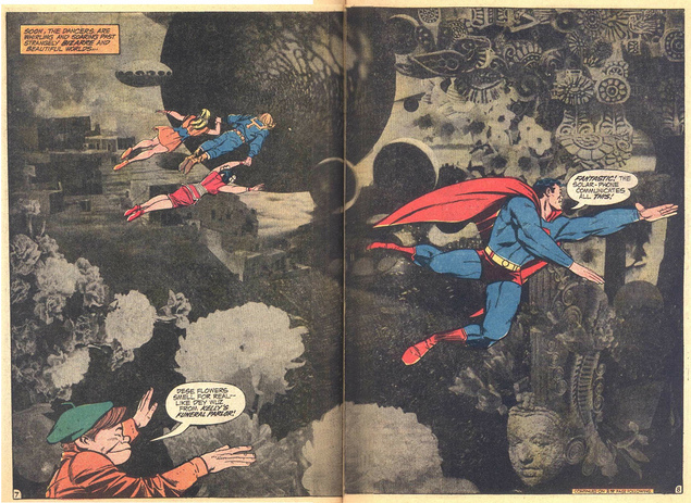
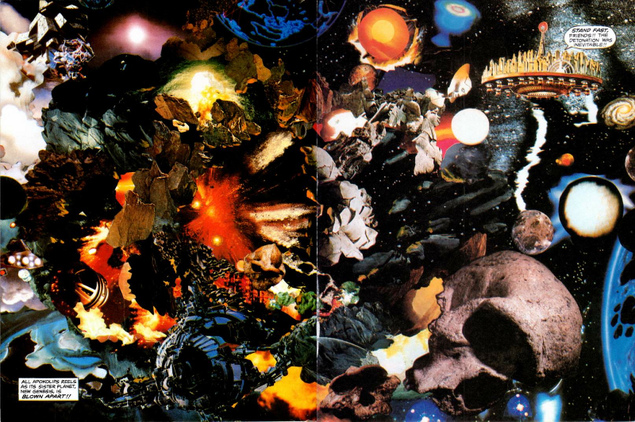
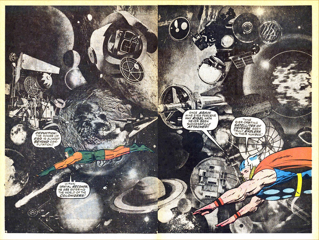 Exactly what is says in the header – staggering work of course and including some of Kirby’s collage work too – view them all here.
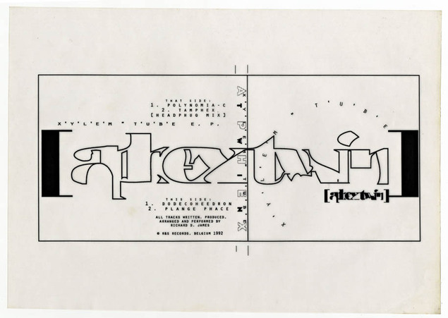
 Arts London Music Magazine asked me to name 10 influential tracks to kick off their Rewind series. These are specifically songs that took me through my three year BA degree course at Camberwell College of Art in London during the years 1990-93. I wrote a little piece about each including design inspirations as well as a couple of old pieces of college work that I did in response to music-related briefs whilst on the course, unseen for 21 years pieces. To cap it all off I gave them a mix I made for a college reunion in 2012 that features many of the songs plus plenty more and runs for nearly 2 hours. Full track list and info in the link above.
ALM Mix 01: DJ FOOD – Citrus ’12 by Arts_London_Music_Magazine on Mixcloud
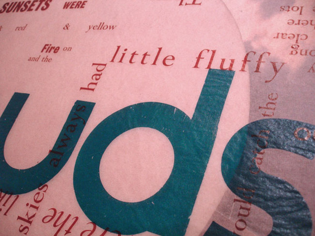
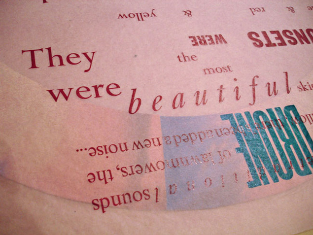
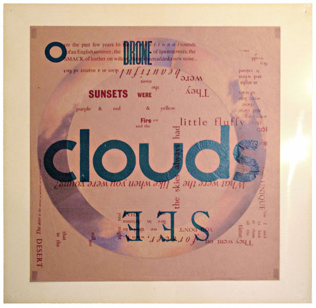
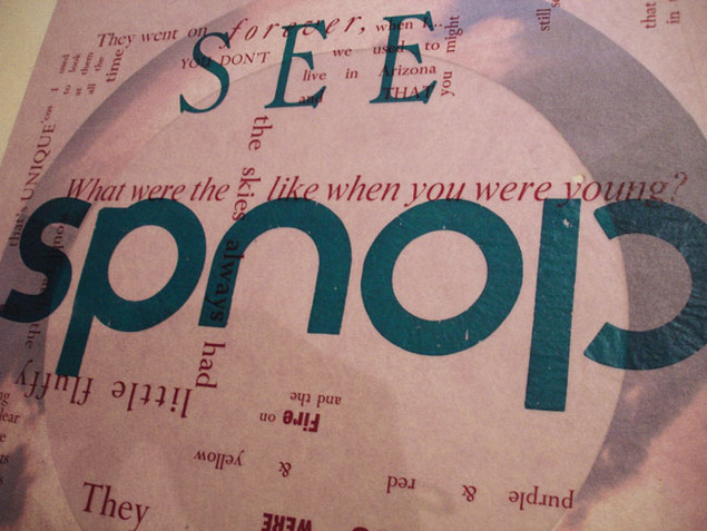
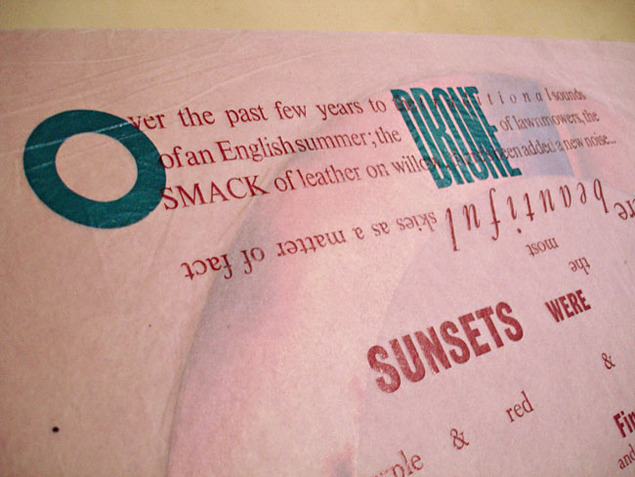
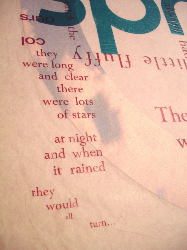
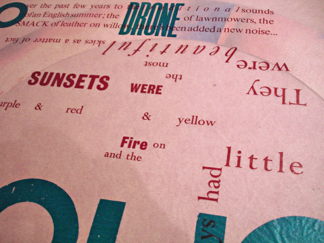
Below are some more detailed shots of the ‘Little Fluffy Clouds’ piece I made. It takes the Ricki Lee Jones interview that’s heavily sampled on the track and twists it typographically using hot metal and wood block printing on tissue paper (in itself a very difficult thing to achieve without ripping the paper). That was then mounted on clear acetate and meant to be hung away from the wall so that light could pass through it to reflect the cloud-like nature of the piece (student thinking huh?).
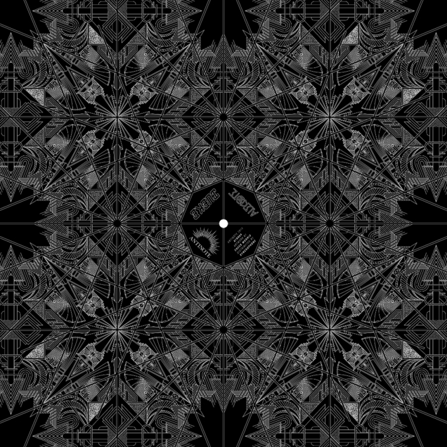
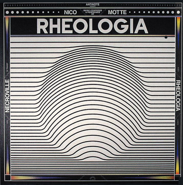
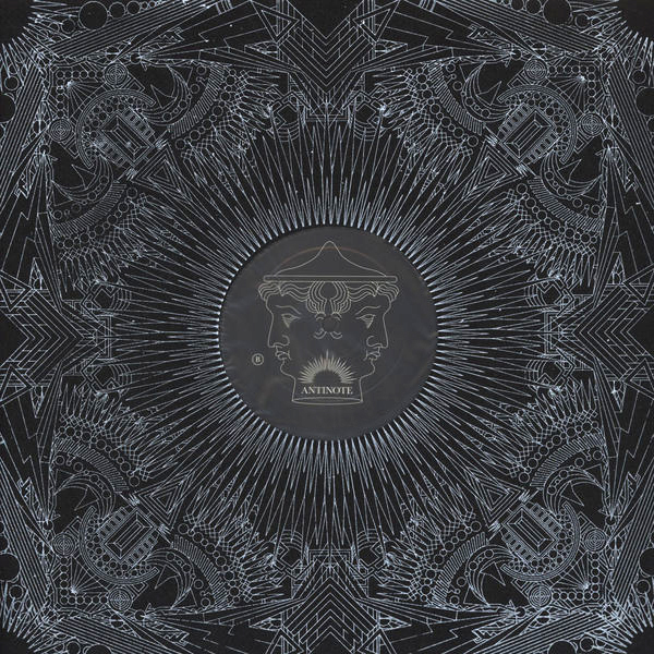
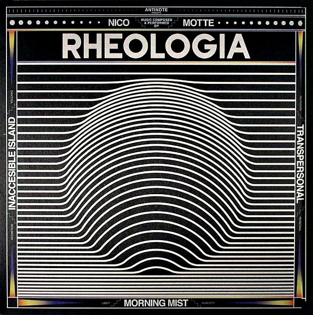 Great sleeves and great music from the Antinote label out of Paris, France. Run by Gwen Jamois – ex of The Sycophants and now excavating old techno tapes he recorded in the 90’s as Iueke. The label is only just 2 years old and their latest release is a total beauty by Nico Motte, a synth-led future music soundtrack with a gorgeous sleeve.
