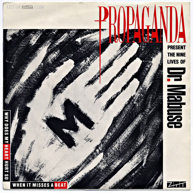
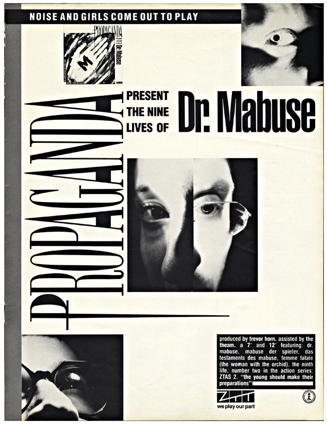
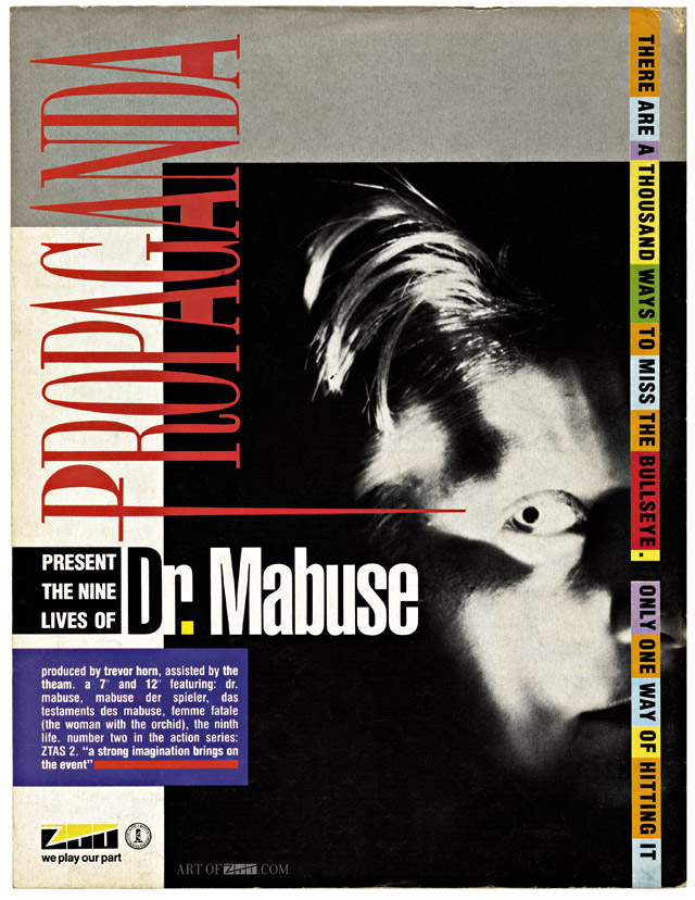
 I found some time to add some more to my Art of ZTT blog, we’re on to Propaganda‘s ‘Dr Mabuse’ now with interviews with John Stoddart, Paul Morley, David Smart, Lo Cole and Garry Mouat to come this year… I’ve had to start watermarking some of the content as it’s been shared around on certain social networking sites without credit.
Art
2001: Space Odyssey (1968, r.: Stanley Kubrick) – Grafika: Gyárfás Gábor, 1979
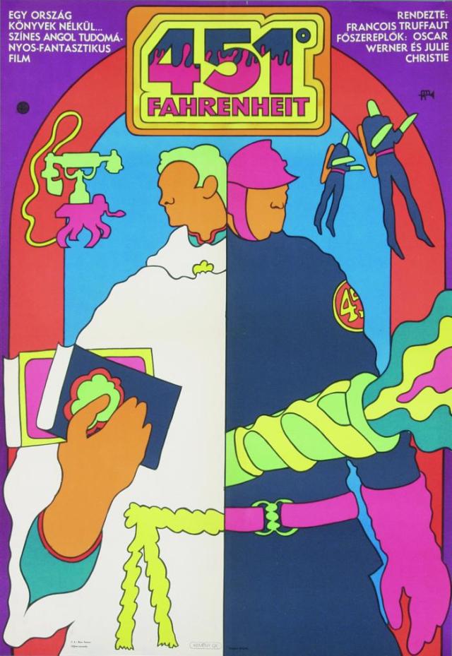
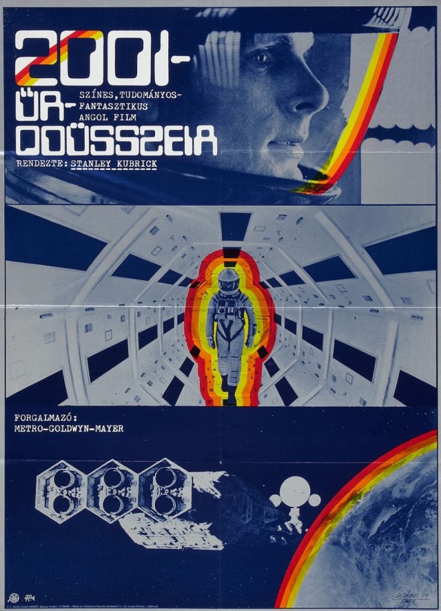 Amazing film posters from Hungary via this website – plenty more there too, including the Star Wars ones I featured a while back.
Fahrenheit 451 (1969, r.: François Truffaut) – Grafika: Kemény György
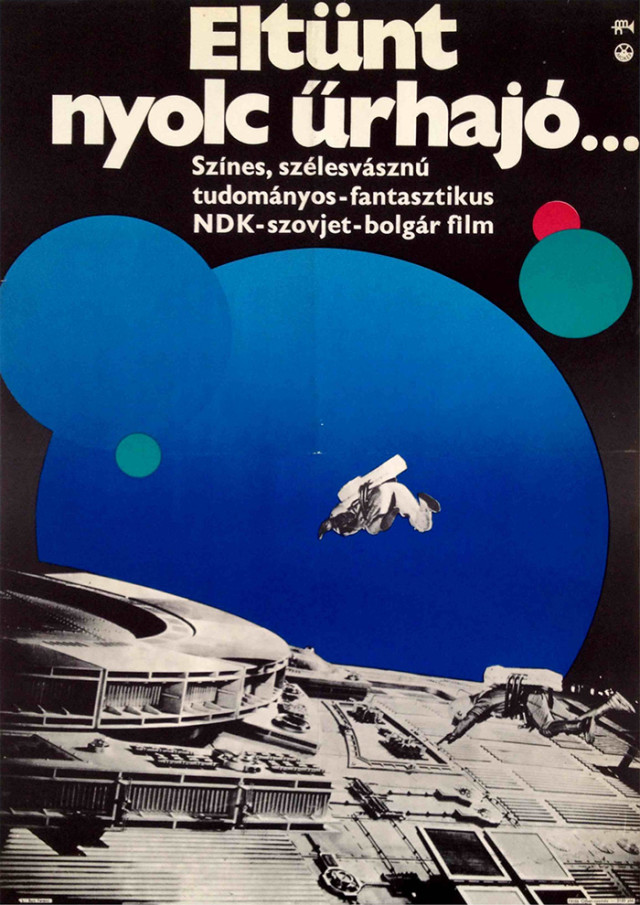
Eolomea (1972, r.: Zschoche Hermann) – Grafika: ismeretlen
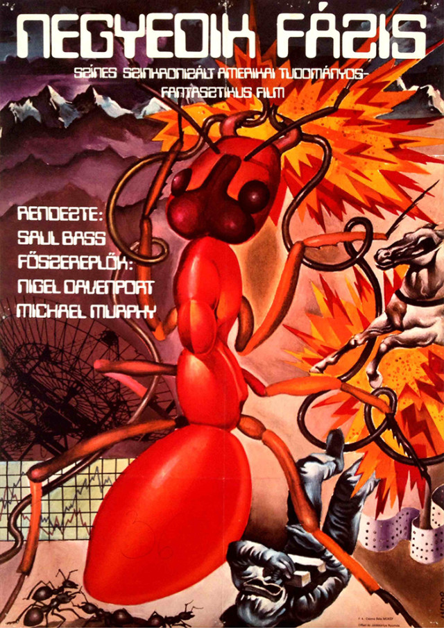
Phase IV (1974, r.: Saul Bass) – Grafika: András Andor, 1980
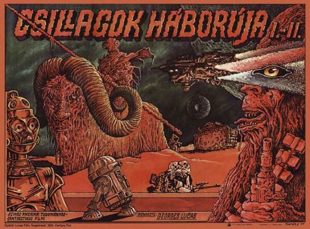
A New Hope (1977, r.: George Lucas) – Grafika: Felvidéki András, 1979
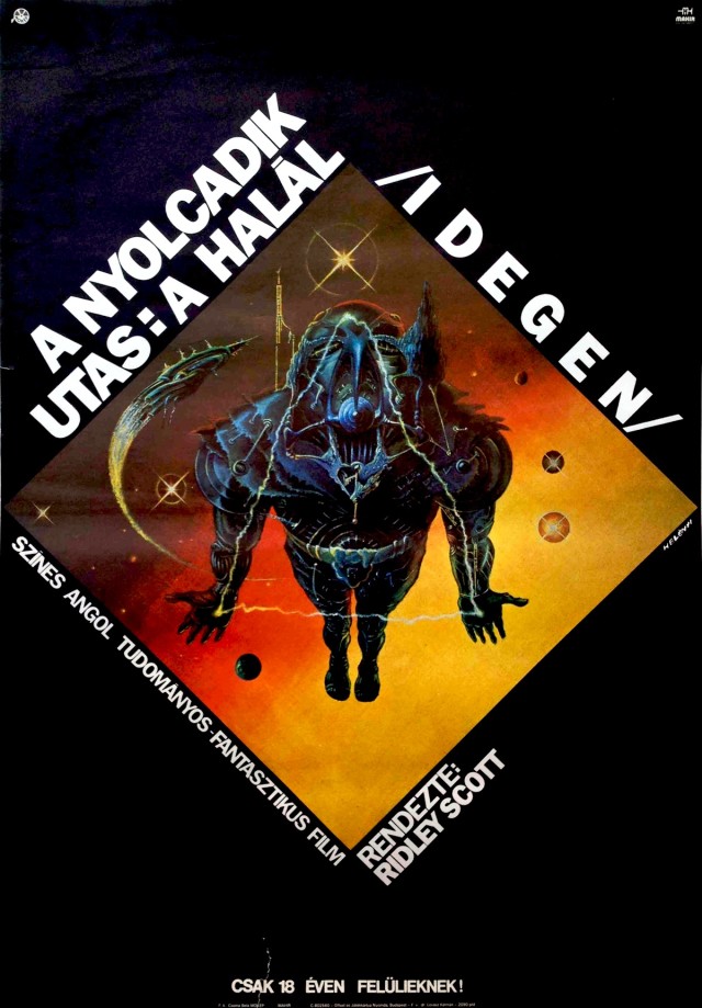
Alien (1979, r.: Ridley Scott) – Grafika: Helényi Tibor, 1981 és egy ismeretlen művész
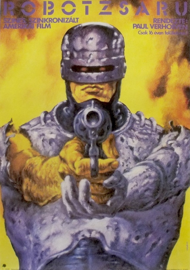
RoboCop (1987, r.: Paul Verhoeven) – Grafika: Helényi Tibor, 1987
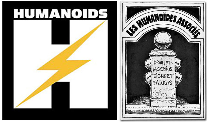 Humanoids (Les Humanoïdes Associés – roughly translated as ‘United Humanoids’), the French publishing imprint set up by Jean ‘Moebius’ Giraud, Phillip Druilett and others in 1974 has recently opened a UK office.
Instantly recognisable on shelves by their large HUMANOIDS logo on each book spine, they produce beautiful hardback editions of French and European comics include oversize versions of Moebius and Jodorowsky‘s ‘The Incal’. This year is their 40th anniversary and it looks like they have big plans for the international market.
Last week they had the chance to buy the original art for their first logo, drawn by Moebius and long thought lost, from an auction in Manhattan (above right).
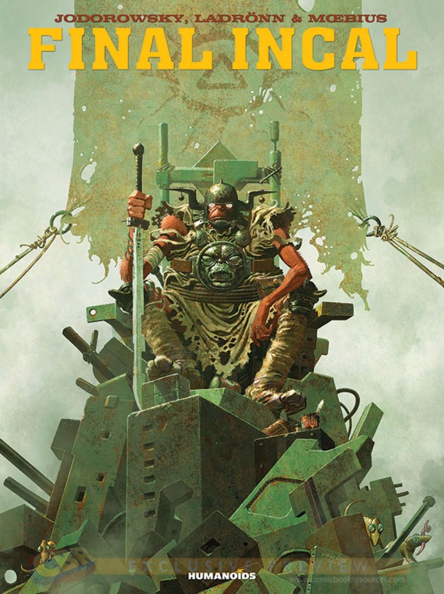
Now that they have a UK office (as well as relocating their French HQ to LA and opening one in Japan) I hope we will see lots of new issues of classic material associated with their founders. Moebius’ ’40 Days In The Desert’ and ‘Quatre-vingt huit’ would be top of my list and I think the English translation of the ‘Final Incal’ book is due any time soon (cover below not final and taken from Robot 6).
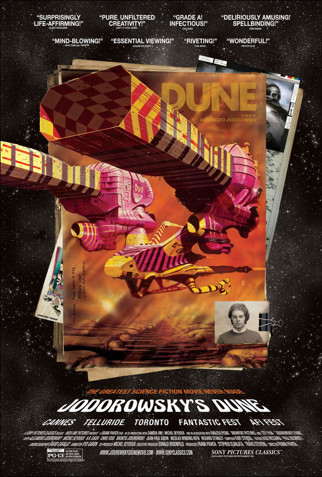
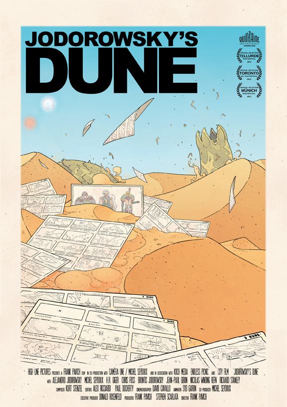
Still no idea when this is getting a proper release but I guess at some point this year we’ll see it in regular cinemas or on DVD. There’s a Facebook page for it now and a couple of posters with Chris Foss and Moebius artwork, possibly a book of some sort too maybe?
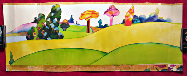 Wish I could afford this, currently on sale on eBay – going at $1,525.00 with 1 day left. Nice story behind it from the seller too:
“My mother used to work for King Features in New York, and as a young child I would often accompany her to work. Many times to keep me entertained I would be seated in a screening room and shown Yellow Submarine, as I was a huge Beatles fan. One day, I found a large selection of Yellow Sub production material on the floor by the freight elevator in the process of being thrown out. Needless to say, I grabbed a lot of it (wish I’d grabbed it all!). I had a rather large collection of cels, backgrounds and production drawings. Eventually, I decided to part with them, and over the years I’ve sold them all, both on eBay and at auction through the It’s Only Rock and Roll auction house in NYC. Recently, however, I found that I still had this piece left.
Although it is about 45 years old and certainly shows its age, it is unique and lovely. Please feel free to ask any questions. If you bid, please remember that this is a one of a kind piece that has not been stored in a fancy vault somewhere…I was about 12 when I acquired the Yellow Sub pieces, and a plastic bag was my idea of storage. It is in far from perfect condition, but is also historical, unique, and from one of the most wonderful and classic animated films ever made.”
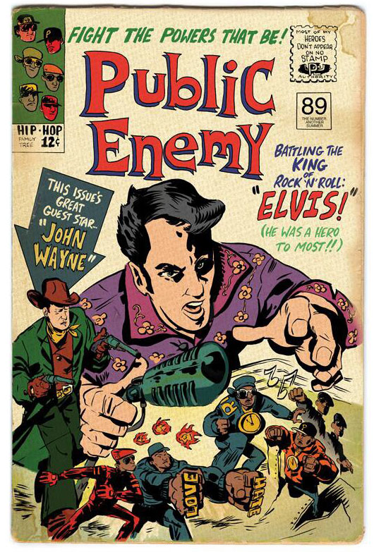
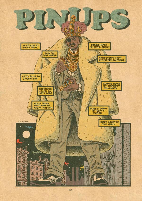
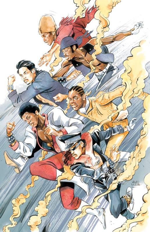 The second volume of Ed Piskor‘s ‘Hip Hop Family Tree‘ – a history of rap music in comic book form – is out this summer. It features another round of guest artist pin ups and a few of these have leaked on the web in the past week or so. There will also be a free issue, drawing from both volumes and sporting a new cover, out for Free Comic Book Day this May.
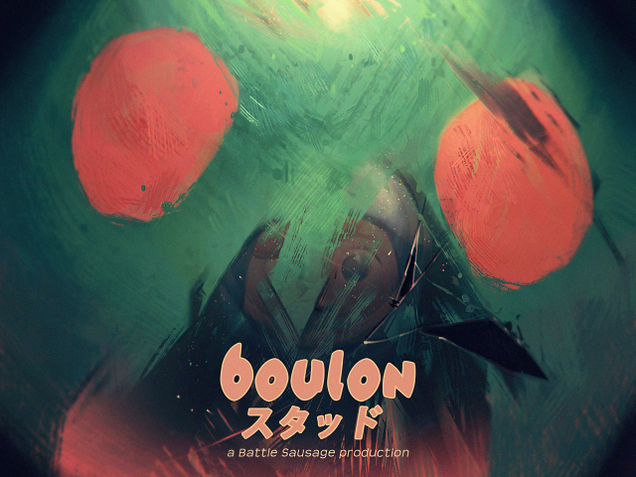 Fantastic work here by Alexandre ‘Zedig’ diboine – tons more over on his tumblr too.
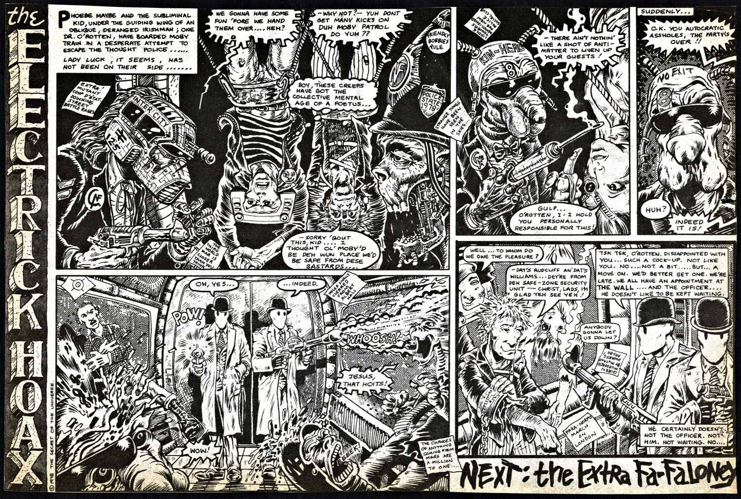
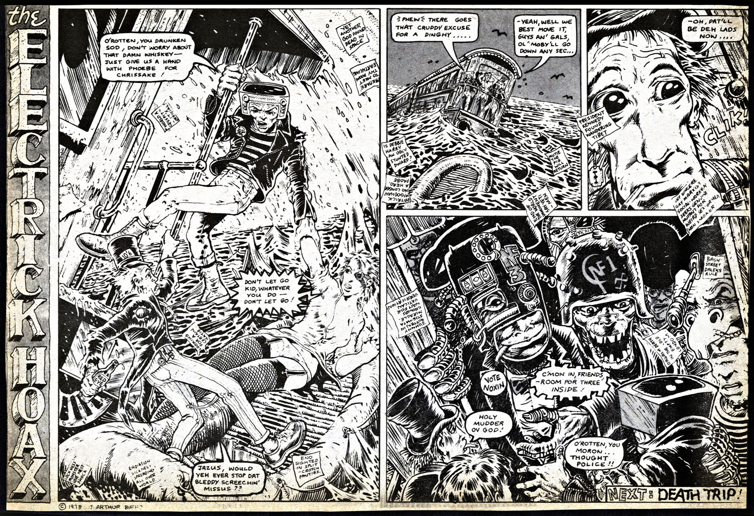
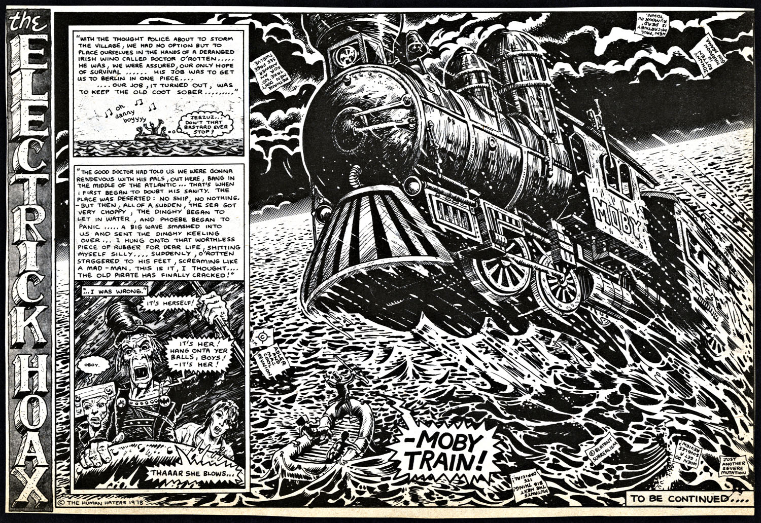
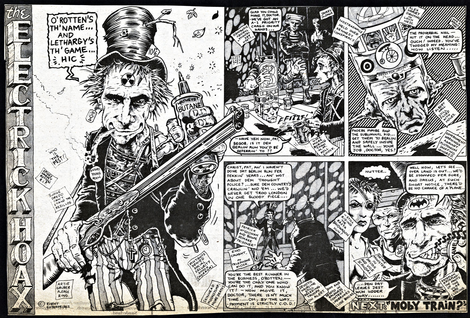
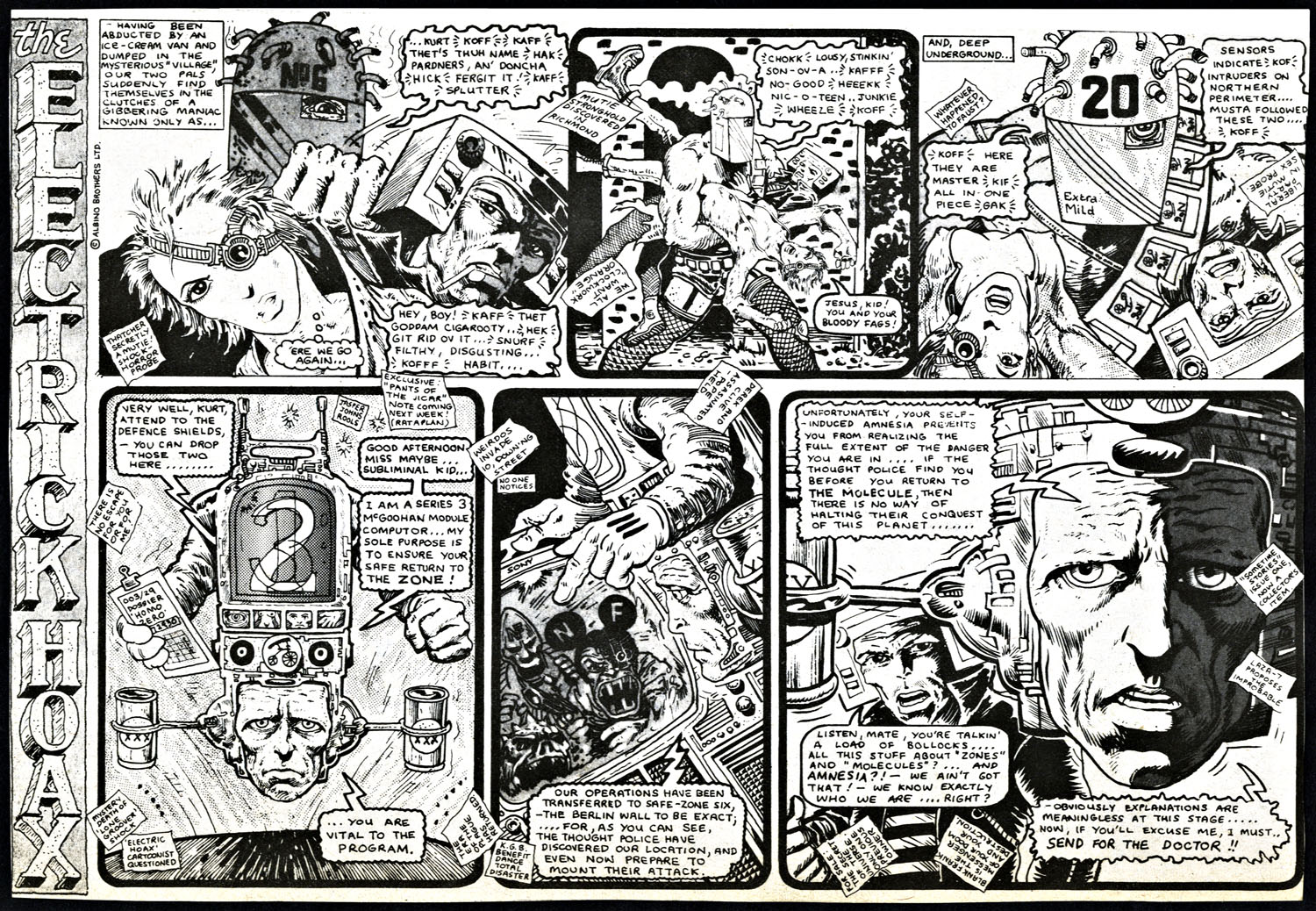
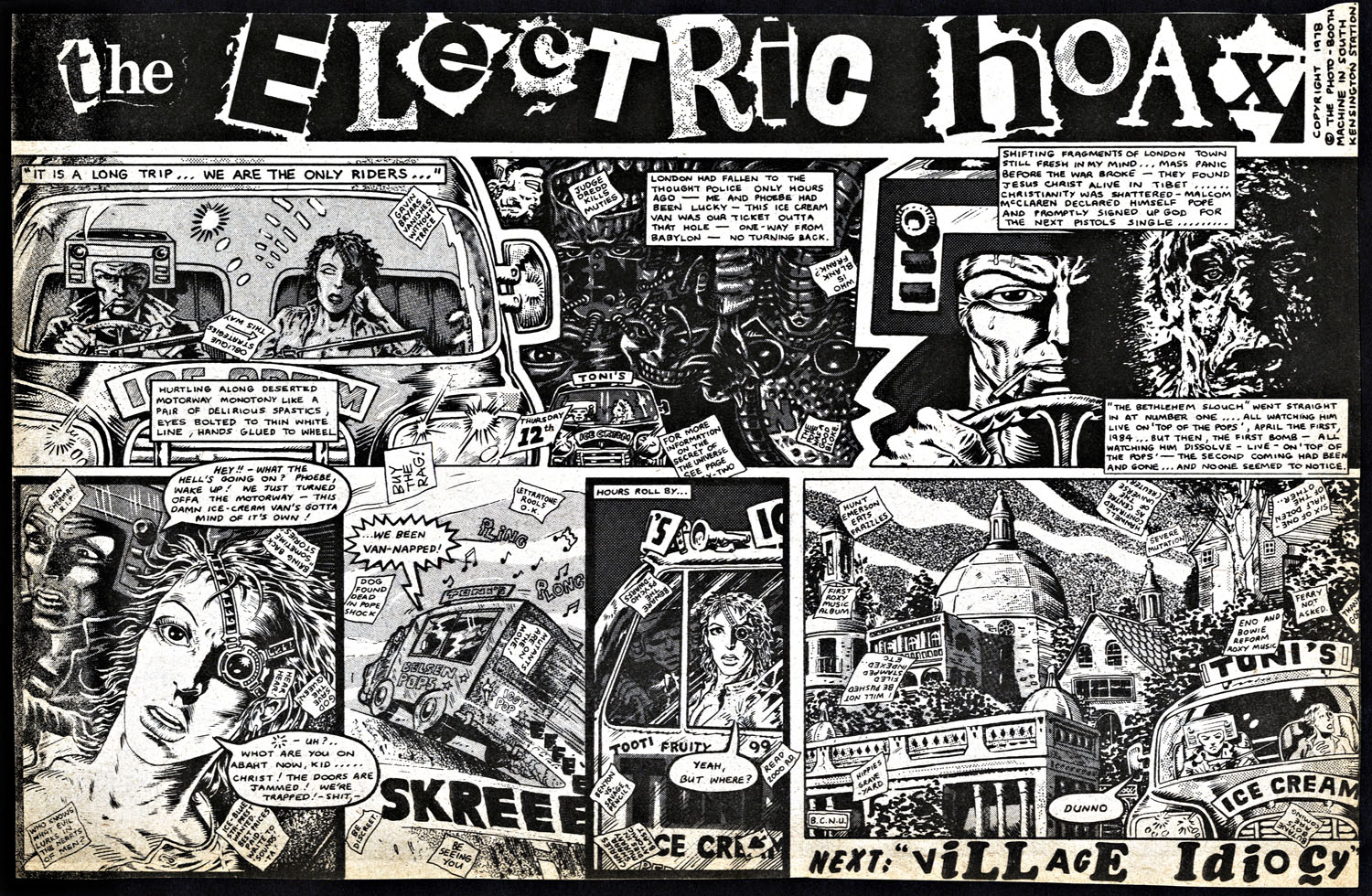
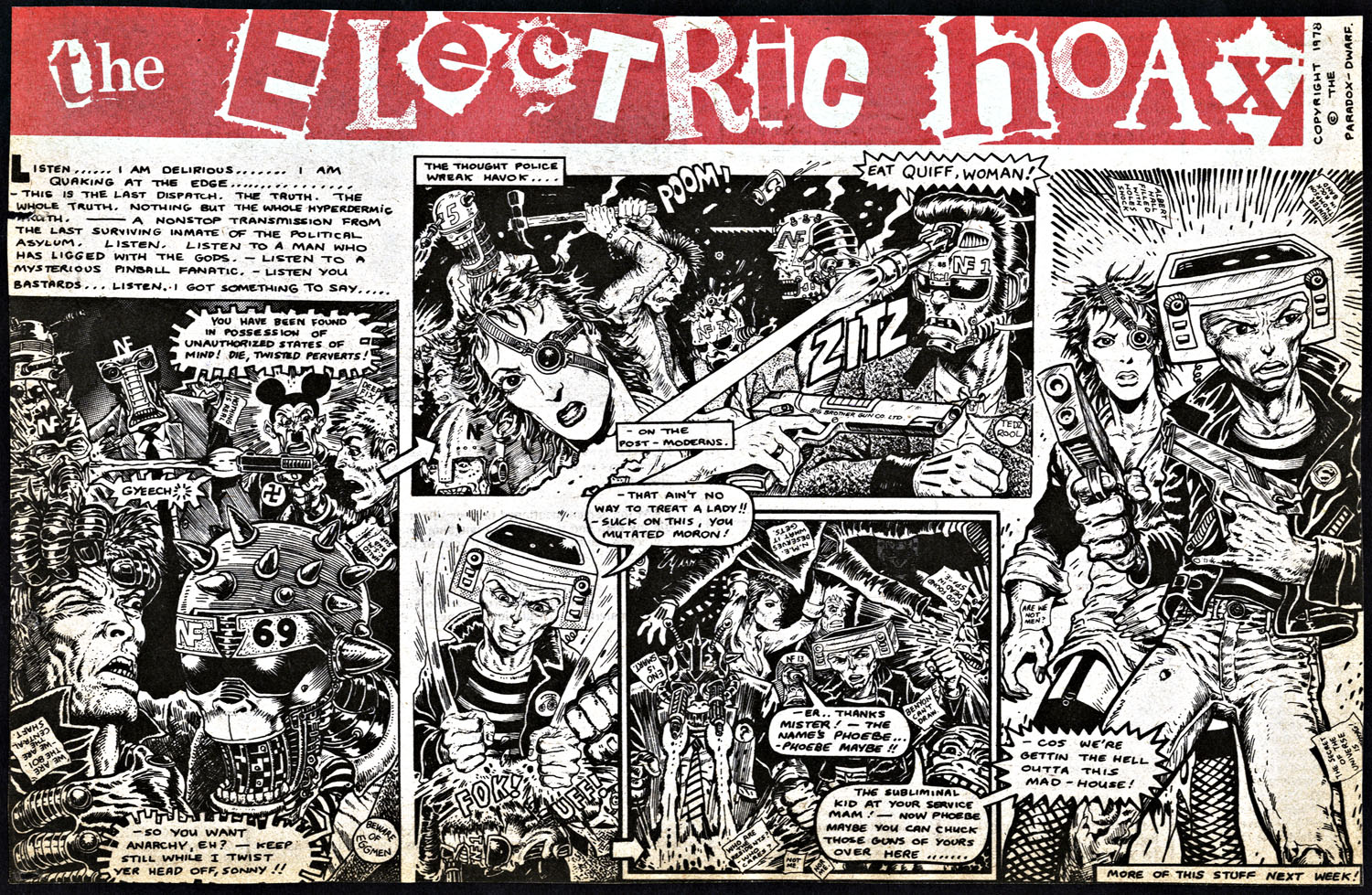
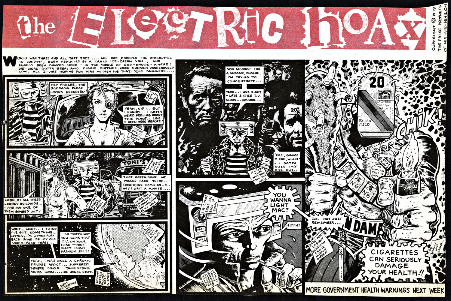 The Electric Hoax Pt.4 by Pete Milligan and Brendan McCarthy. This strip appeared in the weekly UK music paper, Sounds, in 24 parts sometime between mid ’78 and ’79. Click image for larger version.
Also – just in stores – a new strip by McCarthy, ‘The Deleted’, just debuted in Dark Horse Presents no.32.
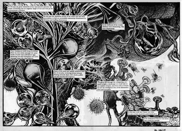
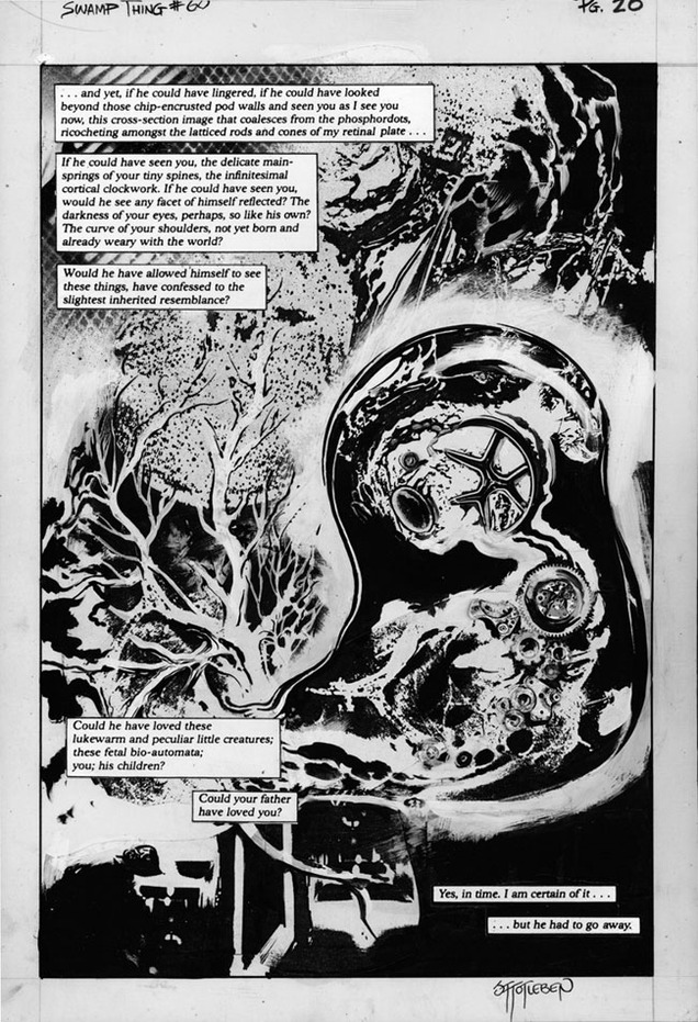
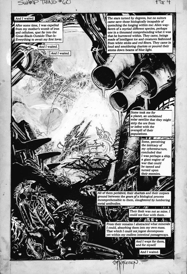
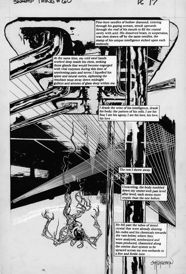
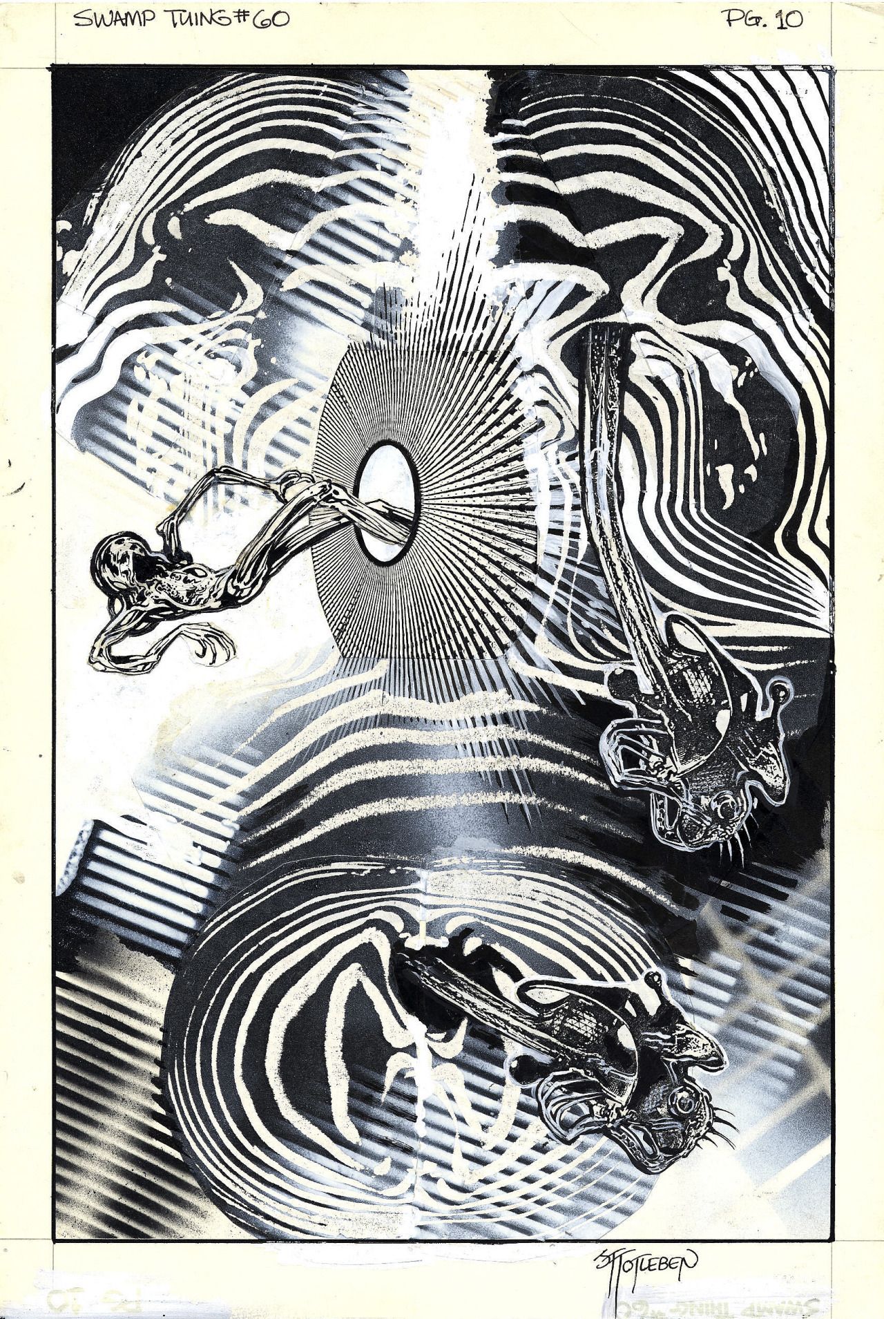
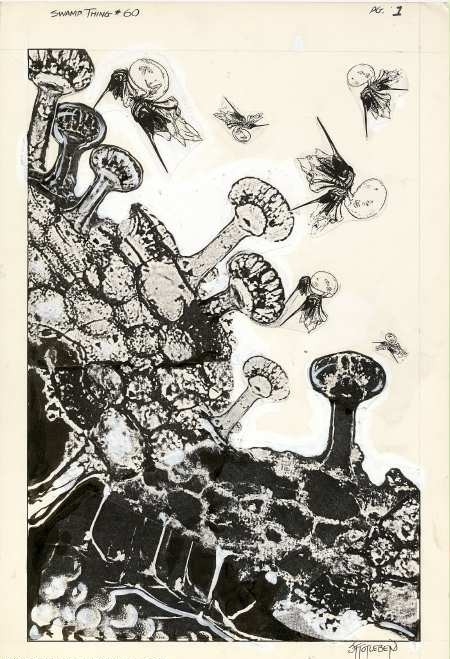
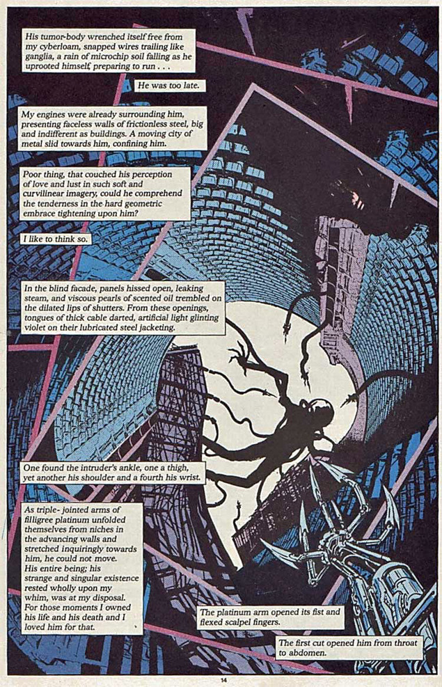
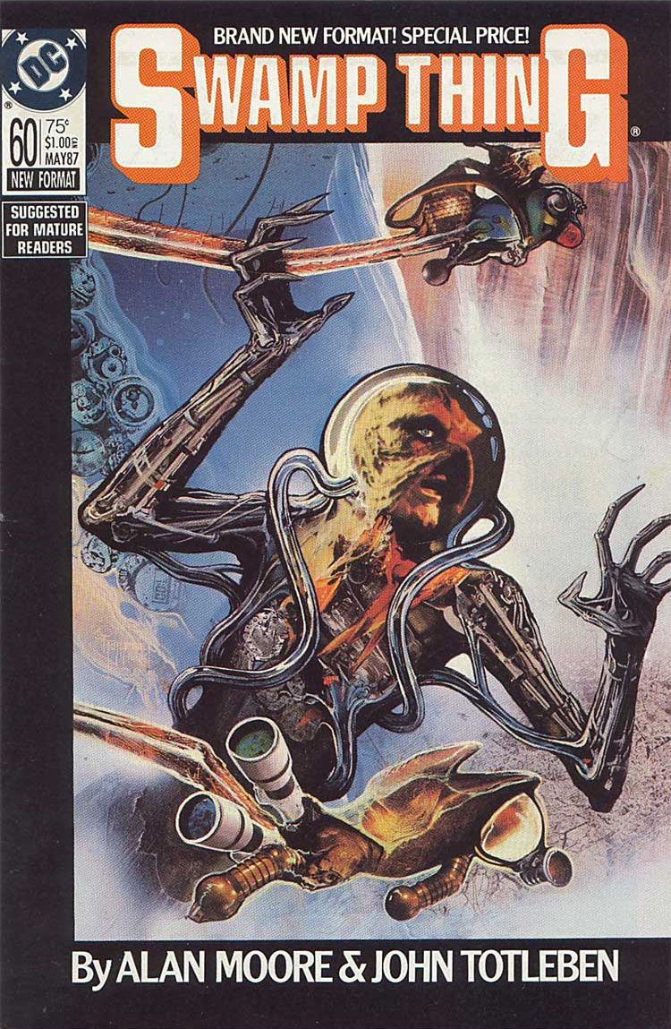 One of the recent trends in comics has been the over-sized deluxe ‘original art’ edition of a book or artist’s work. These are reproductions of the original pages, sans colour, with all the pencil marks, printer mark up and notes, reproduced at the original size – usually ‘half up’ from the final printed size. Usually expensive (around the £100 mark) these beautiful tombs are fascinating artifacts and show how much detail is lost in the print process.
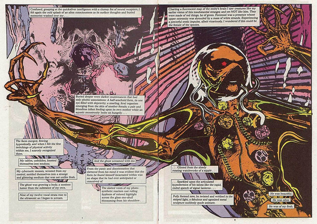
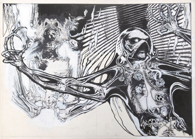
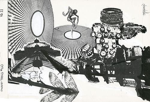
If there’s one issue that needs collecting in this way it’s Jon Totleben‘s work on issue 60 of Alan Moore‘s run on Swamp Thing from 1987. This self-contained story is a standalone in that it’s all collage rather than a straighter pen and ink style and features a sci-fi plot where Swampy is basically raped in space by an alien entity with the horn (I think).
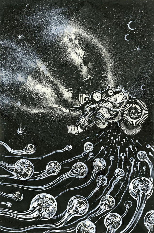
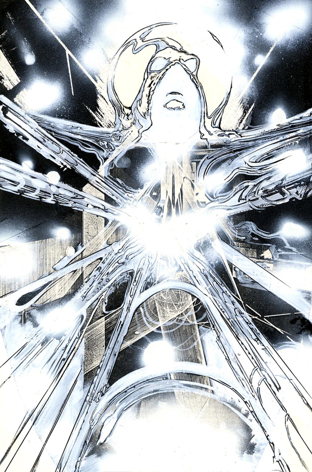
Anyway, the terrible reproduction and flat colours flattened all the subtleties out of the art as these scans of some of the original art from the Cool Lines Artwork website reveal (where you can actually still buy some of the art if you have deep pockets).
Some of it has objects like metal chains and watch innards attached to it but it’s doubtful if this could ever be collected as the art is now scattered to different owners after Steve from Cool Lines bought the majority of it it from the artist. Maybe DC has decent quality scans of it with all the separations somewhere and will see an opportunity milk some more of the Moore cash cow at some stage.
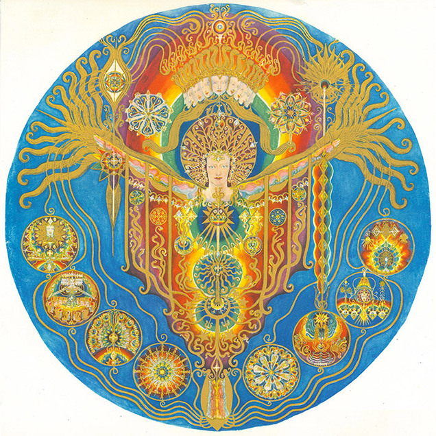 I don’t know anything about Ethel Le Rossignol but just saw this on Twitter, posted by Dan Hayhurst of Sculpture. From the Horse Hospital site:
“Between 1920 and 1933 spirit medium Ethel Le Rossignol created a series of 44 paintings, 21 of which belong to The College of Psychic Studies and will be on display with accompanying texts describing what she refers to as the Sphere of Spirit.
Radiant, psychedelic and ecstatic, her vision of the spirit world is consistent, coherent and stunningly beautiful, depicting a luminous realm of kaleidoscopic colour, inhabited by elegant sylphs, bejewelled apes and astral tigers.
Ethel’s channeled paintings reveal a world of pure light, colour and energy. Incorporating aspects of Art Deco, popular playbills, Eastern mysticism, mandalas and miniatures, they radiate an ecstatic joy, and are prescient of the psychedelic art that would emerge several decades later.
As a medium Ethel took no credit for the actual work, identifying a spirit known only as J.P.F. as the real artist. J.P.F himself claimed to be channeling another group of spirits, who wanted to impart the secrets of the soul to those of us still on the physical plane.
At present very little is known about Ethel Le Rossignol’s life, though we hope that this exhibition might prompt new discoveries. There are clues in her writing that she lost a friend, perhaps relatives, in World War One, and that this encouraged her interests in afterlife communications, which boomed in the inter-war years. Certainly she had a great interest in mediumistic spiritualism, attending lectures and demonstrations on the subject in London.
Ethel died in 1970 and her paintings, and copies of her privately printed book, A Goodly Company, were donated to the College of Psychic Studies in South Kensington. The paintings have been on display in rooms at the College for many years but, as far as we know, this is both the first time that they have ever been exhibited outside the College, and the first time that they have all been seen together in one space.
Encountering the whole Goodly Company assembled in one gallery promises to be a powerful exposure to the astral light and the love that she and her spirit friends so wanted to convey.”
The Horse Hospital, Colonnade, Bloomsbury, London WC1N 1JD
PRIVATE VIEW: Friday 21st February 2014 7pm. EXHIBITION: Sat 22nd Feb – Sat 22nd Mar, Mon – Sat, 12 – 6pm
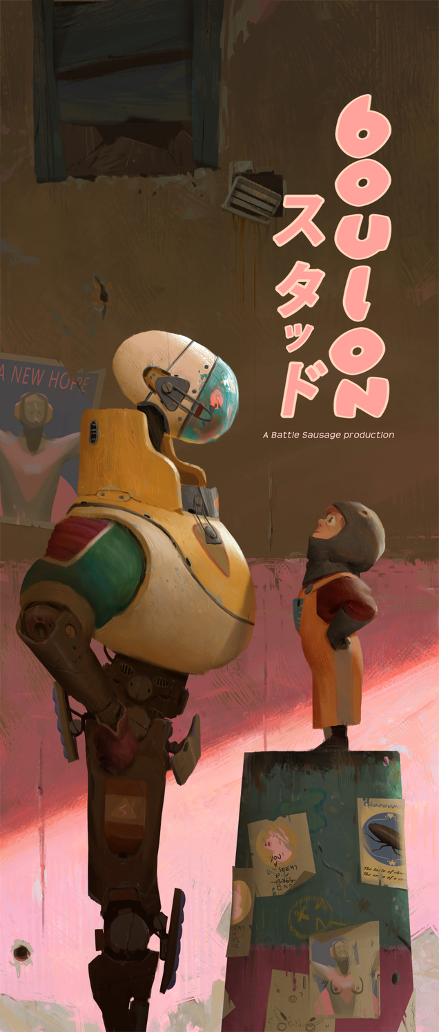
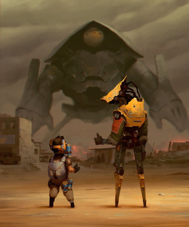
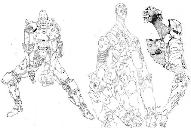
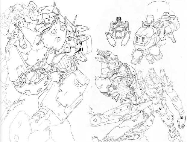
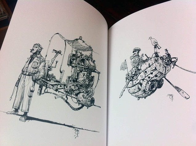
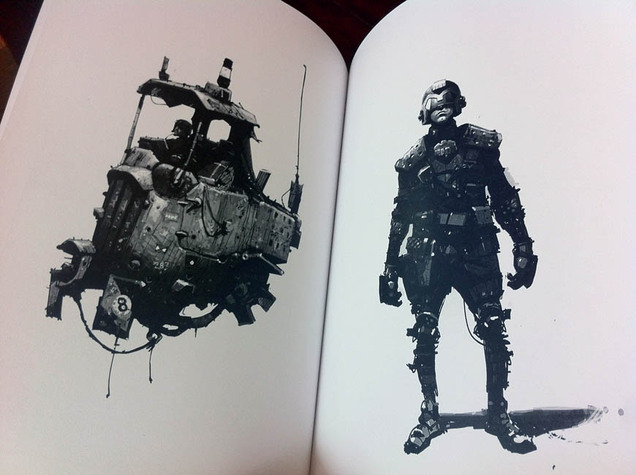
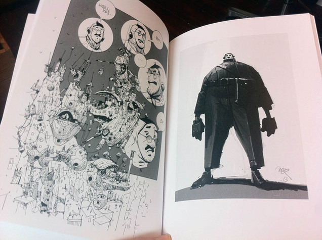
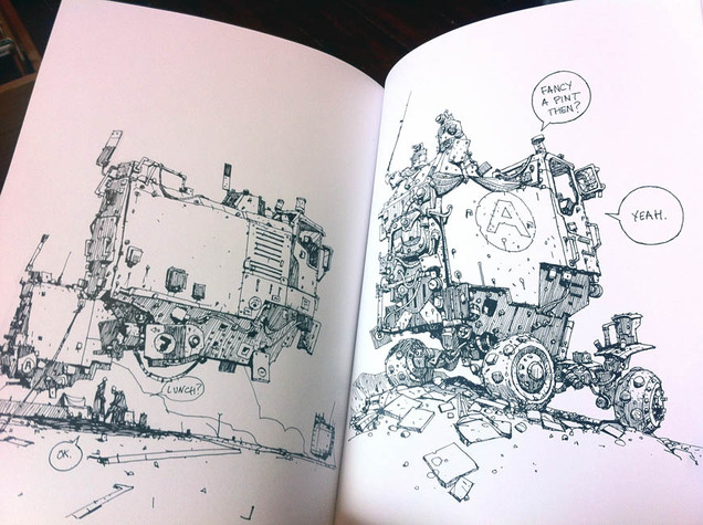
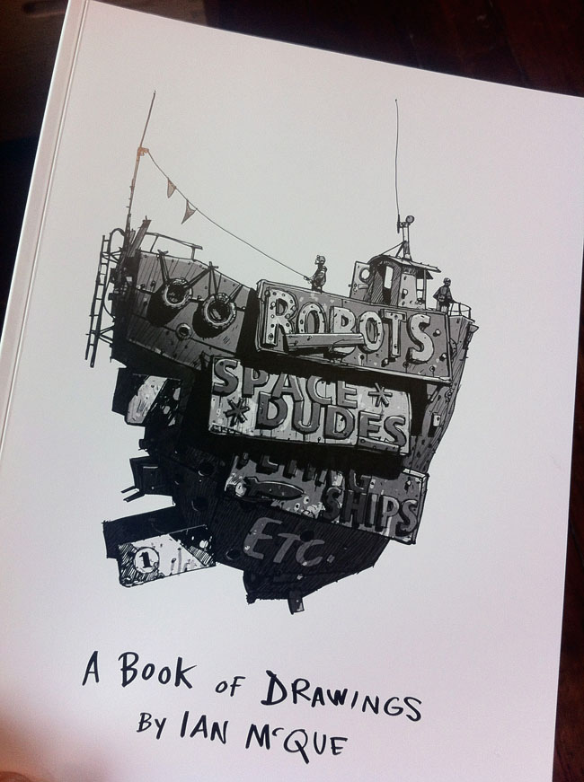 I’ve featured Ian McQue‘s work before on here, his glorious colour work mostly, and now he’s produced an A4-sized book of B&W sketchbook drawings subtitled ‘Robot, Space Dudes, Flying Ships etc’.
His work is populated by flying barge-type ships, usually moored to buildings or futuristic dockyards, small insect-like craft and boxy rough-terrain vehicles. His human characters come in all shapes and sizes and his robots are of the thin, lanky variety or sometimes like spider mechs.
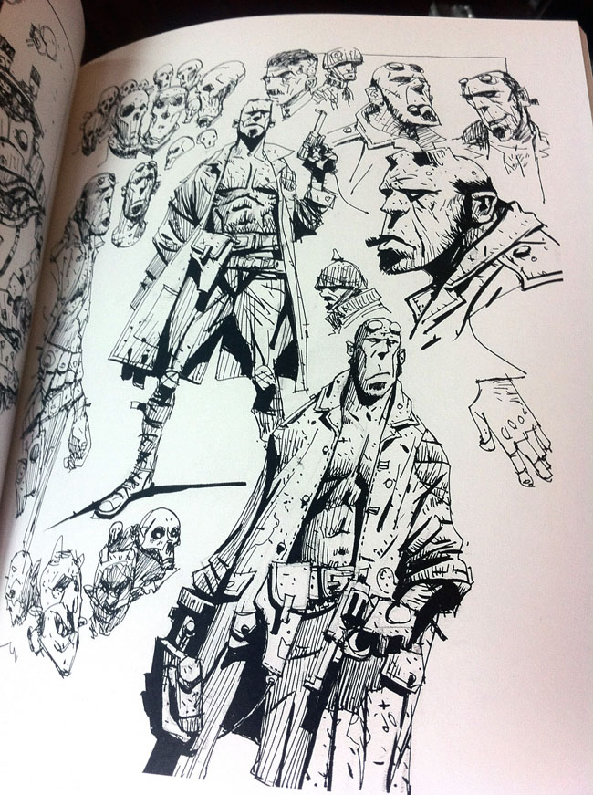
There are even a few deviations in the book to more fantasy countryside scenes, a page of Hellboy studies and a certain Judge costume that features here a fair bit.
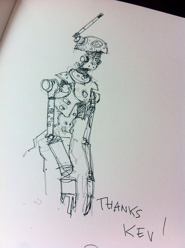
The book – and several colour prints – are available from his bigcartel shop and some come with a personal sketch in the front.
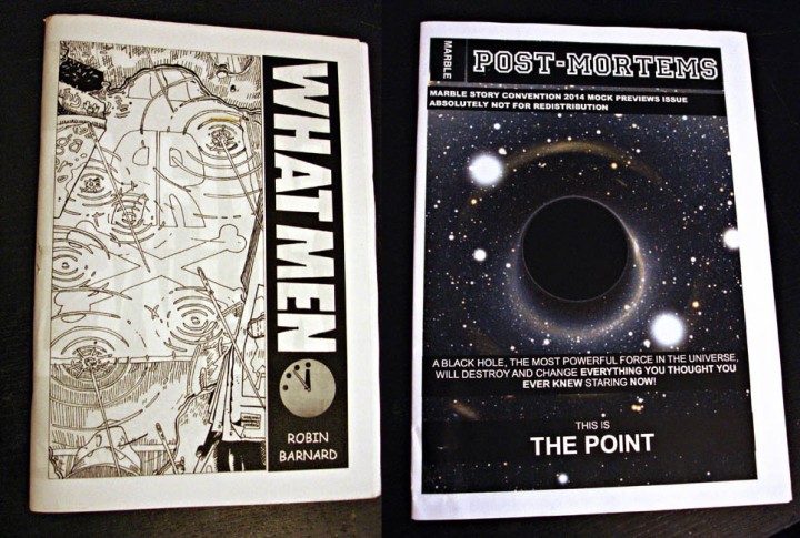 Robin Barnard makes comics, he draws them, writes them, then copies, folds and staples them before distributing them amongst various people he knows. At a quick glance they look like comics that you might have seen before but closer inspection reveals…
Let’s start again; Robin Barnard REmakes comics, he REdraws them, REwrites them, then copies, folds and staples them… You HAVE seen these before, but you’ve not read them like this before. His ‘What Men’ facsimile takes sections of Moore & Gibbons‘ classic ‘Watchmen’ and rewrites it into a critique of the spin-off ‘Before Watchmen’ franchise and the people responsible – Gibbons included.
Barnard redrew each panel in Gibbons’ style and you’d be hard-pressed to spot that it wasn’t just a scanned copy of the original with new lettering. The book is structured in the most incomprehensible way too, it took me a few goes before I cottoned on that you could read it in four different directions. Starting from the back, front or center pages, various pages read in or out of the book, all in landscape format, it’s a bit hard to describe in writing.
In his own words, “What Men is (just) Chapter V of Watchmen: Fearful Symmetry, which is both completely symmetrical and full of mirrored images. I purposely took all the mirrored images and put them all opposite each other and then also put in mirrored dialogue with references to the opposite page as well. What was in my mind was to take those previously seen mirrors rearrange them into an infinite mirror maze and use them to reflect on the Before Watchmen thing.”
There are levels of meaning here and he makes probably the nearest thing to a readable comics mash up that I think I’ve seen and you can find out more on his Images Degrading Forever site. There’s plenty more food for thought concerning ‘What Men’ in the post about reflections on the same site. These are comics ABOUT COMICS or at least indirectly about the comics industry, Barnard is using the medium to comment on the medium rather than write a blog about it.
Another one of his projects takes the Marvel comics Preview Catalogue and lampoons the never ending solicitations of forthcoming series’, character cross-overs and final, FINAL, F-I-N-A-L issues with self-referencing in-jokes that fold in on themselves as ‘The Point’ of it all is sought. It doesn’t all make immediate sense if you don’t have a keen interest or knowledge of certain areas of the comics world and its internal politics, which sometimes read like a superhero cross-over series in themselves.
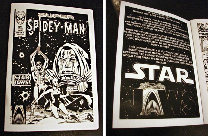
His newest is a comics mash-up proper: ‘Super Spidey Man’ or ‘Star Jaws’ (I’m not sure which) is a mixture of Spiderman, Star Wars, Sesame Street and Dr Doom among others (I won’t spoil where Jaws gets into the mix). This is part 1 of a 4 issue series which may or may not be available from Orbital Comics in London. I don’t know where he’s going with this one but it’ll be interesting to see how it unfolds as the mysterious packages arrive in the post. He does make some physical copies but these are very low runs (‘What Men’ was 10 copies I believe) – but all this material is available to view online at his site, Images Degrading Forever.
