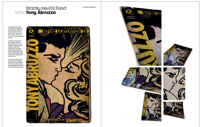
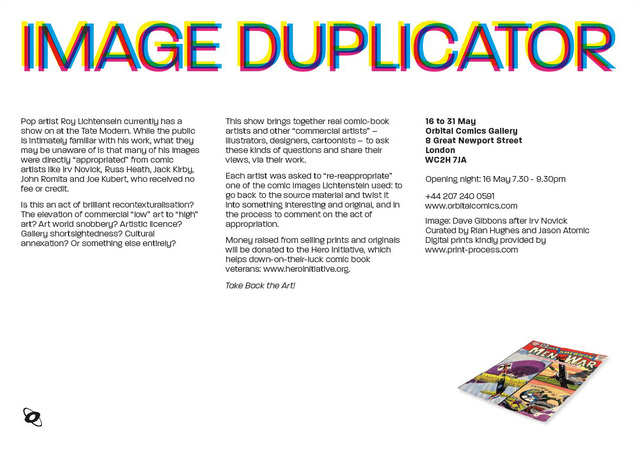
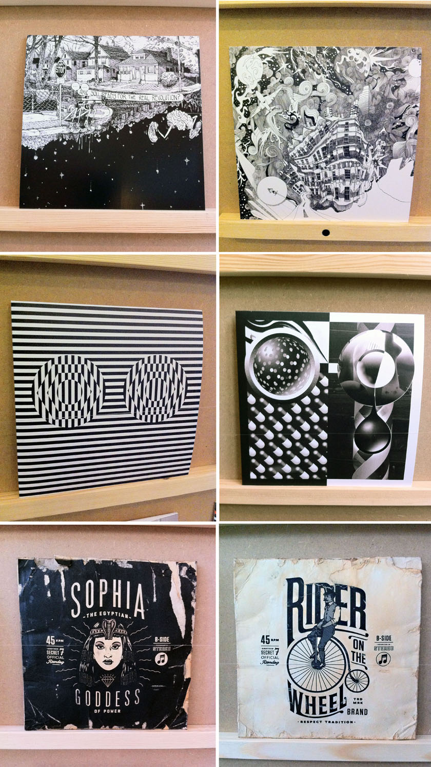
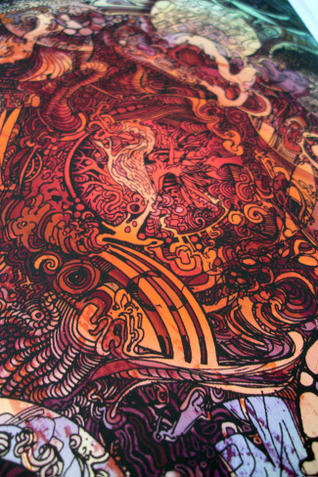
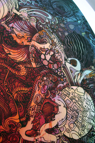
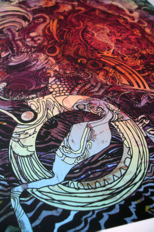
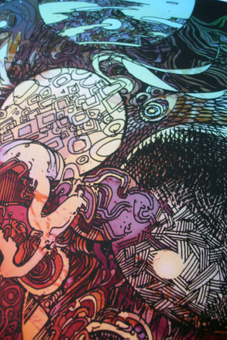
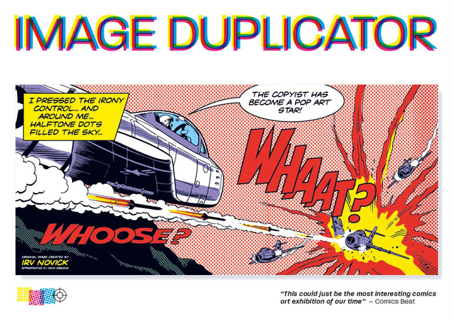
 The Image Duplicator show opens in 10 days at Orbital Comics in London. I have a piece in it which is also available as a print online up until the day the show opens. There will also be a catalogue available when it opens (my pages shown below). Currently there is a downloadable press release and selection of images on the Facebook page and it runs from May 16th-31st. See the blurb below for the concept if you’ve missed my previous posts on the subject. It’s been getting some great press in the comic world so far but if you want to write something about it elsewhere, please feel free or get in touch.
Art
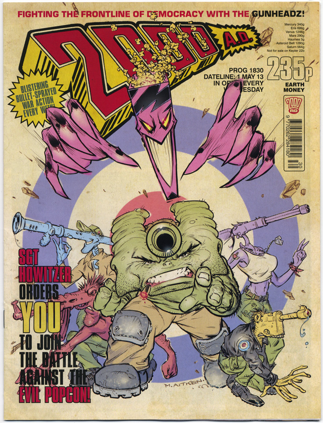 Opening the wrapper to my subscriber’s copy of next Wednesday’s 2000ad, I audibly gasped upon seeing the original (and my personal favourite) logo across the top. With retro fonts, aged paper and Ben-Day dot effects, the reinstated offworld credits and the 235p price tag (it was 8p when it launched in 1977), it bought a nostalgic smile to my face.
The reason for this jump back in time? A story inside exploring the niche genre of comics about comics, a fan finds a rare issue and tracks down the reclusive artist before making a shocking discovery. Also in this issue, Al Ewing and Henry Flint‘s Zombo has gone off the weirdness scale and they now inhabit the throne of bizarro, surrealist pop-culture quoting horror/humour that Brendan McCarthy vacated some years back.
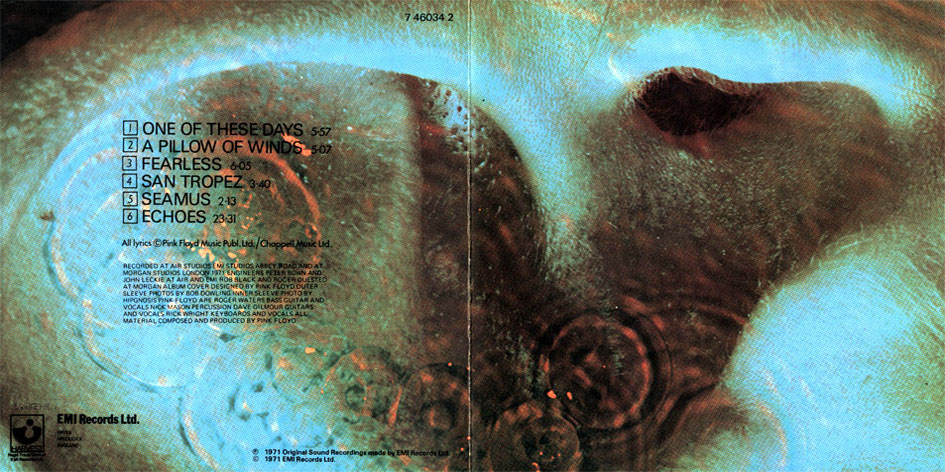
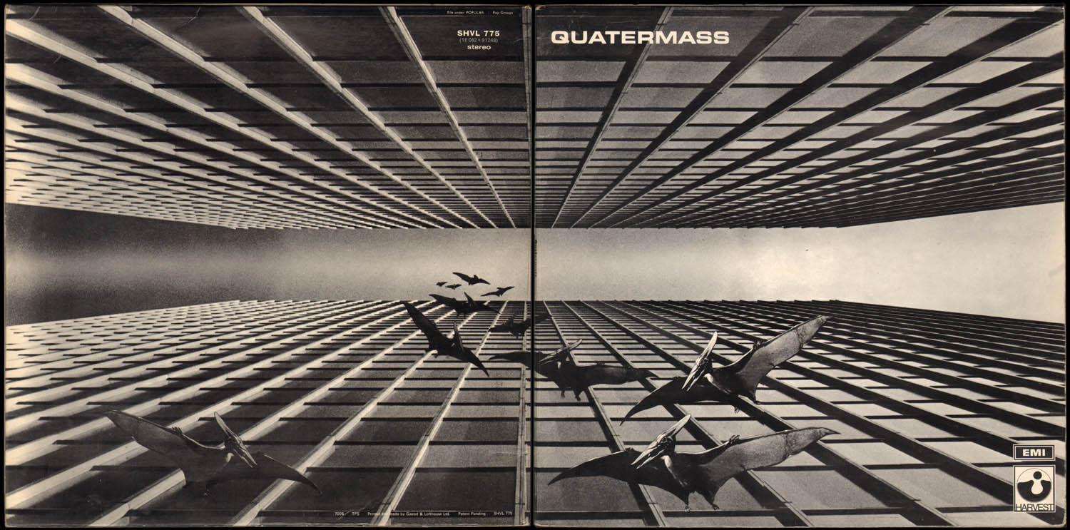
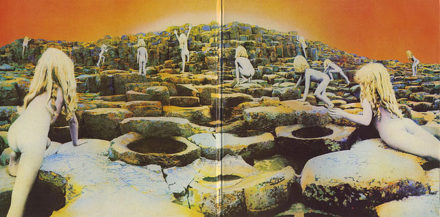
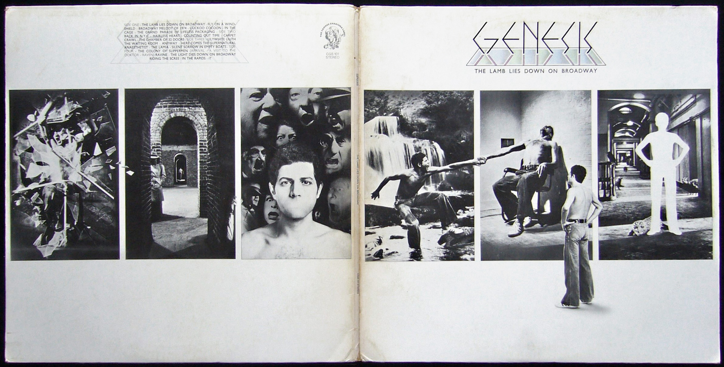
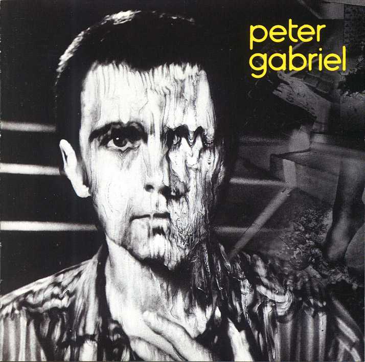
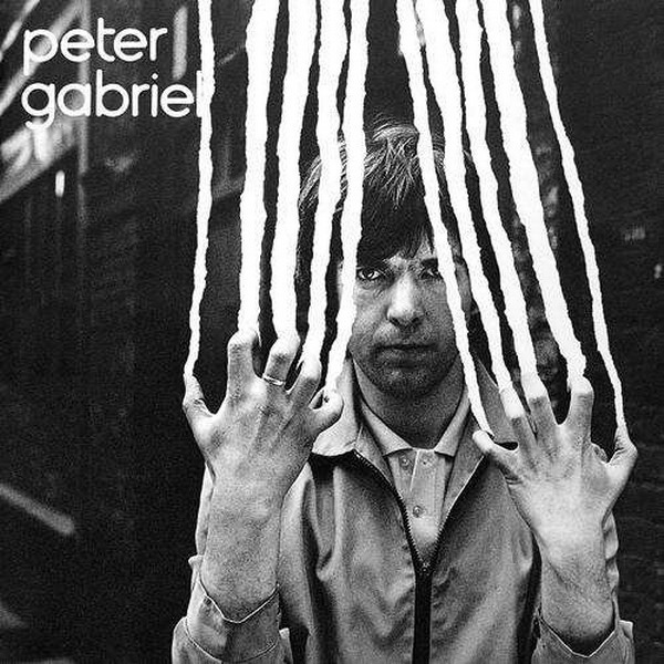
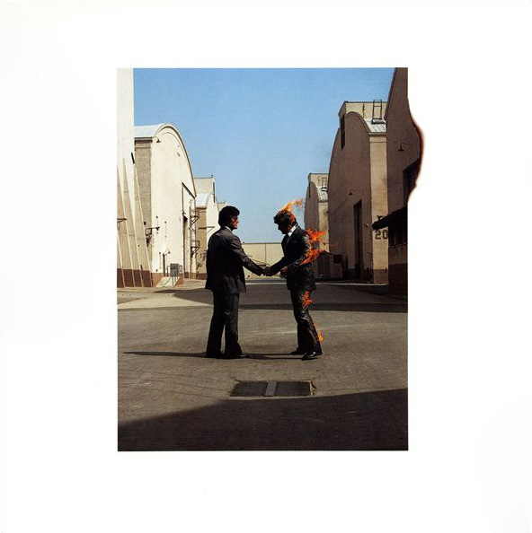
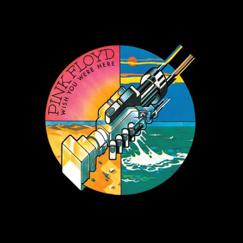
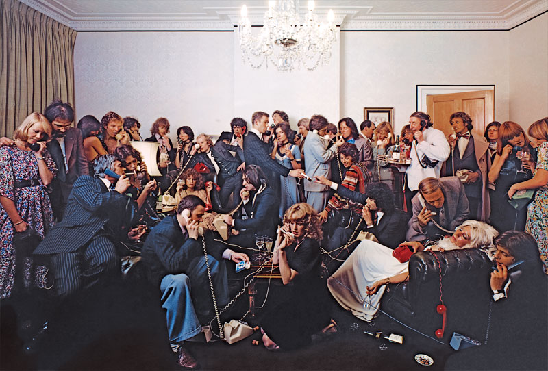
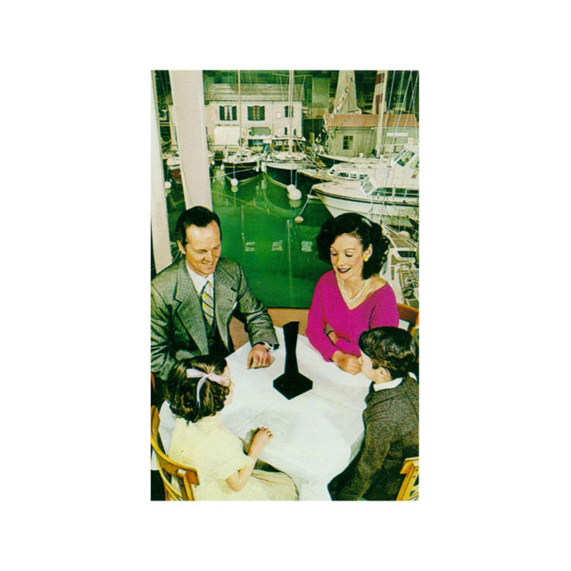
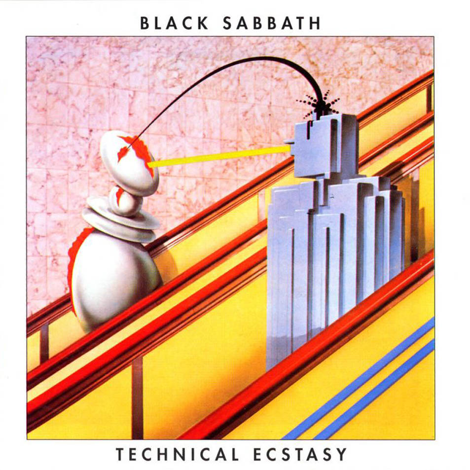
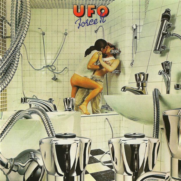
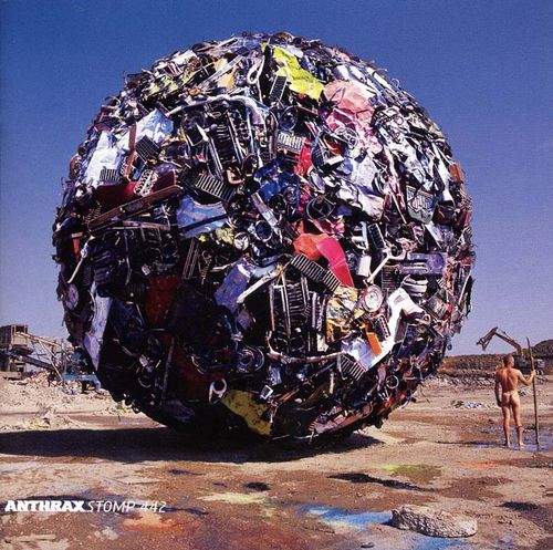
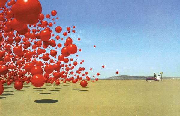
 Things have been so manic this weekend that I’ve only just found time to write something about Storm Thorgerson who passed away last Thursday. As part of the design group Hipgnosis, alongside Aubrey Powell and Peter Christopherson (also no longer with us), they pretty much defined the look of the rock album sleeve in the late sixties, seventies and beyond. You will know their work even if you don’t realise it; Pink Floyd‘s ‘Dark Side Of The Moon’ being the most famous if not their best (as Storm used to admit). 10cc, Genesis, Led Zeppelin, Scorpions, Peter Gabriel, The Who, Black Sabbath, Yes, ELO, AC/DC, Paul McCartney and many more… without their work it’s doubtful magazines like Mojo and Record Collector would have much to fill their pages with these days :).
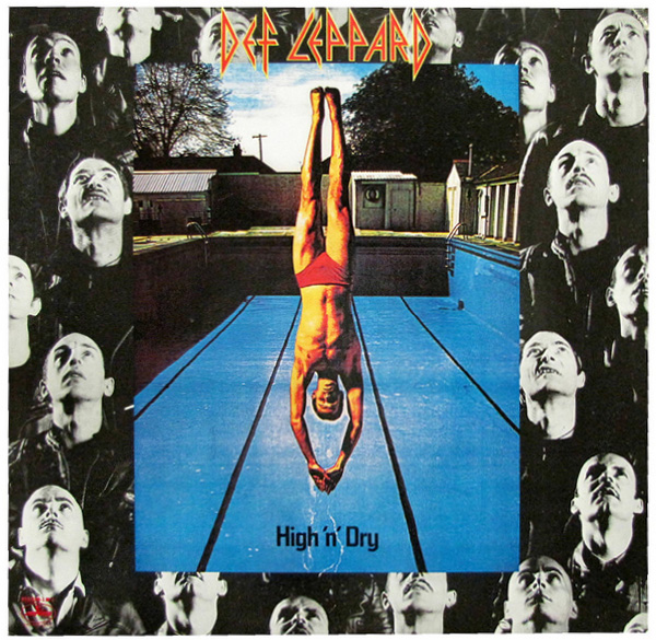
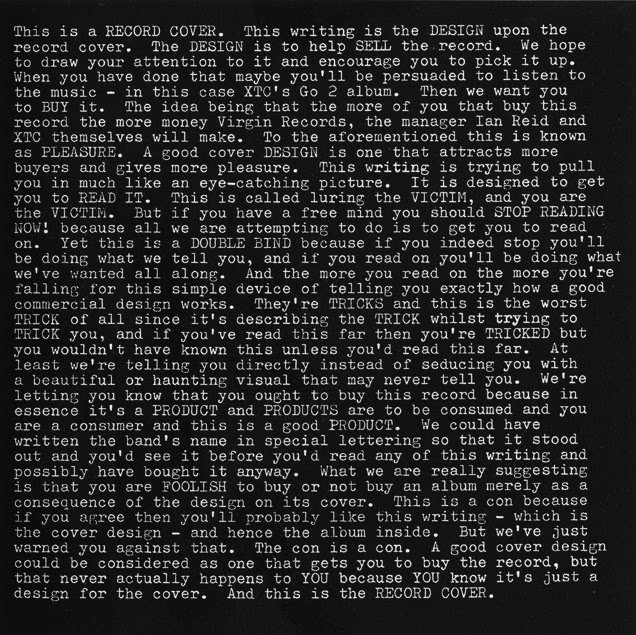
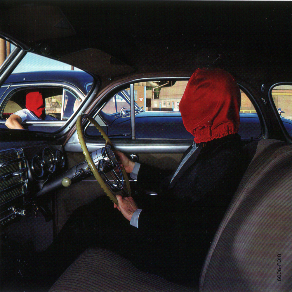
Seriously though, it’s hard to think of anyone else who dominated sleeve design more in the seventies with such a distinctive brand of photographic surrealism, all made pre-computer, on budgets most designers could only dream of these days. It was the age of the gatefold sleeve, Led Zeppelin led the way in deluxe packaging and the sleeve as canvas was in its heyday. Even though Hipgnosis disbanded in 1983 Thorgerson made the transition out of the rock seventies and into the flasher, poppier eighties, still designing for Pink Floyd but adding XTC, Def Leppard, The Cult and more to his portfolio. After Hipgnosis he moved into video direction before returning to sleeve design in the nineties and noughties for bands like Biffy Clyro, The Mars Volta, Muse and Dream Theatre, all wanting some of that retro record sleeve surrealism.
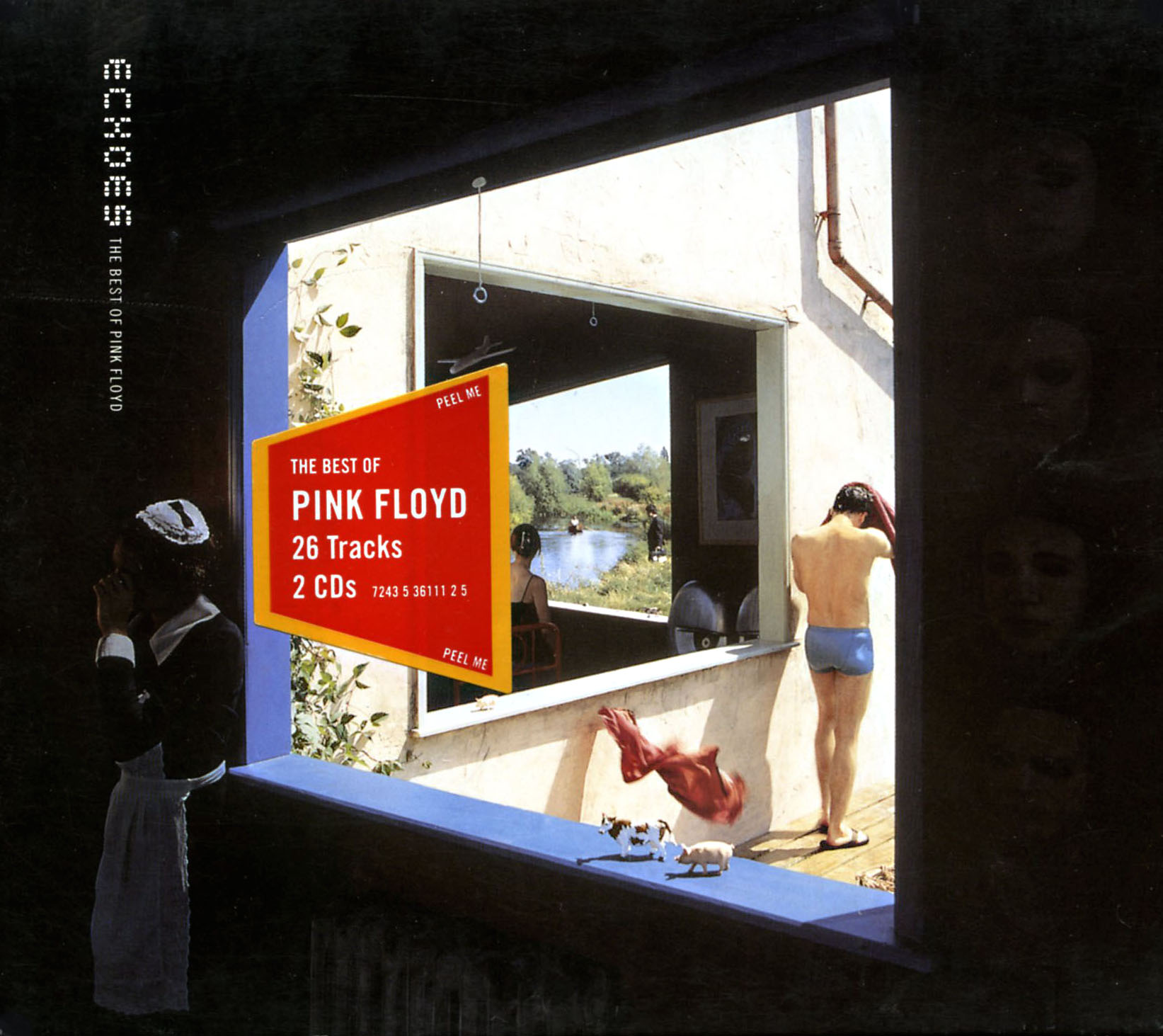
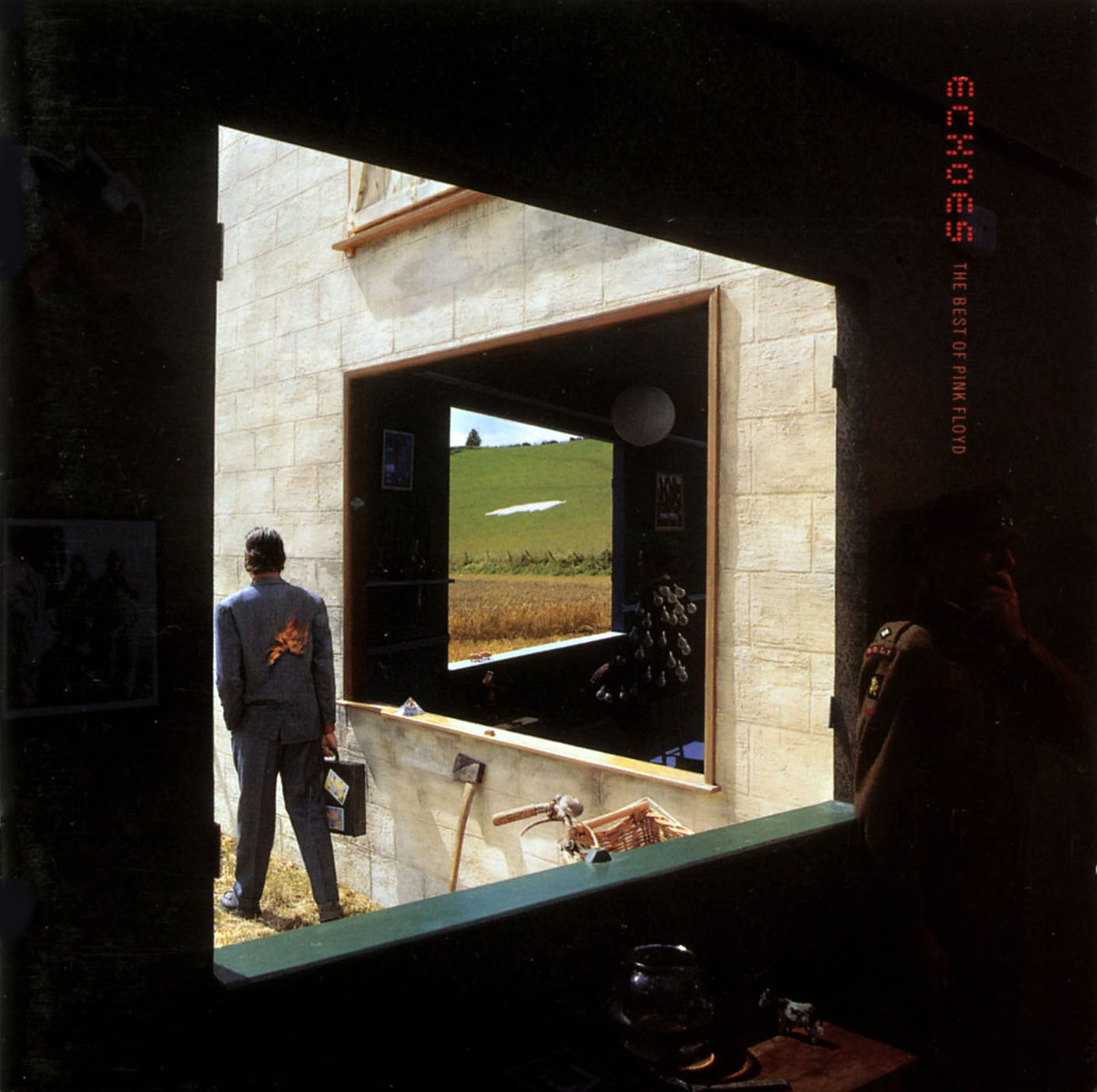
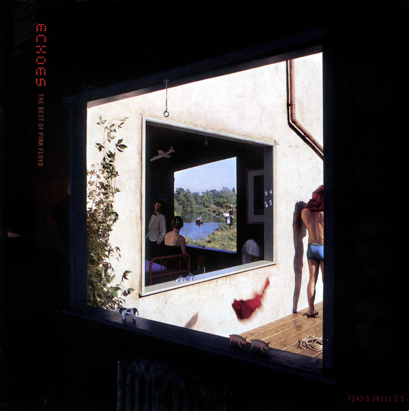
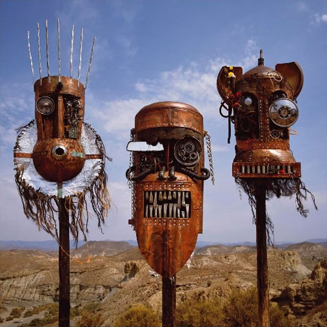
Pick up any book of album cover art and it’s a sure bet that he or Hipgnosis will feature, in some cases heavily although he did co-author the 6 Record Cover Album books in the 80’s so that’s no surprise. His sleeves for Peter Gabriel and The Scorpions used to freak me out as a kid first visiting record shops and I absolutely loved the tribal mask constructions on the Ellis, Beggs and Howard ‘Homelands’ LP sleeve. He’ll probably best be remembered for his work with Pink Floyd and I get the sense that he was at his most relaxed and playful with them, especially is the various compilations and re-imaginings of his past work he was called upon to do, the best being the ‘Echoes’ compilation imagery.
These days the art of the record sleeve is getting reduced to a thumbnail, hidden away, then forgotten, in pdf ‘booklets’ attached to download packages and lower resolutions for the web. When budgets are so tight that album design duties are relegated to online competitions for fans to enter, it’s important to remember and recognise how important the work of Storm is and was. He and others like him shaped the visual language of parts of the music industry and showed that artwork can be as important, controversial and powerful as the music it surrounds. * Special mention for the excellent Hipgnosis Covers blog too, I could spend all day there.
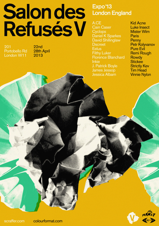 Salon des Refusés V opens today at 201 Portobello Rd, London, W11, a pop up gallery and shop of 30 artists curated by Scraffer. Including work from names like Remi/Rough, Luke Insect, Pure Evil, Kid Acne, Inkie and James Jessop it should be a pretty diverse selection.
The overriding theme of the show is artists that are pushing boundaries, with the work of established artists hanging next to that of ‘up and comers’; there is something for everyone, both stylistically and fiscally.
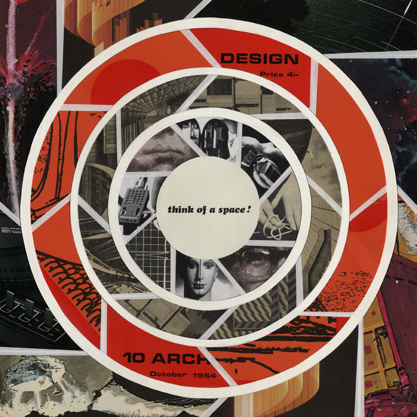
I have an original collage piece on show called ‘Think of a Space’, one of the first of a new series I’m doing at the moment. The Scraffer site will also have two new colour versions of my ‘Skullstronaut’ print on sale shortly after the show.
The show will be on between 22nd to 28th April only and doors open between 10am and 7pm each day.
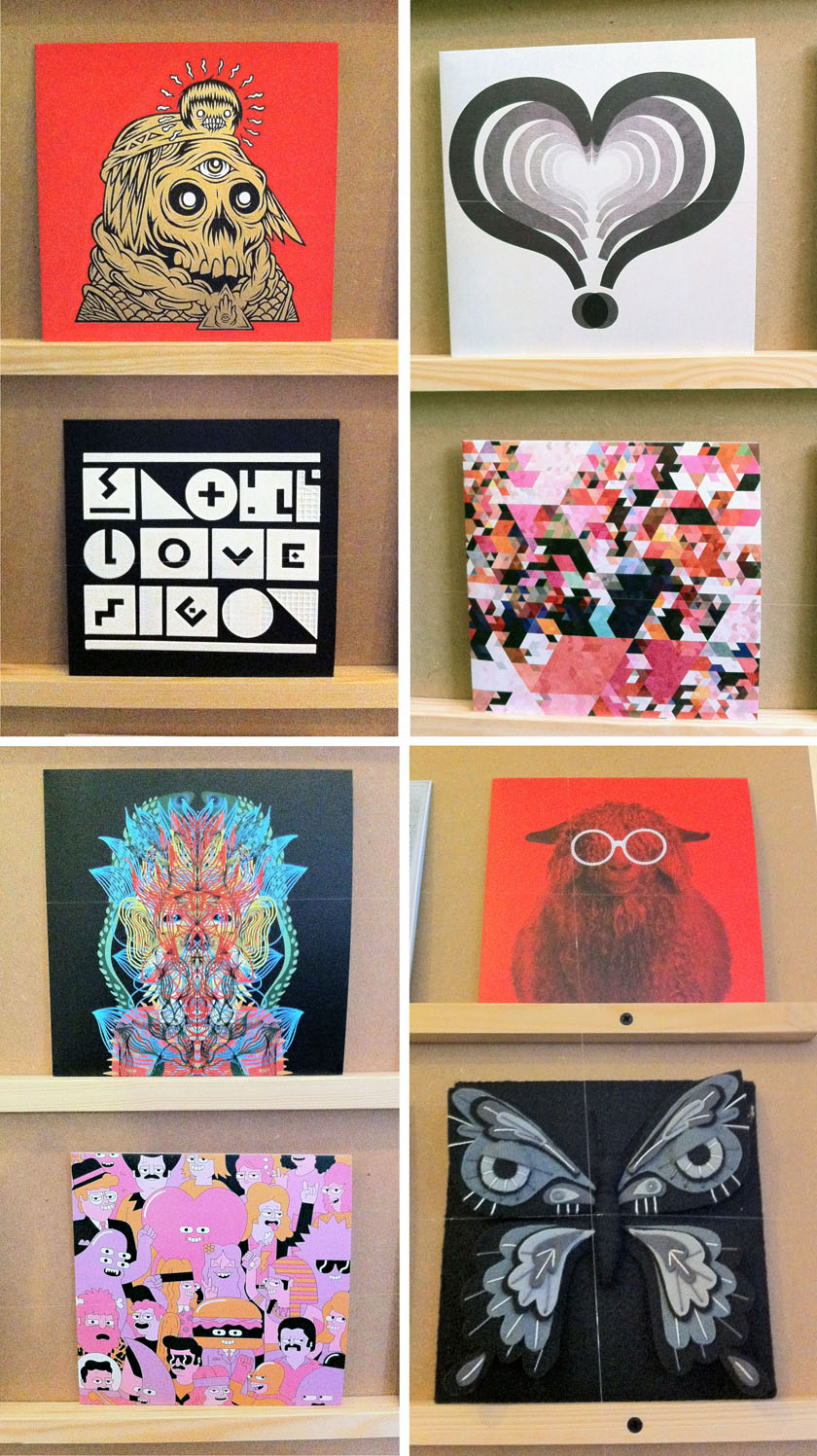
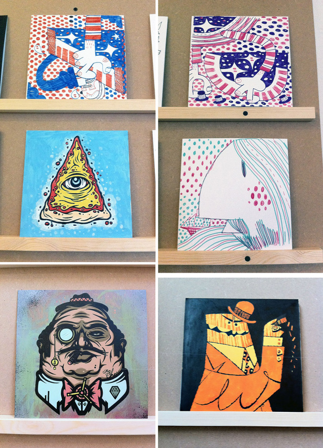
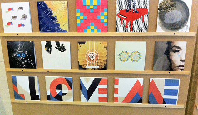
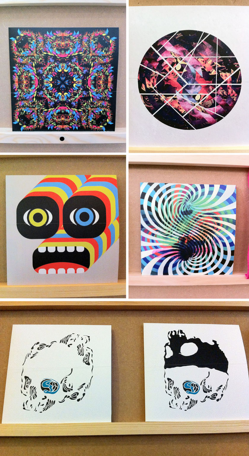 It’s that time of year again, Record Store Day looms this Saturday and the Secret 7″ project is back for another year. Initiated by Universal Records, it presents artists and designers with the chance to create a one-off cover for one of seven different releases, both old and new.
This year’s artists are Public Enemy, Elton John, Laura Marling, Nas, Haim, Jessie Ware and Nick Drake. Over 700 sleeves have been created and each will be available on April 20th at Mother, 10 Redchurch St, London, E2 7DD at the price of £40 each with the money raised going to the charity Art Against Knives.
You won’t know who has designed which sleeve or what song you’re buying (although you can take an educated guess) until you buy it, when all will be revealed. I bought three last year and it was one of the most exciting purchases I made in recent memory.
The sleeves were on view to the public last weekend and I managed to catch the last few minutes and snap some favourites before they closed the doors, which reopen at 10am on Saturday. I spotted work by Pete Fowler, Jonathan Edwards and Felt Mistress among them but Gilbert & George have contributed this year somewhere too.
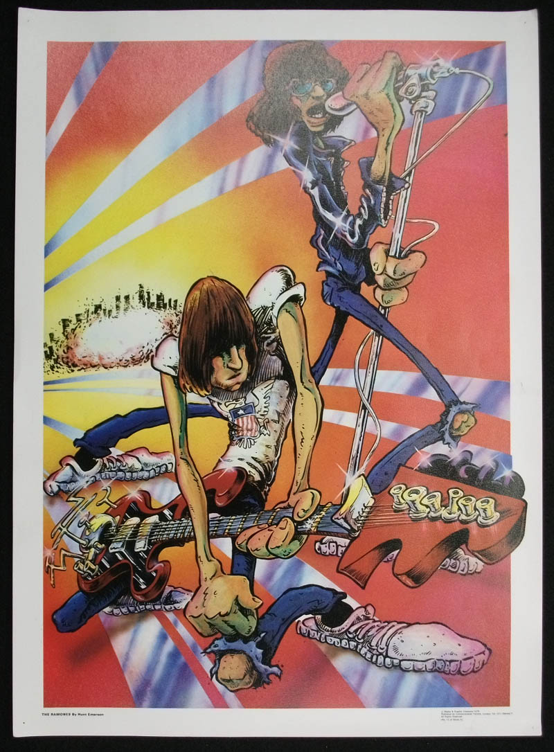
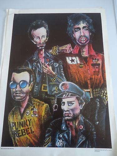
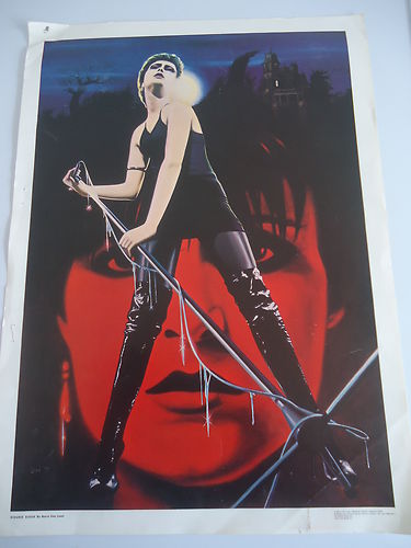
After the post last week I’ve dug up a few more of these odd rock posters with a better look at Hunt Emerson‘s Ramones one and a very weird Stranglers image by Stuart Briers.
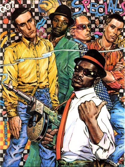
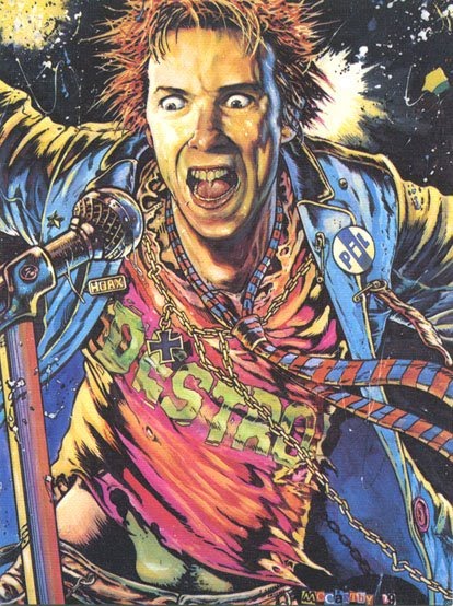
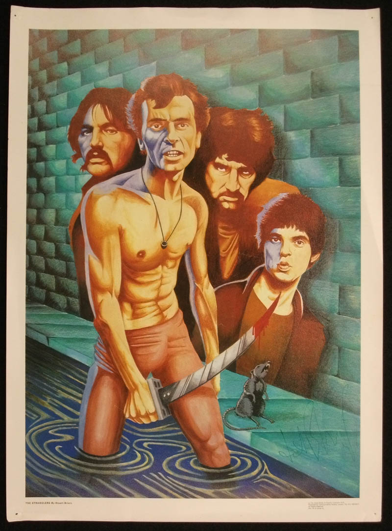
*update – two late additions found elsewhere: The Clash by Mark Manning (the same one?) and Siouxsie by Borin Van Loon (pseudonym?)
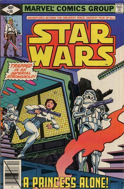
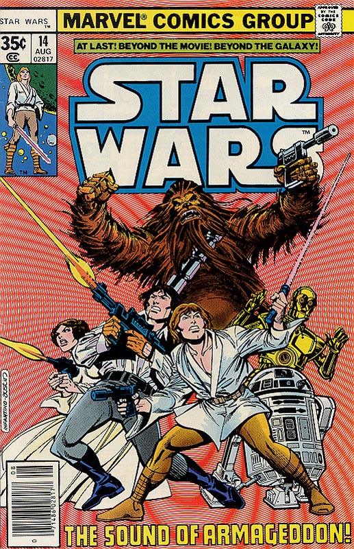
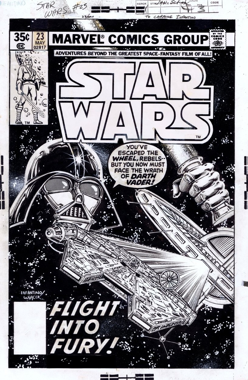
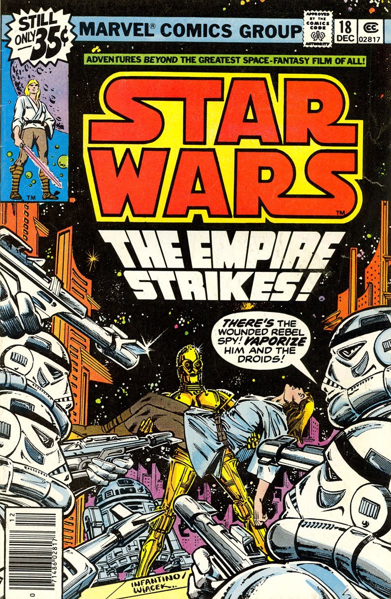 Very sad to hear the news that Carmine Infantino passed away the other day. I remember him from the time he used to draw Star Wars Weekly in the late 70’s as his distinct style stood out despite who was inking his work that week. As a result, he’s probably one of the first American comic book artists I noticed along with Micheal Golden‘s work on Micronauts. I didn’t have access to US comics at that time aside from the random samplings you could find in the spinner racks of some newsagents.
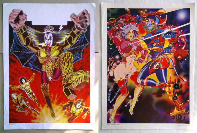
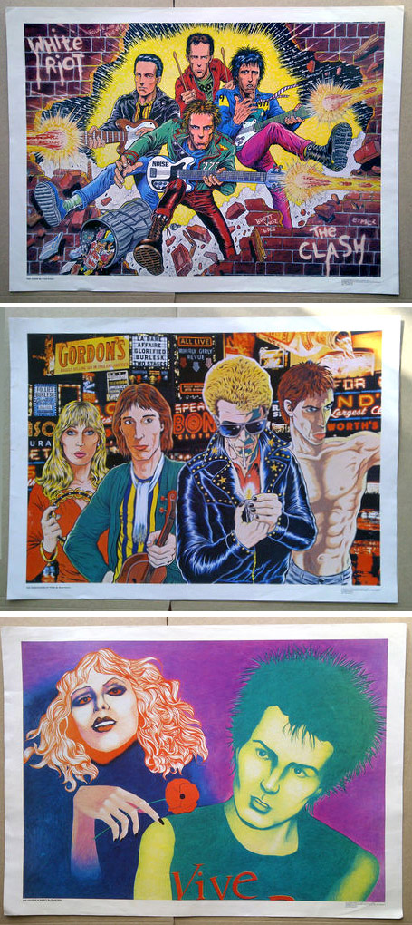
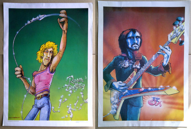
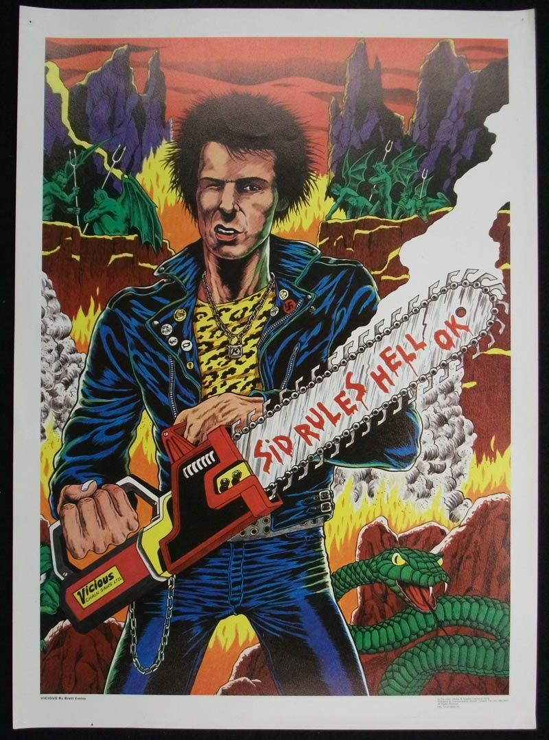
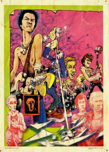
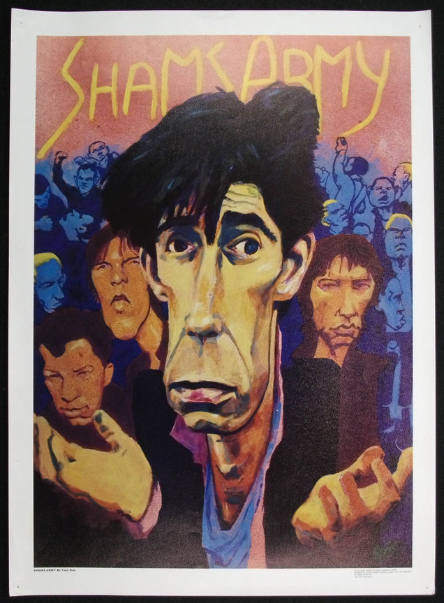
These vintage posters from the late 70’s, and many more of their kind, went up on eBay today from the seller v6kentman.They’re something you rarely see these days in a world where image and copyright is controlled meticulously; illustrated versions of current music idols, originally printed by Communication Vectors of London in 1979 and sold as posters.
What makes some of these especially interesting to me is that they are illustrated by some of the best of the UK’s underground comic artists at the time: Hunt Emerson, Kevin O’Neill, Bryan Talbot, Brett Ewins, John Higgins and David Hine. I’ve seen the O’Neill ones before but the rest are new to me and there were a lot of them it seems with 2 series’, A & B.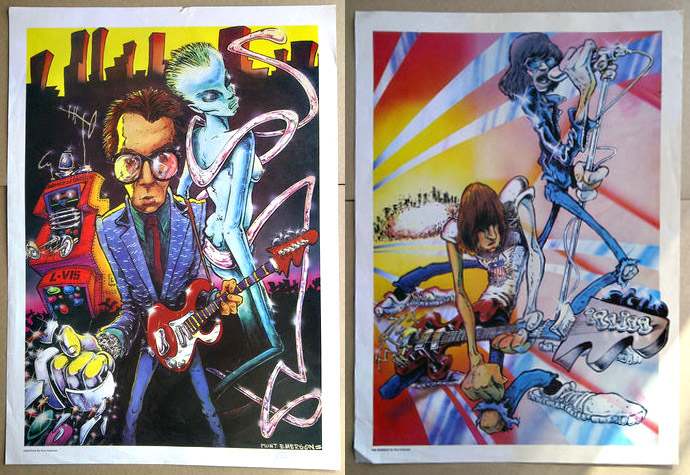
I can find virtually nothing about these on the web aside from a few more examples like Sid Vicious by Ewins and The Sex Pistols by Emerson. If anyone knows more about them then please get in touch. V6kentman has many more for sale though, all starting at £9.99 and featuring loads of other artists such as The Stones, Bowie, Ian Dury, The Runaways, Dylan, Zappa… some great, some not so successful. All fascinating to see though and linked in to a project I’m researching on music illustration in UK magazines from the 70’s onwards.
PS. David Hine writes:
“I hate that illustration! I think that was done 1979 or 1980. There were dozens of posters produced by Communication Vectors. This company, run by a guy called Mal Burns, also produced the comic Pssst! It was a weird setup, I think the money came from a mysterious French millionaire.
I do remember that all the submitted artwork was exhibited in a room and artists were invited to a meeting to vote on which should go to print. It was a ridiculous system. Only a small proportion of the artists were able to get there and I confess we fiddled the vote along the lines of “I’ll vote for yours if you vote for mine.” There were posters by Hunt Emerson, Bryan Talbot, Brett Ewins and Brendan McCarthy among others. Here’s a link to Brendan’s excellent take on The Specials and Johnny Rotten: I think I also did a Buzzcocks print. We were well paid for the time – £200 per artwork if memory serves.”
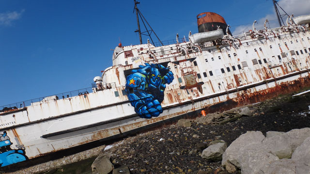
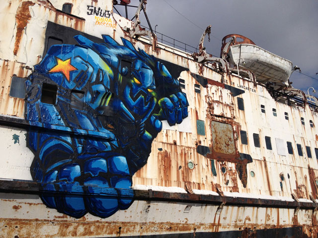
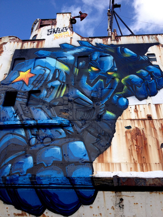
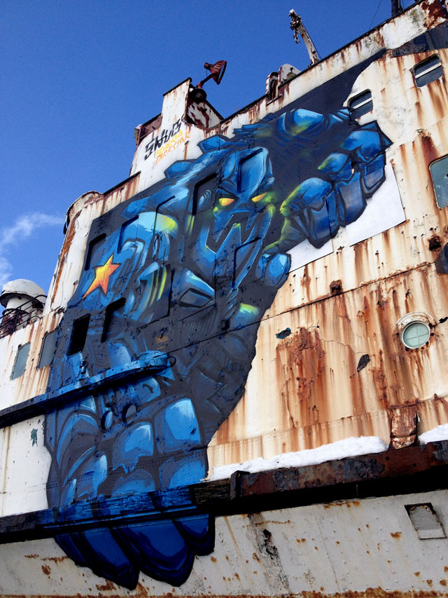
Work by Snub23 the grounded boat, The Duke of Lancaster, which has been dug into the Dee estuary in Flintshire since 1979. His giant piece, named “Your Time is Up, The Future is Here”, is 12m x 12m and part of a legal program by several artists to turn the ship into a work of art.

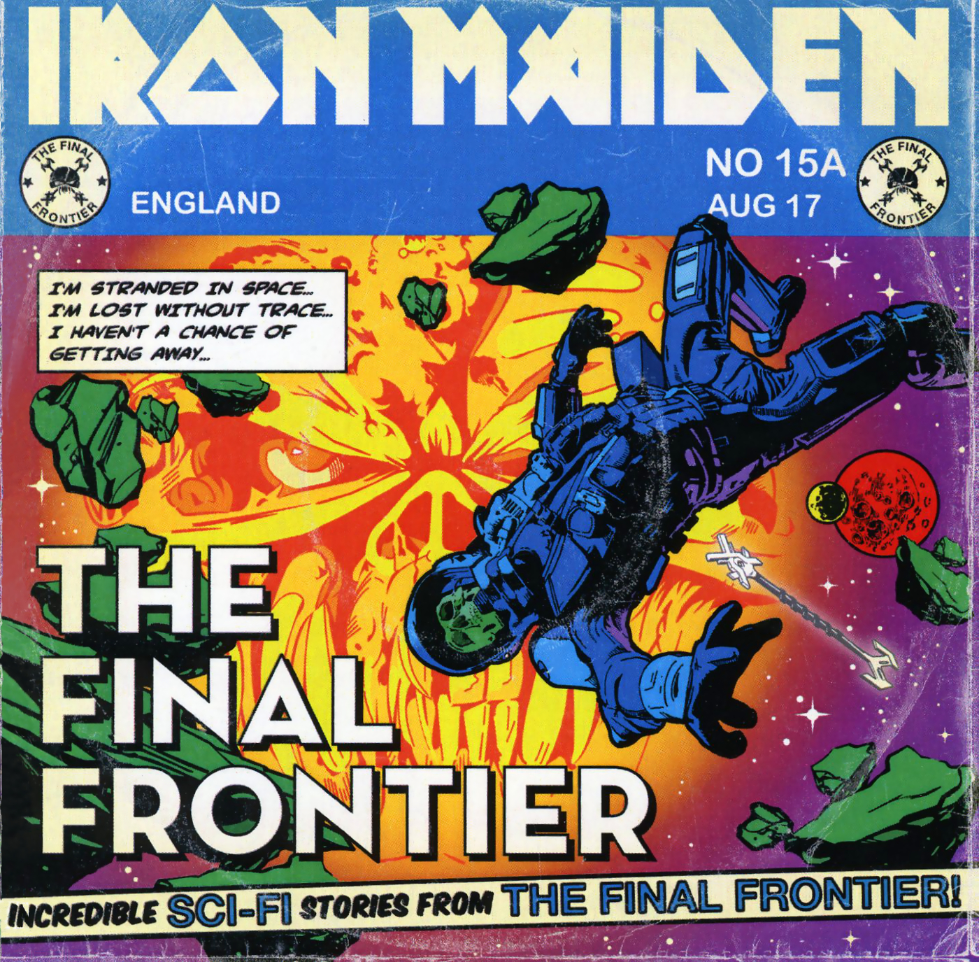
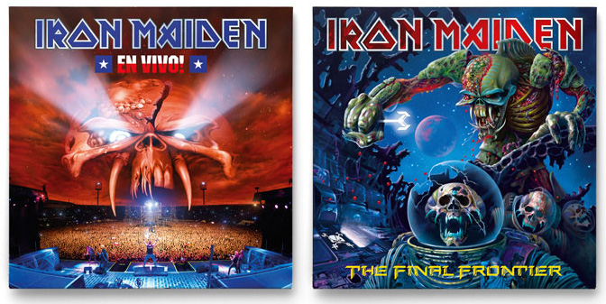
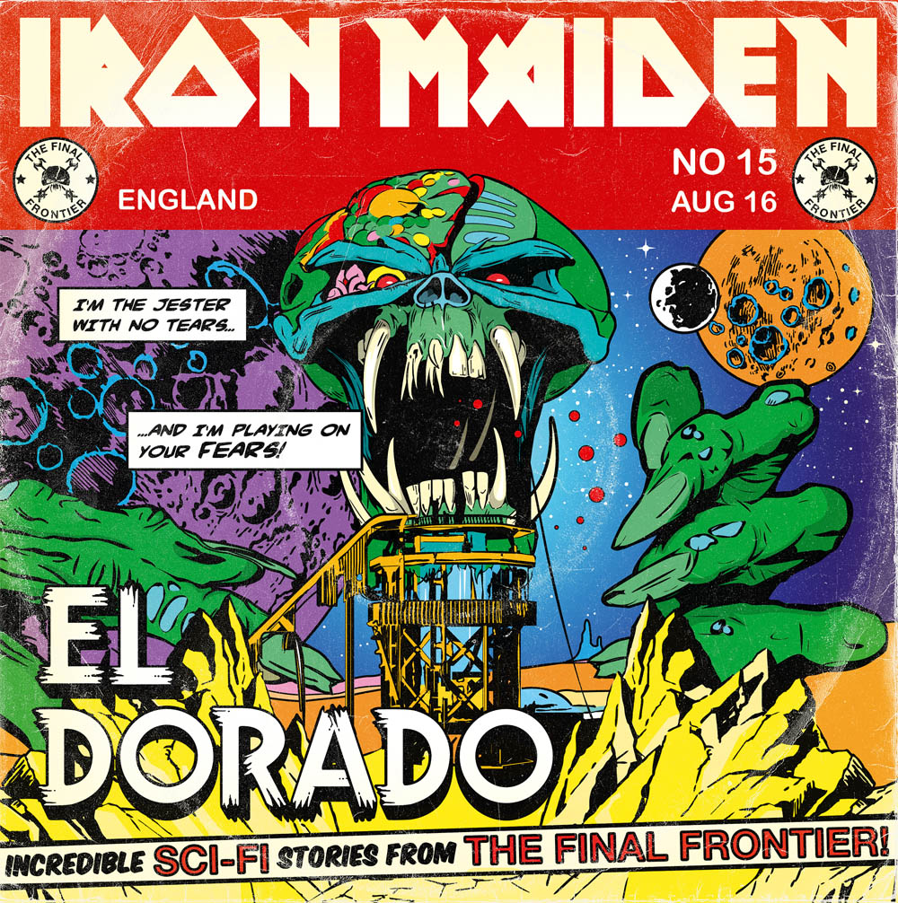 Every guy my age has a soft spot somewhere for Iron Maiden‘s covers (some of the music wasn’t bad either but I dipped out around ‘Somewhere in Time’). Their mascot, Eddie, has been with them through thick and thin, morphing and warping into new identities with each album and I just came across these two designs that ape classic sci-fi comics of the 60’s. I’m not sure if these were designs that didn’t make it as there seem to be more traditional versions of the same titles with Derek Riggs‘-style airbrush images too. But if you’re going to do the ‘comic’ look then this is how to do it. UPDATE: turns out that these were by Anthony Dry, see his comments about them down below.
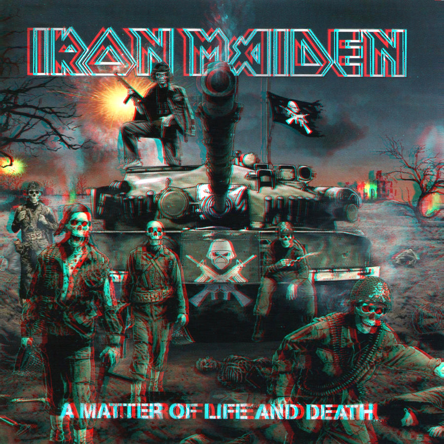
I also found this cover in 3D and couldn’t resist posting it
 Posts are slowly but meticulously being added over at artofztt.com
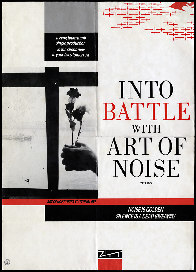
AJ Barratt: “I remember going into the NME offices one day and I saw this poster on their wall, and someone had added a third line to the bottom of it. ‘Noise Is Golden, Silence is a Dead Giveaway… and Bullshit stinks’, that’s what it was! (Laughs) That’s what somebody had written.”
‘Into Battle’ promo poster from the archive of AJ Barratt, digitally restored by artofztt.com. Also included is the original photo for this design, scanned from the negative. The quote above is from a forthcoming interview with AJ which contains more exclusive images from his collection.
artist: Art Of Noise title: Into Battle With Art Of Noise format: A2 promo poster design: XLZTT photography: AJ Barratt cat. no: ZTIS100 date: 09/83 art of notes: The red crosses are identical to the ones on the ‘You Can’t Suck The Same Piece of Sugar…’ poster and continue the trend for ephemeral symbols hovering in the top right corner.
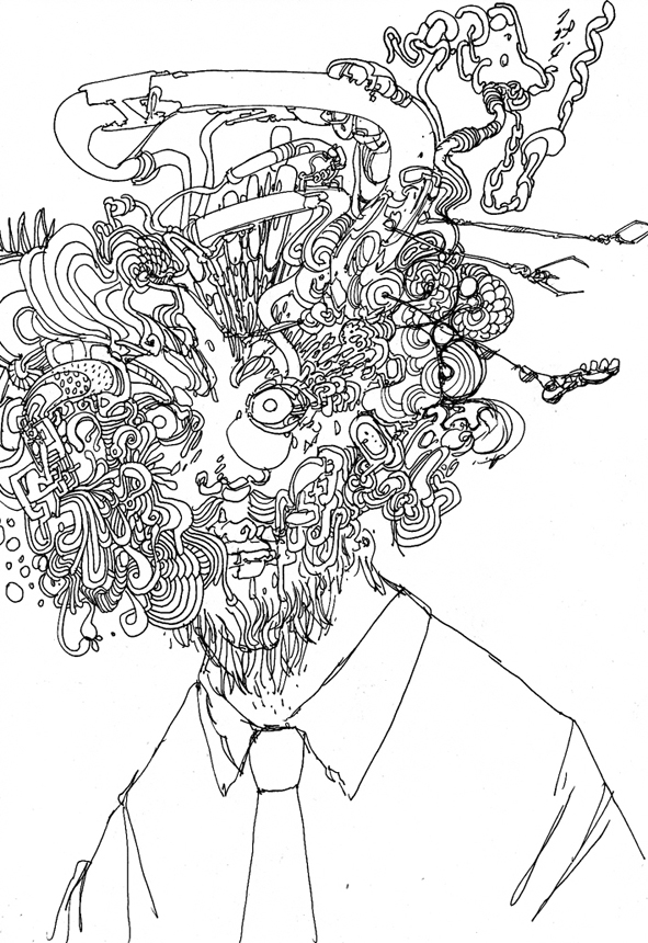
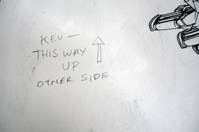 Having handled a fair bit of Henry’s artwork over the past few years it’s always interesting to see that he’s entirely un-precious about it, many pages arriving with other doodles or even finished images decorating the reverse sides.
I started scanning some of these as they were really quite good and I knew that I’d have to give the artwork back at some stage (these were mainly pages from ‘Broadcast’).
When I put the idea of showing some of these to him he promptly sent me a folder with a load more! So, here for your perusal, is a peek over the page, literally, at the other side of Henry Flint‘s work.
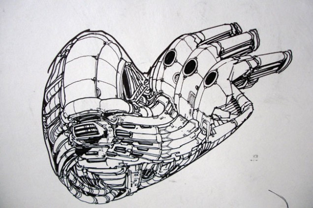
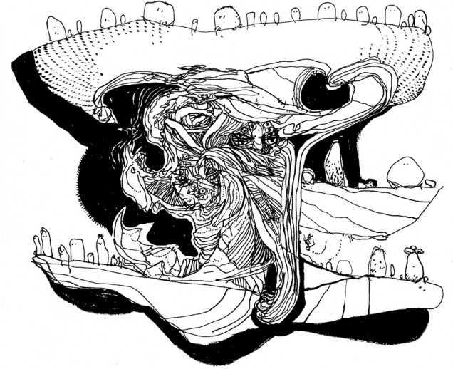
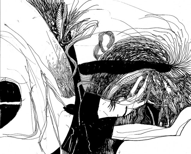
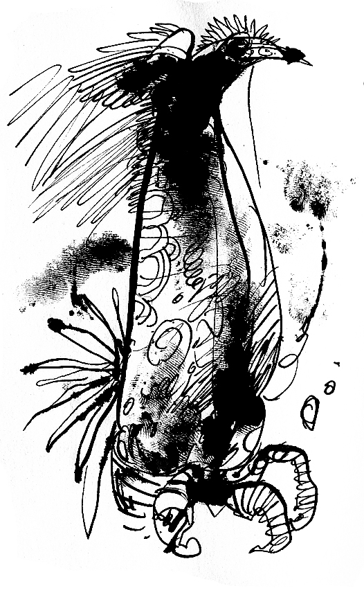
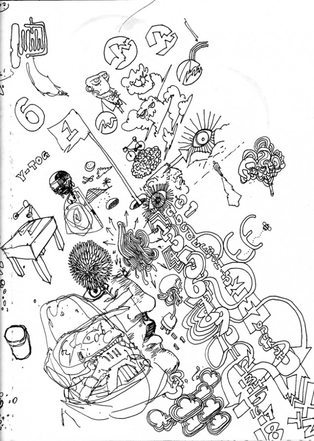
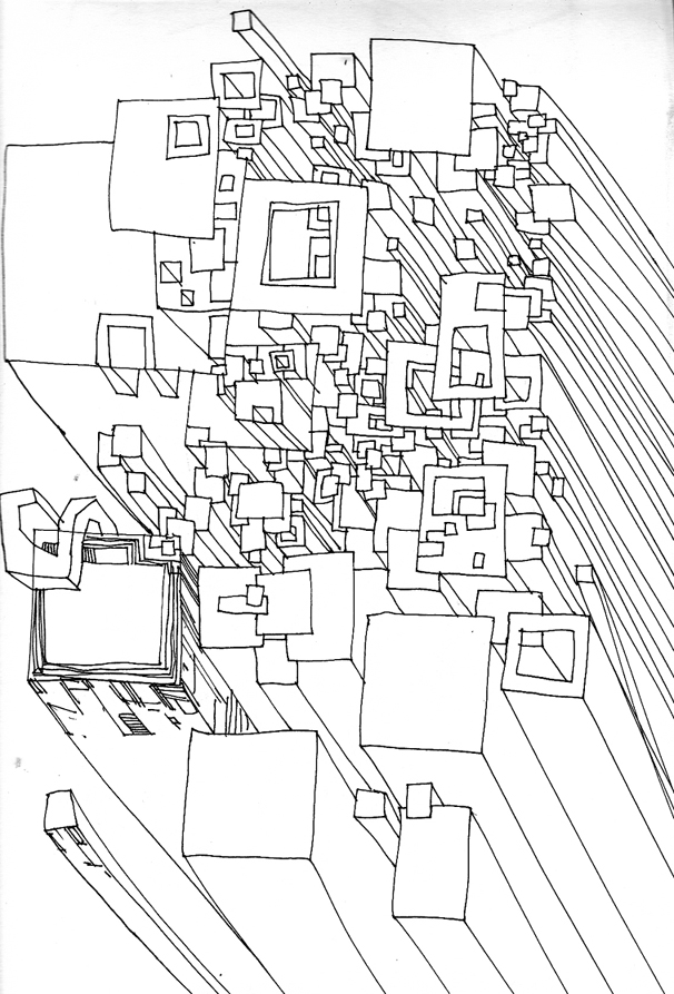
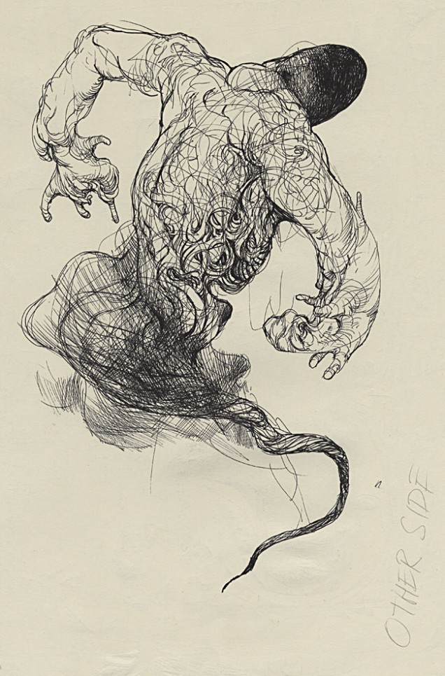
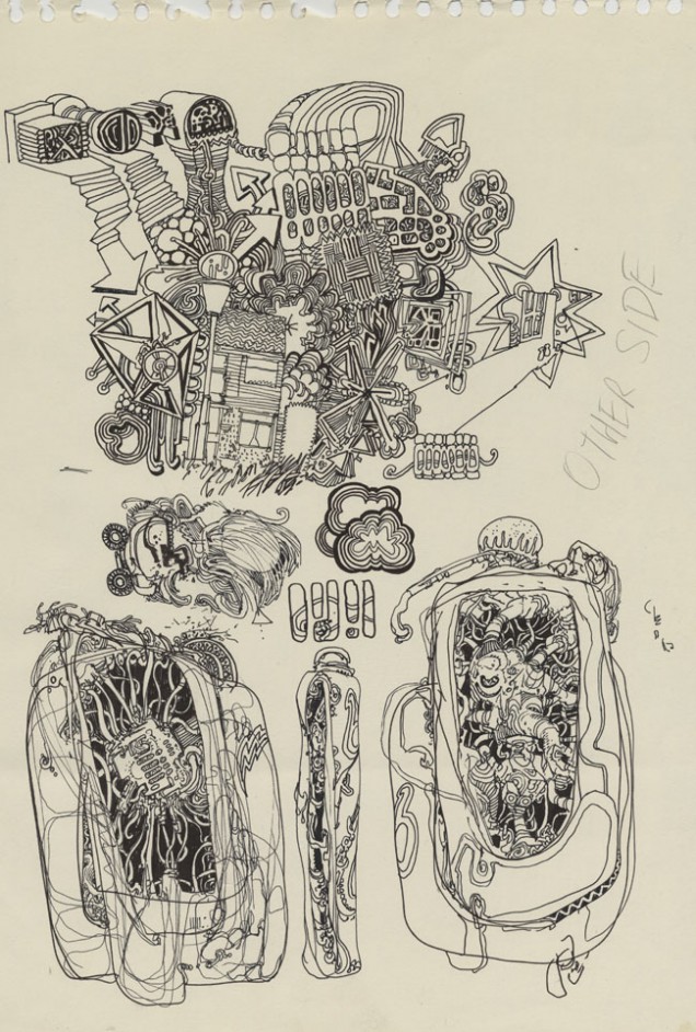
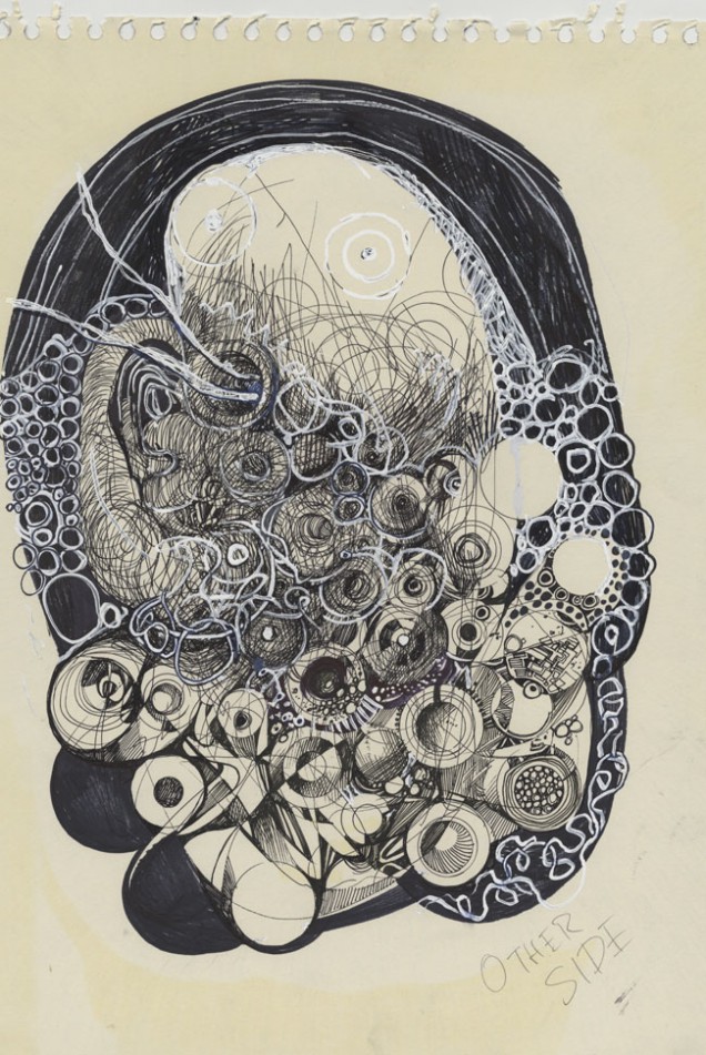
For more like this, see the aforementioned book, ‘Broadcast’ or check Henry’s site. He recently had an operation and used his time to draw his surroundings whilst in hospital.
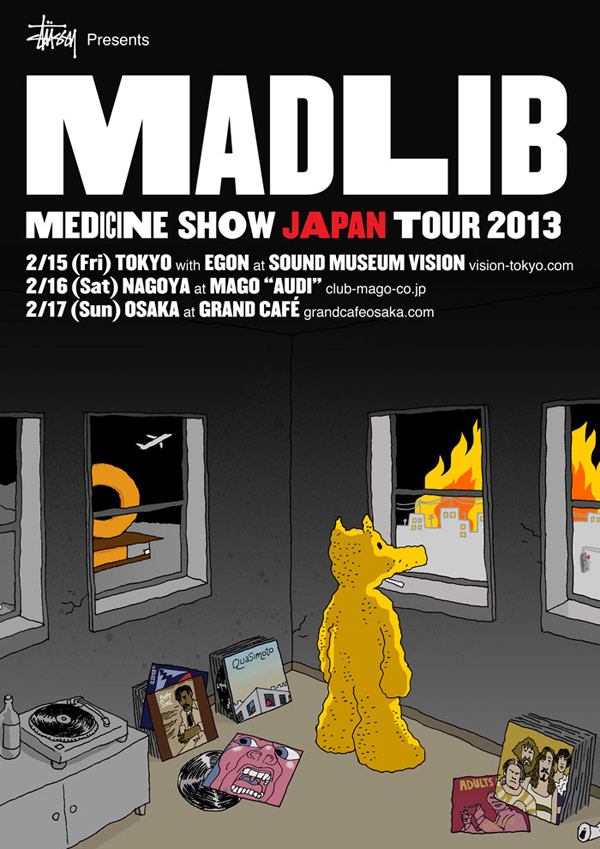
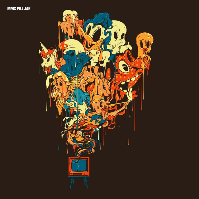 Over on the Rappcats site there’s an 8 track Madlib album to download for free, compiled from his ‘Medicine Show’ albums 1-12. He’s about to embark on an Asian tour (he dropped off one of his 13 CD ‘Bricks‘ in Tokyo today) and here’s the fantastic cover art for the compilation, ‘Pill Jar’.
The tour starts this Friday and takes in these dates:
Feb. 15: Tokyo with Egon at Sound Museum Vision
Feb. 16: Nagoya at Mago “Audi”
Feb. 17: Osaka at Grand Café
Feb. 21: Beijing at Yugongyishan, Beijing, Dongcheng district, Zhang Zizhong Road 3-2.
Feb. 22: Chengdu at Chengdu East Telecast Hall, East Music park, Jianshezhi Road, Chenghua District.
Feb. 23: Shanghai at The Shelter, 5 Yongfu Road.
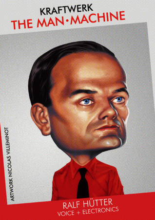
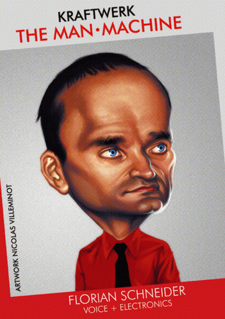

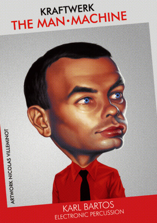
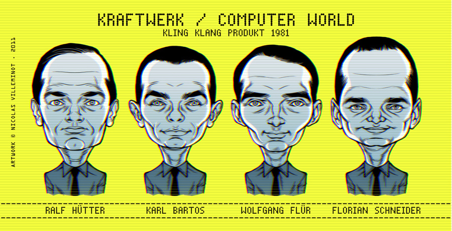
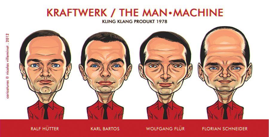
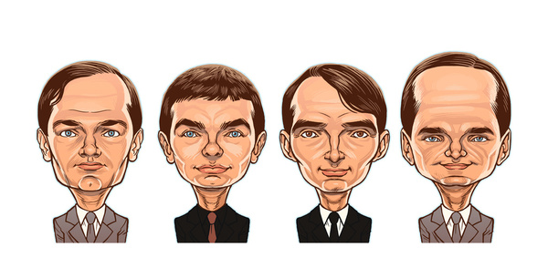
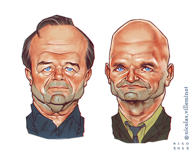
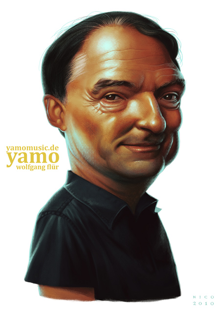
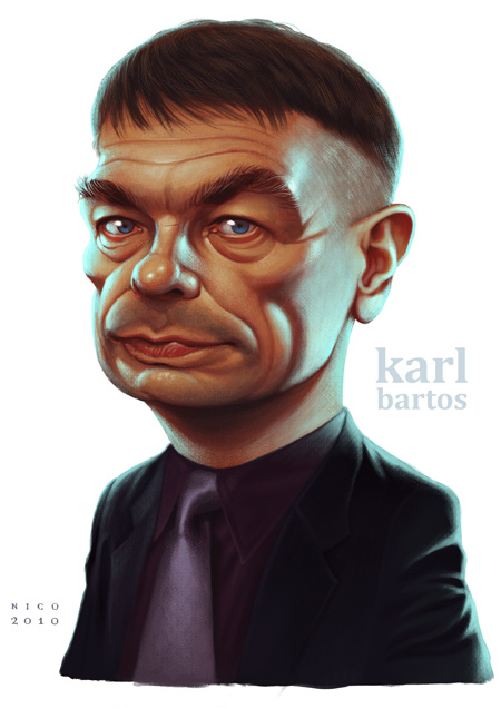
 These brilliant caricatures of Kraftwerk were done by Nicolas Villeminot and feature, among many more, on his Deviant Art page.
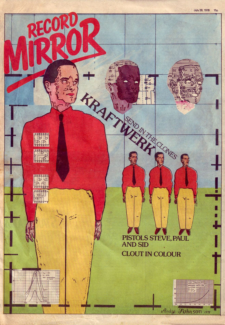
 I found this on the web recently – a Record Mirror cover from 1978 featuring Kraftwerk by Andy Johnson. Some may know Andy by his other pen name: Andy Dog, he’s also the brother of Matt Johnson (The The).
He had this to say about it: “Blimey, what a find! Yes that is one of mine. For your information it was originally commissioned by (the now acknowledged literary expert and renowned author) Tim Lott and was completed with a certain technical difficulty (because the gouache paint kept bubbling instead of laying flat) in my tiny bedroom (shared with Matt) above the pub in Loughton where we lived at the time. I think I got paid about £95 for it. When it came out I was so pleased I walked into Hipgnosis on Denmark Street and showed it to Peter Christopherson and said “how about giving me a job?” He was v. polite but declined….”
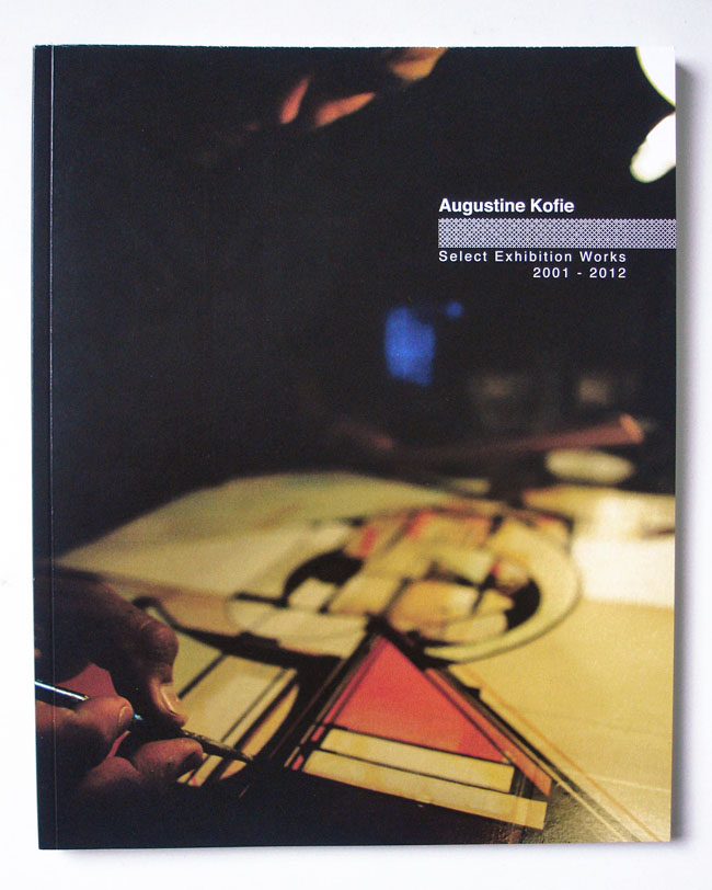
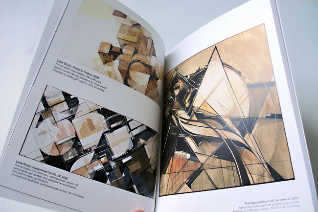
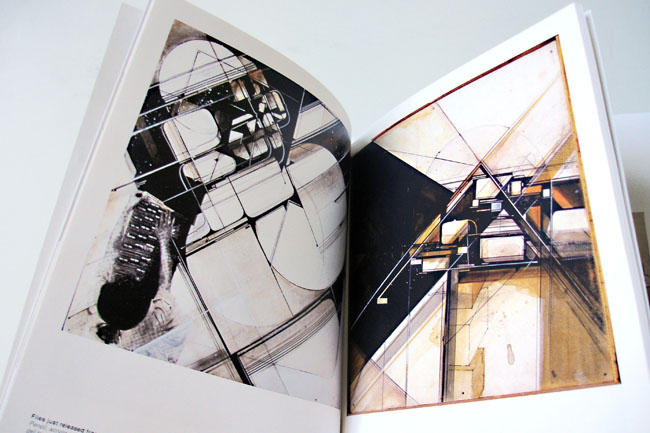
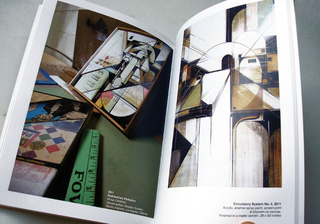
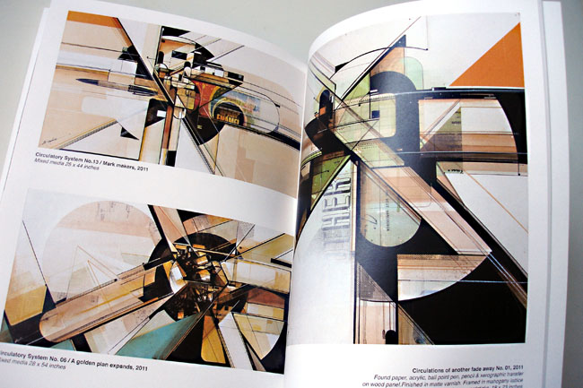
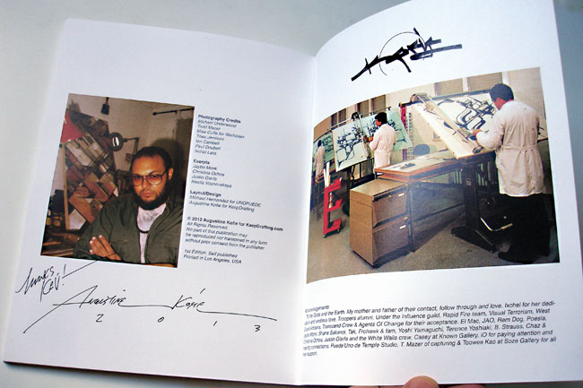
This is the first collection of Augustine Kofie‘s work, self-published and available at his Keep Drafting site for $40 inc. Int. postage. You can see his art progress over a ten year period in just 62 full colour pages. What a body of work to behold so far too, his colour palette and sense of compositional balance is incredible as is his taste in texture and collage.
For me there is no other artist producing work of this calibre right now, I just wish I was richer and could afford some of his originals. This book is a steal at this price when you see some of the work contained within so it’ll have to do for now.
Several prints have just hit the Scraffer.com site shop, all collaborations between myself and Henry Flint for ‘The Search Engine’ album and related EPs. ‘Sentinel’ (top left) and ‘Octopus’ (above) make their first appearance in the shop after being available in a tiny run for last year’s Pure Evil Gallery exhibition. Both are the same size as previous editions – 64.5cm x 47.1cm, come signed by Henry and myself and cost £60. Close up details in the gallery below.
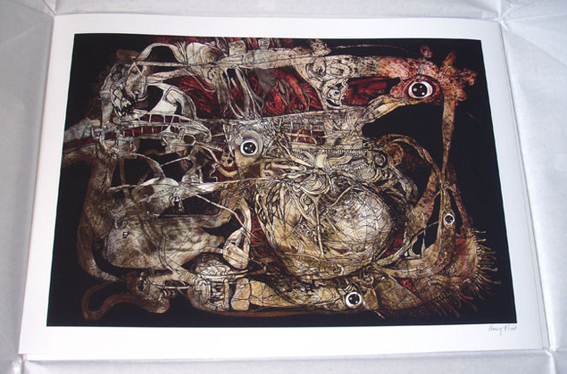
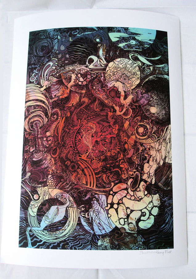
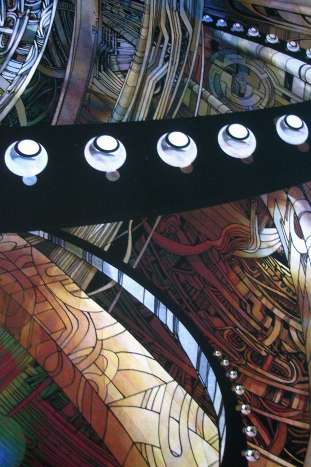
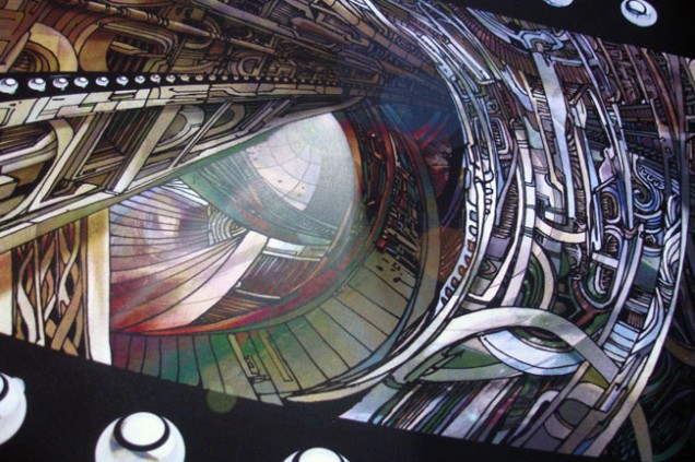
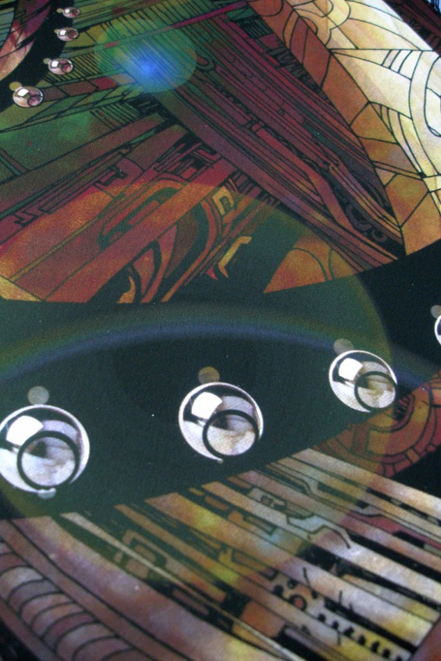
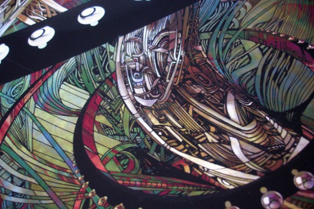
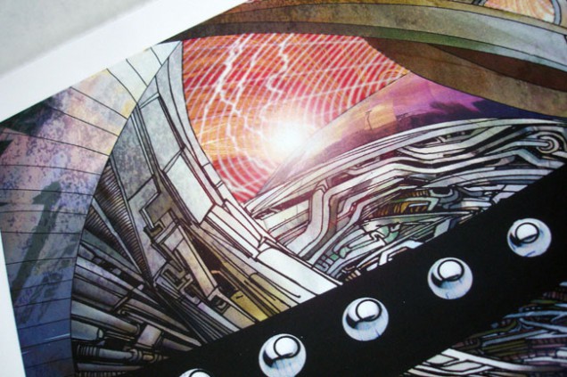
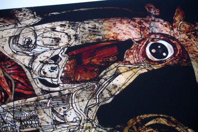
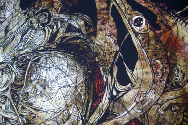
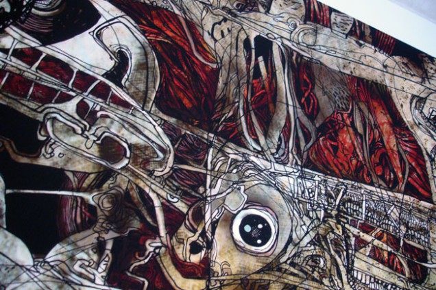
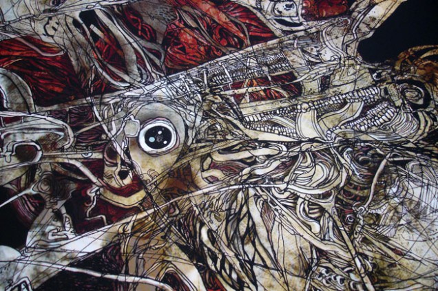
‘Planets’ (top right) is a completely new print in a new size – 47.0cm x 34.7cm – again signed by both of us and at a wallet-friendly £35. All are printed to the very high standards of the Fine Art Trade Guild on 300gsm Somerset Photo Satin which is a 100% cotton paper. Scraffer also has copies of the ‘Cosmonaut’ print, a version of which featured on the cover to ‘The Search Engine’, at £50. The last copies of ‘Mad Man’, which was used on the ‘One Man’s Weird Is Another Man’s World’ EP sleeve, are also there, each one with a unique doodle from Henry in the speech bubble.
‘The Secret Life of A Machine’ print is now sold out unfortunately, as is the ‘Skullstronaut’ which was done for the Factory Road exhibition although this may get a reprint later in the year. For those still waiting for the 4 x 12″ repress of ‘The Search Engine’ EPs in fold out sleeve – it’s coming! The vinyl is pressed and the sleeves are being printed now after going through three different design changes to make the package better. It also may be with us sooner rather than later as the planned Record Store Day release might be vastly oversubscribed this year.
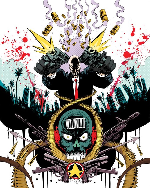
Jim Mahfood just posted this, apparently it’s the artwork for the Hitman video game art book.
Agency : BEING / Illustrations : McBess / Animation : CRCR / Production : QUAD
