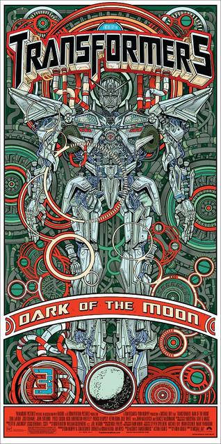
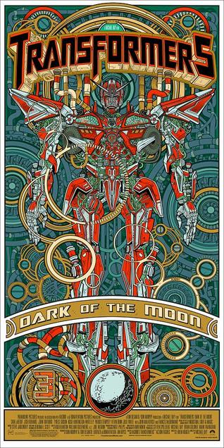
Going to see Transformers 3 at the Imax on Friday (after TF2 I’m not expecting much but, giant robots in 3D can’t be ignored). Here are two variants on a poster that will be given away at the Arclight cinema, Hollywood for the midnight screening tonight. The artist is Jesse Philips and the gold variant will be available to buy sometime Wednesday online.
Art
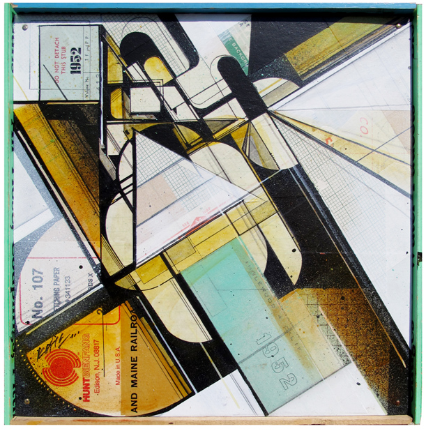
Finally Augustine Kofie will be making it to the UK and showing work in two shows, one in Glasgow, one in London. First off he is part of ‘Rudimentary Perfection’ with work by: SheOne / Duncan Jago / Jaybo Monk / Matt W. Moore / Poesia / Nawer / Derm / Morten Andersen / Mark Lyken. It’s at the Recoat Gallery 323 North Woodside Road, G20 6ND, Glasgow and opens July 1st.
The second is Scream presents West End Rebellion, a group show featuring urban and contemporary artists including;
Faile, Retna, Banksy, Futura, Swoon, KAWS, Giles Walker, Aroe, Antony Micallef, Adam Neate, Os Gemeos, Herakut, Chaz Bojorquez and Shepard Fairey. At the Scream Gallery, 34 Bruton Street, London WIJ 6QX, UK and it also opens July 1st and runs for a month.
More info on both HERE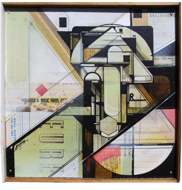
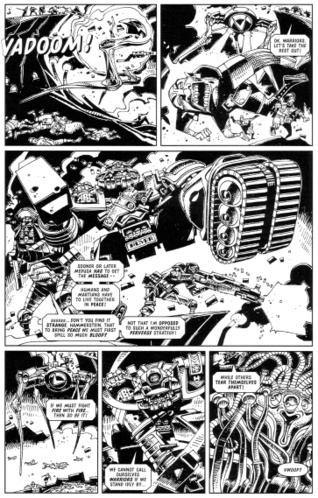
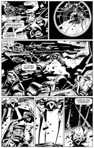
For all you 2000ad fans out there, the legend that is Mike McMahon now has a blog. Featuring all sorts of unseen artwork from over the years including unpublished ABC Warriors pages from 2001!
So wish I could go and see this, looks incredible. I was lucky enough to shake the man’s hand one time at Ninja Tune HQ when he was in town with New Flesh.
[vimeo width=”640″ height=”370″]http://vimeo.com/24481589[/vimeo]
 From Mighty Fine via Megatrip
 .
.
Beautiful
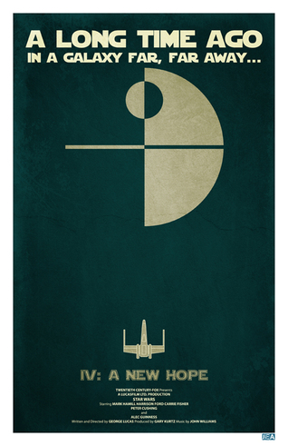
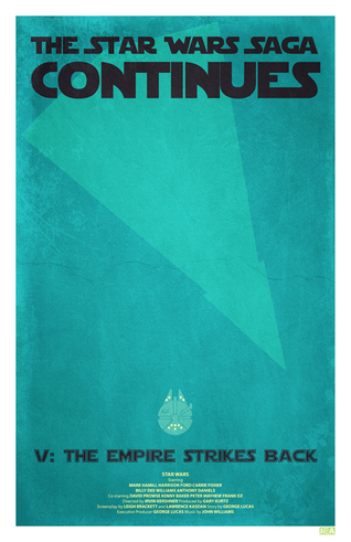
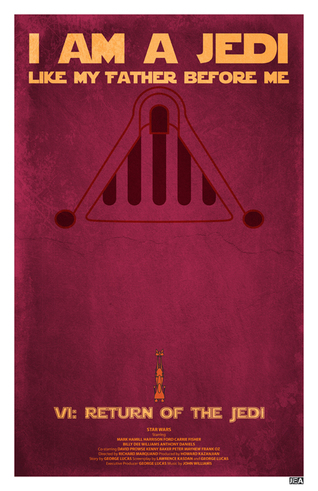 Another set of original Star Wars trilogy posters, this time by Jon E. Allen. Nicely done but Return of the Jedi doesn’t quite work for me. Also I think they’re too reminiscent of Andy Helms’ ones in this post.
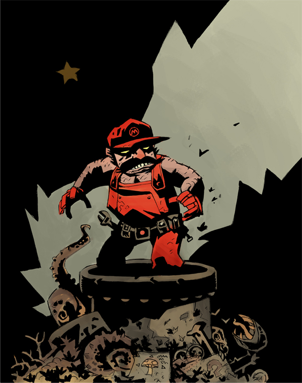
Via Megatrip via Geek Art – this popped up on the web but it’s not by Mike Mignola. Thanks to pAUL for the comment, it was Scott Watanabe.
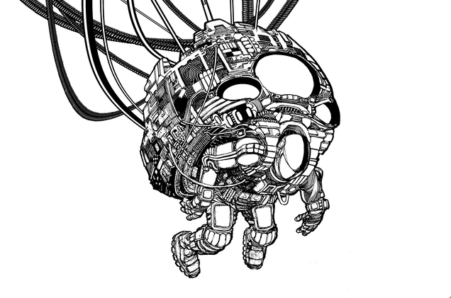
The past few weeks, going through Peckham on the train on the way to London Bridge, I noticed some large scale paintings in amongst the largely derelict buildings just outside the station. Visible from the train is a huge bird perched on top of a stack of skulls plus various other creatures as you whiz past an open courtyard in the building. Today I decided to go and find it and take some pictures as a respite from the studio mix sessions.
There’s no obvious way to get to them but there is a small alleyway off Peckham High St., by the fishmongers, that leads to it. This was, frustratingly, barred by a locked gate so I had to find another way. Various fire escapes out the back of indoor markets led to dead ends or more locked gates. In the end I had to go round the block to the opposite end of the next side street, into a lock up area where store keepers were storing merchandise and I could hear bands practicing behind closed doors. After a couple more wrong turns I found my way down between the buildings, into the courtyard and this is what I found.
[singlepic id=2950 w=640 h=990 float=left]

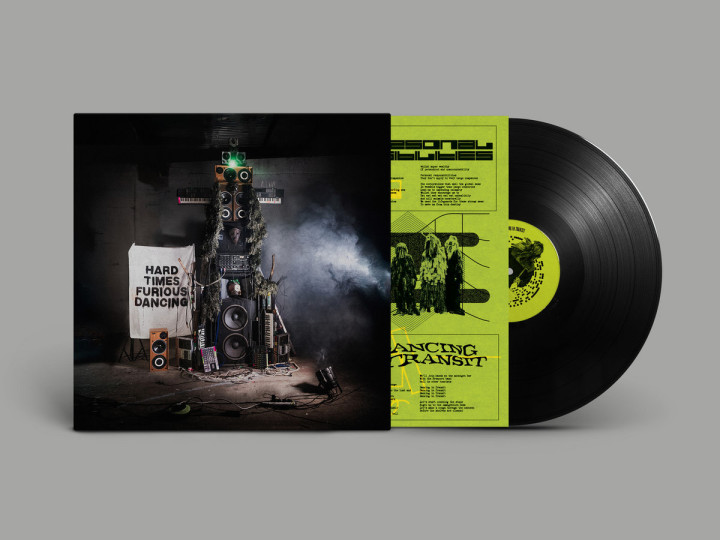
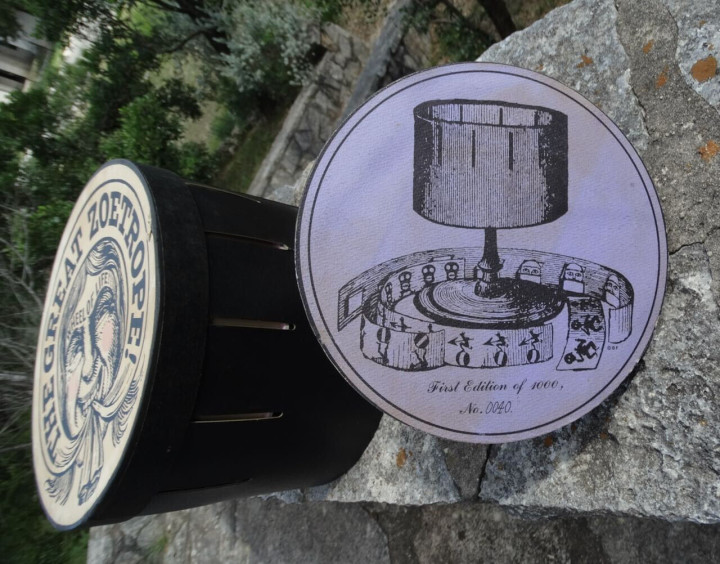
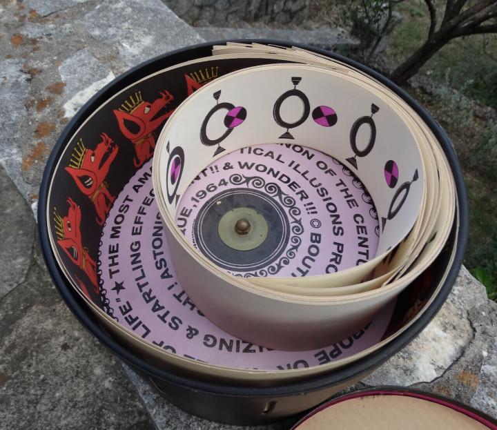
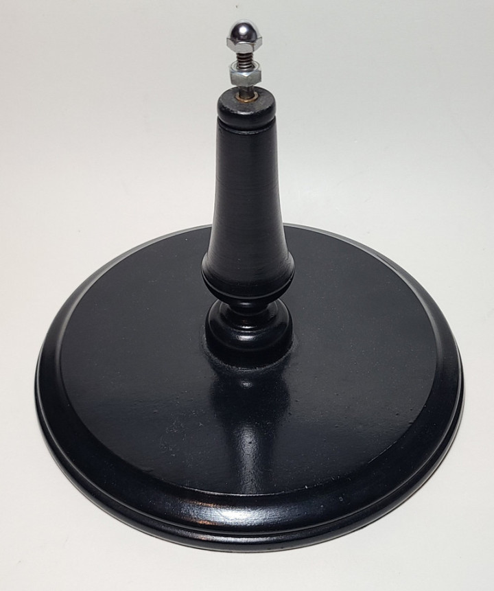
If anyone knows who the artists are I would be interested to know more. The power of the internet rears its head, apparently the animals and skulls are by ROA from Belgium, couple of galleries here and his tumblr here. Looks like the other stuff is Sheffield artist Phelgm, thanks to all those who pointed it out.
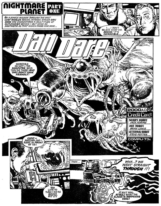 Until recently I knew very little of Brian Lewis’ work, but the handful of pages I did know are etched in my brain as some of my first ever sci-fi comic experiences.
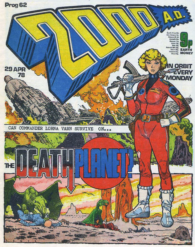
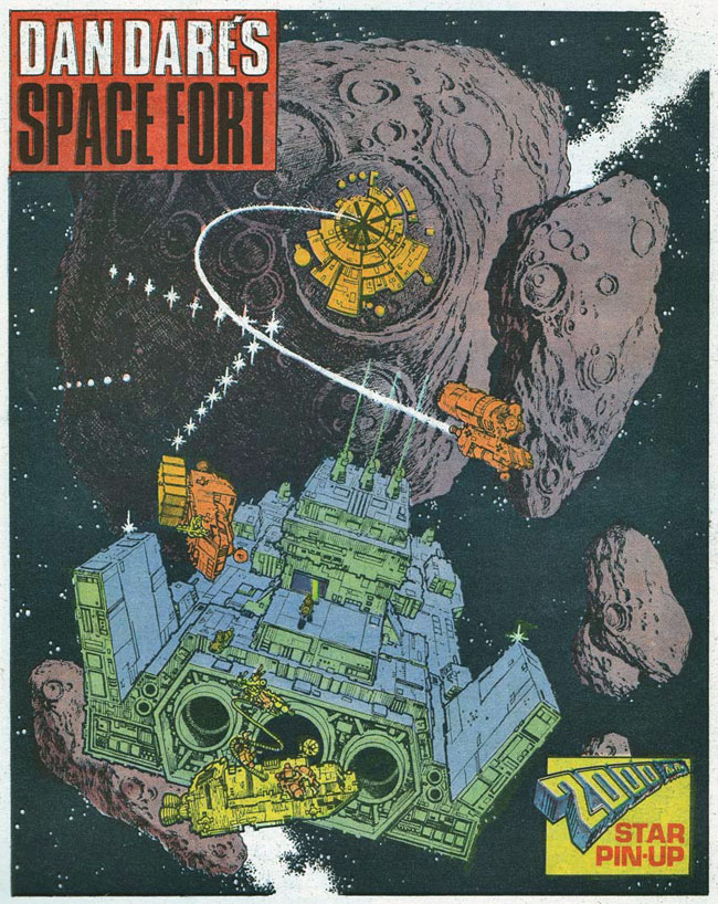
In 1978 I was in a newsagents and spied a comic called 2000ad, it was into its second year and the issue was no. 61. On the cover was their most popular character, Judge Dredd, roaring towards you on his bike, guns blazing. Lucky for me I’d stumbled upon the very issue that the comic decided to begin the first ever ‘epic’ in Dredd’s world – ‘The Cursed Earth’ – now, quite rightly, considered a classic. Opening the cover however, the first strip I was confronted with was an updated take on the old Eagle character Dan Dare. More so than the front cover, the page set fireworks off in my eight year old brain as a spaceship happened upon a huge space monster, the likes of which I’d never seen before. The detail was incredible, every tiny pore of the beast and panel of the ship was rendered meticulously. I’d only read ‘humour’ comics and some of the UK Star Wars weeklies up until then and I couldn’t believe this kind of art existed in a kids comic. I was sold and asked my mum if she could buy it, showing her how amazing it was (to me – I doubt she liked it very much). I loved this comic so much, I even took it to school and showed everyone who would listen how amazing I thought it was, it was ragged and ripped in a very short time but I still have it in a box somewhere.
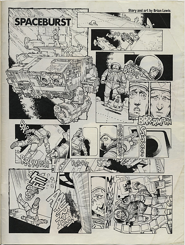
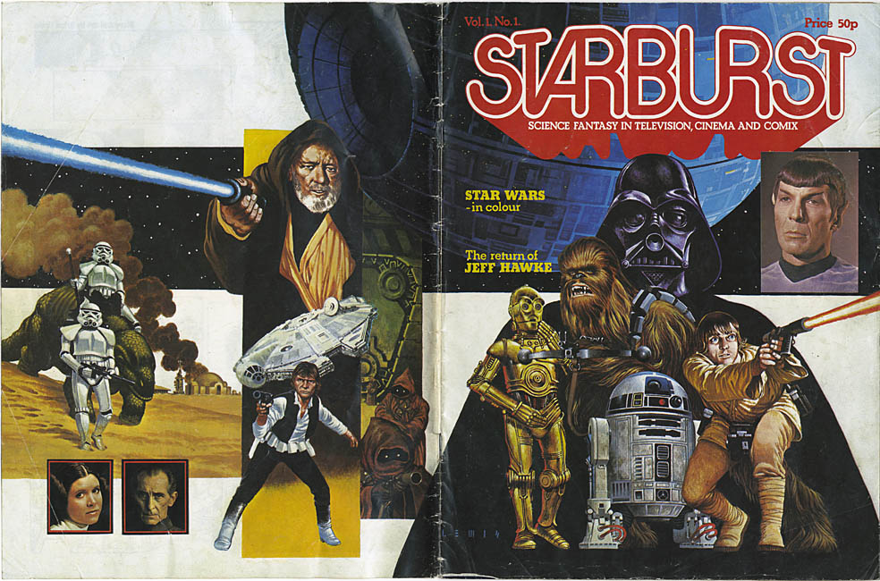 Around the same time, issue No.1 of Starburst magazine arrived, a new monthly title concentrating on sci-fi in the movies, heavily capitalising on the previous year’s Star Wars fever and sporting an eye-catching wrapround cover of said film. Being mad on SW I picked it up, inside it was very text heavy, which, for an eight year old, was a bit of a no-no but the cover was so beautiful I had to have it. This time I pestered my dad (who was a much harder sell than my mum) and finally got a copy after a number of attempts. On the inside cover was a weird little one page strip where an astronaut is wandering about outside his ship in space, he hears a rumble and flees back inside, desperate to make it as quick as possible. The last panel sees him hooked up to a toilet in his suit, relieved to be relieving himself. Juvenile, sure, but beautifully drawn (and written) – by Brian Lewis.
A recent urge to revisit this issue (long since binned or given away) had me hunting around on eBay and a few days later it popped through the letter box. Most of the magazine was as fresh in my mind as when I’d read it years before, the cover still as great, Darth looking a little tired and droopy-mouthed in this rendition. Then I noticed the signature on it, L E W I S, my god, he did the front cover as well! You’d never know this from comparing the two, one being black and white line work, the other being fully painted colour using photos as reference. Doing some research online I found that he was one of the old school and had been in his prime in the 60’s and 70’s drawing Gerry Anderson comics and later Hammer House of Horror strips and covers for Dez Skinn. He’d also contributed a couple of covers to 2000ad as well as a three part Dan Dare story – you guessed it – the one I saw when I first opened the first issue I bought! How I’d never linked this with the Starburst one-pager I’ll never know but the similarities are obvious now.
Sadly, at the same time I was experiencing these revelations, Brian’s time was almost up and this was some of the last work he did, he passed away in 1979. There are a few pockets of information on him around the net but he’s not remembered as widely as the younger artists who were just starting out when 2000ad was the new comic on the block. He was very much the old school passing over the baton to the new, fresh-faced upstarts like Mike McMahon, Brian Bolland and Dave Gibbons. To me his style is very British, very considered, not overly flash but hyper detailed. Even though I only know a few pieces of his work I’m sure they will stay with me forever.
This entry was originally posted 28th October 2008 on my old Myspace blog, before this site existed.
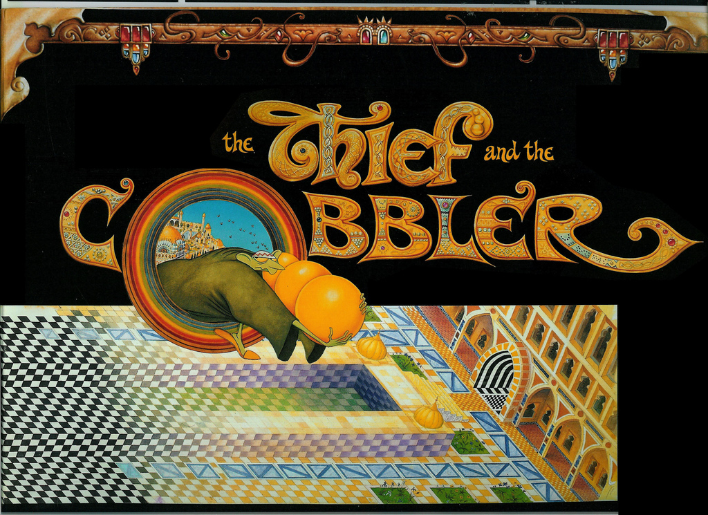
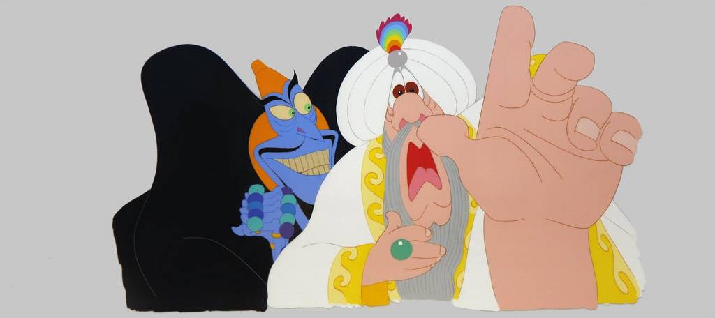
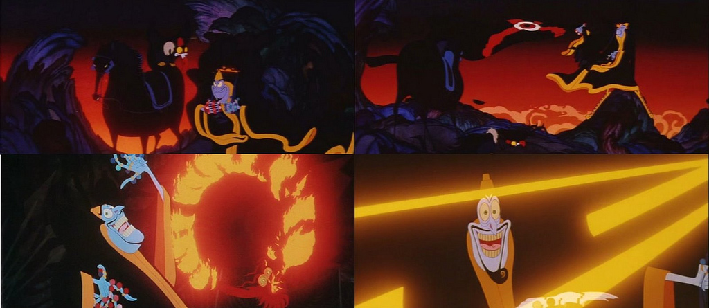
I have been obsessed with this film since I saw a couple of clips in a documentary called ‘I Drew Roger Rabbit’ back in the late 80’s. It is / was the life’s work of the legendary Richard Williams, who most people will know for his animation on Roger Rabbit. For those that don’t know of it, it’s no big surprise, it’s history is long, complicated and it is still unfinished in the form it’s creator intended. There is an DVD in existence but this is a pale shadow of it’s intended groundbreaking form which Williams has disowned.
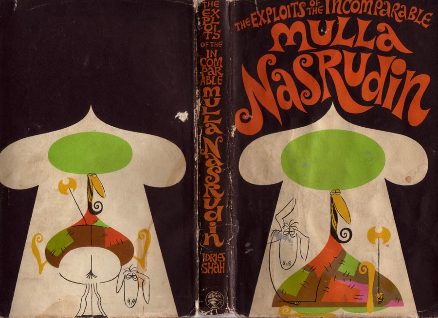
A short history of the production: it was begun in the sixties and loosely based on both Aladdin and the Sufi stories of the character Mulla Nasrudin, some of which Williams illustrated in early editions. It was his intention that it would compare to the early Disney greats and feature some of the most jaw dropping animated sequences ever made, all hand drawn, no computer imagery involved. And it does, from the footage I’ve seen, it delivers several scenes of breathtaking brilliance that have to be watched repeatedly just to pick up just how much detail is in them.
Williams worked in advertising primarily and headed one of the leading animation studios in the UK. He was responsible for lots of adverts you would have seen as a child (if you live in the UK) such as Frosties’ Tony The Tiger, the Listerine Dragon or the Pink Panther selling TDK video cassettes. But all the while he was churning out work that paid the rent he was chipping away at his big project. He used actors such as Vincent Price, Anthony Quayle, Sean Connery and Kenneth Williams, constantly revisiting them over the years to re-voice parts as the story changed. By the time Roger Rabbit hit he was an industry legend and finally the larger public also knew his name – it was time to seize the moment and finish his masterpiece. A deal with Warner Brothers meant he worked full time on it for a number of years but financial troubles and missed deadlines bought bankruptcy and the film was taken from him.
Warners finished the film without him, cut it to bits, added and deleted characters and released it as ‘The Princess & The Cobbler’, a thoroughly bastardised version of the original and miles away from Williams’ original vision. The film was later recut again and released as ‘Arabian Knight’ for the US market which ended up wrecking it even further. Even the release of a DVD was so poor it garnered an award for the worst standard edition DVD of 2006. Williams wasn’t involved with any of these versions, having disowned the project when it fell out of his control.
All was not lost though, with the internet, and like anything that promised so much but fell at the last hurdle, (think Brian Wilson’s ‘Smile’ LP) the cult of the Cobbler has grown over the years. Starting in 2004, a fan and industry insider, Garrett Gilchrist, collected all the best sources he could find, including a copy of an original workprint of the almost finished film. He then assembled a ‘Recobbled Cut’ of the film as Williams would have had it and made it available on the web. When I found this I couldn’t believe it even existed, this was too good to be true, a film I never thought I’d see and now someone had gone to the trouble to assemble all the finished parts into a semi-coherent form.
But there was more, a new blog was started last year simply called The Thief by some of the original animators and staff on the project. They post anecdotes, line tests and technical details behind various scenes along with with in-house memorabilia and countless other things privy only to those involved in such a production. This is also one of the reasons I’m writing this blog now, they have recently initiated a poll in an attempt to drum up an official DVD release of the surviving parts of Williams’ version. Finishing the actual film seems out of the question (Williams rarely wishes to discuss it) but there is a wealth of material finished that ranks amongst some of the best animation ever produced. Various restoration projects have been started over the years and here is another attempt to set the wheels in motion to give it some form of dignified release to the public.
This film is a legend in animation circles and it slowly seems to be coming to light via the web (it already has a lengthy Wikipedia entry). I urge you to check out Garrett’s website for more info on a copy and see it, marvel at it’s contents and then tell someone else. Maybe check out the Thief blog for more of the background behind it or add your vote to the poll to have a DVD released by the studio that holds the footage. Whatever you do, try and make time to see it in some way as it is a superhuman feat in a medium that has become dominated by computers – they simply don’t make them like this anymore.
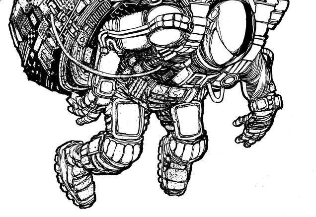 Hot out of the in-box this morning, here’s a detail of Henry Flint‘s cover image for the forthcoming DJ Food album. I’ll post more as time goes on but this is only a close up of part of it, there will be background added (by Henry) and colour (by myself). On the finished product you’ll see how all the different images he’s done for the releases work together too, although I’m trying to find a way to make that work with the packaging!
CUSTOMTONE by Fracture & Neptune feat. Martin Fieber from Astrophonica on Vimeo.
Brand new Fracture & Neptune video for ‘Customtone’ video by resident Astrophonica artists Emilski & Nick Duggins.
[singlepic id=2895 w=320 h=451 float=left] [singlepic id=2903 w=320 h=451 float=right]
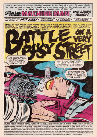
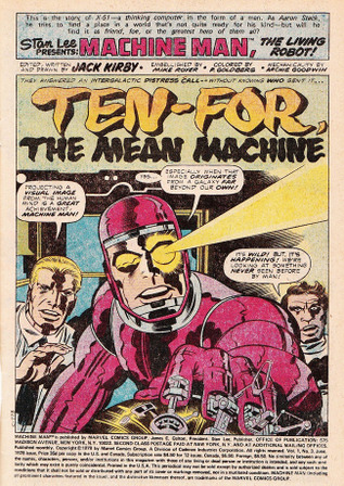
This has been going on for a while now over on Warren Ellis’ sprawling Whitechapel forum. The idea is that you get a few scraps of info about what has now become a classic comic or series, and have to imagine you’ve never seen or read the comic before but were given the job of illustrating the front cover of that issue or book.
[singlepic id=2875 w=320 h=437 float=left] [singlepic id=2866 w=343 h=437 float=right]
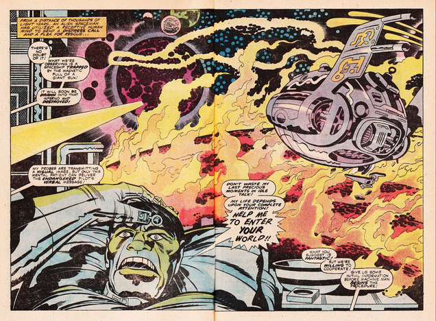
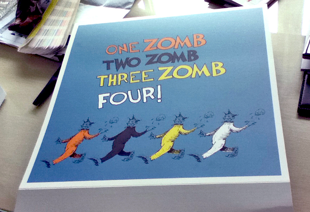
The Fantastic Four, Spiderman (via Amazing Adult Fantasy), 2000ad, Superman, Zap Comix and more have all come in for a re-imagining over the last year and I’ve rounded up my favourites in the gallery below.


More can be seen here and there’s also a Remake/Remodel series where you’re asked to redesign obscure characters from the past.

