Just My Type – Simon Garfield

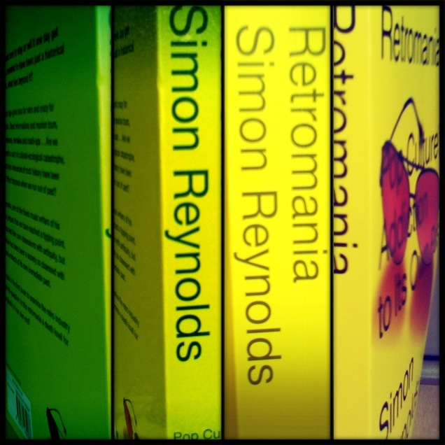
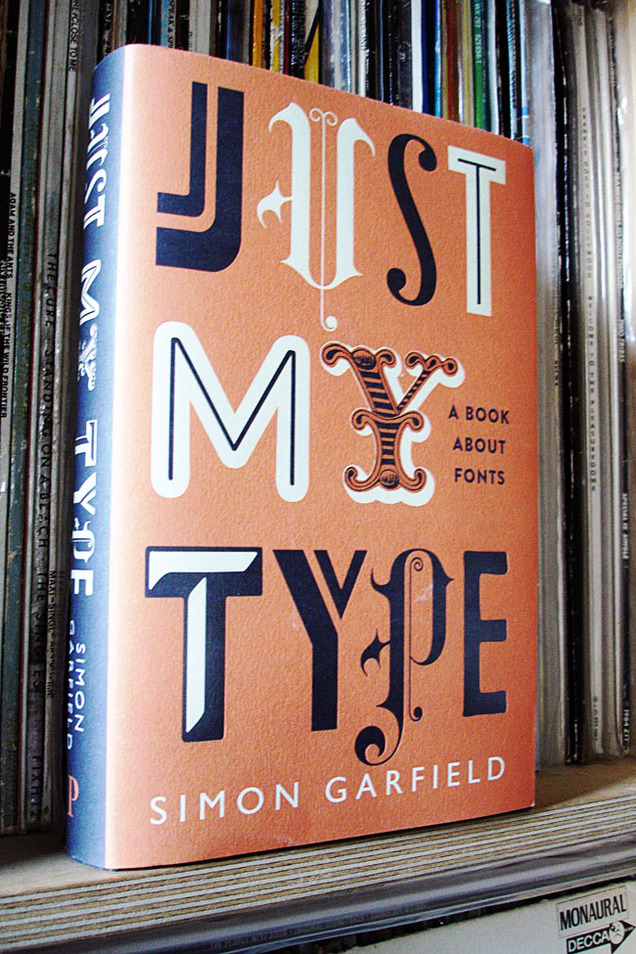
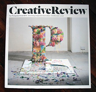
I can’t recommend this enough, a very good read for designers or even people with a just passing interest in design. You don’t have to know your kerning from your baselines to appreciate the information in this great book. Simon Garfield take a humorous, but well researched, look at fonts and typography across the ages, from design giants like Helvetica, Univers and Gill to the underdogs of the lettering community.
Chapters on Comic Sans prove he’s no type snob, a fascinating story about a lost typeface that drowned in the Thames and even a few eye openers will keep you turning the page. Who would have thought Eric Gill was into that? Also the new Olympic font comes in for a good kicking before he’s done.

If you’re a student just starting, a seasoned pro or you just know someone who likes their design but is really hard to buy a present for, this book is for you. I only wish something like this was around when I was in college, it might have saved me from making some of those dodgy font decisions in the past.

Posted in Books, Design. | 2 Comments |

Moebius’ Transe Forme films

[flv width=”312″ height=”255″]http://www.djfood.org/wp-content/uploads/2011/03/GAL-BANDEANNONCE.flv[/flv] [flv width=”312″ height=”255″]http://www.djfood.org/wp-content/uploads/2011/03/MO-DESSLIVE-STELETATAN-1-MUSIQUE.flv[/flv]

The Moebius exhibition in Paris ends this weekend at the Foundation Cartier. I sadly didn’t make it back there but hope it will come to the UK some day. Here are a selection of the films featured on the exhibition site.

[flv width=”312″ height=”255″]http://www.djfood.org/wp-content/uploads/2011/03/E-CARD-2011.flv[/flv] [flv width=”312″ height=”255″]http://www.djfood.org/wp-content/uploads/2011/03/MO-DESSLIVE-MAJOR-5.flv[/flv]

Posted in Art, Books, Comics, Design, Event. | No Comments |

3D Art Book by Tristan Eaton

Last year I had an inexplicable yearning to buy more comics again after largely dipping out of the medium for a few years (save for the weekly dose of 2000ad thrill power and a few others). I also started to dig in the 50p-£1 boxes for older things I read as a kid or just liked the look of. Along the way I picked up a number of 3D comics from the boom in the late 80’s as well as a couple for more recently. When they work they’re great but frequently the writing never matches up to the standard of the imagery. There’s a whole blog post to be had out of some of those but that’s for another time.

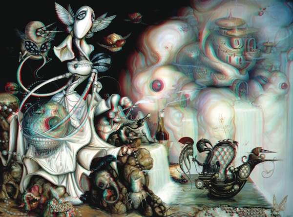
This week I’ve been experimeting with 3D analyphs on a project – converting a 2D image into 3D when you look at it with those red and blue glasses. It’s not that hard, fun, if not a bit frustrating, and involves a bit of guesswork. I’ve managed to make one successful image so far but I can’t post it yet as I’ll get in trouble if it’s available to all at this stage.

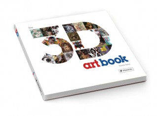
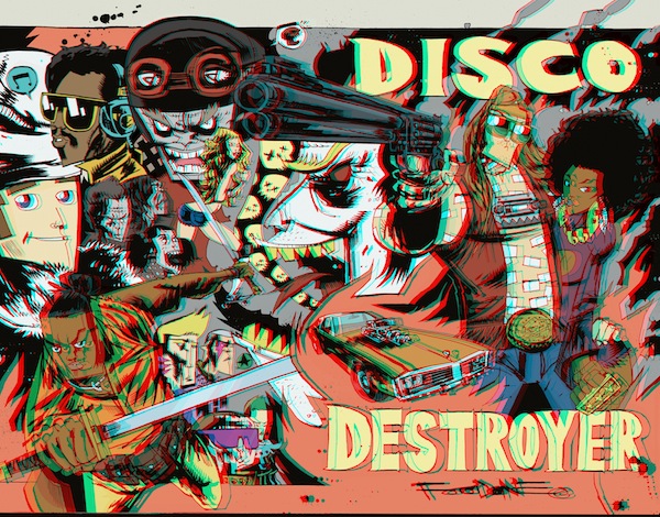
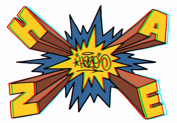
BOOK_PICBut what should turn up on Jim Mahfood‘s Facebook stream today? News of a new book by Tristan Eaton (he designed the Dunny & Munny figures for Kidrobot) full of 3D images by a ton of different artists.  Four years in the making, the 224 page book, published this Spring by Prestel, features a little bit of his work and a lot of Tristan-curated images from 100 artists across a multitude of disciplines: graffiti, illustration, contemporary art, graphic design, etc.

Check some images that I found online at animalnewyork.com and you can pre-order the book here.

JIM_MAHFOOD_3DHAZE_RGBcrayola_3d

The full artist list (with the ones I’m excited to see in bold): DRIAN JOHNSON, ANDREW BELL, ANTHONY AUSGANG, ASKEW, BASK, BILL MCMULLEN, BLOKT, BOOKS, BUFF MONSTER, CALMA, CASEY RYDER, CATALINA ESTRADA, CEY ADAMS, CHRIS MARS, CRAOLA, D*FACE, DABS & MYLA, DALEK, DAVE COOPER, DAVE KINSEY, DAVE NEEDHAM, DAVID FLORES, DEMO, DR. REVOLT, DARREN ROMANELLI, EBOY, EDATRON, ERIK FOSS, ERIC WHITE, ERIC HAZE, ESAO ANDREWS, FILTH, FLORENCIA ZAVALA, GARY BASEMAN, GARY TAXALI, GLENN BARR, GOMEZ BUENO, ISABEL SAMARAS, JAMES JEAN, JEFF SOTO, JEREMY FISH, JEREMY MADL, JERRY ABSTRACT, JIM HOUSER, JIM MAHFOOD, JOE SORREN, JON BURGERMAN, JULIE WEST, JUNKO MIZUNO, KANO, KATHY STAICO SCHORR, KENZO MINAMI, KEVIN BOURGEOIS, KEVIN SKINNER, KID ACNE, KOBIE SOLOMON, KRISTIAN OLSON, LAURA BARNHARD, LOGAN HICKS, MARK BODE, MARK DEAN VECA, MARK JAMES, MARK RYDEN, MATT CAMPBELL, MATT EATON, MAYA HAYUK, MICHAEL DE FEO, MISHKA, MINT AND SERF, MISS VAN, MORNING BREATH, MR JAGO, MYSTERIOUS AL, NATHAN FOX, NATHAN JUREVICIUS, PETE FOWLER, POSE MSK, RAY ZONE, RENATA PALUBINSKAS, RICH JACOBS, RON ENGLISH, ROSTARR, SHEPARD FAIREY, SKET ONE, STANLEY CHOW, STASH, STEPHEN BLISS, TARA MCPHERSON, TES ONE, TODD SCHORR, TOKIDOKI, TOM THEWES, TRAVIS LOUIE, TRAVIS MILLARD, TRISTAN EATON, TRUSTOCORP, UNKL, UPSO, AND WINSTON SMITH.

Posted in Art, Books, Comics, Design. | No Comments |

Moebius exhibition in Paris

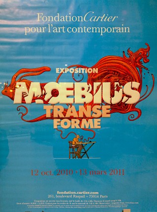
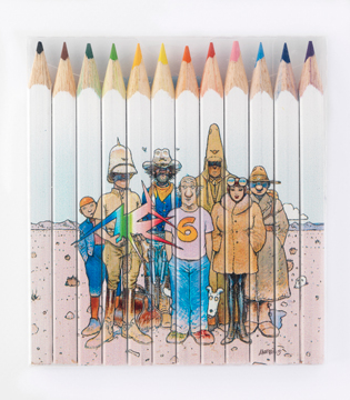
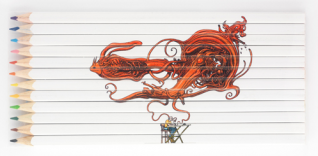
Moebius poster I was in Paris last Friday, playing at La Machine, but upon waiting for the Eurostar the next day I saw a poster for a Moebius Exhibition at the Foundation Cartier. Gutted not have known this was on earlier as I could have seen it before I left. The link above takes you to the exhibition site with a wealth of info, images, beautiful videos of Moebius drawing and mouth-watering merchandise, check the pencil sets below.

Moebius pencils 2Moebius pencils 1

Avatar by Tarkovsky?

Avatar by Tarkofsky
Found this on the web whilst looking for something else, nice idea, no idea where the original picture comes from, presumably an ancient sci-fi novel. Not sure if Avatar would be quite so action packed with this director at the helm.

Posted in Art, Books, Oddities. | No Comments |

Mr Benn ‘Big-Top Benn’ book reissued

[singlepic id=2559 w=400 h=300 float=left]

.

.

Tate Books have reissued the vintage David McKee book ‘Big-Top Benn’ in hardback, handy for that Xmas present where you want to impress the parents as much as the kids. It’s gorgeous too, alternating between colour paintings and black and white line work, with some of McKee’s freakiest work landscape-wise. All the pictures are drawn ‘flat’ with the perspective seemingly looking down from above, if a road turns in a different direction the houses or hills follow it so that, sometimes they are upside down on the page. Mr Benn trying on his clown’s costume in the changing room illustrates this perfectly too.

.

[singlepic id=2558 w=350 h=260 float=left] [singlepic id=2556 w=350 h=260 float=left]

Talking of David McKee, when my wife was 5 years old, her (very hip) mother took her to a McKee book signing in Kensington for the release of a Melric the Magician book. Upon meeting the artist, my wife, who was very shy then, was completely speechless, to make her feel better McKee drew a witch on a broomstick with a cat on the inner cover and signed it.

Posted in Art, Books. | 1 Comment |

Blueprint & Clash magazines

A couple of juicy Ninja XX features are on the magazine racks at the moment. The latest issue of Blueprint contains a six page feature on the artwork and design of the label with quotes from yours truly. Also in the same issue are pictures of the Manchester gallery that Agents of Change painted recently (see gallery above), nice to see them getting some props in an architecture magazine.

You can also now read this article online here

[singlepic id=2390 w=340 h=290 float=left] [singlepic id=2392 w=390 h=290 float=left]

Clash magazine has a nice little 8 page commemorative foldout too in their October issue where I pick some of my favourite sleeve designs on one page.

[singlepic id=2397 w=300 h=230 float=left] [singlepic id=2398 w=300 h=230 float=left]

Ninja Tune XX box set features on Hard Format

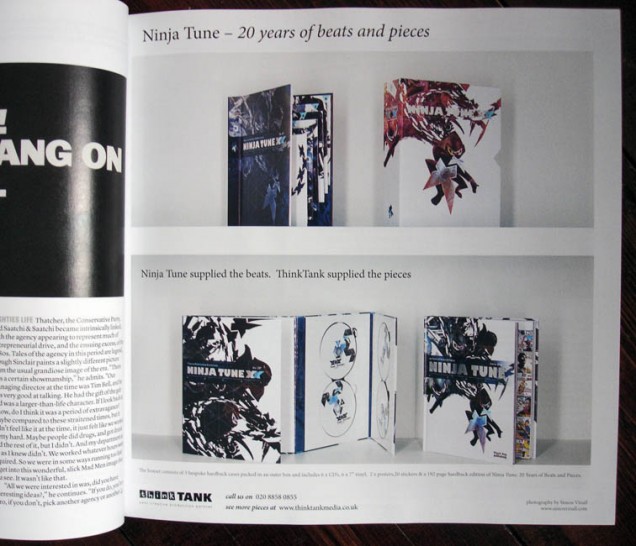
I’m very proud to announce my first design entry on the Hardformat blog. Run for three and a half years now, it’s a site dedicated to “reaching for the sublime in music design”, both past and present. One of the first things I think any designer finding the site would think is, “I wonder if I’m on here?”, the second would be, “I want to be featured here”, if they don’t find their work. The site already published the original mock up image of the set a few months back and we entered into a dialogue about it. That turned into me writing up a lengthy piece detailing some of the process involved in realising the gargantuan project.

www.hardformat.org/5200/ninja-tune-xx/

ninja-xx-9

Process: The working practices of Barney Bubbles

So, Nigel Peake is in town, fresh from painting a mural and we’re wandering around Pimlico like a couple of tourists. Clutching an A-Z and an iPhone, we’re trying to find the Chelsea Space which is currently hosting the Barney Bubbles exhibition, Process.

Bubbles, born Colin Fulcher, sadly committed suicide in 1983 and has long been an unsung hero of British sleeve design but this has started to change in recent years after Paul Gorman’s book on his work, ‘Reasons To Be Cheerful’, was published in 2008. Quickly selling out and starting to command high prices on the web it’s now been updated and expanded in a new edition.

Possibly one of the reasons Bubbles isn’t as widely know as, say, Neville Brody, Malcolm,Garrett, Hipgnosis, Peter Saville or Jamie Reid is because his work spanned both both ends of the seventies and beyond – the hippy / prog / rock and the punk eras –  and never conceded to one house style for anyone. The two things he’s probably most known for – Hawkwind and Stiff Records – couldn’t be much further apart. Looking at one of his Hawkwind sleeves and then an Elvis Costello or Ian Dury from later you’d be hard-pressed to see any sort of stylistic link, yet he did them both.

After walking up and down the street way too many times, asking in the Tate to a bemused attendant and eventually finding the space via a round-the-houses route through the College of Art we realise we’d walked right past it. Failing to notice the sign outside the inconspicuous door set back from the main road, we should have stopped yakking and paid a bit more attention.

Anyway, once inside we were greeted by walls pasted with vintage music paper ads and posters of late 70’s vintage, a couple of old record players sporting various vinyl rarities, badges, stickers and a gorgeous rack of Ian Dury ‘Do It Yourself’ wallpaper-sleeved LPs. Right in, no messing about. Along the bottom of one wall were various publications all sporting BB covers including a John Cooper-Clark ‘Directory 1979’ an issue of the NME, Nova magazine and a Hawkwind programme.

A long, thin, tall corridor then stretches up before turning into the main exhibition room and one wall is covered with posters and record sleeves, the Hawkwind ones unfolded flat to show off their wares. Frustratingly the sharp viewing angle meant that the higher pieces were hard to see properly, further compounded by spot lighting which caused glare on anything in a PVC protective sleeve.

Into the main room, past a giant hanging Chuck Berry sculpture and here’s the good stuff. Cases of artifacts, portraits, sketchbooks, paintings, paste ups, reference books, even materials like Rotring pens he left behind. One wall is covered in original art paste up sheets, tracing paper with notes covering some of them, all hung with big bulldog clips which is a nice touch throughout. Another wall is full of beautifully presented black and white art, logos, layouts – a mixture of paint, pen, Letraset and whiteout – all of which would have blended into one under the camera later.

It must have been a difficult task for the curators to hang the work because it was so random, finding obvious themes and connections is almost impossible with Bubbles because each piece is so different from the next. Sure he has various tricks and techniques that he employs, his mixture of abstract and 3D shapes to make words for instance, but it’s as if he was always starting from scratch with each new piece. His foldout sleeves for Hawkwind and Elvis Costello are placed behind perspex but even they jut out at points, unable to be contained in such a space.

I’m no expert on Bubbles but this looks like a goldmine of his work for anyone remotely interested in him or the groups he designed for. Also this is a great reminder of how things were done decades ago, pre-digital, everything is hand drawn, painted, cut and pasted and it’s beautiful to see, especially all the whited out parts. Although by no means a complete overview – several pieces are conspicuous by their absence – the curators intend this to be more of a stepping stone to bigger things later and the new edition of the book should help this.

The exhibition is on now until October 23rd at Chelsea Space,

16 John Islip Street,

London, Sw1P 4JU
More details here

and visit Paul Gorman’s excellent blog on all things Barney Bubbles

and a good, quick overview of his work at feuilleton

Posted in Art, Books, Design, Event, Music, Records. | 2 Comments |