.
I did a little interview with Robert Lamb over at Stuff To Blow Your Mind and chose three books I’d recommend for some summer reading. This list is here and you can listen to the podcast here.
Books
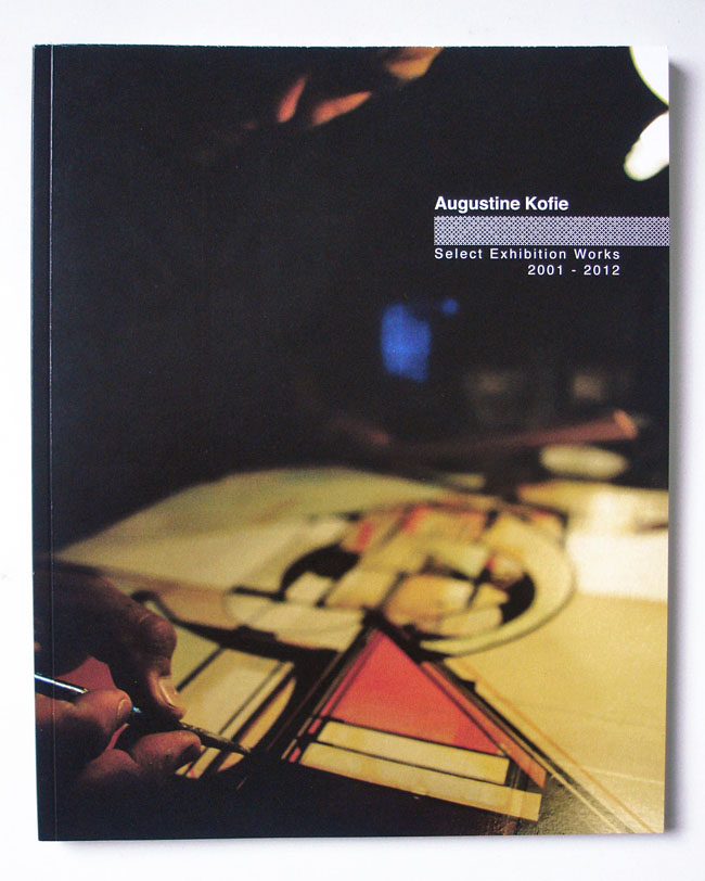
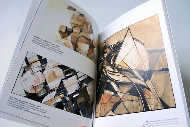
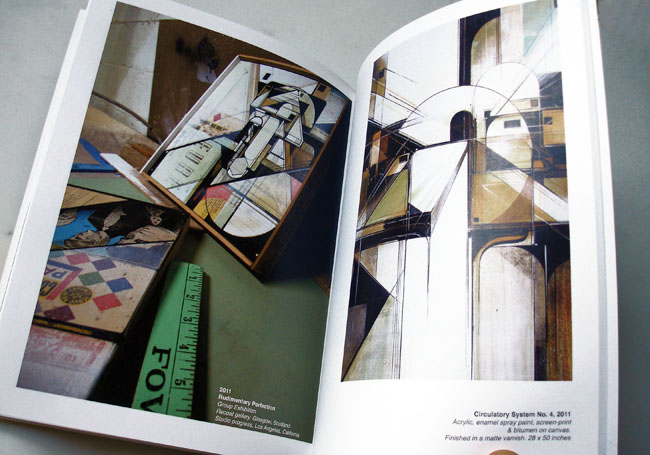
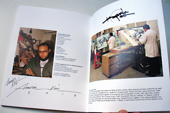
This is the first collection of Augustine Kofie‘s work, self-published and available at his Keep Drafting site for $40 inc. Int. postage. You can see his art progress over a ten year period in just 62 full colour pages. What a body of work to behold so far too, his colour palette and sense of compositional balance is incredible as is his taste in texture and collage.
For me there is no other artist producing work of this calibre right now, I just wish I was richer and could afford some of his originals. This book is a steal at this price when you see some of the work contained within so it’ll have to do for now.
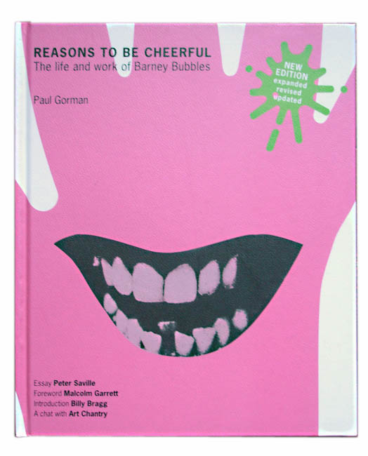
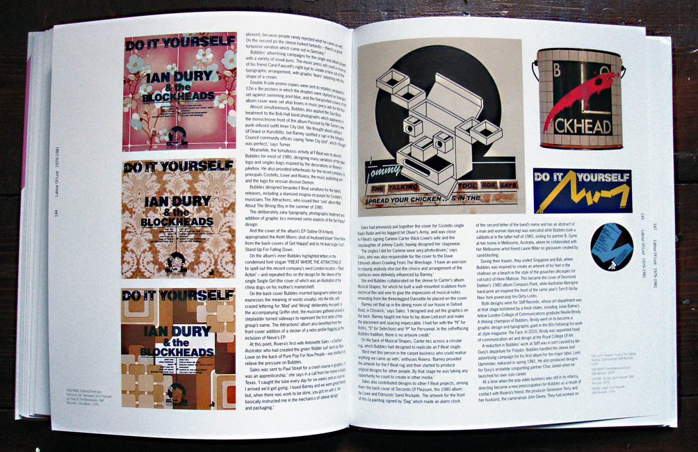
I was lucky enough to receive this fantastic book for Xmas this year after the first printing in 2008 disappeared and started going for silly money. Luckily this 2nd edition has extra info and images so waiting paid off and I can’t recommend this book highly enough for fans of music design in general. Until the middle of the last decade the name Barney Bubbles wasn’t widely known or recognised aside from music business associates from back in the day or the odd rabid fan.
The reason for this is not because his work was hidden away on obscure releases – he designed covers for several classic albums as well as a fair few hit singles in the 70’s and early 80’s. It wasn’t because the work wasn’t good, most of it is stunning, all the more so when you read into the detail he put in each and every one. It was more to do with the fact that Barney often didn’t sign much of his work, and when he did it was under some super-coded pseudonym only a few close to him would recognise. He also didn’t go out of his way to publicise himself and suffered from bouts of depression which, sadly, caused him to take his own life in 1983, thus halting what could have been a groundbreaking career in design.
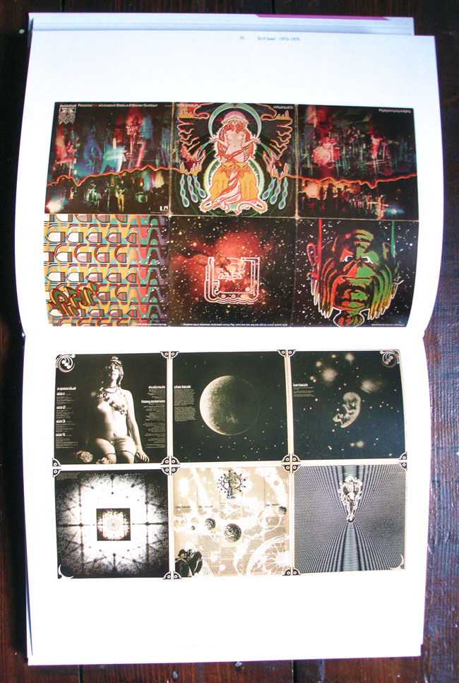
I say this because Bubbles was that rare thing in that he spanned two very distinct generations and worked seamlessly within both of them, a rarity these days and hard to pull off as most designers get associated with a particular style or genre and become known for that only. He started in the midst of the 60’s and became a full blown hippy, journeying to San Francisco in the summer of ’68 . He returned to produce graphics for the scene in London – the name Barney Bubbles was given to him after he started his own psychedelic light show mixing inks on overhead projectors. A long association with Hawkwind followed and he designed some of their most innovative sleeves such as ‘Space Ritual’ and ‘X In Search Of Space’ – both fold out wonders the likes of which were abundant in the 70’s.
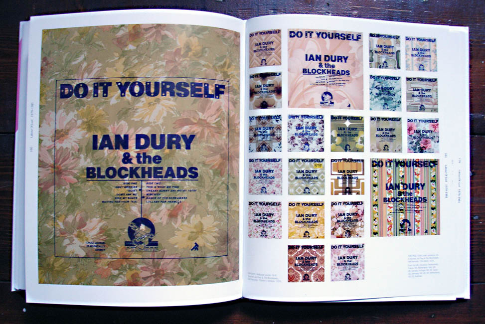
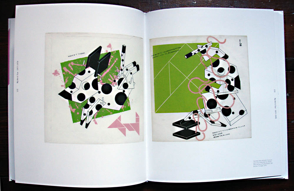
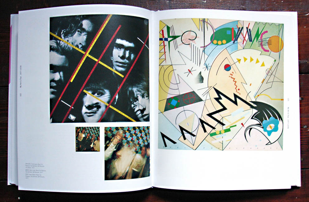
But come the year of punk, when all this was to be washed away and the reset button pushed, Barney fell in with the newly hatched Stiff label with Ian Dury, Elvis Costello and Nick Lowe among others and seamlessly altered his style(s) to fit with the times, coasting through into the 80’s unscathed. He was the first person to mimic the Penguin book covers now so ubiquitous, parodied Blue Note sleeve design nearly a decade before it came back into fashion with Acid Jazz and took De Stijl and Cubist designs as inspiration before many others. He even dipped his toe into furniture design and early video promo making before he passed (did you know he directed The Specials‘ ‘Ghost Town’ video? no, me neither).
Until the publication of the first edition of this book, tirelessly put together by journalist Paul Gorman, who has since helped curate displays at the V&A of famous pop memorabilia, the design world had largely ignored Bubbles even though many pieces have featured in Record Cover collection books over the years. The drawing together of his output and the joining the dots between the various phases, pseudonyms and uncredited work has finally shone a spotlight on him, something it’s doubtful he would have gone out of his way to do had he still been alive.
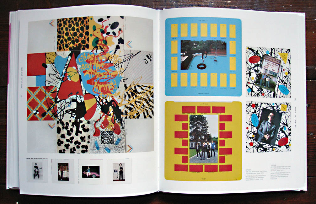
I certainly wasn’t aware of how far he reached with his work but plenty of his sleeves and designs were familiar to me even though a lot of the music wasn’t something I listened to. The logo for the NME paper from 1978 through to 2010 – that was Barney, the Stiff Records logo, Billy Bragg‘s ‘Life’s A Riot With Spy vs Spy’ sleeve, Elvis Costello‘s ‘Armed Forces’ LP package, The Blockheads‘ logo, the first Depeche Mode LP cover, the first Damned singles and albums…
An incredible body of work and an amazing book, lavishly illustrated that chronologically treads the paths that Bubbles did with plenty of input from the artists and friends that he worked with. My only nitpick with it is that the images are almost always out of synch with the text, the illustrations always seemingly several pages behind which is frustrating when you’re trying to get a sense of a sleeve being described only to find it 6 pages later.
His death is also almost a minor entry in the narrative and, having heard Mark Hodkinson‘s harrowing ‘In Search of Barney Bubbles’ documentary on BBC Radio4 it’s all the more tragic when you see everything he’d achieved up until that point. Treat yourself to this book and revel in his work as he finally takes his place among the greats of music design in the 20th Century.
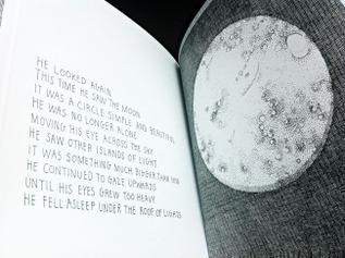
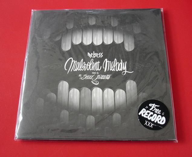
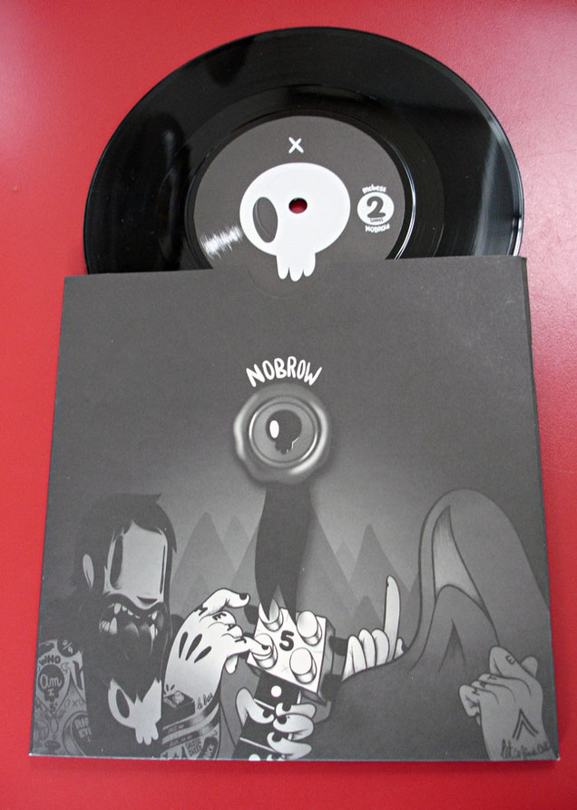
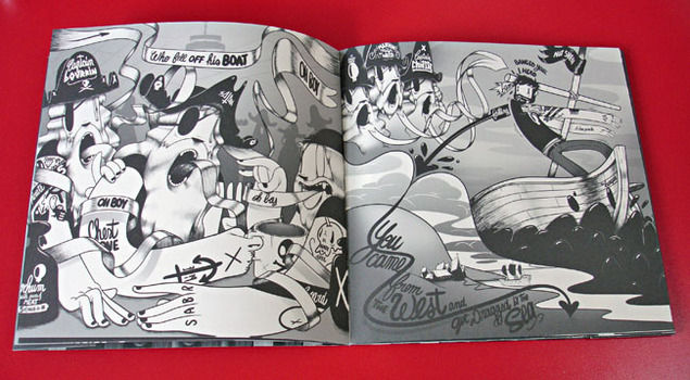
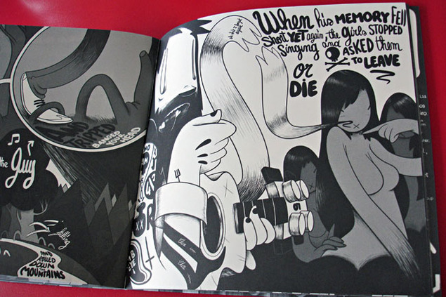
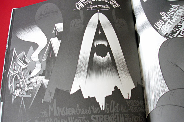
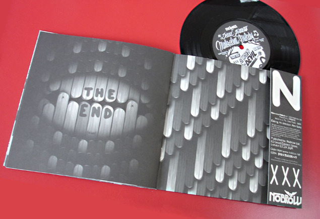
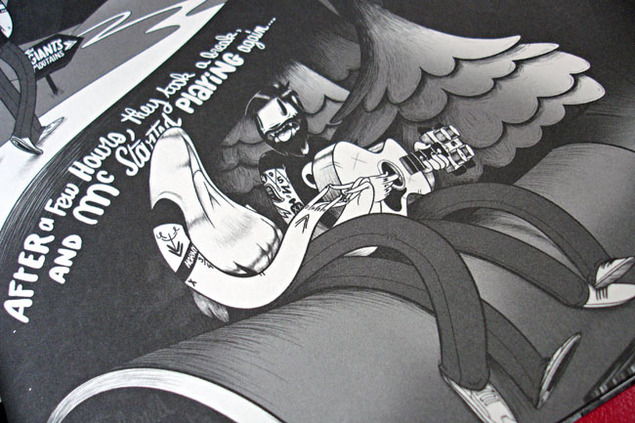
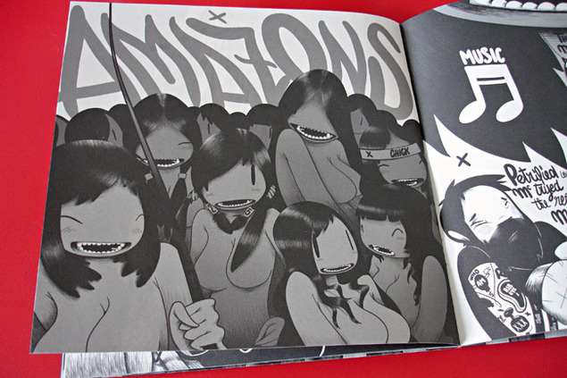
I can’t resist a comic or book with a record on the inside cover and the 7″ size of McBess‘ ‘Malevolent Melody’ made me grab it off the shelf in the NoBrow shop in Great Eastern St. earlier in the year.
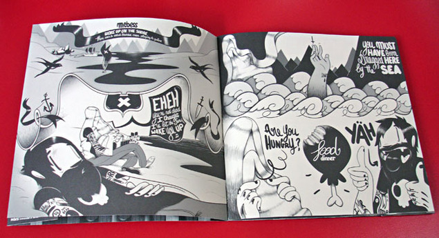
The name McBess was unfamiliar but his images floored me and I immediately bought this as well as another oversize book by him called ‘Big Mother’. Seldom do I come across someone who has such a strong, fully developed visual style that stands out so immediately.
Shades of Kid Acne and Pete Fowler‘s style permeate throughout but not a hint of colour and some of the smoothest draughtsmanship I’ve seen in a while.
I was in love with his style from the minute I saw it, my favourite artistic discovery of 2012. Check out his site here.
When Pepe Deluxé do anything they don’t do it by halves, in fact they go the whole nine yards and then add a load more into the mix for good measure. What emerges is music and imagery so multi-layered it requires repeat listens to pierce the surface and process the motherlode of information contained within.
One of the reasons I love Pepe is because there is genuinely no one like them, they are a one-off and a band seemingly working in and across separate time zones whose records sound so out of place you wonder if they’ll ever even find reappraisal 20 years down the line. This isn’t a criticism, it’s to be admired that a band can strike out so single-mindedly whilst ignoring any current forms of music that are deemed ‘hip’ and ‘cool’. In fact it’s testament to Pepe and Catskills for leaving off the many remixes they’ve had over the last releases as, with the exception of Husky Rescue‘s cover of ‘Supersonic’, none of them came close to Pepe’s vision and sounded like they were trying to force the band into a modern day setting (sorry guys, just my opinion).
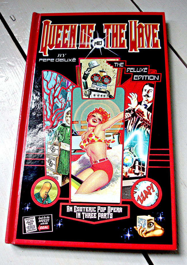
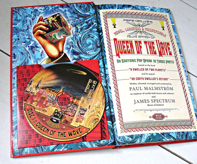
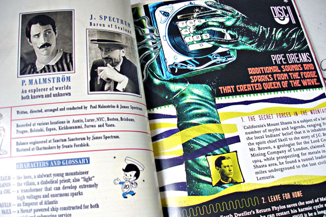
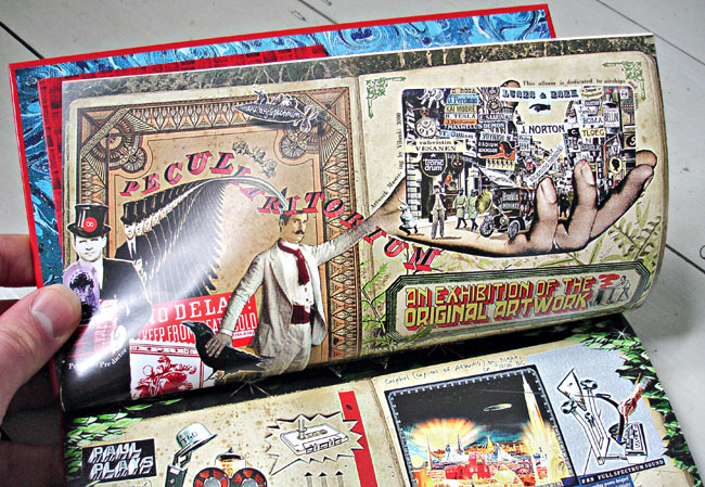
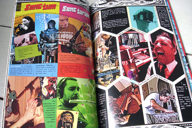
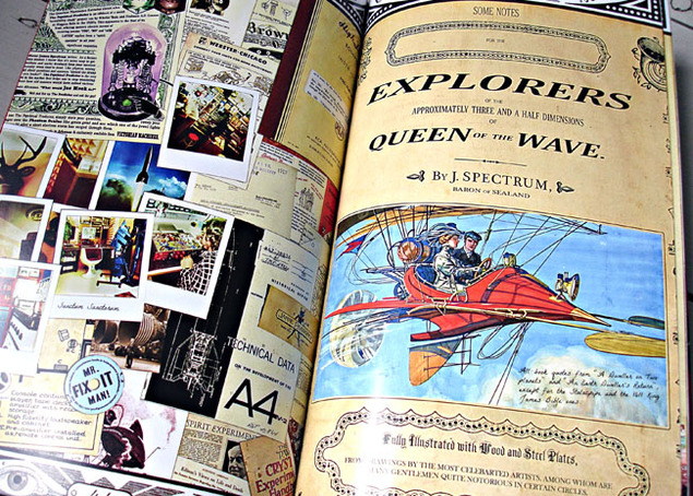
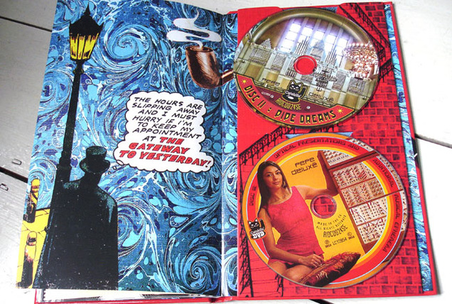
The new Deluxe version of their ‘Queen of the Wave’ album is no different, in fact it ups the ante considerably and throws everything AND the kitchen sink at you over 2 CDs, a DVD and a 64 page booklet inside a hard backed book. The original album is present but the ‘Esoteric Pop Opera In Three Parts’ has suddenly expanded to three discs, the second with versions, new and unused tracks and an easy-listening style EP of selected songs. The DVD includes videos for singles both new and old as well as stems for budding remixers. Everything about it says EPIC, the original album is one in itself but bolstered by the 2nd disc, DVD and a book that has crammed enough material for 100 pages into 64 then the deal is sealed.
No space is left un-filled and we learn everything from recording history to how they shot the video for ‘Night & Day’ with real magic tricks and all. The book shouldn’t work, it breaks so many rules of what good design is with up to 10 different fonts competing for space on any one page and a layout that’s more scrapbook than grid. Yet it does work and adds to the music is so many ways, placing the album visually between steampunk and psychedelia with nods to Tiki and Analogue electronics from the golden age. One minute you think you’re looking at an issue of Practical Electronics then it’s a poster in the style of a traveling circus or a Richard Hamilton-esque collage.
Anyway, enough of me blathering on, check the video below as it’s another brilliant Pepe production with the classic ‘Virtual Chicken Little Funk Operator’ set to become legendary. You can BUY the deluxe package from Catskills HERE.
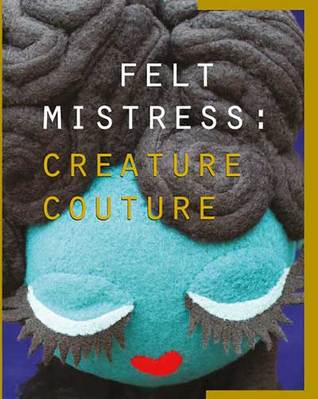
Jonathan Edwards has a few new books out as well as featuring in the upcoming ‘Creature Couture’ book by Felt Mistress. This one is called ‘Imagined Landscapes’ and features all sorts of weird and wonderful locations in his unique style.
If you follow his twitter you’ll have seen these popping up over the last year or so and he’s collected them together in a 32 page sketchbook. I love the colours on the cover and wished there was more colour inside but then again it is a sketchbook.
He has copies in his online shop as well as more sketchbooks, prints, original art, comics and he’ll even do a bespoke portrait of you.
Felt Mistress aka Louise Evans has a book coming out of her creature designs from the last 18 years. 400-pages feature over 1,650 photographs, previously unseen drawings of her partner Jonathan Edwards’ original design ideas, details of every Felt Mistress collaboration with other artists and more. With in-depth interviews with Loiuse, Jonathan, Jon Burgerman, Pete Fowler, Ben Newman, John Knox, Nobrow and more, it looks like the definitive article.
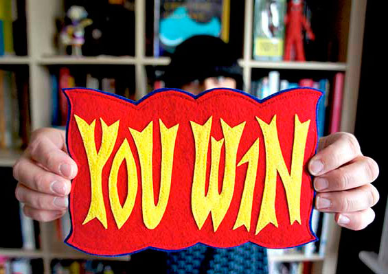
If you pre-order the book from the publishers Blank Slate you’re in with a chance to win an actual Creature made by Louise which is featured in the book. One book will come with a felt ‘You Win’ ticket as seen below and details of how to claim your prize.
There are also versions of the book with Mr Tippy characters in regular and gold editions and, if you still can’t get enough creature love, you can hear Louise and Jonathan talk about the book at Foyles on Charing Cross Rd. on Dec 11th at 8.30pm. The talk is free but you have to book a place online and Jonathan will be doing creature portraits on a first come first served basis.
The excellent Pepe Deluxé are coming to the UK for their first live performance on November 12th at the Scala in London. Tickets are available here from Soundcrash.
The full live experience will be supported by Husky Rescue and guests and coincide with the release of the Deluxe edition of Pepe’s ‘Queen Of The Wave’ album which I rhapsodised over earlier this year.
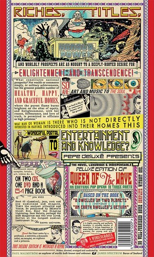
Apparently the new edition (a deluxe Deluxé edition?) contains 2 CDs and a DVD and comes in a 64 page hardback book with loads of extra artwork to add to the album companions already generated for the original version. Check the front and back covers below and get more info from their Facebook page.
Two new Kraftwerk books are about to hit the shelves. The Vinyl Factory issue a collection of 45 sleeves from around the world in a limited edition book with a 7″ of an interview on Sept 12″ with a free exhibition of the sleeves at The Vinyl Factory Chelsea gallery, 91 Walton Street, London SW1 between Sept 13th and Oct 5th. You can pre-order the book for an eye-watering £80 here.
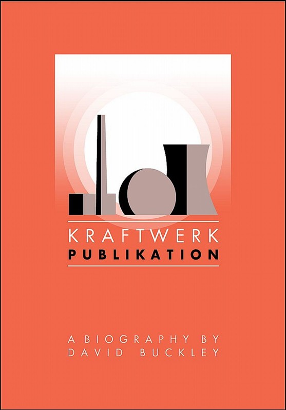
A new biography is also released this week called ‘Publikation’, written by David Buckley and published by Omnibus Press. It got a good review in the recent issue of Mojo as he seems to have interviewed as many of their close associates and ex-band members as possible. You can buy it now and it’s nice to see that it’s been designed by Malcolm Garrett.
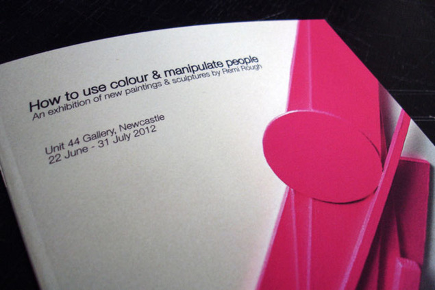
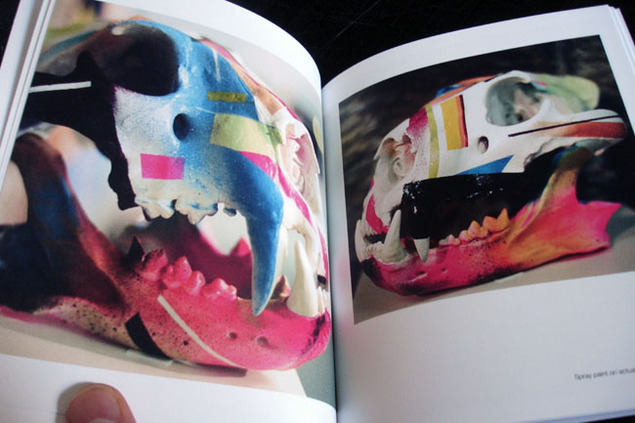
The supremely talented Remi Rough has a new mini book out full of images from his recent show in Newcastle, ‘How To Use Colour & Manipulate People’. Besides showcasing his paintings it also contains some of his new 3D work. Each book costs £30 and comes with a unique artwork, handmade by Remi, see here for more info.
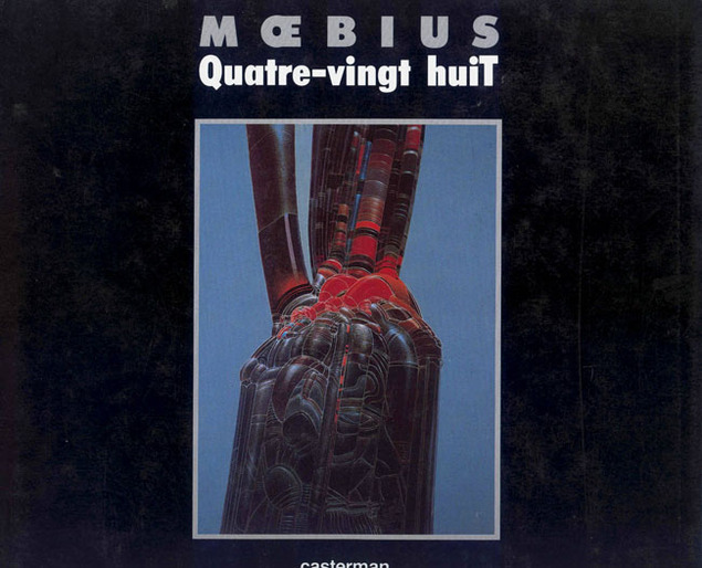
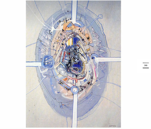
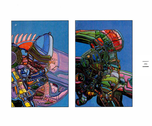
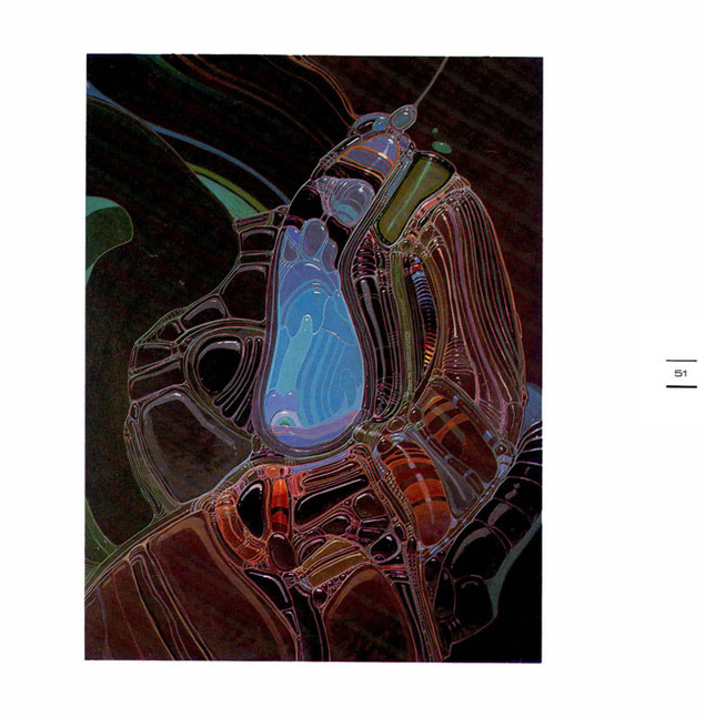
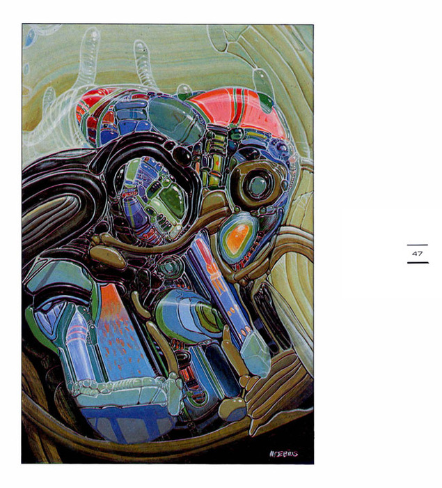
I stumbled upon this today whilst surfing the net for something else. It’s a book of ‘personal work’ by Moebius, forms and shapes that have no purpose other than for him to express himself in a non-work context. Similar to the method Henry Flint used in his ‘Broadcast’ book – of letting his mind go and just drawing to see what came out – these were collected into a book named ‘Quatre-vingt huit’ (’88) in 1990.
Not all the images are this finished but these are some of my favourites, that he could produce work like this in his spare time is incredible. Apparently it’s now quite a rare book but a quick search will net you a digital copy, hopefully someone will reprint it now that he’s gone.
Always enjoy Jim Mahfood‘s work, very much looking forward to his take on Tank Girl this summer. He also has a new book out collecting his online adventures as a working artist, Los Angeles Ink Stains. He has a print out to go with it too as well as toys, T-shirts and more. Go here
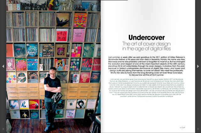
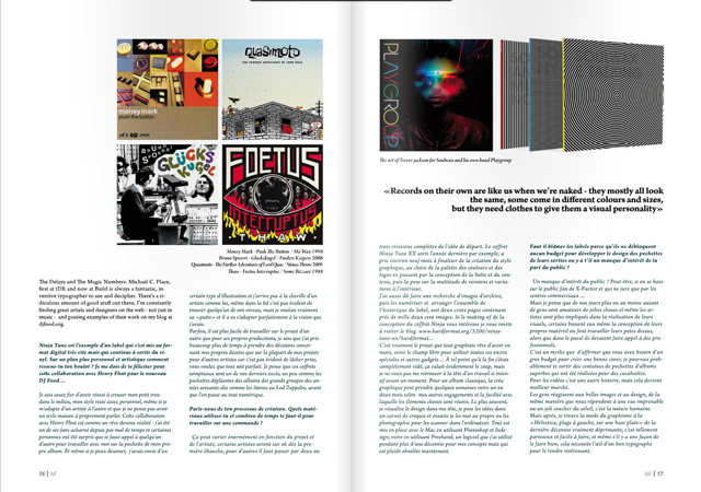
Late last year I wrote an extensive piece in response to an interview by Miguel Angel Rolland for Gilles Peterson‘s Worldwide Festival magazine about design for music in the digital age. It’s finally been published over on Issu and it’s 16 pages long (!) You can order a print copy or just download a digital version and physical copies should be available at the festival this summer. Not sure why they didn’t credit Miguel or photographer Steve Cook for the studio shot either but I’m very pleased to have been given the chance to air my views.
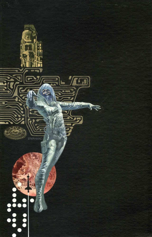
Seen on Megatrip‘s blog via the Heritage Auctions site: Jim Steranko Infinity One Paperback Cover Original Art (Lancer Books, 1970). This mixed-media piece has an overall size of 11″ x 17.5″, and the art is in Excellent condition. Sold for nearly $10,000 in Nov 2008. Stunning work.
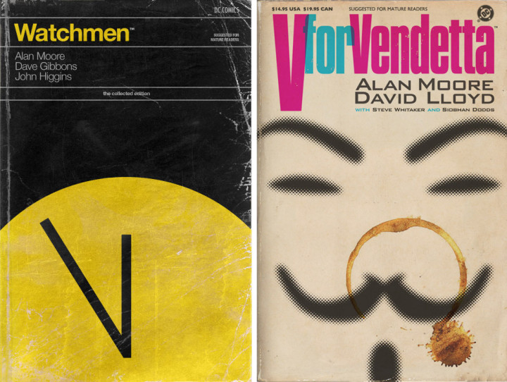
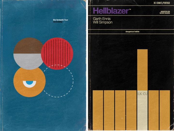
Two new takes on an old concept – films as Penguin Book covers – with the, now ubiquitous original Star Wars trilogy and Studio Ghibli films too. The SW ones are available as posters by Studio Concepcion, the SG ones by 84/5 Studio as prints and a postcard set.
Another tribute to the great Maurice Sendak who has now sadly left us, but has also left us so much great work, including this amazing pop up book.
This book is head and shoulders about all the other pop up books I have (and there are a few). Firstly because it’s the only one to feature Sendak’s art, which is gorgeous as always, and secondly because the paper engineering has to be seen to be believed.
[singlepic id=3786 w=640 h=480 float=left]
The story centers on a boy looking for his mummy who enters the house of Dr Frankenstein. As he moves through each room he encounters a different character from classic horror stories: The Vampire, Frankenstein’s Monster, The Mummy, The Werewolf and, finally, finds his ‘mummy’ in the Bride of Frankenstein.
[singlepic id=3787 w=640 h=890 float=left]
At each monster he enquires, ‘Mummy?’, before proceeding to disable them in different ways, seemingly indifferent to their attempts to frighten him. This is where the ingenious paper engineering comes in, the figures don’t merely pop up, they animate at the same time as each page is opened. The Werewolf actually transforms as he extends out of the book, Frankenstein’s monster is one of the biggest pop ups I’ve seen and the boy deals with his assailants happen as you open a flap on the right side of each page.
[singlepic id=3790 w=640 h=480 float=left]
Again Sendak sends a clear message to the children who read his books: you don’t need to be afraid of these monsters, they are easy to trick or get rid of. I don’t want to spoil it ALL for you by telling you how he does it but it all ends well and there is so much detail in each page that it bares re-reading. The whole scenario was dreamt up by Arthur Yorinks, paper engineered by Matthew Reinhart and released by Scholastic in 2006 where it won several awards including the New York Times‘ Best Illustrated book award. See the gallery below for some shots, with not too many spoilers.
[singlepic id=3793 w=640 h=480 float=left]
I heartily recommend this book for anyone interested in the history of recording. No, no, don’t all run away, it’s actually very good and I say this as someone who literally falls asleep reading any sort of manual.
Starting with the Big Bang and progressing through Edison’s cylinders and tone tests Greg Milner knows his stuff and the stuff he doesn’t he’s gone out and researched. Histories of the birth of vinyl, cassettes, laser discs, synclaviers and fairlights, the New York radio amplification battles and the loudness wars are all covered.
The uneasy birth of the CD and the industries’ initial refusal to accept the medium features along with a step by step guide to what the air particles where doing when John Bonham hit his drums in a stairwell for ‘The Crunge’.
The analogue vs digital debate is also covered but with an even hand rather than the usual ‘vinyl is warmer’ stance adopted by most.
Steve Cook over at Secret Oranges has had something put in his coffee I think, several blinding psychedelic posts today alone…
[vimeo width=”640″ height=”360″]http://vimeo.com/35720685[/vimeo]
Amazing video to advertise usegoodbooks.com. There’s a fun dig at Amazon in there too.