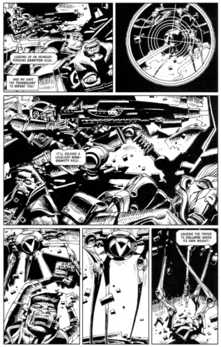
For all you 2000ad fans out there, the legend that is Mike McMahon now has a blog. Featuring all sorts of unseen artwork from over the years including unpublished ABC Warriors pages from 2001!
Comics
 From Mighty Fine via Megatrip
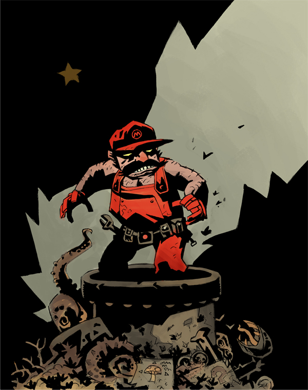
Via Megatrip via Geek Art – this popped up on the web but it’s not by Mike Mignola. Thanks to pAUL for the comment, it was Scott Watanabe.
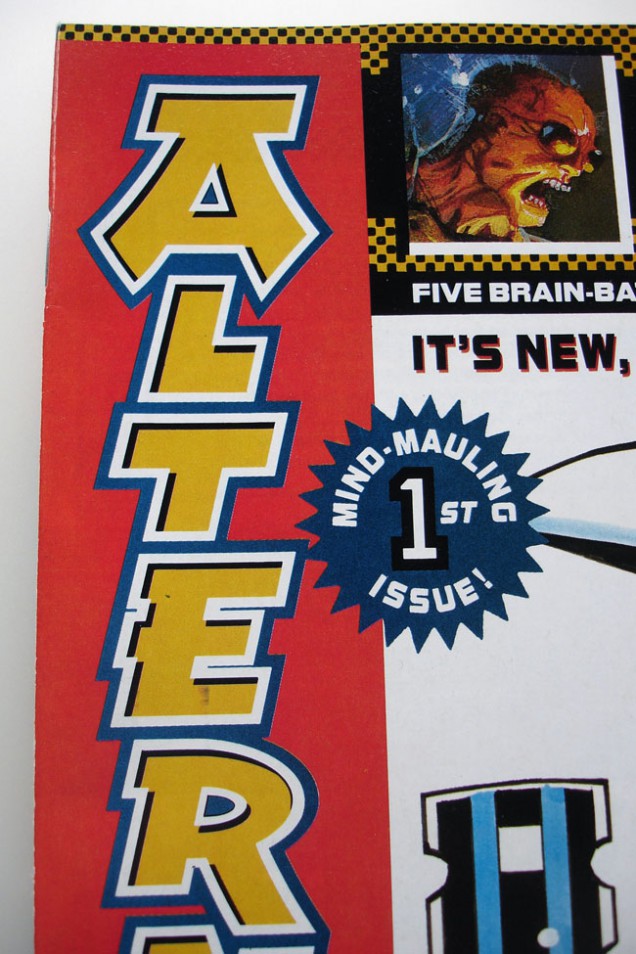
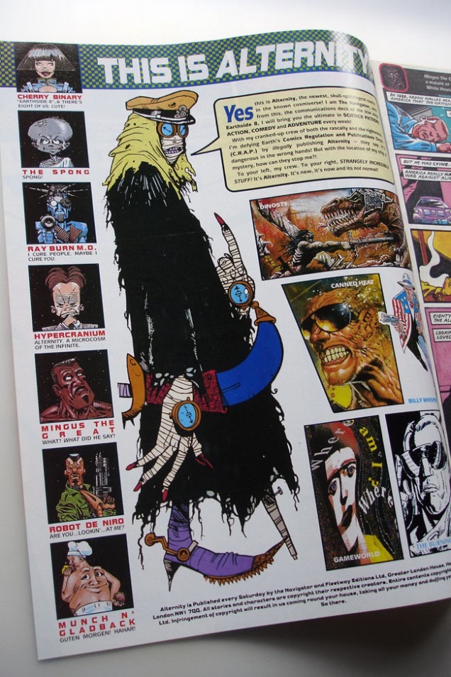
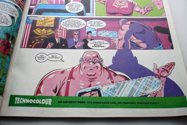
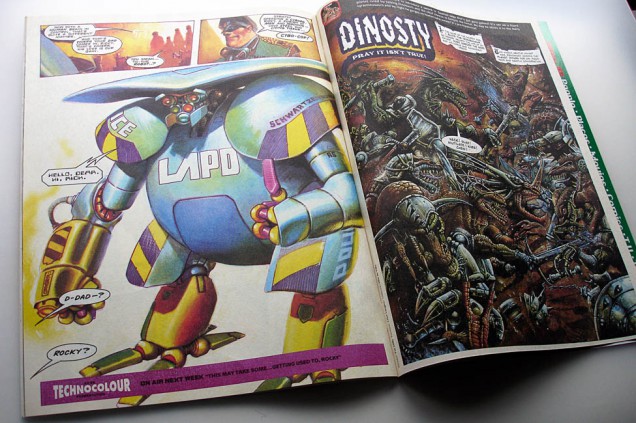
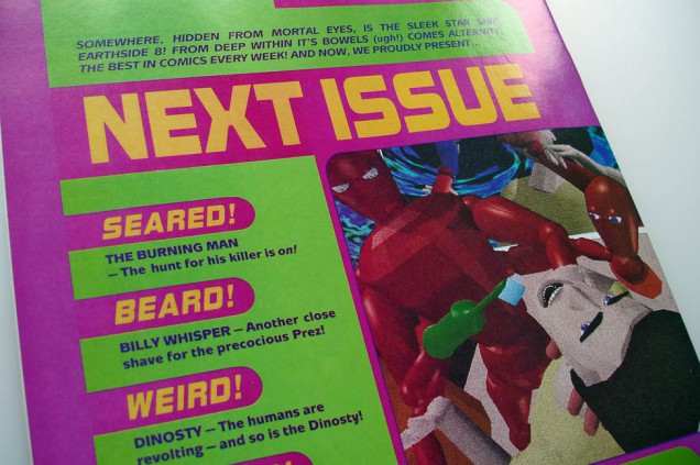
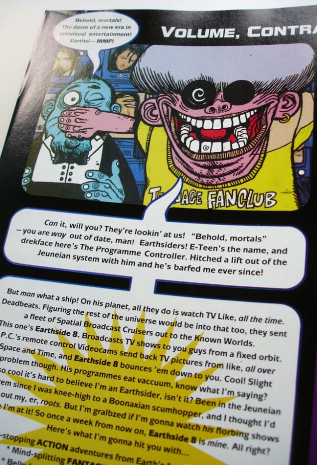
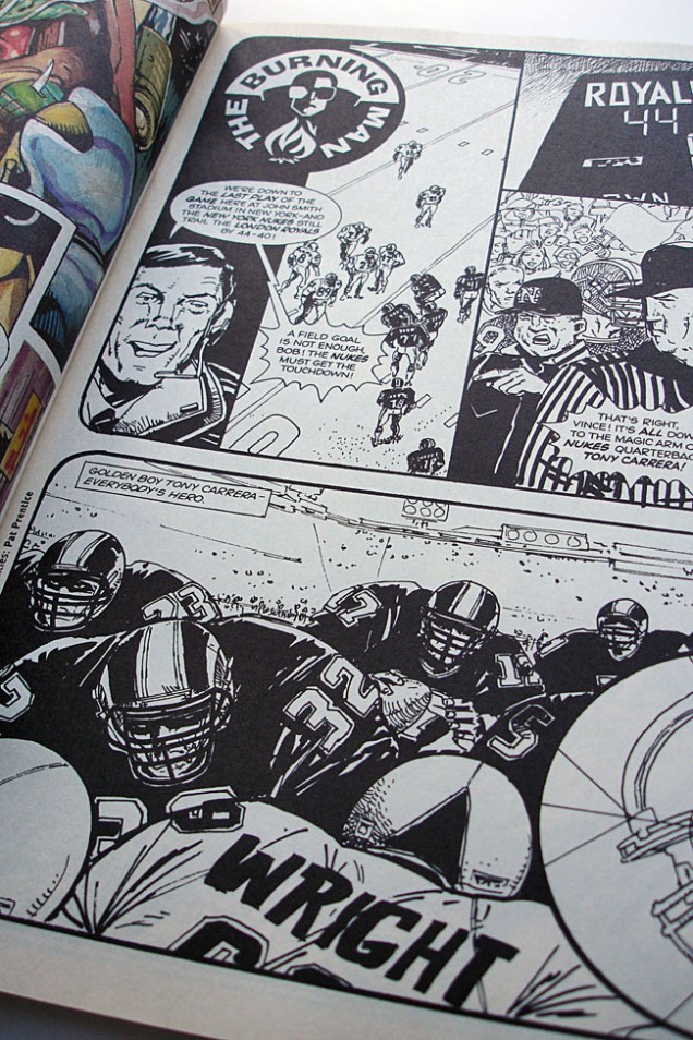
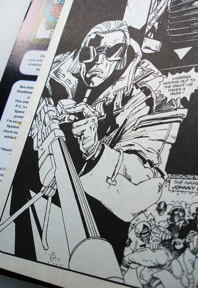
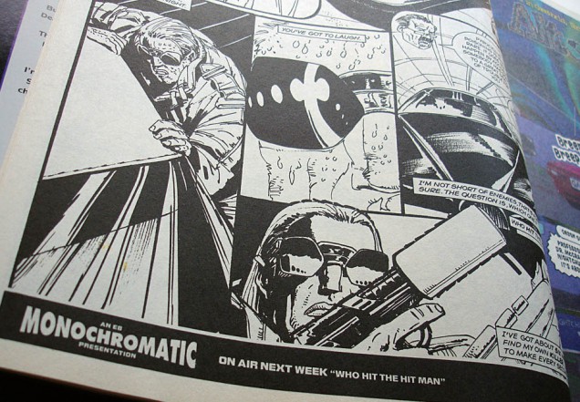
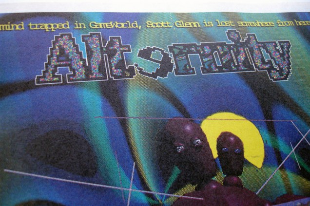
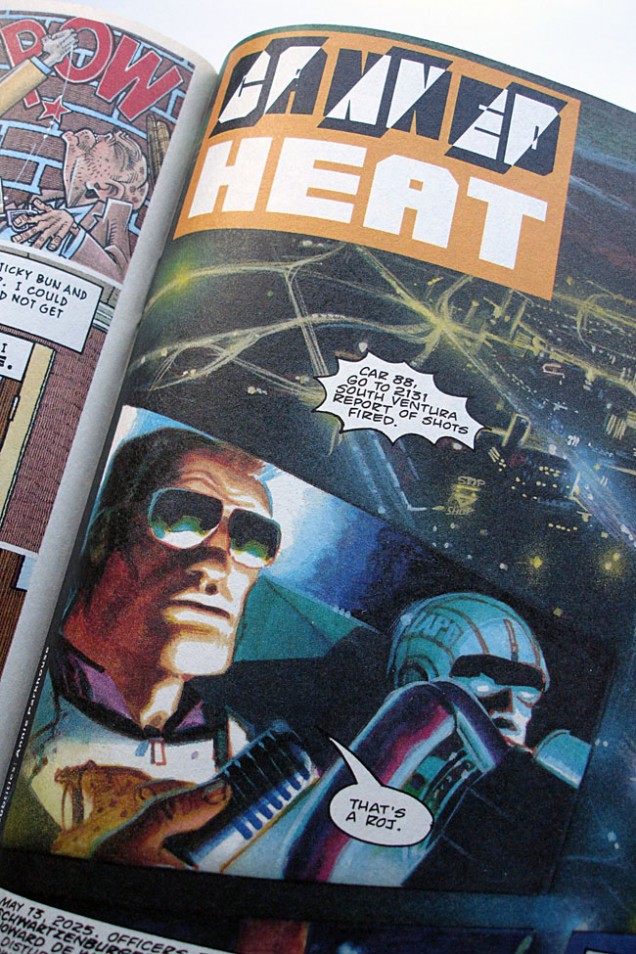
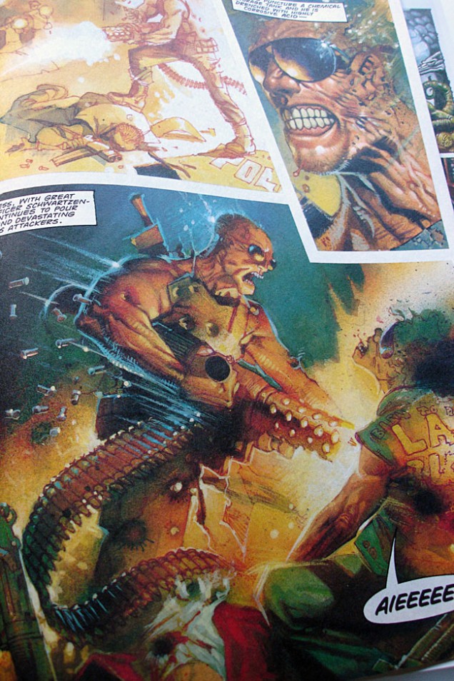
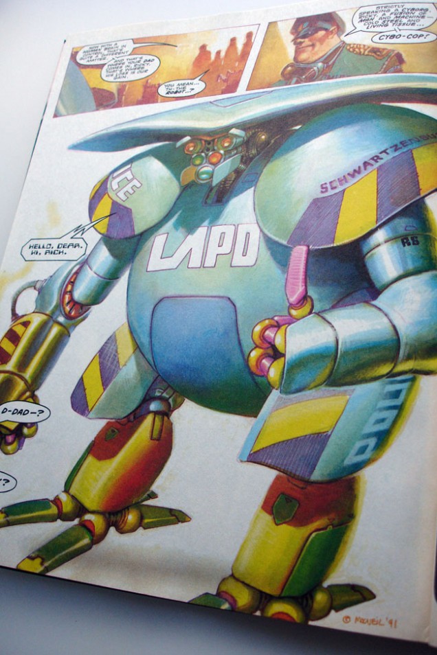
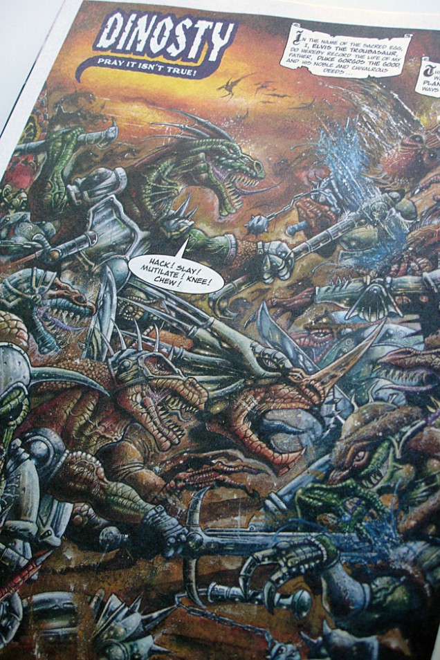
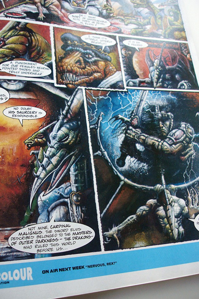
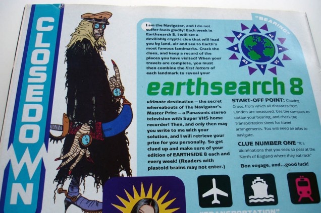
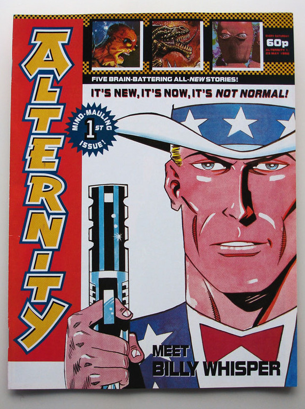 ‘Alternity’ comic issue No. 1, finished copy of the aborted UK comic from the makers of 2000ad, 1992. Includes stories and artwork by Dave Gibbons, Carlos Ezquerra, Colin MacNeil, Brett Ewins, Jamie Hewlett, John Wagner, Mark Millar, Pat Mills and Clint Langley.
Never officially published, this is a revised version of the ‘Earthside 8’ comic with one new story, most were pulped.
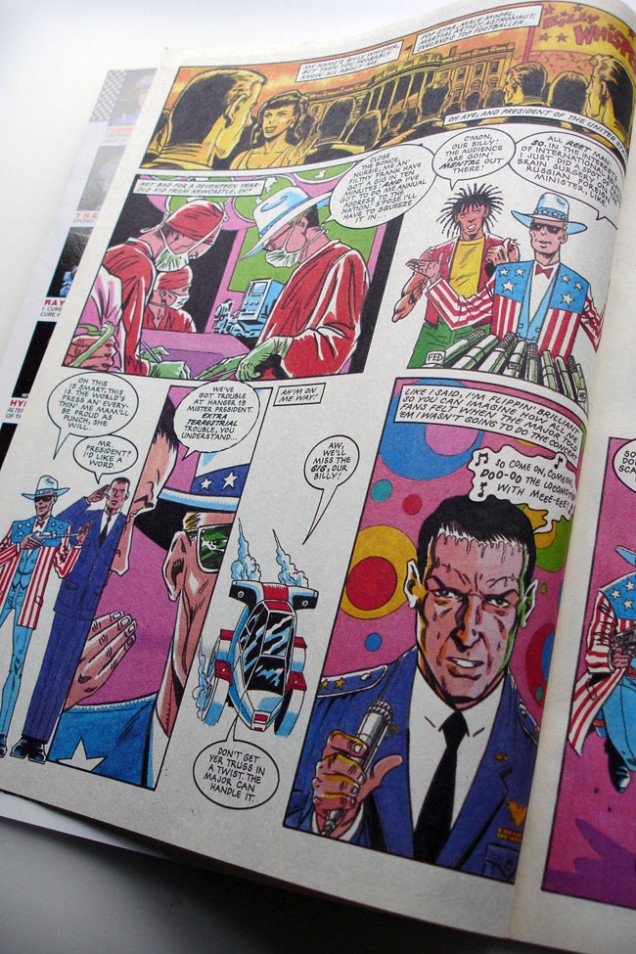
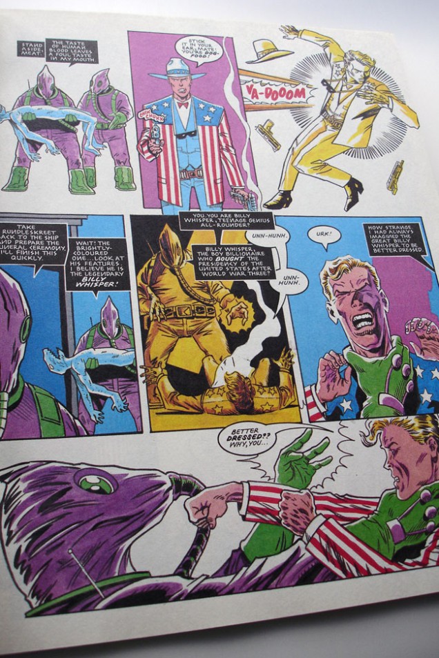
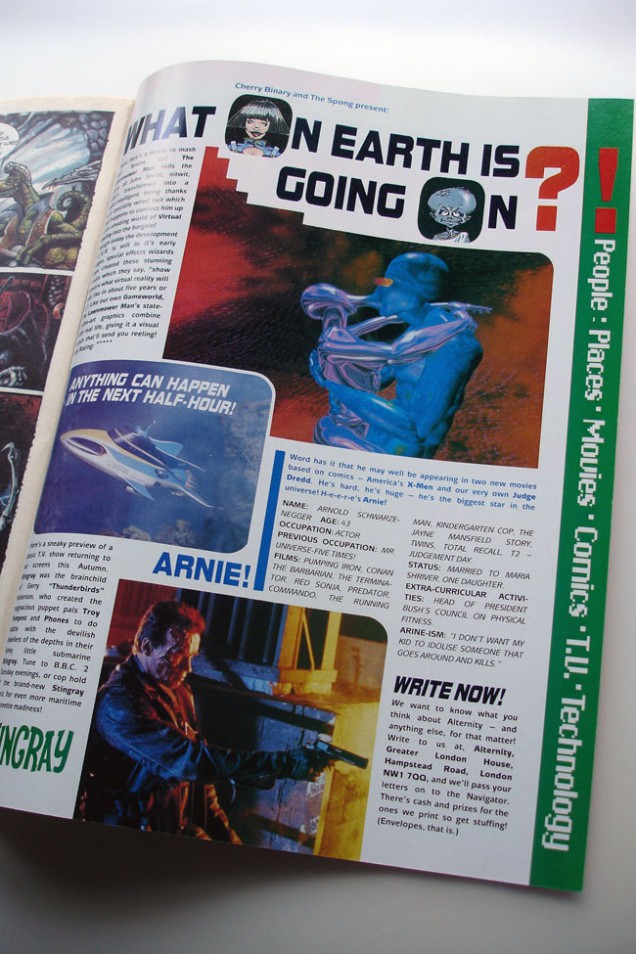
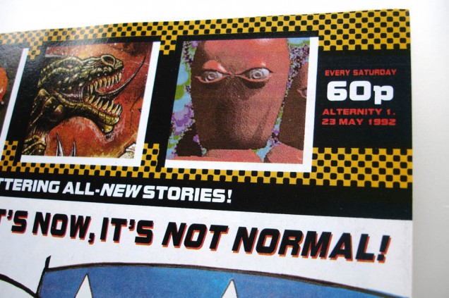
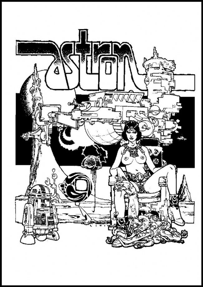
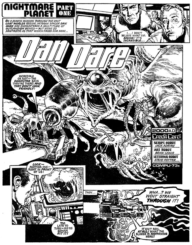 Until recently I knew very little of Brian Lewis’ work, but the handful of pages I did know are etched in my brain as some of my first ever sci-fi comic experiences.
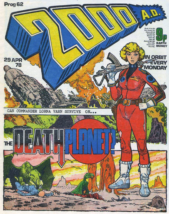
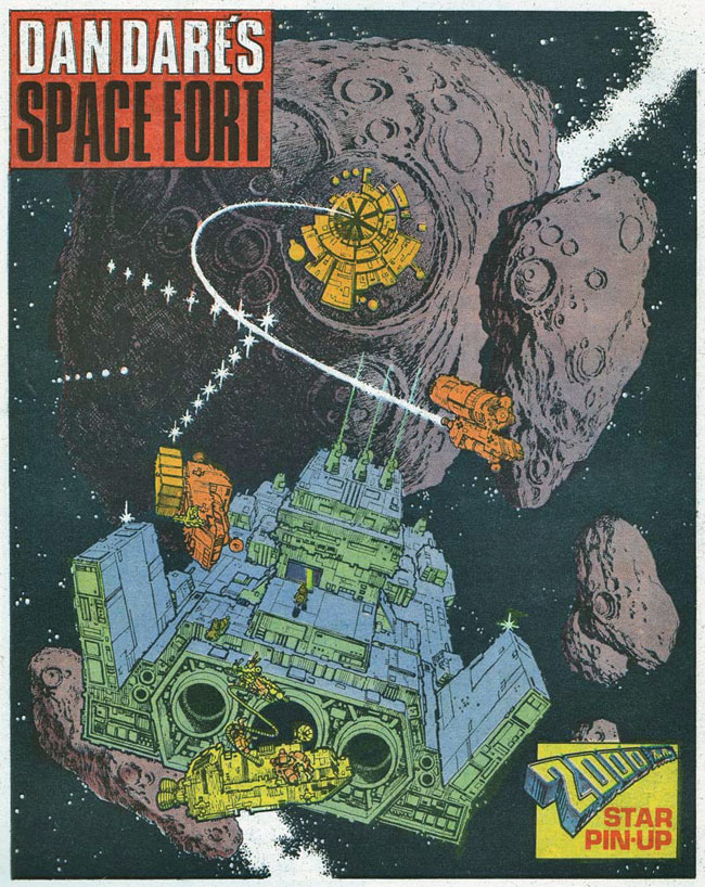
In 1978 I was in a newsagents and spied a comic called 2000ad, it was into its second year and the issue was no. 61. On the cover was their most popular character, Judge Dredd, roaring towards you on his bike, guns blazing. Lucky for me I’d stumbled upon the very issue that the comic decided to begin the first ever ‘epic’ in Dredd’s world – ‘The Cursed Earth’ – now, quite rightly, considered a classic. Opening the cover however, the first strip I was confronted with was an updated take on the old Eagle character Dan Dare. More so than the front cover, the page set fireworks off in my eight year old brain as a spaceship happened upon a huge space monster, the likes of which I’d never seen before. The detail was incredible, every tiny pore of the beast and panel of the ship was rendered meticulously. I’d only read ‘humour’ comics and some of the UK Star Wars weeklies up until then and I couldn’t believe this kind of art existed in a kids comic. I was sold and asked my mum if she could buy it, showing her how amazing it was (to me – I doubt she liked it very much). I loved this comic so much, I even took it to school and showed everyone who would listen how amazing I thought it was, it was ragged and ripped in a very short time but I still have it in a box somewhere.
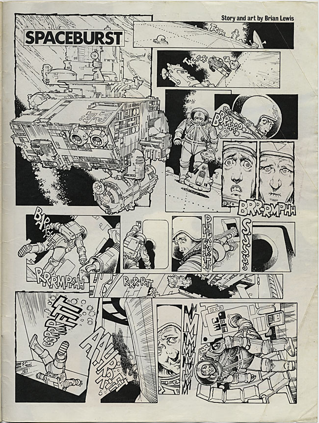
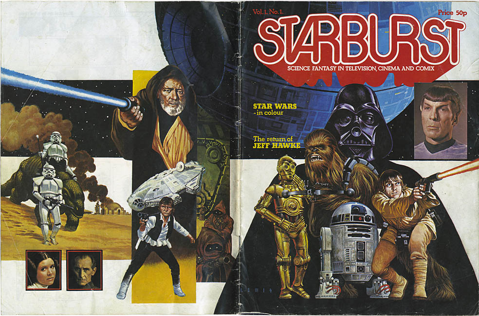 Around the same time, issue No.1 of Starburst magazine arrived, a new monthly title concentrating on sci-fi in the movies, heavily capitalising on the previous year’s Star Wars fever and sporting an eye-catching wrapround cover of said film. Being mad on SW I picked it up, inside it was very text heavy, which, for an eight year old, was a bit of a no-no but the cover was so beautiful I had to have it. This time I pestered my dad (who was a much harder sell than my mum) and finally got a copy after a number of attempts. On the inside cover was a weird little one page strip where an astronaut is wandering about outside his ship in space, he hears a rumble and flees back inside, desperate to make it as quick as possible. The last panel sees him hooked up to a toilet in his suit, relieved to be relieving himself. Juvenile, sure, but beautifully drawn (and written) – by Brian Lewis.
A recent urge to revisit this issue (long since binned or given away) had me hunting around on eBay and a few days later it popped through the letter box. Most of the magazine was as fresh in my mind as when I’d read it years before, the cover still as great, Darth looking a little tired and droopy-mouthed in this rendition. Then I noticed the signature on it, L E W I S, my god, he did the front cover as well! You’d never know this from comparing the two, one being black and white line work, the other being fully painted colour using photos as reference. Doing some research online I found that he was one of the old school and had been in his prime in the 60’s and 70’s drawing Gerry Anderson comics and later Hammer House of Horror strips and covers for Dez Skinn. He’d also contributed a couple of covers to 2000ad as well as a three part Dan Dare story – you guessed it – the one I saw when I first opened the first issue I bought! How I’d never linked this with the Starburst one-pager I’ll never know but the similarities are obvious now.
Sadly, at the same time I was experiencing these revelations, Brian’s time was almost up and this was some of the last work he did, he passed away in 1979. There are a few pockets of information on him around the net but he’s not remembered as widely as the younger artists who were just starting out when 2000ad was the new comic on the block. He was very much the old school passing over the baton to the new, fresh-faced upstarts like Mike McMahon, Brian Bolland and Dave Gibbons. To me his style is very British, very considered, not overly flash but hyper detailed. Even though I only know a few pieces of his work I’m sure they will stay with me forever.
[singlepic id=2895 w=320 h=451 float=left] [singlepic id=2903 w=320 h=451 float=right]
This has been going on for a while now over on Warren Ellis’ sprawling Whitechapel forum. The idea is that you get a few scraps of info about what has now become a classic comic or series, and have to imagine you’ve never seen or read the comic before but were given the job of illustrating the front cover of that issue or book.
[singlepic id=2875 w=320 h=437 float=left] [singlepic id=2866 w=343 h=437 float=right]
The Fantastic Four, Spiderman (via Amazing Adult Fantasy), 2000ad, Superman, Zap Comix and more have all come in for a re-imagining over the last year and I’ve rounded up my favourites in the gallery below.
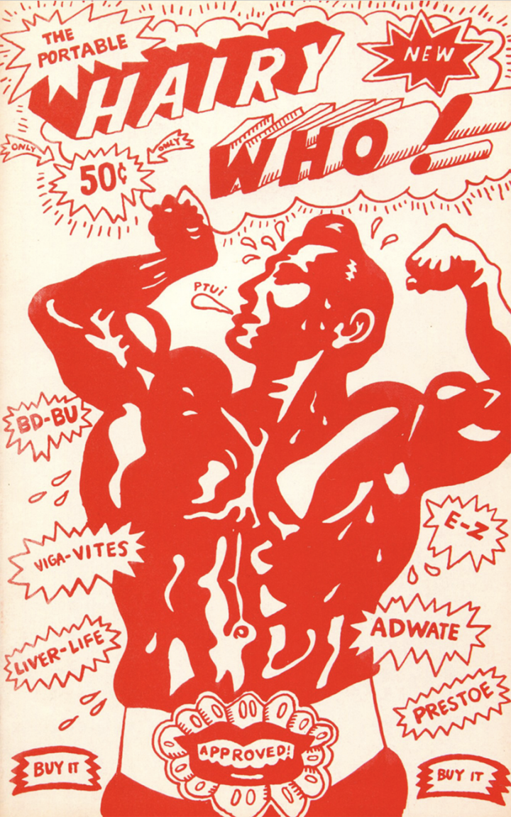
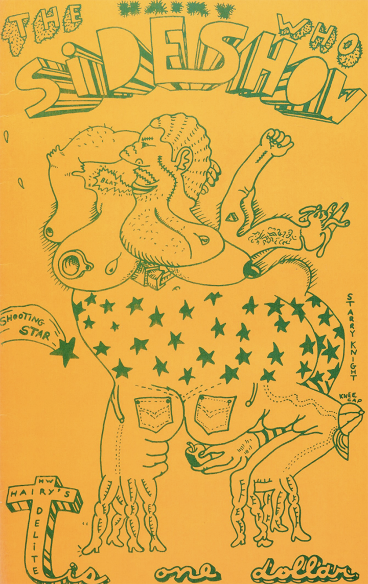
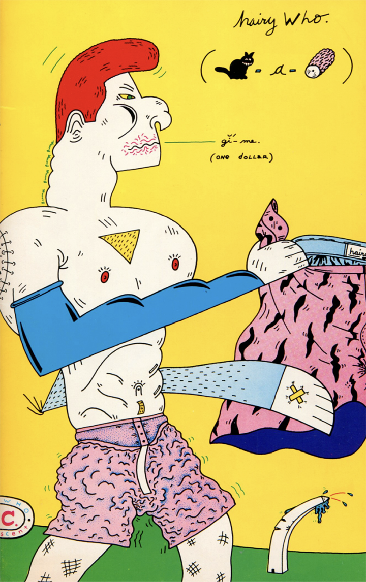
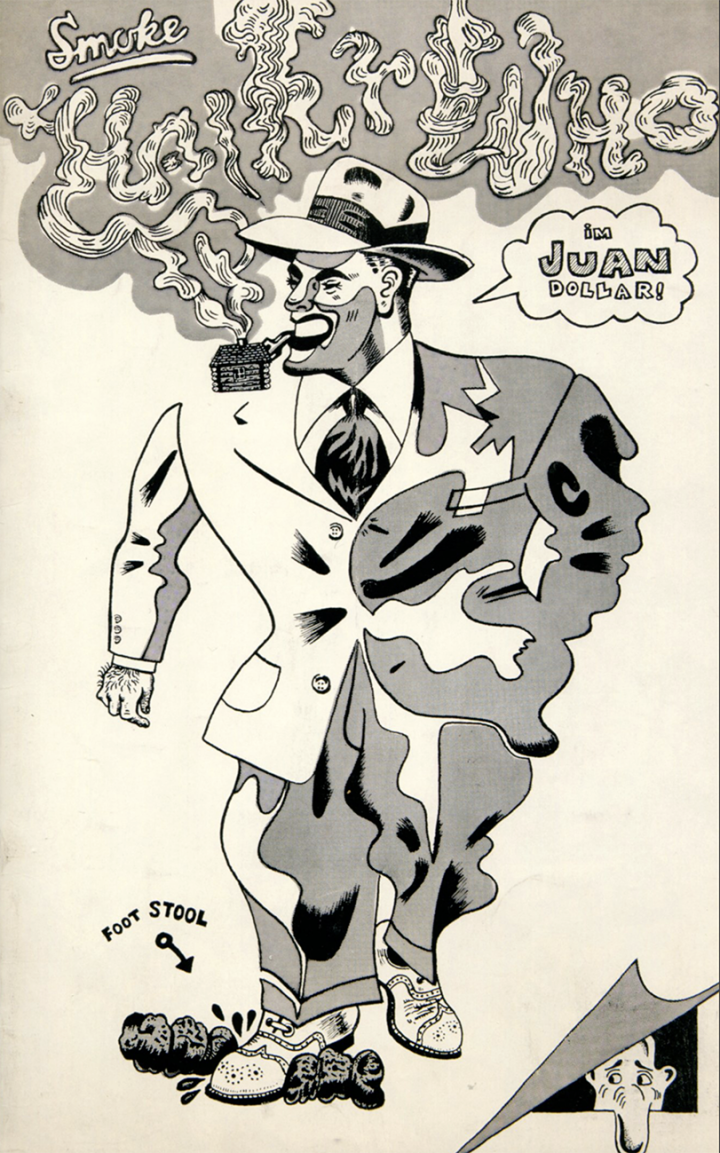

More can be seen here and there’s also a Remake/Remodel series where you’re asked to redesign obscure characters from the past.
[flv width=”312″ height=”255″]http://www.djfood.org/wp-content/uploads/2011/03/GAL-BANDEANNONCE.flv[/flv] [flv width=”312″ height=”255″]http://www.djfood.org/wp-content/uploads/2011/03/MO-DESSLIVE-STELETATAN-1-MUSIQUE.flv[/flv]
The Moebius exhibition in Paris ends this weekend at the Foundation Cartier. I sadly didn’t make it back there but hope it will come to the UK some day. Here are a selection of the films featured on the exhibition site.
[flv width=”312″ height=”255″]http://www.djfood.org/wp-content/uploads/2011/03/E-CARD-2011.flv[/flv] [flv width=”312″ height=”255″]http://www.djfood.org/wp-content/uploads/2011/03/MO-DESSLIVE-MAJOR-5.flv[/flv]
As subtle as a brick, no one’s pretending they don’t know what the ‘M’ stands for, debuts April.
Jim Mahfood and Ziggy Marley with writer, Joe Casey.
[youtube width=”636″ height=”384″]http://www.youtube.com/watch?v=vsbNtm8M9j8[/youtube]
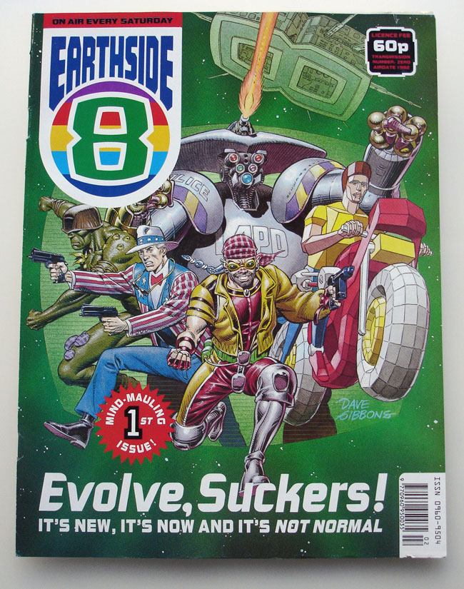
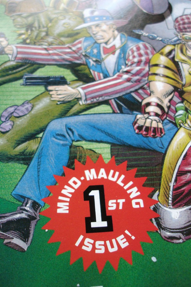
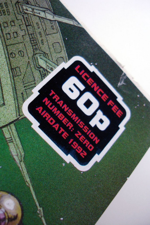
‘Earthside 8’ comic issue No. 1, finished copy of an aborted UK comic from the makers of 2000ad, 1992. Includes stories and artwork by Dave Gibbons, Carlos Ezquerra, Colin MacNeil, Jamie Hewlett, John Wagner, Pat Mills and Clint Langley. Never officially published, most were pulped.

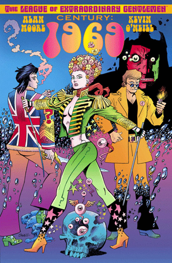 Looking forward to this in April:
CHAPTER TWO takes place almost sixty years later in the psychedelic daze of Swinging London during 1968, a place where Tadukic Acid Diethylamide 26 is the drug of choice, and where different underworlds are starting to overlap dangerously to an accompaniment of sit-ins and sitars. The vicious gangster bosses of London’s East End find themselves brought into contact with a counter-culture underground of mystical and medicated flower-children, or amoral pop-stars on the edge of psychological disintegration and developing a taste for Satanism. Alerted to a threat concerning the same magic order that she and her colleagues were investigating during 1910, a thoroughly modern Mina Murray and her dwindling league of comrades attempt to navigate the perilous rapids of London’s hippy and criminal subculture, as well as the twilight world of its occultists. Starting to buckle from the pressures of the twentieth century and the weight of their own endless lives, Mina and her companions must nevertheless prevent the making of a Moonchild that might well turn out to be the antichrist.
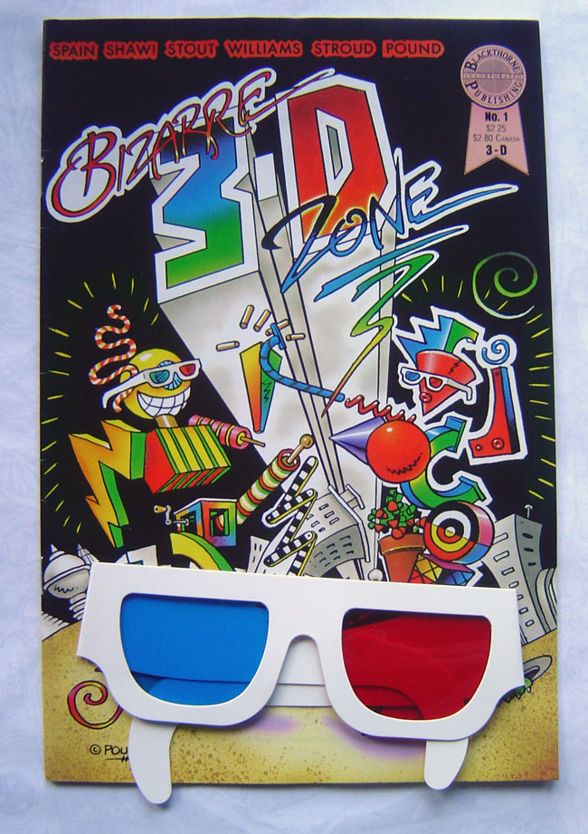 Further to the post about 3D I did last week, I’ve dug out some of the comics I was talking about. Best find was ‘Bizarre 3D Zone’ which is almost Zap Comix in 3D form, including a strip by Robert Williams which works extremely well visually. There were a few underground comics in the the 60’s and 70’s using 3D it seems but not all of them work because the printing is so bad the red/green division can’t be seen too easily.
A company called Blackthorne Publishing spearheaded the 3D comics surge in the late 80’s, buying up licenses to lots of kids shows like Transformers, GI Joe and Star Wars. Their most successful line was, bizarrely, the California Raisins (!?) but they bit off more than the could chew when they acquired the rights to print Michael Jackson’s ‘Moonwalker’ in 3D. The film didn’t do the business expected and their comic flopped, costing them the company. Most of their titles only ran for 1 or 2 issues and the projected Star Wars line (surely a golden ticket?) only made it to issue 3 before the company folded.
In Bizarre 3D Zone there are a few singular page strips that crop up that are quite bizarre indeed, some don’t even work in the conventional 3D way as they are simply only either the green or red. But in amongst the other separated images they give an odd effect and you realise that this is the ultimate in psychedelic comics as it’s playing with your perceptions of the page. I can only imagine what it was doing to hippies on acid way back when.
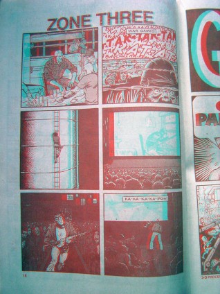
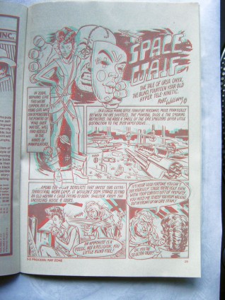
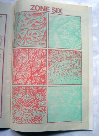
Last year I had an inexplicable yearning to buy more comics again after largely dipping out of the medium for a few years (save for the weekly dose of 2000ad thrill power and a few others). I also started to dig in the 50p-£1 boxes for older things I read as a kid or just liked the look of. Along the way I picked up a number of 3D comics from the boom in the late 80’s as well as a couple for more recently. When they work they’re great but frequently the writing never matches up to the standard of the imagery. There’s a whole blog post to be had out of some of those but that’s for another time.
This week I’ve been experimeting with 3D analyphs on a project – converting a 2D image into 3D when you look at it with those red and blue glasses. It’s not that hard, fun, if not a bit frustrating, and involves a bit of guesswork. I’ve managed to make one successful image so far but I can’t post it yet as I’ll get in trouble if it’s available to all at this stage.
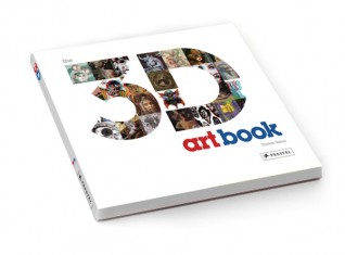 But what should turn up on Jim Mahfood‘s Facebook stream today? News of a new book by Tristan Eaton (he designed the Dunny & Munny figures for Kidrobot) full of 3D images by a ton of different artists. Four years in the making, the 224 page book, published this Spring by Prestel, features a little bit of his work and a lot of Tristan-curated images from 100 artists across a multitude of disciplines: graffiti, illustration, contemporary art, graphic design, etc.
Check some images that I found online at animalnewyork.com and you can pre-order the book here.
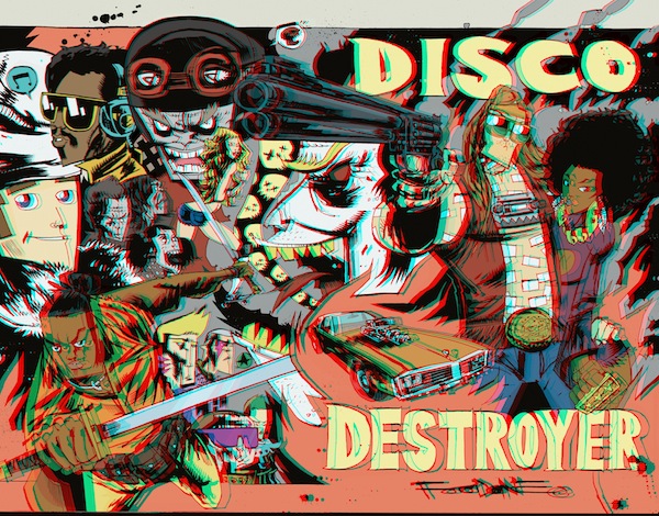
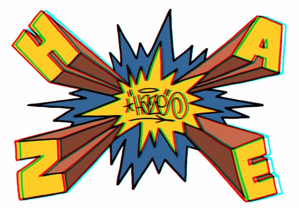
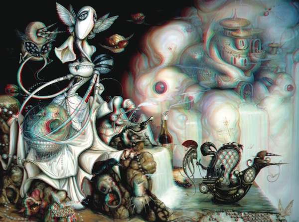
The full artist list (with the ones I’m excited to see in bold): DRIAN JOHNSON, ANDREW BELL, ANTHONY AUSGANG, ASKEW, BASK, BILL MCMULLEN, BLOKT, BOOKS, BUFF MONSTER, CALMA, CASEY RYDER, CATALINA ESTRADA, CEY ADAMS, CHRIS MARS, CRAOLA, D*FACE, DABS & MYLA, DALEK, DAVE COOPER, DAVE KINSEY, DAVE NEEDHAM, DAVID FLORES, DEMO, DR. REVOLT, DARREN ROMANELLI, EBOY, EDATRON, ERIK FOSS, ERIC WHITE, ERIC HAZE, ESAO ANDREWS, FILTH, FLORENCIA ZAVALA, GARY BASEMAN, GARY TAXALI, GLENN BARR, GOMEZ BUENO, ISABEL SAMARAS, JAMES JEAN, JEFF SOTO, JEREMY FISH, JEREMY MADL, JERRY ABSTRACT, JIM HOUSER, JIM MAHFOOD, JOE SORREN, JON BURGERMAN, JULIE WEST, JUNKO MIZUNO, KANO, KATHY STAICO SCHORR, KENZO MINAMI, KEVIN BOURGEOIS, KEVIN SKINNER, KID ACNE, KOBIE SOLOMON, KRISTIAN OLSON, LAURA BARNHARD, LOGAN HICKS, MARK BODE, MARK DEAN VECA, MARK JAMES, MARK RYDEN, MATT CAMPBELL, MATT EATON, MAYA HAYUK, MICHAEL DE FEO, MISHKA, MINT AND SERF, MISS VAN, MORNING BREATH, MR JAGO, MYSTERIOUS AL, NATHAN FOX, NATHAN JUREVICIUS, PETE FOWLER, POSE MSK, RAY ZONE, RENATA PALUBINSKAS, RICH JACOBS, RON ENGLISH, ROSTARR, SHEPARD FAIREY, SKET ONE, STANLEY CHOW, STASH, STEPHEN BLISS, TARA MCPHERSON, TES ONE, TODD SCHORR, TOKIDOKI, TOM THEWES, TRAVIS LOUIE, TRAVIS MILLARD, TRISTAN EATON, TRUSTOCORP, UNKL, UPSO, AND WINSTON SMITH.
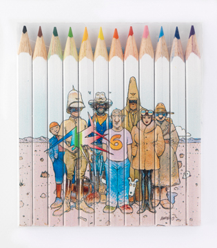
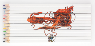
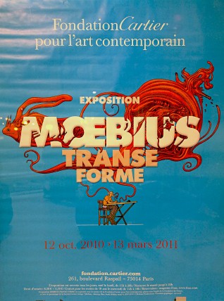 I was in Paris last Friday, playing at La Machine, but upon waiting for the Eurostar the next day I saw a poster for a Moebius Exhibition at the Foundation Cartier. Gutted not have known this was on earlier as I could have seen it before I left. The link above takes you to the exhibition site with a wealth of info, images, beautiful videos of Moebius drawing and mouth-watering merchandise, check the pencil sets below.
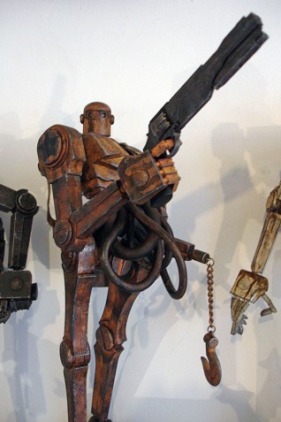
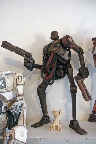
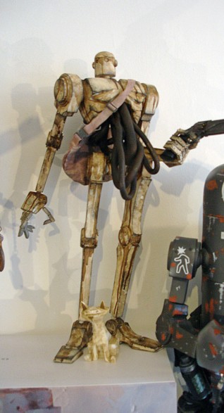
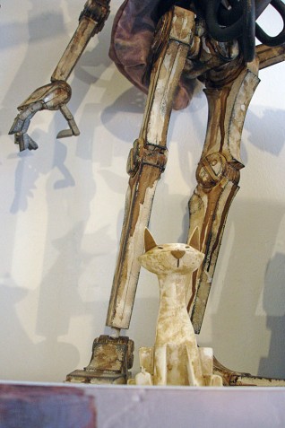
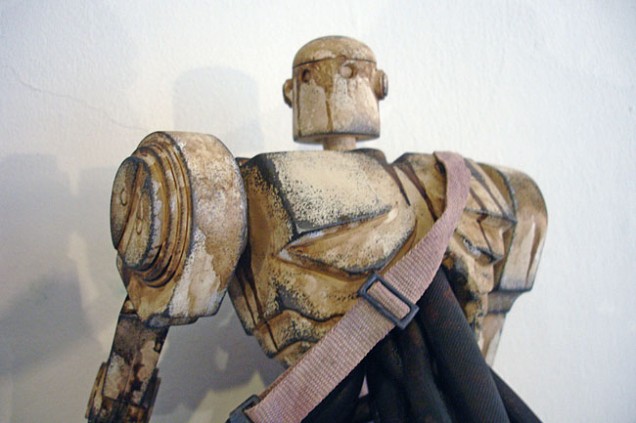 Look what Santa had in his sack for me this year. The Popbot 3-Pack (Popbot, Badbot and The Ascended plus a Kitty each in different colourways). Popbot is an on-going comic by Ashley Wood and his company 3A make toys from this world and others…
Long sold out from pre-order night and waiting in customs for a month while Parcel Force got their act together, they arrived on Dec 23rd so I decided to save them a couple more days before the big opening.


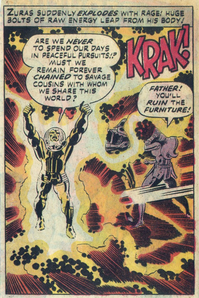
I’ve been picking up old Jack Kirby comics over the last year or so just because I like their throwaway-ness. The man was an art juggernaut, churning out pages like nobodies business, often copied, never bettered. What strikes you when you read the scripts from the 70’s is how basic they are and some of the language, in today’s context, verges on double entendre. Some is just plain odd, like this one.
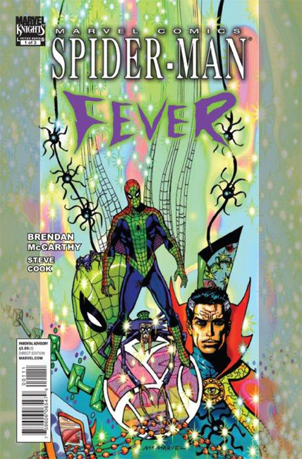
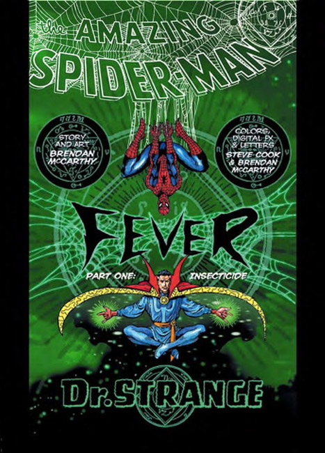
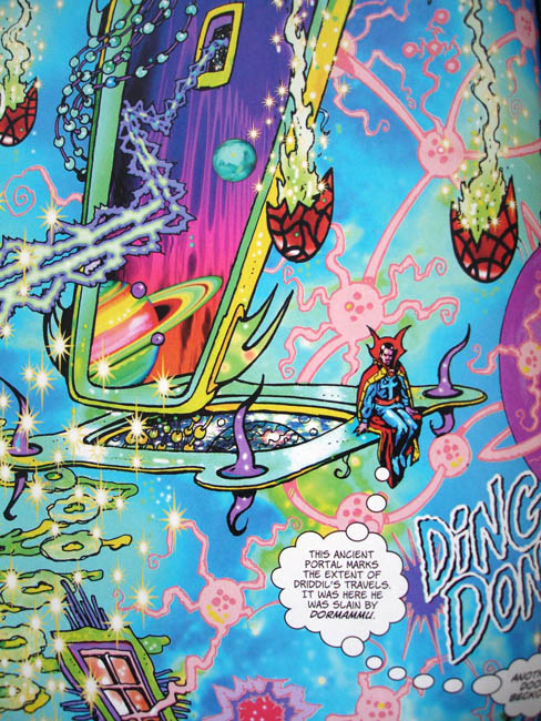
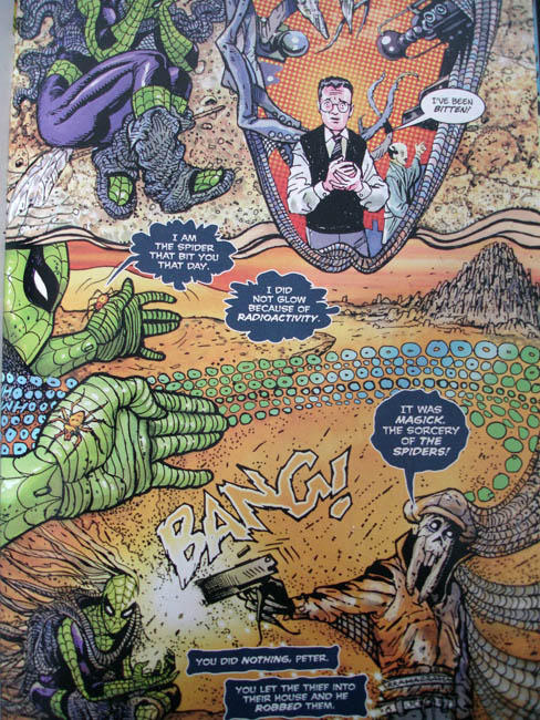
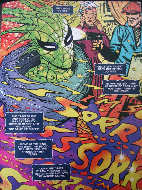
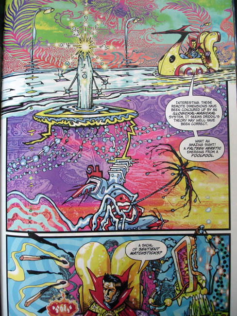
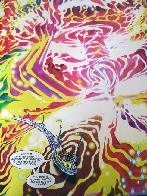
Just finished reading this short, 3 part series where everyone’s favourite wall crawler teams up with Dr. Strange in a story called ‘Fever’. I’m not a big superhero comics fan, Superman, Batman, X-Men etc. don’t do much for me. I generally prefer the more leftfield end of things, in fact I think this is the first Spiderman comic I’ve ever bought outside of the watered down kind for my boys. So, why the special occasion? Brendan McCarthy. One of the demi-gods of UK comic book art, 2000ad veteran and, in the last 2 decades, storyboardist and character designer to Hollywood.
I’ll buy pretty much anything with Brendan’s name on it as he’s a unique talent, rarely repeats himself but has a visual language all of his own. Sometimes copied – Jamie Hewlett’s early work owes much to McCarthy – but never bettered, he is one of the few comic book artists who can portray psychedelia effectively on the printed page, Savage Pencil being another example. He mainly left comics behind after getting his foot in the movie making door and who can blame him, I’m sure the pay is better. But recently he’s been active again here and there and this Marvel Team Up is his first major comic book for some time.
This time round he’s writing as well as illustrating too and seems to have been given quite free reign with the character, something he dives head on into conjuring up a Spider-themed story that incorporates magic, other dimensions, soul-snatching and even references Spidey’s origins quite neatly. It all serves to provide material for a great big acid trip of a story with nods to Steve Ditko and a thinly veiled Alistair Crowley. If you like your comics dark, camp and sporting all the colours of the spectrum then this is for you. In fact one of my only criticisms (aside from the shortness of it all) is the colouring ,which has been done via computer. Some of it works but, knowing McCarthy’s painted work from the past, there’s something lacking in some of the pages.
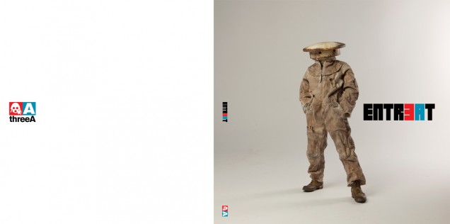
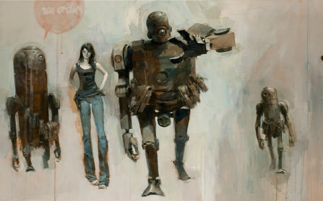 One of my favourite artists and certainly my favourite toy-making company – Ashley Wood and 3A – launch their new book range today on the eve of a massive art and toy show in Beijing. Two hardback books with work from Phil Hale and Ashley Wood are available for $25 each but the one I’m most excited about is ‘Entr3At’, a 282 page celebration of the first 2 years of 3A toys. Packed with paintings, photos, works in progress, designs and box art, it’s going to be one of my books of the year for sure. Order any or all of them from bambalandstore now.
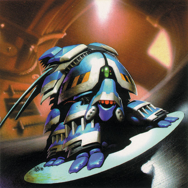
Ninja Tune artists seem to have a love of comic art and one particular comic in particular has played host to various artists who have also graced Ninja Tune sleeves – 2000AD. The first was The Herbaliser’s ‘Wall Crawling Giant Insect Breaks’ 12″ back in 1998 with a cover painting by Jason Brashill -aka graffiti artist Jase – who used to paint with Req and She One in Brighton. His design of a robotic bug perched on a pair of decks and a mixer is one of my favourites of that era.
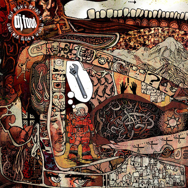 My own DJ Food EPs from last year featured new work from Henry Flint who has been a regular on both the weekly comic and monthly Judge Dredd Megazine for over 10 years. He kindly gave me some of his personal work, highly detailed abstract ‘doodles’, to colour for my sleeves (you can see one to the left of this post) and there will be more for the third EP and album.

FInally we have the latest addition: The Qemists have enlisted none other than Glenn Fabry to paint their new ‘Spirit In The System’ LP cover in what looks like a homage to Stanley Mouse’s Grateful Dead work. If you’ve been paying attention to the recent Qemists releases you’ll notice that the first two are sections of a large ‘logo-ified’ version of the painting, I hope Ninja press a vinyl LP of the album too.


For the hundredth post: the first in an occasional series, miscellaneous shots from around the studio…
[singlepic id=2173 w=635 h=477 float=left]

