Stuff that’s been clogging up the desktop Pt.1
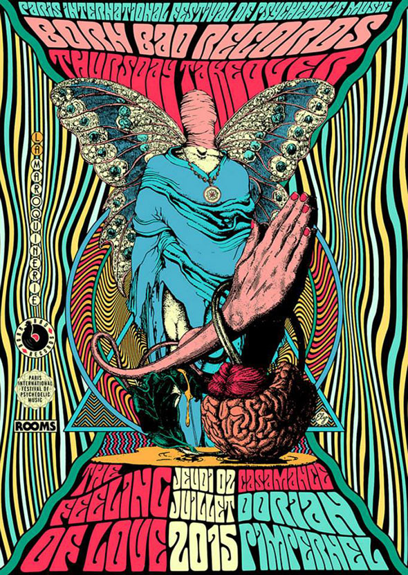
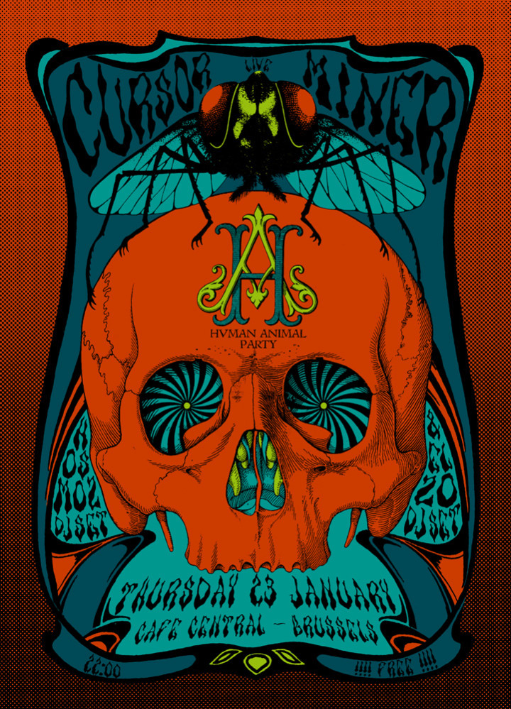
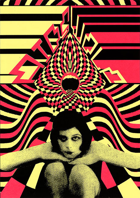
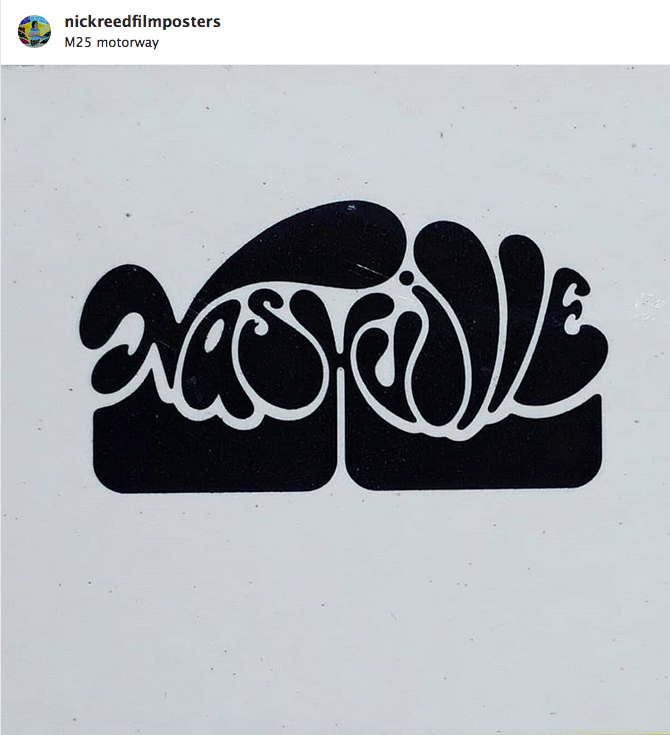
I spotted this beautiful design on Nick Reed’s Instagram. Nick sells a fantastic selection of original film and music posters and you can find him at many vintage fairs with a stall that stands out a mile. He’s also at Spitalfields market in London most Thursdays.
Design
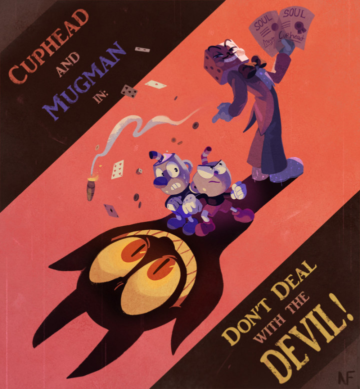
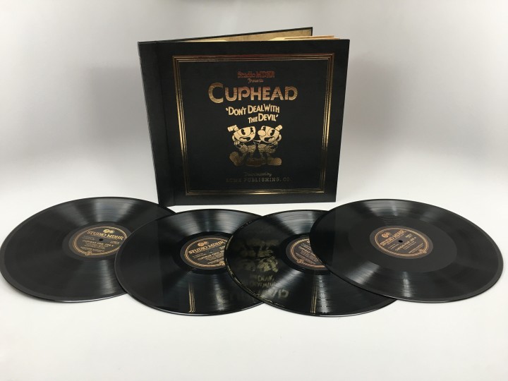
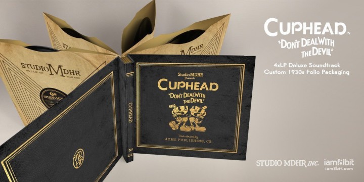
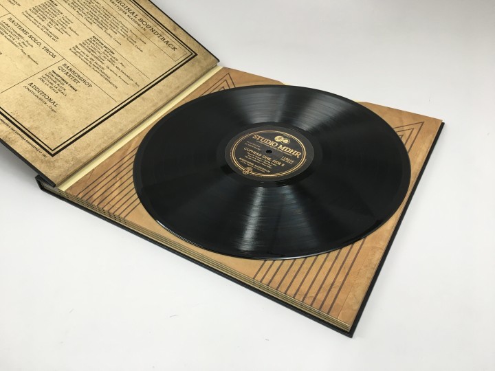
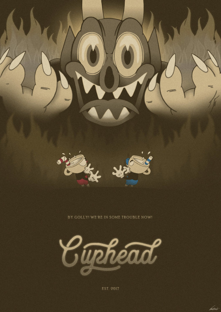
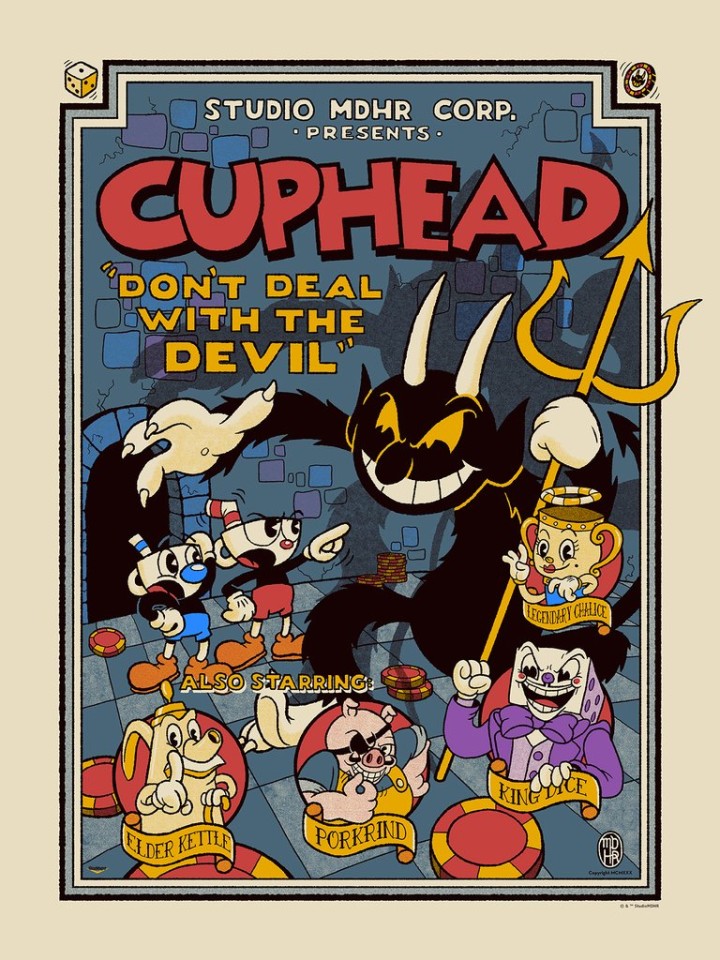
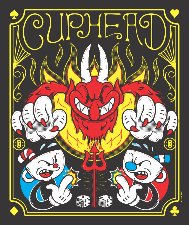
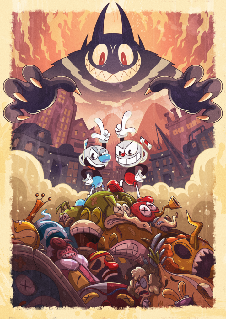
I’m still loving the design of Cuphead, the recent release from Studio MDHR based on the look of the old Fleischer Brothers animation studios. There seem to be lots of great posters for it online, possibly official, it’s hard to tell these days. Many follow the multi-coloured, multi-character model but some keep in line with the look of the game. There’s also merchandise starting to appear, from enamel pin badges to the inevitable Funko toys but the best object so far has to be the 4xLP original soundtrack.
Housed in a 30’s book-style sleeve with gold leaf cover graphics, separate leaves for each disc and yellowed ‘pages’, it looks like it could have come straight from your grandparents’ vinyl collection. There’s also a lovely 7″ with selections from the near 3 hr LP set. At an eye-watering £71 + postage it’s a bit out of my league at the moment but it looks worth every penny from the photos.
* Beware of pre-orders of figures from PopInABox – my Cuphead and Mugman figures are now 2 months overdue, one has been dispatched from overseas without a tracking number and the other remains in limbo while they wait for stock, meanwhile I’ve seen them in shops in the UK.
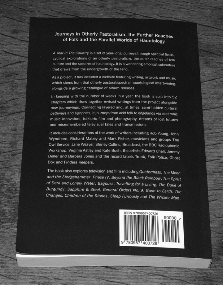
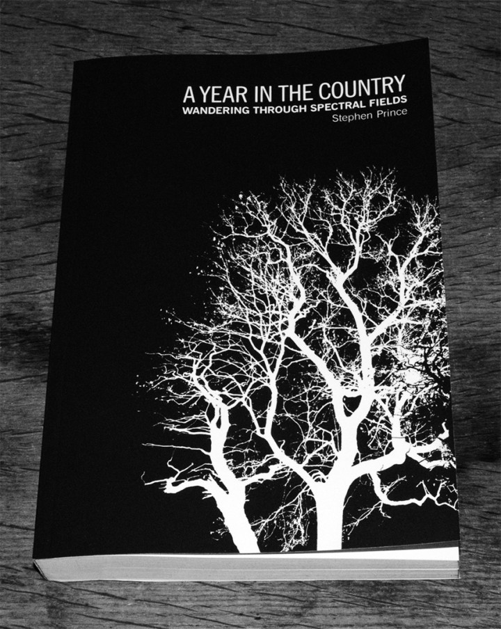 A Year In The Country, Stephen Prince‘s website dedicated to cataloguing, compiling and unearthing all things Hauntological, Radiophonic, Wyrd and uniquely British, is releasing a book of writings from the first three years of it’s output. Collected, revised and revisited, alongside some new writing, ‘Wandering Through Spectral Fields’ – subtitled ‘Journeys in Otherly Pastoralism, The Further Reaches of Folk and the Parallel World of Hauntology’ is now available to read as an e-Book via Am*z*n (if you must) or for pre-order for a print release on April 10th.
Contents include: (deep breath) Hauntology, Acid Folk, Folk Horror, Ghost Box Records, The Wicker Man, Peter Strickland, Finders Keepers, Vashti Bunyan, Broadcast, Children Of The Stones, psychedelic cinema, The Owl Service, Kate Bush, The Stone Tape Theory, The Folklore Tapes, Jane Weaver, Howlround, the BBC Radiophonic Workshop and lots, lots more. I’d say that’s more than enough reasons to order a copy right there and that it’s the first book of it’s kind to catalogue all these disparate strands, many of which cross over time and space to influence one another.
It’s also available via their Bandcamp and you can peruse the, now extensive, release catalogue that’s sprung from the site, even if the monochrome nature of all their releases makes it increasingly harder to discern one from the other. The label is a completist’s joy/nightmare being that they make night/day or dawn/dusk editions of each release but as a singular vision it’s a beautiful set of objects when seen en mass.
A full list of the contents and order links is available here – definitely on my reading list
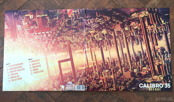
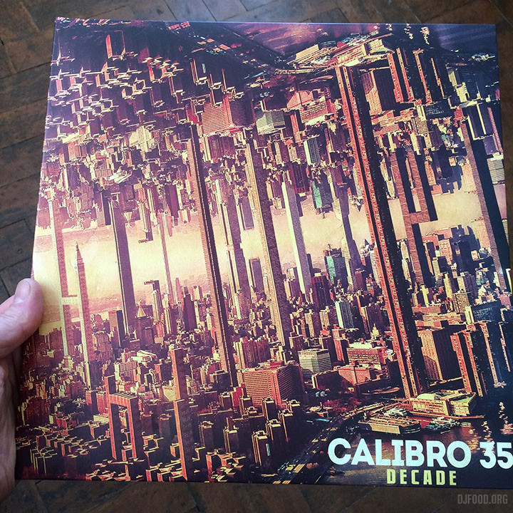
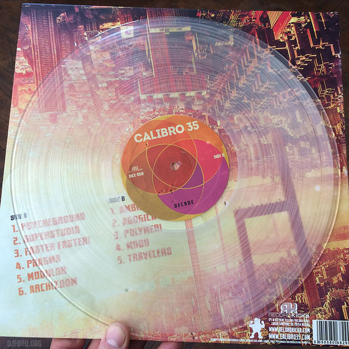
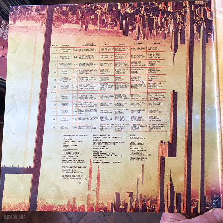
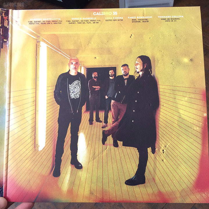
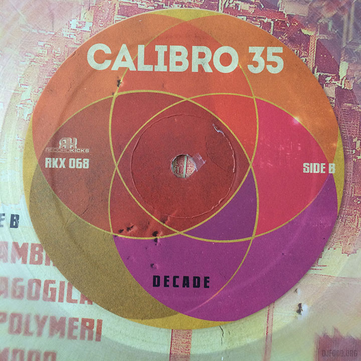
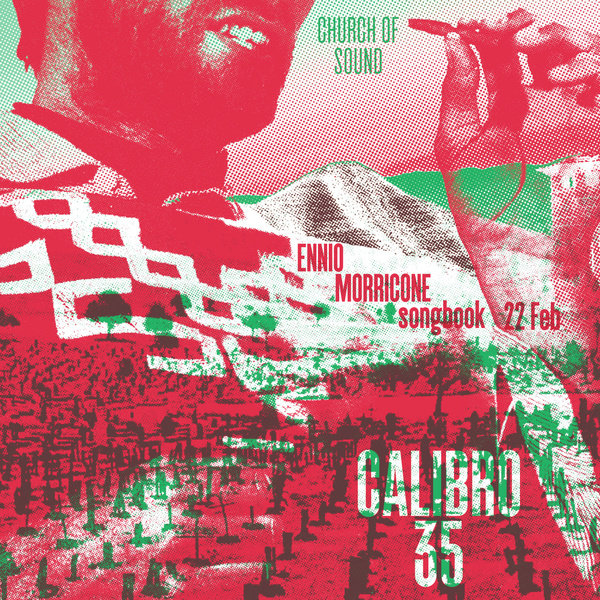
The Italian quintet are back with a new album, video and tour, reaching the UK this week with a special Morricone songbook set at the Church of Sound on Thursday. The new album, ‘Decade’, looks and sounds fabulous and their new video is nuts, the weirdest one yet. If you’ve never seen a Calibro 35 video, go and check them out on YouTube, always high quality, super stylish and original. The album is available is a number of bundles over on their Bandcamp: gatefold vinyl, cassette and CD and with optional black or clear vinyl 7″ too.
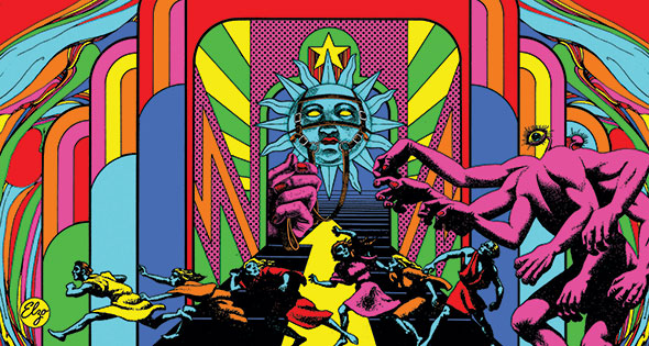
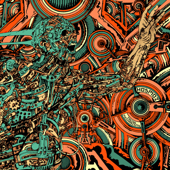
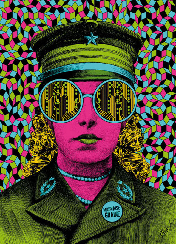
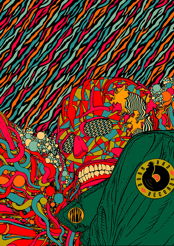
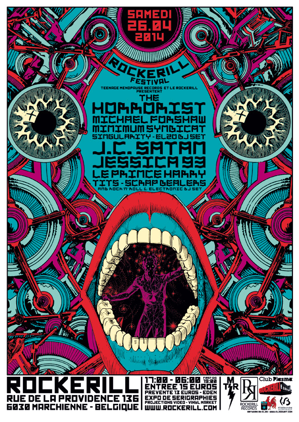
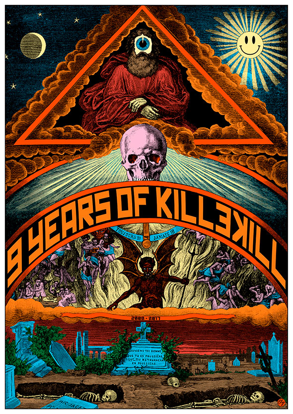
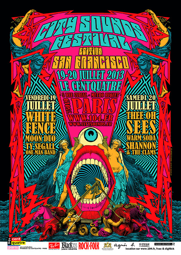
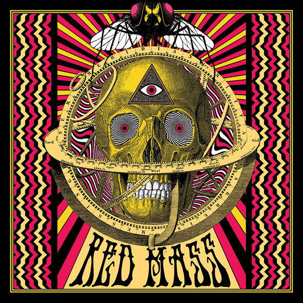
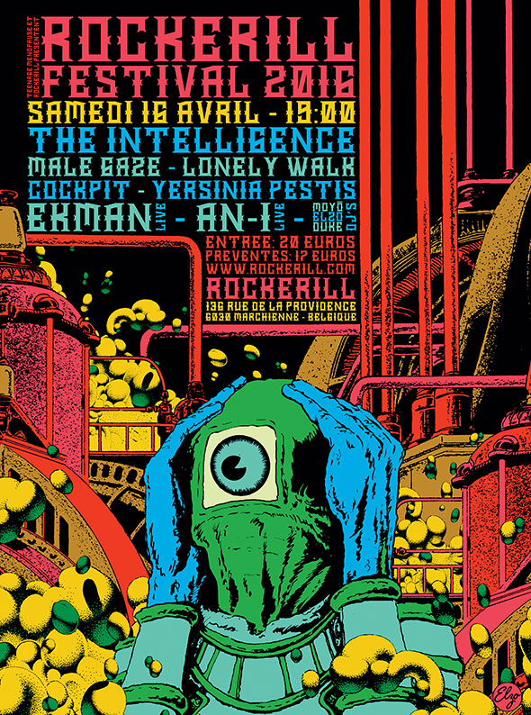
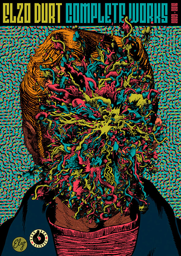 Through an odd set of web links I chanced upon the work of Elzo Durt today, his modern take on collage and psychedelia catching my eye and making me investigate further. This Brussels-based artist works with the Recyclart people (I’ve played for them a couple of times and maybe, unknowingly, seen his work) and runs a record label too. Find out and see more of his work at www.elzodurt.com
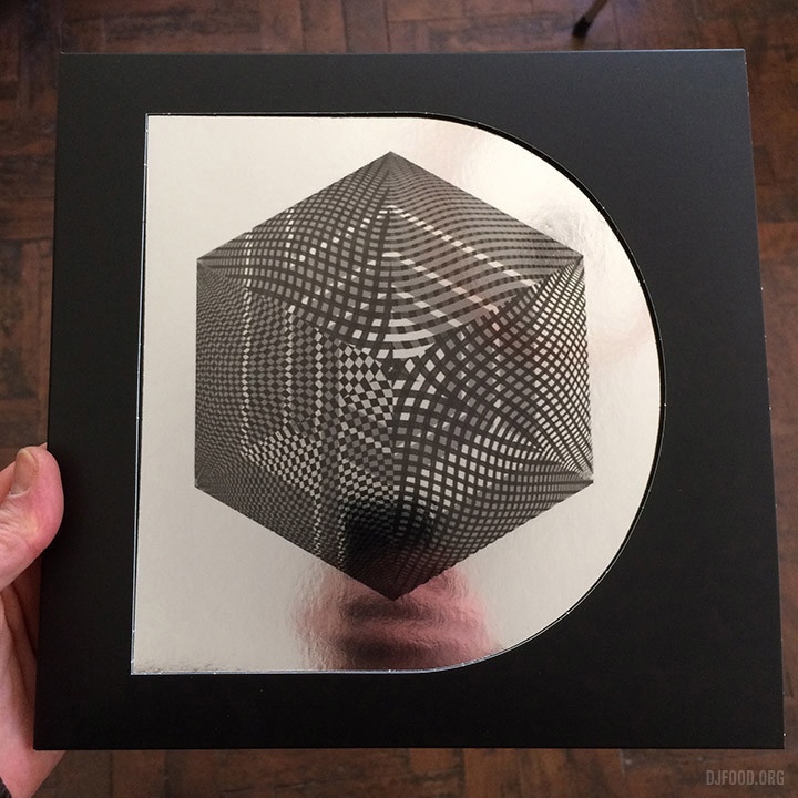
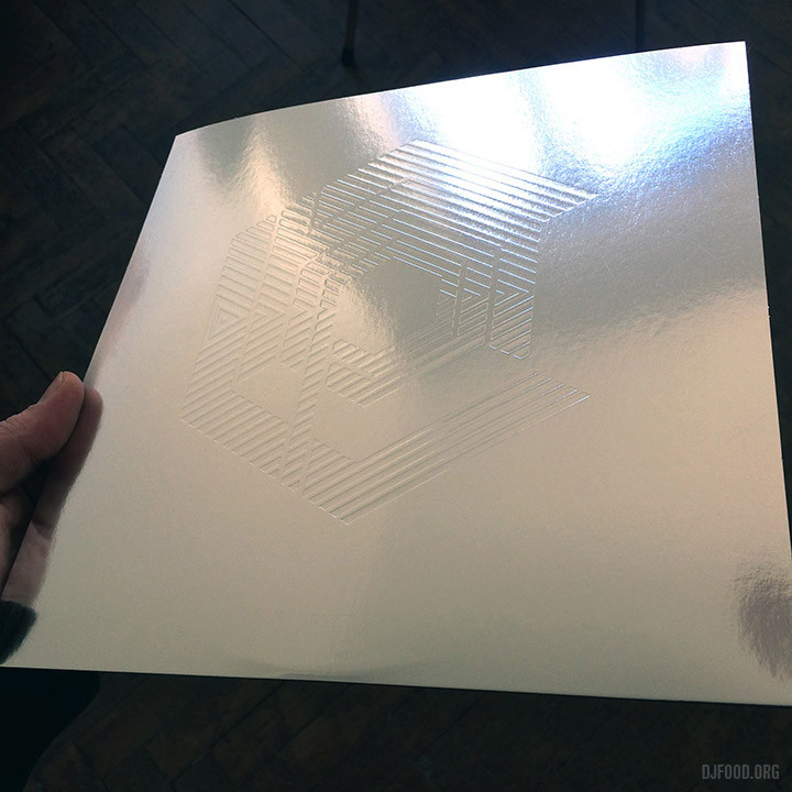
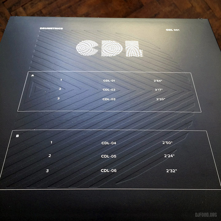
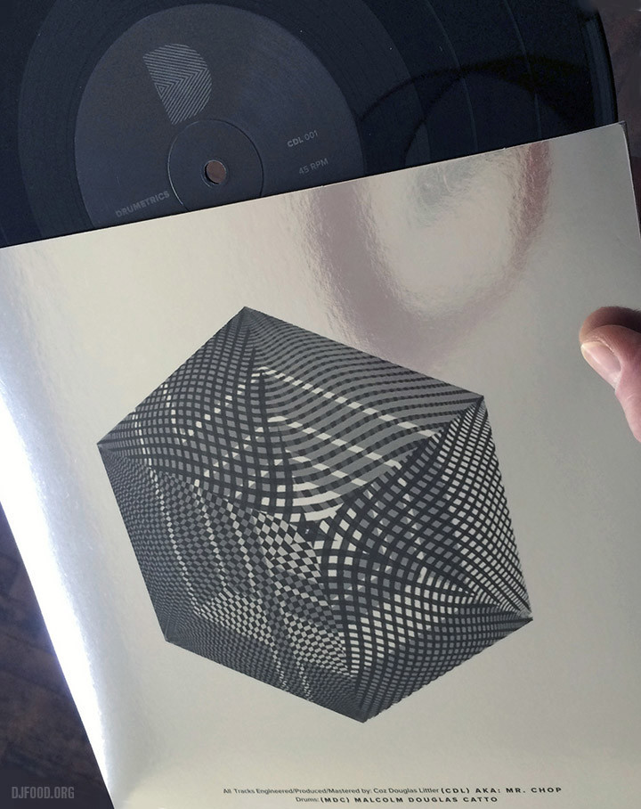
“New release on Drumetrics”, a phrase that strikes fear into the hearts of hardened record collectors. How limited will it be? How dope will the drums be? How cool with the design look? How much will it cost plus shipping? The latest release, a 10″ by Mr Chop featuring Malcolm Catto is not cheap by any means but it is such a beautiful package you can just about swallow that side of things. A die-cut ‘D’ in the front cover shows through an op-art Chop logo printed on mirrorboard card. On the reverse side there’s an embossed Drumetrics D logo and the inner boasts a debossed Chop logo. I hate to think how much that must have cost but that’s one of the reasons it’s expensive. The music bangs of course, as do all Chop releases, no need to worry about that. Get one here before they sell out, only 500 copies but digital is coming soon
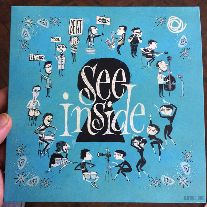
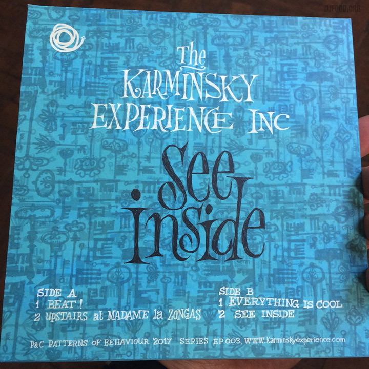
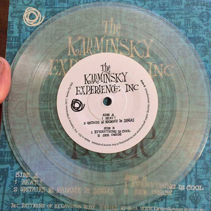
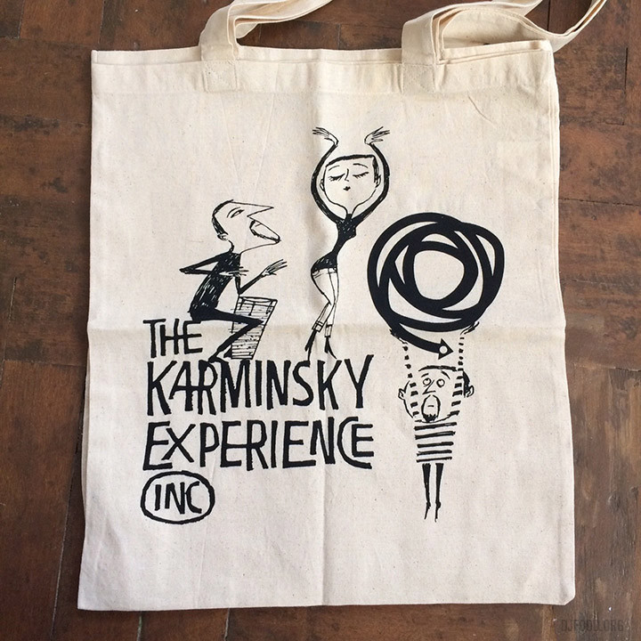
This beautiful object is the latest release from The Karminsky Experience Inc. – a four track 7″ with three tunes from the ‘Beat!’ album of last year plus a new collage and gorgeous sleeve art by Steve Millington aka Dry British. There are only 100 copies so be quick and order via their Bandcamp page.
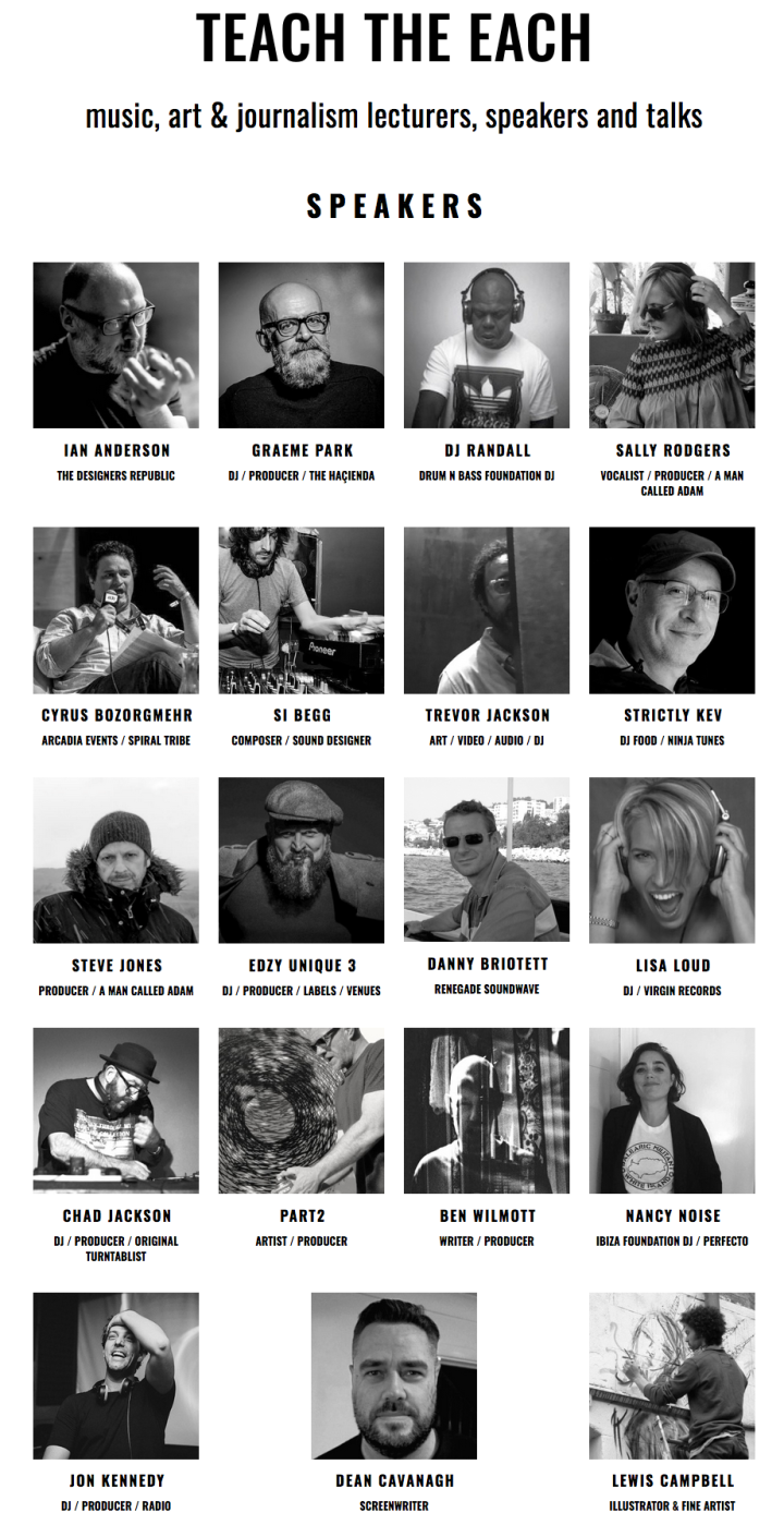
A new initiative just launched by Edzy from Unique 3 is Teach The Each, a pool of producers, artists, DJs, designers, promoters and music industry veterans with decades of experience to draw on in multiple disciplines. The aim is to create a one stop shop where these people can be booked to speak, teach and pass on their experiences and knowledge to up and coming students wherever they should be needed. I’m very pleased to be one of the people asked to take part, that’s some esteemed company to be in. More info here
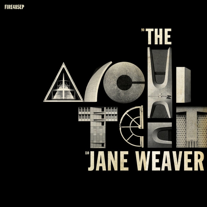
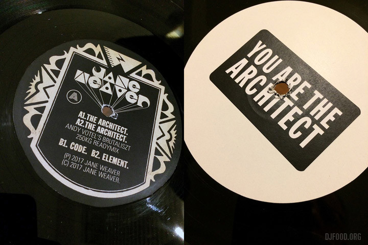
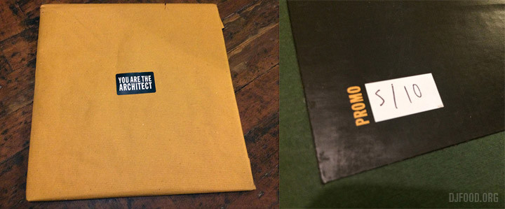 One day last Autumn a mystery package arrived containing various Finders Keepers records and one very special, handmade 12″ of Jane Weaver‘s ‘The Architect’ single. One of an edition of 10, it’s a thing to behold; a test pressing hand-labelled with a paste up cover containing one of my favourite designs of last year (see this post).
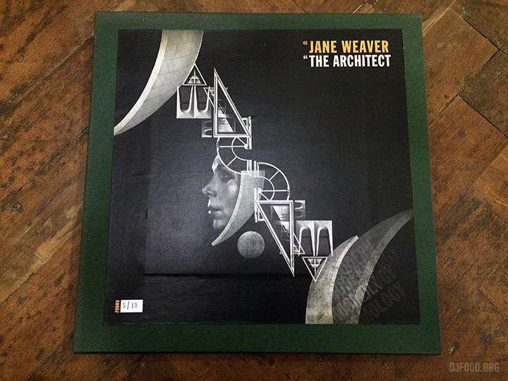
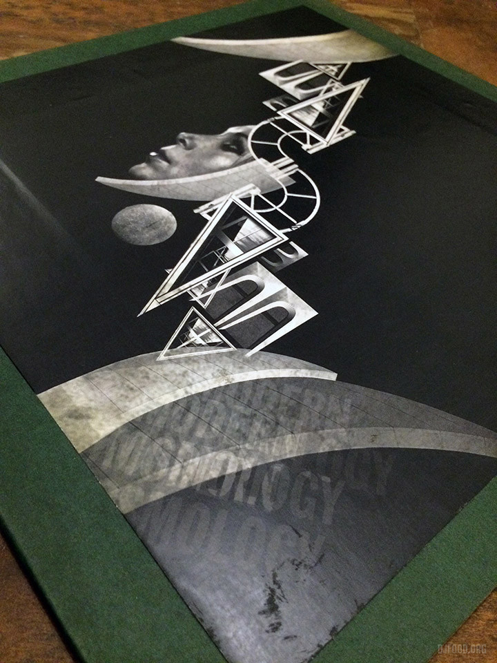
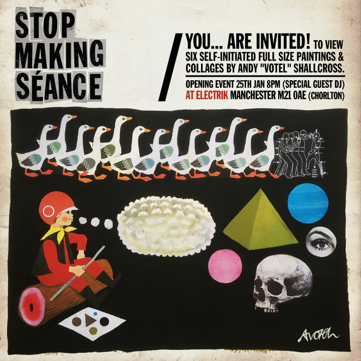
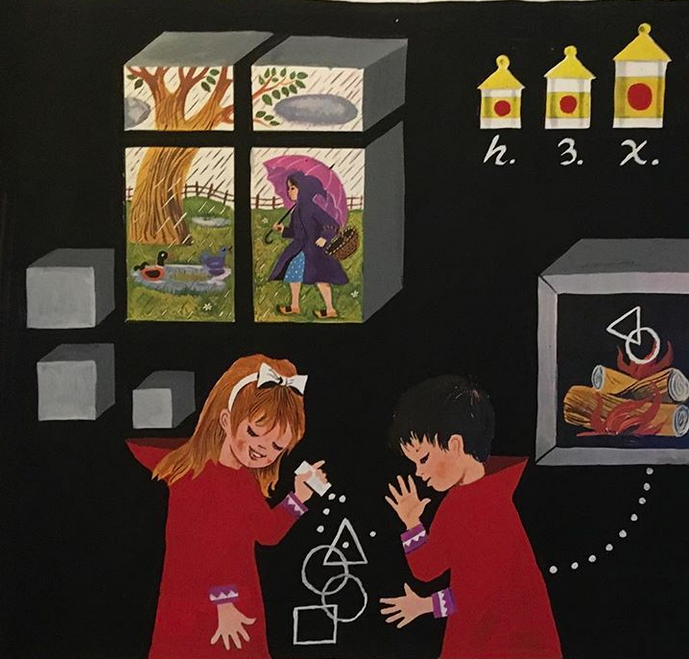
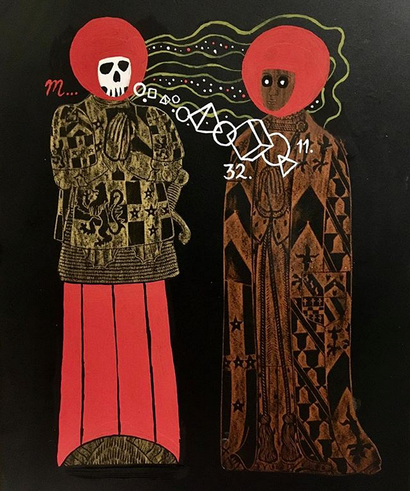
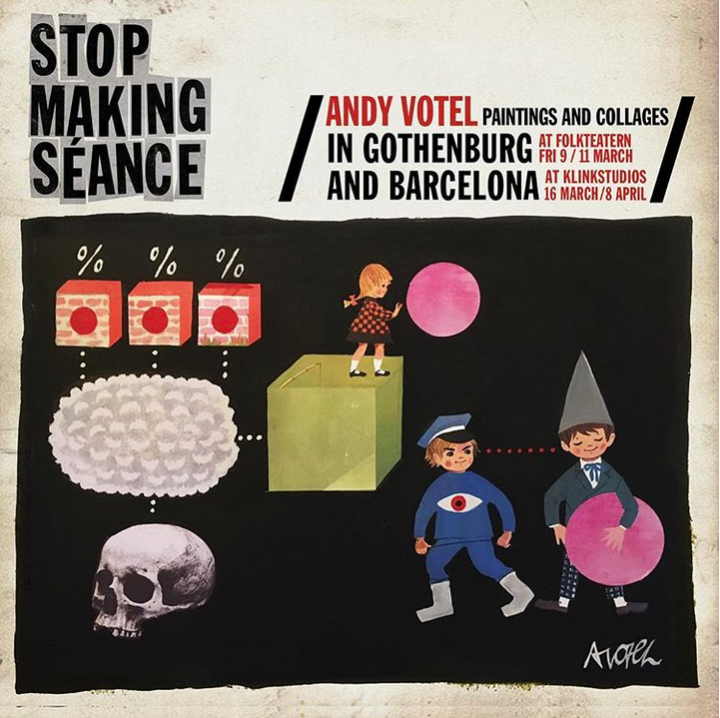
Being one of the people urging the designer to make prints of one of his posters for Jane’s Manchester gig I was gutted when my copy got lost in the post over the Xmas period. Luckily a replacement is soon to be on its way. The ‘architect’ of these creations is one of my favourite contemporary designers, Andy Votel, who will be exhibiting some previously unseen self-initiated full size paintings / collages in Manchester from the 25th at Electrik in Manchester.
From the press release: “Writer, DJ, designer, broadcaster, label boss and anti-musician Andy “Votel” Shallcross displays a series of original personal works created, at home, in October / November 2017.
Based around contemporary “fakelore”, reducing influences of European science-fiction art, scholastic illustration, post-pop-art, Plakatstil and mid-century graphic design Andy uses simple methods of painting, collage, deletion and recontextualisation for these one-off, large format placards.
Adopting a recurring patchwork method found in all of Andy’s multi-discipline “magpaic” activities, the running narrative and aesthetic format used in STOP MAKING SÉANCE can be described as pictorial-anagrams, which Votel playfully refers to as Andygrams. Having designed over 200 record sleeves in over 20 years of his graphic design day-job these singular quick-fire situation-abstractions are not intended for large-scale reproduction or as communicative graphic-design thus retaining a freedom previously unexplored in Andy’s visual work and will be on display for short residency in Manchester, Gothenburg and Barcelona in early 2018.”
Check out this interview with Oi Polloi for more info and images
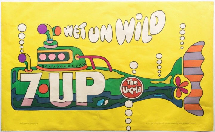
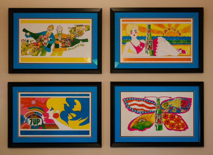
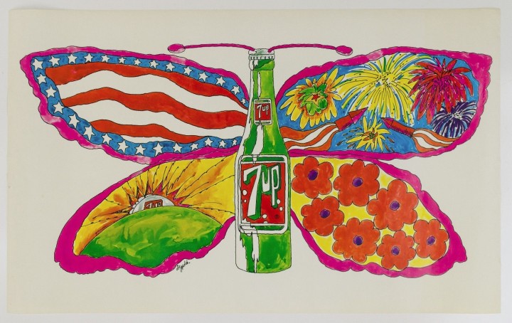
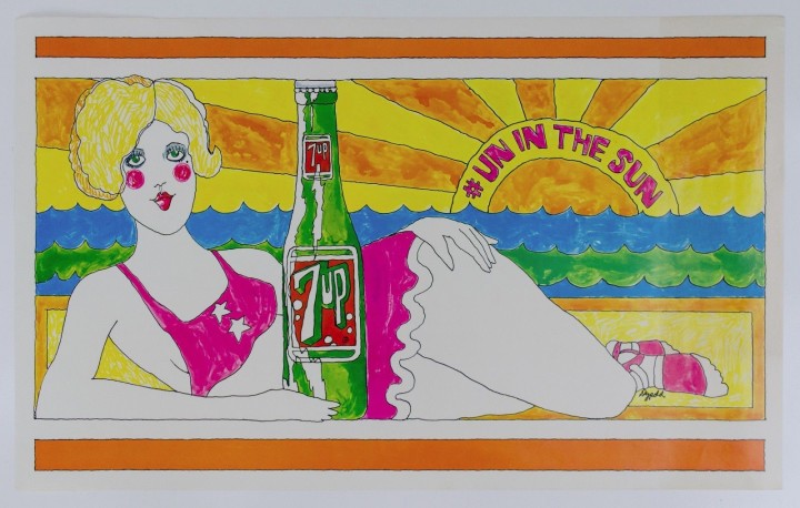
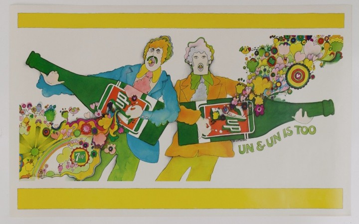
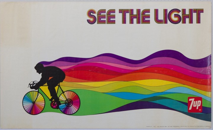
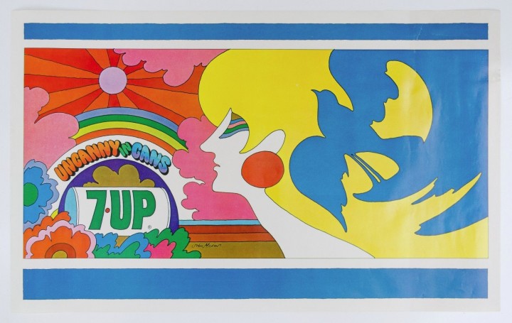
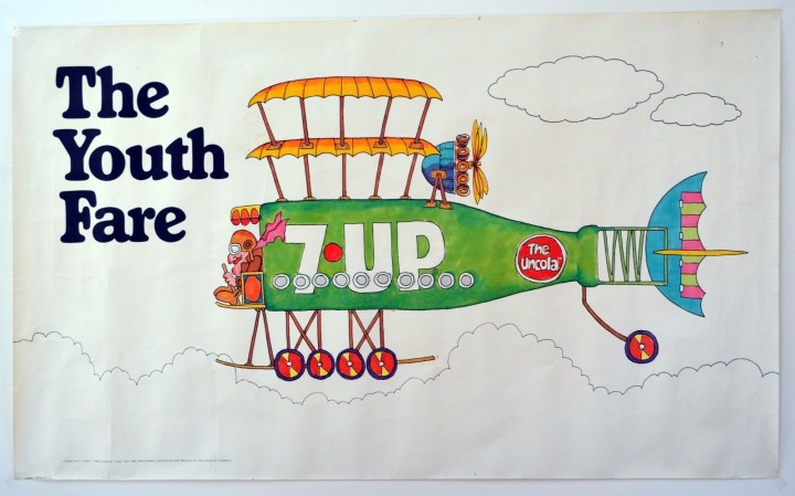
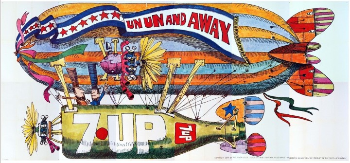
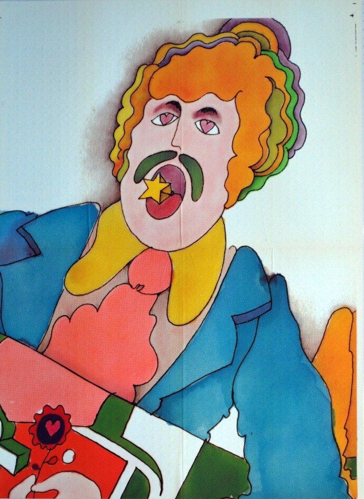
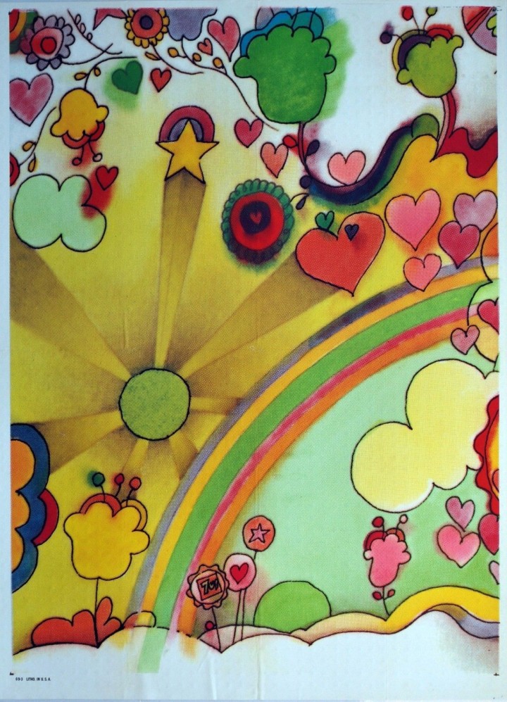
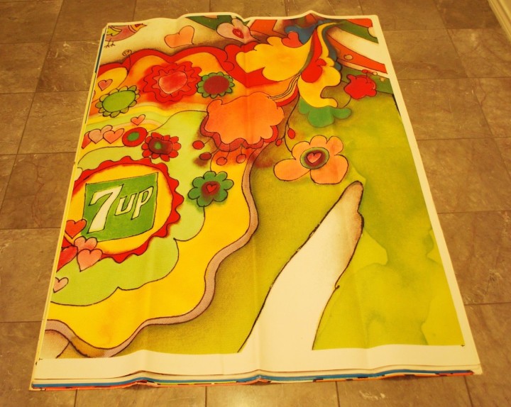
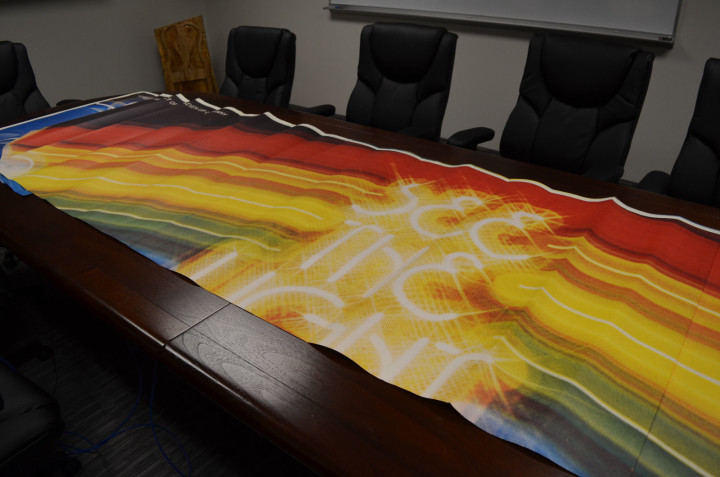
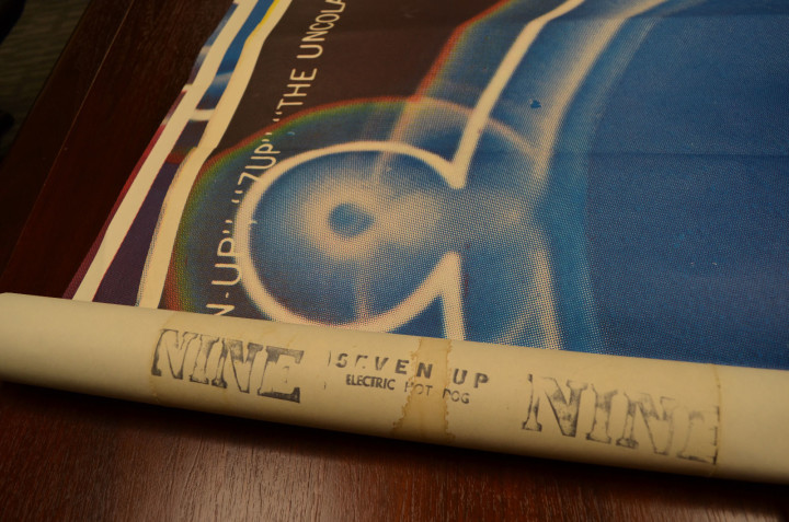
Browsing eBay over the Xmas holiday, a friend came across a psychedelic Submarine poster not a million miles away from Heinz Edlemann’s classic Yellow variant, created for The Beatles‘ film of the same name. In the same brightly-coloured, cartoonish style of the late 60s and early 70s – much popularised by artists like Edelmann, Milton Glaser, Nicole Claveloux and Peter Max – this sub was in fact green and advertising the drink, 7Up – billing itself as ‘The UnCola’. What was remarkable about this eBay listing though was that it was for an original 60″x36″ poster, not the sort of thing that turns up every day.
Indeed, further investigation revealed that the seller, Dallas resident, Robert Trent, is the foremost collector of this era of 7Up advertising and was selling off duplicates from his collection. Even crazier was that he was also selling huge billboard versions of some of the designs, some as an un-pasted set of 12 panels over 12 meters in length. Over the course of many entries he had compiled a huge resource of information, links and imagery, all expertly checked and presented without fuss and in meticulous detail. These kind of posters don’t come up every day and he has the whole history up there to give context to the images. After seeking his permission I hereby reproduce some of the imagery and details before it’s lost.
From Robert’s listing: “‘Wet Un Wild (green submarine, aka yellow submarine) 60” x 36” horizontal poster by Ed George.
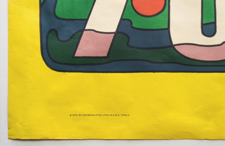
Note: This is made of thick quality poster paper, not dimpled yellow plastic tablecloth material (modern-day Tyvek construction wrap vapor barrier or “paper dress” nylon material) like the other “Wet Un Wild” posters occasionally offered on eBay.
This one is in excellent, but not perfect condition. This illustration is highly sought after and may be the holy grail of all 7Up UnCola poster images. Ed George illustrated this in 1969, (he) held multiple posts in-house at the J. Walter Thompson [advertising] Co. in Chicago (JWT) over many years.”
Below: 28 of the billboards in Robert’s collection as of writing…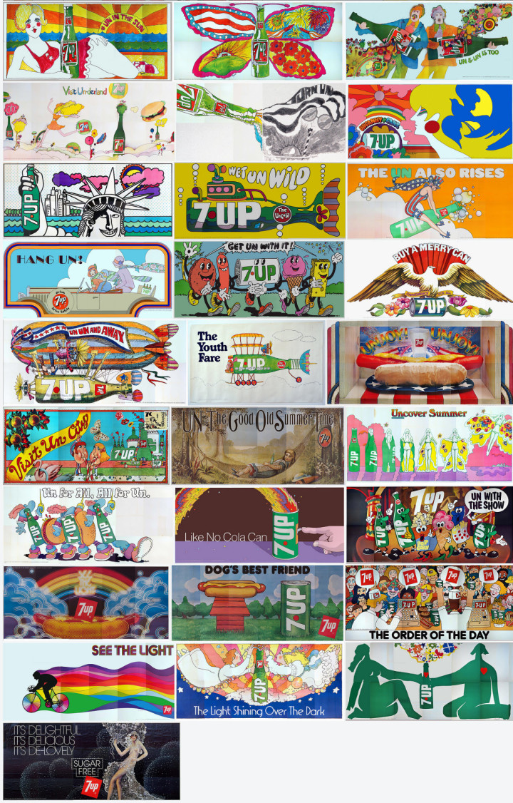
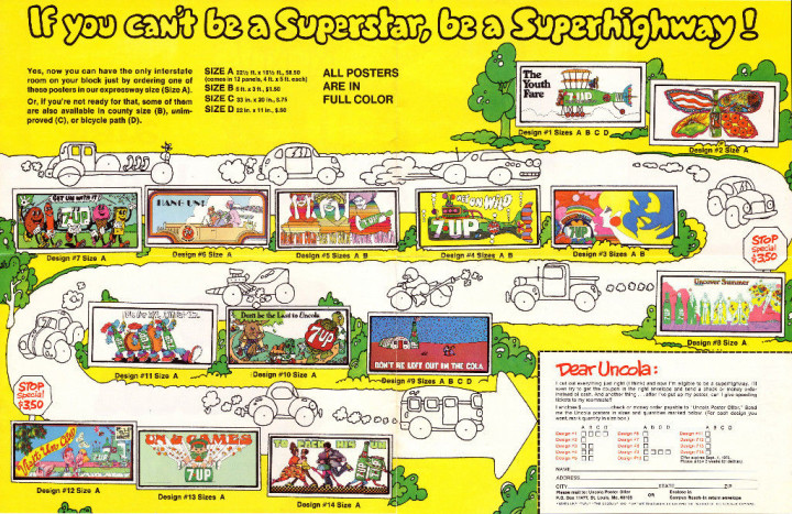
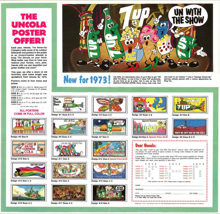
From Robert’s listing: “Most of these images actually graced highway billboards and dorm rooms. They were so popular that the Seven Up Company offered them for sale – few survived. The first batch of billboard sized images were up nationwide when colorful VW vans full of hippies drove to the Woodstock Festival in August of 1969. A “Fallpaper Poster Offer” on the bottom of page 8 of the October 5, 1969 Chicago Tribune Sunday Comics offered a set of (4) 34″x21″ reproductions of their famous billboards seen earlier in the year for, read it and weep – ONE DOLLAR TOTAL (plus 6 bottle cap liners). That offer expired on 12/31/69. The sizes also ranged from small Size “D” posters to giant Size “A” 21’x10′ billboards. These are all ORIGINAL vintage posters – NOT modern giclee photo reproductions.”
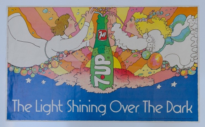
From Robert’s listing: “‘The Light Shining Over The Dark’ This is a vintage 33″ x 20″ horizontal poster that is in excellent condition and VERY RARE. I’m only aware of 2 or 3 other copies, some of which have passed through my hands. The artist’s signature can be seen at the right center in the bottom of the girl’s white dress.
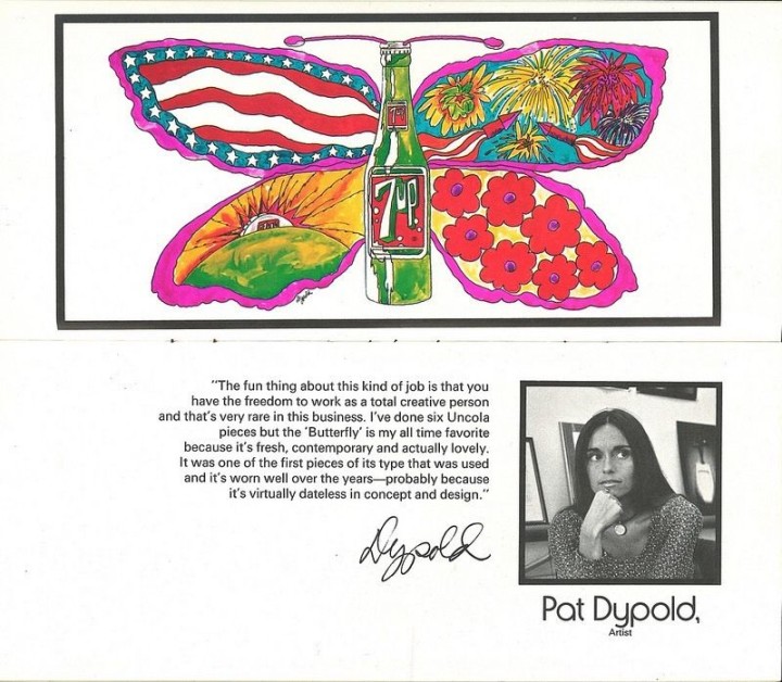
The artist was Pat Dypold who illustrated this by 1973 as a free-lance artist. She did the bulk of the other outdoor ads (billboards) for the J. Walter Thompson [advertising] Company of Chicago (JWT) that orchestrated the famous UnCola ad campaign from about 1968 through 1975.”
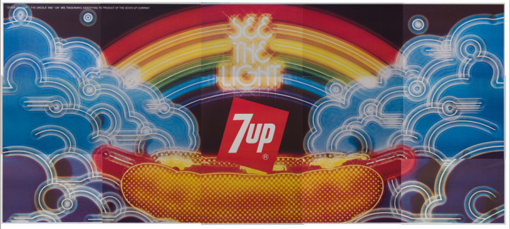
From Robert’s listing: “‘See The Light’ (psychedelic bicycle) 60″ x 36″ horizontal poster by the late Tom Kamifuji (1922-2015) (original concept by Bill Bosworth)
“Hiroyuki “Tom” Kamifuji ran a design studio in San Francisco. He was an illustrator, poster designer, typographer, art director and designer. Yet, for all his legacy of brightly-colored works, there is very little biographical information available. Perhaps his most universal success was the inspiration for the rainbow swath of color within the Apple Computers apple. The concept for this image came from Bill Bosworth who worked in-house at the J. Walter Thompson [advertising] Co. in Chicago (JWT) over many years. However, the actual finished artwork was done by California artist Tom Kamifuji. There is no signature on this “Size B” poster, but the larger “Size A” 21’x10′ “See The light” billboard in my possession has Tom Kamifui’s signature.”
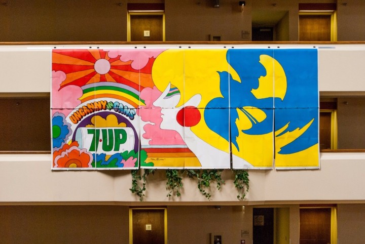
From Robert’s listing: “‘UnCannny In Cans’ This is a vintage 33 3/4″ x 20 3/4″ poster that is in excellent, near mint condition. This is an authentic, traceable representation of late ’60s, early 1970’s pop art advertising. The artist was John Alcorn who illustrated this in 1969 as a free-lance artist. His signature is in the bottom middle brown band. At the age of 24 Alcorn was the 4th person to join Push Pin Studios which was the place to be in the graphics community at the time.
The Seven Up Co. sold 4 different sizes of most images to the general public. BTW – My collection also includes one of the “UnCanny In Cans” Size “A” billboards plus a 60″ x 36″ Size B” version. The poster for sale here is a 34″x21″ Size “C”.
John did a number of well known illustration advertisements in the prior years for Pepsi and Campbell’s Soup and his career flourished for many more years. These outdoor ads (billboards) were commissioned by the J. Walter Thompson [advertising] Company of Chicago (JWT) that orchestrated the famous UnCola ad campaign from about 1968 through 1975. Most of the 53+ extremely colorful billboard & poster images were illustrated by invited outside freelance artists who were allowed to sign their names on the originals if desired – not all did. Only a few images were produced in-house, and never with the artist’s name on them. JWT wisely chose to invite only up and coming artists and not well known graphic stars so as not to let the notoriety overshadow the product itself.
Many of the artists have gone on to great fame in the graphics community Milton Glaser (I [heart] NY logo) (Mad Men final Season 7 poster; co-founder of Push Pin Studios), Seymour Chwast (co-founder of Push Pin Studios) with Isadore Seltzer, John Alcorn (Push Pin Studios), Kim Whitesides, Barry Zaid, Jacqui Morgan, Simms Taback (1st Happy Meal Box in Smithsonian & Caldecott Honor for children’s books), Skip Williamson, Robert Abel (Tron movie), Charlie White III (permanent collection at MOMA), John Craig, Ray Lyle, Heather Cooper, Nancy Martell, Roger Chouinard, Pat Dypold, Bob Taylor, Tom Kamifuj, Bill Bosworth, Ed George, Joanne _ and probably several others.
The Seven Up Company executives chose rough “comps” without the artist’s names attached to the submissions. If 1 or more sketches were chosen, the artist would eventually earn up to $2,000 per completed piece. I’ve spoken with some of the retired ad execs from JWT and they reported that this was a fantastic assignment with a dream client that encouraged bold moves. These Midwest Mad Men boosted sales by anywhere from 30-60% under their highly creative reign from 1968 until the mid-seventies.”
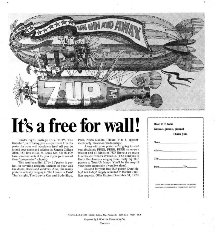
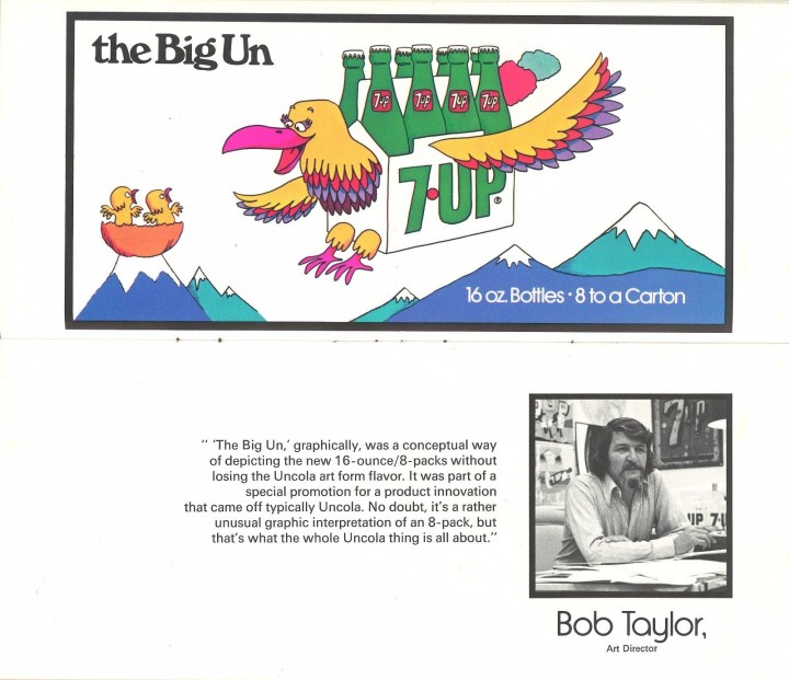
From Robert’s listing: “Bob Taylor was an art director at the famed J Walter Thompson [advertising] Company based in Chicago – the Midwest Mad Men. An American Contemporary Graphics Exhibit booklet from about 1972 featured Bob and a different “cartoony” billboard image of his on pages 9-10. Bob was one of the driving forces behind “The UnCola” ad campaign from the beginning in 1968 until the end in the middle 1970’s. Bob also illustrated “The Youth Fare” in a similar “cartoony” style depicting a green bottle of 7Up as a bi-plane.
This is the 21’x10′ Size “A” billboard version of this blimp image by Bob Taylor available as Design #10 for $7.00 in the billboard and poster offer that expired on 5/31/72. A small 21″x11″ poster was available for FREE if you responded to the poster offer that expired on 12/31/70. Another folding billboard and poster offer that expired on 5/31/72 offered this billboard as Design #12 for $8.50.
As of today, I only know of one other copy besides the 2 billboards in my possession. This piece of advertising history is in NEAR MINT condition and ready for display. To get a sense of scale, a standard sized vehicle would not cover up the blimp itself if laid out flat on a driveway.”
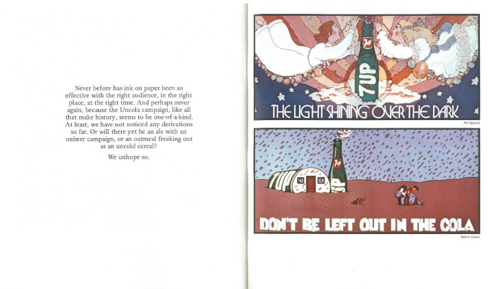
The American Contemporary Graphics Exhibit book laid out profiles of some of the artists along with their contributions and the aim of the campaign.
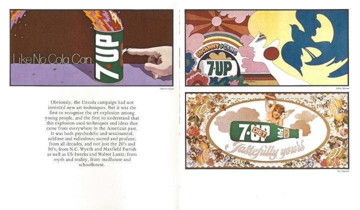
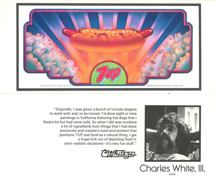
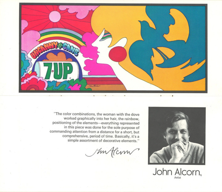
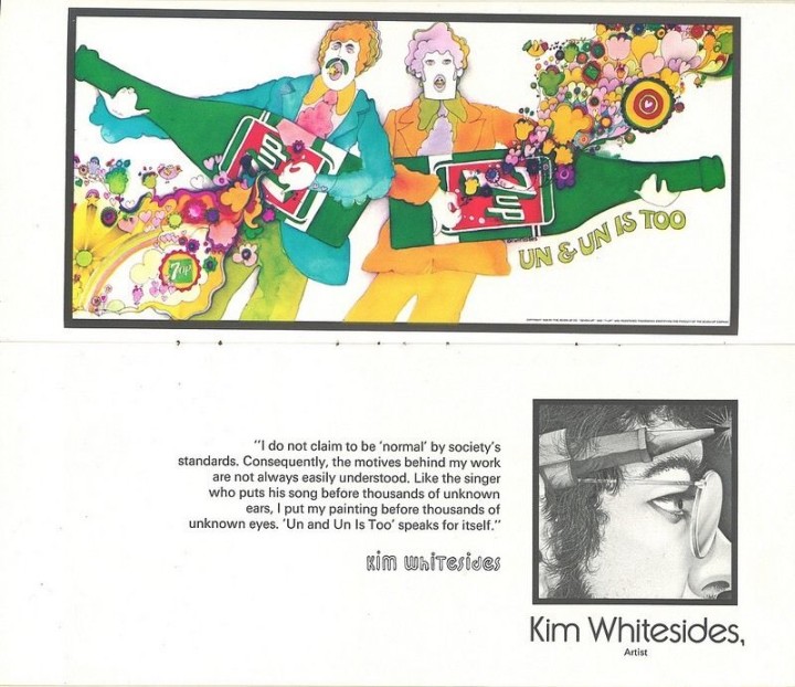
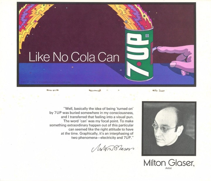
From Robert’s listing: “Milton Glaser (b. 6/26/29) This image was created during his Push Pin Studios era which is the firm he co-founded with Seymour Chwast. It would be another 6 years before he created the most copied “I [heart] NY” logo on the planet in 1977. Scans from 2 different booklets from about 1971 independently attribute this work to Milton Glaser. Here are his own words about the concept for the image:
“Well, basically the idea of being ‘turned on’ by 7Up was buried somewhere in my consciousness, and I transferred that feeling into a visual pun. The word ‘can’ was my focal point. To make something extraordinary happen out of this particular can seemed like the right attitude to have at the time. Graphically, it’s an interphasing of two phenomena – electricity and 7Up”.
My extensive collection includes the ONLY 2 KNOWN COPIES IN ANY SIZE of this particular image. The originals are 21’x10′ Size “A” billboards acquired from someone in the Out Of Home (OOH) [billboard] business that set these aside in the early 1970’s thinking that they might be something special. They are. Even world famous graphics guru Milton Glaser doesn’t have any copies in his vast collection per his archivist. I’ve never seen ANY other copies in ANY other size. I also collect 7Up UnCola “poster offers” but I’ve also never found any offering this image to the general public. Most of my other billboards were offered to the general public for prices between $3.50 and $8.50. For some reason, this one and a few others were not made available although a few like this one were squirreled away. “
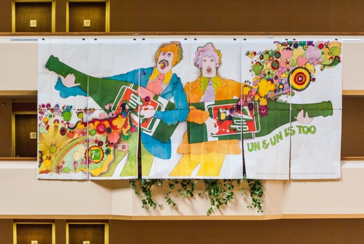
Pat Dypold seems to be the unsung heroine of the piece, contributing many illustrations in various styles but she’s not a name I’m familiar with. Robert had a class reunion and hung several of the billboards from the balcony at the venue they held it at, you get a sense of scale with these photos plus some close up details.
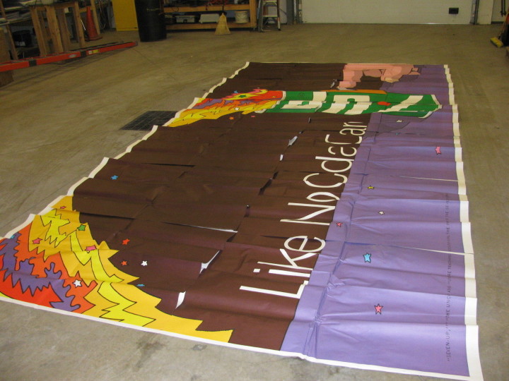
From Robert’s listing: “Giant 21′ x 10′ 7Up UnCola original unused vintage paper billboard illustrated in 1971 by Kim Whitesides. An American Contemporary Graphics Exhibit booklet from about 1972 featured Kim Whitesides and this image on pages 11-12. He did at least 3 other billboard images for The UnCola ad campaign, 2 of which were issued in billboard and/or poster formats.
The billboard itself consists of 12 thick paper panels, each 43″ wide x 59″ tall. There’s about a 1″ white margin on the top and right edges of each panel so it can be installed in an overlapping “rainlap” pattern designed to shed water like shingles on a roof (see last image). These were only meant to last outdoors for 30-60 days, and then the next billboard would be pasted over the top – destroying the paper underneath. The only way any of these survived for nearly 5 decades was for them to be set aside and not used as intended. This is one of the rare examples of that being done. Although rare, I have 3 copies of this billboard image in my collection. All 210 square feet of my copy has been painstakingly reinforced with acid-free scrapbooking tape on the rear side, but only as needed to stabilize small rips, week fold lines and other minor imperfections. Any small holes have been patched with matching paper from donor panels from the same era and are barely noticeable up close. In places, colored pencils or markers have been used to refresh missing ink.”
There are examples of many order forms including this fold up mail out, such great thinking going into something so ordinary.
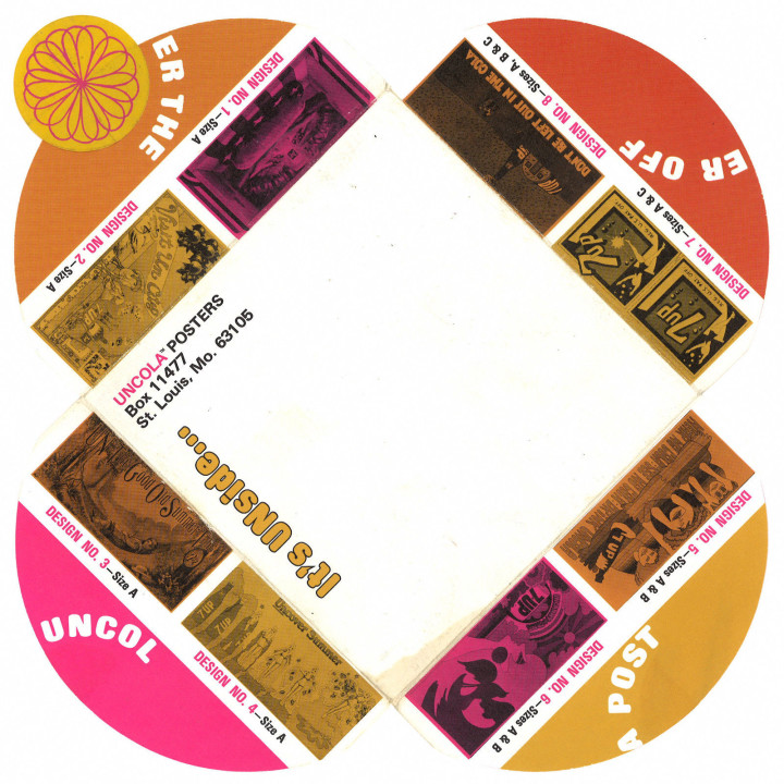
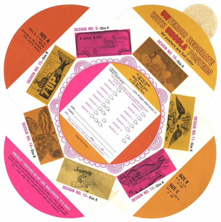
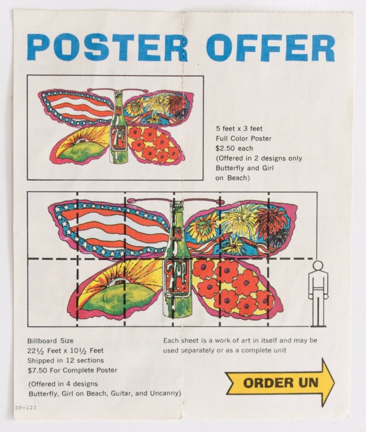
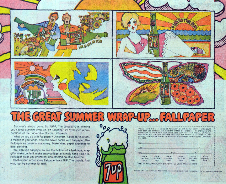
There are two very good articles / interviews with Robert on the web: one with Collector’s Weekly
and one with the ever-reliable Dangerous Minds so head there if you want more info. You can follow Robert on Instagram, view his whole collection on Flickr or peruse his eBay entries for yourself. Masny thanks to Robert for letting me repost these pictures and info.
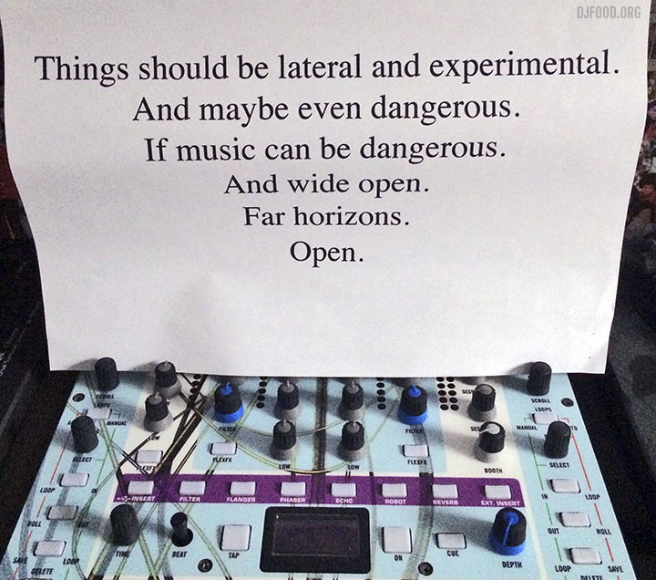
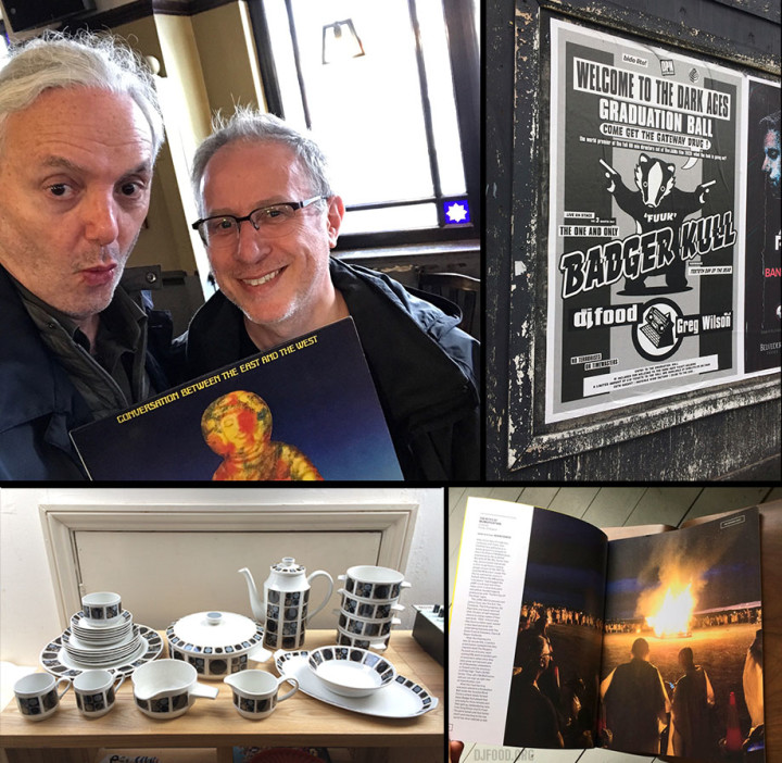
The above photo was my brief from Bill Drummond for the set I was to play at the JAM‘s Welcome To The Dark Ages event in Liverpool. I stuck it above my mixer as I was preparing the set, it’s something to keep in mind as we go forward into 2018. I spent most of the year in limbo, waiting in a chain for a property to come through. When it finally did in mid September, I pretty much ate, drank and slept it in between jobs as it needed a lot of work doing, hence no posts for the past two odd months. I’m in now and can see the wood for the trees but it did mean I largely dipped out of social media for the latter quarter of the year (probably not a bad thing).
Seeing as 2016 was such a shitter, in 2017 I wrote down all the good things that happened as the year progressed:
Got implicated in the KLF/JAMMs/K2 comeback media scrum because of an innocent quote in my 2016 round up
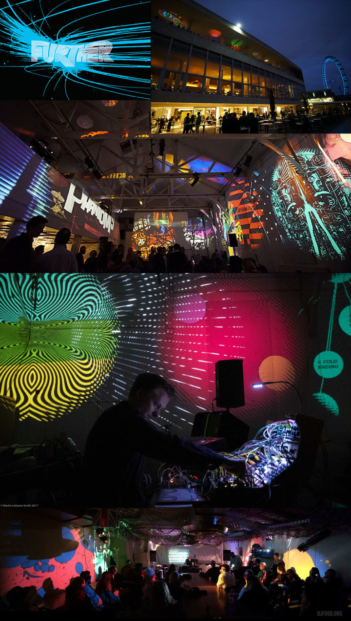
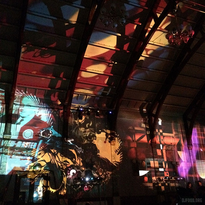
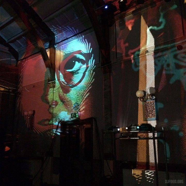
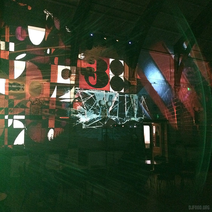
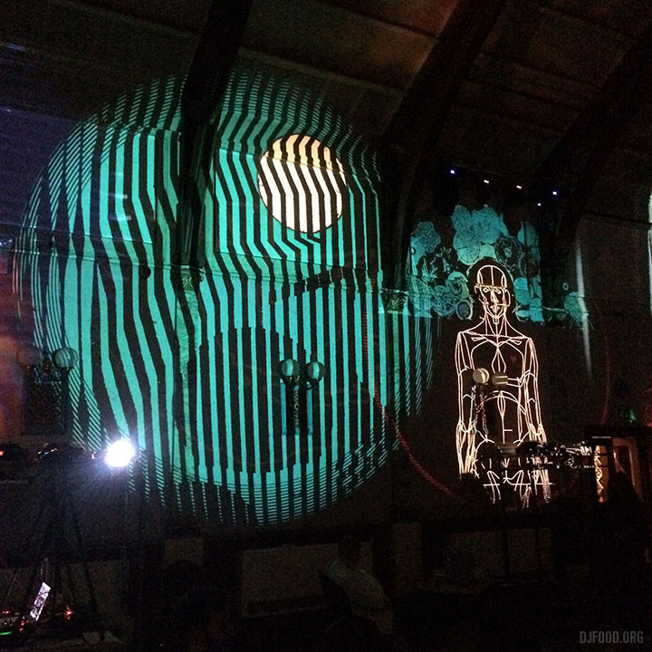
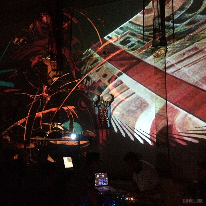
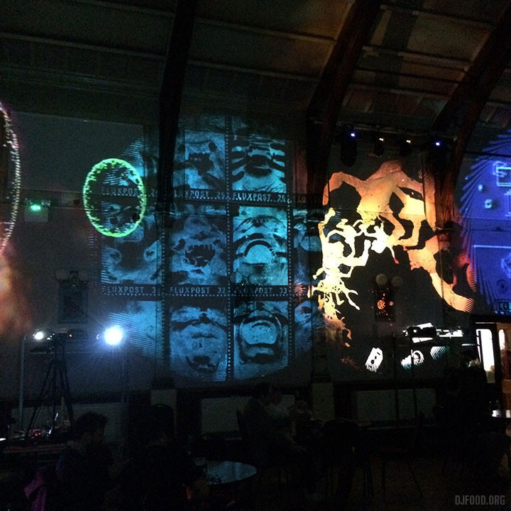
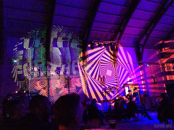
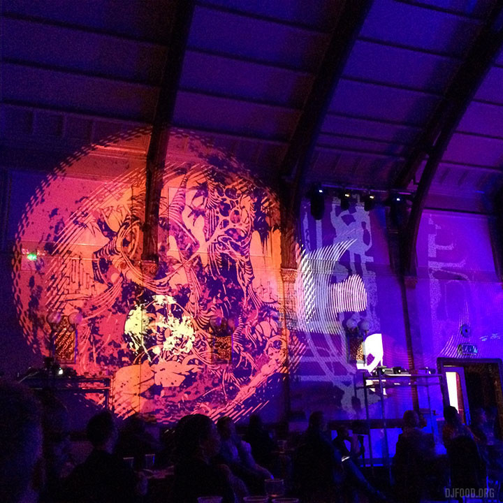
Started Further with Pete Williams – a multimedia music & projection night playing non-dancefloor sounds with analogue-based visuals plus food and a record stall – and founded a studio/ HQ in S. London
Pete Isaac (45 Live) found me a perfect copy of a long time wants list staple, Bam Bam’s ‘Where’s Your Child’ on 7″ for free
Got asked to play as Further at The Orb‘s ambient evening at the Royal Festival Hall in April and lit up the 5th floor balcony with 20 projectors
Mixed a Death Waltz Originals CD which was given away free at Halloween with Mondo/DW orders
Appeared on the Big Mouth podcast and played at the opening of Orbital Comics‘ exhibition, both celebrating 40 years of 2000AD
Found a set of Thomas ‘Eclipse’ plates, cups and saucers for a bargain price from an eBay seller
Pete managed to find a broken 6k projector for free and fixed it for £50
My kids got into the secondary school we wanted them to go to and aced it in their first term
The first Further event at the Portico Gallery was sold out and a great success with Ghost Box and Howlround as guests
Played the first Big Fish Little Fish in Athens which promptly sold out
Played three different street food festivals in the summer, love those sort of gigs, more please
Found a huge Barbara Brown dinner service in the charity for £15 – find of the year
Played at The Delaware Road performance in July inside a nuclear bunker with a host of electronic artists – a very special night
Asked to play the Justified Ancients of Mu Mu happening in Liverpool, which turned out to be one of the events of the year – who’d have thought it? A career highlight that saw me playing many of the tracks they’d sampled in their career alongside acid house classics and ending at 3am with a version of ‘In The Ghetto’.
Further went to Spiritland and we supported The Heliocentrics as part of the SYNthesis festival, both very special occasions even though we worked our balls off to set them up
The return of The The in musical, film and live capacity
Scoring a long time wants list LP – Yves Hayat‘s ‘Conversations Between The East & The West’ – direct from the archive of the composer himself and meeting him in London to receive the record.
Blade Runner 2049 was actually amazing and a worthy follow up to the original
The second major Further gig at the Portico Gallery featured Simon James playing a Buchla set to bespoke visuals we made and Sculpture slaying the place with their AV act.
Asked to support the Art of Noise at the British Library next March
Further featured twice in Electronic Sound magazine and I had an opening spread printed of my end of night image of the funeral pyre from the JAMs event in Liverpool
Taking my boys to the Colourscape on Clapham Common
Finally moved in and moved on
Asked to play a very special run of shows in 2018 that I’ll reveal soon…
Music:
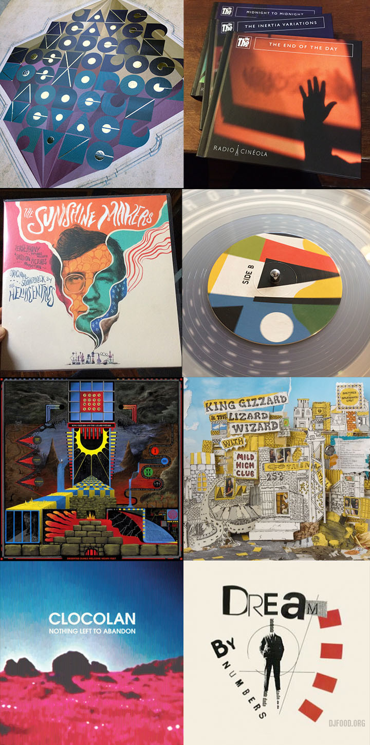
OK, so 2017 was the year of the Lizard for me, I listened to more hours of King Gizzard & The Lizard Wizard’s music than any other band, but considering they released 5 albums this year alone it ‘s not surprising. Each album was different and they steadily got better with each release as the year progressed (disclaimer: I can’t speak for album no. 5 ‘Gumboot Soup’ as it came out today but ‘Polygondwanaland is probably my album of the year)
Brian Eno – Reflection (Warp)
Cavern of Anti-Matter – Blood Drums (reissue) (Duophonic)
Clocolan – Nothing Left To Abandon (Enpeg)
Run The Jewels – RTJ3 (Mass Appeal)
Revbjelde – Revbjelde (Buried Treasure)
Thundercat – Them Changes (Brainfeeder)
Jamiroquai – Automaton (the single)
The Dandelion Set – A Thousand Strands (Buried Treasure) (technically 2016 but copies got held up by distribution and it was more widely available in 2017)
The Heliocentrics – A World Of Masks (Soundway)
The Heliocentrics – The Sunshine Makers (Soundway)
King Gizzard & The Lizard Wizard – Flying Microtonal Banana (and still playing the hell out of Nonagon Infinity and It’s In My Mind Fuzz)
Klaus Weiss – Time Signals (reissue) (Trunk)
Vanishing Twin – Dream By Numbers EP (Soundway)
The Allergies – Entitled To That (Jalapeno)
Jane Weaver – Modern Kosmology (Fire Records)
Ulrich Schnauss & Jonas Munk – Passage (Azure Vista Records)
Ilia Gorovitz – Turmoil/Simmering With No End (Rassh Records)
John Brooks – Un Autre Directions (Clay Pipe Music)
King Gizzard & The Wizard Lizard – Murder of the Universe (Flightless)
Markey Funk – Witch Doctor / The Brew (Delights)
Nevermen – Mr Minute (Boards of Canada remix) (Lex)
The The – Radio Cineola Trilogy (Lazarus)
Hans Zimmer & Benjamin Wallfisch – Blade Runner 2049 OST
King Gizzard & The Wizard Lizard – Sketches of Brunswick East (Flightless)
King Gizzard & The Wizard Lizard – Polygondwanaland (Flightless)
Exhibitions:
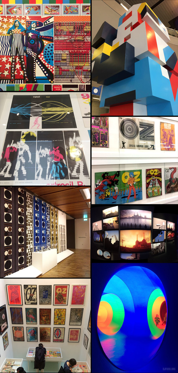
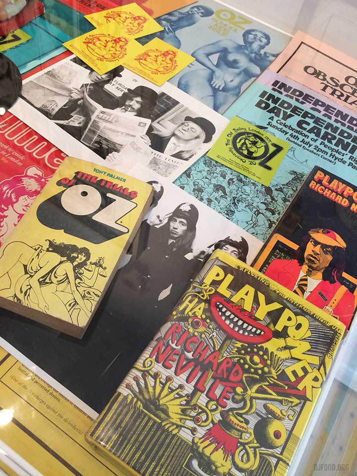
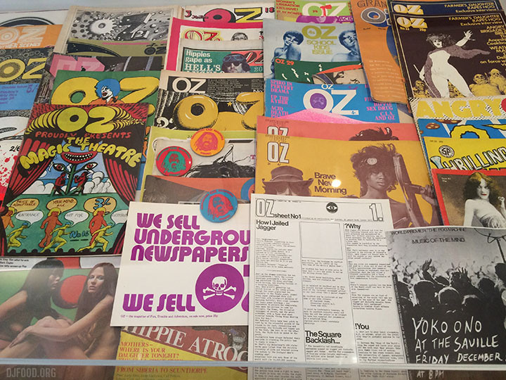
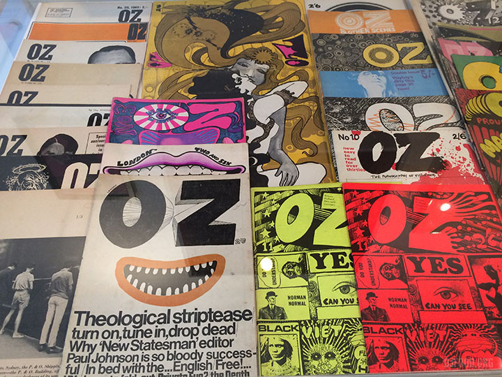
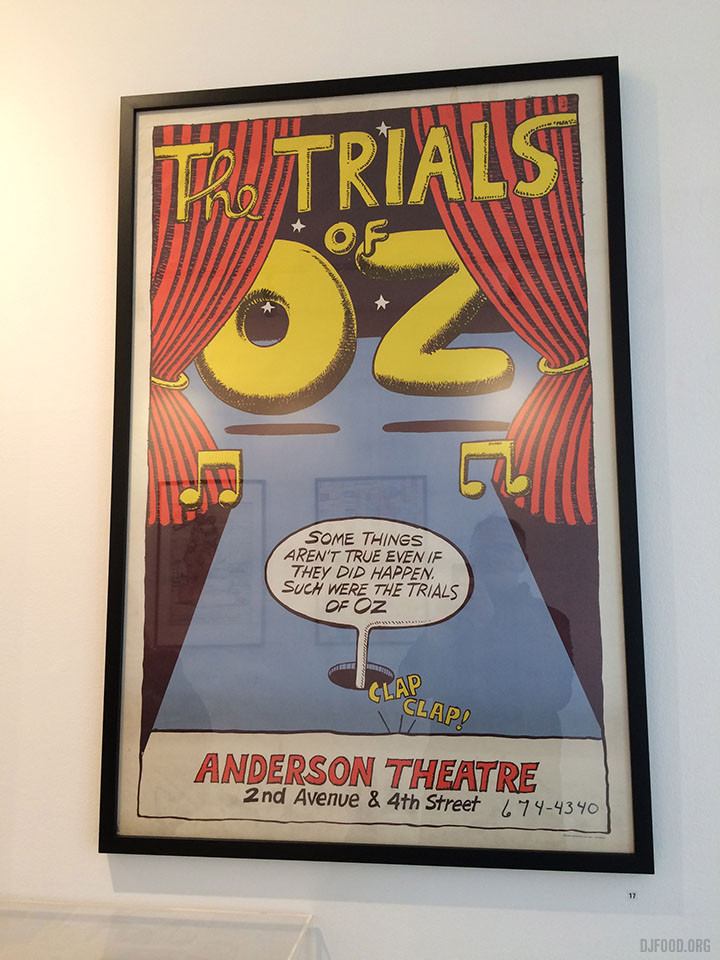
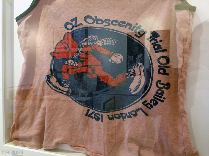
Future Shock – 40 Years of 2000AD – Cartoon Museum (London) / Paolozzi at the Whitechapel Gallery (London), Will Barras at Sector 25 (London) / Barbara Brown and Lucienne Day at the Whitworth Gallery (Manchester) / Franco Grignani at Estorick Collection of Italian Art (London), We Are Watching: Oz Magazine – Chelsea Art Space (London) / Delta – Mima Museums (Brussels) / Pink Floyd: Their Mortal Remains at the V&A (London), British Underground Press of the 60s at the A22 Gallery (London) / Can Graphic Design Save Your Life? – Wellcome Collection (London) / Snub 23 at the Boz Boz Gallery (Brighton)
Books / Comics:
Out Of Time – Miranda Sawyer / Ian Helliwell – Tape Leaders (Sound On Sound) Book + CD / British Underground Press of the 60s (Rocket 88) / The Process Is The Inspiration – House Industries / B.P.R.D.: Hell On Earth (Dark Horse) / Barbarella (Dynamite) / Swifty – FunkyTypo Graphix (Gamma Proforma) / Boris Tellegen – 86/97 – a black book (A Paper Book) / Batman: White Knight (DC)
RIP: Jaki Liebezeit, David Axelrod, Alan Aldridge, Dick Bruna, Clyde Stubblefield, Larry Coryell, Toshio Nakanishi, Chuck Berry, Skip Williamson, Jay Lynch, Mika Vainio, Adam West, Brian Cant, Pierre Henry, Anne-Marie Bergeron, Glen Campbell, Bruce Forsyth, Holger Czukay, Virgil Howe, Sean Hughes, Christine Keeler, Keith Chegwin, Dennis Dragon, Jim Baikie
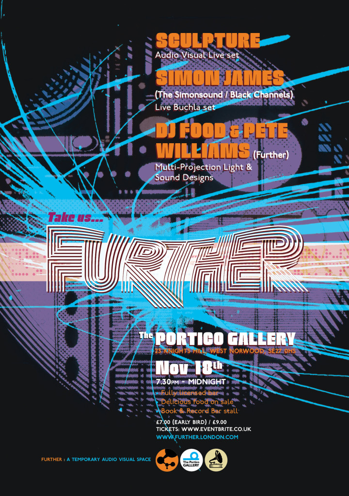 The next Further at The Portico Gallery is on Sat Nov 18th. Pete Williams and I are very excited to be joined by Sculpture for one of their incredible live AV sets and Simon James (Simonsound / Black Channels /Akiha Den Den) will be performing a live set from his Buchla easel system. Early bird tickets on sale now
We’ll also have the Book & Record Bar stall with releases from both acts and a hand-picked selection to compliment plus delicious food and plenty of seating. See below for what to expect on the night.
Sculpture
Simon James
The last Further at the Portico Gallery
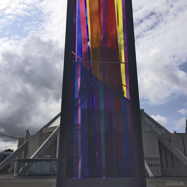
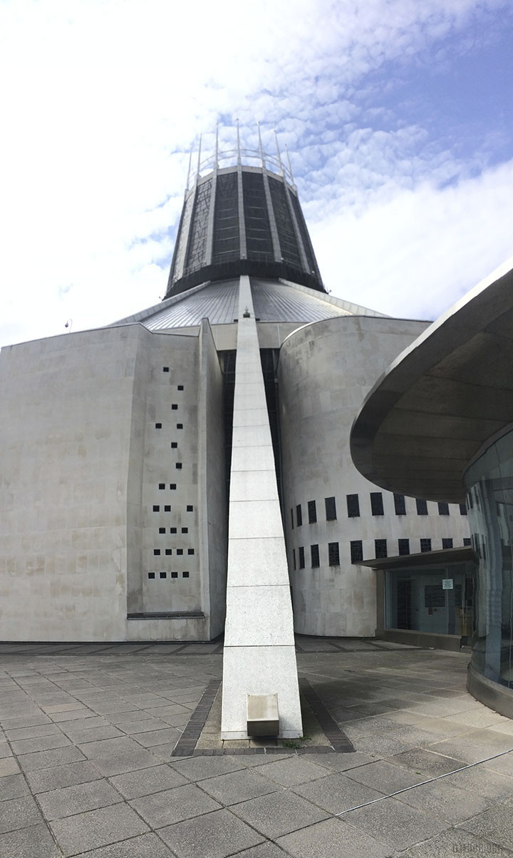
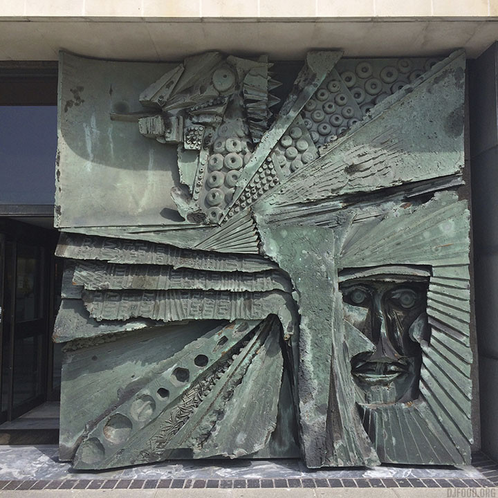
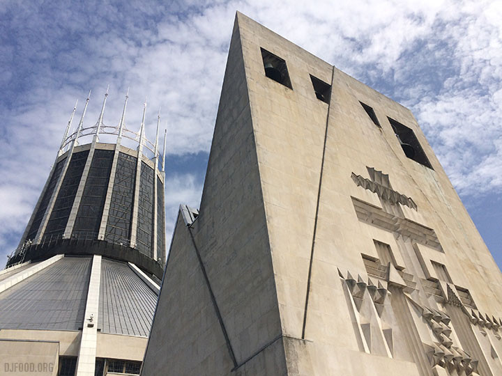
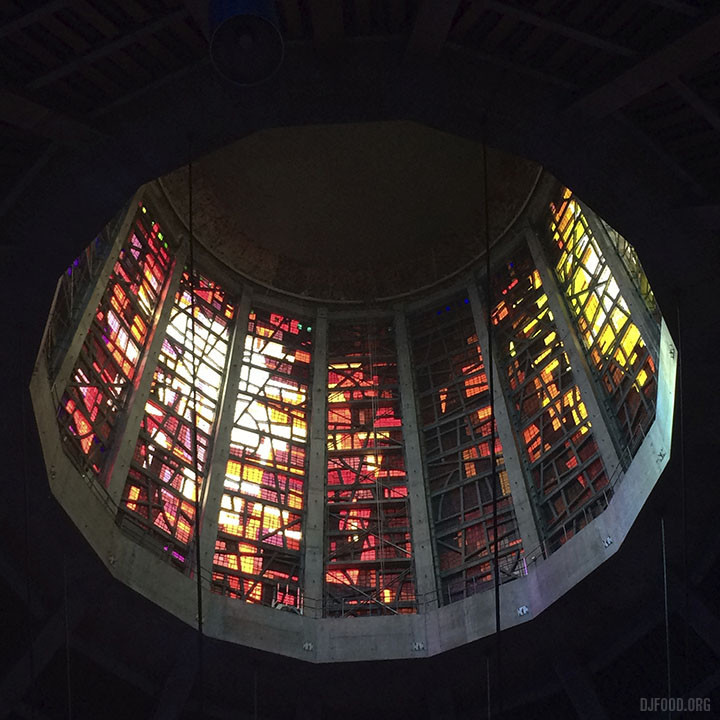
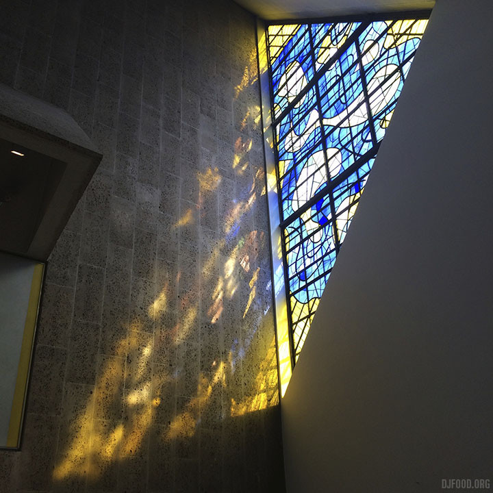
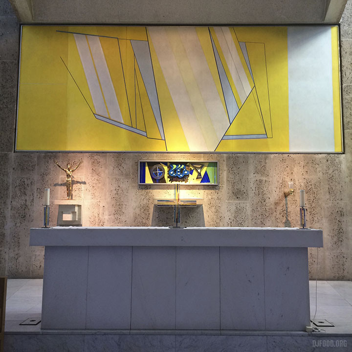
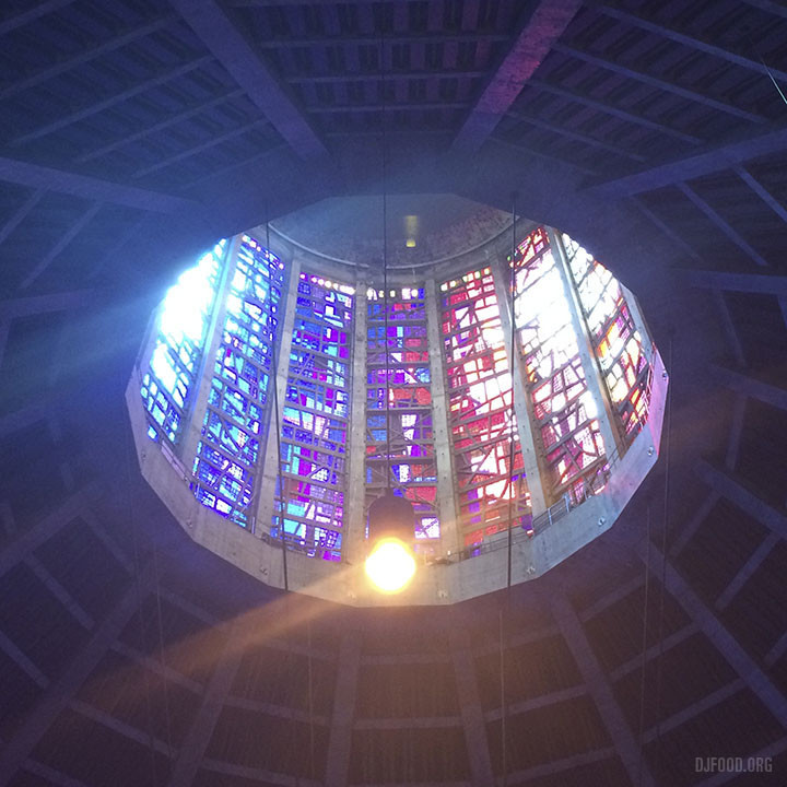
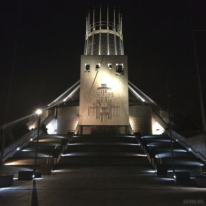 This summer, during my visit to Liverpool to attend The JAM’s ‘Welcome To The Dark Ages’ event I found some time to visit a few landmarks around Liverpool. My first stop was the 50 year old Metropolitan Cathedral of Christ the King which has some of the most stunning architectural features and stained glass windows I think I’ve ever seen.
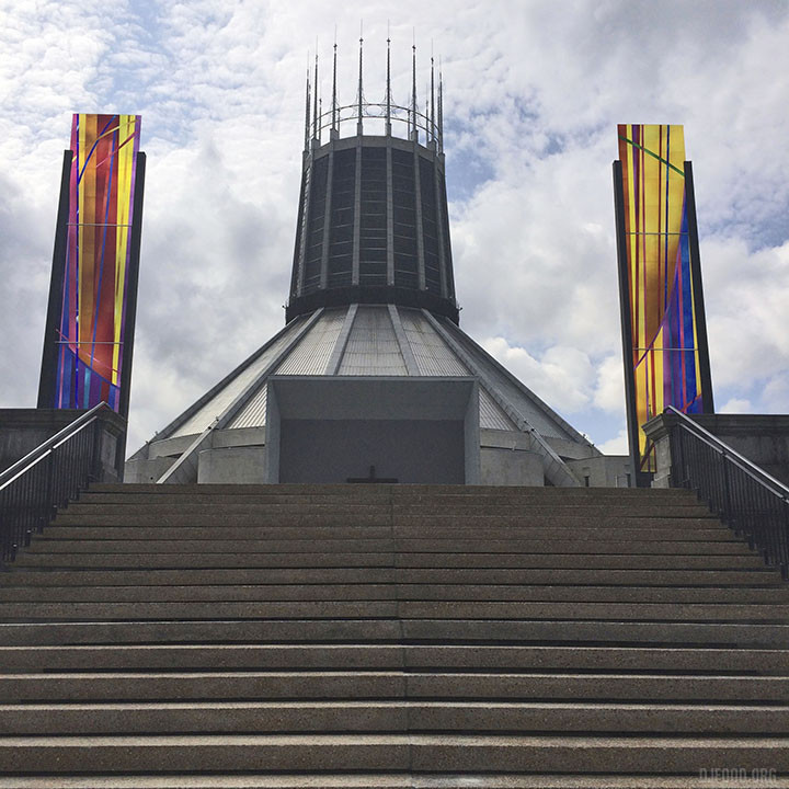
The photos speak for themselves but my camera just couldn’t capture the vividness of colour created by the sun lighting up the windows. For a building half a century old it’s an incredibly modern piece of art, right down to some of the imagery and sculptures they have installed.
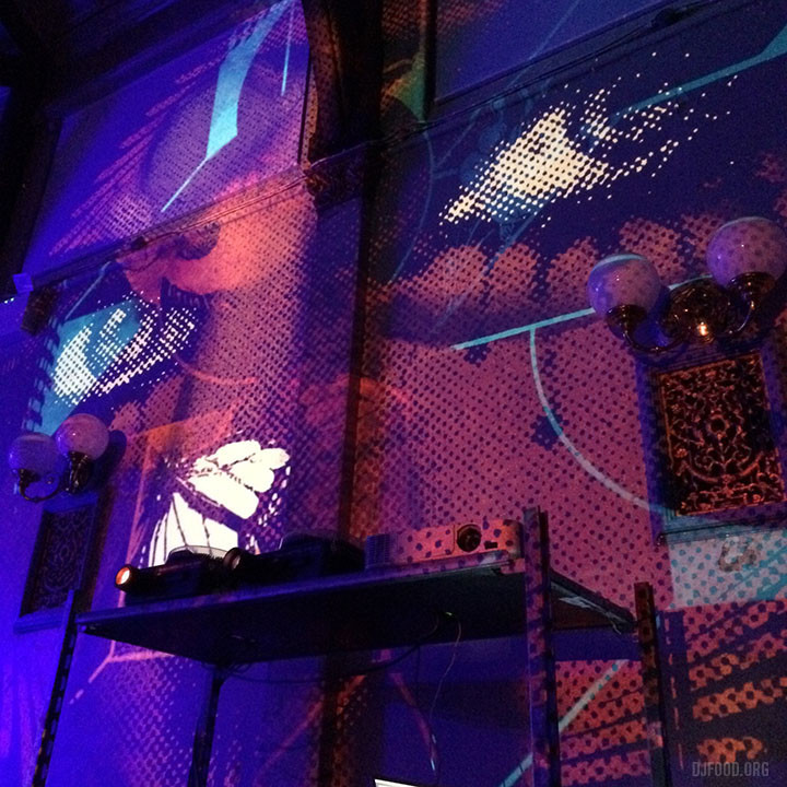

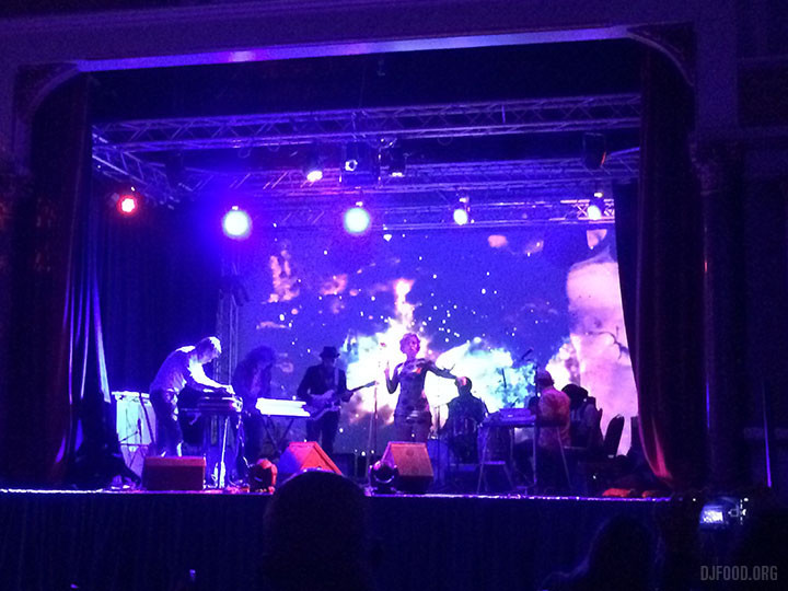
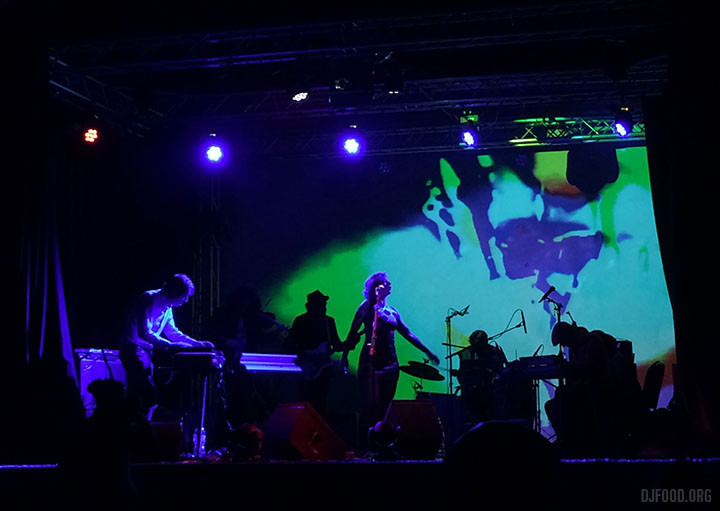
Pete Williams and myself set up our Further environment in support of The Heliocentrics at the Synthesis festival at Stanley Halls in South Norwood at the end of September. The group were utterly spellbinding with their vocalist tying everything together with an incredible vocal range somewhere between Roisin Murphy and Shirley Bassey. They played for two hours with visuals by Innerstrings and for a Thursday evening in deepest South London (nearly Croydon if we’re honest) it was pretty mind blowing.
Following dates featured DJ Krush, Andrea Parker, Juice Aleem, Beak and more in a hugely ambitious three day event – all the brainchild of Rob Swain, owner of the Gamma Proforma label and the local Sector 25 bar/gallery. If you check out the streets of South Norwood now you’ll see all sorts of new murals and paintings adorning walls and hoardings by international artists like Mode 2, Delta, Kofie 1, SheOne, O-Two, Will Barras and more.
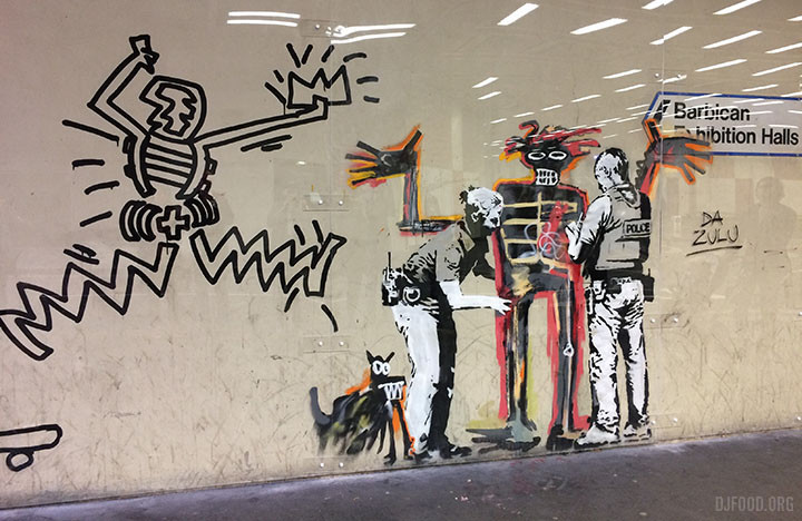
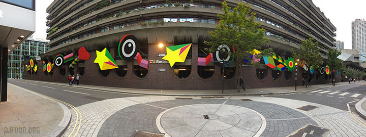
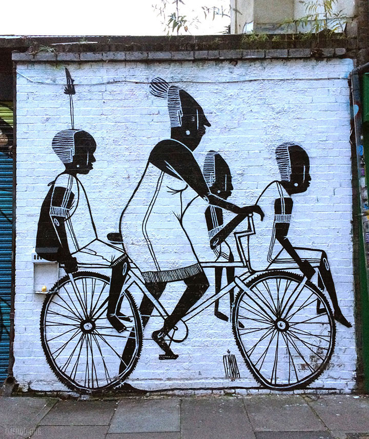
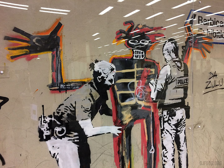
A recent trip to East London to see the British Underground Press exhibition (see previous post) yielded a wealth of great street art including the new Banksy homage to Basquiat at the Barbican (the former street artist’s show was booked up but you could see the Banksy for free – just how it should be)
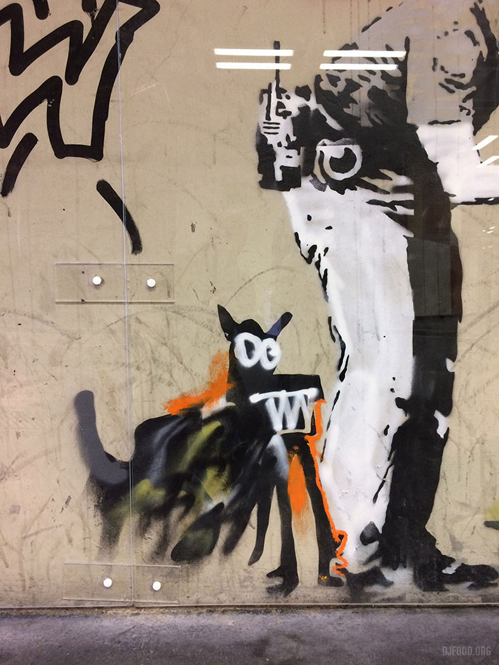
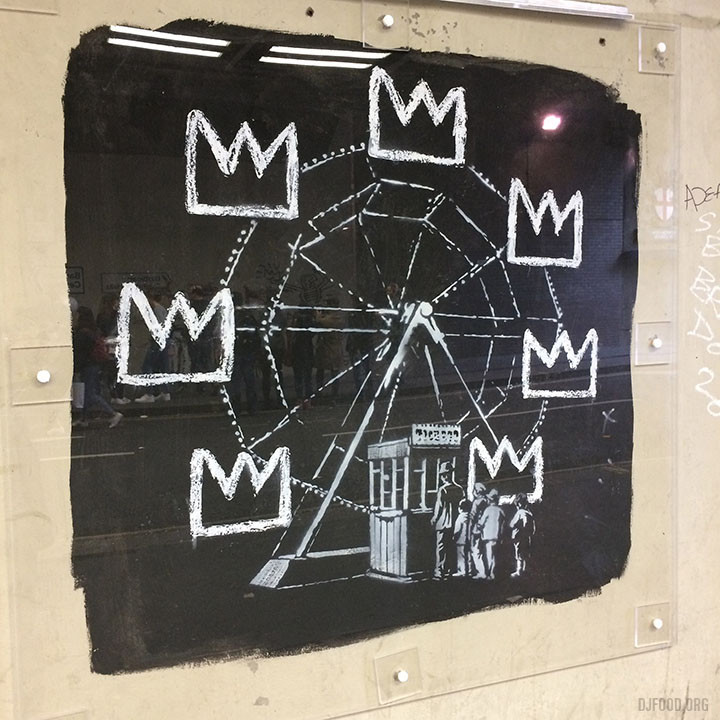
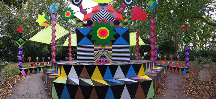
Down the road on Coin Street there was a huge installation that was a companion to another in a park near Spitalfields market, unfortunately I didn’t get the name of the artist.
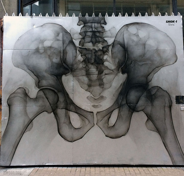
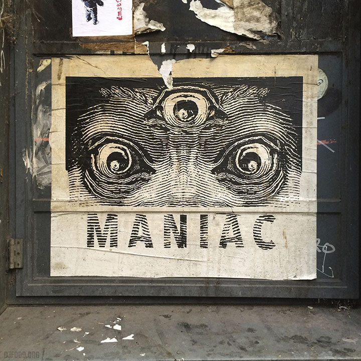
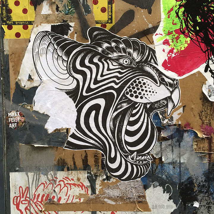
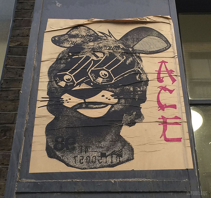
Over in Brick Lane there was almost too much to see and it’s hard to process the good from the bad. A huge Shok 1 I’d not seen before covered an entrance gate and there are plenty of paste ups of strange animals.
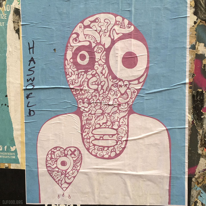
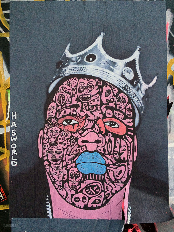
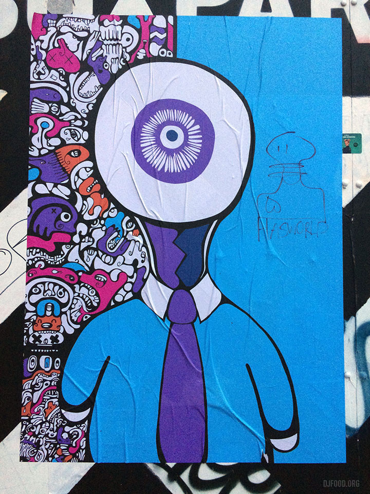
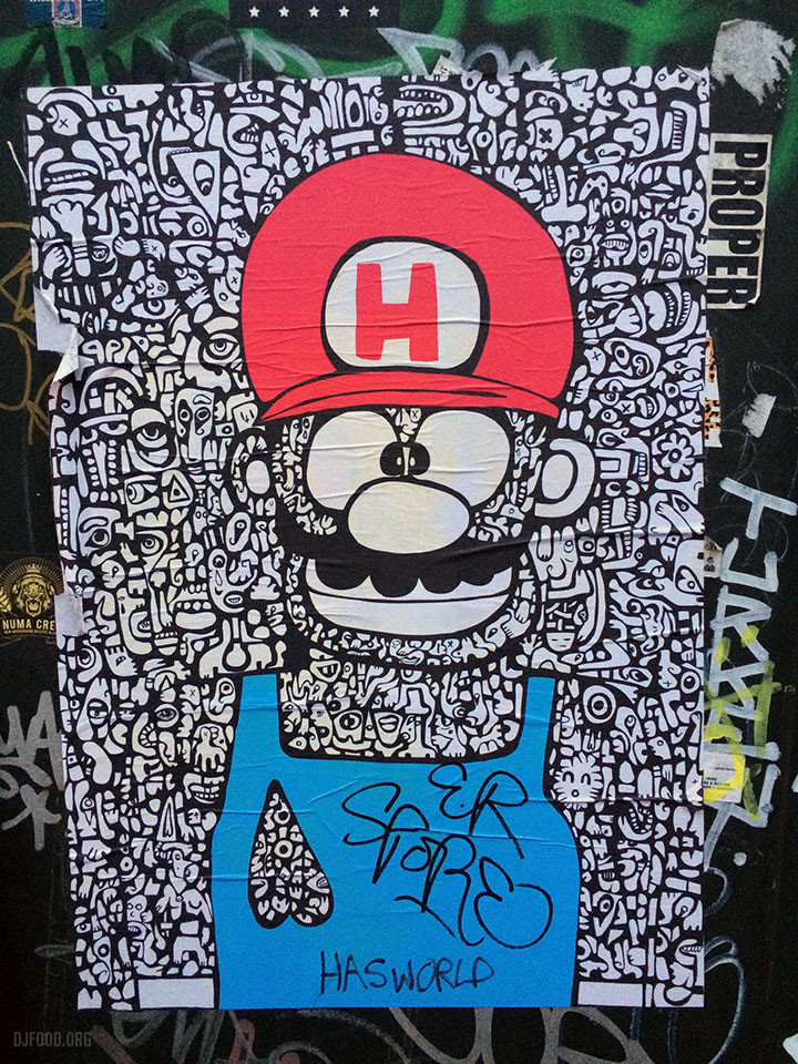
Hasworld, who’s work I’ve been enjoying for about a year, had been busy with some new posters too.
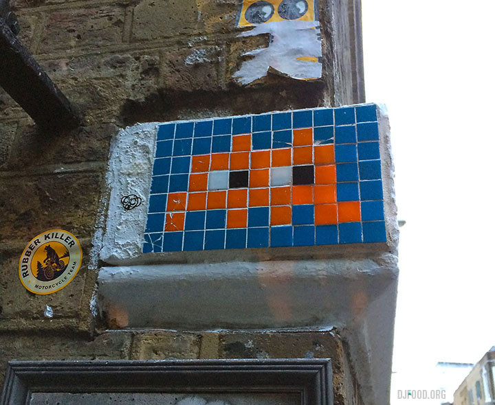
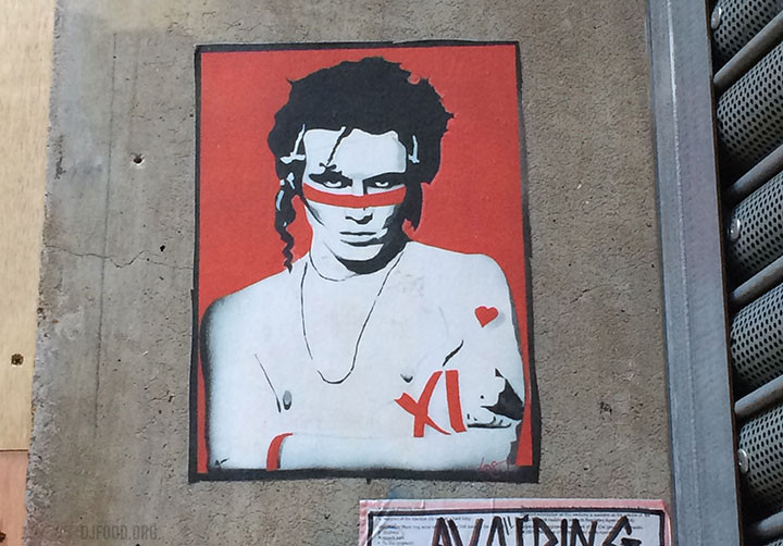
A Space Invader cemented to a wall on Brick Lane and, for no apparent reason, a stencil of Adam Ant.
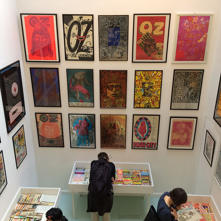
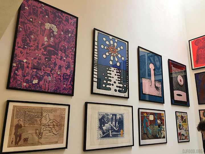
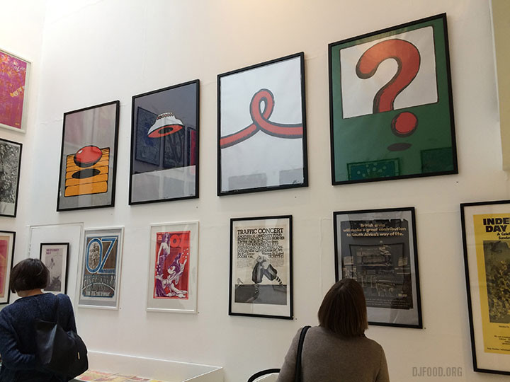
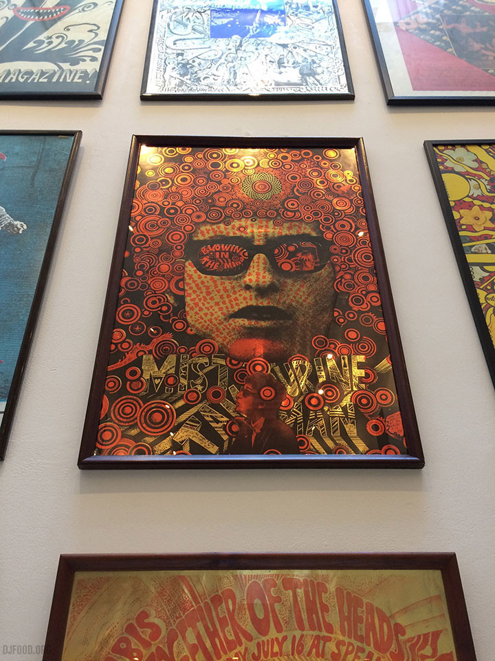
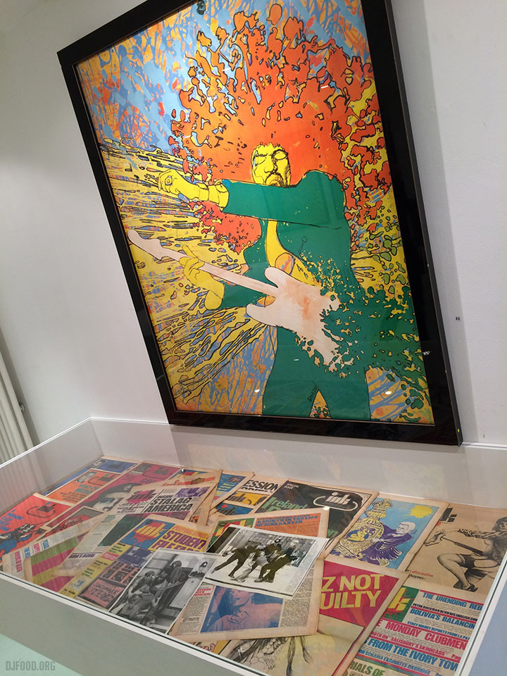
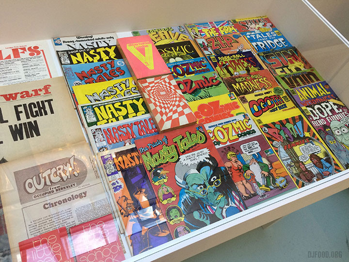
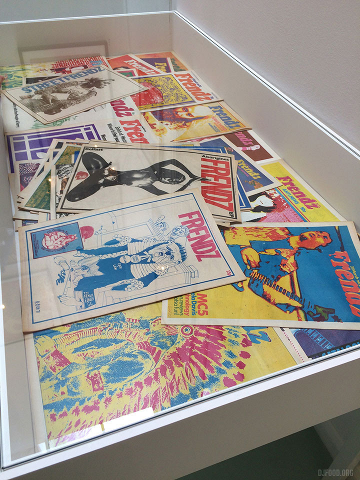
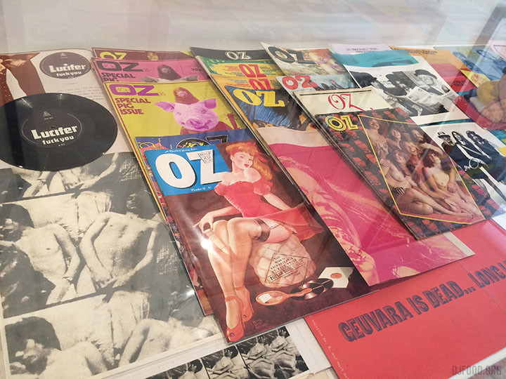
Just opened at the A22 Gallery in Clerkenwell is an exhibition supporting the British Underground Press of the Sixties book by Barry Miles and James Birch that collects the covers to all (big claim I know) the major magazines of the late 60s and 70s together. The exhibition features much more than just the magazines though with archive posters, badges, promo material and memorabilia collected together in a mass of psychedelic colour and badly registered print.
Oz, International Times, Frendz, Gandalf’s Garden, Black Dwarf, Ink, cOzmic Comics and more all feature and it’s a wonder to behold. Some of the covers verge on pornographic and serve to remind of more anarchic and sometimes unsavoury times. The book is spectacular, highly recommended at £35 from Rocket 88 and is also available at the gallery with a deluxe edition containing vintage copies of original undergrounds for a silly money price too.
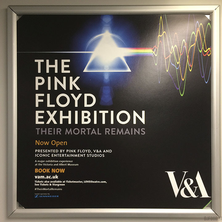
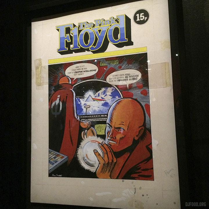
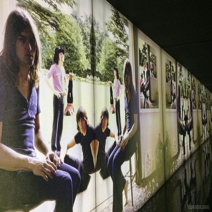
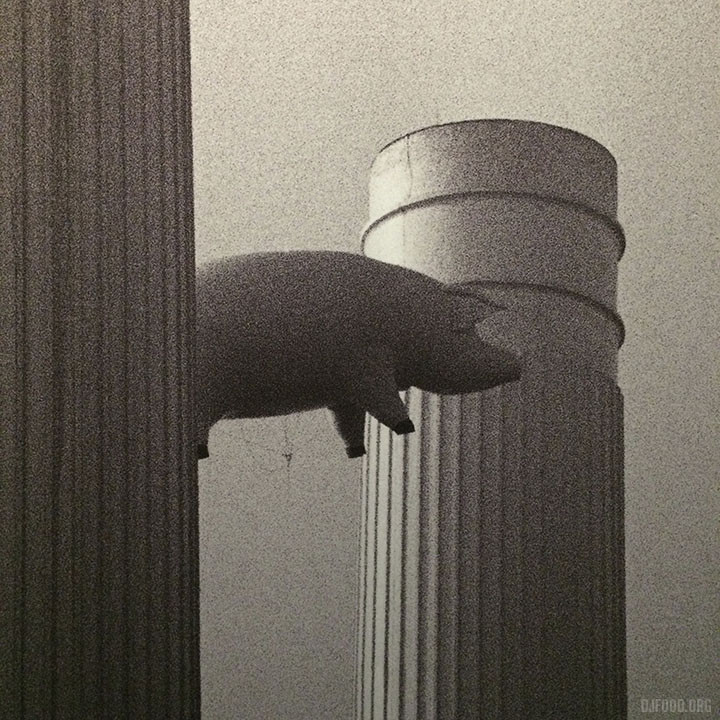
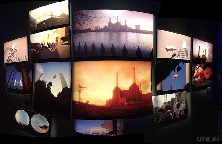
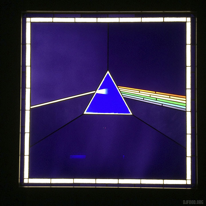
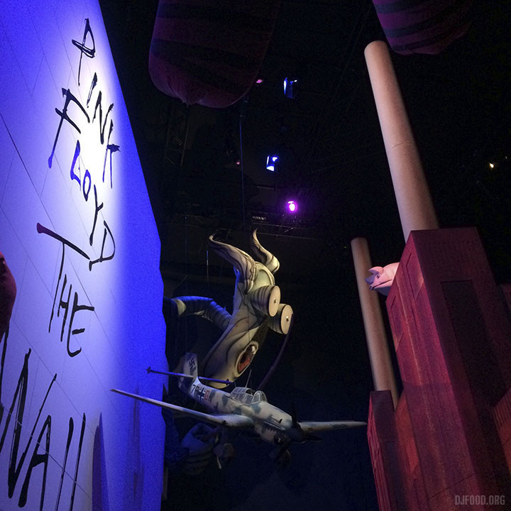
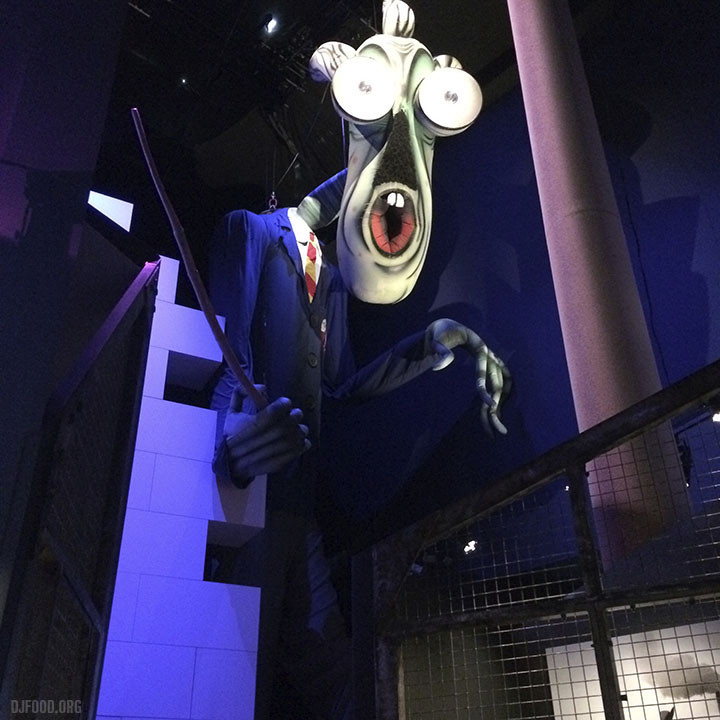
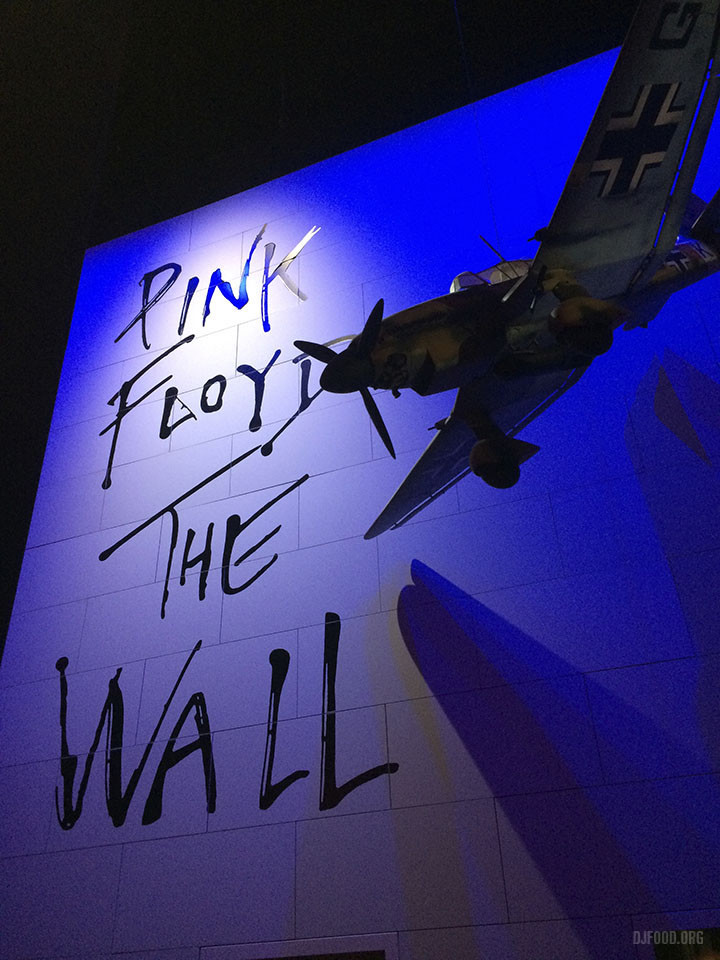
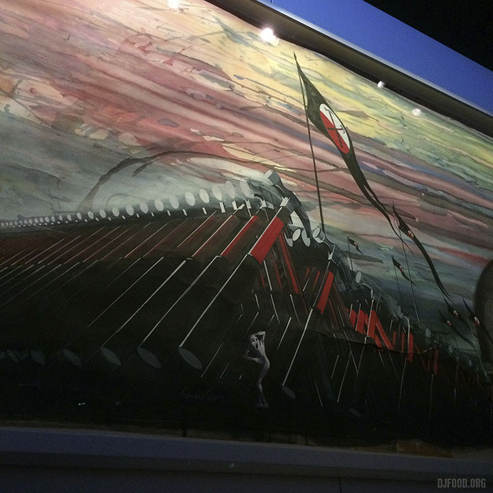
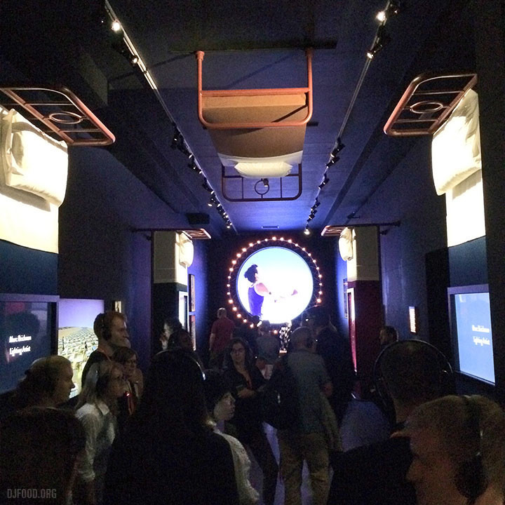
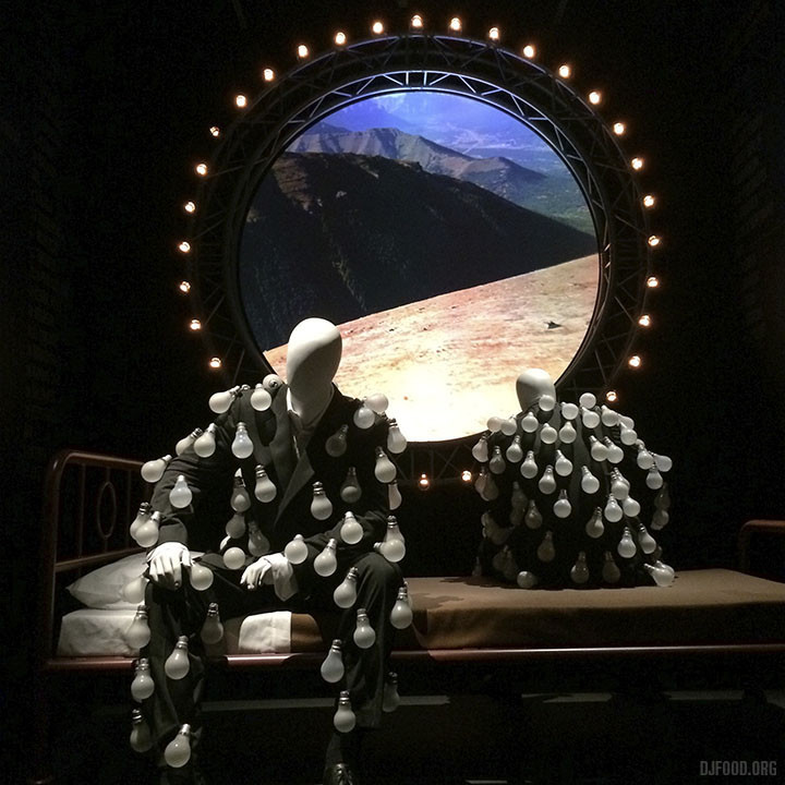
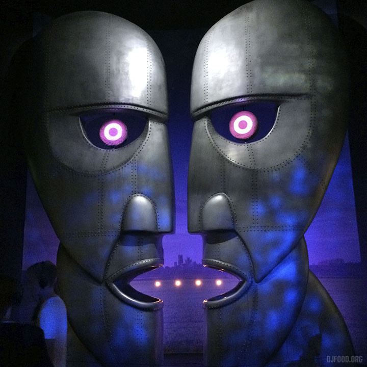
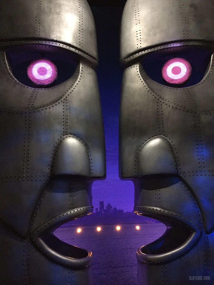
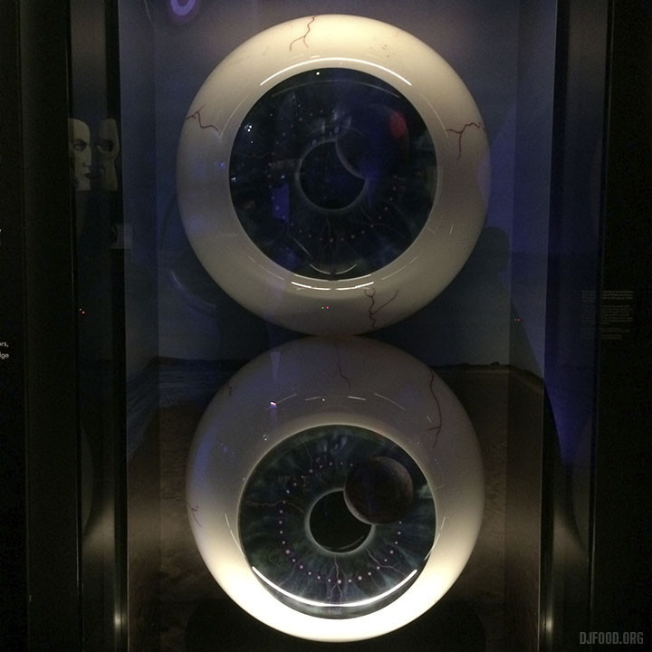
It’s taken me an age to post these because life is currently getting in the way in the form of moving and renovating a new home. The Pink Floyd exhibition, ‘Their Mortal Remains’ at the V&A Museum, is very much worth seeing even if, like me, Pink Floyd don’t mean much to you. I swore off them for a long while due to ‘Another Brick In The Wall Pt.2’ being no.1 for so many weeks as a child and finding myself utterly sick of it.
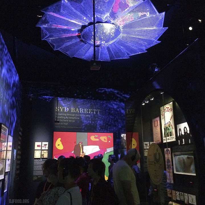
But the fickleness of youth only lasts so long and I found myself gradually checking back through their back catalogue, picking up the odd cheap LP here and there and finally realising why everyone raves about ‘Dark Side Of The Moon’. This exhibition highlights exactly what a forward-thinking, visually aware band they were, adapting as their fame and venue sizes increased, their sleeve concepts becoming ever more outlandish as budgets made pre-photoshop surrealist montage possible. The amount of artwork and props present attest to a group with a very strong concept behind each album, courtesy of the Hipgnosis team of course.
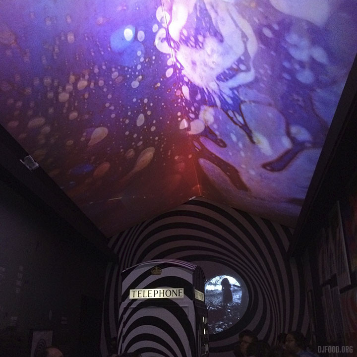
Starting at the beginning and travelling chronologically through their career we enter a time tunnel and emerge inside a version of the UFO club circa ’67 complete with pulsating liquid light ceiling, psychedelic poster gallery and films. Rooms concentrating of Syd Barratt, Wish You Were Here, Dark Side of the Moon and more eventually give way to a stunning display of Animals and The Wall-era stage props and art. The 80s side of things were less my bag but the concepts were now reaching gigantic proportion and are impressive as last bastions of the sort of excess that just doesn’t happen any more now that we can do all these things digitally. The final room with a surround performance of their reunion at Live8 was very moving and a perfect way to end this retrospective. Go and see if before it ends on October 15th!
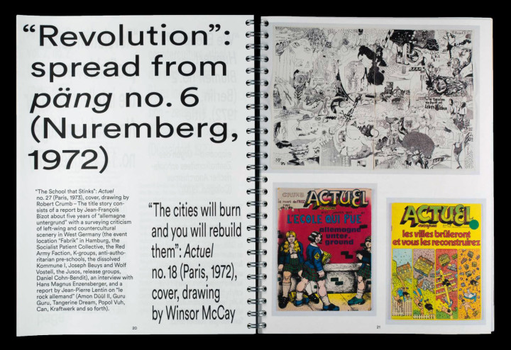
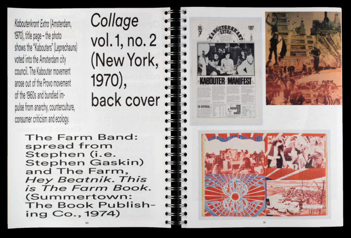
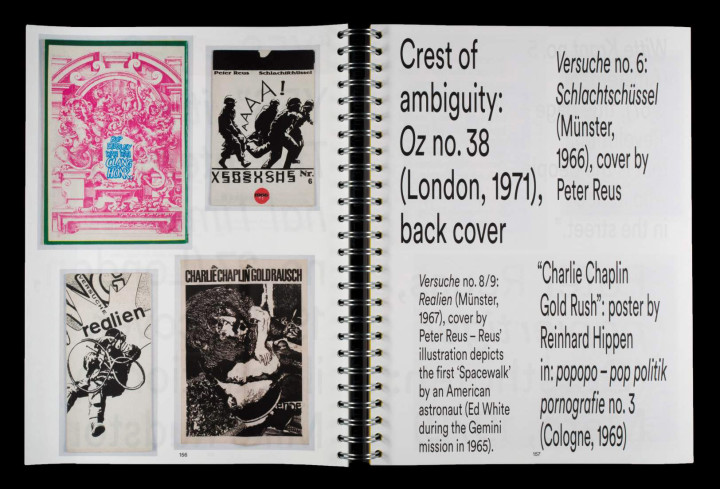
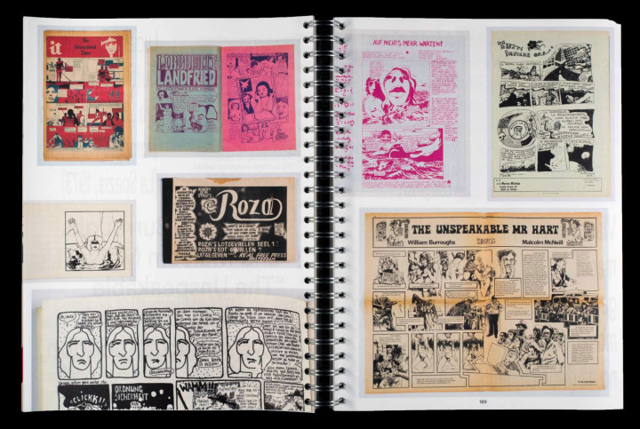
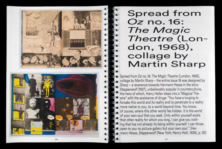
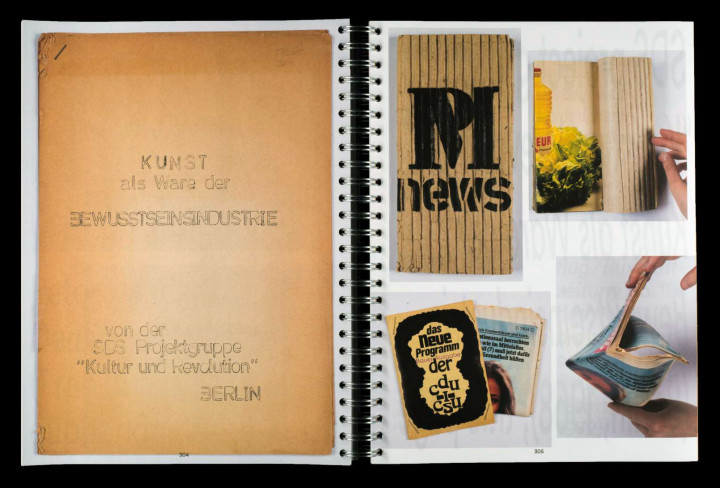
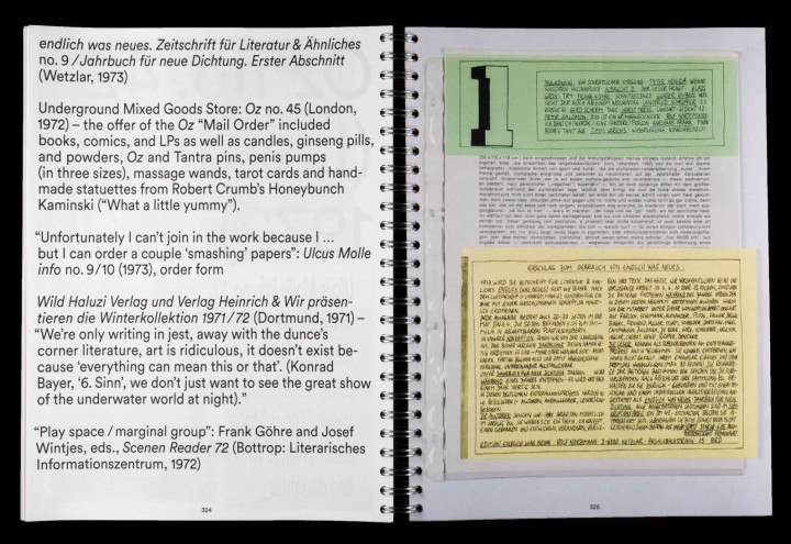
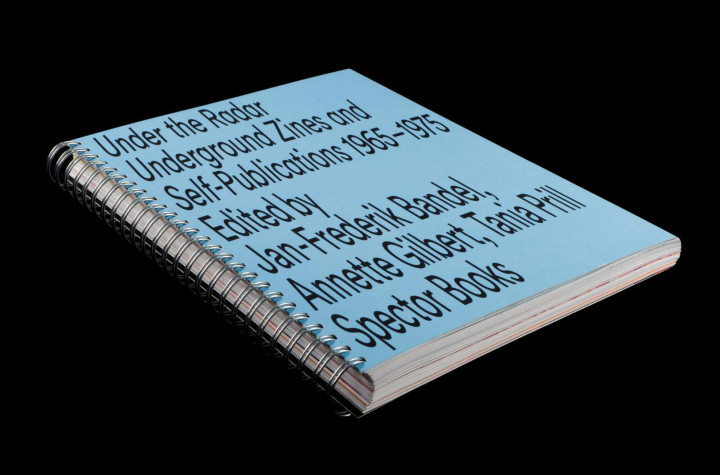 I was sent a copy of this fantastic book a few months ago and now i’ve seen it appearing in a few of the better books shops over here (Magma has them I believe).
Designed in collaboration with students of the HfK Bremen it’s a 368 page B&W and colour publication from Leipzig, edited by Jan-Frederik Bandel, Annette Gilbert, Tania Prill and Prill Vieceli Cremers
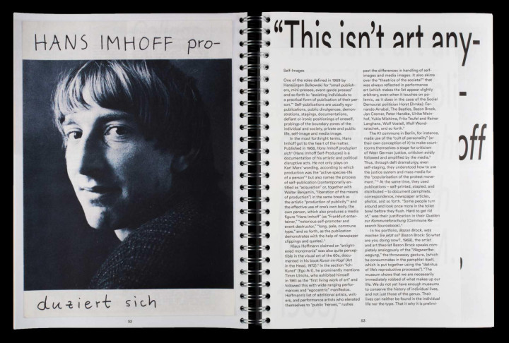
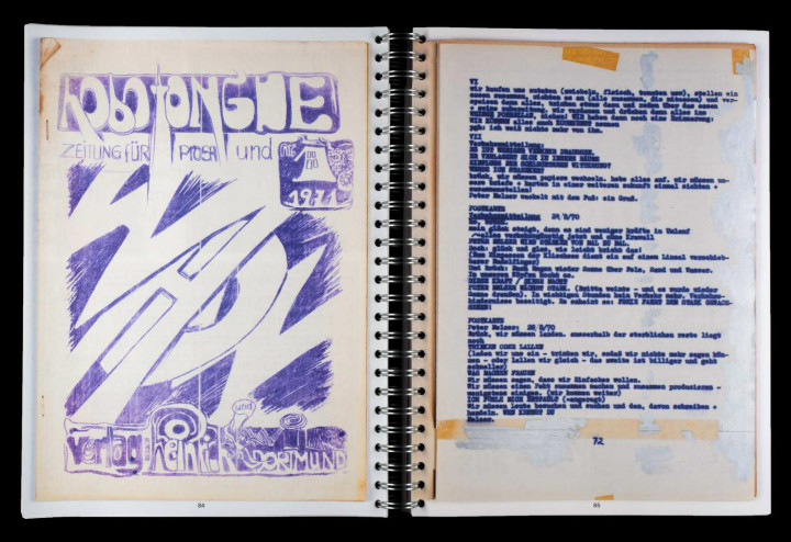 Packed full of underground press magazines, fanzines and comics from West Germany, showing them in the context from which they emerged. A collection like this is priceless, you would never track down some of these publications even if you knew they existed.
Editor Tania Prill will talk about the project at Printed Matter’s NY Art Book Fair this Saturday, September 23rd at 12:00 am, at MoMA PS1, 22-25 Jackson Ave, Long Island City, NY 11101
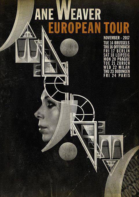
Blimey!!! Jane Weaver European Tour poster designed by Andy Votel, see also his cover for her new single, ‘The Architect’ on Fire Records. Make prints man, you’ll sell a bundle!
More Covers from Henning M. Lederer on Vimeo.
More of these faboulous animated covers by Henning M. Lederer – Sourced from the excellent Julian Montague Projects instagram account
Also check out his mesmerizing video for OMD‘s track, ‘Isotype’– properly hypnotizing
OMD – Isotype from Henning M. Lederer on Vimeo.

