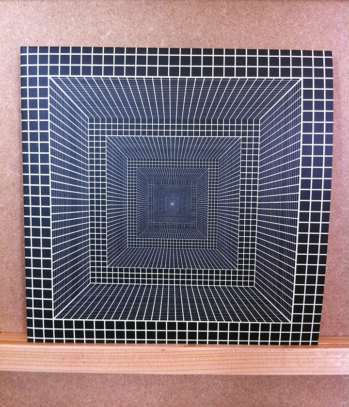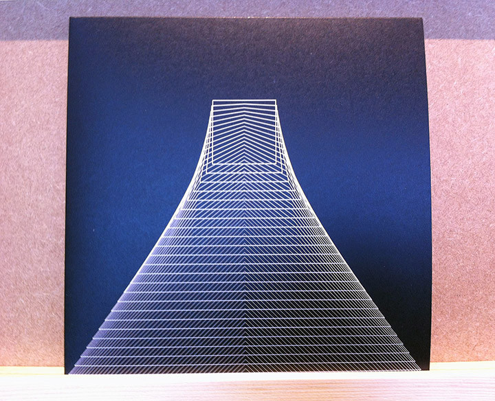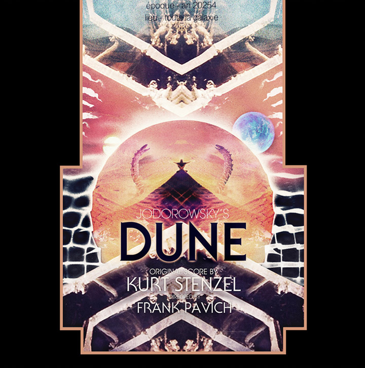
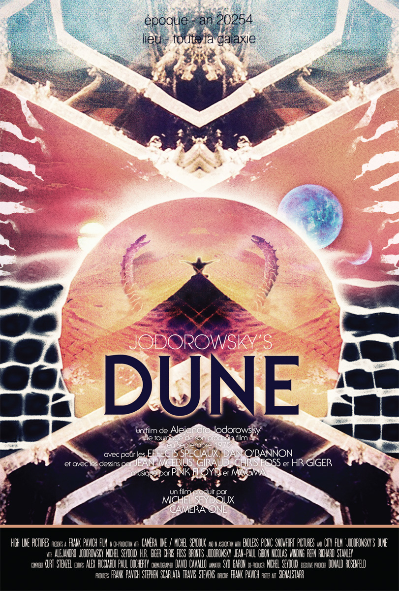
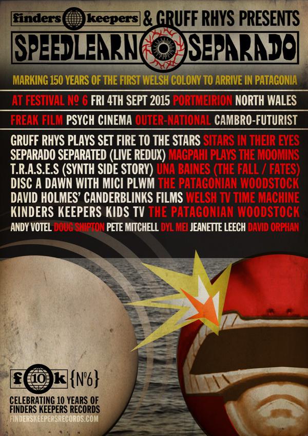
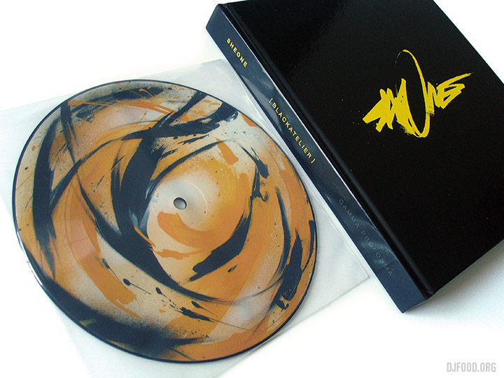
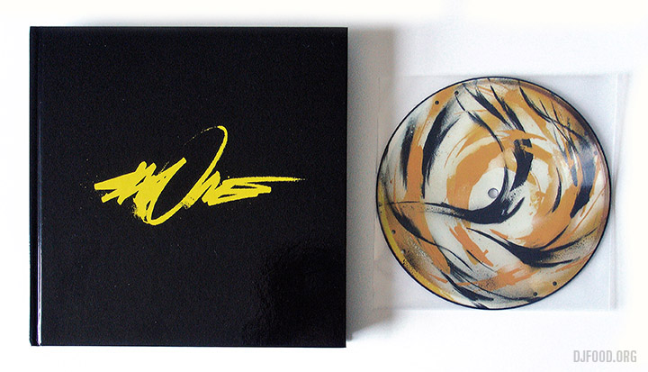
Beautiful artwork by Nick Stewart Hoyle aka Signalstarr for the soundtrack release of ‘Jodorowsky’s Dune’. Pre-order is up now via One Way Static for European customers, who have an exclusive variant. For US customers, order via Light In The Attic. It comes as a double LP with coloured swirl vinyl, silver foil embossing, gatefold sleeve and a poster version of this cover.
“Building upon director Frank Pavich’s idea for a score with a “Tangerine Dream-type feel,” Stenzel lays out a cosmic arsenal of analog synthesizers that would make any collector green at the gills: among other gems are a rare Moog Source, CZ-101s, and a Roland Juno 6, as well as unorthodox instruments like a toy Concertmate organ and a Nintendo DS. “I also played guitar and did vocals,” says Stenzel, “some chanting… and some screaming, which comes naturally to me.” The score also features narration by Jodorowsky himself. As Stenzel notes, “Jodo’s voice is actually the soundtrack’s main musical instrument–listening to him was almost like hypnosis, like going to the guru every night.”
My DJ set from Saturday, performed after the showing of the doc. at the FEAST night in West Norwood, is almost ready to post and contains several cuts from this album alongside all manner of other Dune-centric material.

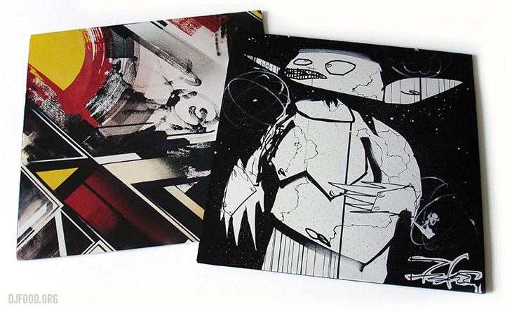
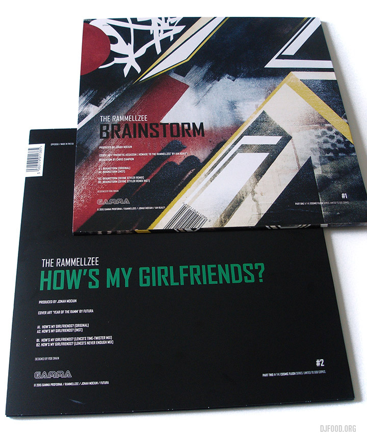
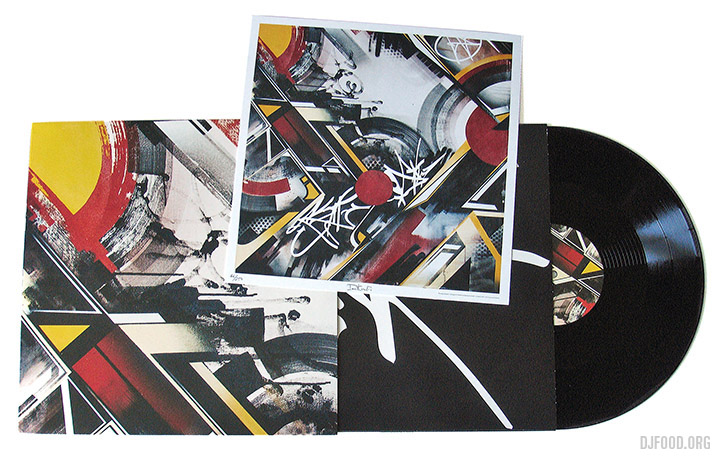


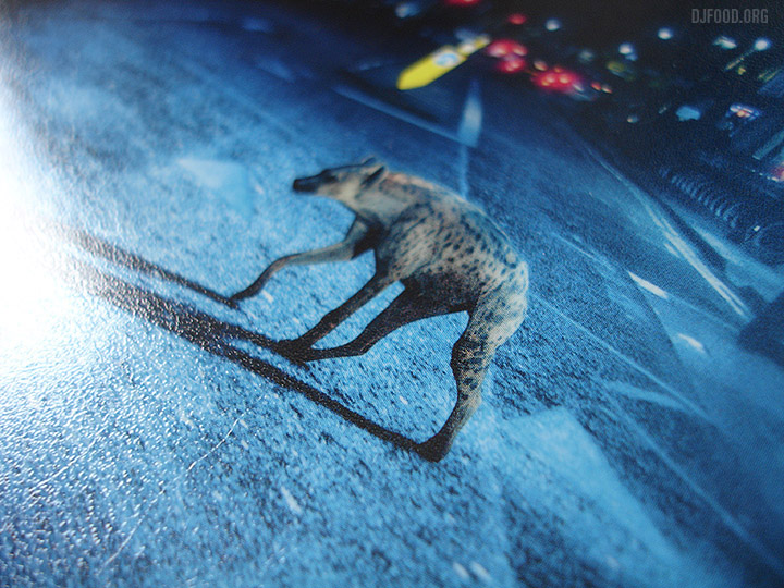
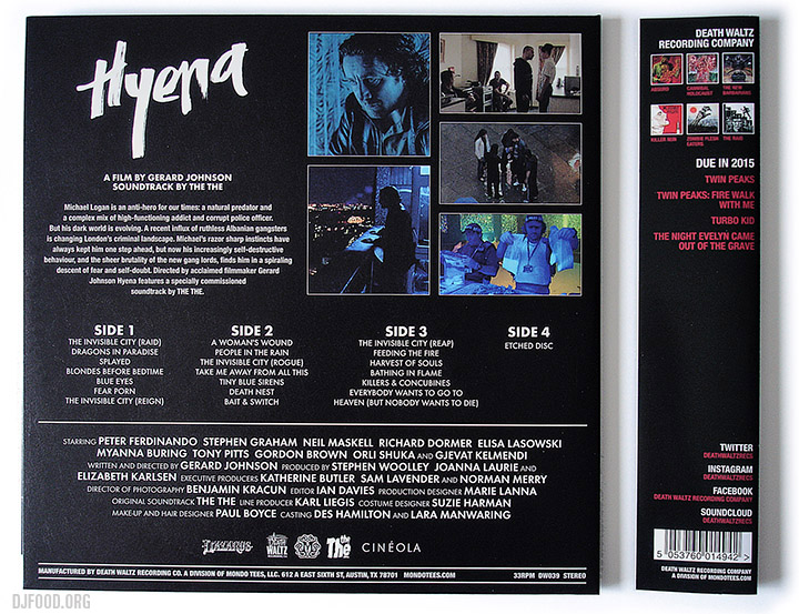
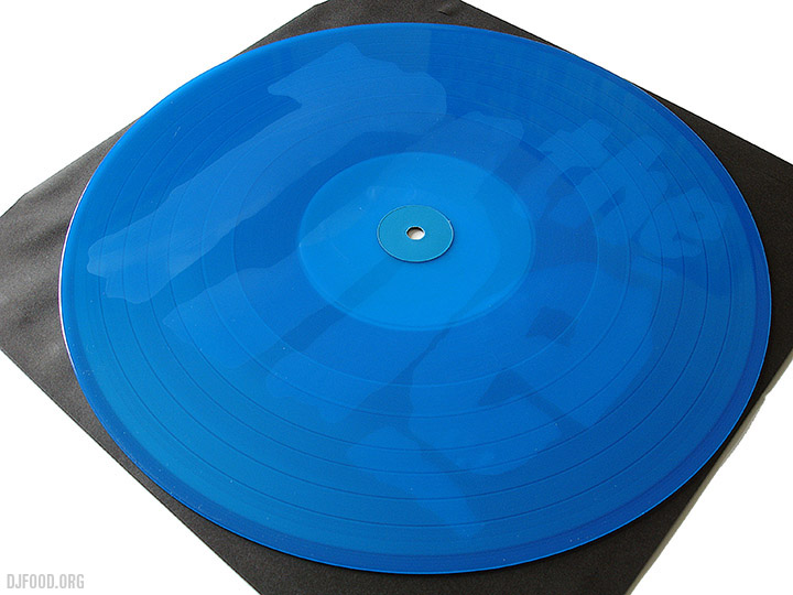
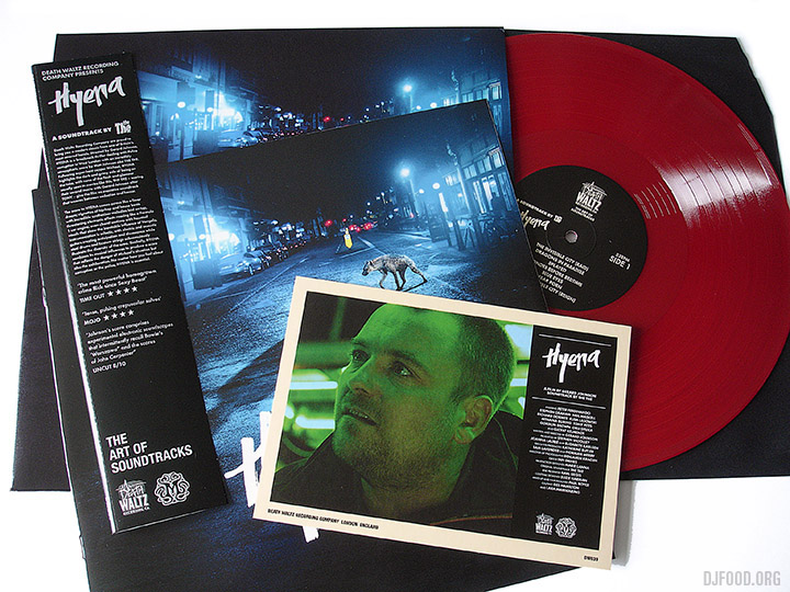
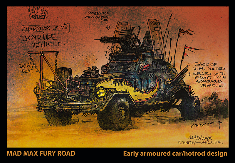
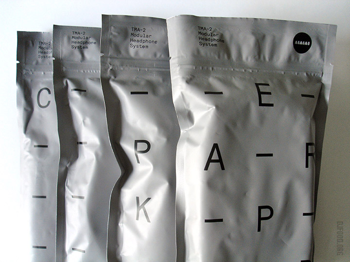
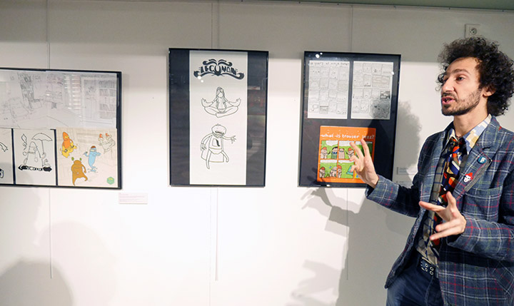
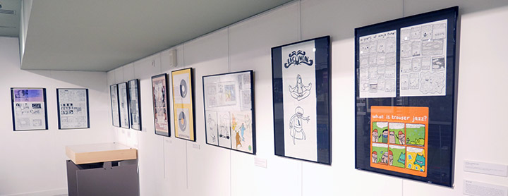
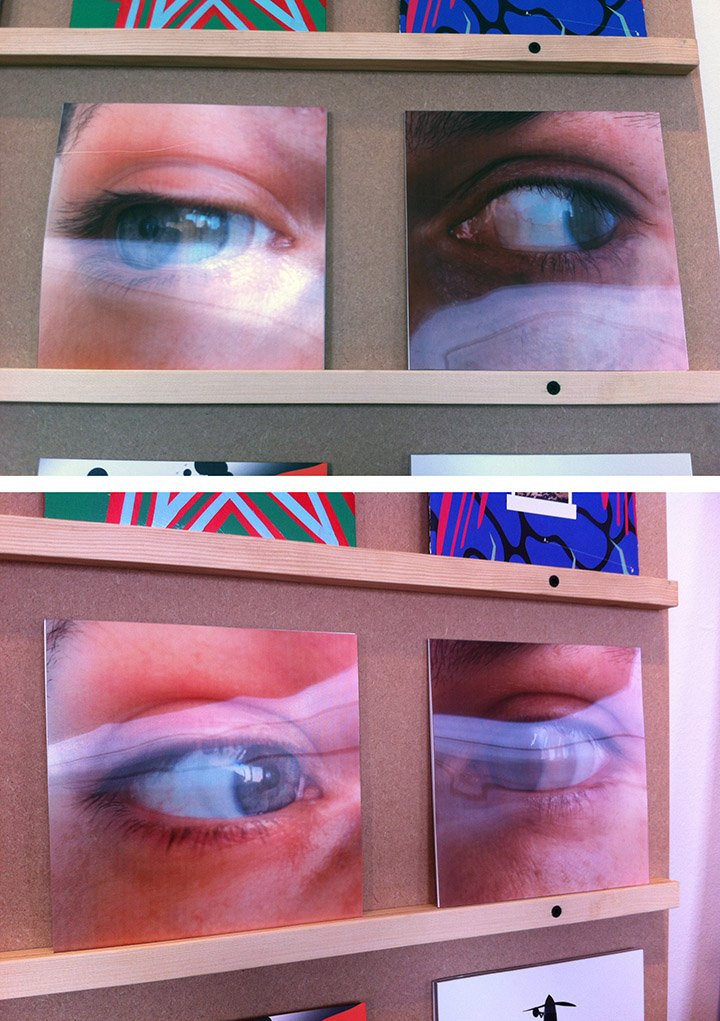
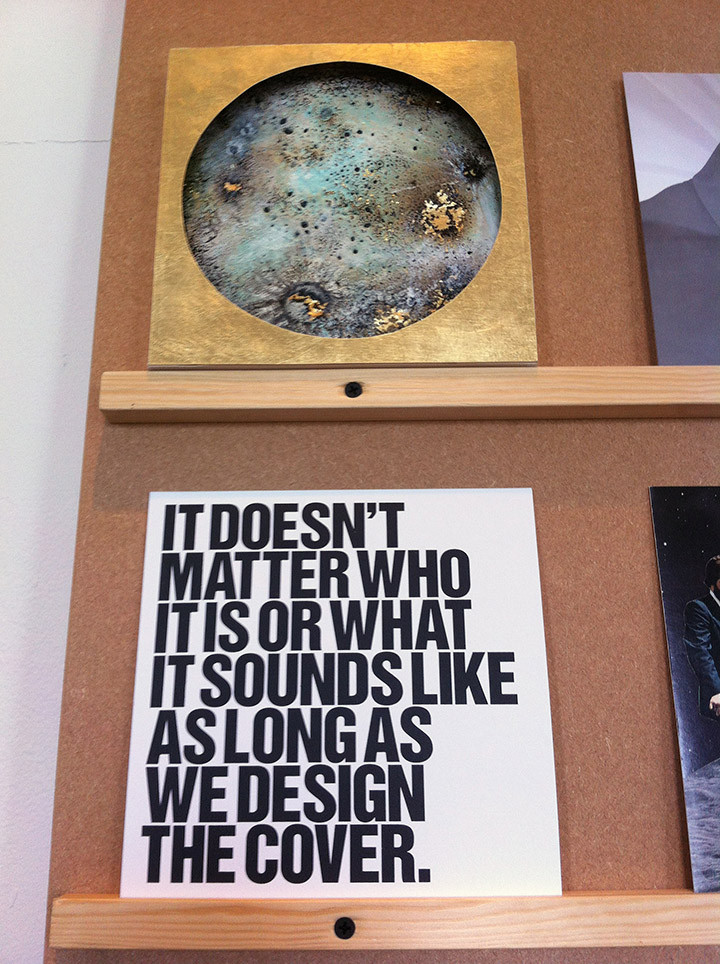
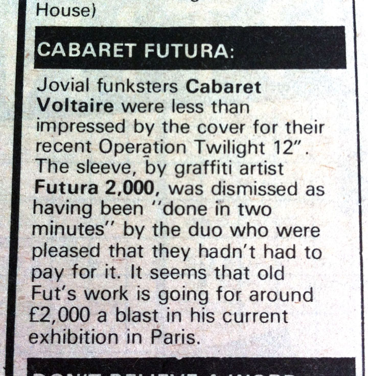 Made me laugh – not sure why
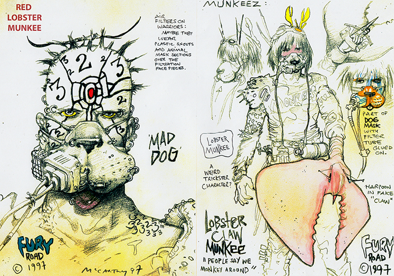
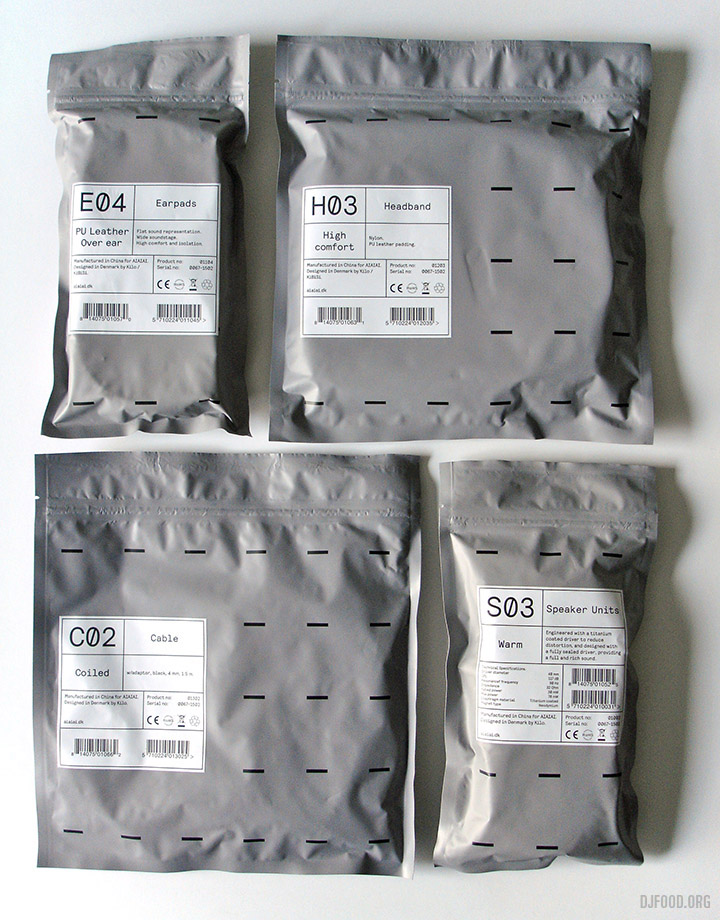