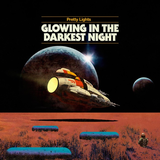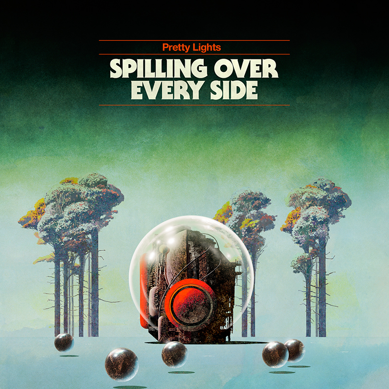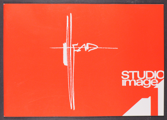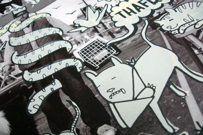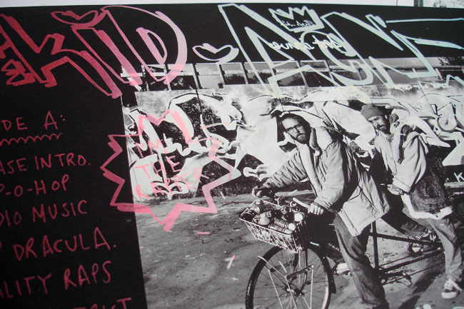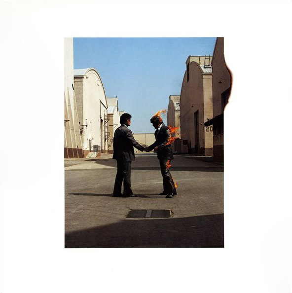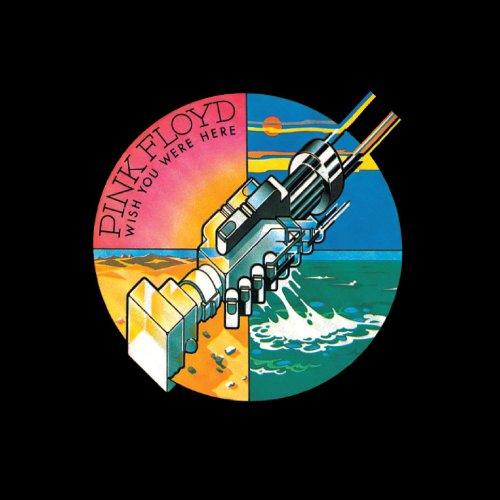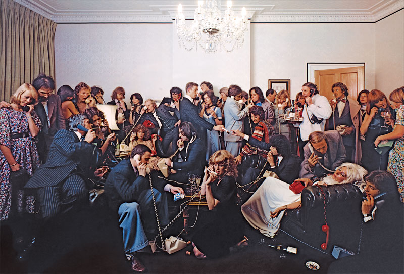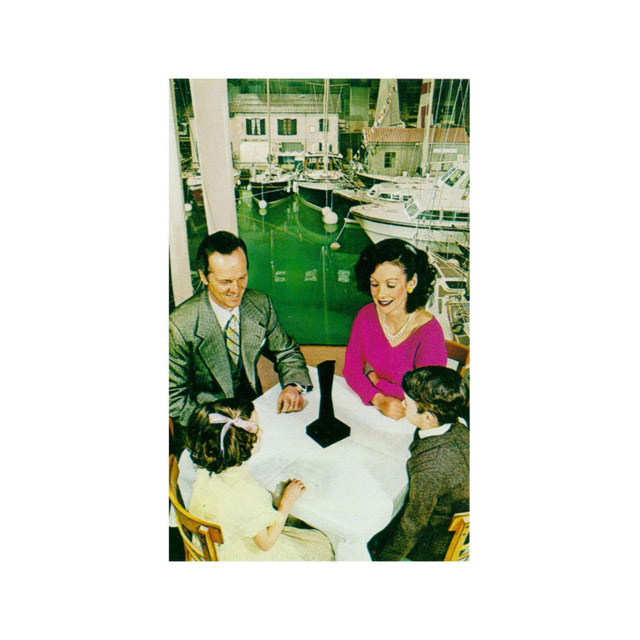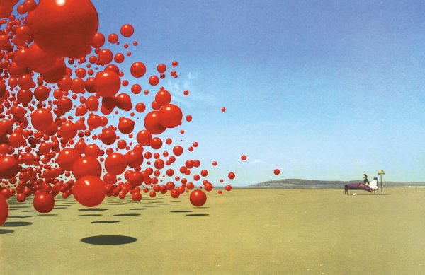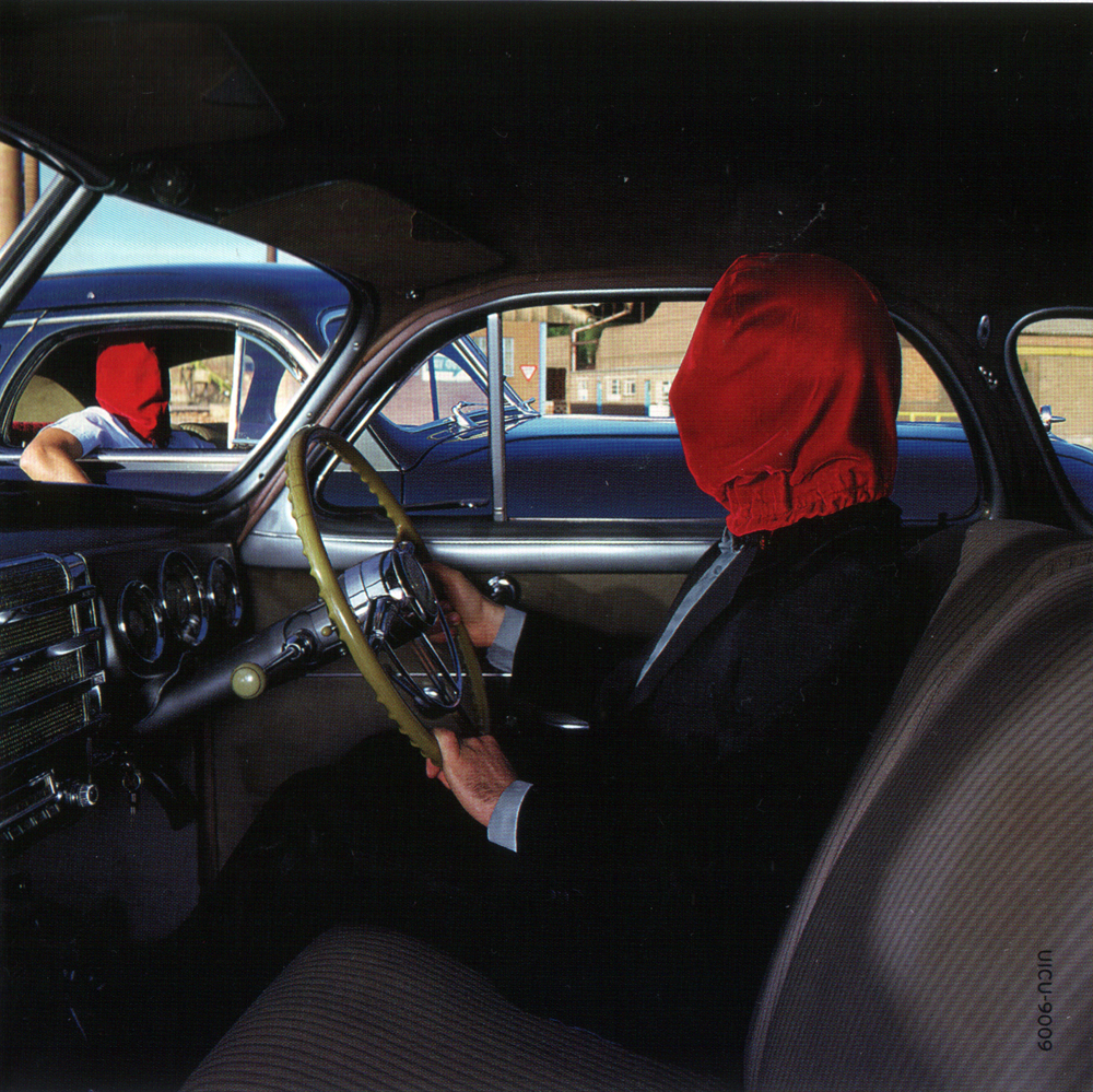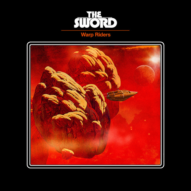
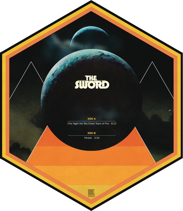
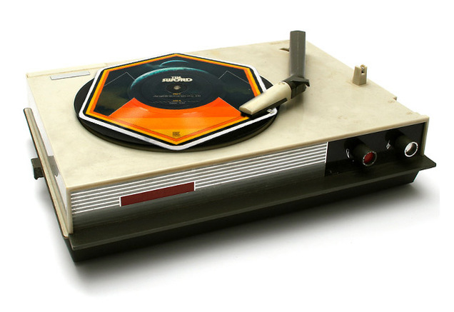
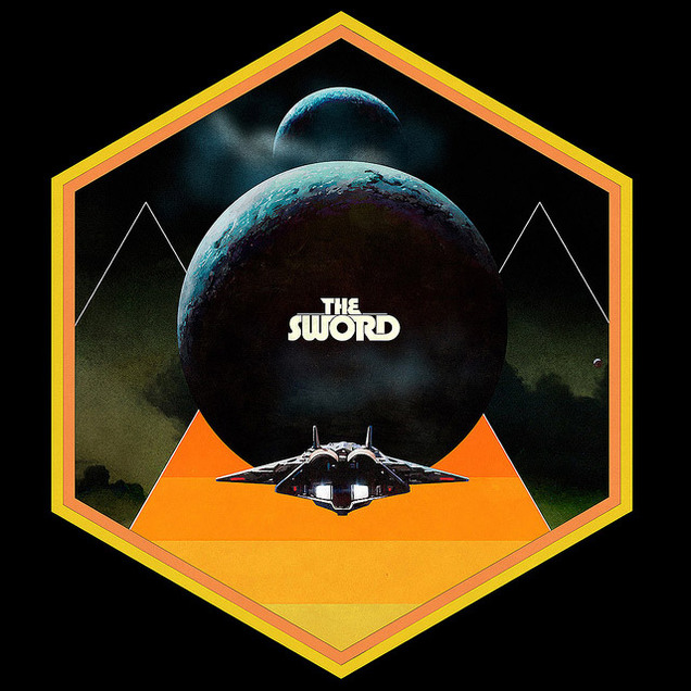
More old Dan McPharlin designs just because they’re so fantastic, this time for The Sword, check out the hexagonal picture disc.
Design
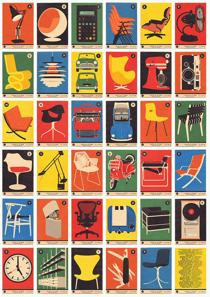
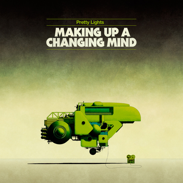 These are pretty old now but I’m a sucker for Dan McPharlin‘s work. Such beautiful examples of image and typography evoking a certain era perfectly.
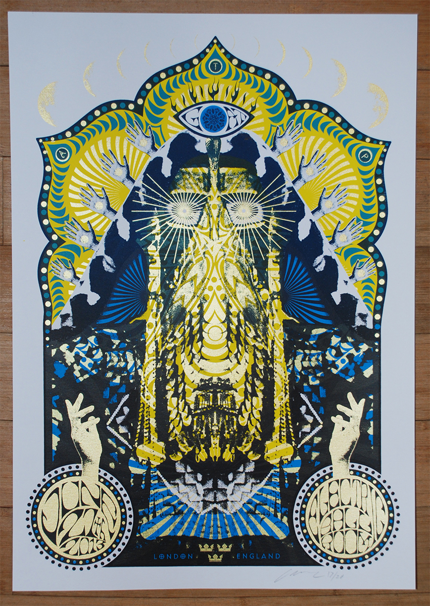
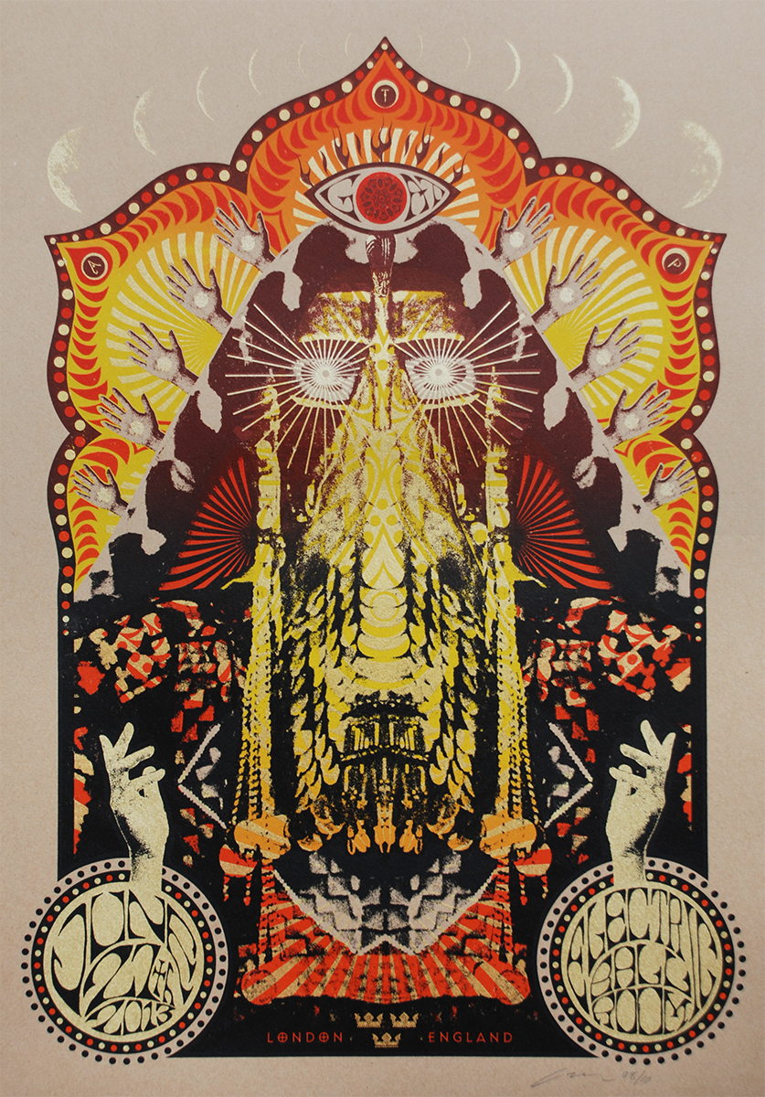 Adam Pobiak did these great posters for GOAT‘s London gig last weekend in 4 different variations. They are nearly all sold out but you can grab the last ones here.
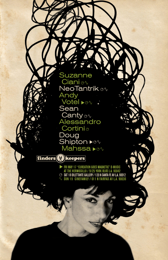 There’s a new mix available by Doug Shipton from the Finder’s Keepers collective that was recorded for the Cinefamily gig in LA recently (or it may be a recreation of his set). It’s a half hour mix of spacey New Age electronics, the new love of the digging set it seems. Great poster here too, featuring Suzanne Ciani with a head full of wires, presumably by the man Votel, he really should do a book of his work some day.
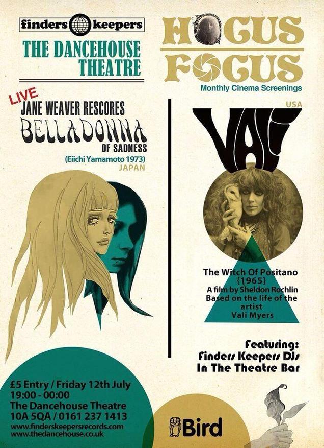
And here’s another for an event coming up, a Hocus Focus night featuring Andy’s missus, Jane Weaver, re-scoring ‘Belladonna of Sadness’ live as well as a screening of ‘Vali The Witch of Positano’ (no, me neither). Love what these guys are doing, wish they would do more down South but then we’re pretty spoilt anyway.
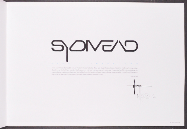
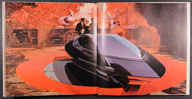
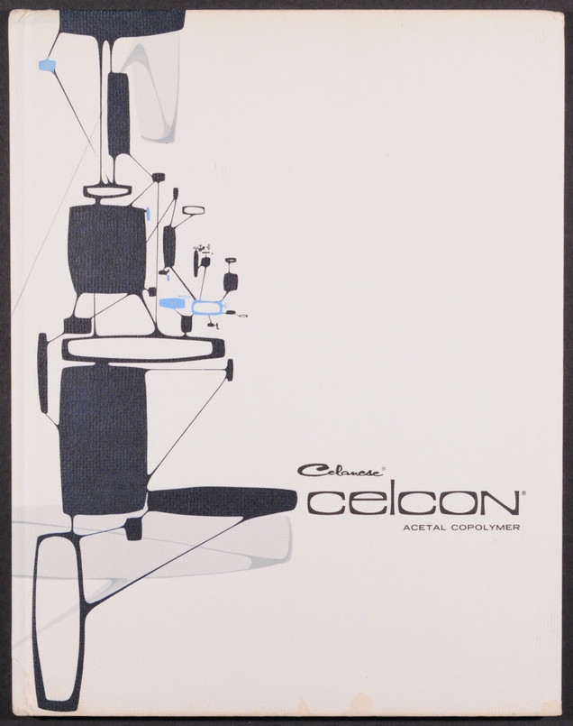
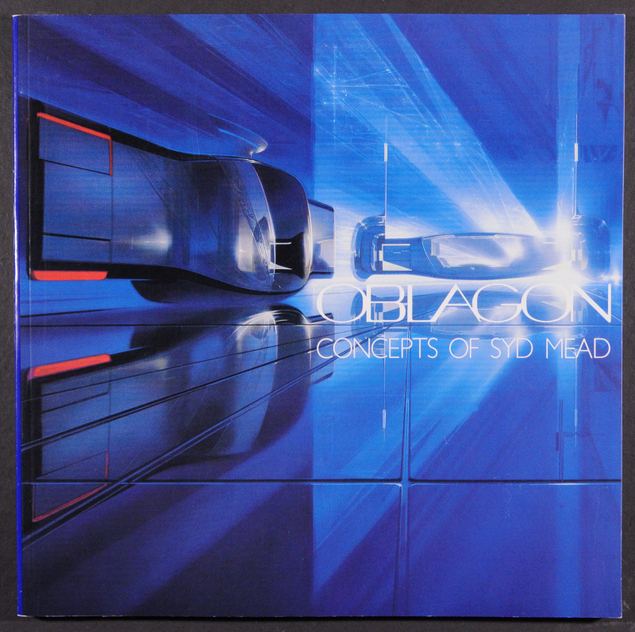
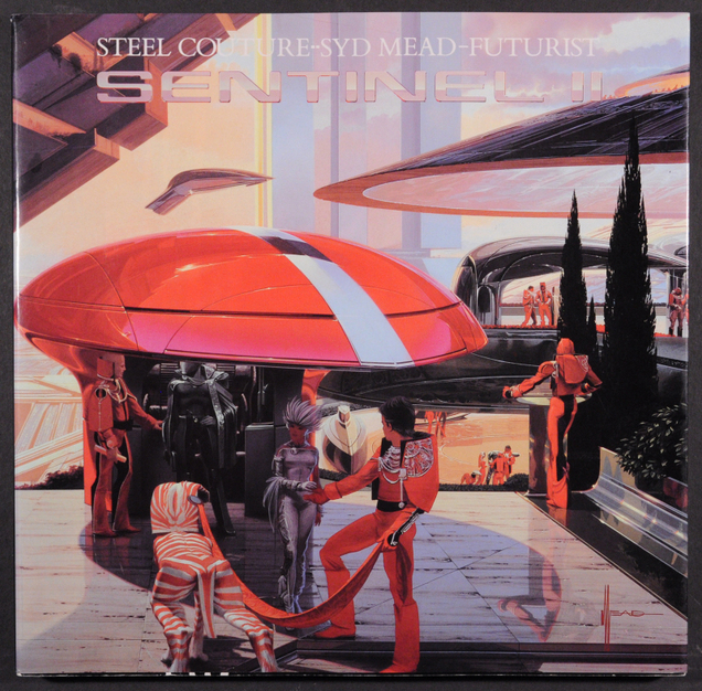
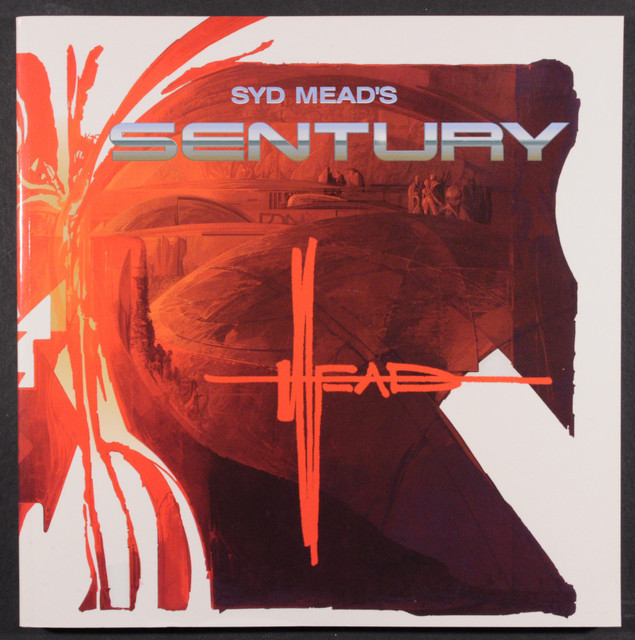 A seller (inddes)has put some seriously rare Syd Mead books up on eBay – a lot of them signed, with very low starting prices. Most of these books rarely come up for sale and when they do will start at around the £100 mark. Marvel at his beautiful design work, if I had the money I’d bid on the lot.
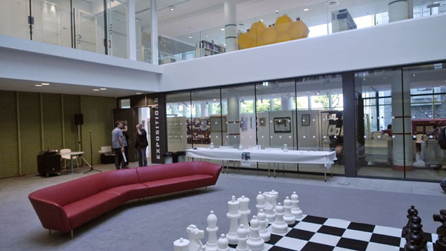
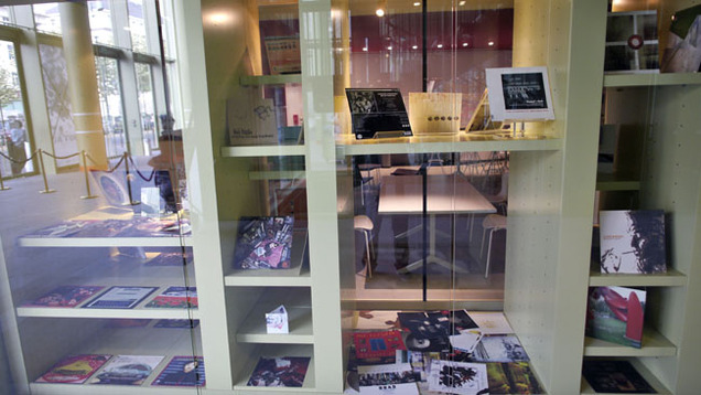
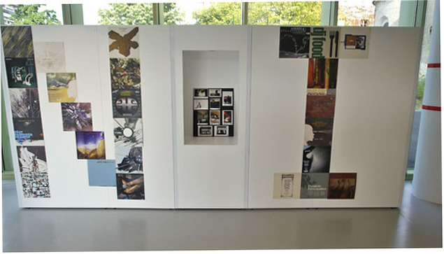
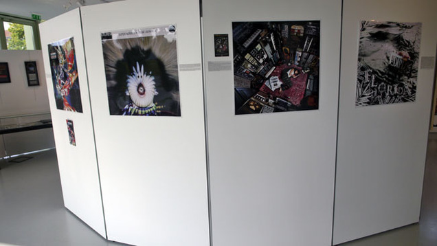
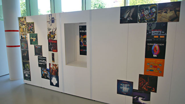
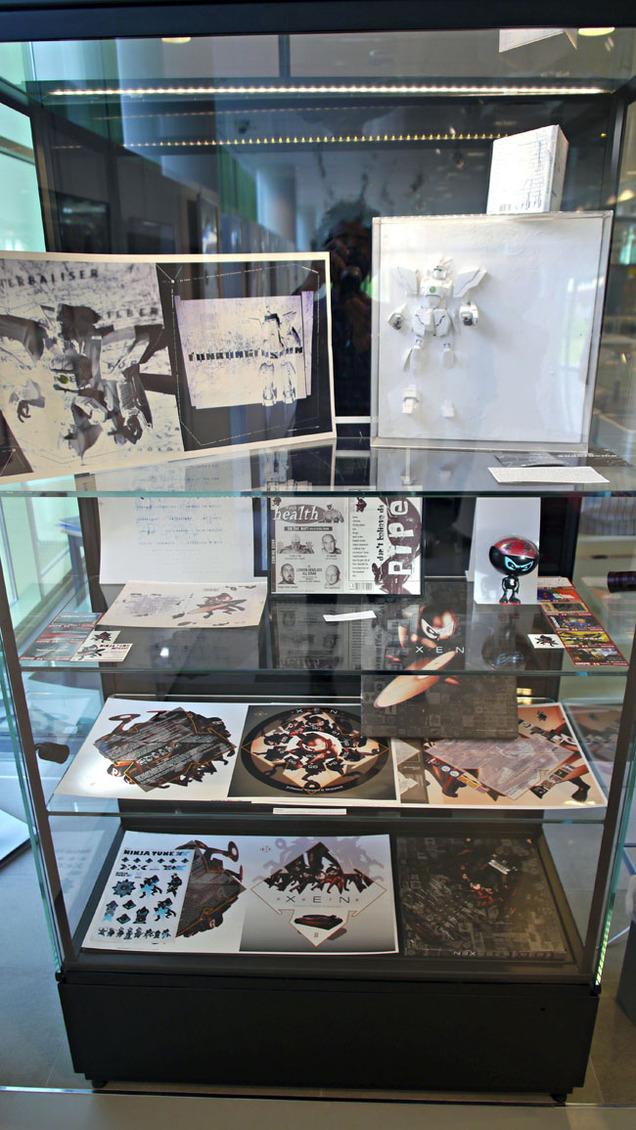
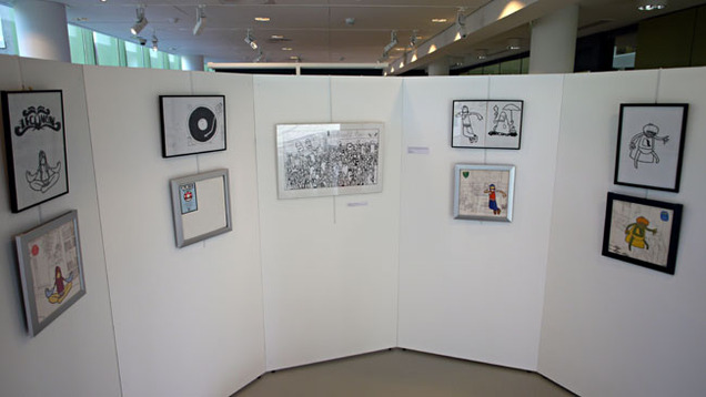
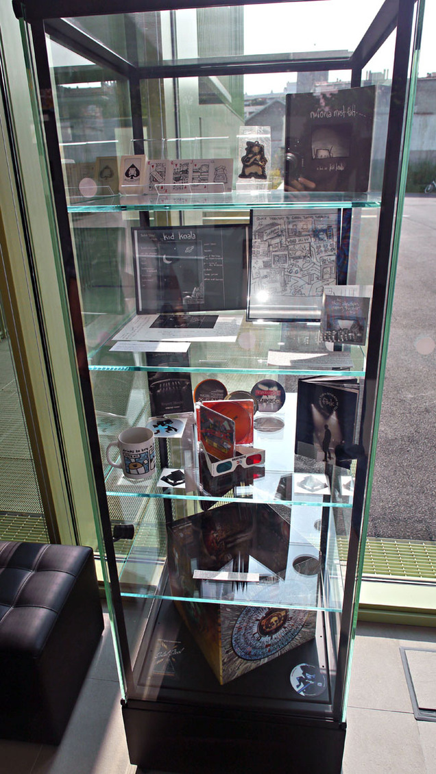
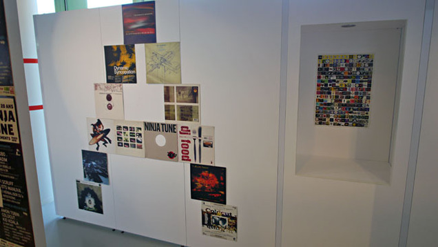
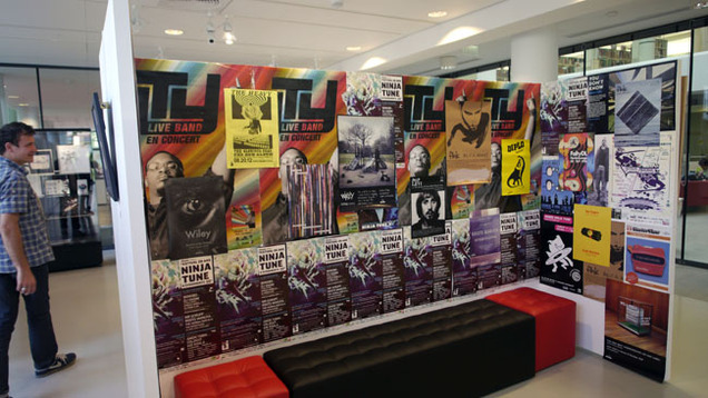
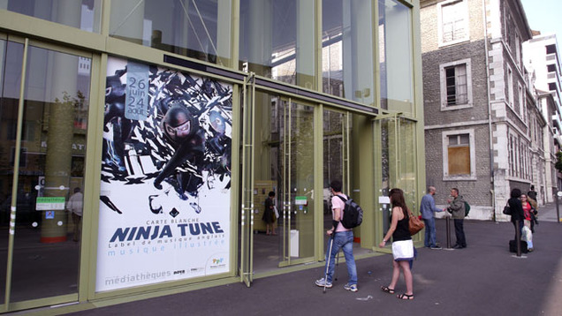 A new retrospective exhibition about Ninja Tune just opened in Pau in the Pyrénées, France at the André Labarrere Mediatheque. Curated by Fred Elalouf of the Ping Pong promotional agency in Paris, it also ties in with Ping Pong’s 15th year of existence. They have represented the label in France throughout their past decade and a half through thick and thin.
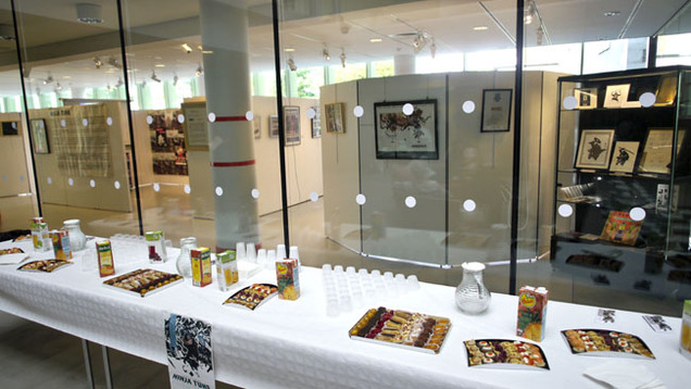
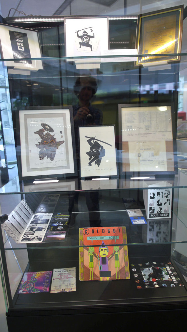
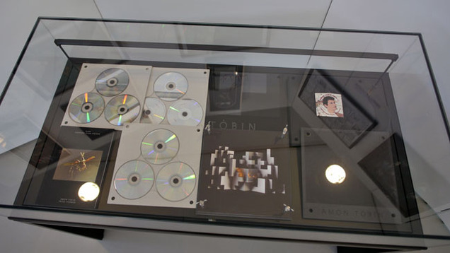
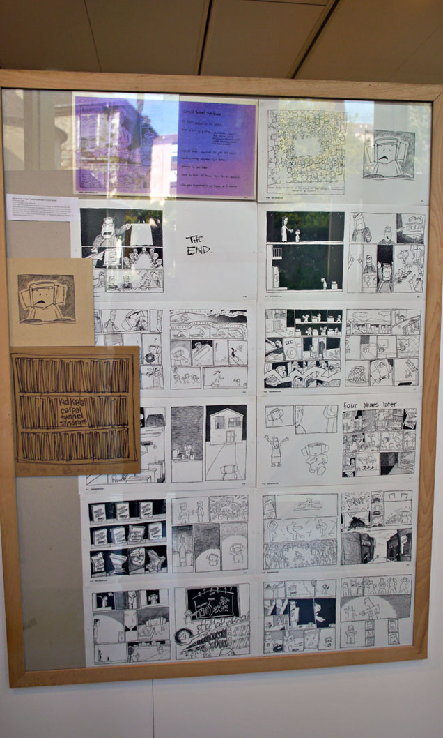
Earlier this year Fred visited the Ninja offices and my studio on a mission to gather as much original material as he could find for this event. Original art, promotional posters, sleeves, videos, slides and other ephemera are all present, some of it never exhibited outside the UK before. I have to say, he’s done an amazing job as you can see by some of these photos.
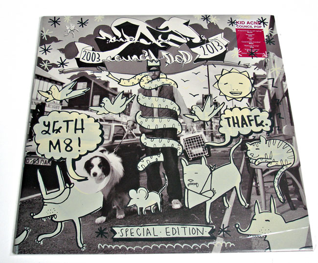
The exhibition just opened and is on for the next two months, closing on August 24th. It’s free (I think) so, if you’re in that part of the world, go and take a look as there are a lot of items that will go back into private collections when it’s over. Original Kid Acne, Mr Scruff and Kid Koala artwork hangs with cover proofs and promotional toys. The model robot that was projected on for the front cover of the ‘Funkungfusion’ compilation is on display as well as some of the original drawings for the now famous Ninja logos.
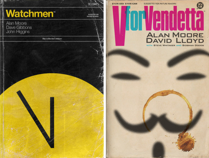
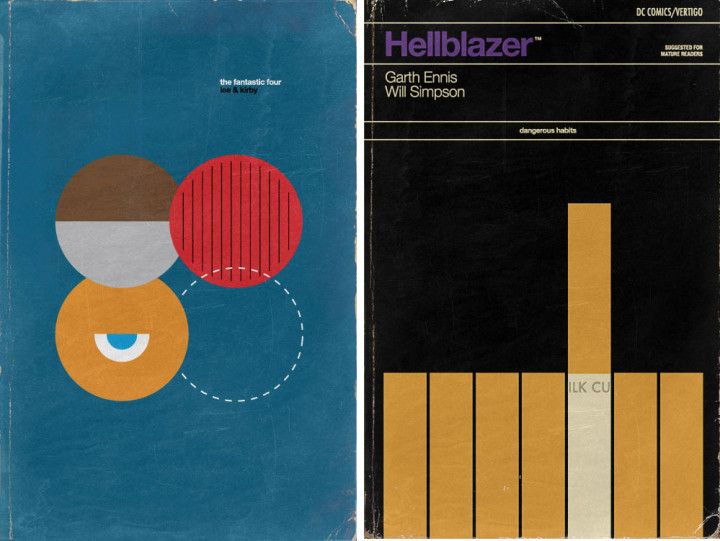
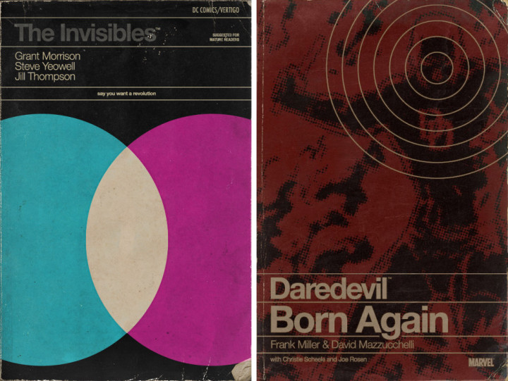 Now a design cliché whilst highlighting just how adaptable those old designs were, the object as Penguin book gets another outing here. We’ve had record sleeves, film posters and more but now it’s the turn of comics to get their chance in the spotlight. When they’re done as well as these then I don’t mind at all, more examples by Fonografiks over here.
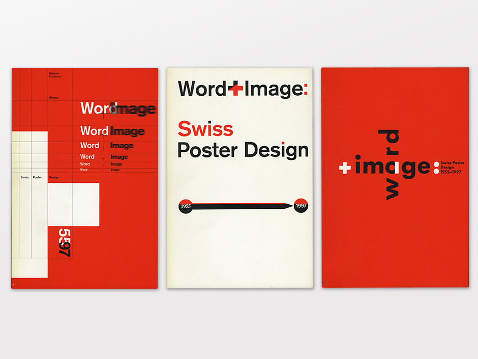 I love that I can find things like this on someone’s Tumblr site but what really pisses me off is that the site strips away any title the original file had. If the person putting it up then doesn’t credit the image (which few seem to) then that info is lost or takes an amount of detective work to find. It’s exactly this that exasperates me when the copyright laws making the use of ‘orphaned work’ (ie images found online with no discernible author attributed) then give users a better legal position to exploit it rather than protect the original owner.
 Damn! Any regular reader of this blog knows that this combines two things I dearly love. There are 5 Lego maps of the London Underground on display around the capital until the end of the summer. More details and locations over at BuzzFeed.
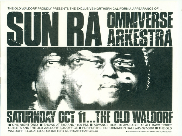 Fantastic flyer for a Sun Ra gig from an excellent set of old Post Punk flyers I found on the reinvigorated Flickr the other week.
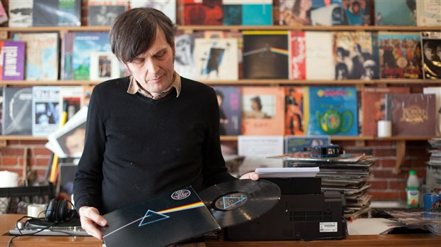 Shortly after Storm Thorgerson died I did an interview with Matt Meuse of CBC Music about why sleeve art matters and where it will go next. Also in the interview are Jeff Jank who designs for Stones Throw and David Jones (pictured) who owns the Vinyl Records store in Vancouver.
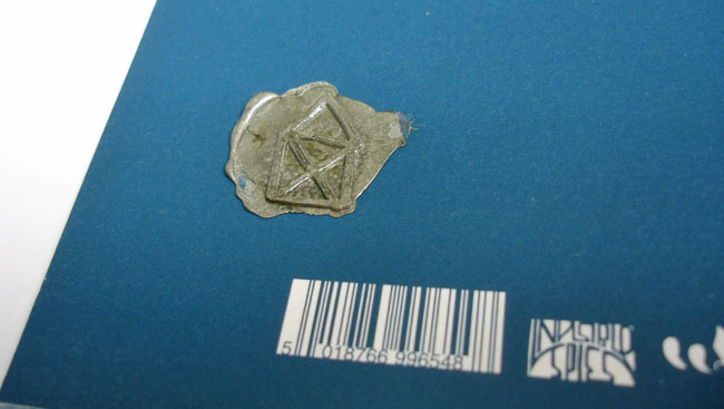
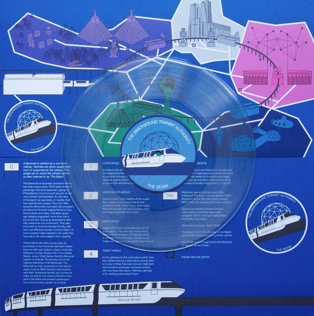
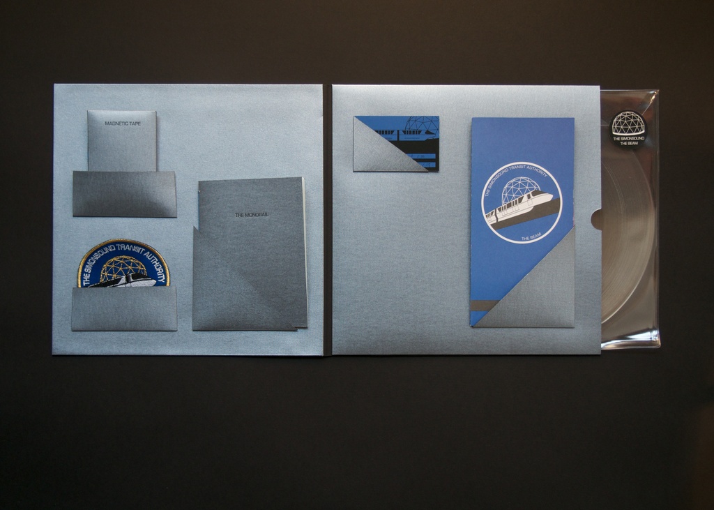 Want one of these? The new single from The Simonsound in a special 25 copy ‘Pilot Pack’ with 10″ colour vinyl, two sided colour map, sew on ‘The Simonsound Transit Authority’ Pilot patch, 1 of a kind 1/4 inch tape loop, mini booklet, Monorail ticket, all housed in a beautiful letter press printed sleeve? Better be quick – pre-orders happening NOW.
If they’re sold out or your budget doesn’t stretch to business class you can still catch the monorail in a more regular and affordable standard class version. 10″ colour* vinyl of ‘The Beam’, comes with two sided colour map. (*Colour to be confirmed.) Also, if you’ve not tried the debut LP from the group (Simon James and DJ Format) then you could do a lot worse than grab ‘Reverse Engineering’ while you’re there.
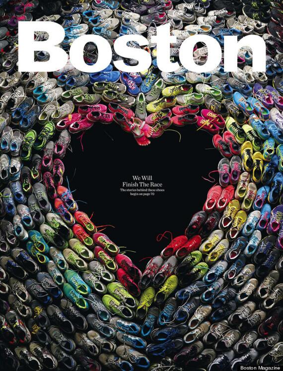 No more to be said, read the story behind the cover here.
 After posting a circular version of the London Underground map earlier this week, this version was bought to my attention. Everyone knows that the traditional map has locations forced into places that they aren’t so as to make them fit a cleaner, clearer design. Mark Noad decided to make a geographically correct version of the map in September 2011 and his excellent website has various versions available for download inc. step-free access, journey times and walking links.
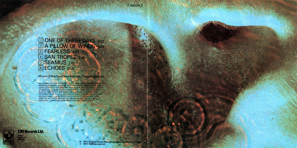
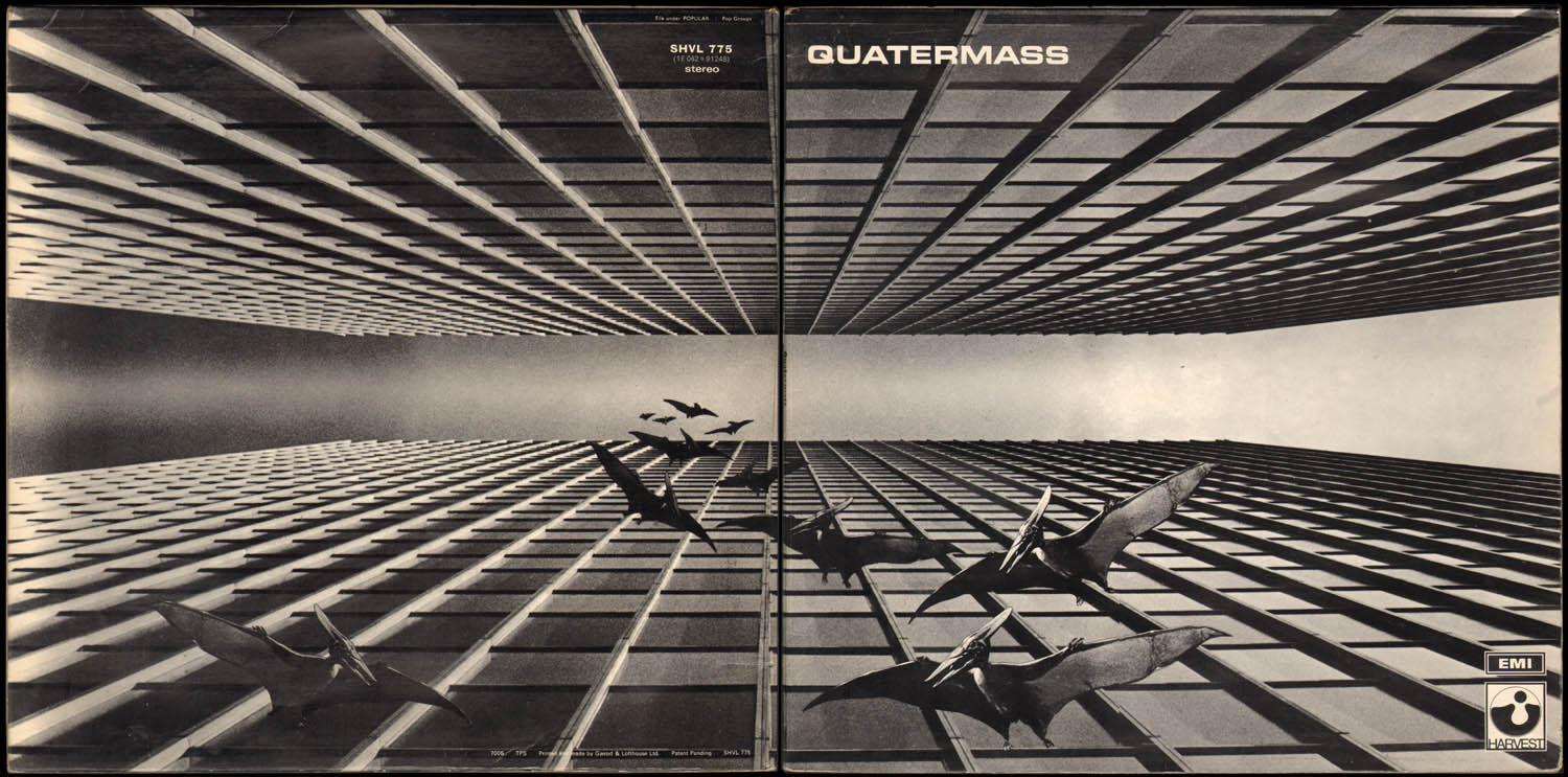
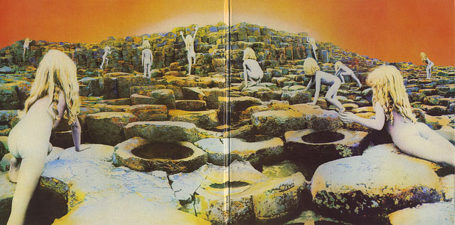
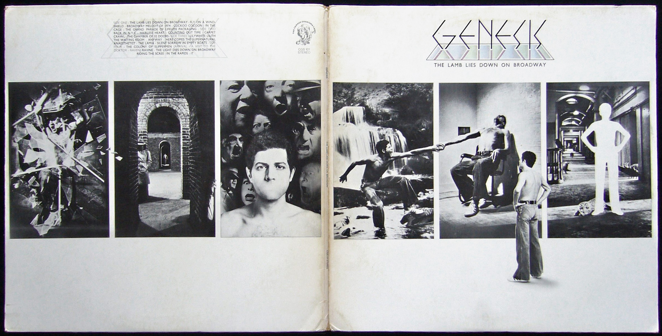
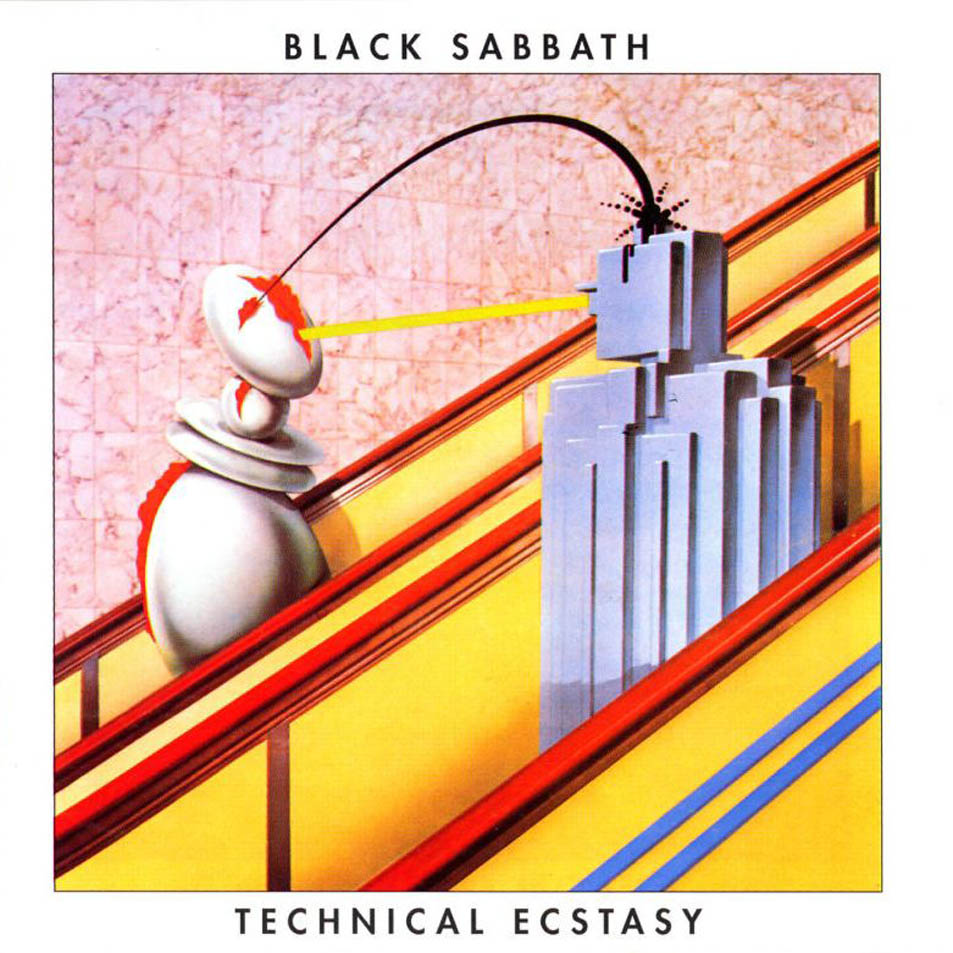
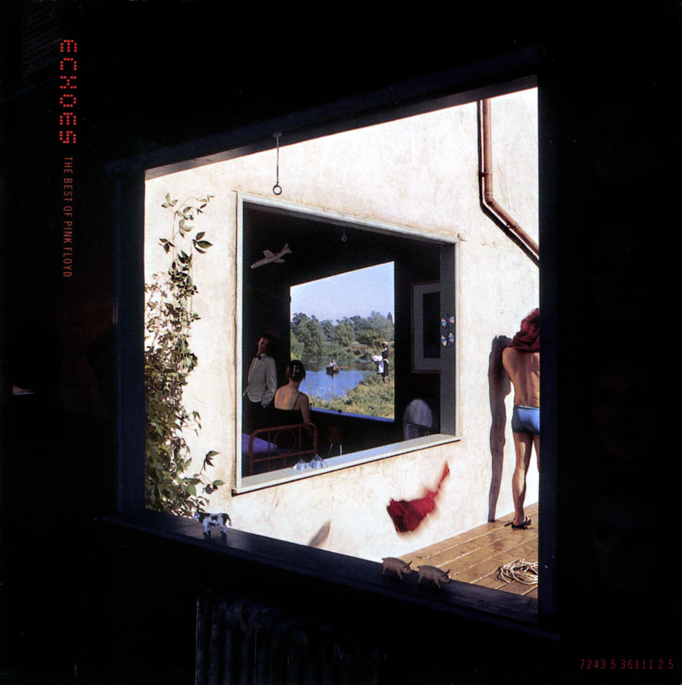
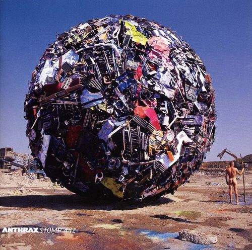
 Things have been so manic this weekend that I’ve only just found time to write something about Storm Thorgerson who passed away last Thursday. As part of the design group Hipgnosis, alongside Aubrey Powell and Peter Christopherson (also no longer with us), they pretty much defined the look of the rock album sleeve in the late sixties, seventies and beyond. You will know their work even if you don’t realise it; Pink Floyd‘s ‘Dark Side Of The Moon’ being the most famous if not their best (as Storm used to admit). 10cc, Genesis, Led Zeppelin, Scorpions, Peter Gabriel, The Who, Black Sabbath, Yes, ELO, AC/DC, Paul McCartney and many more… without their work it’s doubtful magazines like Mojo and Record Collector would have much to fill their pages with these days :).
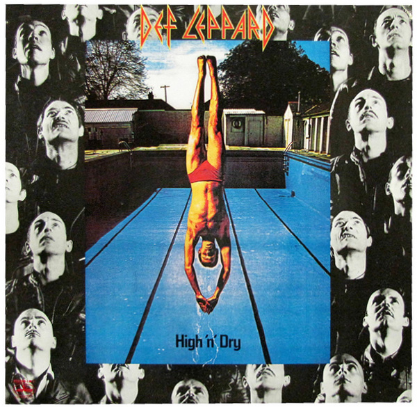
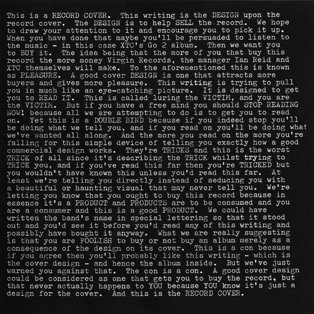
Seriously though, it’s hard to think of anyone else who dominated sleeve design more in the seventies with such a distinctive brand of photographic surrealism, all made pre-computer, on budgets most designers could only dream of these days. It was the age of the gatefold sleeve, Led Zeppelin led the way in deluxe packaging and the sleeve as canvas was in its heyday. Even though Hipgnosis disbanded in 1983 Thorgerson made the transition out of the rock seventies and into the flasher, poppier eighties, still designing for Pink Floyd but adding XTC, Def Leppard, The Cult and more to his portfolio. After Hipgnosis he moved into video direction before returning to sleeve design in the nineties and noughties for bands like Biffy Clyro, The Mars Volta, Muse and Dream Theatre, all wanting some of that retro record sleeve surrealism.
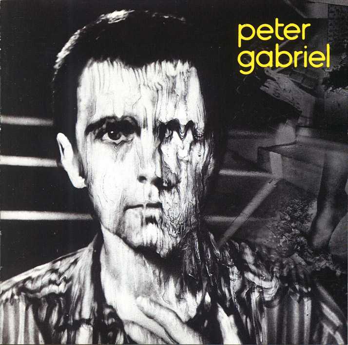
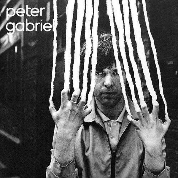
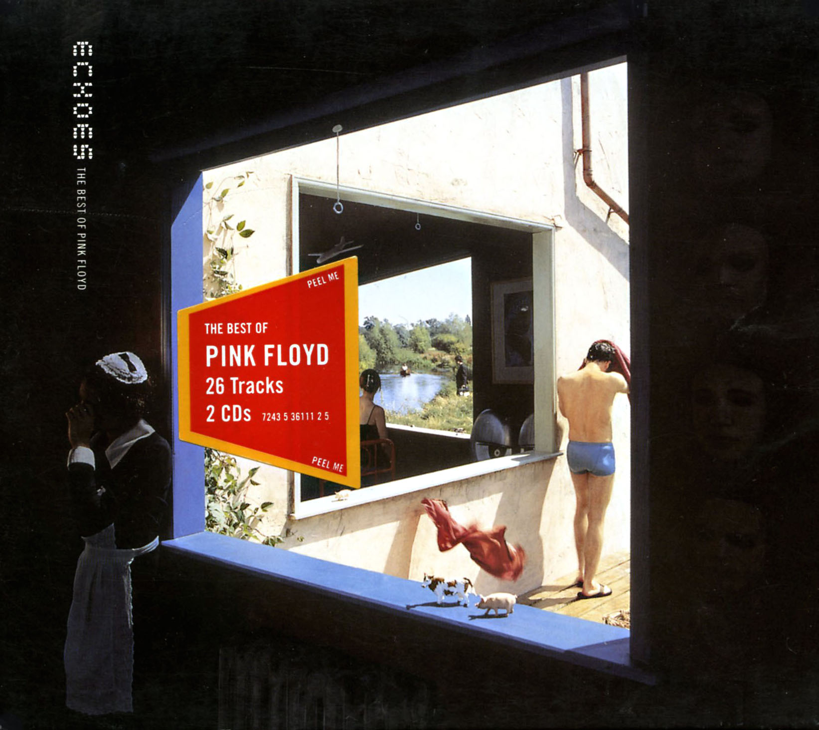
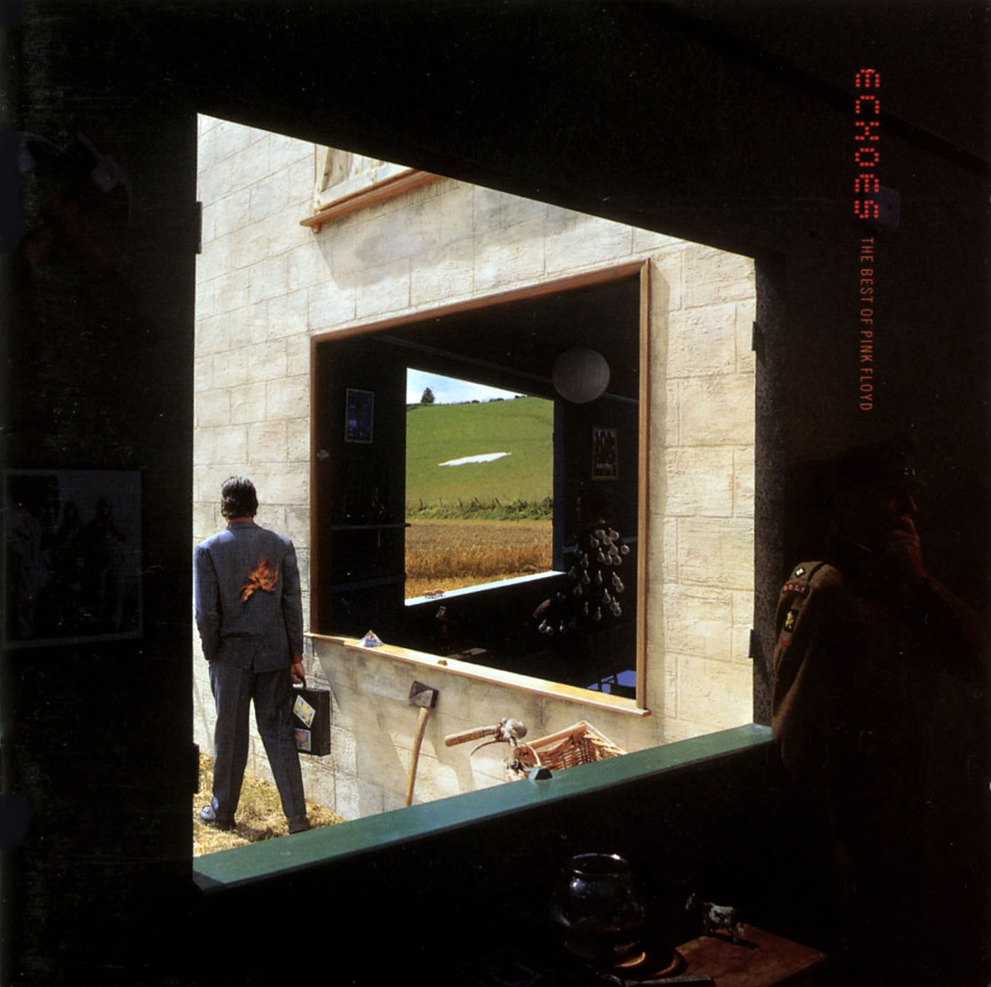
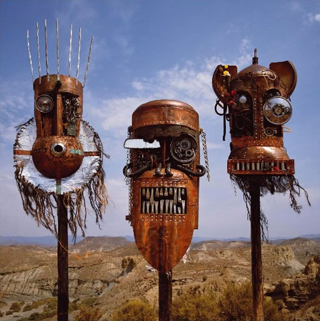
Pick up any book of album cover art and it’s a sure bet that he or Hipgnosis will feature, in some cases heavily although he did co-author the 6 Record Cover Album books in the 80’s so that’s no surprise. His sleeves for Peter Gabriel and The Scorpions used to freak me out as a kid first visiting record shops and I absolutely loved the tribal mask constructions on the Ellis, Beggs and Howard ‘Homelands’ LP sleeve. He’ll probably best be remembered for his work with Pink Floyd and I get the sense that he was at his most relaxed and playful with them, especially is the various compilations and re-imaginings of his past work he was called upon to do, the best being the ‘Echoes’ compilation imagery.
These days the art of the record sleeve is getting reduced to a thumbnail, hidden away, then forgotten, in pdf ‘booklets’ attached to download packages and lower resolutions for the web. When budgets are so tight that album design duties are relegated to online competitions for fans to enter, it’s important to remember and recognise how important the work of Storm is and was. He and others like him shaped the visual language of parts of the music industry and showed that artwork can be as important, controversial and powerful as the music it surrounds. * Special mention for the excellent Hipgnosis Covers blog too, I could spend all day there.
 This debuted in January this year apparently but I only just saw it, I rather like it as a new take on the standard London Underground map. The redesign isn’t official however but was done by Dr Max Roberts, based on concentric circles, partly inspired by the orbital London Overground. He posted it on the Going Underground blog earlier this year because he felt the regular map was becoming too crowded with the recent addition of new lines like the East London Line. It’s probably not geographically correct but then neither is the regular tube map, it does show however, show unbalanced the South of London is in relation to the North where transport links are concerned.

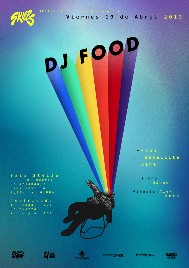 Tomorrow sees a double whammy in Madrid where I’ve been invited to talk about my design work in general for a meeting at Café Molar. It starts around 7.30pm and should last for an hour with a Q&A session.
Later that night I’ll be playing a 2 hour AV DJ set at the Skills Club before heading back to the UK on Saturday for Record Store Day.

