 When the cover image for David Bowie‘s ‘The Next Day’ appeared earlier this year I was firmly in the ‘dislike’ camp. Designer friends raved about it but I just couldn’t agree, although it was nice to have a debate raging over a piece of graphic design – brilliant PR move there. Jonathan Barnbrook‘s defacing of Bowie’s classic, ‘Heroes’, did nothing for me visually despite being a bold move from Bowie for allowing such an act to become the cover of his new album. Supposedly signalling a need to move on and obscure the past from which any artist is always judged, Barnbrook said, “The obscuring of an image from the past is also about the wider human condition; we move on relentlessly in our lives to the next day, leaving the past because we have no choice but to.”
 Fair enough, I can get with that but the result is dull and ugly to me, the casual scoring out of the original title and insertion of a white square seemingly designed to provoke. The use of a classic image reminds me of lesser designers who take other’s established icons as part of their own to bolster their visual cred, the equivalent of someone wearing a faux-distressed Led Zeppelin T-shirt they bought in Top Shop last week. The dull typeface across the middle… there’s just nothing to say about it. I would have liked it if they’d have physically stuck a white square with the title onto actual Bowie albums from the past, not just ‘Heroes’ but any of them, that would have had some impact.
The moment passed, as all internet ‘storms’ do, and the first single emerged to rabid fanfare, which I was also unmoved by. I like Bowie but I can’t say I could remember a song he’s done since the ‘Let’s Dance’ era if I’m honest and I stopped checking him out a long time ago. Then, last week, I was at dinner with some friends and one recommended I listen to it as it was, ‘the best thing he’s done since ‘Scary Monsters’. Really? But the single was a maudlin ballad, sung by a man who sounded like he was reminiscing about his glory days – although excessive plays on 6 Music over the past month have softened me to it somewhat. ‘No, that’s the only thing like it on the record, the rest is just a great rock album, said the friend. So I went home and checked the stream on iTunes. My god, he wasn’t wrong.
After hearing the single, the album is a revelation, not only is it full of killer hooks and inventive arrangements, it’s Bowie in full flow. Opener, ‘The Next Day’, kicks straight in and within 70 seconds roars into the chorus with Bowie hollering for all his worth, “HERE I AM, not quite dying, my body left to rot in a hollow tree!” As opening tracks on a comeback album go, that takes some beating and immediately silences all the pundits who were sure the album would be a melancholic glance back at the past by an aging icon. You’d never know it was the same record to feature, ‘Where Are We Now?’, which is a huge curveball of a lead single if ever there was one. ‘Dirty Boys’ skanks along sounding like he’s being backed by Fishbone at a New Orleans wake, ‘If You Can See Me’ is just intense, his voice pitched into alien dimensions whilst navigating a time signature that would tax any competent player. ‘Dancing Out In Space’ recalls the best parts of the 80’s pop like ‘Modern Love’, a joyous, bouncy song with doo-wop backing vocals whilst ‘Boss Of Me’ alternates hard and soft that even the saxophone can’t spoil. There are shades of both 70’s and 80’s Bowie, the ghost of Robert Fripp‘s guitar (although he doesn’t actually play on it), the mood is generally uptempo and his band is tight as… It’s chock full of singles and you wonder whose idea it was to lead off with what is essentially the breather you get after the first five tracks. The closing track, ‘Heat’ sounds like ‘Low’-era Bowie meets Scott Walker doing ‘The Electrician’, a chilling piece to end the album. If you get the deluxe download edition there are three bonus tracks too, none of which are filler in any way.
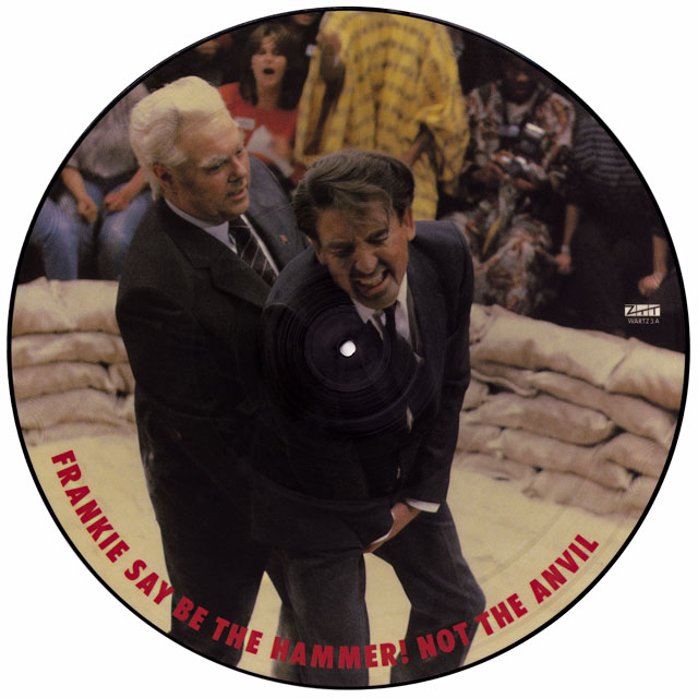
All that to say, I love it, I’ve played virtually nothing else all week and, inspired by the music, I decided to do my own take on defacing ‘Heroes’ which I’ve posted above.


