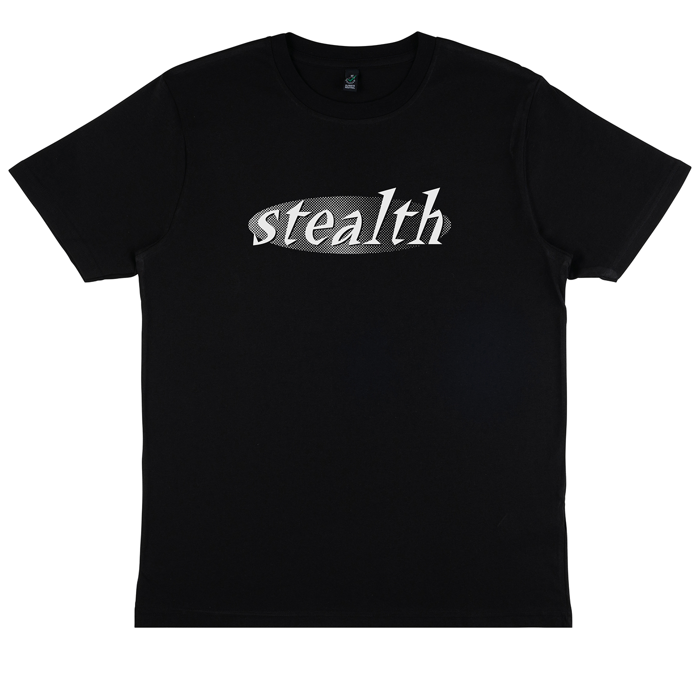
There are two anniversaries happening next week, one related to Ninja Tune and one to 1 of 100.
I’ve collaborated with the latter for these exclusive shirts, you know the drill with these, 100 pieces only, no reprints, colours will be split between Black and Ecru, depending on orders.
Sign up for drop details at weare1of100.co.uk/t-shirts/

Design
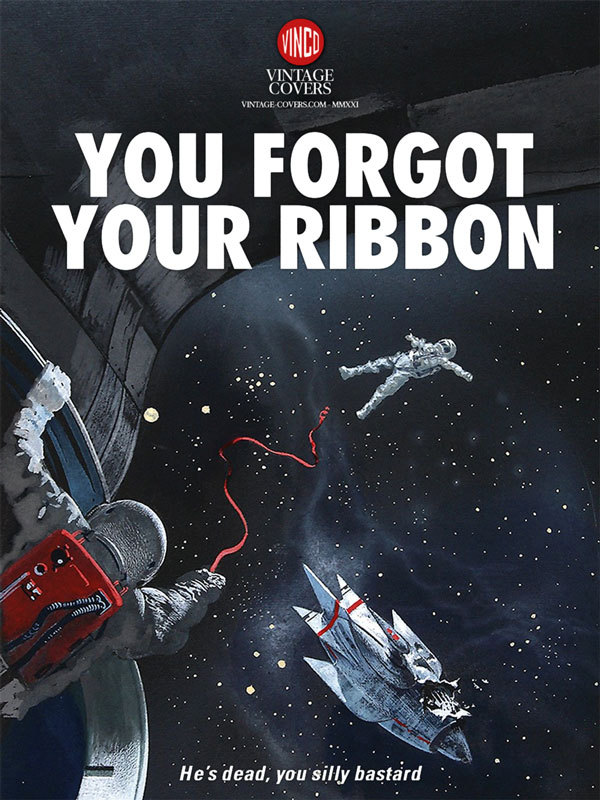
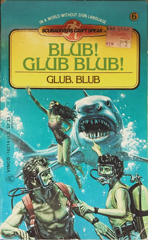
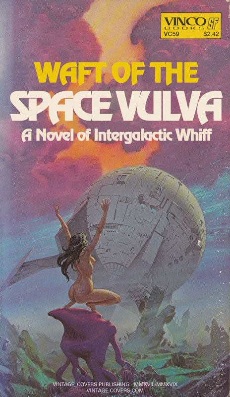
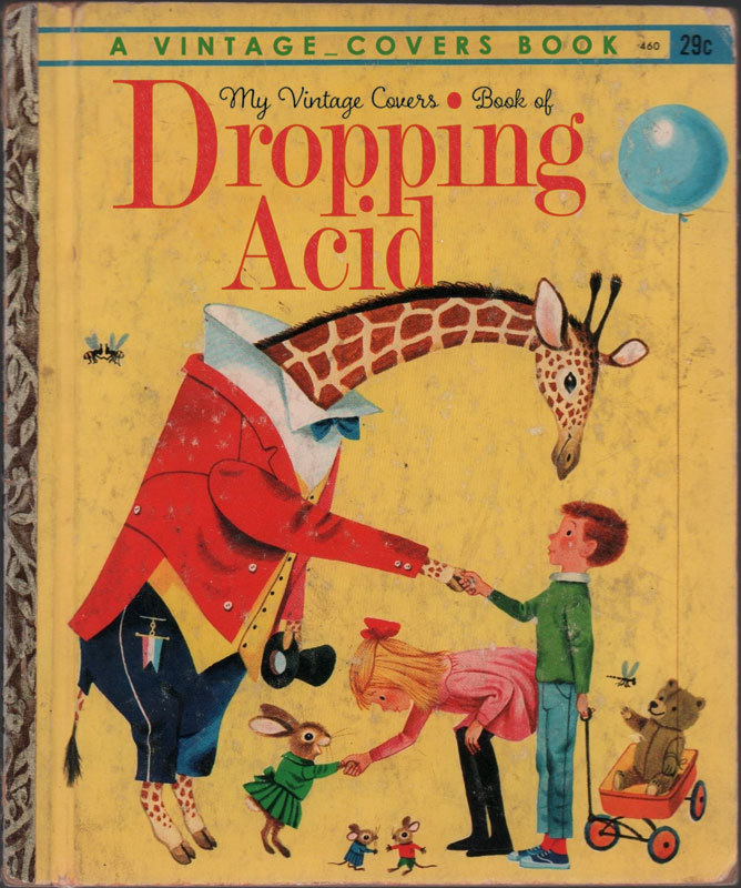
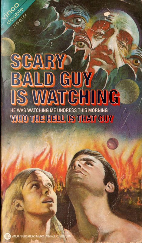
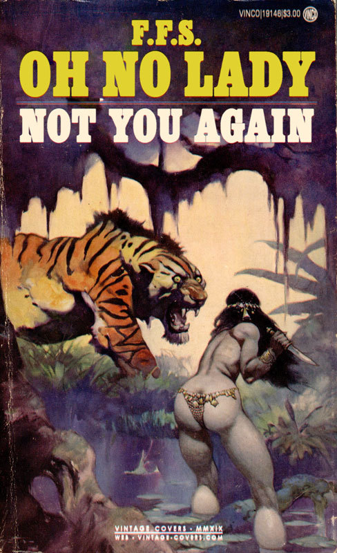
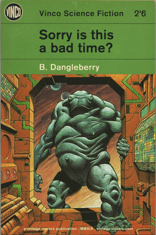
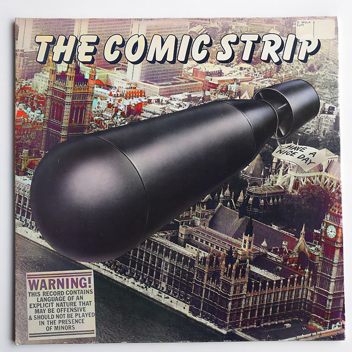
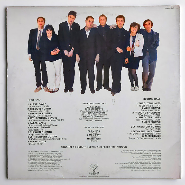
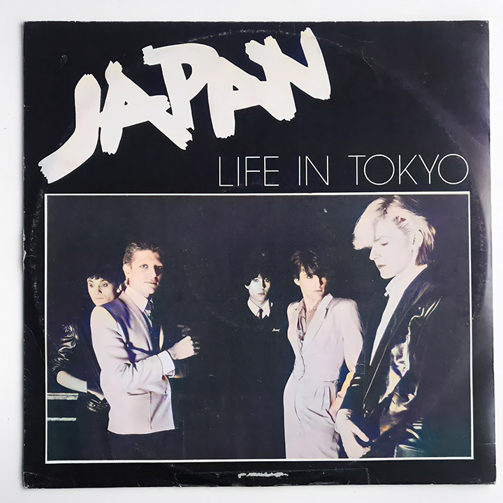
Old but new to me, these made me laugh, many more here at https://vintage-covers.com/
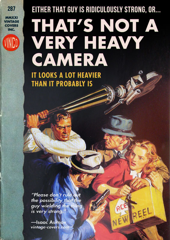
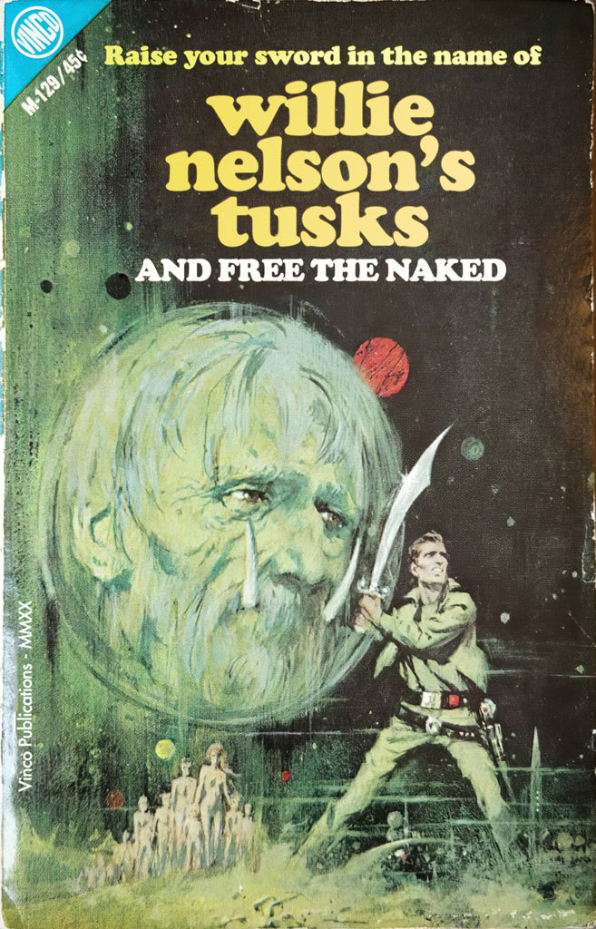
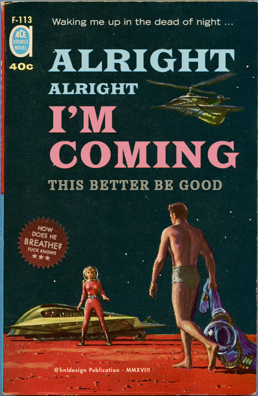

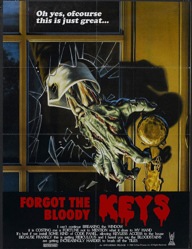
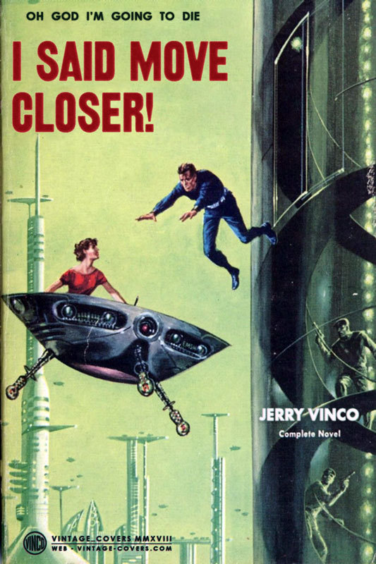
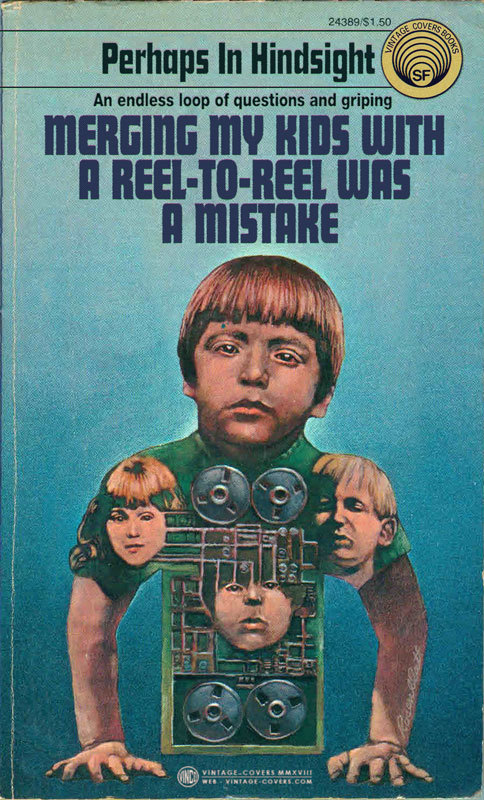
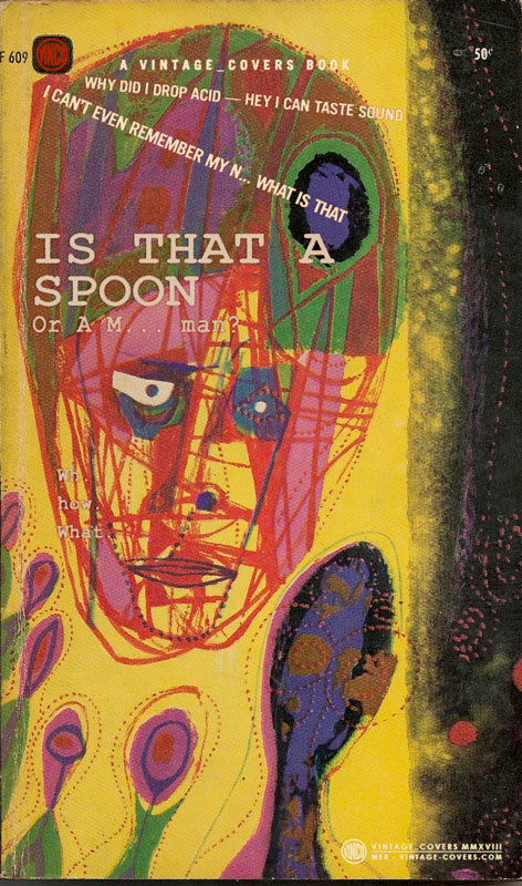
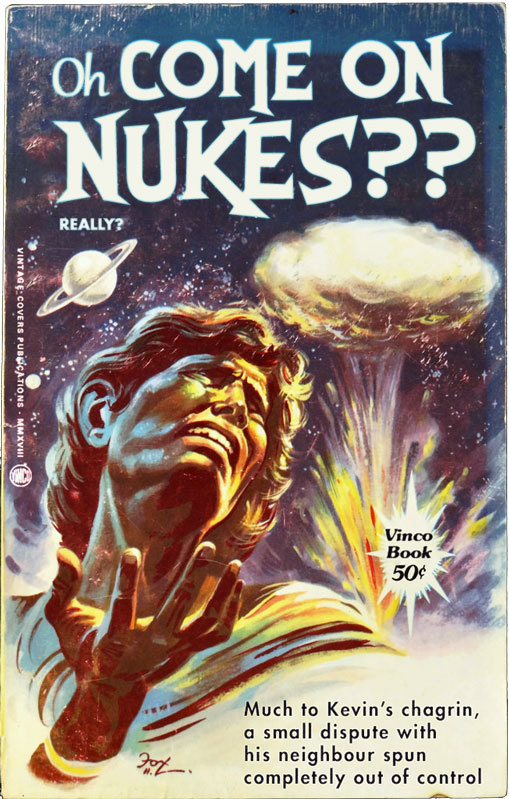

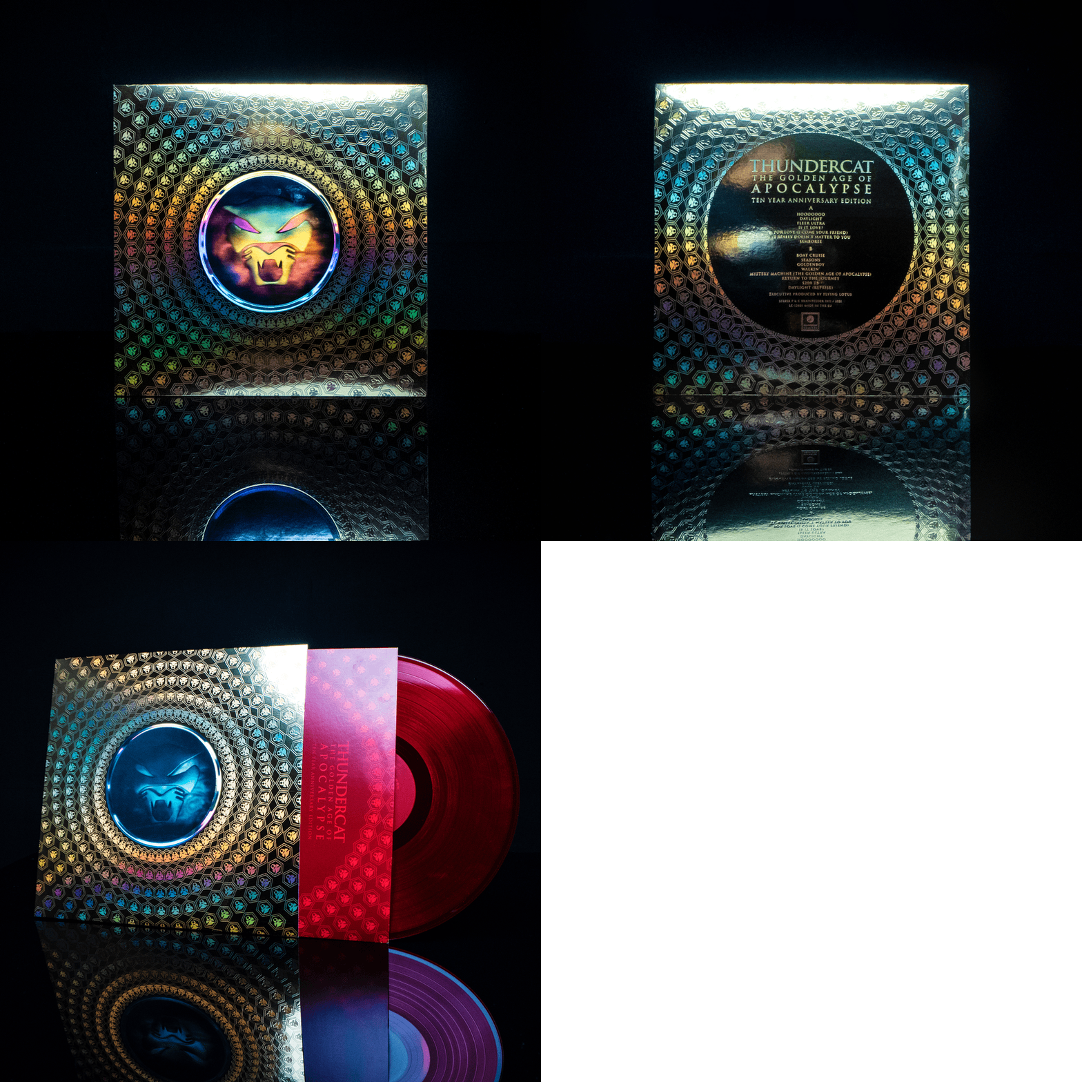
We may have packaging of the year here – Thundercat 10th anniversary repress of The Golden Age Of Apocalypse on Brainfeeder – “a translucent red LP housed in a beautiful shiny gold mirri board sleeve with a large Thundercat logo hologram sticker and gold rainbow holofoil detail” – out this (Black) Friday.
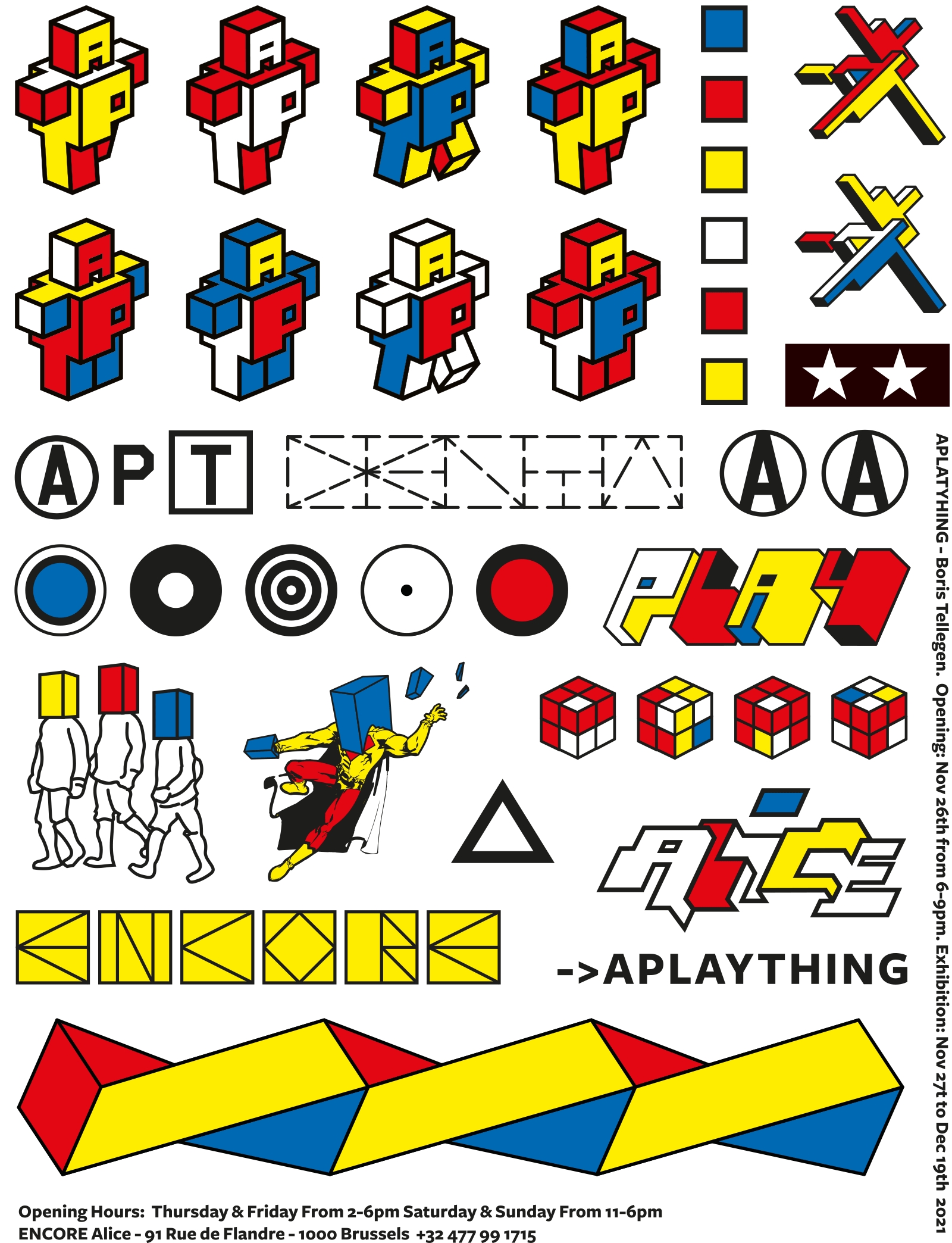
Boris Tellegen – A PLAY THING
27 nov – 19 dec. Opening 26 november
Encore Alice, 91 Rue de Flandre, Brussels
https://alicebxl.com/exhibitions/a-play-thing
Marc Oosting & Boris Tellegen – Copy
20 nov – 15 jan. Opening zaterdag 20 november 15:00 – 18:00
Gallerie Vriend van Bavink, Geldersekade 34
https://www.vanbavinkgallery.com/exhibitions
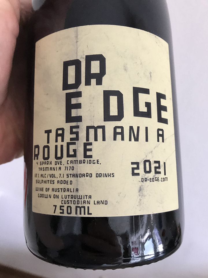
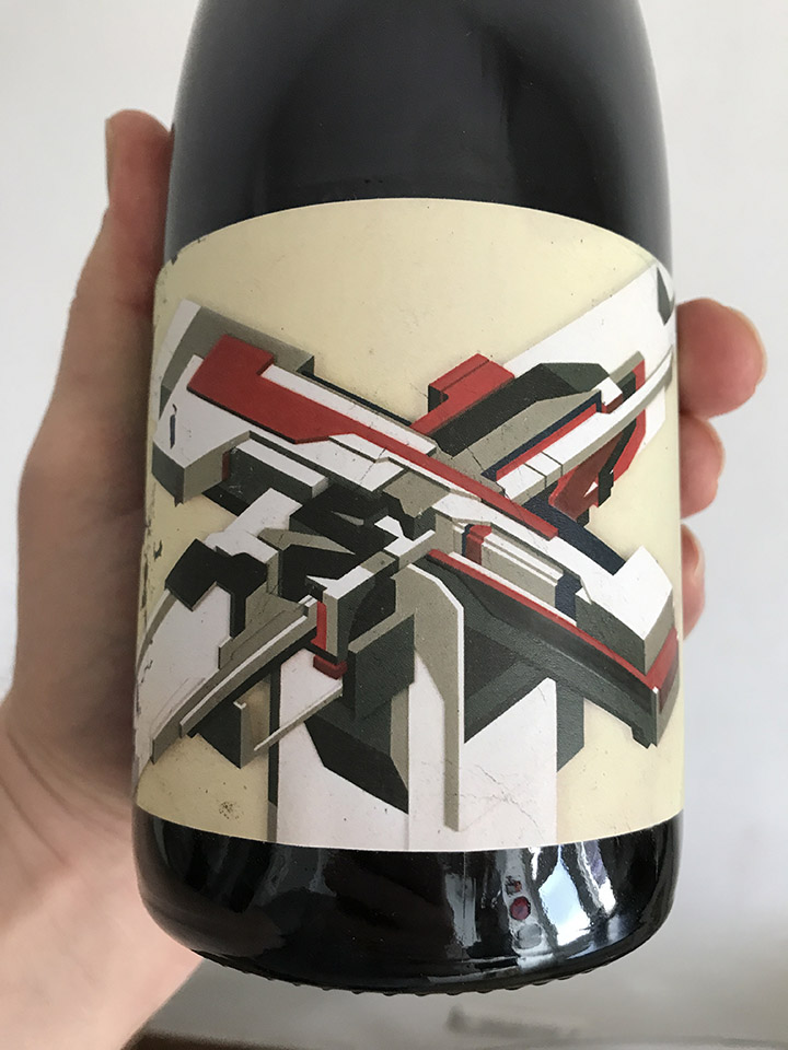
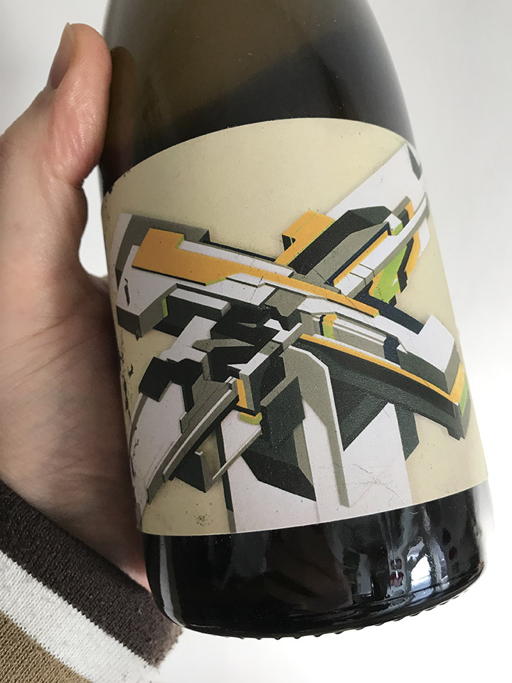
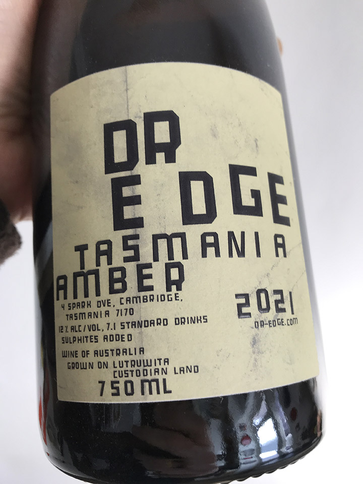
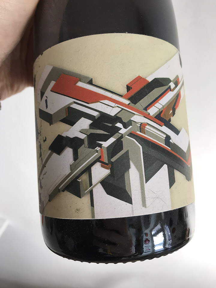
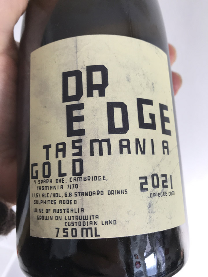
In other Delta news, Boris and I have granted the Tasmanian wine maker Dr Edge the rights to use our cover image for DJ Vadim‘s ‘USSR Life From The Other Side’ on a range of wine bottles. The good doctor has done several collaborations with Robert ‘3D’ Del Naja already and you can find these wines here.
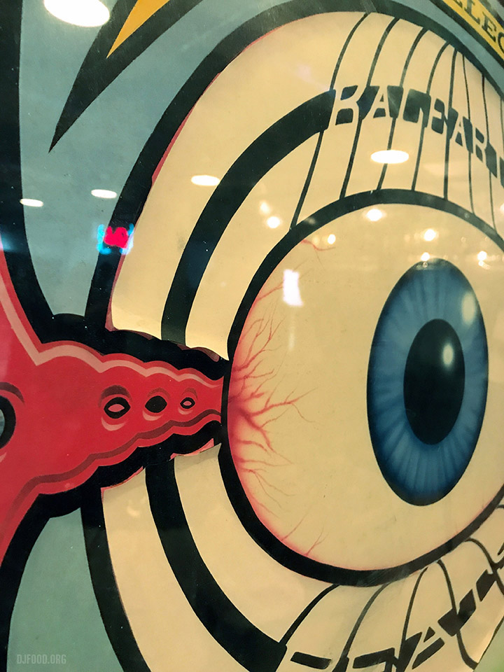
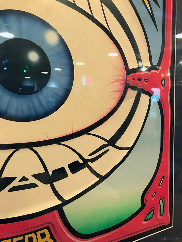
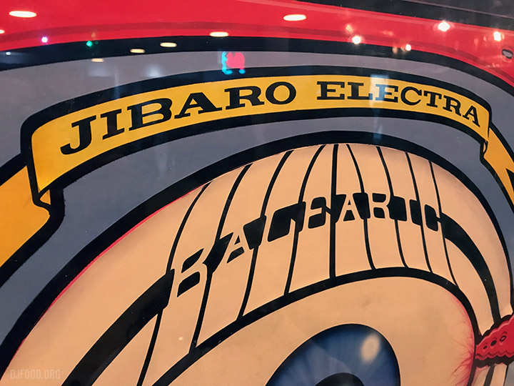
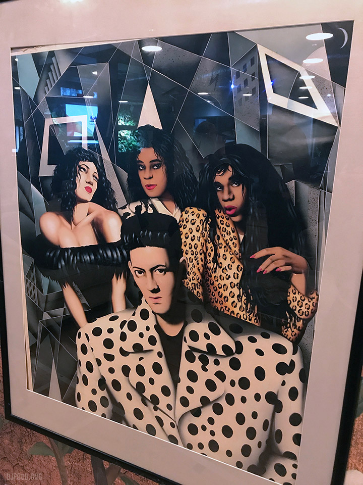
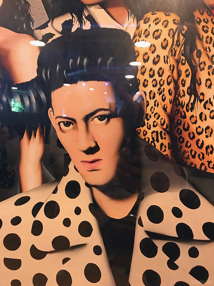
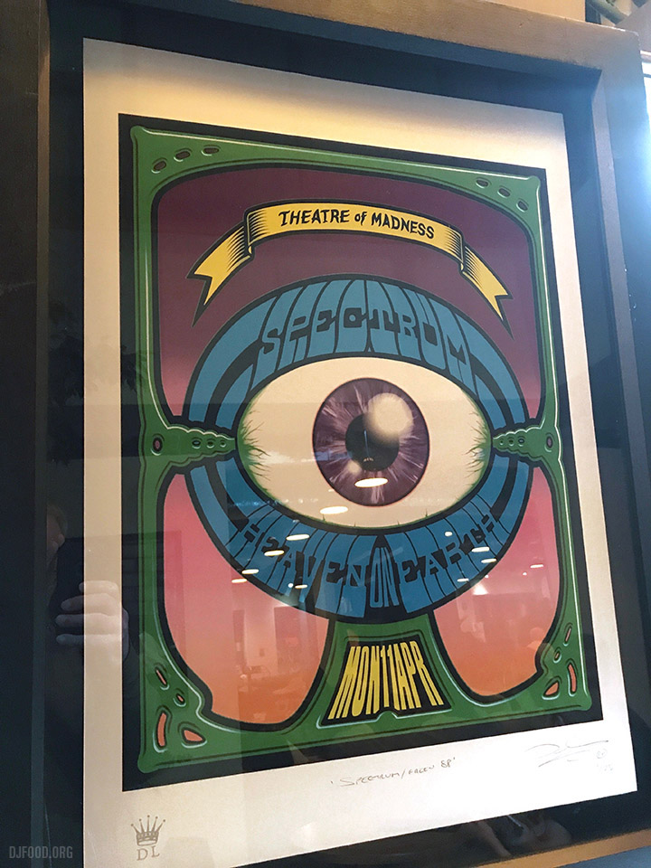
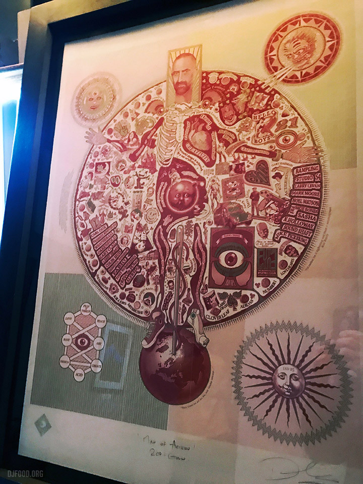
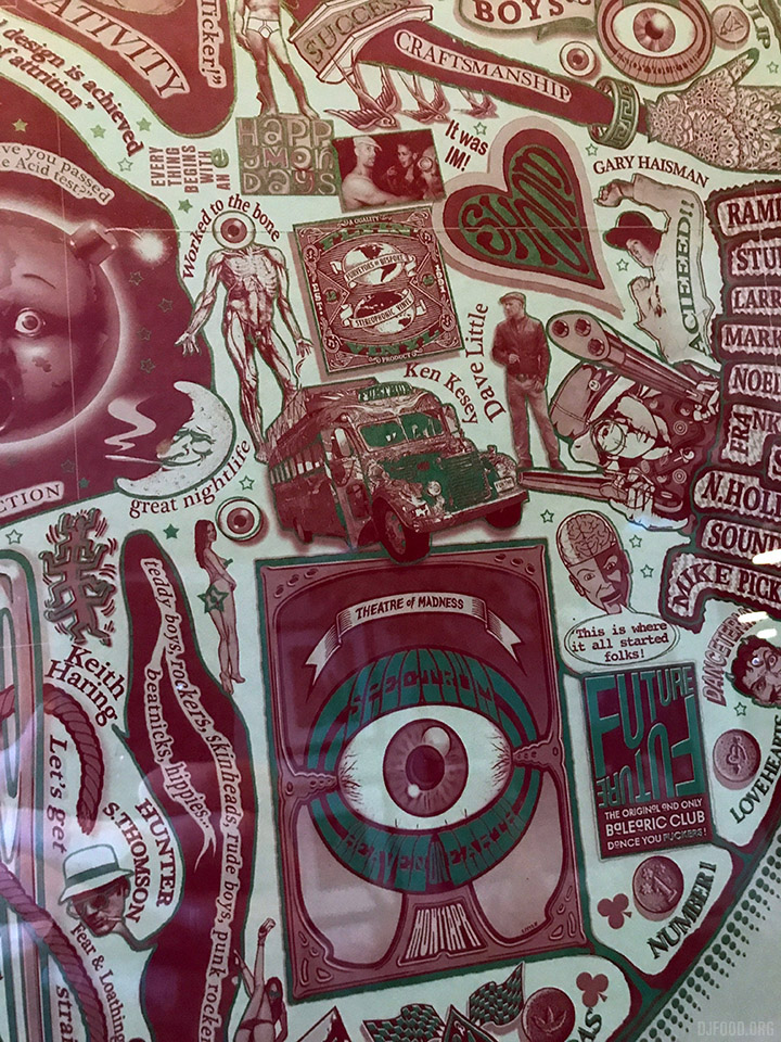
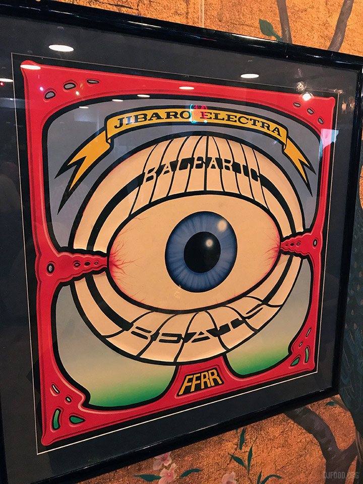 I was amazed to see the originals of Dave Little‘s covers for S’Express‘ Original Soundtrack album and Jibraro ‘Electra’ 12″ at the screening of the 1988 documentary, Club Culture tonight at Arboretum. There was a small show of his work including Renegade Soundwave, Spectrum, Junior Boys Own and his Acid screen print. If you look closely at the Jibaro sleeve you can see the stuck on lettering peeling away. You can buy some of these as prints from Dave’s site.
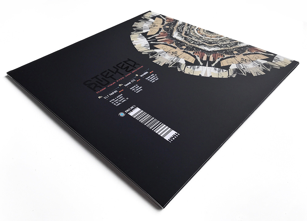
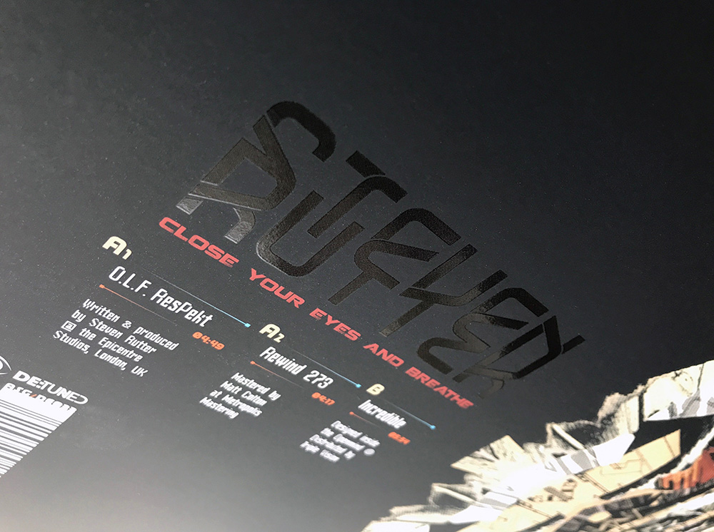
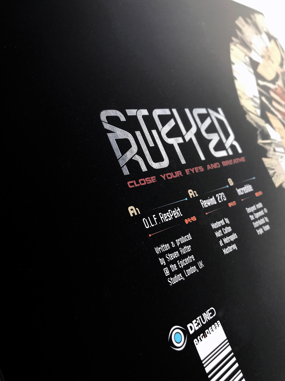
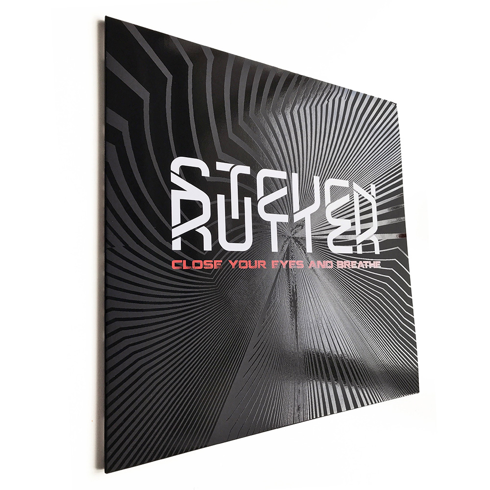 Finished copies of the Steven Rutter 12” I designed for De:tuned arrived yesterday and I couldn’t be happier with the final result.
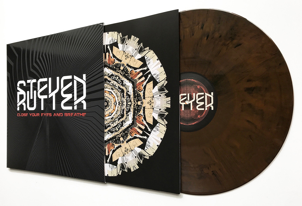 This took a while, not least because of the worldwide delays with vinyl production, but also because we had to change details of the design after an initial die cut cover option proved unworkable. No matter because the final result is one of my favourite designs in recent years. Available in black or copper/brown vinyl.
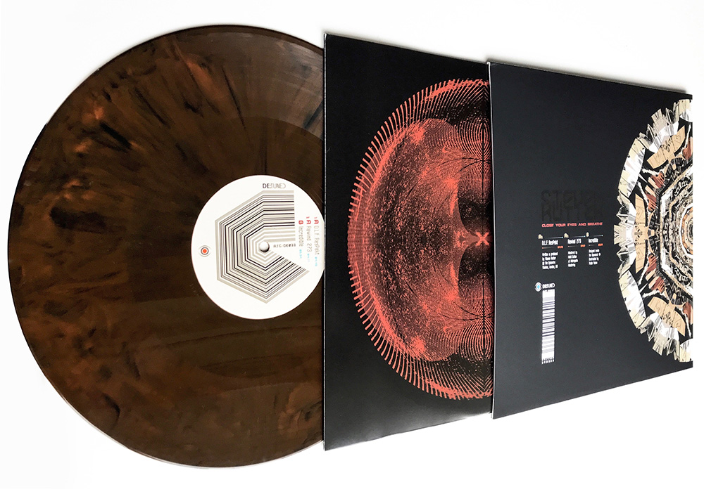
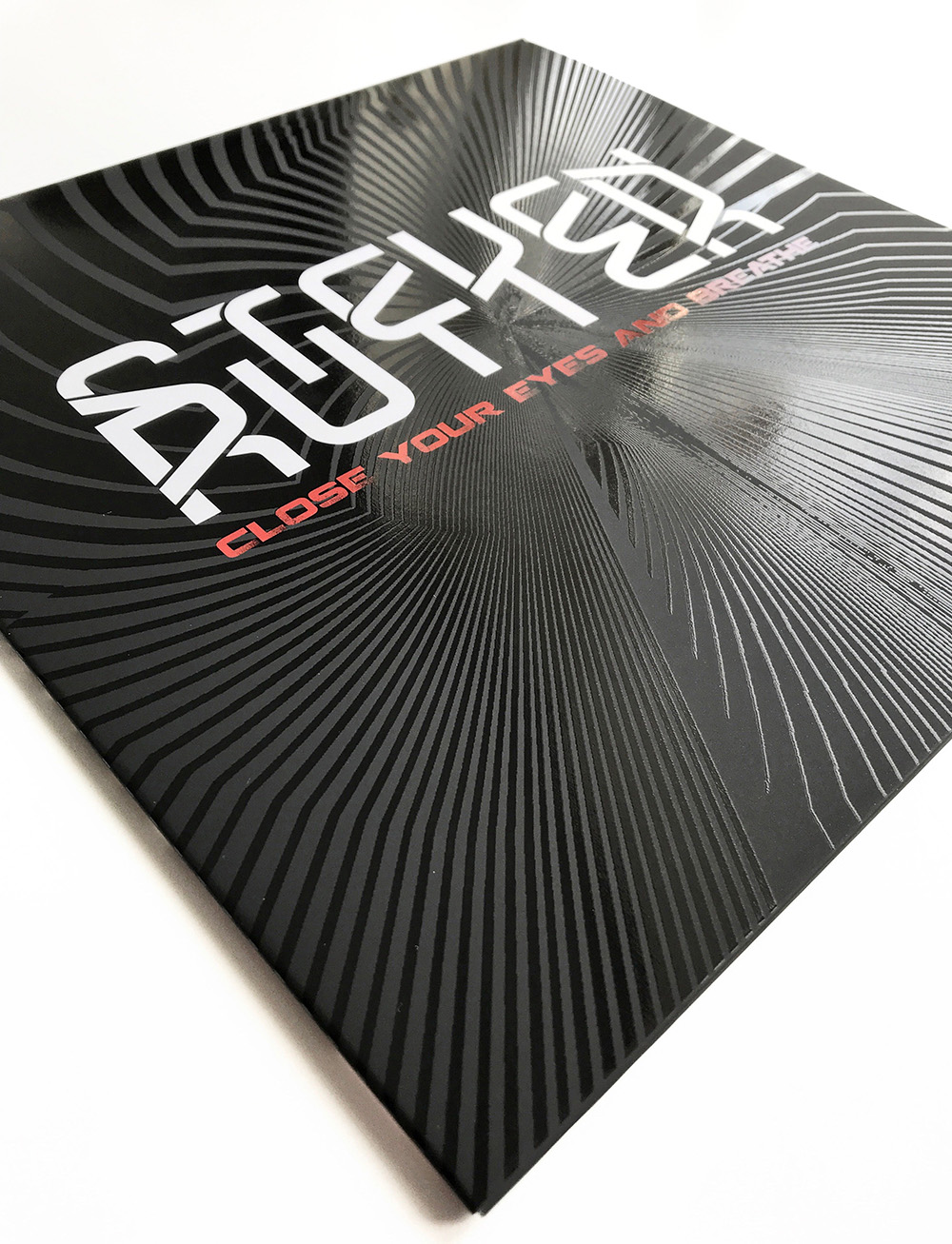 And that’s not to forget that the music it houses is absolutely beautiful, a career high for Steven. Available now from all good record shops and De:tuned just launched the full label on Bandcamp last week too.
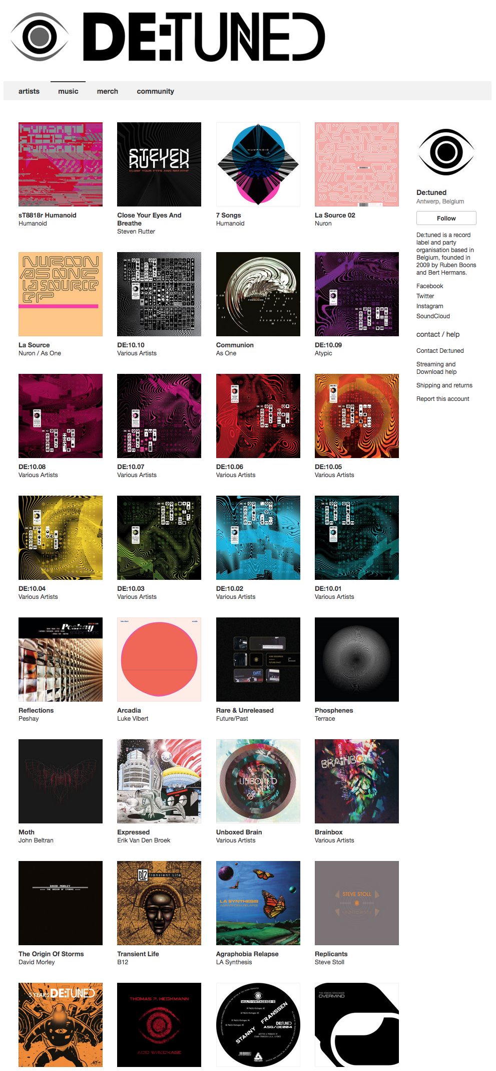
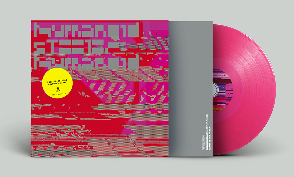 Not only has the Belgian label, De:tuned, announced another new Humanoid release, this one is remixed by Autechre, Luke Vibert and Mike Dred! The label, who I’ve been designing sleeves for alongside The Designers Republic for the last five years, has also set up shop on Bandcamp – look at that discography.
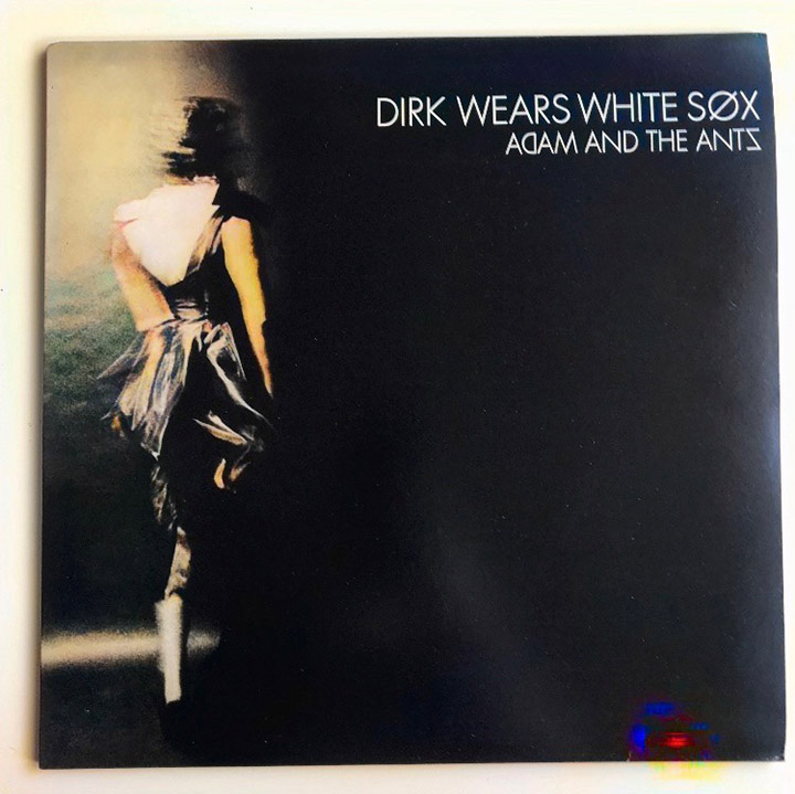
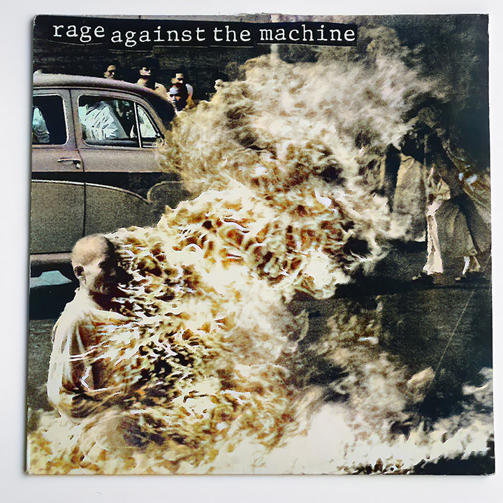
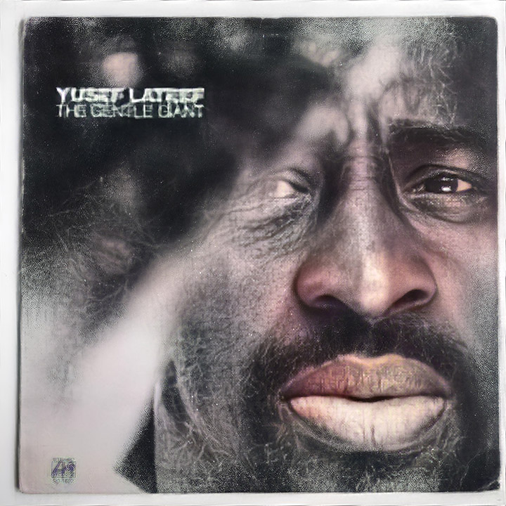
I’ve been experimenting with photo colouring / enhancing / animating apps like Remini and similar on various things recently and thought it would be interesting to feed some classic black & white record sleeves into the apps and see what came out. The results are fun, extremely fast – usually about a minute, and have the delayed joy of waiting for a Polaroid to appear. It seems to work better with images that contain a lot of tones rather than high contrast like some seen here. Colours are patchy, sometimes missing parts of the body and there’s a lot of sepia or beige for skin tones which occasionally gets things wrong if the images are abstracted. It’s also not seemingly able to recognise non-Caucasian faces too easily and architecture comes out in an ad hoc way. Some of them do very odd things with text (see the Yussef Lateef cover at the bottom) and sometimes adds strange colour artefacts – notice the blue/red object on the Dirk cover repeated on the Marshal McLuhan. 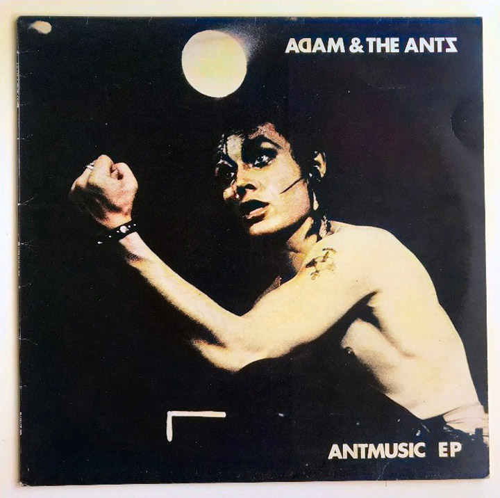
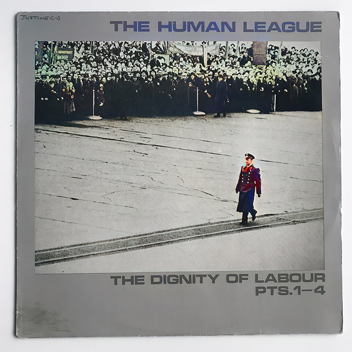
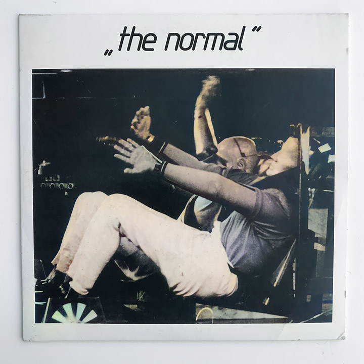
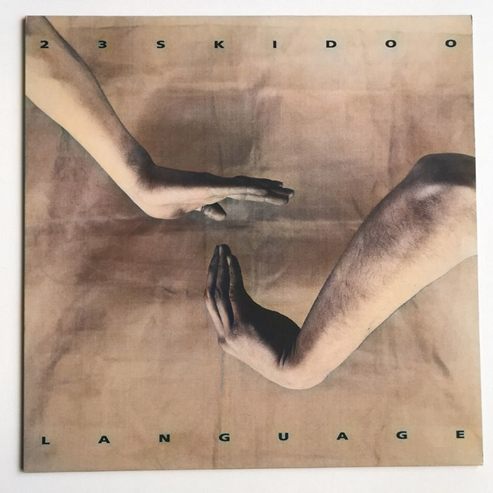
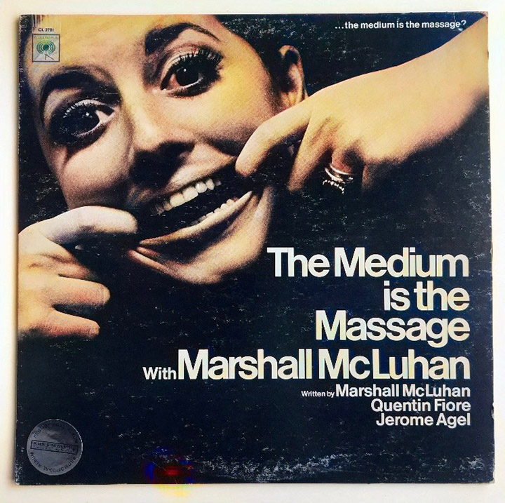
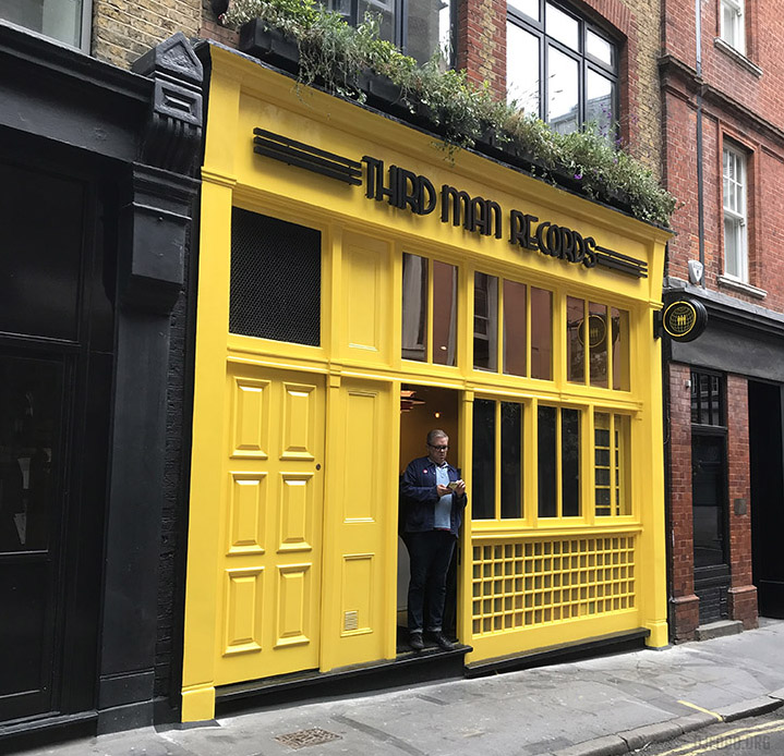
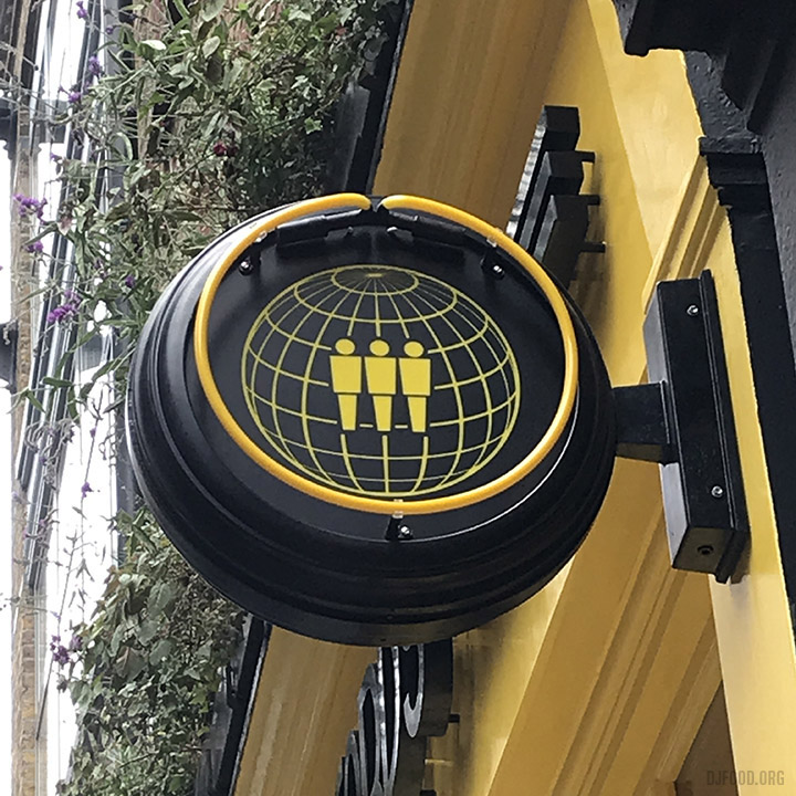
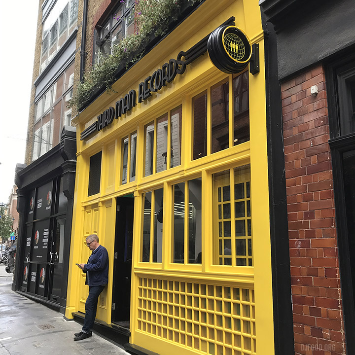
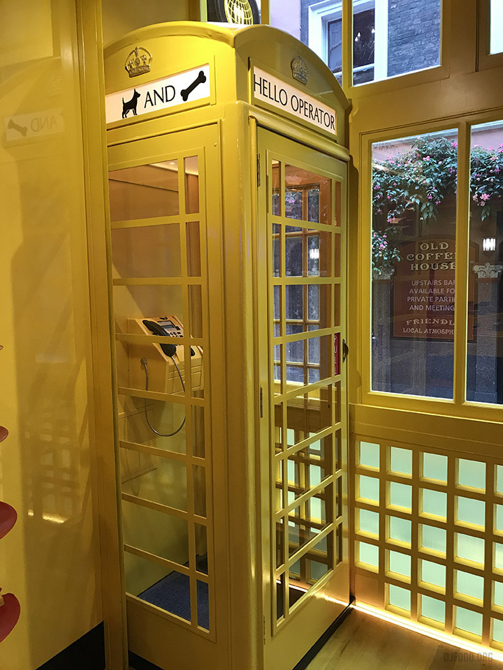
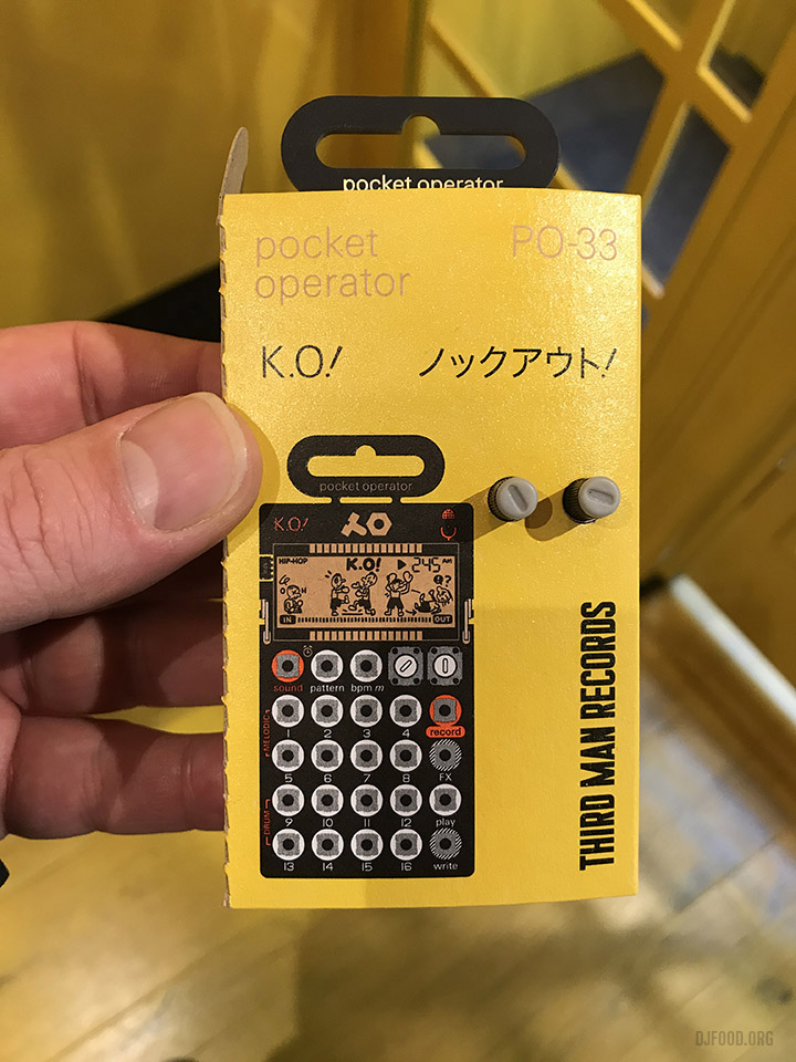
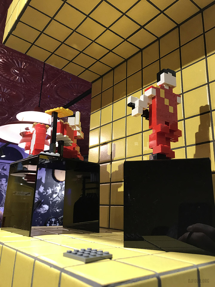
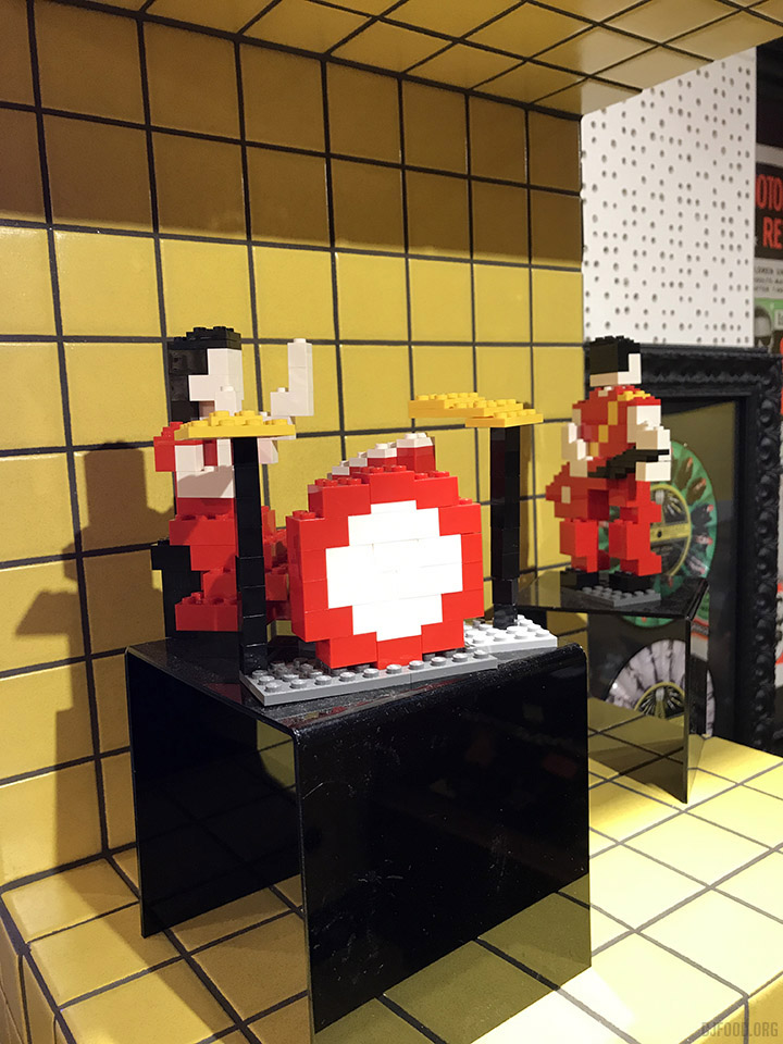
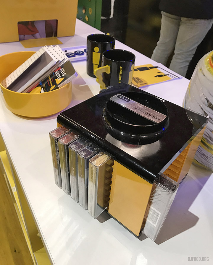
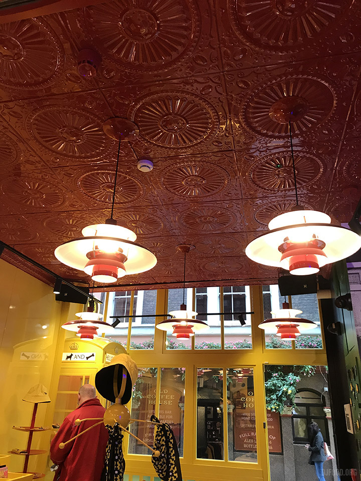
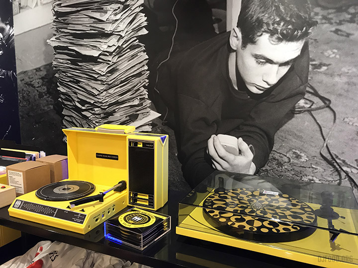
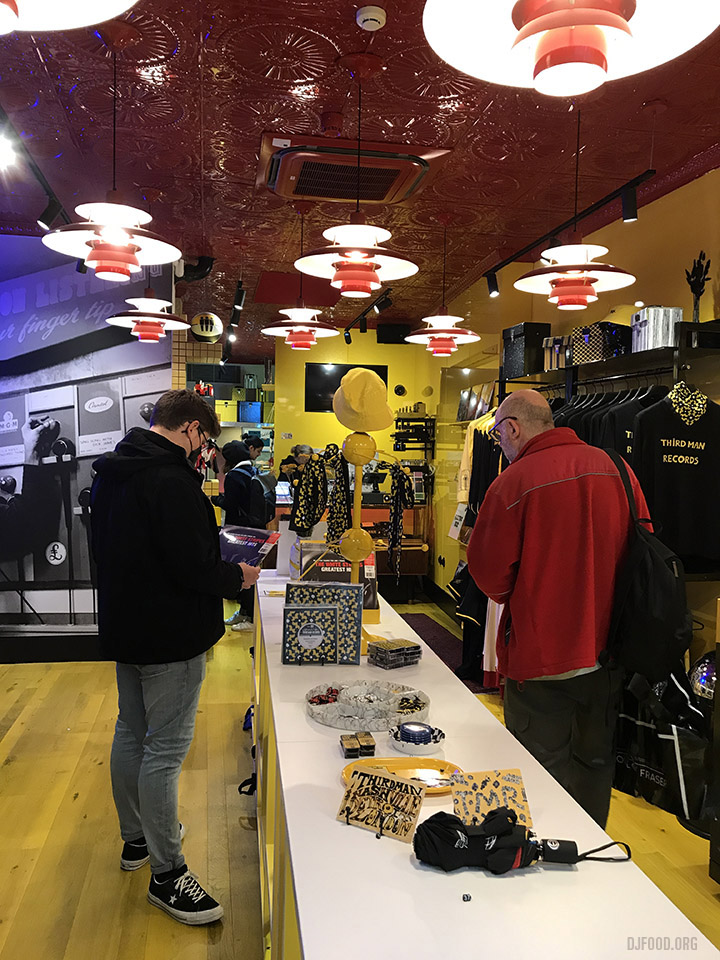
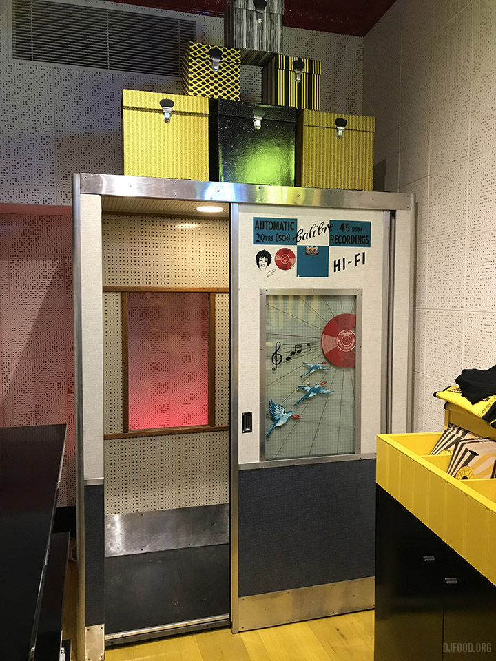
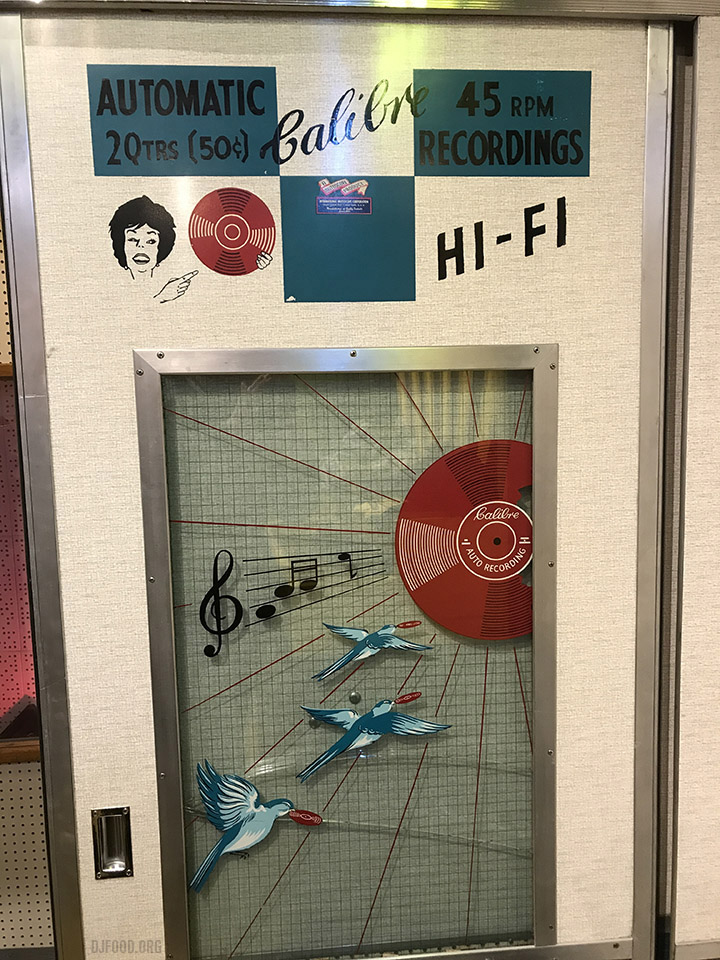
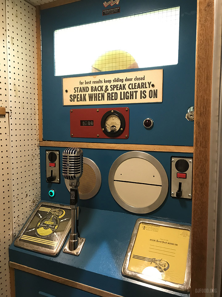
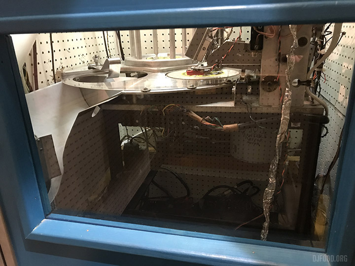
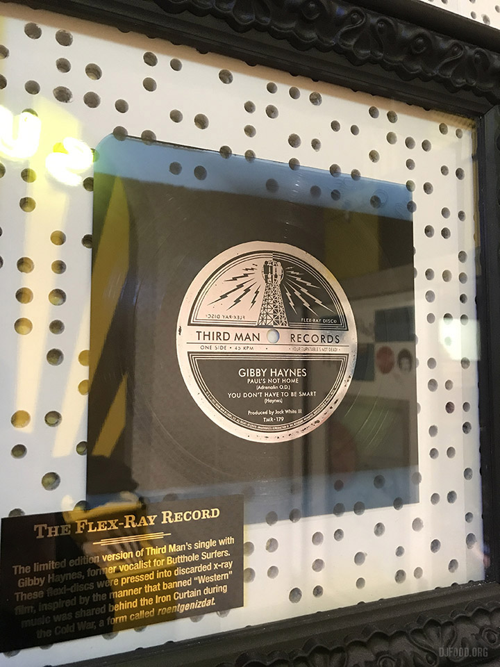
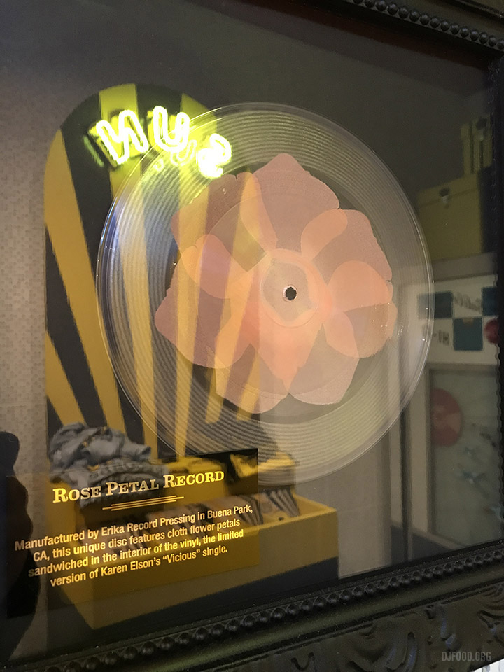
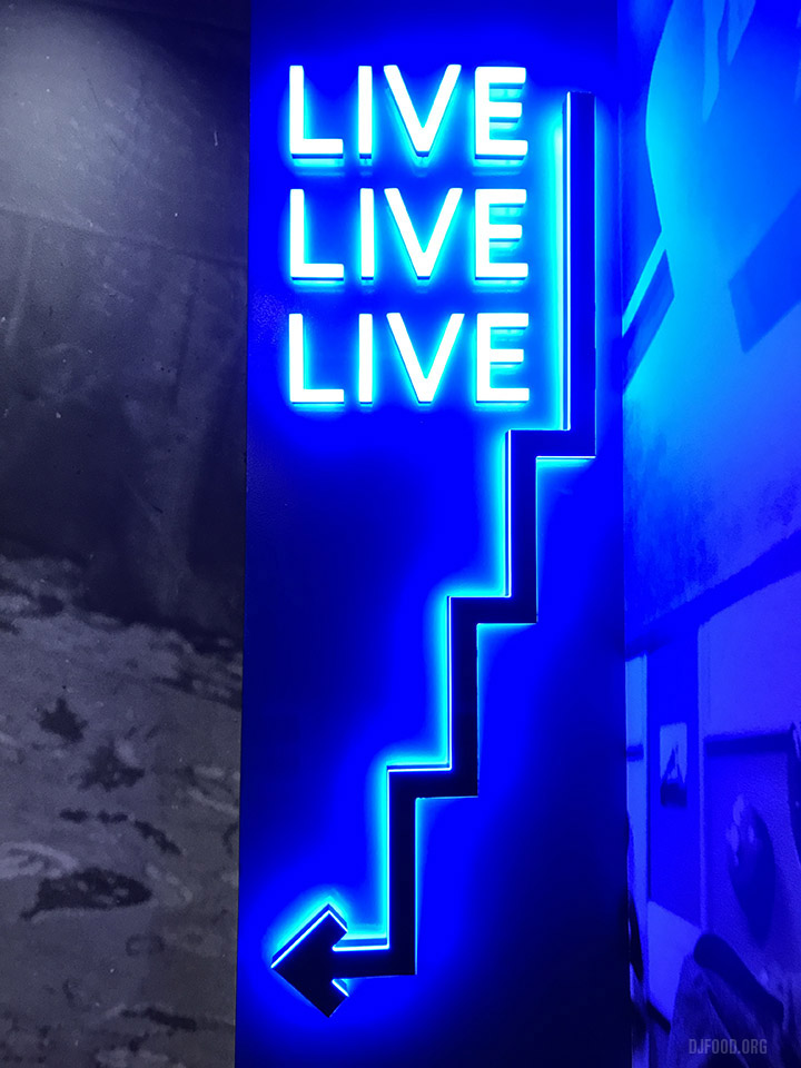
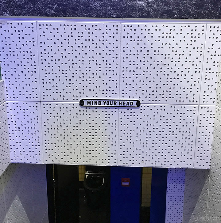
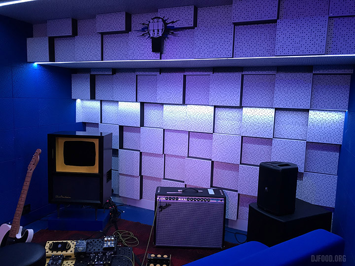
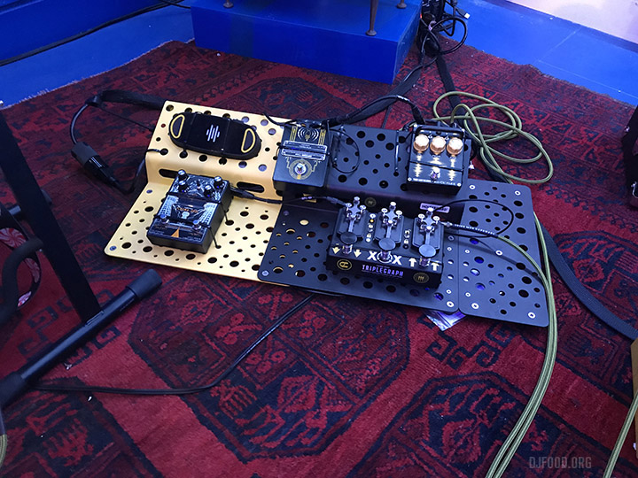
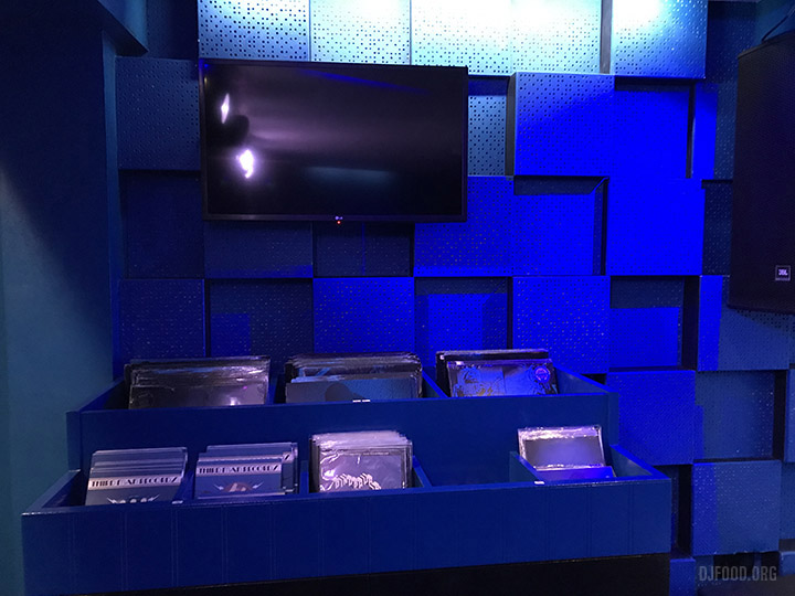
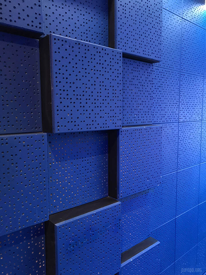
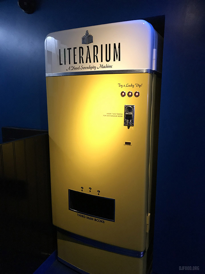
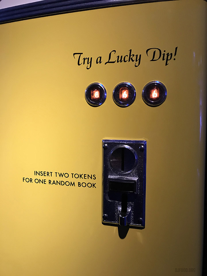
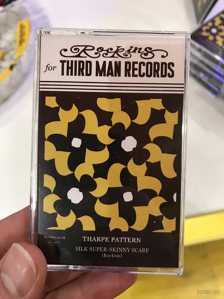
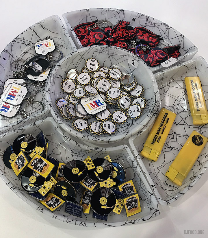
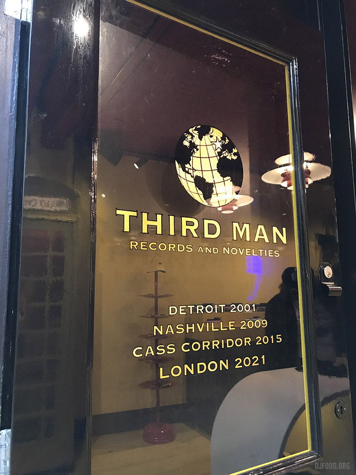
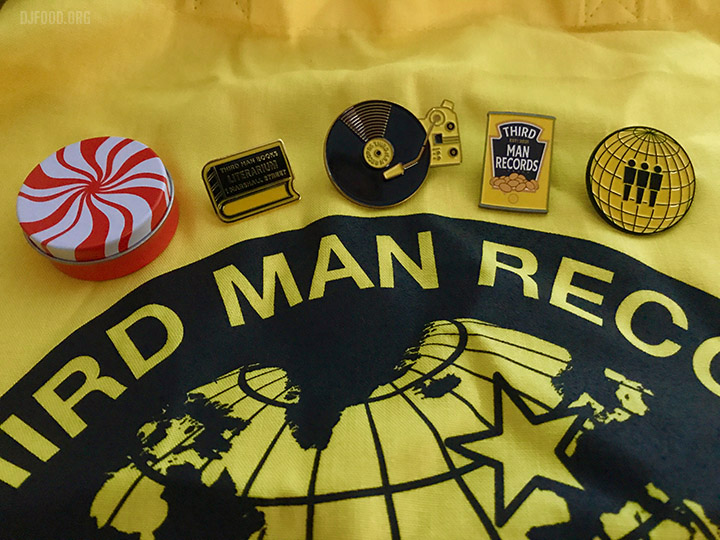
I found the time to visit the Third Man London shop today and was completely taken with the whole concept and design. Not only is it a record shop but also houses a small basement for live gigs, a book dispenser, a Record-o-gram booth for recording records and masses of merchandise from clothes, badges, turntables, audio gear and anything you can slap a Third Man logo on. I’d recommend a visit just to see what a lovely piece of interior design it is, part shop, part venue, part curio store and museum of Third Man artefacts. Just a very bold statement of intent.
It’s on Marshall St near Carnaby St in Soho, you can’t miss it.
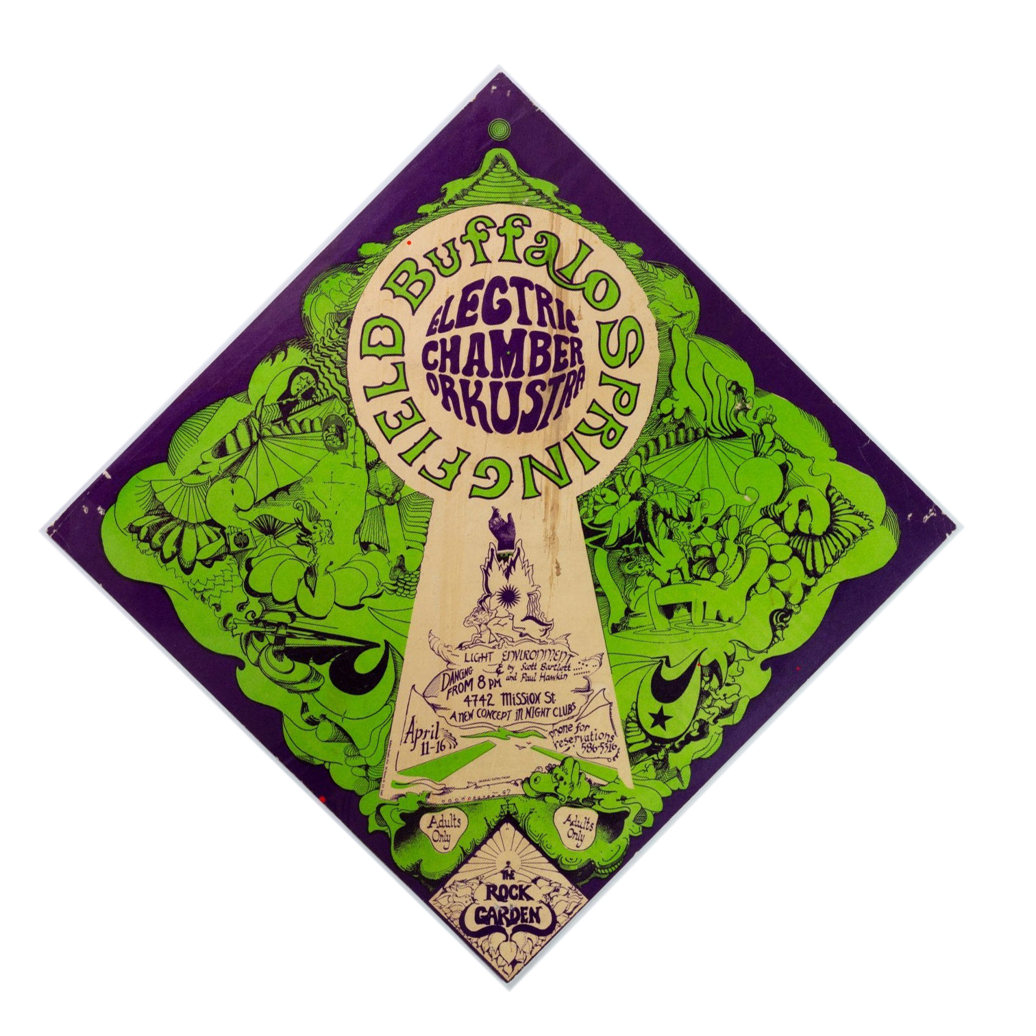
Apparently these flyer don’t come up for sale very often and I’ve certainly never seen one. There are only three in this diamond style and they are extremely rare. Hard to tell who the artist is although it looks like there may be a signature near the bottom of the keyhole shape. Anyway, saw this and thought I’d share.
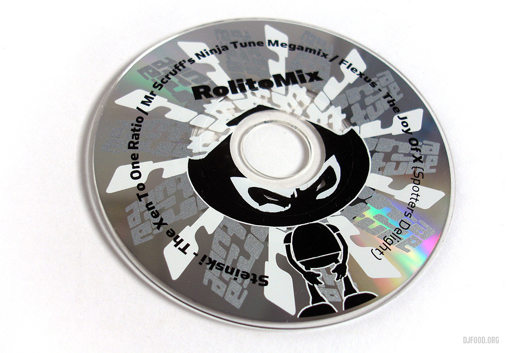
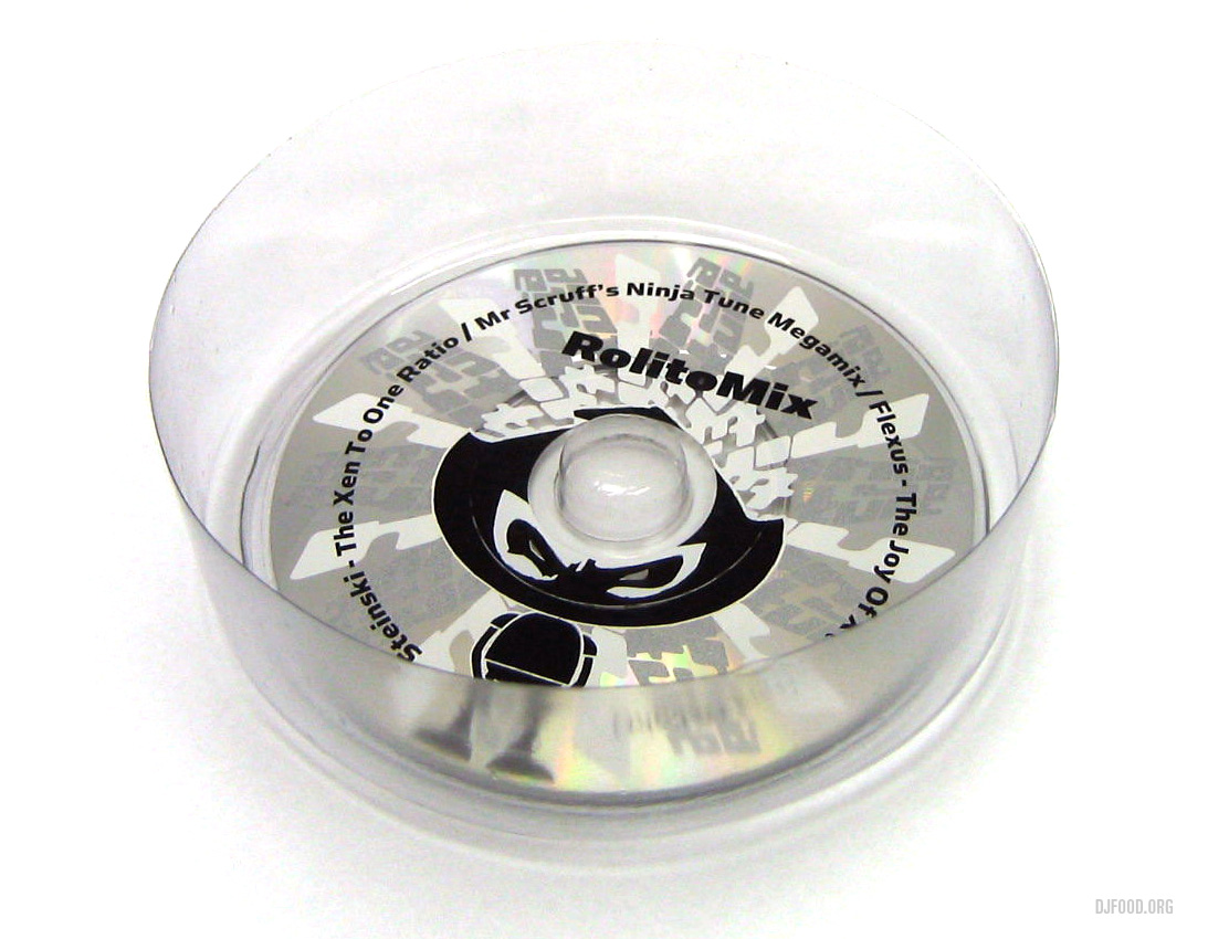
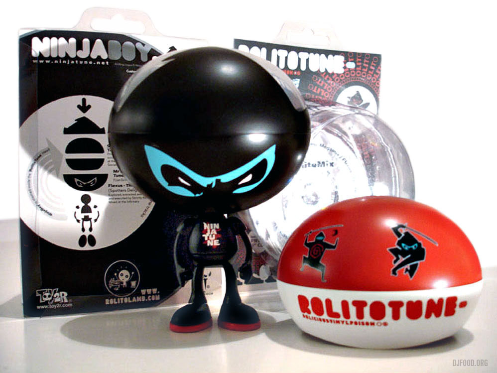
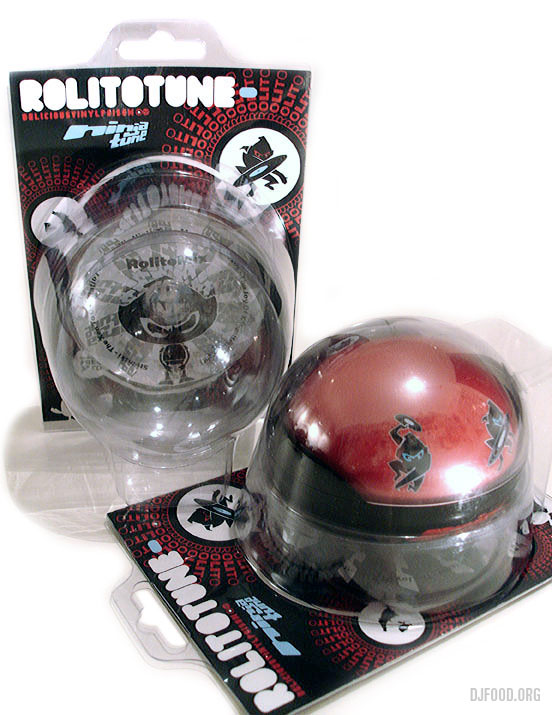
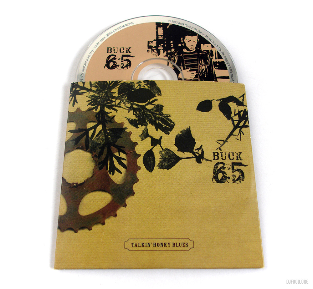
An email from the mysterious ‘Rolito’ arrived one day in 2003 with an offer of being one of 6 designers to customise a new line of toys he was making. Each toy had a tiny body and a large, dome-shaped head inside of which was another, smaller, stash box. I was intrigued as I’ve been a fan of the vinyl toy ‘thing’ since Michael Lau came out with his Crazy Children around 2000 and the thought of having my own one was something that appealed greatly. The other thing that appealed was that Rolito had a crazy website based around a load of characters he had created that inhabited Rolitoland. There was little or no explanation about these creatures but the attention to detail and graphic ideas were more than enough to hook me in.
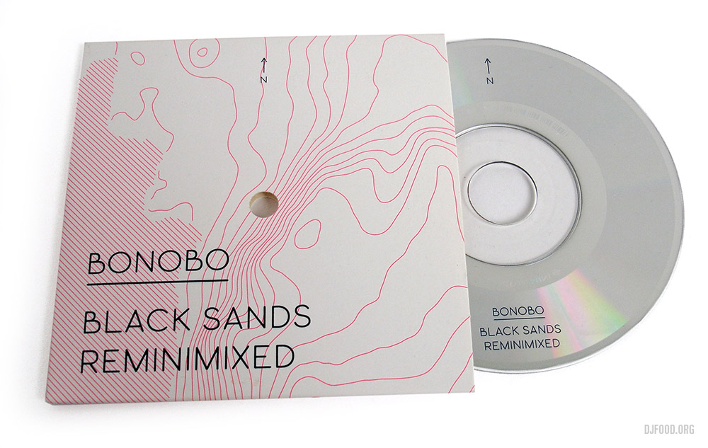
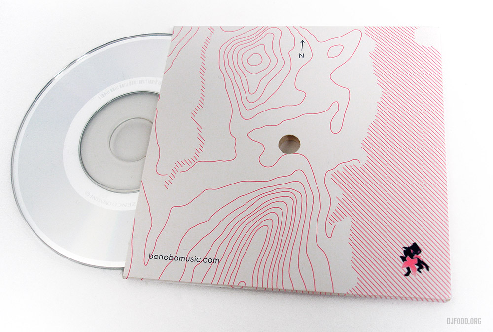
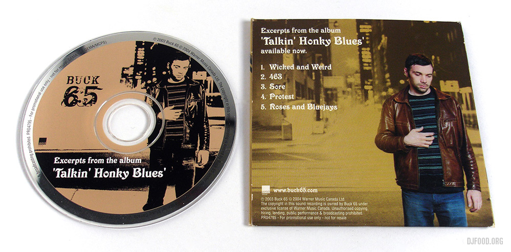
The brief was open and I decided to adapt my Ninja logo around the toy using various different existing graphics and logos to make a ‘RolitoTune Ninjaboy’. The process for getting the graphics onto the toy were slightly limited so I wasn’t able to do some of the things I wanted to. I suggested we include a 3″ CD in the package with a selection of Ninja music to add to the promotional aspect of the toy so that people who didn’t know where it came from would be introduced to the label via the disc. One of the beauties of the Rolito packaging is that it dismantles without having to tear, cut or unstick anything, this meant that the empty vacuum packing would ultimately become the ‘sleeve’ that would house the CD.
There were only 450 made, Ninja got around 150 I think and sold the lot within a weekend over the net, some of which have since appeared on eBay for up to £99. I also contributed a short soundtrack to an animation on his website that showed the shipment getting stuck at the French customs – a scenario that actually happened.
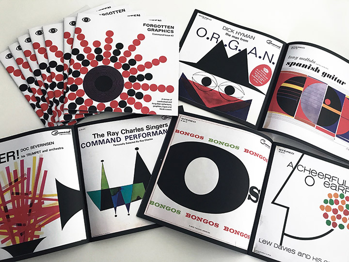 I’ve compiled some of my favourite Command sleeves for a 4th volume of Forgotten Graphics – 24 pgs, buy here
Or I will have copies with me at Jonny Trunk‘s Groovy Record Fair this Saturday
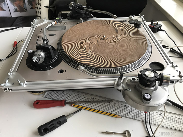
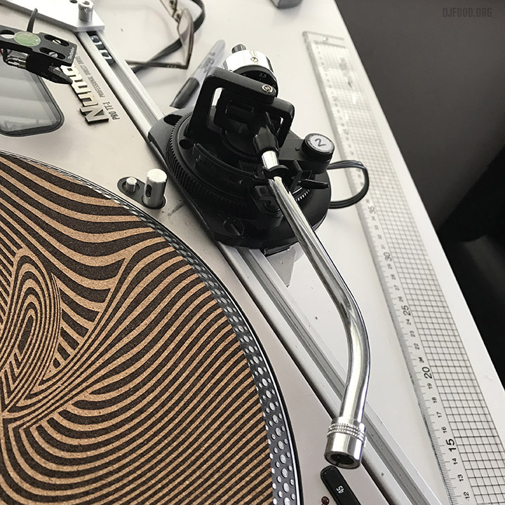
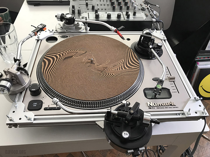 The Quadraphon Mk II – a lot of last week was spent working on this, making container pods that hold three extra tone arms, attached to a modular sliding rail that can be fitted over any DJ turntable.
Each tone arm can be moved and locked into position to recalibrate where the arm sits in the groove and the whole thing comes apart for portability.
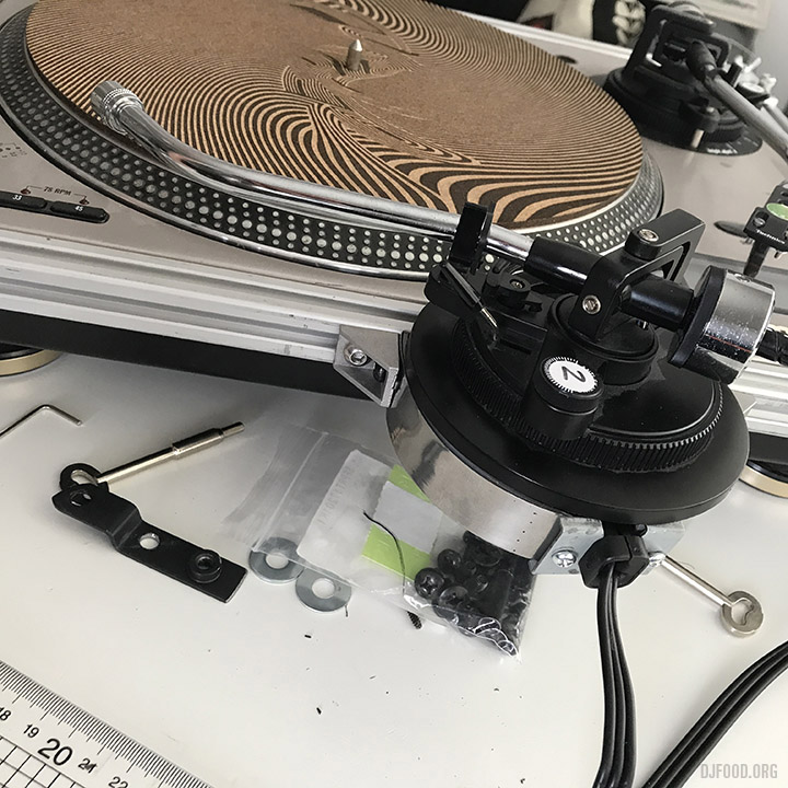
It’s not perfect but better than the Mark I which had free-standing tone arms. Still got to perfect the sliding action to make it smoother and retool one of the pods but it all works. If you want to hear what comes out of such a contraption then check out the releases on my Infinite Illectrik label on Bandcamp.
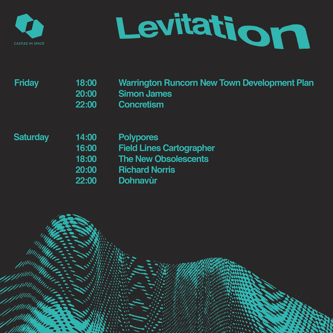
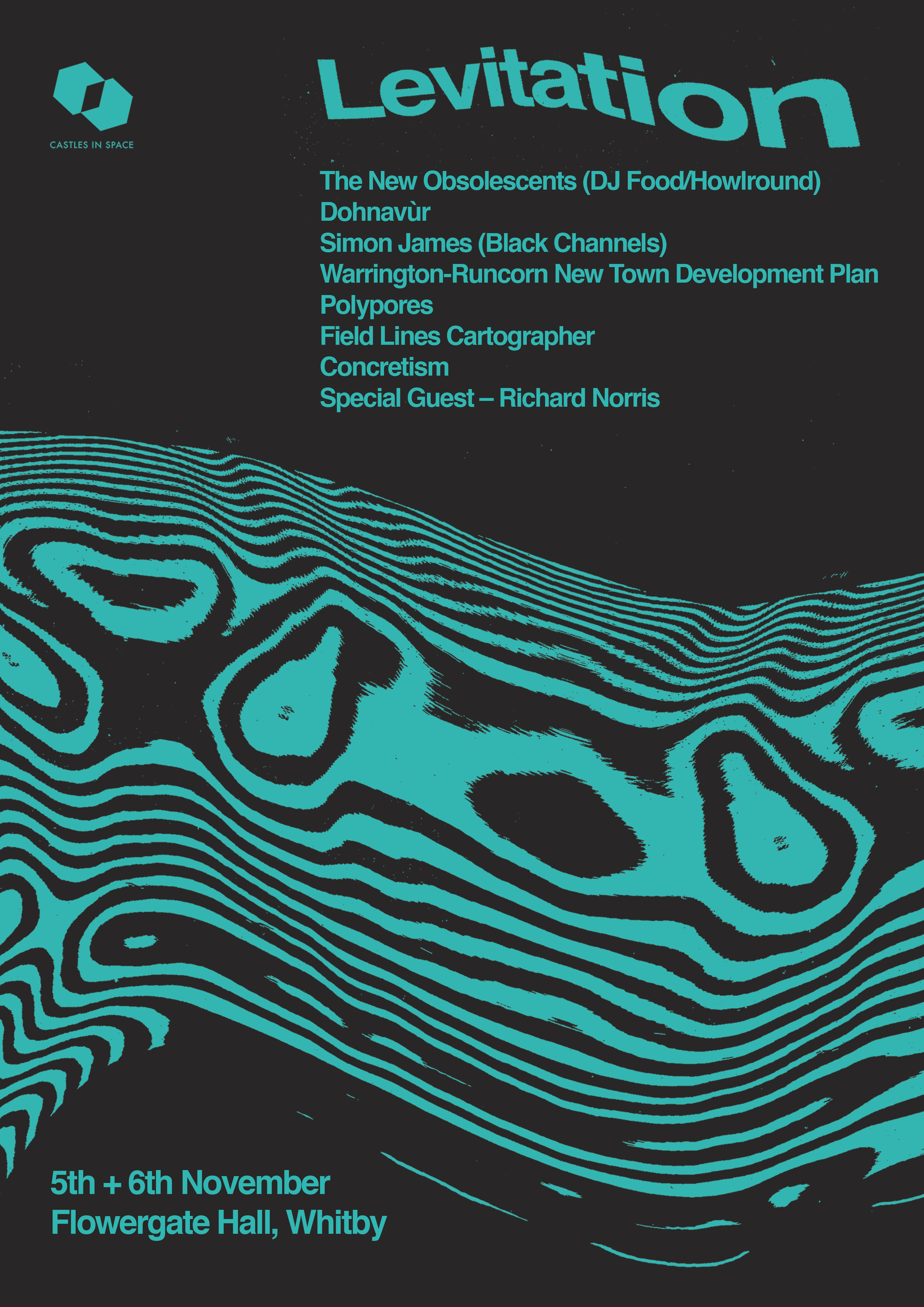
Its debut should be at the Castles In Space Levitation show in Whitby, Nov 6th as part of The New Obsolescents’ first proper live show, the time and details of which are below. There are two nights and tickets can be bought here
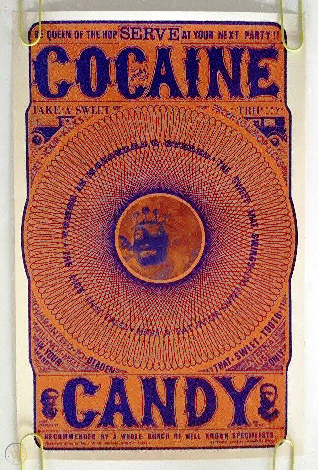
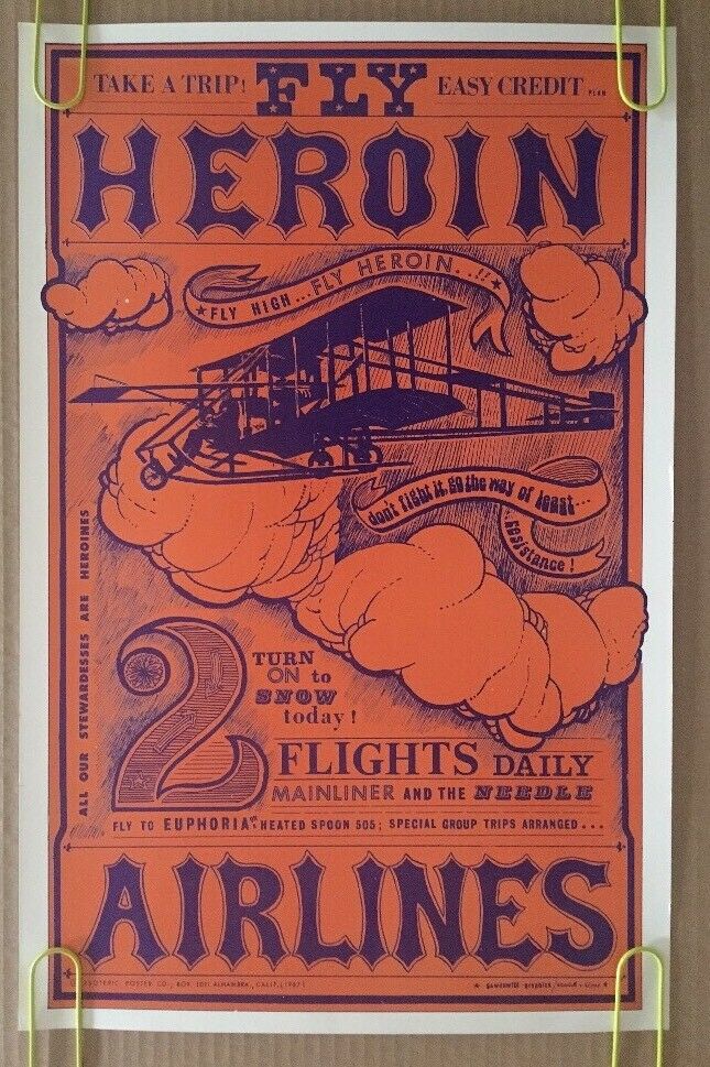
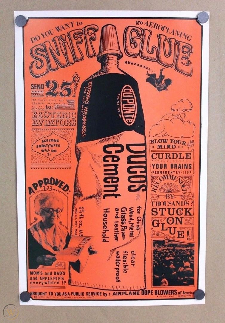
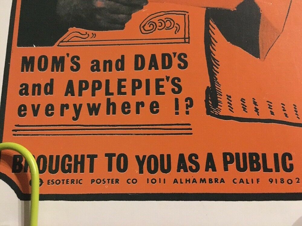
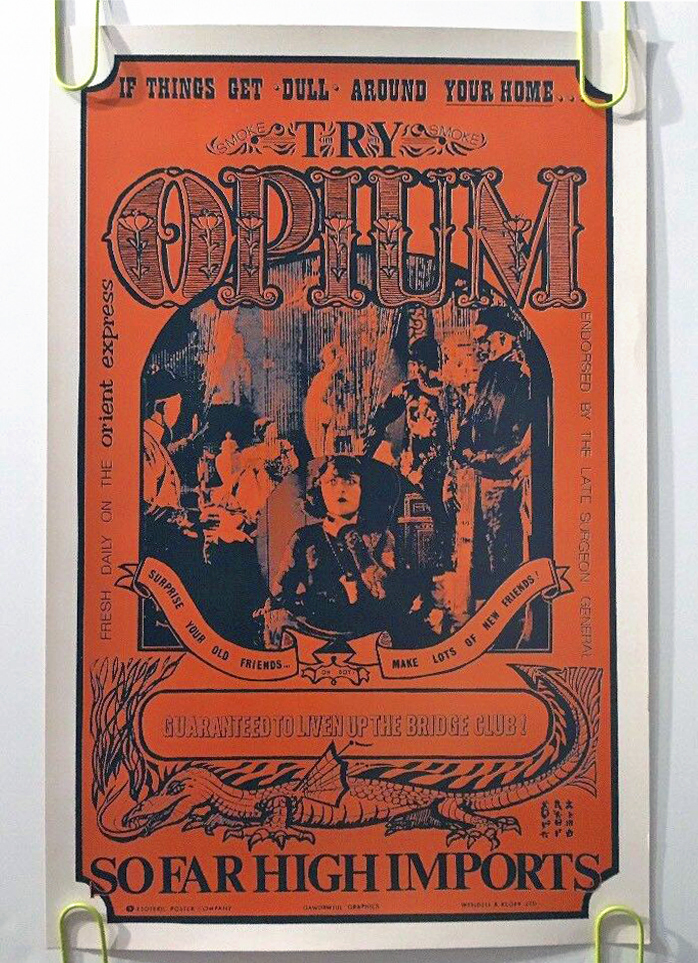
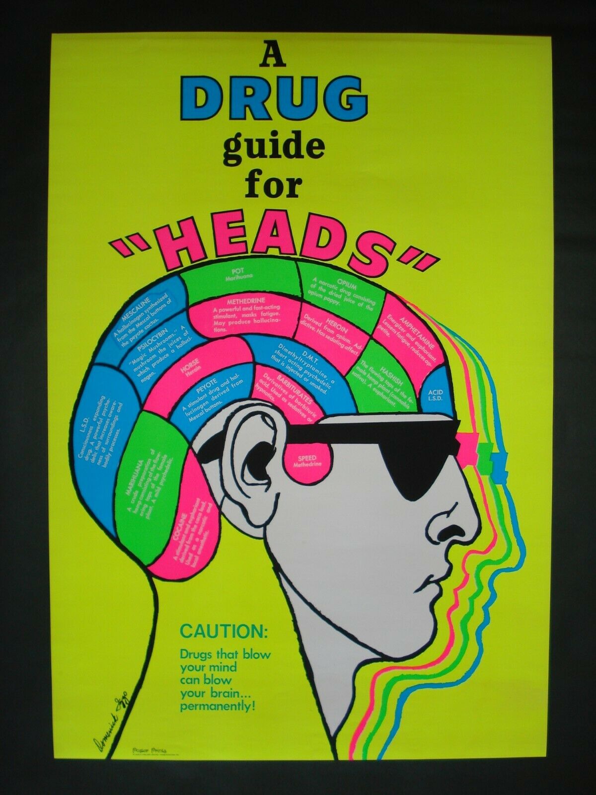
On my travels round the web I ran across these late 60s parody drug posters – the following info was cribbed from the Worthpoint website:
Vintage Psychedelic Poster ‘Cocaine Candy’ Limited Print
Published by The Esoteric Poster Company in 1967
Hand-Pulled Serigraph on Thick Stock Paper, Semi-Gloss Finish
Original Art by Robert Wendell, after Roland Crump
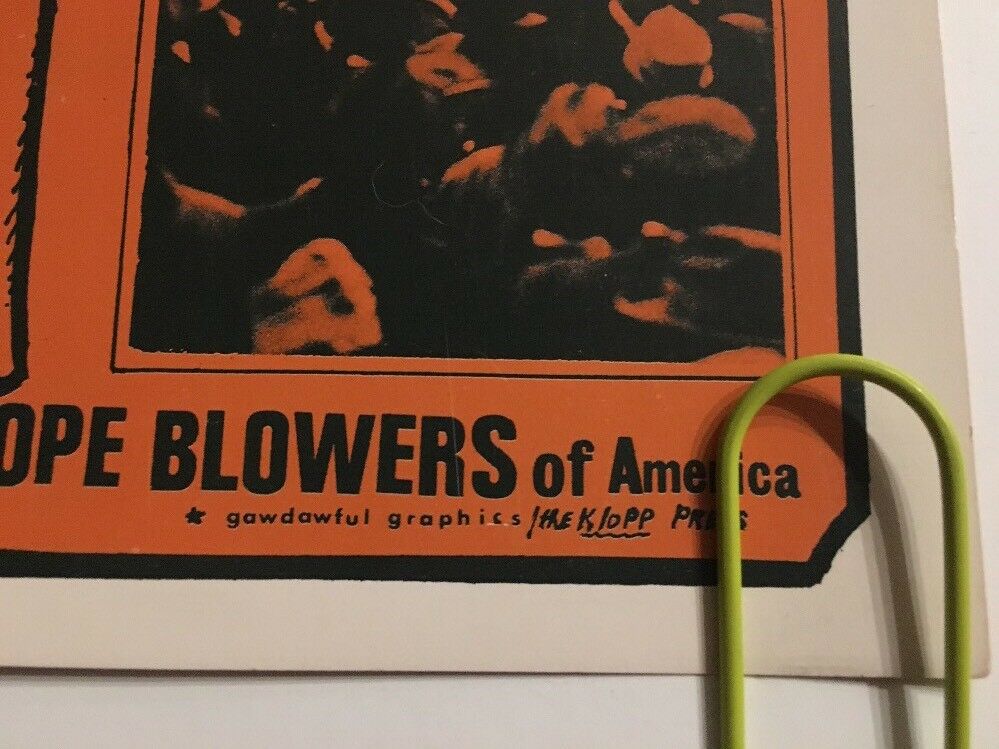
Printing by Gawdawful Graphics / Wendell & Klopp
20″ x 13″ Black Light Sensitive
The Esoteric Poster Company, founded by Howard Morseburg in California during the early 1960’s, had a brief run before folding for good in 1968. The beatnik satirical ‘drug’ parody posters achieved popularity from the community they sought to mock. Owner and founder Howard Morseburg hired artists Roland Crump (acclaimed Disney animator) and Robert Wendell to produce the designs. Very limited printing, less than 300 (as low as 100) printed.. among the most collectible and prized of all 1960’s psychedelic era posters.
Guaranteed original from very limited back stock, from Howard Morseburg’s gallery in Alhambra, California.
A bit more history:
Howard Morseburg (1924-2012) began his career in the art business in the 1950s. He was a World War II veteran who had served in the Merchant Marine and later worked in the book and magazine business. As a young officer during the war, Morseburg was on the “Murmansk Run” to the Soviet Union and other perilous wartime voyages through the submarine-infested North Atlantic. It was one of Morseburg’s friends from this time, a young skipper named Jim Greenberg, who was to introduce him to the art business.
After the war, this friend became a ship’s captain on the Atlantic route, and began importing paintings by European artists to the United States. In Europe, which was still suffering from the economic after effects of the war, there was no appreciable market for these artists’ work. During the 1950s Greenberg began selling the paintings he imported to galleries, furniture stores and interior designers who were then developing a wider consumer market for art than had existed before the war. From his base in Seattle, where he and his young family were then living, Howard Morseburg followed suit, and he began selling paintings imported from Europe throughout the western United States.
In addition to the European paintings he received, Morseburg began representing young American artists. He also became involved in the West Coast printmaking movement. In the late 1950s and early 1960s he started to represent young artists like Wayne Thiebaud, Elton Bennett and Mel Ramos, who created their own hand-pulled prints. It was this interest in printmaking that helped lead to his next venture.
The Beatnik Posters: About 1960, Morseburg became interested in creating humorous and satirical posters. At this time, the “beatnik” movement was in full swing and coffee houses and jazz clubs were full of beatniks spouting free-form poetry to the beat of bongo drums. To Morseburg, the beatnik movement found in Greenwich Village, Seattle, San Francisco and the East Bay was ripe for satire. He met a talented young Disney artist and Imagineer named Roland Crump at a gift shop in the San Fernando Valley, just north of Los Angeles. Crump was a brilliant and eccentric young artist and designer who became one of the most important Disney “Imagineers.” Crump was already producing some hand-pulled beatnik posters before he met Morseburg, but once the association began, Morseburg had larger quantities of some of the posters published using the photo-offset process.
Crump designed a series of images that satirized the drug culture that was developing among the Beats, which Morseburg took on the road, travelling down the coast from Seattle to San Diego. In that era, drug use was not widespread and they were chiefly popular with musicians and beatnik hipsters. So, Esoteric Poster’s first releases were “Smoke Marijuana,” “Fly High, Fly Heroin Airlines” “Cocaine” and “Opium.”The next posters were which poked fun at a Beatnik club, and “Big Liz,” which was a colorful poster of a Beatnik princess. Those 30″ x 24″ posters were silk screened in three colours and for posterity’s sake they cost $0.50 to produce, were sold to book stores for only $1.00 and retailed for $1.95.
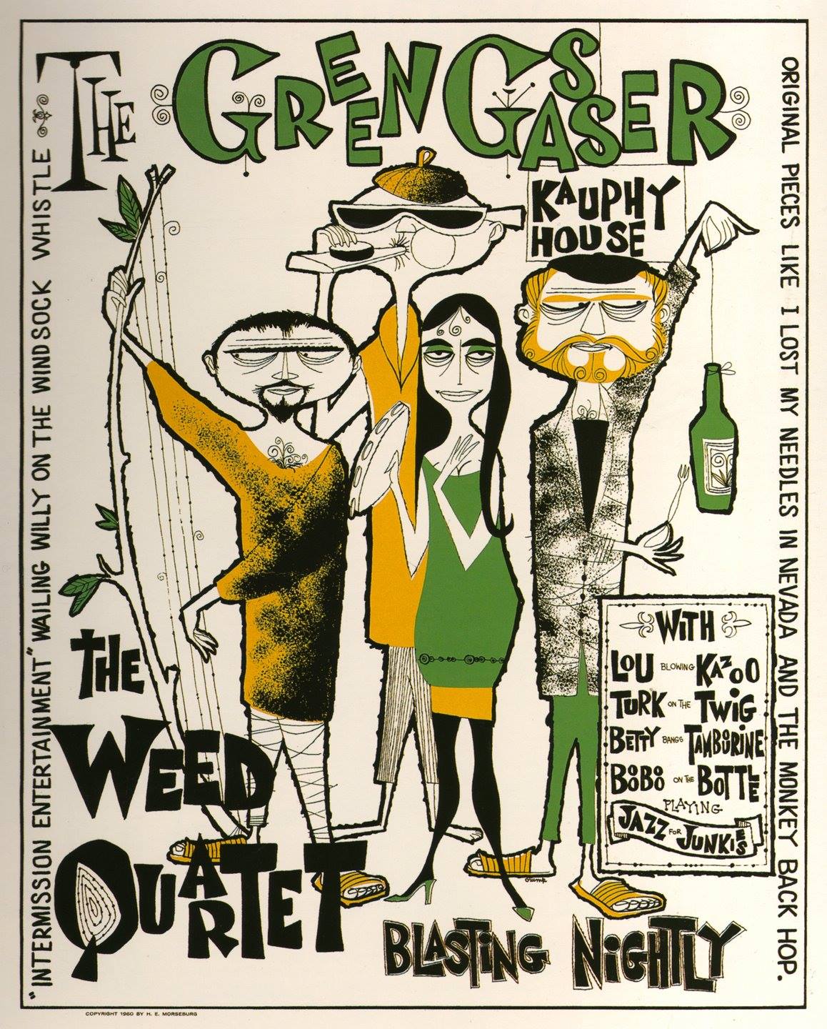 In the course of his frequent sales trips to visit art galleries, Morseburg personally distributed Esoteric’s posters. His primary outlets for the posters were the book stores along the west coast that catered to college students in Berkeley, Stanford, Portland, Seattle, San Francisco and San Diego. These posters were produced as very early critical parody of the drug culture by the Esoteric Poster Company, but the message was so subtle that they were popular among the very community they sought to mock.
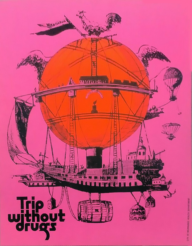
Below are a few more I’ve run across although details about dates and print houses are scarce but I’m reasonably sure they’re from the same era.
Original vintage black light ultra violet poster designed by Dominick Jago, 1969.
Depiction of the pharmacopeia of the era.
Publisher: Poster Prints, Plymouth Square Center-Conshohocken, PA.
Dimensions: full sheet: 21″ x 31.5″
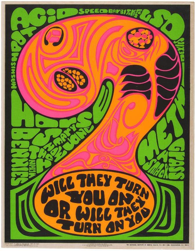
Printed by The US Department of Health, Education and Welfare; Public Health Services and Mental Health Administration, possibly 1969 although other sources say 70’s.
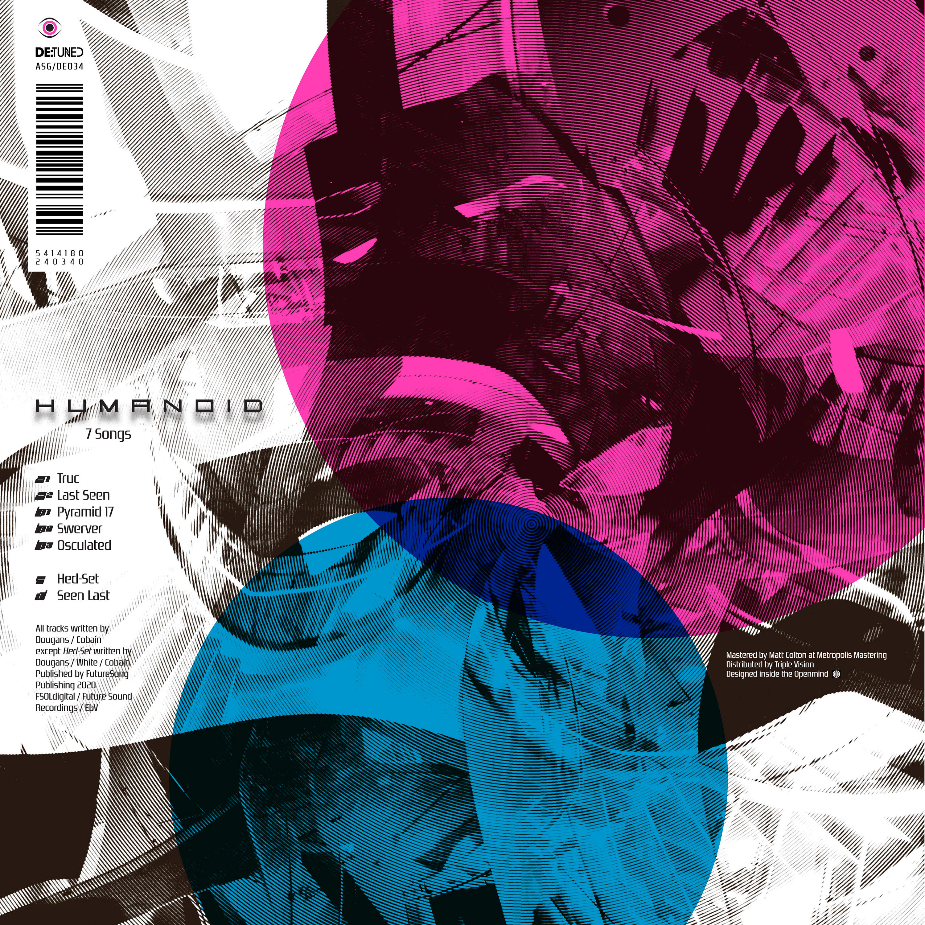
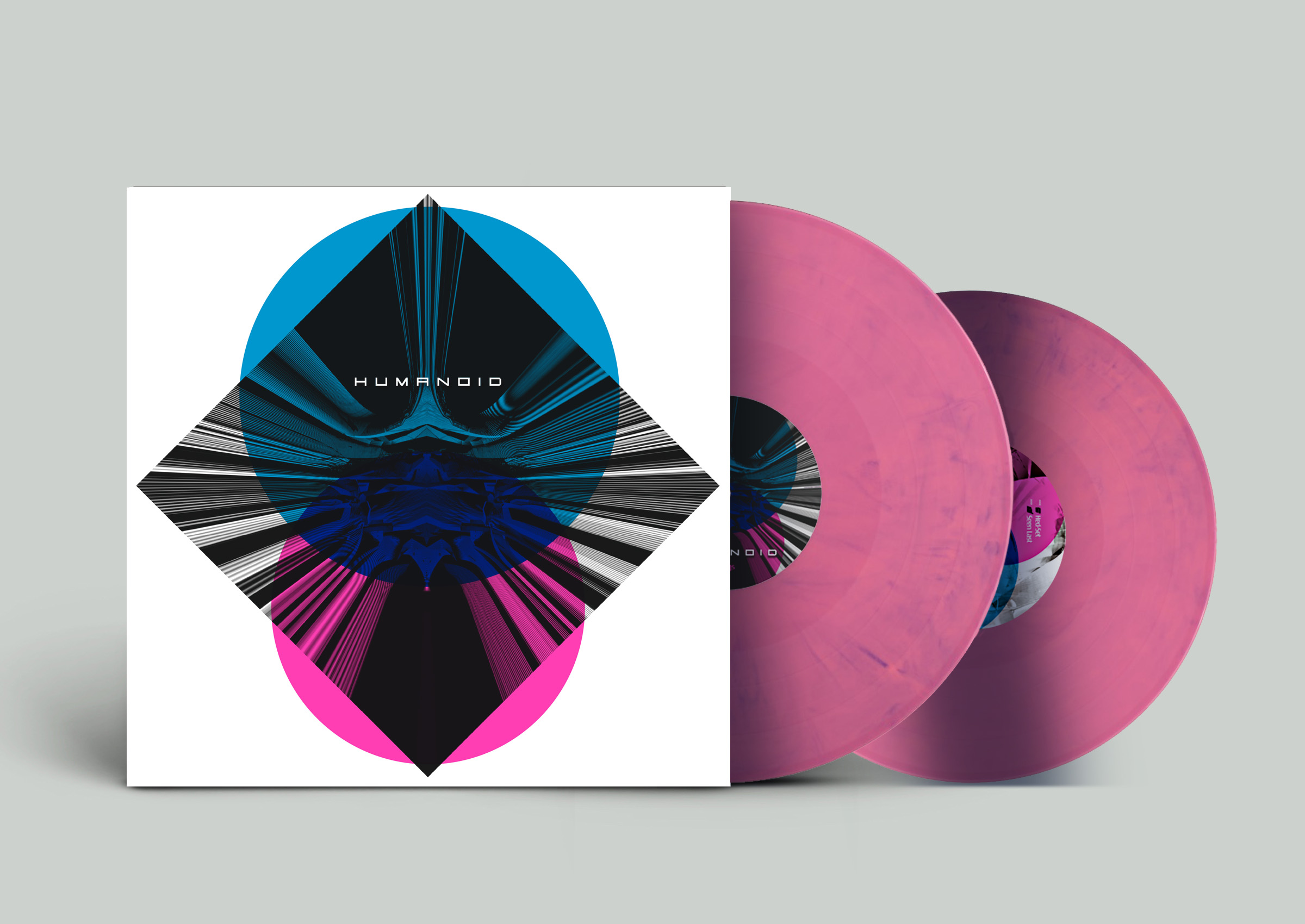
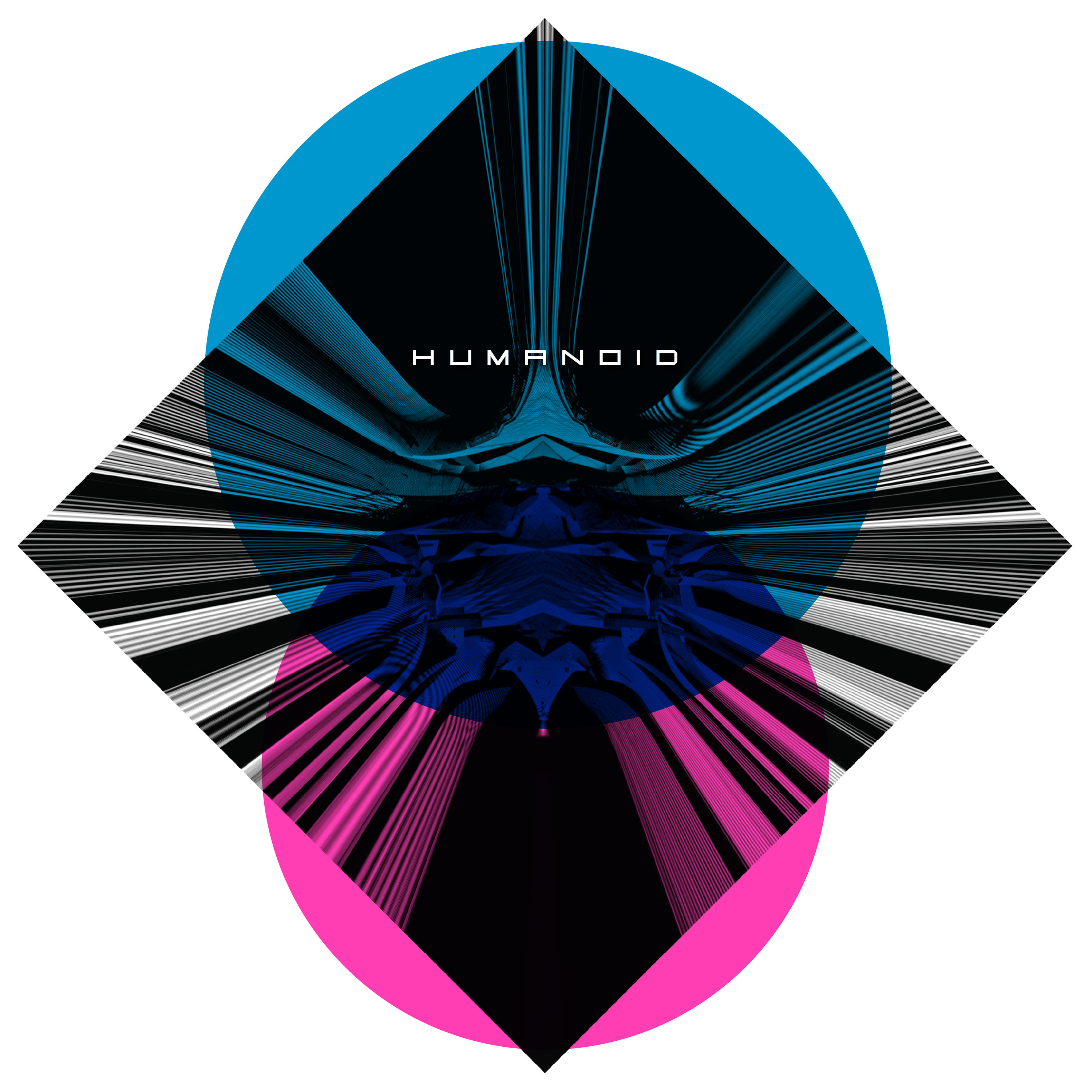 Humanoid – ‘7 Songs’ on De:tuned (black and coloured vinyl editions) is out today!
Artwork by yours truly, cover includes a spot varnish finish on the circles too.
Listen on SoundCloud:
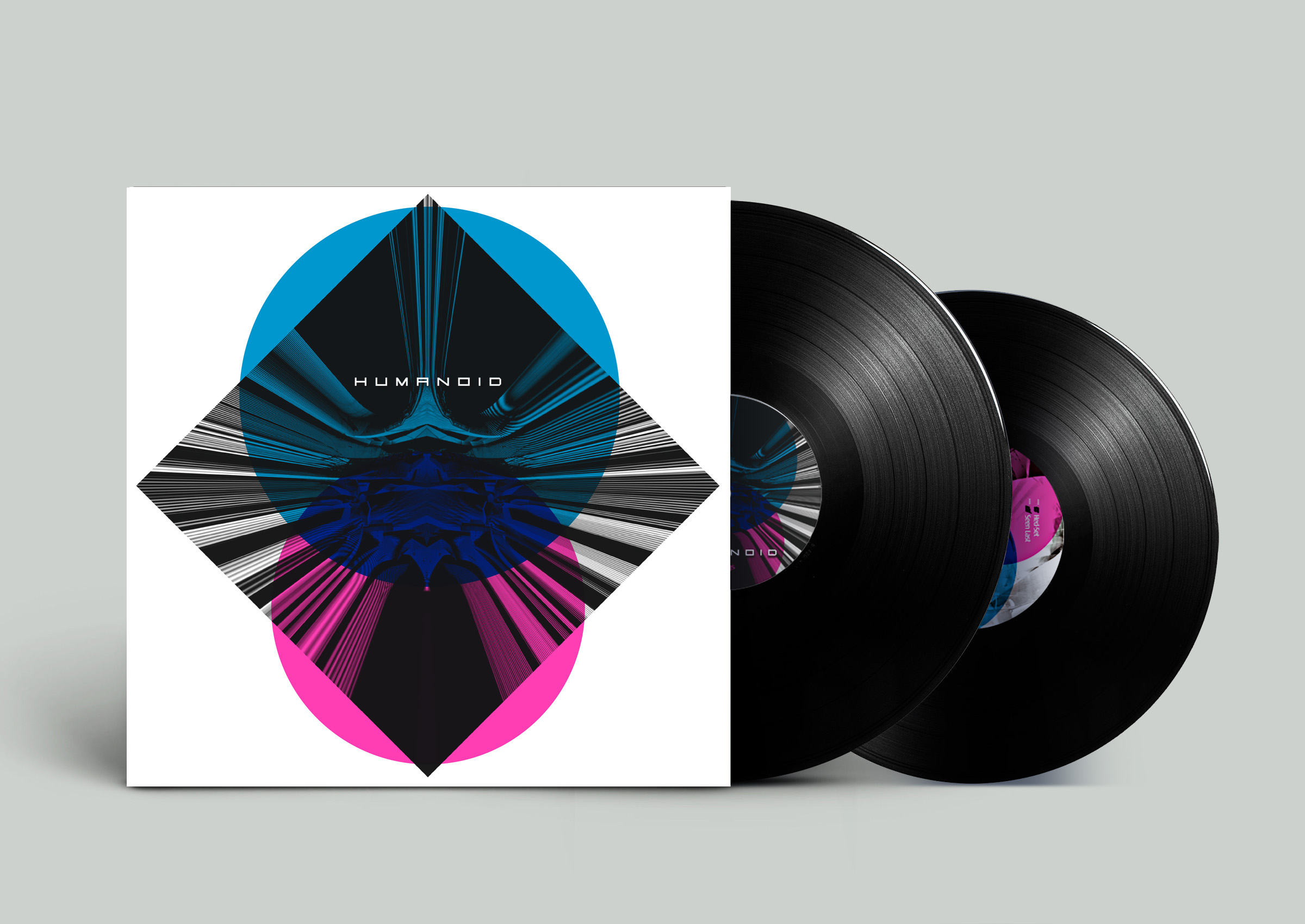 Order now: Black vinyl
Bleep: https://bit.ly/2S0SGsF
Phonica: https://bit.ly/3opugVP
Red Eye: https://bit.ly/3omvp0z
Norman: https://bit.ly/3ydoyej
Juno: https://bit.ly/3hqTdyN
Horizons: https://bit.ly/3by4pWq
Deejay: https://bit.ly/2RZiTIc
Decks: https://bit.ly/3wcqz8S
HHV: https://bit.ly/3hADjSF
Clone: https://bit.ly/3wf67UN
 Colored vinyl (Limited Edition)
Bleep: https://bit.ly/2S0SGsF
Phonica: https://bit.ly/2SY8DQX
Red Eye: https://bit.ly/3ojM6cI
Juno: https://bit.ly/33Oo1kU
Deejay: https://bit.ly/3yhwon2
Decks: https://bit.ly/3uRdvp6
Clone: https://bit.ly/2Ro5B7V
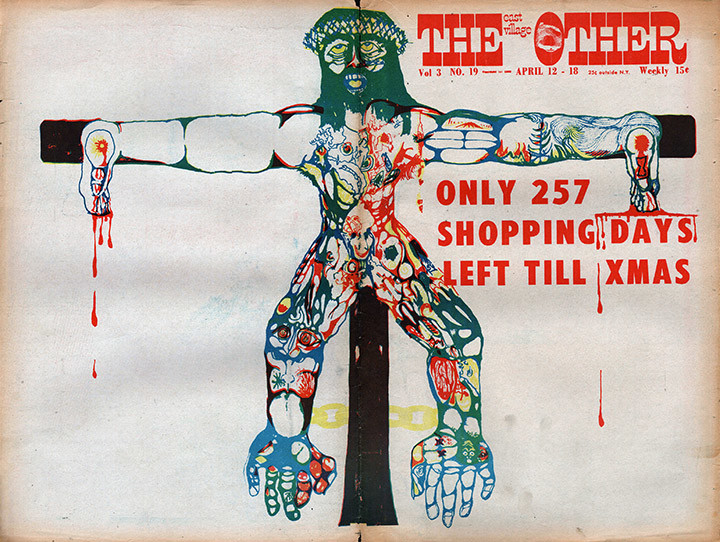
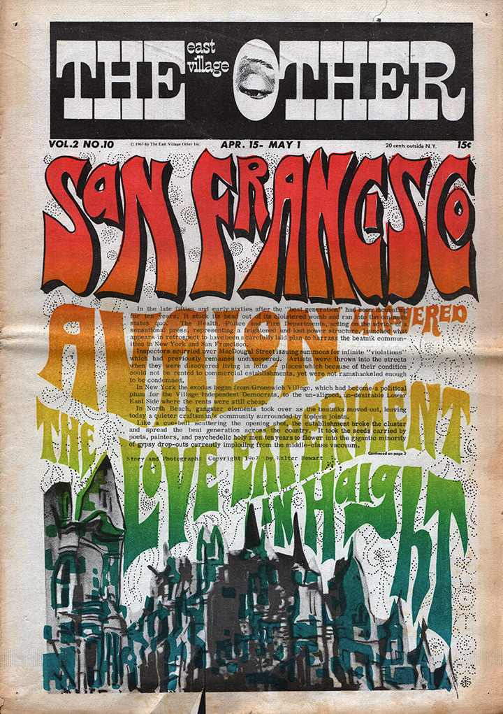
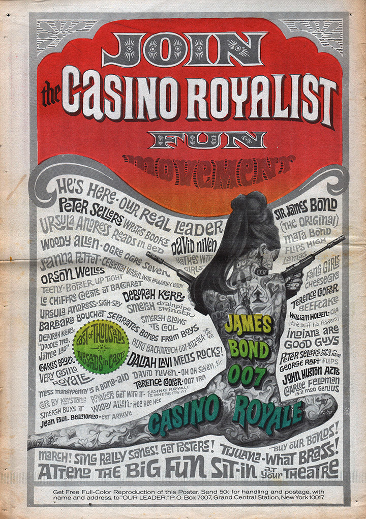
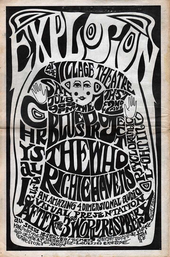
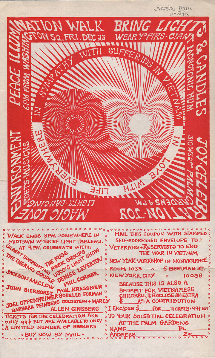
Perusing the Wisconsin Historical Society G.I. Press Collection I came across a stash of East Village Other papers, all scanned in high res, (much higher than here) and started going through them. Here’s a selection of things that caught my eye from the covers and back pages.
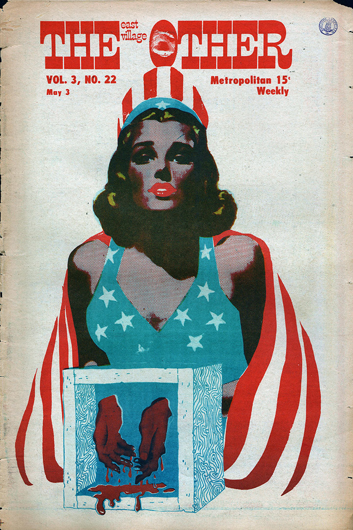
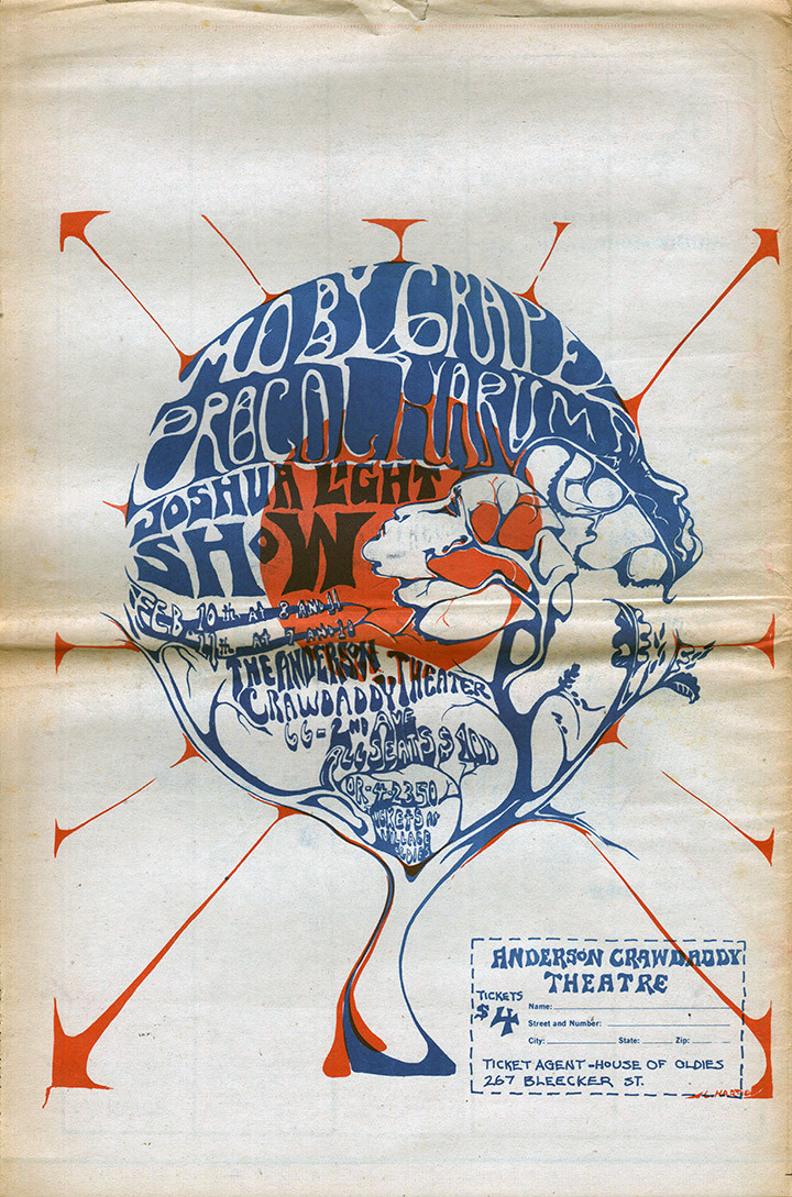
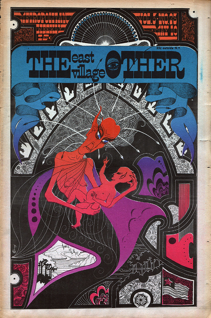
Possibly Susan Morris‘ work above?
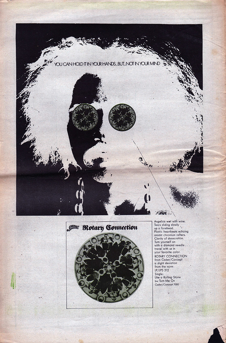
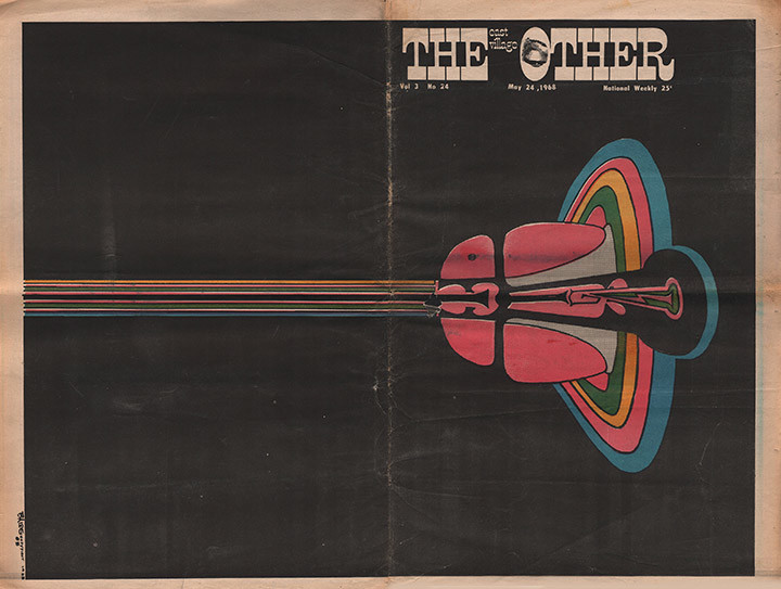
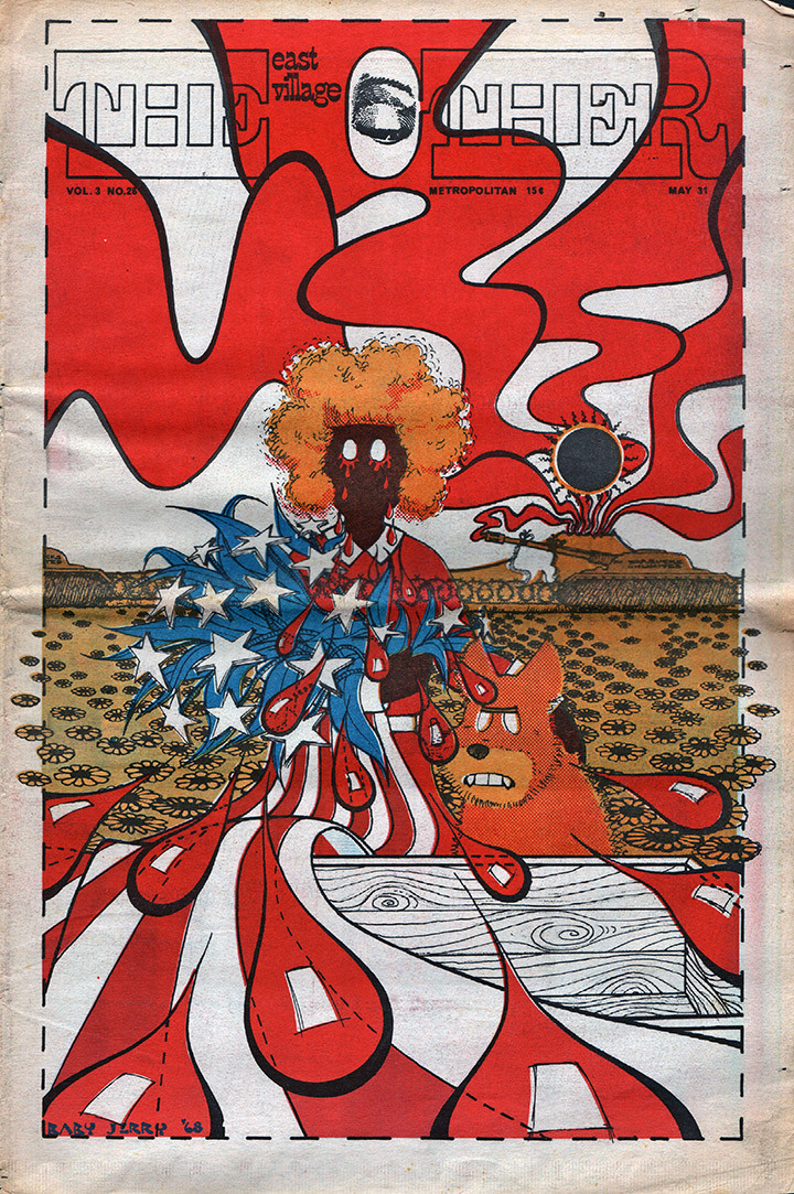
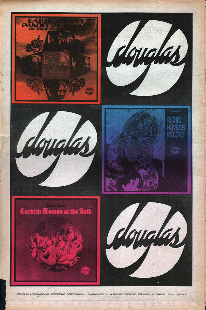
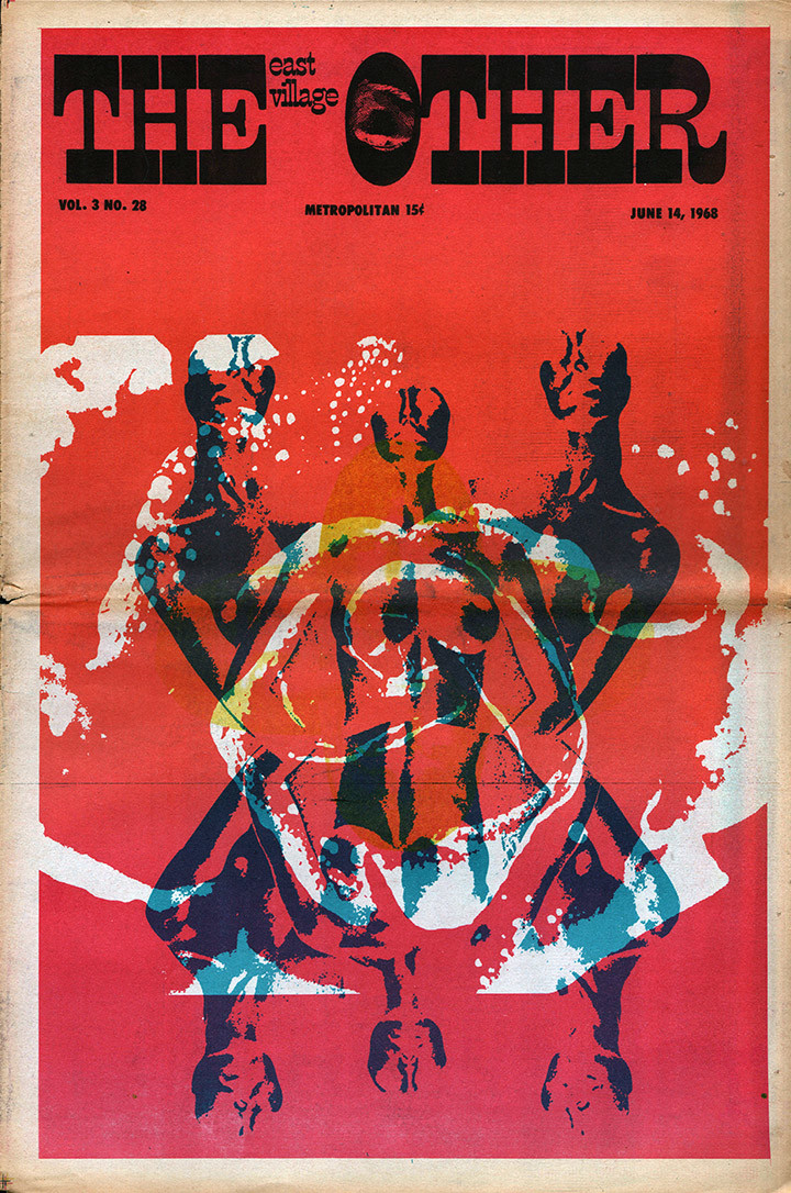
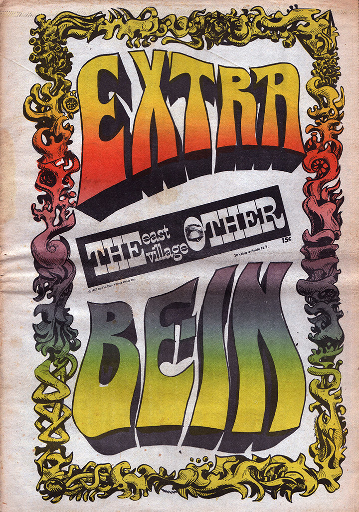
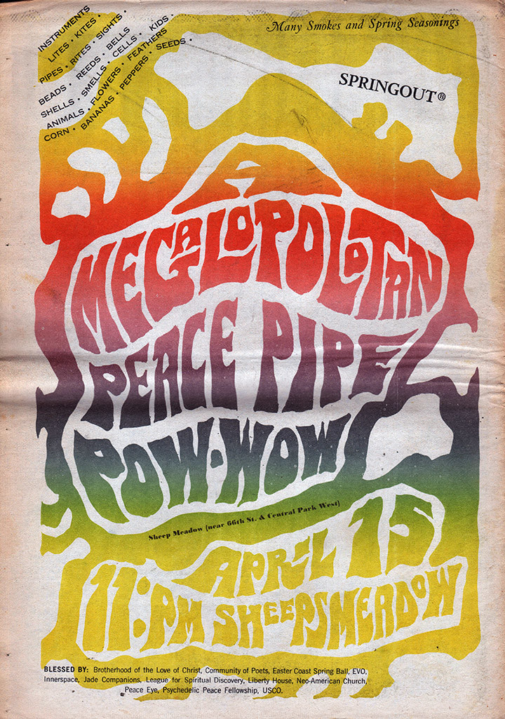
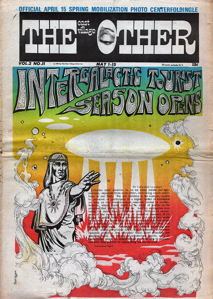
Is that an early Spain Rodriguez inking the figure above? The clouds don’t look like his work but the darker ink work does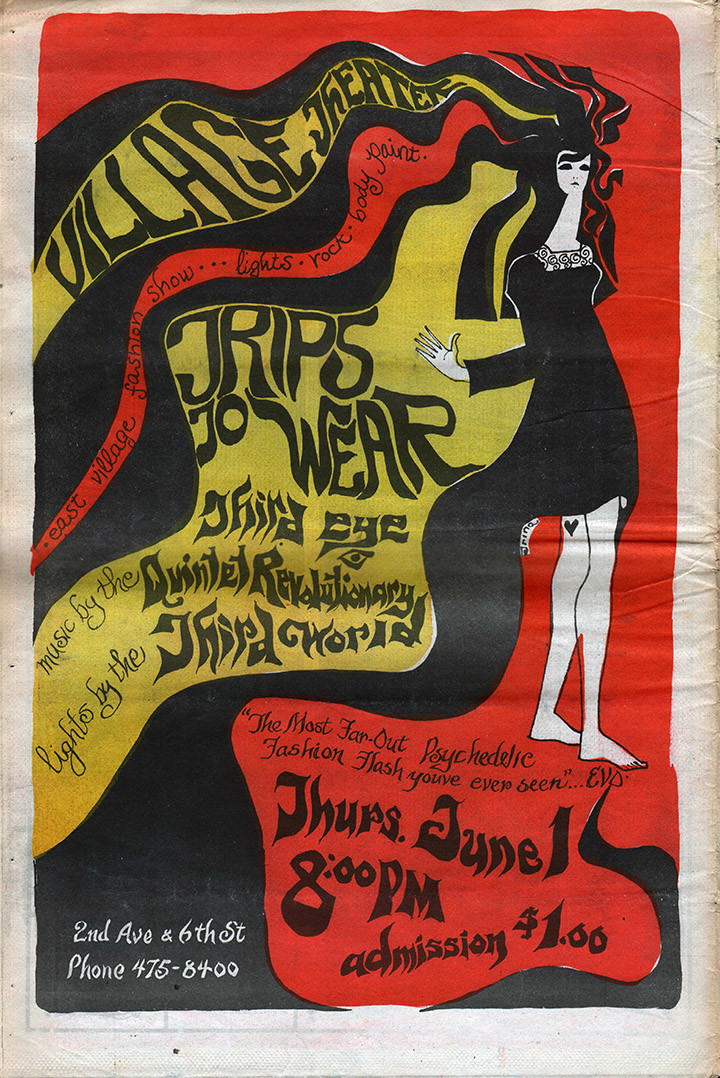
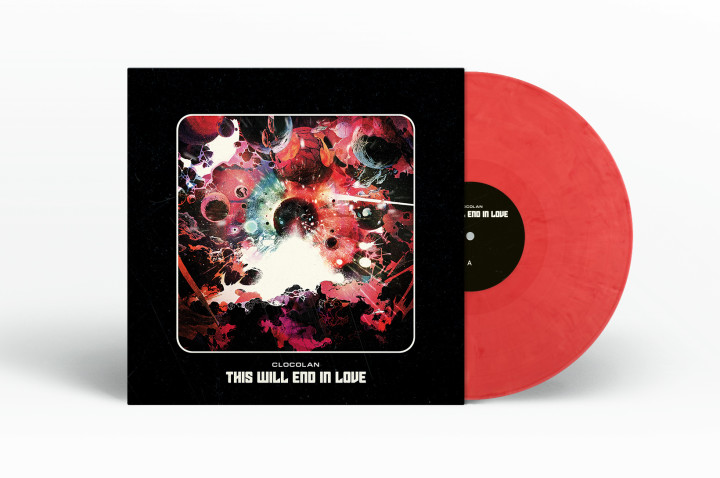
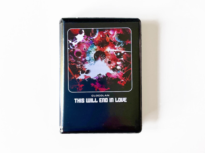
Another bit of sleeve design I did last summer emerges from the vinyl log jam. I was asked by Clocolan to illustrate the cover of his 3rd album (second for Castles in Space), ‘This Will End In Love’. Out Aug 6th in pink Nebula vinyl and red or blackberry purple cassette housed in a rave tape case.
No pre order on this but the label has them in hand I’m told so look out for it in a month’s time, I’ll be posting a process video of the cover then too. In the mean time you can get his previous album and single here.

