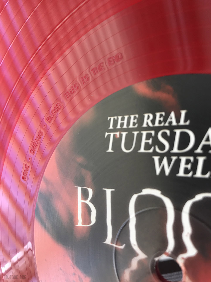
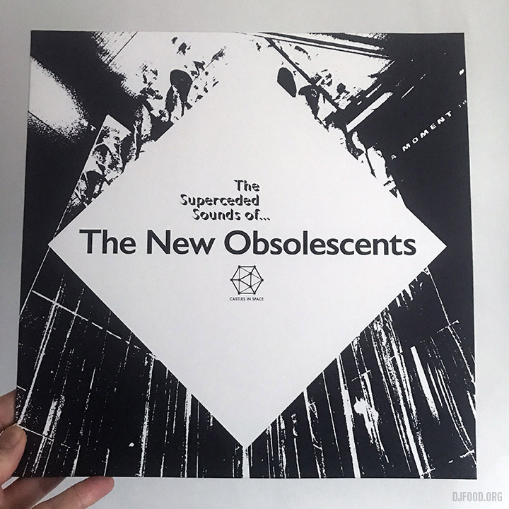
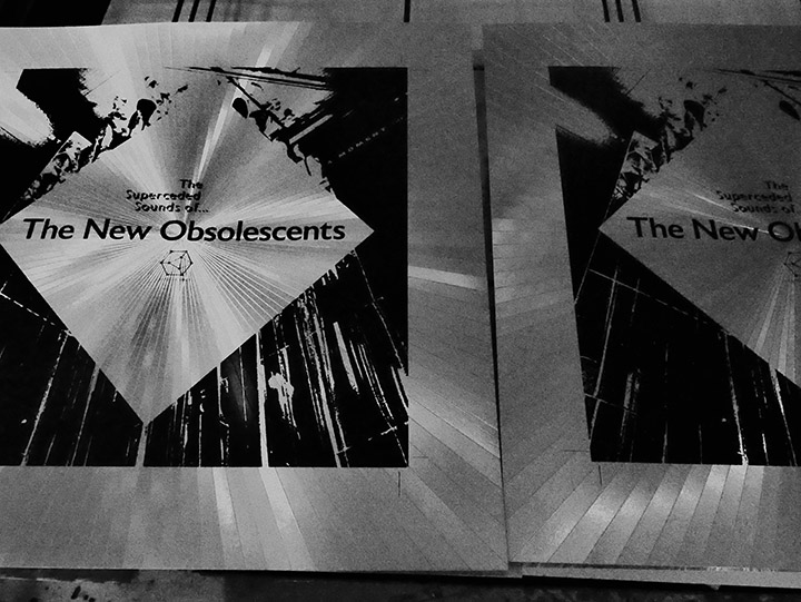
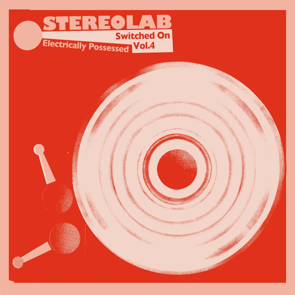
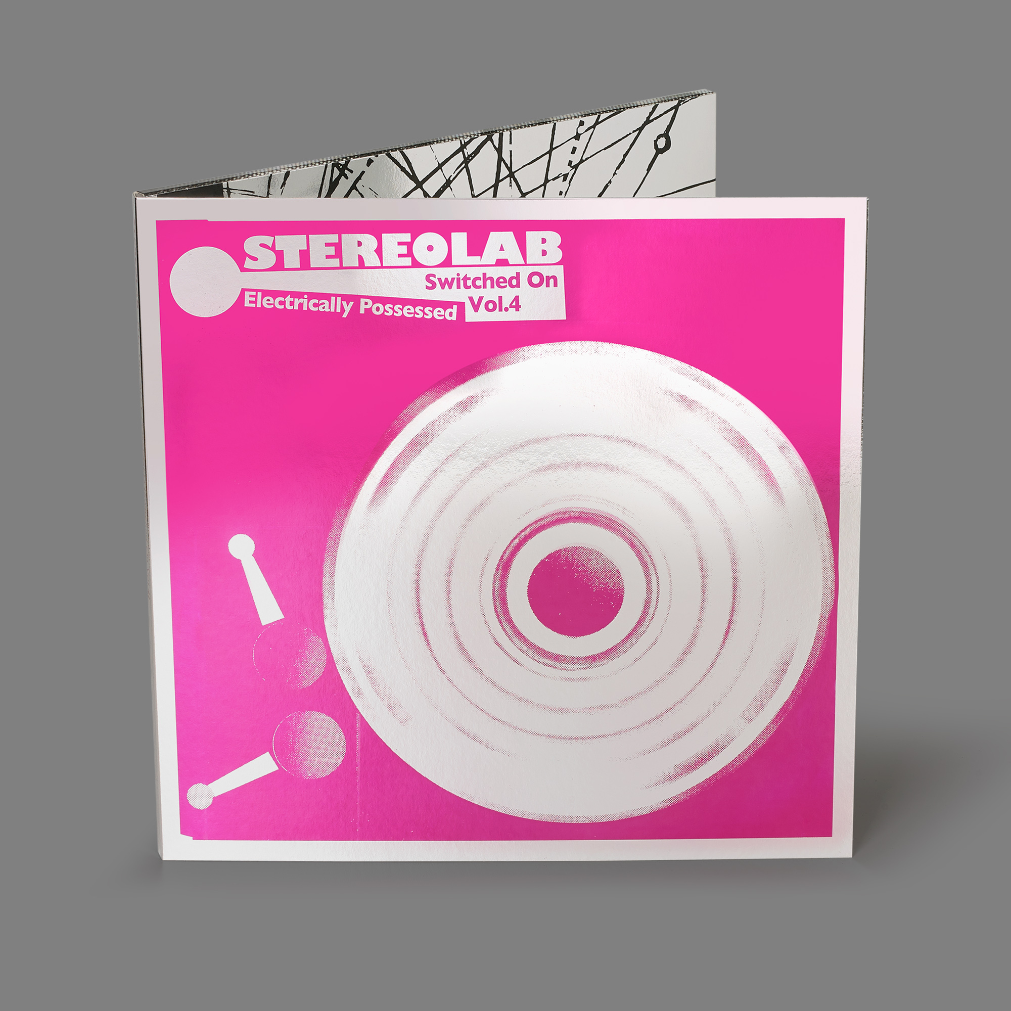
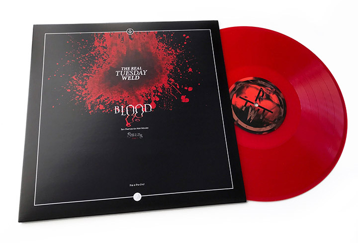
 This has been a long time coming but… ‘There will be Blood!’. More specifically The Real Tuesday Weld‘s ‘Blood’, the first in a trilogy of albums under the umbrella of ‘Swan Songs’, the final bow of Stephen Coates‘ 20 year+ recording career under this name. ‘Blood’ is the first, to be followed by ‘Dreams’ and ‘Bone’ over the next 18 months and each will be supplemented by cassette versions with completely different tracks in sympathetic packaging to each main title.
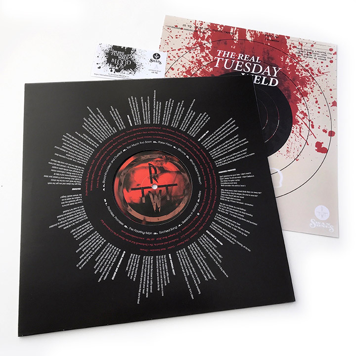
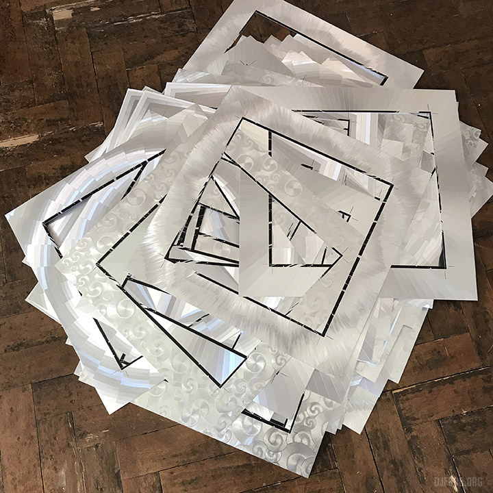
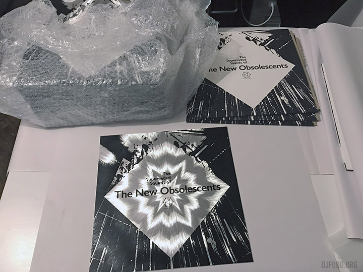
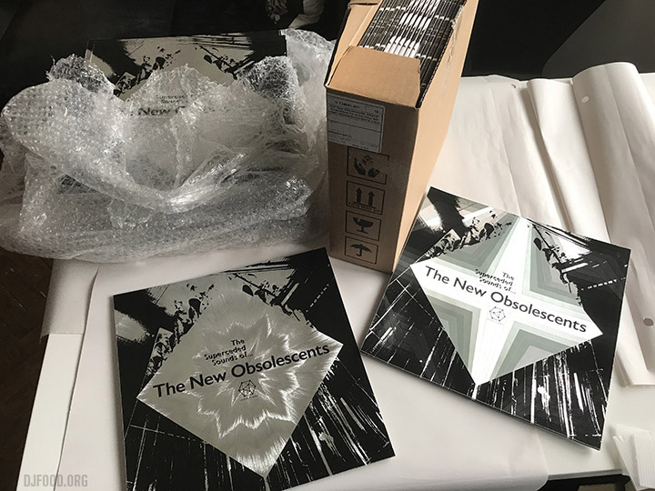
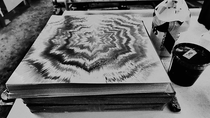
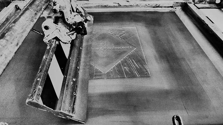
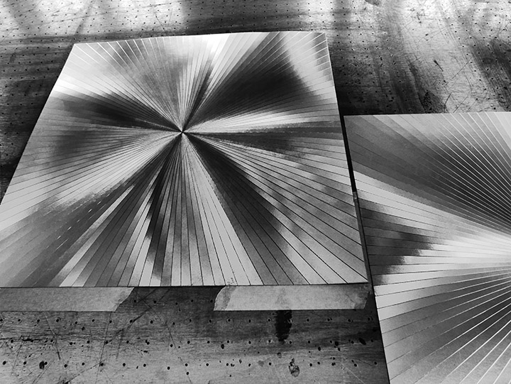
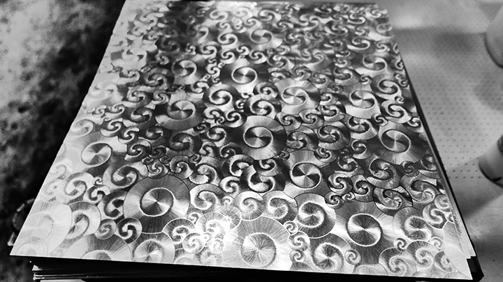
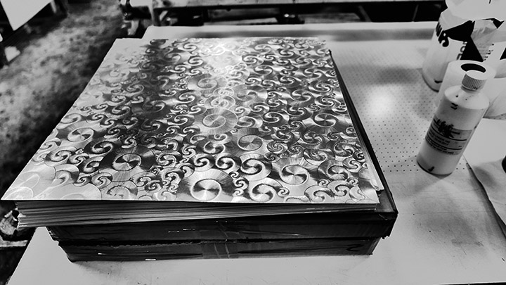
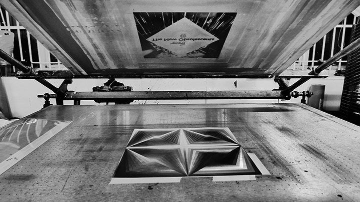
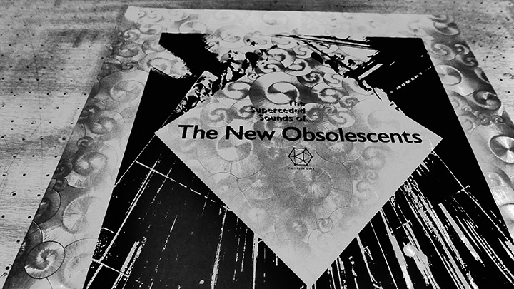
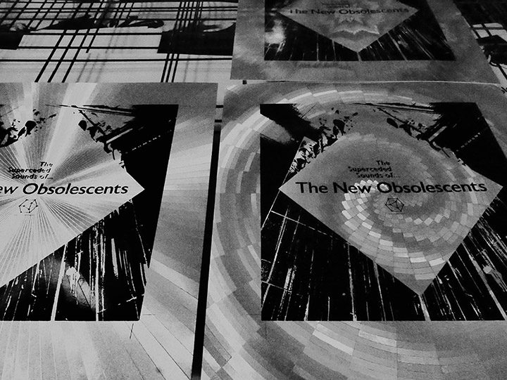
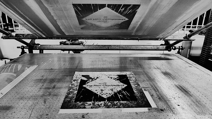
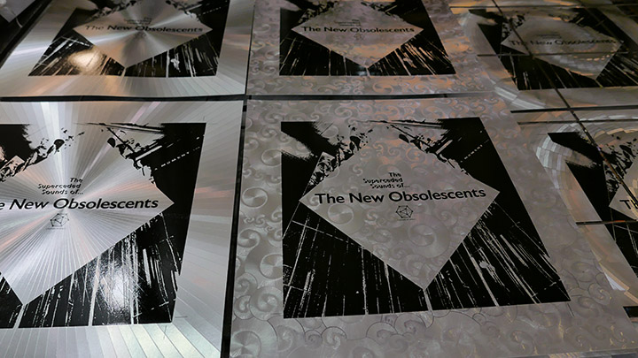
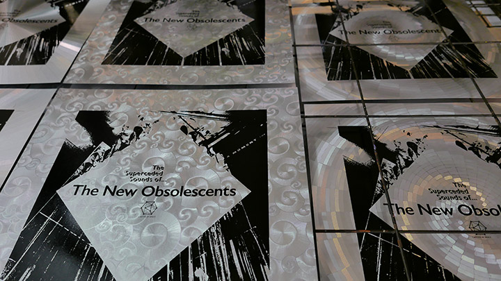
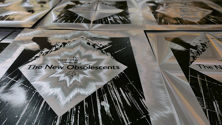
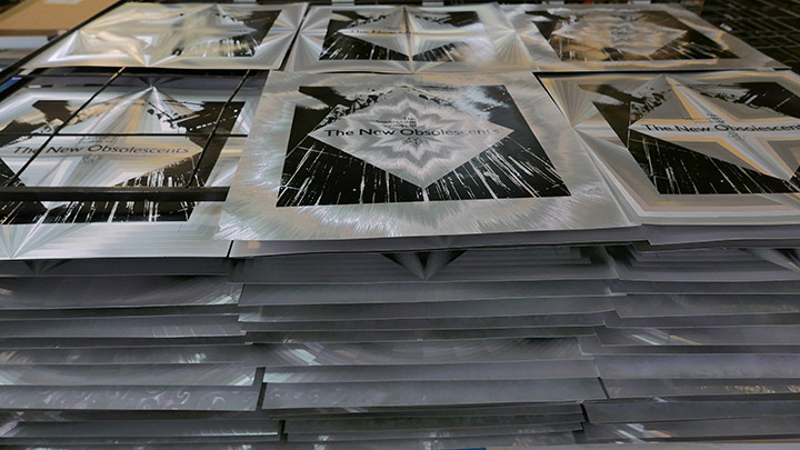
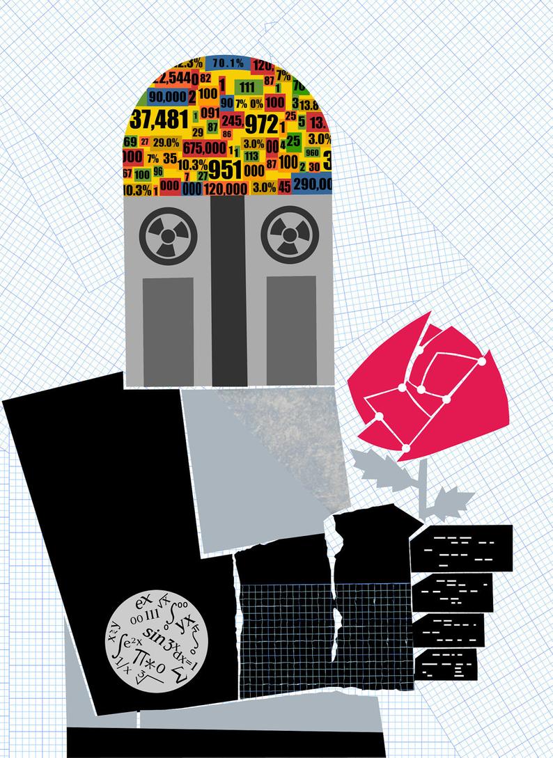
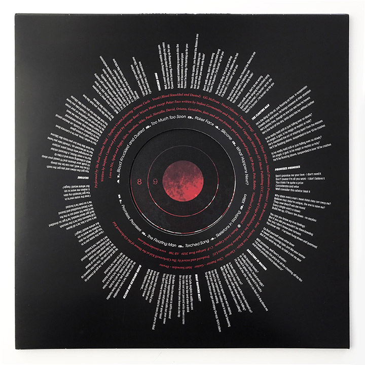
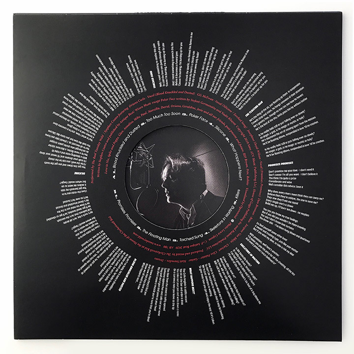
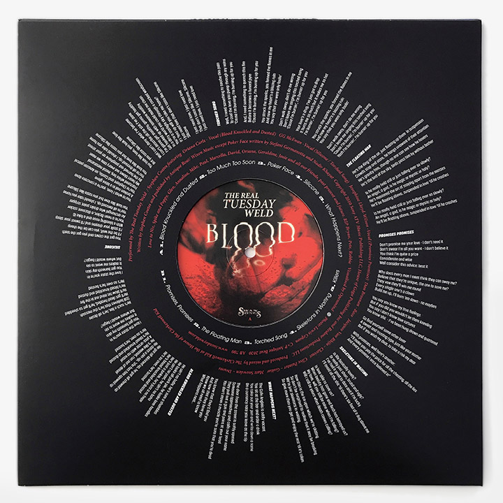
The whole design concept was started over a year ago, pre-lockdown, but stalled like everything for months mid year until we picked it back up in the summer, reworked the concepts and mapped out the whole set. With the benefit of hindsight it was worth the rest and the design is better for it as we went through various stages and ideas, coming back to it with fresh eyes. There’s a small books-worth of unused elements and ideas that never made it for this series, a huge folder of work that was slowly honed into shape over months as the artwork formed.
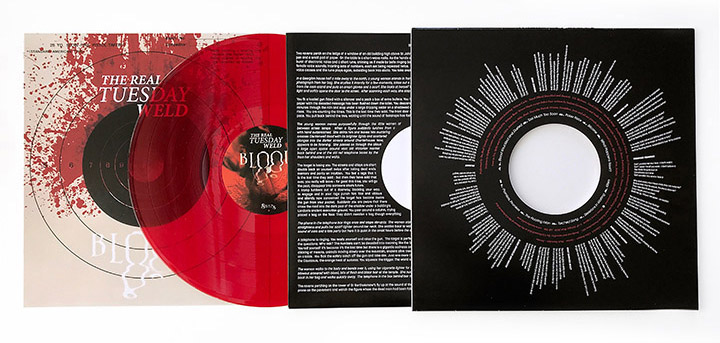
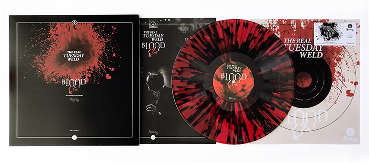
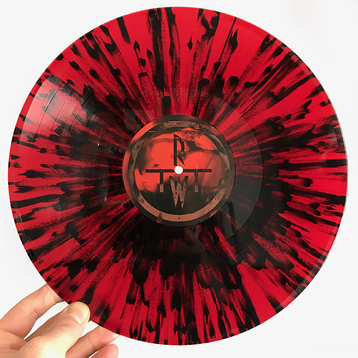
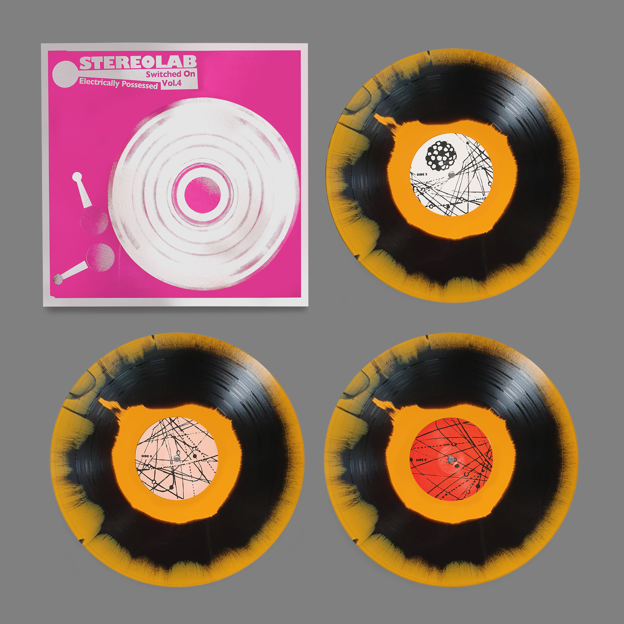
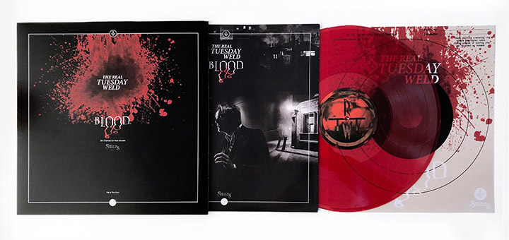
The ‘Blood’ vinyl comes in red or red & black splatter vinyl versions, has an inner sleeve with a short story (a feature of all the albums), die-cut back and inner covers and download card. Depending on how you insert the record / inner sleeve or poster you can have different back covers.
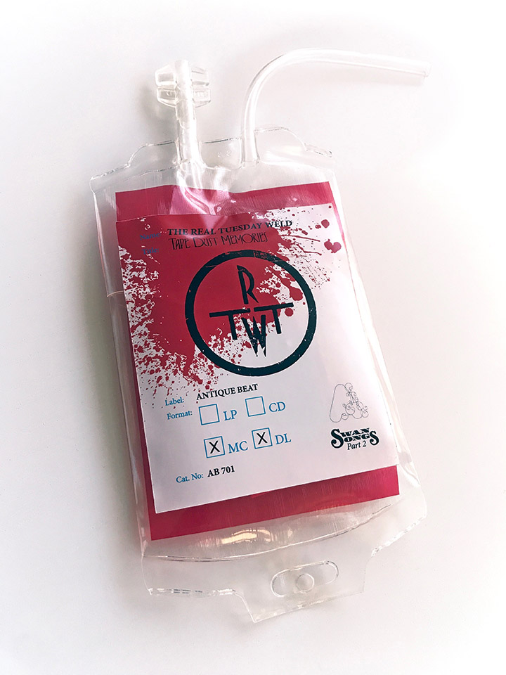
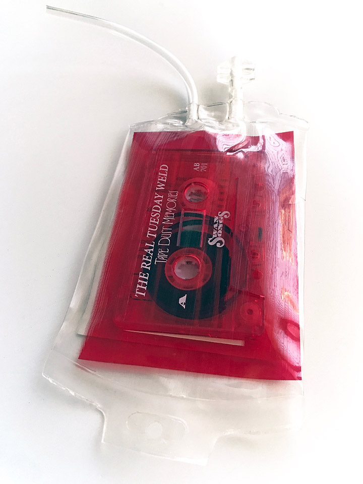
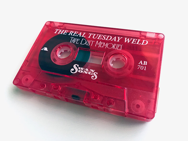
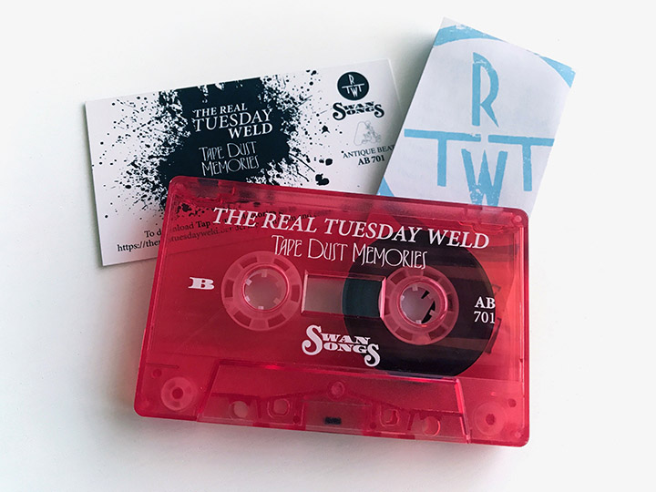
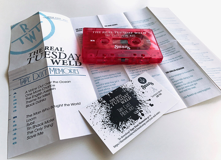
If you pre-order direct from the Real Tuesday Weld Bandcamp page you get an exclusive target print and beermat with the 10 track album plus there you can also find a bundle with the 11 track cassette companion, ‘Tape Dust Memories’ which is housed in a blood bag with medical-style lyric sheet and download card. This is a completely different album of extra tracks from the same sessions and possibly not available anywhere else. I’m extremely pleased with how these have both turned out and we’re forging ahead with the follow up, ‘Dreams’ for the end of 2021.
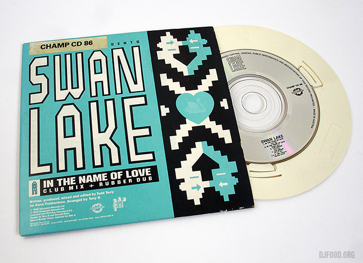
For those wanting a CD version, there may be something at the end of the trilogy that collects them all, we’ll see…