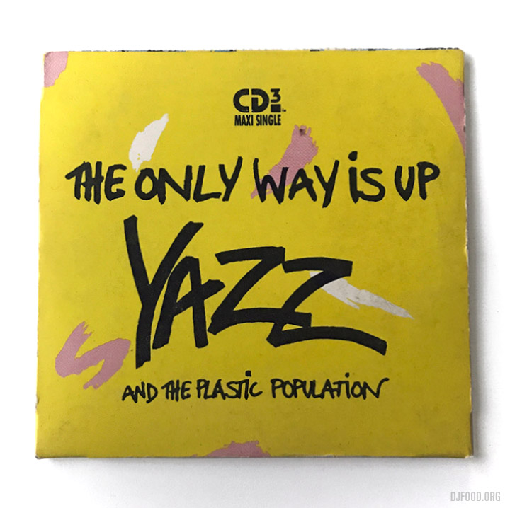
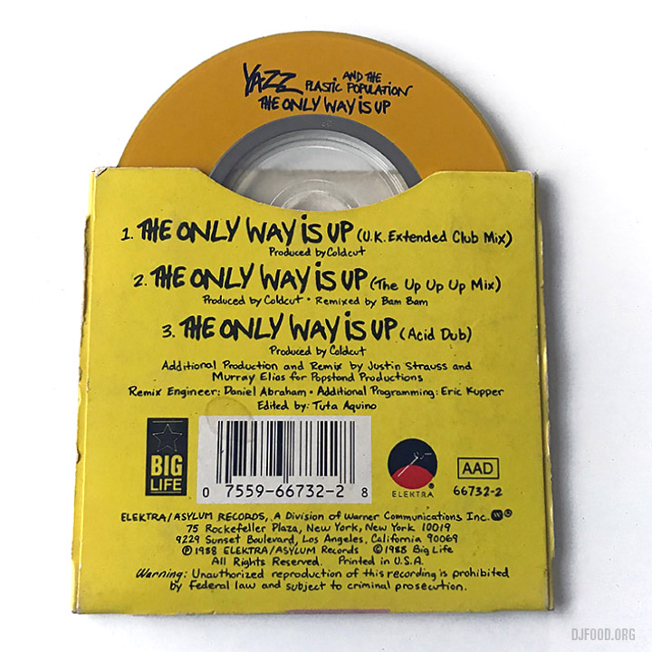
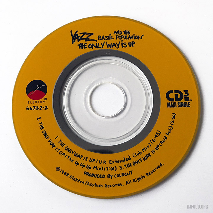
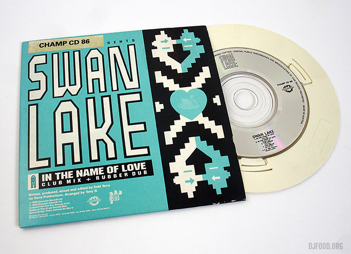
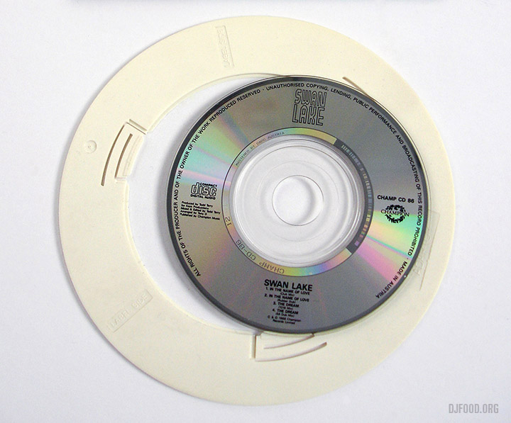
This US CD single is unfortunately missing part of its cover, it was part of a long box as can be seen in the bottom photo. The extended UK mix and the Bam Bam remix feature from both of the UK 12″s but the most interesting thing about this release is the Acid Dub mix by Justin Strauss and Murray Elias which was exclusive to the US releases and not featured on any European editions. It all starts getting interesting around the 3.50 mark
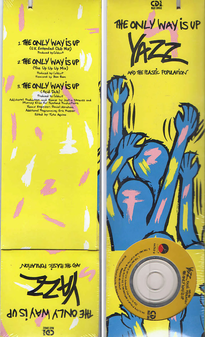


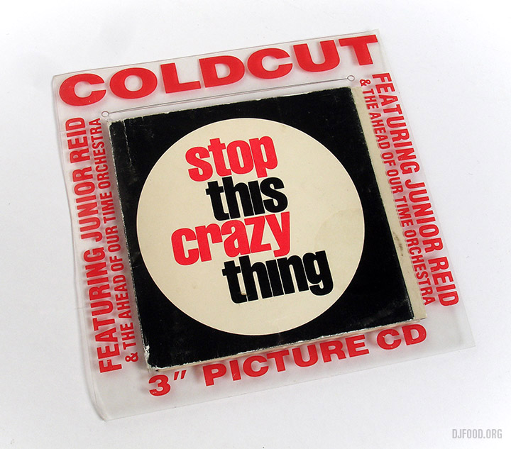
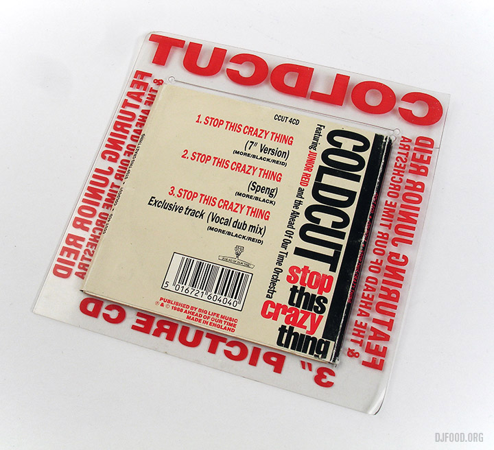
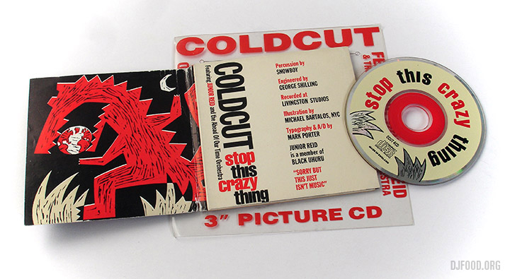


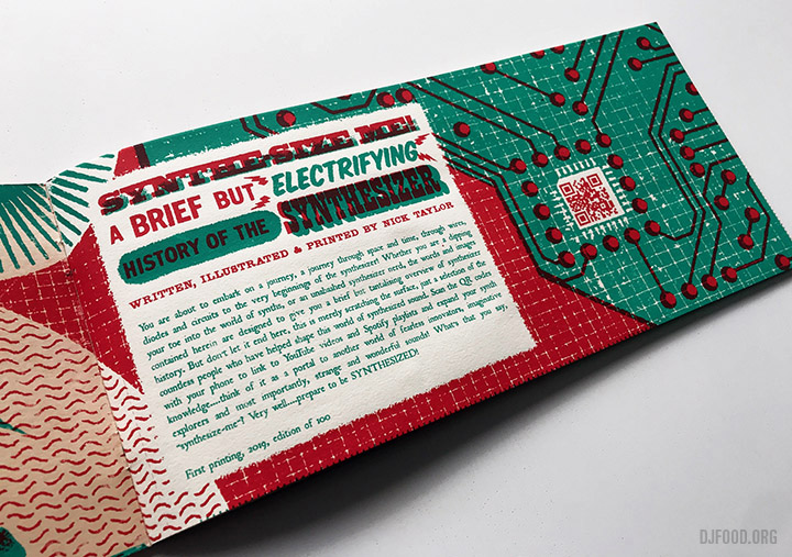
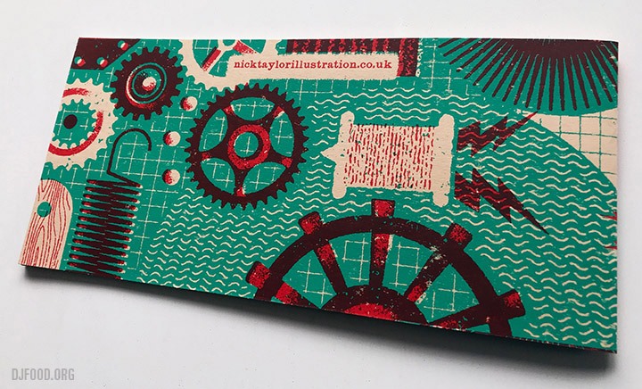
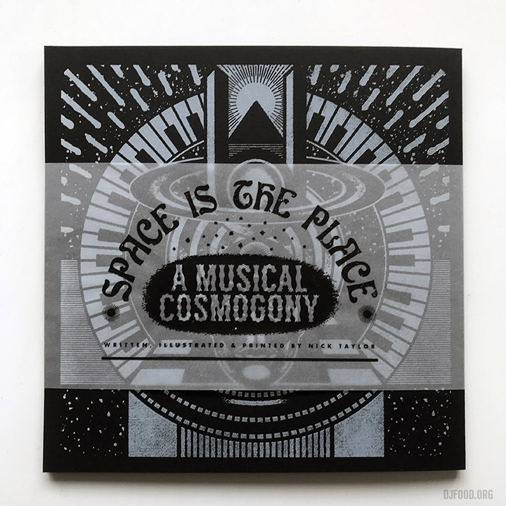
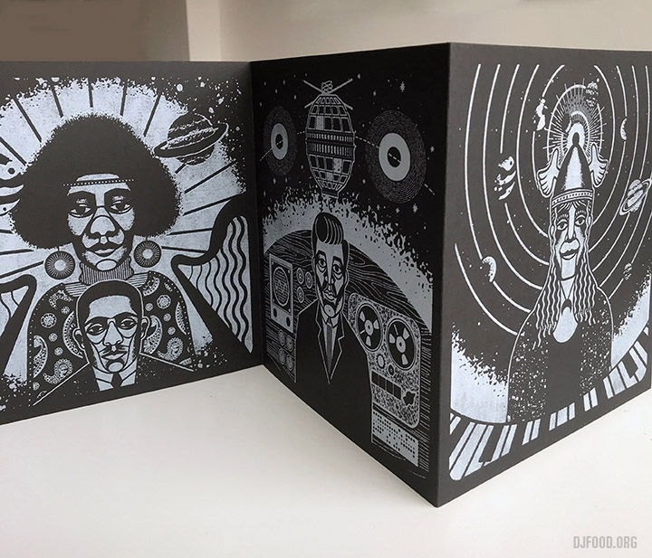
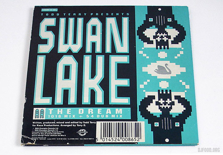


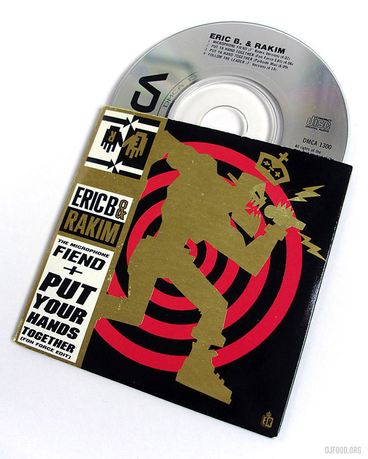
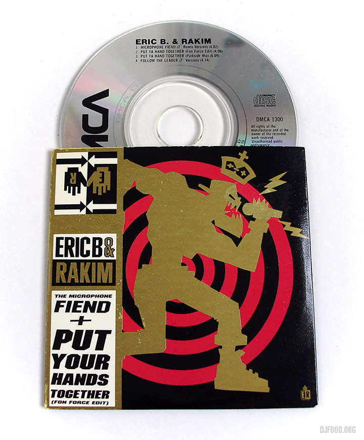


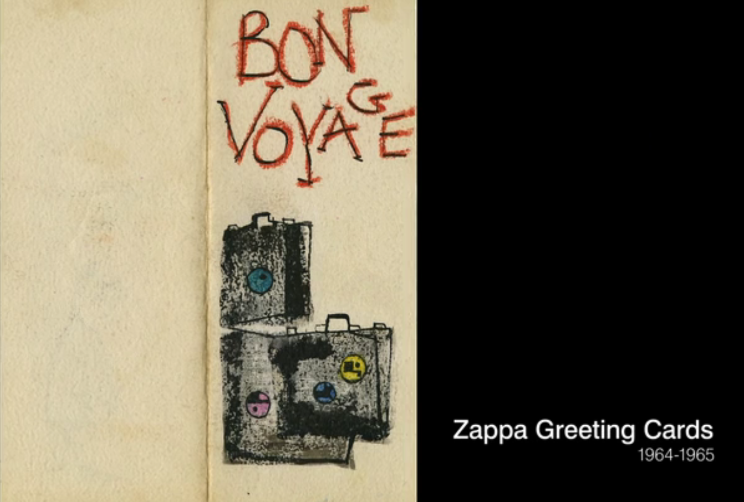


 – very limited 3″ CD in fold out sleeve –
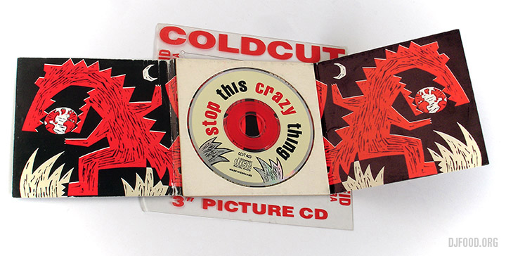
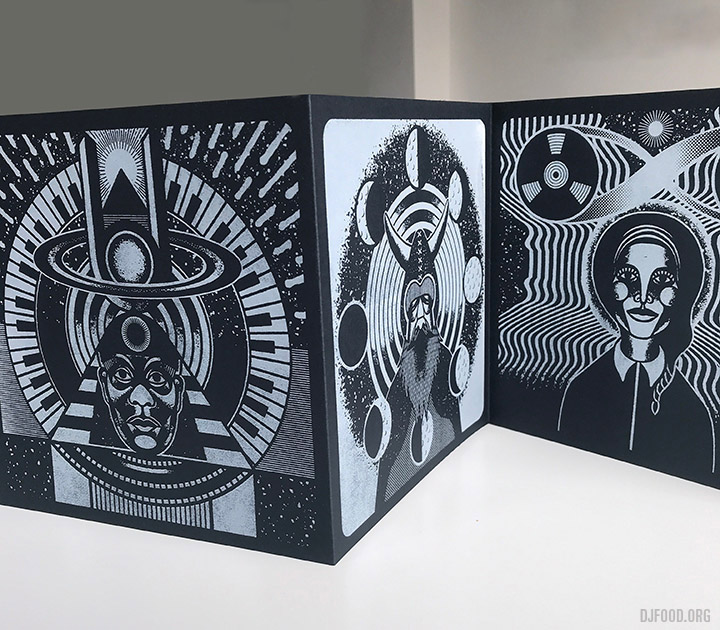
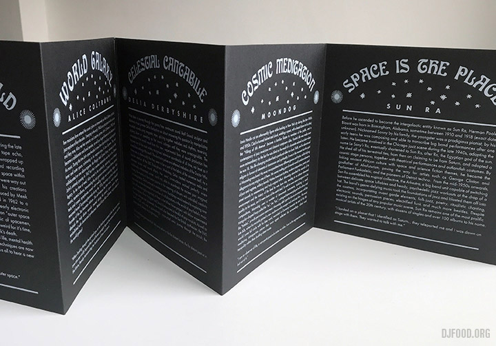
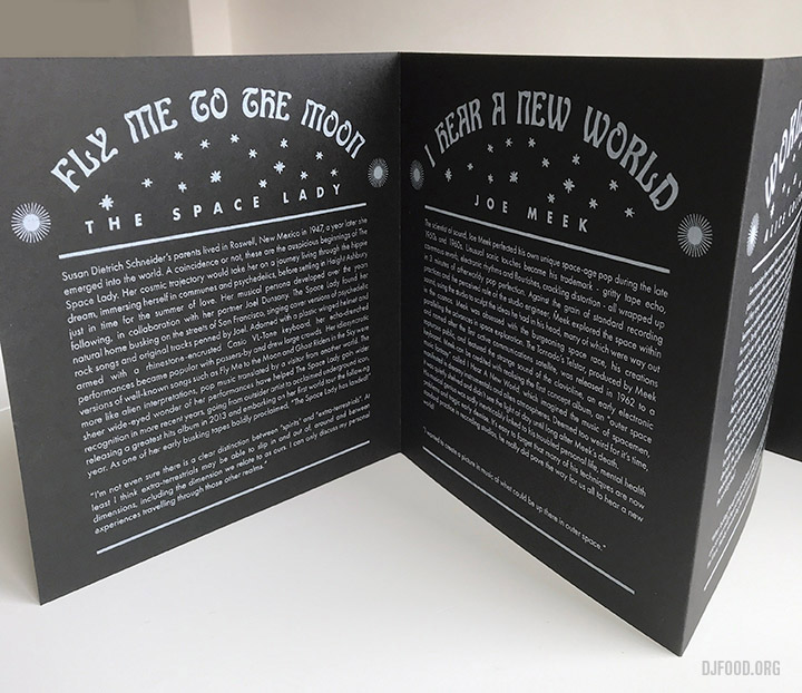
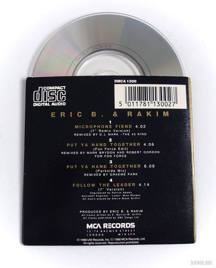
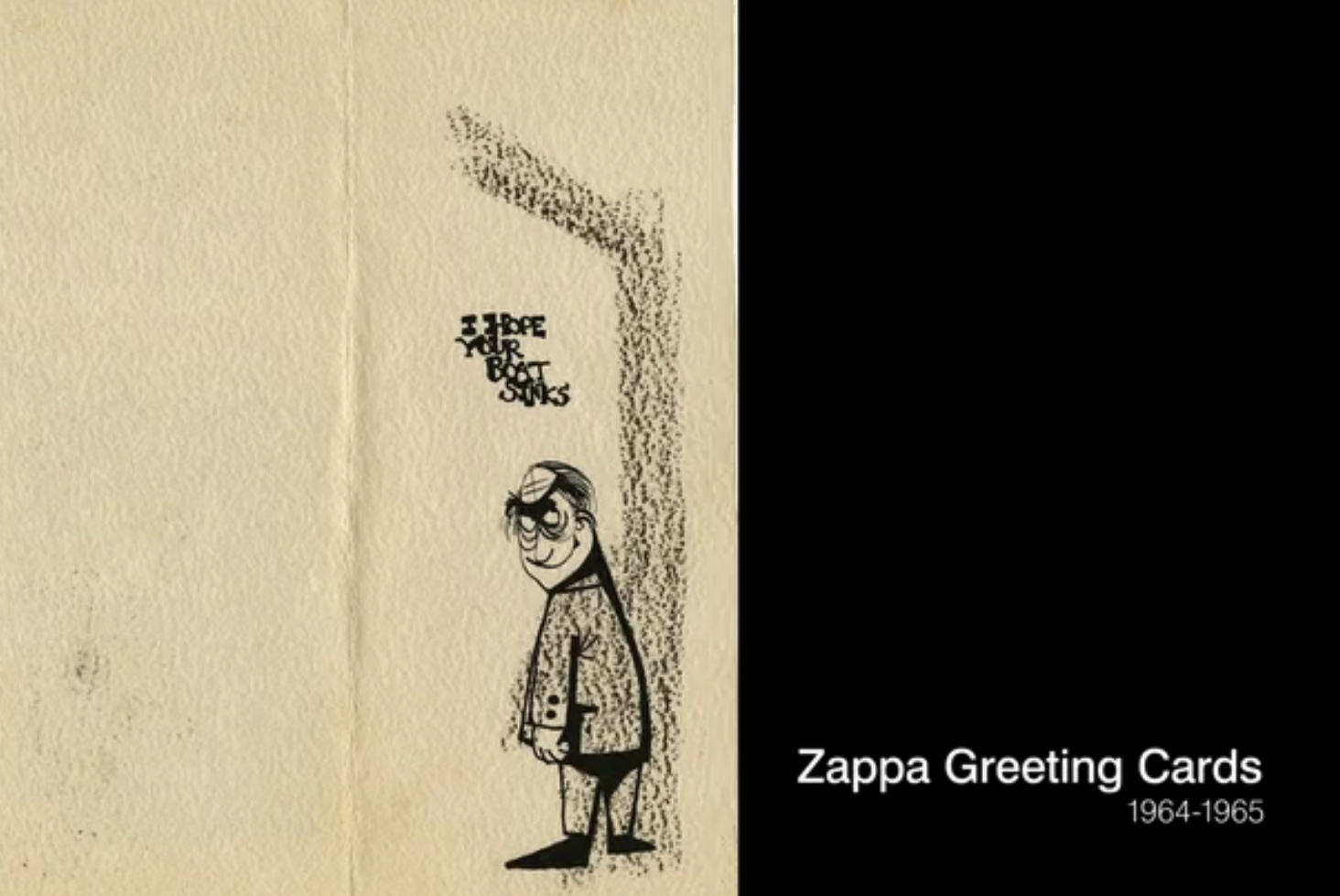