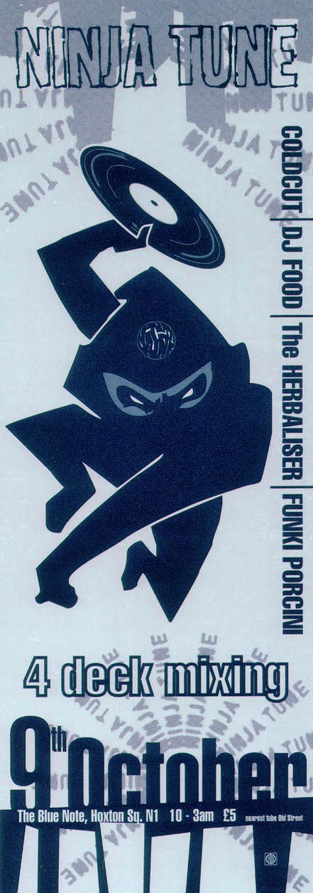
Yes, that’s what it says on the flyer above. 20 years ago today Ninja Tune held a launch party for the DJ Food album ‘A Recipe For Disaster’ at a small club called The Blue Note in a little known part of London called Shoreditch. Metalheadz hosted a club there every Sunday and a few others had done nights there at the time but such was the success of this one-off it was decided that the label should make it regular. Two months later ‘Stealth’ was born and Ninja became the second label to host a regularly monthly night at the club which, it’s no exaggeration to say, brought people to Shoreditch and spearheaded the interest and popularity of the area as we know it today.
Openmind designs
Items created by by design alter-ego, Openmind
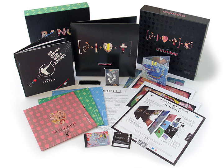
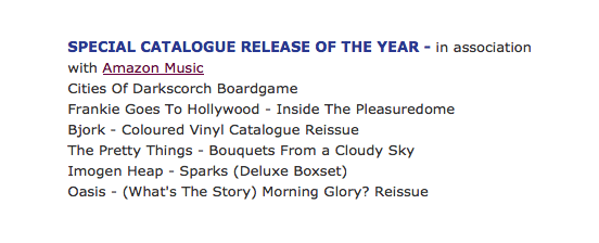
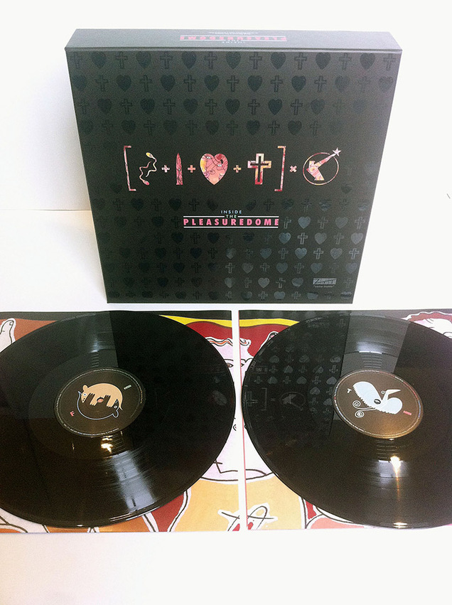
I’m very pleased to announce that the Frankie Goes To Hollywood box set I co-designed last year with Philip Marshall and Ian Peel for Union Square Music has just been nominated for an award in the ‘SPECIAL CATALOGUE RELEASE OF THE YEAR’ category in the AIM (Association of Independent Music) awards. We’re up against Oasis, Bjork, Imogen Heap, The Pretty Things and the Cities of Darkscorch boardgame – fingers crossed. Regardless of whether we win or not it’s also been announced the Ninja Tune HAVE won the ‘Innovator Award’ so well done Matt, Jon, Peter and everyone involved in the label.
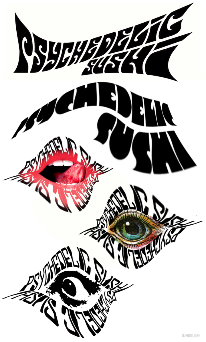 Here are 5 prospective logos I knocked up for the Psychedelic Sushi night I’m doing with Matty Skylab. The top two were deemed too obvious, my favourite was the mouth although it wouldn’t translate easily into a black and white logo. Matty liked the coloured eye but thought it was too cartoon-y so I swapped it for a photographic one instead. The night is on July 24th, 8pm -1.30am at Brilliant Corners and is free – turn up, tuck in and freak out as we play anything we deem psychedelic enough whilst they serve from their lovely Japanese menu. More info here…
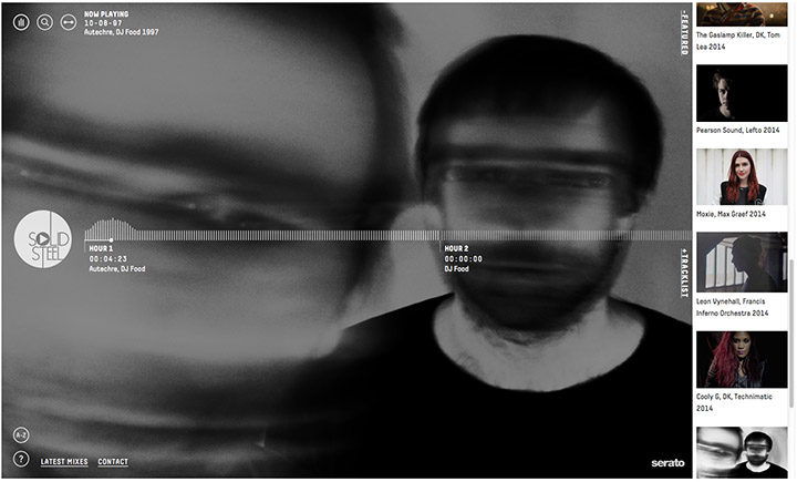
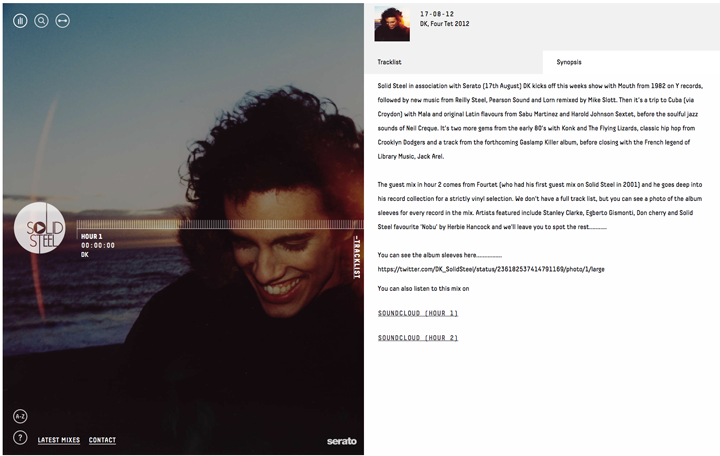
We have a brand new Solid Steel website, built for us by antipattern, which finally does all the things we wanted it to do with the vast archive of mixes we’ve accumulated from the last 27 years. We’re very pleased with the results as the site is full of easy to navigate touches that leave plenty of room for a gallery of artwork and photography to grace your desktop, tablet or phone whilst you listen.
Here’s a quick walk through: (above) Main landing page with Featured mixes bar on the right – just tap Featured to close it. (Below) Once a mix is selected just hit play on the Solid Steel logo on the left, you can jump through the mix once it’s loaded or pause by tapping the logo again. Click Tracklist to open a side bar with a scrollable tracklist.

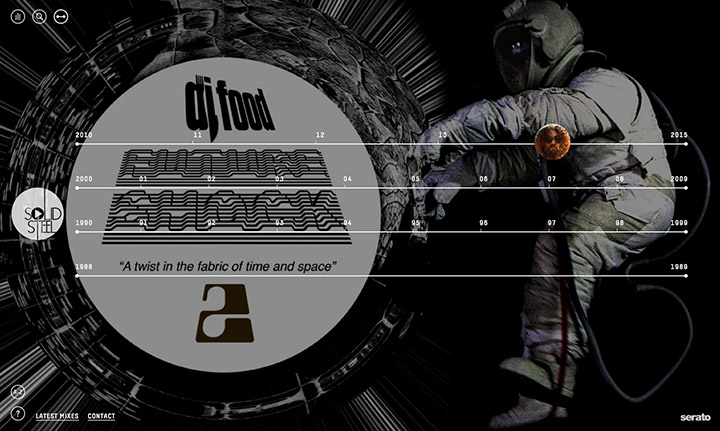
(Above) Click the Synopsis tab to bring up details of the mix plus a link to Soundcloud where you can find the mixes and leave a comment or download. (Below) If you fancy finding an old mix there are several ways of accessing them: the good old Search button in the middle of the three top left circles or the Timeline button next to it which brings up a new graphic showing the decades from 1988 to the present.
(Above) Click the Year you want and a side bar will appear with a scrollable list of all the shows from that date. You can also then scroll vertically through the years too. (Below) Finally there’s an A-Z directory down at the bottom left so that you can see if an artist you love has contributed a mix to the show, hit the name and all their mixes will appear in a scrollable side bar.

Big thanks again to Suki and Paul at antipattern, go visit their new site, DK for producing the whole project and Tom and James at Ninja for the behind the scenes help.
 The start of the new Solid Steel site was the creation of a new logo for the show, from which we determined where we were going design-wise. A clean, modern look was wanted that also had to work alongside an image of the mix artist featured each week. I decided on a very thin, san-serif font that would leave plenty of space for an image, show date and artist name, all within a circle or square that would work at thumbnail size.

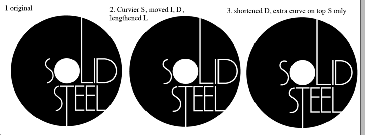
(Above) I started off with variants of the existing single ‘S’ logo which looked OK but lacked that certain something.
(Below) I won’t bore you with all the endless font and weight placements but there were many and I ended up with a central ‘o’ which aped a record or CD appearance from a distance and a very thin font on which I did a lot of work kerning and re-sculpting letters to sit at different weights. There were many subtle variations on the ‘S’s and by extending the ‘L’s and ‘T’ the text was suddenly no longer floating and a unique, eye-catching logo had been formed.
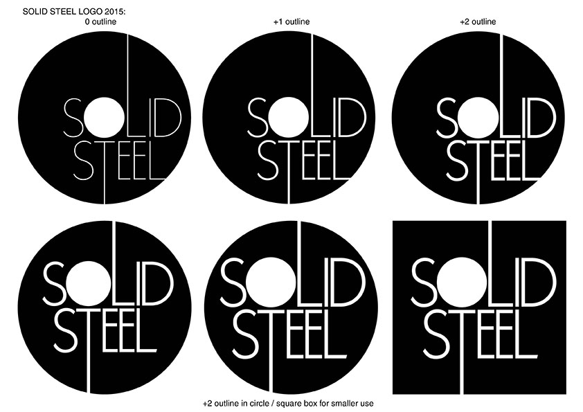
(Above) Variations in a heavier weight as well as an off-centre ‘O’ were needed for use at smaller sizes.
(Below) I then started experimenting with different ways to unify the weekly artist images – toning or tinting the images and discarding an oblong title card inside a square as it looked too much like existing mix show graphics.
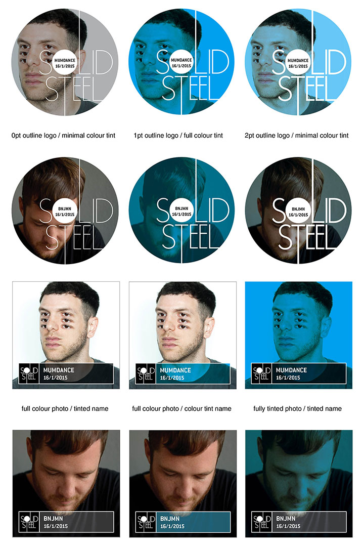
(Below) A brief flirtation with breaking the circle which was discarded because it would cause too much trouble when placed onto a coloured background or image.
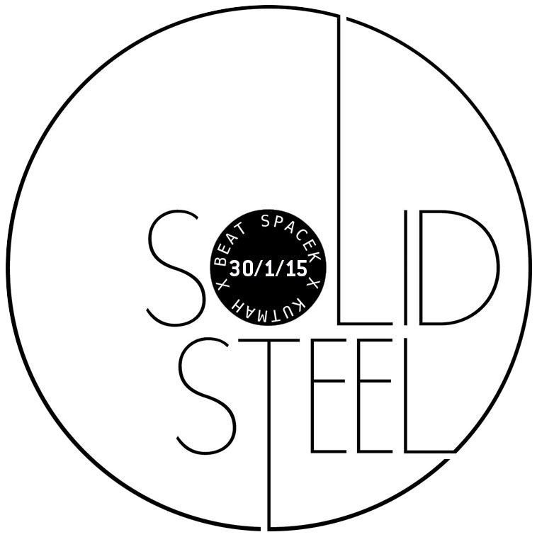
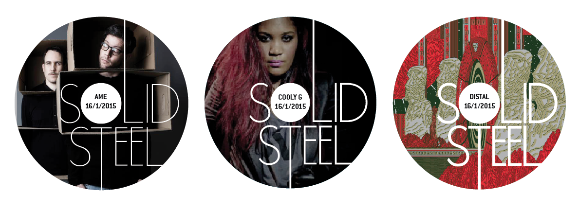
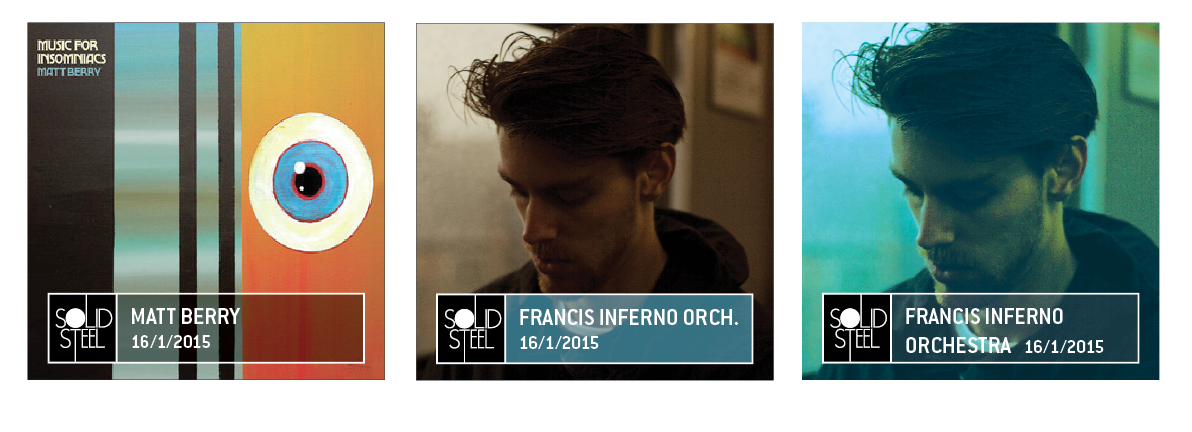
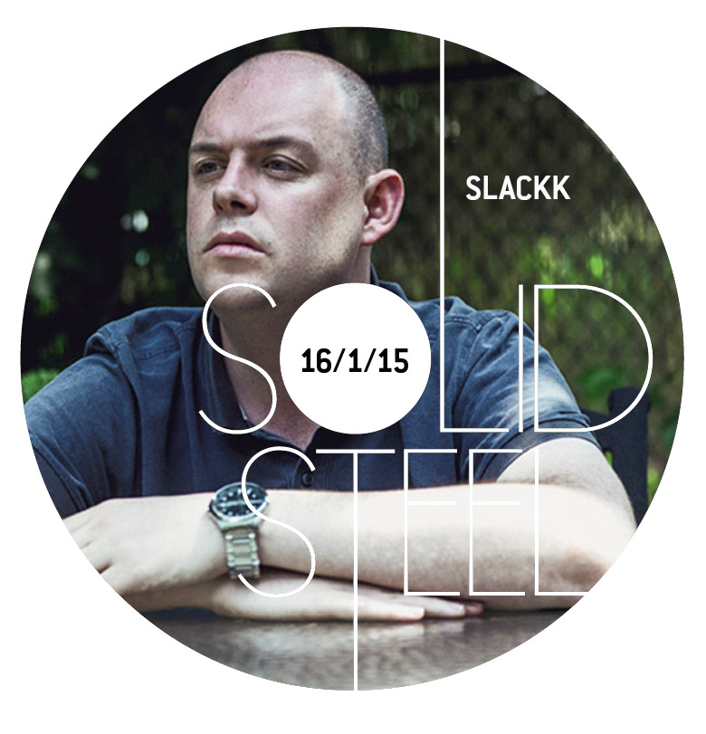
(Above) Different weights of type for readability. (Below) By moving the artist name out of the centre circle we freed up space and gave ourselves room for longer names. I have to be creative with the image placement each week but the date is readable and there’s plenty of room for the artist names in the top right section.
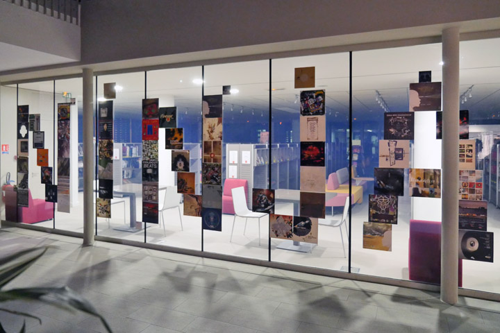
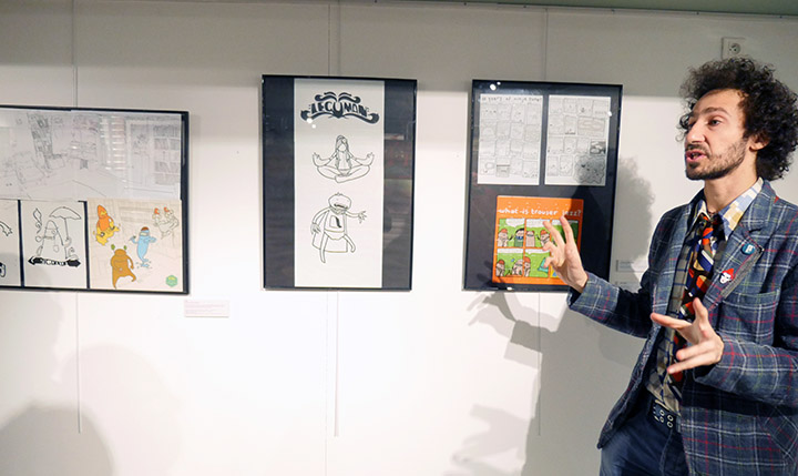
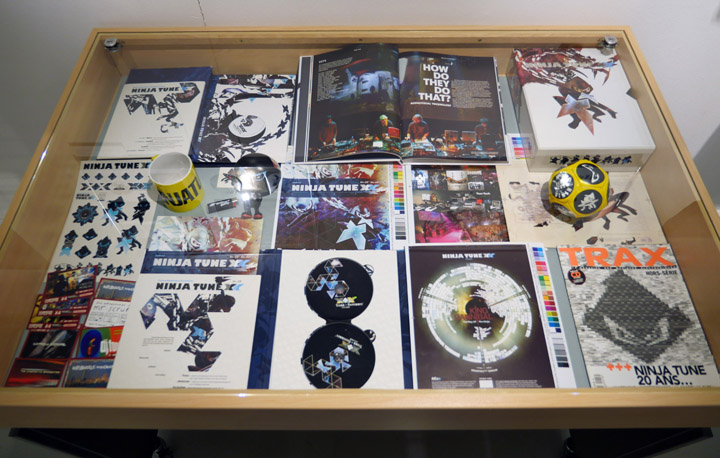
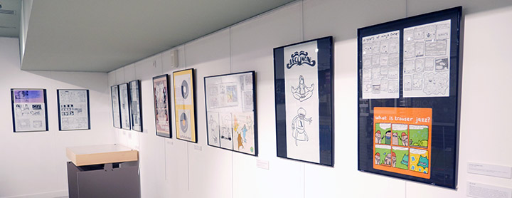
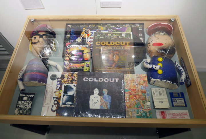
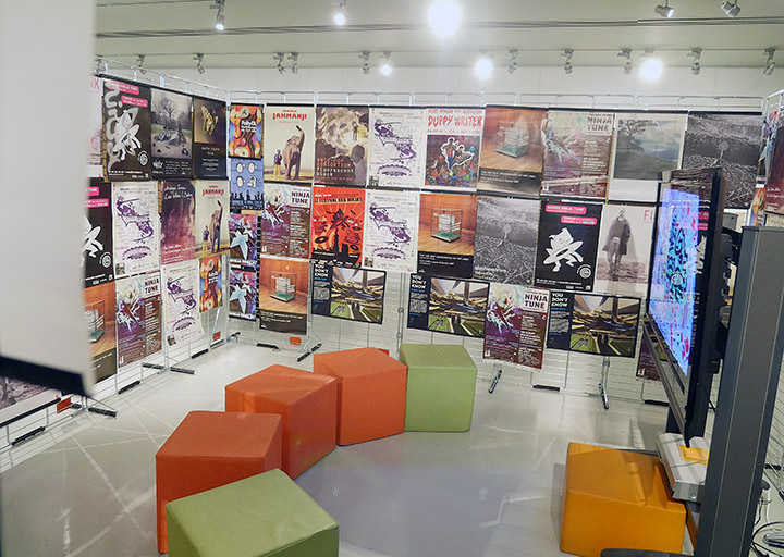
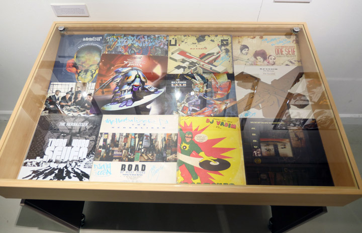
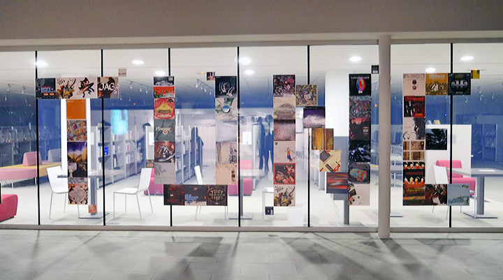
I keep forgetting to post this – there’s a Ninja Tune 25 Year retrospective currently showing at the Médiathèque Voyelles, 2 Place Jacques Félix, 08000 Charleville-Mézières in France. It’s been curated by Jais Elalouf aka DJ Oof (that’s him below, at the opening night) from his own personal collection and some of my archive. It features many record sleeves, promo posters, proofs and some original artwork and finishes on April 30th so if you’re in the area check it out.
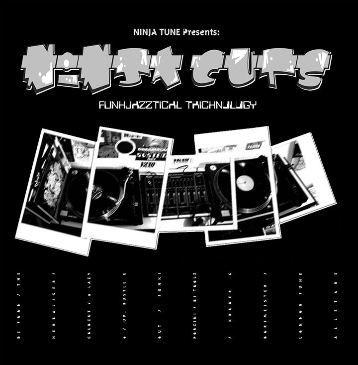
Apparently this was released 20 years ago this week – how time flies. Above is my computer file for the Black print that went to the printer before the silver was applied. Below is what it came back looking like if you can imagine the grey as being silver. It didn’t come back with exactly the look I was hoping for in terms of a silver-toned image but back then I was learning the print side of things as I went along.
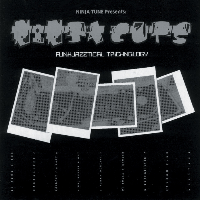
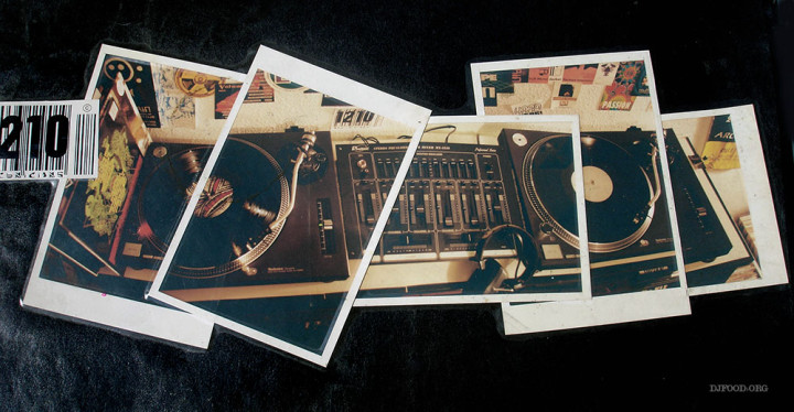
Below is an alternate version of the turntables featured on the cover in colour at last. These were my decks and mixer and the photos weren’t actually Polaroids, just normal photos made to look like it by adding a white border. To the left you can see the back of the Jungle Brothers‘ first album with NWA‘s second just peeking out and on the left deck is a Steroid Maximus LP – already subliminally flaunting my love of Foetus‘ music back in 1995.
On the wall are a collection of flyers from the day, the Brain, Passion, Talkin’ Loud and the edge of an Archaos poster on the right. This was only my second ever sleeve design for Ninja, not a design classic by any means but an album that many people hold dear it seems. You can still buy it in digital form online from the Ninja shop too.
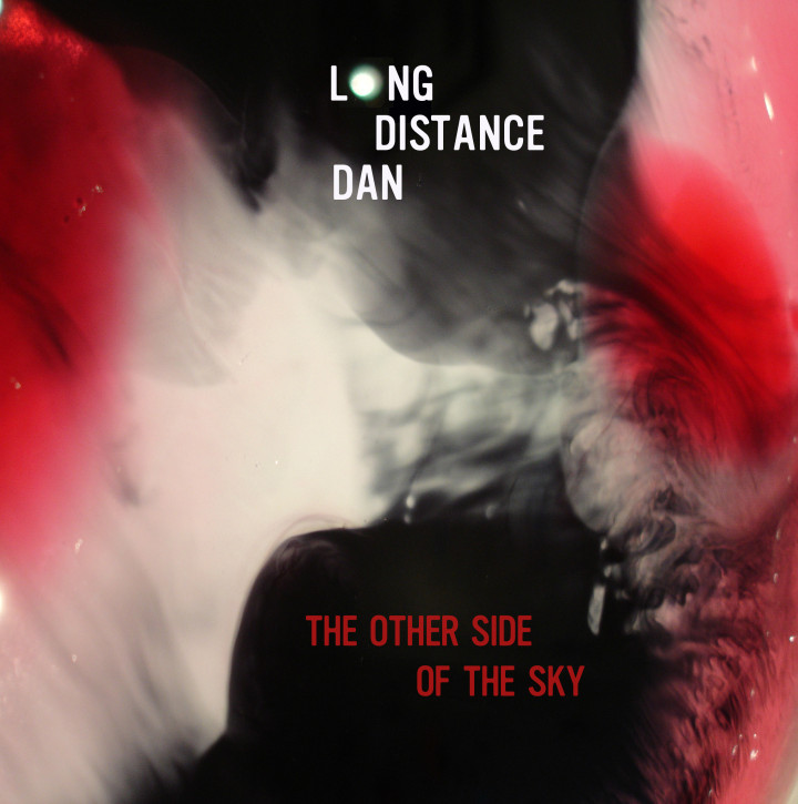
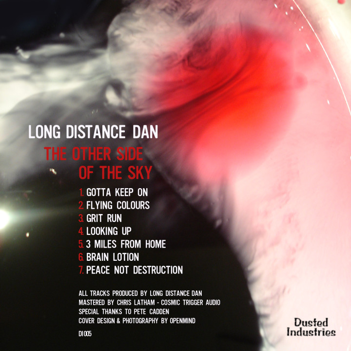
Long Distance Dan releases a new EP today, ‘The Other Side Of The Sky’, seven tracks of raw, funky, psychedelic beats on Dusted Industries. Dan has previous form, compiling the ‘Twisting The Frame’ and ‘Cosmic Dust Agenda’ compilations. It’s a digital only release via Bandcamp available as a Name Your Price with an exclusive 45 minute DJ mix to download for buyers who do pay for it.
Here’s a sampler of the EP or you can listen in full on the site.
I provided the artwork for this release because I liked it so much.
Mixmaster Morris – Ambient Tea Party Vol. 3 mix – Brixton 02.05.1993 from Fiasko One on Vimeo.
Here’s a bit of musical history I just found online, Mixmaster Morris DJing at the second Telepathic Fish party that I hosted with David Vallade, Mario Aguera and Chantal Passamonte aka Mira Calix back in 1993. This is volume 3 and I should have the other 2 volumes somewhere in the archive, one with Aphex Twin playing I think as well as my own efforts. Check the cassette inlay for some ‘of its time’ design by my own hand.
For those that aren’t familiar with it, Telepathic Fish was the name my then housemates and I gave to a series of Ambient parties that we staged in London in the early to mid 90’s. They started on a Sunday afternoon and went through to the early hours and the emphasis was on chilling out rather than dancing (although that did happen too sometimes). At some point I’m going to compile the whole Telepathic Fish experience into a series of blog posts or a small book as it was quite a formative time for me as well as the rest of the crew. For more mixes from Morris, who was a guiding light for me back then, you can now check out his brand new website here.

Keen-eyed listeners to the Solid Steel weekly radio show may have noticed a logo makeover last week. A new, slimline logo has taken place of the previous single ‘S’ one as we continue to streamline the show for online consumption. The logo comes in white on black circle but can be reversed and I designed it in three weights with the heaviest being for small usage where the centre circle is offset with the outer circle also in box form. Expect a new responsive website redesign in April too. 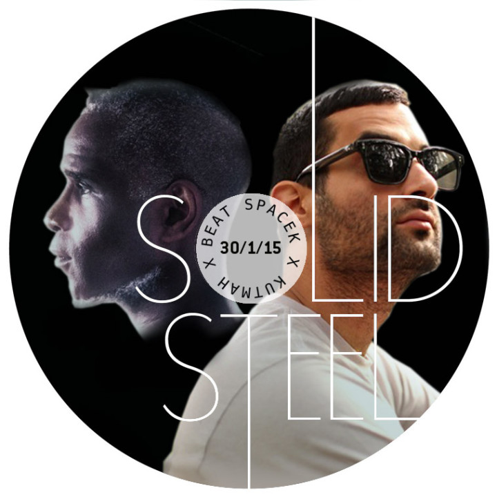

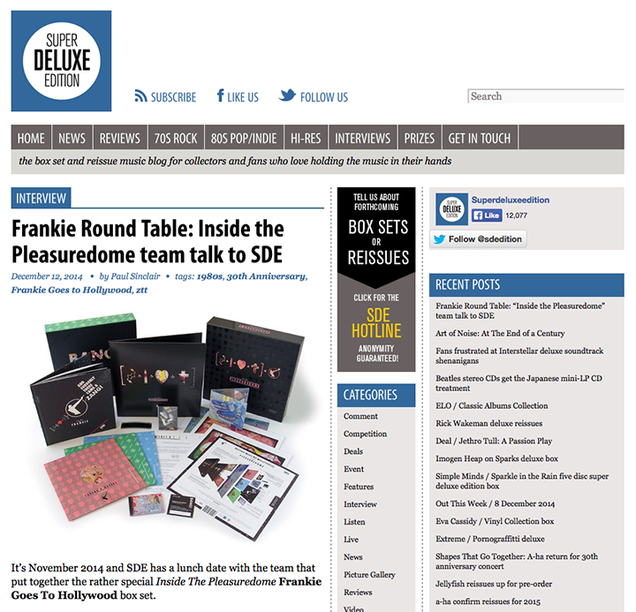
 Finally here’s the 2nd part of the interview I took part in alongside Ian Peel, Philip Marshall and Steve Bunyan with Paul Sinclair of Super Deluxe Edition talking about the making of the Frankie Goes To Hollywood ‘Inside The Pleasuredome’ box set last year.
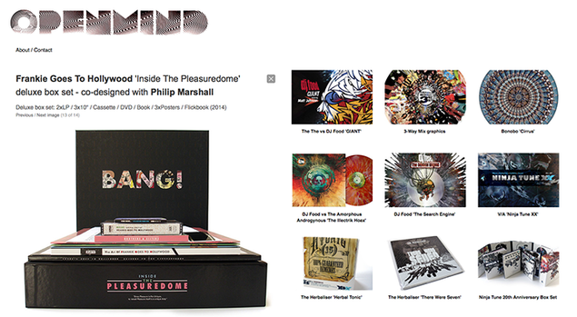
A couple of big design-related things happened this week – I’ve now finessed a site for the best of my design work over the last 20 years under the Openmind alias. You can check it out at www.openmindesign.uk – it’s not exhaustive and doesn’t contains all the extra info I provide in the design section of this site (look, it’s up there ^) but it offers a quick overview of some of the things I’ve done. Who knows, maybe you might even want my design work to grace your own objects?
Speaking of this site, it’s been undergoing a redesign, spring clean and update over the last few months as well as being made responsive so as to work better on mobiles, tablets and desktops. This has all been happening on a server elsewhere but should go live before Xmas. Don’t worry, everything will still be here (mostly) in the same place, it will just be easier to use, view and the Design and Discog sections will be fully up to date. It’s been 5 years since this version debuted and it’s never had an overhaul save for a couple of back end updates.
The other big design thing is the first part of an interview about the making of the Frankie Goes To Hollywood ‘Inside The Pleasuredome’ box set over on the Super Deluxe Editon website. Curator Ian Peel, co-designer Philip Marshall, Steve Bunyan from Union Sq Music and myself all discuss aspects of the thinking and approach to making the set with part two set to appear next week…
Here’s a short film of what went on at the Sarm Studios playback event of ‘Welcome To The Pleasuredome’.
For people who didn’t get a copy of the box set or were restricted by territory (N. America and Japan were excluded because of licensing laws) you can now order it through Am*z*n and elsewhere (although beware, some places are taking the p*ss with prices).
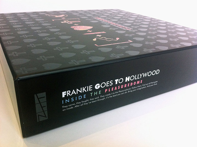
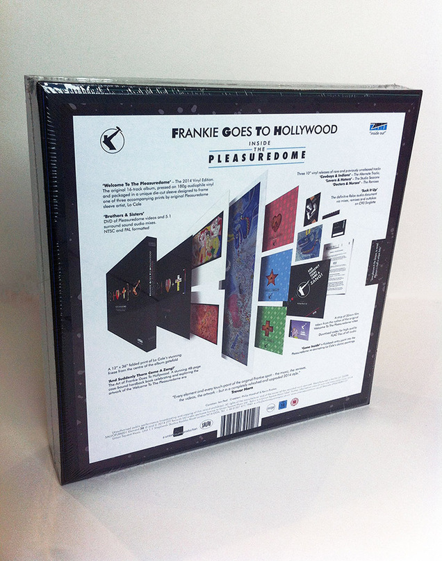
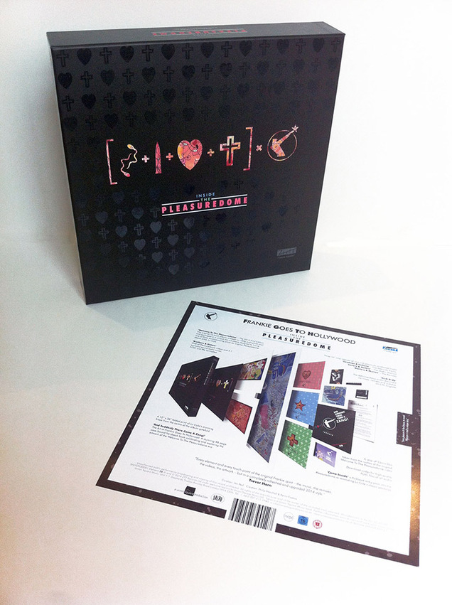
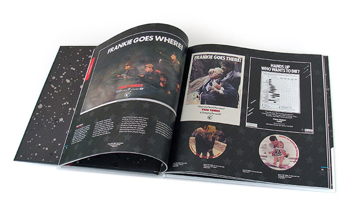
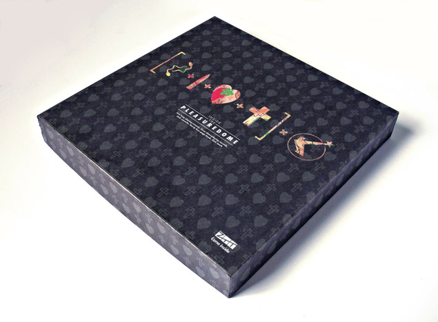
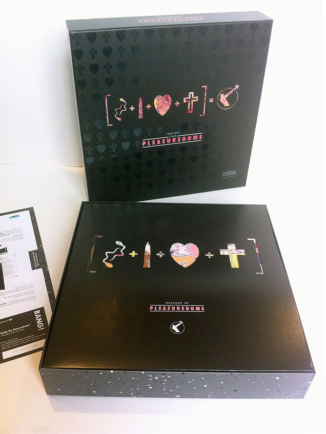
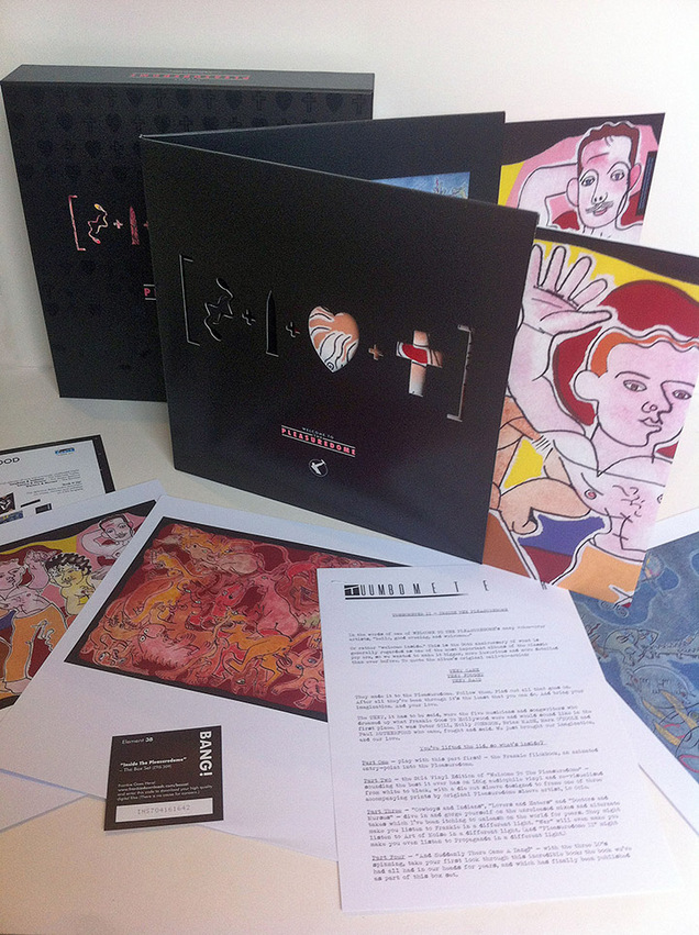
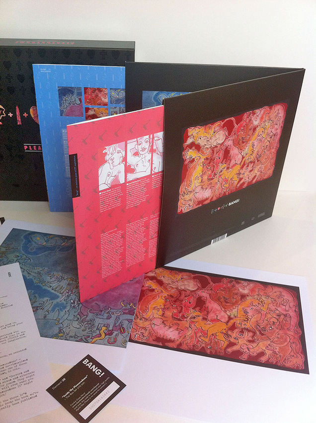
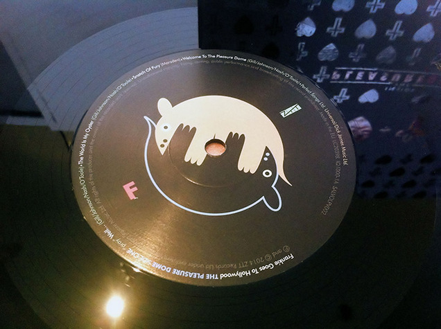
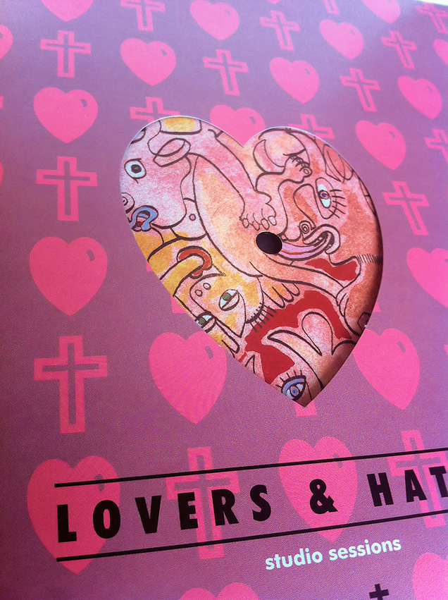
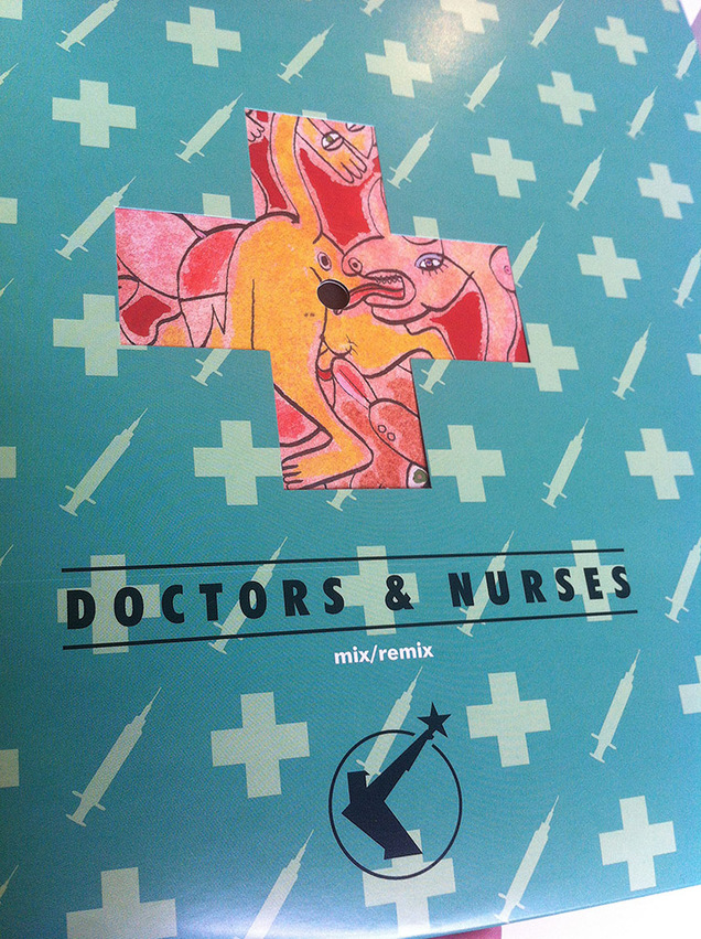
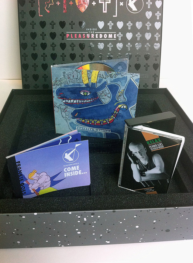
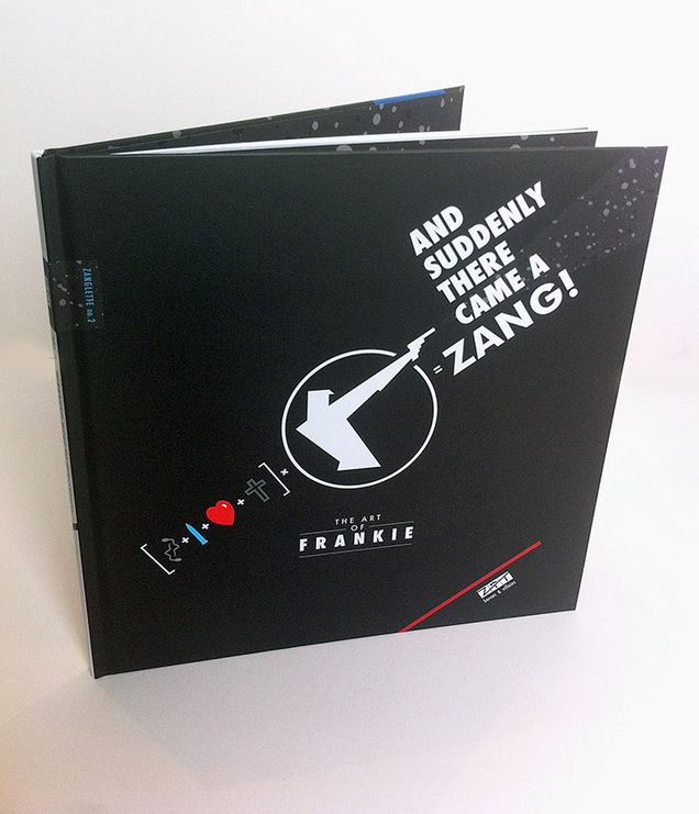
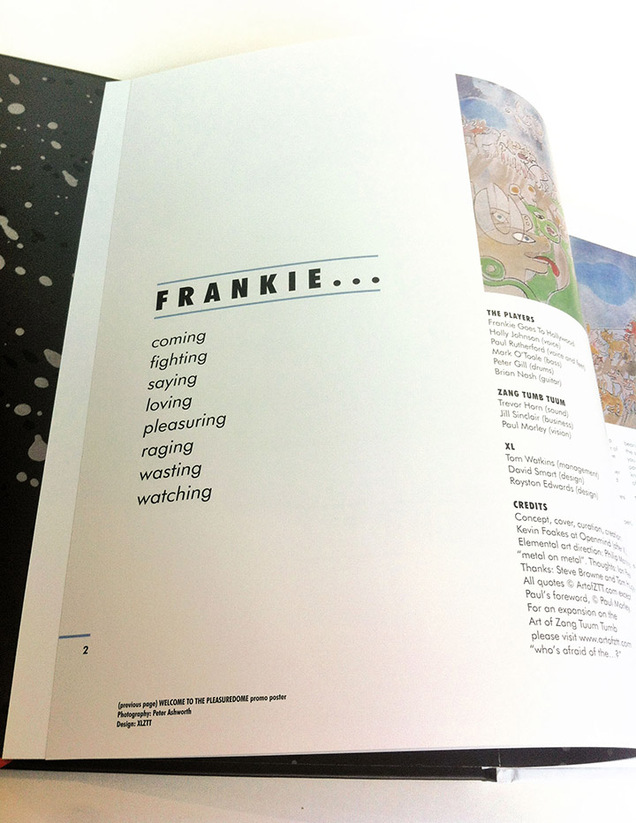
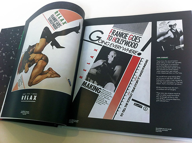
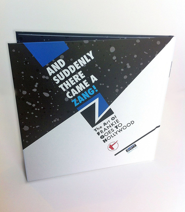
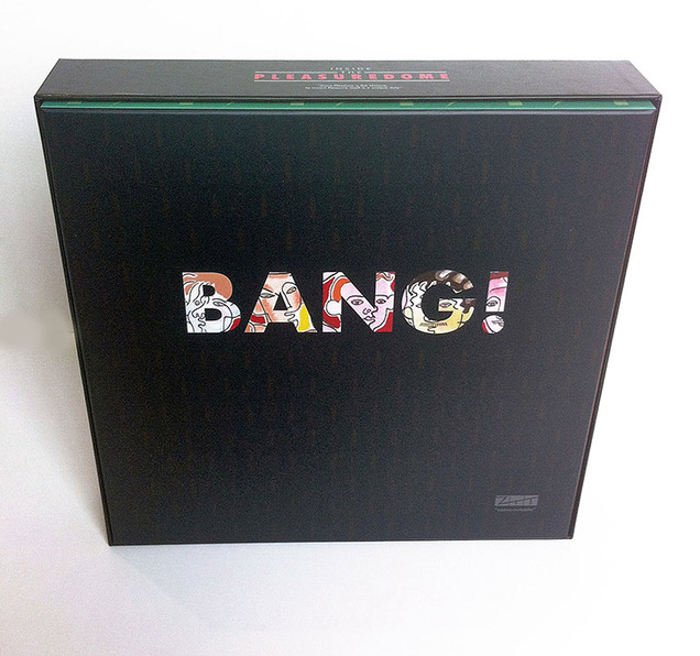
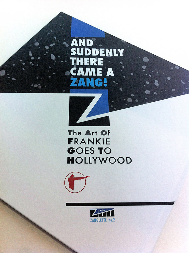
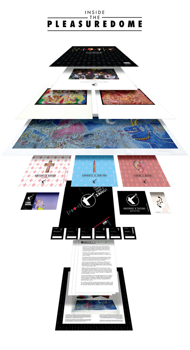
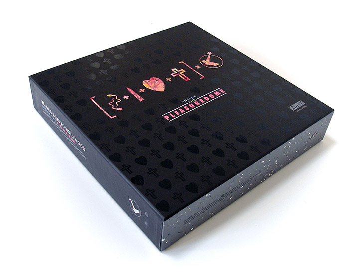
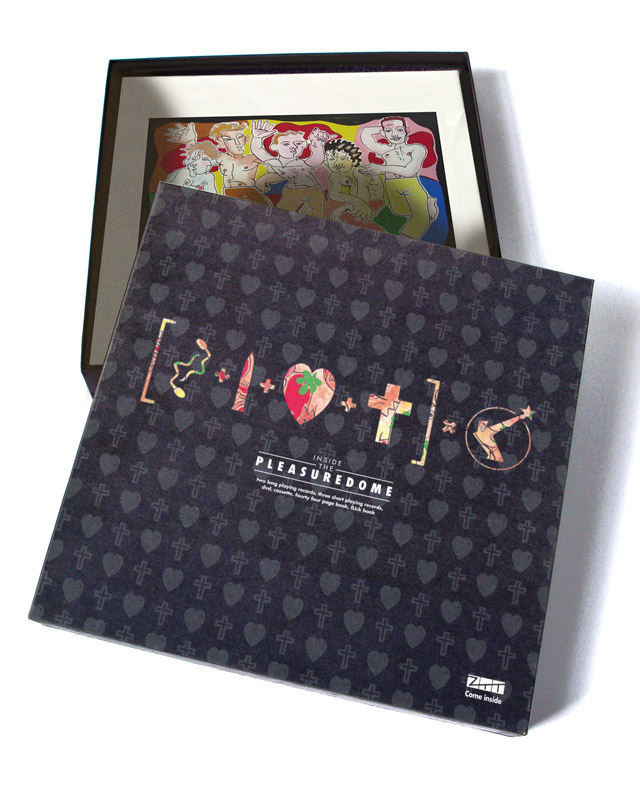
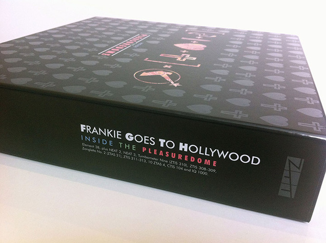 At long last, after 8 months of work (off and on) the Frankie Goes To Hollywood box set ‘Inside The Pleasuredome’ was released on Wednesday 29th – 30 years to the day from its original debut. Back in November 2013 I was asked if I’d be part of the team that would put together the 30th anniversary set of Frankie’s ‘Welcome To The Pleasuredome’ album, for release in Autumn 2014 and this is what writer Ian Peel, designer Philip Marshall and myself came up with.
To put this is context, this was a big deal, a very big deal indeed. Frankie and by extension Zang Tuum Tumb records were a massive formative influence on me in my early to mid teens. The band and label created a phenomena in 1984 which I’ve still not seen the likes of again and, alongside Trevor Horn and his team, the group made some of my favourite pop songs ever.
The album was the most eagerly anticipated of the year and, while being uneven, contains possibly the greatest side A of music ever issued in the 17 minute long title track. The design of the label greatly influenced my own aesthetic for record sleeve graphics although I didn’t realise this until years later and I started the Art of ZTT website as an online archive of the old material which I feel has been neglected in the history of music design.
This set is officially sold out now as it was a Pledgemusic production but I’m told a quantity have been kept back of the 2000 made (never to be repressed) and will be available from some distributors to those who couldn’t pledge due to the restrictions of licensing territories.
Here’s the unboxing of the Frankie Goes To Hollywood ‘Inside The Pleasuredome’ set I co-designed with Philip Marshall for Universal Music / ZTT. The 30th anniversary of its release is next week and these will ship out to pledgers on the 28th.
There is still time to pre-order one but they’re down to the last 30 of 2000 now it seems. A series of full, in-depth blog posts will follow soon detailing the various aspects of the designs which have been on-going since January this year.
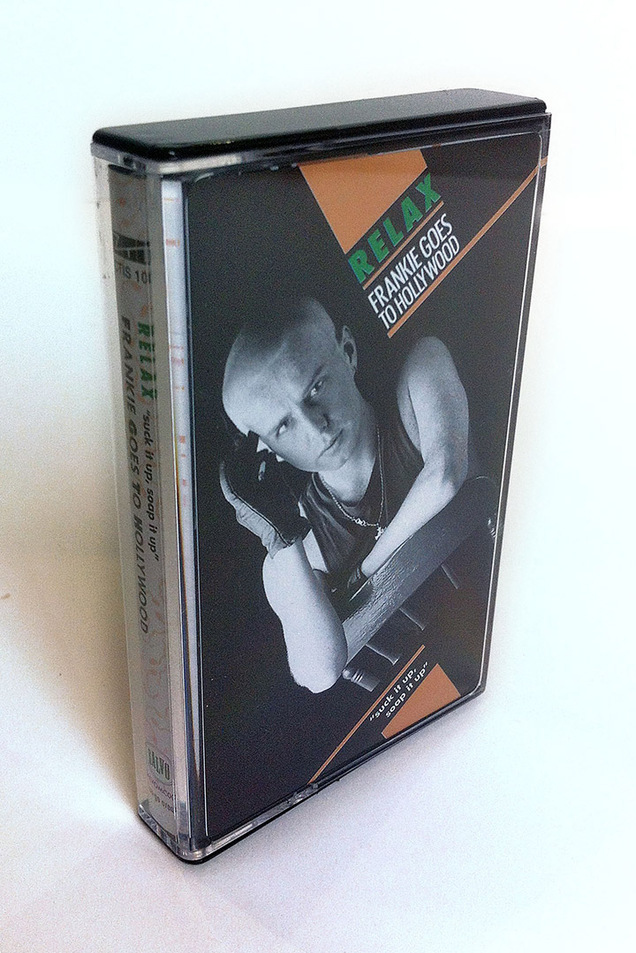
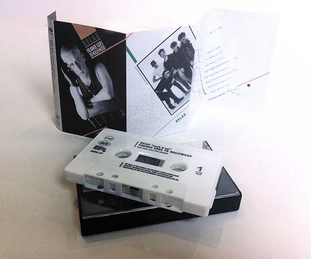
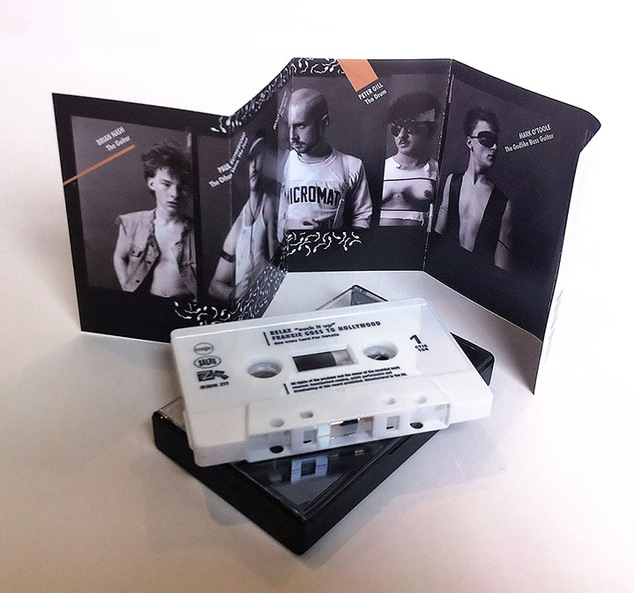
It’s been a bit quiet on here of late because I’ve been very busy tying up the last pieces of the Frankie Goes To Hollywood box set with Philip Marshall and the deadline is this weekend with the book still to finish. We’ve had some 11th hour changes due to the USM legal dept. getting cold feet over the cassette front cover (there’ll be a lengthy blog post about the cassette one day) but also some higher res images arrived today of one of the Lo Cole gatefold prelims for the interior of the book. These were courtesy of a German fan who went out of his way to get a decent copy of the image from someone who had bought the rough draft painting when it was sold years ago. Now we can have a much larger version of the image rather than the low grade jpegs we’ve had for years.
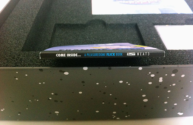
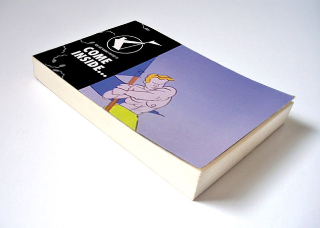
But the subject of this post is about the Flick book* – maybe considered a throw away item to some, certainly the runt of the litter but getting as much love as the rest in its construction. The book features scenes from the TV advert that briefly aired around the time of the album launch in November ’84 with imagery based on Lo Cole’s paintings – a brief 40 second rampage into the Pleasuredome by the band accompanied by assorted mythical beasts. As pages are limited in the book the original film was broken down into an image sequence – 25 frames per second x 40 to nearly 1000 frames – which were then stripped down to essential frames and made into .gif files to see which few seconds of animation would work best.
*( this is a provisional cover design – it’s changed a bit since this version)
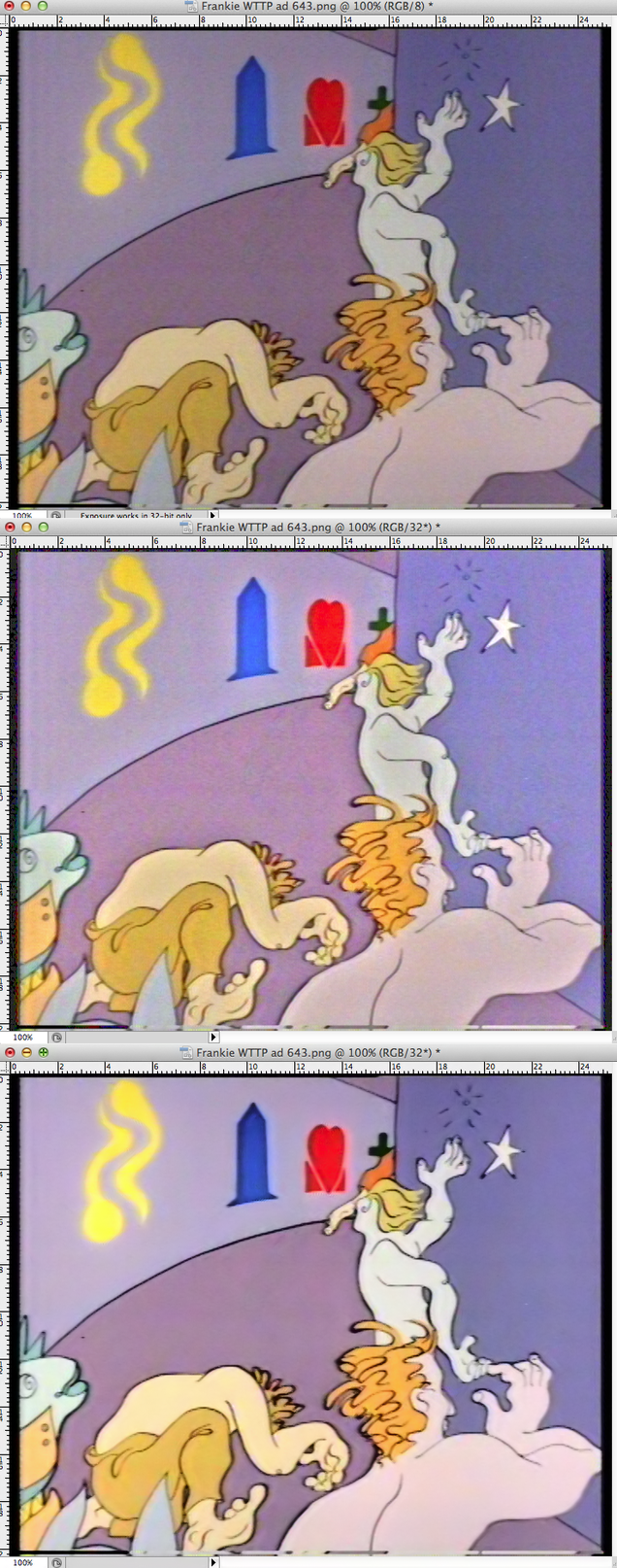
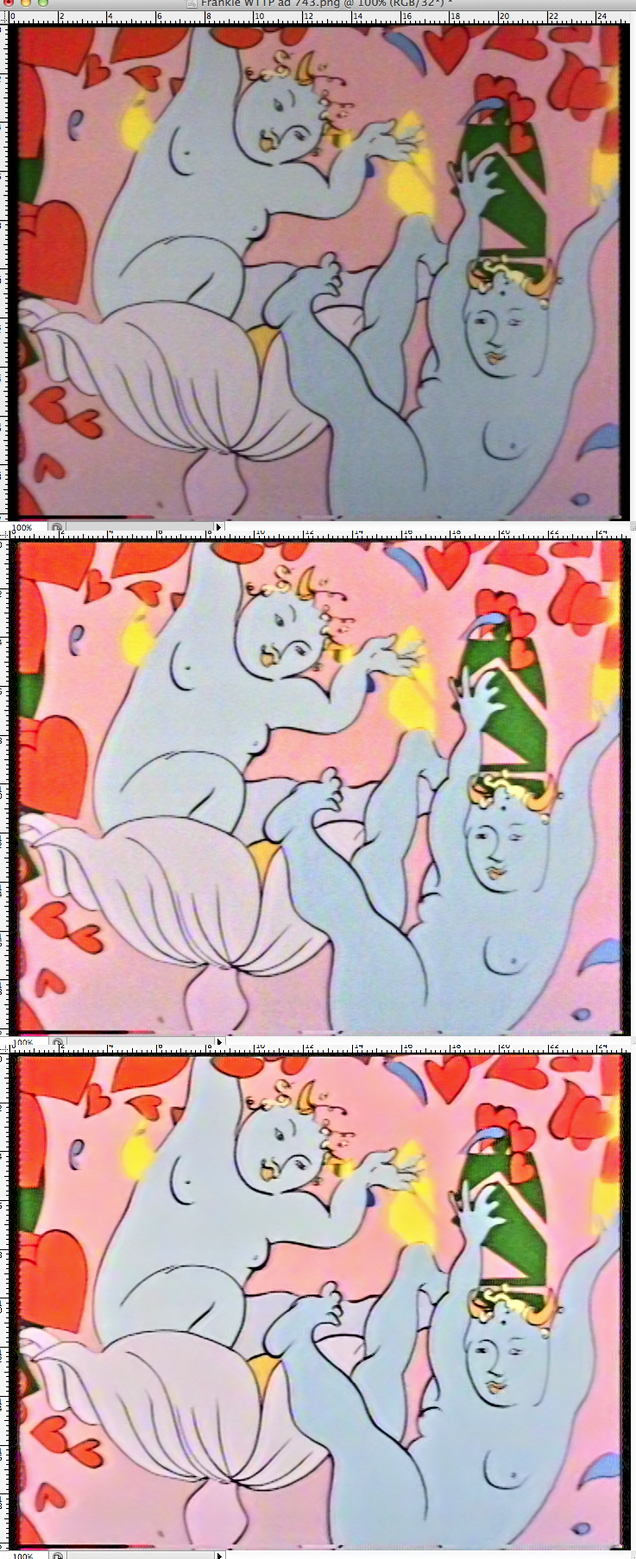
Luckily we can print on both sides of the page with this book so you can view two separate animations depending on which way round you hold the book. In an effort to get the best possible image quality for the book we went back to the sole surviving master copy, a U-Matic tape, and pulled the frames we needed. These were still fairly grubby looking with a dark caste over most, dull colours and lots of ‘noise’ across the image. In Photoshop I set up a series of image filters to find out how best to lighten the images and bring out the vibrancy of the colours without it looking too forced. It turned out that different scenes needed different amounts of filtering as the saturation kept changing so there was no chance to automate the process.
When I was satisfied I’d got the best colour and light balance there was still the subject of the noise and how to remove it, this is when you can see a texture like a grain across an image, usually caused by light or introduced by generations of copies. I use a great Photoshop plug in caused Neat Image (yes, terrible name but amazing results) to remove this. It takes a digital fingerprint of the image and then smooths out all the bumps without blurring the image, something some similar plug ins tend to do. See the process below, at the top is the original as it came to me, then the filtered version with enhanced colours and any dark cast taken away. Finally there’s the denoised version that will end up in the book.
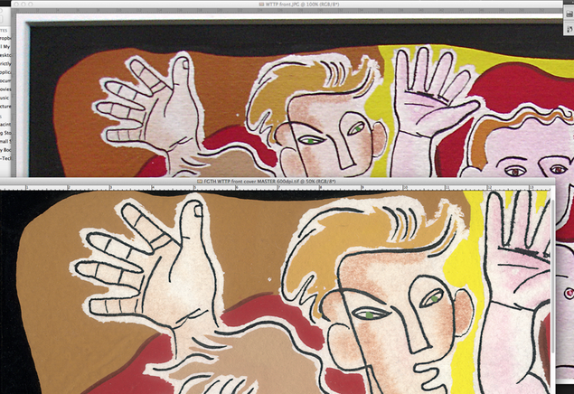 I’ve been scanning the original Welcome To The Pleasuredome artwork by Lo Cole this week and, comparing it to the existing scans I was working with, there’s quite a bit of difference. It’s tempting with Photoshop to put images through all sorts of filters and processes to make the image ‘pop’, much like compression and limiting on audio files. After a while you can lose sight of the original but having the original paintings to hand I could check on screen that they were as accurate reproductions as possible. Certain colours didn’t initially scan exactly so I made sure that I corrected them to as near as possible with the colours of origin.
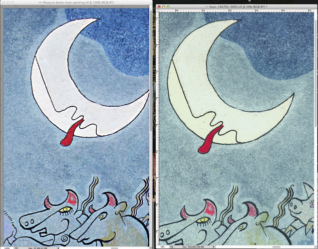
It’s actually hard to tell but the lower left of the moon is a subtlely different shade to the rest. The background is a more yellow/grey tone of blue.
This is a little like remastering from the original master tapes, cleaning up any stray dust or hair particles that have got on to the surface in the process. The blurrier, more saturated images here are the working files I’ve had and the subtler, sharper ones are the new scans that will be seen on the forthcoming box set. If you get the prints from the box, rest assured that the colours on them will be as accurate as possible to the original source (as long as the printer doesn’t mess things up) and if you display them they will nearly pass for originals.
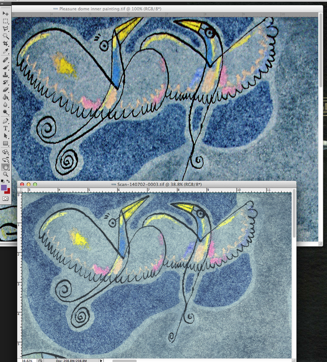
As you can see with this comparison, there’s a bit more of the image on the top and the blues are more grey/yellow.
Very pleased to log on and see that the Frankie Goes To Hollywood ‘Inside The Pleasuredome’ box set I designed has tipped over the 100% mark to become fully funded :). Rob Puricelli has put together a great overview of the project on his Failed Muso blog.
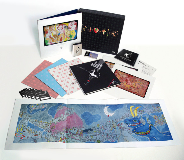
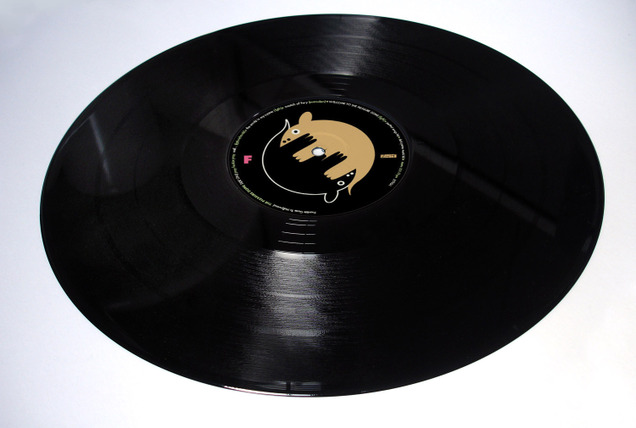
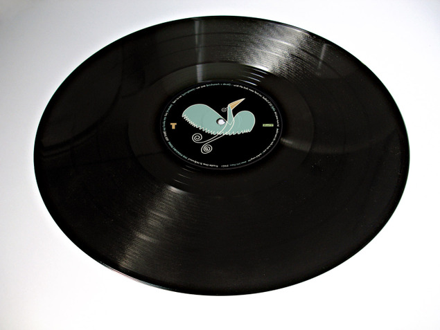
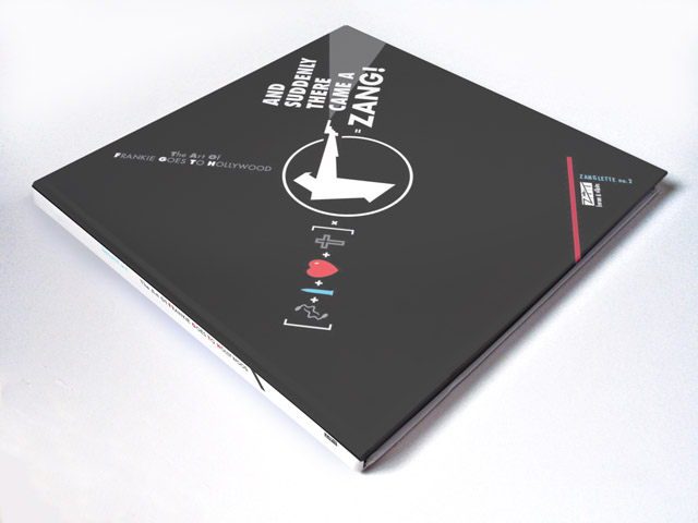
The Frankie Goes To Hollywood deluxe 30th anniversary edition of ‘Welcome To The Pleasuredome’ I designed is now 83% funded after less than 2 weeks. Here are some more images of some of the contents. You can pledge for a set or separate elements here.

 I’ve just been combing old discs for archived artwork for various Beat Delete reissues, forget vinyl, this is the new digging – byte digging. The first Herbaliser LP sleeve (‘Remedies’, 1995) and labels takes up just 5.4 MB of space, madness.
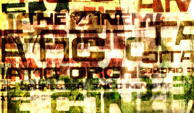
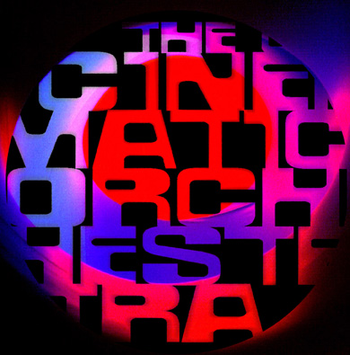 Above and to the right are unused designs for the first Cinematic Orchestra album and singles. Neither are for anything in particular, more playing around with the typeface I had created for the band and exploring different textures.
The top version was done by colour copying the logo at different sizes onto sheets of tracing paper which were then ripped, crumpled and overlaid under a scanner. The bright light of the scanner shone through the layers and the resulting scan had various filters applied to bring out the colours in the paper. No Photoshop layers there though, real layers of paper in one scan.
To the right is more playing with letter forms than anything else. The image behind the type is one of the photos from the Colourscape that later got used on my ‘Kaleidoscope’ LP. Below is a typeface I designed in college – check me out with my Fuse fonts, must have thought I was Neville Brody or something…
