Poster / flyer
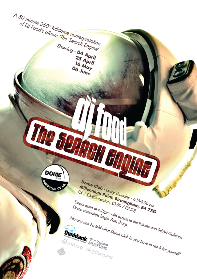 Starting next week at Dome Club, the UK’s first weekly place to see full dome content, is the first of four performances of ‘The Search Engine’. This is a 360 degree film for the full dome (or planetarium) environment.
It’s been seen before in London, Leicester and Montreal but this is a newer, revised version that lasts 50 minutes and presents an alternative version of the album with film, animation, photography and graphics.
The first show is April 4th, starting at 7pm at the Think Tank planetarium at Millennium Point, Birmingham. It will then be shown on the 25th, then May 16th and June 6th. Admission is £4 or £3 depending where you sit – the middle back half is usually the sweet spot for dome showings.
The club has weekly showings of all sorts of interesting, art-based full dome films and it’s really the sort of experience it’s hard to convey without actually going yourself. Here’s the little short about the Montreal version of this show that I did last summer.
Ticket available both online or at the door, go to: domeclub.co.uk > TICKETS > Dome Club -> 4th April (or whichever date you’re after).
 Posts are slowly but meticulously being added over at artofztt.com
AJ Barratt: “I remember going into the NME offices one day and I saw this poster on their wall, and someone had added a third line to the bottom of it. ‘Noise Is Golden, Silence is a Dead Giveaway… and Bullshit stinks’, that’s what it was! (Laughs) That’s what somebody had written.”
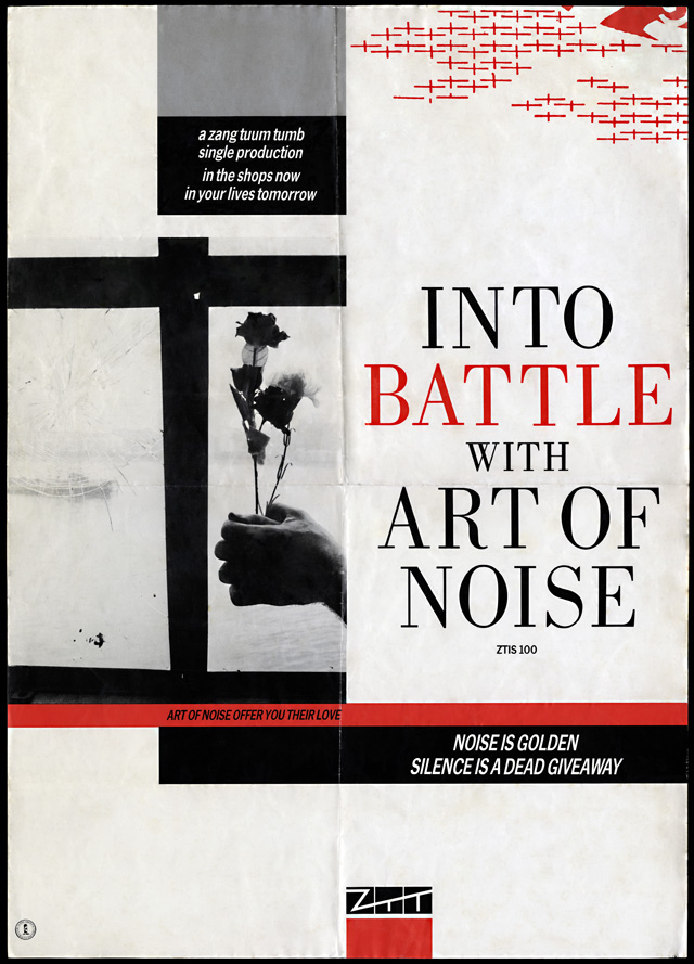
‘Into Battle’ promo poster from the archive of AJ Barratt, digitally restored by artofztt.com. Also included is the original photo for this design, scanned from the negative. The quote above is from a forthcoming interview with AJ which contains more exclusive images from his collection.
artist: Art Of Noise title: Into Battle With Art Of Noise format: A2 promo poster design: XLZTT photography: AJ Barratt cat. no: ZTIS100 date: 09/83 art of notes: The red crosses are identical to the ones on the ‘You Can’t Suck The Same Piece of Sugar…’ poster and continue the trend for ephemeral symbols hovering in the top right corner.
 I’d like to bring your attention to a new blog I’ve set up about the Art of ZTT Records (or ‘Who’s Afraid of the Art of Zang Tuum Tumb’ to give it its full title).
For years I’ve been collecting everything I can find from the early 80’s incarnation of this label and tracking down the designers and photographers responsible for some of the artwork. It’s a constant work in progress, starting off as a possible magazine article then progressing to a book idea and now, finally, I’ve decided to make it a website.
Inspired by Paul Gorman‘s rehabilitation of Barney Bubbles‘ work into today’s design community I hope the same can happen for the work of ZTT as it was hugely influential on my own desire to design for the music industry. XL, Accident and The London Design Partnership aren’t exactly household names in the same way as Vaughn Oliver and Peter Saville are but I think that the work they produced for the label in their golden age is at least an equal of the Factory and 4AD portfolios.
The site will eventually feature sleeves, promo posters, print ads, photos, exclusive interviews and associated ephemera connected with the label, its artists and designers. At the very least it should be an exhaustive gallery of an innovative label with a host of rare and forgotten imagery.
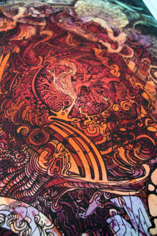
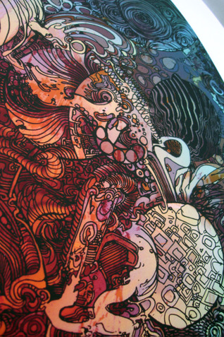
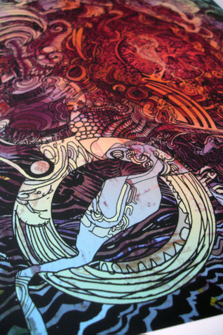
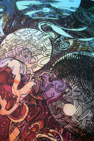
Several prints have just hit the Scraffer.com site shop, all collaborations between myself and Henry Flint for ‘The Search Engine’ album and related EPs. ‘Sentinel’ (top left) and ‘Octopus’ (above) make their first appearance in the shop after being available in a tiny run for last year’s Pure Evil Gallery exhibition. Both are the same size as previous editions – 64.5cm x 47.1cm, come signed by Henry and myself and cost £60. Close up details in the gallery below.
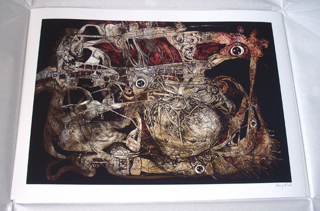
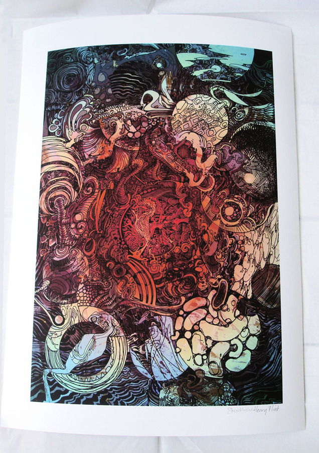
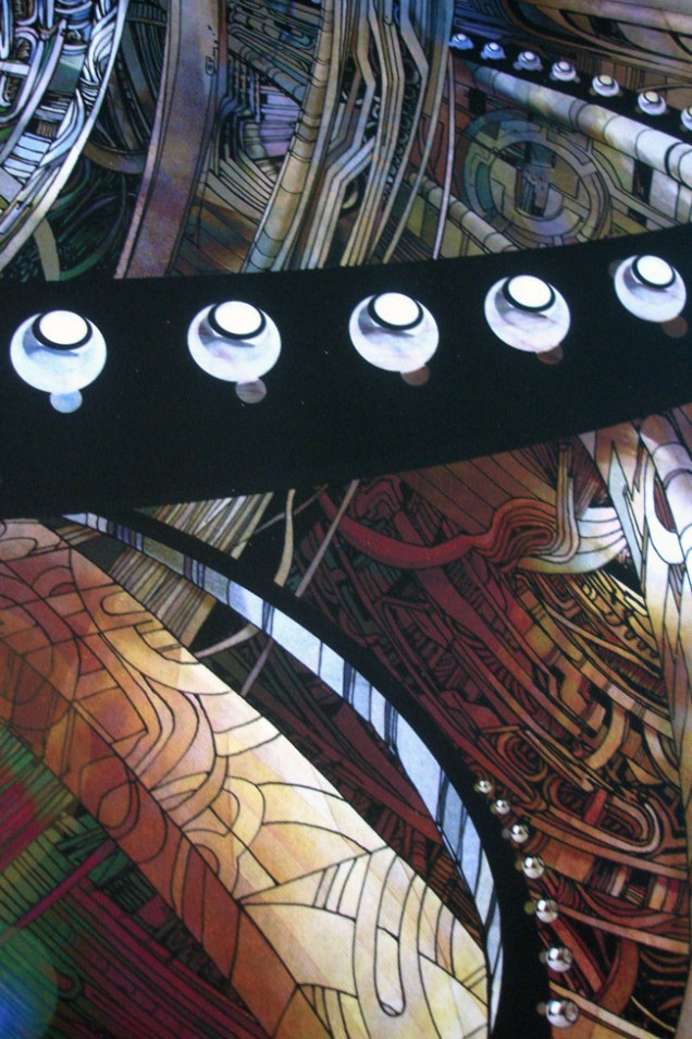
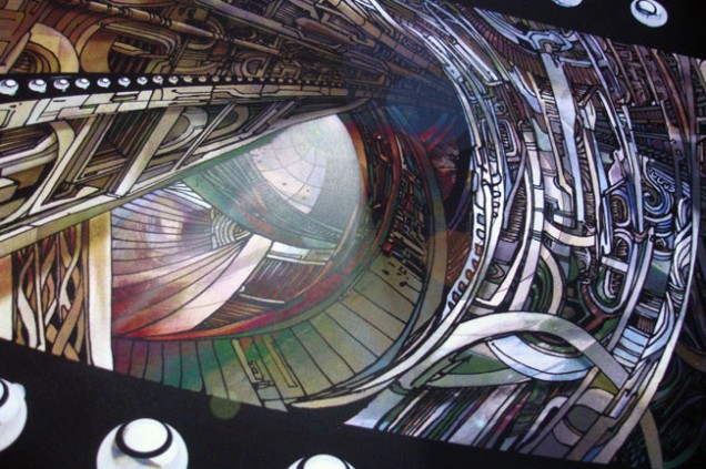
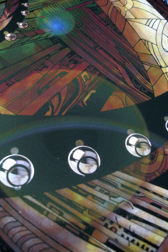
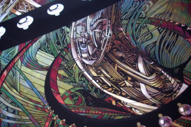
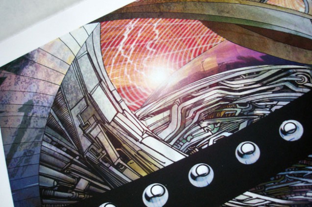
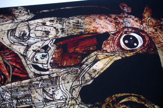
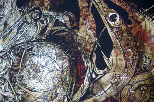
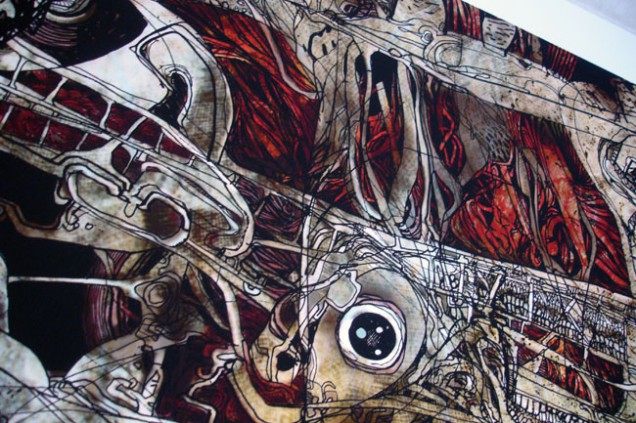
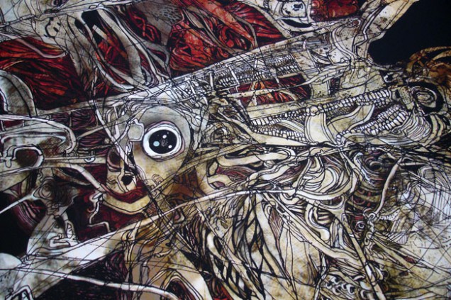
‘Planets’ (top right) is a completely new print in a new size – 47.0cm x 34.7cm – again signed by both of us and at a wallet-friendly £35. All are printed to the very high standards of the Fine Art Trade Guild on 300gsm Somerset Photo Satin which is a 100% cotton paper. Scraffer also has copies of the ‘Cosmonaut’ print, a version of which featured on the cover to ‘The Search Engine’, at £50. The last copies of ‘Mad Man’, which was used on the ‘One Man’s Weird Is Another Man’s World’ EP sleeve, are also there, each one with a unique doodle from Henry in the speech bubble.
‘The Secret Life of A Machine’ print is now sold out unfortunately, as is the ‘Skullstronaut’ which was done for the Factory Road exhibition although this may get a reprint later in the year. For those still waiting for the 4 x 12″ repress of ‘The Search Engine’ EPs in fold out sleeve – it’s coming! The vinyl is pressed and the sleeves are being printed now after going through three different design changes to make the package better. It also may be with us sooner rather than later as the planned Record Store Day release might be vastly oversubscribed this year.
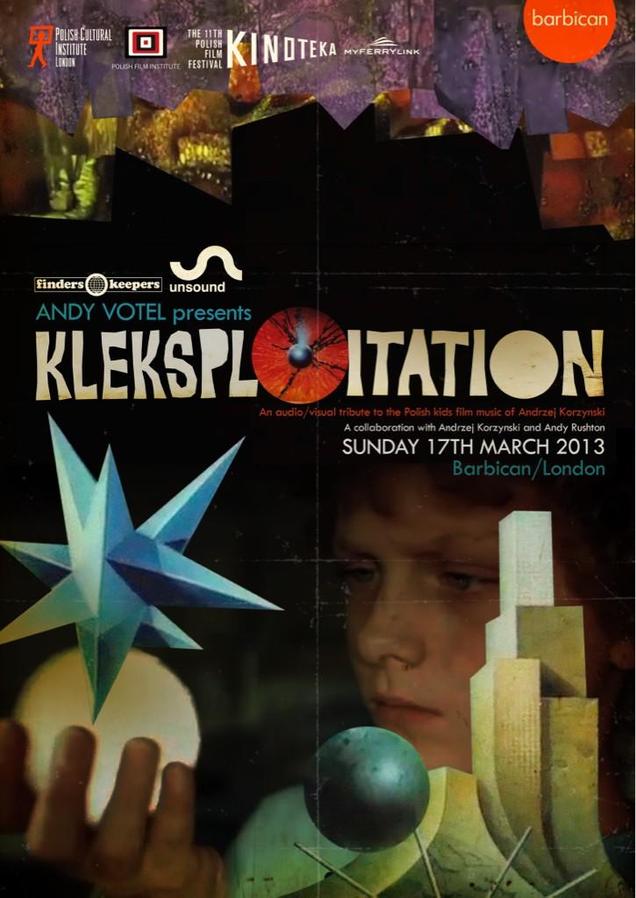
Andy Votel presents: Kleksploitation – 17 March 2013
A homage to Pan Kleks, a Polish trilogy of films for children from the 1980s, loved by Poland’s children from that era. Electronic musician, DJ and music producer Andy Votel draws on images, music and sound from the original films, selecting and subverting, to coax their darker side to the surface and create something wholly original, unsettling and – at times – weirdly humorous.
The Pan Kleks trilogy was scored by Andrzej Korzyński, a Warsaw composer whose unearthed catalogue Votel is currently releasing on his Finders Keepers label, including music written for Andrzej Żuławski’s incredible Possesion.
Want to go to this, tickets available here
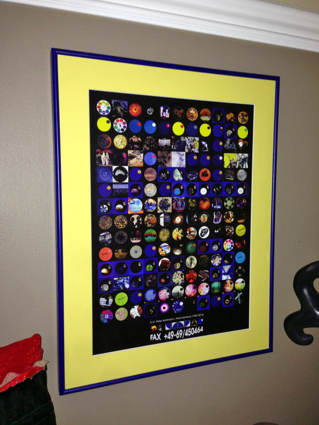 Christian at Stylusnation sent me this photo of the Pete Namlook / Fax records tribute poster I designed. His wife downloaded the pdf and had it printed and framed as a surprise for Xmas, looks beautiful, well done that woman.
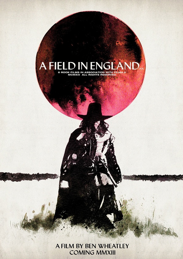
This may well be sold out by the time you read this *SOLD OUT* but what a great teaser poster for the film ‘A Field in England’ from Luke Insect and Kenn Goodall. The film is Ben Wheatley’s follow-up to ‘Sightseers’ and the poster is available as a limited print from Rook Films.
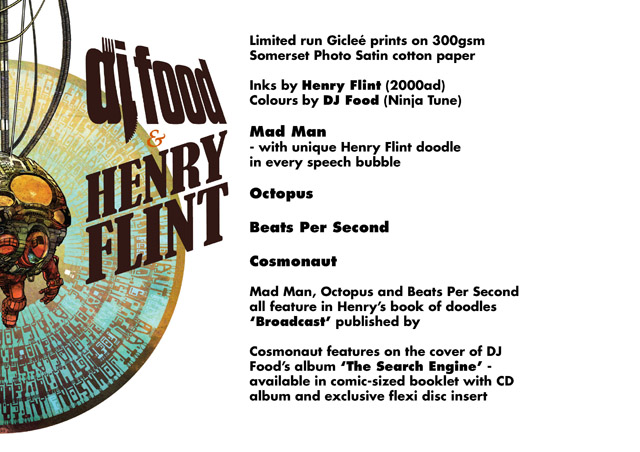 All four giclee prints I did with Henry Flint are now available in Orbital comics, 8 Great Newport Street, WC2H 7JA just off Charing Cross Rd. in London. They also have copies of the comic book / flexi disc / CD edition of ‘The Search Engine’ and Henry’s ‘Broadcast’ book along with a fine selection of comics, books, vintage toys and a small gallery space which is always interesting. Highly recommended.
It looks like there will be a fifth print soon too by way of a revitalised Scraffer.com, a smaller A3 size of ‘Planets’, an illustration that appeared on the ‘One Man’s Weird Is Another Man’s World’ EP. Talking of which, the 4 x 12″ repress package (the three EPs plus the Amorphous Androgynous remix 12″) is at the printers but it might be held over until Record Store Day in April now, I’m not sure. More info when I have it.
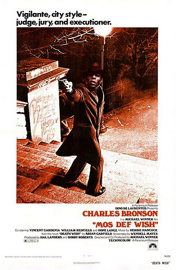

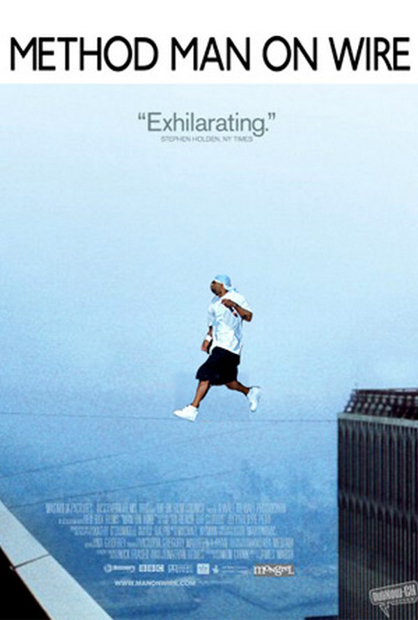
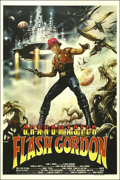 These made me laugh, more over on the egotripland site.
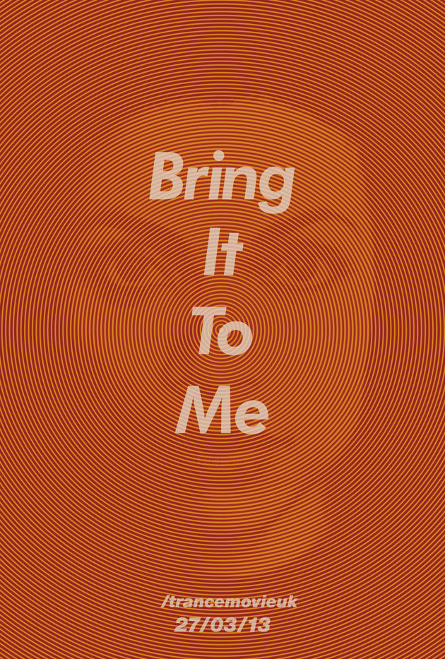
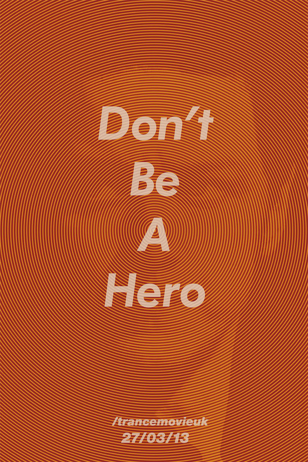
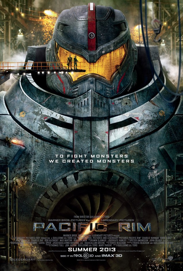
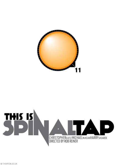
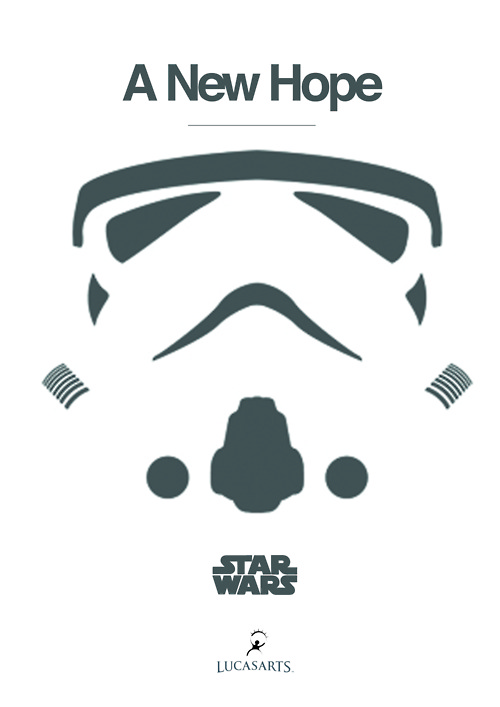
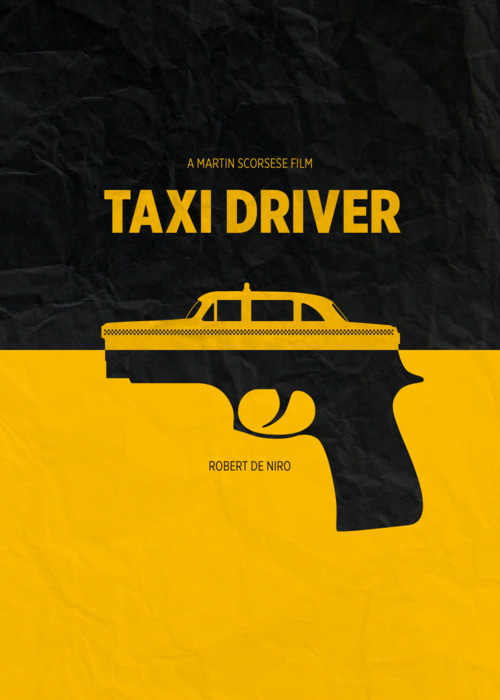
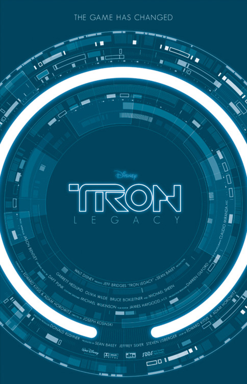
Love this tumblr of Olly Moss-inspired minimal movie posters. You’ll need a while to go through them but I’ve picked some that caught my eye, I seem to be obsessing over circular designs at the moment.
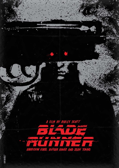
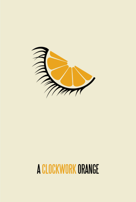
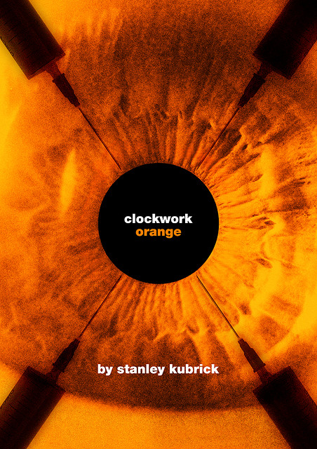
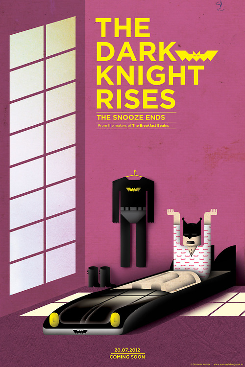
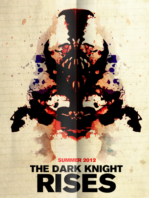
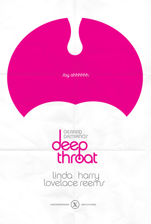
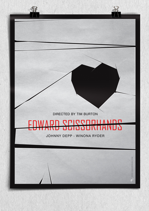
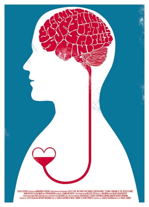
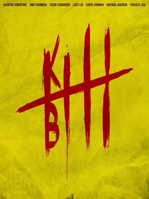
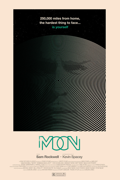
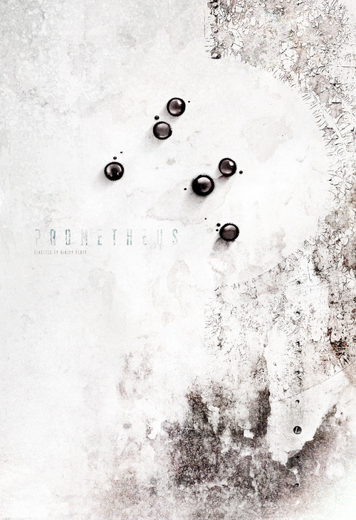
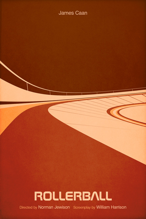
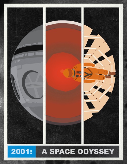
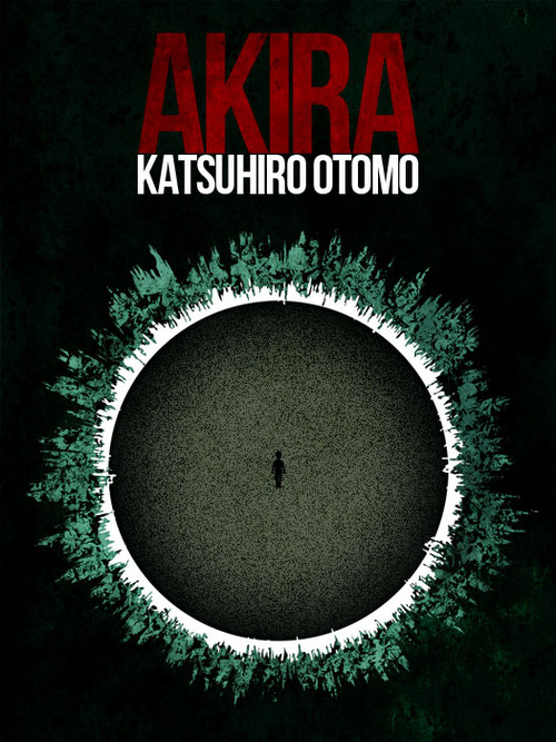
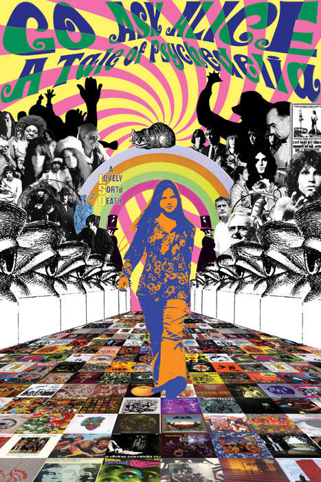 Never seen this poster before but Dangerous Minds posted it and you can watch the film on YouTube if LSD frightspoiltation films are your thing. Whenever I see the name Alice associated with LSD I’m reminded of the Kenny Everett jingle he once did… KE – Alice D
*UPDATE* Seems that this poster was made by Markey Funk in 2006, for Agitpop Records – not for the film at all. It was for a psychedelic mix and here’s it is in three parts with additional info – well worth a listen.
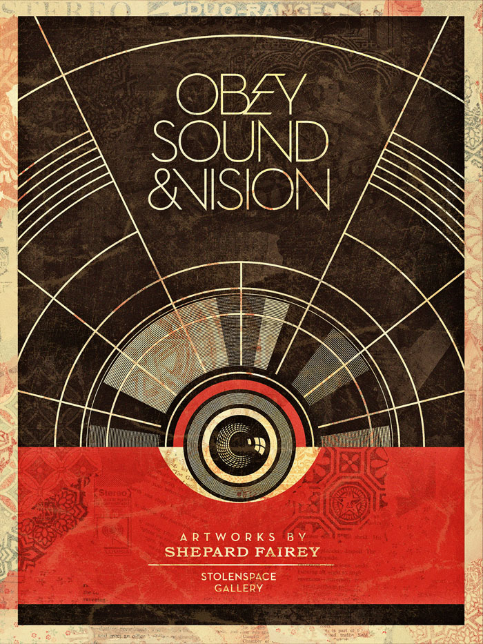
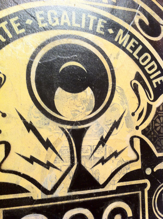
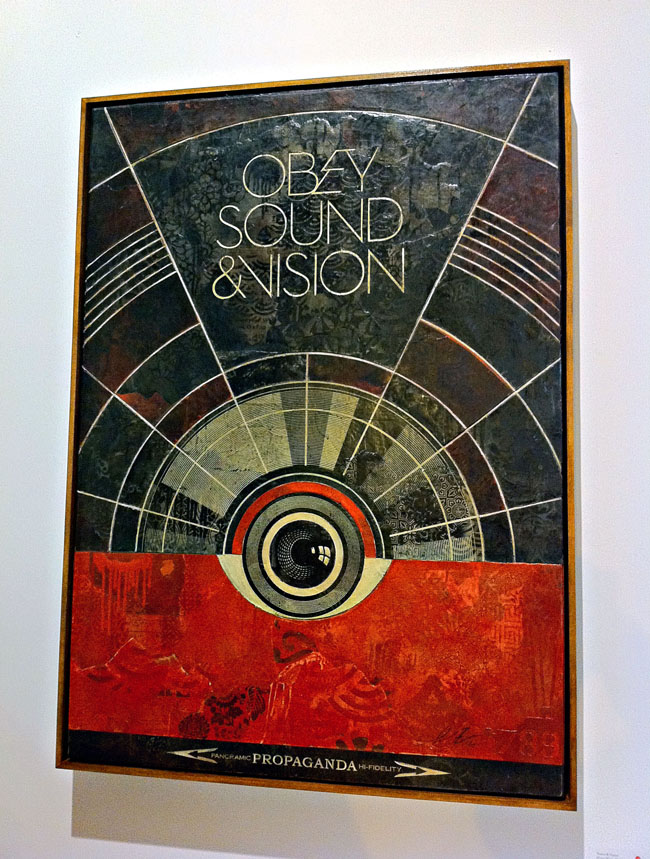
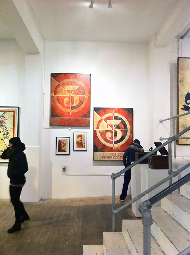
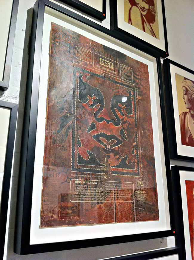
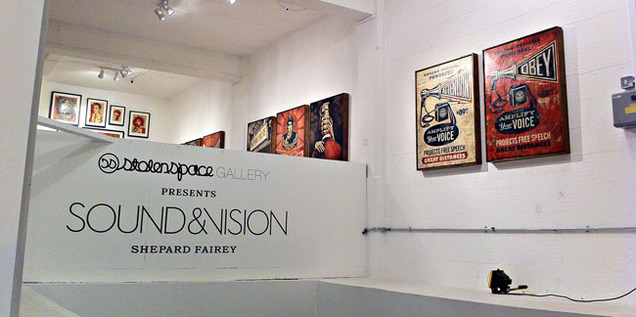 I finally got to see the Shepard Fairey ‘Sound & Vision’ show at StolenSpace over the weekend and it is highly recommended. There was a vast amount of work pitched between two galleries with a shop in between for good measure and as a body of work it’s very impressive. I’ve been a fan since seeing his early paste ups in New York in the mid 90’s and attended his first London show in ’99 at the Horse Hospital. That he was doing a music-themed show was music to my ears (sorry), given that he’s designed sleeves and videos for a number of acts over the years and knows the language, always inserting musical icons into his work. For those that know Fairey’s style – it’s not a massive departure visually, the red, cream and black colour scheme dominates throughout and that’s fine because it’s a classic. He really doesn’t need to mess with the formula as there’s more than enough here to see and it gives everything a certain coherence.
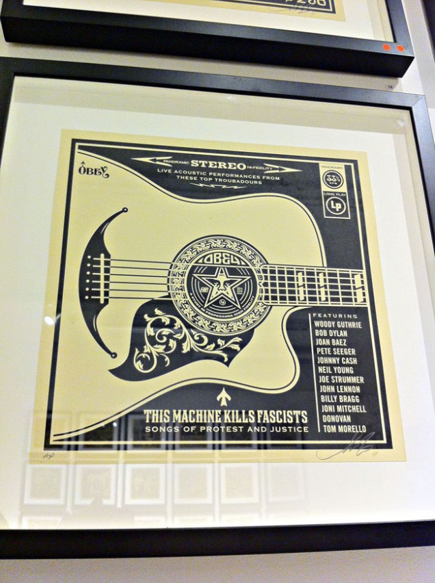
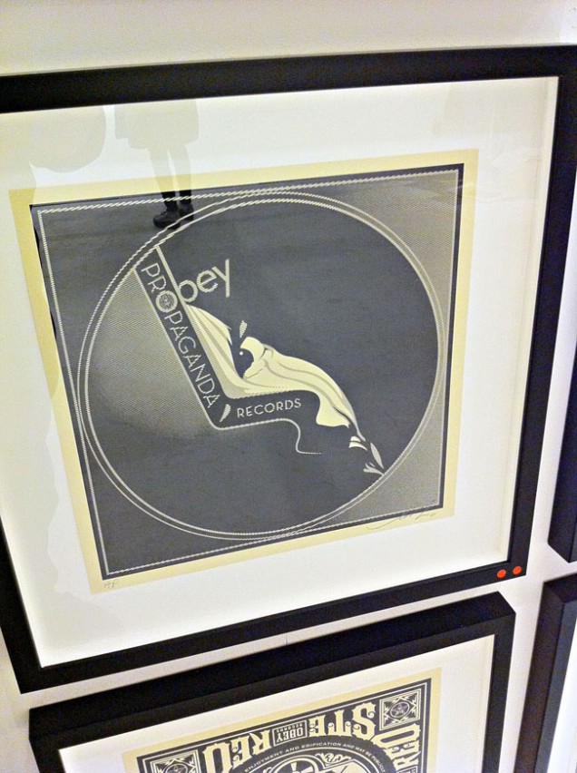
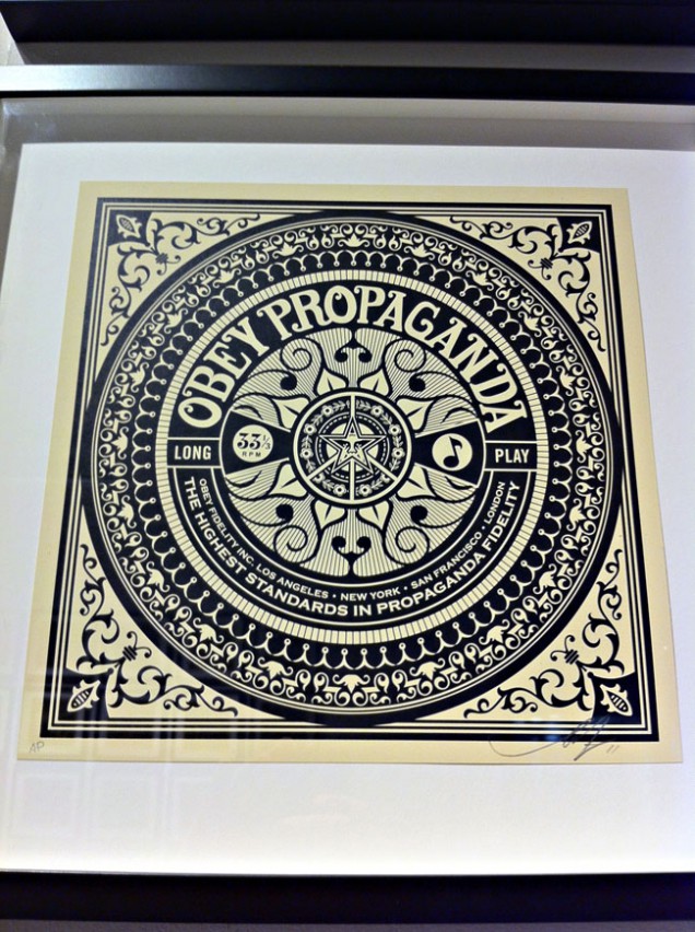
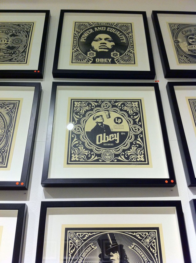
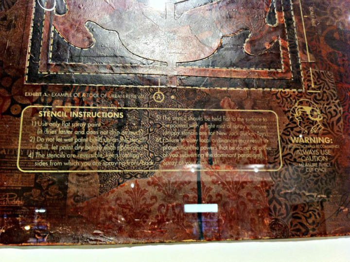
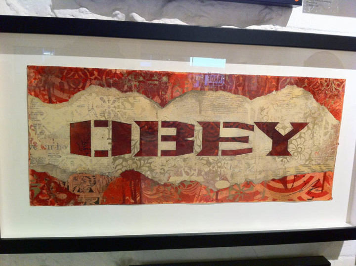
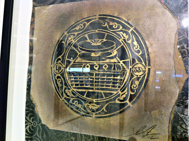
He’s experimented with other ways of presenting though, a series of A2 images are repeated on brushed metal in one part of the gallery and there’s an underlying collage feel to some of the pieces where he’s pasted several layers of paper together before printing over the top, much like the fly-postered surfaces he goes over on the streets. Elsewhere multiple copies of the same print have been dissected, mixed up and reassembled so that geometric patterns are present from the different print and paper colours. These are stunning to see in the flesh, like some ancient scrolls unearthed from an Eastern archive, each one is dirty as if layers of varnish and glue have been applied and their edges remain ragged. Elsewhere he has ‘retired’ stencils pasted into collages, edges thick with paint and given a new lease of life as the tools become exhibits in their own right.
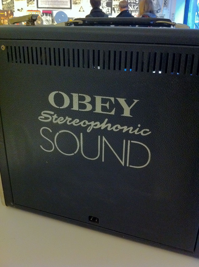
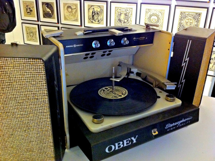
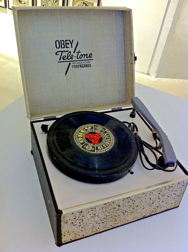
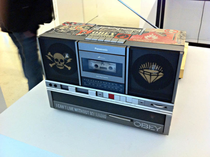
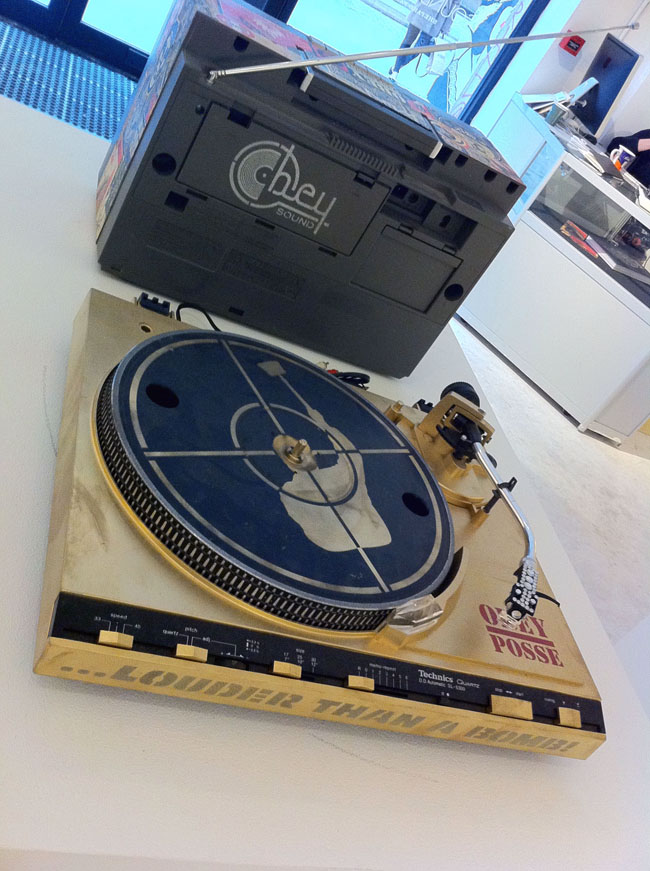
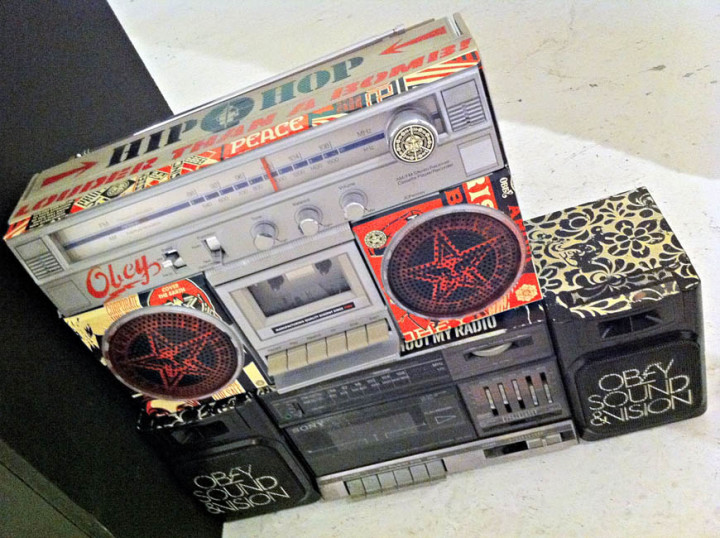
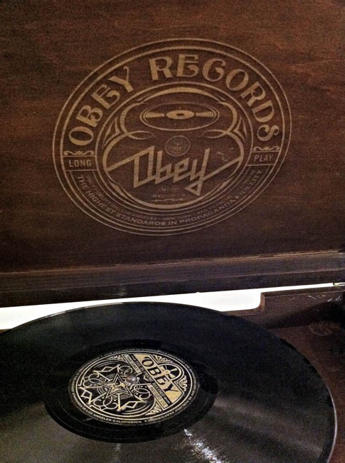
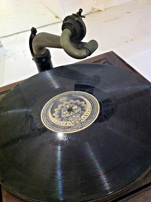
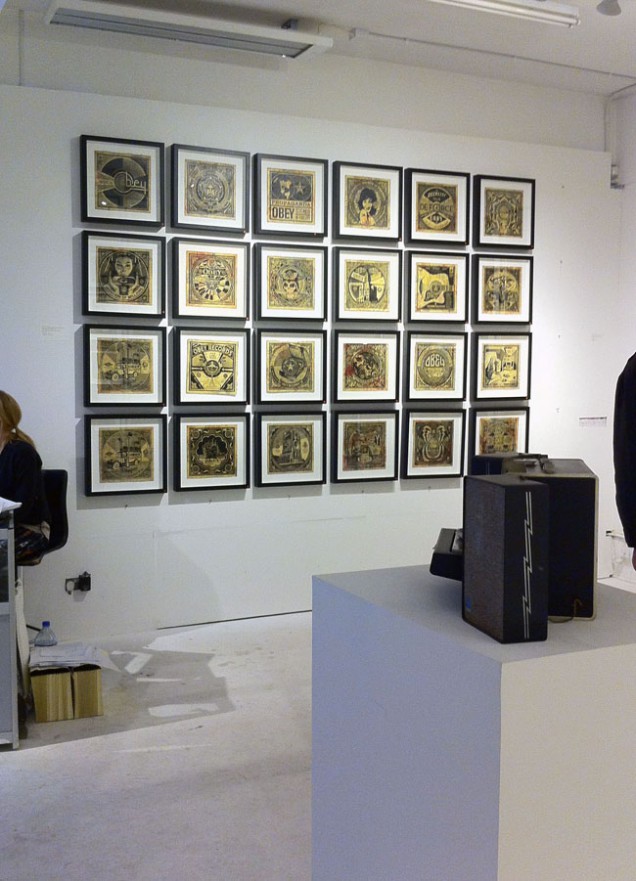
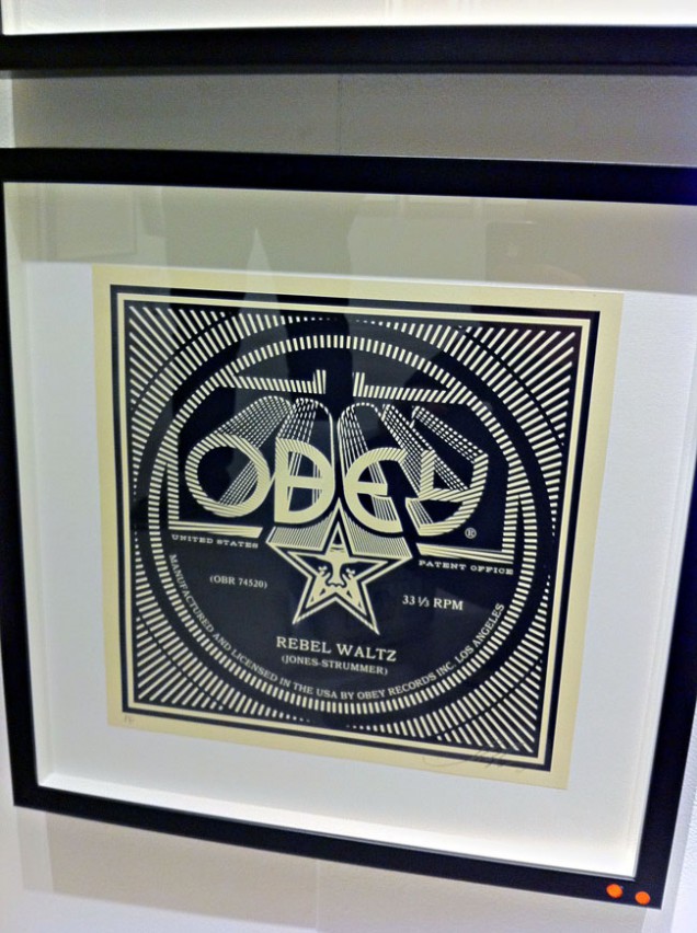
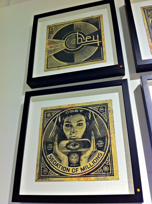
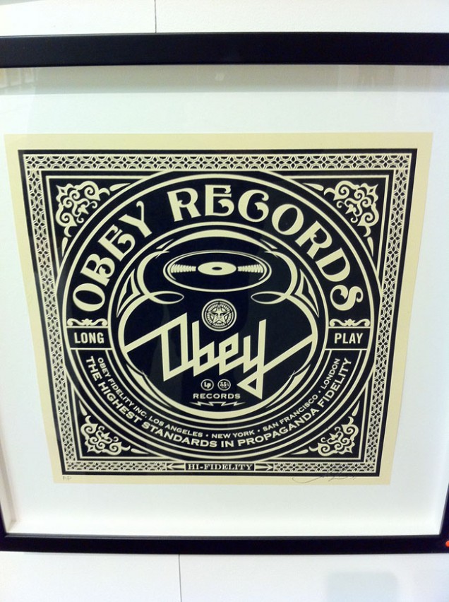
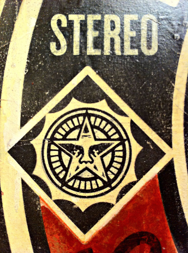
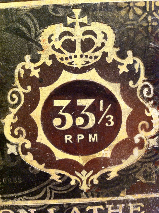
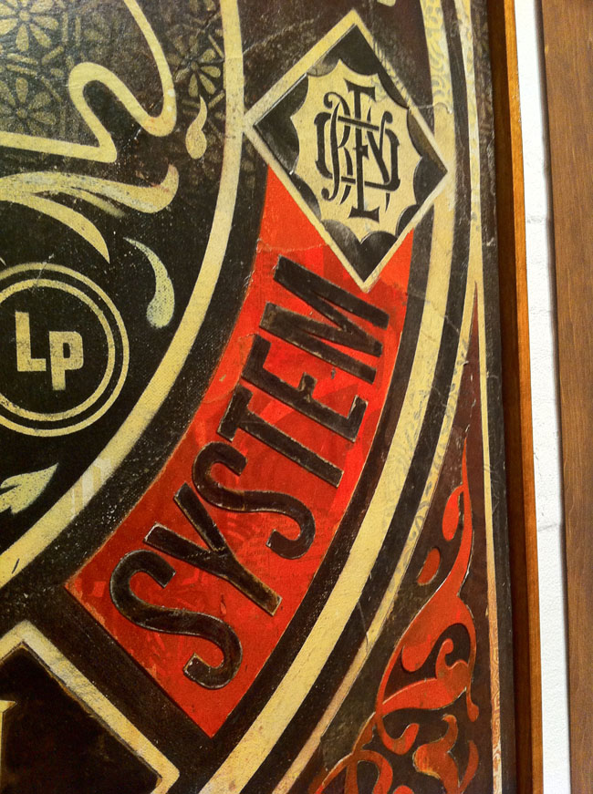
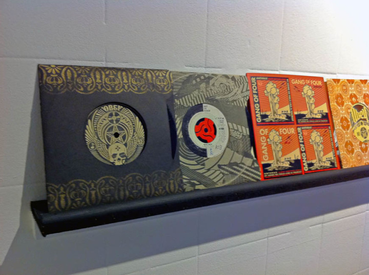
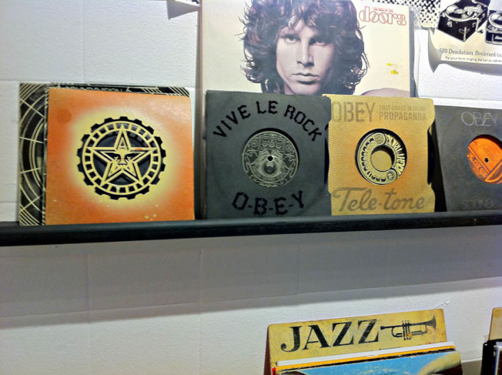
The part of the show that I thought most successful was the gallery with the records in racks, (part of Fairey’s own collection), customised turntables and 12″x12″ prints. Copies of sleeves he’d designed were randomly inserted throughout the vinyl as well as a tantalising selection of 7″ custom ‘Obey Recordings’ laser-cut sleeves and record labels. These were beautiful objects and the fact that you could touch them just added to the experience, sadly they weren’t for sale and I wanted to steal one so badly but resisted. Various vintage record and tape players were dotted about with stencils and stickers added to personalise them in the Obey way, you could even play the records on some of the turntables which was a nice touch. A lot of the prints in this gallery were fictional Obey record sleeves using advertising logos and jargon from the classic Stereo Test record era mixed with Fairey’s usual propaganda-type slogans. There was repetition of the imagery but each design held it’s own and it was hard to pick a favourite as they were all beautiful. Above the record racks sat a wall of black & white gig posters, except they weren’t. Fairey had taken existing images and posters and retooled them with his own logos and messages and this is where I start to have issues with some of the work.
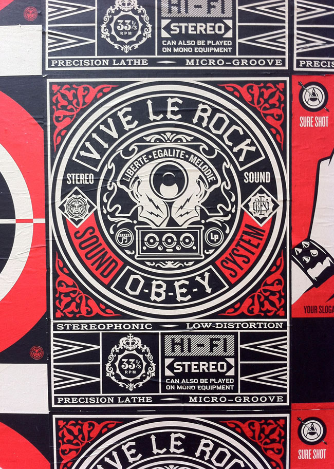
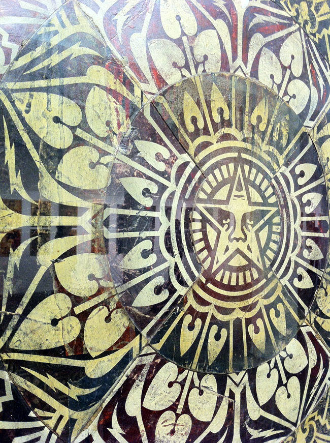
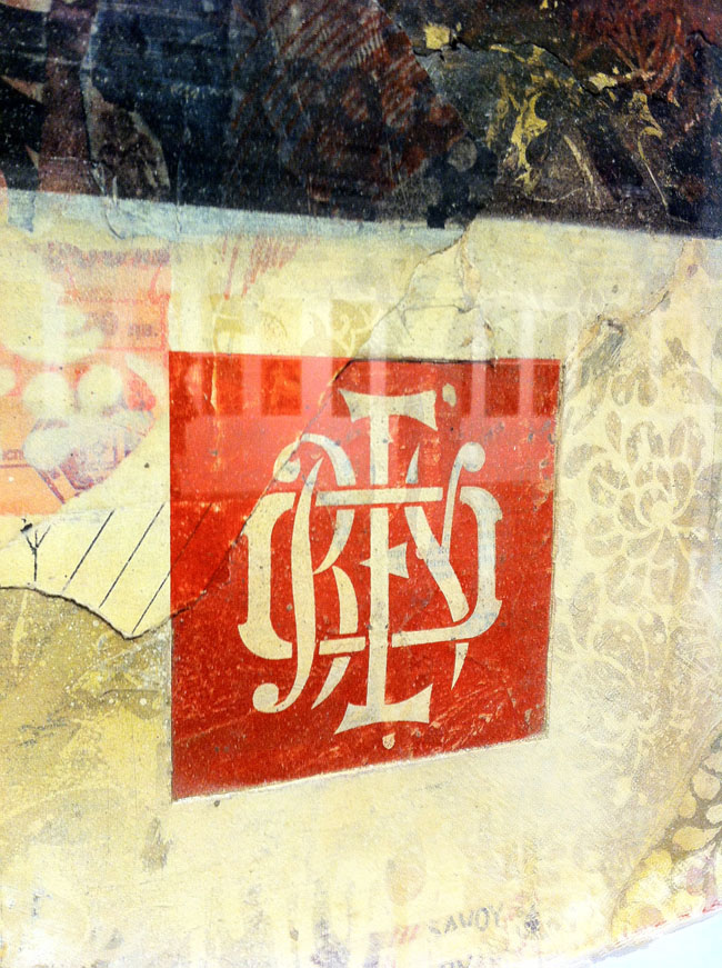
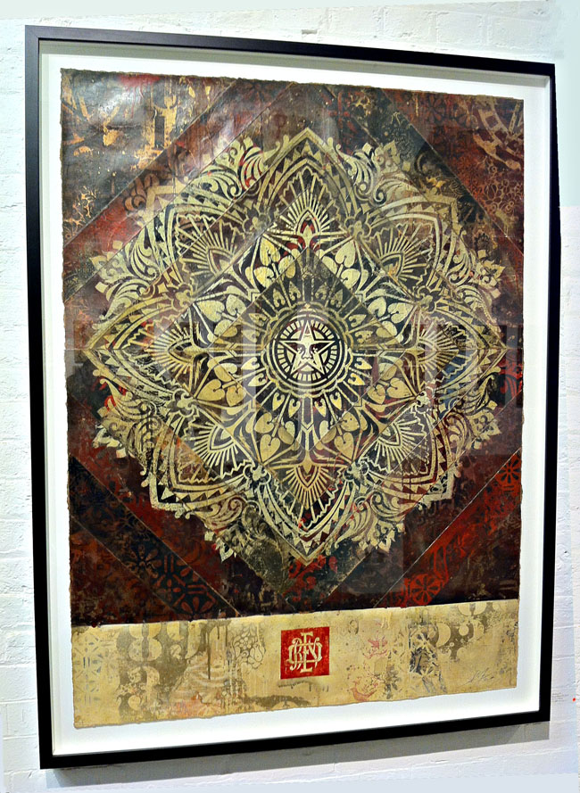
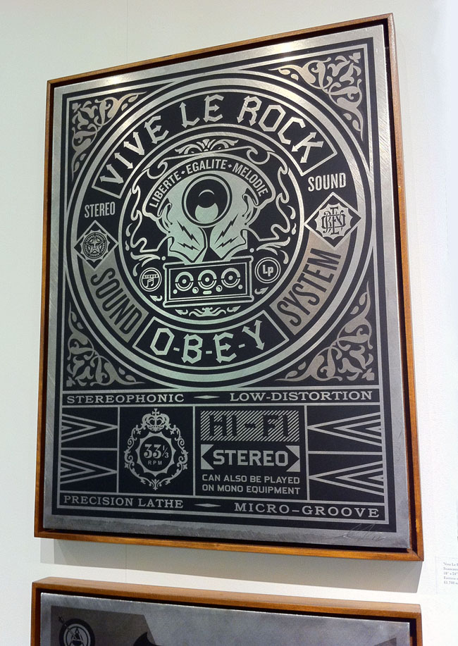
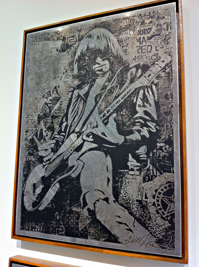
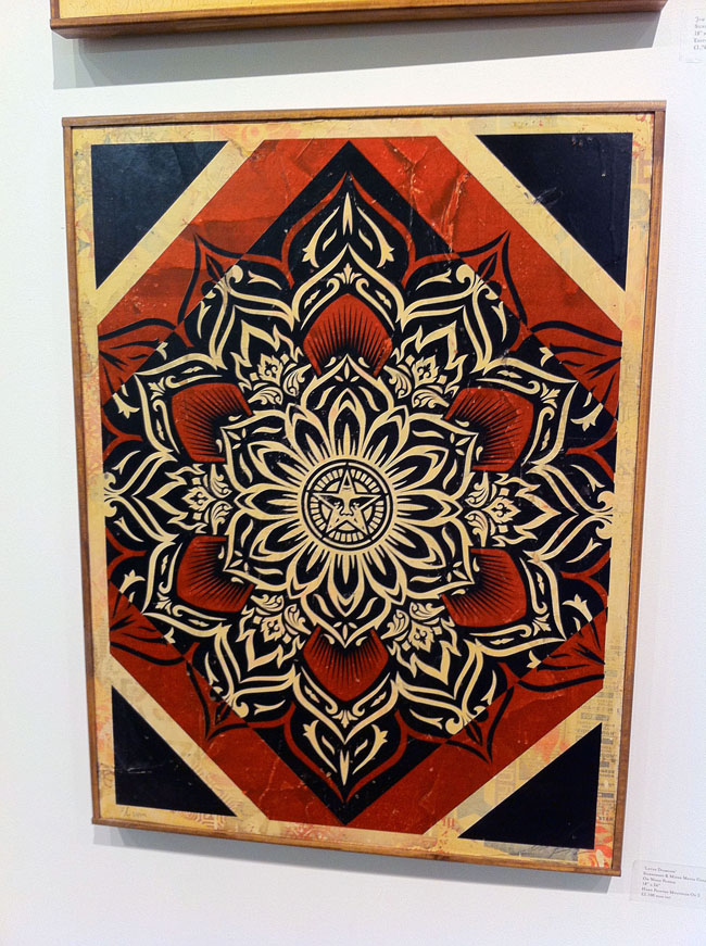
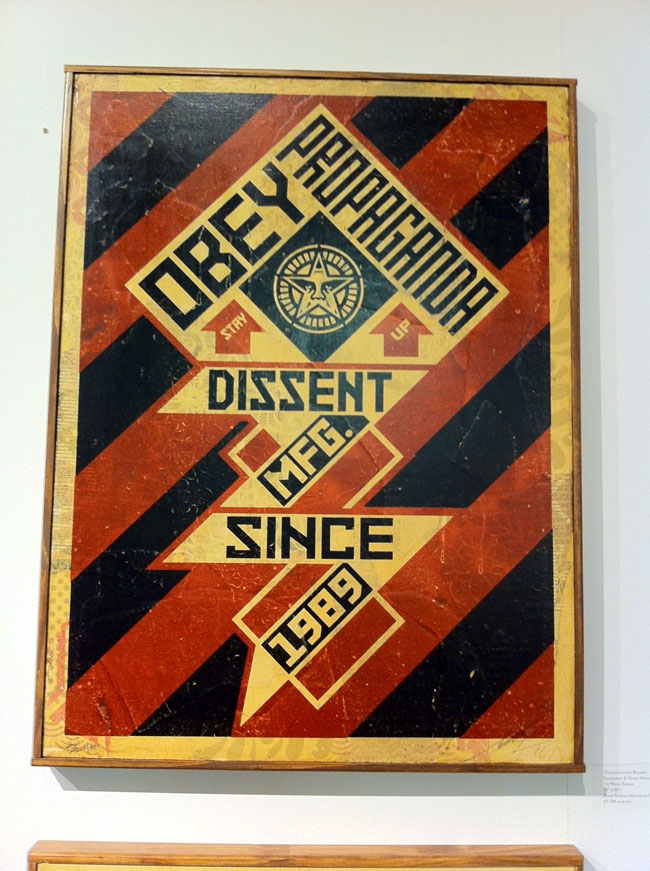
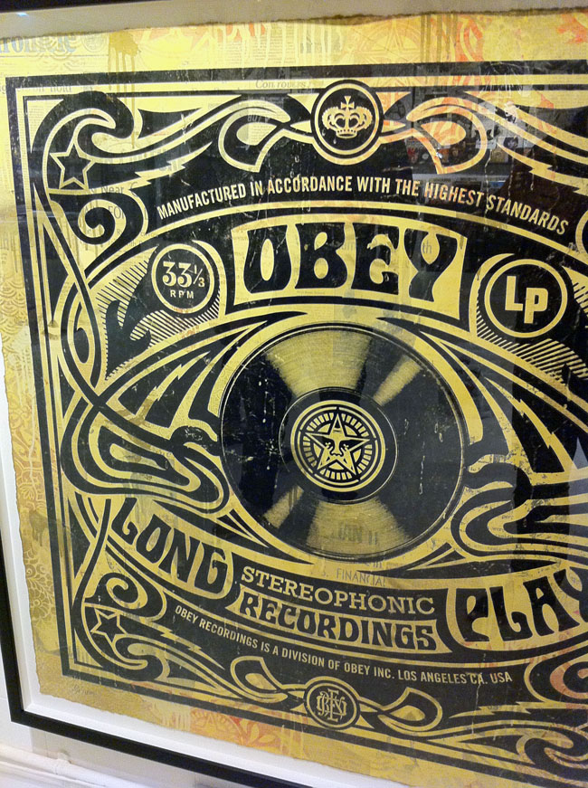
Before everyone pulls me up and says, “Shepard Fairey using other people’s work? surely not!? Next you’ll be telling me bears shit in the woods?” I’m pretty well versed in his history. He’s always appropriated the imagery of others, subverted existing logos and messages to his own needs, he’s by no means the first or the last to do this and various lawsuits have been filed as with any successful artist – ‘where there’s a hit there’s a writ’. The whole argument for and against appropriation could fill books and I’m not about to go into it at length here, also given that I use others materials in my own work there’s an element of the pot calling the kettle black. However I have my own yardstick for how much of something is used, abused or hinted at in any work and far too often he goes over the line with parts of his designs here. I find this work to be the weakest and it cheapens the rest of it somewhat as it’s a quick and easy thing to take an existing image or logo and reinterpret it – it’s lazy for the most part, a quick artistic crowd-pleaser.
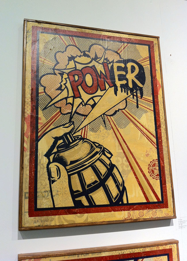
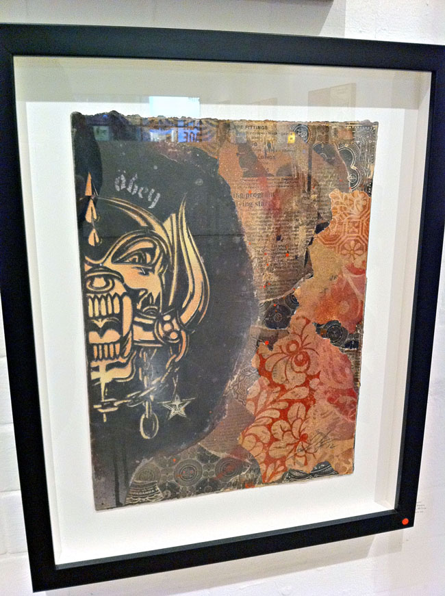
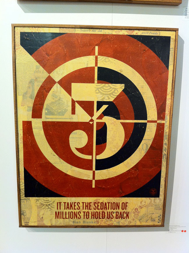
I find it more interesting to take the benign and turn it into something beautiful by re-contextualising it like Warhol‘s Campbell’s Soup tins or Lichtenstein‘s comic art appropriations (although this still doesn’t discount the matter of copyright infringement). Fairey does this well with the various nods to the design language of 60’s and 70’s era record graphics: turntable speeds, 45 adapter shapes, retro fonts and patterns – you’ve seen it, or something like it, before but it’s not a complete rip. But by taking existing gig posters and redesigning them into more gig posters in his own image he’s not bringing anything new to the medium, just basking in the reflected glory of others’ work. Chuck D‘s Public Enemy logo is modified so that the silhouetted figure in the crosshairs now has a pasting brush, Lichtenstein’s pop art is parodied with a grenade as spray can adding an ‘er‘ to a ‘POW!’ speech balloon, Jamie Reid‘s ‘No Future’ Sex Pistols tour poster is modified and Joe Petagno‘s Motorhead logo is just used straight in a couple of pieces. Another one takes Jasper Johns‘ multi-layered number paintings as inspiration and just changes the typeface, again using the collaged bed for texture that worked far more successfully on the previously mentioned pieces where he’d used his own designs.
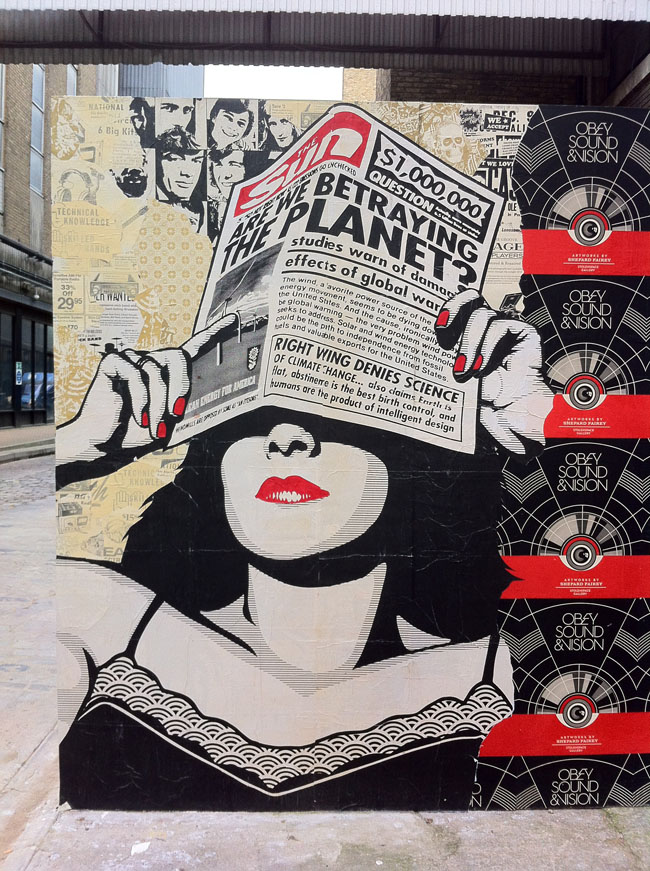
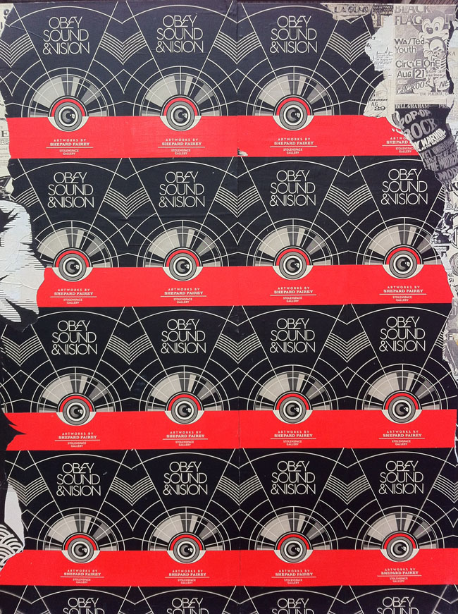
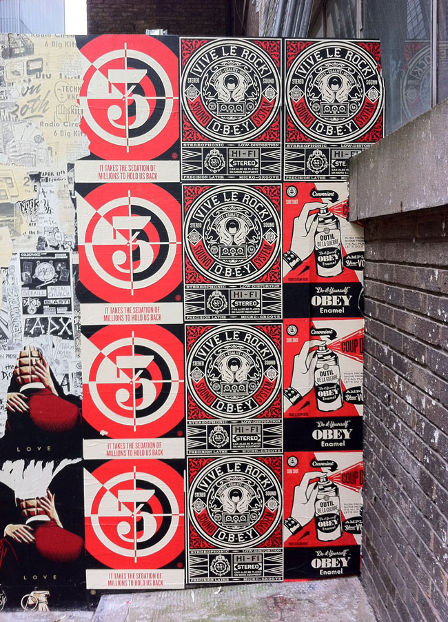
By parodying other artists’ work I feel Fairey is cheapening his own art, I think he’s better than this, well, I know he is because of all the other work in the show. It is littered with cultural bookmarks and (mostly Rock) icons – Joey Ramone, Lennon & Yoko, Lemmy, Iggy, Cash, etc. – again taken from existing (uncredited) photographs and homogenised in the clean, smoothed out style he made famous with his Obama ‘Hope’ poster. 80’s graffiti heroes like Haring and Basquiat feature alongside enough punk and post punk legends to fill an issue of Mojo. And that’s fine but I’m not sure what he’s trying to say by including these aside from the inherited ‘cool’ factor and the rebel nature of a lot of the subjects, linking into the subversive attitude and message in many of the other pieces no doubt. Grenades feature in several pieces and the grenade as spray can image from the ‘PowER’ piece is an extremely strong icon which he should revisit and exploit in future works rather than have relegated to a Lichtenstein pastiche.
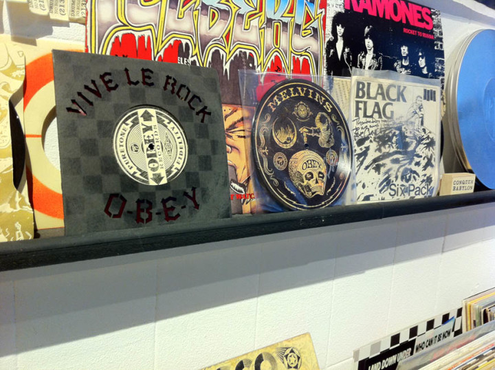
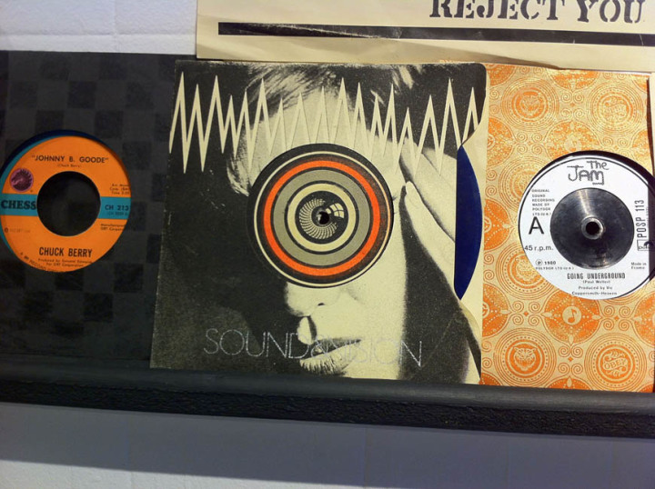
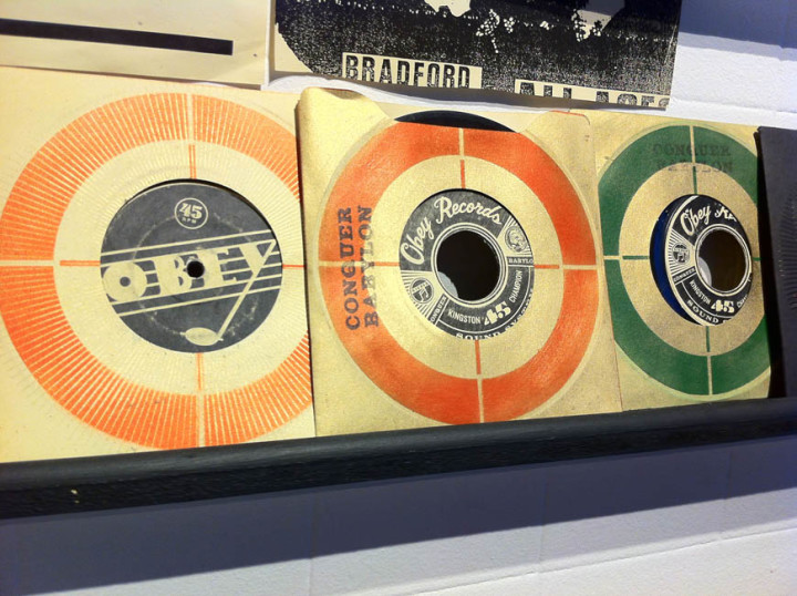
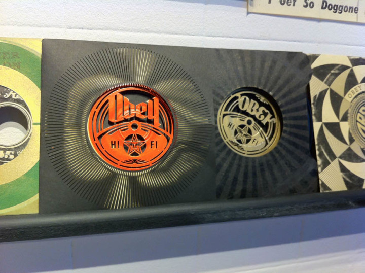
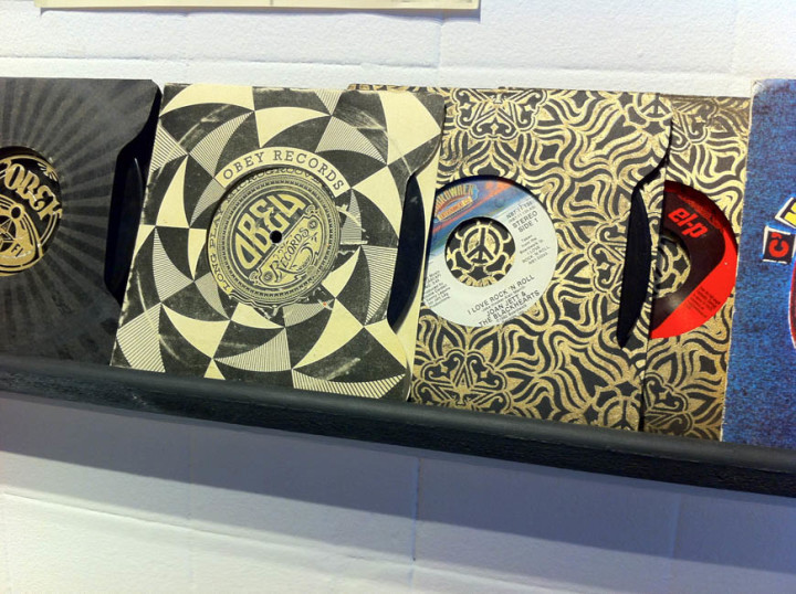
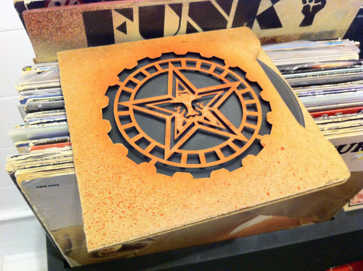
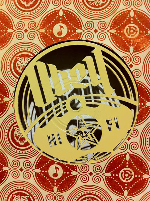
I found the upstairs of the main Stolen Space gallery the most uneven of all the work including a few larger pieces that looked like they were experiments in a new direction but with little visual direction apparent. Interestingly, whilst virtually every piece had sold throughout the exhibition, these had not, possibly more due to their high price tag than the virtual absence of anything that said ‘Obey’ about them. It was this elevated section that seemed to have the left overs in it, odd sized pieces which didn’t fit elsewhere so had been clustered together when a few less and a bit more surrounding space would have given them more impact and taken any filler out. The best here were the retired stencils – one of his classic Andre The Giant with painting instructions – and the design for the show poster itself which greeted you when you walked in. Overall though there was way more good than bad and to have such high quality throughout with that number of pieces – there must have been around 200 or more – is some feat.
The show ends on Nov 4th so you have less than a week to check it out and we feature Z-Trip‘s soundtrack mix for the exhibition on this weeks Solid Steel.
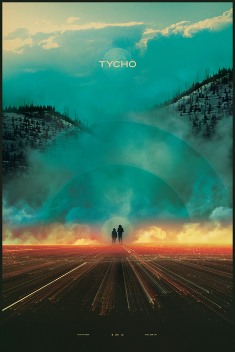 Now that is pretty gorgeous, new print from Tycho, whose ISO50 website you should really check out if you’re a regular reader of this blog and haven’t ever been over there.
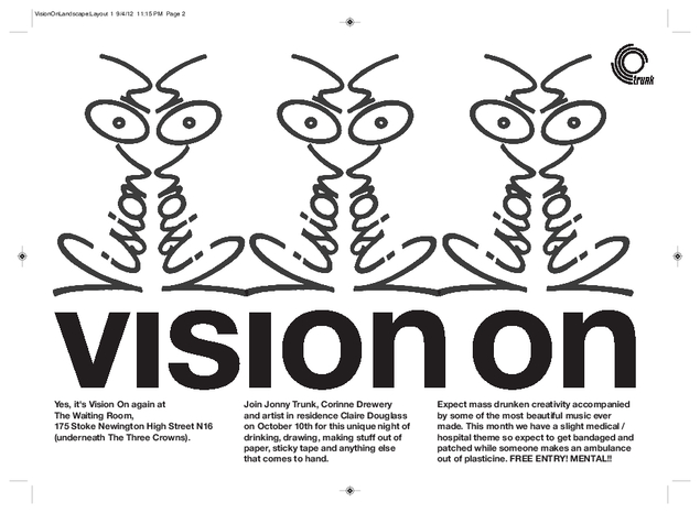
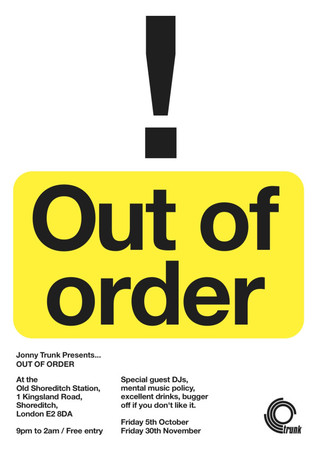 Jonny Trunk that is, of Trunk Records. Here he is explaining the premise behind each night:
“Both in London. The first is this coming Friday, It’s called Out Of Order, it’s free to get in, myself and a fellow DJ Pingo, (one of the Moshi Moshi DJs) will be playing interesting records (1950 – 2011) in a small and strange bar / place / hangout on the corner of Old Street and Shoreditch High Street. 9pm until 2am.
And secondly, we have a new Vision On evening coming up, which is an excellent night to come along to and drink and draw and make things and stuff, and this time we are having a vague hospital theme, so expect paper bandages, cardboard crutches, eye patches, that sort of thing getting constructed. Again, it’s free to get in, and is on Wed 10th October at the Waiting Room in Stoke Newington.”
