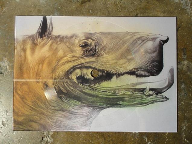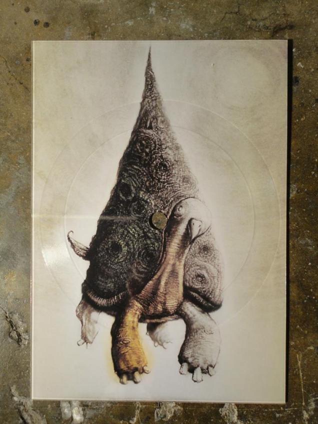
Kol Nidrei by Max Bruch, 7″ dedicated to Ilse Joseph’s four children gassed in Auschwitz. Present from a fellow record collector.
Records
I was lucky enough to receive this fantastic book for Xmas this year after the first printing in 2008 disappeared and started going for silly money. Luckily this 2nd edition has extra info and images so waiting paid off and I can’t recommend this book highly enough for fans of music design in general. Until the middle of the last decade the name Barney Bubbles wasn’t widely known or recognised aside from music business associates from back in the day or the odd rabid fan.
The reason for this is not because his work was hidden away on obscure releases – he designed covers for several classic albums as well as a fair few hit singles in the 70’s and early 80’s. It wasn’t because the work wasn’t good, most of it is stunning, all the more so when you read into the detail he put in each and every one. It was more to do with the fact that Barney often didn’t sign much of his work, and when he did it was under some super-coded pseudonym only a few close to him would recognise. He also didn’t go out of his way to publicise himself and suffered from bouts of depression which, sadly, caused him to take his own life in 1983, thus halting what could have been a groundbreaking career in design.
I say this because Bubbles was that rare thing in that he spanned two very distinct generations and worked seamlessly within both of them, a rarity these days and hard to pull off as most designers get associated with a particular style or genre and become known for that only. He started in the midst of the 60’s and became a full blown hippy, journeying to San Francisco in the summer of ’68 . He returned to produce graphics for the scene in London – the name Barney Bubbles was given to him after he started his own psychedelic light show mixing inks on overhead projectors. A long association with Hawkwind followed and he designed some of their most innovative sleeves such as ‘Space Ritual’ and ‘X In Search Of Space’ – both fold out wonders the likes of which were abundant in the 70’s.
But come the year of punk, when all this was to be washed away and the reset button pushed, Barney fell in with the newly hatched Stiff label with Ian Dury, Elvis Costello and Nick Lowe among others and seamlessly altered his style(s) to fit with the times, coasting through into the 80’s unscathed. He was the first person to mimic the Penguin book covers now so ubiquitous, parodied Blue Note sleeve design nearly a decade before it came back into fashion with Acid Jazz and took De Stijl and Cubist designs as inspiration before many others. He even dipped his toe into furniture design and early video promo making before he passed (did you know he directed The Specials‘ ‘Ghost Town’ video? no, me neither).
Until the publication of the first edition of this book, tirelessly put together by journalist Paul Gorman, who has since helped curate displays at the V&A of famous pop memorabilia, the design world had largely ignored Bubbles even though many pieces have featured in Record Cover collection books over the years. The drawing together of his output and the joining the dots between the various phases, pseudonyms and uncredited work has finally shone a spotlight on him, something it’s doubtful he would have gone out of his way to do had he still been alive.
I certainly wasn’t aware of how far he reached with his work but plenty of his sleeves and designs were familiar to me even though a lot of the music wasn’t something I listened to. The logo for the NME paper from 1978 through to 2010 – that was Barney, the Stiff Records logo, Billy Bragg‘s ‘Life’s A Riot With Spy vs Spy’ sleeve, Elvis Costello‘s ‘Armed Forces’ LP package, The Blockheads‘ logo, the first Depeche Mode LP cover, the first Damned singles and albums…
An incredible body of work and an amazing book, lavishly illustrated that chronologically treads the paths that Bubbles did with plenty of input from the artists and friends that he worked with. My only nitpick with it is that the images are almost always out of synch with the text, the illustrations always seemingly several pages behind which is frustrating when you’re trying to get a sense of a sleeve being described only to find it 6 pages later.
His death is also almost a minor entry in the narrative and, having heard Mark Hodkinson‘s harrowing ‘In Search of Barney Bubbles’ documentary on BBC Radio4 it’s all the more tragic when you see everything he’d achieved up until that point. Treat yourself to this book and revel in his work as he finally takes his place among the greats of music design in the 20th Century.
A couple of weeks ago I posted about buying a fifth copy of The The‘s ‘Infected’ album upon finding a test pressing secondhand. Whilst record shopping in Montreal this summer I found a new copy of the Nonesuch vinyl reissue of Eno & Byrne‘s ‘My Life In The Bush of Ghosts’ – another of my all time favourite albums. The CD reissue in 2008 with the bonus tracks is already in my collection but the double vinyl version added multi-track parts to two album cuts on the fourth side as well so I couldn’t help but pick it up.
Add to the bonus audio that the whole package was housed in a beautiful, heavyweight card gatefold sleeve with notes and it was an instant sale. Around the time of the reissue a special website was created with additional content such as extra sleeve notes by Paul Morley, recording session photos and discarded screen captures from the original artwork. Unfortunately it hasn’t been updated and now all you can get is the home page (possible out-dated Flash plug-in is my guess) so here are some of the artwork outtakes.
I now own five versions of this seminal record – the original vinyl (with the track, ‘Qu’ran’ which was later removed), original CD, Nonesuch reissue CD and vinyl. There’s also an Italian bootleg CD called ‘Ghosts’ with demos and original versions before samples were removed or tracks reworked which features a couple of things not on the reissues. I also have the two 12″ singles that were released originally in the early 80’s but not the ‘first edition’ vinyl bootleg of demo versions.
Apparently above is a scan of an earlier version of the album sent to the record label. Because of ‘sample-clearance’ issues (this was 1980, such a thing was unheard of) the record was delayed and later some of it was reworked by Eno and Byrne. Some tracks were dropped or titles changed, some mixes were redone and some new tracks were added. Most of the dropped tracks were reinstated on the reissues on Nonesuch. I never tire of this record and the reissue is the rare exception of the bonus material actually adding to an enhancing the original rather than just padding it out.
Much like Malcolm McLaren‘s ‘Duck Rock’ album this record is a product of its time and exists almost in a vaccuum, barely dating in the 30 years + since its release. You can hear echoes of the sounds Eno & Byrne created here on either side of their respective discographies around the time but they never fully reached the other-worldliness achieved on this album
I can’t resist a comic or book with a record on the inside cover and the 7″ size of McBess‘ ‘Malevolent Melody’ made me grab it off the shelf in the NoBrow shop in Great Eastern St. earlier in the year.
The name McBess was unfamiliar but his images floored me and I immediately bought this as well as another oversize book by him called ‘Big Mother’. Seldom do I come across someone who has such a strong, fully developed visual style that stands out so immediately.
Shades of Kid Acne and Pete Fowler‘s style permeate throughout but not a hint of colour and some of the smoothest draughtsmanship I’ve seen in a while.
I was in love with his style from the minute I saw it, my favourite artistic discovery of 2012. Check out his site here.
Digging in the MVE in Berwick St. yesterday I came across this in the mid-price section. It appears to be a test pressing of The The‘s classic ‘Infected’ LP with uncut / glued cover and inner sleeve plus Epic credit sheet. This album (by Matt Johnson – who I worked with on ‘The Search Engine’ – and collaborators) is one of my all time favourite records EVER. Serious Desert Island Disc stuff which will stay with me until I die.
I already own the original vinyl, CD, remastered CD and limited ‘Torture’ cover with poster versions. I even had a signed proof cover of another, largely unknown sleeve design with a cow skull on it that I bought from Andy Dog (the cover artist and Matt’s brother) years ago but it was mistakenly thrown out in a house move as it was stored inside a 12″ mailer! Gutted…
[vimeo width=”640″ height=”350″]http://vimeo.com/50267638#[/vimeo]
Created by Mark Taylor and Thad Povey. Love the painted records creating sounds when the needle hits, what fun you could have with this although it’s not immediately obvious how you could change each record.
Out on Stones Throw a while back now but still in stock, ‘3 Dollars’ on 5 inches of vinyl (actual cost: $10 + postage) but still cheap compared to some of the prices I’ve been seeing lately. Great design and illustration plus the track’s a banger – “that’s right!”
With the US election upon us I thought I’d share these photos which were taken during the run up to the 2004 Presidential election. The display was in the window of Record Palace in Amsterdam (a shop I’d recommend to anyone visiting the city).
Also Steinski knocked up a little topical skit about Mitt Romney over here.
I’ve just come back from Tel Aviv and while I was there I met Markey Funk, whose ‘Go Ask Alice’ image and mix I posted by complete coincidence earlier this week. He gave me a load of records including his latest album ‘The Mystery of Mordy Laye’ as well as a DVD with 3D glasses.
If you love radiophonic / moog / library / space beats then this is the album for you. The nearest I can pitch it is The Simonsound LP by DJ Format & Simon James on First Word last year. I definitely recommend this record, check out the album and the intriguing back story on their bandcamp page. On the same label, Audio Montage – also the home to The Apples – are a number of 45’s of old and new psyche, funk, surf, sitar material and the same goes for the Fortuna label which is only 2 releases old.
Out next week but having a release party this Halloween night in Boston is Mister Jason‘s Frankensteez project’s latest release – ‘Son of Frankensteez’. Anyone who caught the original limited Frankensteez 10″ will know the instant classic ‘Mister Jason Has A Posse’, a rap tune where 26 different rappers take a letter of the alphabet for four bars and let rip using as many words starting with their given letter as possible.
‘Son of…’s’ opening track ups the ante even further with DJ Format‘s remix where he swaps a classic break underneath each rapper at the same time. Also featured on the EP are remixes and production by The Herbaliser, Rain and J-Zone. The clear vinyl is limited to 500 copies and available to pre-order via UGHH.com, digital is via iTunes and there’s a whole album on Amazon.
They’ve knocked up this great video for the original ‘Mister Jason…’ track too.
I finally got to see the Shepard Fairey ‘Sound & Vision’ show at StolenSpace over the weekend and it is highly recommended. There was a vast amount of work pitched between two galleries with a shop in between for good measure and as a body of work it’s very impressive. I’ve been a fan since seeing his early paste ups in New York in the mid 90’s and attended his first London show in ’99 at the Horse Hospital. That he was doing a music-themed show was music to my ears (sorry), given that he’s designed sleeves and videos for a number of acts over the years and knows the language, always inserting musical icons into his work. For those that know Fairey’s style – it’s not a massive departure visually, the red, cream and black colour scheme dominates throughout and that’s fine because it’s a classic. He really doesn’t need to mess with the formula as there’s more than enough here to see and it gives everything a certain coherence.
He’s experimented with other ways of presenting though, a series of A2 images are repeated on brushed metal in one part of the gallery and there’s an underlying collage feel to some of the pieces where he’s pasted several layers of paper together before printing over the top, much like the fly-postered surfaces he goes over on the streets. Elsewhere multiple copies of the same print have been dissected, mixed up and reassembled so that geometric patterns are present from the different print and paper colours. These are stunning to see in the flesh, like some ancient scrolls unearthed from an Eastern archive, each one is dirty as if layers of varnish and glue have been applied and their edges remain ragged. Elsewhere he has ‘retired’ stencils pasted into collages, edges thick with paint and given a new lease of life as the tools become exhibits in their own right.
The part of the show that I thought most successful was the gallery with the records in racks, (part of Fairey’s own collection), customised turntables and 12″x12″ prints. Copies of sleeves he’d designed were randomly inserted throughout the vinyl as well as a tantalising selection of 7″ custom ‘Obey Recordings’ laser-cut sleeves and record labels. These were beautiful objects and the fact that you could touch them just added to the experience, sadly they weren’t for sale and I wanted to steal one so badly but resisted. Various vintage record and tape players were dotted about with stencils and stickers added to personalise them in the Obey way, you could even play the records on some of the turntables which was a nice touch. A lot of the prints in this gallery were fictional Obey record sleeves using advertising logos and jargon from the classic Stereo Test record era mixed with Fairey’s usual propaganda-type slogans. There was repetition of the imagery but each design held it’s own and it was hard to pick a favourite as they were all beautiful. Above the record racks sat a wall of black & white gig posters, except they weren’t. Fairey had taken existing images and posters and retooled them with his own logos and messages and this is where I start to have issues with some of the work.
Before everyone pulls me up and says, “Shepard Fairey using other people’s work? surely not!? Next you’ll be telling me bears shit in the woods?” I’m pretty well versed in his history. He’s always appropriated the imagery of others, subverted existing logos and messages to his own needs, he’s by no means the first or the last to do this and various lawsuits have been filed as with any successful artist – ‘where there’s a hit there’s a writ’. The whole argument for and against appropriation could fill books and I’m not about to go into it at length here, also given that I use others materials in my own work there’s an element of the pot calling the kettle black. However I have my own yardstick for how much of something is used, abused or hinted at in any work and far too often he goes over the line with parts of his designs here. I find this work to be the weakest and it cheapens the rest of it somewhat as it’s a quick and easy thing to take an existing image or logo and reinterpret it – it’s lazy for the most part, a quick artistic crowd-pleaser.
I find it more interesting to take the benign and turn it into something beautiful by re-contextualising it like Warhol‘s Campbell’s Soup tins or Lichtenstein‘s comic art appropriations (although this still doesn’t discount the matter of copyright infringement). Fairey does this well with the various nods to the design language of 60’s and 70’s era record graphics: turntable speeds, 45 adapter shapes, retro fonts and patterns – you’ve seen it, or something like it, before but it’s not a complete rip. But by taking existing gig posters and redesigning them into more gig posters in his own image he’s not bringing anything new to the medium, just basking in the reflected glory of others’ work. Chuck D‘s Public Enemy logo is modified so that the silhouetted figure in the crosshairs now has a pasting brush, Lichtenstein’s pop art is parodied with a grenade as spray can adding an ‘er‘ to a ‘POW!’ speech balloon, Jamie Reid‘s ‘No Future’ Sex Pistols tour poster is modified and Joe Petagno‘s Motorhead logo is just used straight in a couple of pieces. Another one takes Jasper Johns‘ multi-layered number paintings as inspiration and just changes the typeface, again using the collaged bed for texture that worked far more successfully on the previously mentioned pieces where he’d used his own designs.
By parodying other artists’ work I feel Fairey is cheapening his own art, I think he’s better than this, well, I know he is because of all the other work in the show. It is littered with cultural bookmarks and (mostly Rock) icons – Joey Ramone, Lennon & Yoko, Lemmy, Iggy, Cash, etc. – again taken from existing (uncredited) photographs and homogenised in the clean, smoothed out style he made famous with his Obama ‘Hope’ poster. 80’s graffiti heroes like Haring and Basquiat feature alongside enough punk and post punk legends to fill an issue of Mojo. And that’s fine but I’m not sure what he’s trying to say by including these aside from the inherited ‘cool’ factor and the rebel nature of a lot of the subjects, linking into the subversive attitude and message in many of the other pieces no doubt. Grenades feature in several pieces and the grenade as spray can image from the ‘PowER’ piece is an extremely strong icon which he should revisit and exploit in future works rather than have relegated to a Lichtenstein pastiche.
I found the upstairs of the main Stolen Space gallery the most uneven of all the work including a few larger pieces that looked like they were experiments in a new direction but with little visual direction apparent. Interestingly, whilst virtually every piece had sold throughout the exhibition, these had not, possibly more due to their high price tag than the virtual absence of anything that said ‘Obey’ about them. It was this elevated section that seemed to have the left overs in it, odd sized pieces which didn’t fit elsewhere so had been clustered together when a few less and a bit more surrounding space would have given them more impact and taken any filler out. The best here were the retired stencils – one of his classic Andre The Giant with painting instructions – and the design for the show poster itself which greeted you when you walked in. Overall though there was way more good than bad and to have such high quality throughout with that number of pieces – there must have been around 200 or more – is some feat.
The show ends on Nov 4th so you have less than a week to check it out and we feature Z-Trip‘s soundtrack mix for the exhibition on this weeks Solid Steel.
Documentary in the works about the Stones Throw label – Kickstarter fund to finish it too if you want to help out and grab some goodies.
Kid Koala tonight – DAMN! – way to build a show around a turntable blues record with an average bpm of 80. Dancing girls, puppets, giant record deck, paper planes, kazoos, audience participation and crowd surfing.
And that’s not even everything, in the middle of the show he plays a particular track, one I never thought I’d hear him play, those that have seen it will know what it is but I won’t spoil it. He plays Bristol tonight and Manchester Saturday, make sure you see it, he only does these shows once.
If you can’t then do the next best thing and buy his new ’12-Bit Blues’ LP which melds The Blues with Turntablism perfectly and also comes with a DIY turntable and 5″ flexi disc.
Incredible stencil work done by Snub23 for the ultra limited edition (and sadly sold out) deluxe LP bundle for The Herbaliser‘s new album, ‘There Were Seven’. You can however buy the regular vinyl (but not for long as that’s a limited run too), designed by yours truly, from the Herb’s online shop, (click the red ‘store’ button top right for a pop up). Each one comes with two printed heavy card inners inside a screen printed PVC sleeve with a downlode code too.
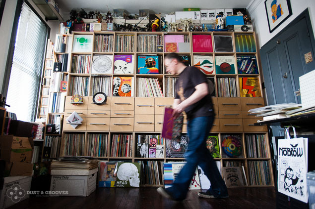
This little lot left the studio today, a raft of Hip Hop, Trip Hop, Turntablism and other assorted breaks and beats that I can live without for the moment. I’ve not had a good sort out since the mid noughties and it really is time. I said last year in the Record Collector piece that I had spent 40 years building up a collection and was planning on spending the next 40 dismantling it. Well not quite but boiling it down to essentials is the main thing for me now, I have too much, some of it hasn’t aged well and I only have so much space.
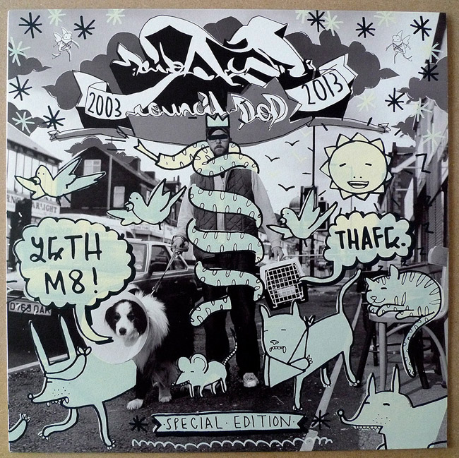
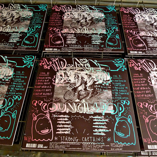
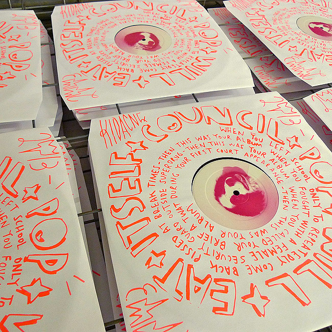
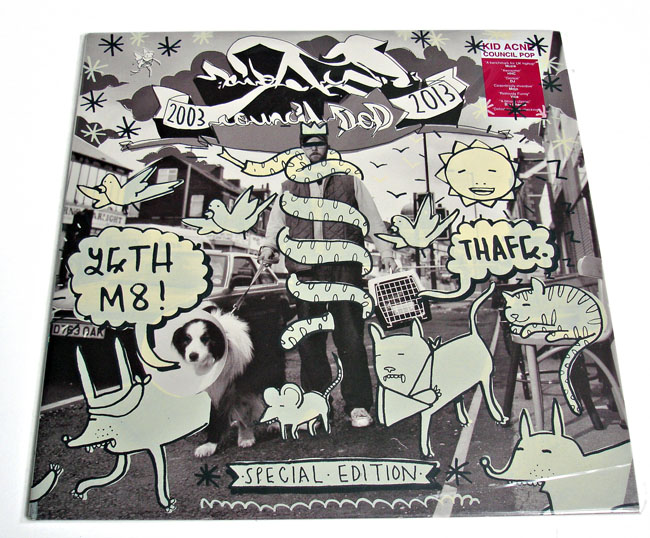
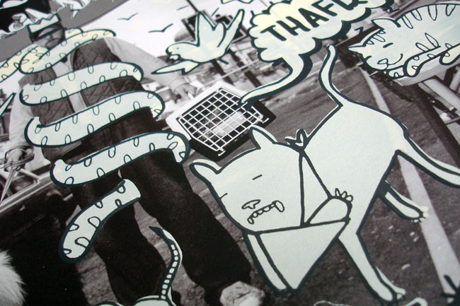
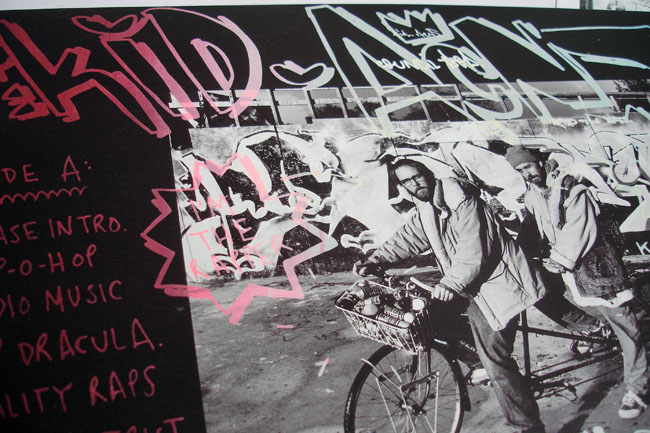
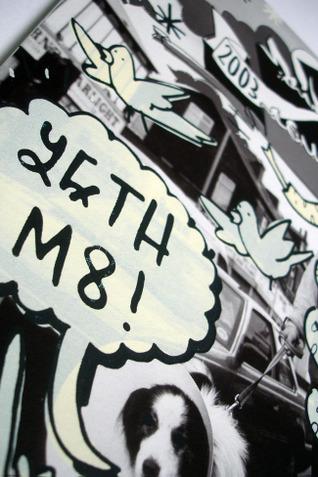
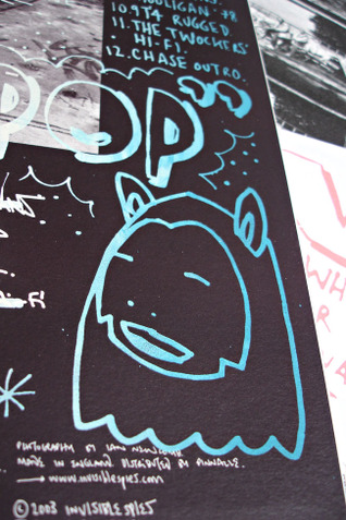
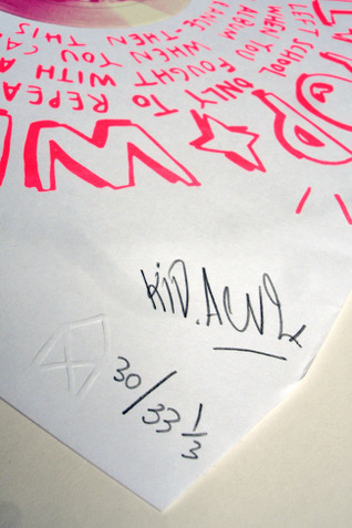
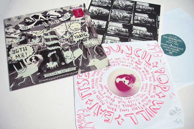
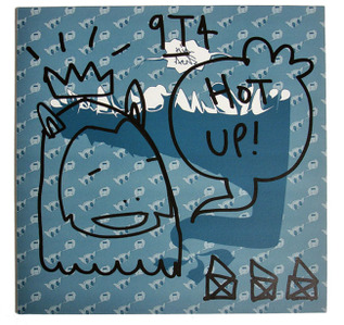
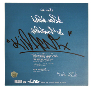
It’s a pretty satisfying experience to be rid of this much in one fell swoop too and, again, going through the shelves I’m reminded of several things that I’d forgotten about. Divine Styler’s little known ‘Spiral Walls of Autumnal Light’ album, J-Live‘s second album, Broadway Project‘s first, ‘Compassion’ – all solid records that may have taken a few listens the first time and still contain forgotten treats. Those Lemon Jelly singles with the crazy denim, leather and sack sleeves, hand-painted promo 12″s, and designs for lesser known releases like this Kid Acne cover for Rex Records.
One thing that’s a godsend and will be sadly lacking for future generations of music fans, historians and librarians is the record sleeve. Not just for the obvious large canvas that the cover affords and the packaging opportunities but for the small print and credits on the back. Several times whilst going through records I’ve flipped over a sleeve to discover someone was part of the process that I never realised, little messages that flesh out the release, lyrics and thank-you’s. I kept records where I had a thanks, a cover design was just too nice to part with or, in the case of most of the Finders Keepers releases, the sleeve notes are an education in themselves.
The art of finding samples is all about reading the small print, noting engineers, producers, player, studios, labels and year of issue wherever that is hidden on the recording. Now without sleeves, labels and inners that is being lost – iTunes doesn’t even have a box to add the label to the mp3 info and how many of your files are tagged with the year they were released? What about mixes? All those tracks, sitting together without a tracklist let alone the writer, label and year of issue. We’ll have a situation similar to the taping of mixes off of radio years back where you’ll never know what track 4 was, I suppose Shazam could come into play here.
It does bear thinking about though, not only are we entering a time where music is becoming faceless, it’s also becoming credit-less too. Instead of a quick flip of the sleeve we’ll have to consult the web to find info on tracks in the future, pdf ‘booklets’ with albums is all fine and well but how many of those do you have? People need to tag their files with as much info as possible but I doubt many are going to include the publisher, the engineer, who worked the desk or the equipment used. Should a site like Discogs ever disappear, (surely the no.1 music info resource on the web?), what would we be left with?
Shots of the forthcoming album by The Herbaliser, ‘There Were Seven’, which I designed. This is the regular vinyl version which comes in a screen printed PVC sleeve and has a download code for the whole album too. You can pre-order if here (Click the red ‘shop’ tab for options).
The launch party in London is at the HMV Forum on October 27th where I’ll also be supporting along with Belleruche and DJ Cam. Tickets with a special ‘Friends of Food’ discount can be found here. Or, if they’re all gone – here.
Be very quick if you want one of these, The Herbaliser have their new LP (designed by yours truly) up for pre-order. If you want CD or download, you’ll be fine, but…
If you want vinyl you have two options: regular double LP with full printed inner sleeves in a screen printed sleeve – only 450 copies though.
Or there’s the super limited (50 copies) deluxe version which comes with hand stenciled covers by Snub23, a signed A2 poster, a T-shirt and a download card. More photos when I actually have a physical copy! Order here (red ‘shop’ tab on the top right) – actually I think you can only order the regular vinyl right now…
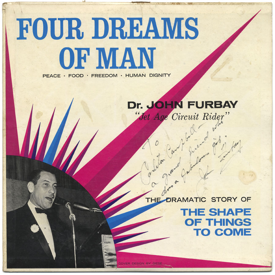
The vinyl sort out is still happening, today I found this, a signed Busy Bee LP, love the little message he’s added, modest to a T.
A lot of turntablist records are biting the dust, I’ve got a re-ignited passion for Divine Styler, Cappo and J-Live albums, found some Major Force and Skylab remixes I forgot I had and was surprised at how much or little certain records are worth nowadays. I also found a remix of Tipsy‘s ‘Space Golf’ by Muziq tucked away on a B-side and was reminded how great their first album was/is.