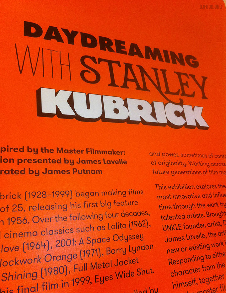
The Daydreaming With Stanley Kubrick exhibition started a few weeks back at Somerset House in London’s West End and it’s well worth a look. Curated by James Lavelle, it features many familiar names that hint that his phone book must be a thing to behold. Artists, film makers and musicians from around the world have contributed but with over 40 pieces to look at there’s always going to be some stronger than others.
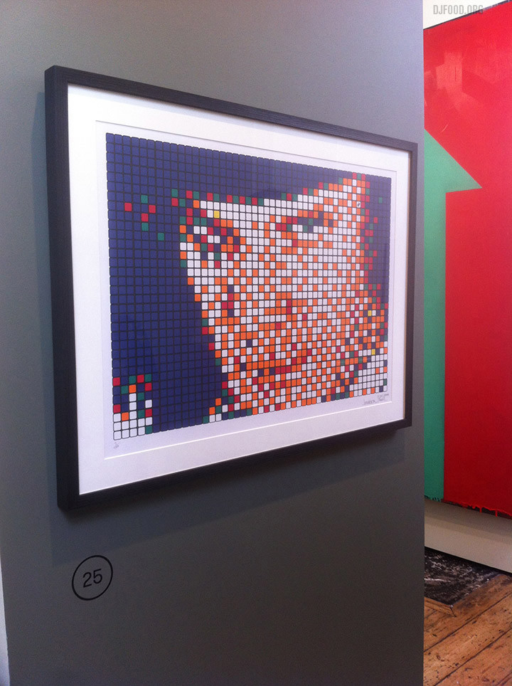
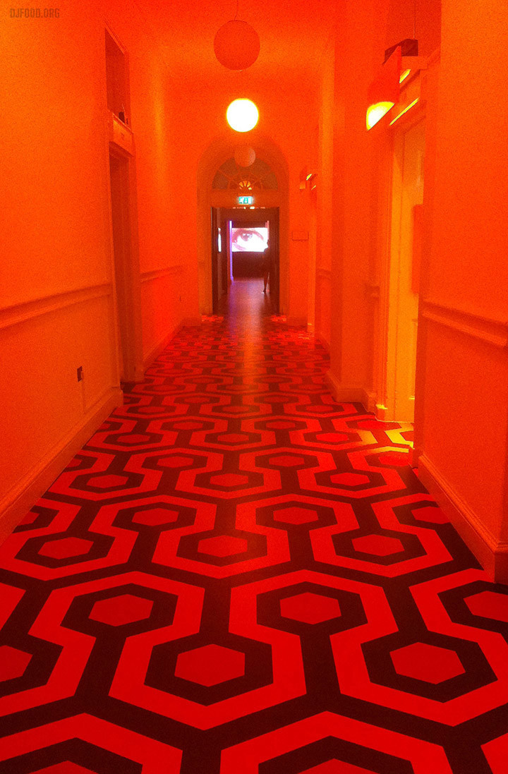
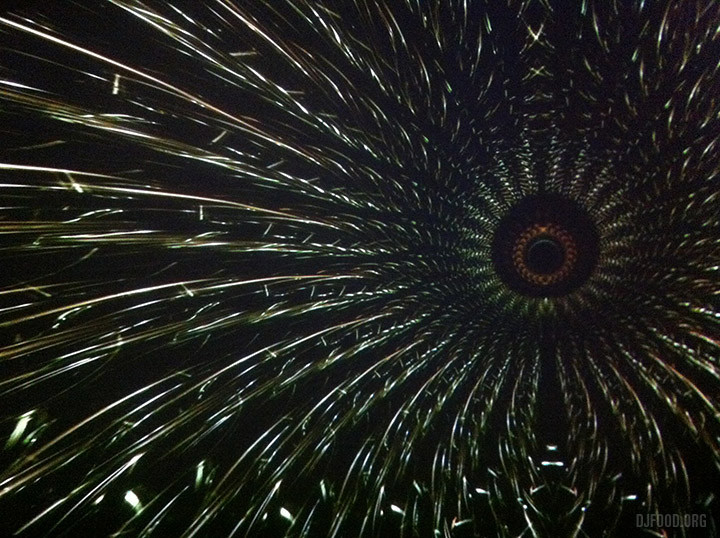
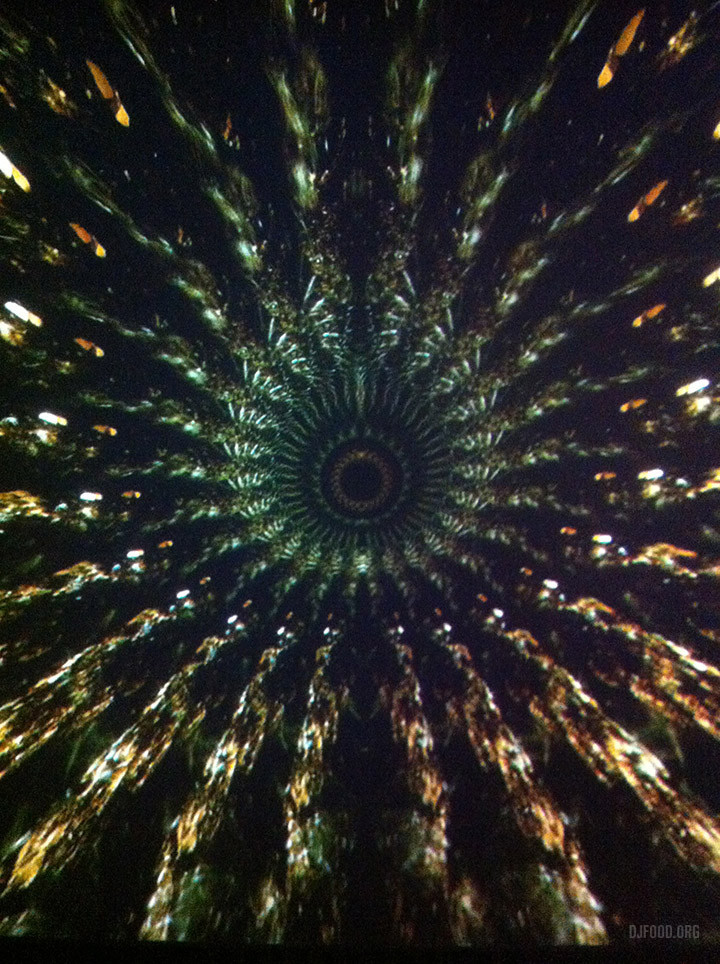
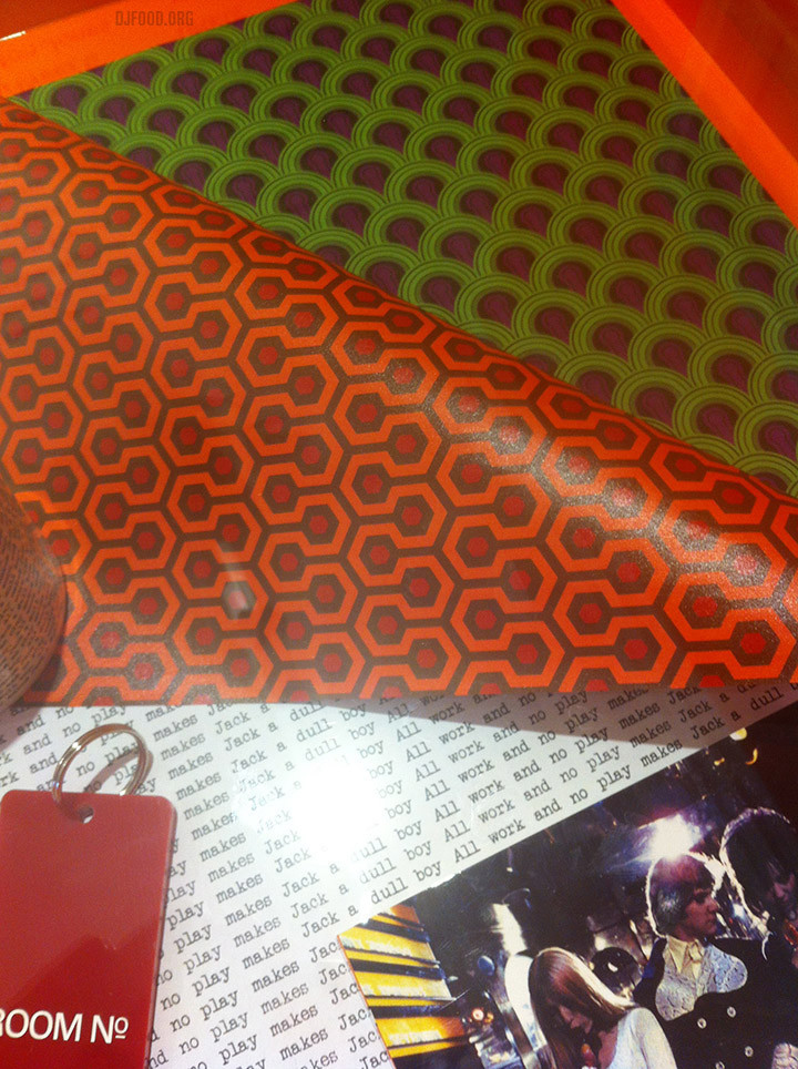
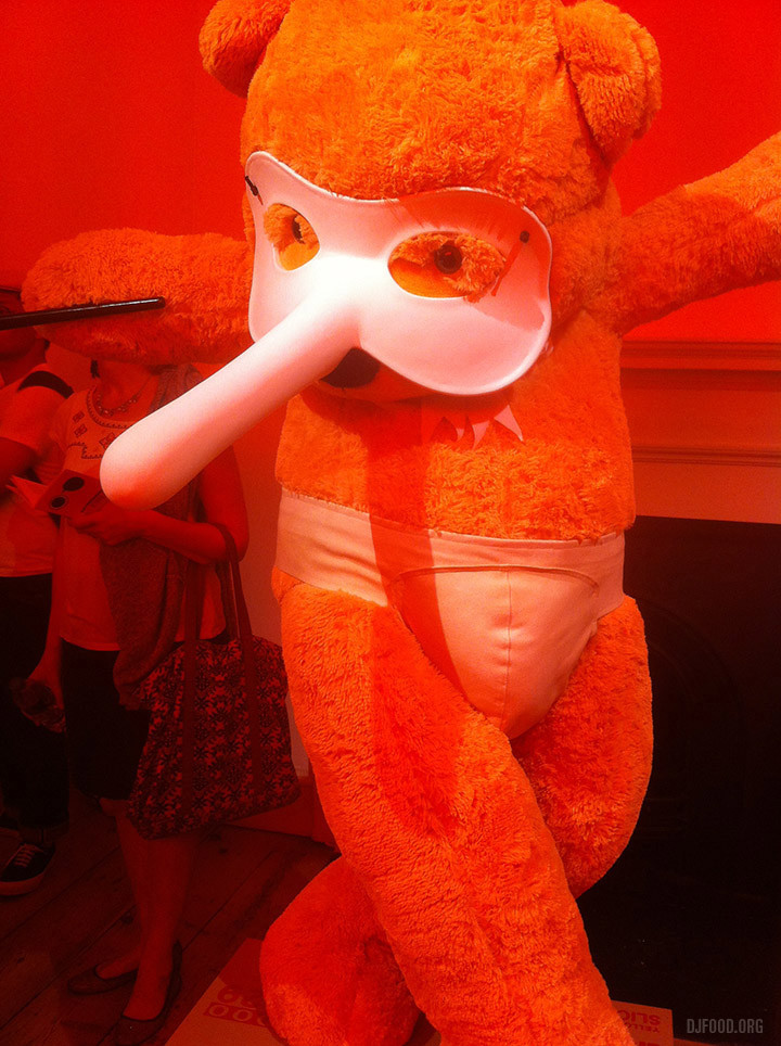
For the most part, I enjoyed the more literal, graphic interpretations; the hexagon-patterned floor from The Shining, Space Invader‘s Rubix-cubed Alex from A Clockwork Orange and Doug Foster’s homage to the stargate scene in 2001, ‘Beyond The Infinite’ – a mesmerising widescreen kaleidoscope that constantly shifted to a soundtrack by UNKLE. I was surprised there wasn’t more reference to Hal from 2001 outside of some of the graphics for the exhibition branding though and there was a missed opportunity to do something with Kubrick toys seeing as James has had an affinity with them for so long.
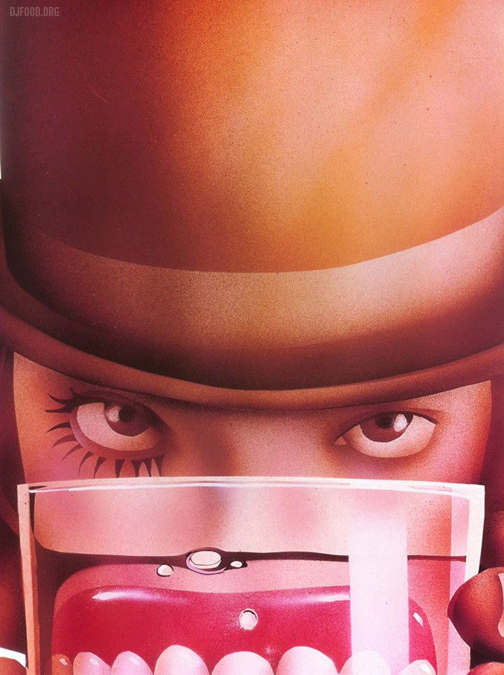
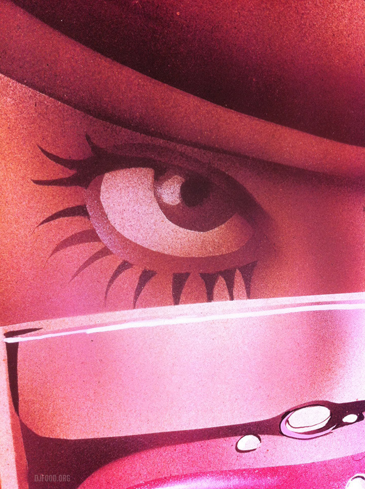
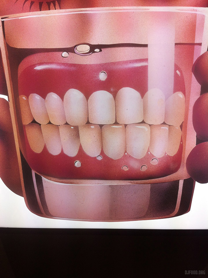
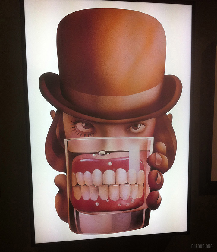
One of my favourite pieces was Philip Castle‘s 70s airbrushed illustration for the original film of Alex with dentures in a glass. Unfortunately this was represented as a slide blown up rather than the original painting but it still had enough presence, menace and period textured beauty to outshine most of the other exhibits.
Elsewhere, several installation pieces were the most successful in invoking Stanley’s spirit. A vertical pulsing strip of LED lights by Chris Levine burned images onto the retina from the end of a corridor so that, when you looked away, you saw split second flashes of Kubrick’s face. A ‘breathing’ camera by Nancy Fouts, sat eerily in another corner, rasping in and out to itself. A room of 114 wireless’ all tuned to the same channel in a dimly-lit workshop created a WWII-like atmosphere and the exhibition guide revealed that a huge cast of celebs had made the soundtrack playing through the tinny speakers. Peter Kennard‘s ant-war collages were further bolstered by additions from Dr. Strangelove although it felt largely transplanted from his recent Imperial War Museum exhibit with some added Kubrickisms.
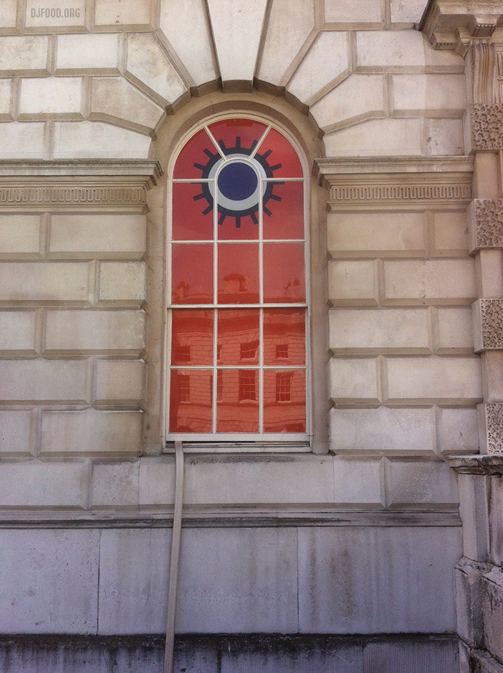
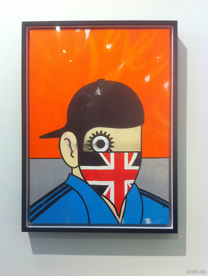
Possibly equal to Foster’s AV piece was Toby Dye‘s small room showing four different scenes from The Corridor, each one using a Kubrick technique of focus pulling in or out of a centralised corridor. This, when shown full frame on each of the four walls, gave the viewer a sense of unease or vertigo as the walls appeared to shift around them. Very effective if off-balancing. David Pellam‘s classic Droog design featured twice, once in the show branding and once in Paul Insect‘s updating of his work, ‘Clockwork Britain’. An iconic design, connected with Kubrick by the simplification of his visualisation for the Droogs, it sits alongside the Shining carpet as a graphic motif instantly connected to his films. A VR headset with interior 2001 space station scenario was also installed but the queue was just too long so don’t head to it at peak weekend hours if possible.
