- RELEASED: 29 Jul 1996 / 15 Nov 1996
- FORMAT: 12″
- LABEL: SKAM / WARP
- CAT No.: SKA007 / WAP 88
- DESIGN: Openmind / She-One
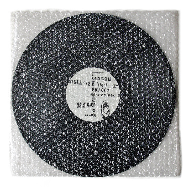
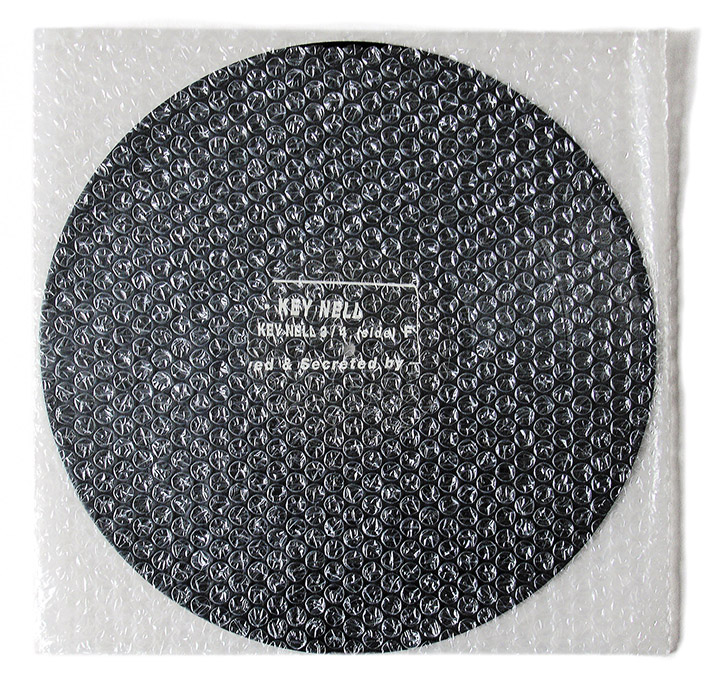
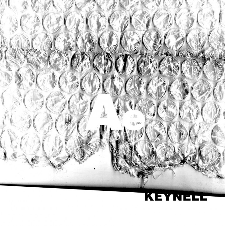
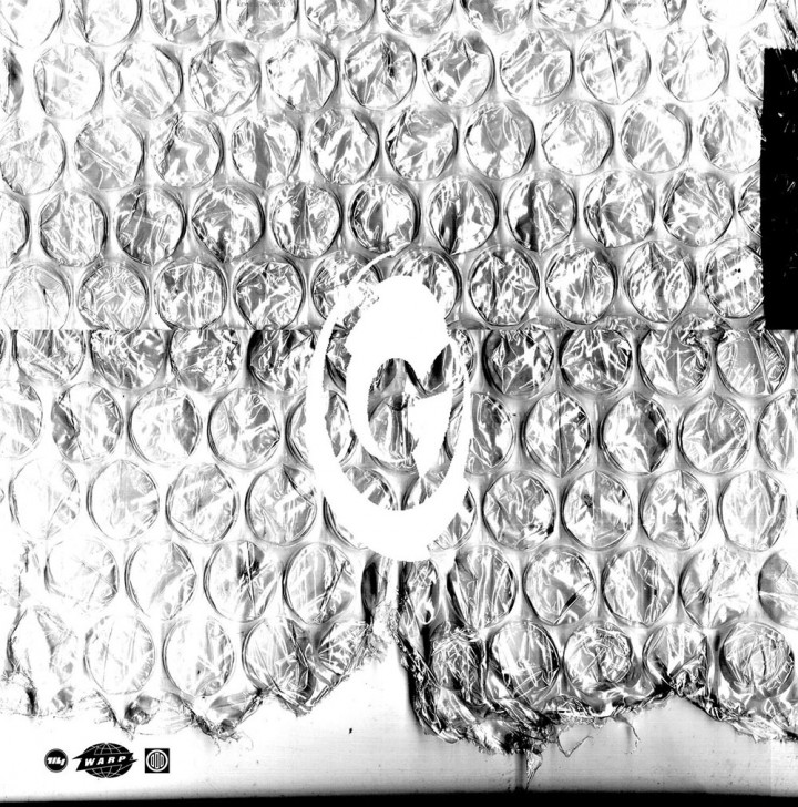
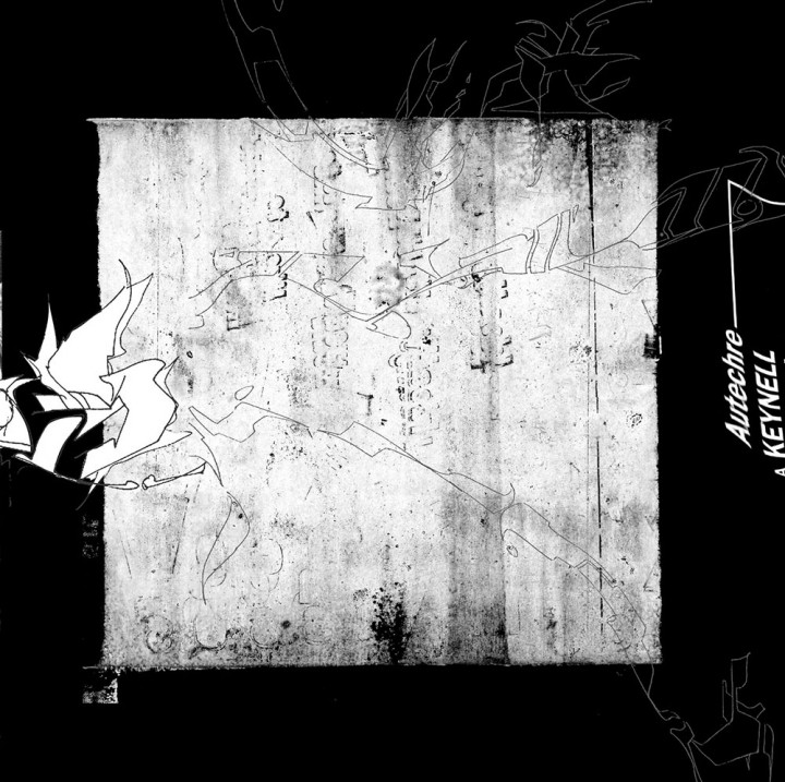
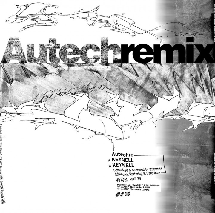
- SPOTTERS DELIGHT: The Skam 12″ came in a bubble wrap cover, the later repress inverted the label colours. The first print run of the remixes had designs inside the sleeve too with a message on the inner spine…
- EXTRA ZEN: Skam Records / Warp.net / BUY
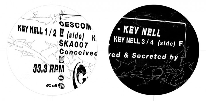
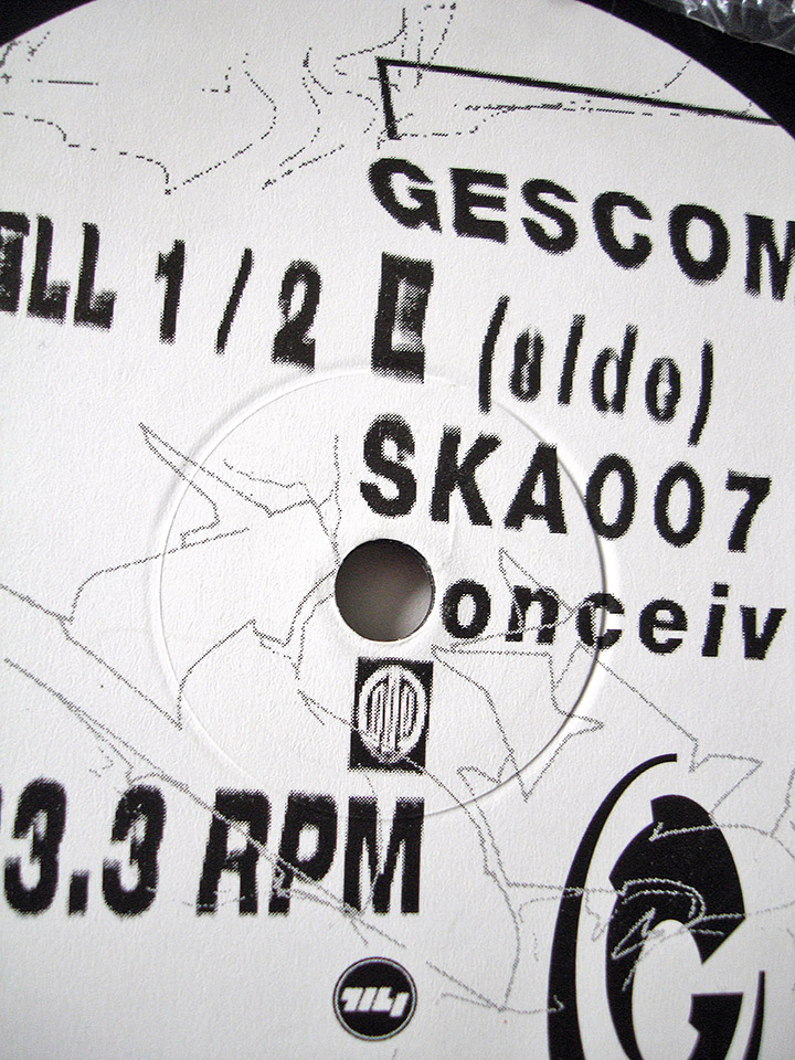
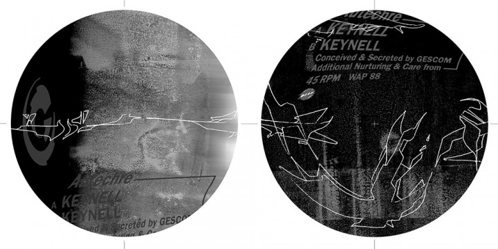
A collaboration with She-One again using some of his sketches along with textures and photocopy-distorted type. Because the original Skam 12″ had come wrapped in bubble wrap, when it came to do the Warp remixes I wanted to print a bubble wrap texture on the cover as a spot varnish over another printed texture. I also wanted the outside to be minimal but to print inside as both mine and Ae’s mischievous nature wanted to mess with the obsessive Autechre fans by putting in something that they couldn’t quite see without destroying the cover. I wanted the look to be very rough, not slick, very obvious edges to things, nothing computer clean about it. Type ran off the edge of the sleeve and inside and there was no band name on the outside, just the Ae letters reversed out of texture and the Gescom logo.
All was going well until I sent the files away to print and then got a phone call the morning I was about to leave for a trip to Japan. The printer was calling to tell me that they couldn’t print halftone images in spot varnish and that I’d have to resupply the bubble wrap layer as a file without any greyscale tones. This was news to me as I’d never used spot UV before and was learning as I went.
There was no time as I was about to leave for over a week and, in a panic, I suggested they print it in a metallic instead, finding a random colour to go over the top and hoping that the combination would at least look interesting when it came back from the printer. Unfortunately it looked shit and I was gutted as I felt I’d let Sean & Rob down and my big chance to design a sleeve for Warp was a cover that looked like it had been used to mob the floor with.
