- RELEASED: May 2003
- FORMAT: 2xLP / CD / Ltd DVD
- LABEL: NINJA TUNE
- CAT No.: ZEN78 / ZENCD78 / ZENDV78
- DESIGN: Openmind
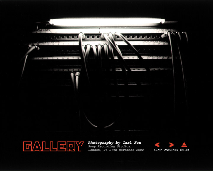
- PHOTOGRAPHY: Carl Fox
- SPOTTERS DELIGHT: Book edition DVD, heavyweight card LP repress in 2012
- EXTRA ZEN: ninjatune page / BUY
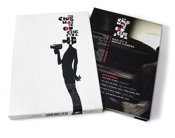
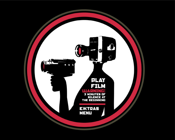
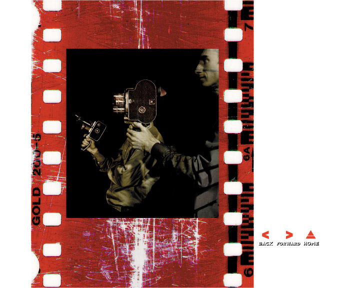
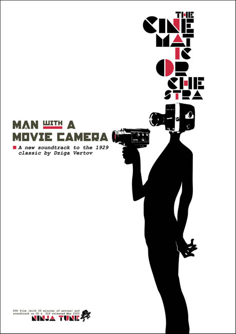
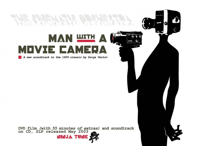
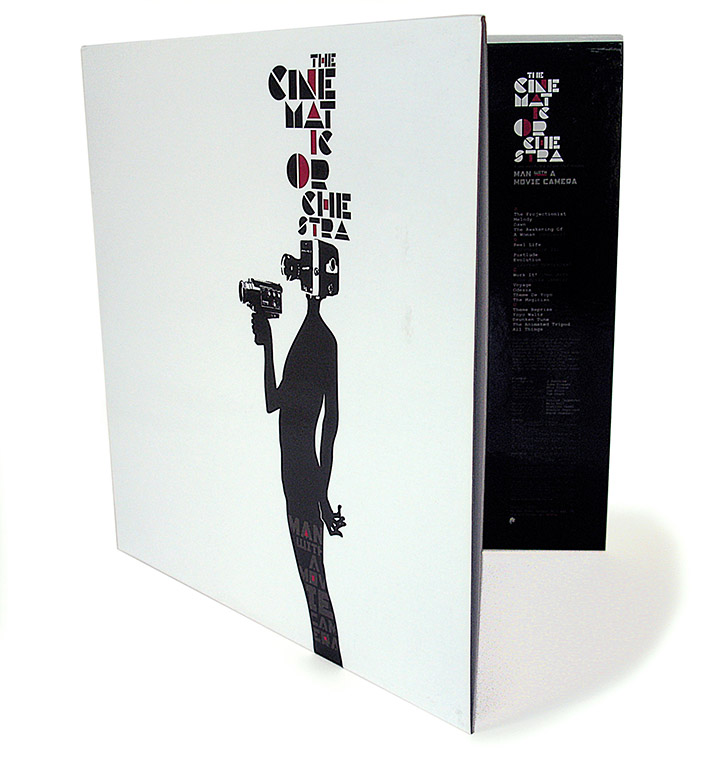
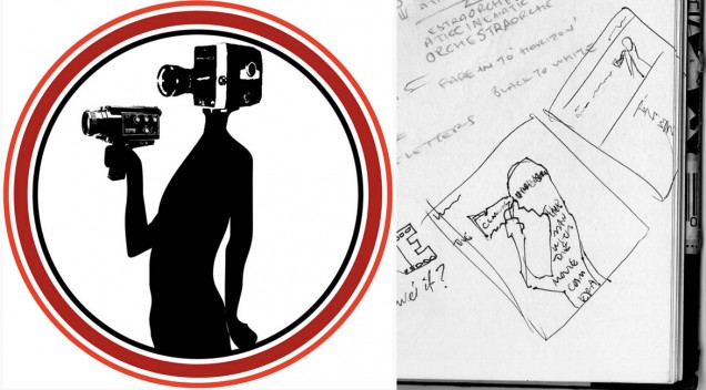
The original idea for this came about during the mass of artwork created for the ‘Every Day’ album a year earlier and a version of the ‘cameraman’ logo was even included on the band’s bass drum on that record’s cover. As MWAMC is essentially an expanded rework of ‘Every Day’ including the track that gave the album it’s title, it seemed apt to continue the theme. The actual ‘cameraman’ figure was drawn in about 20 seconds and then given a camera to hold and for a head from images sourced on the web. I remember why it was so quick because, after I had drawn it, I knew I had nailed something incredibly quickly that was visually instant in response to the title.
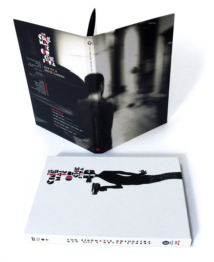
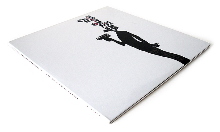
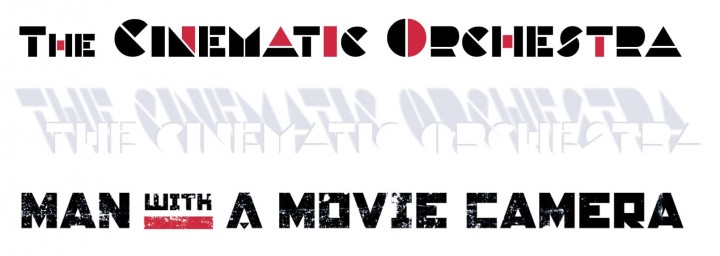
For the MWAMC cover I reworked the hand down at his side as this was very basic on the ‘Every Day’ version and I knew it needed something a little more defined. The whole look was supposed to be evocative of eastern European film posters of a certain era, basic, flat graphics and minimal text. It could have been black and white but I added touches of red just to pick out certain things and also to allude to ‘Every Day’ as the main colour for that album artwork was red. Courier was used for the text because it was simple and also because it was a typeface regularly used at the time the film was made (even though it’s not a font i’m particularly fond of)
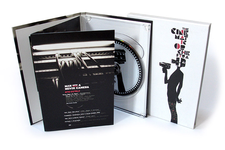
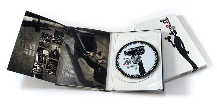
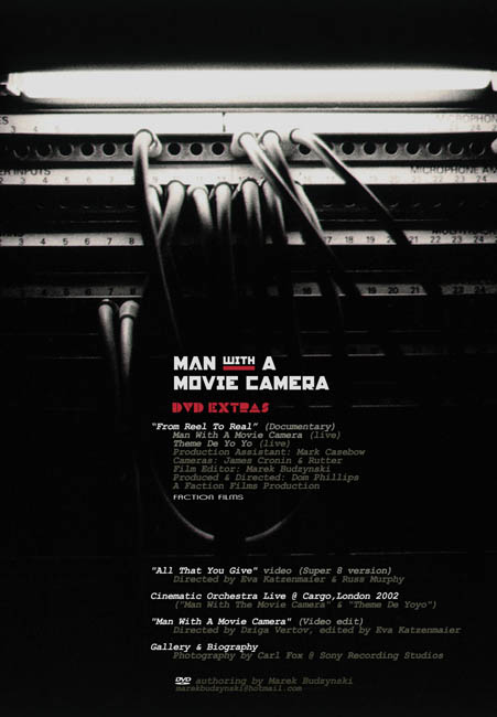
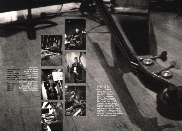
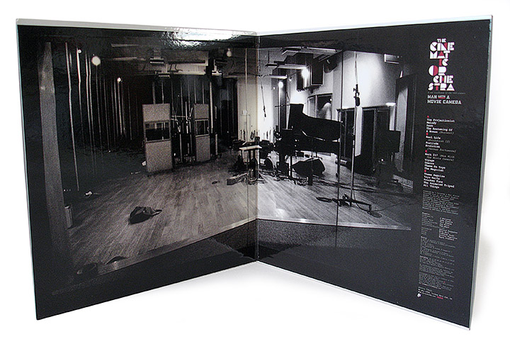
I also has some excellent photos of the studio sessions taken by Carl Fox to work with that fleshed out the basic black and white feel beautifully. For the inside gatefold on the vinyl sleeve there was a shot of the empty studio through the control room window except it wasn’t originally empty. There was a person sitting at the piano and a girl half hidden behind the screen over on the left that were taken out via Photoshop to give it a solitary air. The DVD came out very nicely with it’s minimal hardback book-style cover and interior pages. Jason Swinscoe originally suggested that I revisit the ‘cameraman’ figure from the previous album as he had liked it and it was an obvious choice when we began the artwork. I’m really glad he did as it’s one of my favourite projects in terms of the elements conveying the mood of the music and adding an image to the project.
