- RELEASED: 6 July 2009
- FORMAT: 12″ / DL / CD promo
- LABEL: NINJA TUNE
- CAT No.: ZEN12232 / ZENDNL232 / ZENCD232P
- DESIGN: Openmind / Henry Flint
- PHOTOGRAPHY: Alice Ceresole
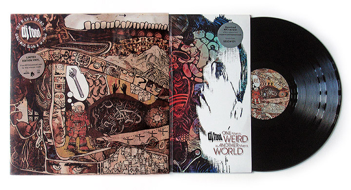
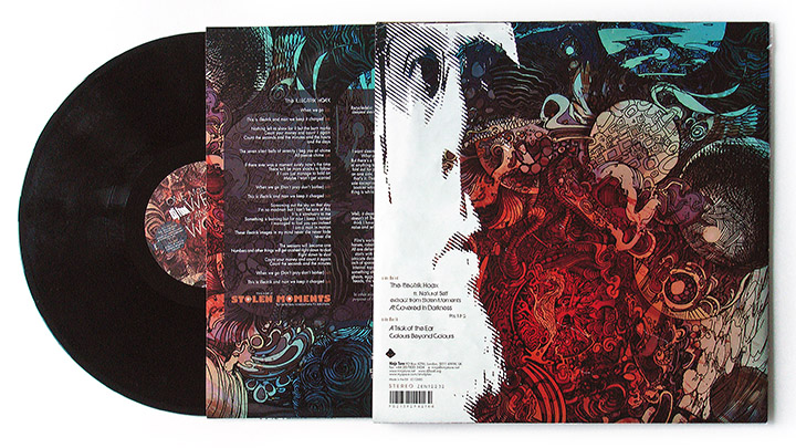
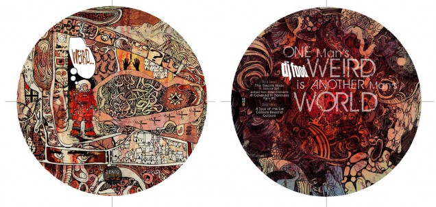
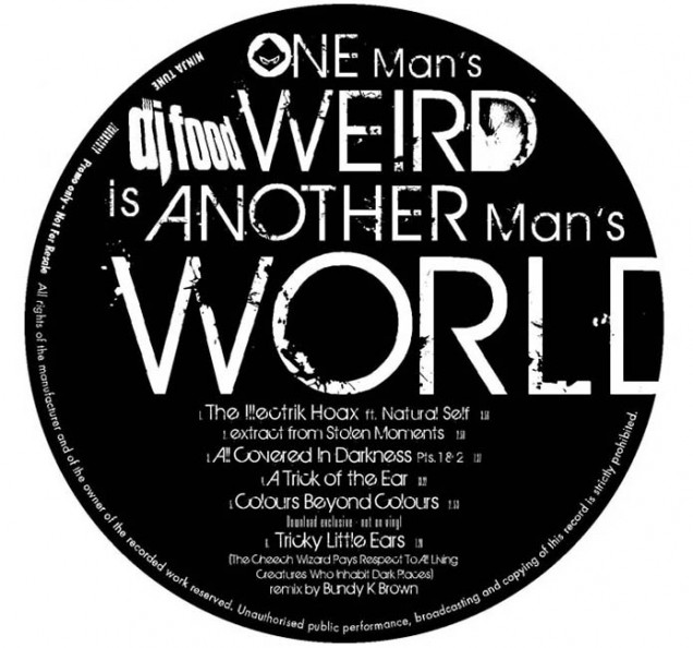
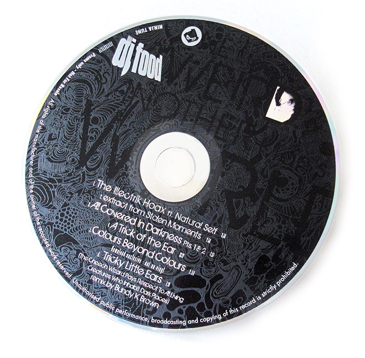
- SPOTTERS DELIGHT: 12″ A2 double sided poster cover. CD promo contains an exclusive bonus remix by Bundy K Brown different from the one available on the download version of the EP.
- EXTRA ZEN: ninjatune page / BUY
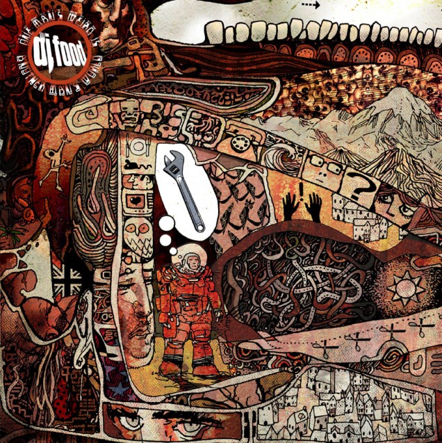
How to go about dressing you own record? A blank canvas but the thing that the public will associate the music with first. I did something I didn’t think I’d ever do, I let someone else have a big hand in it. I’ve been a fan of comic artist Henry Flint’s work for ages, accruing tens of pages of it over the years firstly from dealers and then from him personally. For me he embodies the perfect collision of old school 2000ad artist with contemporary comic illustrator, someone who can adapt and ape a number of styles with apparent ease and can draw robots, cities, spacecraft, humans and aliens with equal success. After purchasing some art from him he included a number of postcards of his personal work. They completely blew my mind and I asked if he was selling any of it as it was perfect for the artwork I had in mind on a forthcoming record.
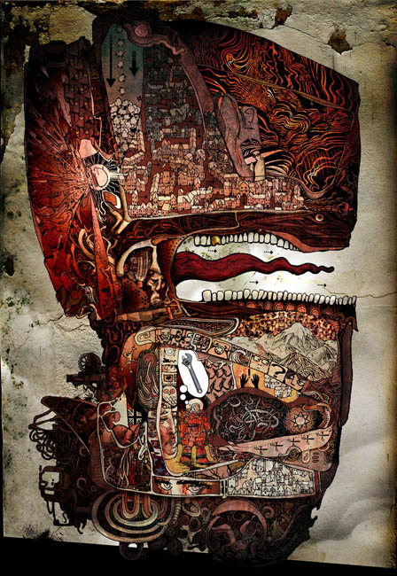
They weren’t for sale but he had some more and kindly sent me a CDR of over 30, all different but mostly insanely detailed, flights of fantasy. I’d been thinking of commissioning him to do something with very random guidelines but these were fully formed and he allowed me to do what I wanted with them. They were also in black and white and I knew I could put my stamp on them by colouring them which I set about doing, occasionally sending him versions for feedback. The question now was how to present them? Most were A3 sized and, because of the detail, really needed to be seen bigger so a poster sleeve idea was formulated and I went back and forth with the printer to find the best, and cheapest, way to do it all, complete with inner, outer and plastic sleeves.
It was a 12″ and download only release but Ninja wanted a CD promo so I did a nice spot varnish effect on black with the disc on body and the cover includes a partially coloured version of the final poster image. As this was the first of three EPs I continued this theme as I had plenty more of Henry’s drawings to use before the series was done.
