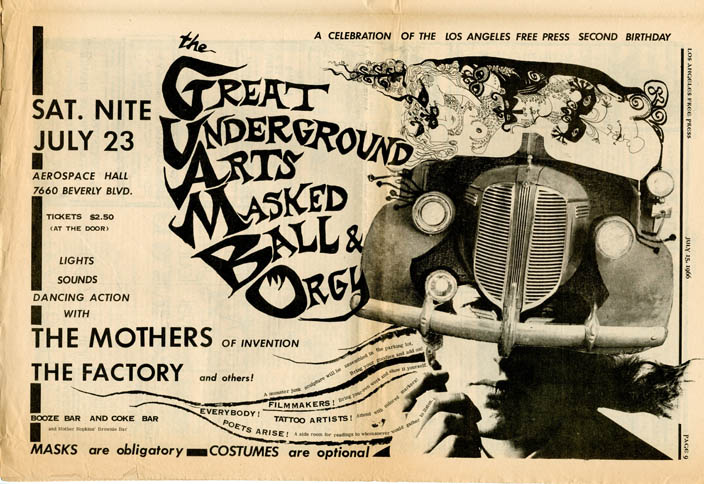
Continued from part 1…
I’m not sure who did the design above but, from the date, I’d guess it was Zappa, regardless it’s a great poster
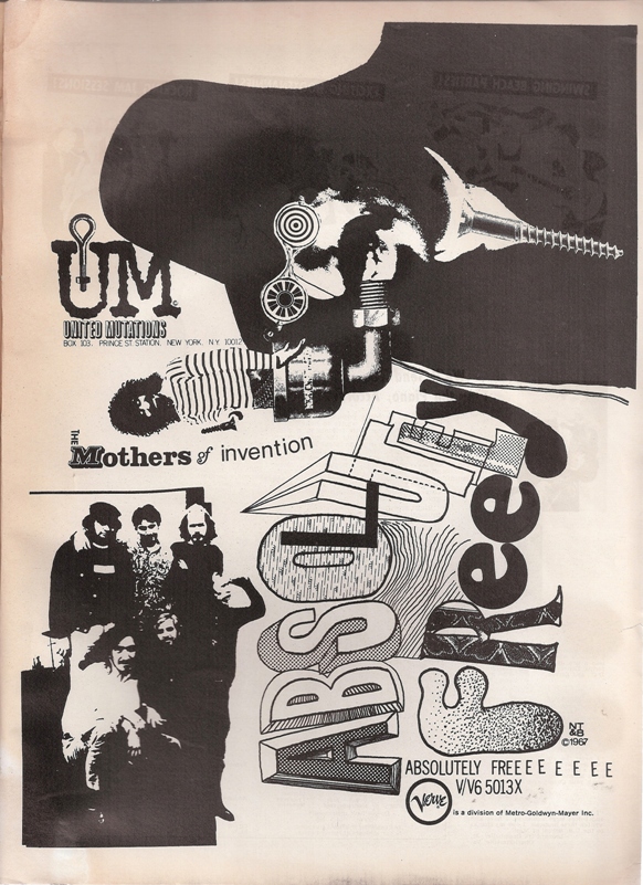
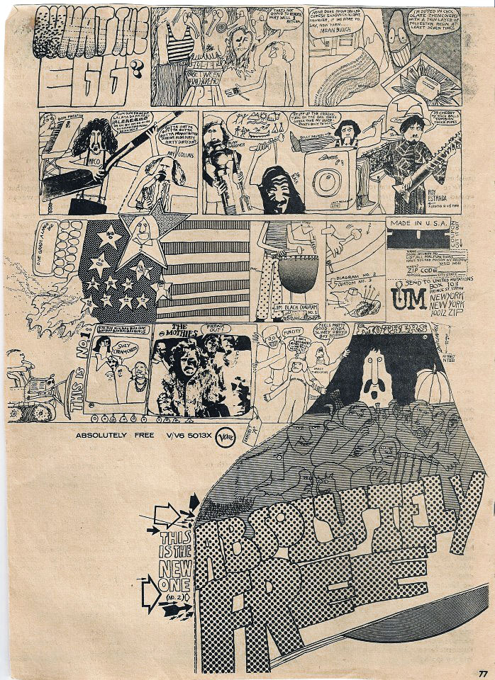
Around the end of making The Mothers of Invention‘s ‘Absolutely Free’, Cal Schenkel started working with Frank Zappa on artwork (he also appears on the ‘Freak Out’ album as one of the studio voices). From then on he became the graphic artist most associated with the Mothers and some of Zappa’s solo works, his collages, paintings and sculptures adorning many of their classic LPs. Here’s an ad for ‘Absolutely Free’
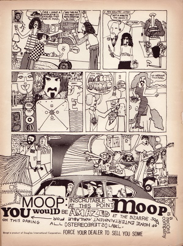
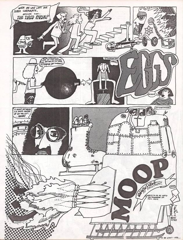
Cal created several ‘Moop’ ads, odd comic-styled pages, “…yeah, and we also did a series of ads which you might have seen at one point… for MOOP. You ever seen any of the MOOP ads? …but they were the weirdest ads, they were like just funny little surrealistic comic strips…and there’s a bunch of ads that were running–like, Hit Parader, and just the oddest places…” – from this interview
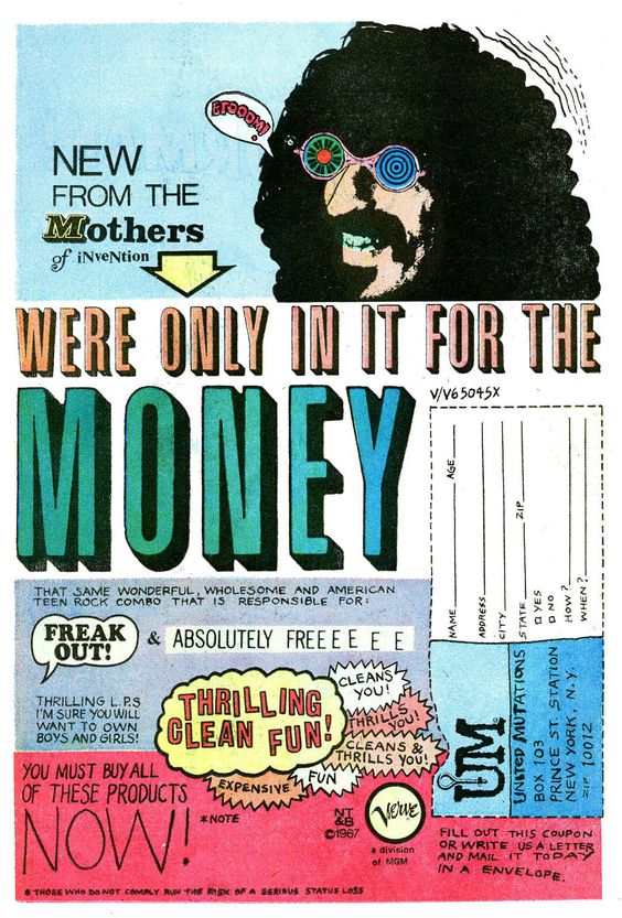
This beauty below appeared in Marvel comics’ Daredevil #38
By the 70s, things had started to change graphic-wise in publications and we go into what I call the ‘statement’ era of advertising where text played a big part in hooking the viewer in via an intriguing ‘headline’ and then selling the product in a quirky sales-pitch style similar to these examples below. Crazy graphics, surrealism and excessive detail were out and, as a designer, I can’t blame them. Much the same as the sometimes impenetrable psychedelic posters of the late 60s were only meant for the heads in the know to decipher, their time was up and now the marketing men had to sell this stuff to the masses rather than keep it underground. Cue straight, no-nonsense text in blank space and packshots of the album or group in question.

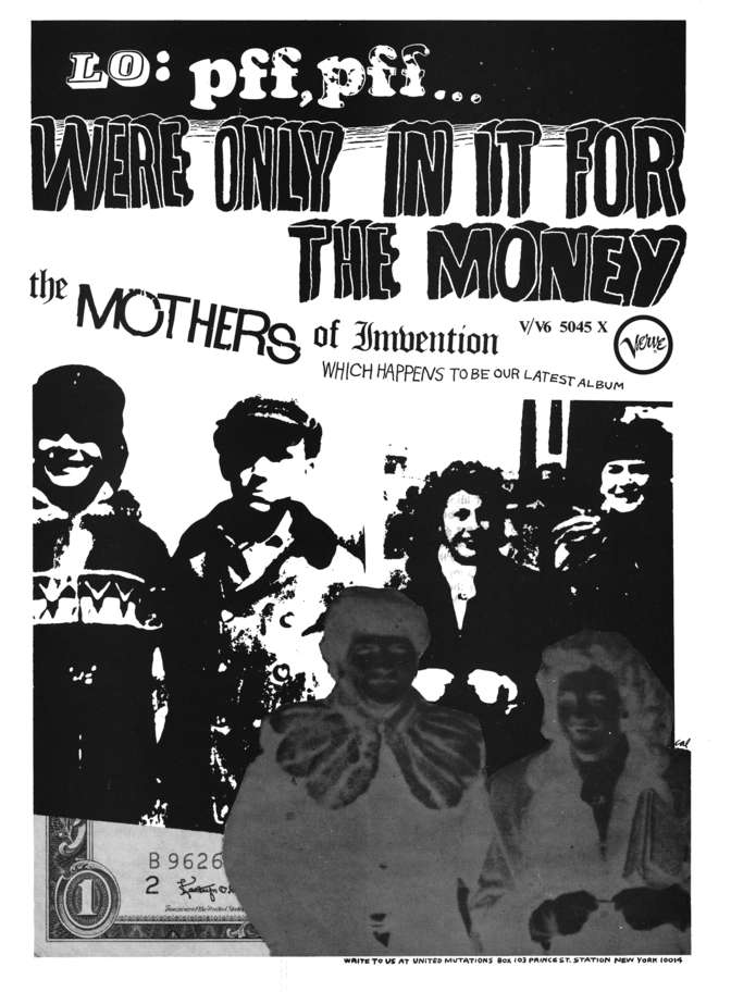
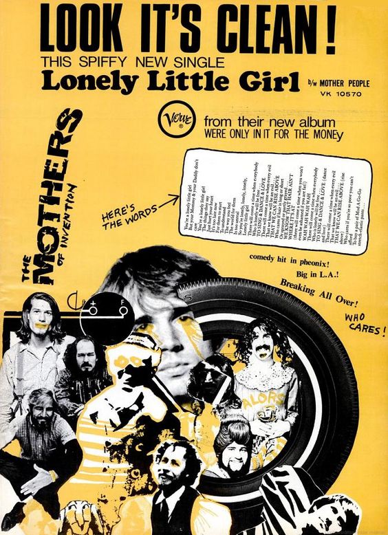
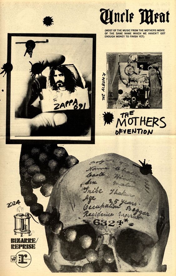
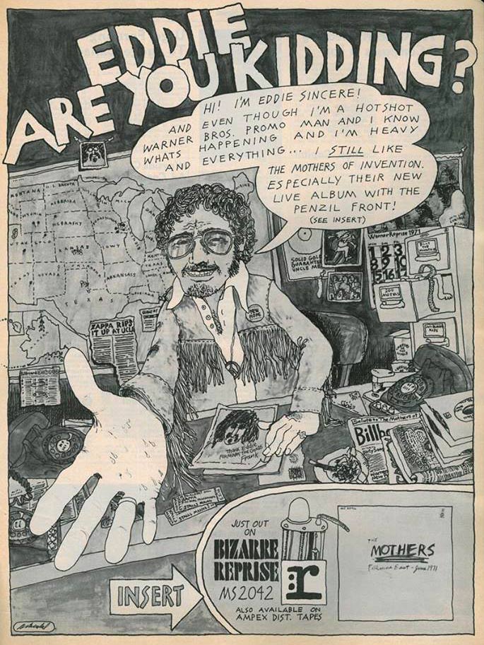
![1969-06-14 Rolling Stone [UK] n35 05](https://www.djfood.org/wp-content/uploads/2018/04/1969-06-14-Rolling-Stone-UK-n35-05-720x1032.jpg)
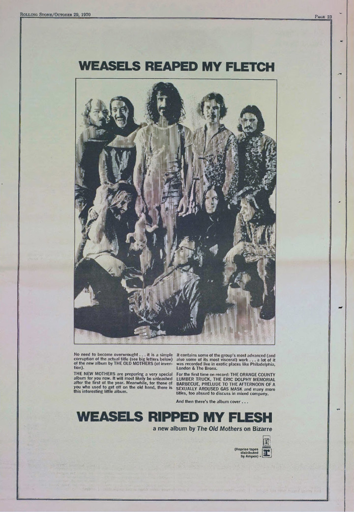
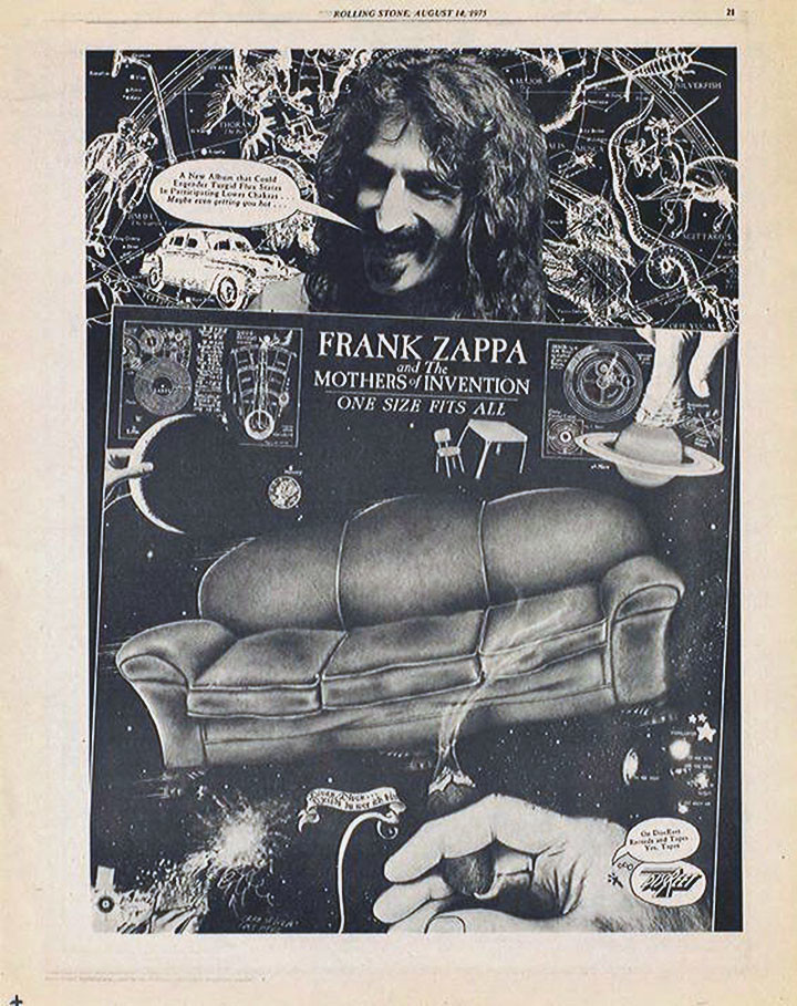
Massive early Mothers fan, I’m into most of it, inc. solo Zappa up to the mid 70s, then he lost me.
Mr. Foakes, I love the Mothers, and FZ, as well. I didn’t know you were a fan.