It’s been a bit quiet on here of late because I’ve been very busy tying up the last pieces of the Frankie Goes To Hollywood box set with Philip Marshall and the deadline is this weekend with the book still to finish. We’ve had some 11th hour changes due to the USM legal dept. getting cold feet over the cassette front cover (there’ll be a lengthy blog post about the cassette one day) but also some higher res images arrived today of one of the Lo Cole gatefold prelims for the interior of the book. These were courtesy of a German fan who went out of his way to get a decent copy of the image from someone who had bought the rough draft painting when it was sold years ago. Now we can have a much larger version of the image rather than the low grade jpegs we’ve had for years.
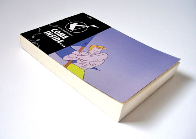
But the subject of this post is about the Flick book* – maybe considered a throw away item to some, certainly the runt of the litter but getting as much love as the rest in its construction. The book features scenes from the TV advert that briefly aired around the time of the album launch in November ’84 with imagery based on Lo Cole’s paintings – a brief 40 second rampage into the Pleasuredome by the band accompanied by assorted mythical beasts. As pages are limited in the book the original film was broken down into an image sequence – 25 frames per second x 40 to nearly 1000 frames – which were then stripped down to essential frames and made into .gif files to see which few seconds of animation would work best.
*( this is a provisional cover design – it’s changed a bit since this version)
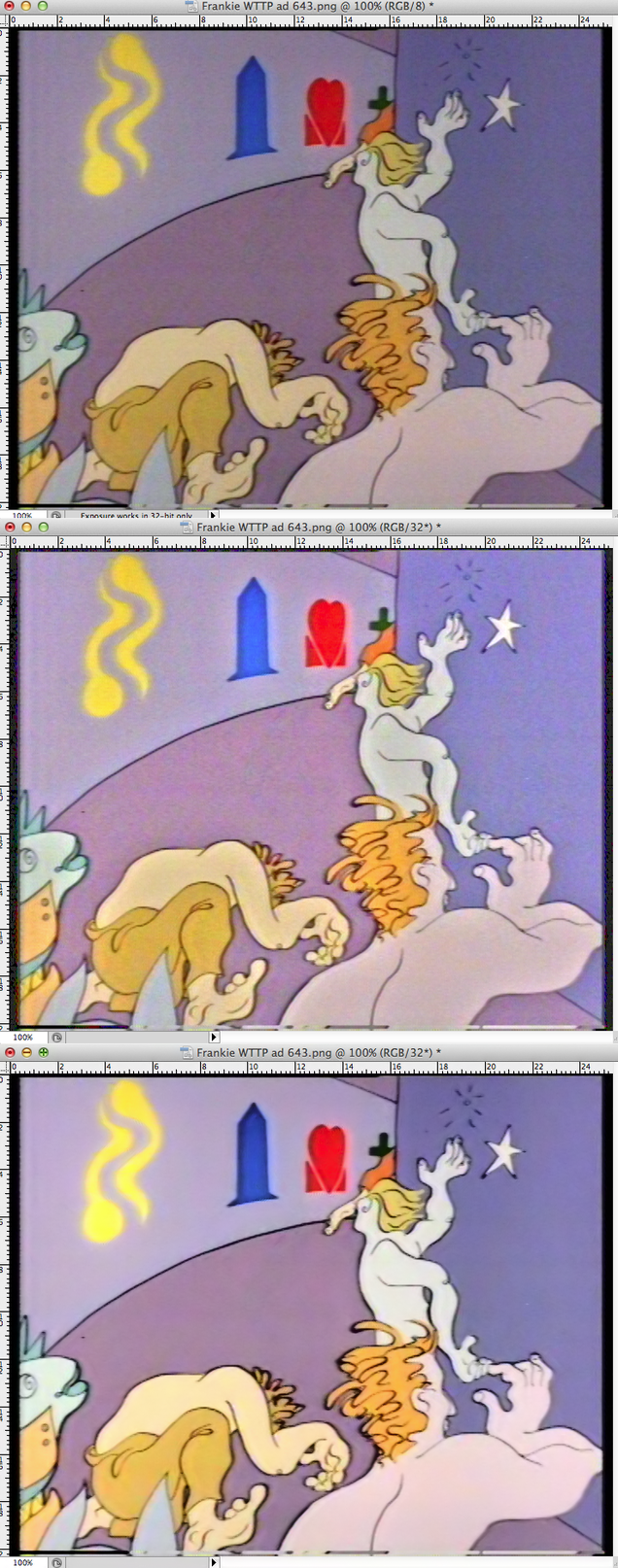
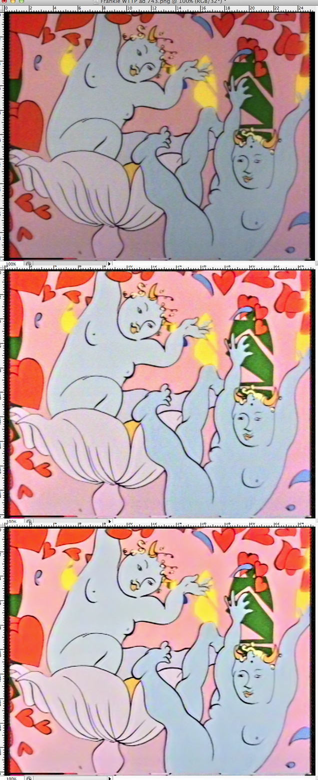
Luckily we can print on both sides of the page with this book so you can view two separate animations depending on which way round you hold the book. In an effort to get the best possible image quality for the book we went back to the sole surviving master copy, a U-Matic tape, and pulled the frames we needed. These were still fairly grubby looking with a dark caste over most, dull colours and lots of ‘noise’ across the image. In Photoshop I set up a series of image filters to find out how best to lighten the images and bring out the vibrancy of the colours without it looking too forced. It turned out that different scenes needed different amounts of filtering as the saturation kept changing so there was no chance to automate the process.
When I was satisfied I’d got the best colour and light balance there was still the subject of the noise and how to remove it, this is when you can see a texture like a grain across an image, usually caused by light or introduced by generations of copies. I use a great Photoshop plug in caused Neat Image (yes, terrible name but amazing results) to remove this. It takes a digital fingerprint of the image and then smooths out all the bumps without blurring the image, something some similar plug ins tend to do. See the process below, at the top is the original as it came to me, then the filtered version with enhanced colours and any dark cast taken away. Finally there’s the denoised version that will end up in the book.


