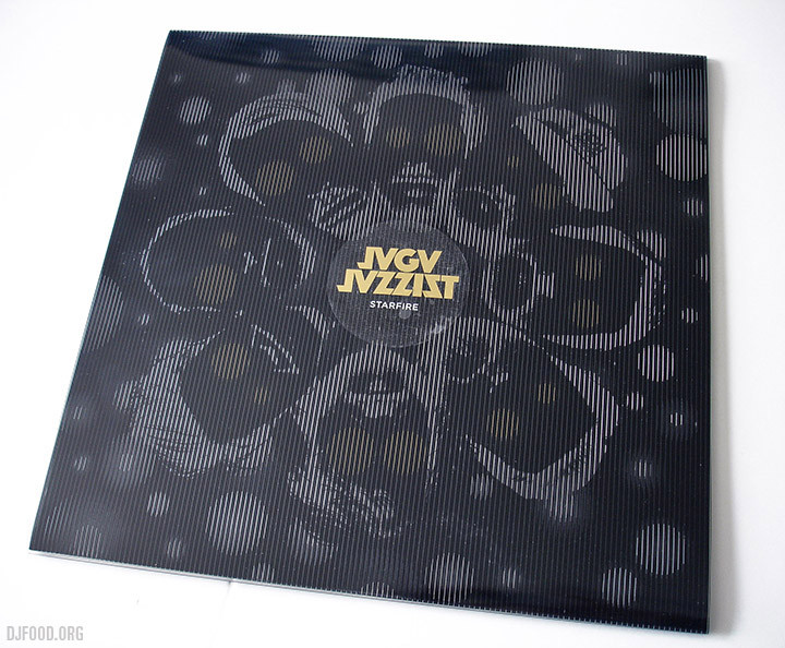
This is the stunning new album from Jaga Jazzist, not only contender for cover design of 2015 by a very long margin but also heading for top 10 album of the year status too. It’s taken a while for me to fully appreciate Jaga but with each album they’ve crept further into my orbit so that now each release has to be checked out. ‘Starfire’, after only a few listens, I can quite confidently say, is my favourite so far and it sees a slightly more electronic mission statement than before whilst still retaining the uber-tight Zappa-like syncopation of previous work.
The design on the sleeve is magnificent here as well and really compliments the futuristic feel of the music perfectly. Browsing the new releases in Fopp the other day I was struck by how little of the current crop of album designs stood out, possessed any kind of classic iconography or would make me want to look at them twice. So much of the ‘style’ of the last few years of the kind of music that racks up kudos from the critics seems to be about minimal, safe, almost nonchalant anti-design, designers afraid to go all out and make a statement or content to reference past styles.
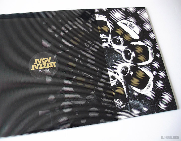
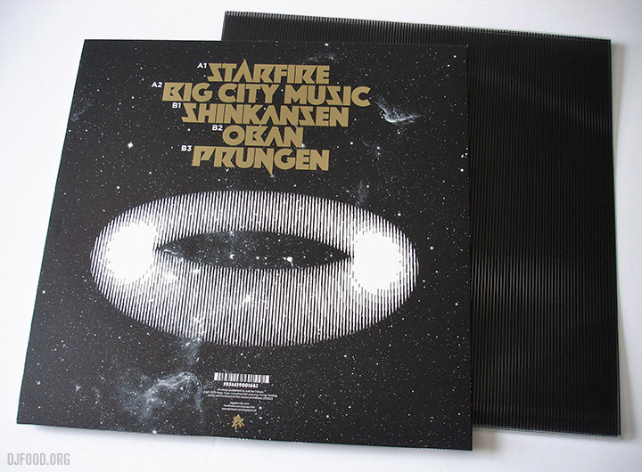
The Jaga sleeve, besides being striking yet minimal, has a clever trick up its sleeve – or should that be on it?. It comes in a screen printed transparent outer cover of evenly spaced vertical lines that animate keys graphics underneath on both front and back as you slowly pull the inner cover out. This effect is being billed as ‘anamorphic’ in the press releases but that’s more about stretching an image, this process is closer to the ‘moire effect’ that tricks the eye into believing that objects are moving as the black and white lines move past each other, much like a TV screen flicker.

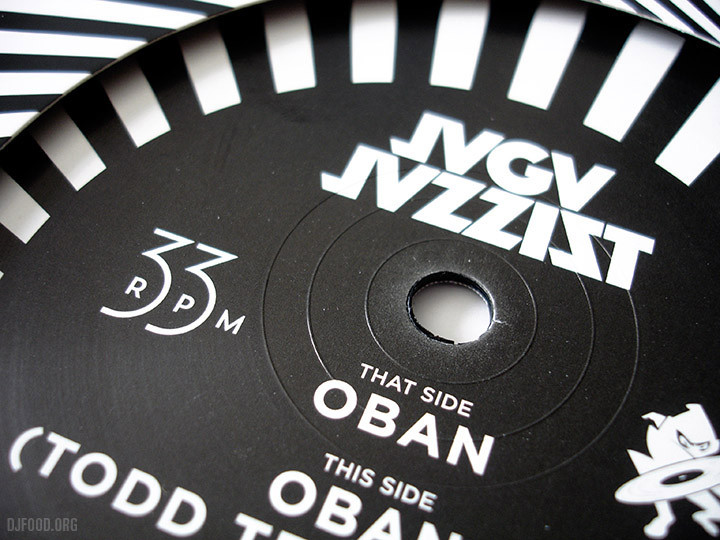
Aside from the outer cover gimmick, the typography on it is stunning, look at those titles above, that must be a custom made face that works with just the right dose of sci-fi and heavy metal styling to make it unique. The labels and second inner sleeve work beautifully to counterpoint the blackness of the outer as well, as does the companion single, ‘Oban’.
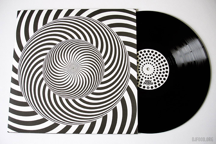
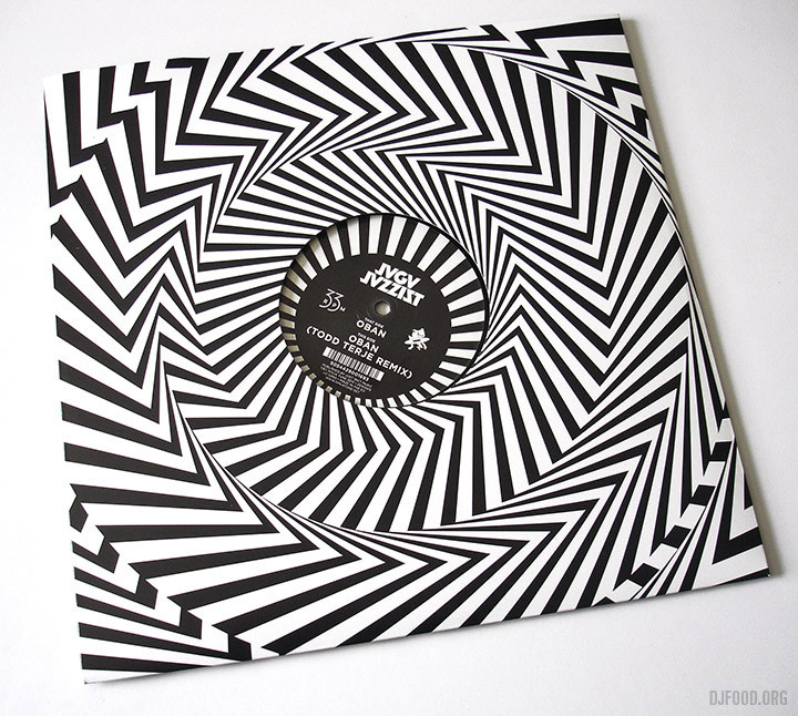
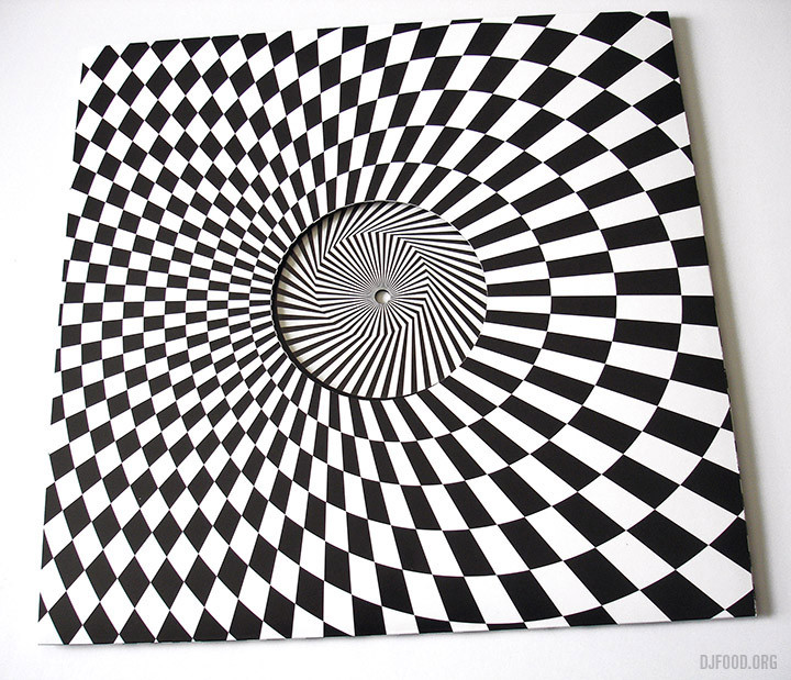
Coming from the Bridget Riley school of Op-Art the single’s sleeve is right in your face, begging you to pick it up. I take my hat off to Martin Kvamme who is credited with the design just for the elegant graphic solution to the 33 rpm speed text on the label, so few designers would bother devising something different these days.
Both releases are out now on Ninja Tune – go and grab them, music that needs to be held as much as heard.
