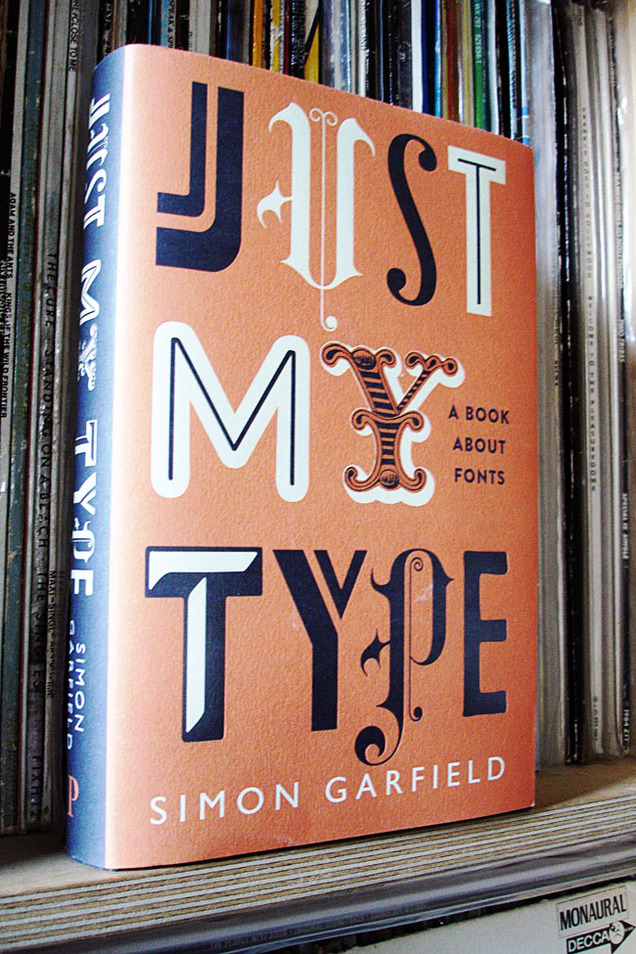
 I can’t recommend this enough, a very good read for designers or even people with a just passing interest in design. You don’t have to know your kerning from your baselines to appreciate the information in this great book. Simon Garfield take a humorous, but well researched, look at fonts and typography across the ages, from design giants like Helvetica, Univers and Gill to the underdogs of the lettering community.
Chapters on Comic Sans prove he’s no type snob, a fascinating story about a lost typeface that drowned in the Thames and even a few eye openers will keep you turning the page. Who would have thought Eric Gill was into that? Also the new Olympic font comes in for a good kicking before he’s done.
If you’re a student just starting, a seasoned pro or you just know someone who likes their design but is really hard to buy a present for, this book is for you. I only wish something like this was around when I was in college, it might have saved me from making some of those dodgy font decisions in the past.

My sister gave me this for my Birthday, just reading it now and loving it.
you spelt basslines wrong 😉