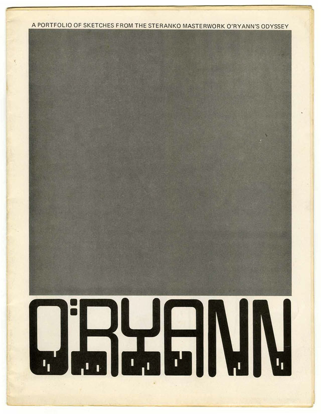
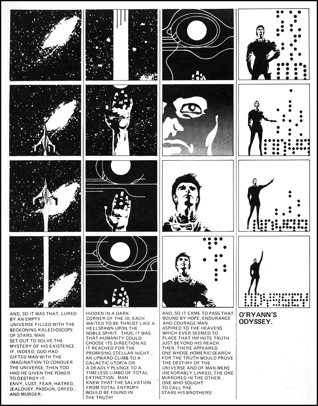
 Nice font there, possibly by Mike Hinge? Interesting choice of cover ‘image’, forces you to focus on the type. The contents of the portfolio can be seen over on fredschiller’s site, there’s a great final page that looks like a storyboard for the opening of a film which I’ve nicked to show below.


Thanks very much for the info Tony, the splash is amazing, see cinematic. Just took a peek at your site, I’m going to waste a while checking that lot out!
That was the splash page of the comic. Stan Lee said it didn’t look like a comic and rejected it. Steranko bought the project back from Marvel and planned to publsh it himself, but that never happened. All we ever saw of the projecct was published in that small portfolio of images. I asked Steranko if the entire comic was going to have the same design as the splash page and he said no.