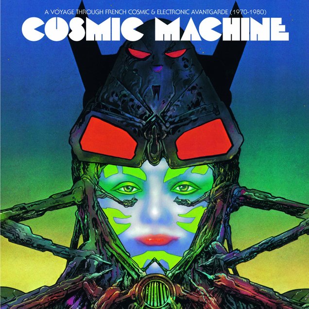
 Love this cover for a new comp of French Cosmic and Electronic music. Very Phillippe Druillet, if not cribbed directly from one of his works. See the tracklist and pre-order here.
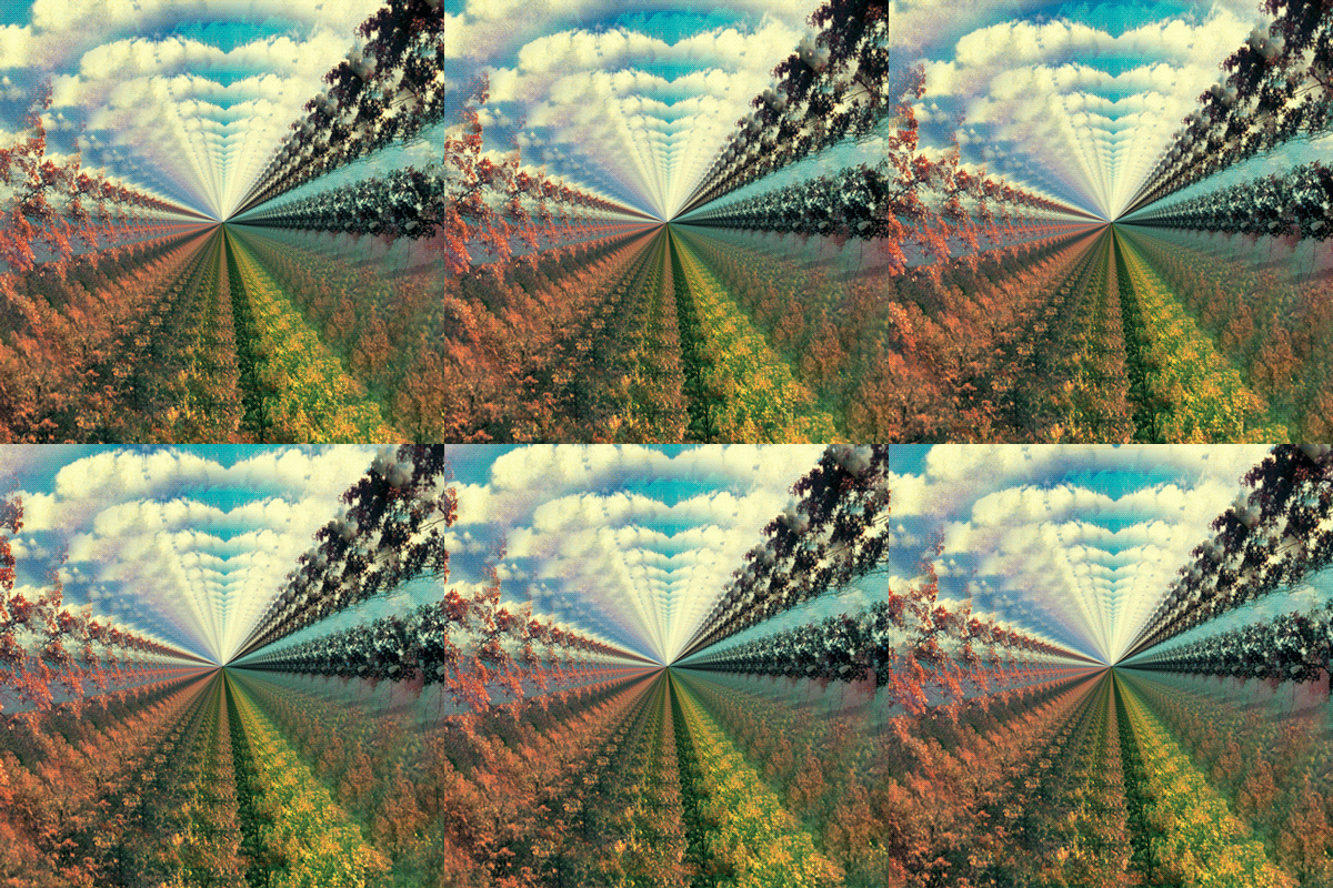 As seen on Leif Podhajsky’s tumblr
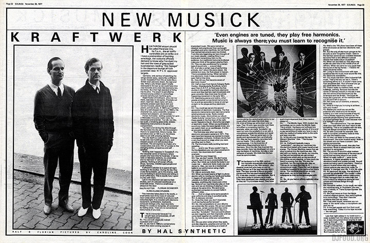
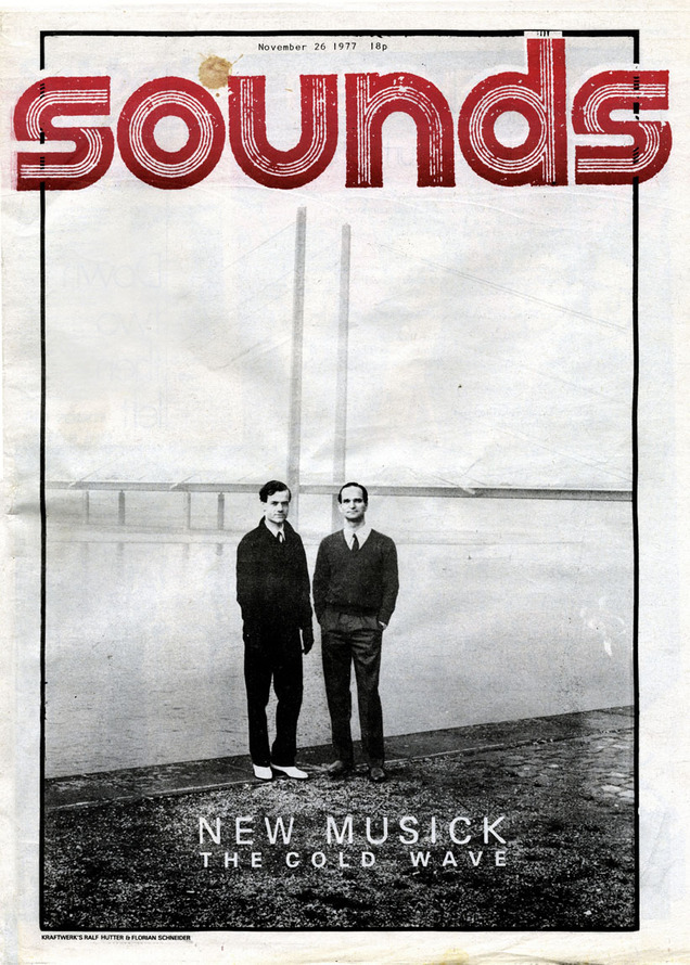 The now defunct weekly UK music paper, Sounds, had a reputation for championing Rock and Heavy Metal above everything else. Writers Garry Bushell and Jon Savage raved and wrote about Oi and Punk respectively but there was more to the paper. 1977: The Queen’s Jubilee and the height of Punk in the media, right? Not by late November in Sounds it wasn’t, this was also the year ‘Trans Europe Express’ was released.
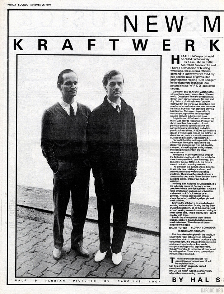
A stark cover featured Ralf Hutter and Florian Schneider photographed on the banks of the Rhine in their hometown of Dusseldorf by Caroline Coon, a two page interview leading the first part of a look at ‘New Musick: The Cold Wave’. Interviews or pieces on Eno, Throbbing Gristle, The Residents and Devo all appear by Savage, Jane Suck and Hal Synthetic (love these writing pseudonyms). Not very Rock or Punk.
The Kraftwerk interview is fascinating, with Florian almost adding as much as Hutter and the two finishing each other’s sentences. Hutter mentions the term ‘Electronic Body Music’ and they talk about putting together comics detailing the themes of their music, I wonder what happened to them? Karl Bartos and Wolfgang Flur aren’t even mentioned although they do appear in at least one of the photos in the piece. It’s interesting to note that Ralf and Florian picked the journalist up from the airport and showed him about the city before the interview was conducted inside their Kling Klang studios. That certainly wouldn’t happen today. See more photos from the shoot, including a smiling Ralf & Florian that were not featured in the article, here.
*After numerous requests, here’s the piece, hope you can read it*
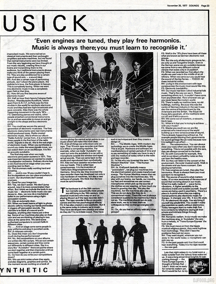 The Eno piece is typical, well… Eno, he talks and talks about his ideas, just as he always does, with his sideways looks at subjects ranging from dub reggae to Eskimos engineering US Air Force jets in Alaska. There’s no attempt at cross examination and the ‘interview’ is distilled from five hours of chat into two Eno’s: the non-musician and the theorist. Along with Throbbing Gristle refusing to issue forth any kind of manifesto but the paper giving their ‘2nd Annual Report’ a 5 star review and a fairly scathing feature on The Residents, it’s an odd collection. The rest of the paper features things like ads for The Damned’s second album, Kiss’ ‘Kiss Alive II’ and the new Rick Wakeman LP, live reviews of The Jam, Richard Hell and Blondie sit with articles on Pub Rock and The Eaters (no, me neither) and a very early Savage Pencil episode of ‘Rock & Roll Zoo’.
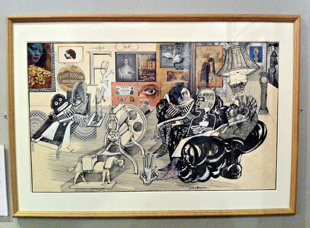 Ralph Steadman at 77 is a retrospective currently running at the Cartoon Museum in Little Russell St., London, WC1A 2HH. Featuring over 100 of his works, most of them originals, from Punch, Rolling Stone, Private Eye and the Observer. His book illustration work is also featured with some of the incredible Alice In Wonderland/Through The Looking Glass images (see below), Leonardo, Fear & Loathing and various children’s books.
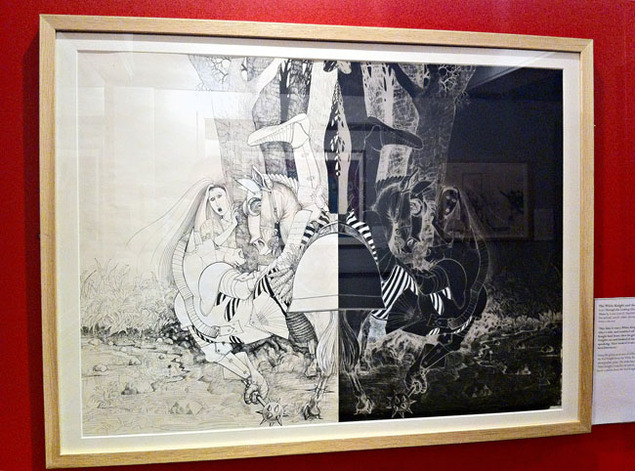
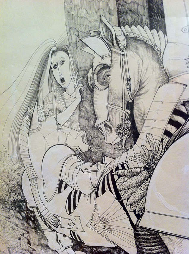
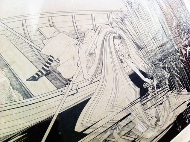 Seeing the originals of some of these classic (for me) images was amazing, his line work is incredible but it was nice to see the amount of white out where he hadn’t quite nailed it every time too. The real treat though, was seeing some of his earlier 60’s work that I wasn’t familiar with, a few incorporating colour imagery collaged into the background (see top). Another was an illustration of the infamous Rolling Stones drug bust but my favourite of all was a square print from 1967 called ‘Bedlam’. This circular design of what looked like a board game was unlike many of his works that I’d ever seen, tightly (typo)graphic with all his usual unhinged, unkempt flair reigned in.
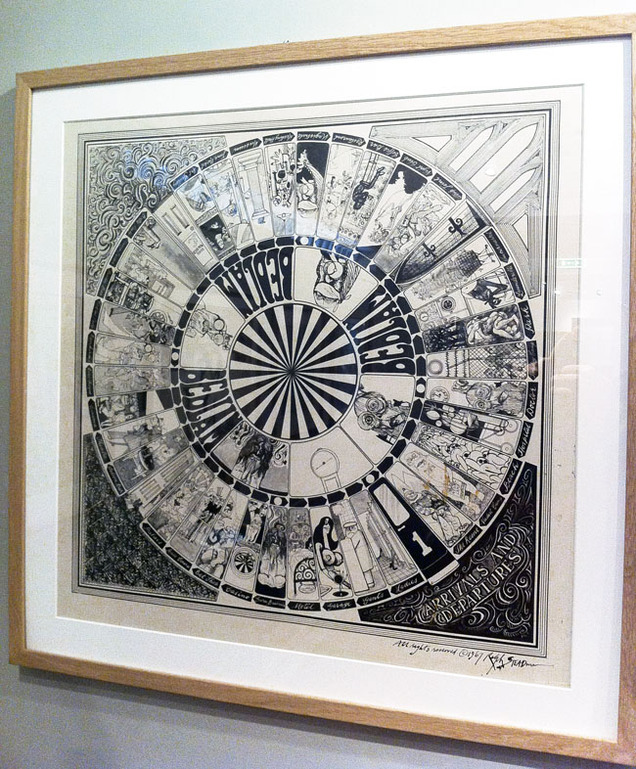
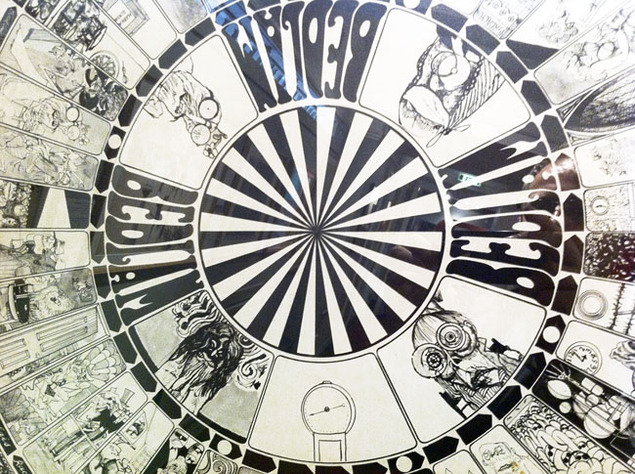
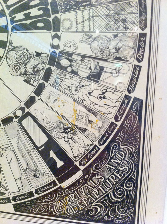 Seeing original work like this is one of my favourite past times, with a connection in scale and technique that is rarely captured in the books the pieces were made for. The imperfections and corrections, staining, yellowed paper and sometimes pasted-on additions fascinate me in the same way as a making-of documentary. An artist’s early work, his or her formative years, are always the most interesting for me, the style signposts slowly emerging whilst others are discarded as they find their own direction. Steadman found his fairly quickly and has been mining the same vein for decades now but he’s one of the few that have kept pushing himself into new areas, thus keeping the ‘shock’ factor intact. After the satire and bile of the 70’s and 80’s caricatures he and Gerald Scarfe became known for he moved into promotion for Oddbins, the off-licence, and then on into children’s books, neither of which you would ever have dreamed his material suitable for.
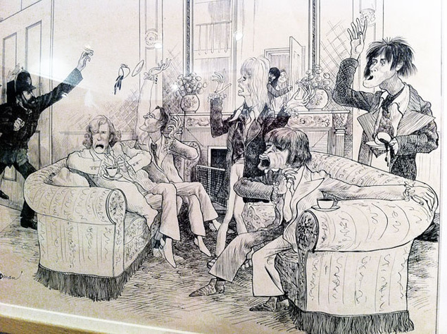
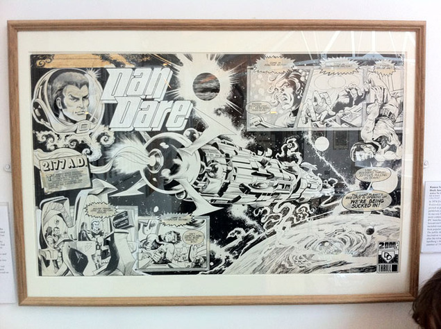
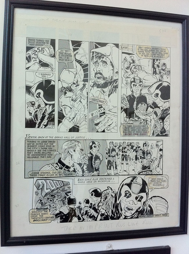
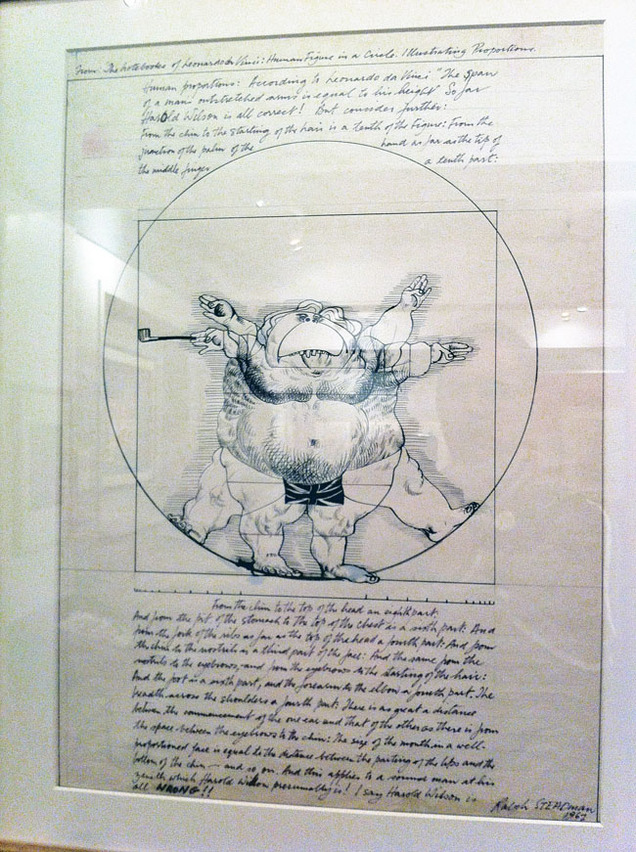 The exhibition runs until September 8th so there’s still a month left to catch it. Entry ranges from £5-3 and children are free. The upstairs houses original art from a lot of classic children’s comics at the moment, the Beano and Dandy being well represented but also a couple of pages from vintage 2000ad too: a Mike McMahon Dredd and a stunning Massimo Belardinelli Dan Dare splash page. By coincidence, Dave Gibbons’ ‘Whaat!?’ piece from the Image Duplicator show also currently resides there too at the moment.
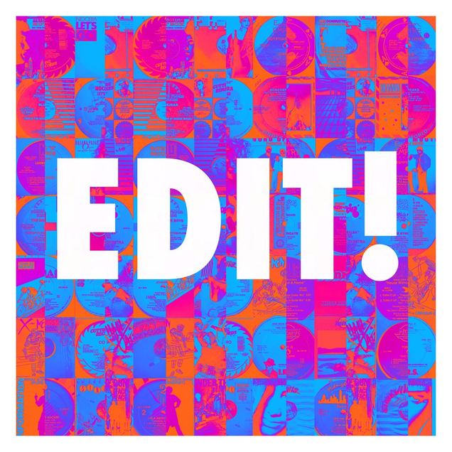 DK takes the first 40 minutes then Trevor Jackson cuts up the Tape Edit Kings of the 80’s.
In his own words; “This mix consists of electro/freestyle/miami bass classics & bonus beat edits by the likes of Chep Nunez, Omar Santana & The Latin Rascals, how they did what they did with just tape, a reel 2 reel & a razor blade still defies belief and continues to inspire me as much as it did when I first heard their work in the mid 80’s
There is no tracklisting & won’t be because I come from a generation when Shazam. Discogs, eBay & Google didn’t exist, when I first heard something on the radio in a club or a mixtape it often took me many months of desperate searching to find out what it was, I’m more than happy to inflict this highly satisfying laborious experience upon you, you’ll appreciate it in the long run.”
The second hour has an interview with Thundercat and DK finishing up with a tribute to George Duke who died earlier this week.
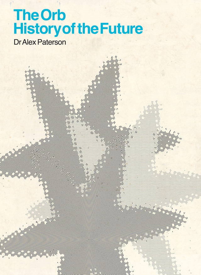 Due on October 7th and spread across 3 CDs and 1 DVD:
Disc 1: The Singles Collection
01. A A Huge Ever Growing Pulsating Brain That Rules From The Centre of the Ultraworld: Loving You (Orbital Dance Mix)
02. Little Fluffy Clouds (Single Version)
03. Perpetual Dawn (Solar Youth Mix)
04. Blue Room (Seven-Inch Version)
05. Assassin (Seven-Inch Version)
06. Oxbow Lakes (Album Version)
07. Asylum (Album Version)
08. Toxygene (Album Version)
09. Once More (Album Version)
10. Ghost Dancing (Album Version)
Disc 2: Remixes and Rarities
01. A Huge Ever Growing Pulsating Brain That Rules From The Centre of the Ultraworld: Loving You (Aubrey Mix Mk II)
02. Little Fluffy Clouds (Coldcut Heavyweight Dub Mix)
03. Perpetual Dawn (Andrew Weatherall Ultrabass 1 Mix)
04. Blue Room (Excerpt 605)
05. Majestic (Heavy Mix – The Orb and Youth)
06. Close Encounters (Smile, You’re On Camera mix – The Orb and Slam)
07. Assassin (Another Live Mix)
08. Toxygene (Ganja Kru Mix)
09. Once More (Mark Pritchard Mix)
Disc 3: Live In Copenhagen & Woodstock
01. Towers of Dub (Live @ Trekkoner Sunset Gig)
02. Little Fluffy Clouds (Live @ Trekkoner Sunset Gig)
03. Blue Room (Live @ Trekkoner Sunset Gig)
04. Star 6 & 7 8 9 (Live @ Trekkoner Sunset Gig)
05. Valley (Live @ Trekkoner Sunset Gig)
06. Assassin (Live @ Woodstock 2)
Disc 4: DVD
01. Fluffy Little Clouds
02. Perpetual Dawn
03. Assassin
04. Oxbow Lakes
05. Pomme Fritz
06. Toxygene
07. DJ Asylum
08. Once More
09. Blue Room (Top Of The Pops ’92)
10. Toxygene (Top Of The Pops ’97)
11. Little Fluffy Clouds (T In The Park)
12. Perpetual Dawn (Ten-Inch TV Advert)
Very pleased to announce this for October 11th in Bristol. What a line up! Thanks to the D.O.P. for helping get this together. Tickets and more info: HERE.
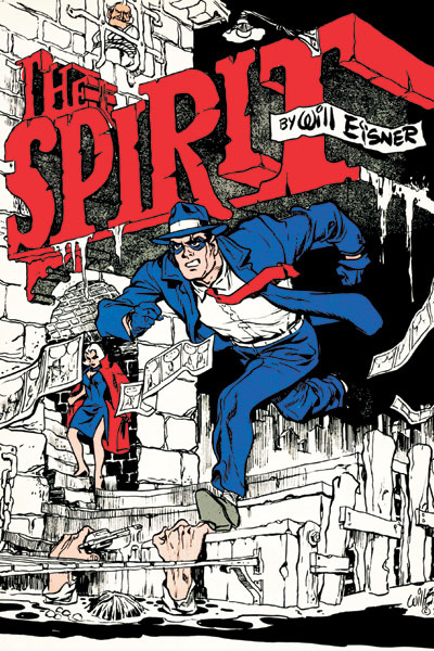
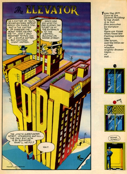
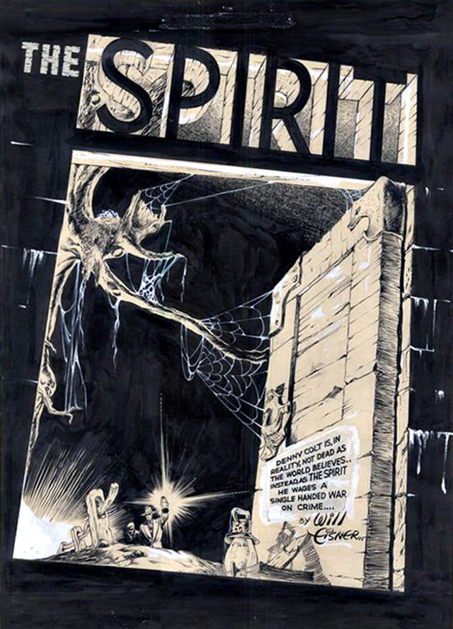
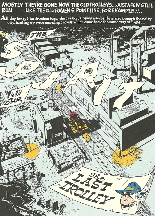
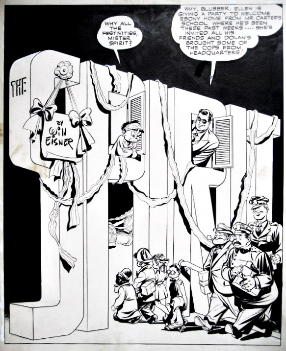
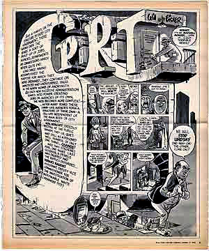
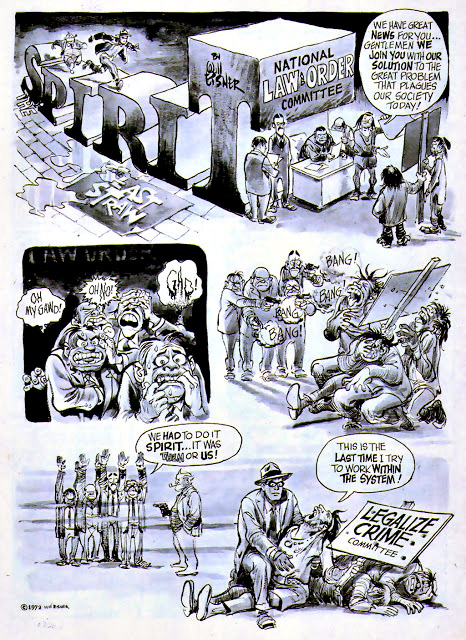
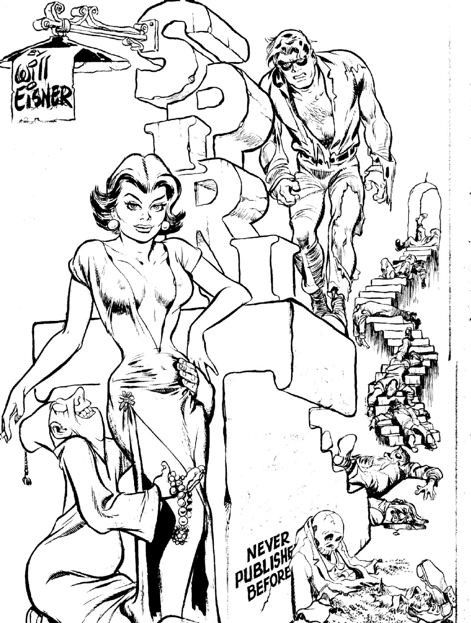
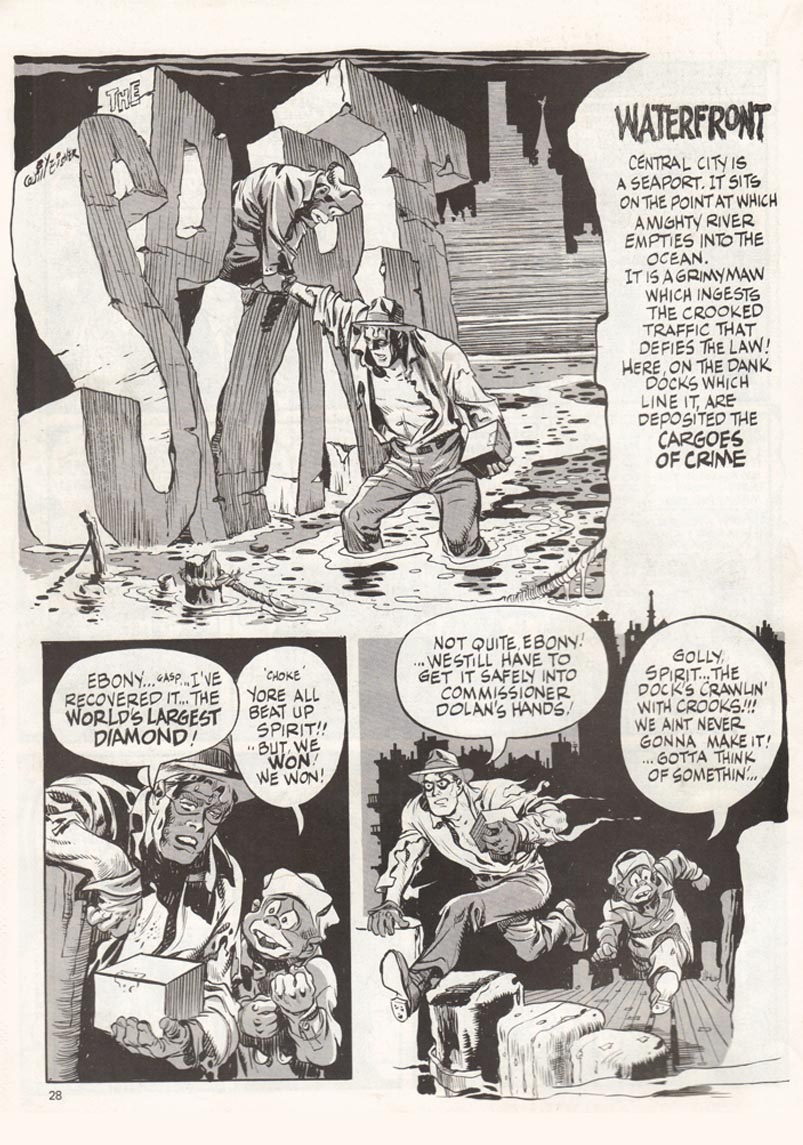
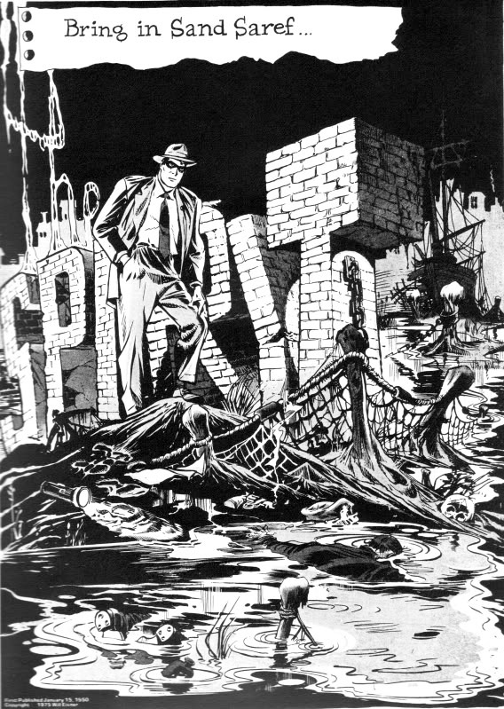
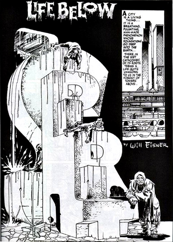
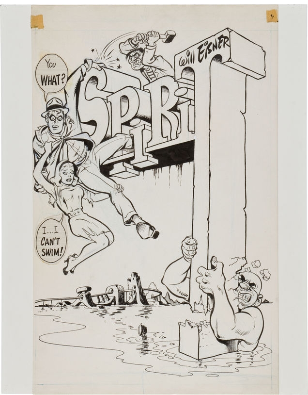
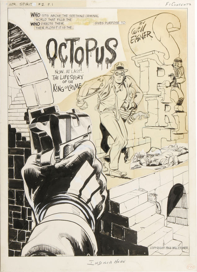
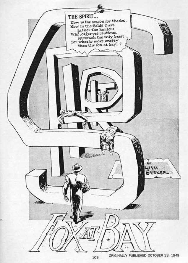 I got into a conversation recently about comic book opening pages where type and title became part of the landscape which reminded me of the king of this; Will Eisner. I can’t claim to be an expert but I always found The Spirit opening pages that I saw to be endlessly inventive with the idea being ripped off numerous times over the decades.
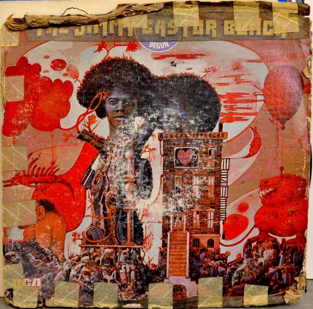 There’s a great article about the public cataloging of Afrika Bambaataa‘s record collection over on Wax Poetics’ site.
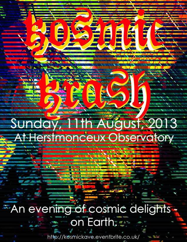 Going to this next Sunday, The Simonsound playing all night in one dome, psychedelic visuals, telescopes to watch the meteor shower (maybe), Ashley Beedle DJing and more, should be fun. There will be limited free Simonsound mix CDs available and he should have copies of the new 10″ single if they arrive in time. Get more info and tickets here.
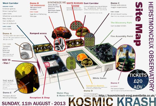
 This promises to be a pretty unique event, you’re not going to get a line up like this every day. Even more so once the Very Special Guests (3 in total) are announced. The end of the 25th year will be seen out in style and Cheeba, Moneyshot and I will attempt to recreate the Paul’s Boutique mix we put together last year.
Tickets can be bought here and we should be announcing similar events in Bristol and Paris very soon.
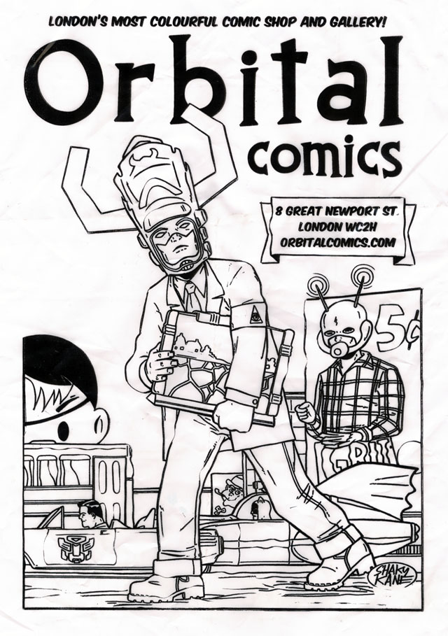 Speaks for itself really, Shaky Kane redesigns the Orbital Comics bag.
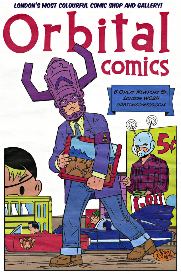
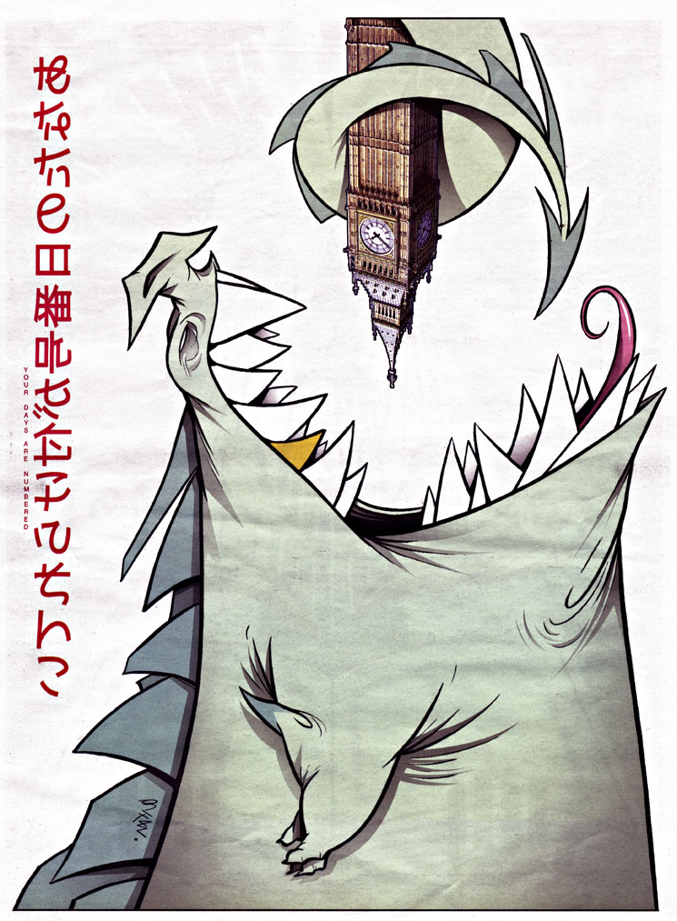 The bag is in black & white but, if you pick up the latest issue of the free paper Your Days Are Numbered (cover, left), you get a colour version in the back (above). This is a decent quarterly freebie, printed A3 size and available in various places by the counter or where they put flyers.
Featuring original comics, interviews with creators and reviews, it’s one of the good ones to look for. The latest issue has interviews with David Hine & Shaky Kane, Gustavo Duarte (who also does the cover) and Fabio Moon & Gabriel Ba.
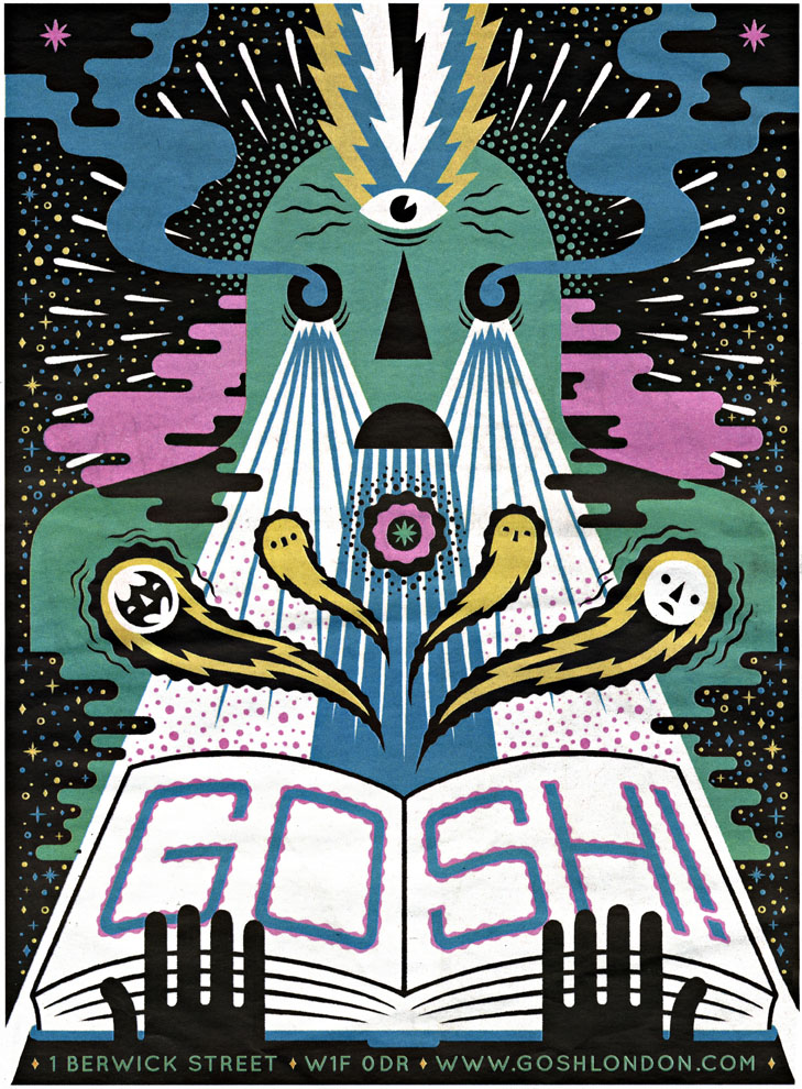
Also inside is this great ad for Gosh! Comics by Ben Newman (below) which, along with the new Orbital bag by Shaky, means that Forbidden Planet really need to step up with their promo artwork.
This week we return to the Solid Steel birthday celebrations and share the cake with something else that turns 25 this year – Public Enemy‘s ‘It Takes A Nation of Millions to Hold Us Back’ album.
To honour both occasions our very own DJ Moneyshot shows us once again why he’s the mixtape king with the career-best offering, ‘Solid Steel and the Hour of Chaos’.
Over 60 blistering minutes he takes in all the beats, breaks, samples and spoken word nuggets that made this seminal Bomb Squad production such an explosive release.
Amongst the vast stack of tracks in the mix, expect words of wisdom from Louis Farrakhan, exclusive interviews with Hank Shocklee, and all the soul, rock ‘n’ roll and early rap tracks that went into making up P.E’s (if not hip-hop’s) finest album.
After taking part in last year’s dissection of ‘Paul’s Boutique’ and US of Audio‘s trbute to ‘3 Feet High & Rising’ – can Moneyshot raise the bar? Of course he can. If you enjoy the mix, why not read his exhaustive feature on the album in the pages of this month’s Future Music magazine?
Power to the people and the broadest beats.
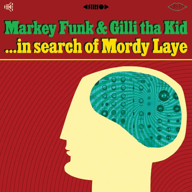 I love these guys. Taste-wise I may as well be listening to one of my own mixes here, so many tracks that I know and love. And the ones that I don’t know, I want to know.
With a graphic like that I can’t resist either – go take a listen and then – if you like what you hear – check the Group Modular album that Markey Funk made with Mule Driver.
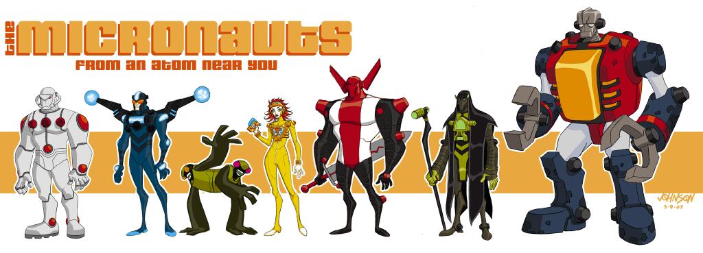 How cool is this? An animated version of the Micronauts toy and comic franchise that looks pitched somewhere between Transformers Animated and Tron: Uprising.
These are concept drawings, posted by Dave Johnson aka @Devilpig666 via his Twitter account after reaching 10k followers.
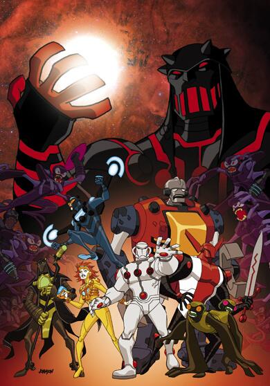
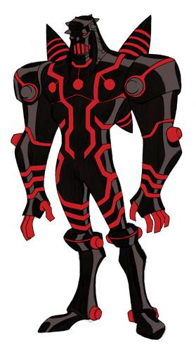
The pitch ultimately failed and it looks like it won’t be made because Hasbro bought the rights but he revealed that they would have got original Micronauts comic artist Michael Golden in to do some designs too.
Regardless, it’s just nice to see this modern day re-imagining of an old classic although this does look like it would be a bit less brutal than the old comics.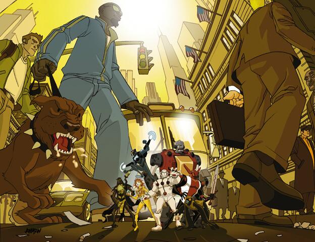
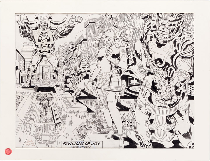
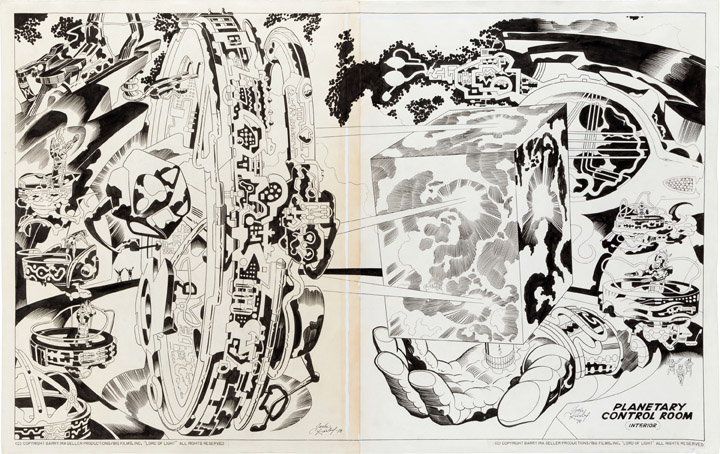 From the Heritage Auctions sale site where these two original Jack Kirby pieces are due to be auctioned this weekend:
“Jack Kirby Lord of Light/Argo “Pavilions of Joy” Illustration Original Art (1978). This incredible Jack Kirby illustration, loaded with the kind of style only “King” Kirby could provide, has a very interesting story connected with it. Originally conceived as production pieces for a proposed film, based on a Roger Zelazny Science Fiction novel, the commissioned art was stored away when producer Barry Geller lost his funding. It was later picked up by the CIA for use in a daring covert rescue mission of six Americans held in Iran. A fake film production company was created, with offices set up in Hollywood, and permission to film scenes in Iran was obtained, all as a ruse to spirit the Americans out. The Ben Affleck film, Argo, is based on these true events, and this piece of art played a pivotal role in that astounding and successful mission.
The art is in ink on paper, with an approximate image area of 22.25″ x 17″, matted to an overall size of 26″ x 20″. The art is in Excellent condition, and even without the fascinating story behind it, this is Classic Kirby as you love him.
Incidentally, this piece and the other “Lord of Light” piece we’re offering have spent the last 20 years in the collection of star artist and DC Comics co-publisher Jim Lee.”
* post script: in the end these two pieces sold for $16, 730 and $23,900!
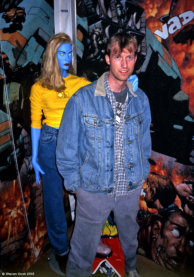
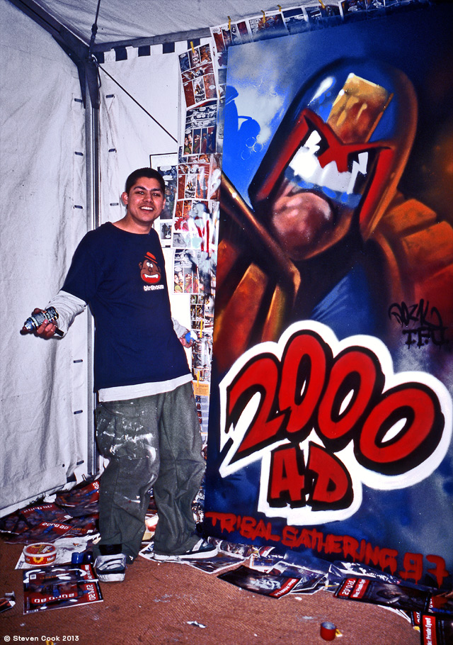
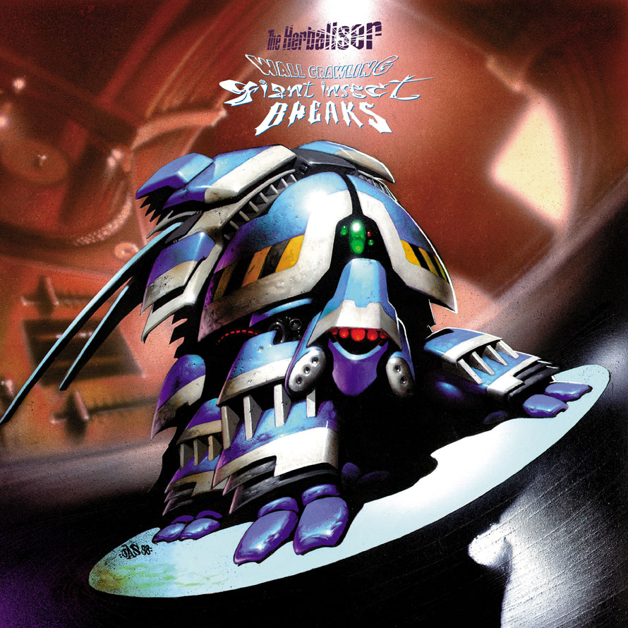
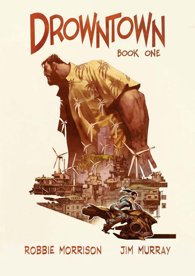 Steve Cook put these photos up last week on his Secret Oranges blog. Above is Jim Murray and below, Jason Brashill, taken at Tribal Gathering in ’97. Both were then working for 2000ad on various projects, with Jim eventually finishing off vol.2 of the Batman/Judge Dredd team-up ‘Die Laughing’ after Glenn Fabry couldn’t commit to it. He then went off to work in the computer games industry but has just put out a gorgeous book with Robbie Morrison called ‘Drowntown’ which is the first of several apparently. Jason followed a similar path but not before he’d painted one of my favourite sleeves for The Herbaliser in the shape of ‘Wall Crawling Giant Insect Breaks’, which I commissioned from him after seeing his work with graffiti artists She One and Req 1 as part of their Brighton crew, The Dusty Knights.
