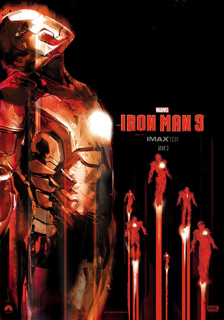
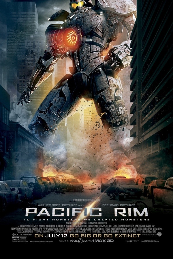
 Saw the trailer for this huge on the IMAX screen last night, roll on July…
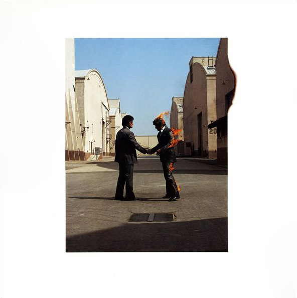
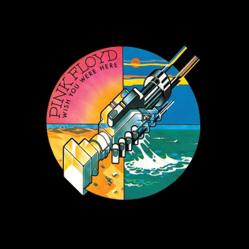
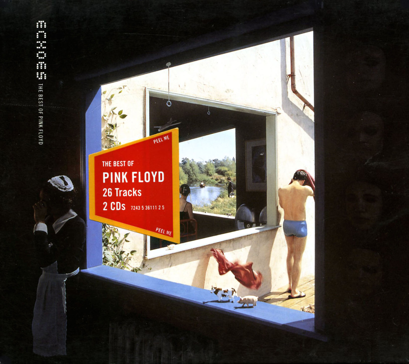
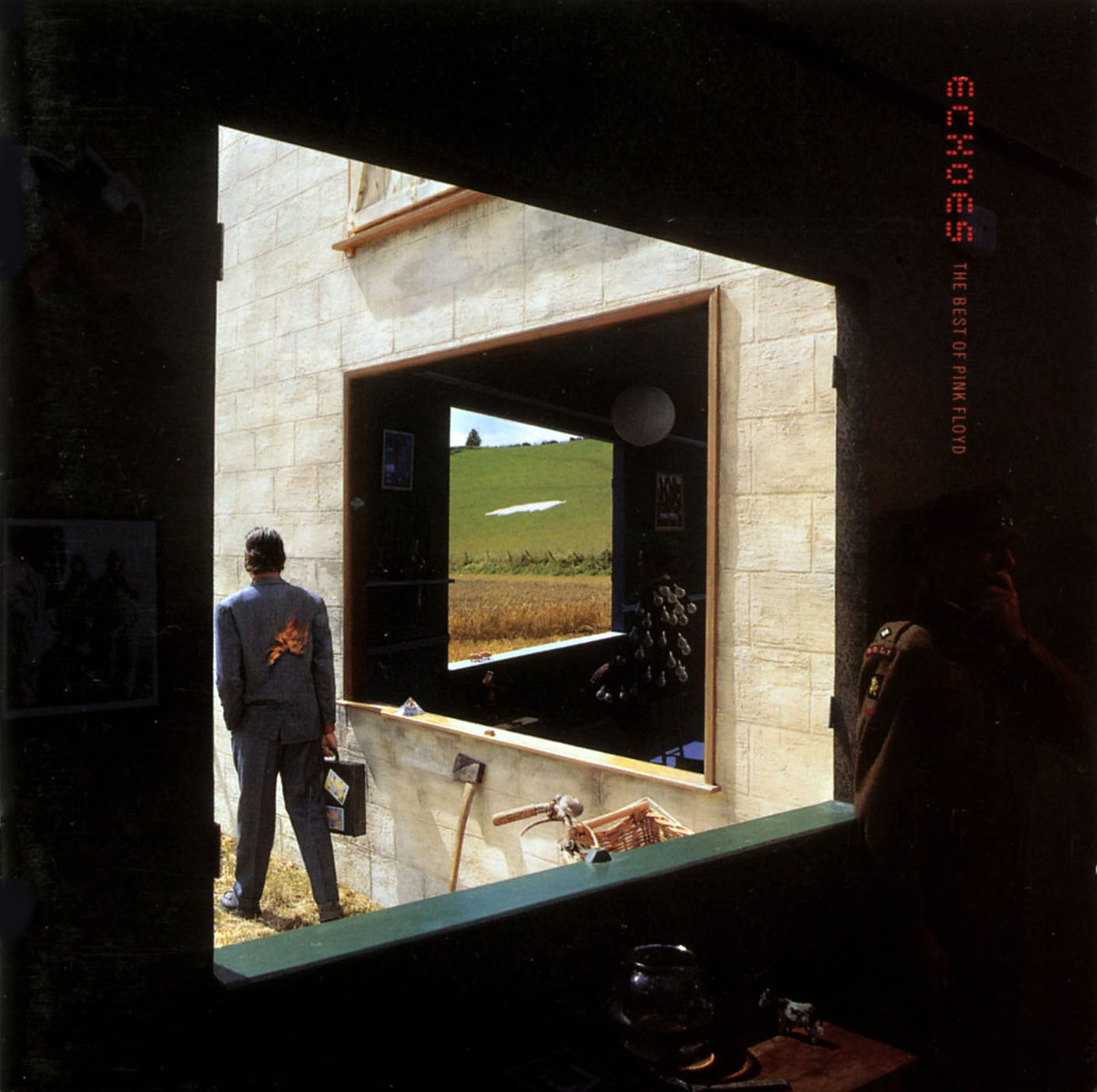
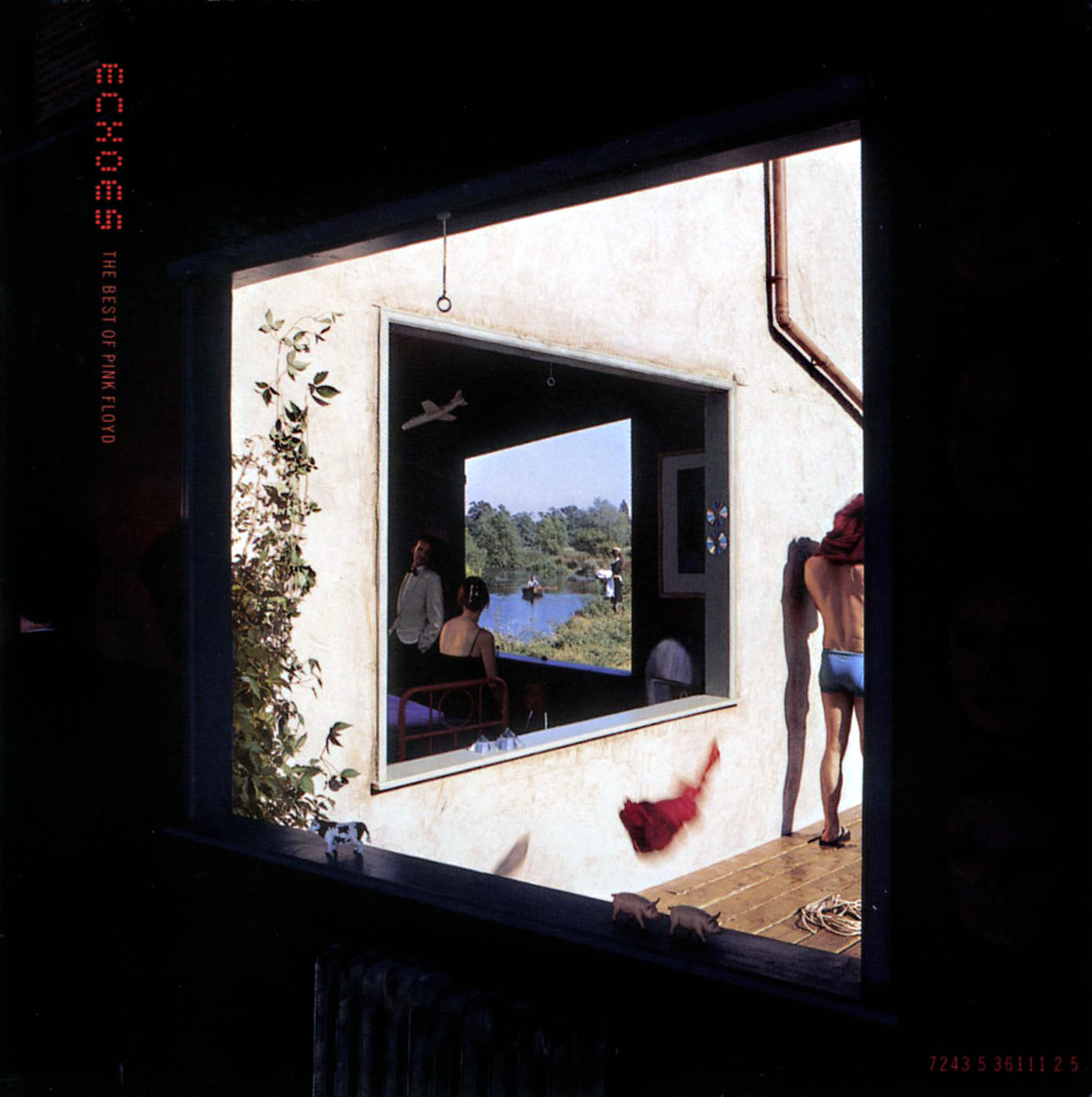
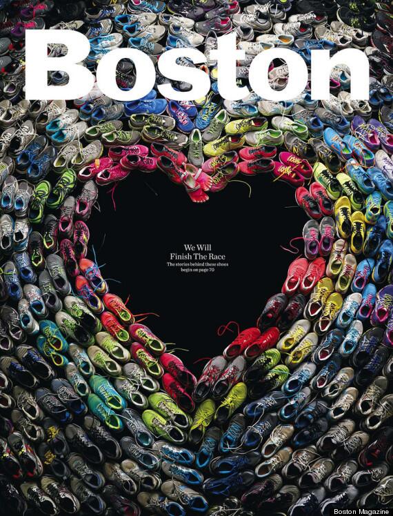 No more to be said, read the story behind the cover here.
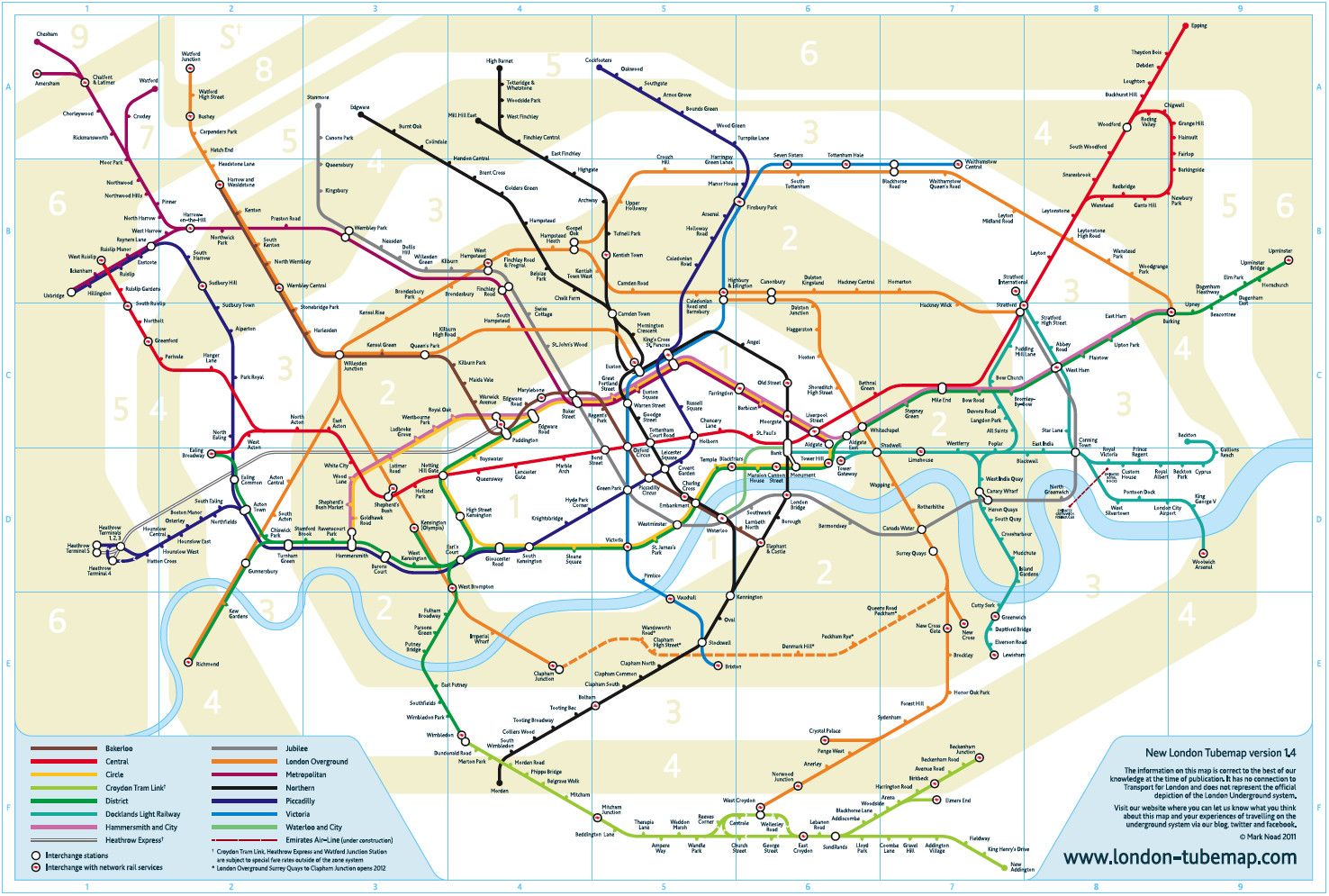 After posting a circular version of the London Underground map earlier this week, this version was bought to my attention. Everyone knows that the traditional map has locations forced into places that they aren’t so as to make them fit a cleaner, clearer design. Mark Noad decided to make a geographically correct version of the map in September 2011 and his excellent website has various versions available for download inc. step-free access, journey times and walking links.
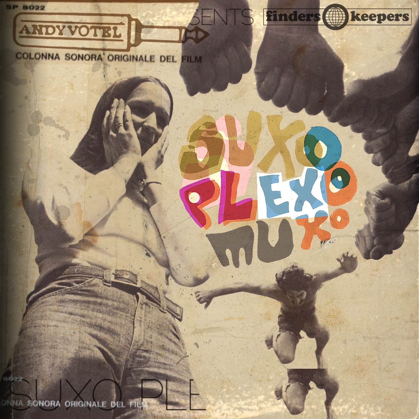 Andy recently made a fine mix for Jonny Trunk’s OST show on Resonance FM. As they don’t have a listen again feature you might have missed it but, by the magic of the internet, it’s been made available over on the excellent A Sound Awareness blog. Go grab it a take some time to peruse the delights over there too.
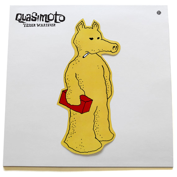
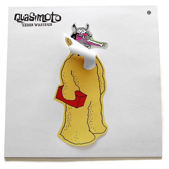
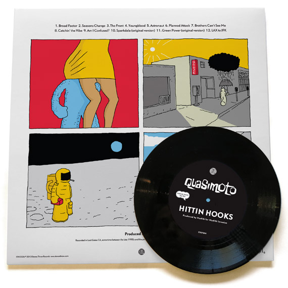 Appearing out of nowhere with only a brief tweet from Madlib a couple of weeks ago showing a test pressing of ‘the new Quasimoto album’ – here it is.
Available now on the Stones Throw store as a pre-order (with free 45) plus the album immediately available as a download.
Check the cover too, Lord Quas has gone for a Velvet Underground-esque sticker that reveals his insides when peeled. Who ever knew he had a bone in his nose?
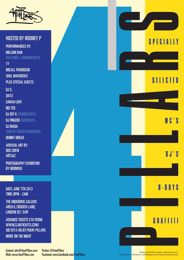 Had to post this as the old Steetsounds Electro compliation sleeves are a big favourite of mine and no.4 was the first one I ever bought. Line up for the gig looks pretty special too. More info here
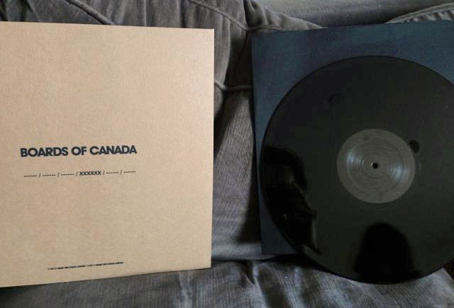 In case you haven’t been in the loop for the last few days it seems that Boards of Canada are finally coming out of hibernation with what appears to be a set of coded records placed anonymously in record stores around the world. Two have been found in New York and London with 20 second pieces of music and a code number that seems to be part of something bigger. Another code cropped up in a YouTube video on the Hell Interface channel (old BOC alias) and another was played on Zane Lowe‘s radio show. Naturally BOC fans being what they are, theories have gone off the scale online and the updates seem to be coming daily at the moment. Keep an eye on the 2020k site for the latest updates, the best of which is that a close friend of the band has confirmed an album release for June this year – great news!
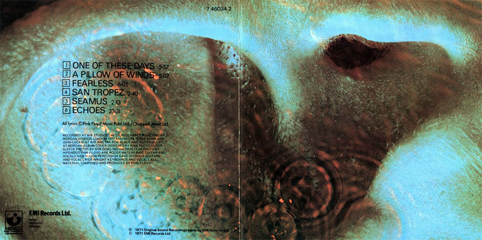
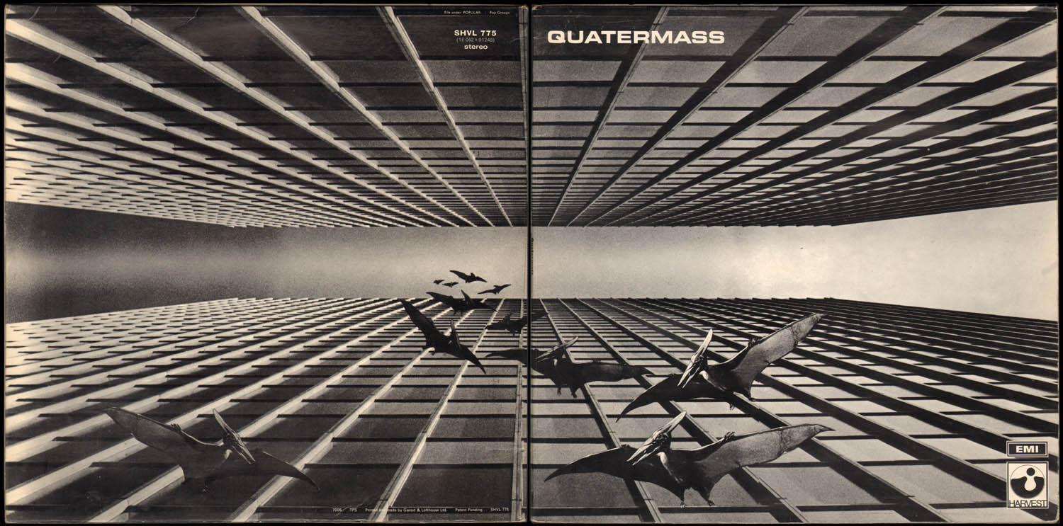
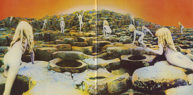
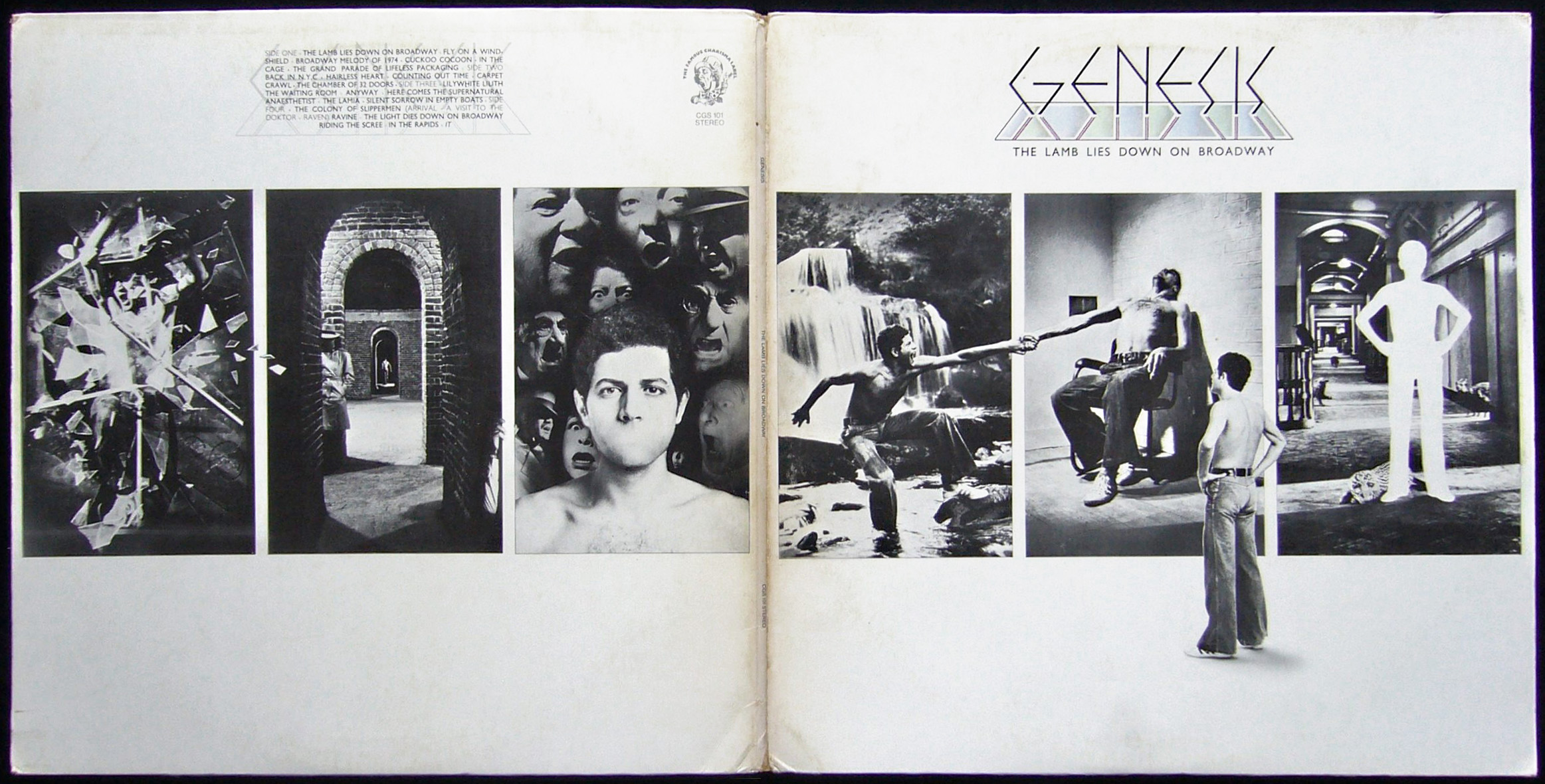
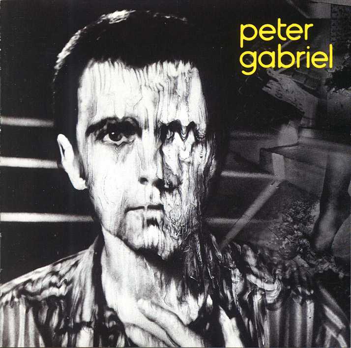
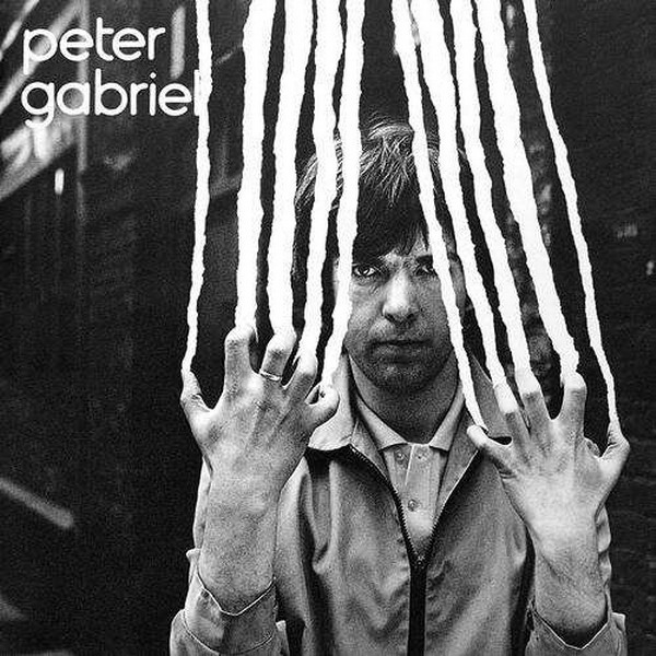
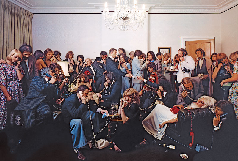
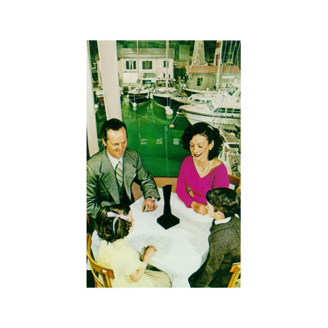
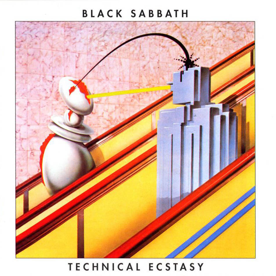
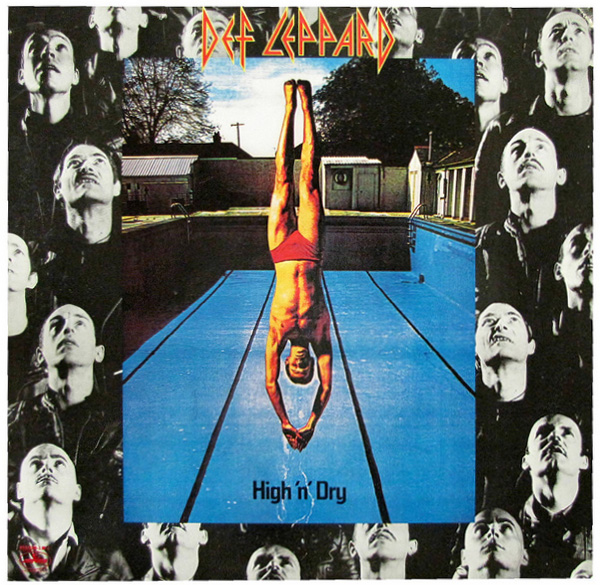
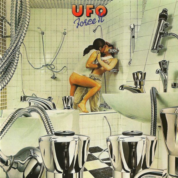
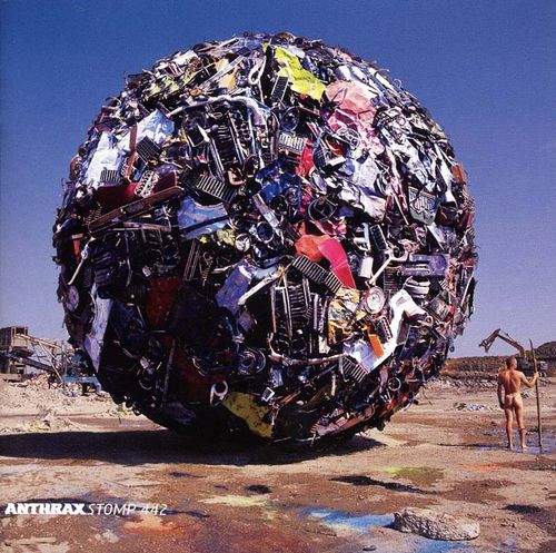
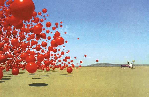
 Things have been so manic this weekend that I’ve only just found time to write something about Storm Thorgerson who passed away last Thursday. As part of the design group Hipgnosis, alongside Aubrey Powell and Peter Christopherson (also no longer with us), they pretty much defined the look of the rock album sleeve in the late sixties, seventies and beyond. You will know their work even if you don’t realise it; Pink Floyd‘s ‘Dark Side Of The Moon’ being the most famous if not their best (as Storm used to admit). 10cc, Genesis, Led Zeppelin, Scorpions, Peter Gabriel, The Who, Black Sabbath, Yes, ELO, AC/DC, Paul McCartney and many more… without their work it’s doubtful magazines like Mojo and Record Collector would have much to fill their pages with these days :).
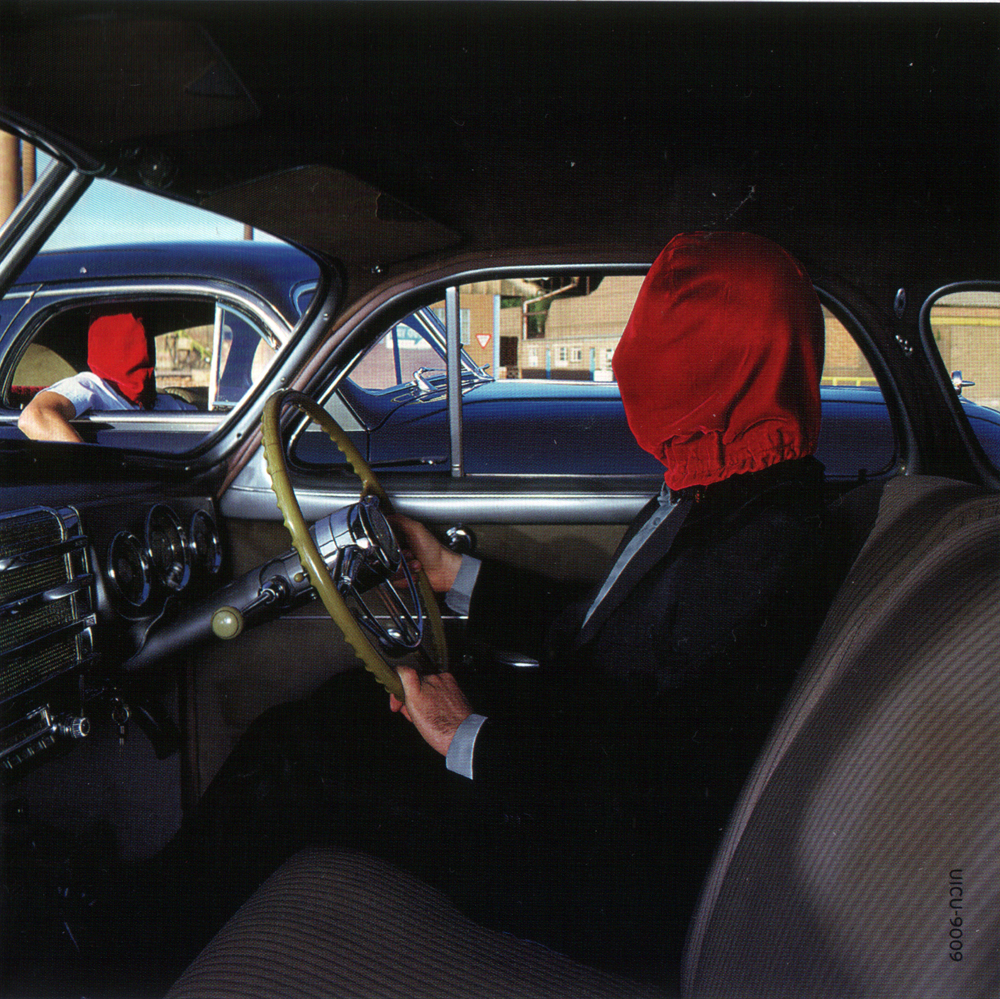
Seriously though, it’s hard to think of anyone else who dominated sleeve design more in the seventies with such a distinctive brand of photographic surrealism, all made pre-computer, on budgets most designers could only dream of these days. It was the age of the gatefold sleeve, Led Zeppelin led the way in deluxe packaging and the sleeve as canvas was in its heyday. Even though Hipgnosis disbanded in 1983 Thorgerson made the transition out of the rock seventies and into the flasher, poppier eighties, still designing for Pink Floyd but adding XTC, Def Leppard, The Cult and more to his portfolio. After Hipgnosis he moved into video direction before returning to sleeve design in the nineties and noughties for bands like Biffy Clyro, The Mars Volta, Muse and Dream Theatre, all wanting some of that retro record sleeve surrealism.
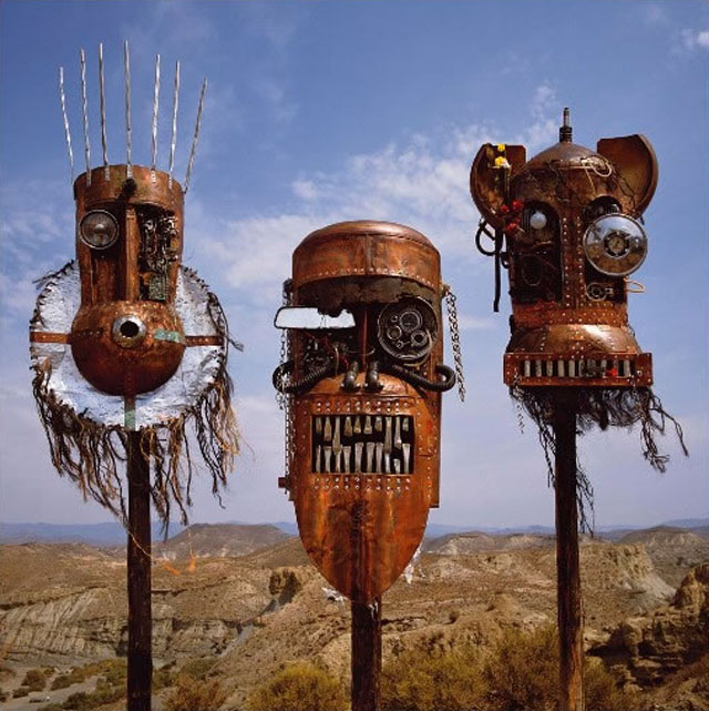
Pick up any book of album cover art and it’s a sure bet that he or Hipgnosis will feature, in some cases heavily although he did co-author the 6 Record Cover Album books in the 80’s so that’s no surprise. His sleeves for Peter Gabriel and The Scorpions used to freak me out as a kid first visiting record shops and I absolutely loved the tribal mask constructions on the Ellis, Beggs and Howard ‘Homelands’ LP sleeve. He’ll probably best be remembered for his work with Pink Floyd and I get the sense that he was at his most relaxed and playful with them, especially is the various compilations and re-imaginings of his past work he was called upon to do, the best being the ‘Echoes’ compilation imagery.
These days the art of the record sleeve is getting reduced to a thumbnail, hidden away, then forgotten, in pdf ‘booklets’ attached to download packages and lower resolutions for the web. When budgets are so tight that album design duties are relegated to online competitions for fans to enter, it’s important to remember and recognise how important the work of Storm is and was. He and others like him shaped the visual language of parts of the music industry and showed that artwork can be as important, controversial and powerful as the music it surrounds. * Special mention for the excellent Hipgnosis Covers blog too, I could spend all day there.
 This debuted in January this year apparently but I only just saw it, I rather like it as a new take on the standard London Underground map. The redesign isn’t official however but was done by Dr Max Roberts, based on concentric circles, partly inspired by the orbital London Overground. He posted it on the Going Underground blog earlier this year because he felt the regular map was becoming too crowded with the recent addition of new lines like the East London Line. It’s probably not geographically correct but then neither is the regular tube map, it does show however, show unbalanced the South of London is in relation to the North where transport links are concerned.
This is doing the rounds at the moment, very nicely done.
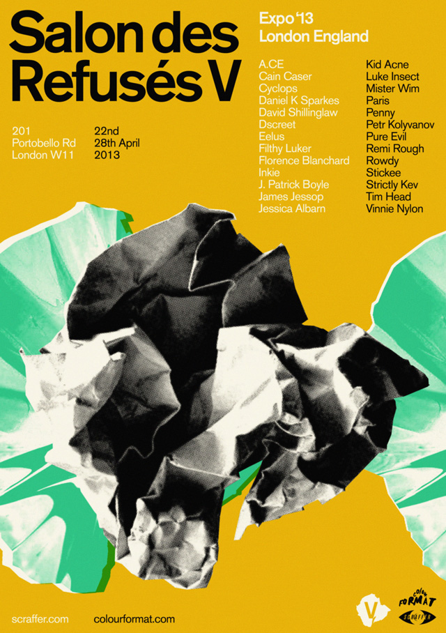 Salon des Refusés V opens today at 201 Portobello Rd, London, W11, a pop up gallery and shop of 30 artists curated by Scraffer. Including work from names like Remi/Rough, Luke Insect, Pure Evil, Kid Acne, Inkie and James Jessop it should be a pretty diverse selection.
The overriding theme of the show is artists that are pushing boundaries, with the work of established artists hanging next to that of ‘up and comers’; there is something for everyone, both stylistically and fiscally.
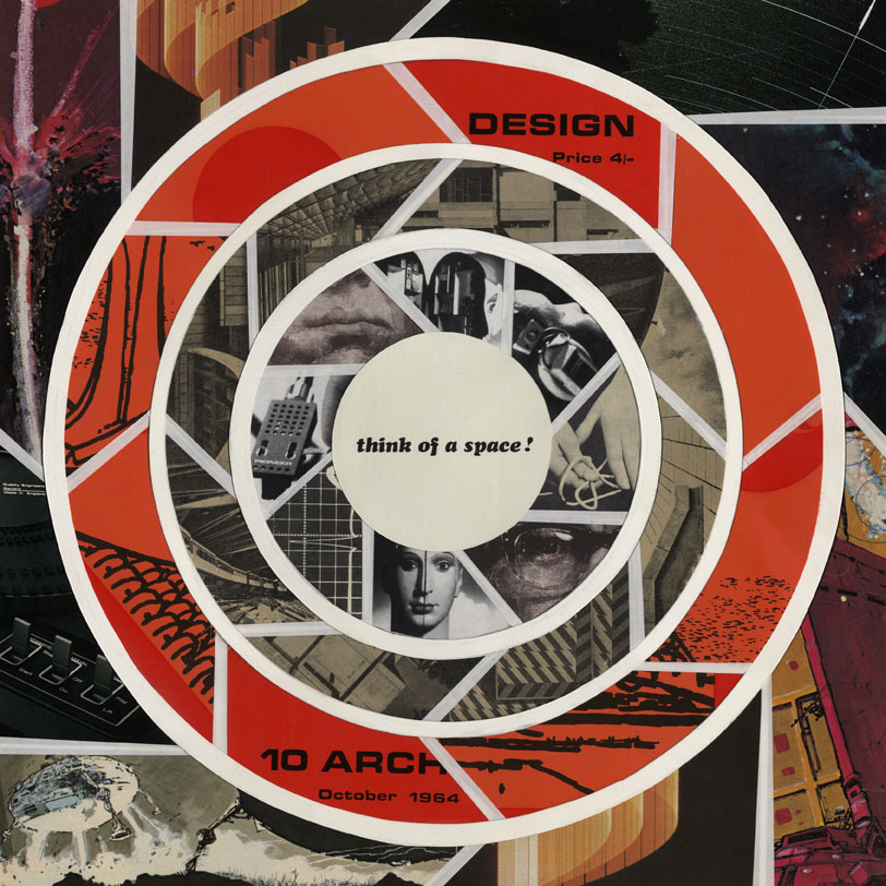
I have an original collage piece on show called ‘Think of a Space’, one of the first of a new series I’m doing at the moment. The Scraffer site will also have two new colour versions of my ‘Skullstronaut’ print on sale shortly after the show.
The show will be on between 22nd to 28th April only and doors open between 10am and 7pm each day.
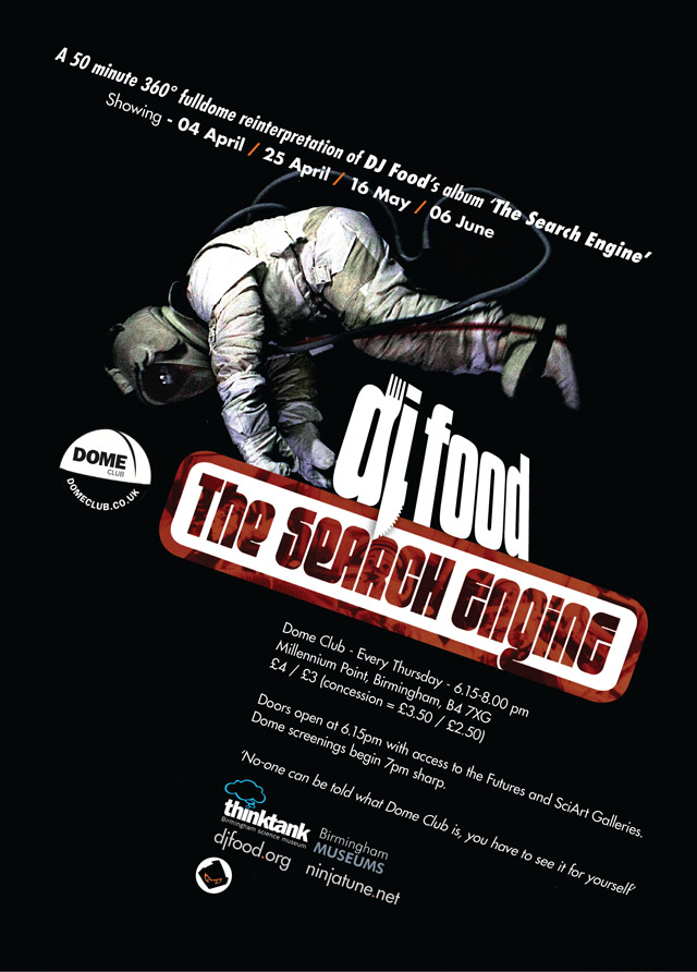
Also this Thursday, the second showing of The Search Engine full dome show at Dome Club at the Think Tank Planetarium in Birmingham.
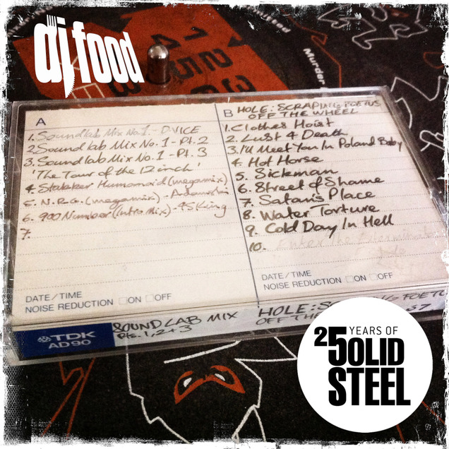 This week on Solid Steel I put together the best of a set I made for the De:Tuned party in Antwerp the weekend before last with the I Love Acid crew. They asked for an old school Hip Hop and Hip House set (I think I probably own about one Hip House record so it’s more heavy on the electro to be honest). Anyway, it’s a trip back to the 80’s but with an added bonus for Solid Steel that the Antwerp crowd didn’t get. The first seven and a half minutes consists of selections from the first mixtape I ever made in 1987, extracted from an old TDK AD90 cassette and unheard by virtually anyone for 25 years.
Let me explain a little about the mix, it was made over many months in various sections once I traded in my first mixer (a Tandy model with no crossfader) and bought a Soundlab model – hence the name, ‘The Soundlab Mix’. At the time I had very few records, maybe less than 100, I had no parental collection to raid as they never had a record player and my younger brother had none either. So, I was forced to use what I could find alongside the few import 12″s I could afford and the limited UK releases of US Hip Hop that were available. People forget that a lot of early rap never got released in the UK in the first half of the 80’s, we were mostly forced to survive on Streetsounds Electro compilations and the few ‘hits’ that the Sugarhill, Tommy Boy and Def Jam labels produced until the rest of the industry caught up.
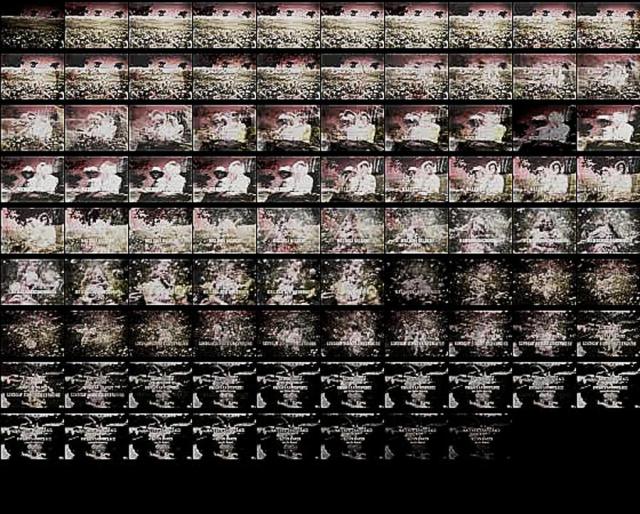
This meant that my early mixes have tracks from 7″ singles given away free with music papers, carboot soul and funk compilations and even a flexi disc I had found attached to a magazine in a paper recycling shed at school. As you will hear, the mix is massively influenced by Double Dee & Steinski‘s ‘Lessons’ series and Grandmaster Flash‘s ‘Adventures On The Wheels of Steel’. Kicking off with the Thunderbirds theme, the idea to mix well known soundtracks over beats seemed like a no-brainer but I’ve spared you the 007 and 2001 themes elsewhere on the tape. In the spirit of the aforementioned ‘Lessons’ I decided I needed an ‘old’ song to mix over some beats, similar to the ‘Hernando’s Hideaway’ section in Double Dee & Steinski’s masterpiece. For this, I used the flexi disc which happened to contain, ‘The Inquisition’ from Mel Brooks‘ ‘History of the World Part 1’ film, not very politically correct by any means, sorry, I had to use what I get my hands on.
Anyway, I wanted lots happening rather than having to mix live and change records so I would record a short section of two records, wait until one had finished and pause the tape on the beat. Rewinding to the best point, I’d cue up another record and jump back in at the appropriate point, sometimes for as little one line of dialogue. Neither of the decks were Technics 1200‘s and only one had a pitch control so each record had to be pitched to beat mix before the next section. Actually the ‘pitch’ control wasn’t anything of the sort, it was a tiny screw next to the tone arm that I found, if you inserted a small screw driver into it, you could fine tune the deck speed faster or slower. At times I would have to release the pause button and start scratching immediately so a lot of it is a little shoddy, also, occasionally the initial edit was sloppy so I had to rewind and do it all again until I got a clean join between the two separate recordings. It was a learning experience and I would record small sections with what I had and slowly build on it as and when I got new records so that the side filled up over the course of about a year, eventually ending with some chart acid and dance music in amongst the beats, rhymes and film snippets.
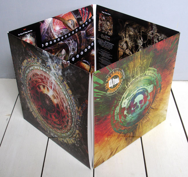
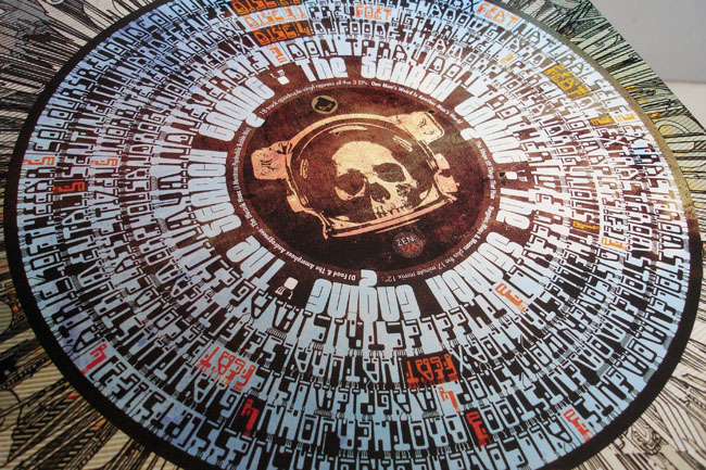
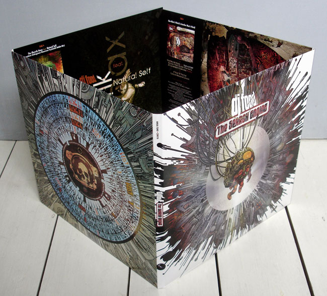 It’s Record Store Day again and Ninja Tune release a four disc vinyl repress of the EPs that made up my album, ‘The Search Engine’. These are straight represses of the original three EPs (One Man’s Weird…, The Shape of Things… and Magpies, Maps & Moons) plus the Amorphous Androgynous remix 12″ from last years’ RSD (on black vinyl this time though).
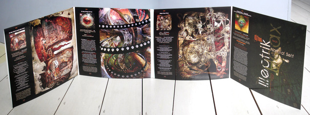 The first three 12″s have been out of print for some time now and contain extra tracks plus some different mixes to the CD album, with some tracks also being full length versions. If your bought these the first time round there’s nothing new musically here I’m afraid. The poster covers are replaced by an eight panel foldout sleeve though, with remixed artwork of which you can see more images here.
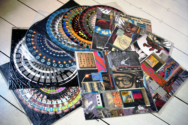
In the spirit of the title, and to add a little something for RSD, I’ve had ten unique pieces of artwork inserted randomly into the first 600 copies of the album. Six high quality prints of zoetropes that I made for the exhibitions last year and four unique collages as seen in this post. All are 12″x12″ in size, signed, stamped and protected by a transparent sleeve.
If any readers of this blog find one, please let me know, I will post a photo of you here with your find and it will be nice to see how far they go out into the world. Everyone going to a store has a chance to find one of the inserts, they’re completely random and could go out to whoever orders them at stores participating in RSD. Even if you manage to get a regular copy I’d appreciate photos and locations and will post the best ones like last year.
The Ninja Tune online shop will have another 400 or so copies for sale the Monday after RSD so don’t worry if you can’t get to a store.
You have to hand it to Jack White, this is the coolest thing to bring back into the world.

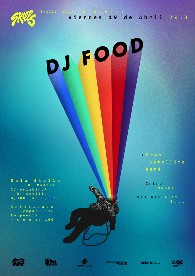 Tomorrow sees a double whammy in Madrid where I’ve been invited to talk about my design work in general for a meeting at Café Molar. It starts around 7.30pm and should last for an hour with a Q&A session.
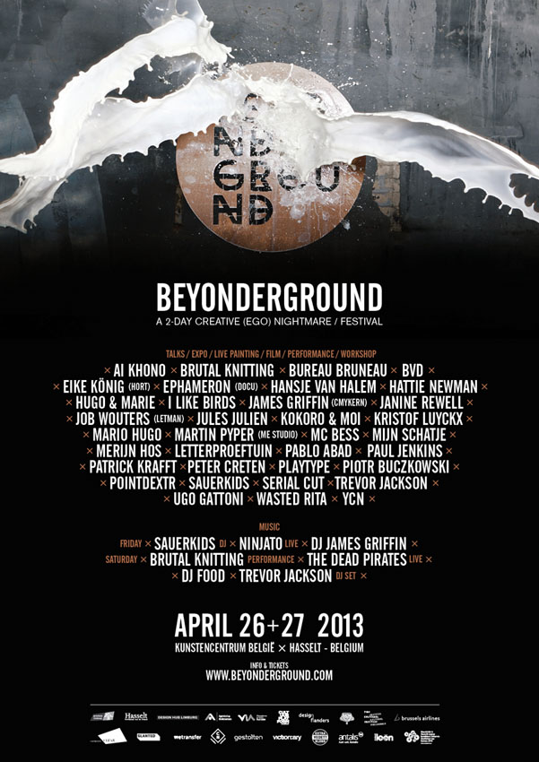
Later that night I’ll be playing a 2 hour AV DJ set at the Skills Club before heading back to the UK on Saturday for Record Store Day.
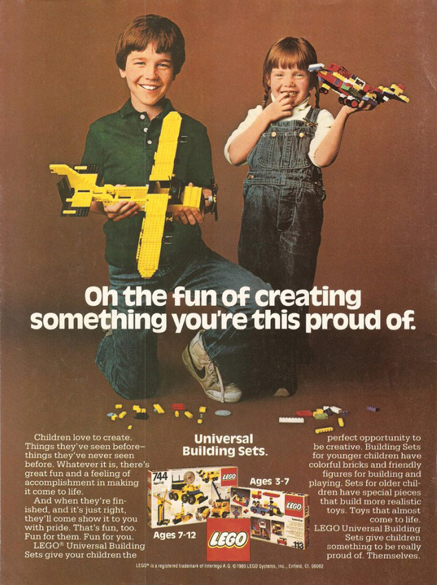
 I absolutely love these ads from 1981, they’ve been doing the rounds on the web for some time now, I think they originate from a Lego Flickr group but I can’t find the source. Anyway, before Lego Friends designated a pink and purple world for girls only, it was resolutely unisex, and hang the cheap brown background, it was all about the bricks.
