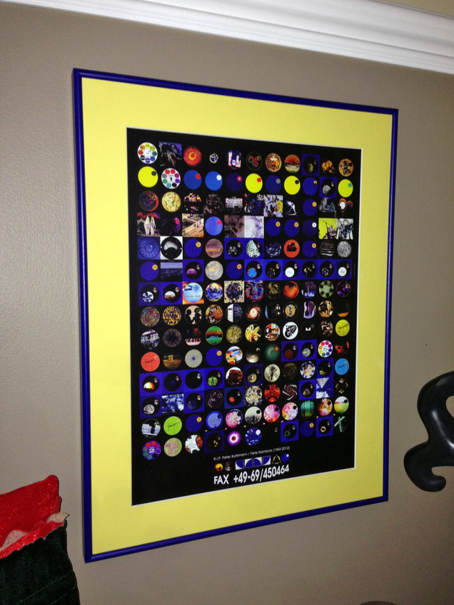
 Christian at Stylusnation sent me this photo of the Pete Namlook / Fax records tribute poster I designed. His wife downloaded the pdf and had it printed and framed as a surprise for Xmas, looks beautiful, well done that woman.
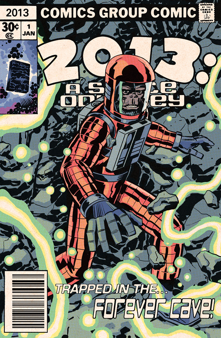 Another killer card from Edmund Bagwell.
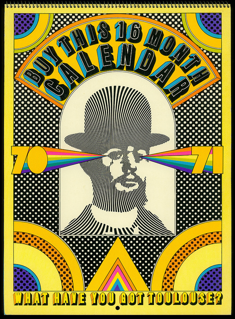
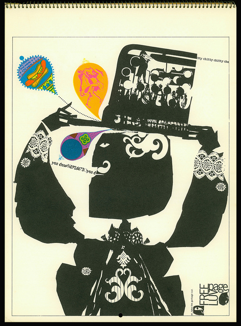
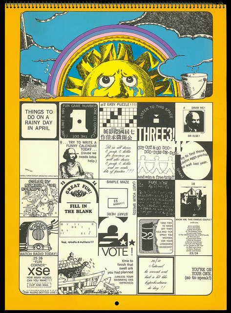
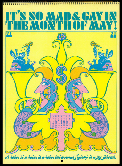
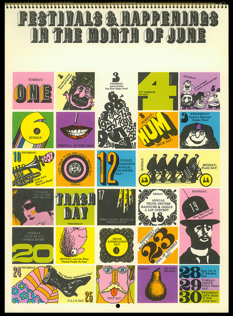 Fabulous Hallmark calendar from 1970-71, designed by Push Pin Studios and containing 16 months. Seen via the ever-excellent Voices of East Anglia website who, themselves cribbed it from the Flickr of Mewdeep who has the full thing.
2012 was a busy year for me, probably one of the best yet in terms of new things achieved and unique experiences. I’m always striving to do something different and at the end of each year I remember the line from The The‘s ‘I’ve Been Waiting For Tomrrow (All of My Life)’, “another year over and what have I done?”.
Thankfully 2012 has been a golden year in terms of ‘getting things done’:
Finally getting ‘The Search Engine’ out there was a good start as were the Greenwich Planetarium launch shows and exhibition with Henry Flint at the Pure Evil Gallery, all in January.
Featuring on a Cineola podcast, being interviewed by Matt Johnson alongside an exclusive remix of ‘GIANT’.
The Kraftwerk month and mixes I did on my blog going a bit viral in March.
Having The Amorphous Androgynous remix one of my tracks for a release on Record Store Day was a massive thrill. Hearing it played on 6 Music was great too.
Going to Montreal to learn about and present The Search Engine show in their SATosphere was one of the proudest points of my gigging career to date.
Having J.G. Thirlwell pop round for tea and a chat one afternoon.
The Food & Flint exhibition, hosted at the Factory Road Gallery in Hinckley by Sarah & Leigh was amazing fun.
The Sacrum Profanum concert in Krakow I took part in after an invitation from Skalpel was one of the most fantastic concerts I’ve ever seen and gig of the year for 2012.
The Beastie Boys’ ‘Paul’s Boutique’ mix I did with Cheeba and Moneyshot making waves on the web.
Playing a small part in some of ZTT‘s Element reissue series and getting to edit one particular master recording for a future issue.
Providing images, sleeve notes and audio for a reissue compilation of John Rydgren‘s work on the Australian Omni Recording Corporation label.
Instigating and then editing the results of a new meeting of Coldcut and The Orb for the 25 years of Solid Steel mixes in 2013.
With so much out there it was inevitable that some got missed.
Things that came out in 2012 that I still didn’t get to see or hear:
Berberian Sound Studio
Cabin In The Woods
Lone’s – Galaxy Garden album
The Amazing Spiderman
The B.P.R.D. hardback editions
Butcher Baker comic
Can : The Lost Tapes compilation
The last few issues of Godland comic
GOAT’s ‘World Music’ album
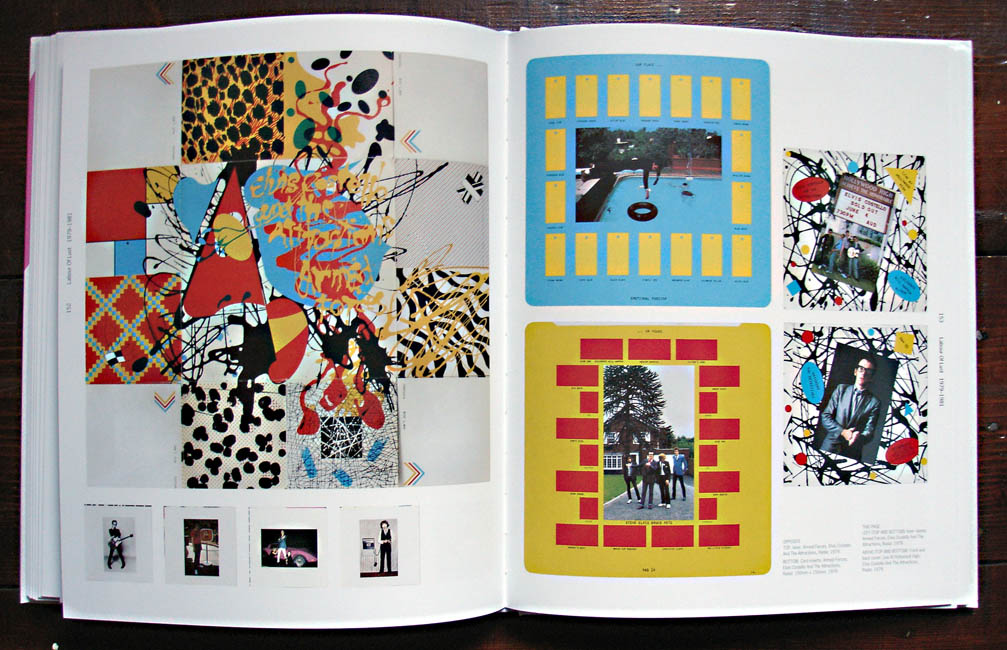
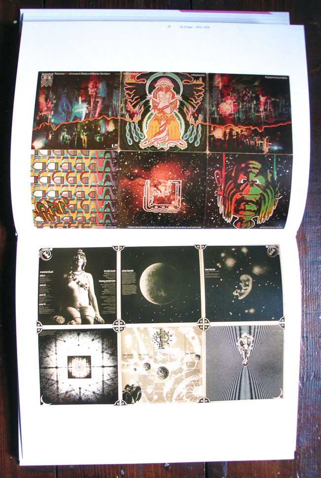
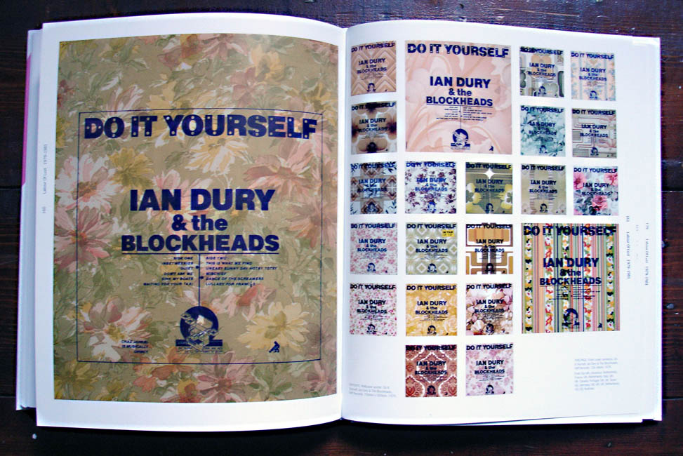
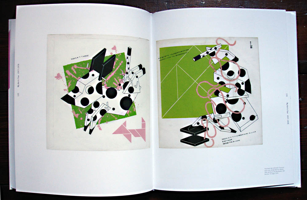
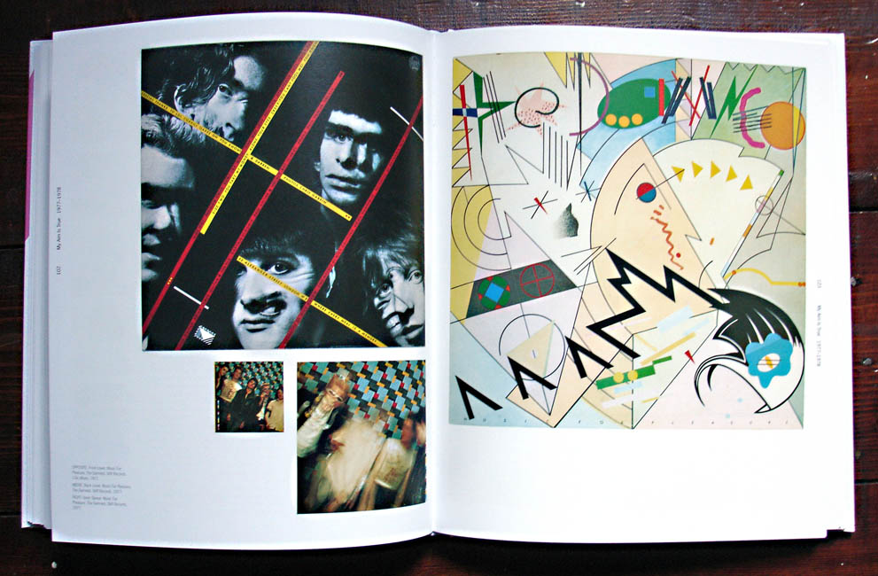
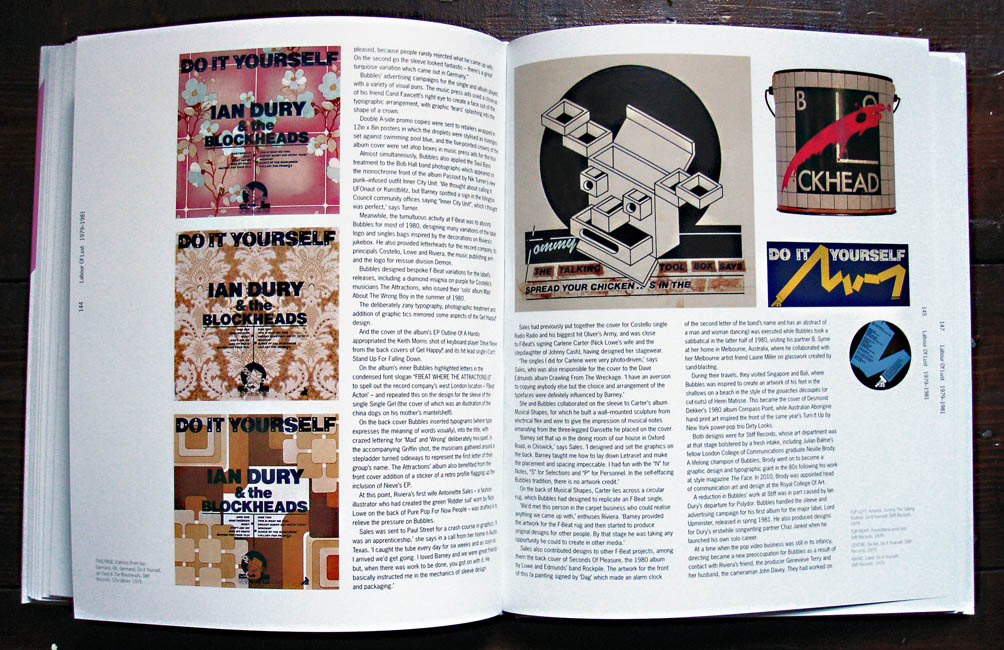
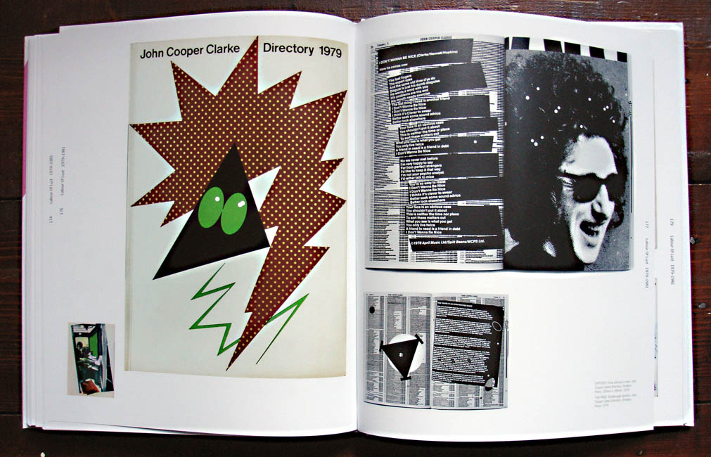
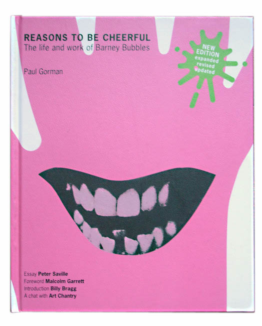 I was lucky enough to receive this fantastic book for Xmas this year after the first printing in 2008 disappeared and started going for silly money. Luckily this 2nd edition has extra info and images so waiting paid off and I can’t recommend this book highly enough for fans of music design in general. Until the middle of the last decade the name Barney Bubbles wasn’t widely known or recognised aside from music business associates from back in the day or the odd rabid fan.
The reason for this is not because his work was hidden away on obscure releases – he designed covers for several classic albums as well as a fair few hit singles in the 70’s and early 80’s. It wasn’t because the work wasn’t good, most of it is stunning, all the more so when you read into the detail he put in each and every one. It was more to do with the fact that Barney often didn’t sign much of his work, and when he did it was under some super-coded pseudonym only a few close to him would recognise. He also didn’t go out of his way to publicise himself and suffered from bouts of depression which, sadly, caused him to take his own life in 1983, thus halting what could have been a groundbreaking career in design.
I say this because Bubbles was that rare thing in that he spanned two very distinct generations and worked seamlessly within both of them, a rarity these days and hard to pull off as most designers get associated with a particular style or genre and become known for that only. He started in the midst of the 60’s and became a full blown hippy, journeying to San Francisco in the summer of ’68 . He returned to produce graphics for the scene in London – the name Barney Bubbles was given to him after he started his own psychedelic light show mixing inks on overhead projectors. A long association with Hawkwind followed and he designed some of their most innovative sleeves such as ‘Space Ritual’ and ‘X In Search Of Space’ – both fold out wonders the likes of which were abundant in the 70’s.
But come the year of punk, when all this was to be washed away and the reset button pushed, Barney fell in with the newly hatched Stiff label with Ian Dury, Elvis Costello and Nick Lowe among others and seamlessly altered his style(s) to fit with the times, coasting through into the 80’s unscathed. He was the first person to mimic the Penguin book covers now so ubiquitous, parodied Blue Note sleeve design nearly a decade before it came back into fashion with Acid Jazz and took De Stijl and Cubist designs as inspiration before many others. He even dipped his toe into furniture design and early video promo making before he passed (did you know he directed The Specials‘ ‘Ghost Town’ video? no, me neither).
Until the publication of the first edition of this book, tirelessly put together by journalist Paul Gorman, who has since helped curate displays at the V&A of famous pop memorabilia, the design world had largely ignored Bubbles even though many pieces have featured in Record Cover collection books over the years. The drawing together of his output and the joining the dots between the various phases, pseudonyms and uncredited work has finally shone a spotlight on him, something it’s doubtful he would have gone out of his way to do had he still been alive.
I certainly wasn’t aware of how far he reached with his work but plenty of his sleeves and designs were familiar to me even though a lot of the music wasn’t something I listened to. The logo for the NME paper from 1978 through to 2010 – that was Barney, the Stiff Records logo, Billy Bragg‘s ‘Life’s A Riot With Spy vs Spy’ sleeve, Elvis Costello‘s ‘Armed Forces’ LP package, The Blockheads‘ logo, the first Depeche Mode LP cover, the first Damned singles and albums…
An incredible body of work and an amazing book, lavishly illustrated that chronologically treads the paths that Bubbles did with plenty of input from the artists and friends that he worked with. My only nitpick with it is that the images are almost always out of synch with the text, the illustrations always seemingly several pages behind which is frustrating when you’re trying to get a sense of a sleeve being described only to find it 6 pages later.
His death is also almost a minor entry in the narrative and, having heard Mark Hodkinson‘s harrowing ‘In Search of Barney Bubbles’ documentary on BBC Radio4 it’s all the more tragic when you see everything he’d achieved up until that point. Treat yourself to this book and revel in his work as he finally takes his place among the greats of music design in the 20th Century.
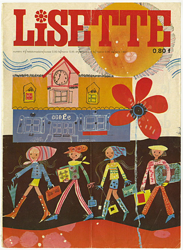

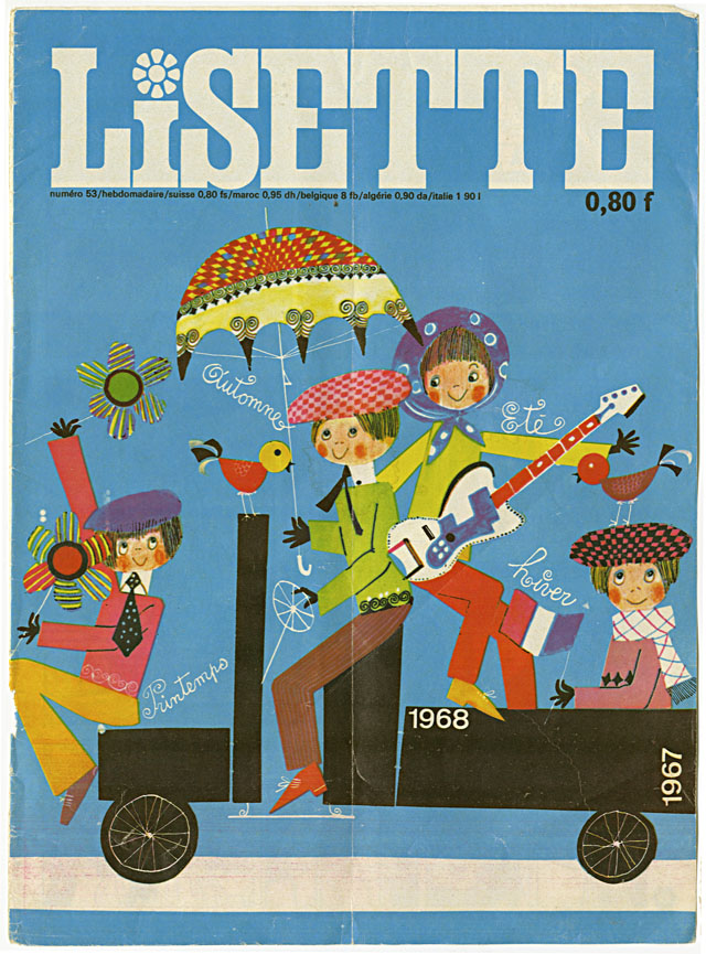
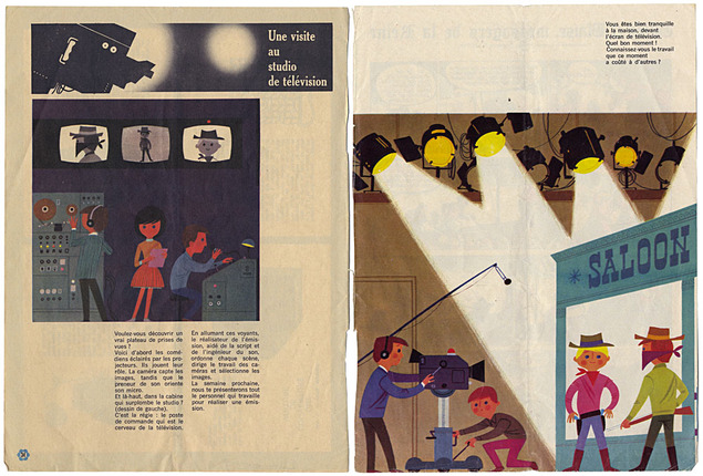 The last of the European kids’ magazines I discovered last May with Steve Cook: covers from French girls magazine Lissette, a feature on going to a TV station and numerous gorgeous masthead designs for different sections within the mag.
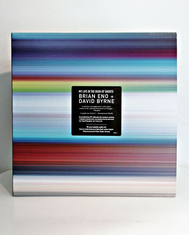
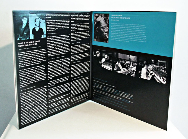
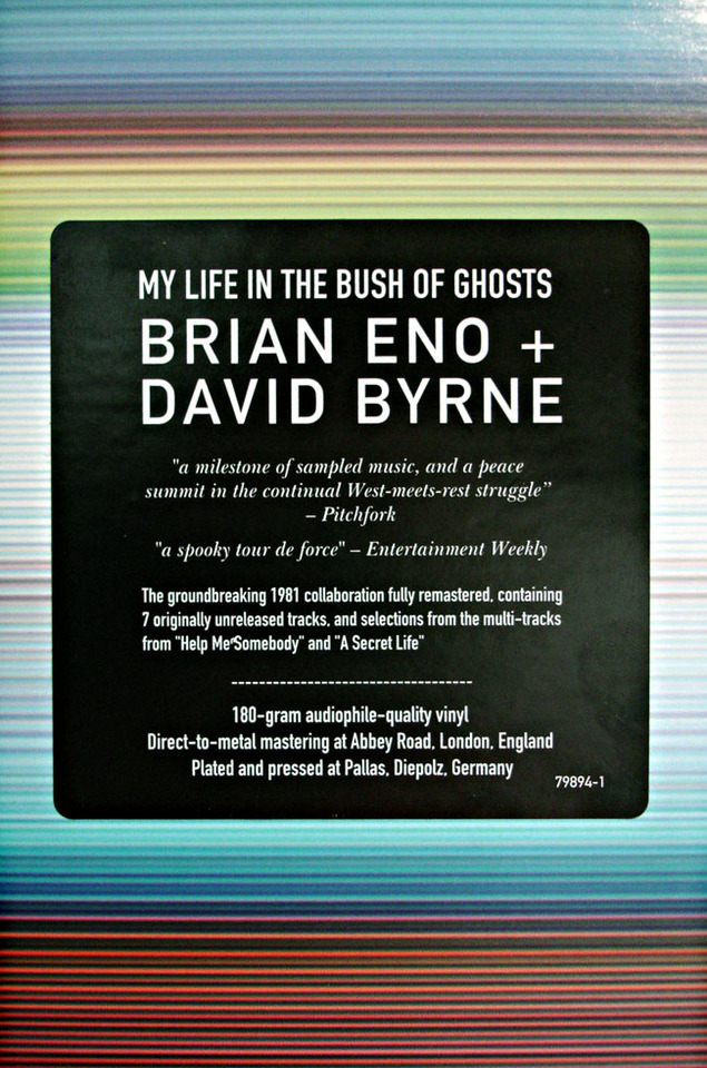
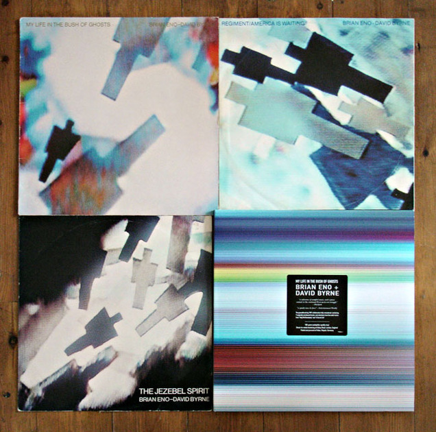
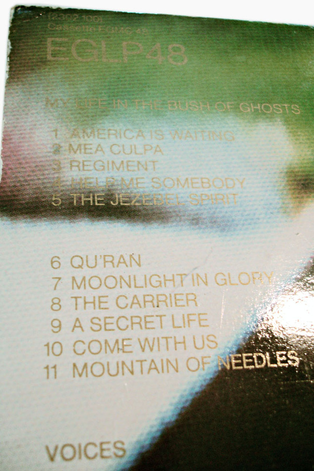
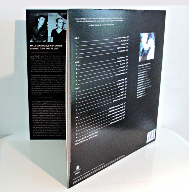 A couple of weeks ago I posted about buying a fifth copy of The The‘s ‘Infected’ album upon finding a test pressing secondhand. Whilst record shopping in Montreal this summer I found a new copy of the Nonesuch vinyl reissue of Eno & Byrne‘s ‘My Life In The Bush of Ghosts’ – another of my all time favourite albums. The CD reissue in 2008 with the bonus tracks is already in my collection but the double vinyl version added multi-track parts to two album cuts on the fourth side as well so I couldn’t help but pick it up.
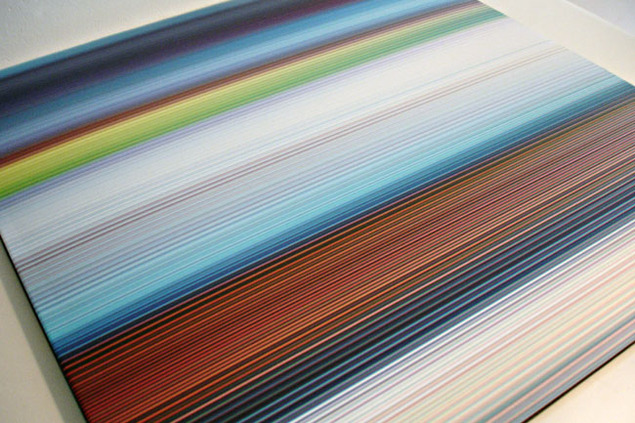
Add to the bonus audio that the whole package was housed in a beautiful, heavyweight card gatefold sleeve with notes and it was an instant sale. Around the time of the reissue a special website was created with additional content such as extra sleeve notes by Paul Morley, recording session photos and discarded screen captures from the original artwork. Unfortunately it hasn’t been updated and now all you can get is the home page (possible out-dated Flash plug-in is my guess) so here are some of the artwork outtakes.
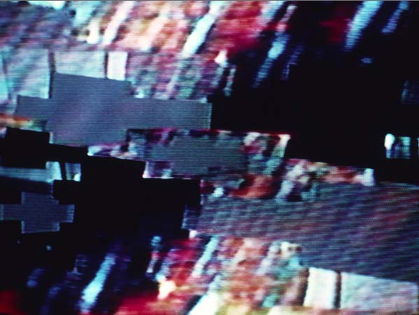
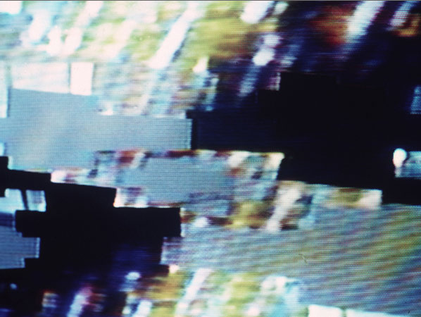


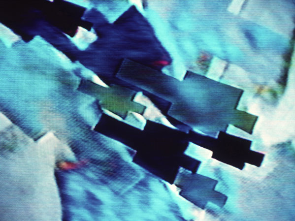
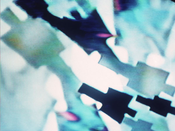
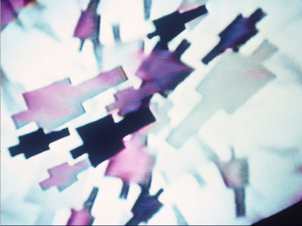
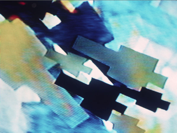
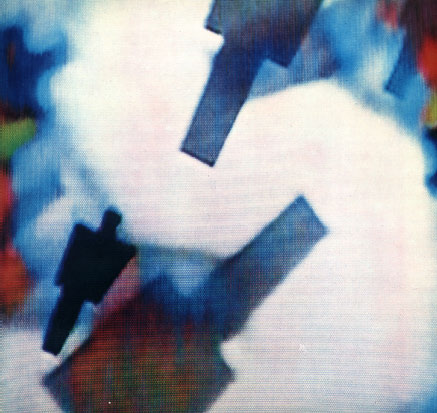
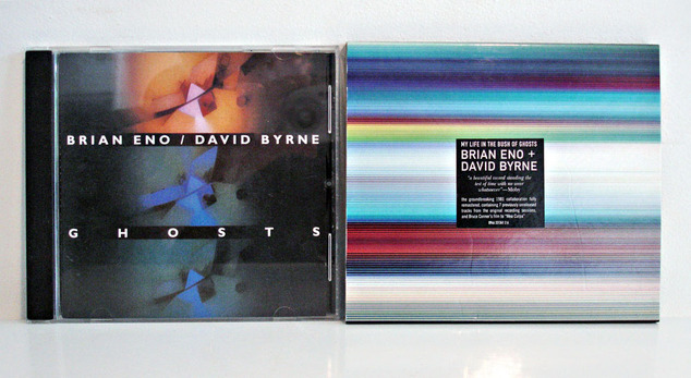
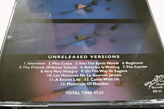
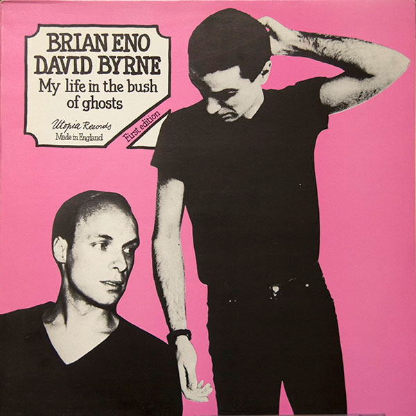
I now own five versions of this seminal record – the original vinyl (with the track, ‘Qu’ran’ which was later removed), original CD, Nonesuch reissue CD and vinyl. There’s also an Italian bootleg CD called ‘Ghosts’ with demos and original versions before samples were removed or tracks reworked which features a couple of things not on the reissues. I also have the two 12″ singles that were released originally in the early 80’s but not the ‘first edition’ vinyl bootleg of demo versions.
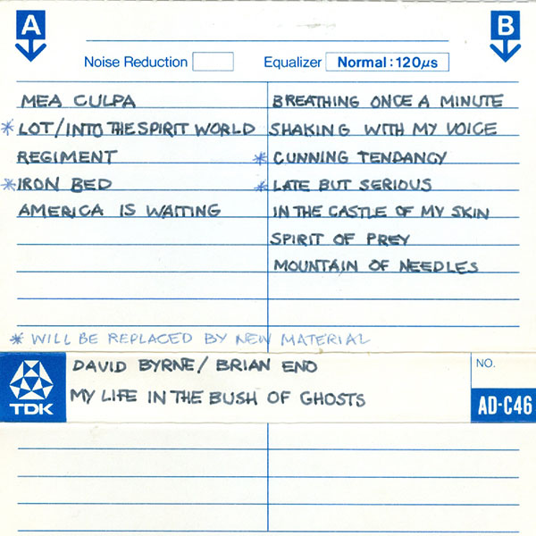
Apparently above is a scan of an earlier version of the album sent to the record label. Because of ‘sample-clearance’ issues (this was 1980, such a thing was unheard of) the record was delayed and later some of it was reworked by Eno and Byrne. Some tracks were dropped or titles changed, some mixes were redone and some new tracks were added. Most of the dropped tracks were reinstated on the reissues on Nonesuch. I never tire of this record and the reissue is the rare exception of the bonus material actually adding to an enhancing the original rather than just padding it out.
Much like Malcolm McLaren‘s ‘Duck Rock’ album this record is a product of its time and exists almost in a vaccuum, barely dating in the 30 years + since its release. You can hear echoes of the sounds Eno & Byrne created here on either side of their respective discographies around the time but they never fully reached the other-worldliness achieved on this album
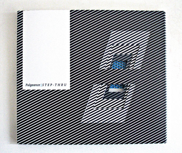
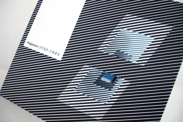
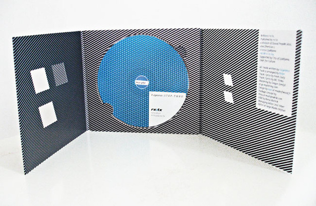
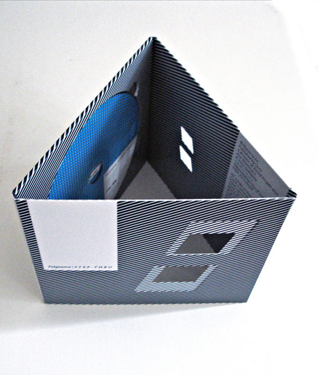
I actually already included this in my list of favourite design pieces of 2012 before posting it on the site even though these photos were taken months ago. The Rx:Tx label from Ljubljana reused their die-cut packaging again (this is the third time to my knowledge) but now with a retina-burning Op-Art design for Fulgeance‘s album ‘Step-Thru’. 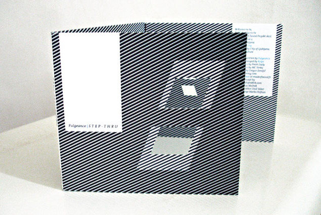
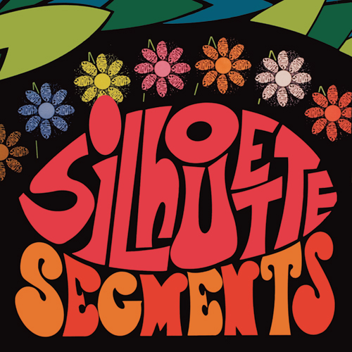
 Earlier this year I was contacted by David Thrussel who runs the Omni Recording Corporation label in Australia. He was interested in reissuing John Rydgren recordings and – knowing that I had a pretty decent collection – needed someone who knew the material. He also needed imagery and good quality scans of cover art, which I provided from the LPs I had and the super-rare book Rydgren published, ‘Tomorrow Is A Handful of Together Yesterdays’ .
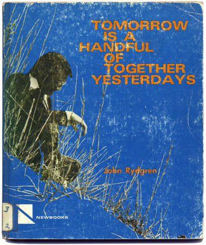
Finally after months of additional research, liner note editing and remastering in NYC being halted by Hurricane Sandy – the 2CD 64 track reissue of the bulk of John’s best work is here.
For anyone familiar with Rydgren’s work, ‘Silhouette Segments’ is the album to get, originally a double LP sent only to radio stations but later edited down and bootlegged as a single record, it is restored and remastered in full here on the first CD. The two other LPs on many collector’s wants lists are ‘World of Youth’ and ‘Cantata For New Life’ – both feature here in their entirety too and, whilst not as ‘hip’ as ‘Silhouette…’, they are full of great material.
Even rarer, so much so that it’s virtually unknown, is an album titled, ‘They Say’, full of 20 Silhouette Segments for radio broadcast and, along with the two former albums, never reissued or bootlegged before. The release comes with a booklet packed with photos, cover scans and liner notes from collectors and those who worked with ‘Brother John’ before he passed away.
I’m very pleased to be rounding out the year having had a hand in this release. Check out some of the other reissues via Omni or the vinyl counterpart, Roundtable.
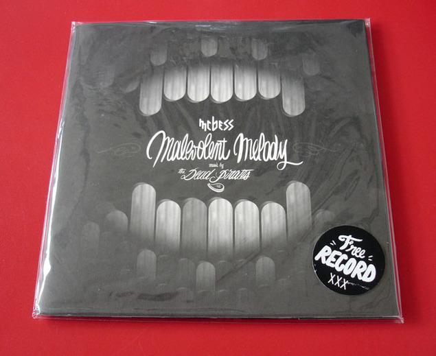
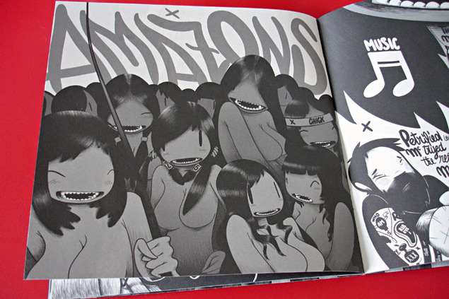
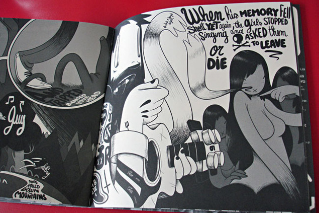
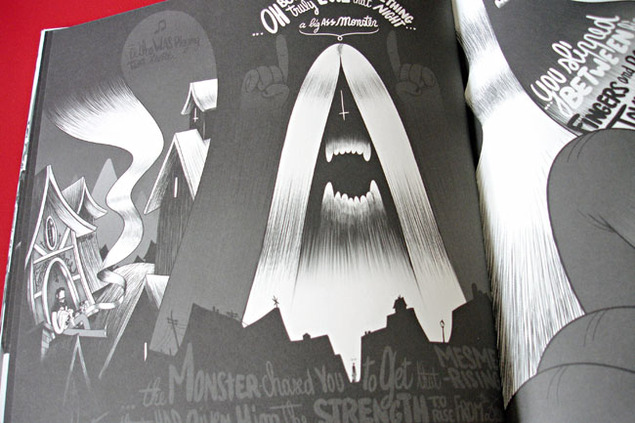
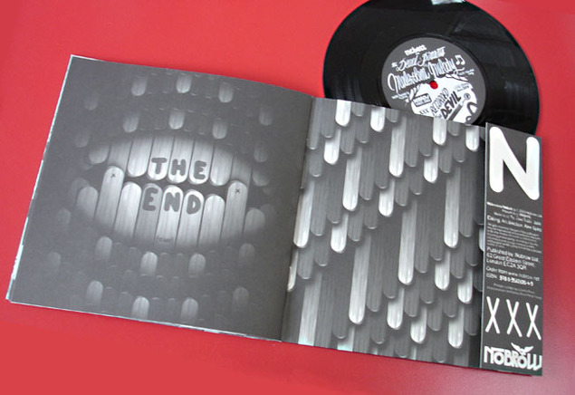
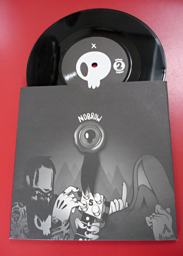 I can’t resist a comic or book with a record on the inside cover and the 7″ size of McBess‘ ‘Malevolent Melody’ made me grab it off the shelf in the NoBrow shop in Great Eastern St. earlier in the year.
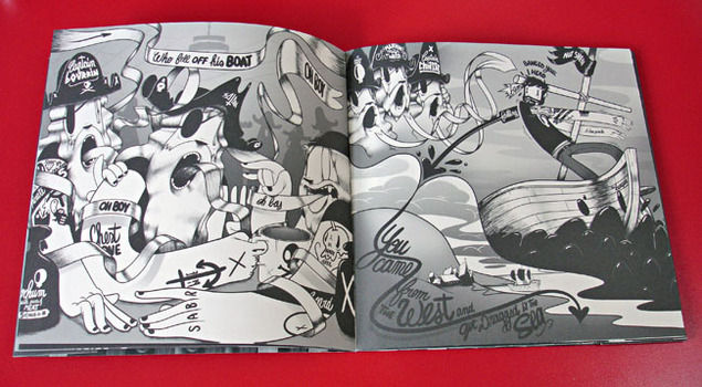
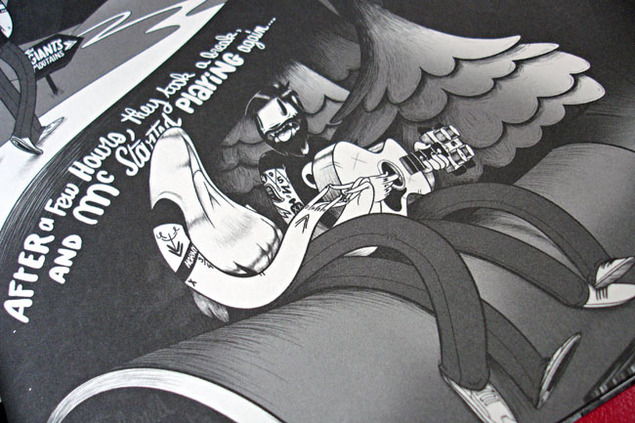
The name McBess was unfamiliar but his images floored me and I immediately bought this as well as another oversize book by him called ‘Big Mother’. Seldom do I come across someone who has such a strong, fully developed visual style that stands out so immediately.
Shades of Kid Acne and Pete Fowler‘s style permeate throughout but not a hint of colour and some of the smoothest draughtsmanship I’ve seen in a while.
I was in love with his style from the minute I saw it, my favourite artistic discovery of 2012. 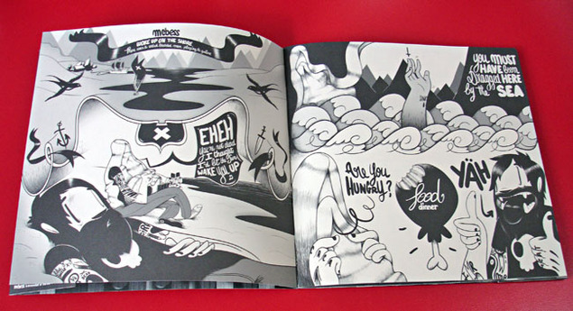
 Check out his site here.
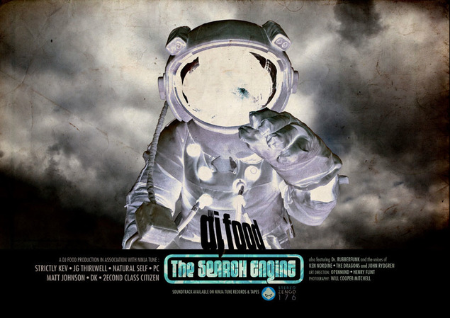
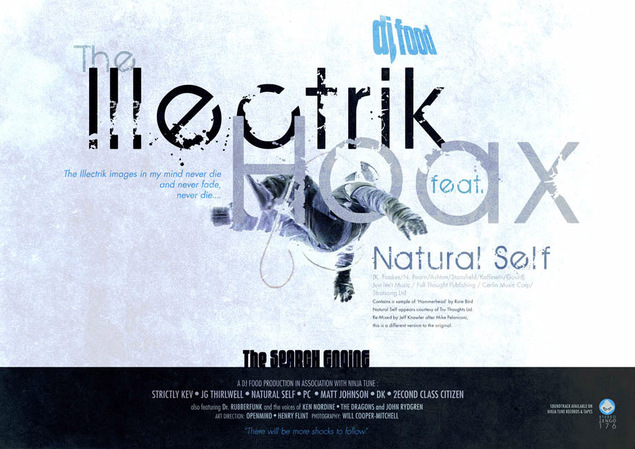
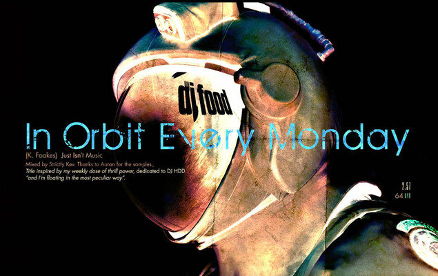
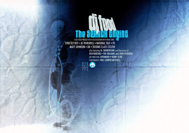
When I do a design project there’s usually a fair few versions of things that don’t make the cut, variations on ideas to see if something will work etc. For ‘The Search Engine’ I made a series of ‘film poster’ designs, some of which cropped up in other things like a short reel telling people the timetable at the Planetarium gig or animations for a video that didn’t happen. These are ‘negative’ versions of some of those designs where I particularly like the colours.
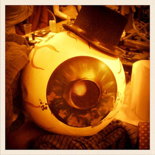
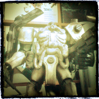
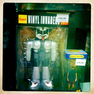
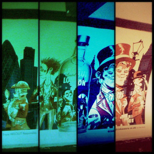
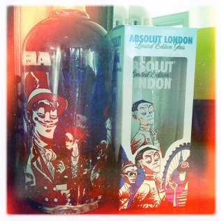
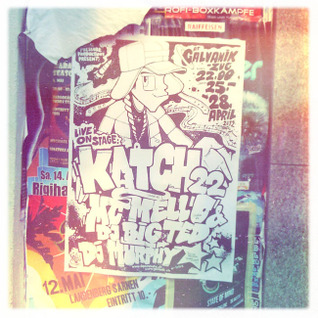
I neglected the iPhone image dump this year so here’s a little selection I always intended to post but never got round to. Top to Bottom, L-R: Cabaret Freaks backdrop and Eyeball prop, France, Occupy stencil, Paris, Matt&Jon&Kevin&Darren T-shirt by Megatrip, Zaku toy by Ashley Wood, Kissbot toy, Jamie Hewlett Absolute vodka for the Olympics – bottle and tube poster, London, Swiss architecture, UK Hip Hop legends poster, Switzerland, Science Museum sculpture, London, inflatable alien heads, France, Space Invader, France, Lego DJ minifigure.
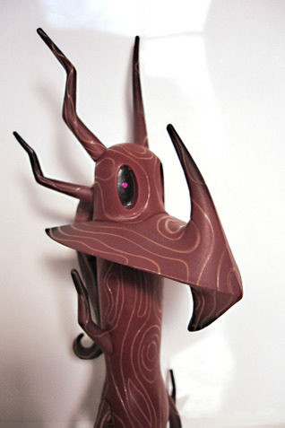
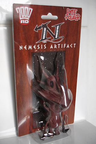 Nearly a year after it was first teased to the public comes Pete Fowler‘s take on 2000ad‘s Nemesis The Warlock from Unbox Industries. There are various finishes and colours from wooden to a chrome ‘Blitzspear’ edition. Available from 2000ad (wood) for £11 or Unbox (chrome + other colours to come) at $28.50 plus postage.




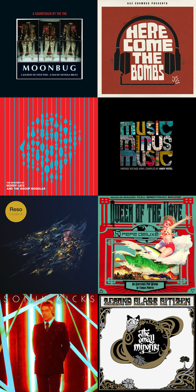 *In no particular order at all
Albums:
Pepe Deluxé – ‘Queen of the Wave’ (Deluxe Edition) (Catskills)
2econd Class Citizen – ‘The Small Minority’ (Equinox)
Tame Impala – ‘Lonerism’ (Modular Recordings)
The The – ‘Moonbug’ (Lazarus)
Gaz Coombes – ‘Here Come The Bombs’ (Hot Fruit)
Paul Weller – ‘Sonik Kicks’ (Universal/Island)
Robert Duncan & David Cain – ‘The Seasons’ (Trunk)
Frankensteez – ‘Son of Frankensteez’ (Fort Point Recordings)
Various (selected by Andy Votel) – ‘Music Minus Music’ (Fat City)
Air – Le Voyage Dans La Lune (Virgin)
Reso – ‘Tangram’ (Civil Music)
Kid Koala – ’12-Bit Blues’ (Ninja Tune)
Cults Percussion Ensemble – ‘Cults Percussion Ensemble’ (Trunk)
Belbury Poly – ‘The Belbury Tales’ (Ghost Box)
Mordy Laye & The Group Modular – ‘The Mystery of Mordy Laye’ (Audio Montage)
Gaslamp Killer – ‘Breakthrough’ (Brainfeeder)
Singles:
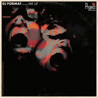
DJ Format – ‘Spaceship Earth/Terror’ (Slice of Spice)
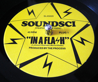
Soundsci – ‘In A Flash’ (Crate Escape)
Cut Chemist – ‘Outro (Revisited)’ feat. Blackbird (A Stable Sound)
Noel Gallagher – ‘AKA…What A Life’ (Amorphous Androgynous remix) (Big Brother)
Lone – ‘Crystal Caverns 1991’ (R&S)
Tame Impala – Elephant (Modular Recordings)
Tomorrow’s World – ‘So Long My Love’ (Protoyp Recordings)
Comics:
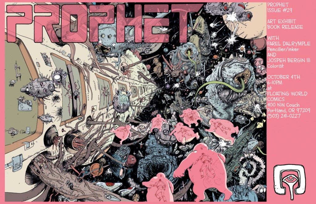
Prophet – Brandon Graham and others (Image)
B.P.R.D. Hell On Earth / Hellboy – Mignola, Allie, Cudi and others (Dark Horse)
2000ad – a cast of thousands (Rebellion)
The Bulletproof Coffin Disinterred – David Hine & Shaky Kane (Image)
Multiple Warheads – Brandon Graham (Image)
Godland – Joe Casey and Tom Scioli (Image)
Films:
The Avengers
Beyond The Black Rainbow
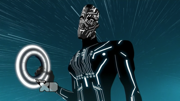
Tron:Uprising
Dredd 3D
Sleeve design / packaging: (designer in brackets)
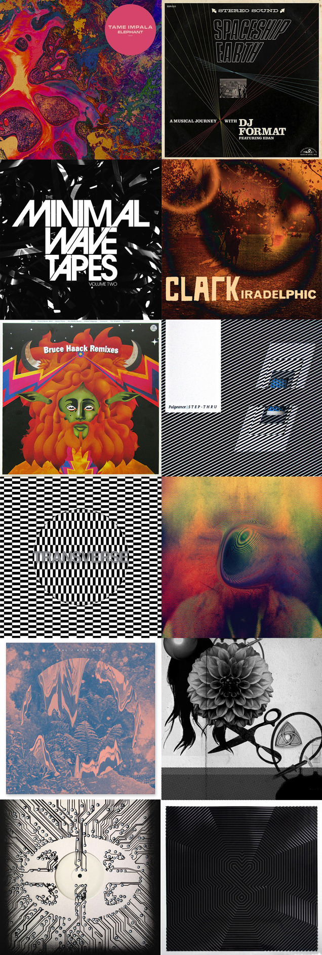
Tame Impala – ‘Elephant’ (Leif Podhajsky)
DJ Format – ‘Terror/Spaceship Earth’ (Mr Krum)
Fulgeance – Step-thru (Ease/madeofwood)
Demdike Stare – ‘Elemental’ (Andy Votel)
The Herbaliser – ‘There Were Seven’ (Snub 23 stencil edition) (Openmind / Snub 23)
Machine, Dear – ‘Killing Something That’s Already Dead’ (Klaus Matthiesen)
Various – ‘The Minimal Wave Tapes vol.2’ (unknown)
Bruce Haack – ‘Remixes’ (Alexandre Korobov)
Clark – ‘Iradelphic’ (Julian House)
Young Magic – ‘Melt’ (Leif Podhajsky)
Ital – ‘Hive Mind’ (Sam Chirnside)
Carter/Tutti/Void – Transverse (Chris & Cosey)
R.I.P.
Ewan Robertson
Moebius
MCA/Adam Yauch
Ralph McQuarrie
Pete Namlook
Maurice Sendak
Davy Jones
Looking forward to:
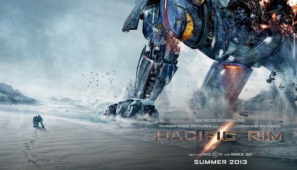
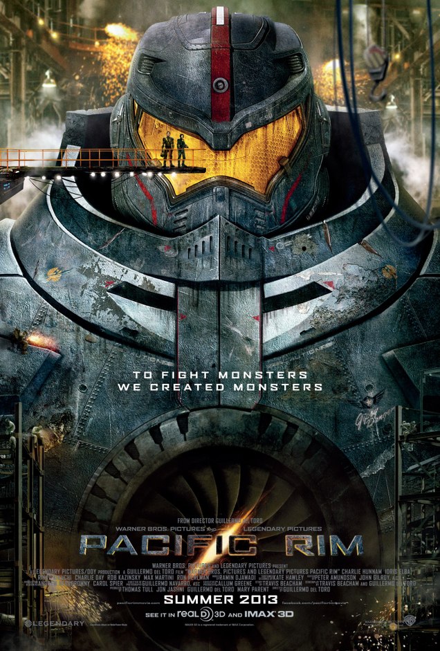
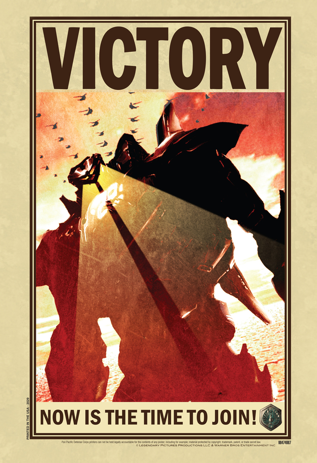
Pacific Rim
Kraftwerk live in Dusseldorf and London
Hellboy In Hell / Sledgehammer
Mike McMahon Dredd/Cursed Earth commission piece
Iron Man 3
Ed Piskor’s Hip Hop Family Tree Book
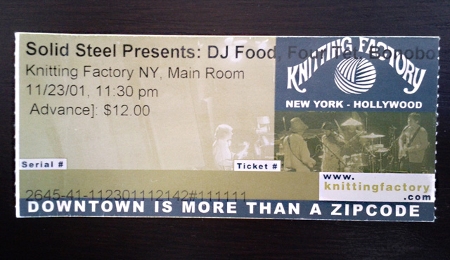 Appalled, saddened and depressed by the events in Connecticut yesterday I tweeted that if my performance in Brussels last night was lacking it was because it was the last place I wanted to be after hearing about such atrocities. Finding the enthusiasm to go and rock a club for 2 hours after hearing such news was hard but pales into insignificance next to what the friends and families of those caught up in the tragedy must be going through.
I went to sleep thinking about it and woke up with it immediately in mind. I was sent this message by Christoper Whipple early this morning and it helped to brighten up the day a little:
“i wasn’t in brussels, but i saw your tweet about it and felt inspired to share this:
i remember back in 2001, the shock of 9/11 was still pretty fresh for us in nyc, but late that november there was an amazing (dare i say, purifying?) show of tremendous energy and resolve. i remember waiting to get in, a bunch of us were mulling over what would take the place of vadim’s terrorist track – or if you’d keep it in the set. the get ur freak on mix was perfect – i remember it with such clarity. that was the first time i really felt alive again after that whole tragedy.
thanks for that.”

 I’ve featured Stéphane Halleux’s work before and he has a new exhibition opening at the Galerie Ariel Sibony in Paris this week.
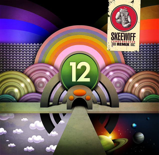 I only just heard this, a great remix of Walt Kramer‘s ‘Pinball Number Count’ by Skeewiff. With all the 12/12/12 malarky yesterday someone posted it on my Facebook page and it’s excellent. Hop over to Skeewiff’s YouTube Channel and check it out along with many of their other releases. They do a great line in cover versions as well as their own tracks, I’ve ended many a night with their version of ‘Soul Bossanova’.
Several others have also done 3D animated versions and put them on YouTube
This one has ADD with the pitch control
and of course, there’s the Family Guy version. If you still need more after this there are some hilarious versions from foreign Sesame Street episodes with dubbed counting in different languages on YouTube.
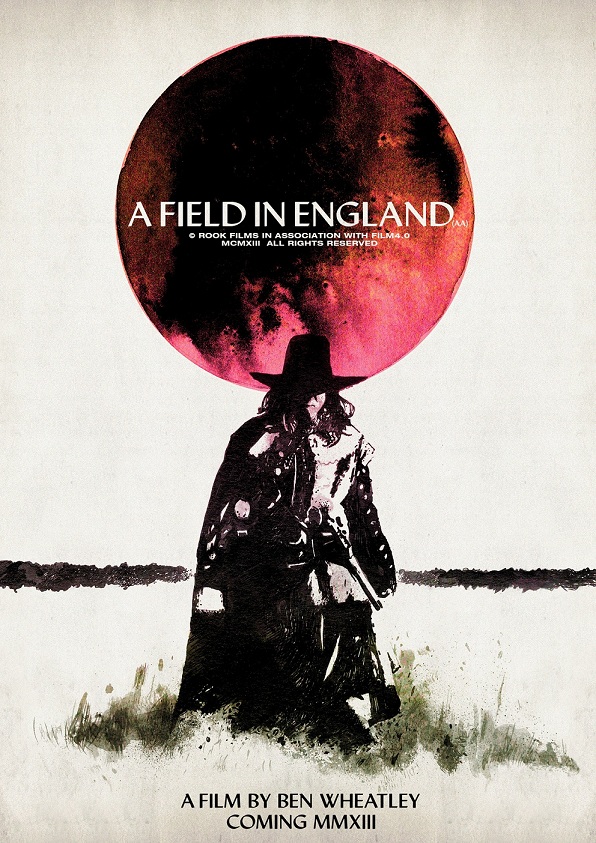
This may well be sold out by the time you read this *SOLD OUT* but what a great teaser poster for the film ‘A Field in England’ from Luke Insect and Kenn Goodall. The film is Ben Wheatley’s follow-up to ‘Sightseers’ and the poster is available as a limited print from Rook Films.


Bidding ended today on a collection of Star Wars figures on eBay, rather a LARGE collection by anyone’s standards, in fact this is supposed to be over 85% of all Star Wars figures of this scale ever produced since 1978. The collection of nearly 2,000 figures was sold for $11,500 and were donated by one-time ILM model maker Fon Davis to benefit the Rancho Obi-Wan charity.


I’ve taken these images from the eBay listing, each shelf is a large jpeg which you can zoom into by clicking. SW figures aren’t personally my thing save for a few of the older ones from my childhood but that is a collection and a half.

