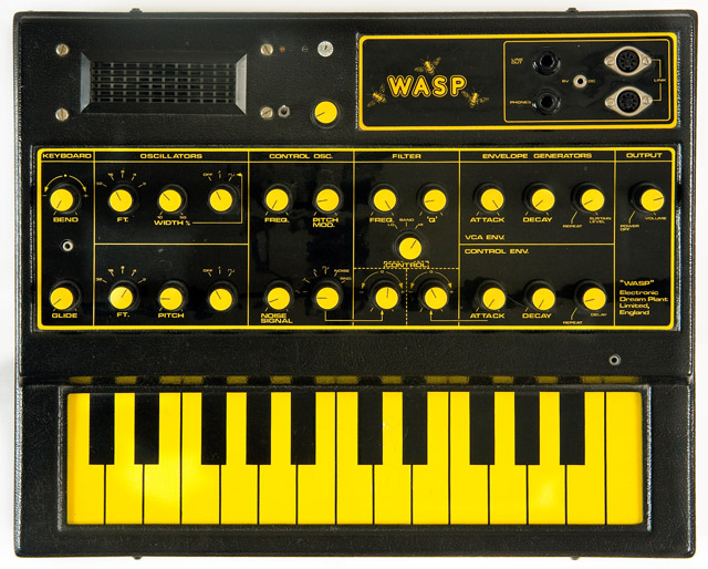
Having a hard drive clear out / clean up, things might get a little random this week…
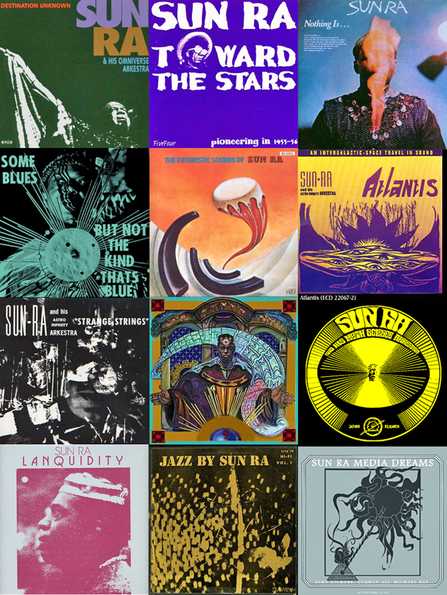
Loved Skylab‘s output, some truly wonderful records made by Mat Ducasse with some help from Major Force West and Howie B along the way.
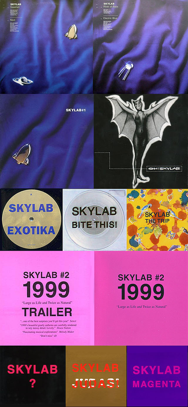
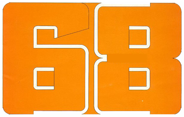

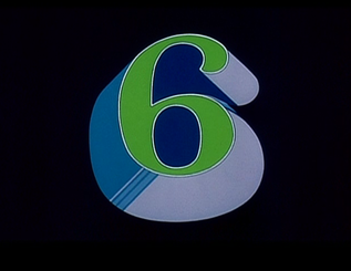
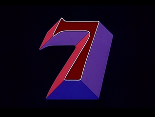
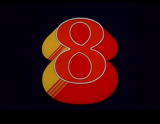

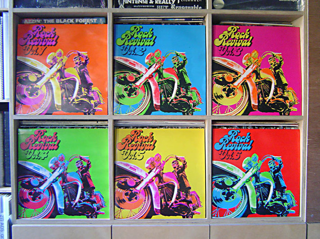
These were in a box with a totally destroyed front cover, I like the way they look, kind if Warhol-like, next to each other.
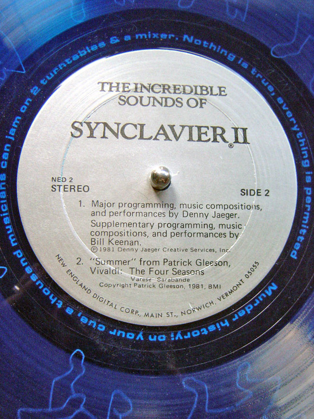
‘The Incredible Sounds of the Synclavier II’ blue vinyl demonstration 12″, 1981, bargain basement find.
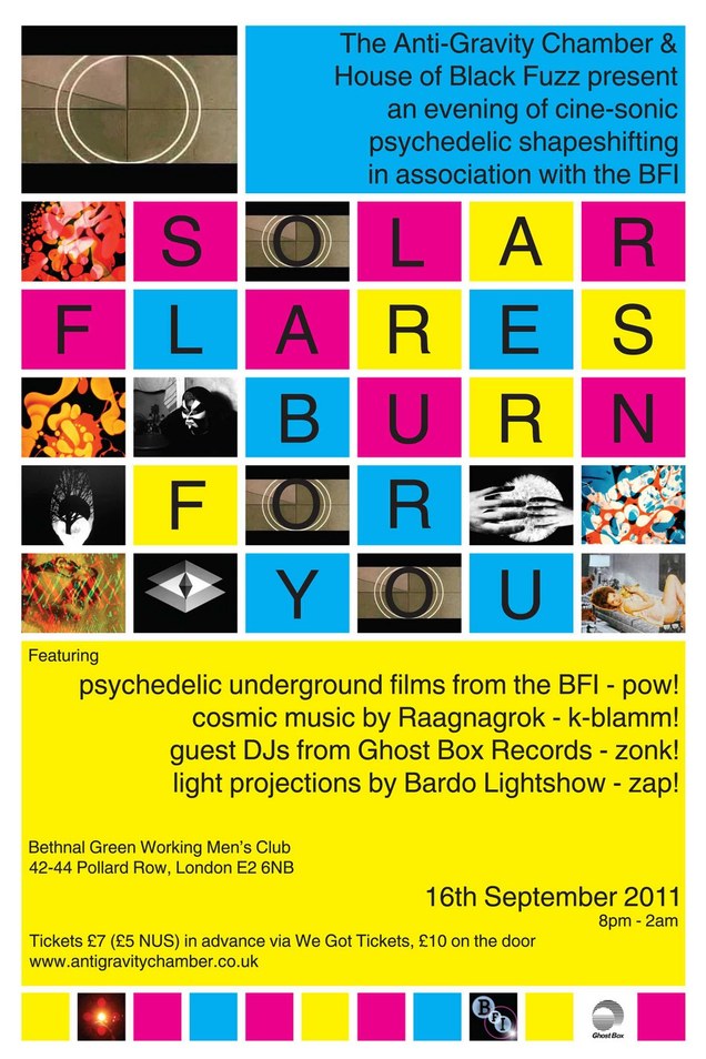
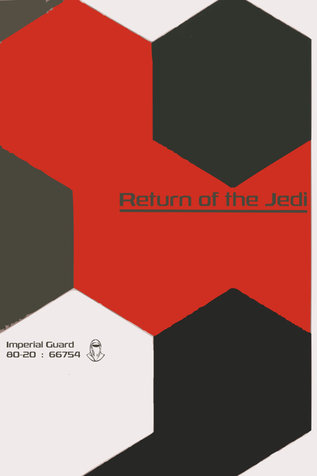
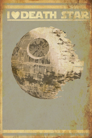
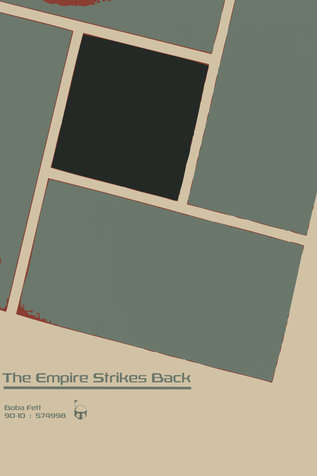 A few nice graphic takes on the first Star Wars trilogy in amongst the hip hop mash ups here by Nicholas Hyde.
I just played a packed and sweaty gig in Seignosse, France at the Safari Beach Club. The drive was 90 minutes from Bordeaux so I amused myself with various iPhone apps.
There


Back


Andy Votel and Doug Shipton’s Finders Keepers label was also affected in the PIAS fire earlier this week, they have responded by putting together a 10 CD series of compilation, curated by various friends like David Holmes, Jarvis Cocker, Gruff Rhys and Demdike Stare.
You can buy individual CDs or downloads or subscribe to the entire series upfront by visiting their website. Please support this excellent label and all its offshoots as they consistently amaze with their releases.
I could listen to this for ages, a simple yet fascinating idea, personalised for a number of North American cities, like a real time rolling KLF chill out piece.
Remember this painting? Here’s the first finished prototype, debuted at a Hong Kong Toy Fair a few weeks ago, check the amazing camera work in the video too.

Want! … so bad
Many of you will have heard about the riots in London and around the UK this week, the causes of these are many, complex and I’m not about to go into my views on them here. There are many repercussions to be felt from these that will no doubt be felt for years, if not decades, to come in this country. An immediate one though is the needless destruction of a warehouse containing stock from over 150 independent labels, including Ninja Tune and its sub-labels. PIAS (Play It Again Sam) have been our distributor for many years now and I have nothing but admiration for the way they are handling this catastrophe alongside AIM, – official Ninja statement below.

A fire on Monday night in London wiped out the entire stock in the primary warehouse of 165 Independent record labels. The best way to help in the immediate future is to buy an album from one of these labels from a UK digital store, local record shop whilst stocks last or direct from the label. This will enable them to remanufacture CDs and vinyl more quickly, to resupply the record shops who are also affected by the riots. For Ninja Tune it means we have had to put Toddla T album release back to August 22nd and spend a lot of money repressing other titles. It’s very sad to know some of our wonderful and more obscure back catalogue titles may never get to be repressed.
Alison Wenham, Chairman and CEO of AIM, the UK’s Trade Association for the Independent Music Industry, has also commented: “This is a disaster for the music community, but with the fans’ help, labels and artists will survive. Please show your support for the music community by buying a digital album from an independent label today.”
Although we despise the many gross inequalities and immoral profiteering in our country, it’s emblematic of the riots’ futility that a warehouse storing millions of units of the unusual, interesting and less commercially minded albums on indie labels was torched. We wish all the other affected labels and our excellent distributor the best of luck. And thanks to all our supporters! The full list of record labels is here: http://www.pias.com/uk/pias-distributed-labels-list/
Also – news of a new fund to help struggling labels – see the link below for more:
[PIAS] & AIM Establish Fund for Labels Adversely Affected By The Sony DADC Fire
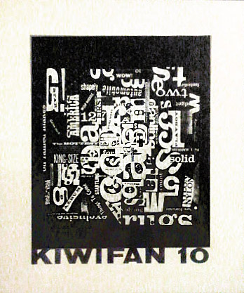
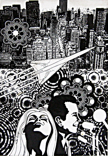
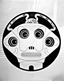
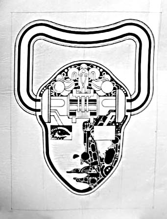
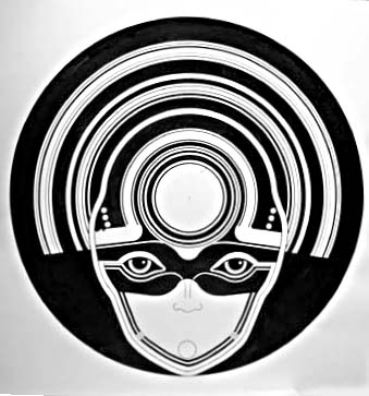
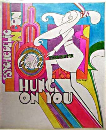
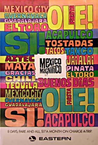
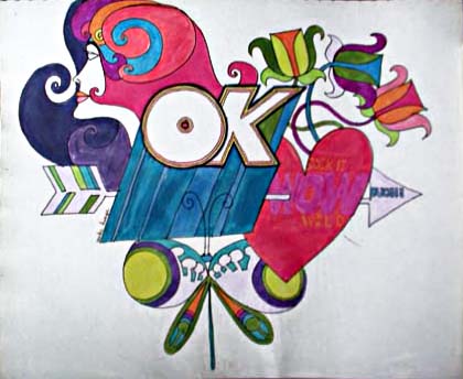
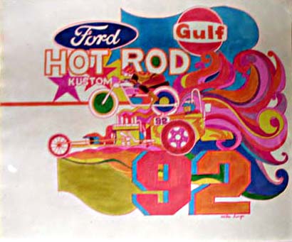
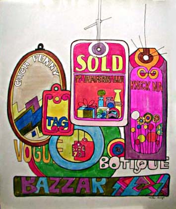
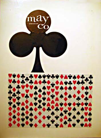
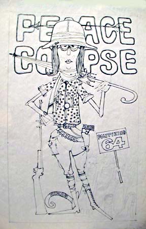
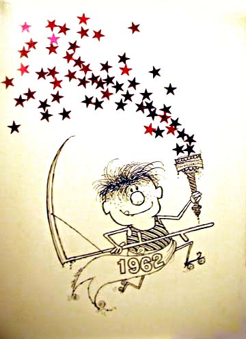
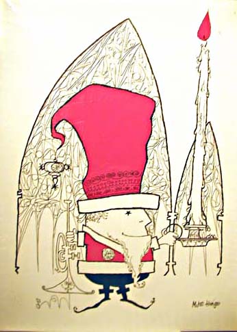
According to Ivan over at OnyxCube – the no.1 Mike Hinge resource on the web – Mike would have been 80 years old today. To celebrate he has all sorts of special treats that he’s dug up to show including typeface designs and memories of old friends so go and check his site out, it’s a goldmine.
Over here though I’ve got a lovely selection of images saved by my good friend Elisa from various lots on eBay that were auctioned around 2003 when his estate sold a lot of his work on. Amazingly she forwarded me a whole folder she recently found on a hard drive that she’d kept, she also won the Kiwifan 10 piece (included here left). The images aren’t great because they were taken by the auctioneer but I’ve tried to make them look as good as possible – thanks Elisa!





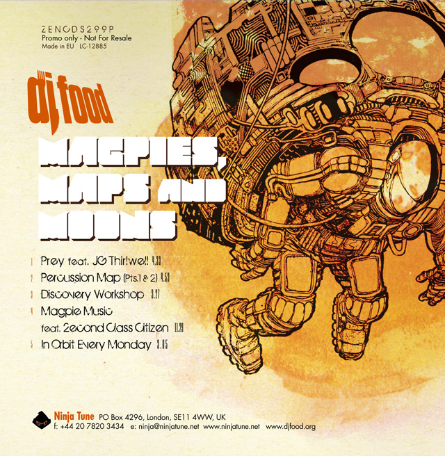
My third EP will be called ‘Magpies, Maps and Moons’, featuring 5 tracks with a vocal collaboration from JG Thirlwell and a musical one from 2econd Class Citizen. It will be out Oct/Nov, on 12″ and DL, not entirely sure the exact date yet, with the album to follow shortly afterwards.
…only the Eagles of Death Metal will do
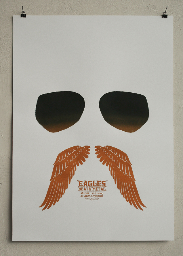 Poster by Michael Hacker, ed. of 71
Excellent promo video for Pendulum‘s ‘Coffin’ by Jude and Jolyon Greenaway.

I can’t seem to embed the video here so you’ll have to click the link, they are also doing a 360 degree film presentation for Ron Arad at the Roundhouse next Wednesday.
[singlepic id=3092 w=680 h=500 float=left]
Comics fans will be familiar with the cover to Fantastic Four #1 whether they read the book or not, Jack Kirby‘s classic image of the Mole Man’s monster emerging from the ground, reaching out to grab Sue Richards whilst the rest scatter around him.
It’s been revived and parodied several times. both within the FF universe and by other titles, the latest being X-Men‘s Marvel 50th anniversary issue (I think, I don’t read these kind of comics).
A quick search, after seeing the Monster substituted for Galactus, revealed quite a few variations on the original, most cribbed from an existing article here on Comic Coverage. Thanks to Megatrip for pointing out extra homages too.


 I’ve just finished reading this and regular readers of this blog will have seen me waxing lyrical over Reynolds‘ writing in the past. His latest is a timely examination of our obsession (or is it his obsession?) with the past in current culture with particular focus on the saturation of retro over the last decade. In short he believes we are currently more obsessed with the past than the future, especially in music but the same things permeate other strands of media too, film for instance. It’s an excellent, well researched and thought-provoking work, which I would currently hold up as my book of the year so far. He weaves many different strands from all areas of culture together, sometimes to his own convenience, missing out conflicting examples that weaken his own theories, but, for the most part, he’s spot on in his analysis.
The book touches on so many things I’ve felt over the past few years although I’m in a slightly different camp to Simon on whether this is a good or bad thing. His stance is that music has always been forward-looking and progressive, this has largely stopped during the noughties with revivals and remakes taking more and more precedence over originality and innovation. I don’t think we can help but look back now that there is so much music history and we have the tools to access it, it’s human nature to reminisce. Being a collector through and through, part of my interests lie in the past as much as the present so I am constantly referring back and have found more to love in sounds and visuals from the past than the present over the last decade.
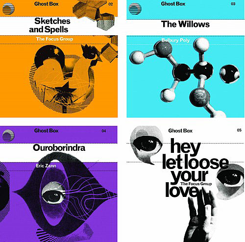
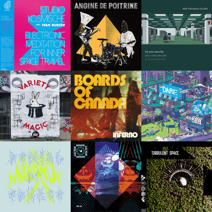
I’ve increasingly found that the things I’m attracted to and am moved by, look and sound ‘old’ for want of a better word, actually ‘analogue’ rather than ‘digital’ would be a better description. I’d say at least half the music I buy is either more than two decades old, whether it be original pressings of vintage vinyl or ‘new’ reissues on labels like Trunk, Finder’s Keepers or Now Again. Of the new music I like, a lot of it uses a dated sound palette, either through samples, analogue gear or styles that glance back to a bygone era, then makes something new from it rather than constantly forging ahead into uncharted waters. Labels like Ghost Box and bands like Boards of Canada (both given a hefty space in ‘Retromania’), Amorphous Androgynous and Moon Wiring Club all come infused with a sense of the past, recontextualised into the present. Hip Hop has largely changed so much in the last decade it’s unrecognisable to the original aesthetic but labels like Stones Throw and artists like Edan, Cut Chemist, Sound Sci and DJ Format still produce work that carries the torch from the golden eras for those who don’t want bling, bitches, Crunk or Hyphy. Sonically, the fashion for compression, brick wall limiting and side chaining in production over the last decade – the so-called ‘Sound Wars’ – does little for me besides make it increasingly harder to play older tracks alongside new ones in a DJ set or mix without having to ramp up the EQ and gain.
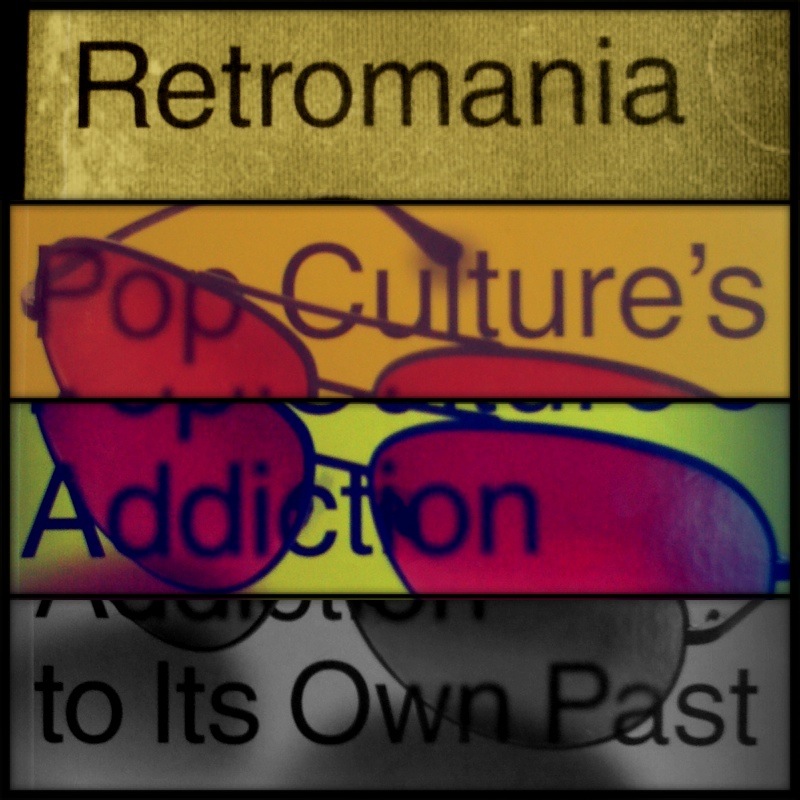
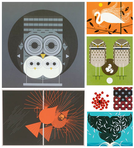
Visually I’ve also noticed similar patterns in graphics and illustration: Julian House‘s roughly cut collage style, aping the Penguin book design aesthetic of yesteryear, Jeff Jank‘s work for Stones Throw, the return of screen printing on record sleeves, the kind of illustrators featured on sites like Grain Edit, wildly riffing off the textures and colour palettes of Charley Harper. Witness iPhone photo apps like Hipstamatic, Leme Leme, Tiltshift Generator introducing abnormalities and grit into images (my own efforts with Simon’s book, above) and Ashley Wood’s 3A toy company artificially ‘weathering’ their figures. Texture and grain, both in sound and vision, are part of the package for me, give me that over florescent colours, CGI or auto-tuned gloss any day. I guess my tastes are out of step with what’s deemed ‘current’ but I’m obviously not alone as there is plenty of material out there referring to bygone days for inspiration without soullessly copying.
This is where I think Reynolds falls down slightly, towards the end of the book he makes a couple of wild generalisations that just don’t hold up for me. Saying, “Nothing on the game-changing scale of rap or rave came through in the 2000s”, is a bold, sweeping statement and plenty of new styles of music emerged in the noughties. Both new and retro appeared, some being micro genres of existing styles, some, make overs of older ones. Aside from the Bastard Pop /Mash up craze – which was unashamedly retro and, I think, more a response to the turn of the century than anything else, you had: Hip Pop (my phrase) the Neptunes/Timbaland years of credible Hip Hop and Pop, Dirty South / Crunk / Hyphy, Minimal Techno, Dubstep (the big new one), Baile Funk, Funky, Grime, Juke/Footwork/Kwaito, Hauntology, Wonky, Electroclash (fairly retro), and the resurgence of Rock, Folk and Psychedelia (very retro) … and they’re just the ones I can think of off the top of my head.
Reynolds is right in the respect that there’s nothing there that swept into our lives and changed everything overnight and a lot of the above are variations on existing genres. But he’s also writing from the perspective of a man in his late 40’s who’s lived in the US for over a decade. By the time I hit 35 I could see things coming round for a second time, I could pinpoint influences, samples and the like because I’d experienced them the first time round. When I was in my teens, Hip Hop was brand new, including all the samples, some of which were less than a decade old by the time they were sampled (Planet Rock > Trans Europe Express). Someone 15 years my senior would have probably heard what I was listening to and commented that they were just rehashing funk, disco and later, jazz. I doubt many over the age of 30 will feel the thrill and rush of those initial discoveries, those special ones in your teens where you ‘claim’ a music, group or movement as your own.
But to some teenager living in a UK inner city Grime and Dubstep must be/have been their Hip Hop and we won’t know this for another decade or more as it infiltrates the pop mainstream as it’s already begun to. Hip Hip didn’t blow up big for a good 10 years from its inception save for an initial ‘fad’ which the media jumped on then dropped for the next thing. The trouble with the pace of everyday living now is that every little musical movement is examined, dissected, proclaimed dead and then filed away under a new sub-genre heading before it’s even given a chance to evolve. Reynolds is as guilty of this as any current writer, constantly looking for The Shock of the New, that’s part of his job, but I’m not sure if he’s going to find it in quite the same way as rock and rave hit him at a younger age.
The web has unlocked so many secrets that made music and its practitioners appealing and revelatory, even as far back as the 90’s, so much of the mystery of music is gone now as we all scramble to record ever detail of everything we do. Where I had to learn how to scratch by working out the fader movements of DJs by listening to the records you can now watch instructional videos. When I had to search through piles of junk and pick up info by word of mouth on breaks, labels and artists, they’re a quick search and a couple of clicks away now. Obscure films glimpsed on late night TV or on short film festival line ups can be found easily. But none of this is a bad thing, and I’d never want to go back, returning to collector/seeker mode, technology has enabled us to time travel in some respects. The shuffle mode on the iPod can transport us back decades in a single click and the search engine can instantly access more media than we can consume. In that respect, if what’s contemporary isn’t doing it for me then give me the Shock of the Old and I’ll be just fine.
I’ve ended here on a bit of a negative tangent, go and read the book and decide for yourself, it’s an excellent piece of work and I’d hold it up there with David Toop‘s ‘Ocean of Sound’, Paul Morley‘s ‘Words & Music’ and Reynolds’ own ‘Rip it Up & Start Again’.
