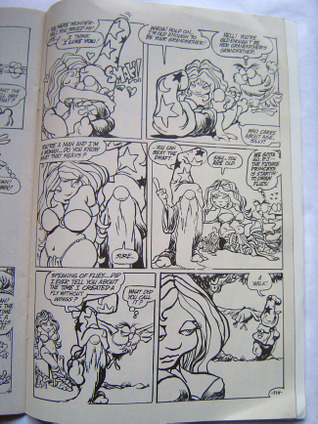
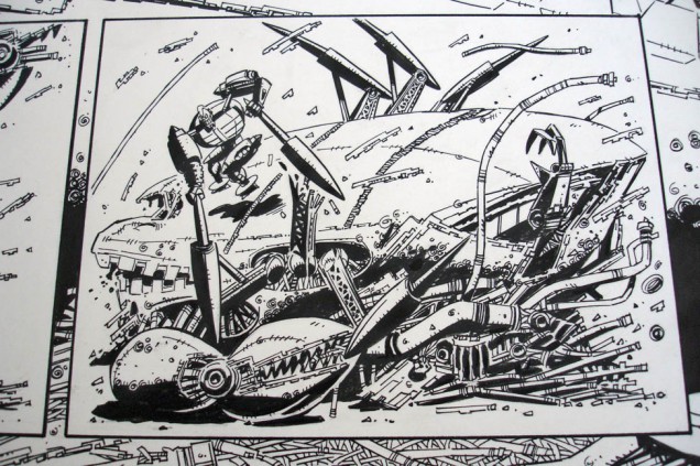
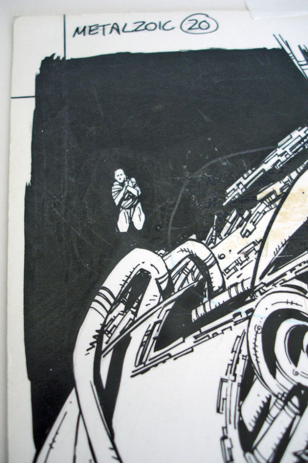
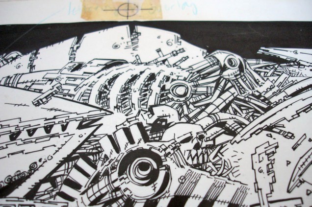
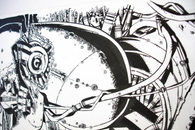
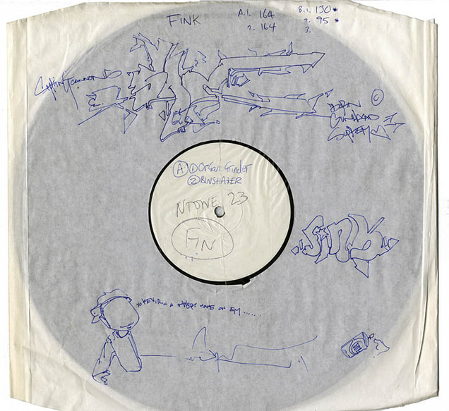
 12″ test pressing on Ntone – ‘Fink Funk EP’ by Fink, with hand drawn ‘annotations’ by She 1, 1997.
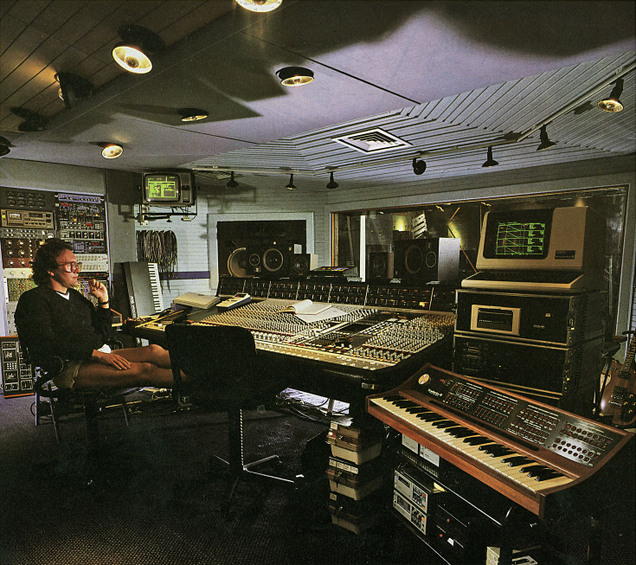
The man…
I’ve recently completed a track with long-time musical hero JG Thirlwell, aka Foetus, Manorexia, Steroid Maximus and many more, for my new record due out in Sept. To say it was an honor is an understatement as well a dream fulfilled. Since first being given a cassette of seminal album’s ‘Hole’ and ‘Nail’ in the 80’s I’ve been hooked on his music and always checked for new releases. He’s been on the list of collaborators I’ve wanted for this new record for years and, to add the icing on the cake, I’m pleased beyond words with the resulting track – ‘Prey’. It will kick off my third EP this autumn, before the album compiles the trilogy shortly after.
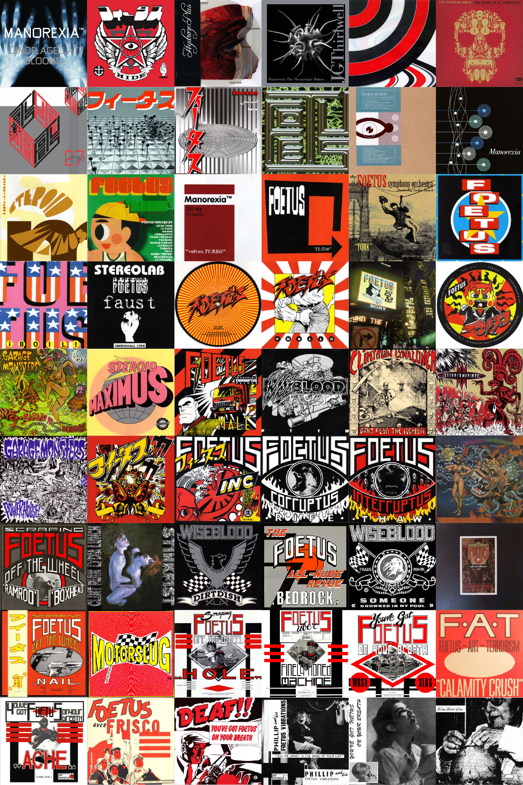
If you’re not familiar with his work, the Quietus have just published this piece by my good friend Mark Emsley of ireallylovemusic. It’s as good a place as any to start. I’ve also put together a visual discography of all his many guises – Foetus, Wiseblood, Steroid Maximus, Manorexia, Garage Monsters, Stinkfist, Clint Ruin, The Flesh Volcano, Baby Zizanie, Hydroze Plus and of course, JG Thirlwell. Three decades’ work and that’s just his own productions, not including remixes, collaborations and four season’s worth of scores for The Venture Brothers TV series. One of the joys of any JGT production is that the artwork is always excellent, with themes and colours recurring to form a visual identity.
 If this has piqued your interest but you don’t know where to start, I suggest the 80’s albums ‘Hole’, Nail’ and ‘Thaw’. ‘Sink’ is a great catch-all compilation of a lot of the surrounding singles and compilation tracks of the era. Noughties albums ‘Flow’, ‘Damp’ and ‘Hide’ are amazing and, if vocals aren’t your thing, any Steroid Maximus album is worth a try.
[vimeo width=”640″ height=”300″]http://vimeo.com/20901980[/vimeo]
[youtube width=”640″ height=”385″]http://www.youtube.com/watch?v=U0GRxu0oIEA&feature=player_embedded#at=22[/youtube]
I went to the opening of Amon Tobin and Tessa Farma‘s exhibition last night, showing original sculptures from the ‘ISAM’ album artwork at the Crypt Gallery in St. Pancras, London. It’s on between the 26th May and the 5th June 2011 and is free, before being taken to Paris (Galery Art Roch) between the 13th and 23rd June. Dates are also being confirmed for Brussels, Berlin, and North America later in the year.

Also very much looking forward to seeing Amon’s live set when it comes to town, it debuts at Mutek next week.
[youtube width=”640″ height=”385″]http://www.youtube.com/watch?v=Umf0C0WCsr8&feature=player_embedded[/youtube]
Updates on the album progress and the usual drip drip of ephemera that makes up my world. Also another piece of Henry’s artwork for the album in the background.
 From Mighty Fine via Megatrip
[vimeo width=”640″ height=”480″]http://vimeo.com/18267299[/vimeo]
Documentary Feature 83 mins
A film by Nichola Bruce
Music by Matt Johnson
Bitten by the ‘Moonbug‘, photographer Steve Pyke sets out on a journey across America in his search to meet and photograph the men who walked on the moon.
 .
.
Beautiful
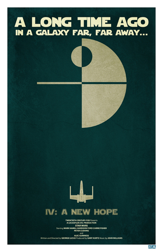
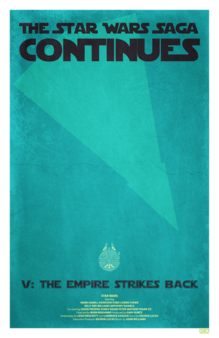
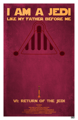 Another set of original Star Wars trilogy posters, this time by Jon E. Allen. Nicely done but Return of the Jedi doesn’t quite work for me. Also I think they’re too reminiscent of Andy Helms’ ones in this post.
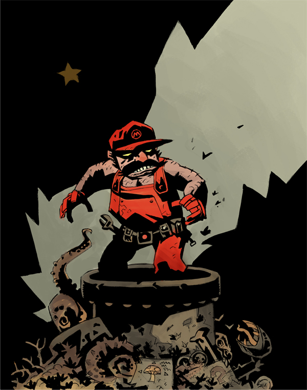
Via Megatrip via Geek Art – this popped up on the web but it’s not by Mike Mignola. Thanks to pAUL for the comment, it was Scott Watanabe.
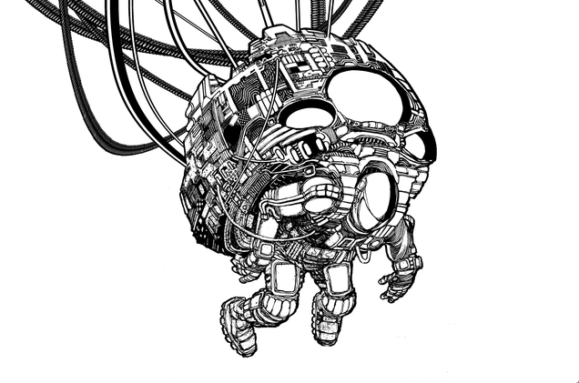
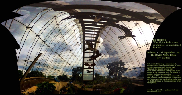 My good friend Riz Maslen aka Neotropic has a new sound piece installed at Kew Gardens in London called ‘The Alpine Path’. It’s on from May 14th to Sept 25th at The Davies Alpine House, more info here

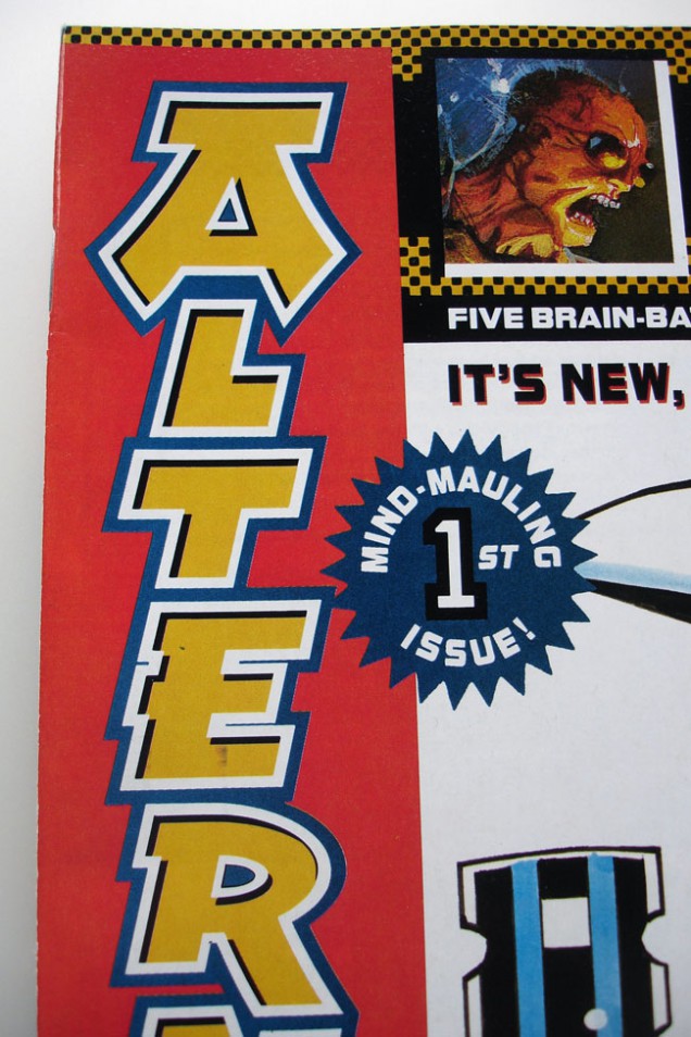
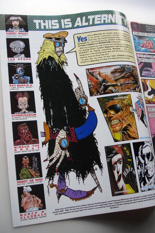
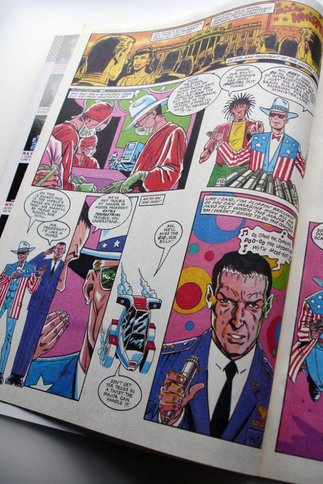
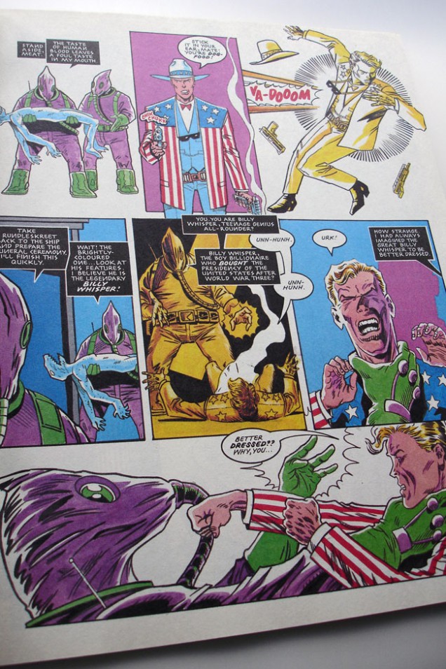
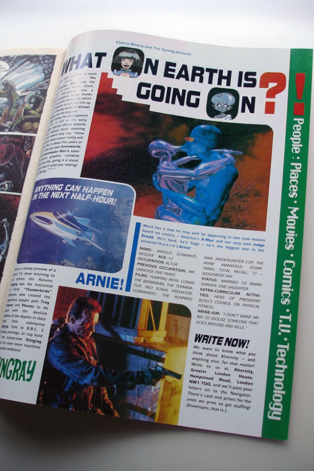
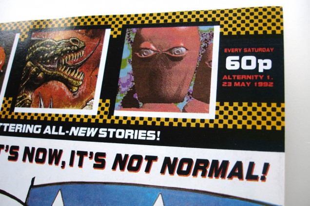
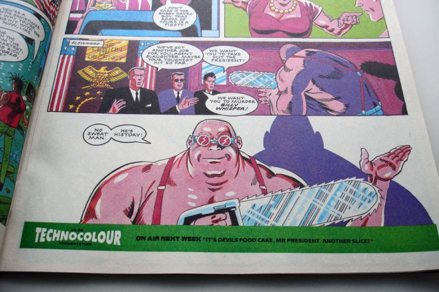
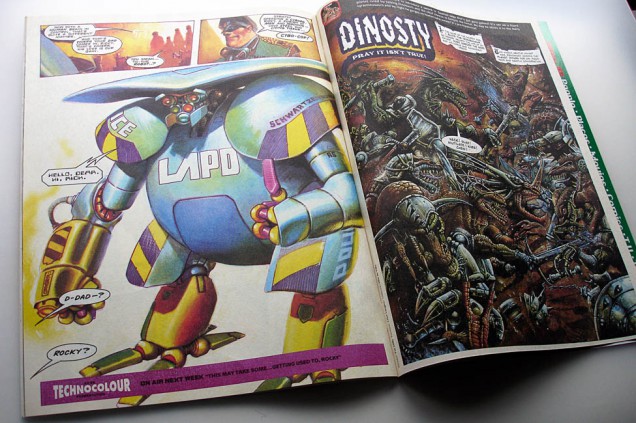
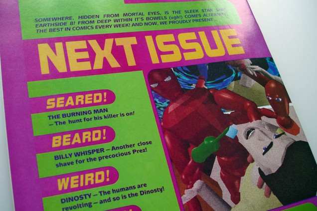
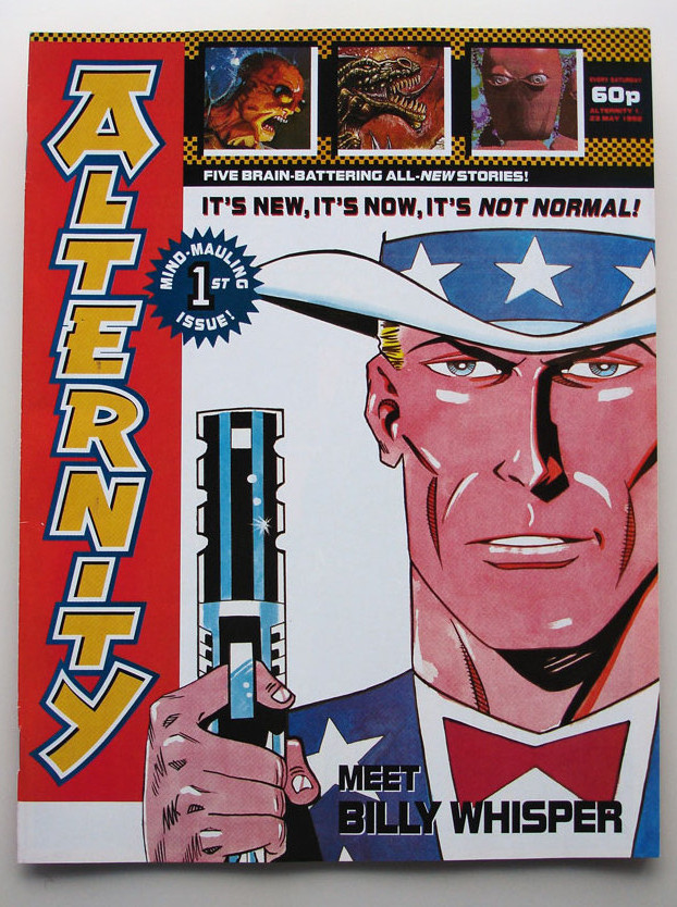 ‘Alternity’ comic issue No. 1, finished copy of the aborted UK comic from the makers of 2000ad, 1992. Includes stories and artwork by Dave Gibbons, Carlos Ezquerra, Colin MacNeil, Brett Ewins, Jamie Hewlett, John Wagner, Mark Millar, Pat Mills and Clint Langley.
Never officially published, this is a revised version of the ‘Earthside 8’ comic with one new story, most were pulped.
Check the ball section near the end – amazing
[youtube width=”640″ height=”480″]http://www.youtube.com/watch?v=X0fjUgopSdw&feature=youtu.be[/youtube]
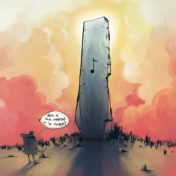
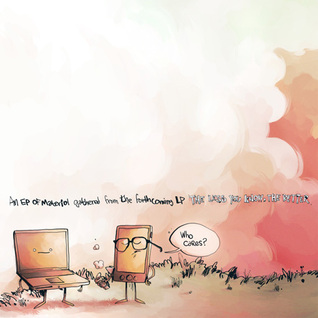
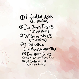
New 6 track EP from DJ Shadow just jumped out of nowhere –
3 ‘new’ tracks
(2 have been floating around for a bit) and 3 remixes of same.
‘I Gotta Rokk’ will be his new ‘Organ Donor’ I think. Grab mp3, CD of vinyl versions here.

 https://twitter.com/#!/djfood