Great post over on Scarfolk this week…
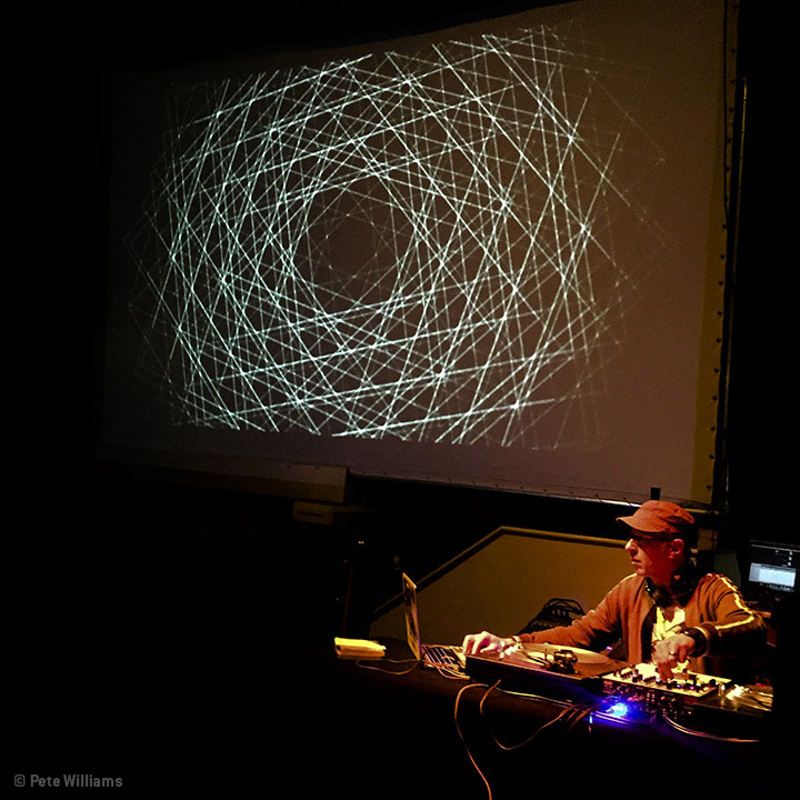
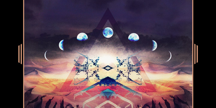
Last Saturday (Sept 12th) I played an hour long set after a showing of ‘Jodorowsky’s Dune’ documentary at one of the FEAST film nights in West Norwood’s Portico Gallery. During the mix the audience were greeted with a film of the slowly evolving, geometric designs of Ambigraph aka Ameet Hindocha.
Night co-ordinator Pete Williams recorded the mix and Ameet has reworked his visuals to accompany it in an hour long, meditative soundscape where all tracks are sourced from releases connected with Frank Herbert‘s most famous novel. *I recommend viewing in HD, probably late at night with the lights off.
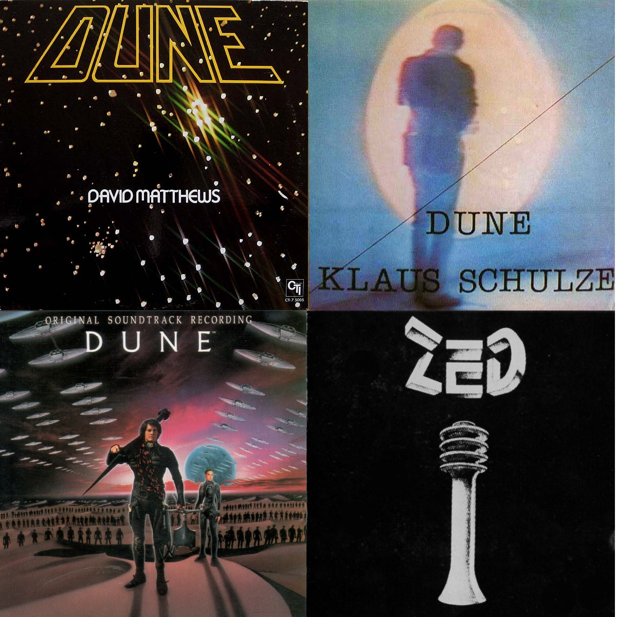
Over the decades many artists have been inspired by this work and there are many concept albums built around themes from his books. As well as Toto‘s score for David Lynch‘s big screen adaptation there’s also music from the forthcoming soundtrack to the documentary I mentioned and tunes from Bernard Szajner‘s ‘Visions of Dune’ release among others.
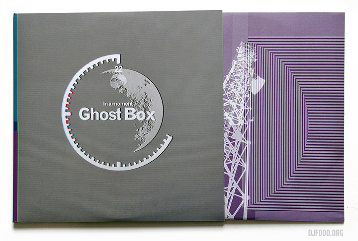
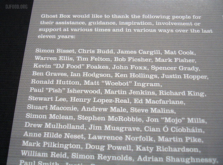
I was very pleased when one of these popped through the letterbox the other day – a present from one of my consistently favourite labels. Ghost Box records are 10 and what does any self-respecting label do when they reach that anniversary? They compile some of the best bits and that’s exactly what ‘In A Moment’ showcases.
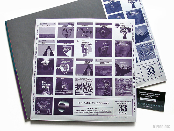
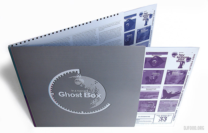
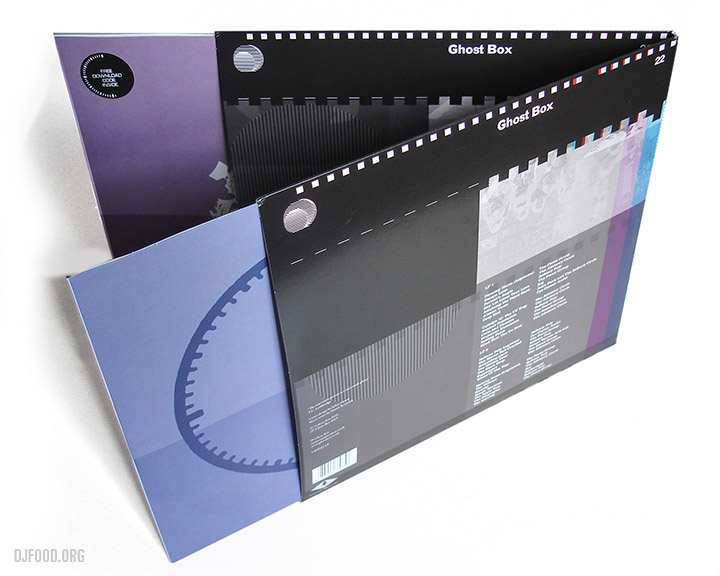
Nestling in the credits as well… that’s very serious company to be keeping. The comp is out on 9th October on double vinyl, CD and DL with sleeve notes by Simon ‘Hauntology’ Reynolds.
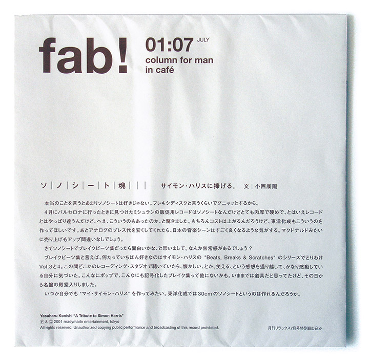
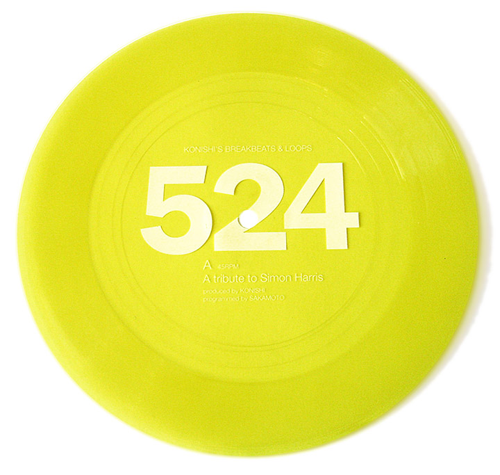
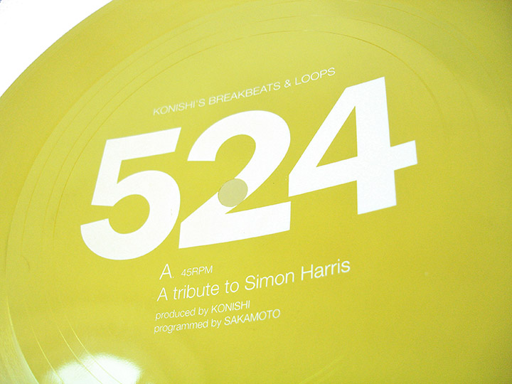
My last flexi disc from Japan this week and one that looks back to the west, London and Simon Harris’ Music of Life record label. Yasuharu Konishi – a founding member of Pizzacato 5 – creates ‘A Tribute To Simon Harris’, a multi-tempo break beat cut & paste tune on bright yellow plastic. It was available in issue 53 (July 2001) of Relax magazine, this time in a printed sleeve, and the 524 on the disc is the name of his record label.
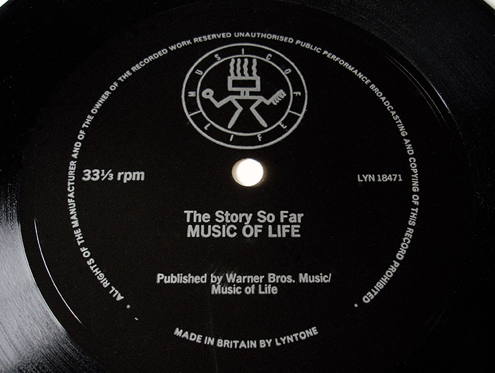
 Back in the UK, in the late 80s, Simon Harris was issuing flexi discs of his own, the one below being an overview of his Music of Life label thus far. It dates from 1987, only about a year since the label’s inception, a time when it was transitioning from reissues of US material to original content, focusing on the UK Hip Hop scene. He mentions “here at the 1987 International DJ convention“ so I’d guess it was only available at the event as the tone is very industry-based with talk of distributors, import-style pressings and loud vinyl cuts. There’s no trace of it on either Discogs or YouTube so I think this is a fairly safe one to put up and I’ve added it to my Soundcloud.
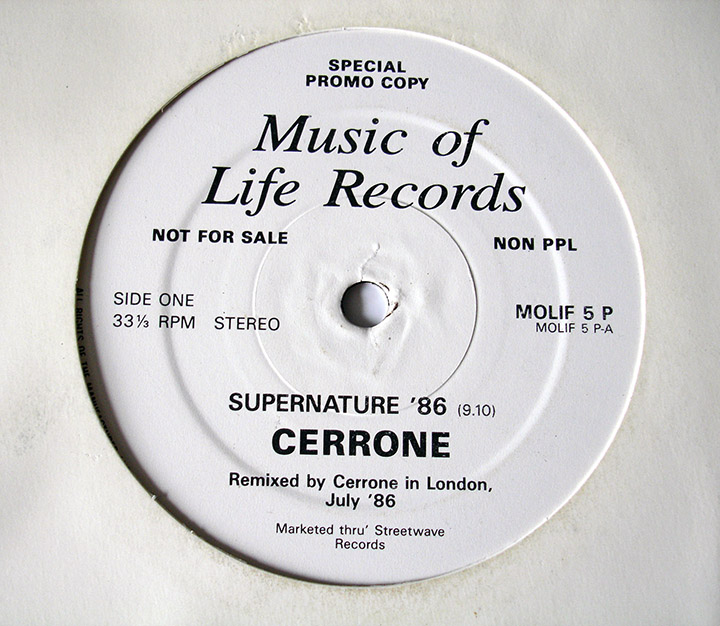
I’ve always known Music of Life as a Hip Hop or Breakbeat label but during the history of the label, Simon mentions their first release – a remix of Cerrone‘s ‘Supernature’ on a one-side 12″. I dug out my copy and sure enough, check the catalogue number: MOLIF 1 from 1986 no less. (This isn’t a flexi but I thought it was interesting).
Another flexi that MOL issued was a preview promo for their Hard As Hell 3 compilation which dates from 1988. I don’t actually have a copy of this myself but someone has put it up on YouTube in all its Harris-narrated glory, nice Music of Life slipmat too. No idea where this was available from, maybe a magazine like Hip Hop Connection?
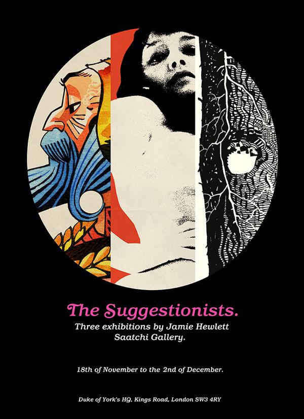
Jamie Hewlett’s first ever exhibition will actually be three: “the fine art exhibition comprises three bodies of work: “Tarot” (“Hewlett’s idiosyncratic, breathtaking interpretation of the world of tarotica”), “Honey” (a “frisky homage to the exploitation movies of the 60s and 70s”), and “Pines”, featuring “extraordinarily detailed illustrations of trees Hewlett observed while in the south of France.”
Pre-exhibition prints (that are very expensive and possibly spoil part of the surprise) here
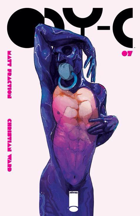
Out today, Christian Ward and Matt Fraction‘s continuing space saga, ODY-C from Image Comics– it’s all about the logo placement.
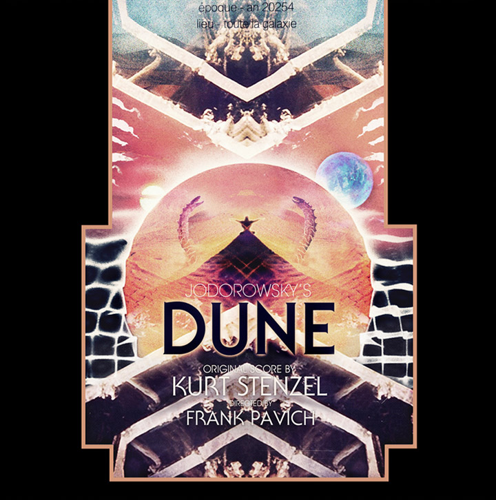
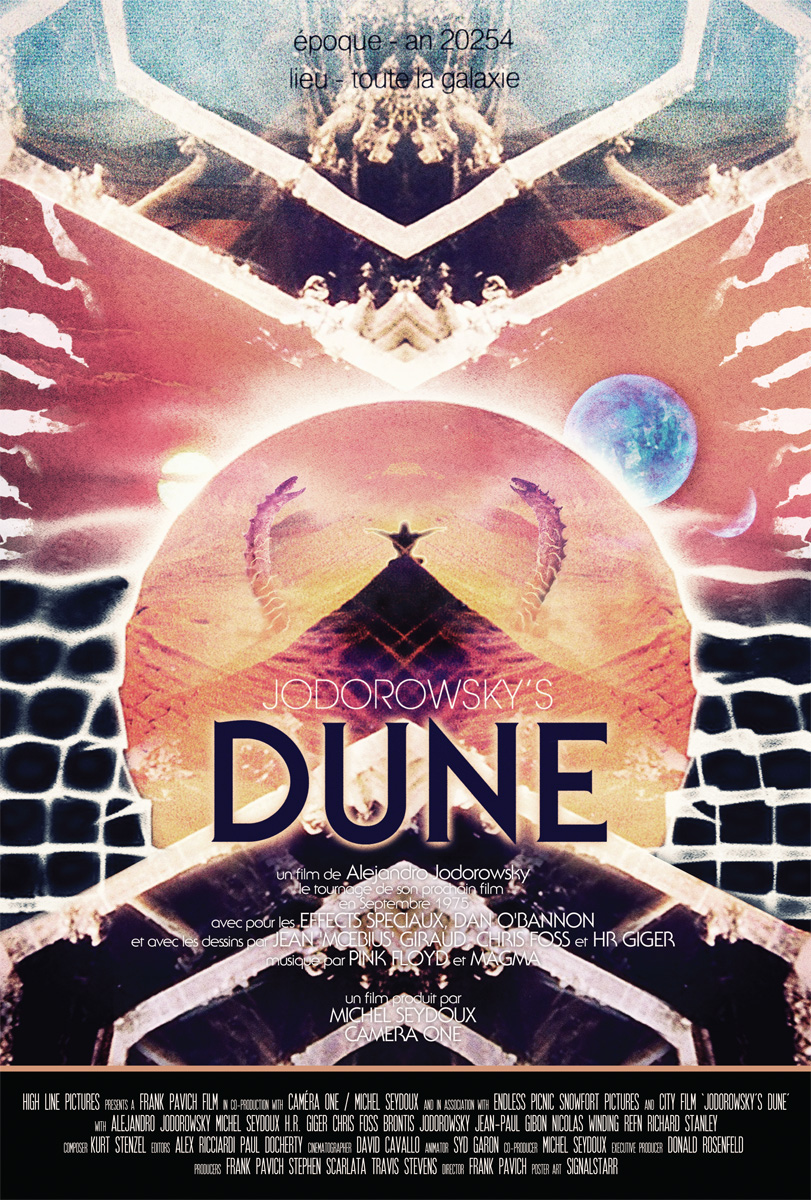
Beautiful artwork by Nick Stewart Hoyle aka Signalstarr for the soundtrack release of ‘Jodorowsky’s Dune’. Pre-order is up now via One Way Static for European customers, who have an exclusive variant. For US customers, order via Light In The Attic. It comes as a double LP with coloured swirl vinyl, silver foil embossing, gatefold sleeve and a poster version of this cover.
“Building upon director Frank Pavich’s idea for a score with a “Tangerine Dream-type feel,” Stenzel lays out a cosmic arsenal of analog synthesizers that would make any collector green at the gills: among other gems are a rare Moog Source, CZ-101s, and a Roland Juno 6, as well as unorthodox instruments like a toy Concertmate organ and a Nintendo DS. “I also played guitar and did vocals,” says Stenzel, “some chanting… and some screaming, which comes naturally to me.” The score also features narration by Jodorowsky himself. As Stenzel notes, “Jodo’s voice is actually the soundtrack’s main musical instrument–listening to him was almost like hypnosis, like going to the guru every night.”
My DJ set from Saturday, performed after the showing of the doc. at the FEAST night in West Norwood, is almost ready to post and contains several cuts from this album alongside all manner of other Dune-centric material.
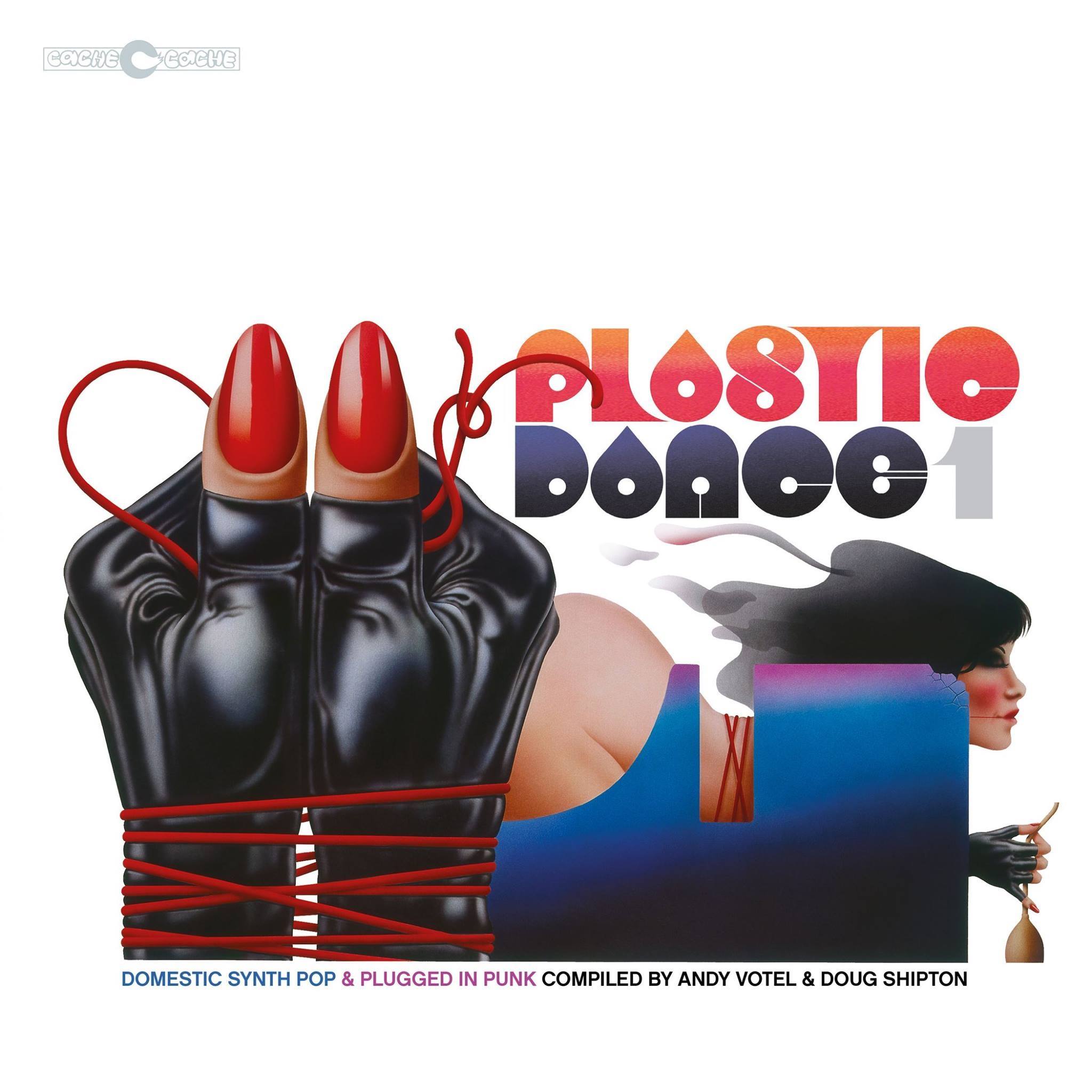
So much to love about this, from the 70s-esque illustration by Terry Pastor to the typography. It’s another winning compilation from Finders Keepers, on sale here and now.
This is slowly creeping up on us, a new release and launch party from Buried Treasure whose recent compilation of John Baker cuts, The Vendetta Tapes, I loved.
“London. 1968. Two pioneering musicians compose electronic themes for television & radio. They discover a recording that leads to a startling revelation about their employer. Fascinated by the occult nature of the tape they conduct a studio ritual that will alter their lives forever.”
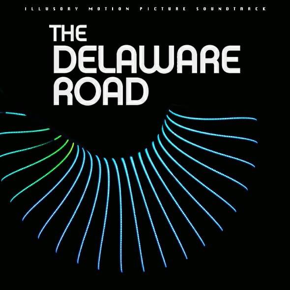
The Delaware Road is a psychological thriller & an audio-visual treat for fans of archived electronica, far out jazz & haunted folk grooves. Conceived & written by Alan Gubby. Additional material by David Yates. Compere: Dolly Dolly
Debut performance on Sat 14th Nov 2015 @ South Street Arts Centre, Reading, Berks.
Tickets here:
Live performances by: Howlround, The Dandelion Set, Ian Helliwell, The Rowan Amber Mill, Robin Lee, Loose Capacitor, Tim Hill, The Twelve Hour Foundation & Revbjelde.
DJs: Jonny Trunk & The Séance (feat. Pete Wiggs from Saint Etienne)
Tickets: £15 advance, £13 concession; £16 on the door.
Price includes free poster & advance download code for ‘The Delaware Road’ compilation album on Buried Treasure Records. All tickets are inclusive of booking fee

Star Wars video mash ups are all very well and good but now for the serious stuff that matters. I’ll be playing some tunes at this on Saturday, please visit this link for more details about how you can help, what is needed and what isn’t. You can drop donations at Glasshouse and they will be distributed to those who need them, have a clear out and help make a difference.
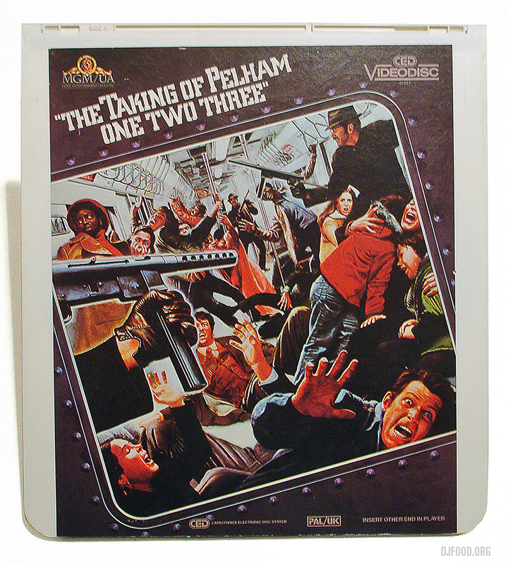
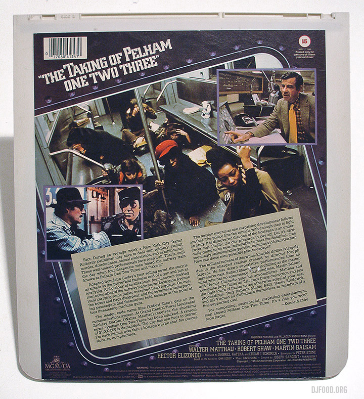
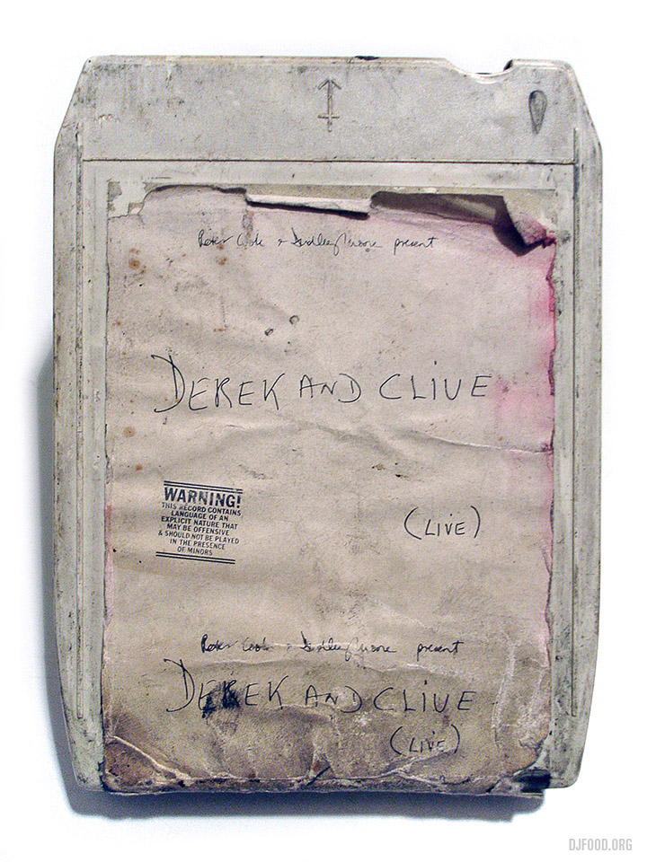
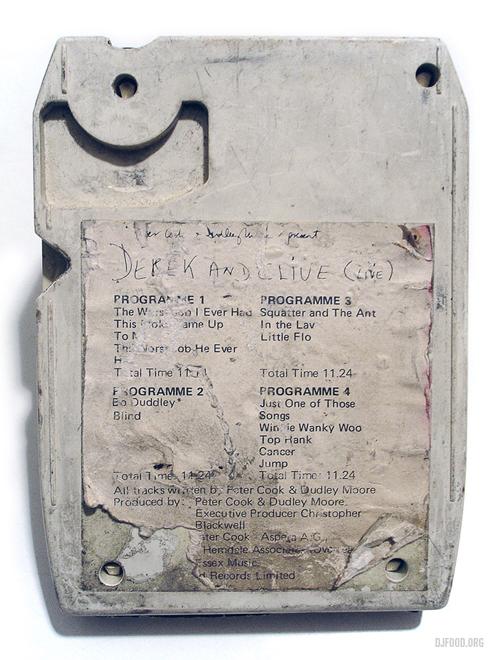
Obsolete formats: I have no way to play these first few items and already own them in several other forms but I couldn’t resist picking these up today.
The ‘…Pelham 123’ release is a Video disc in a huge plastic ‘cartridge’, bigger than an LP, I originally thought this was the same as the Laser disc system but it seems it’s an earlier, failed format that was read with a physical needle rather than a laser! – more info here.
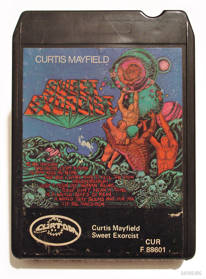
I was amazed that the Derek & Clive release was even on 8-Track – this one almost as dirty as the audio it contains. The Curtis Mayfield cart is just a beautiful object.
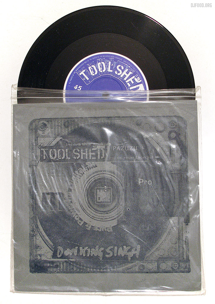
This is Toolshed‘s first ever release from 15 years ago, a 2 track 7″ in a ziplock bag with screen-printed, folded card cover. Toolshed is Graham Massey‘s occasional all-star experimental supergroup featuring the likes of Paddy Steer, Seaming To and many more.
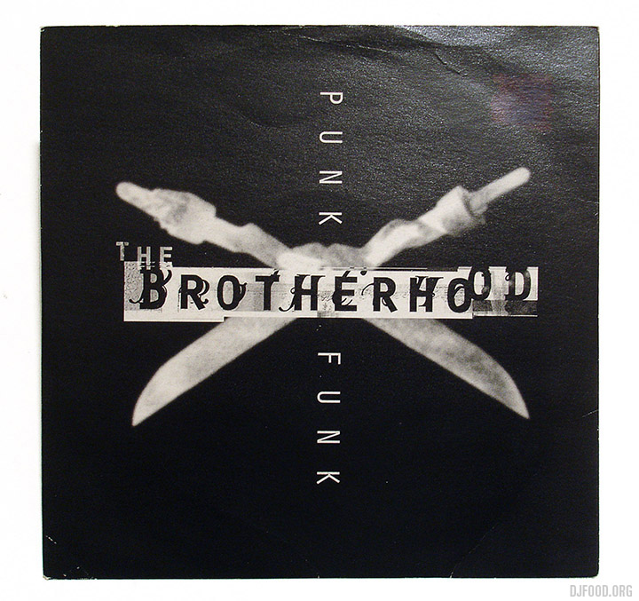
‘Punk Funk’ was my favourite track from The Brotherhood‘s Elementalz album back in the mid 90s and I never even knew this existed on 7″. With a great heavy remix by 12 Rounds (who included Atticus Ross among their members) exclusive to this format it’s probably my favourite find of the day. This particular version is not on YouTube so you’ll have to take my word for it.
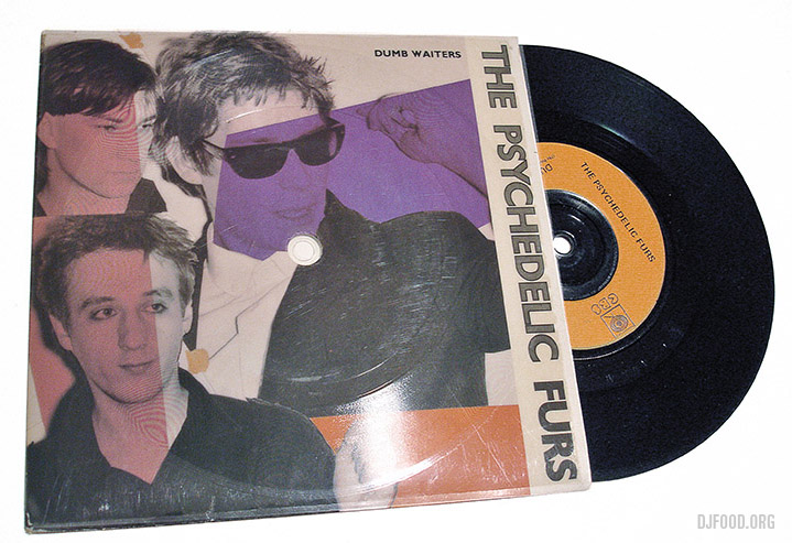
Finally found this Psychedelic Furs 7″ with a flexi stuck to the cover, play the sleeve as well as the 45 inside!
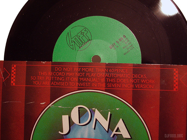
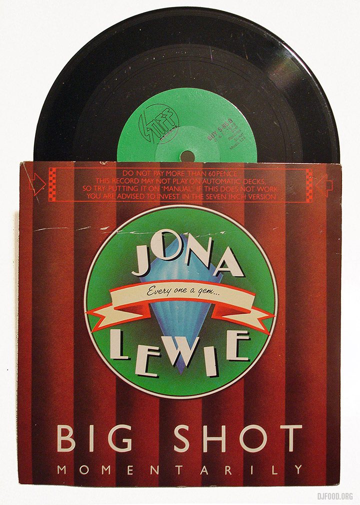
This Jona Lewie single is actually only 6″s in size and includes a funny little disclaimer about the realities of automatic turntables trying to play it. Stiff Records up to their old tricks again, strange that they should do a 6″ and a 7″? This one was bought purely for its odd format and joins the tiny ranks of my irregular-sized vinyl collection.
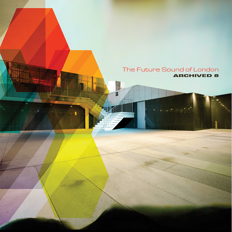
From the seemingly bottomless archives of the Future Sound of London‘s tape cupboard comes vol. 8 in their From The Archives series, 12 tracks from unspecified times that never made the cut. As well as this new release there are now vinyl versions of earlier volumes of their more ambient Environments series, complete with Buggy G. Riphead sleeves. You can preview one track from Archived 8 below and get CDs, downloads and vinyl from their FSOLdigital online store where they also have posters and T-shirts. Also you get an extra exclusive 3-track digital EP if you order from there too.
 New Yppah album, Tiny Place, out next month on Counter – preview two tracks here.
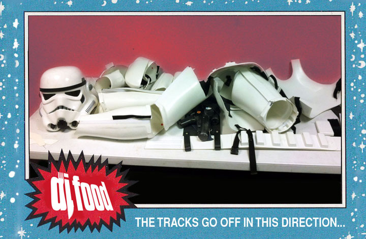
Finally, after a long hiatus, I’ve managed a new mix, and a audio visual one at that. The school summer holidays are a killer creatively when you have kids to attend to but now that the little ones are back to the 9-3.30 I’m back in gear. Something else that’s been occupying my time this summer, since May to be precise, is Secret Cinema‘s production of The Empire Strikes Back that I’ve been playing at in various locations and guises since it opened. Last night was my last gig, sound-tracking the Cantina Bar post-film with the run finishing completely in two weeks.
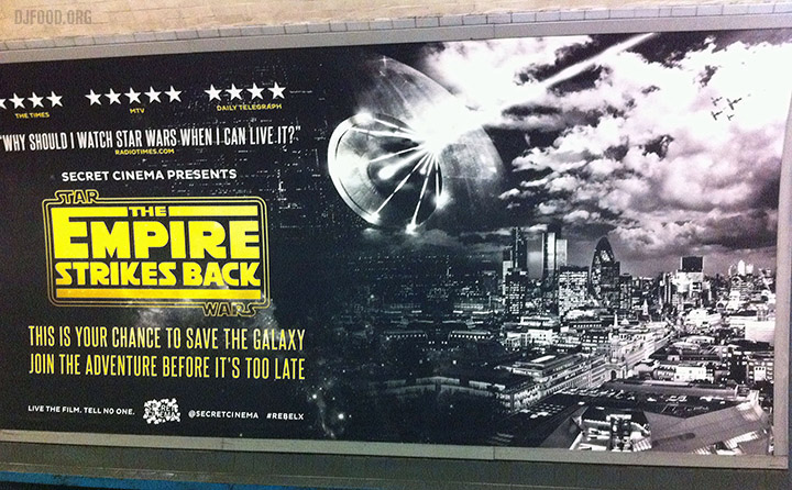
To say it’s been an experience is an understatement and it’s one I will cherish forever as it is like nothing else out there. If you were one of the thousands who attended then you’ll know what I’m talking about and I’ll do a full post about my time there in a few weeks time when it’s closed as I don’t want to spoil things for those yet to go. But to commemorate the end of my run I’ve put together this 30 minute Star Wars-themed mix, complete with a video accompaniment, featuring some of the songs I played in amongst the rest of the themed tunes selected for the different areas.
Titled ‘The Tracks Go Off In This Direction…’ it follows the hunt for the Droids as songs and styles from the SW canon get progressively more random. It’s all Star Wars, plenty of which you will have seen and heard before, but I like to think I’ve dug a little and unearthed some hidden gems that might not be as familiar as Meco‘s ubiquitous disco-fied Star Wars Theme.
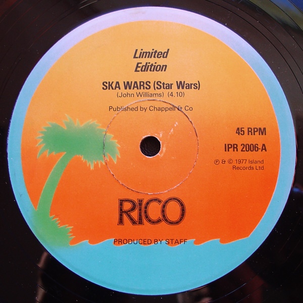
For example: Rico Rodriguez, The Specials‘ trombonist who recently passed away, released a cover version called ‘Ska Wars’ (what else?) in 1977 on Island records which I’ve included as a tribute. Dickie Goodman, creator of the infamous UFO ‘break-in’ records’ made a ‘Star Warts’ 45 to cash in the same year, I’ve included a later (better) version and several cuts from Herbie Hancock‘s modular synth sidekick, Dr Patrick Gleeson‘s analogue Star Wars album.
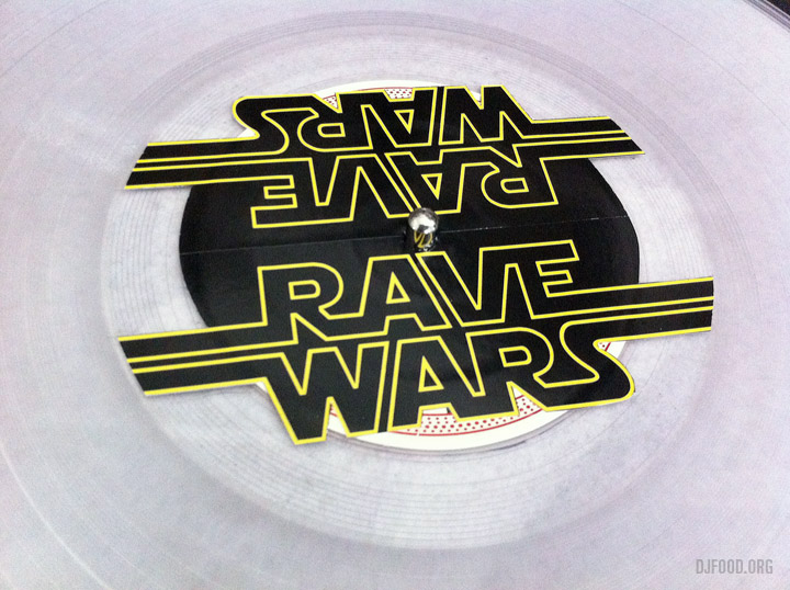
It’s not all period covers though, there’s plenty of modern day Hip Hop, Rave and Techno from the likes of AGT Rave Cru, Mark Archer, DJ Shadow and all manner of, shall we say, ‘copyright infringing’ releases under pseudonyms. At the start of the Secret Cinema run, when they also ran a separate satellite Cantina Club in Hoxton, I made a ton of video clips to go with tracks for a one-off AV performance and some of the work I put into those has found its way into the video mix. With a property like Star Wars this is a red flag to a bull so how long it will stay up is anyone’s guess. Grab it while you can… UPDATE – Sorry folks, I’ve been asked to take it down… back up!
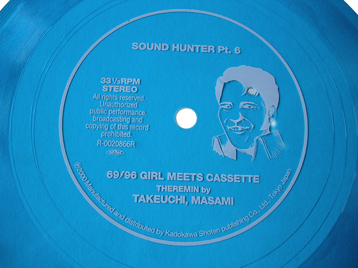
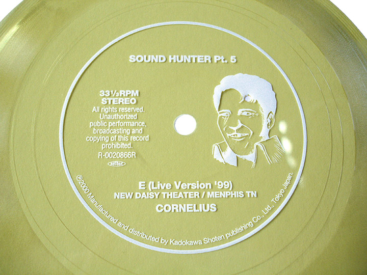
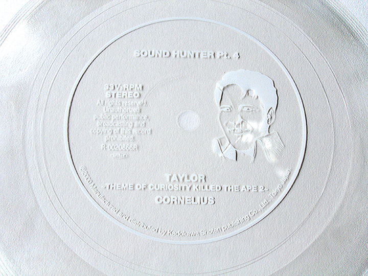
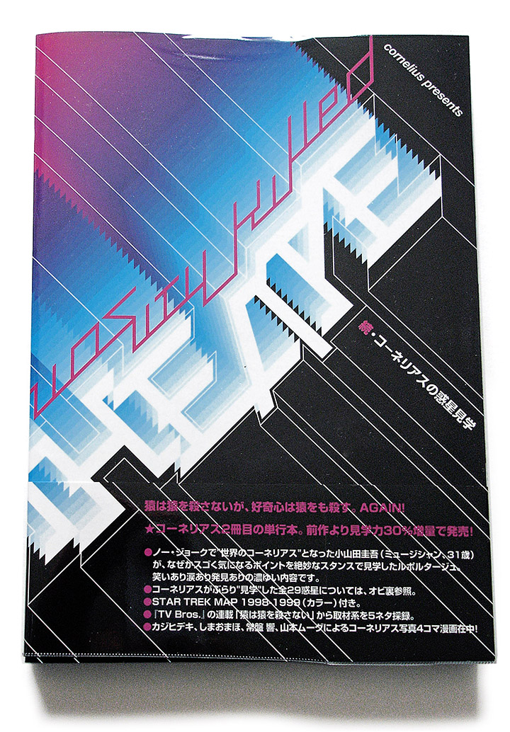
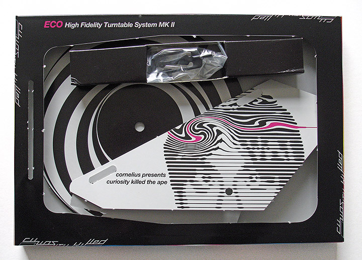
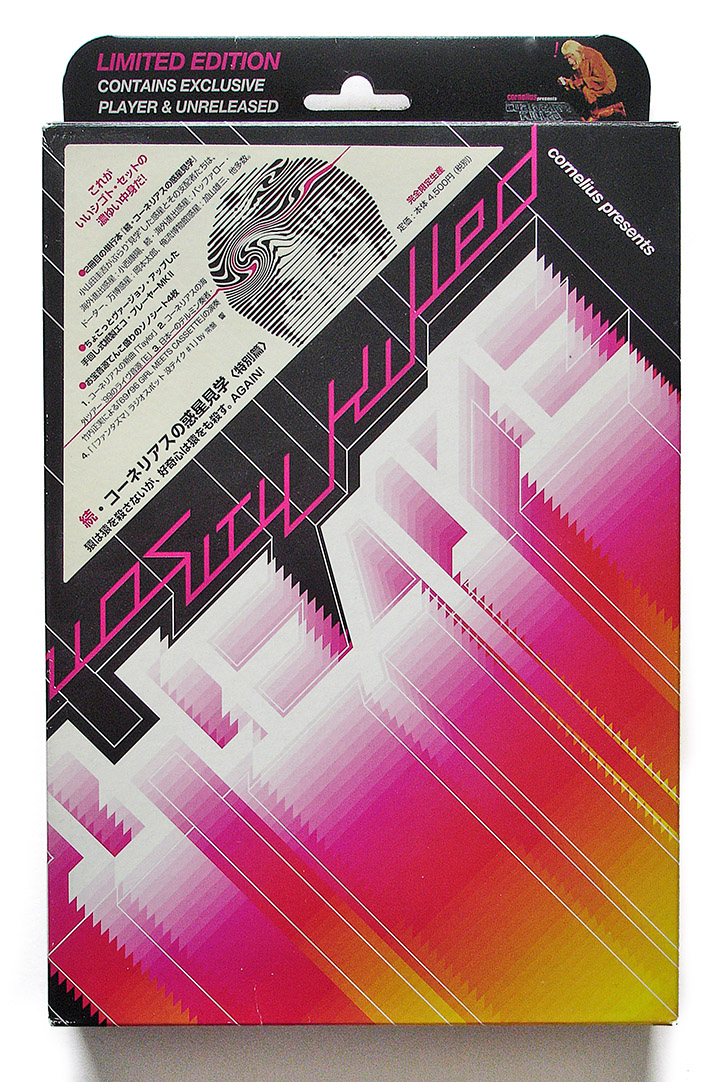
This is a pretty special release I picked up in Japan at the turn of the century. Cornelius has always pushed the boundaries with both his music, live performances and videos and this is no exception. Four 6″ ‘Sono-sheets’ under the title of ‘Sound Hunter’ (Pts.4-7 – not sure what happened to the first three), a 182 page book and a DIY record player. I’ve never built it so can’t vouch for the fidelity of the contraption but only in Japan do things like this happen.
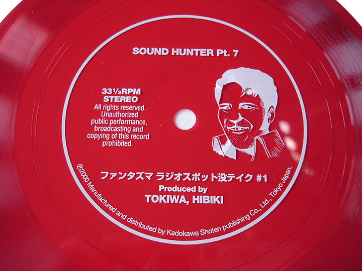
Three of the four discs are on YouTube but the ‘Fantasma Radio Spot Take #1’ sadly isn’t. The music veers from rock to vocal pop to crazed sampledelia and all the disc are worth a listen. You can find copies on Discogs but they’re not cheap as you’d expect. There’s not much I can add to this because most of the text is in Japanese but marvel at how well it’s come together.

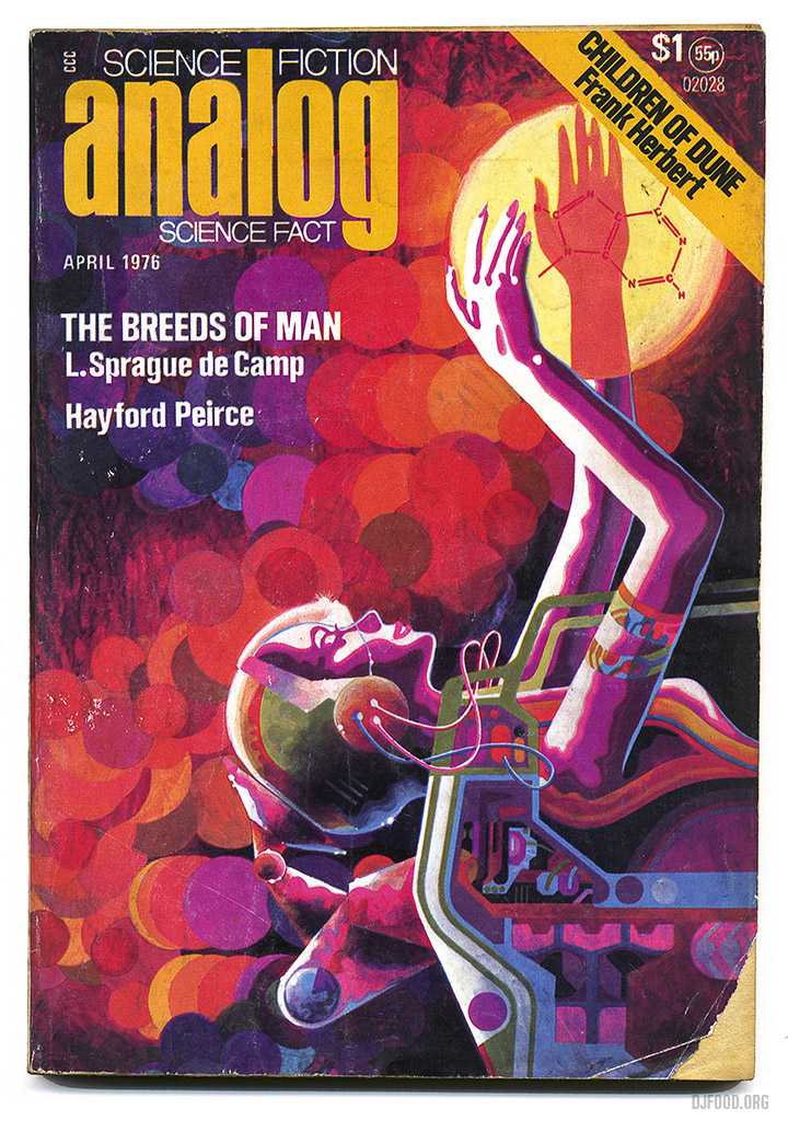
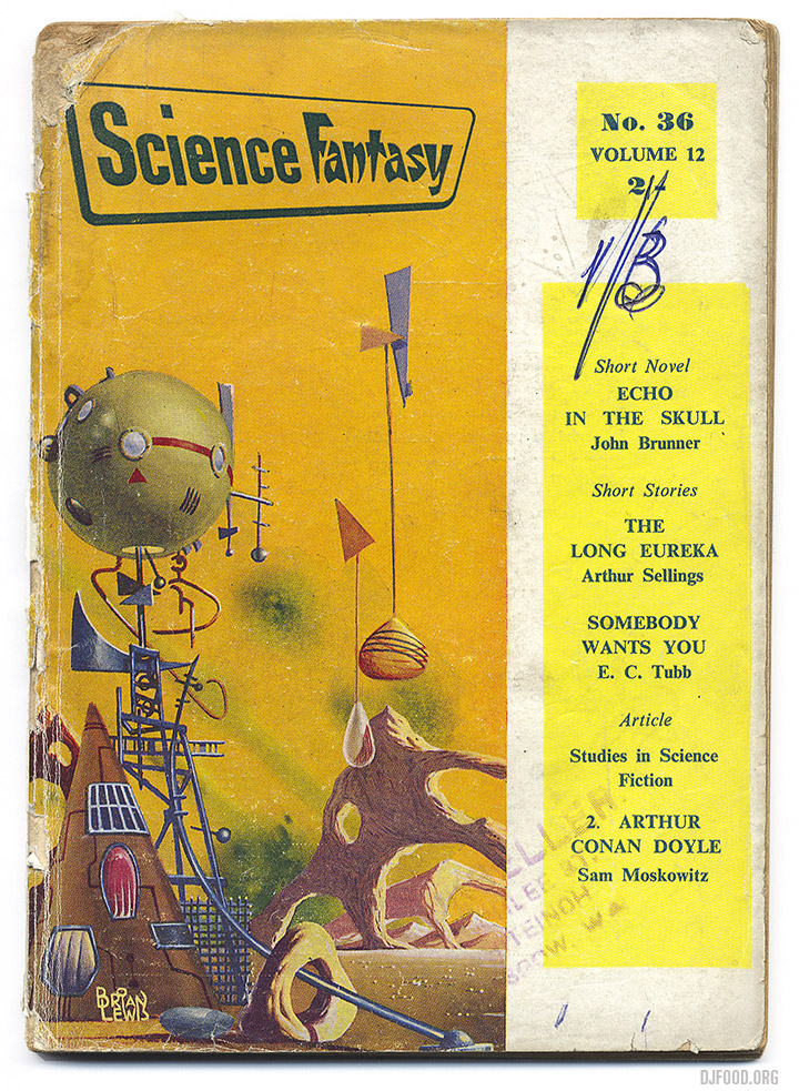
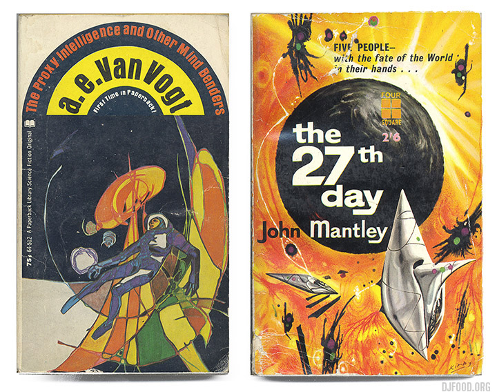
Unearthed from the teetering piles of books in Voltaire & Rousseau, Otago Lane, Glasgow this weekend. See just one aisle from the shop at the bottom, proper archeology needed to get to some of these beauties. Found a couple of Richard M. Powers covers and a Brian Lewis cover from Science Fantasy that seemed to be channeling him. The Kirby cover at the bottom is similar in style, I’m a sucker from this abstract, psychedelic depiction of alien worlds and it seems to have been a fad for a while to paint like this. I’m pretty sure the Kirby there isn’t Jack but you never know, anyone who can identify the artist on the Analog cover will be most appreciated, maybe Mike Hinge?.

Out today, Ollie Teeba‘s first solo album, a LONG time in the making, finally here and it’s a banger. Check out this snippets mix, full of cameos from the likes of Jean Gray, Ghettosocks, the Soundsci crew of course… full of quality tunes with a Darrell Krum cover to boot. Get a copy here, very limited vinyl.
UPDATE: – Digital now online HERE
Techno DJ Colin Faver has died, best known for his Abstract Dance radio show and club night, Knowledge. His and Colin Dale‘s shows on a Monday and Tuesday night on KISS FM in the early 90s were essential listening. It was there that I first heard the Aphex Twin and the emerging UK electronica scene amongst all the other great Hardcore and rave tunes. A pioneer.
I only just saw this, a teaser of just some of the moments during the Empire Strikes Back Secret Cinema event. I’m back there this weekend, playing both nights and the run finishes at the end of the month so be quick if you still want to go. I’ll be dropping a special SW-centric mix before that to commemorate this amazing spectacle.