Coldcut ‘Journeys By DJ’ 20 Years on by Joe Clay on the Quietus

quietus_coldcut-70minutescrop
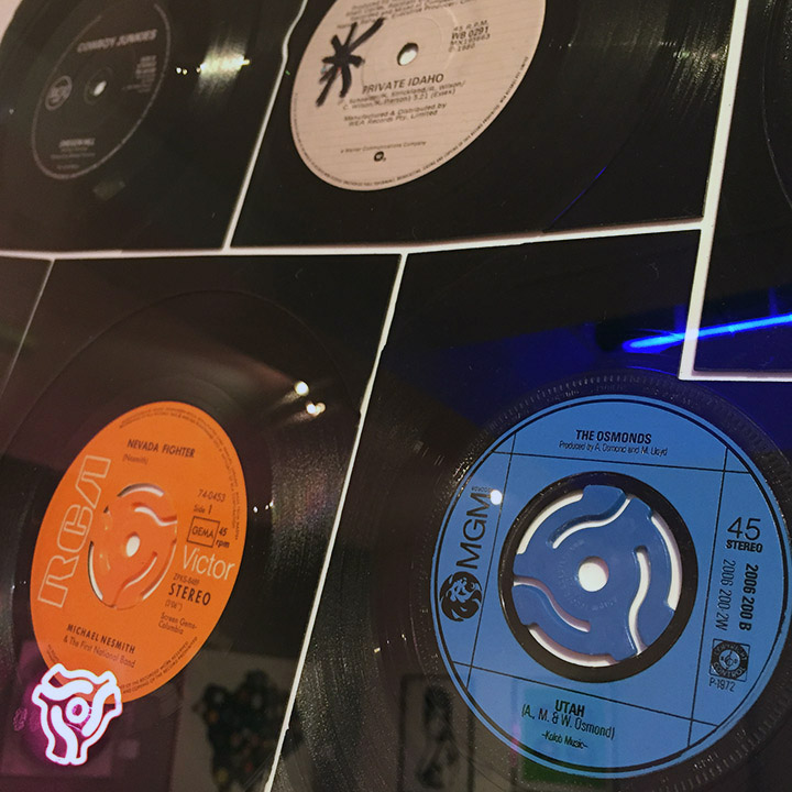
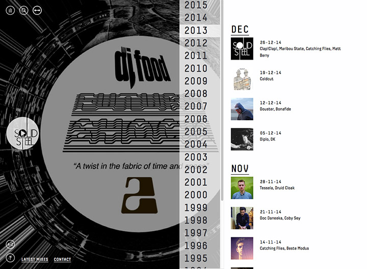
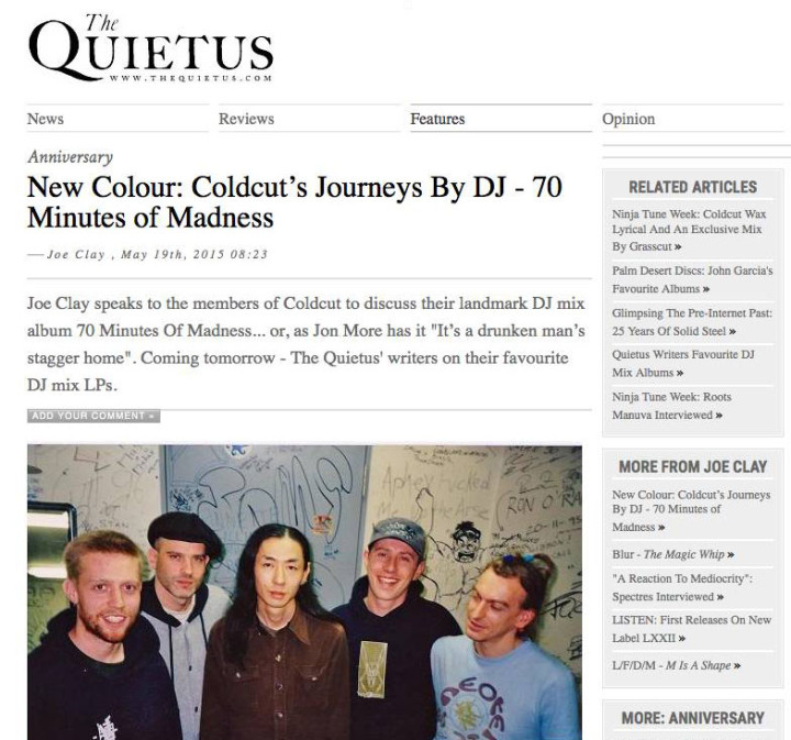
Joe Clay interviewed Coldcut, PC and myself back in January for a 20th anniversary piece about the making of ‘Seventy Minutes of Madness’, Coldcut‘s contribution to the Journeys By DJ series back in 1995. It seems crazy that this was two decades ago now but time flies when you’re having fun. It’s a pretty extensive delve into the circumstances and techniques involved in the creation of what they’re calling ‘the greatest DJ mix album of all time’ *blushes*.
This piece also reveals why Coldcut never made a follow up but highlights the logical successor to the mix and kicks off a series on the Quietus where writers pick their favourite mixes. Incidentally the photo above was taken in Japan around 1996/7, back stage with DJ Takemura before a gig. If you’ve never heard the mix before or fancy a refresher after reading then someone called GarethisOnit has put it up on Soundcloud as part of a Classic Mix CD Series he’s creating.


Mega Mad Max vehicle round up

MMFR-Poster
I’m still buzzing about seeing Mad Max this past weekend (I went a second time on Sunday evening) and the web seems to be aglow with positive reviews and articles on everything from Dayna Grant, Charlize Theron‘s stunt double, to how they realised the bungee hanging guitarist in the red onesie. I want to focus on the vehicles and concept designs that led to them in this post and you’ll see how closely they were followed and realised in the final film.
Above we see a mock up – by comic illustrator and concept artist Brendan McCarthy, also co-writer of the film – of a proposed graphic novel for Fury Road, the fourth installment of the Mad Max saga. Below are designs for vehicles and characters that he worked on, amazingly dating from 1997! Brendan has a new website that these were taken from that includes tons of his other comic and film work, he’s the master of psychedelic imagery, few can portray altered states as he can so make a note of anything you missed if you take a look. Incidentally, there’s an official comic debuting this week, published by Vertigo, DC‘s more indie offshoot, that digs into some of the character’s back stories.

MMFR-armada-vehicles MMFR-chariot MMFR-Digger MMFR-LOCOMMFR-early-design-hotrod  MMFR-munkee MMFR-nekro1 MMFR-NEON

Tony ‘Riot’ Wright, an associate and sometime collaborator of McCarthy’s, was also invited to Australia to provide storyboards for the film in 1999 but ended up doing concept designs. He posted these images and more on his blog with some background to his involvement.

TonyRiot_WarRigconcept TonyRiotMM4concept TonyRiotMM4concept2

The task of realising these images in the flesh (or should that be metal?) was down to production design, Colin Gibson and I managed to snag this extensive interview with him from the film’s press people late last week. *WARNING – possible spoilers in the text but Colin does have a very poetic turn of phrase*

madmax_plymouthrock

On Mad Max: Fury Road, you were faced with the task of making vehicles that look cool but that are also sturdy enough to survive the rigors of filming in the Namibian desert. That has to create a ton of difficulties, marrying the machine to the role.

COLIN GIBSON: They had to perform, and, like any other character, had a part to play in fleshing out the story and making believable the world they inhabit. Technically, the desert terrain and climate made for logistic problems (overheating, wear on suspension, clogged aspirators, etc), but those very antagonisms added to the beauty and sheer physics of the action with swirling dust, spat sand and airborne vehicles. We design to the story and react to the reality, and each adds truth to the other. Further, we designed the design process to resemble as much as possible the HOW of the Warboys: scavenge, assemble, increase grunt, weaponize, increase grunt, add cup-holder, set off to war with v8 roar…

madmax_buggy9

There’s a classiness to the muscle cars and some of the older models that makes them timeless, but also kind of harkens back to a time when you actually drove a car.

COLIN GIBSON: Well, that was part of the ethos. There’s the double helix of film design, one strand the requirements and logistics of the film-making, one the truth and logic of the story and the world we are in. Mad Max was set at the end of the ‘70s, and we wanted to use that as a starting point, yet now it’s far further into a future in freefall toward feudalism. So, why are we still using these cars? How do we justify this look? We have basically three fantastic reasons…

Number one, if you’re going to go to war you want heavy Detroit steel rather than carbon fiber. Number two: the analog/digital divide…You also want something you can fix yourself that has balls and grunt, but that is also mechanical, as opposed to computer chipped and plugged in. Number three, in a world of scarce resources and lost beauty, I can’t see anybody schlepping a Corolla halfway across the wasteland to save.

Mad-Max-Fury-Road-People-Eater-1200x800-6fc69950ac3ea19f

Tell us about the rolling nightmare called the People Eater? It looks like it’s got a Mercedes chassis to it.

COLIN GIBSON: Yeah. In [director] George [Miller]’s mind, the People Eater truck was always representative of the corporate industrial military complex. A horizontal cracking tower on wheels, refining fuels from oil even as it hurtled across the desert. The head of Gas Town is pretty much large, bald, and be-suited—a bean counter who drives to kill and kills to acquire; he’s all about bartering fuel for water and munitions, so the story required his vehicle to be huge, corporate, military …and it was fated to explode in a massive climax. With the People Eater chassis, I was lucky enough that a wedding company closed down and their pair of old Mercedes stretch limos were up for sale, cheap. So, they became him. And then we did a little lattice cut-out instead of windows, as glass was rare and because he always struck me as Sydney Greenstreet in a Casablanca Café—a large, corpulent man counting coins in the back of a casbah.

madmax_fdk 1

There’s a Volkswagen Bug that we used for one of the Gas Town vehicles and we decided to make it the vehicle that tracked with him, like the fish that track with sharks to eat the parasites, the remora. (We were desperate to use a Volkswagen, and the lead Imperator of Gas Town has a domed bald head, is quite round and corpulent, so the Beetle became the perfect choice). It was beaten back to bare metal because it gave us the shiny, chrome dome; we aped the piping, drums, coils and condensation vats in shape and color to mimic the larger unit and viola, the beetle is reimagined, recycled and reborn.

Did you apply that same logic to each vehicle?
COLIN GIBSON: To each vehicle. We built close to 150 vehicles total but there were eighty-eight set characters.

madmax_interceptor 1

The Mad Max Interceptor is very iconic in signature, but you’re not overly bound to expectations. Did you feel you had something of a blank canvas to adapt it for this story?

COLIN GIBSON: A blank canvas that absolutely must be filled with ‘Interceptor.’ We open with Max’s car as the last remaining beat of the Mad Max world, last gasp of a legend lost to fight or flight, running on fumes, rolling on rags, rust to dust… We pass the baton, we hand the dim memory of myth to the new Max, and we wipe it out in the opening scenes of the film. It’s there and then it’s not. And a little later, we do as the Wasteland does, what man is forced to do—salvage and recycle—and the Interceptor returns, ground bare and rebuilt, jacked up and juiced, four-wheel drived and double aspirated, weaponized to wreak havoc in an ever more brutal future. Max must do battle with his own past.

madmax_gigahorse 1

Does Immortan Joe have two cars in the film?

COLIN GIBSON: The Immortan Joe really owns all the vehicles in the Wasteland, his fiefdom, his armada, all the steering wheels his, the vehicles gifted to the Warboys only to further his ambitions. The Immortan takes over a monster truck at one stage to navigate an avalanche-strewn canyon and jockey his son to battle, but his real vehicle—the Giga-Horse—is probably my favorite because it was built from the ground up. Deep in the dim, dark Rev-Head past, the glory of a Cadillac’s tail fin still haunts the imagination. The glory days before the Fall, a snatch of song tugging at the heart, the gas-guzzling joy of once having been able to put one arm out the window and your other arm around the girl, hit the accelerator and live, be someone … a luxury long lost.

madmax_bigfoot

So, in a world where there is barely one of anything, only the Master may have a pair. We took great delight in taking a couple of 1959 Cadillac Coupe de Villes, tail fins akimbo and red rocket brake lights glowing, cutting them down the center, mounting them one atop the other in flagrante delicto, tipped at a rakish angle over a pair of giant blown V8s, slaved through a custom transmission to harmonize in a deep bass rumble and drive two-meter-high double rear wheels into the Wasteland.

madmax_doofwagon In the trailer, we see a vehicle with a rocker swinging from it while shredding on his guitar as this armada storms into the Wasteland. What can you tell us about that?

COLIN GIBSON: The Doof Wagon. This is an army scavenging across the Wasteland for what’s left, fighting over the scraps, and every army needs a Little Drummer Boy. George imagined one bigger and louder than ever seen before, something raw and raucous to drive the troops on to glory or to death. So, the kid with a drum became Spinal Tap on wheels, a high-speed, high volume wailing rock concert hurtling across the bloodied terrain, Taiko drummers strapped to repurposed metal ducting beating a brutal rhythm for Coma the guitarist, blind and bungee-slung, before the last Marshall stack in existence in the moshpit at the end of the world.

madmax_peacemaker 1

Can you talk about the Bullet Farmer vehicle, what it is and what it does? That’s an inspired look.

COLIN GIBSON: Yeah, but that was inspired by the story. When you’re in a long and constant chase, you need to come up with punctuation, and George, in his storytelling, had some great punctuation—beats that vary the speed and flow of story, let you catch your breath and expand your sense of the personal dramas unfolding. The toxic storm, the endless dunes…

Another of the main punctuation points is the Night Bog, which stops a lot of the vehicles because it’s basically a huge, endless bog. And what can go through a bog but a tank?

So, we needed a tank, heavily armed, that could do over 60 kilometers-an-hour, keep up with the progress of the other vehicles, and be ready to be unleashed at this point. There’s a company in the States that builds tanks for mining and also for the U.S. military, and we were lucky enough to have them customize a ‘Ripsaw’ for the film. We adapted one of those, exchanged their diesel engines with a water-cooled Merlin V8, then gave it a brassy muscle car body, aviation parts styling, a shark mouth finish of bullets as teeth … and an enormous armory.

FURY ROAD FURY ROADFURY ROAD FURY ROAD

The motorcycles of the Vuvalini are some impressive machines.

COLIN GIBSON: For the Vuvalini’s bikes, we wrapped some feminine detail and nomadic styling around the leather seat of a repurposed Harley or BMW to give you the last thrill of your last ride before these lovely old bikie chicks took you out with a single shot. Heavy touring motorbikes are not necessarily built for swinging around sand dunes at high speeds with an 80 year-old woman on board, but our bike mechanics and [second unit director / supervising stunt coordinator] Guy Norris and his team did a fantastic job making them do things that we tried to pretend we had designed them for.

There are a lot of motorbikes, and, again, for punctuation and for momentum, there are specific stunts asked of particular tribes. One of the splinter groups that lurks in the canyons, the Rock Riders, are basically hyenas on motorbikes: attack units working almost vertically over rocky terrain. Trail and Trial bikes alike were redesigned and rebuilt for the fantastic riders filling these roles.

madmax_elvis

You’ve been working on this project for over a decade in one form or another?

COLIN GIBSON: On and off. I went out looking for locations after George offered me the film in 2000, and had a fantastic time traveling the world visiting all the places no one wanted to go. As it turned out, they all had different flavors of the epic and fantastic, but very few of them had more than one or two, and very few satisfied the logistics of a large crew and a difficult schedule. We were generally missing the huge, rocky canyons in most of the places, because they just didn’t seem to abut a beautiful desert.

Namibia was a great choice because it had the advantage of having four or five different looks. I came back convinced that it was the spot because It had many flavors of desert (sand dune, gibber plain, salt lake and rocky riverbed) and yet, at the end of the day, there were two little seaside towns—one of German and one of English extraction, but all African—where you could have a beer and watch the sun go down and eat German pork knuckle. And then the next day you could be out surrounded by a 360-degree view of absolutely nothing.

madmax_warrig 1

On such a nomadic production, does that present new challenges to your gig in terms of not having the kind of control over everything you’d have in a studio shoot?

COLIN GIBSON: No, I think it’s a great thing. I don’t want control over everything. The director does. You know what directors are like—they can’t keep their sticky fingers off every pixel. [Laughs] We desperately embrace all that comes our way, just the same as with the design process. If you’re going to build from salvage then you can only build from what you can find, and that arm tied behind your back forces ever more creative solutions.

The War Rig looks the way it looks partly because [concept artist] Peter Pound did such a great job imagining it through the original storyboard process, but also because I had to build four of them and therefore needed eight of a particular vehicle from the ‘40s or ‘50s to give me a hot rod look that I could actually find for real. Enter the Chev Fleetmaster, a ubiquitous hulk rusting in paddocks all across our wide, brown land.

This design ethic allowed us to be true to the philosophy our Warboys also had to follow: dream what might have been, salvage what you may, build to do battle and make a fetish of your love and lust. I think that’s what gives us an internal logic and a truth, that we build the machines and pit them against each other and the elements, mankind struggling as ever against itself and against physics. What goes up, comes down; what goes fast, stops hard. History.

madmax_nux 1

So, there’s a certain element of jazz with the unreliable terrain and atmosphere?

COLIN GIBSON: Oh, it’s an undeniably necessary component. I use the jazz riff concept when you’re working within the trope of post-apocalypse, which has been beaten to death by a whole bunch of B-grade knuckleheads who think welding some barbed wire to a Camaro gives you the future of civilization. Really it’s coming up with a weirder instrument and playing in a different place, and yet still catching bits of old standards. So it really is jazz. You’ve hit the nail on the head. And jazz works better. There’s nothing better than hearing a little Charlie Mingus over the roar of a V8 in an ever widening desert…

madmax_buick 1

If, after a post as relentless as the film, you’re still fiending for more there’s an article with Jacinta Leong about the actual building of the cars here with detailed plans of some of the main vehicles.

More ‘Art Pop’ and the record store in the basement

KeithHaynes_Beatles
I made time to actually visit the Keith Haynes ‘Art Pop’ show at Gallery Different in London last week after posting photos friends had taken on the opening night. I really wanted to see the cut up Bowie and Beatles sleeves and I wasn’t disappointed, they are beautifully executed and what becomes apparent when you view them up close is that Keith has selected covers with differing print qualities so as to make the contrast between the same sections more apparent. The same covers printed 20 years apart can be quite noticeable, especially in this digital age where the original films or photos might have been lost and an inferior scan used in their place. This is especially noticeable on the ‘Hunky Dory’ image below, try and check them out before the show ends on May 30th and there’s another surprise in the basement of the gallery that I knew nothing about.

Roger Miles has installed his version of a 70’s record shop underneath the gallery entitled, ‘Resonate – Generate’, complete with vinyl, 8-Track machines, vintage posters and more. Having just read Roger Perry’s ‘The Writing On The Wall’ it was a timely coincidence that evoked memories of the same era. His jogroglog blog is full of fascinating artifacts and information on his various art projects (one was in a local dump where he could use anything that was bought in – including a speed boat on a trailer!). Anything one best viewed in the flesh.

KeithHaynes_Bowie3 KeithHaynes_Bowie2 KeithHaynes_Bowie

Posted in Event, Music, Records. | No Comments |

Mad Max : Fury Road review

Mad-Max-Fury-Road-Banner-Charlize-Theron-Tom-HardyCurrently sitting at 99% on Rotten TomatoesMad Max: Fury Road – believe the hype, it’s everything that the trailers promised and more. From the start the pedal is down and it doesn’t let up for the first 30 minutes as characters and chases are thrown at you relentlessly with little or no knowledge of who or why. Not that it’s hard to work out but it’s refreshing that there’s no pandering to the audience and little dialogue so keep up at the back there or become road kill.

The film looks stunning, worn, gritty, dirty, it would probably smell of sweat, piss and engine oil too if it was in smell-o-vision. The vehicle and character design is out of this world, taking its cues from British artist and co-writer Brendan McCarthy‘s early concepts and superbly translating them onto the screen. Imagine the 2nd and 3rd Mad Max films with bigger budgets and the colour saturation turned up. The yellow, rust and orange palette of the posters radiates out of the screen, forget those sepia-toned initial press shots that were photo-shopped to within an inch of their life and made it look cold and windy, the film blazes as hot as fire.

madmax3dThe vehicles, machines and stunts are said to be 90% real with little cgi and it shows. You’re more aware of what was taken out than what was added – the safety ropes on the multiple stuntmen flying through the air in most scenes and half of Charlize Theron‘s arm as she sports a stump with robotic arm. Not that it’s ever explained or even matters how this came to be, like most of the look of the film, it simply looks cool and adds to several different moments that would have played differently had she been fully able-bodied.

Theron is actually the star of the film, a physical match for Max, a better shot and a she saves his arse at least as many times as he does hers. She’s the Tank Girl we never got 20 years back and thankfully there’s no unnecessary romance, more a grudging respect, the Future may belong to the Mad as the posters proclaim but the film belongs to her. Tom Hardy is decent as Max but with maybe a pages worth of dialogue he doesn’t have the impact he could have had and when he does speak his accent wavers from Aussie to.. I’m not entirely sure, he doesn’t seem to make up his mind. It’s a small gripe as he looks the part and certainly kicks enough arse to make Mel Gibson look like a wimp although it’s not in comparison I’d want to make, Hardy plays Max differently that’s all.

mad-max-fury-road-poster-posse-1-600x800

Other small gripes, the music is uneven, either overplayed in the few sentimental scenes or not rawk-ous enough in some of the chases where a blind guitarist swings on bungee ropes whilst thrashing out riffs to motivate the War Boys into battle. I had visions of Marilyn Manson‘s ‘The Beautiful People’ as being the perfect soundtrack for some of the scenes, short, sharp shocks metered out to a marching band glam beat. Again though, small gripes.

As exhilarating rides go the first and last acts are flawless examples of fast-paced, relentlessly brutal roller coasters that will take some beating. There’s a fragmented and slightly baggy middle to the film including night scenes in blacks and blues that contrast nicely with the oranges and yellows of the day. I’m hoping that the film will inspire a whole new generation of artists, film-makers and writers in the same way that the originals did, spawning a host of copycats as well as pushing some of Hollywood to follow suit and back away from heavy CGIwork.

I saw it at the IMAX in 3D (thankfully used sparingly here) and enjoyed it’s use far more than in The Avengers where it felt forced in every scene. I ducked at least once as things flew at the screen and only one scene gratuitously played to the effect, tellingly one of the only obvious CGI moments it must be noted. Go and see it, it’s worth every penny, ‘More Please’ Mr George Miller.

Posted in Film. | 4 Comments | Tags:

United States of Audio ‘A History of the KLF’

USA23.2webOn the 23rd anniversary of The KLF retiring from the music industry, deleting all their back catalogue (and later vowing 23 years of silence), comes this new mix from United States of Audio. He’s assembled a chronological trip through the band’s history from underground bedroom samplers to Stadium House pop overlords.

As ever with USofA’s mixes it’s perfectly threaded together with interview snippets that tell the tale (listen out for how they build ‘Doctorin’ The Tardis’ sample by sample at one point). If you don’t know their story then jump in and if you do then all hail the Mu Mu, The Timelords and the Kings of Low Frequency and wonder where that 23 years went.KLF_exit NMEad

Flexibition# 20: DJ Food ‘Discovery Workshop’

Flex20_food flexi 3
An easy one this, my own entry from the limited edition ‘comic book’ edition of ‘The Search Engine’ album package. I always wanted to do a flexi disc with my own music on but they stopped manufacturing them right around the time I was getting round to it. Wind forward a decade and I have an album and a reason to make one just as they are coming back into circulation. It seems fitting that this track’s title was pinched from another flexi disc in the first place, a happy coincidence rather than forward planning. I felt that the track didn’t fit on the album but wanted to include it somehow, especially with its reference to “a little short playing record like one of these”.

Flex20_DJFood_DiscWork

This little short playing record is transparent with silver print and was stapled inside the book version of the album with a serrated edge which could be torn to remove the disc. I don’t recall exactly how many there are but they appeared in the first batch of books and once they were gone that was it so some copies won’t have flexi’s.

Flex20_DJ Food ZENBK176X inside flexi 2

Seeing as they originally came in sealed bags it’s hard to tell if buying a new copy. The track did actually appear on the ‘Magpies, Maps & Moons’ EP in exactly the same form so it is available but, truth be told, it’s a bit of a mess, far too much going on, a very confused arrangement. Some kind soul has put it up on YouTube and gone to the trouble to edit a video to it with a few NSFW moments too!

Posted in Flexibition. | 1 Comment | Tags:

Roger Perry ‘The Writing On The Wall’ reissue

TWOTWcover
Arriving the morning after the recent UK election result, finally holding the reprinted, expanded edition of Roger Perry‘s ‘The Writing On The Wall’ was a bittersweet experience. In George Melly‘s original introduction he says; “With the ballot box effective why spray walls?” a statement a fair few people would most likely have a bone to pick with right now. Looking through the beautifully printed pages at the replica version I cherry-picked a few shots that struck a chord and prove that not much changes when it comes to public opinion of those in charge.

TWOTW2 TWOTW6 TWOTW5 TWOTW4
It’s not all socio-political commentary though, there are oddities, messages of love, the inevitable football allegiances and more bizarre offerings. Often there are some poignant juxtapositions on either side of a spread, the ‘God Is Love’ / ‘Clapton is God’ example below being just one of them. New forewards by Bill Drummond and George Stewart-Lockheart (who organised the whole project via Kickstarter last year) bring context via hindsight to the photos. and while Drummond is the name you’ll recognise, Stewart-Lockheart’s essay is a fascinating, expertly-researched history of much of the content, something the original book lacked.

Expertly laid out by Pearce Marchbank – the original designer and Time Out art director in the 70s – the reprinted facsimile of the book has a yellowed, off-white tint to the pages which distinguishes it from the clean white of the new material. The end section features profiles of those involved in the making of the original volume as well as a host of newly discovered images and negatives from the archives which expand on and reveal how the book came together. It’s a lovingly put together edition with its cloth-bound, foil-blocked front cover and I highly recommend it to anyone with an interest in seeing 70s London and the marks made by ordinary people in the days before the art of Hip Hop graffiti writing came to these shores. More info about where you can obtain a copy is here at the rogerperrybook site or you can buy it direct.

TWOTW7TWOTW3 TWOTW1

Flexibition #19: Geste ‘P.I.N.N. Electronics’

Flex19_CounterFutureFlexi
The month of May features some modern flexi discs, several made since manufacturing restarted on them just a few years ago over in North America. Since Eva-tone stopped production in 2001 it seemed virtually impossible to find anyone with the resources to press up flexi discs but they are now readily available through some pressing plants.

As a resurgence in flexi’s started a German record label was sadly coming to an end as Equinox closed its doors in 2013, bowing out with a huge compilation complete with a free soundsheet. And what a beauty it is too, a pure white disc which is housed in a colour, semi-transparent sleeve with the graphic touches that the label always employed courtesy of boss and designer Gunter Stoppel aka DJ Scientist.

Flex19_CounterFutureFlexilabel
Gunter was one of the first people to contact me when I found a place to press my own flexi disc the year before and our paths had crossed a few times on the subject over the years as he’d been the first person I’d seen to produce playable postcards, something I indulged in too. Not only was a (friendly) competition to see who could find the rarest records, now it was who could make the rarest format!

The disc contained a Geste remix of an obscure track by Philip P.I.N.N. – originally issued on DJ Vadim’s short-living Electro Caramel label, an off-shoot of Jazz Fudge. There’s a long explanation as to why this was chosen to be immortalised on flexible plastic here and you can hear the track below, a feisty, low end electro number and definitely one of the best looking new flexi discs I’ve seen. RIP Equinox Records.


Posted in Flexibition. | No Comments | Tags:

Flexibition #18: Yair Nitzani ‘Hashem Tamid’ / ‘Sex Mashmin’

This weeks entry is another special guest post, this time by Markey Funk and Ofer “Schoolmaster” Tal with not one but two picks…

Hashem-tamid-b-side
Hashem Tamid’ / ‘Sex Mashmin’ (1986, “Monitin” magazine, Israel)

Despite having a well-developed music industry since the early 1950’s, Israel has a very tiny flexi heritage. None of the major record-pressing plants had a proper technology for production of flexi discs. Working with factories abroad made the process slightly expensive for a record that was supposed to be a free bonus. Nonetheless, the 80’s saw quite a few well-known flexi releases in Israel, including an Agfa-sponsored single by Ofra Haza in 1984, a famous Burger Ranch (local fast-food chain) “menu song” lottery, and this special oddity. The story of this weird record goes like Ariadne’s thread through the very labyrinth of the Israeli 80’s popular culture, connecting its distant corners:

In 1984, Yair Nitzani, a keyboard player and songwriter for the extremely popular nonsense pop-rock band T-Slam, joined the cast of “Ma Yesh” – one of the most popular entertainment radio-shows of the decade. He impersonated an eccentric and slightly controversial character – Hashem Tamid (a word play on arab name Hashem, and common Jewish phrase “God is always with you”; check out Coen Brothers“A Serious Man” for a clearer reference) – an arab that tries so hard to assimilate in the higher levels of the Jewish Israeli society, that in the end converts to Judaism. As a side-kick for the radio-show, Nitzani released a few songs by his character. His first song – “Hashem Tamid” – a humoresque “Celebration Rap”-style tune, became, in fact, the first rap song in Hebrew. The music video for the song was broadcast on Israeli Channel 1 in prime-time, which quickly turned it into a major hit, which was even voted a song of the year!

The song was released in minor quantity as a promo 12″ for local radio stations, but became available to public only on this flexi disc, which came as a bonus with the monthly lifestyle magazine “Monitin” (“Reputation”) – a sort of “light” take-off on Penthouse.

Hashem-tamid-a-side

The title translates for “Hashem isn’t ours, Hashem is not alone, and is surely not anybody’s sucker.” Actually, this wasn’t even the original version of the song, but a remix!

The single was backed by even weirder B-side: a crazy Hebrew take on James Brown‘s “Sex Machine” – “Sex Mashmin” (“Sex Makes You Fat”), with sloppy and sleazy lyrics and a heavy oriental accent:

The label says “not for broadcast”, I guess that’s because of the content of the song, but the song never had any radio play for a different reason. Both tunes from this flexi, with an addition of some more songs and sketches were collected on a cassette. However, except for a minor run of promo copies of the title song, none of the rest of this material, saw a proper vinyl or CD release. “Sex Mashmin” got pretty much lost between the pages of the magazine, leaving it a “joke that never shot”.

Here’s also a poster from the same issue of Monitin, which says “Not for broadcast. The song that’s forbidden to play on the radio”

Hashem-monitin-poster

Photo by Beit haTaklit, Ramat Gan

Later, Yair Nitzani became a CEO of the major recording company – Hed Artzi. Among his achievements was Ofra Haza‘s major international breakthrough with a mixture of Yemenite songs and modern beat. The first real hip hop record came out in Israel only in the early 90’s…

As a special bonus – and because Avengers 2 just opened and it’s Free Comic Book Day this weekend – Markey has dug out another weird treasure from his collection: the ‘Scream Along With Marvel’ flexi by the Merry Marching Marvel Society which features the theme song for the 1960’s cartoon ‘The Marvel Super Heroes’.
I’d say it’s merits lie in the cover art more than the music but who am I to judge?
Markey is about to embark on a European tour, starting with The Apples in London on May 4th, and then going solo later in the month, catch all the details on his Facebook page.

March-a-Long-with-Marvel-front

March-a-Long-with-Marvel-back

Posted in Flexibition. | 2 Comments | Tags:

Moomins RSD 7″ from Finders Keepers

Moomin_front cover
The Moomin 7″ from Finders Keepers was certainly one of the most popular releases of RSD 2015 in the UK and it’s an item of beauty, both musically and sleeve-wise. The cover is made of felt, hand-stitched and colour printed, I’ve never seen anything like it (there are also two different cover images to collect). The music is pure analogue electronics, being the UK-specific soundtrack by Graeme Miller and Steve Shill.

Happily for those that didn’t score a copy on RSD and now that the fuss has died down, Finders Keepers are allowed to sell it on their site. So don’t feed the flippers on eBay, pay the label direct. Whilst you’re there you could do worse than also pick up Bruce Ditmas‘Yellow Dust’ album – I did, he plays a Moog Drum and it’s mental in the best possible way.

Moomin_detailMoomin_sticker Moomin_backcover Moomin_backtext Moomin_label

AIAIAI TM-2 Modular headphones

AIAIAIbox

I don’t often feature tech stuff but I have to share these headphones as much for the packaging as the hardware. Beautifully presented in a box that seals itself with two indented buttons these AIAIAI TM-2 headphones come as a modular system that you build and can easily change to suit your needs. They even have a very nice ‘configurator’ on their site to build your own virtually.

AIAIAIbutton AIAIAImodular

I started using the TM-1s in the studio a couple of years back after having Sennheiser‘s for an age and the difference is stark. I’m using the S03 drivers in mine – titled ‘Warm’ – and the sound is indeed rich, warm and deep, lots of clarity, kind of like bathing your ears in molten chocolate. The headphone cup is perfect on the ear for long hours too, the tension on the headband just enough not to get uncomfortable and you can forget you have them on (my studio is next door to my kids’ bedroom so I work a lot in headphones in the evenings).

AIAIAIboxopen

AIAIAIbags AIAIAIbagsbackThe new modular range consists of 18 different parts (not all contained in the box) including four different drivers, five different ear pads, six cable and three headbands variations. There are studio and DJ set ups and they have a neat locking action on the mini jacks that can be set to pull out if the cable is snagged so that you don’t damage the lead or connection. Any additions or upgrades to the line will presumably be compatible and any damaged parts can easily be exchanged. They’re not cheap but my god they are worth it and beautifully thought out.
AIAIAIparts

Posted in Design, Packaging. | No Comments | Tags:

‘Art Pop’ show by Keith Haynes

Keith Haynes4
The ‘Art’ Pop  show by Keith Haynes just opened at Gallery Different, 14 Percy Street, W1, just off Tottenham Court Road. The North American map above, entitled ‘Hitsville USA’, in made up of vinyl records, all laser cut and named after each of the states. Likewise the ‘Going Undeground’ maps all have relevant records associated with the stops they represent, a simple idea presented immaculately. In a subtle touch Haynes has used various colours from Factory Road’s extensive 45 adapter range to compliment the 7″ centres. I predict we’ll be seeing this ripped off for years to come.

Keith Haynes3  Keith Haynes6 Keith Haynes1 Keith Haynes8Keith Haynes5Keith Haynes2
Cover Version 2
Musical icons such as the smiley and the target are rendered in coloured badges that remind me of the work of Ian Wright or Jimmy Cauty. ‘Cover Versions’ of Bowie & Beatles sleeves are cut up and modified, looking like physical manifestations of Photoshop filters. The mutated sleeves work well (the ‘Heroes’ one above is even preferable to Jonathon Barnbrook‘s reworking of same for Bowie’s ‘The Next Day’ last year) because he’s remixing the original physical media to form a new work, in the same way Christian Marclay has in the past. Where I find it less successful is when he’s recreated existing designs in vinyl – the Sex Pistols, Velvets (not shown) and Dylan covers for example. They’re beautifully done but they’re Reid, Warhol and Glaser designs, not Haynes’ and it irks me when I see artists reappropriating the iconic work of others. I feel the same way about the portraits of singers like Amy Winehouse, Blondie, Bolan and more in used copies of their old vinyl records.

It renders him as more craftsman than artist, reproducing and recontextualising the work of others, relying on the audience’s familiarity and love of the original subject matter to sell ‘his’ work. The same could be said for the smiley and underground map of course but these are now accepted cultural icons, as part of the public visual consciousness as Coca Cola or Apple. I love the look of his show but I’m conflicted because of some of its artistic origins. It’s on until May 30th, so still a month to check it out and make your own mind up. Photos courtesy of Leigh Adams

Keith Haynes12

Keith Haynes11

Keith Haynes10

Keith Haynes9

Keith Haynes7

Kevin O’Neill ‘Mek Memoirs’

KON_MekM4
Finally, FINALLY!, I’ve secured a copy of Kevin O’Neill‘s legendary ‘Mek Memoirs’ fanzine/mini comic from 1976. It’s only taken me 14 years since first signing up to eBay and creating a search for it, having been outbid on the only two other copies to have come up in that time. 12 pages of self-published, prime pre-2000AD O’Neill robot business, no one can draw bots like Kev.
His hyper-detailed style is still forming into the unique presence he would add to the comic a year later here, first as art director and occasional spot illustrator and then as fully-fledged art droid. For a thorough overview on Kev’s early career including his stint on Horror Classics, take a look at Lew Stringer’s excellent blog piece here.

KON_MekM3 KON_MekM2 KON_MekM1

Jason De Haan ‘Nowhere Bodily Is Everywhere Ghostly’ exhibition

Jason De Haan5
Details and excerpts from Jason De Haan‘s ‘Nowhere Bodily Is Everywhere Ghostly’ exhibition at the Southern Alberta Art Gallery in 2010 – incredible collage work. Above and below: ‘New Jerusalem’, 2010 (detail) “A floating city/landscape collaged from the deconstructed covers of over 1000 1950’s-80’s science-fiction paperbacks.”

Spotted by Imaginary Cities on Twitterfollow them for daily image dumps of, well… imaginary cities.

Jason De Haan4 Jason De Haan1 Jason De Haan2 Jason De Haan3

Posted in Art, Event. | No Comments | Tags:

Brand new Solid Steel website by antipattern

SSSite_Featured
We have a brand new Solid Steel website, built for us by antipattern, which finally does all the things we wanted it to do with the vast archive of mixes we’ve accumulated from the last 27 years. We’re very pleased with the results as the site is full of easy to navigate touches that leave plenty of room for a gallery of artwork and photography to grace your desktop, tablet or phone whilst you listen.

Here’s a quick walk through: (above) Main landing page with Featured mixes bar on the right – just tap Featured to close it. (Below) Once a mix is selected just hit play on the Solid Steel logo on the left, you can jump through the mix once it’s loaded or pause by tapping the logo again. Click Tracklist to open a side bar with a scrollable tracklist.
SSSite_Tracklist

SSSite_Tracklist

(Above) Click the Synopsis tab to bring up details of the mix plus a link to Soundcloud where you can find the mixes and leave a comment or download. (Below) If you fancy finding an old mix there are several ways of accessing them: the good old Search button in the middle of the three top left circles or the Timeline button next to it which brings up a new graphic showing the decades from 1988 to the present.

SSSite_Timeline
SSSite_Year_weeks

(Above) Click the Year you want and a side bar will appear with a scrollable list of all the shows from that date. You can also then scroll vertically through the years too. (Below) Finally there’s an A-Z directory down at the bottom left so that you can see if an artist you love has contributed a mix to the show, hit the name and all their mixes will appear in a scrollable side bar.
SSsite_-Z
Big thanks again to Suki and Paul at antipattern, go visit their new site, DK for producing the whole project and Tom and James at Ninja for the behind the scenes help.