 I hope you all got what you deserved this year
There’s been lot of online activity surrounding the Alien film franchise recently, specifically aimed at the original film. I don’t seem to be able to go a day without some new spin-off popping up, I’ve updated this post three times already.
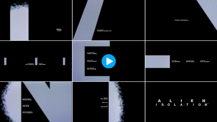
You might have seen the recent Alien: Isolation game that takes the look of Ridley Scott‘s version and goes to great lengths to emulate it. The Art of the Title website has an extensive feature on what went into creating the look and design of the game here with some fascinating info and behind the scenes stuff. Just the opening title sequence alone is worth a watch (above – click the image to be taken to the site).
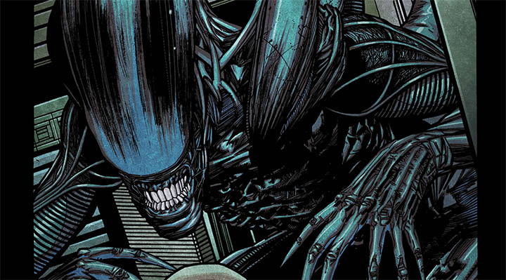
On the Alien: Isolation website there’s a whole host of Alien advent calendar goodies to get into, most pleasing to me being that you can now download parts of the comic that Henry Flint drew for the release around the time of SDCC. As well as that there are posters, concept art, game play tips and add-ons.
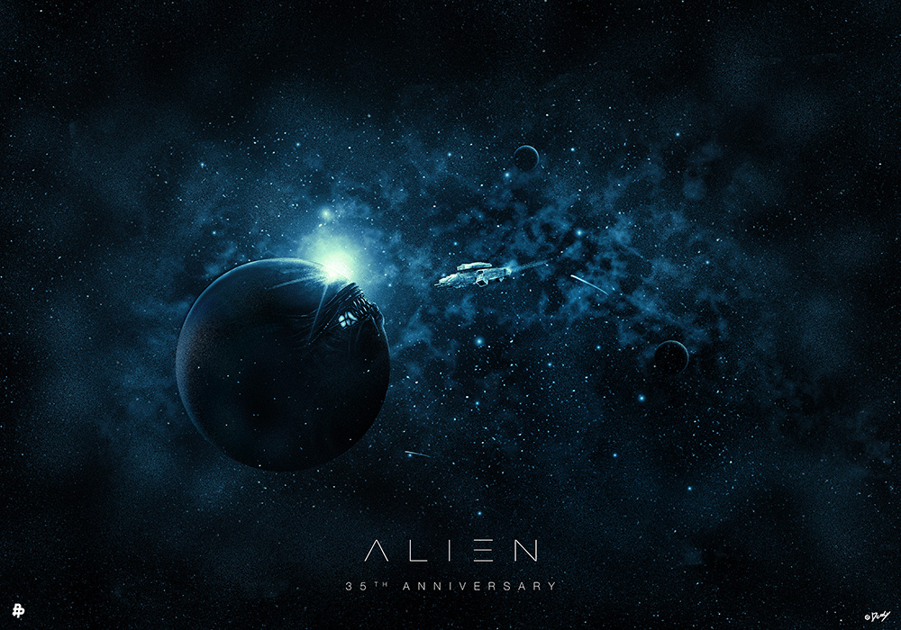
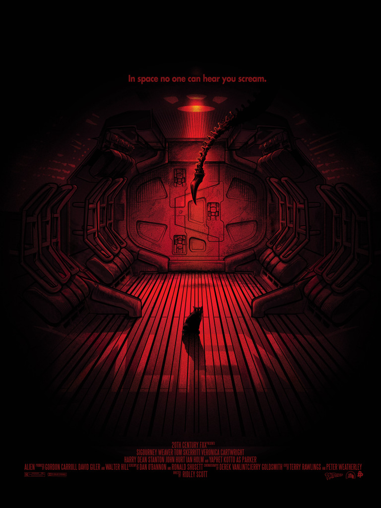
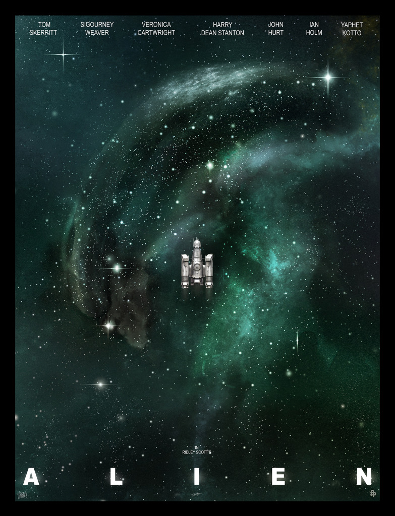
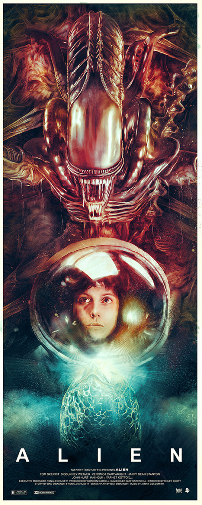
Poster posse have a great gallery of tribute posters to celebrate the 35th anniversary of the original and most, predictably, centre on the mood and tone of the debut. They’ve split the posters into three different phases and they can be viewed here PHASE 1 / PHASE 2 / PHASE 3.
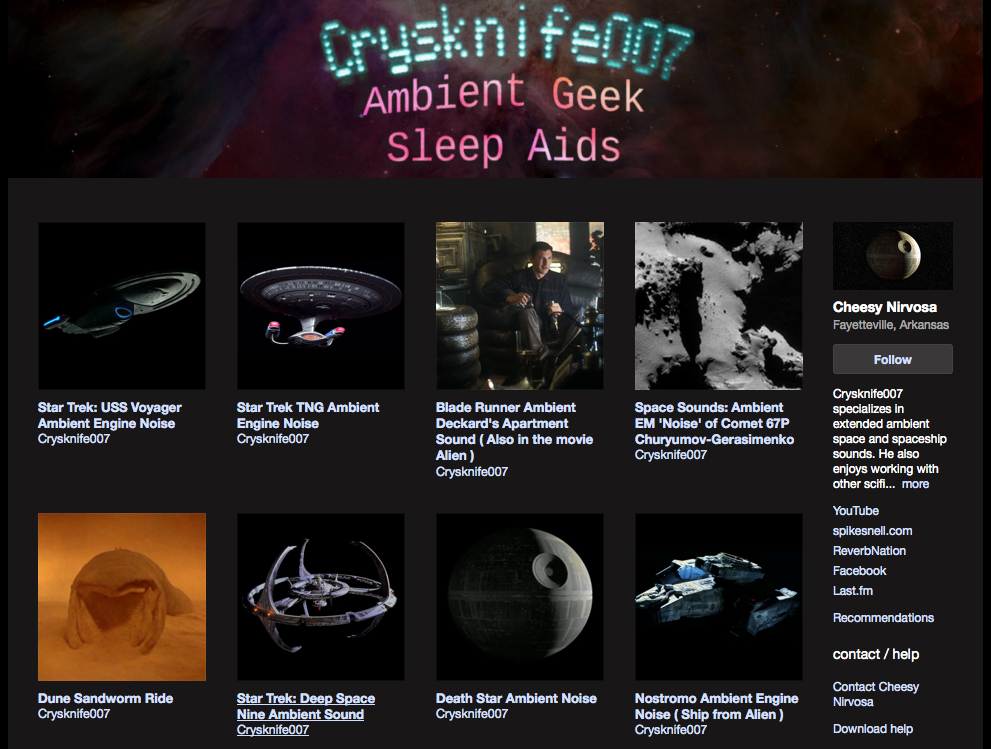
 If sound is your thing then Ambient Sleep Aids in the form of looped atmospherics and sound FX from Sci-Fi films are at your fingertips. Want to drift off to the sound of the Nostromo or the Death Star drifting through space? Someone called Crysknife007 has posted 20 minutes loops of just that.
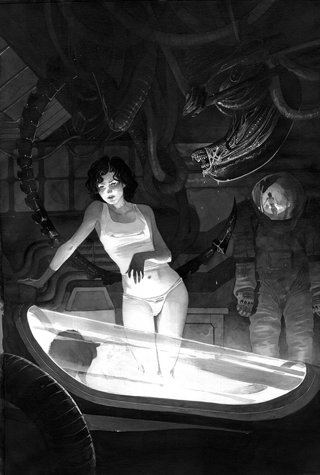
and there’s more… check out this gorgeous fan image by Lord Mishkin which reminds me of John Bolton‘s work. Just look at that light source casting shadows and the reflection in the helmet, beautifully realised. She must be really knackered not to have clocked the Alien hanging from the rafters though…
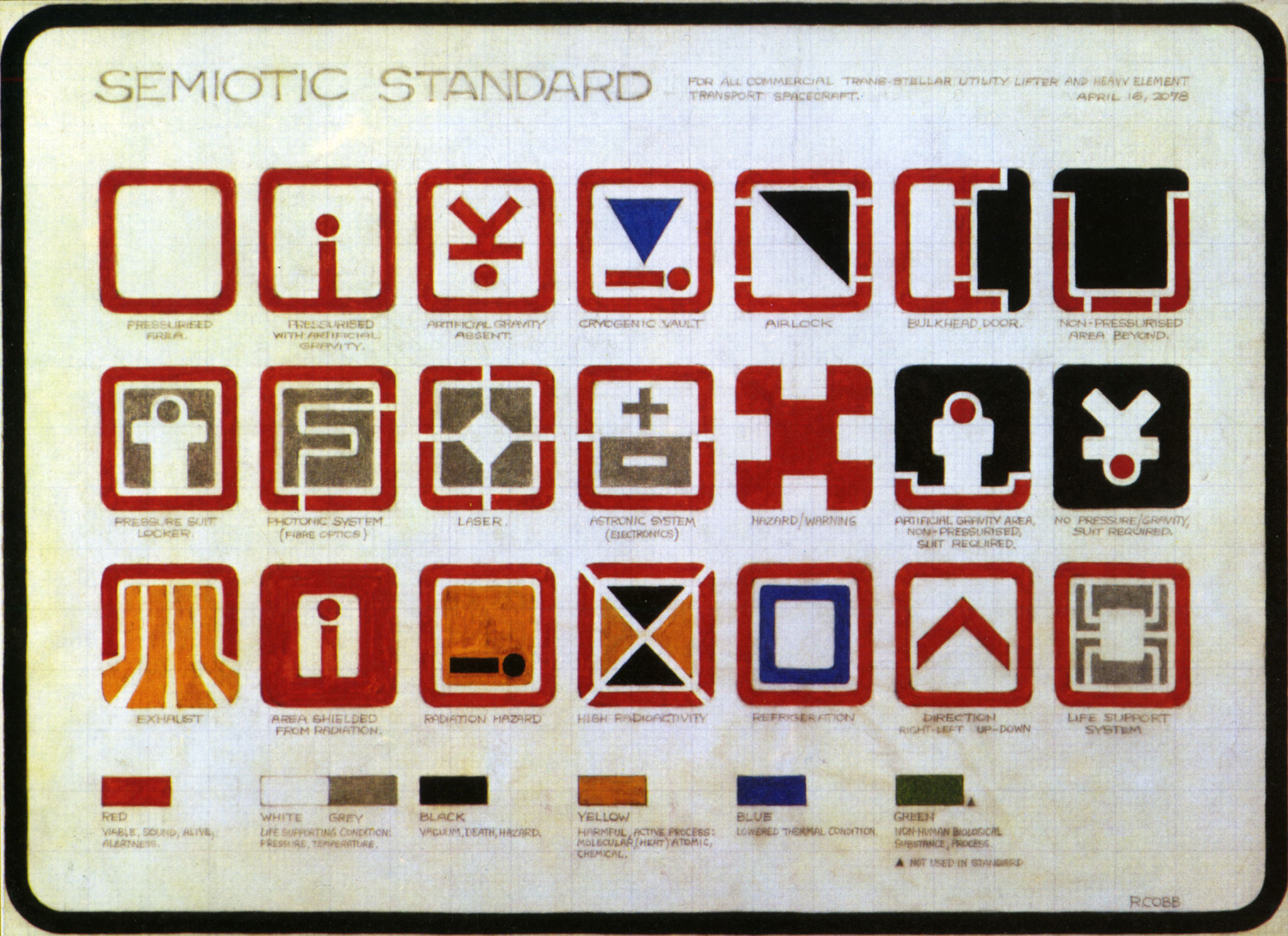
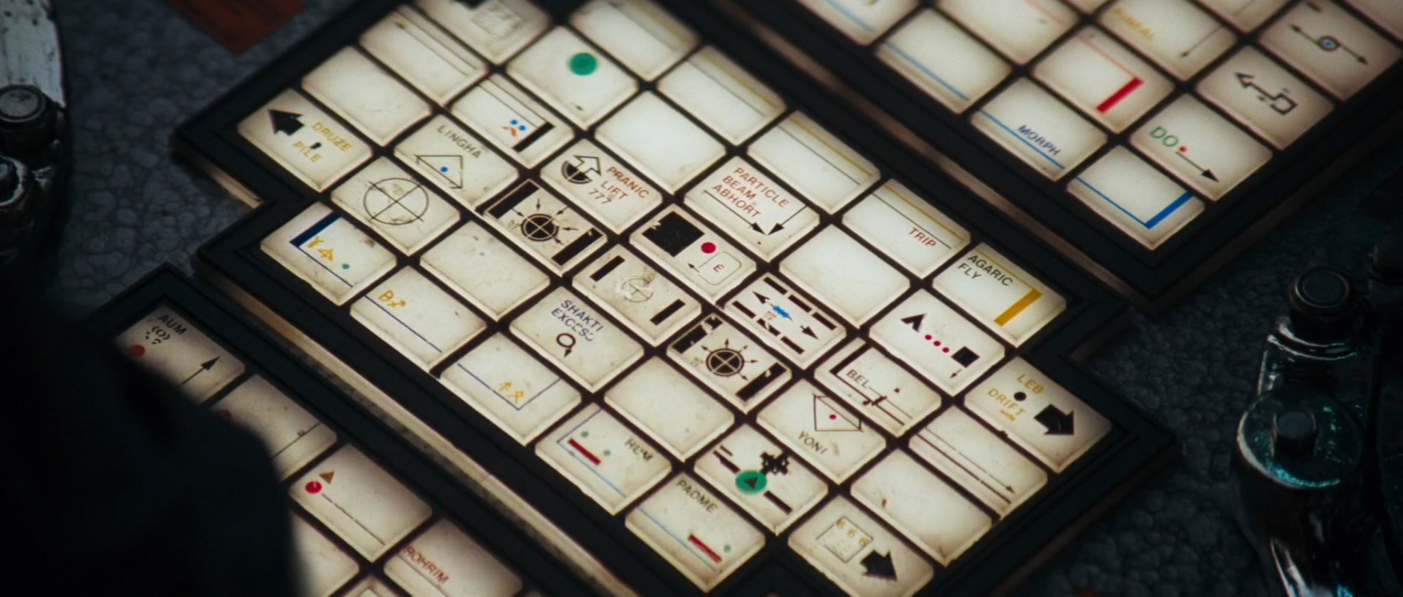
I’ve saved the best post for last, I hope you have some time on your hands because this one goes way deeper than most. Dave Addey‘s Typeset In The Future site has published a feature on the graphic design of ‘Alien’ after his exploration of the typography in ‘Moon’ and ‘2001’.
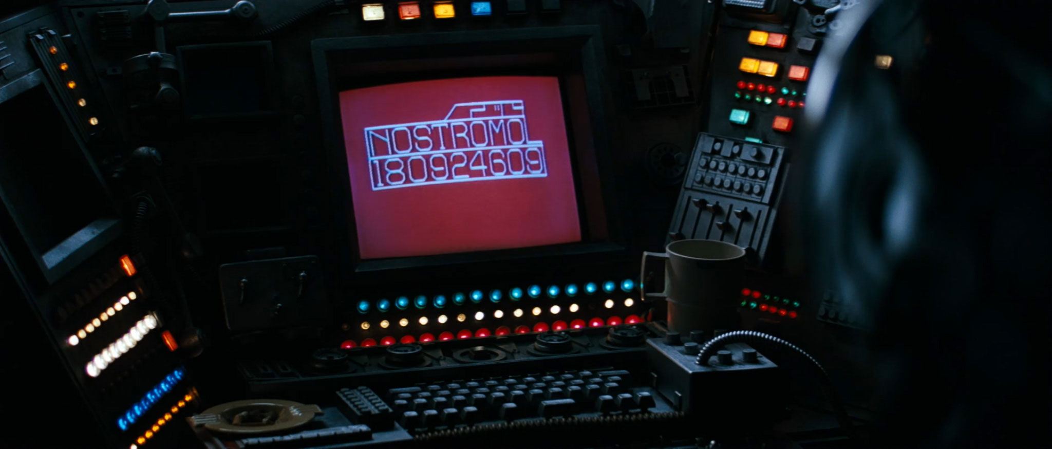
It’s beyond nerdy in all the best ways – going from the opening titles to signage and on screen read outs on board the Nostromo. Clothing insignia, food packaging, warning signs and even keyboard labeling is covered, the last of which reveals some telling details about what the designers were reading at the time.
You may have noticed that things are now a bit different, yes the new site is here but I’m still ironing out bugs in it.
Can you please post any bugs or things that are broken in the comments below? At the moment I’m finding scrolling in Firefox very slow and stutter-y compared to Safari. I can’t even see the site in Chrome but I have an old version that I’ve not updated on my main machine, let me know if the site is showing up.
I know that there are broken images and links in some posts but there’s 5 years worth to go through so if you chance upon some it would be appreciated if you could flag them up here and I’ll get on it. In the meanwhile, have a look around, the Discog section is now fully up to date, as is the Design section, with easier to navigate galleries and the whole site is responsive so it’ll do that neat reshuffling thing when you turn your tablet from portrait to landscape
Many thanks to David Hazell at Curious People Projects for rebuilding the whole site after a responsive one was suggested by original site builder Dean Ricca-Smith at Chalk.
From ‘Adam Buxton’s Shed Of Christmas’ – a conversation between Adam and his 5 year old daughter about Jabba The Hutt‘s fashion ideas. Can’t argue with that logic.
Animation by The Brothers McLeod / Twitter: @BROTHERSMCLEOD
![]()
The original short, ‘Pixels’ by Patrick Jean (below), has now been made into a full length film. Here are some of the new posters posted online recently.
![]()
![]()

ODY-C is a new sci-fi take on The Odyssey, turning the myth on its head by reversing the roles so that almost all the characters are female. For me it was hard going, obviously taking cues from Prophet‘s galaxy-wide palette but not exactly easy to get into with the prose style being what it is.


Great artwork but ridiculous 8 panel foldout opening pages with baffling preamble that almost put me off. The main thing that will be interesting is that, aside from two male characters, it’s totally female-centric and that’s refreshing. It’s beautiful to look at but will that be enough to sustain it? Writer Matt Fraction is unknown to me but he seems to have written a ton of the main characters for a lot of the major publishers as well as winning a fair few awards.

Speaking of Prophet, there have been two interim ‘Strike Files’ that fill in characters and back story for those just getting into it. The next arc – Earth War – begins Dec 24th and this is still one of the most intelligent, forward thinking sci-fi comics out there. Here’s a self-contained page from ‘Strike File 2’.


Another amazing-looking comic that reads badly is the MadMan ‘In Your Face 3D special’ which, despite having some of the best 3D I’ve ever seen in a comic, is dull as dishwater. The first half of the comic mainly consists of Madman and Mister Excitement running through all manner of alternate realities featuring versions of themselves as just about every comic character you can think of. Many are rendered in the style of the originals with some excellent stylistic observations but it’s just page after page of tedious dialogue.
Later on he spends 14 double page spreads battling flying snake-like beings whilst engaging in the kind of conversation you’d normally associate with a few jars down the pub. The depth of the imagery is great and the wormy beings are perfect to convey this but it’s repetitive and dull to read. Better are the 20 odd pin-up pages that form a large chunk of the end of the book, drawn by guest artists that play with the medium to varying degrees of success.
But what do I know? I’ve never read Madman in my life and am probably missing all sorts of clever plot points and character development, looks great but wasn’t for me. UPDATE: Actually there was a nice little story at the back of the book which dealt with creative plagiarism where the villain ripping off Madman’s look was called Vatchah Gondu – nice touch. It strikes me though that the 3D treatment would be better served on something like the current run of Sandman and would be perfect fodder to play with the inter-dimensional themes of the character.

 Love this design and look at that line up.
 Distilled from over 100 tracks made over the last 14 years, Trevor Jackson has teamed up with The Vinyl Factory to release a version of his next album as 12 different formats.
A version including 12″, 10” and 7” vinyl, CD, Mini CD, Cassette, USB, VHS, Mini Disc, DAT, 8-track and Reel-to-Reel will be available in February with standard vinyl and digital editions to follow. No idea on price yet but more info is here.
 The latest album from Jon Brooks under his The Advisory Circle guise is his best yet. I feel confident in saying this, not only because it’s already received universal praise from others but because there’s something in ‘From Out Here’ that goes further than before. There’s a deeper sense of menace than previous, lighter, works, as well as that ‘remembered nostalgia’ feeling that you really have heard some of these songs before. As with Boards of Canada‘s best, relying more on the familiarity of sound textures than samples, Brooks transports us back to an unspecific time somewhere between the mid 60’s and the late 70’s.
Take a track like ‘Escape Lane’ for example; the opening motif recalling classic Carpenter / Howarth before the main chiming keyboard riff instantly evokes a forgotten library cue from a BBC schools play or educational programme. The kind of track that would be labelled “light, breezy, synthetic, optimistic… ‘ on the back of any library LP description. So far, so good, this is then followed by a much subtler, darker piece that recalls some of David Sylvian‘s soundscapes before swinging back into another light synth line, this time accompanied by acoustic guitar and piano. Then things get weird as we eavesdrop of a recording of someone sending a message back to a loved one, repeatedly referred to in a slightly stilted way as, “…darling”. It’s here that the phrase ‘from out here’ is uttered and presumably what inspired the album title. Further spoken word pieces appear; a disembodied voice intoning ‘pushing, pushing, pushing and purring’ and ‘2, 5, 9’ in a mix of Twin Peaks meets number station menace.

There are shades of old world nostalgia similar to Kraftwerk‘s ‘Radio Activity’ on tracks like ‘Experiment!’ with synthesized machines blowing steam and pumping pistons in the background. It continues on side 2 as Brooks conjurers themes from the kind of TV programmes that would start just as it was time for bed, the opening strains of which would be all you’d hear as you were ushered out of the living room and up the stairs, wondering what they could contain that wasn’t fit for children’s eyes. It’s also a distinctly British sound and approach, from the sonic tones to the accents of the spoken passages and nowhere near as dark as Jeremy Schmidt‘s similarly-themed ‘Beyond The Black Rainbow’ which piled on the horror.
Julian House‘s artwork has now moved to a point where he has defined a good portion of the visual stimulus associated with the Hauntological genre and his cover doesn’t shy away from including as many as possible. On receiving the LP my wife remarked, “oh is there a record of that book?” (referring to ‘Discovering Scarfolk’ by Richard Littler), so strong are the associated connections now. And make no mistake, that’s no bad thing, this is a perfect example of Hauntology right down to the sci-fi concept of patient experimentation and computer-generated society. All this is helped by track titles like ‘Discipline Before Data’, ‘Jessica Finds The Beach’ and references to ‘Triadex’ (a Triadex Muse was an old 70’s sequencer-based synthesizer) set in the old Monotype ‘Computer’ font.

It’s hard to pick a favourite track as they all work to form a larger picture, a complete work that’s all any composer could wish for in an age where albums are cherry-picked into a distilled form of ‘highlights’. Brooks has been on a roll this year with the highly personal ’52’ album on Clay Pipe Music, mastering work, mixes and a collaboration with Sean O’Hagan on the Other Voices series for Ghost Box. ‘From Out Here’ is my favourite though as it embodies everything I love about the label and it’ll be interesting to see where he takes things next. You can buy it direct from the label here and, although vinyl is my preferred format for all GB releases, the CD and DL have 3 extra tracks so I might have to get a second copy.
The Advisory Circle present ‘Winter From Out Here’ by Cafekaput on Mixcloud


A couple of big design-related things happened this week – I’ve now finessed a site for the best of my design work over the last 20 years under the Openmind alias. You can check it out at www.openmindesign.uk – it’s not exhaustive and doesn’t contains all the extra info I provide in the design section of this site (look, it’s up there ^) but it offers a quick overview of some of the things I’ve done. Who knows, maybe you might even want my design work to grace your own objects?
Speaking of this site, it’s been undergoing a redesign, spring clean and update over the last few months as well as being made responsive so as to work better on mobiles, tablets and desktops. This has all been happening on a server elsewhere but should go live before Xmas. Don’t worry, everything will still be here (mostly) in the same place, it will just be easier to use, view and the Design and Discog sections will be fully up to date. It’s been 5 years since this version debuted and it’s never had an overhaul save for a couple of back end updates.
The other big design thing is the first part of an interview about the making of the Frankie Goes To Hollywood ‘Inside The Pleasuredome’ box set over on the Super Deluxe Editon website. Curator Ian Peel, co-designer Philip Marshall, Steve Bunyan from Union Sq Music and myself all discuss aspects of the thinking and approach to making the set with part two set to appear next week…


Punks The Comic #3 arrived this week and has generated a little bit of a fuss in some stores over the inclusion of Fist flipping the bird on the cover. There was meant to be a censored version (see right, above) but this got lost somehow at the printing stage so Kody Chamberlain (the artist) thought he’d have fun with the occasion and has made a censorship kit.


 After the last piss poor Lucas ‘directed’ trilogy I was actively indifferent about any kind of sequel but JJ Abrams is just pushing all the right buttons, hard not to be sucked in. I feel like I’m 7 years old again. More info here, expect to see more over the coming year…


Just in time for Xmas Vicki Bennett aka People Like Us has release an extremely limited edition 8″ postcard record featuring her track ‘Dreaming’ which samples from various versions of ‘White Christmas’. The words slowly change in tone, especially when watched with the accompanying video (see link >>). You can buy a copy here, not cheap but these are all hand cut individually on a lathe somewhere in Sweden. Having made a postcard record myself I know that it’s a whole lot cheaper than buying a machine and making my own.


Wanderers – a short film by Erik Wernquist from Erik Wernquist on Vimeo.
Absolutely wonderful vision of future space exploration by digital FX artist Erik Wernquist with a voice over by Carl Sagan
Oh, My. God!

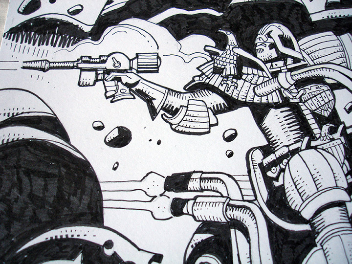
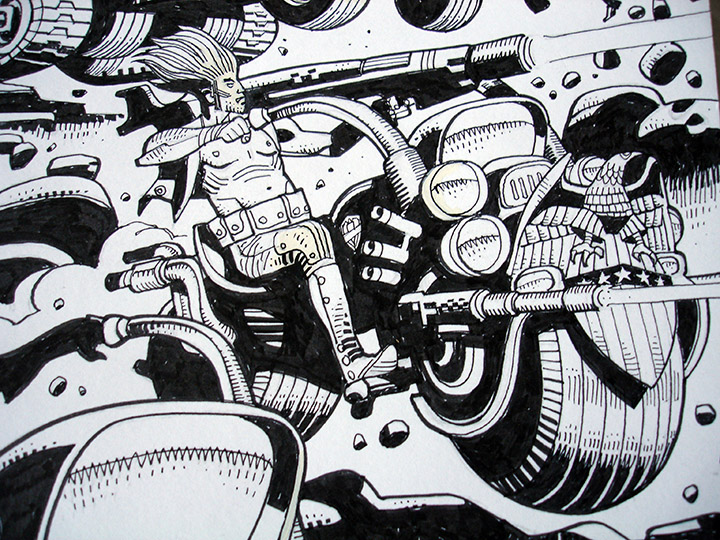
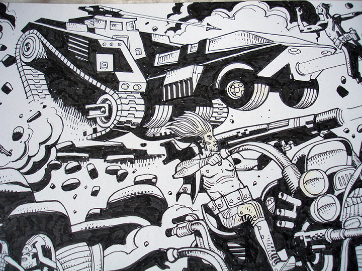
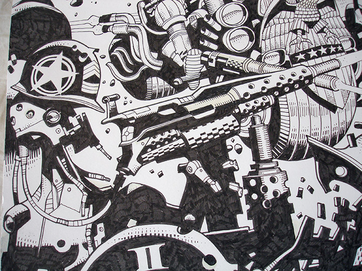
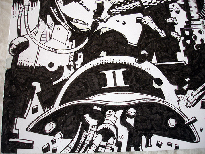
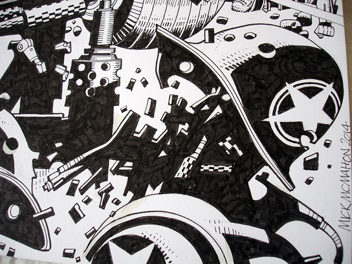
Mike McMahon – ‘Dredd & Spikes in The Cursed Earth’, private commission, 2014
(420 x 297 mm, black ink on paper).

Saw an early UK preview of this today with the kids (it’s been out in the US for a while though). Really good family fun with enough for the adult child in you as well. Lovely design on the main character and some fun fish-out-of-water moments as he gets acclimatised to the outside world.

My good friend Ollie Teeba (The Herbaliser / Soundsci) is featured over on Dust & Grooves this week with a peek into his collection and a revealing interview about his upbringing and early record purchases.

There’s also a nice little 45 minute selection of tunes from the collection too.


