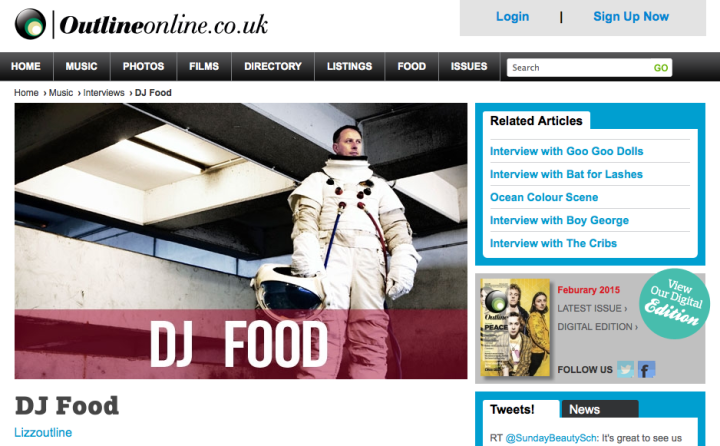
Two features I took part in recently went online: a 12 track playlist (although only 10 feature as 2 aren’t released yet) for the Inna Di Mood website and a short interview with some good questions for OutlineOnline ahead of my gig at the Norwich Arts Centre at the end of the month.
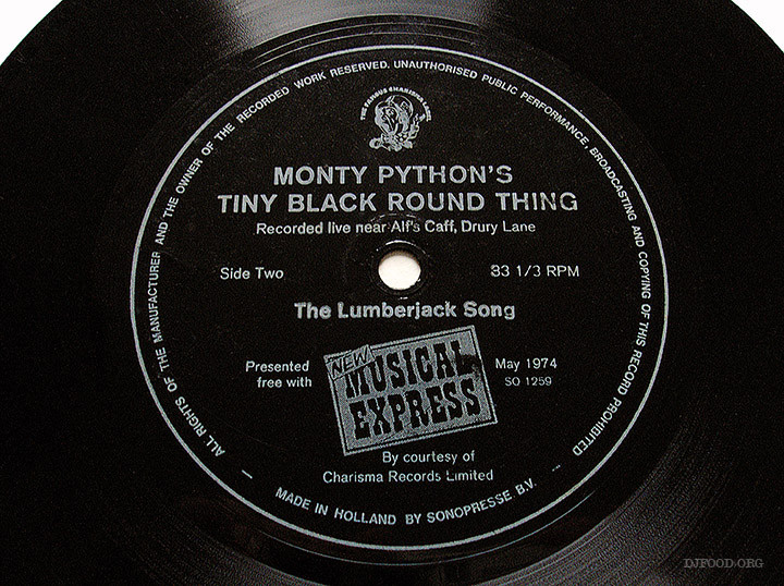
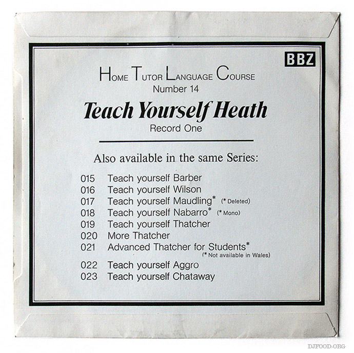
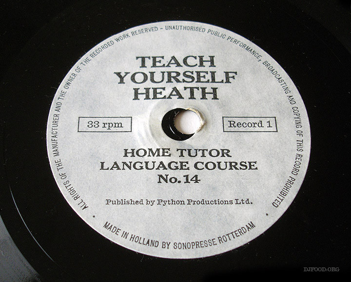
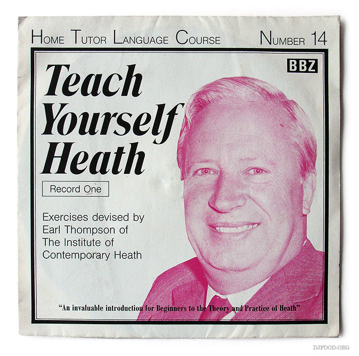 As flexis go neither of these are especially rare, certainly not the ‘Tiny Black Round Thing’ which I discovered I had several copies of when going through my collection. ‘Teach Yourself Heath’ is actually quite good though, being a piss take of the former PM Edward Heath by an uncredited Eric Idle and Michael Palin from the Pythons. It was originally given away inside copies of the 1972 ‘Monty Python’s Previous Record’ album, an issue of Zig Zag (#27) and possibly Format magazine.
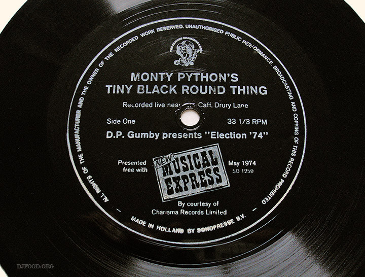
‘Monty Python’s Tiny Black Round Thing’ was given away with a May 1975 copy of The NME to promote the group’s ‘Live at Drury Lane’ LP. Palin hams it up as a radio announcer talking about the flexi’s merits and Gumby makes an appearance as the NME’s editor. The B-side is ‘The Lumberjack Song’ which I’m sure you’ve all heard way too many times already.
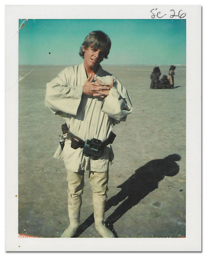
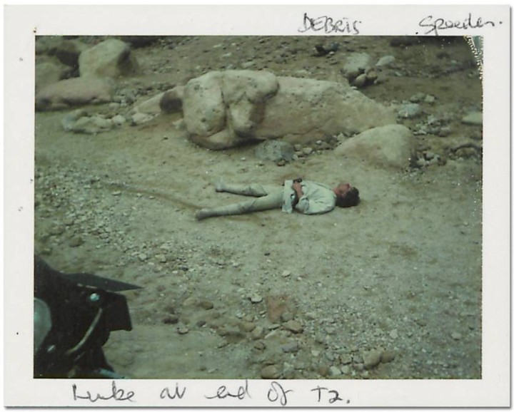
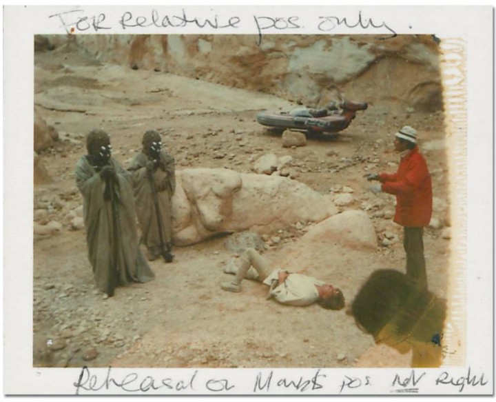
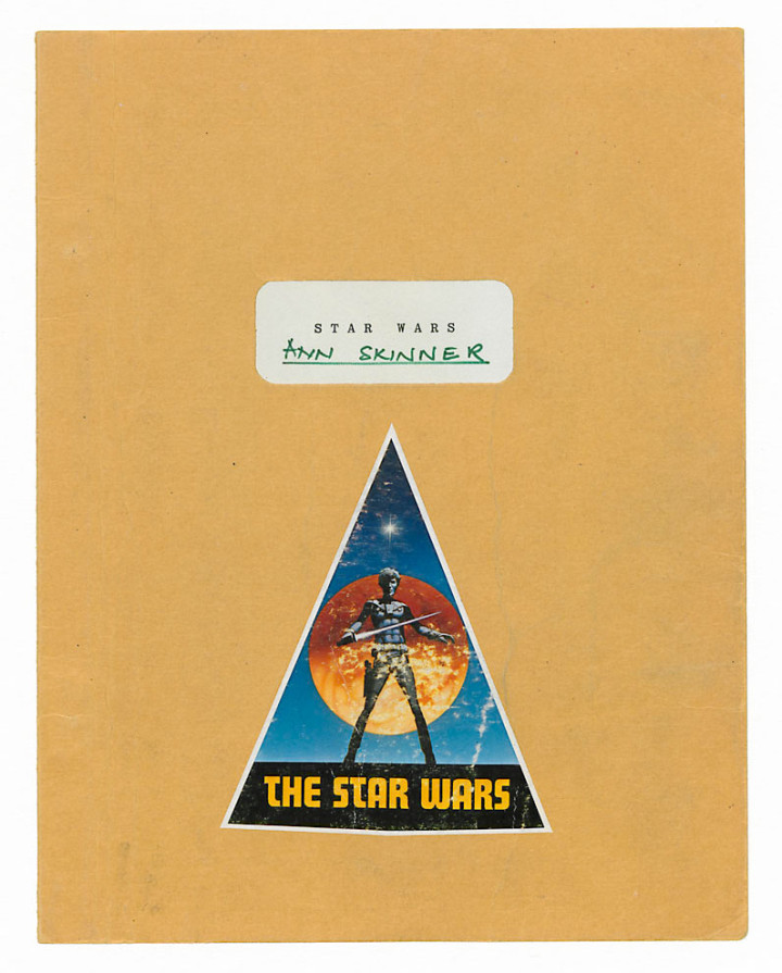
There’s going to be lots of Star Wars activity this year isn’t there? These polaroids are from the collection of continuity expert Ann Skinner who was on set for Star Wars: A New Hope (as it’s now known). They are on display in London as part of BFI’s sci-fi season, Days of Fear and Wonder, in the Southbank’s atrium until Jan 4th, 2015. 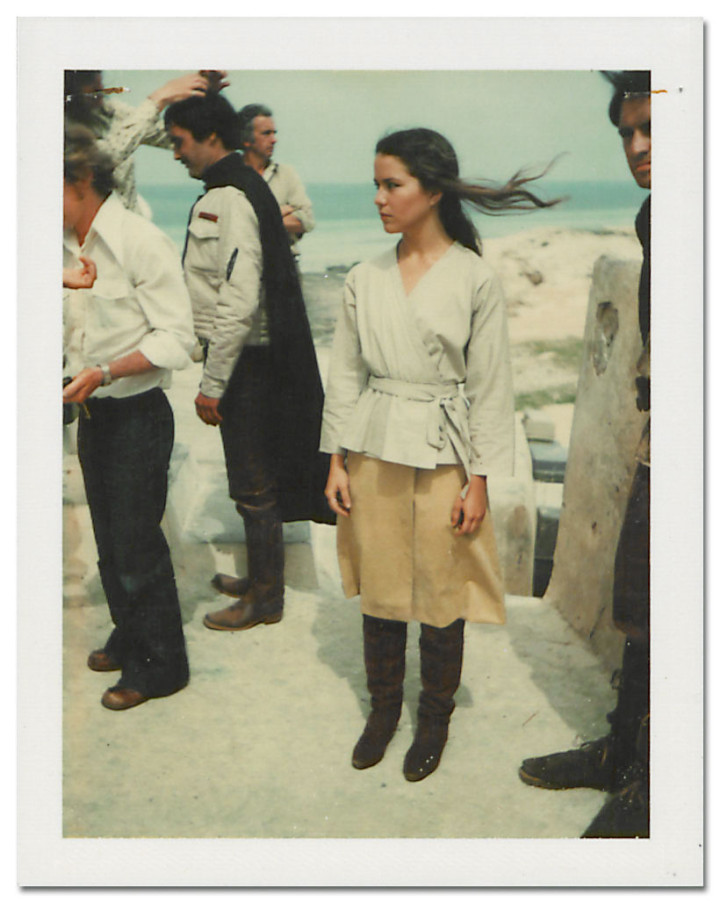
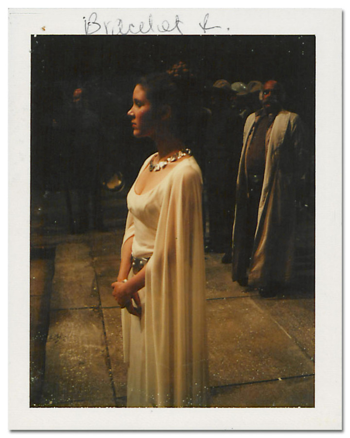
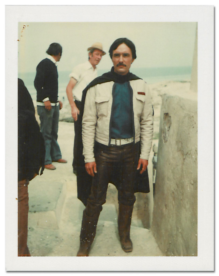


Another day, another legend gone, RIP Demis
a sped up Demis features on Vangelis‘ classic Blade Runner score too
So, say for instance, you’ve heard of Judge Dredd, maybe you saw the Dredd film on DVD a year or so ago, you’ve read the odd graphic novel or seen high praise for certain stories kicking around the internet? Maybe you’ve read a few from the Top Ten Essential Dredd epics lists that periodically do the rounds on the web but want more? Where do you start with 38 years worth of stories, characters and continuity? Here is where, The Mega Collection: a fortnightly series of hardback story collections of the essential must-read tales spanning 80+ volumes (I read somewhere but can’t find now).
Starting with the classic tale of ‘America’ written by Dredd co-creator John Wagner and painted by Colin MacNeil at the incentive-inducing price of £1.99 it’s a no-brainer of a purchase if you’ve never read it. I can confirm that it’s a bonafide classic all right, centering around the subject of ‘democracy’ in Dredd’s world although it’s an odd choice to start the collection with. Maybe it sets the tone more than anything else and is a hard-hitting jump into how the Judges meter out ‘justice’ in the future?.
After the first issue the price jumps up to £9.99 per issue but there are subscriptions available with all sorts of free gifts and a free issue as well. Another incentive is that the complete collection will display this scene across the spines once finished. If you’re still not convinced then here’s a review of the first issue from the Everything Comes Back To 2000AD blog. This post reads back a bit like an advert unfortunately but it’s a perfect jumping in point and, for the same price of a vinyl 12″, a hardback collection every two weeks is a very good deal indeed.
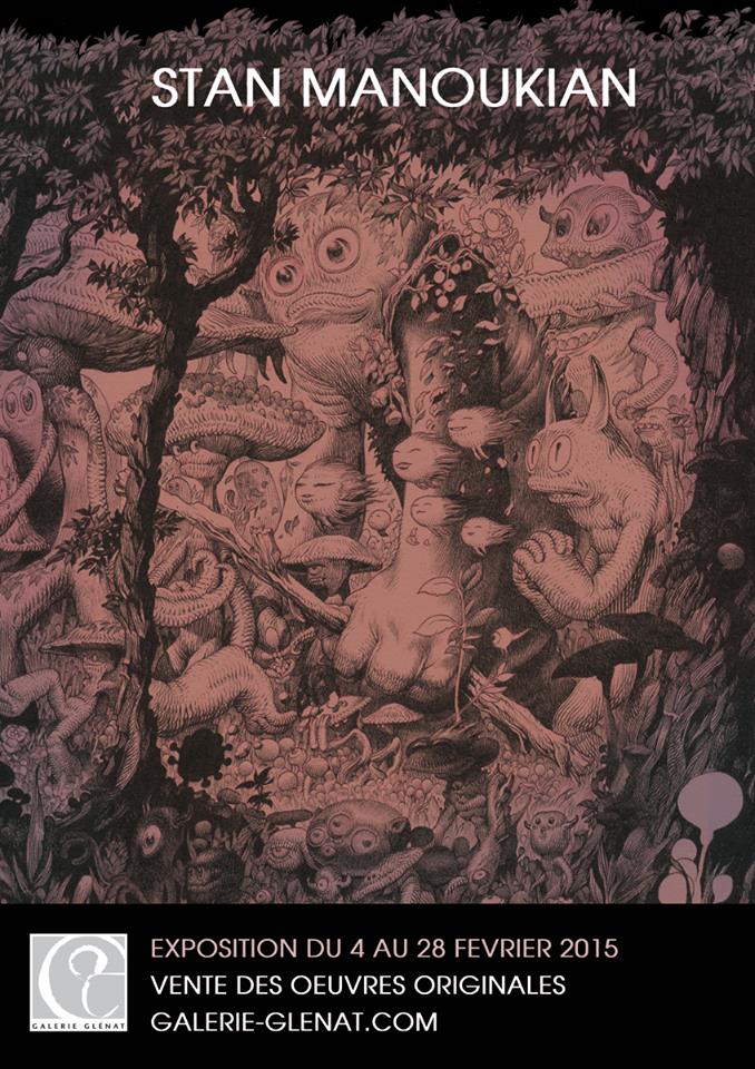
Just saw Stan Manoukian (of Stan & Vince fame) is having a show in Paris next month. Inspiring, I must start drawing again…
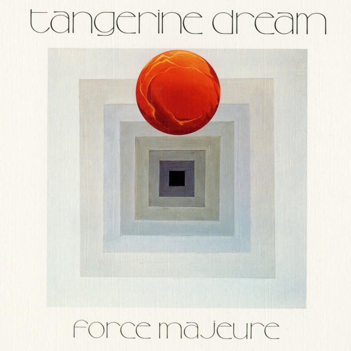
I’ll never forget hearing this track on a tape at school aged 13 or 14. Nick Canning played it to me, swearing blind that his uncle made it and that it was called ‘Flight Through Metamorphic Rocks’. I loved it and only later found out who really made it and the actual title (the track before is called ‘Cloudburst Flight’).
Funnily enough, the tape started the track at about the same place, the first half of the song is pretty average but then it breaks down and comes back with this pre-techno monster, not bad for 1979.
Of course, come the early 90’s and the resurgence of ambient music I was hoovering up LPs like the classic ‘Phaedra’, ‘Zeit’ and ‘Stratosfear’, even ‘Electronic Meditation’ but I lost track around the mid 80’s soundtrack period. And then there was this album where the truth was revealed… RIP Edgar
It’s been a while but here’s my first mix for 2015 and Solid Steel and it’s a second installment of ‘Magpie Music’, the name for mixes where I generally group the more psychedelic, fuzzed up, heavy beat productions I like. If it’s got a live band feel then it’ll probably be in one of these mixes for the moment but they can also include rawer, sample-led Hip Hop and Trip Hop cuts. My other series – Future Shock – is reserved for more electronic, sci-fi synth and soundtrack work although there’s always room for cross over.
I’ve decided to split music into there two camps for the foreseeable future as I find they focus the mixes more and make for a better overall listen rather than lumping the two together. There will of course be other themed mixes coming your way (I must get round to KKK9, The Lynch Party pt.2 and the Duck Rock audio documentary one day). Oh, and there’s the Alphabet Series too which comes and goes when it feels like it of which the mythical lost Sesame Street compilation is part of.
Anyway, this mix features some of my favourite songs from 2014, certainly from the second half of the year anyway. Plenty of The Heliocentrics, Jane Weaver, Temples and Ghost of a Sabre Tooth Tiger whose albums I adored and still do. I’m finishing up the second Future Shock mix right now so hopefully that should be along sometime next month too.
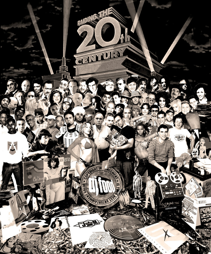 A decade ago this week (I think it was a Monday or Tuesday) I debuted the expanded ‘Words & Music’ version of ‘Raiding The 20th Century’, this time lengthened to an hour and featuring specially recorded voice overs from Paul Morley. It was an attempt to chronicle a fragmented history of sampling from the advent of music concrete through to tape cut ups, sampling and finally the Bastard Pop/Mash Up phenomenon at the turn of the century.
Paul’s inclusion was through his book, ‘Words & Music’ that I’d read shortly after completing the first 40 minute version of ‘Raiding…’ the year before. The two mirrored each other so closely in places that the opportunity to revisit and revise was too good to pass up. Also the fact that I’d cribbed the title from a piece of text Paul had written nearly 20 years before didn’t go unnoticed, sometimes there are too many coincidences to ignore.
Since then it’s had a cease and desist take down notice from EMI and an attempt made at a video version but still, through the miracle of the internet, it endures. Here’s a collage that I started back at the beginning of 2006 and finally finished this morning, based on the Sgt. Peppers cover, of Paul and I alongside Alvin Lucier and Kylie, surrounded by some of the cast of thousands that make up the recording.
You can still listen to the mix here via UbuWeb but it’s out there in all sorts of corners of the internet.
The first track from Matt Johnson‘s soundtrack to his brother Gerard’s film ‘Hyena’ has been previewed over on the Quietus. The score is out in March on CD in hardback book packaging via Matt’s Cineola label and vinyl via Death Waltz.

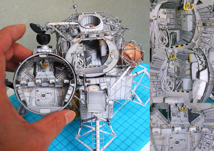
An expert in paper craft from Japan called (I think) uhu02 has made these incredibly detailed ships, droids and weapons from classic sci-fi and fantasy films. His/her uhu02 Paper Craft site “It is a production diary of precision Paper Craft (model) with a focus on items that appeared in the movie” has detailed photos and even downloadable plans to make them. Don’t think this is an easy few hours cutting, folding and gluing though, it’ll take you that long to get through his site.


There’s is so much to see, the detail on the Lunar Lander is just insane and what’s most impressive is the scale, most of the ships you can easily hold in one hand.
Original link from Sploid via the excellent Ian McQue
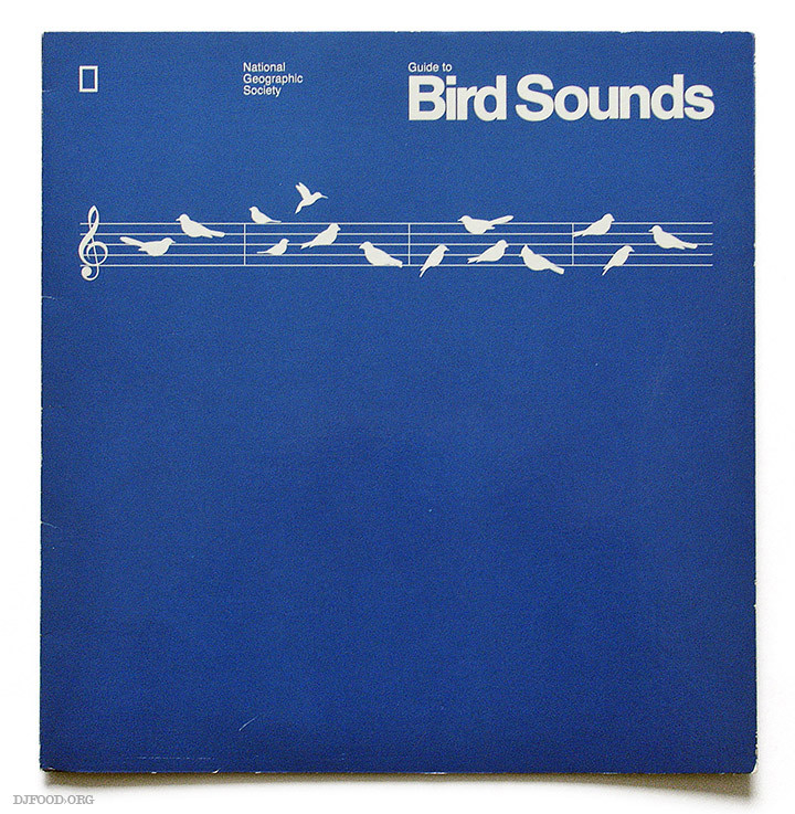
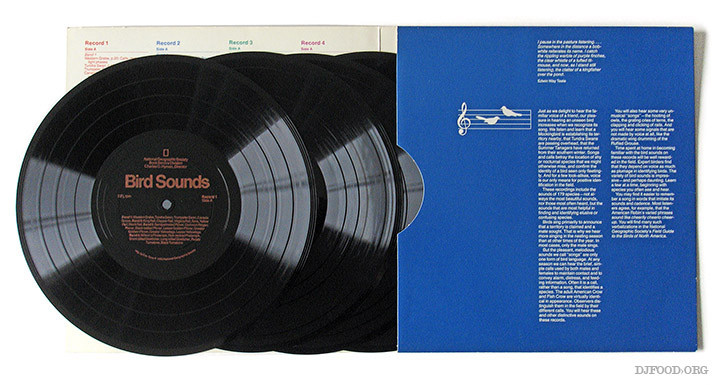
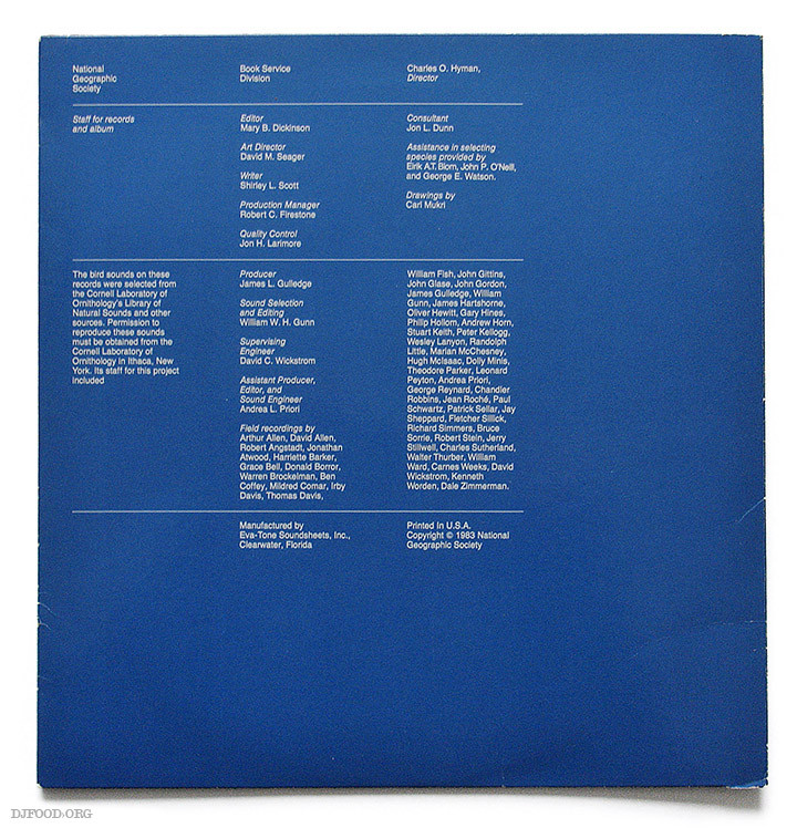
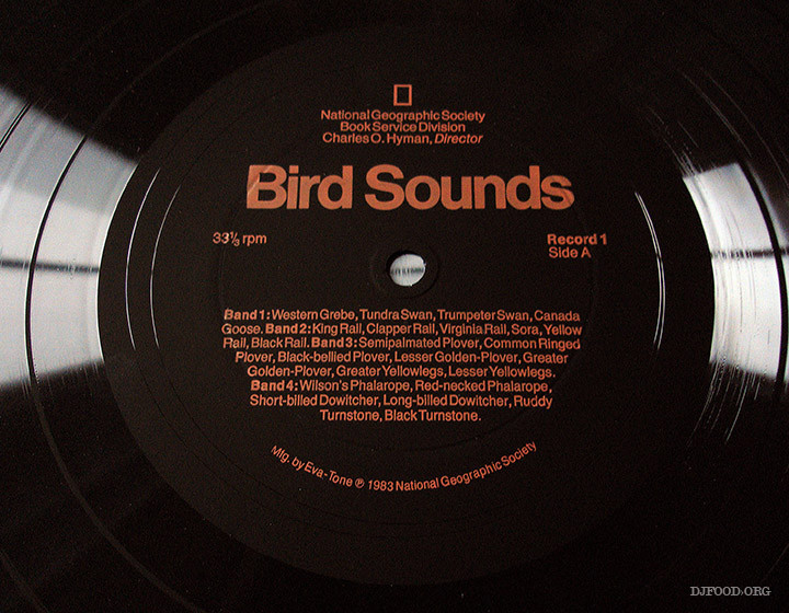
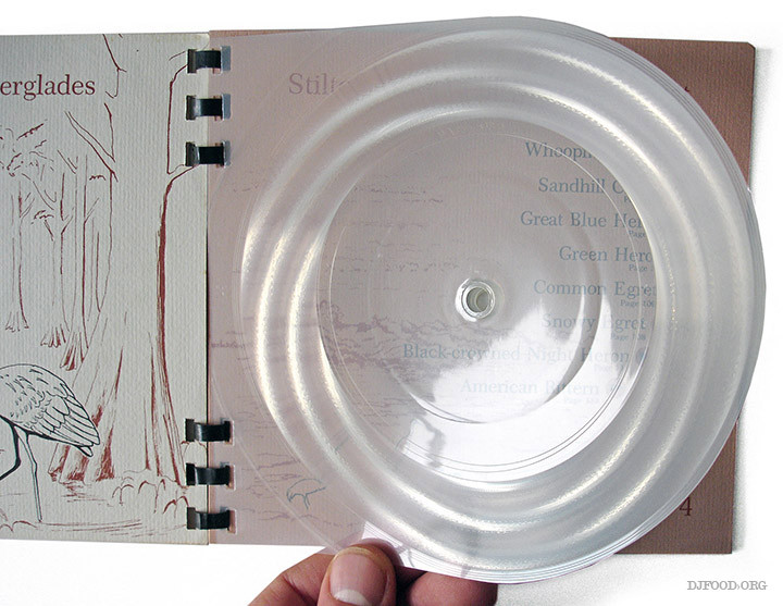
Who ever knew Bird Sounds would be such a big deal on flexi disc? Here we have two different releases filed under the same heading: a 4 disc 9″ set from the National Geographic Society and a tiny 6.5″ x 6.5″ book with six transparent discs held inside, again published by NGS in association with the Cornell Laboratory of Ornithology in New York. Not being any kind of expert on Bird Sounds I confess I bought both of these for their packaging more than the contents held in the grooves although I did give them a listen. I swear that I heard the bird sample that Boards of Canada used on ‘Happy Cycling’ on the 1983-released ‘Guide To’ set. There’s no audio on the web that I can find but it does have an entry on Discogs where someone has actually taken the trouble to type out the extensive tracklist so you can see what you’re missing.
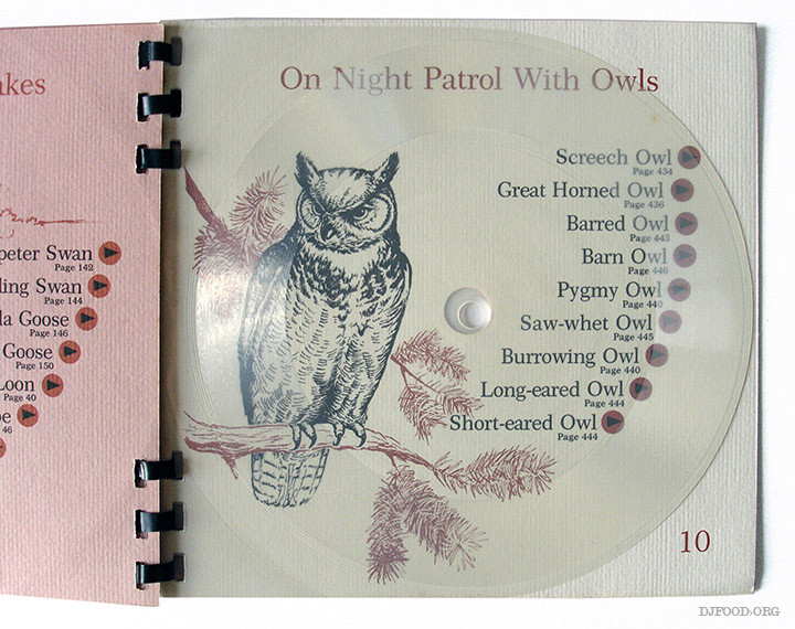
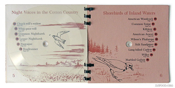
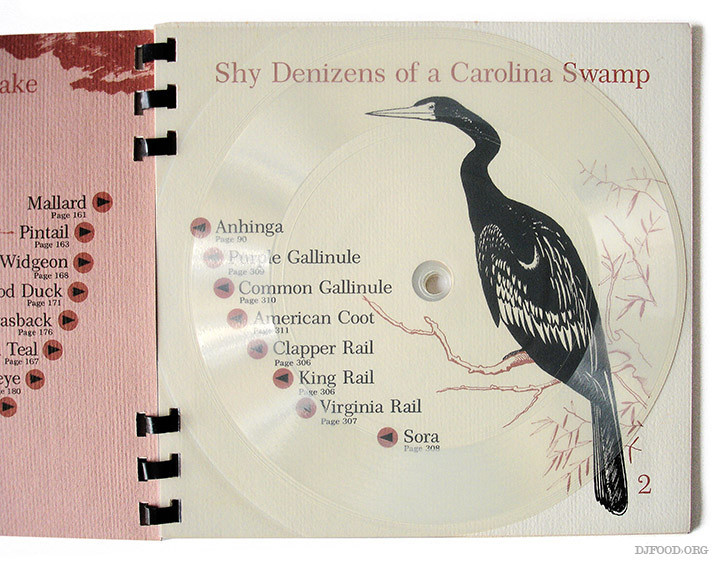
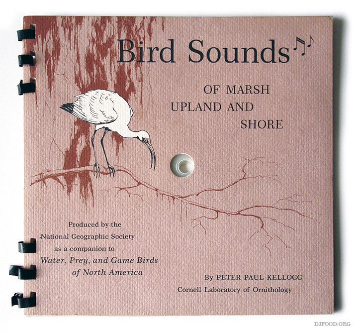 This beautiful ‘singing’ book from 1965 is illustrated by wildlife artist Ron Jenkins and you have to fold back the pages and place the whole thing on the turntable to play the discs – not the last time we’ll see such an practice either as there’s a months worth of audio books coming up later in the year. Again, no audio but there are copies on Am*z*n, Abebooks and more.
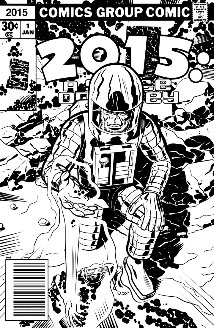
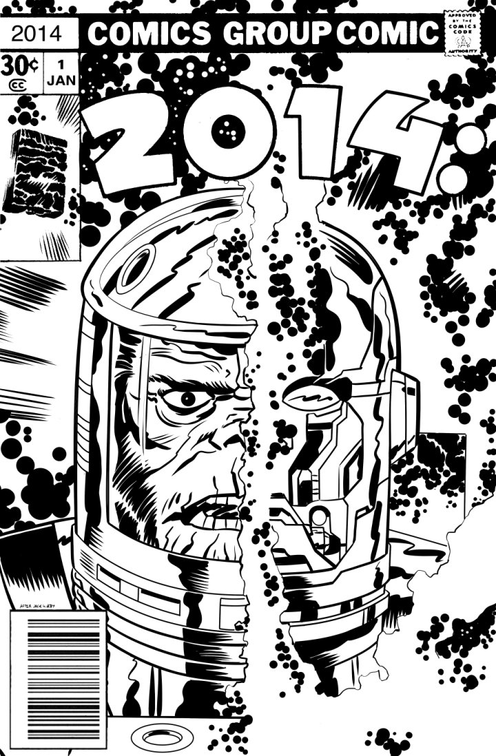
If you read this blog regularly you may remember that around New Year Edmund Bagwell does an annual ‘cover’ to mark the date in the style of the old Jack Kirby 2001 comics. I checked his blog earlier this year to see if he’d uploaded one but nothing doing. Then today the 2015 one popped up in my Twitter feed and checking back through my posts I realised that I hadn’t posted 2014’s cover either. So here they are although the 2015 one is very low res unfortunately. UPDATE: Edmund just sent me a hi quality version – thanks! 
This looks very interesting indeed, Kraftwerk‘s classic ‘Radio- Activity’ revisited and re-imagined by Matthew Bourne (The Leaf Label) and Franck Vigroux on sound and Antoine Schmitt on vision under the name Radioland. There’s a small UK Tour lined up for March – full details here.
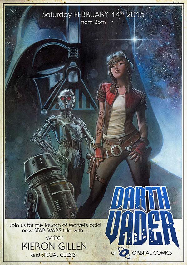
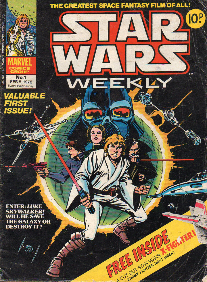
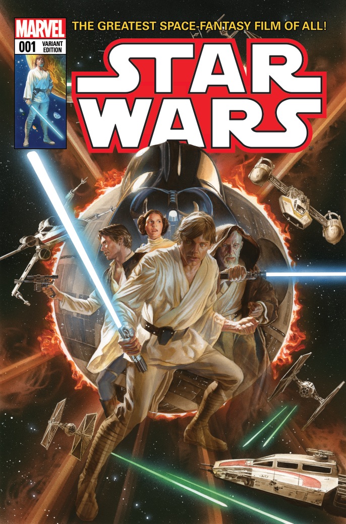 Because Disney now own Star Wars as well as Marvel they are relaunching the monthly titles previously published by Dark Horse in 2015 in anticipation for the new film in December. They’ve gone a bit over the top on the variant covers for this one – around 30 different ones apparently – here are some of my favourites starting with Alex Ross‘ version of the first ever Star Wars comic cover in his own style, very clever. Check the slightly less snooty depiction of Leia
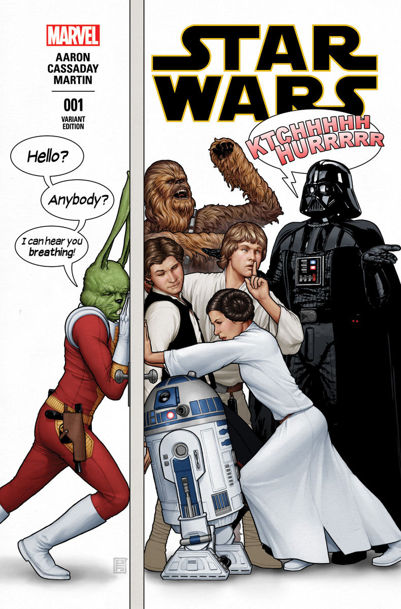 This one by John Tyler Christopher both hints back to the original post-film tales of the original comic (yes there used to be a green humanoid rabbit as part of the cast at one point) and also tips a nod to those old Mad magazine covers of the 80’s.
 More retro love with this version – again by John Tyler Christopher – in the style of the old toy packaging, I wonder if there’ll be a monthly variant with a different character each time?
 This Skottie Young image comprises three titles: Princess Leia, Star Wars and Darth Vader, that join to form one panorama.
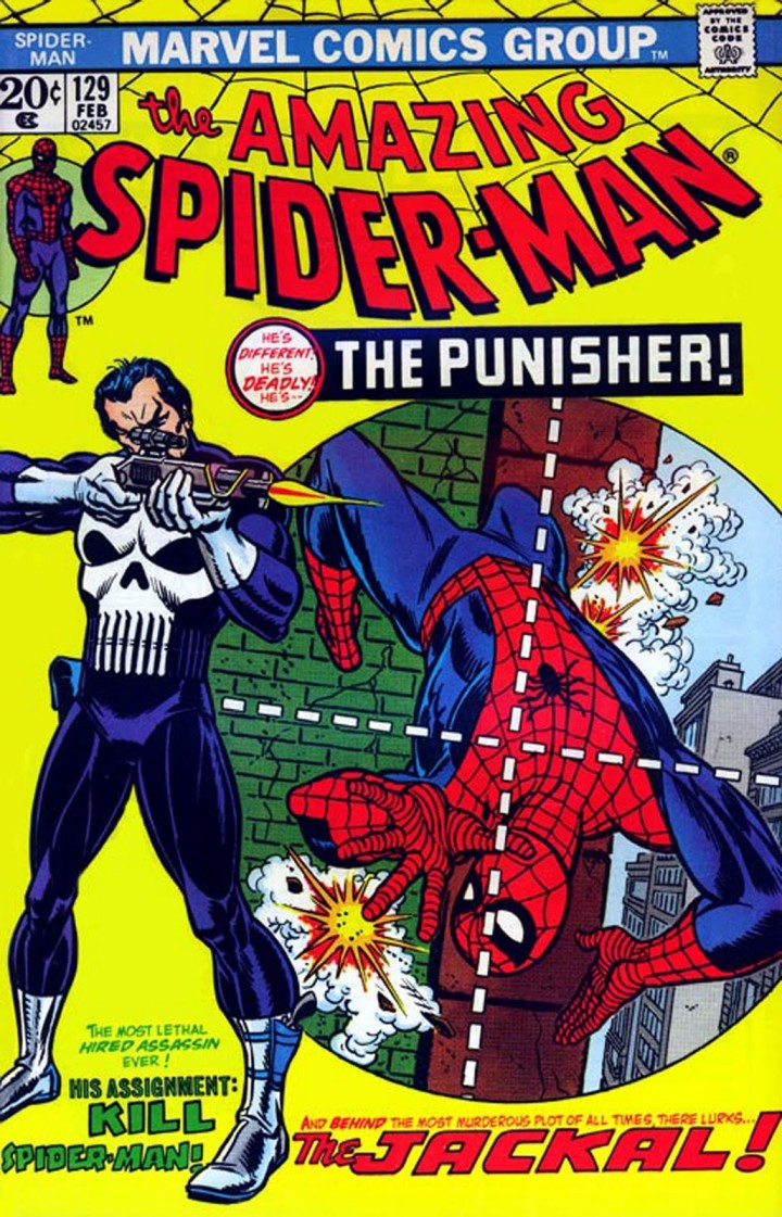
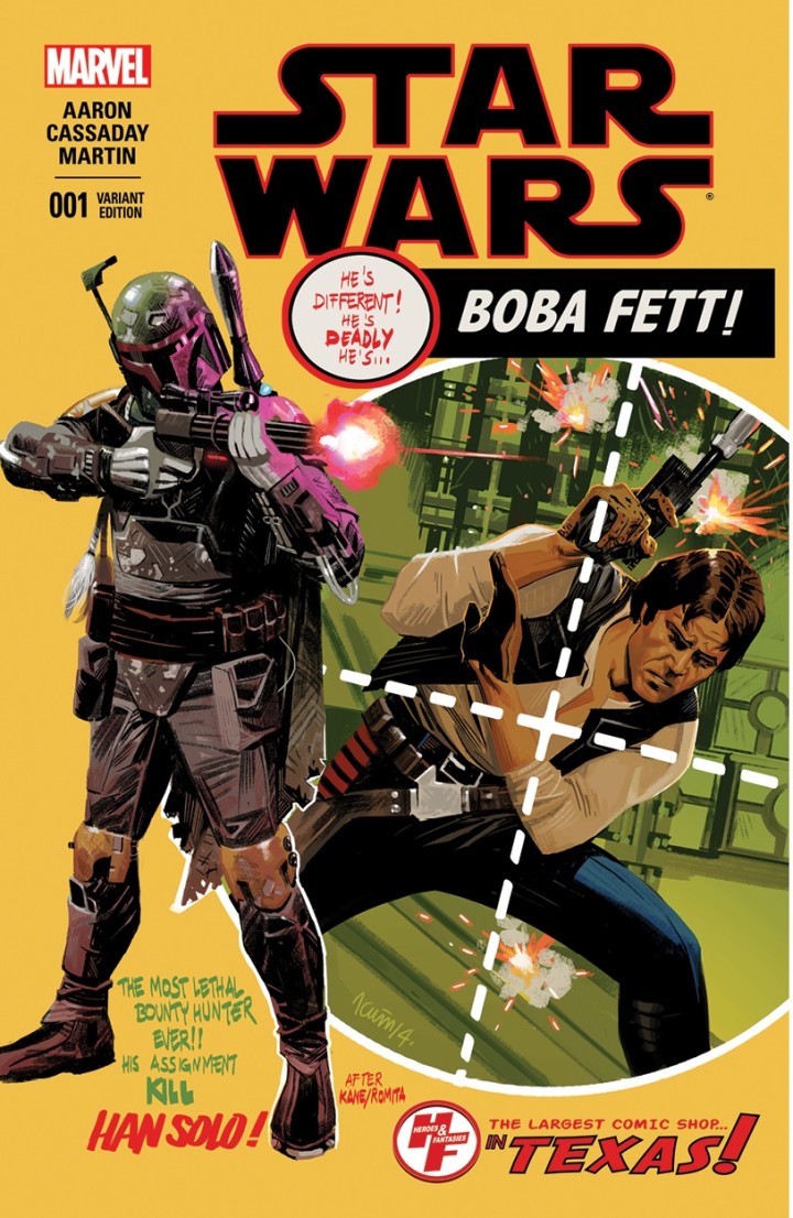 And there had to be a Boba Fett one didn’t there? (in fact there are several) I like the pulp feel of this one by Daniel-Acuna and Leslie has pointed out in the comments that it’s a take on The Amazing Spider-man 129 which was the first appearance of The Punisher.
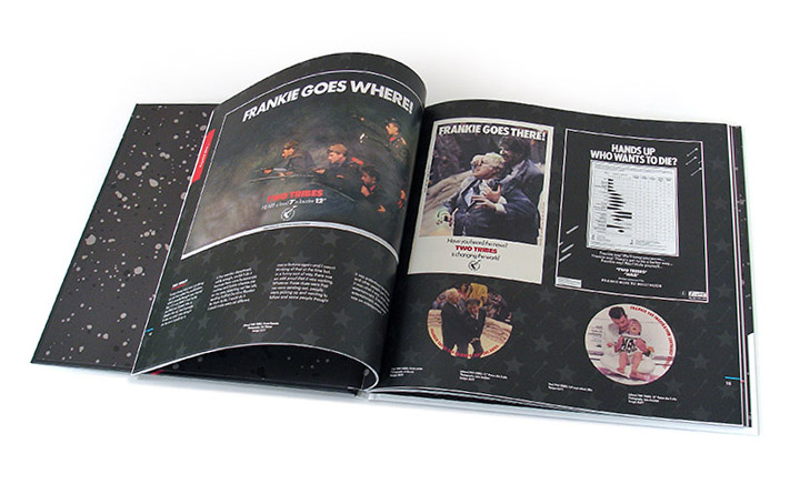
 Finally here’s the 2nd part of the interview I took part in alongside Ian Peel, Philip Marshall and Steve Bunyan with Paul Sinclair of Super Deluxe Edition talking about the making of the Frankie Goes To Hollywood ‘Inside The Pleasuredome’ box set last year.

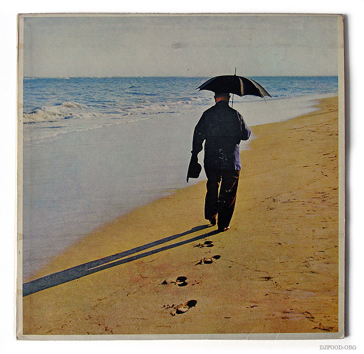
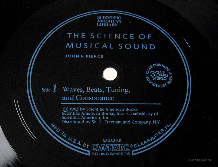
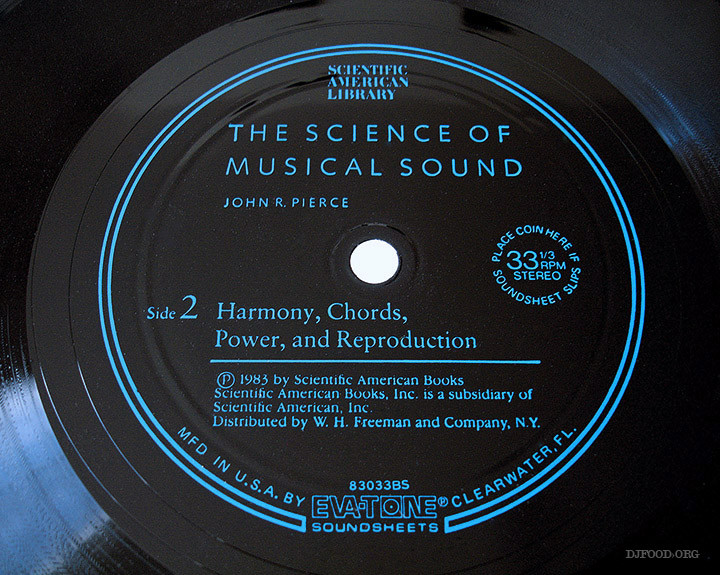
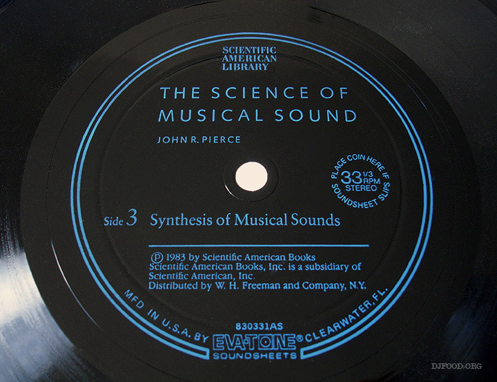
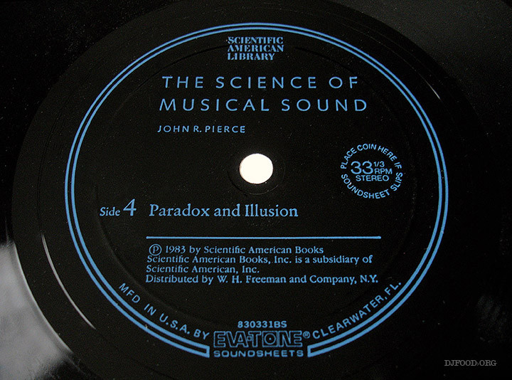
This book, published in 1983, was lent to me by DJ Vadim back in the late ’90s. Nestling in the back cover are two double-sided 7″ flexi discs with electronic examples of sonics described in the text. A couple of them made their way onto the ‘Kaleidoscope’ album, in fact I think the very first sound you hear on the record comes from one of these discs.
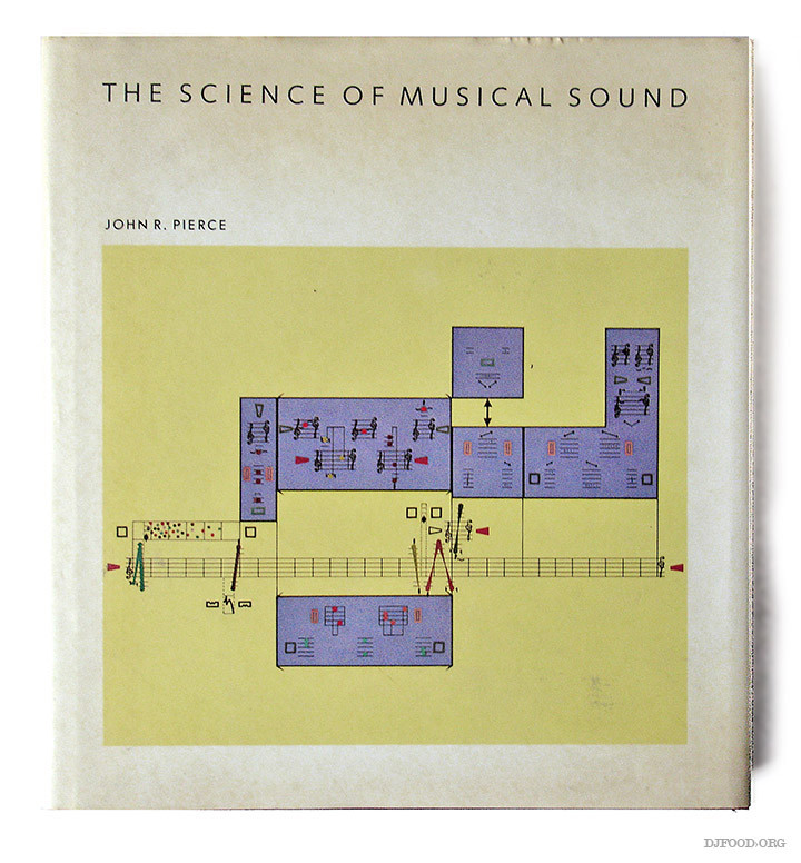 The author, John R. Pierce, worked extensively in radio communication, computer music and psychoacoustics and was one of the inventors of something called the Bohlen-Pierce Scale which I’m not going to even attempt to describe as it’s way over my head. He worked at Bell Labs, coined the term ‘transistor’ and helped develop the first communications satellite, Telstar 1. He wrote several academic books like this and also wrote science fiction under the name J.J. Coupling. He also composed several electronic pieces, some of which were featured on the ‘Music From Mathematics’ album originally issued by Bell Labs and recently reissued across two 45s by Finders Keepers.
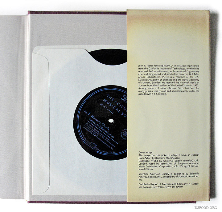
There’s a nice little piece about the book here and I’ve cribbed some text about the flexi discs from it. Sadly the links on the page are long gone but the French versions of the discs are on the web under the translated title ‘Le Son Musical’.
“The two 7-inches collect around 10 short sound examples per side of mathematics applied to sound and music, each introduced by speaker Jean-Claude Risset (in French). Some were recorded by Pierce and Max V. Mathews at IRCAM, Paris in 1979. Some were created by Elizabeth Cohen [+] and John Chowing at Stanford University in 1979. Some were recorded by Jean-Claude Risset using Mathews’ Music V program in Marseille, IRCAM and Bell Labs. A biographical memoir was written by colleagues of Pierce in 2002, among them Dr. Max V. Mathews, and is available as a PDF here. Download link comes with 20 or so pictures from the book.”

